Choice Cream SW 6357 by Sherwin Williams
Unveiling Warmth and Elegance
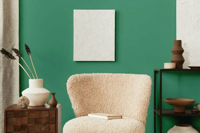
In the ever-expanding palette of Sherwin Williams, Choice Cream stands out as a versatile hue that brings a soft, comforting glow to interiors and exteriors alike. Embodying the warmth of a sunny afternoon, this color transcends the boundaries of style, proving itself adaptable in traditional and modern spaces.
In this detailed exploration of SW 6357 Choice Cream, we delve into its applications, how it complements various design elements, and why it has become a go-to choice for professional designers and DIY enthusiasts.
Whether you’re looking to create a serene retreat, a welcoming living space, or a vibrant workspace, Choice Cream offers a harmonious foundation that enhances natural light and pairs beautifully with a wide array of colors and textures.Understanding the subtle power of this creamy hue is essential for anyone considering a transformative paint project.
From its psychological effects to its practical applications, SW 6357 Choice Cream by Sherwin Williams represents a thoughtful choice for any design ethos, promising to bring a touch of softness and elegance to every inch it covers. Join us as we uncover the charm and versatility of Choice Cream, a color that defines understated beauty.
via plan home
What Color Is Choice Cream SW 6357 by Sherwin Williams?
Choice Cream SW 6357 by Sherwin Williams is a rich and inviting color that exudes warmth and sophistication. As a hue that seamlessly bridges the gap between pure cream and light beige, Choice Cream offers a versatile palette that can breathe life into various spaces without overpowering them. Its subtle undertones provide a cozy, yet bright and airy feel, making it an ideal choice for creating a relaxed and welcoming atmosphere.
In Scandinavian designs, Choice Cream can add warmth to the minimalistic décor, while in Bohemian interiors, it serves as a perfect backdrop for vibrant textiles and eclectic accessories.
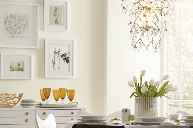
Choice Cream pairs beautifully with a wide range of materials and textures, enhancing the room’s overall aesthetic appeal. Natural wood tones, from light oak to rich walnut, look stunning against this creamy backdrop, highlighting the warmth of the wood.
Soft, plush fabrics like velvet or silk in deeper hues create a lovely contrast, adding depth and interest to the space.
Additionally, woven textiles and jute rugs introduce texture and an element of earthiness, making the rooms feel grounded yet airy. Metal accents in gold or brass can introduce a touch of glam, resulting in a sophisticated and cohesive look that ties together the elegance and comfort that Choice Cream embodies.
housekeepingbay.com
Table of Contents
Is Choice Cream SW 6357 by Sherwin Williams Warm or Cool color?
Choice Cream SW 6357, by Sherwin Williams, possesses a soft and warm tone that exudes comfort and elegance in any living space. Representative of its name, Choice Cream is a soothing shade that offers just the right balance of brightness and warmth, making it highly versatile for various home styles and decors. Its creamy, gentle presence can transform rooms into serene retreats or inviting communal areas, reinforcing a sense of openness and airiness.
In homes, Choice Cream works exceptionally well in spaces that benefit from a touch of warmth, without the overpowering intensity of deeper shades. It harmonizes beautifully with natural light, glowing softly in well-lit areas and maintaining its warmth in spaces with limited natural light, thus enhancing the perceived size and openness of rooms.
Its neutral undertone makes it an excellent canvas for accentuating textures and colors, allowing for flexibility in decorating without the risk of clashes.
Ideal for living rooms, bedrooms, or even kitchens, Choice Cream can serve as a standalone color or complement bolder accents, providing a timeless backdrop that adapts to changing decor trends. Its calming effect contributes to a welcoming atmosphere, making any home feel more inviting and comfortable.
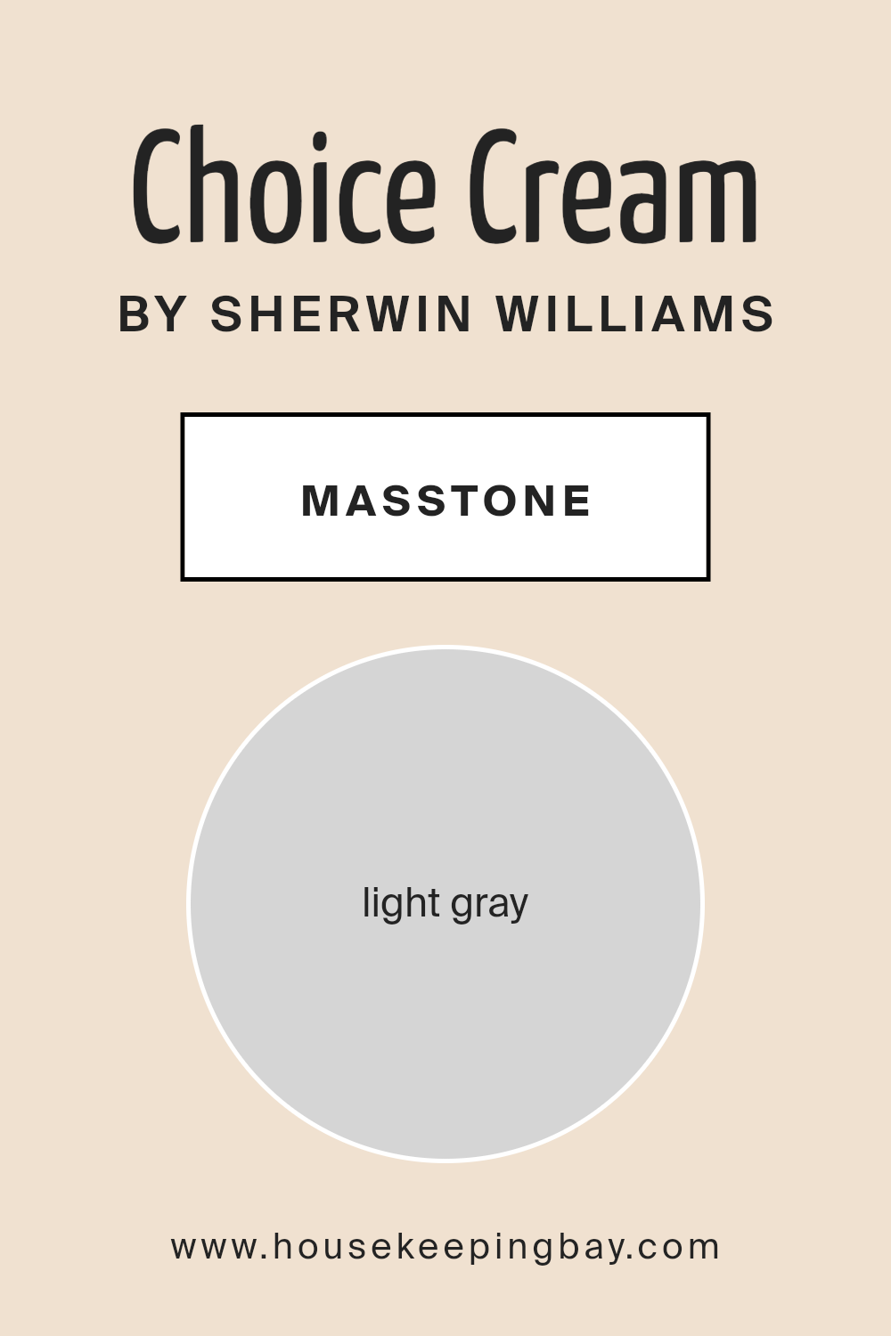
What is the Masstone of the Choice Cream SW 6357 by Sherwin Williams?
Choice Cream SW 6357 by Sherwin Williams, with its masstone of Light Gray (#D5D5D5), is a versatile and subtle hue that exudes a sense of calm and serenity, making it an excellent choice for residential spaces.
The light gray masstone carries an inherent softness that allows it to blend seamlessly with a variety of decor styles, from modern minimalist to cozy traditional. Its neutral base enables it to act as a soothing backdrop, against which colors can pop or as a standalone shade that quietly sophisticates a room without overwhelming it.
The adaptability of Choice Cream’s light gray masstone means it can be used in virtually any room of a home, enhancing natural light in well-lit spaces or providing a luminous quality to areas lacking in natural sunlight. Furthermore, its neutrality encourages a sense of spaciousness and openness, making smaller rooms feel larger and more inviting. Whether applied on walls, trim, or cabinetry, Choice Cream SW 6357, with its gentle gray undertones, offers a timeless elegance and a tranquil atmosphere conducive to relaxation and comfort.
housekeepingbay.com
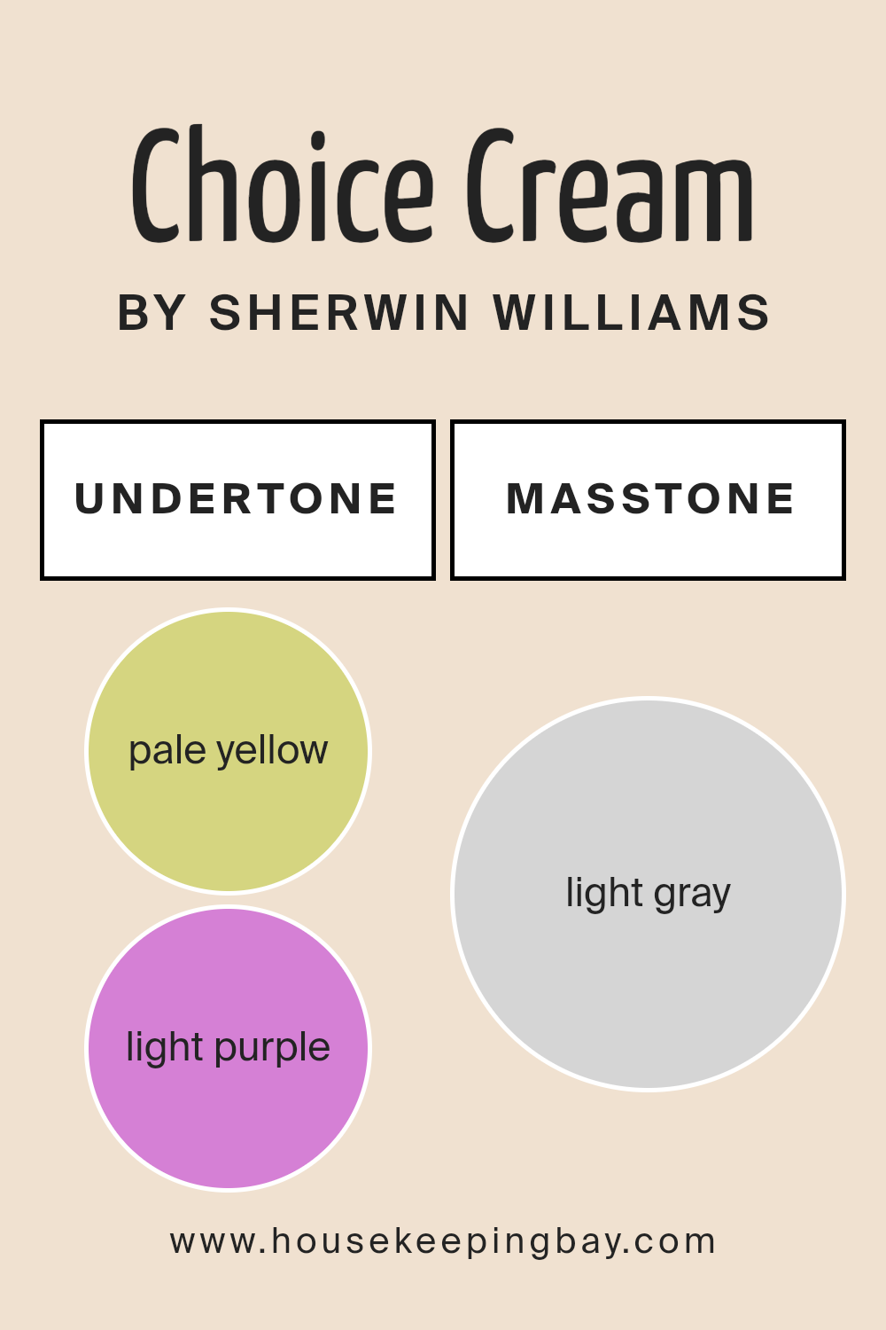
Undertones of Choice Cream SW 6357 by Sherwin Williams
Choice Cream SW 6357 by Sherwin Williams is a captivating hue that brings warmth and brightness to any space. What sets this paint apart are its subtle undertones, specifically pale yellow (#D5D580) and light purple (#D580D5).
Undertones are the underlying colors that, while not immediately apparent, significantly influence how we perceive the primary color. They can add depth, warmth, or coolness, altering the color’s appearance under different lighting conditions.
The pale yellow undertone in Choice Cream lends a sunny warmth, making spaces feel more inviting and cheerful. This warmth is particularly beneficial in rooms that receive less natural light, as it helps to brighten and energize the space. On the other hand, the light purple undertone introduces a touch of sophistication and complexity. This subtle infusion can give a room an air of elegance and tranquility, balancing the brightness of the yellow to prevent the cream color from feeling too stark or overwhelming.
When applied to interior walls, Choice Cream SW 6357 transforms the space by blending these undertones harmoniously. The result is a dynamic interplay of warmth and refined elegance that adapts throughout the day with changes in natural and artificial lighting.
In morning light, the yellow undertones may shine brighter, offering a cheerful start to the day. As the evening comes, the purple undertones can become more pronounced, contributing to a soothing ambiance perfect for relaxing. This adaptability makes Choice Cream an excellent choice for various rooms and styles, adding depth and character that goes beyond a simple cream paint.
housekeepingbay.com
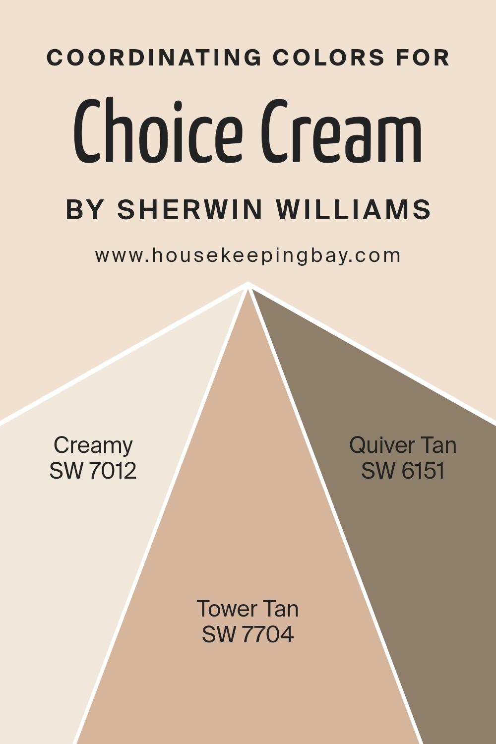
Coordinating Colors of Choice Cream SW 6357 by Sherwin Williams
Coordinating colors are hues that complement each other when used together in interior design or art, creating a cohesive and pleasing aesthetic. These colors, when paired with a base color, enhance the overall palette, bringing balance and unity to a space.
Choice Cream SW 6357 by Sherwin Williams is a warm, inviting neutral that serves as a perfect canvas for a variety of coordinating colors, enriching the ambiance without overwhelming the senses.
The art of selecting coordinating colors involves considering the undertones and saturation of each hue to ensure they harmoniously blend, offering both contrast and cohesion.
One of the coordinating colors, Creamy SW 7012, offers a soft, buttery feel that adds a light and airy quality to the ambiance, perfect for creating a serene and welcoming space. Its subtle warmth pairs beautifully with the base neutrality of Choice Cream, enhancing the room’s comfort level. Tower Tan SW 7704, on the other hand, introduces a bolder, yet earthy dimension, grounding the palette with its rich, sandy undertones, and evoking a sense of stability and warmth.
Lastly, Quiver Tan SW 6151 brings a unique balance with its subtle mix of gray and tan, providing a muted elegance that complements the creamy base, resulting in a sophisticated yet inviting scheme. These coordinating colors, when used with Choice Cream, seamlessly blend to create a harmonious and appealing interior palette.
You can see recommended paint colors below:
- SW 7012 Creamy
- SW 7704 Tower Tan
- SW 6151 Quiver Tan
housekeepingbay.com
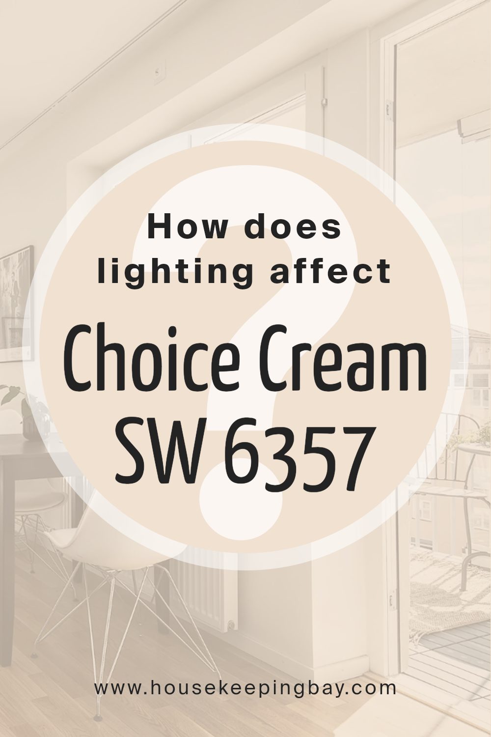
How Does Lighting Affect Choice Cream SW 6357 by Sherwin Williams?
Lighting plays a crucial role in how we perceive color. In essence, the type of light and its intensity can dramatically alter the appearance of colors within a space. Each light source casts its own hue, affecting the way colors look. Natural light, which changes throughout the day, offers the broadest color spectrum, making colors appear true to life.
Meanwhile, artificial light, including LED, fluorescent, and incandescent bulbs, can shift colors toward their specific hues – cool light can make colors appear bluer, while warm light can add a yellowish tint.
Sherwin Williams’ Choice Cream SW 6357 is a warm, inviting hue that can transform under different lighting conditions. In natural daylight, Choice Cream radiates a soft, gentle warmth, providing a soothing and welcoming atmosphere. Under artificial light, the effect depends on the type of bulb: incandescent lighting amplifies its warmth, making rooms feel cozier, while fluorescent lighting might lend a slightly cooler tone, yet maintaining its inviting essence.
The orientation of a room significantly impacts how Choice Cream is perceived. North-facing rooms typically receive cooler, indirect light, which can make colors appear slightly more muted. In such rooms, Choice Cream may lean towards a softer, more subtle warmth, enhancing the coziness of the space without overwhelming it with brightness.
South-facing rooms bask in plentiful warm light for most of the day, making Choice Cream glow with vibrancy and warmth. This orientation accentuates the paint’s inviting nature, making spaces feel open, airy, and cheerful.
East-facing rooms enjoy bright, warm light in the morning, with the light turning cooler as the day progresses. Here, Choice Cream will wake up with a lively warmth in the morning, subtly transitioning to a calmer hue as natural light diminishes, offering a gentle ambiance throughout the day.
West-facing rooms are cooler in the morning and filled with intense warm light in the afternoon and evening. Choice Cream will start the day understatedly in these rooms, gradually flourishing into a warm, radiant backdrop as the sun sets, creating a cozy and inviting space perfect for evenings.
Thus, Choice Cream SW 6357 by Sherwin Williams adapts uniquely to different lighting conditions and room orientations, showcasing its versatility and the dynamic interaction between color and light.
housekeepingbay.com
What is the LRV of Choice Cream SW 6357 by Sherwin Williams?
Light Reflectance Value (LRV) is a measure used to describe the amount of visible and usable light that a color reflects or absorbs when light falls upon it, expressed as a percentage from 0 to 100. Colors with high LRV, closer to 100, reflect more light and appear brighter, making them ideal for creating a light, airy feel in a space.
Conversely, colors with low LRV absorb more light, appearing darker and can make a room feel smaller or more intimate. Understanding the LRV of a paint color is crucial when designing a space, as it affects both the mood and the functionality of the room.
It informs decisions on lighting, creating contrasts with decor, and enhancing the perceived size of the space. Essentially, LRV plays a significant role in achieving the desired ambiance and practical use of a room.
Choice CreamSW 6357 by Sherwin Williams, with an LRV of 77.087, falls into the higher range of the LRV scale, indicating that it is a fairly light color capable of reflecting a substantial amount of light. This particular LRV value means that Choice Cream will help to make a room feel more spacious and open, contributing to a bright and welcoming atmosphere.
The high LRV makes this color particularly suitable for spaces that receive less natural light or for creating a serene and uplifting environment. Furthermore, the warmth of Choice Cream, combined with its high light reflectivity, can soften and enrich the space, creating a cozy yet luminous setting.
For homeowners and designers, understanding the impact of this LRV can guide the choice of complementary colors and furnishings, ensuring a harmonious and well-lit space.

housekeepingbay.com
What is LRV? Read It Before You Choose Your Ideal Paint Color
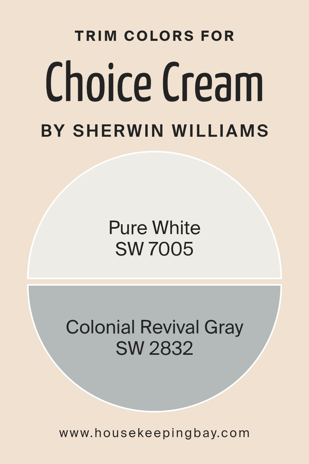
What are the Trim colors of Choice Cream SW 6357 by Sherwin Williams?
Trim colors are specific hues chosen to accentuate or complement the main color used on walls, ceilings, or other large surfaces. They are applied to architectural elements such as door frames, baseboards, crown moldings, and window trims.
The choice of trim color can dramatically alter the perception of the main color, enhancing its beauty and tying the overall color scheme of a room or exterior together. For Choice Cream SW 6357 by Sherwin Williams, a warm and inviting neutral, selecting the right trim color is crucial in highlighting its cozy, welcoming essence while providing a polished, cohesive look.
For a crisp and clean appearance, SW 7005 – Pure White serves as an excellent trim color to pair with Choice Cream SW 6357. Pure White is a bright, neutral white without any strong undertones, making it an ideal choice for creating a clear demarcation that enhances the warm tones of Choice Cream, ensuring the space feels grounded yet airy.
On the other hand, SW 2832 – Colonial Revival Gray offers a stately and sophisticated option for trim, introducing a subtle contrast that underscores the richness of Choice Cream. This gray carries a balanced blend of warm and cool tones, providing versatility and depth to spaces, making them appear more defined and structured without overwhelming the gentleness of Choice Cream.
You can see recommended paint colors below:
- SW 7005 Pure White
- SW 2832 Colonial Revival Gray
housekeepingbay.com
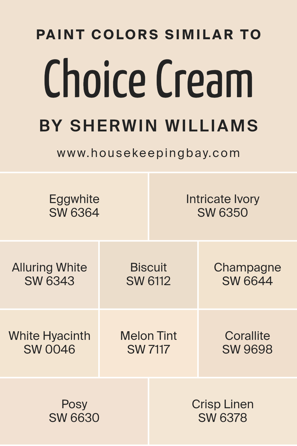
Colors Similar to Choice Cream SW 6357 by Sherwin Williams
In the realm of interior design, the subtle art of pairing similar colors can profoundly impact the atmosphere and visual appeal of a space. Colors akin to Choice Cream SW 6357 by Sherwin Williams, such as Eggwhite SW 6364 and Intricate Ivory SW 6350, play an essential role in creating a cohesive yet varied palette.
These hues, closely related in tone and saturation, work harmoniously together to foster a warm, inviting environment while adding a touch of elegance and continuity. The presence of similar shades like Alluring White SW 6343 or Biscuit SW 6112 emphasizes soft transitions between walls and decor, ensuring that no element feels out of place or overly dominant.
Similarly, colors like Champagne SW 6644 and White Hyacinth SW 0046 introduce a subtle richness and depth, enhancing the space without overwhelming it with stark contrasts. Melon Tint SW 7117 and Corallite SW 9698 add a gentle hint of color, providing an understated vibrancy that invigorates the palette. Meanwhile, Posy SW 6630 and Crisp Linen SW 6378 contribute to the spectrum’s versatility, offering options for spaces that seek a balance between neutrality and warmth.
Together, these similar colors work in concert, crafting environments that are visually cohesive, emotionally resonant, and inviting by their very nature.
You can see recommended paint colors below:
- SW 6364 Eggwhite
- SW 6350 Intricate Ivory
- SW 6343 Alluring White
- SW 6112 Biscuit
- SW 6644 Champagne
- SW 0046 White Hyacinth
- SW 7117 Melon Tint
- SW 9698 Corallite
- SW 6630 Posy
- SW 6378 Crisp Linen
housekeepingbay.com
How to Use Choice Cream SW 6357 by Sherwin Williams In Your Home?
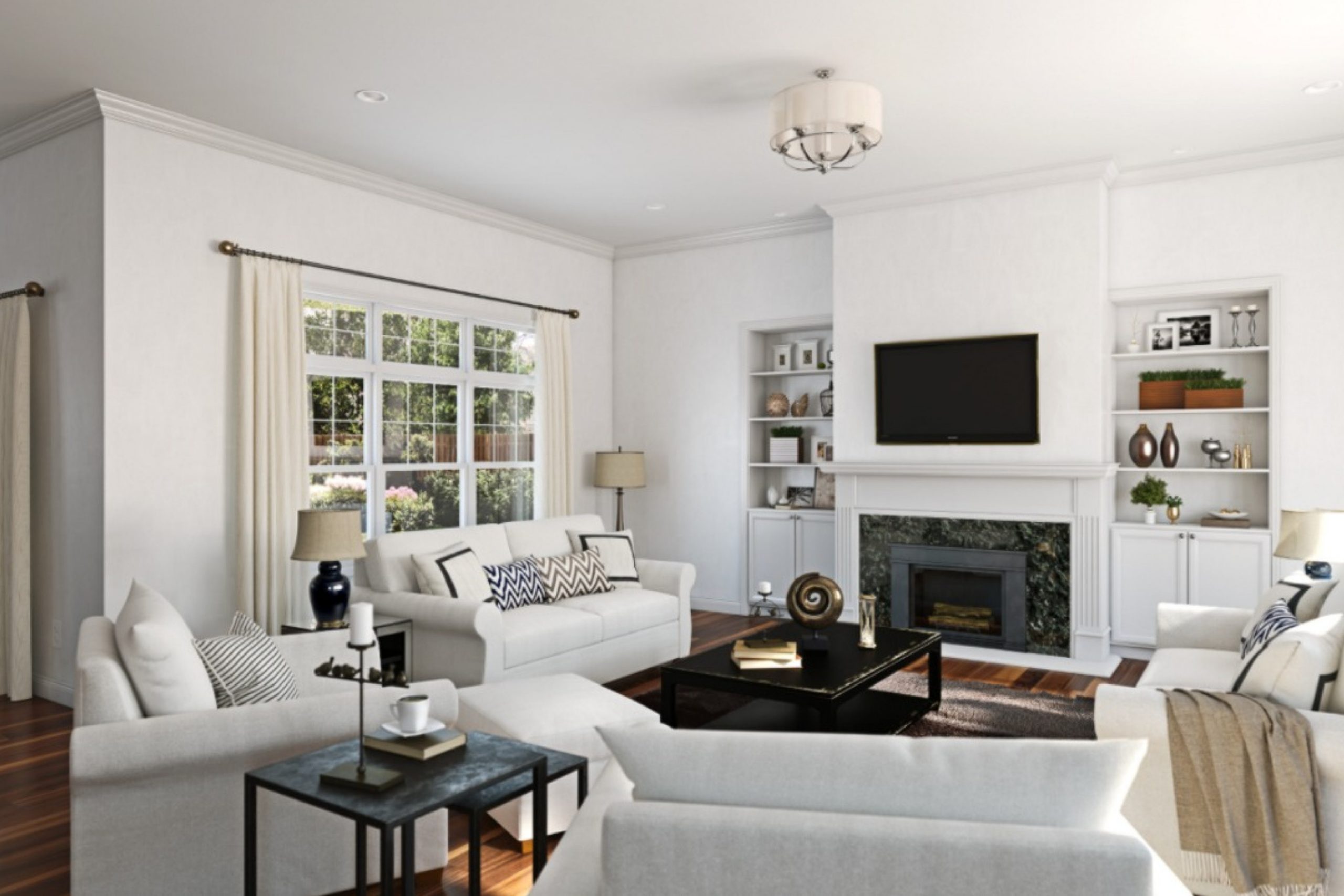
Choice Cream SW 6357 by Sherwin Williams is a warm, inviting shade that exudes comfort and serenity, making it an ideal choice for creating a cozy and welcoming atmosphere in any home. This soft, creamy hue possesses a subtle elegance that can enhance various spaces, from living rooms and kitchens to bedrooms and bathrooms. Its versatility allows it to complement a wide range of interior styles, including traditional, modern, and farmhouse decors.
Incorporating Choice Cream into your home can be both simple and transformative. For a harmonious look, apply it as a main wall color, providing a neutral backdrop that allows furniture and art to stand out. It pairs beautifully with natural wood tones, soft pastels, or even bold colors for a more dramatic effect.
Alternatively, use Choice Cream on trim, kitchen cabinets, or as an accent piece to add warmth to a room without overwhelming it with color. This shade can help make small spaces appear brighter and more spacious, while adding a touch of sophistication to larger areas. By selecting Choice Cream SW 6357, homeowners can achieve a timeless, comfortable space that feels both welcoming and stylish.
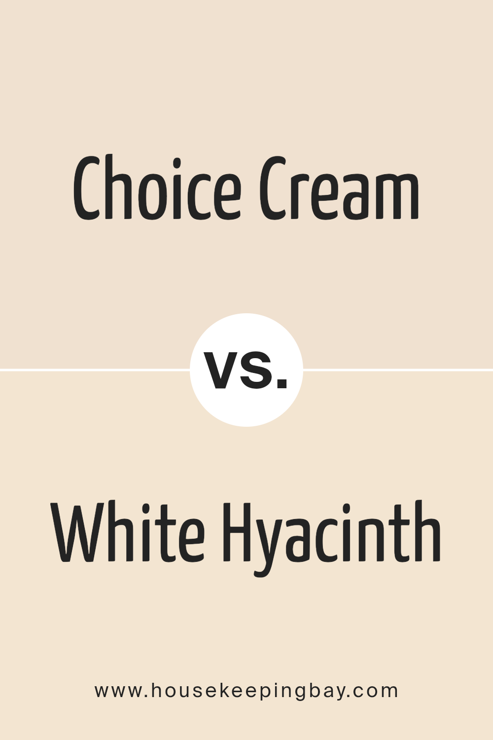
Choice Cream SW 6357 by Sherwin Williams vs White Hyacinth SW 0046 by Sherwin Williams
Choice Cream SW 6357 and White Hyacinth SW 0046 by Sherwin Williams present subtle nuances in hue that distinguish their applications and mood settings in interior spaces. Choice Cream is a warm, creamy beige, embodying a rich, inviting tone that suggests comfort and coziness. Its warmth is versatile, capable of complementing a wide range of decor styles, from traditional to contemporary, making spaces feel more intimate and welcoming.
On the other hand, White Hyacinth is a cleaner, brighter shade, leaning towards a pure, soft white with subtle undertones. This color reflects more light, imparting a crisp, airy feel to spaces, enhancing openness and brightness. It’s particularly effective in achieving a minimalist aesthetic or in spaces aiming for a fresh, serene ambiance.
While both colors promote a sense of tranquility and elegance, Choice Cream offers warmth and depth, making spaces feel grounded and homely. White Hyacinth, conversely, provides a backdrop for clarity and expansion, suggesting freshness and simplicity. Their uses hinge on the desired emotional and visual impact within a room, whether one seeks the embrace of warmth or the breath of freshness.
You can see recommended paint color below:
housekeepingbay.com
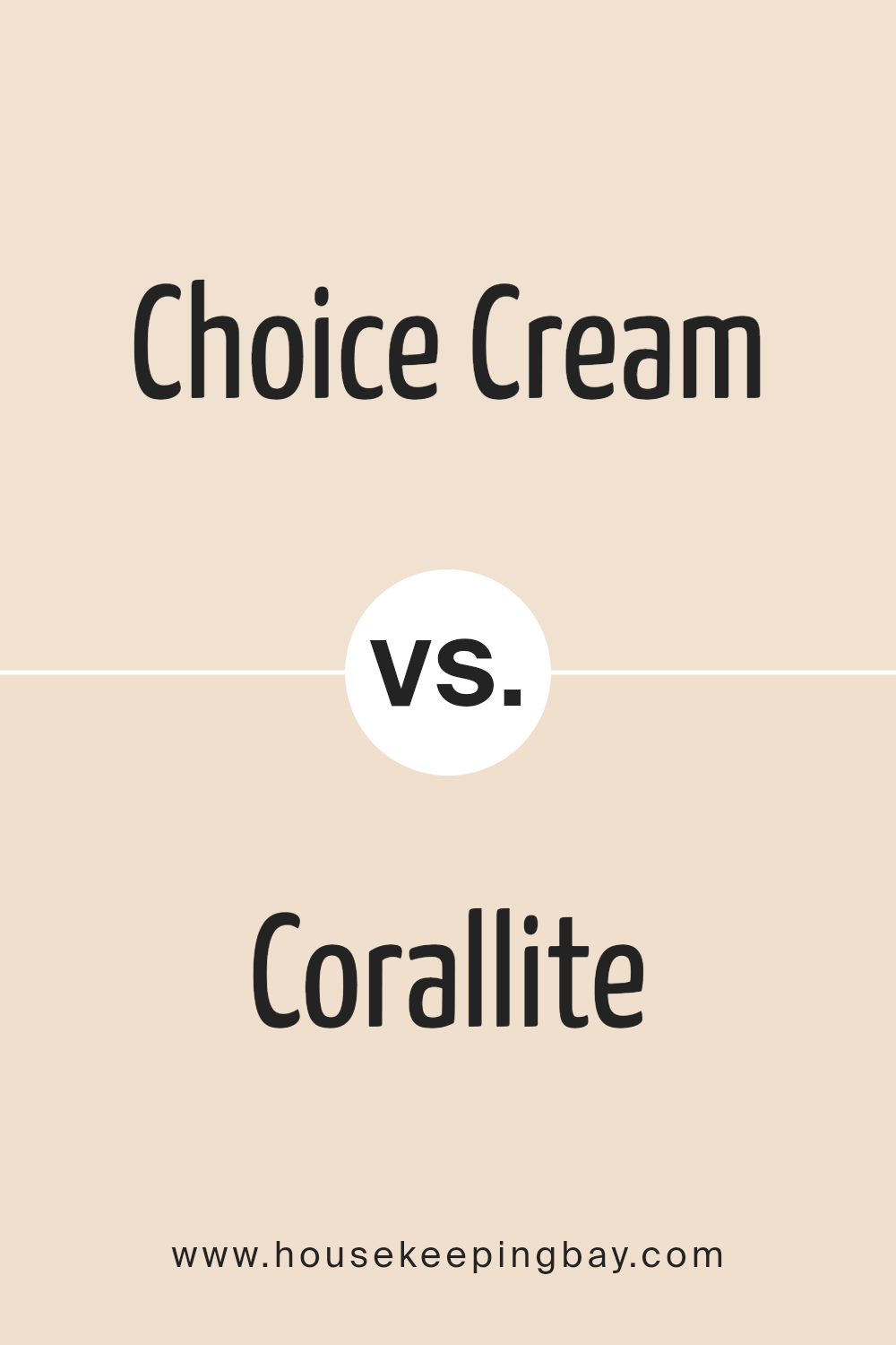
Choice Cream SW 6357 by Sherwin Williams vs Corallite SW 9698 by Sherwin Williams
Choice Cream SW 6357 and Corallite SW 9698 by Sherwin Williams represent two distinctly different hues that cater to varied aesthetic preferences. Choice Cream is deeply rooted in warm, creamy tones, offering a soothing and inviting vibe. This color exudes a soft, almost buttery presence, which makes it ideal for creating a serene and welcoming atmosphere in any space. Its understated elegance allows it to serve as a versatile backdrop, capable of complementing a wide range of decors and color schemes.
On the other hand, Corallite SW 9698 ventures into a more vibrant territory with its coral essence. This color vibrates with a lively energy, bringing a burst of freshness and warmth into a room. It’s the kind of color that can inspire joy and creativity, making it a perfect choice for spaces that benefit from a dynamic and uplifting ambiance.
Although vibrant, Corallite maintains a level of sophistication, allowing it to be used in both energetic and relaxed settings.
When comparing the two, Choice Cream offers a neutral canvas, fostering calm and relaxation, while Corallite injects life and vibrancy into a space. Both colors have their unique charm, making the choice between them dependent on the desired mood and thematic elements of the room in question.
You can see recommended paint color below:
- SW 9698 Corallite
housekeepingbay.com
Choice Cream SW 6357 by Sherwin Williams vs Alluring White SW 6343 by Sherwin Williams
Choice Cream SW 6357 and Alluring White SW 6343, both by Sherwin-Williams, represent subtle yet distinct hues that can significantly impact interior spaces. Choice Cream embodies a warm, welcoming presence with its creamy, soft undertones. This hue leans towards a gentle beige, offering a cozy, comforting atmosphere without overwhelming the senses. It’s particularly well-suited for spaces meant to be inviting and serene, such as living rooms and bedrooms, where its warmth can be accentuated with natural light or complemented by rich textures and furnishings.
Alluring White SW 6343, on the other hand, is a lighter, more neutral shade that exudes a clean, crisp aura. This color is closer to what one might consider a true white, but with a subtle warmth that prevents it from feeling stark or clinical.
It’s incredibly versatile, ideal for creating a sense of space and openness in smaller rooms or serving as a refined backdrop in more minimalist or contemporary designs. Alluring White can pair seamlessly with a wide range of colors, offering a pristine canvas for various decor styles.
In essence, while Choice Cream brings a depth of warmth and coziness, Alluring White offers a fresh, airy feel. Each color has its unique appeal, with Choice Cream fostering an inviting ambiance and Alluring White providing a sleek, open aesthetic.
You can see recommended paint color below:
- SW 6343 Alluring White
housekeepingbay.com
Choice Cream SW 6357 by Sherwin Williams vs Champagne SW 6644 by Sherwin Williams
Choice Cream SW 6357 and Champagne SW 6644 by Sherwin Williams are both part of the warm neutral family, offering a sophisticated and inviting palette for interiors. Choice Cream is a deeper, rich hue that provides a robust warmth to spaces, emanating a comforting and cozy ambiance.
It offers a solid foundation for rooms, grounding them with its substantial presence and can serve as an excellent backdrop for both bold and subtle decor.
On the other hand, Champagne is a lighter, more ethereal color, with a gentle luminosity that can make spaces feel more open and airy. Its softness is ideal for creating a serene and elegant environment, perfectly suited for living areas and bedrooms that seek a touch of understated luxury. Its ability to reflect light beautifully complements its warm undertone, ensuring spaces are inviting.
While both colors share a warm base, their difference in depth and intensity allows them to serve unique roles in interior design. Choice Cream anchors spaces with its hearty warmth, whereas Champagne introduces a delicate, refined touch, making them beautifully complementary when used in a cohesive design scheme.
You can see recommended paint color below:
- SW 6644 Champagne
housekeepingbay.com
Choice Cream SW 6357 by Sherwin Williams vs Posy SW 6630 by Sherwin Williams
Choice Cream SW 6357 and Posy SW 6630, both by Sherwin-Williams, epitomize the brand’s proficiency in crafting hues that evoke distinct moods and styles. Choice Cream is a warm, inviting off-white with a subtle hint of yellow, evoking a sense of coziness and light.
Its creamy texture offers a soft backdrop, ideal for creating a serene and welcoming space. This color particularly shines in interiors seeking a neutral, but warm base, pairing beautifully with a wide range of accent colors, from bold to pastel.
In contrast, Posy SW 6630 is a statement-maker. This vibrant, cheerful pink has a youthful energy and a boldness that can instantly brighten and add personality to a space. Unlike the understated subtlety of Choice Cream, Posy demands attention and is perfect for areas or accent walls where a touch of playfulness and vibrancy is desired.
While Choice Cream is about creating a soft, timeless base, Posy is about injecting life and color. Together, they could complement each other in a space that aims to be both warm and dynamic, with the calming neutrality of Choice Cream grounding the exuberant positivity of Posy.
You can see recommended paint color below:
- SW 6630 Posy
housekeepingbay.com
Choice Cream SW 6357 by Sherwin Williams vs Biscuit SW 6112 by Sherwin Williams
The main color, Choice Cream SW 6357, and the second color, Biscuit SW 6112, both by Sherwin Williams, are warm, inviting neutrals that provide a serene and welcoming atmosphere to any space. Choice Cream is a soft, muted yellow with a creamy base that exudes a buttery warmth, making it ideal for creating cozy and bright interiors.
Its light-reflective qualities can make small spaces appear larger and more open, offering a sense of freshness without overwhelming the senses.
In contrast, Biscuit SW 6112 leans towards a richer, beige tone with a hint of gray. This color has a deeper, earthier base compared to Choice Cream, allowing it to bring a sense of solidity and grounding to a room. Biscuit is perfect for those looking to add warmth to their space while maintaining a sophisticated and neutral backdrop that pairs well with a wide range of decor styles.
Together, these two colors can complement each other beautifully within a home. While Choice Cream adds a light, airy feel, Biscuit provides depth and stability, making them a harmonious pairing for anyone looking to achieve a balanced and inviting neutral palette.
You can see recommended paint color below:
housekeepingbay.com
Choice Cream SW 6357 by Sherwin Williams vs Crisp Linen SW 6378 by Sherwin Williams
The color Choice Cream SW 6357 by Sherwin Williams is a warm and inviting hue, exuding a sense of comfort and embrace. It occupies a particular spot on the color spectrum where it casts a soft, golden glow, reminiscent of early morning sunlight filtering through a cosy, well-loved space. Its deep, rich undertones provide a sense of depth and sophistication, making it an ideal candidate for creating welcoming living areas, serene bedrooms, or even enhancing the warmth of a kitchen or dining room.
On the other hand, Crisp Linen SW 6378 by Sherwin Williams leans more towards a neutral, clean palette, offering a breath of fresh air to any space it graces. This color is emblematic of purity and simplicity, drawing its inspiration from the unblemished look of fresh linen.
Its lighter, softer approach makes it incredibly versatile, capable of brightening spaces while maintaining a subtle, elegant vibe. Crisp Linen can effectively enlarge a space visually, making it a perfect choice for small rooms or areas that benefit from a more open, airy feel.
While both colors emanate warmth, Choice Cream SW 6357 offers deeper, golden undertones, whereas Crisp Linen SW 6378 presents a fresher, more neutral base. Each brings its unique atmosphere to interiors, with Choice Cream adding depth and a cozy ambiance, and Crisp Linen providing a clean, refreshing backdrop.
You can see recommended paint color below:
- SW 6378 Crisp Linen
housekeepingbay.com
Choice Cream SW 6357 by Sherwin Williams vs Eggwhite SW 6364 by Sherwin Williams
Choice Cream SW 6357 and Eggwhite SW 6364 by Sherwin Williams are two inviting hues that harbor warmth and brightness, yet each presents its distinct personality. Choice Cream is a deeper, richer tone embodying a sense of creamy warmth and cozy comfort, making spaces feel welcoming and serene. Its depth allows it to stand as a robust neutral, versatile enough to complement various decor styles and materials, from rustic woods to modern metals.
On the other hand, Eggwhite softens the palette with a lighter touch. This shade is closer to an off-white with just a whisper of warmth, evoking a clean, airy feel that enhances natural light in any room. Its subtle nuance makes it an excellent choice for walls in a space designed to feel open and bright.
While both shades share a foundational warmth, Choice Cream holds a more pronounced color presence, offering a sense of embrace and enclosure. Conversely, Eggwhite leans towards minimalism and lightness, providing a backdrop that allows other elements in the space to stand out. Together, they can create a harmonious balance, pairing depth with lightness in a layered interior design approach.
You can see recommended paint color below:
housekeepingbay.com
Choice Cream SW 6357 by Sherwin Williams vs Intricate Ivory SW 6350 by Sherwin Williams
Choice Cream SW 6357 and Intricate Ivory SW 6350, both from Sherwin Williams, are warm, inviting colors, but they cater to different aesthetic tastes and purposes. Choice Cream has a deeper, richer tone, embodying a traditional cream hue with a slightly more saturated, golden undertone. This color inherently brings a cozy, vibrant warmth to spaces, making it an excellent choice for living areas, kitchens, or any room that benefits from a cheerful, welcoming ambiance.
In contrast, Intricate Ivory leans towards a much lighter, softer palette, embodying the essence of off-white with a subtle, neutral undertone. This delicacy and lightness make it ideal for creating a serene, open, and airy feel, perfect for bedrooms, bathrooms, and small spaces that aim to appear more expansive.
While both colors inspire a sense of comfort and warmth, Choice Cream offers a statement with its richer, more pronounced presence, whereas Intricate Ivory provides a quiet backdrop, offering versatility and a sense of calm. Their distinct qualities enable them to be used independently or in combination to enhance different aspects of a home’s decor, depending on the desired atmosphere and spatial characteristics.
You can see recommended paint color below:
housekeepingbay.com
Choice Cream SW 6357 by Sherwin Williams vs Melon Tint SW 7117 by Sherwin Williams
Choice Cream SW 6357 and Melon Tint SW 7117, both Sherwin Williams paints, offer distinct yet subtly sophisticated options for interior spaces. Choice Cream is a warm, inviting neutral with a deep, creamy undertone that exudes comfort and coziness. Its rich composition makes it an ideal choice for creating a soft, welcoming environment in living areas, bedrooms, or even kitchens, bringing a sense of calmness and serenity.
On the other hand, Melon Tint is a lighter, more playful hue that carries a subtle pinkish-orange undertone, reminiscent of the inside of a cantaloupe. This color has an airy, refreshing quality to it, making it perfect for spaces intended to be bright, cheerful, and slightly whimsical.
It’s particularly effective in enhancing natural light in a room, offering a delicate burst of warmth without overwhelming the space.
Both colors are versatile and can complement a wide range of décor styles, but they serve distinct moods and atmospheres within a home. While Choice Cream leans towards creating a grounding, soothing sanctuary, Melon Tint aims to uplift and energize, making each color uniquely suited to different spaces and preferences.
You can see recommended paint color below:
- SW 7117 Melon Tint
housekeepingbay.com
Conclusion
Without access to a specific article on the Color Choice Cream SW 6357 by Sherwin Williams, I can provide a general conclusion based on the paint color itself. Color Choice Cream SW 6357 by Sherwin Williams is a versatile and warm neutral paint color that effortlessly brings a sense of comfort and light to any space.
Its creamy undertones make it an excellent choice for creating a cozy and inviting atmosphere, suitable for living rooms, bedrooms, and kitchens alike.
This hue exudes a subtle elegance that pairs beautifully with a wide range of decor styles, from traditional to contemporary, making it a go-to option for designers and homeowners looking to add a touch of sophistication without overwhelming a room.
Given its adaptability, Cream SW 6357 can serve as a soft backdrop for bolder colors or act as the main color theme, enhancing the aesthetic appeal of a home’s interior. Its ability to reflect light helps in making spaces appear larger and more open, thereby contributing to a pleasant and welcoming environment. Additionally, when combined with natural elements and materials, this color adds to the creation of a serene and earthy ambiance.
Sherwin Williams’ Color Choice Cream SW 6357 is indeed a testament to the enduring appeal of neutral paint colors, providing a timeless charm that enriches the home’s overall aesthetic while offering ample flexibility in interior design.
housekeepingbay.com
Ever wished paint sampling was as easy as sticking a sticker? Guess what? Now it is! Discover Samplize's unique Peel & Stick samples. Get started now and say goodbye to the old messy way!
Get paint samples