Intricate Ivory SW 6350 by Sherwin Williams
Intricate Ivory, Embracing Elegance in Every Space
Intricate Ivory SW 6350, by Sherwin Williams, is a testament to elegance and subtlety in the realm of neutral paint colors. As part of Sherwin Williams’ vast and versatile palette, Intricate Ivory distinguishes itself with its warm, inviting tone that promises to bring a cozy, yet sophisticated, aura to any space.
This shade is more than just a simple ivory; it’s a carefully balanced blend that offers depth and complexity, making it a versatile choice for designers and homeowners alike.
The beauty of SW 6350 lies not only in its appearance but also in its ability to enhance a wide range of decor styles, from traditional to contemporary, without overwhelming the senses. It acts as a perfect backdrop, allowing furniture and artwork to stand out, yet contributes significantly to the atmosphere of a room.
Its adaptability extends to various lighting conditions, where it can shift subtly to complement the changing ambiance throughout the day.
Choosing Intricate Ivory for a project means opting for a color that embodies tranquility and warmth, making spaces more inviting and comfortable. In this article, we delve deeper into the nuances of SW 6350 Intricate Ivory by Sherwin Williams, exploring its applications, compatibility with other hues, and tips for integrating this exquisite color into your living spaces.
Whether you’re embarking on a home renovation or a professional design project, Intricate Ivory offers a foundation that can transform any space into a haven of sophistication and serenity.
via colorx
What Color Is Intricate Ivory SW 6350 by Sherwin Williams?
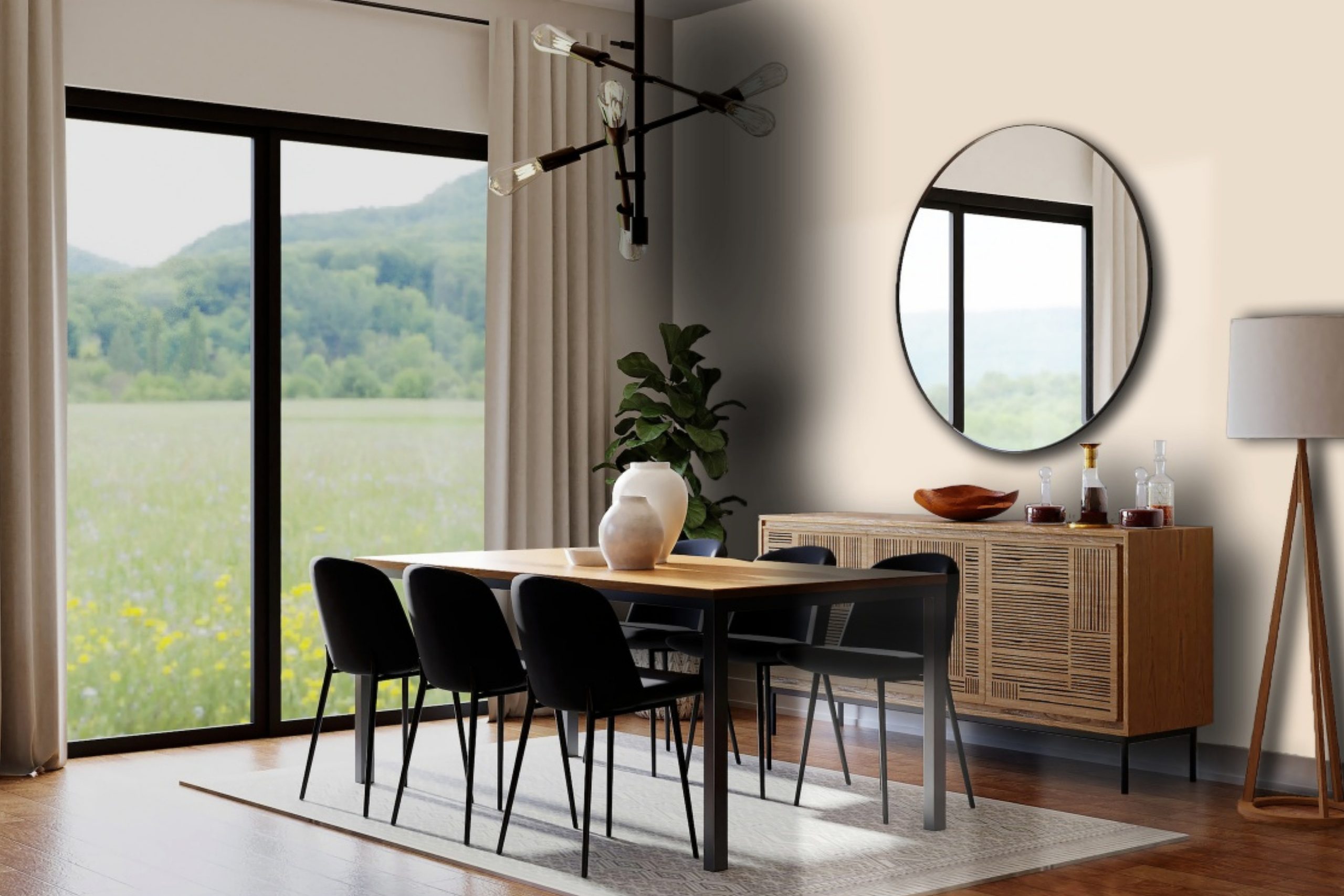
Intricate Ivory SW 6350 by Sherwin Williams is a harmonious and sophisticated hue that radiates warmth and comfort, offering an inviting canvas to any space it graces. This nuanced ivory shade is not a stark white but rather imbued with subtle, creamy undertones that make it incredibly versatile and welcoming.
Intricate Ivory possesses a depth that allows it to stand out as a background color, accentuating the interplay of light and shadow, and bringing a serene and soft ambiance to interiors.
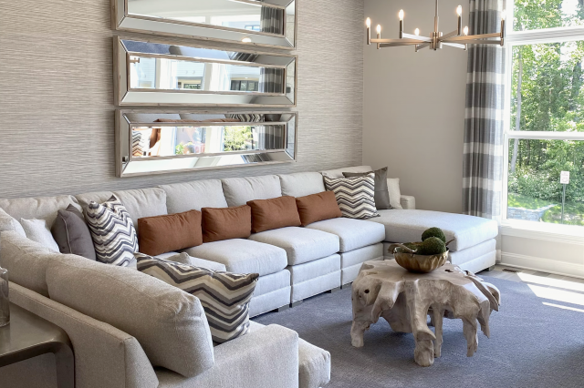
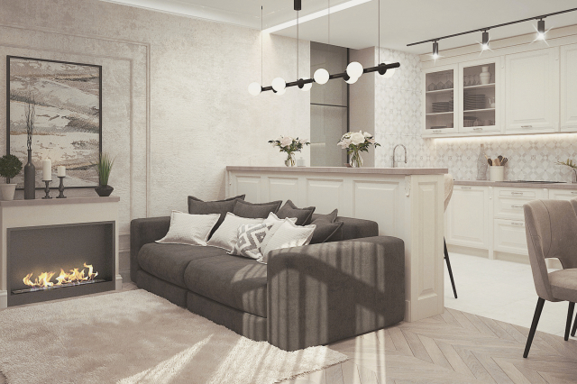
Perfect for those aiming to create a cozy, yet elegant atmosphere, Intricate Ivory works seamlessly within a variety of interior styles. It is particularly suited for classical, contemporary, and minimalistic designs, where its ability to blend harmoniously with a wide spectrum of colors and patterns can be fully appreciated.
This color finds its strength in its softness, making rooms appear larger, brighter, and more airy, which is a hallmark of modern and Scandinavian designs.
Intricate Ivory pairs exceptionally well with natural materials and textures, enhancing the organic beauty of wood grains, the lustre of metals, and the ruggedness of stone. Whether used in living rooms, bedrooms, or even kitchens, when combined with matte finishes on furniture, linen fabrics, and woven textures, it introduces a sense of calm.
In spaces with a lot of natural light, Intricate Ivory evolves throughout the day, reflecting the changing ambiance and highlighting details in the interior with a subtle, yet powerful grace.
housekeepingbay.com
Table of Contents
Is Intricate Ivory SW 6350 by Sherwin Williams Warm or Cool color?
Intricate Ivory SW 6350 by Sherwin Williams is a color that exudes warmth, elegance, and a timeless charm, making it an exceptional choice for homes. This shade is a part of Sherwin William’s collection that focuses on sophisticated and inviting tones, enabling homeowners to create spaces that feel both comforting and stylish.
Intricate Ivory is not just a mere off-white; it harbors subtle undertones that can vary from a soft, warm cream to a gentle beige, depending on the lighting and surrounding colors. This adaptability makes it a versatile option for any room, whether it’s creating a serene backdrop in a bedroom or adding a touch of warmth to a living room.
The color works exceptionally well in homes due to its ability to enhance natural light, making spaces appear brighter and more spacious. It serves as an excellent base, allowing homeowners to layer with textures and colors through furniture, textiles, and decor, without the space feeling overwhelmed.
Moreover, Intricate Ivory promotes a sense of calm and cleanliness, vital for creating a welcoming home environment. Whether aiming for a minimalist, modern, or a more traditional aesthetic, Intricate Ivory SW 6350 can be the cornerstone of a home’s design, providing flexibility and a soft warmth that’s universally appealing.
What is the Masstone of the Intricate Ivory SW 6350 by Sherwin Williams?
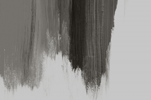
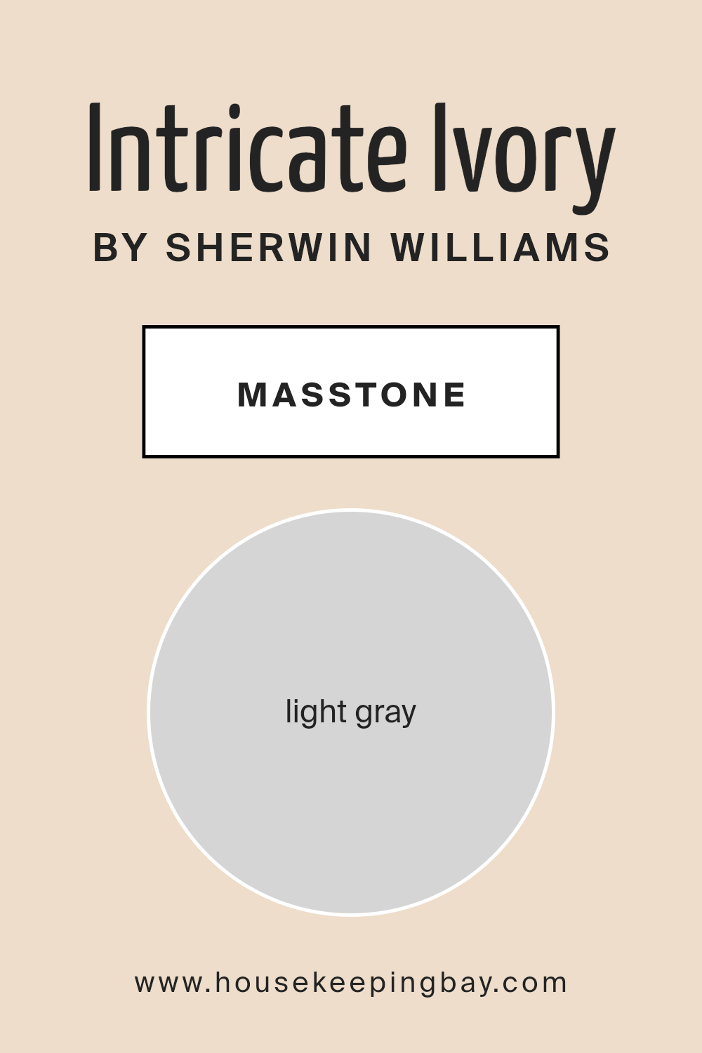
Intricate Ivory SW 6350 by Sherwin Williams, with its masstone of light gray (#D5D5D5), presents itself as a versatile and subtly sophisticated palette choice for interior spaces. This nuanced shade stands out for its ability to blend seamlessly into a range of home aesthetics, from minimalistic modern to cozy country and everything in between.
Its light gray undertone offers a soft neutrality, making it an excellent backdrop for both bold and subdued color schemes. In well-lit rooms, Intricate Ivory captures and reflects natural light, enhancing the sense of space and openness. In dimmer settings, it contributes to a serene and calming atmosphere, promoting relaxation.
Importantly, the light gray masstone of Intricate Ivory means it effortlessly complements a variety of materials and textures, from glossy finishes and metallic accents to rustic wood and soft textiles. The color’s adaptability makes it a favored choice for not just walls, but also for cabinetry, trims, and ceilings, facilitating a cohesive look throughout the home.
Ultimately, Intricate Ivory’s light gray masstone ensures it acts as a sophisticated, unifying base that can evolve with changing decor styles and preferences, making it a timeless addition to any home.
housekeepingbay.com
Undertones of Intricate Ivory SW 6350 by Sherwin Williams
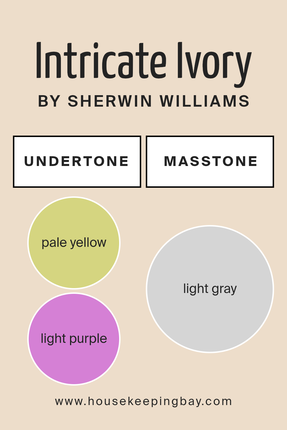
Intricate Ivory SW 6350 by Sherwin-Williams, a sophisticated shade that at first glance presents as a soft, welcoming ivory, is nuanced with subtle undertones that add depth and complexity to its presence. Specifically, the undertones of pale yellow (#D5D580) and light purple (#D580D5) play pivotal roles in how this color is perceived and experienced within a space.
Undertones in paint colors are subtle hues that influence the primary color’s appearance under different lighting conditions. These underlying colors can shift the perception of the main hue, making it cooler, warmer, brighter, or deeper depending on the context.
For Intricate Ivory, the pale yellow undertone adds warmth and a sense of sunlight to the color, making spaces feel more inviting and cozy. This quality is particularly valuable in north-facing rooms or spaces with limited natural light, as it can help counteract the coolness and make the area seem brighter and more welcoming.
Conversely, the light purple undertone introduces a hint of cool sophistication, lending balance to the warmth of the yellow. In well-lit or south-facing rooms, this undertone can become more pronounced, adding a layer of depth and preventing the color from feeling too stark or bland.
This intrinsic balance between warmth and coolness allows Intricate Ivory to adapt beautifully to various lighting conditions and design aesthetics, making it an incredibly versatile choice for interior walls.
When applied to interior walls, Intricate Ivory purveys a harmonious atmosphere, its complex undertones interacting delicately with both natural and artificial light. During the day, it may lean towards its warmer side, creating a soft, nurturing environment. As the evening sets in and the light changes, the cooler undertones might emerge, bringing a subtle, refreshing shift in mood.
This dynamic interplay ensures that spaces painted in Intricate Ivory remain lively, engaging, and ever-responsive to their changing surroundings, making it an ideal backdrop for a wide range of interior designs.
housekeepingbay.com
Coordinating Colors of Intricate Ivory SW 6350 by Sherwin Williams
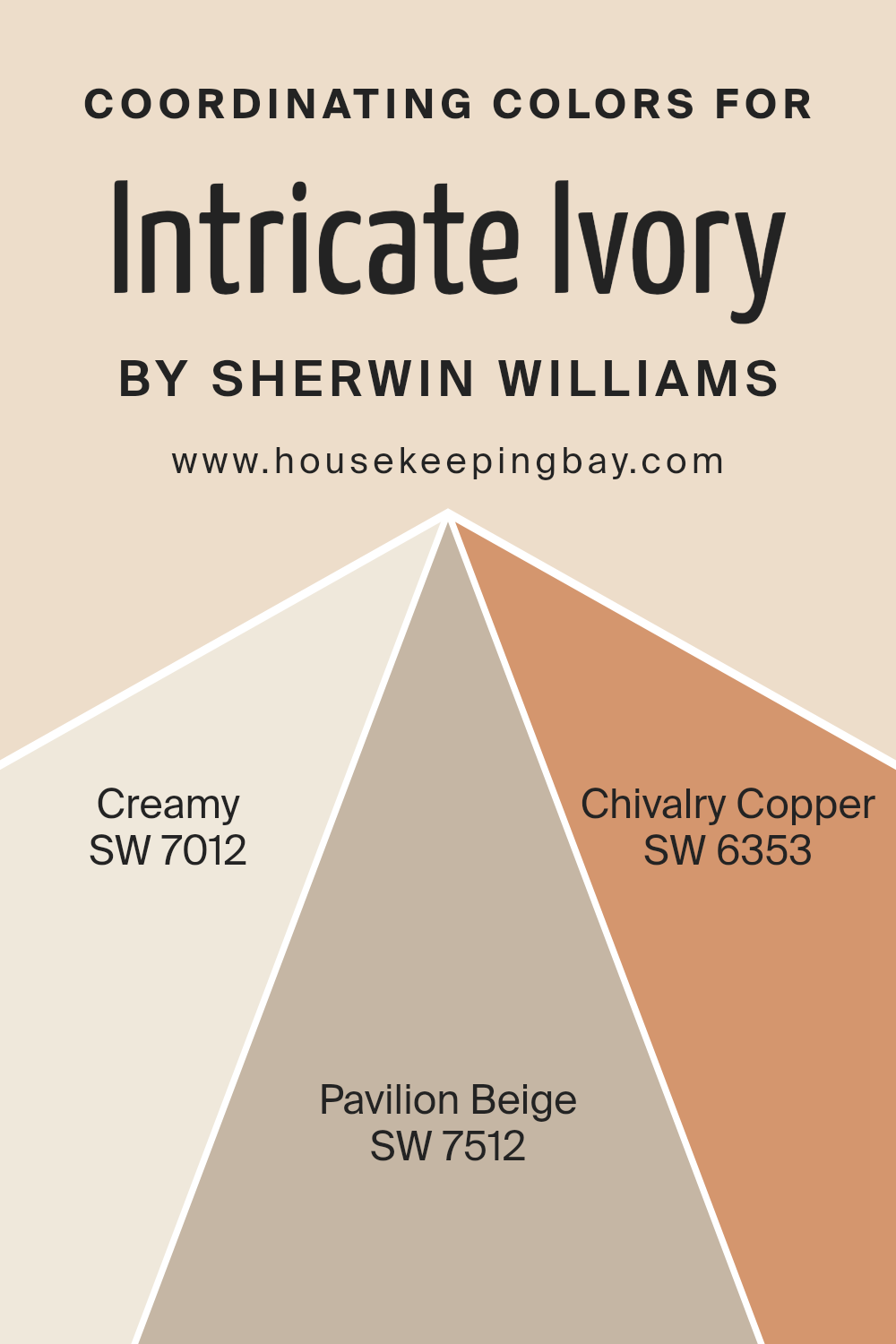
Coordinating colors are a palette of hues that work harmoniously together to enhance the visual appeal of a space, by complementing a primary color. In this case, the primary color Intricate Ivory SW 6350 by Sherwin Williams, a soft and warm shade of ivory, serves as the foundation for a cohesive and inviting color scheme. To complement this primary hue, specific colors have been chosen for their ability to create a balanced and cohesive look. Each coordinating color contributes to the overall aesthetic by either providing a subtle contrast or by enriching the primary color’s warmth and texture.
Creamy SW 7012 is a gentle, muted shade of white with a slight hint of yellow undertone that brings a soft glow to the room, enhancing the warmth of Intricate Ivory without overwhelming it. This color is ideal for creating a serene and welcoming atmosphere.
Pavilion Beige SW 7512, on the other hand, is a warmer, deeper shade that adds depth and sophistication to the space. Its earthy tones make it a perfect complement to the lightness of Intricate Ivory, grounding the scheme with its richness. Lastly, Chivalry Copper SW 6353 introduces a bold, yet refined, element to the palette.
This rich, terracotta hue offers a striking contrast to Intricate Ivory, adding a touch of drama and vibrancy that invigorates the space. Together, these coordinating colors create a harmonious and dynamic palette that enhances the beauty of Intricate Ivory, making it easy to design a cohesive and inviting interior.
You can see recommended paint colors below:
- SW 7012 Creamy
- SW 7512 Pavilion Beige
- SW 6353 Chivalry Copper
housekeepingbay.com
How Does Lighting Affect Intricate Ivory SW 6350 by Sherwin Williams?
Lighting plays a pivotal role in how we perceive color, often transforming the appearance and ambiance of a space. Different sources of light, whether natural or artificial, can significantly alter the way a color looks. For instance, Intricate Ivory SW 6350 by Sherwin Williams is a subtle, warm hue that can vary dramatically depending on the lighting conditions.
In natural light, Intricate Ivory SW 6350 exudes warmth and softness. However, the direction of the light source – whether north, south, east, or west – influences its appearance. In north-facing rooms, which receive cooler, more consistent light throughout the day, Intricate Ivory may appear slightly more muted and cooler, emphasizing its beige undertones.
Despite this, it manages to maintain a sense of warmth and coziness, making spaces feel inviting.
South-facing rooms, awash with warm, bright light for most of the day, bring out the best in Intricate Ivory. Here, the color appears vibrant and warm, highlighting its creamy undertones. It adds a luminous quality to the room, making spaces feel airy and bright.
East-facing rooms enjoy the warm glow of morning light, which enhances the warmth of Intricate Ivory, making it feel softer and warmer in the morning. As the day progresses and the natural light becomes less intense, the color may appear more neutral and subdued. This makes it versatile for spaces used primarily in the morning.
West-facing rooms receive intense evening light, which can make Intricate Ivory appear more golden and vibrant in the afternoon and evening. This lighting can add a cozy, inviting ambiance to the room, perfect for living spaces that are used more in the evenings.
Under artificial lighting, the impact on Intricate Ivory depends on the color temperature of the light sources. Warm white bulbs enhance its creamy, warm tones, making the space feel welcoming and cozy. In contrast, cool white bulbs might make the color appear slightly duller and more neutral, reducing its warmth.
In conclusion, Intricate Ivory’s perception is heavily influenced by lighting conditions. This color’s ability to adapt and transform with different lighting makes it a versatile choice for any space, offering a spectrum of atmospheres depending on the room’s orientation and light source.
housekeepingbay.com
What is the LRV of Intricate Ivory SW 6350 by Sherwin Williams?
Light Reflectance Value (LRV) is a measure that reflects how much light a color absorbs and how much it reflects back into a room, presented on a scale ranging from 0 (absolute black, which absorbs all light) to 100 (pure white, reflecting all light back). This metric is crucial in the selection of paint colors for interiors and exteriors as it affects both the ambiance of a room and the perceived size and warmth of the space.
The LRV influences how a color “behaves” under different lighting conditions – natural or artificial. Darker colors with lower LRVs absorb more light, making rooms feel cozier but smaller, while lighter colors with higher LRVs reflect more light, contributing to a sense of spaciousness and airiness.
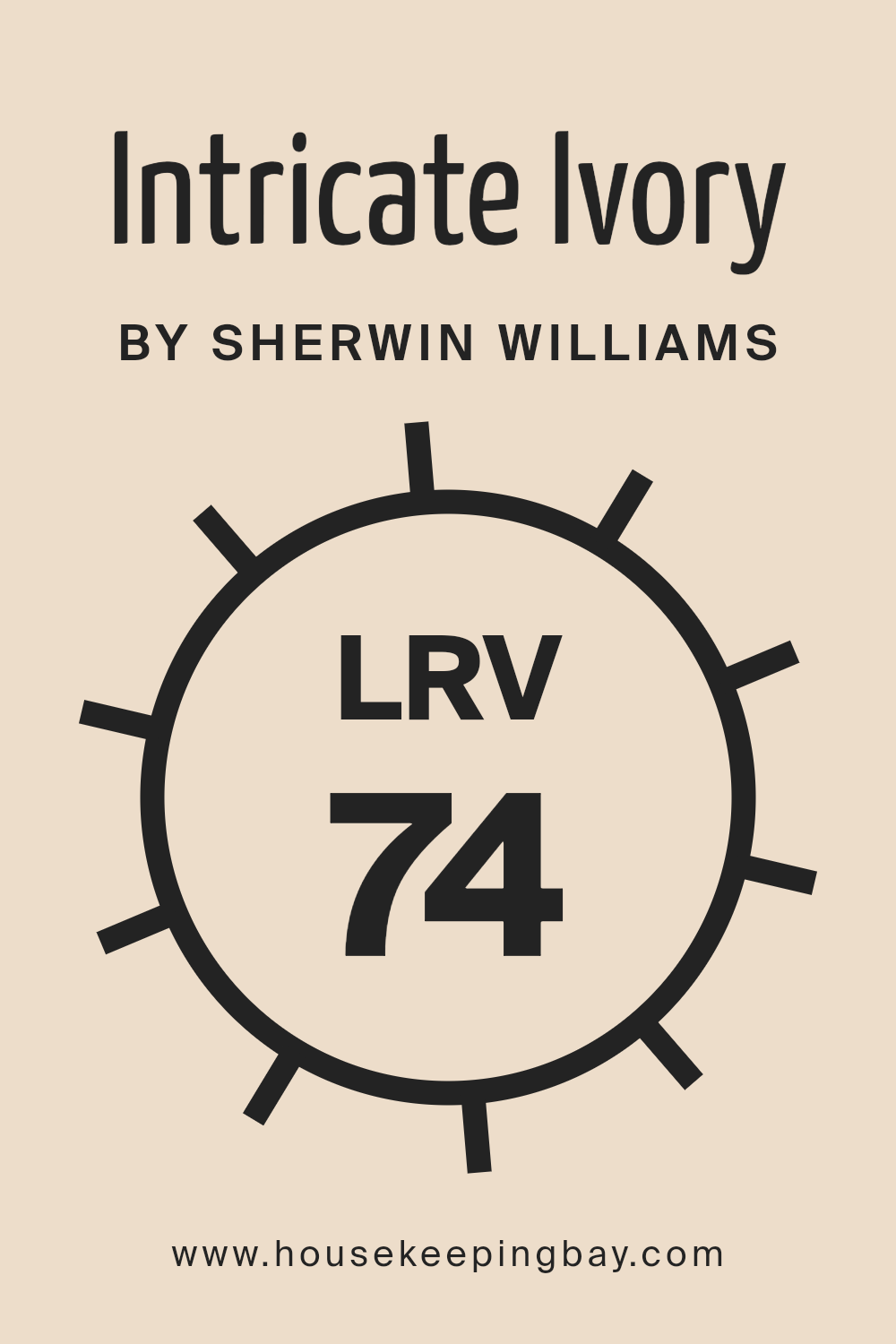
The LRV of Intricate Ivory (SW 6350) by Sherwin Williams is 74.203, placing it towards the lighter end of the scale. This high LRV indicates that it is a color that reflects a significant amount of light, making it an excellent choice for creating a bright, welcoming space.
In rooms with less natural light, Intricate Ivory can help to brighten the space and make it feel more open. However, the perception of this color can still vary depending on the direction of the room and the type of artificial lighting, potentially influencing the warmth and the feel of the color on the walls.
In spaces with ample sunlight, Intricate Ivory will appear lighter and more radiant, enhancing its ability to make spaces feel larger and more inviting. This makes it particularly versatile for various applications, contributing positively to the overall aesthetics and feel of the interiors where it is applied.
housekeepingbay.com
What is LRV? Read It Before You Choose Your Ideal Paint Color
What are the Trim colors of Intricate Ivory SW 6350 by Sherwin Williams?
Trim colors play a vital role in interior and exterior design, especially when working with a base color like Intricate Ivory SW 6350 by Sherwin Williams. This particular shade, a warm and inviting ivory, provides a canvas that accentuates the architectural details and enhances the overall ambiance of a space.
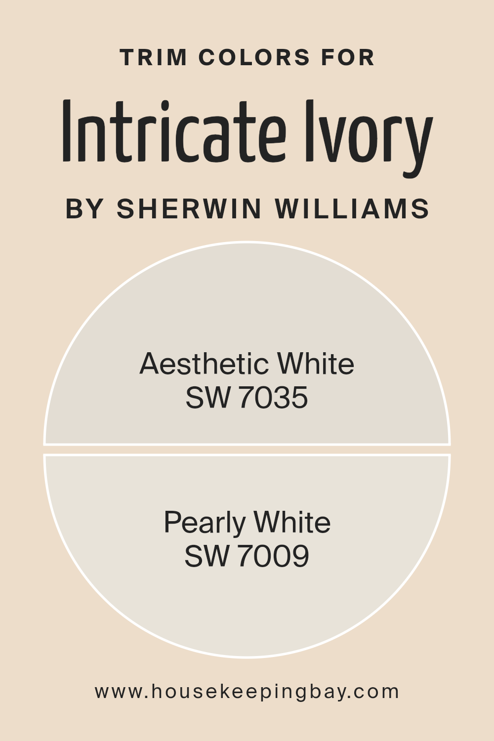
Choosing the right trim colors is crucial as they frame the walls, defining the space and highlighting the structural beauty of a home. The chosen trim colors, such as SW 7035 – Aesthetic White and SW 7009 – Pearly White, are designed to complement Intricate Ivory by adding depth and character to the living space.
These colors subtly distinguish the trim, creating a harmonious and balanced look that enriches the visual appeal of the room.
SW 7035 – Aesthetic White is a soft and serene shade that exudes a sense of calm and simplicity. It’s a versatile color that pairs well with the warm undertones of Intricate Ivory, providing a gentle contrast that enhances the room’s sophistication.
On the other hand, SW 7009 – Pearly White offers a brighter, more radiant approach. This color brings a crisp and airy feel to the space, illuminating the surroundings and making architectural details pop against the soft backdrop of Intricate Ivory.
Together, these trim colors forge an elegant and cohesive palette, ensuring that the walls are not just a boundary but a part of the home’s character and charm.
You can see recommended paint colors below:
housekeepingbay.com
Colors Similar to Intricate Ivory SW 6350 by Sherwin Williams
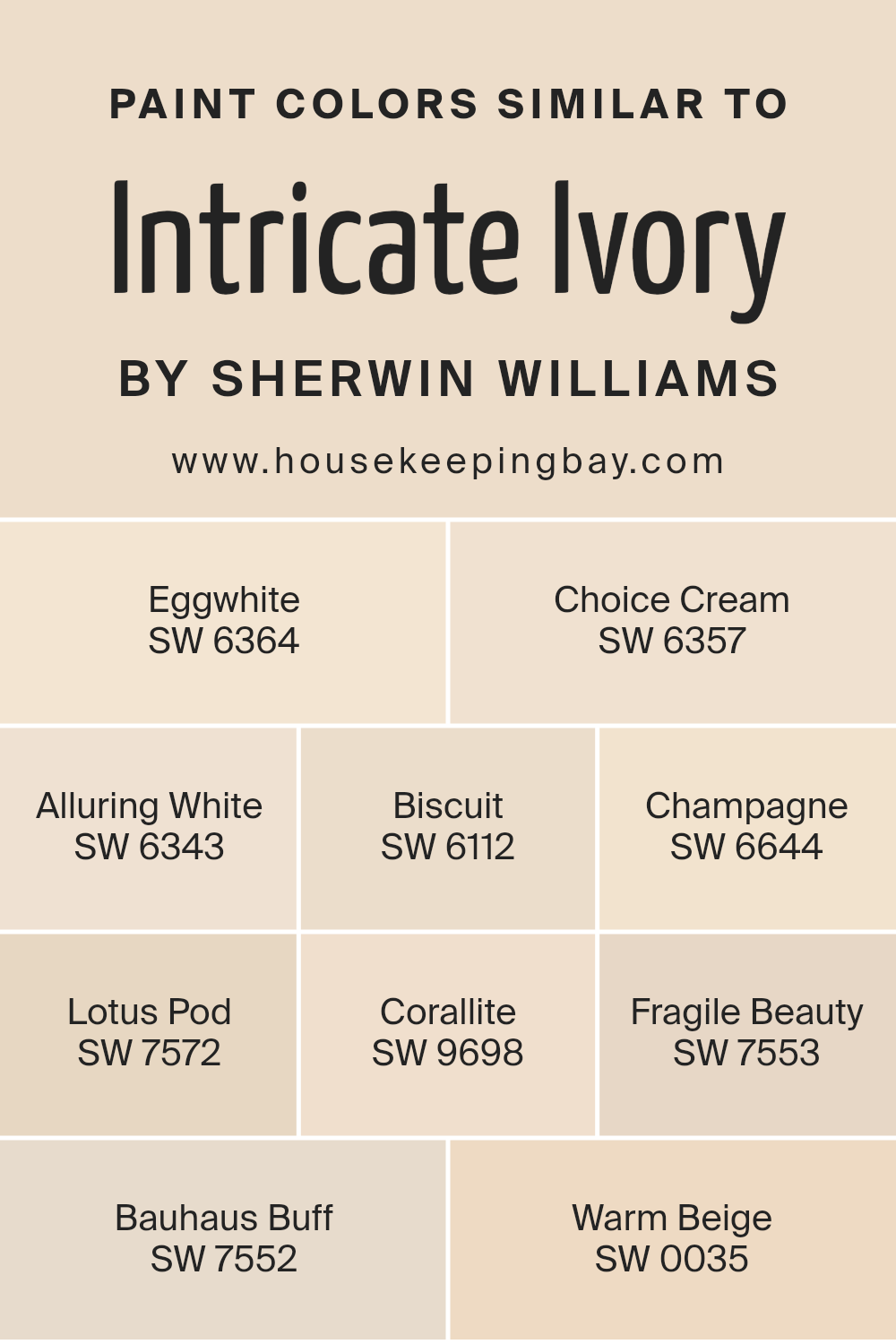
Choosing the right color for a space is crucial as it sets the tone and atmosphere of the environment. Similar colors to Intricate Ivory SW 6350 by Sherwin Williams, such as Eggwhite, Choice Cream, Alluring White, Biscuit, Champagne, Lotus Pod, Corallite, Fragile Beauty, Bauhaus Buff, and Warm Beige, play a significant role in creating a harmonious and cohesive look.
These colors, while distinct, share a common softness and warmth, making them ideal for crafting interiors that feel welcoming and comforting. Their subtle differences allow for layering and depth without the risk of clashing, offering a palette that is both versatile and sophisticated.
Eggwhite and Choice Cream introduce a gentle lightness, perfect for spaces that aim for a soft, airy feel. Alluring White brings a slightly brighter touch, offering crispness without sterility. Biscuit and Champagne dive into richer territories, providing a touch of earthiness and subtle sophistication, respectively.
Lotus Pod and Corallite add a unique flair with their muted yet distinctive tones, suggesting an elegant touch. The elegance is further embraced by Fragile Beauty and Bauhaus Buff, which present themselves as subdued and refined choices.
Lastly, Warm Beige rounds out the selection by grounding the palette with its cozy and inviting hue, creating a foundation that ties all the similar colors together seamlessly. Together, these colors work harmoniously to achieve a balanced and beautiful aesthetic.
You can see recommended paint colors below:
- SW 6364 Eggwhite
- SW 6357 Choice Cream
- SW 6343 Alluring White
- SW 6112 Biscuit
- SW 6644 Champagne
- SW 7572 Lotus Pod
- SW 9698 Corallite
- SW 7553 Fragile Beauty
- SW 7552 Bauhaus Buff
- SW 0035 Warm Beige
housekeepingbay.com
How to Use Intricate Ivory SW 6350 by Sherwin Williams In Your Home?
Intricate Ivory SW 6350 by Sherwin Williams is a captivating shade that exudes both warmth and elegance, making it an exceptional choice for those looking to bring a cozy yet sophisticated atmosphere into their home. This particular ivory hue, with its soft and subtle undertones, offers a versatile backdrop that can complement a wide range of decor styles, from classic to contemporary. Its inherent warmth makes it perfect for creating inviting spaces, whether it’s the serene ambiance of a living room, the welcoming heart of a kitchen, or the peaceful retreat of a bedroom.
One of the beauties of Intricate Ivory is its ability to blend seamlessly with natural materials, such as wood and stone, enhancing their textures and adding to the overall sense of harmony in a space. It’s also a fantastic color for showcasing artwork or accent pieces, as its neutral yet distinct character provides a delicate balance that highlights without overpowering.
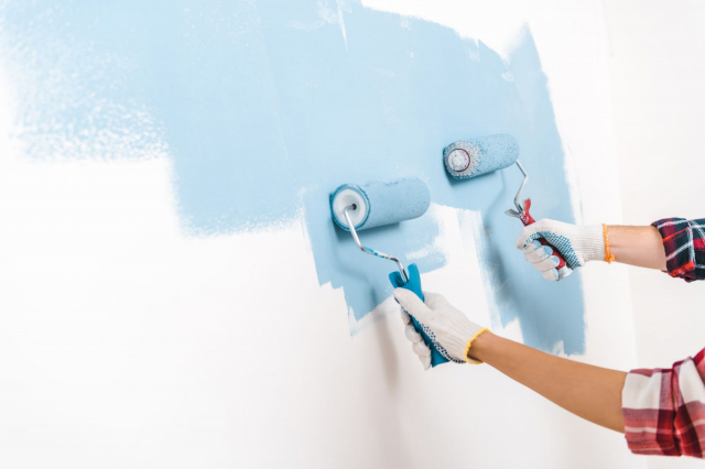
For those looking to refresh their home with a touch of understated elegance, applying Intricate Ivory on walls can instantly lift the space, making it feel brighter and more spacious. Pairing it with bolder or contrasting colors in furnishings or decor elements can add depth and interest to a room, while maintaining a cohesive look. In essence, Intricate Ivory SW 6350 offers endless possibilities for creating beautiful, comfortable, and personalized spaces.
Intricate Ivory SW 6350 by Sherwin Williams vs Fragile Beauty SW 7553 by Sherwin Williams
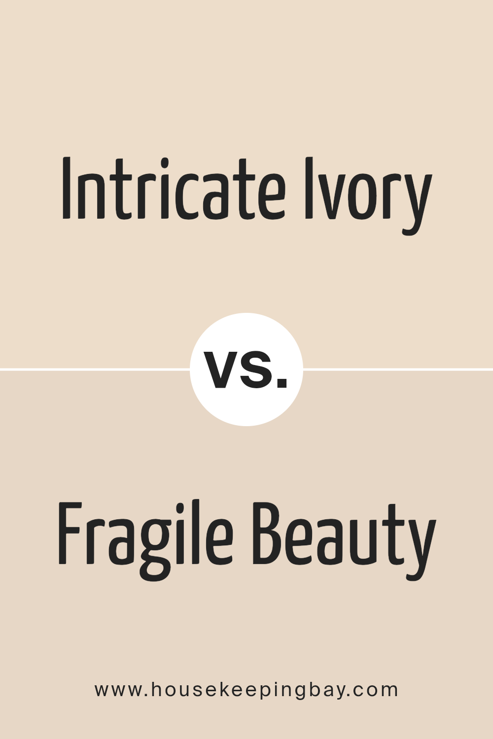
Intricate Ivory SW 6350 and Fragile Beauty SW 7553, both from Sherwin Williams, present an interesting comparison within the subtle nuances of neutral hues. Intricate Ivory leans towards a warm, inviting cream with an underlying hint of soft peach, offering a sense of coziness and light to any space.
It exudes an elegant simplicity that can brighten areas while maintaining a soothing warmth, making it ideal for living areas and bedrooms seeking a touch of comfort without overwhelming brightness.
Fragile Beauty SW 7553, on the other hand, moves into a slightly cooler domain of neutral tones. This color embodies a delicate gray with understated lavender undertones, presenting a serene and tranquil vibe. Its capacity to act as a subdued, refined backdrop makes it perfect for spaces aiming for a quiet elegance or a minimalist aesthetic.
When comparing both, the warmth and subtle peachy base of Intricate Ivory offer a traditional, welcoming feel, whilst Fragile Beauty’s cooler, gentle lavender-gray undertone promotes a contemporary, serene atmosphere. The choice between them hinges on the desired ambiance — Intricate Ivory bringing warmth and light, Fragile Beauty offering cool sophistication.
You can see recommended paint color below:
housekeepingbay.com
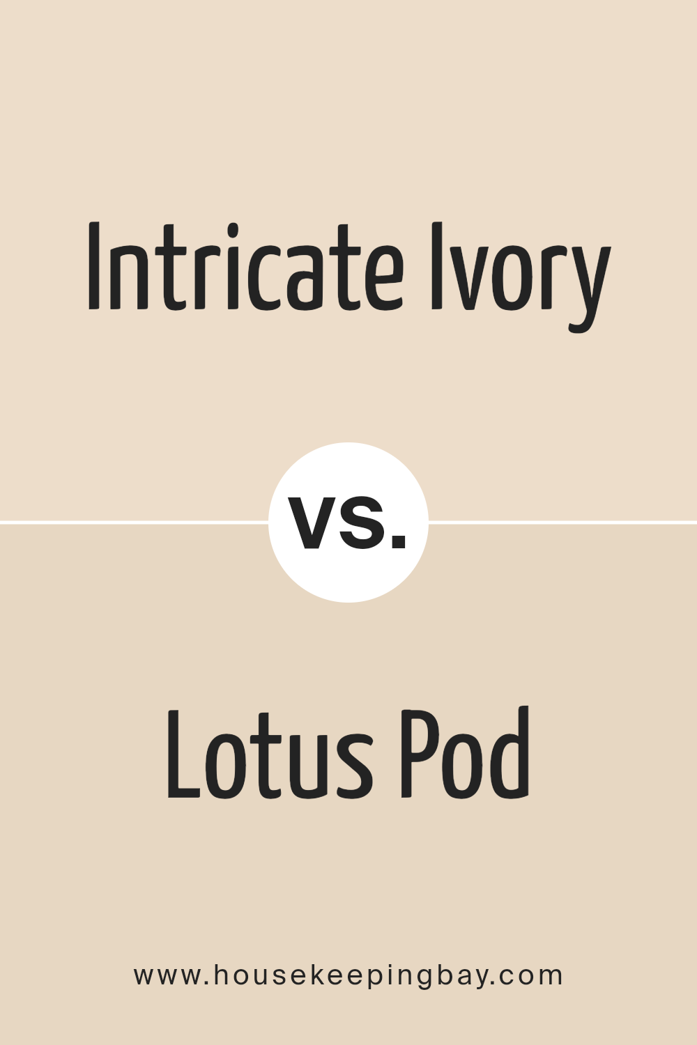
Intricate Ivory SW 6350 by Sherwin Williams vs Lotus Pod SW 7572 by Sherwin Williams
“Intricate Ivory” SW 6350 and “Lotus Pod” SW 7572, both by Sherwin-Williams, offer subtle yet distinct tones that cater to different design aesthetics. Intricate Ivory possesses a warm, creamy essence, imbuing spaces with a soft, welcoming glow. Its lightness reflects a versatile nature, capable of acting as a neutral backdrop or a standalone hue that brightens and enlarges a room. Its somewhat yellowish undertone enriches environments, offering a cozy, inviting atmosphere.
On the other hand, Lotus Pod presents a slightly deeper, more nuanced color. While still in the neutral zone, it shifts towards a beige-pink undertone, providing a unique warmth that exudes elegance and sophistication.
This color is adept at creating a serene, harmonious space, promoting a sense of calm and relaxation. Its depth makes it a suitable choice for areas seeking character without overwhelming brightness.
When comparing these two, Intricate Ivory offers a light, airy feel, ideal for maximizing natural light and enhancing spaciousness, while Lotus Pod introduces depth and warmth, suggesting a more intimate, cozy ambiance.
Together, they could create a layered, harmonious palette, but each stands strong on its own with distinct qualities and vibes.
You can see recommended paint color below:
housekeepingbay.com
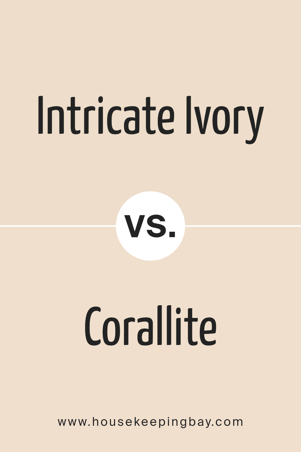
Intricate Ivory SW 6350 by Sherwin Williams vs Corallite SW 9698 by Sherwin Williams
Intricate Ivory SW 6350 and Corallite SW 9698 by Sherwin Williams are two distinct hues that cater to different atmospheres within interior spaces. Intricate Ivory, as suggested by its name, is a warm, delicate shade part of the ivory family.
It exudes a subtle elegance and natural warmth, perfect for creating a cozy and inviting atmosphere. This color can serve as a versatile backdrop in various settings, enhancing the light and adding a soft, refined touch to any space.
On the other hand, Corallite SW 9698 introduces a playful and vibrant energy. This color, nestled comfortably within the coral spectrum, boasts a lively yet gentle presence. It is ideal for spaces intended to stimulate happiness and creativity, or for adding a vivid pop to a more neutral palette. Corallite can transform a room by infusing it with personality and charm, making it feel more welcoming and dynamic.
While Intricate Ivory offers a serene and classic canvas, conducive to relaxation and tranquility, Corallite invites an energetic and cheerful mood. Their applications can either stand alone or complement each other, depending on the desired ambiance and design goals.
You can see recommended paint color below:
- SW 9698 Corallite
housekeepingbay.com
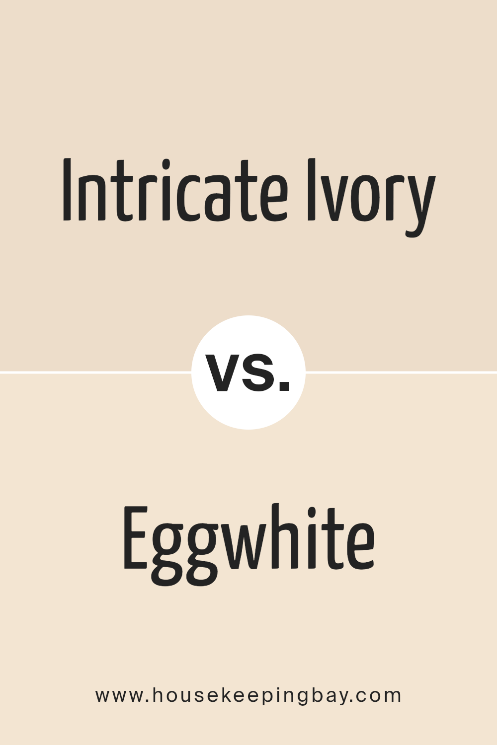
Intricate Ivory SW 6350 by Sherwin Williams vs Eggwhite SW 6364 by Sherwin Williams
“Intricate Ivory” SW 6350 and “Eggwhite” SW 6364, both from Sherwin Williams, present subtly different yet harmonious tones that cater to varied preferences for neutral, warm spaces. “Intricate Ivory” delves into a delicate blend of beige with a soft undertone of peach or pink, providing a cozy, comforting warmth that illuminates spaces with an airy elegance. It’s a color that offers versatility, seamlessly blending with both bold and muted palettes, enhancing textures and fabrics with its subtle complexity.
On the other hand, “Eggwhite” leans closer to the pure essence of a creamy, soft white with just a hint of yellow undertone, invoking the freshness of early morning. It’s lighter and more neutral than “Intricate Ivory,” offering a pristine backdrop that reflects more light, making spaces appear larger and more open.
“Eggwhite” is ideal for those seeking a crisp, clean look that still carries a touch of warmth, making it an excellent choice for walls, trim, or cabinets.
Both colors epitomize elegance in simplicity, with “Intricate Ivory” providing depth and warmth, while “Eggwhite” offers clarity and openness, each creating inviting spaces tailored to individual styles and preferences.
You can see recommended paint color below:
housekeepingbay.com
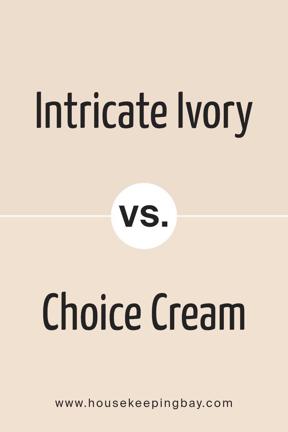
Intricate Ivory SW 6350 by Sherwin Williams vs Choice Cream SW 6357 by Sherwin Williams
Intricate Ivory SW 6350 and Choice Cream SW 6357, both by Sherwin-Williams, present a serene palette, but they exude distinct atmospheres due to their subtle differences. Intricate Ivory leans slightly towards a soft, warm, off-white with a gentle beige undertone, offering a cozy and inviting feel to spaces.
It’s versatile, working well in areas where a hint of warmth is desired without overwhelming the senses. On the other hand, Choice Cream stands out with its slightly deeper, richer cream tone, encapsulating a more pronounced warmth and depth. This makes it an excellent choice for those seeking a bit more saturation and a cozy, enveloping ambiance in their interiors.
While both colors maintain an elegant neutrality, making them easy to integrate into various decor styles, Intricate Ivory is preferable for a lighter, airier feel, whereas Choice Cream suits spaces where a more robust, comforting presence is desired.
You can see recommended paint color below:
housekeepingbay.com
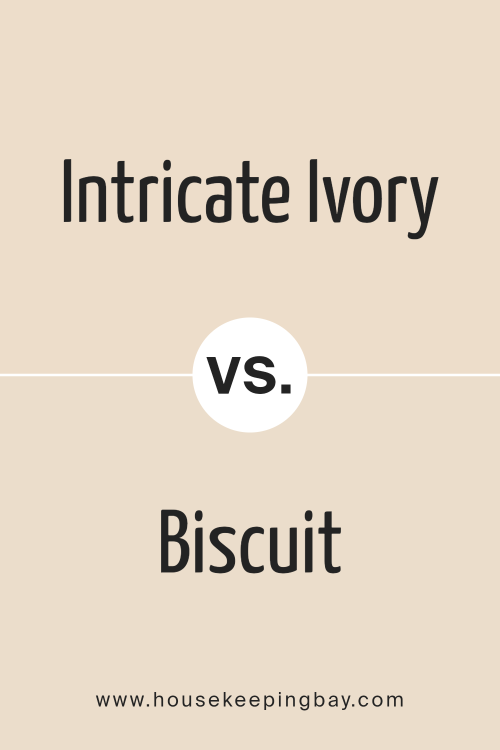
Intricate Ivory SW 6350 by Sherwin Williams vs Biscuit SW 6112 by Sherwin Williams
Intricate Ivory SW 6350 and Biscuit SW 6112, both by Sherwin Williams, offer subtly warm tones yet present contrasting atmospheres when applied to interior spaces. Intricate Ivory, with its lighter, almost ethereal quality, infuses spaces with a soft, welcoming glow.
It reflects natural light beautifully, making it an excellent choice for creating an airy and serene ambiance. Its gentle presence can make small spaces appear larger and more open, providing a canvas that pairs well with a wide range of decor.
Conversely, Biscuit SW 6112 leans into a richer, more grounded tone. Despite its warmth, it offers a depth that Intricate Ivory lacks, making it ideal for adding a cozy, enveloping feel to a room. Biscuit’s slightly deeper hue brings a sense of comfort and earthiness, making it perfect for spaces where a more intimate atmosphere is desired.
While both colors promote warmth and comfort, Intricate Ivory excels in creating a luminous, expansive feel, whereas Biscuit offers a snug, embracing quality. The choice between them hinges on the desired balance between lightness and warmth versus depth and coziness in a space.
You can see recommended paint color below:
housekeepingbay.com
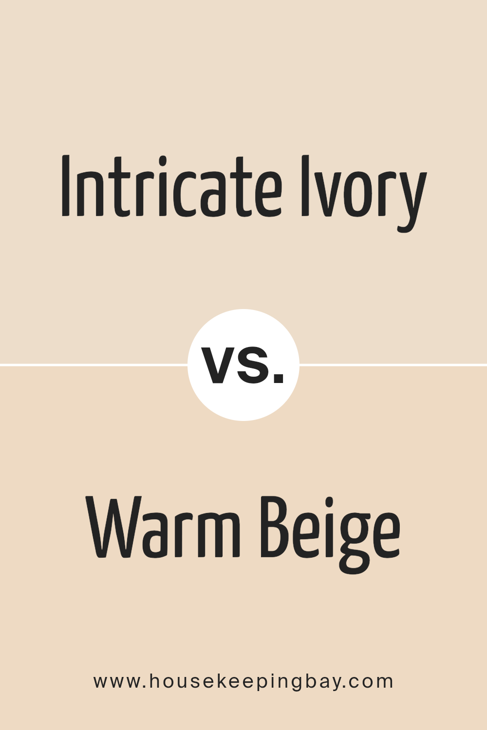
Intricate Ivory SW 6350 by Sherwin Williams vs Warm Beige SW 0035 by Sherwin Williams
Intricate Ivory SW 6350 and Warm Beige SW 0035, both by Sherwin-Williams, offer cozy, inviting atmospheres but differ subtly in their tones and implications for space. Intricate Ivory leans towards a soft, serene palette that reflects light with a gentle warmth, making it a perfect choice for creating a bright, airy feel in rooms. Its slightly creamy undertone adds a delicate richness without overwhelming the senses, making it versatile for various settings, from modern to classic.
Warm Beige, on the other hand, brings a deeper, more pronounced warmth to spaces. It embraces a richness that feels more grounded compared to the lighter touch of Intricate Ivory. Warm Beige’s fuller-bodied hue offers a comforting embrace, making spaces feel more enclosed and intimate.
This color works exceptionally well in settings where a cozy, enveloping atmosphere is desired, such as in living rooms or bedrooms.
While both colors promote warmth and comfort, Intricate Ivory is your ally in creating spaces that feel expansive and light-infused, whereas Warm Beige is ideal for crafting environments that prioritize depth and coziness. The choice between them hinges on the desired ambiance and how much one wishes to play with light and spatial perception.
You can see recommended paint color below:
- SW 0035 Warm Beige
housekeepingbay.com
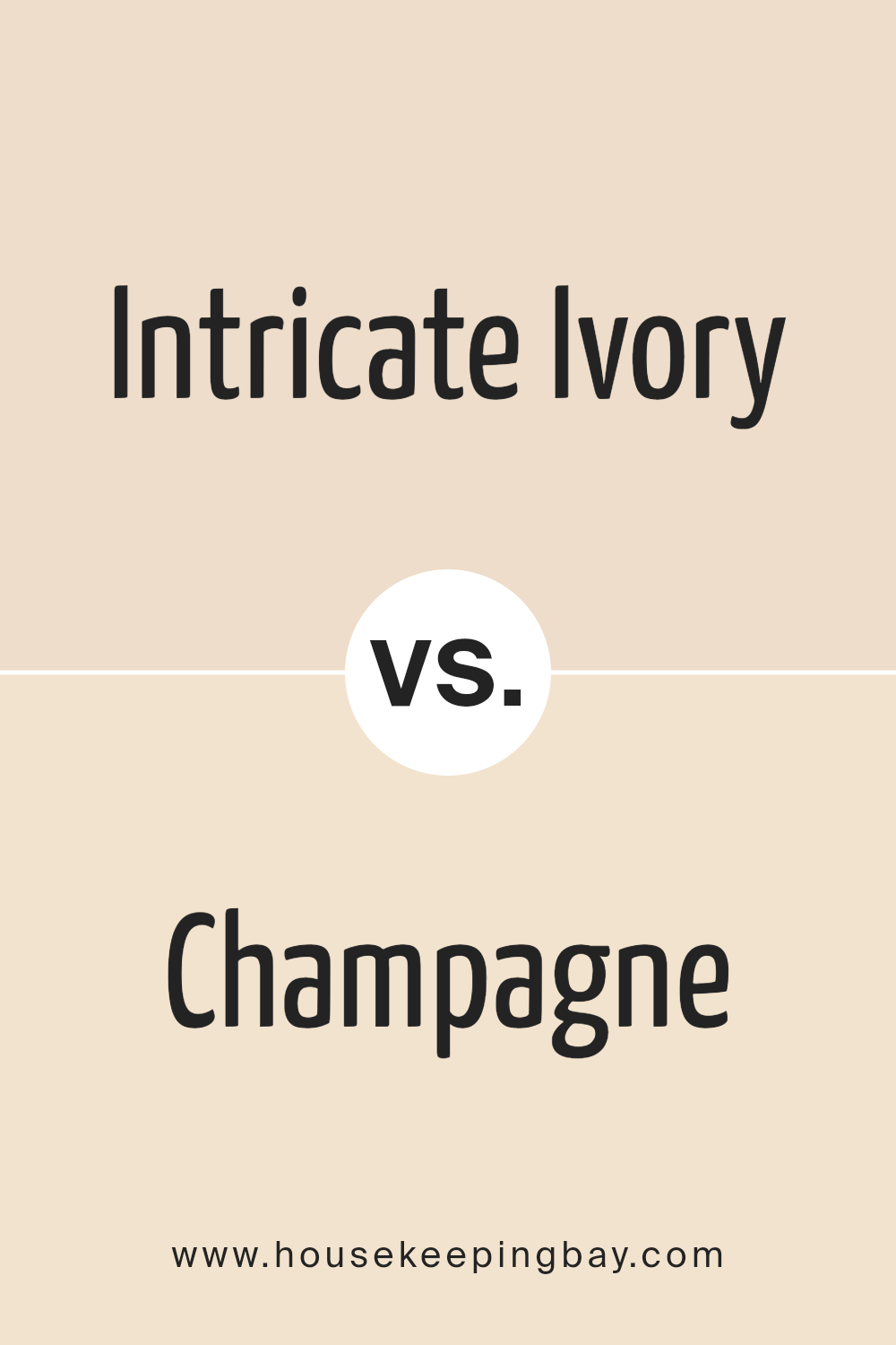
Intricate Ivory SW 6350 by Sherwin Williams vs Champagne SW 6644 by Sherwin Williams
Intricate Ivory SW 6350 and Champagne SW 6644, both from Sherwin Williams, present a sophisticated palette rooted in warmth and elegance. Intricate Ivory leans towards a soft, warm, and creamy white hue, embodying a feeling of comfort and serenity.
Its subtle undertones provide a versatile background that can gracefully support a range of decors, adding a nuanced depth without overwhelming with color. This makes Intricate Ivory an ideal choice for creating a light, airy, and inviting atmosphere in any space.
On the other hand, Champagne SW 6644, as its name suggests, offers a slightly more luxurious and celebratory vibe. It is a muted, soft golden beige, reminiscent of the bubbly beverage it’s named after. Champagne exudes a subtle glamour and warmth, bringing a cozy yet sophisticated glow to rooms.
It successfully marries the neutrality of beige with a hint of gentle golden sparkle, making it perfect for spaces intended to feel both comfortable and elegant.
Despite their similarities in warmth and subtlety, Intricate Ivory and Champagne cater to slightly different aesthetic realms. Intricate Ivory is about creating a calm, soothing base, while Champagne introduces a touch of delicate opulence, making each color unique in its right.
You can see recommended paint color below:
- SW 6644 Champagne
housekeepingbay.com
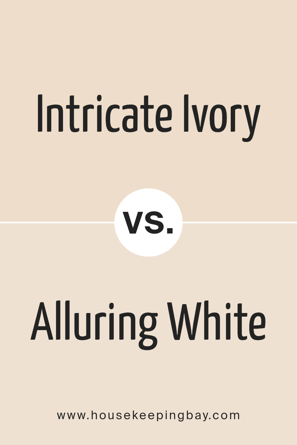
Intricate Ivory SW 6350 by Sherwin Williams vs Alluring White SW 6343 by Sherwin Williams
“Intricate Ivory” SW 6350 and “Alluring White” SW 6343, both from Sherwin Williams, are elegant, sophisticated colors, yet they each express unique aspects of neutrality and warmth which can subtly transform the atmosphere of a space.
“Intricate Ivory” is a soft, creamy color with a warm, inviting undertone that creates a cozy, welcoming feel. It mirrors the gentle subtleties of early morning light, offering a serene and calming ambience that is both versatile and timeless. Its warmth adds depth and complexity, making spaces feel more intimate and homey.
On the other hand, “Alluring White” SW 6343 leans towards a cleaner, crisper side of the spectrum, with a slightly cooler undertone compared to “Intricate Ivory.” This color reflects more natural light, making spaces appear brighter, more open, and airy. The pristine quality of “Alluring White” can make it an excellent choice for creating a fresh, uplifting environment that promotes clarity and concentration.
While both colors share a foundation in elegance and neutrality, “Intricate Ivory” brings warmth and coziness, inviting relaxation and comfort, whereas “Alluring White” offers a crisp, clean backdrop that enhances natural light and space, fostering a refreshing and invigorating feel.
You can see recommended paint color below:
- SW 6343 Alluring White
housekeepingbay.com
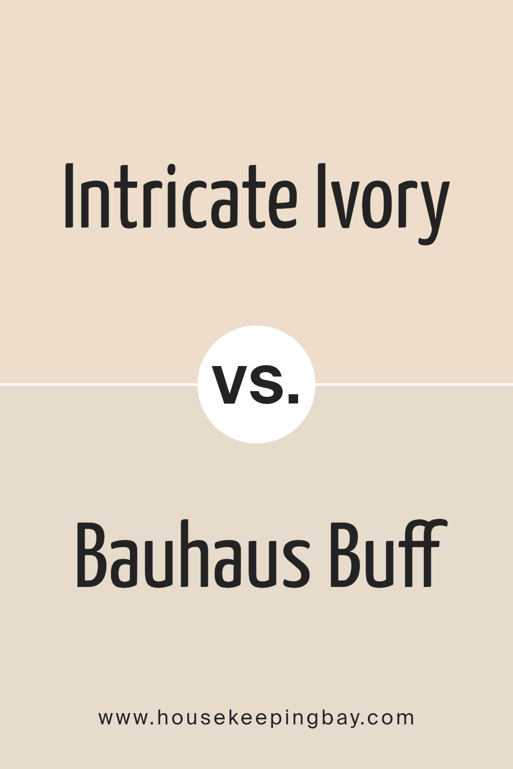
Intricate Ivory SW 6350 by Sherwin Williams vs Bauhaus Buff SW 7552 by Sherwin Williams
“Intricate Ivory” SW 6350 and “Bauhaus Buff” SW 7552, both by Sherwin Williams, offer unique takes on neutral palettes, yet each brings its own essence to interiors. Intricate Ivory sits closer to the warmer end of the spectrum, presenting a subtly creamy hue that echoes a serene and inviting ambiance. Its warmth is particularly effective in spaces seeking a cozy, almost ethereal glow, making rooms appear more welcoming and lived-in.
On the other hand, Bauhaus Buff leans towards a more muted, understated elegance. With its cool undertones, it offers a contemporary edge, acting as a perfect backdrop for a minimalist or modern aesthetic.
Despite its cooler vibe, it retains a touch of warmth, preventing spaces from feeling too sterile. This color is highly adaptable, blending seamlessly with various decor elements to create a sophisticated space.
Comparatively, while both colors are versatile, Intricate Ivory introduces warmth and a hint of coziness, making it ideal for traditional or rustic settings. Bauhaus Buff, with its slightly cooler and more neutral appeal, is a haven for those preferring modern minimalism.
The choice between them hinges on the desired atmosphere and design intention of the space.
You can see recommended paint color below:
housekeepingbay.com
Conclusion
Intricate Ivory SW 6350 by Sherwin Williams symbolizes a harmonious blend of elegance and serenity in interior design. This nuanced shade of off-white stands out for its ability to imbue spaces with a warm, inviting ambiance while offering a versatile backdrop for a wide range of decor styles.
Its subtle richness allows it to act as a soft, neutral canvas that can either stand alone for a minimalist aesthetic or serve as a foundation for showcasing bolder colors and textures. Intricate Ivory makes rooms feel larger and more open, bringing a light, airy feel that is both comforting and sophisticated.
The versatility of Intricate Ivory SW 6350 is further emphasized by its compatibility with various lighting conditions, proving its prowess in adapting to natural and artificial light to maintain its inviting warmth. Homeowners and interior designers alike appreciate the color for its capacity to create an understated yet deeply resonant emotional impact within a space.
Whether aiming for a chic, modern look or a more traditional setting, Intricate Ivory serves as a bridge between contemporary and classic design elements.
It encapsulates a timeless appeal that makes it a perennial favorite in Sherwin Williams’ palette, underscoring its role as a quintessential choice for creating spaces that feel both expansive and intimately cozy.
housekeepingbay.com
Ever wished paint sampling was as easy as sticking a sticker? Guess what? Now it is! Discover Samplize's unique Peel & Stick samples. Get started now and say goodbye to the old messy way!
Get paint samples
