Lotus Pod SW 7572 by Sherwin Williams
Unveiling Nature's Serene Hue
In the vast and vibrant spectrum of Sherwin Williams’ paint colors, SW 7572 Lotus Pod stands out as a testament to the beauty and elegance found in nature. As one of the many hues inspired by the natural world, Lotus Pod is a color that evokes a sense of calm, warmth, and organic harmony, making it a versatile choice for decorators and homeowners alike.
This color review delves into the subtle nuances of SW 7572 Lotus Pod, exploring its potential to transform spaces and create atmospheres that range from cozy and inviting to sophisticated and serene.
With its understated elegance, Lotus Pod possesses an adaptable quality, seamlessly fitting into a variety of design aesthetics, from rustic country charm to minimalist modern chic.
This article will take you through the inspirations behind Lotus Pod, its complementary colors in the Sherwin Williams collection, and advise on where and how to use this versatile shade in your home to achieve the perfect balance between comfort and style.
Whether you’re looking to refresh a living space, bedroom, or bathroom, Lotus Pod offers a cultivated palette that inspires creativity and brings spaces to life.
vis sherwin-williams.com
What Color Is Lotus Pod SW 7572 by Sherwin Williams?
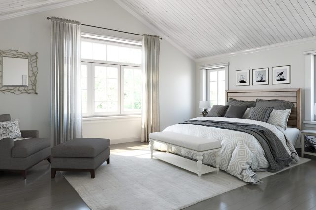
Lotus Pod SW 7572 by Sherwin Williams is a captivating hue, embodying a soft and serene essence that speaks to both modern minimalism and timeless elegance. This color straddles the fine line between warm and cool tones, making it exceptionally versatile for various interior styles.
It has a muted, creamy undertone that conveys a sense of calm and comfort, reminiscent of the early morning light gently illuminating a serene, cozy space. Its subtle beige color carries an understated sophistication, making it a perfect backdrop for a myriad of design aesthetics.
Lotus Pod works remarkably well in Scandinavian and contemporary interiors, where the goal is to create a light, airy, and peaceful ambiance. Its neutral yet warm palette complements the clean lines and natural materials characteristic of these styles.
In a more traditional setting, Lotus Pod adds a touch of modernity without overpowering the classic elements, creating a harmonious blend of old and new.
When it comes to pairing with materials and textures, Lotus Pod is incredibly accommodating. It pairs beautifully with natural wood, from light oaks to rich walnuts, enhancing their warmth and adding to the room’s overall coziness.
Metallic accents in gold or brass can introduce a touch of luxe, while matte black finishes can offer a contemporary contrast. In terms of textures, soft, plush fabrics like wool, cotton, and linen in white or soft neutral tones work beautifully with this color, encouraging a soft, layered look that invites relaxation and comfort.
Lotus Pod thus serves as a versatile foundation that can evolve with changing tastes and trends, making it an enduring choice for any interior.
housekeepingbay.com
Table of Contents
Is Lotus Pod SW 7572 by Sherwin Williams Warm or Cool color?
Lotus Pod SW 7572 by Sherwin Williams is a serene and versatile shade that breathes tranquility and warmth into any space. As part of Sherwin Williams’ color collection, it possesses a unique blend of soft beige with subtle hints of gray, making it an exceptional neutral choice for homeowners.
This color works wonders in enhancing the lightness and spaciousness of rooms, providing a perfect canvas for both contemporary and traditional decor.
The beauty of Lotus Pod lies in its adaptability; it pairs effortlessly with a wide spectrum of colors, from vibrant hues to muted tones, allowing for creative freedom in design.
Its understated elegance promotes a calming atmosphere, making it ideal for bedrooms, living rooms, and even bathrooms where a peaceful ambiance is desired.
Moreover, the natural, earthy quality of Lotus Pod contributes to a sense of grounding, creating a cozy and inviting environment that encourages relaxation and comfort.
In homes, the presence of Lotus Pod can significantly affect the mood and aesthetic appeal, instilling a sense of balance and harmony. Its ability to reflect natural light beautifully enhances the perception of space, making it a strategic choice for smaller rooms or areas with limited sunlight.
Overall, Lotus Pod SW 7572 is not just a paint color; it’s a design element that elevates the home environment, blending seamlessly with various styles and themes to foster spaces that are both beautiful and functional.
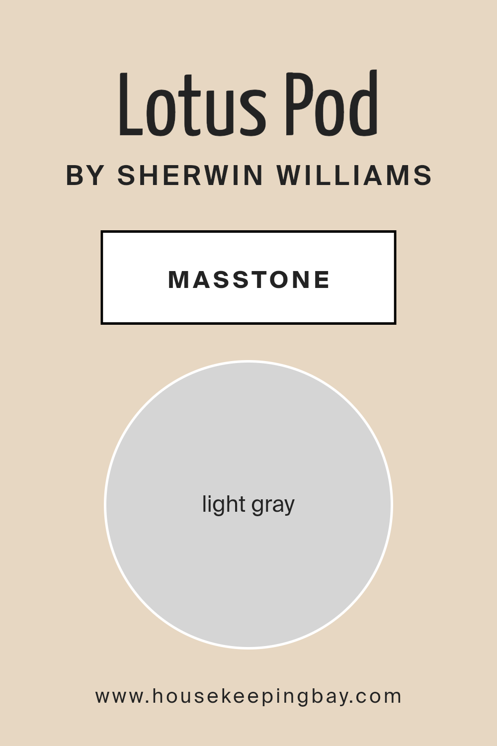
What is the Masstone of the Lotus Pod SW 7572 by Sherwin Williams?
Lotus Pod SW 7572 by Sherwin Williams is a nuanced paint color with a masstone of light gray, represented by the hexadecimal code #D5D5D5. This particular shade of gray is a versatile and tranquil hue, capable of bringing a serene and airy feel to any space.
The inherent neutrality of Lotus Pod’s light gray masstone ensures that it pairs seamlessly with a wide array of colors and materials, making it an ideal backdrop for both minimalist and eclectic home designs.
In homes, the effect of Lotus Pod’s light gray masstone is both calming and sophisticated. It provides a soft, luminous base that enhances natural light, making spaces appear larger and more open.
This quality is especially beneficial in smaller rooms or areas with limited natural light. Additionally, the understated elegance of this light gray allows for creative freedom in decorating; vibrant artworks, bold textiles, and natural elements like wood and stone all stand out against its subtle backdrop without overwhelming the senses.
Functionally, Lotus Pod’s light gray masstone has the advantage of concealing minor imperfections on walls better than pure white or darker shades, requiring less frequent touch-ups.
This pragmatic aspect, coupled with its aesthetic versatility, makes Lotus Pod SW 7572 by Sherwin Williams a favored choice for creating peaceful and inviting home environments.
housekeepingbay.com
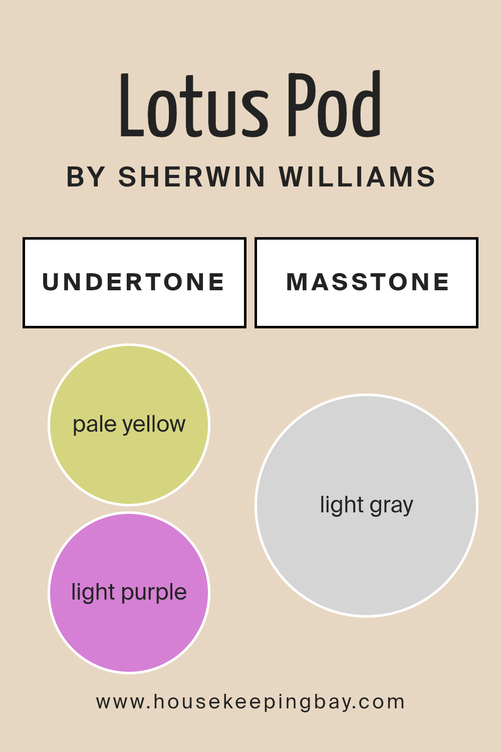
Undertones of Lotus Pod SW 7572 by Sherwin Williams
Lotus Pod SW 7572 by Sherwin-Williams is a captivating paint color that belongs to the off-white family, presenting a serene and subtle elegance. What makes Lotus Pod particularly intriguing are its undertones.
Unlike the more common cool or warm undertones found in many paint colors, Lotus Pod harbors a unique blend of pale yellow and light purple undertones. This combination significantly influences the color’s perception and behavior in various lighting conditions.
The pale yellow undertones add a layer of warmth and brightness to the color, making it inviting and cozy. This warmth ensures that spaces painted with Lotus Pod feel welcoming and vibrant, even in rooms that might not receive a wealth of natural light.
On the other hand, the light purple undertones introduce a hint of cool sophistication. This hint of coolness adds depth and complexity to the color, preventing it from feeling too stark or overly warm.
When applied to interior walls, Lotus Pod SW 7572 takes on a chameleon-like quality, reflecting and absorbing light in a way that showcases its varied undertones at different times of the day. In natural daylight, the pale yellow might become more pronounced, giving the space a lively and airy feel.
Conversely, in artificial lighting or during the evening, the light purple undertones might emerge, lending the room a more subdued and contemplative atmosphere.
The blend of undertones in Lotus Pod means that it can harmonize with a wide range of decor styles and color palettes, from warm, earthy tones that highlight its yellow undertones to cool, modern schemes that draw out its purple notes.
This versatility makes Lotus Pod SW 7572 an exceptional choice for those looking to infuse their spaces with depth, warmth, and a touch of unexpected sophistication.
housekeepingbay.com
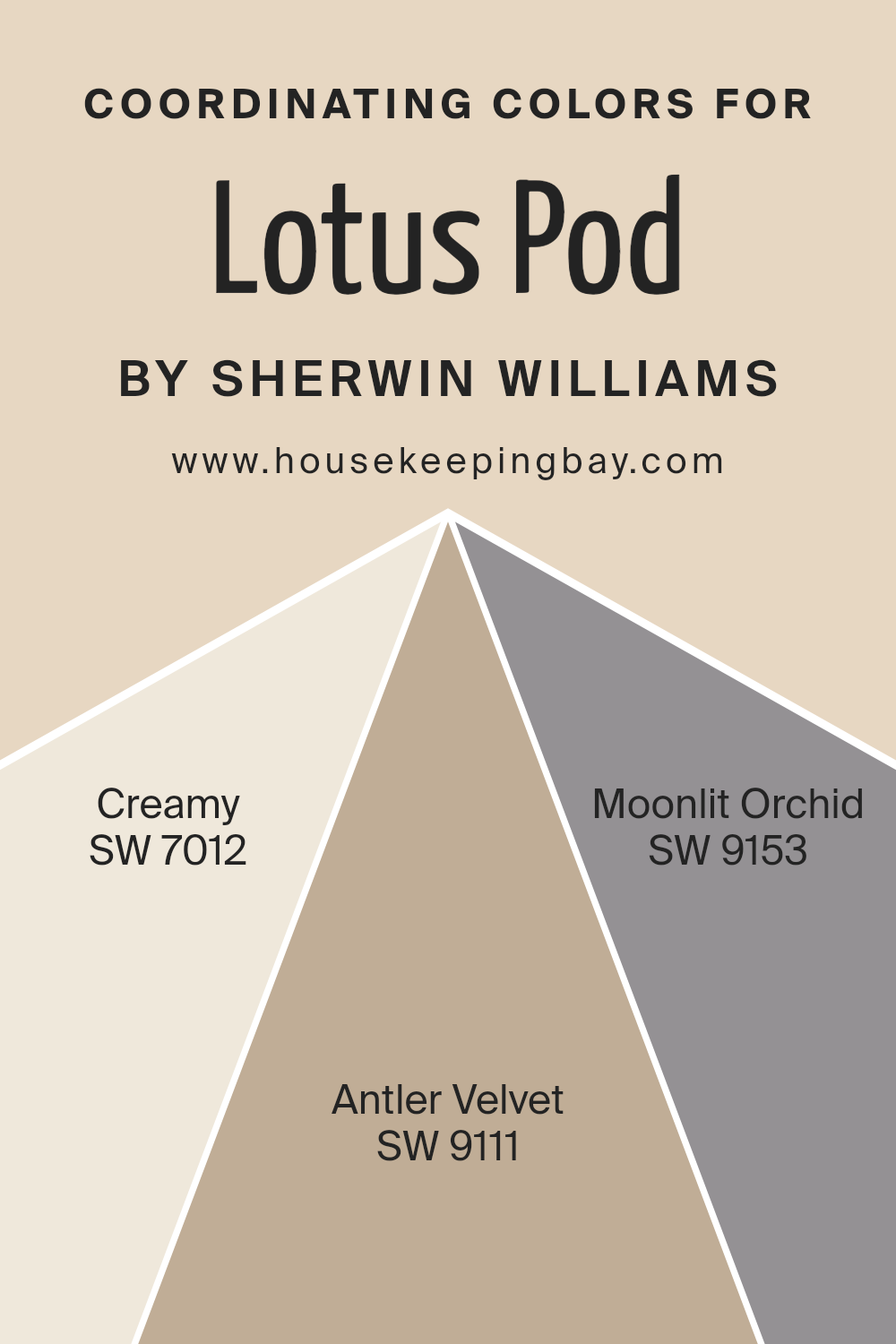
Coordinating Colors of Lotus Pod SW 7572 by Sherwin Williams
Coordinating colors are hues that work harmoniously together on a color scheme, enhancing the aesthetic appeal of a space without overwhelming the senses. These colors complement each other and can create a balanced and unified look within a room.
When using coordinating colors, especially in reference to a specific paint color like Lotus Pod SW 7572 by Sherwin Williams, the choice of complementary colors is essential to achieve a cohesive interior design.
Coordinating colors for Lotus Pod SW 7572 include Creamy SW 7012, Antler Velvet SW 9111, and Moonlit Orchid SW 9153, each bringing a unique vibe while maintaining a seamless transition throughout the space.
Creamy SW 7012 is a soft, warm white with a subtle buttery undertone that brings a light and airy feel to the environment, offering a gentle contrast to the earthy tones of Lotus Pod.
Antler Velvet SW 9111 is a deeper, neutral shade that echoes the natural world, providing a grounded, comforting presence that complements the botanical essence of Lotus Pod.
Moonlit Orchid SW 9153, on the other hand, introduces a soft, romantic touch with its muted purple hue, adding a layer of sophistication and depth to the palette. Each color, while distinct, supports the overall design narrative, enabling a fluid and harmonious aesthetic that enhances the base color of Lotus Pod SW 7572.
You can see recommended paint colors below:
- SW 7012 Creamy
- SW 9111 Antler Velvet
- SW 9153 Moonlit Orchid
housekeepingbay.com
How Does Lighting Affect Lotus Pod SW 7572 by Sherwin Williams?
Lighting plays a critical role in how we perceive colors, often transforming their appearance significantly across different conditions. This phenomenon can be extensively observed with colors like Lotus Pod SW 7572 by Sherwin Williams, a warm, nuanced hue that exhibits a unique range of qualities under various lighting conditions.
In artificial light, the inherent warmth of Lotus Pod SW 7572 is accentuated, making spaces feel cosy and inviting. The yellow and beige undertones in the paint become more pronounced, enhancing the color’s natural richness. This makes it particularly suitable for living spaces and bedrooms where soft, artificial lighting is often used to create a relaxed ambiance.
Under natural light, Lotus Pod SW 7572 takes on a different character. The quality of daylight can significantly affect the color’s appearance. In north-faced rooms, which receive less direct sunlight and tend to have cooler, bluer light, Lotus Pod can appear slightly more muted and cooler, thus retaining its warmth but with a softer touch. This subtle shift can create a serene and calming environment, making it an excellent choice for spaces intended for relaxation.
In south-faced rooms, awash with abundant, warmer light for the majority of the day, Lotus Pod SW 7572 glows warmly, its creamy undertones coming to the forefront.
This exposure maximizes the color’s potential for warmth, making rooms feel brighter and more welcoming. It’s ideal for communal areas like the kitchen or the living room, where the natural light accentuates the paint’s inviting quality.
East-faced rooms would see Lotus Pod in its warm, vibrant best in the morning light, which could then transition to a softer, more tranquil shade as the day progresses. This makes it adaptable and versatile for bedrooms or offices that benefit from the motivational quality of morning light and the calmness of the afternoon.
West-faced rooms enjoy the best of both worlds, with the color appearing cooler and more subdued in the morning, then transforming into a warm, golden hue by the evening due to the intense, warm light. It’s perfect for dining rooms or sitting areas where the evening light complements social gatherings or dinner parties, enhancing the richness of the color.
Understanding the dynamic nature of Lotus Pod SW 7572 under different lighting conditions highlights the importance of considering the orientation of a room and its lighting sources when choosing colors, ensuring the chosen hue aligns with the intended ambiance and functionality of the space.
housekeepingbay.com
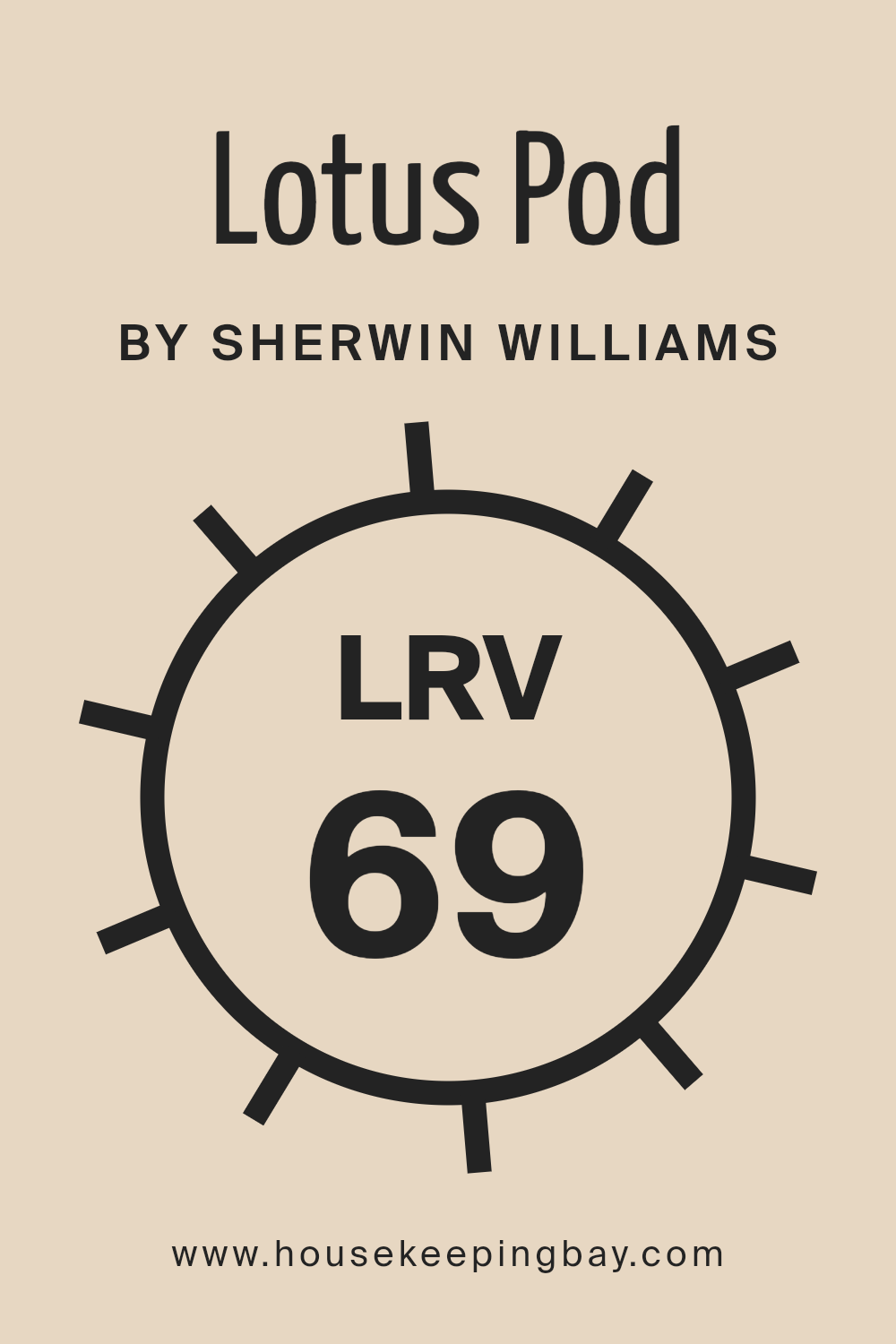
What is the LRV of Lotus Pod SW 7572 by Sherwin Williams?
Light Reflectance Value (LRV) is a measure used to describe the percentage of visible and usable light that a paint color reflects or absorbs when dry. This value ranges from 0 to 100, with 0 being perfectly black, absorbing all light, and 100 being perfectly white, reflecting all light.
LRV is an important factor to consider during the design and painting process because it affects how light or dark a color looks in a space. The level of natural or artificial light in a room can significantly impact the perception of the color.
Lighter colors with higher LRVs make spaces feel more open and airy, as they reflect more light. Conversely, darker colors with lower LRVs absorb more light, creating a cozier or smaller feel in a space.
With an LRV of 69.38, the Lotus Pod SW 7572 by Sherwin Williams is on the lighter end of the scale. This means it has a high capacity to reflect light, making it a great choice for making a room feel bright and spacious.
The specific value suggests that Lotus Pod will significantly influence the ambiance of a room by enhancing natural light during the day and effectively utilizing artificial light at night.
Therefore, it’s well suited for smaller spaces or rooms with limited natural light, as it can help to make them appear larger and more inviting. However, it’s important to remember that the effect of the LRV is also influenced by other factors such as the direction of light, the size of the windows, and other colors in the room, which can all alter the perception of the paint color.
housekeepingbay.com
What is LRV? Read It Before You Choose Your Ideal Paint Color
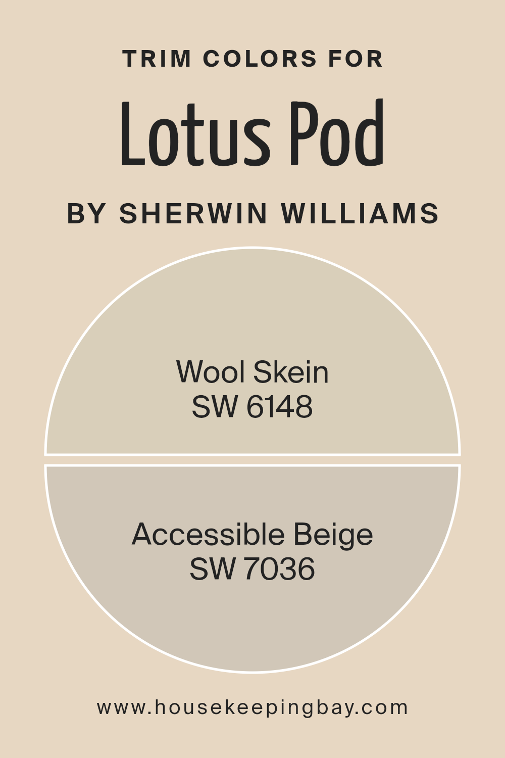
What are the Trim colors of Lotus Pod SW 7572 by Sherwin Williams?
Trim colors play an essential role in interior and exterior design by defining and accentuating architectural details, creating visual interest, and enhancing the overall aesthetic appeal of a space.
For the Lotus Pod SW 7572 by Sherwin Williams, selecting the appropriate trim color is crucial to complement its serene and subtle hue, ensuring a cohesive and harmonious look.
Trim colors like SW 6148 – Wool Skein and SW 7036 – Accessible Beige are excellent choices as they possess the ability to subtly contrast or softly complement Lotus Pod, depending on the desired effect and the lighting of the space.
Wool Skein is a muted, soft shade that echoes the natural fibers found in unspun wool, embodying warmth and versatility. This color works beautifully as a trim for Lotus Pod SW 7572, adding a touch of cozy sophistication without overwhelming the primary color’s gentle charm.
On the other hand, Accessible Beige is a warm, welcoming neutral that straddles the line between beige and gray. As a trim color, it offers a seamless transition that enriches the depth and complexity of the space, providing a grounded yet uplifted frame to the tranquil Lotus Pod.
Together, these trim options offer a palette that can enhance the aesthetic appeal, creating spaces that feel intentionally designed and effortlessly elegant.
You can see recommended paint colors below:
- SW 6148 Wool Skein
- SW 7036 Accessible Beige
housekeepingbay.com
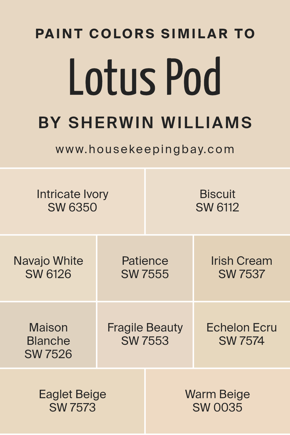
Colors Similar to Lotus Pod SW 7572 by Sherwin Williams
Similar colors play a pivotal role in design, offering a seamless blend and unity that can enhance the aesthetic appeal of any space. Colors like Lotus Pod SW 7572 by Sherwin Williams create a warm, inviting atmosphere, serving as a versatile backdrop that can be complemented with a range of similar hues.
For instance, Intricate Ivory SW 6350 introduces a soft, creamy essence that emits an understated elegance, while Biscuit SW 6112 adds a hint of warmth, embodying the comfort of home with its gentle, earthy tone.
Navajo White SW 6126 leans into a classic, slightly golden hue that brings a sense of brightness and expansiveness.
Exploring further, Patience SW 7555 offers a tranquil nuance, reminiscent of early morning light, whereas Irish Cream SW 7537 envelops spaces in a cozy, comforting embrace with its rich, creamy depth. Maison Blanche SW 7526 strikes a balance between sophistication and simplicity, with its understated, neutral canvas.
Fragile Beauty SW 7553 whispers serenity, lending an airy, ethereal quality. Echelon Ecru SW 7574 and Eaglet Beige SW 7573, with their subtle, refined elegance, effortlessly anchor any space, providing a solid foundation that’s both welcoming and poised.
Lastly, Warm Beige SW 0035 rounds out this palette with its inviting, soft glow, creating a sense of harmony and balance.
Together, these colors exemplify how varying shades of similar hues can enrich environments, fostering a cohesive yet dynamic decor scheme.
You can see recommended paint colors below:
- SW 6350 Intricate Ivory
- SW 6112 Biscuit
- SW 6126 Navajo White
- SW 7555 Patience
- SW 7537 Irish Cream
- SW 7526 Maison Blanche
- SW 7553 Fragile Beauty
- SW 7574 Echelon Ecru
- SW 7573 Eaglet Beige
- SW 0035 Warm Beige
housekeepingbay.com
How to Use Lotus Pod SW 7572 by Sherwin Williams In Your Home?
Lotus Pod SW 7572 by Sherwin Williams is a captivating paint color that exudes warmth and sophistication, making it a versatile choice for any home. This hue is part of the Neutral Nuance collection, which is renowned for its ability to create tranquil and welcoming spaces.
Lotus Pod has a unique character, blending beige and soft brown tones to produce a cozy, inviting ambiance that can easily enhance the aesthetic appeal of any room.
Incorporating Lotus Pod into your home can be a delightful venture. Its earthy undertones make it an excellent choice for living rooms or bedrooms, where creating a soothing and comfortable environment is key.
This color pairs beautifully with natural materials such as wood, stone, and leather, enabling you to create a serene, grounded space. Whether applied as a main wall color or as an accent to complement bolder shades, Lotus Pod brings a touch of elegance and subtlety.
It can also be utilized in kitchens and bathrooms, offering a neutral backdrop that allows fixtures and accessories to stand out. With Lotus Pod SW 7572, you’re not just painting your walls; you’re cultivating an atmosphere of peace and warmth that makes your house truly feel like a home.
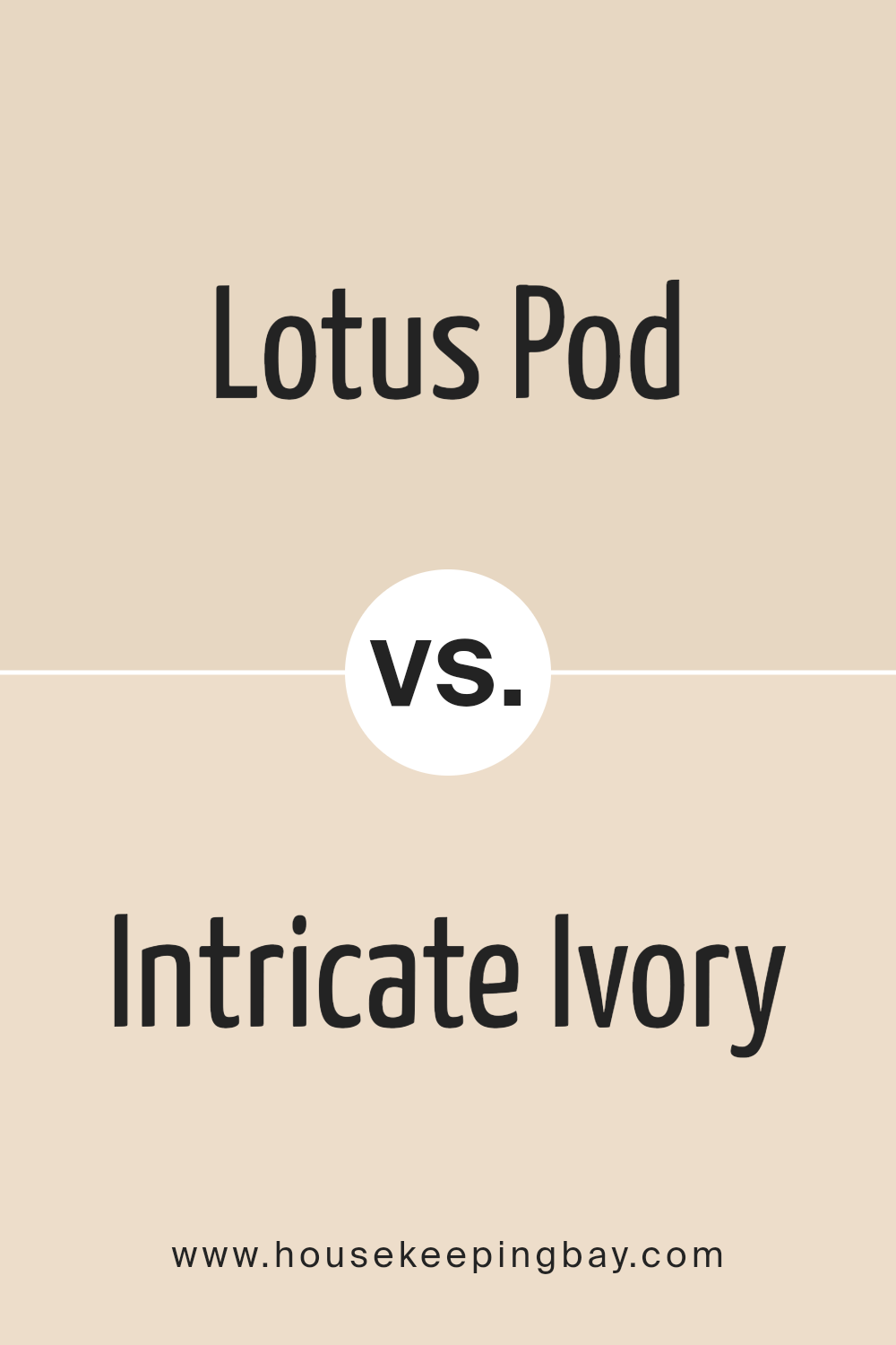
Lotus Pod SW 7572 by Sherwin Williams vs Intricate Ivory SW 6350 by Sherwin Williams
Lotus Pod SW 7572 and Intricate Ivory SW 6350 by Sherwin Williams are two distinct hues that offer unique ambiances for interior spaces. Lotus Pod is a deeper, rich tone that conveys a sense of warmth and sophistication.
It embodies a natural earthiness with its subtle, brownish-pink undertones, making it a perfect choice for creating cozy, inviting spaces. On the other hand, Intricate Ivory is a much lighter, airy color with a creamy base that exudes a gentle, calming presence.
Its softness and versatility make it an excellent option for walls in almost any room, imparting a bright and open feel. This color can serve as a neutral backdrop, allowing for flexibility in decor and furniture choices.
While Lotus Pod adds depth and character to a room, Intricate Ivory offers a clean, minimalist canvas. Together, they could create an elegant contrast, with Intricate Ivory lightening up spaces grounded by the earthy tones of Lotus Pod.
You can see recommended paint color below:
housekeepingbay.com
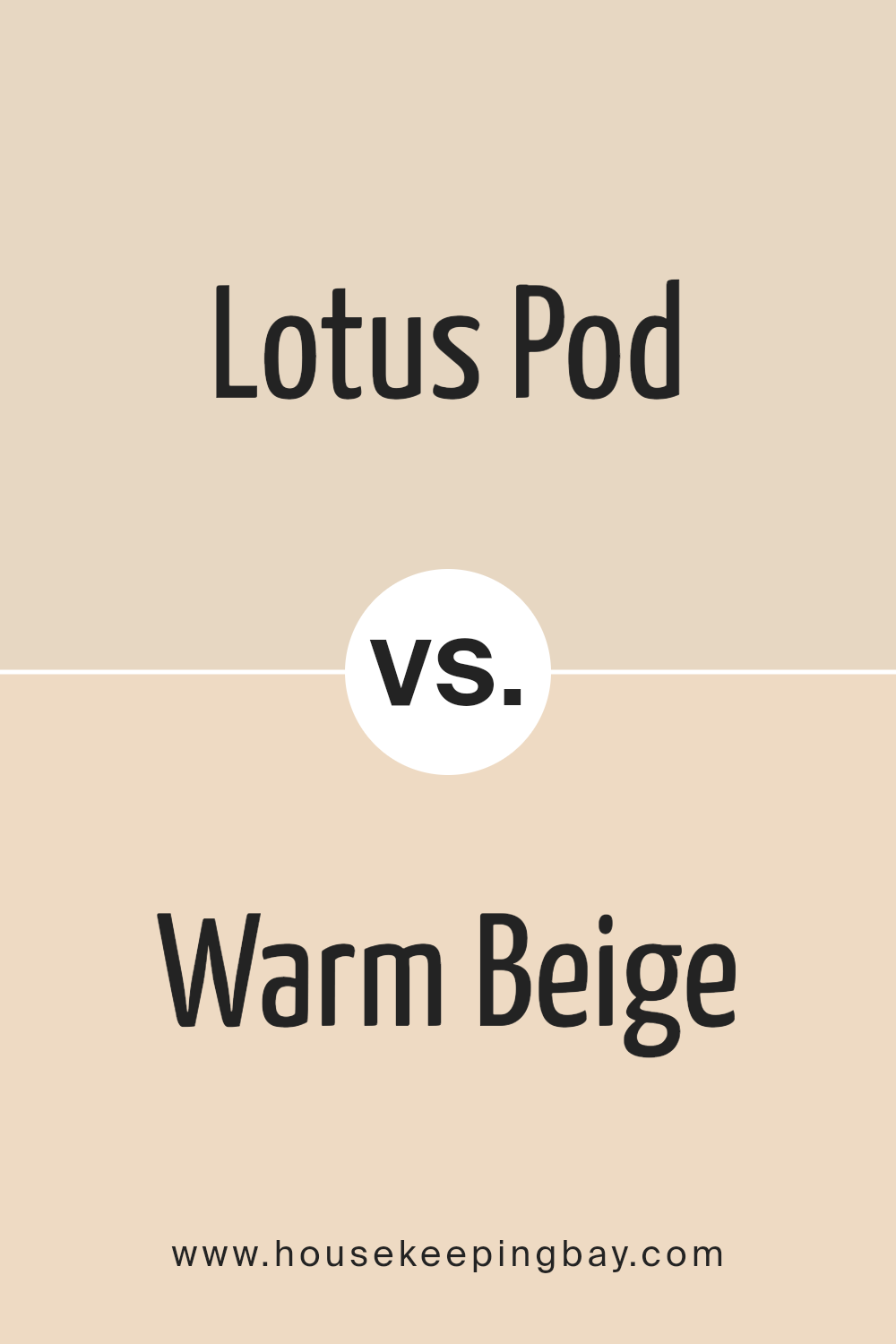
Lotus Pod SW 7572 by Sherwin Williams vs Warm Beige SW 0035 by Sherwin Williams
Lotus Pod SW 7572 and Warm Beige SW 0035 by Sherwin Williams are two colors that evoke a sense of warmth and comfort but in subtly distinct ways. Lotus Pod is a rich, deeper hue that suggests a blend of earthen tones with a slight, understated pinkish undertone, giving it a unique warmth and sophistication.
This color can create a feeling of cozy intimacy, making spaces feel more enclosed and personal. On the other hand, Warm Beige is a lighter, softer shade that leans towards a classic neutral beige, embodying a more traditional sense of warmth.
Its lightness brings an open, airy quality to spaces, promoting a sense of calm and relaxation.
While Lotus Pod adds depth and character to a room, potentially serving as an excellent accent or focal point, Warm Beige offers a versatile backdrop, seamlessly integrating with various decors and styles. Both colors celebrate warmth but cater to different aesthetic preferences and uses in interior spaces.
You can see recommended paint color below:
- SW 0035 Warm Beige
housekeepingbay.com
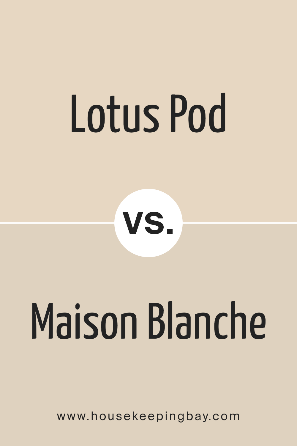
Lotus Pod SW 7572 by Sherwin Williams vs Maison Blanche SW 7526 by Sherwin Williams
Lotus Pod SW 7572 and Maison Blanche SW 7526, both by Sherwin Williams, represent distinctive hues that cater to varied aesthetic and design preferences.
Lotus Pod is a deep, earthy beige with a subtle pink undertone, evoking warmth and natural elegance. This nuanced shade can add depth and coziness to spaces, standing out for its ability to blend with both bold and muted color schemes, making it versatile for living rooms, bedrooms, and hallways.
On the other hand, Maison Blanche is a lighter, classic neutral with creamy undertones. It exudes a soft, inviting brightness, making rooms feel more open and airy. This shade is ideal for achieving a serene and timeless ambiance, suitable for spaces aiming for a minimalist or chic farmhouse look.
While Lotus Pod brings a richer, more grounding atmosphere with its earthier presence, Maison Blanche offers a clean, refreshing backdrop that amplifies natural light. Choosing between them depends on the desired effect: warmth and depth with Lotus Pod or light and openness with Maison Blanche.
You can see recommended paint color below:
- SW 7526 Maison Blanche
housekeepingbay.com
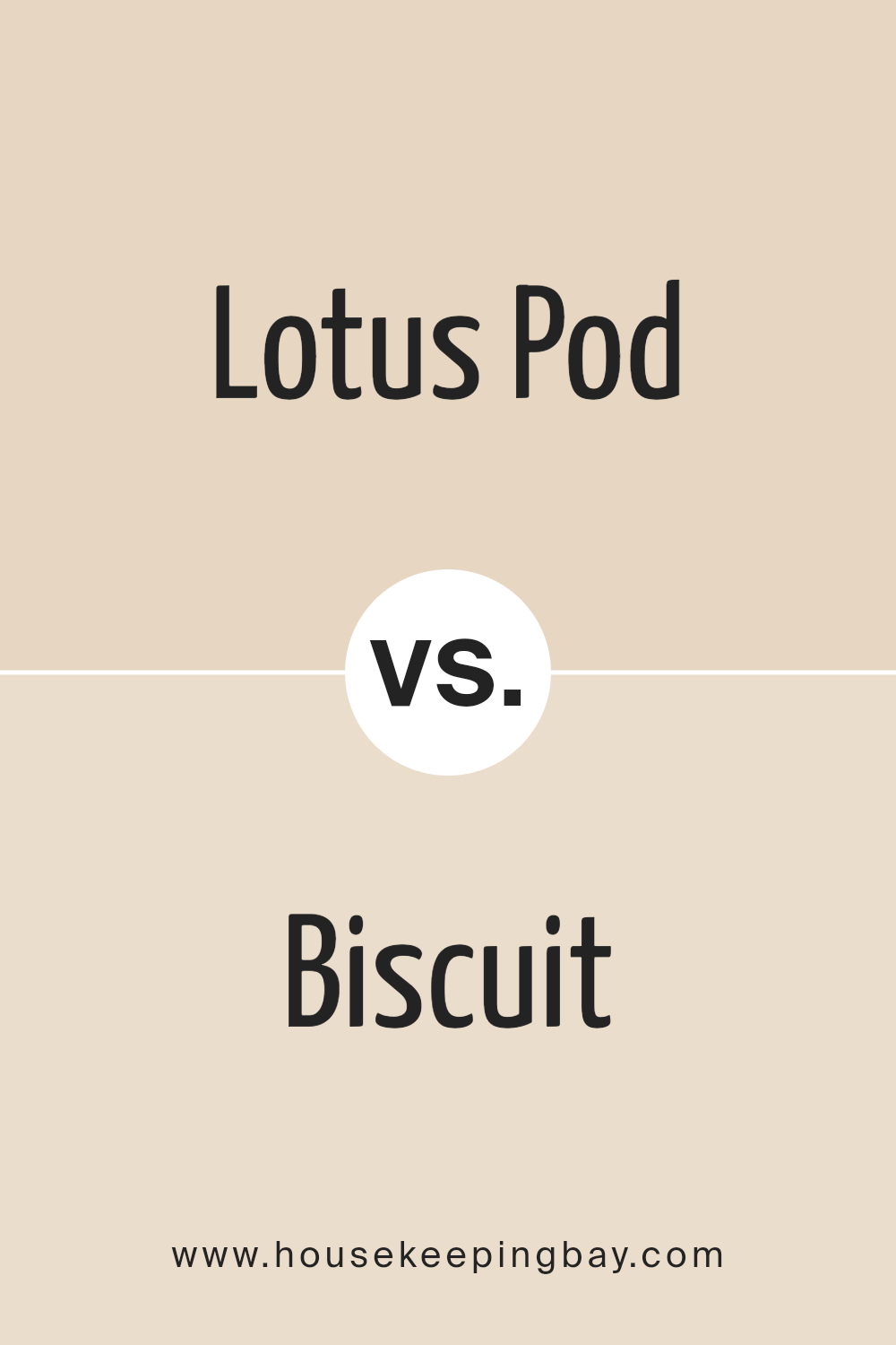
Lotus Pod SW 7572 by Sherwin Williams vs Biscuit SW 6112 by Sherwin Williams
Lotus Pod SW 7572 and Biscuit SW 6112 by Sherwin Williams are two distinct hues that offer unique atmospheres to interior spaces. Lotus Pod situates itself as a deeper, more enveloping color, bearing a rich, earthy quality that conveys warmth and sophistication.
It is a color that resonates with those looking to create a space that feels both grounded and enveloping, capable of making large rooms feel cozier and more intimate.
On the other hand, Biscuit SW 6112 is lighter and softer, presenting a neutral palette that evokes a sense of calm and serenity. Its creamy, almost sandy tone makes it an excellent choice for creating a bright, airy, and welcoming atmosphere.
Biscuit is versatile, capable of complementing a wide range of decor styles, from the most rustic to the sleekly modern.
While Lotus Pod draws in warmth and depth, Biscuit offers a canvas for light and space, making each color suited to different aesthetic tastes and design intentions.
Whether one seeks the cozy embrace of Lotus Pod or the gentle openness of Biscuit, both colors provide compelling choices for those looking to bring their interior spaces to life.
You can see recommended paint color below:
housekeepingbay.com
Lotus Pod SW 7572 by Sherwin Williams vs Echelon Ecru SW 7574 by Sherwin Williams
Lotus Pod SW 7572 and Echelon Ecru SW 7574, both by Sherwin Williams, present a harmonious yet distinct palette rooted in warmth and natural sophistication.
Lotus Pod emulates a soft, muted pink with beige undertones, encapsulating the essence of a tranquil dawn or the delicate interior of its namesake. This color exudes comfort and serenity, perfect for creating a nurturing and gentle ambiance in any space.
Echelon Ecru, on the other hand, subtly shifts the mood with its richer, deeper beige hue. This color leans more towards a classic earth tone, embodying the warmth of sunlit sand or the timeless elegance of vintage parchment.
Echelon Ecru offers a slightly more pronounced statement, grounding spaces with its sturdy yet inviting presence.
While both colors share a base of warm neutrality, Lotus Pod introduces a touch of rosy warmth, suggesting softness and subtle vibrance. Echelon Ecru, conversely, provides a stronger anchor, favoring depth and stability.
Together, they offer a versatile palette that balances understated elegance with welcoming comfort.
You can see recommended paint color below:
housekeepingbay.com
Lotus Pod SW 7572 by Sherwin Williams vs Fragile Beauty SW 7553 by Sherwin Williams
Lotus Pod SW 7572 and Fragile Beauty SW 7553 by Sherwin-Williams present a refined and serene palette, yet they distinctly differ in mood and depth.
Lotus Pod is a deeper, more grounding hue that evokes the richness of terracotta mixed with subdued earthy undertones, offering warmth and a subtle hint of elegance. Its depth makes it a perfect choice for creating a focal point or adding character to a space without overwhelming it.
On the other hand, Fragile Beauty leans towards a lighter, softer tone that whispers tranquility and lightness. This color resembles a delicate, almost ethereal touch with its muted, pastel base, blending seamlessly into environments that aim for a restful and airy atmosphere.
It is especially suited for spaces seeking a touch of refinement without the saturation of bolder colors.
Together, Lotus Pod and Fragile Beauty can harmonize within a space, offering a balance between strength and softness. While Lotus Pod anchors the environment, Fragile Beauty introduces an uplifting contrast, creating an inviting and cohesive look that is both elegant and comforting.
You can see recommended paint color below:
housekeepingbay.com
Lotus Pod SW 7572 by Sherwin Williams vs Irish Cream SW 7537 by Sherwin Williams
Lotus Pod SW 7572 by Sherwin Williams and Irish Cream SW 7537 from the same brand are two distinctive hues that offer unique vibes to any space. Lotus Pod is a muted, cozy pink with warm undertones, conveying a sense of serenity and elegance.
It’s a color that suggests softness and subtlety, evoking the delicate nature of its namesake, making it perfect for creating a tranquil, soothing ambiance. Its muted tones blend beautifully in spaces that aim for a soft, romantic, or sophisticated appearance.
On the other hand, Irish Cream is a lighter, neutral beige with creamy undertones, exuding a sense of warmth and comfort. It is versatile and welcoming, crafting spaces that feel airy and open.
This color can effortlessly complement various decor styles, from modern minimalism to rustic charm, acting as a perfect backdrop for bolder accents or serving as a serene stand-alone palette.
Both colors promote a sense of calm and are excellent choices for creating inviting interiors. However, Lotus Pod leans towards a more distinct, characterful appearance with its pink undertones, while Irish Cream offers versatility and neutrality for broader appeal and application.
You can see recommended paint color below:
- SW 7537 Irish Cream
housekeepingbay.com
Lotus Pod SW 7572 by Sherwin Williams vs Eaglet Beige SW 7573 by Sherwin Williams
“Lotus Pod” by Sherwin Williams (SW 7572) and “Eaglet Beige” (SW 7573) present a fascinating pair for those keen on creating harmonious color schemes with subtle distinctions.
“Lotus Pod” dives into a muted, serene backdrop, embodying an earthy warmth that suggests comfort and understated elegance. Its tone, reminiscent of clay or soft terra cotta, brings a touch of natural sophistication to spaces, making it ideal for creating inviting living areas or serene retreats.
On the other hand, “Eaglet Beige” is a step lighter, providing a breezier feel that reflects more light, thereby making spaces appear larger and more open. It holds a creamy hue that blends effortlessly with a wide range of decor styles, from contemporary to classic.
Despite its lighter touch, it retains an earthy base that ensures warmth and coziness.
Both colors play well together, allowing for a seamless transition between rooms or providing a soft contrast for layering and depth.
“Eaglet Beige” can serve as a refreshing canvas for interiors, while “Lotus Pod” adds depth and interest, grounding spaces with its richer tone. Together, they form a duo that balances light and warmth, making them an excellent choice for those seeking a sophisticated yet welcoming atmosphere.
You can see recommended paint color below:
- SW 7573 Eaglet Beige
housekeepingbay.com
Lotus Pod SW 7572 by Sherwin Williams vs Navajo White SW 6126 by Sherwin Williams
Lotus Pod SW 7572 by Sherwin Williams and Navajo White SW 6126 are two distinctive hues that offer unique vibes to any space. Lotus Pod is a muted, earthy tone that leans towards a sophisticated blend of beige and pink.
This color carries a subtle warmth that can create a cozy, welcoming atmosphere in a room, enveloping the space in a soft, serene embrace.
Its understated elegance makes it versatile for use in various settings, providing a neutral backdrop that complements both bold and subdued decor elements.
On the other hand, Navajo White SW 6126 is a classic, creamy white with a soft, buttery undertone. It radiates a brighter, more luminous feel compared to Lotus Pod, bringing a light and airy quality to interiors.
Navajo White can make spaces appear larger and more open, lending itself well to creating an inviting and refreshing environment. This color is ideal for those seeking to infuse their space with a sense of brightness without the starkness of pure white.
Both colors exemplify Sherwin Williams’ ability to craft shades that enhance the aesthetic appeal of spaces with subtlety and sophistication. Whether choosing Lotus Pod for its cozy charm or Navajo White for its cheerful brightness, each color offers a unique palette to inspire beautiful interiors.
You can see recommended paint color below:
housekeepingbay.com
Lotus Pod SW 7572 by Sherwin Williams vs Patience SW 7555 by Sherwin Williams
Lotus Pod SW 7572 and Patience SW 7555, both from Sherwin Williams, present a fascinating exploration within the realm of warm, neutral tones, exuding an understated elegance that enhances various spaces.
Lotus Pod dwells in a slightly darker and warmer territory, reminiscent of the earthy hues found in nature’s quiet corners. Its rich, beige tone carries an inviting depth, making it an excellent choice for creating cozy, soothing atmospheres within homes and commercial spaces alike.
On the other hand, Patience SW 7555 offers a lighter, more airy feel, leaning towards a soft, creamy palette. This color broadcasts tranquility and a sense of openness, making it ideal for spaces intended to feel spacious and serene.
Its ability to reflect light beautifully adds to its charm, giving rooms a brighter and more uplifting vibe.
When comparing the two, the main distinction lies in their ability to set different moods and visual impacts. Lotus Pod, with its deeper, warmer undertones, brings warmth and coziness, whereas Patience, being lighter and softer, creates a calm and relaxed atmosphere.
Both colors, while similar in their neutral bases, offer unique aesthetics that cater to different design preferences and functionalities.
You can see recommended paint color below:
housekeepingbay.com
Conclusion
Sherwin Williams’ Lotus Pod SW 7572 emerges as a paint color that has captivated homeowners and designers alike, establishing itself as a refreshing choice for those looking to infuse their spaces with warmth and sophistication.
This hue reflects a unique blend of understated elegance and modern versatility, making it an ideal backdrop for a wide array of design styles.
Whether it’s applied in living areas, bedrooms, or cozy nooks, Lotus Pod exudes a comforting presence that pairs beautifully with both light and dark accents, transforming spaces into serene retreats.
The appeal of Lotus Pod SW 7572 extends beyond its aesthetic charm; it also exemplifies Sherwin Williams’ dedication to offering colors that enhance the feeling of home.
It provides a soothing canvas that encourages creativity in decor, allowing for personal tastes and trends to shine through without overwhelming. As a testament to its popularity, Lotus Pod has garnered attention for its adaptability, proving that neutral paint colors can be both dynamic and subtle.
In essence, Lotus Pod SW 7572 has carved a niche for itself among the classics, offering a timeless quality that promises to remain relevant and beloved in the world of interior design.
housekeepingbay.com
Ever wished paint sampling was as easy as sticking a sticker? Guess what? Now it is! Discover Samplize's unique Peel & Stick samples. Get started now and say goodbye to the old messy way!
Get paint samples