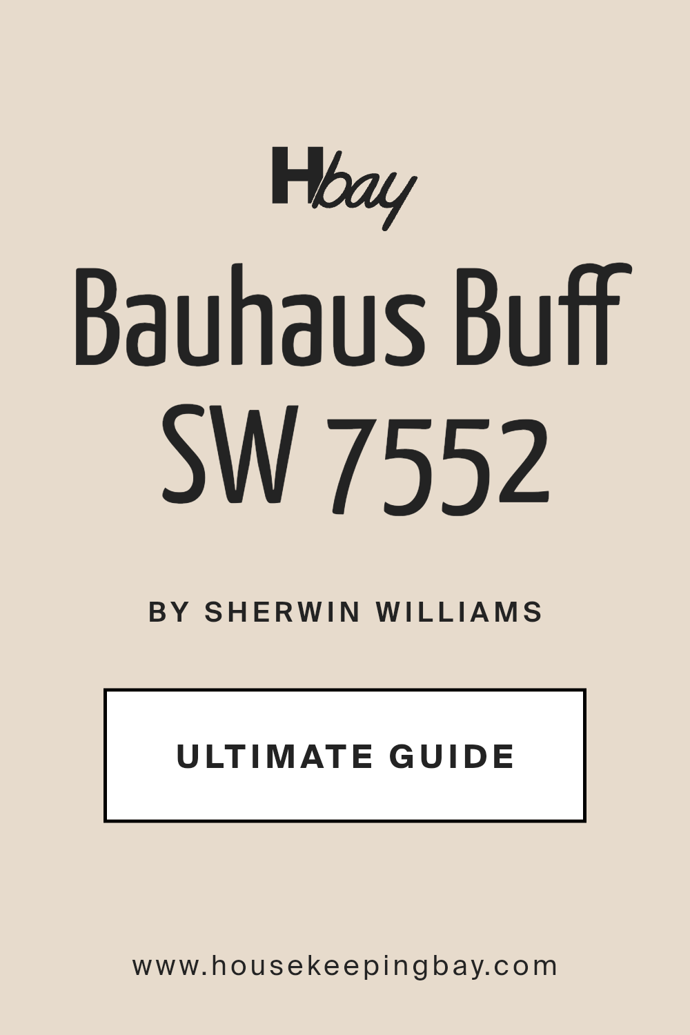
Bauhaus Buff SW 7552 by Sherwin Williams
Warm Elegance Redefined: A Timeless Hue for Contemporary Spaces
In the vast panorama of interior design, color plays a pivotal role, acting as the silent yet profoundly powerful language of space and mood. Among the hues that have carved a niche in both historical and contemporary palettes, SW 7552 Bauhaus Buff by Sherwin Williams stands out as a beacon of warmth and minimalistic charm.
This hue, rooted in the foundational principles of the Bauhaus movement, not only echoes the ethos of functional beauty but also brings a timeless elegance to any space it graces. This article delves into the soul of Bauhaus Buff, exploring its aesthetic allure and versatile application that make it a favored choice among designers, homeowners, and architects alike.
Crafted by Sherwin Williams, a name synonymous with quality and color innovation, Bauhaus Buff transcends the ordinary by offering a swatch of light that can illuminate and expand spaces. Its undertones, compatibility with various décor styles, and adaptability to changing natural light conditions showcase its chameleon-like capability to complement and enhance.
The discussion will extend beyond the mere visual appeal, touching upon the color’s psychological impacts, how it harmonizes with other palette choices, and its place within the broader context of design trends.
Whether you’re embarking on a full-scale renovation or simply seeking a fresh splash of sophistication, Bauhaus Buff emerges as a compelling narrative of color that invites warmth and light into the heart of homes and public spaces alike.
via sherwin-williams.com
What Color Is Bauhaus Buff SW 7552 by Sherwin Williams?
Table of Contents
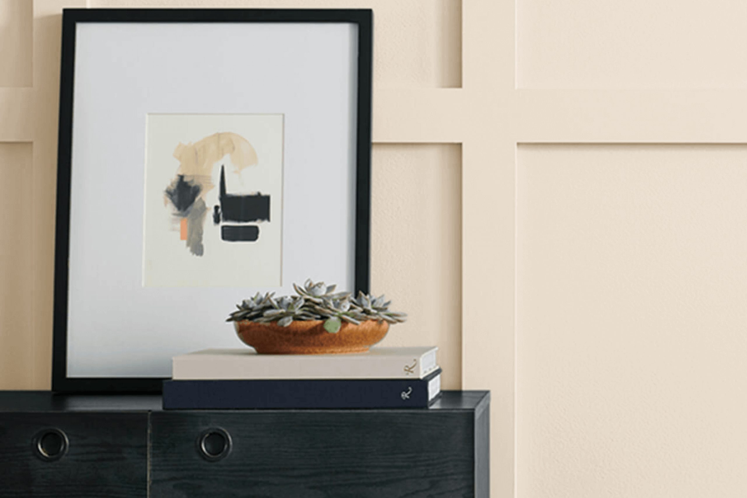
Bauhaus Buff SW 7552 by Sherwin Williams is a warm, inviting shade that effortlessly straddles the line between a rich cream and a light, understated beige. This versatile color exudes a sense of simplicity and elegance, making it a perfect backdrop for a variety of interior styles. Its soft, neutral palette provides a soothing ambiance that is both comforting and chic, imbuing spaces with a subtle luminosity that can make rooms feel larger and more open.
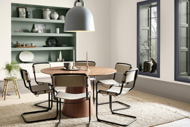
Bauhaus Buff works exceptionally well in interior designs that emphasize clean lines and minimalist aesthetics, such as contemporary, Scandinavian, and of course, the Bauhaus style from which it takes its name. This hue’s understated character is ideal for creating a serene and timeless space, offering a sense of calm and continuity.
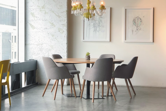
It pairs wonderfully with a wide range of materials and textures, emphasizing the beauty and tactile qualities of natural wood, stone, and metals. In spaces featuring exposed brick or concrete, Bauhaus Buff serves as a soft counterpoint, enhancing these textures without overwhelming them.
For a sophisticated palette, it can be juxtaposed with bold colors like deep blues or rich greens for a dynamic contrast, or combined with other neutrals for a layered, monochromatic look. In terms of textures, this color harmonizes beautifully with soft textiles, such as linens and wool, creating a cozy and inviting feel.
Whether used as a primary color scheme or as an accent, Bauhaus Buff SW 7552 brings warmth and versatility to any interior, embodying a modern yet timeless aesthetic.
housekeepingbay.com
Is Bauhaus Buff SW 7552 by Sherwin Williams Warm or Cool color?
Bauhaus Buff SW 7552 by Sherwin Williams, a nuanced neutral, embodies the timeless spirit of the Bauhaus movement with its emphasis on simplicity, functionality, and the blending of art and craftsmanship. This shade is more than just a color; it’s an homage to an era that revolutionized design, making it a poignant choice for those looking to infuse their homes with a sense of history and harmony.
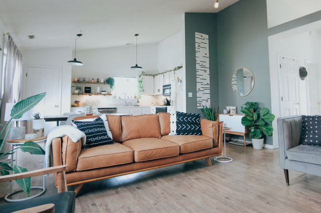
In the home, Bauhaus Buff presents a versatile backdrop that complements a wide range of decor styles, from minimalist and modern to traditional and eclectic. Its warm, inviting hue brings a sense of calm and cohesion to spaces, whether it adorns a cozy living room or a serene bedroom. This color has an exceptional ability to enhance natural light, making spaces feel more open and airy, yet it retains a cozy ambiance that feels like a warm embrace.
Furthermore, Bauhaus Buff fosters a timeless aesthetic, ensuring that interiors will not soon feel outdated. Its adaptability allows homeowners to update furnishings or accent colors without the need to repaint, making it both a practical and beautiful choice. In essence, Bauhaus Buff SW 7552 by Sherwin Williams is not just a paint color; it’s a foundational element that transforms houses into welcoming, harmonious homes.
What is the Masstone of the Bauhaus Buff SW 7552 by Sherwin Williams?
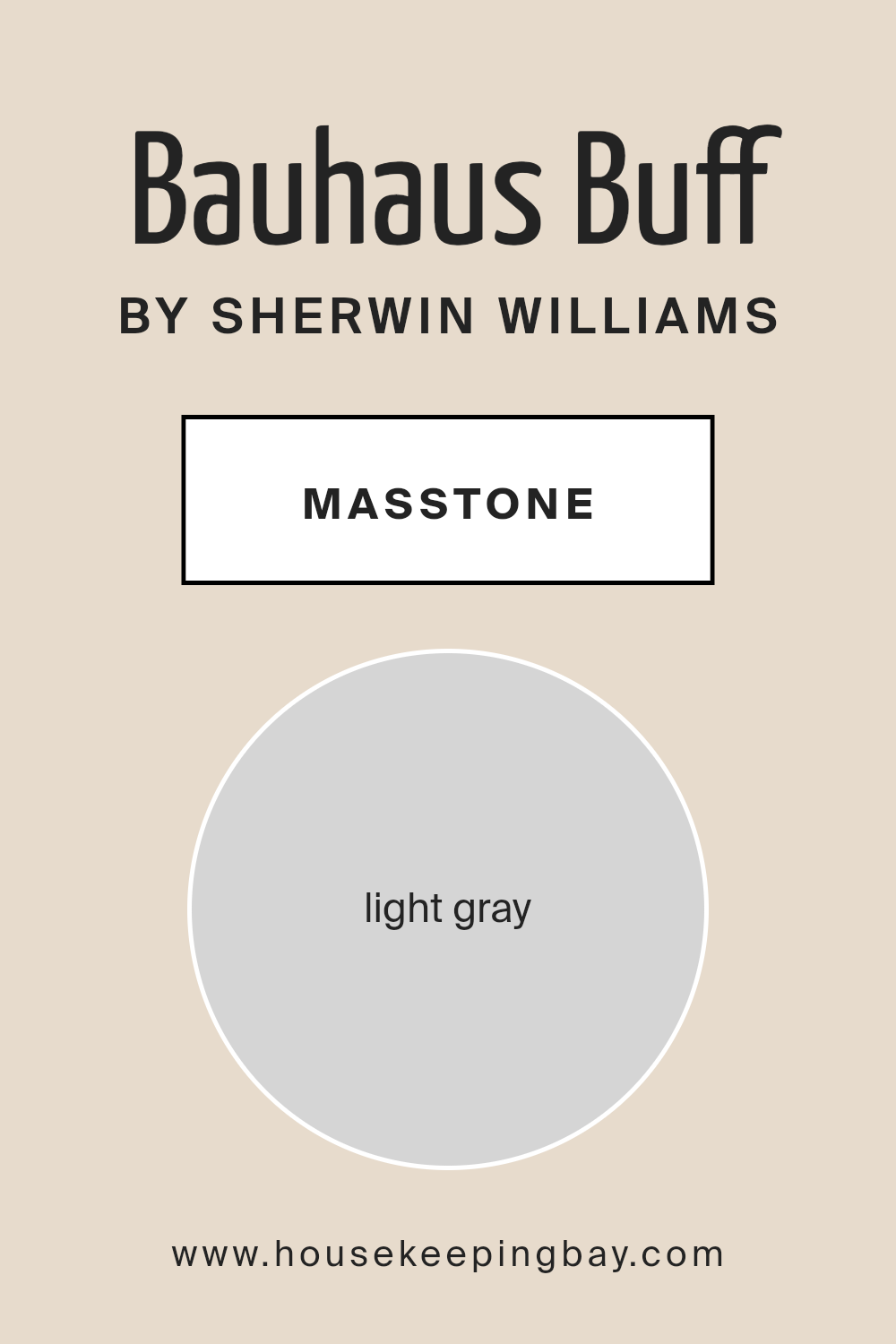
Bauhaus Buff SW 7552 by Sherwin Williams, with its masstone of Light Grey (#D5D5D5), embodies the essence of modern tranquility and versatility in home decor. This particular shade of light grey serves as a neutral backdrop, offering a soothing canvas that can elevate any room’s aesthetic. Its inherent subtlety means it can seamlessly blend with various color schemes, from vivid hues to more understated tones, making it an ideal choice for those seeking flexibility in their design choices.
In homes, Bauhaus Buff’s light grey masstone has a unique capability to enhance natural light, making spaces appear brighter and larger. Its cool undertone provides a calm and serene atmosphere, conducive to relaxation and focus, making it particularly appealing for living areas, bedrooms, and home offices.
Additionally, this color can effortlessly bridge traditional and contemporary elements within a space, ensuring a timeless appeal that adapts with evolving tastes and decor trends. Essentially, Bauhaus Buff SW 7552 brings an understated elegance and a sense of spaciousness, making it a sophisticated yet practical choice for modern homes.
housekeepingbay.com
Undertones of Bauhaus Buff SW 7552 by Sherwin Williams
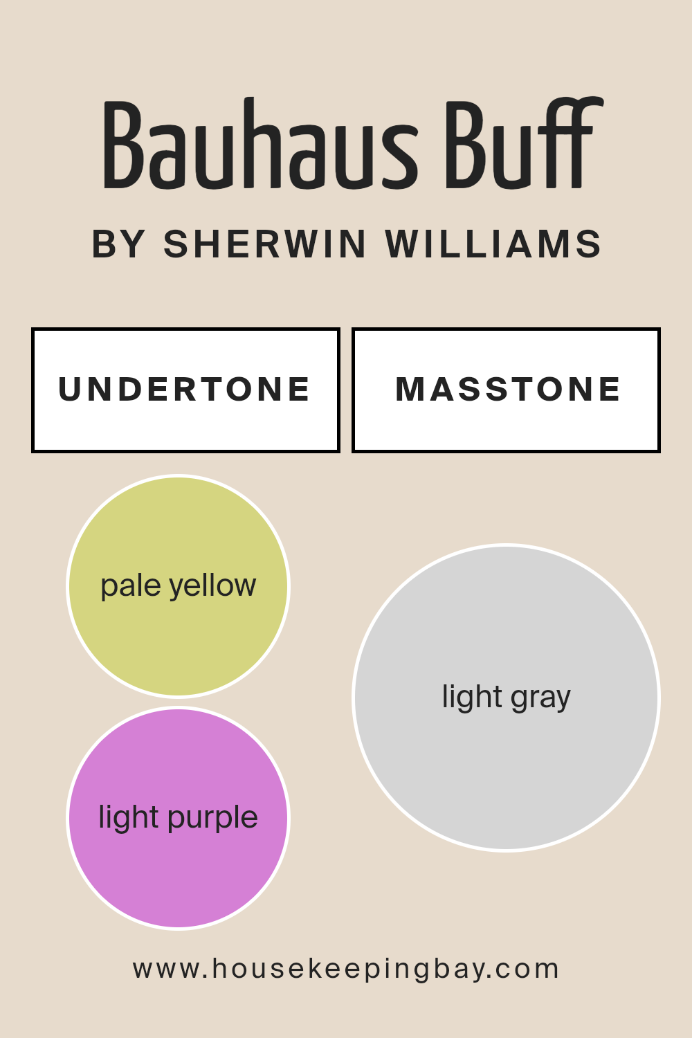
Bauhaus Buff SW 7552 by Sherwin Williams is not merely a singular tone, but a complex hue imbued with nuanced undertones that deeply influence its visual impact and the ambiance it creates. This color, at first glance, presents as a serene and soft neutral, yet its subtle complexity is revealed through its undertones of pale yellow (#D5D580) and light purple (#D580D5). These undertones play a significant role in how we perceive the color, as they can shift dramatically based on lighting, surrounding colors, and even the time of day.
The presence of a pale yellow undertone adds a layer of warmth and light, making Bauhaus Buff feel welcoming and energizing. This is especially beneficial in spaces that aim to be cozy and inviting, as the yellow hues bring a sun-kissed quality that can make rooms feel more lively and bright.
On the other hand, the light purple undertone introduces a hint of cool sophistication, balancing the warmth of yellow with a subtle, calming effect. This touch of purple can make the color appear more refined and poised, especially in well-lit areas or when paired with complementary colors.
When applied to interior walls, the undertones of Bauhaus Buff SW 7552 significantly influence the room’s atmosphere. In natural light, the pale yellow can make spaces feel airy and open, while artificial lighting may highlight the light purple, creating a more intimate and restful environment.
This duality allows Bauhaus Buff to be exceptionally versatile, capable of adapting to and enhancing myriad interior styles and moods. Understanding these undertones is crucial for homeowners and designers alike, as they guide color pairing decisions and ensure the creation of a desired ambiance within a space.
housekeepingbay.com
Coordinating Colors of Bauhaus Buff SW 7552 by Sherwin Williams
Coordinating colors are those that harmoniously accompany a primary color, enhancing the overall aesthetic of a space without overwhelming it. They are chosen based on color theory principles, ensuring a cohesive and balanced look.
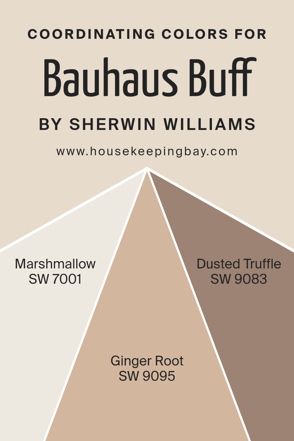
The primary color, in this case, Bauhaus Buff SW 7552 by Sherwin Williams, serves as the foundation. It’s a sophisticated, creamy hue that offers a soft, neutral backdrop ideal for a variety of spaces. Coordinating colors for Bauhaus Buff include SW 7001 – Marshmallow, SW 9095 – Ginger Root, and SW 9083 – Dusted Truffle. These selections provide a refined palette that can beautifully elevate interiors when paired wisely.
Marshmallow SW 7001 is a light, airy white with a hint of warmth, making it an excellent choice for creating a sense of spaciousness and light in a room. It pairs seamlessly with Bauhaus Buff for a subtle contrast that’s both inviting and serene.
Ginger Root SW 9095, a gentle, muted brown with a touch of spice, adds a layer of coziness and earthiness to the mix, ideal for spaces aiming for a natural, grounded feel. Dusted Truffle SW 9083 offers a deeper, more robust complement.
This rich, nuanced brown brings depth and sophistication, ensuring a harmonious blend that enriches the overall palette. Together, these coordinating colors work in harmony to create a cohesive and inviting space, highlighting the versatility and balanced beauty of Bauhaus Buff as the foundation.
You can see recommended paint colors below:
- SW 7001 Marshmallow
- SW 9095 Ginger Root
- SW 9083 Dusted Truffle
housekeepingbay.com
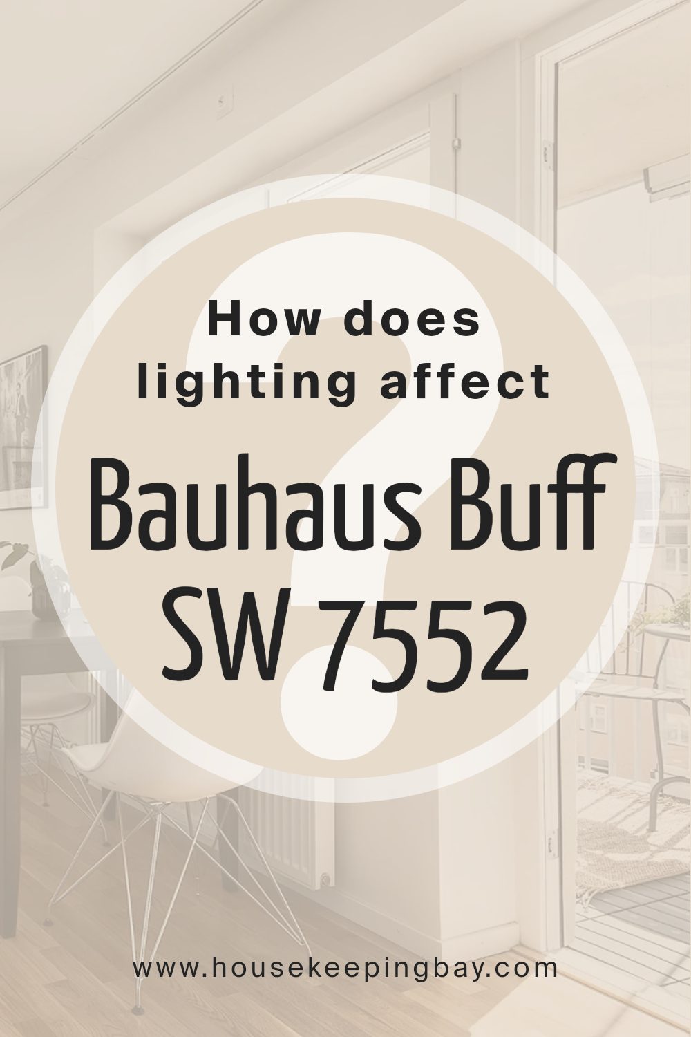
How Does Lighting Affect Bauhaus Buff SW 7552 by Sherwin Williams?
Lighting plays a pivotal role in how we perceive colors, significantly influencing their appearance and mood in a space. The type and direction of light can transform the same color into different shades and tones throughout the day. When considering a color like Bauhaus Buff SW 7552 by Sherwin Williams, understanding the impact of lighting becomes crucial for its application in interior design.
In natural light, Bauhaus Buff exhibits a warm and inviting cream hue. Natural light, especially in its purest form during midday, showcases this color in its true essence without any distortion. However, the orientation of the room significantly alters its appearance.
In north-faced rooms, which receive cooler, indirect light, Bauhaus Buff may appear slightly more muted and cooler, emphasizing its subtle grey undertones. This cooler light can make the color seem more subdued and sophisticated, perfect for creating a serene and tranquil space.
South-faced rooms bask in warm, direct sunlight for most of the day, which enhances the warm and creamy tones of Bauhaus Buff, making spaces feel cozy and bright. The color becomes more vibrant and lively, ideal for living rooms or spaces where a welcoming atmosphere is desired.
East-faced rooms receive the morning sun, which is warm and golden, highlighting the creamy and warm aspects of Bauhaus Buff. This orientation brings out the brightness in the color, making it appear more luminous in the morning while transitioning into a softer glow as the day progresses.
West-faced rooms are illuminated by the intense and warm evening light, which can make Bauhaus Buff look warmer and richer towards the end of the day. This lighting condition emphasizes the color’s cozy and inviting qualities, making it a great choice for dining rooms or spaces used primarily in the evening.
Artificial light also affects Bauhaus Buff’s appearance, with different types of bulbs casting various tones. Incandescent lighting enhances its warm tones, making the color appear more inviting, while fluorescent lighting can pull out cooler notes, making it appear slightly starker.
Choosing the right lighting is critical to ensure that Bauhaus Buff SW 7552 creates the desired effect in a space, harmonizing with both its functional needs and aesthetic preferences. Email marketing
housekeepingbay.com
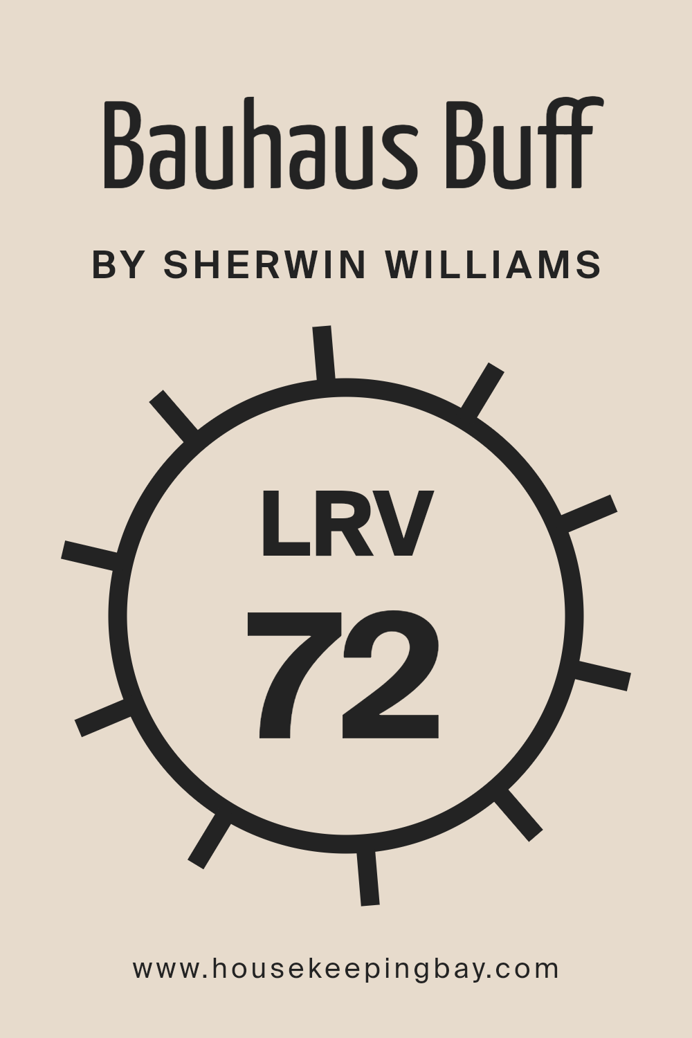
What is the LRV of Bauhaus Buff SW 7552 by Sherwin Williams?
Light Reflectance Value, or LRV, is a measure used to reflect how much light a color will reflect when applied to a surface, as well as how much it absorbs. It plays a crucial role in the way colors appear in different settings, primarily based on the amount of natural or artificial light a room receives.
Measured on a scale from 0 to 100, where 0 represents absolute black that absorbs all light and 100 represents pure white that reflects all light, LRV helps in selecting paint colors that will achieve the desired ambiance and mood in a space. Colors with higher LRV make rooms feel more spacious and brighter as they reflect more light, whereas colors with lower LRV can make a room feel cozier and smaller by absorbing more light.
For Bauhaus Buff SW 7552 by Sherwin Williams, with an LRV of 72.056, it stands on the higher end of the scale, indicating it is a color that will reflect a considerable amount of light. This characteristic means it’s well-suited to making spaces feel airy and open, enhancing the natural light in a room or compensating for the lack of it.
The light, almost pale quality of Bauhaus Buff can contribute to a serene and tranquil atmosphere, making it a great choice for creating a comfortable, soothing environment. It’s particularly efficient in north-facing rooms or spaces without an abundance of natural light, as its high LRV will help brighten the area and make it appear more inviting.
This level of reflectance also offers flexibility in decor, allowing for both contrasting bold accents and harmonious light tones to create diverse aesthetics.
housekeepingbay.com
What is LRV? Read It Before You Choose Your Ideal Paint Color
What are the Trim colors of Bauhaus Buff SW 7552 by Sherwin Williams?
Trim colors serve a significant role in the realm of interior design, acting as the finishing touch that can either subtly complement or strikingly contrast with the main color palette of a room. When it comes to a specific shade like Bauhaus Buff SW 7552 by Sherwin Williams, the selection of trim colors is crucial in highlighting its unique characteristics.
Bauhaus Buff is a warm, inviting hue that can act as a neutral backdrop or a stand-alone statement, depending on how it’s accented. Trim colors, in this context, help in defining the architectural details of a space, drawing attention to the craftsmanship and enhancing the overall aesthetic appeal.
Choosing the right trim color can either elevate the sophistication of Bauhaus Buff or gently blend the walls with the trim for a cohesive look.
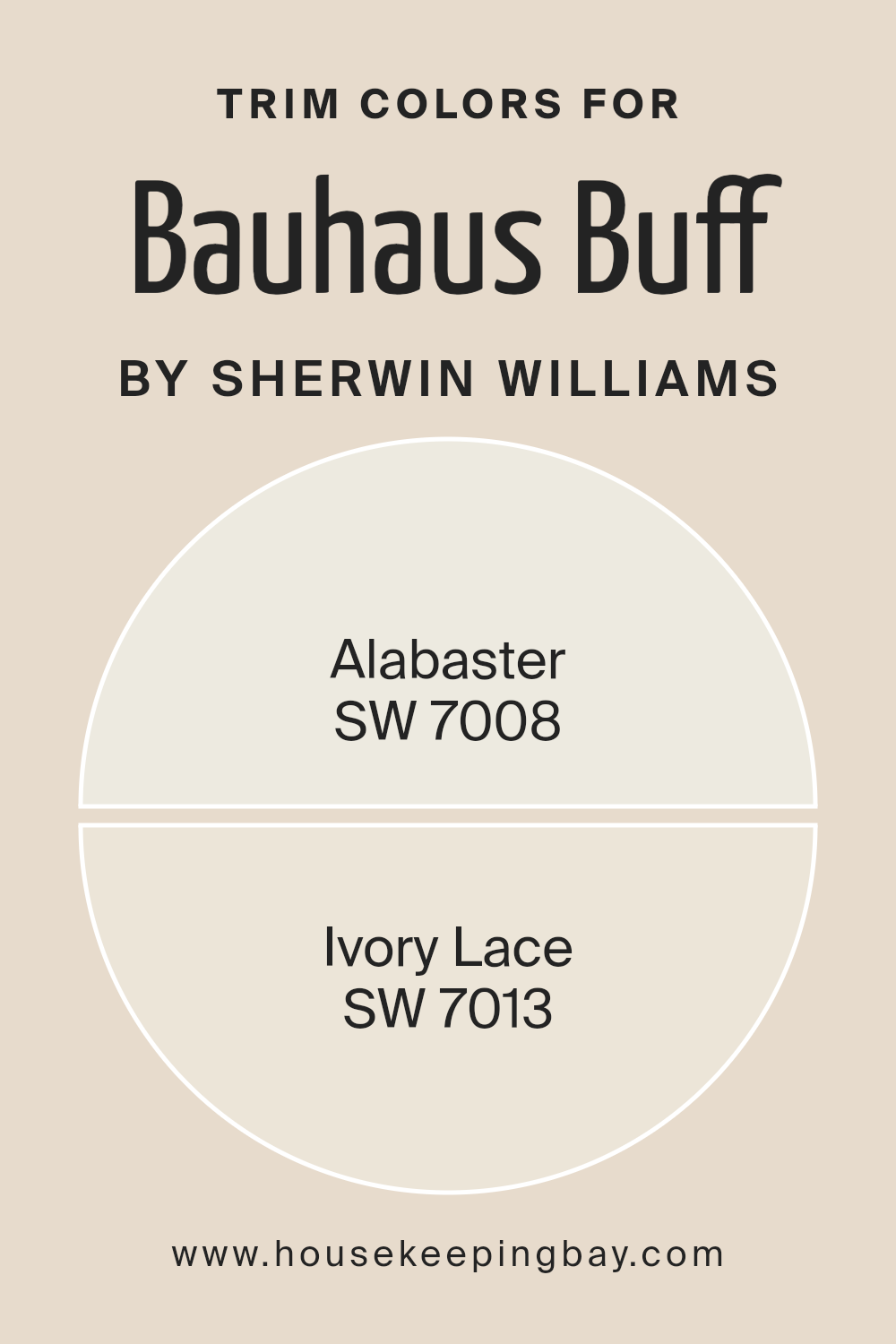
Among the trim colors that harmonize beautifully with Bauhaus Buff are SW 7008 – Alabaster and SW 7013 – Ivory Lace by Sherwin Williams. Alabaster, with its understated beauty, brings a soft, creamy brightness that can illuminate Bauhaus Buff’s warm tones, creating an ambiance of elegance and serenity.
It’s perfect for spaces seeking a subtle contrast without overwhelming the senses. On the other hand, Ivory Lace offers a slightly richer and warmer companion to Bauhaus Buff, contributing to a harmonious and inviting atmosphere. Its gentle hue complements the velvety depth of Bauhaus Buff, ensuring a sophisticated and cohesive look that is both welcoming and refined.
Together, these trim colors provide versatile options for enhancing the charm and character of Bauhaus Buff, whether the goal is to create a bold statement or a serene retreat.
You can see recommended paint colors below:
housekeepingbay.com
Colors Similar to Bauhaus Buff SW 7552 by Sherwin Williams
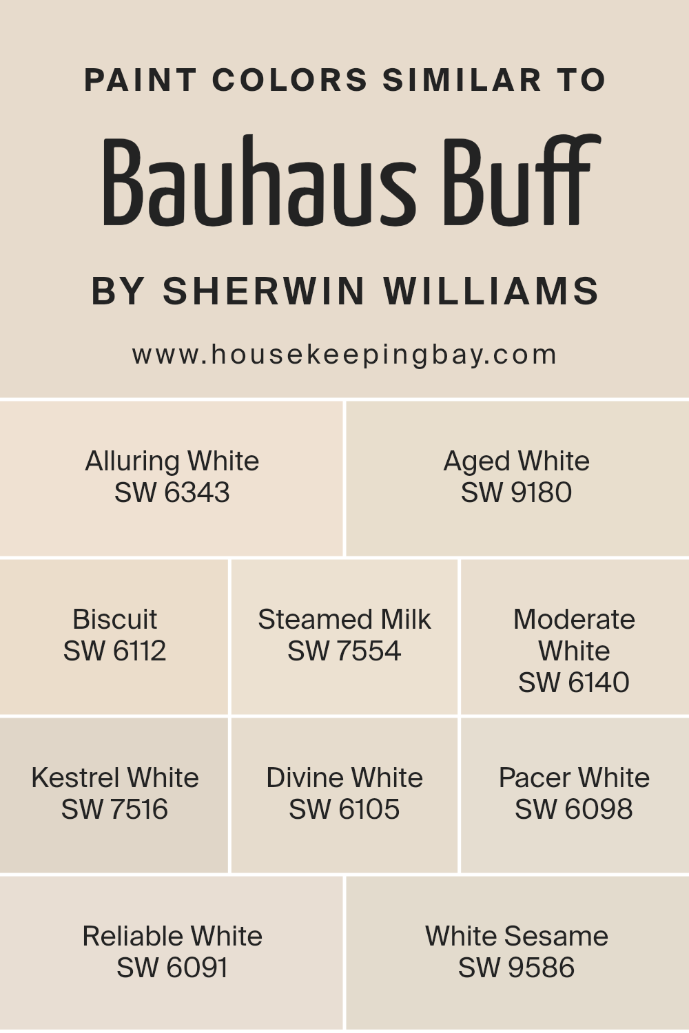
Similar colors play an essential role in interior design and decoration, offering a nuanced palette that can create depth, enhance aesthetics, and evoke specific moods or atmospheres within a space. Colors similar to Bauhaus Buff SW 7552 by Sherwin Williams, such as Alluring White SW 6343 and Aged White SW 9180, work harmoniously together because they share a common undertone, enabling designers to layer tones for a cohesive and sophisticated look.
For instance, Biscuit SW 6112 adds warmth with its creamy presence, while Steamed Milk SW 7554 offers a softer, more neutral base, making it ideal for creating a serene and welcoming environment. This continuity of hues ensures a seamless transition between spaces, enabling a fluid visual narrative throughout the home.
Moderate White SW 6140 and Kestrel White SW 7516, for example, introduce slight variations in saturation and brightness, providing flexibility in accenting architectural features or curating collections of decor. Meanwhile, Divine White SW 6105 bridges the gap between stark whites and deeper beige tones, offering a balance that is both inviting and elegant.
Pacer White SW 6098 and Reliable White SW 6091 further contribute to this palette by grounding the scheme with their subtle gravitas, while White Sesame SW 9586 injects a hint of sophistication with its understated elegance. Each color, while unique, shares a kinship with Bauhaus Buff SW 7552, ensuring that the collective palette remains cohesive, versatile, and visually appealing, thus illustrating the vital role of similar colors in creating harmonious interior spaces.
You can see recommended paint colors below:
- SW 6343 Alluring White
- SW 9180 Aged White
- SW 6112 Biscuit
- SW 7554 Steamed Milk
- SW 6140 Moderate White
- SW 7516 Kestrel White
- SW 6105 Divine White
- SW 6098 Pacer White
- SW 6091 Reliable White
- SW 9586 White Sesame
housekeepingbay.com
How to Use Bauhaus Buff SW 7552 by Sherwin Williams In Your Home?
Bauhaus Buff SW 7552 by Sherwin Williams is a subtle yet exquisite paint color that belongs to the Timeless White collection, reflecting an elegant blend of warmth and neutrality. This shade exhibits a comforting softness and an understated elegance, making it an ideal choice for creating serene and welcoming spaces within the home. Its versatile nature allows it to seamlessly adapt to various design aesthetics, from modern minimalist to cozy traditional.
When considering Bauhaus Buff for your home, think of it as a canvas offering endless possibilities. It’s perfect for living rooms, bedrooms, or kitchens, providing a fresh, airy feel, enhancing the sense of space and light.
This color pairs beautifully with bolder accents or soft pastels, allowing personal touches and decorative elements to stand out. Use it on walls to forge a calm and collected ambiance or as a backdrop for art, where it compliments rather than competes. For a cohesive look, extend this color to trim, molding, and ceilings, creating a seamless transition throughout your space. Bauhaus Buff is more than just paint; it’s a step towards crafting a home that embodies tranquility and timeless grace.
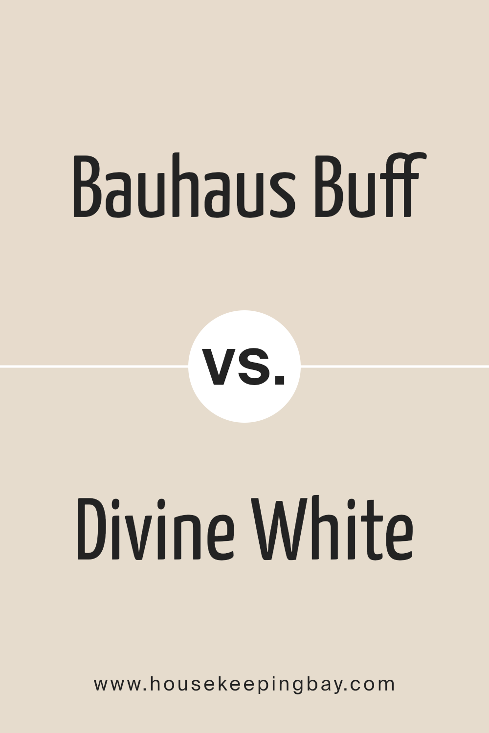
Bauhaus Buff SW 7552 by Sherwin Williams vs Divine White SW 6105 by Sherwin Williams
Bauhaus Buff SW 7552 and Divine White SW 6105 by Sherwin Williams are two nuanced shades that cater to elegant and understated interior palettes. Bauhaus Buff is characterized by its warm, creamy undertone that exudes a sense of comfort and sophistication.
This color resembles the soft hue of natural limestone, offering a solid foundation for both contemporary and traditional designs. In contrast, Divine White SW 6105 leans towards a softer, more delicate presence. It embodies a gentle, almost ethereal quality, with a whisper of warmth that prevents it from becoming stark or cold.
This makes Divine White an excellent choice for spaces aiming for a light, airy feel, while still maintaining a touch of warmth. When comparing the two, Bauhaus Buff presents as the richer, deeper option, ideal for creating cozy environments, whereas Divine White provides a clean, serene backdrop, suitable for enhancing natural light and making spaces appear more open and inviting.
Together, these colors could harmonize beautifully, with Bauhaus Buff adding depth and Divine White offering a refreshing contrast.
You can see recommended paint color below:
housekeepingbay.com
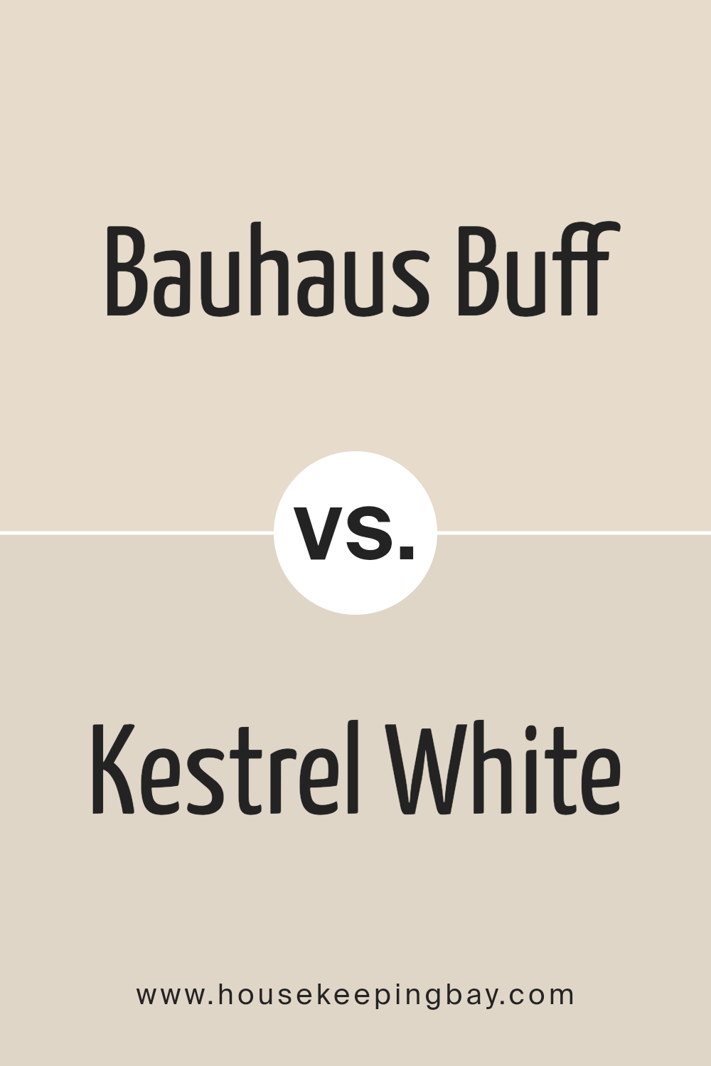
Bauhaus Buff SW 7552 by Sherwin Williams vs Kestrel White SW 7516 by Sherwin Williams
Bauhaus Buff SW 7552 and Kestrel White SW 7516, both by Sherwin Williams, stand as classic, neutral shades that bring warmth and versatility to spaces. Bauhaus Buff is a warm, gentle beige, with an inviting sophistication that makes rooms feel cozy yet spacious. It pairs beautifully with both bold and soft color palettes, acting as a solid background that allows furniture and art to stand out. Its depth provides a more pronounced presence in a room compared to paler neutrals, creating a serene and welcoming ambiance.
Kestrel White SW 7516, on the other hand, is a soft, creamy white with slight gray undertones. This color is perfect for creating a bright, airy feel in any space, reflecting natural light beautifully and making rooms appear larger. Kestrel White offers a subtle elegance and is more of a neutral backdrop, promoting a sense of calm and cleanliness. It’s particularly effective in spaces that aim for a minimalist, understated aesthetic, as it effortlessly complements a wide range of decors.
Both colors have their unique charm; Bauhaus Buff brings warmth and depth, while Kestrel White introduces lightness and a crisp, clean feel. Depending on the ambiance one wishes to create, each color offers distinct advantages, making them favorite choices for designers seeking versatility and timeless appeal.
You can see recommended paint color below:
housekeepingbay.com
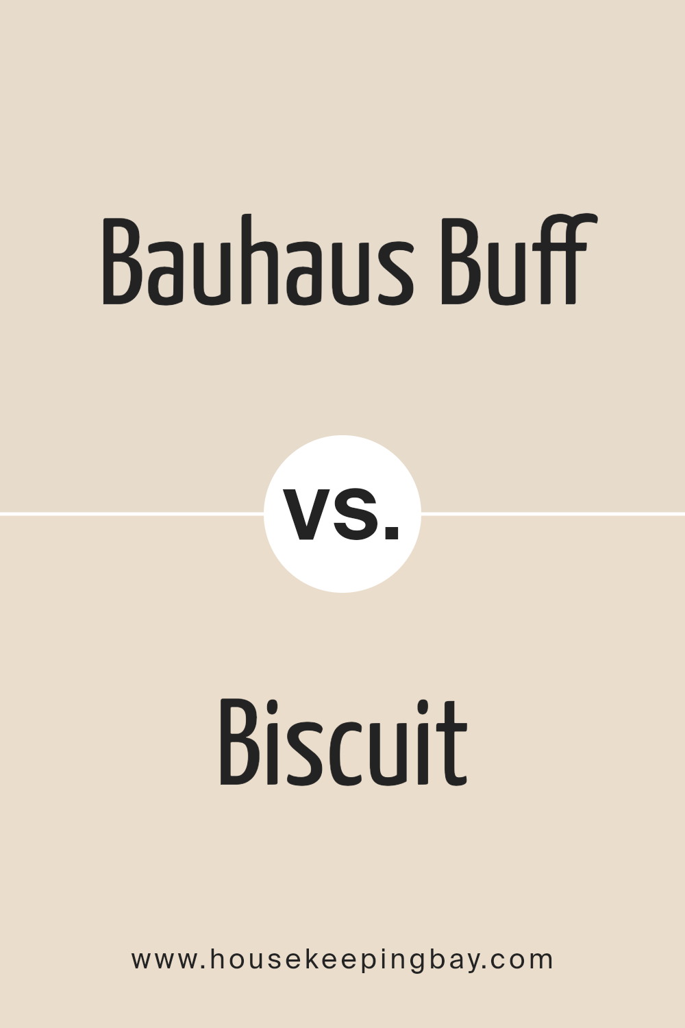
Bauhaus Buff SW 7552 by Sherwin Williams vs Biscuit SW 6112 by Sherwin Williams
Bauhaus Buff SW 7552 and Biscuit SW 6112, both by Sherwin Williams, are warm, inviting neutral hues that bring a sense of calm and elegance to spaces. Bauhaus Buff is a subdued, creamy beige with a slightly yellow undertone, offering a hint of warmth that makes a room feel cozy yet spacious. It emanates a soft glow in well-lit areas, making it ideal for living rooms and bedrooms where a soothing ambiance is desired.
Biscuit SW 6112, on the other hand, leans towards a richer, deeper beige with a touch of earthiness in its undertone. This color brings a more pronounced warmth to spaces, making it perfect for creating a welcoming and comfortable environment. It stands out in areas with natural light, giving depth and character to walls without overwhelming the senses.
While both colors share a neutral palette, Bauhaus Buff is lighter and more muted, offering a subtle backdrop for rooms. Biscuit, with its slightly deeper tone, provides a stronger presence and can anchor a room with its warmth. Both are versatile choices for a variety of decorating schemes, but the choice between them depends on the desired level of warmth and the specific ambiance one aims to create.
You can see recommended paint color below:
housekeepingbay.com
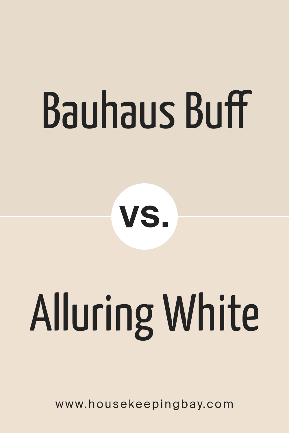
Bauhaus Buff SW 7552 by Sherwin Williams vs Alluring White SW 6343 by Sherwin Williams
“Bauhaus Buff SW 7552” and “Alluring White SW 6343” by Sherwin Williams are both subtle and sophisticated colors that bring warmth and light into any space, yet they each offer distinct undertones and ambiance. Bauhaus Buff is a soft, creamy beige that exudes a serene and inviting warmth, making it perfect for creating a cozy yet refined atmosphere.
Its gentle hue pairs beautifully with a wide range of colors, offering a versatile backdrop for both modern and traditional décors. On the other hand, Alluring White is a delicate, warm white with a slightly creamy undertone. It radiates a subtle luminosity, making spaces appear brighter and more spacious.
Compared to Bauhaus Buff, Alluring White serves as a neutral base that highlights other colors, providing a fresh and clean canvas for artwork and furnishings to stand out. While both colors promote a sense of calm and elegance, Bauhaus Buff leans towards a richer, more pronounced warmth, whereas Alluring White offers a minimalist, airy feel.
You can see recommended paint color below:
- SW 6343 Alluring White
housekeepingbay.com
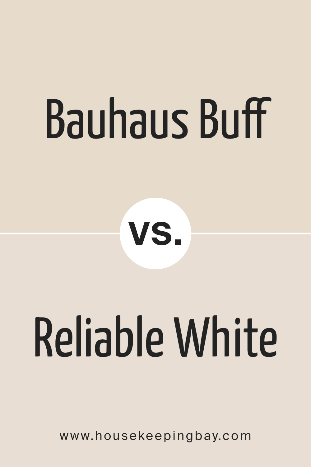
Bauhaus Buff SW 7552 by Sherwin Williams vs Reliable White SW 6091 by Sherwin Williams
Bauhaus Buff SW 7552 and Reliable White SW 6091, both from Sherwin-Williams, present a fascinating study in subtle, nuanced color variations that can dramatically influence the mood and aesthetic of a space. Bauhaus Buff is a warm, inviting hue with a creamy undertone that offers a sense of comfort and understated elegance.
This color exudes a soft, welcoming ambiance, making it ideal for living spaces that aim for a cozy, yet sophisticated feel. Its depth provides a soothing backdrop that complements a wide range of decor styles, from traditional to contemporary.
On the other hand, Reliable White SW 6091 leans towards a clean, pure essence, with a neutral base that infuses spaces with brightness and an airy feel. It is the quintessence of simplicity, offering a fresh, crisp foundation that can either stand alone for a minimalist aesthetic or serve as a contrast to bold accents. Reliable White is exceptionally versatile, suitable for creating a bright, open feel in smaller spaces or adding a refreshing clarity in well-lit environments.
Together, Bauhaus Buff and Reliable White illustrate how subtle shifts in tone and temperature can define the character of a room, either by using them in conjunction to balance warmth and light or choosing one to set a specific mood and style.
You can see recommended paint color below:
- SW 6091 Reliable White
housekeepingbay.com
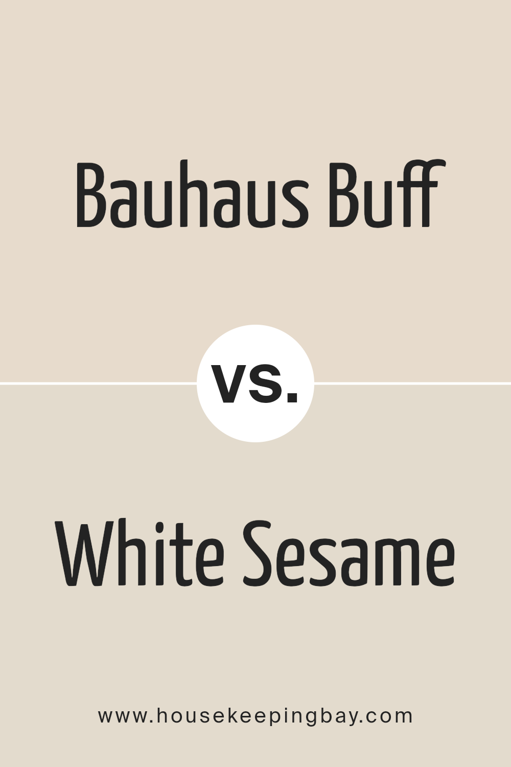
Bauhaus Buff SW 7552 by Sherwin Williams vs White Sesame SW 9586 by Sherwin Williams
Bauhaus Buff SW 7552 and White Sesame SW 9586, both by Sherwin-Williams, exhibit subtle yet distinct characteristics that cater to different aesthetic preferences and design needs. Bauhaus Buff embodies a warm, welcoming vibe with its rich, creamy undertone, providing a sense of comfort and elegance. This color is versatile, making it perfect for creating a cozy environment in living spaces or adding a sophisticated touch to bedrooms and dining areas. Its warmth promotes a serene and inviting atmosphere, suitable for various decor styles, from rustic to modern minimalist.
Conversely, White Sesame SW 9586 presents a lighter, airier feel, with a delicate balance of warmth, thanks to its soft, almost ethereal quality. This color leans towards a neutral palette, offering a clean and crisp backdrop that enhances natural light in a room. It’s particularly effective in smaller spaces or areas with limited natural light, as it can visually expand the space and impart a fresh, open feel.
While both colors share a warmth that can seamlessly integrate into multiple design schemes, Bauhaus Buff offers depth and coziness, contrasting with the light and breezy essence of White Sesame. Their distinct qualities suggest Bauhaus Buff for those seeking a more robust, inviting ambiance, whereas White Sesame is ideal for creating a subtle, uplifting, and spacious environment.
You can see recommended paint color below:
housekeepingbay.com
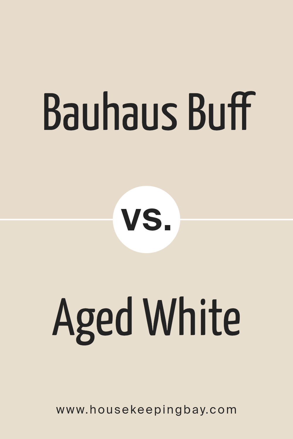
Bauhaus Buff SW 7552 by Sherwin Williams vs Aged White SW 9180 by Sherwin Williams
Bauhaus Buff SW 7552 and Aged White SW 9180, both by Sherwin-Williams, are creamy, warm whites that beautifully encapsulate a sense of tranquility and timeless elegance. Bauhaus Buff leans towards a soft, beige palette, imbuing spaces with a warm, inviting glow that captures the essence of minimalist sophistication. Its subtle undertones make it versatile for a variety of decor styles, enhancing natural light and creating a cozy atmosphere.
On the other hand, Aged White SW 9180 has a slightly deeper, richer tone, verging on the cusp of beige and off-white. This hue exudes a vintage charm, reminiscent of heritage homes and antique linens, bringing a sense of warmth and lived-in comfort to interiors. Its depth offers an excellent backdrop for both traditional and contemporary spaces, providing a solid foundation for textures and patterns to flourish.
While both colors share a warm, neutral base, Bauhaus Buff’s lighter, airier presence contrasts with the more grounded, nostalgic vibe of Aged White. Whether used individually or in tandem, these shades offer a harmonious palette for creating serene and welcoming environments.
You can see recommended paint color below:
housekeepingbay.com
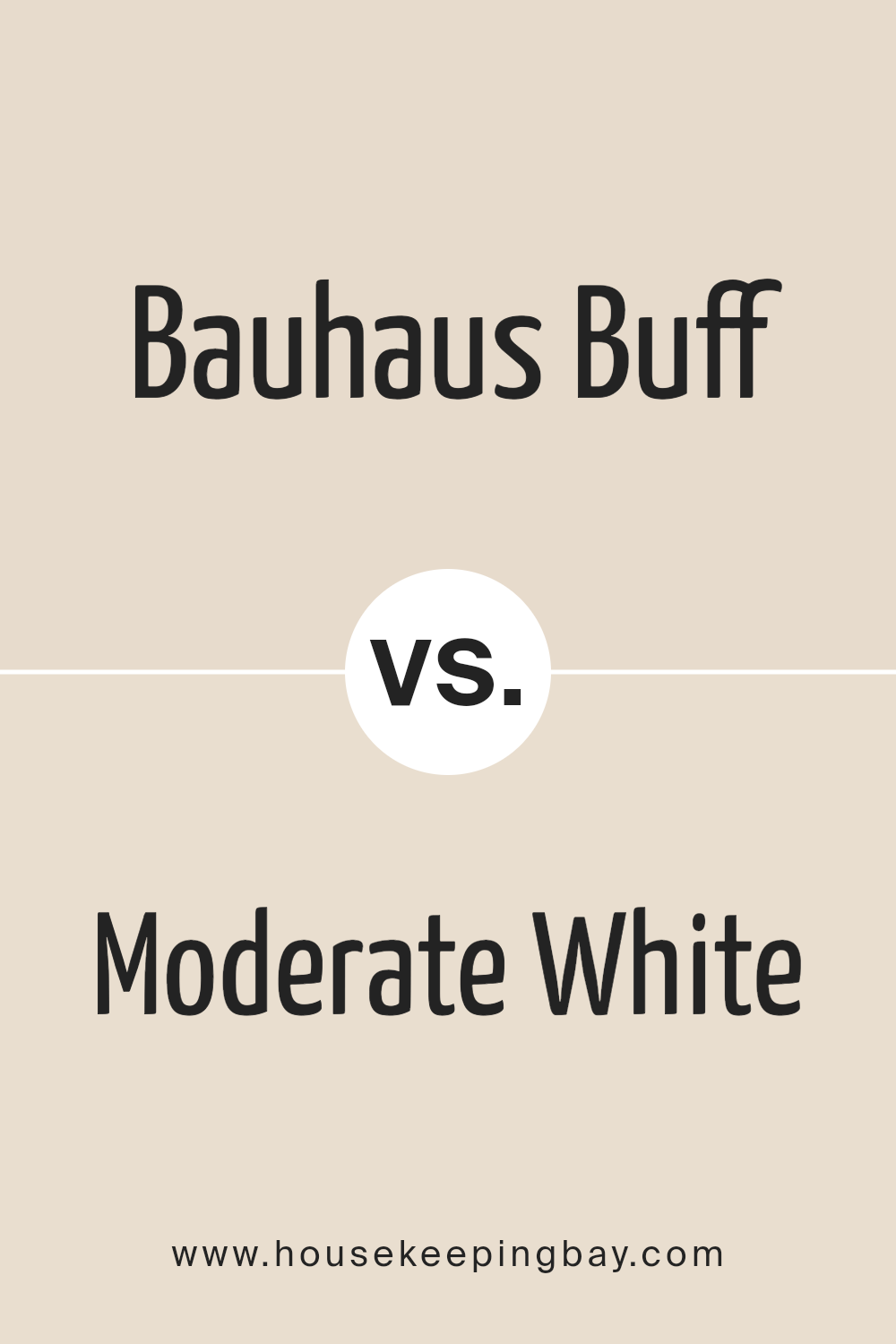
Bauhaus Buff SW 7552 by Sherwin Williams vs Moderate White SW 6140 by Sherwin Williams
Bauhaus Buff SW 7552 and Moderate White SW 6140, both by Sherwin Williams, occupy spaces within the neutral palette, each exuding a serene and versatile character, yet they impart a distinct mood and depth when applied to interiors. Bauhaus Buff is a warm, inviting hue that carries a hint of beige, offering a cozy atmosphere that feels both refined and welcoming. This color is adept at creating an elegant backdrop that complements a wide array of decor styles, from modern minimalism to classic traditional, enhancing the warmth in spaces without overwhelming with color.
Moderate White SW 6140, on the other hand, leans towards a softer, more subdued presence. It’s a lighter, almost ethereal neutral with a base that subtly blends warm and cool undertones, making it an excellent choice for spaces aiming for a brighter, airier feel. When used in well-lit spaces, Moderate White can expand the perception of space and light, lending an understated sophistication.
Though similar in their neutrality, Bauhaus Buff offers warmth and depth, making spaces feel grounded and enveloping, while Moderate White brings an open, luminous quality that elevates the sense of openness and light in any room. Each color, with its unique character, can dramatically influence the ambiance and aesthetic of a space, in alignment with personal style and design goals.
You can see recommended paint color below:
housekeepingbay.com
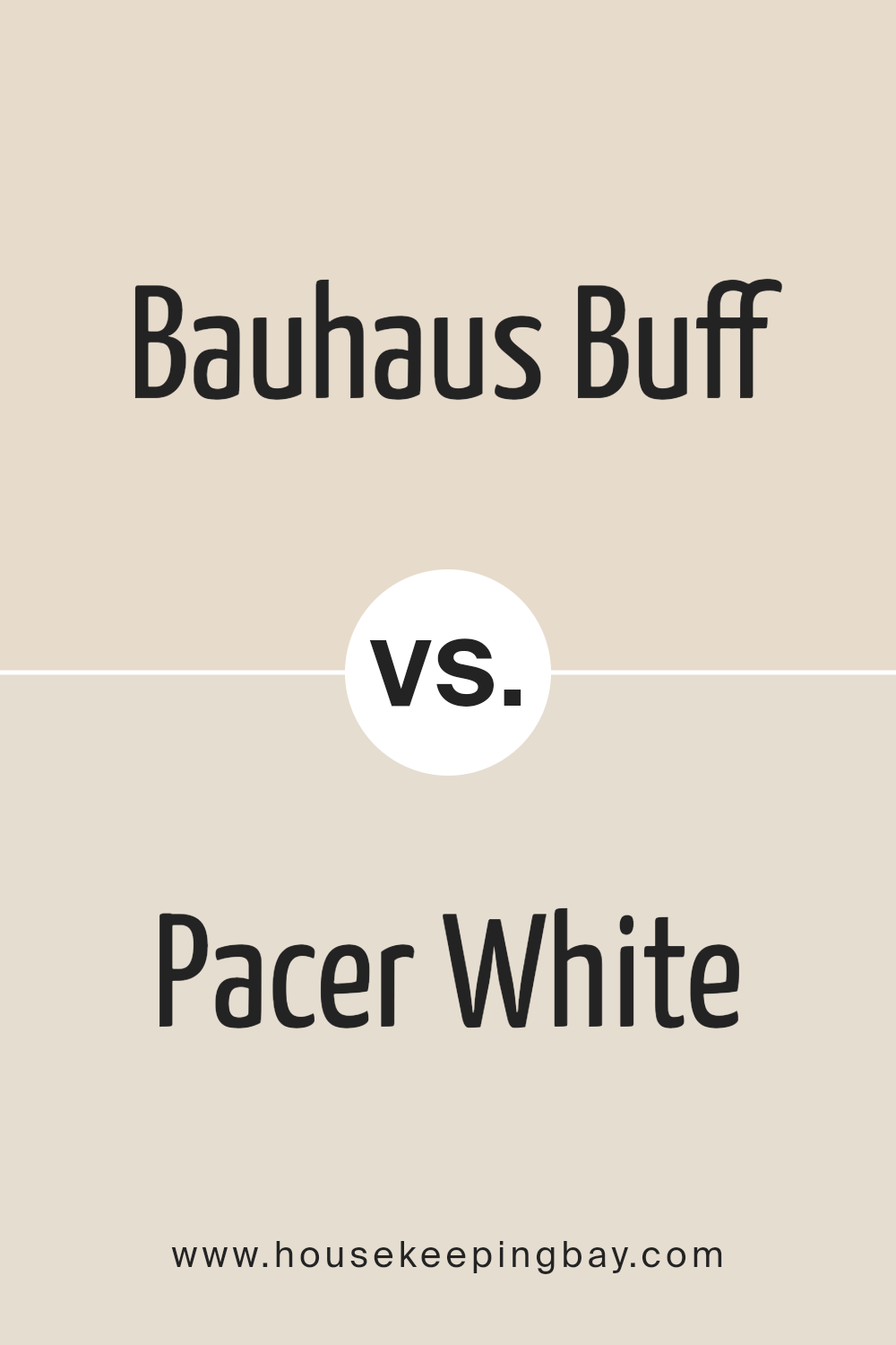
Bauhaus Buff SW 7552 by Sherwin Williams vs Pacer White SW 6098 by Sherwin Williams
Bauhaus Buff SW 7552 and Pacer White SW 6098, both by Sherwin Williams, present subtle yet distinct differences that cater to various design needs. Bauhaus Buff is a warm, inviting hue with an earthy undertone, encapsulating a sense of coziness and calmness that is versatile enough for any space. Its gentle beige tone offers a neutral backdrop that complements a wide range of decor styles, from contemporary to traditional, adding a touch of elegance without overwhelming the senses.
On the other hand, Pacer White SW 6098 leans towards a soft, off-white palette with a hint of warmth, making it an excellent choice for creating a bright, airy feel in a room. This color reflects natural light beautifully, enhancing the sense of space and openness in smaller or darker rooms. Its subtle warmth makes it more approachable than a stark white, providing a comfortable and inviting atmosphere.
While both colors promote a sense of tranquility and lightness, Bauhaus Buff introduces a richer, deeper warmth, whereas Pacer White offers a cleaner, crisper background. Choosing between them depends on the desired ambiance; for a cozier, grounded environment, Bauhaus Buff is ideal, while Pacer White suits those seeking to maximize light and create an illusion of more space.
You can see recommended paint color below:
housekeepingbay.com
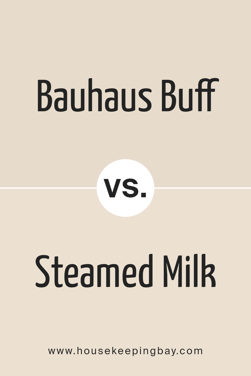
Bauhaus Buff SW 7552 by Sherwin Williams vs Steamed Milk SW 7554 by Sherwin Williams
Bauhaus Buff SW 7552 and Steamed Milk SW 7554, both by Sherwin Williams, are creamy, warm-toned neutrals, but they differ subtly in hue and ambiance. Bauhaus Buff presents a slightly deeper, more saturated creamy beige, evoking a sense of solidity and earthiness. This color can offer a room a strong sense of warmth and grounding, making spaces feel more intimate and cozy. It’s particularly suitable for areas where a touch of elegance and a more pronounced color presence are desired without veering too far from neutral.
On the other hand, Steamed Milk, with its lighter, almost ethereal quality, is the softer of the two. It provides a more subdued, airy feel, making it perfect for spaces intended to be light, open, and relaxing. Steamed Milk can help to brighten a room while still maintaining a warm, inviting atmosphere. It’s excellent for creating an illusion of a more spacious area, working well in smaller rooms or spaces with limited natural light.
In essence, while both colors share a warm neutral base, Bauhaus Buff leans towards a stronger, more assertive hue, and Steamed Milk offers a gentler, more rejuvenating feel.
You can see recommended paint color below:
housekeepingbay.com
Conclusion
Derived from the essence of the Bauhaus design movement, Bauhaus Buff SW 7552 by Sherwin Williams encapsulates the ethos of simplicity, functionality, and beauty in design, translated into a paint color that brings warmth and understated elegance to any space.
This carefully crafted hue embodies the timeless principles of the Bauhaus movement, blending seamlessly with various interior themes, from minimalist to contemporary, bringing a touch of sophistication and a harmonious balance to environments. Its versatile nature allows it to act as both a serene backdrop and a unifying element for diverse design elements, making it a favorite among homeowners and designers alike.
The appeal of Bauhaus Buff lies in its ability to nurture a warm, inviting atmosphere while maintaining a link to the fundamental Bauhaus belief in the unity of art, craft, and technology. In the context of modern interior design, it serves as a reminder of the importance of thoughtful color selection in creating spaces that are not only aesthetically pleasing but also deeply connected to the principles of functional design.
As such, Bauhaus Buff SW 7552 stands out as more than just a color; it is a testament to the enduring legacy of the Bauhaus movement, championing simplicity, material honesty, and the blend of form and function in everyday spaces.
housekeepingbay.com
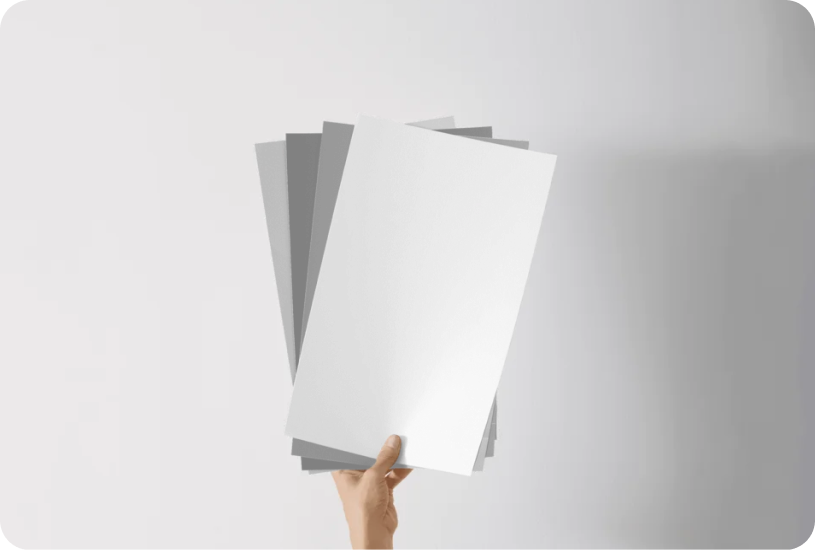
Ever wished paint sampling was as easy as sticking a sticker? Guess what? Now it is! Discover Samplize's unique Peel & Stick samples. Get started now and say goodbye to the old messy way!
Get paint samples
