Soft Sage SW 9647 Paint Color by Sherwin-Williams
A Comprehensive Guide
Painting our homes is an artistic endeavor that requires both technique and inspiration. The right color choice is vital for creating a harmonious space that resonates with our unique style. With so many shades available in the market, making a decision can be daunting.
One of the contenders that’s been catching attention lately is SW 9647 Soft Sage by Sherwin-Williams. This article delves deep into its world, understanding its nuances and helping you make an informed choice.
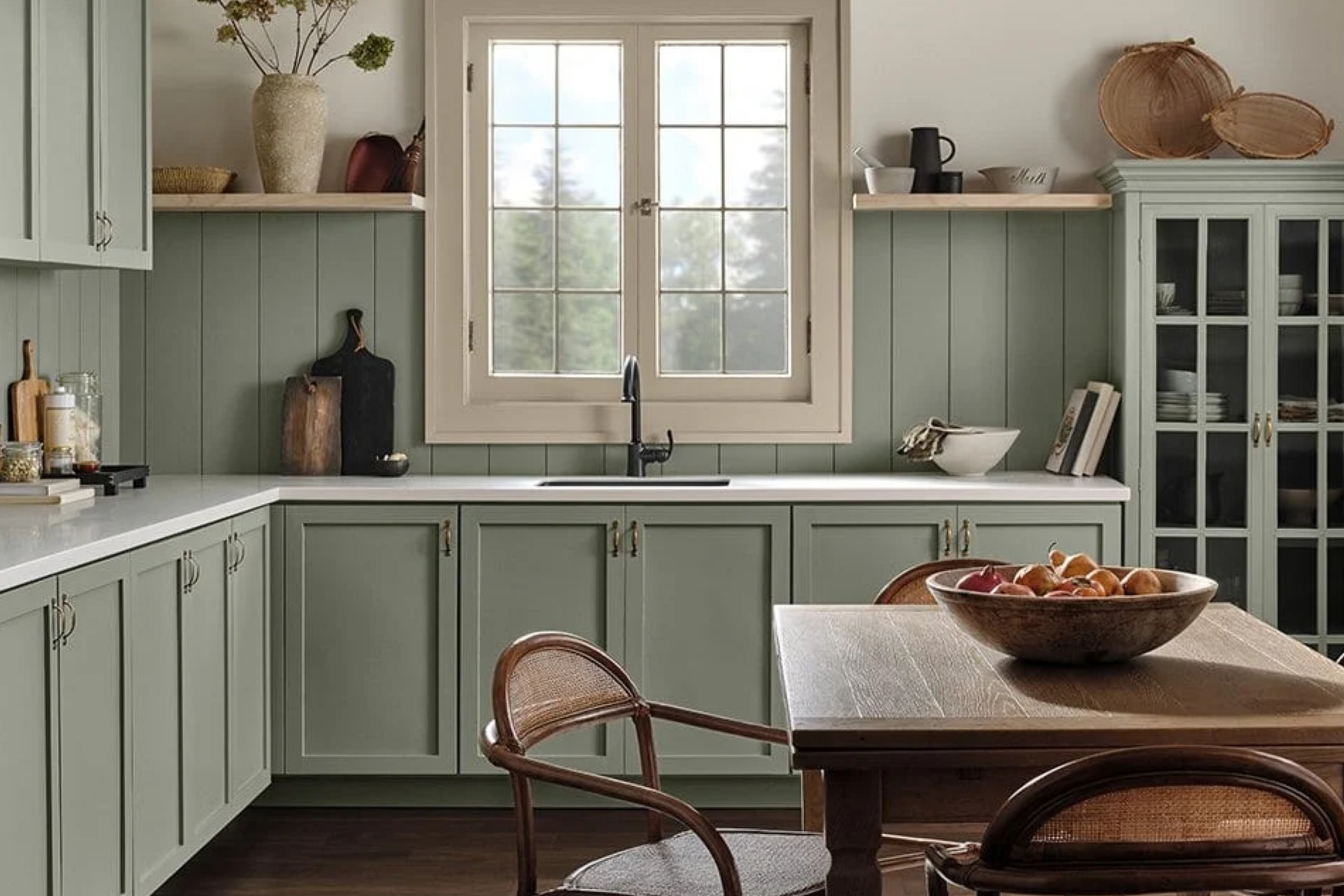
via blesser house
What Color Is SW 9647 Soft Sage?
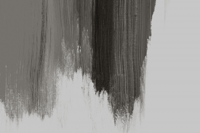
SW 9647 Soft Sage can be visualized as the gentle embrace of early morning mist against a lush meadow. This color is a delicate blend of green and grey that emanates serenity and balance. Its soft and muted tone works exceptionally well in contemporary, minimalist, and Scandinavian interior styles.
Paired with natural textures like linen, jute, and light woods, Soft Sage brings out an organic, grounded ambiance.
housekeepingbay.com
Table of Contents
Is It a Warm Or Cool Color?
SW Soft Sage, with its greenish-grey hue, tilts more towards the cool spectrum. The cool undertone brings about a calming and soothing presence. This coolness makes the color perfect for homes that wish to foster a sense of peace and tranquillity.
Undertones of SW 9647 Soft Sage
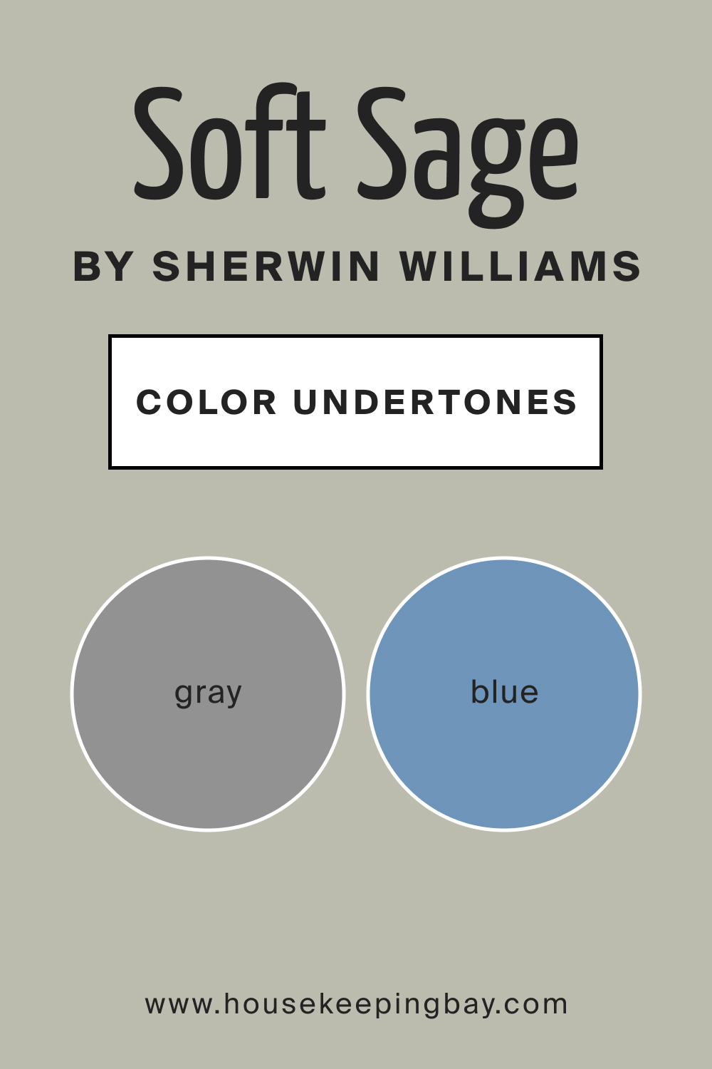
Every color boasts undertones that subtly influence how we perceive them. Soft Sage’s undertones are predominantly cool with hints of blue and grey. When painted on interior walls, these undertones can become more evident based on the room’s lighting and decor. A room with ample sunlight might accentuate the greenish undertones, while artificial lighting might bring out the grey more.
housekeepingbay.com
Coordinating Colors of SW 9647 Soft Sage
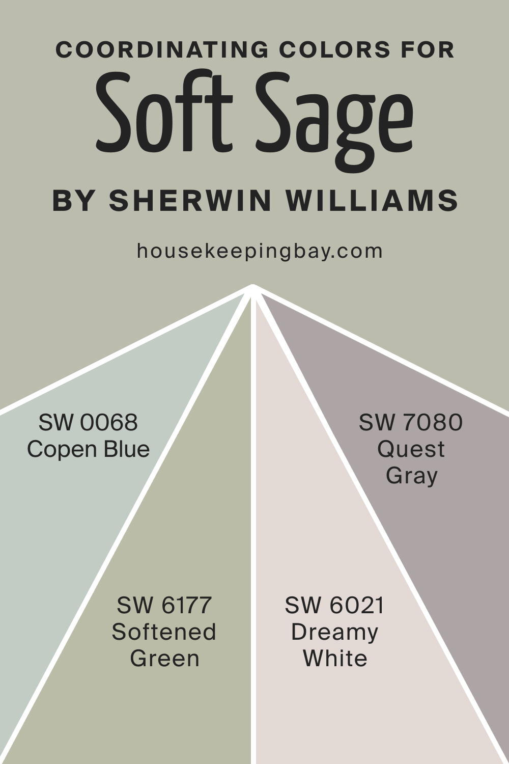
Coordinating colors are those that harmoniously complement a primary color. For SW Soft Sage, these coordinating colors include muted blues, soft lavenders, and light greys. Each of these shades plays off SW Soft Sage’s cool undertones, either contrasting or complementing its serene nature. For example, you might want to consider the following colors:
- SW 0068 Copen Blue
- SW 6177 Softened Green
- SW 6021 Dreamy White
- SW 7080 Quest Gray
housekeepingbay.com
How Does Lighting Affect SW 9647 Soft Sage?
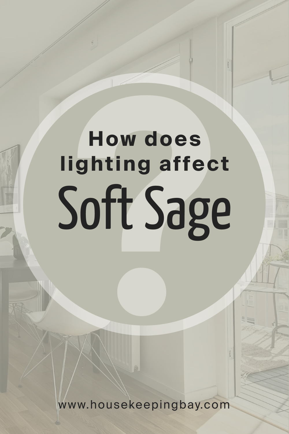
Lighting plays a crucial role in determining how we perceive color. Natural sunlight can make Soft Sage appear lighter, especially in south-faced rooms that get the most sun. In contrast, in north-faced rooms, the color might appear slightly darker and more muted.
East-facing rooms, with their morning light, would cast a soft glow on the color, while west-facing rooms, bathed in evening light, might make it look warmer than it is. Artificial lighting, depending on its type, can either accentuate its green undertones or its grey aspects.
housekeepingbay.com
LRV of SW 9647 Soft Sage
LRV, or Light Reflectance Value, is a measure of how much light a color reflects. With an LRV of 50, Soft Sage sits at the midpoint, neither absorbing too much light nor reflecting too much. This balanced LRV makes it versatile; it doesn’t darken a room or make it overly bright, maintaining a neutral ambiance.

housekeepingbay.com
What is LRV? Read it Before You Choose Your Ideal Paint Color
Trim Colors of SW 9647 Soft Sage
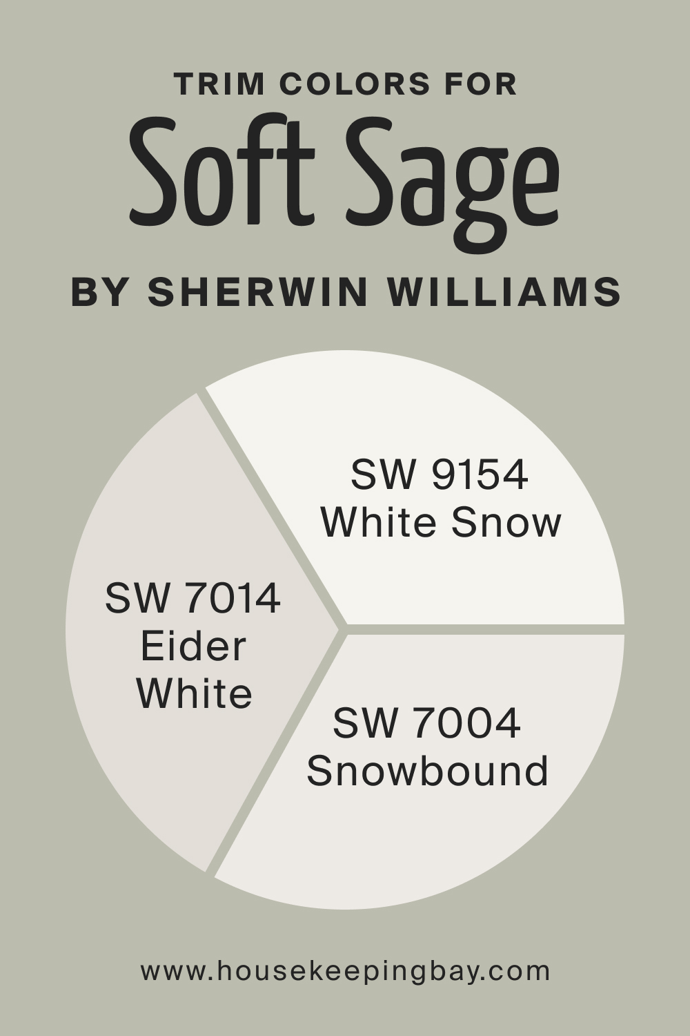
Trim colors accentuate a wall color, providing definition and contrast. With Soft Sage, light shades of white work wonders. SW 9154 White Snow has a crisp clarity to it, while SW 7014 Eider White carries a touch of grey, beautifully complementing Soft Sage’s undertones. Another recommendation would be SW 7004 Snowbound, a slightly warmer white.
housekeepingbay.com
Colors Similar to SW 9647 Soft Sage
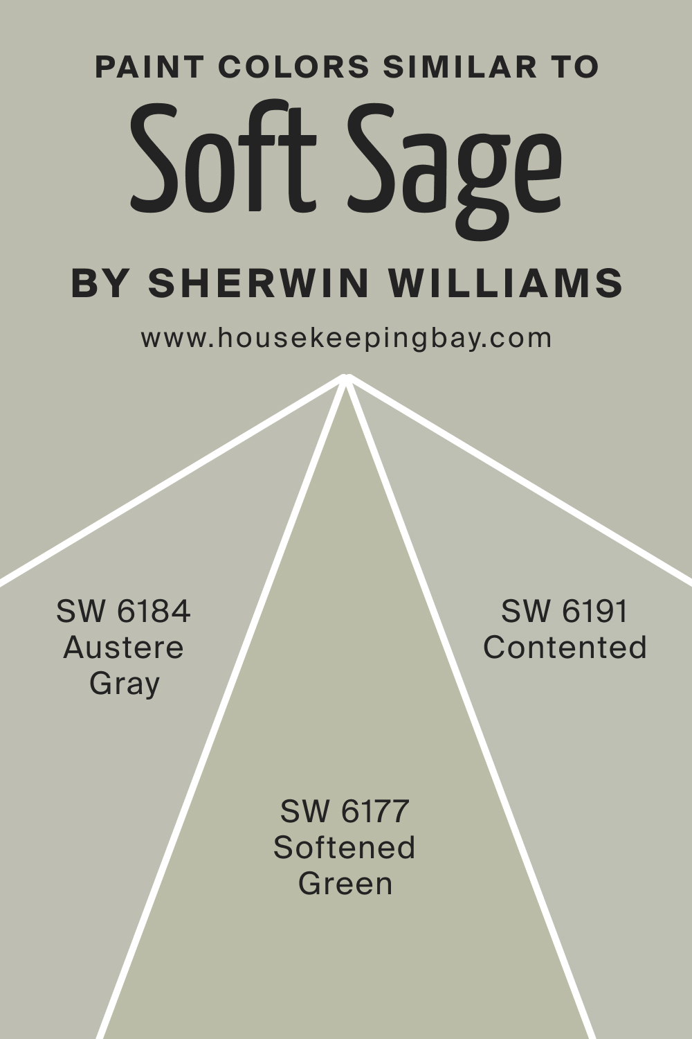
Knowing similar colors allows for flexibility in design choices. For SW Soft Sage, consider these alternative hues that read nearly the same:
- SW 6184 Austere Gray leans more into grey but has a hint of green
- SW 6191 Contented is a soothing green with grey undertones
- SW 6177 Softened Green is a lighter, more pastel shade of green, ideal for those seeking a softer touch.
housekeepingbay.com
Colors That Go With SW 9647 Soft Sage
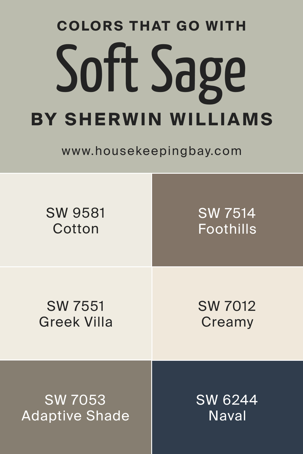
For a cohesive interior, pairing complementary colors is essential. To create a balanced palette with SW Soft Sage as the dominant color, opt for the following colors:
- SW 7514 Foothills is a rich, earthy brown;
- SW 9581 Cotton is a pristine off-white;
- SW 7551 Greek Villa brings warmth with its beige tone;
- SW 7012 Creamy is a neutral beige;
- SW 7053 Adaptive Shade is a muted grey;
- SW 6244 Naval introduces a bold navy blue.
Additional options include SW 9165 Gossamer Veil, a light grey; SW 9141 Grounded, a rich taupe; and SW 9173 Shiitake, a warm beige. Each of these colors creates a harmonious palette with Soft Sage, offering countless design possibilities.
housekeepingbay.com
How to Use SW 9647 Soft Sage In Your Home?
SW 9647 Soft Sage offers versatile aesthetics suitable for various rooms. This harmonious color can be a fitting backdrop for bedrooms, living rooms, and even exteriors, adding a touch of serenity. It’s particularly well-matched with styles like contemporary, Scandinavian, rustic, and farmhouse. Its muted elegance enhances minimalistic designs while seamlessly blending with wooden textures of rustic aesthetics.
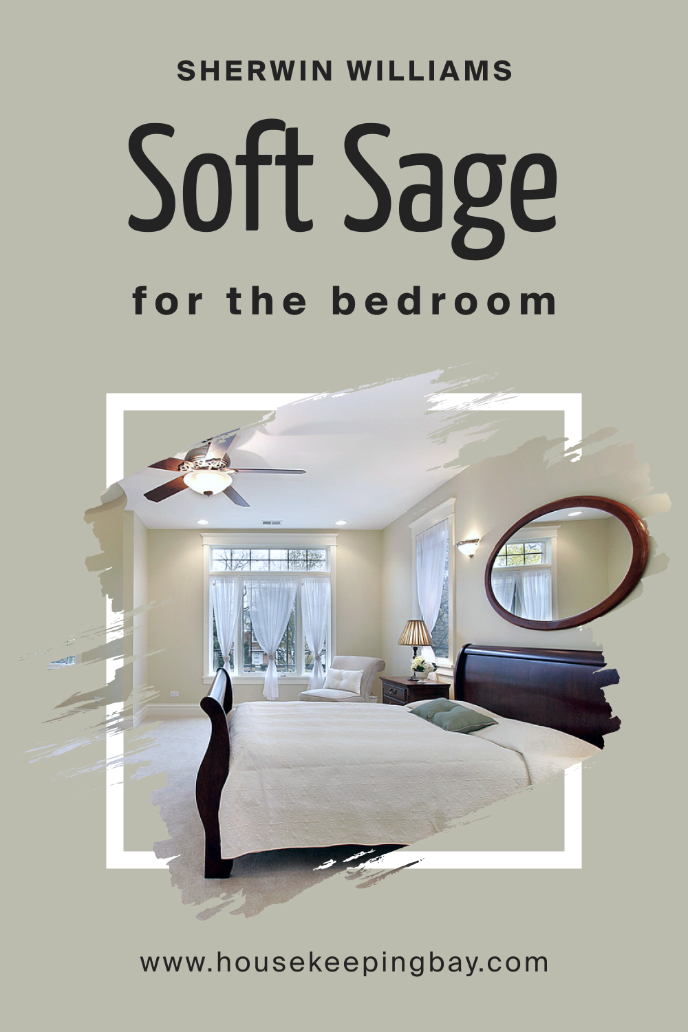
How to Use SW 9647 Soft Sage in the Bedroom?
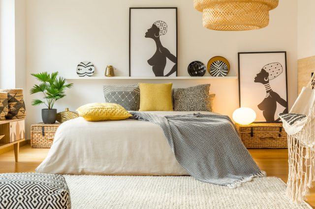
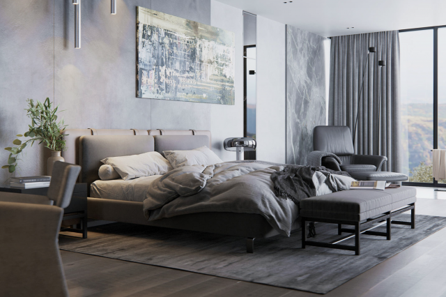
A bedroom is a sanctuary, and Soft Sage introduces a calming presence perfect for rest and rejuvenation. Pair it with soft whites for bedding and curtains. Incorporate wooden or brass accents for warmth. The result is a tranquil oasis, making one’s sleep environment feel serene and harmonious.
housekeepingbay.com
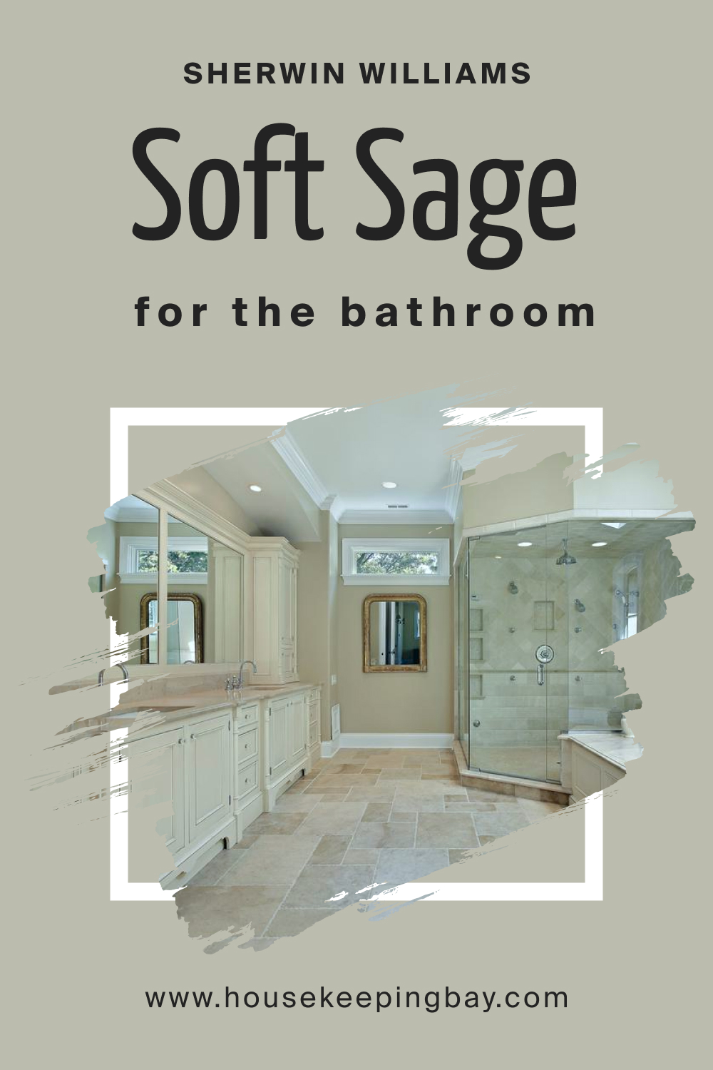
How to Use SW 9647 Soft Sage in the Bathroom?
For bathrooms, Soft Sage provides a spa-like ambiance. Paired with white or marble fixtures, it exudes clean luxury. Tiled backsplashes in muted tones can complement Soft Sage’s cool undertones. Add potted green plants and bamboo accessories for a natural, rejuvenating atmosphere.
housekeepingbay.com
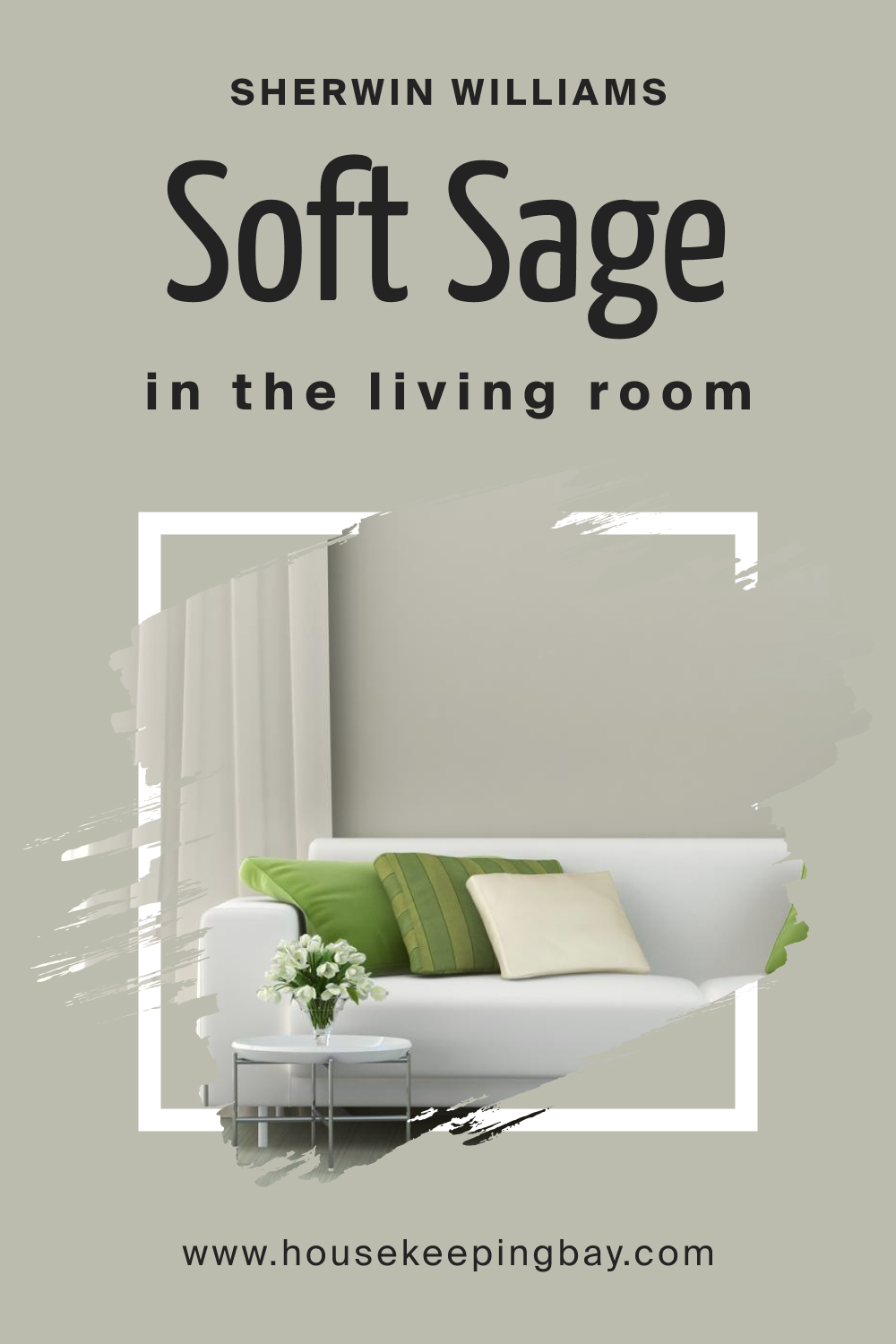
How to Use SW 9647 Soft Sage in the Living Room?
In living rooms, Soft Sage becomes a neutral canvas. It’s perfect for highlighting decorative pieces, artworks, or vibrant furniture. Blend it with greys, blues, or soft yellows for a cohesive look. Wooden furniture and green indoor plants enhance its organic appeal, making the space inviting and grounded.
housekeepingbay.com
How to Use SW 9647 Soft Sage for an Exterior?
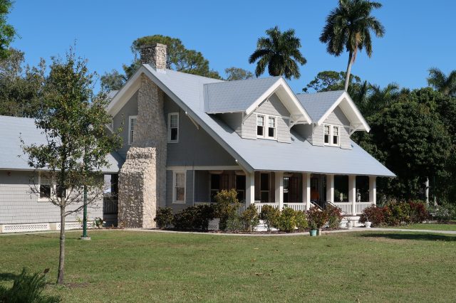
For home exteriors, Soft Sage offers timeless appeal. It merges beautifully with natural landscapes, making homes feel rooted and in harmony with their surroundings. White trims and wooden accents emphasize its beauty. The color is resilient enough to stand out yet subtle enough to blend with nature.

housekeepingbay.com
How to Use SW 9647 Soft Sage in the Kitchen?
Kitchens in Soft Sage feel fresh and invigorating. Paired with stainless steel appliances, it evokes a modern vibe. Wooden countertops or open shelves introduce warmth. For a vibrant touch, use bar stools or dishes in contrasting colors, ensuring the kitchen feels lively and dynamic.

housekeepingbay.com
How to Use SW 9647 Soft Sage for the Kitchen Cabinets?
Soft Sage cabinets become the highlight of a kitchen. They provide a muted elegance that’s both chic and functional. Brass or gold handles create a luxurious contrast. Paired with light-colored countertops and backsplashes, these cabinets stand out, making the kitchen a blend of functionality and artistry.

housekeepingbay.com
Comparing SW 9647 Soft Sage With Other Colors
Comparing colors is vital for a variety of reasons. It allows homeowners, designers, and artists to understand subtle differences and undertones that might not be initially apparent. By contrasting colors side by side, one can gauge how different hues will interact in a given space, how they might affect mood and ambiance, and how they either stand out or blend in with existing decor.
Furthermore, in understanding these comparisons, we can more intentionally design our spaces to evoke specific feelings and aesthetics.
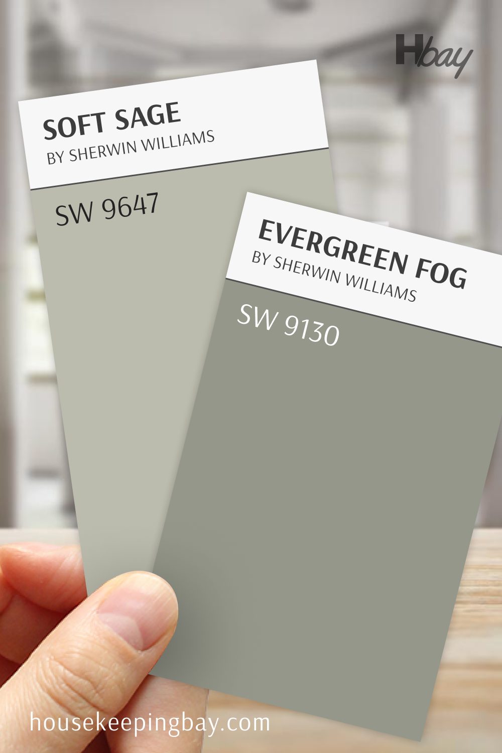
Soft Sage by Benjamin Moore vs Evergreen Fog SW 9130 by Sherwin Williams
Soft Sage and Evergreen Fog bring two unique takes on green, each offering a calm, natural feel with different undertones. Soft Sage is a light, muted green with a hint of gray that feels airy and fresh, making it ideal for rooms where you want a gentle touch of color without overwhelming the space.
Evergreen Fog, a deeper green-gray, has more earthy richness and creates a grounded, serene look. Compared to Soft Sage, it adds more depth and warmth, making it a great choice for accent walls or rooms where you want a stronger, nature-inspired statement.
Together, they offer a choice between a soft, refreshing green and a deeper, cozy green that suits a variety of spaces and styles.
housekeepingbay.com
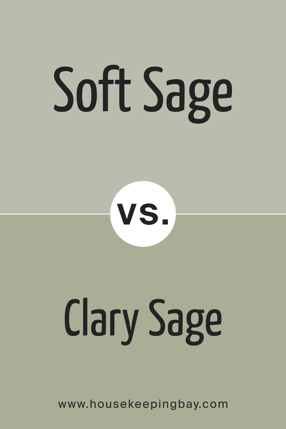
SW 9647 Soft Sage vs. SW 6178 Clary Sage
While both share the foundational ‘sage’ element, Clary Sage leans more towards a traditional green with deeper undertones. Soft Sage, on the other hand, is muted and greyer. The former offers a more botanical feel, while the latter exudes tranquility and subtlety.
housekeepingbay.com
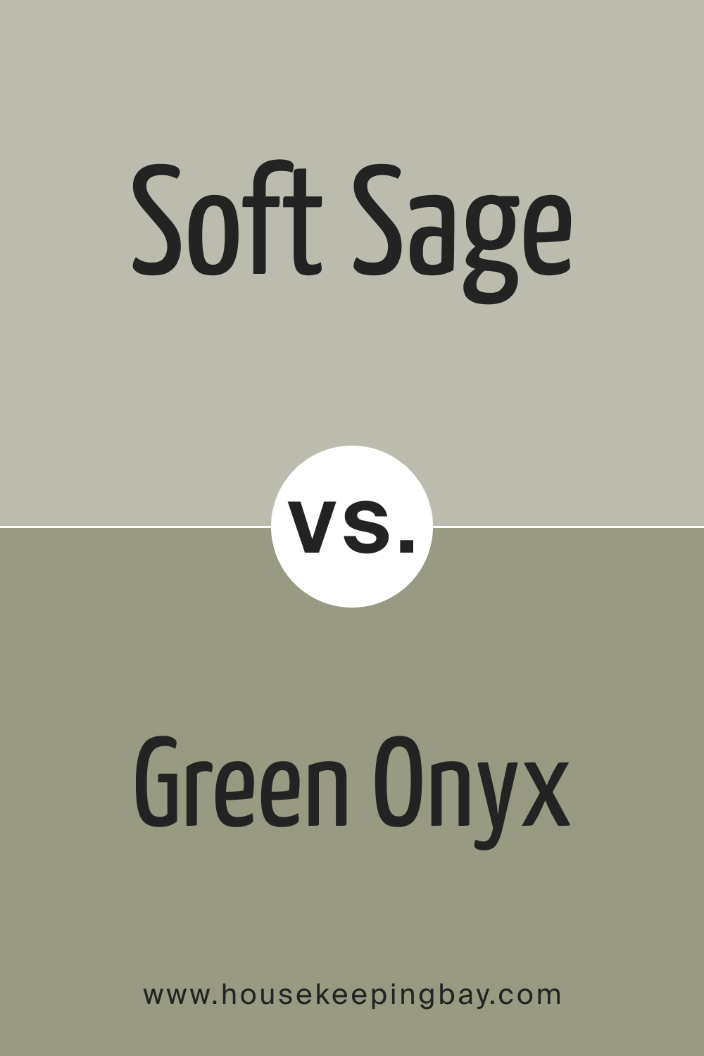
SW 9647 Soft Sage vs. SW 9128 Green Onyx
Green Onyx is a brighter, more vibrant hue with a jewel-toned quality. In contrast, Soft Sage is understated, providing a muted background. Green Onyx stands out, making bold statements in spaces, while Soft Sage works as a neutral, grounding color.
housekeepingbay.com
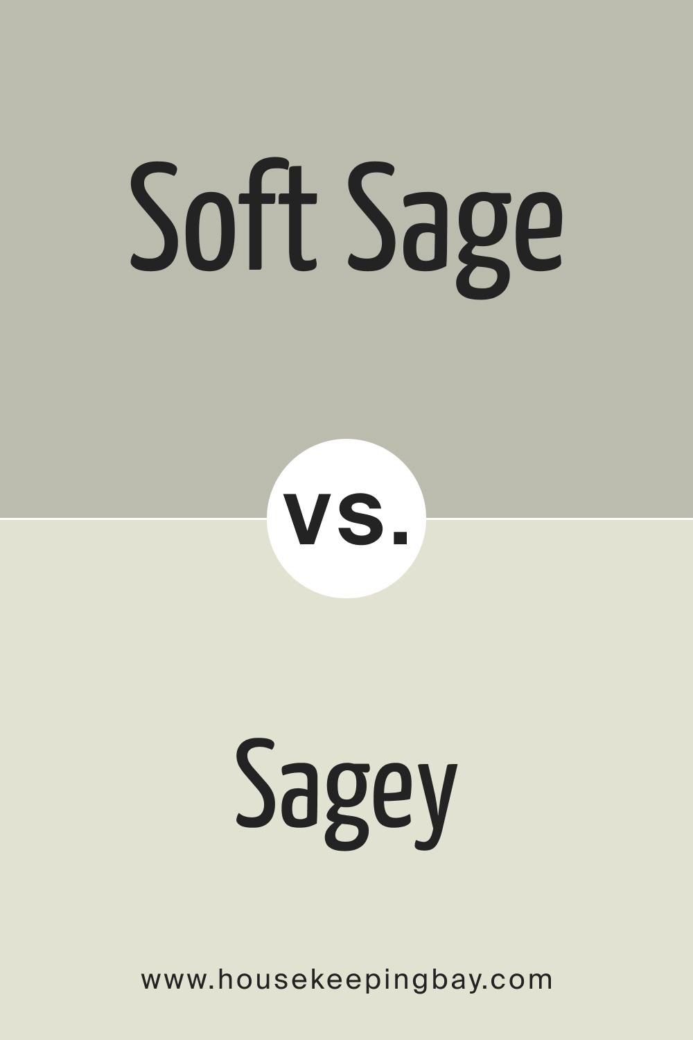
SW 9647 Soft Sage vs. SW 6175 Sagey
Sagey presents a lighter, almost pastel touch to the sage family. Its airy feel contrasts Soft Sage’s deeper, moodier tone. Sagey is ideal for spaces needing an uplifting, fresh ambiance, while Soft Sage brings depth and coziness.
housekeepingbay.com
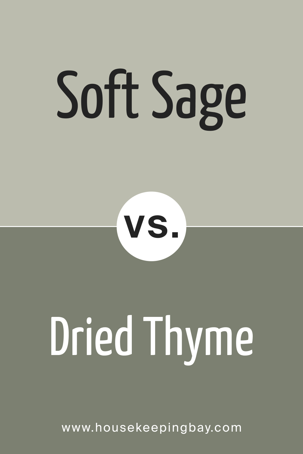
SW 9647 Soft Sage vs. SW 6168 Dried Thyme
Dried Thyme carries a rustic charm reminiscent of dried herbs in a Mediterranean kitchen. It’s earthier and browner than Soft Sage. Where Dried Thyme adds warmth and a touch of vintage, Soft Sage introduces modernity and calm.
housekeepingbay.com
SW 9647 Soft Sage vs. SW 6179 Artichoke
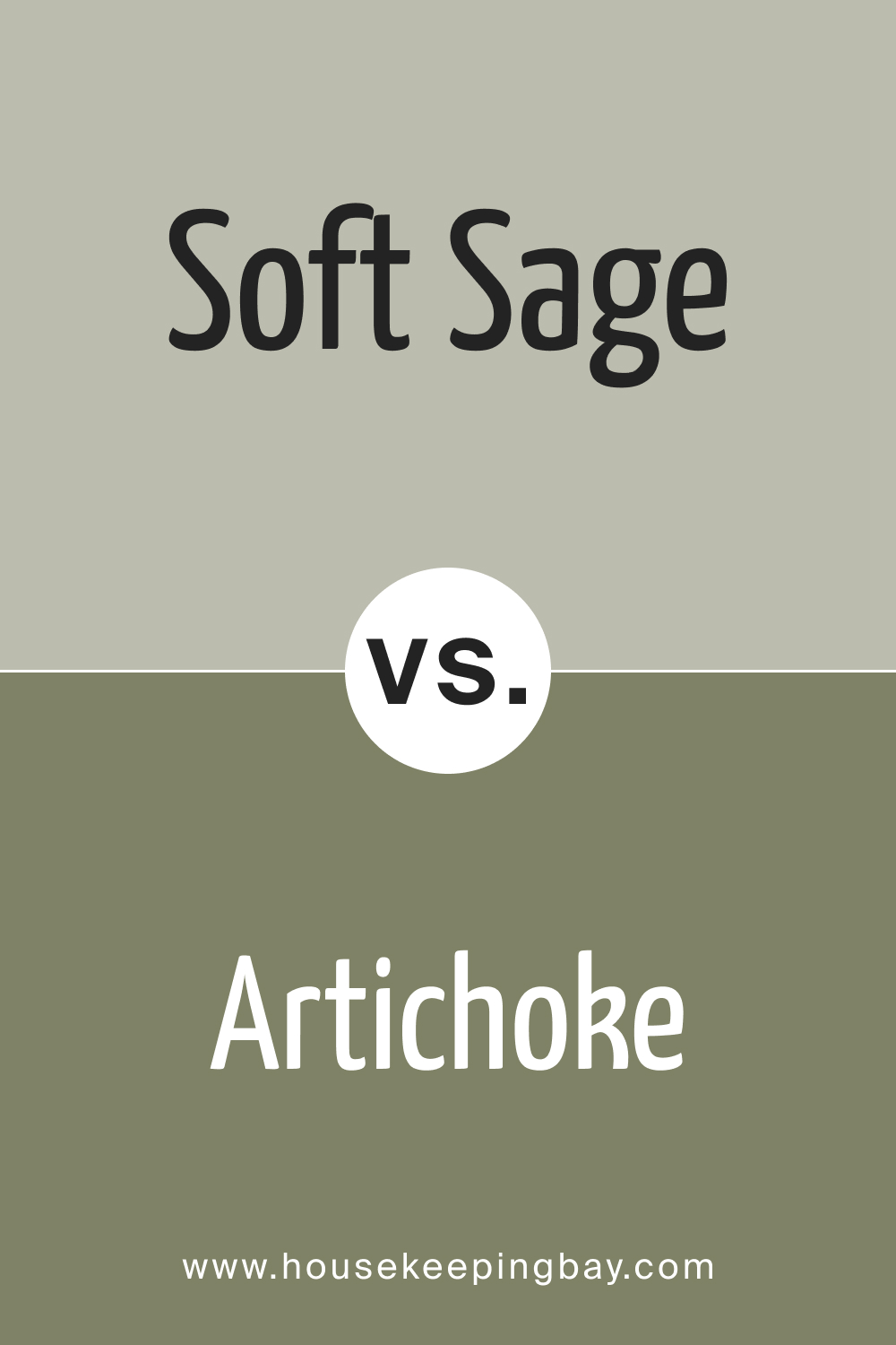
Artichoke , as the name suggests, evokes the rich, deep green of the vegetable. It’s bolder and more pronounced than Soft Sage. While Artichoke dominates a space, Soft Sage plays a more complementary role, allowing other decor elements to shine.
housekeepingbay.com
SW 9647 Soft Sage vs. SW 6164 Svelte Sage
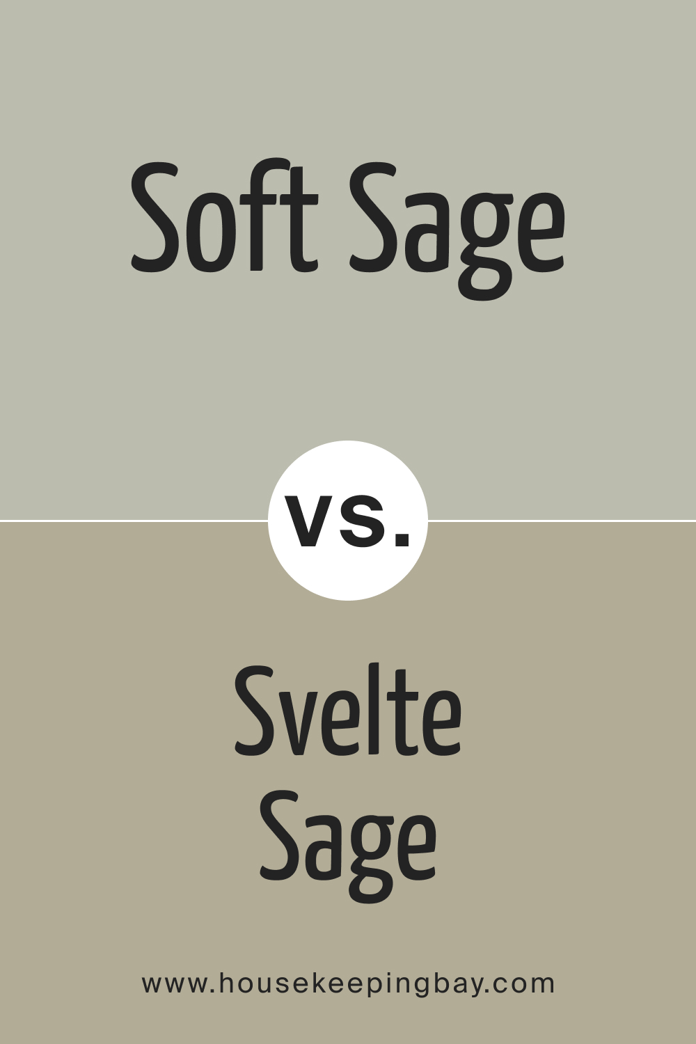
Svelte Sage is closer to Soft Sage in the spectrum but carries a slightly warmer undertone. It’s like the sunlit version of Soft Sage. Both colors provide a neutral backdrop, but Svelte Sage is a tad more invigorating, while Soft Sage is soothing.
housekeepingbay.com
Conclusion
Colors, though they may carry similar names or come from the same family, possess unique qualities. Soft Sage, with its tranquil character, stands distinct among its peers. Comparing it with other shades not only highlights its unique character but also helps in understanding its versatility and adaptability in various design scenarios.
housekeepingbay.com
Ever wished paint sampling was as easy as sticking a sticker? Guess what? Now it is! Discover Samplize's unique Peel & Stick samples. Get started now and say goodbye to the old messy way!
Get paint samples




Frequently Asked Questions
⭐What styles does SW 9647 Soft Sage best complement?
Soft Sage is versatile and complements several styles, including contemporary, Scandinavian, rustic, and farmhouse. Its muted elegance enhances minimalistic designs while seamlessly blending with wooden textures of rustic aesthetics.
⭐Is SW 9647 Soft Sage considered a warm or cool color?
SW 9647 Soft Sage leans towards the cool spectrum. It has a calming and soothing undertone, making it ideal for serene settings.
⭐Which rooms are best suited for SW 9647 Soft Sage?
This harmonious color can be a fitting backdrop for bedrooms, living rooms, bathrooms, and even exteriors. Its serene aura makes it an excellent choice for spaces where relaxation is prioritized.
⭐What trim colors pair best with SW 9647 Soft Sage?
For a harmonious look, consider trim colors like SW 9154 White Snow or SW 7014 Eider White. These shades of white complement the softness of Soft Sage, creating a balanced look.
⭐Are there any similar colors to SW 9647 Soft Sage by Sherwin-Williams?
Yes, some colors that come close include SW 6184 Austere Gray, SW 6191 Contented, and SW 6177 Softened Green.
4 thoughts on “Soft Sage SW 9647 Paint Color by Sherwin-Williams”
Leave a Reply



Can this color be used for exteriors?
Absolutely! Soft Sage offers a timeless appeal for exteriors, blending well with natural landscapes. Using white trims can emphasize its beauty further.
Has anyone tried Soft Sage in a home office?
I recently painted my home office with Soft Sage, and it’s been wonderful. The cool undertones make the space feel calm and focused, perfect for long work hours. Paired it with white office furniture, and the room feels bright yet tranquil.