Oat Milk SW 9501 Paint Color by Sherwin-Williams
A Comprehensive Color Guide
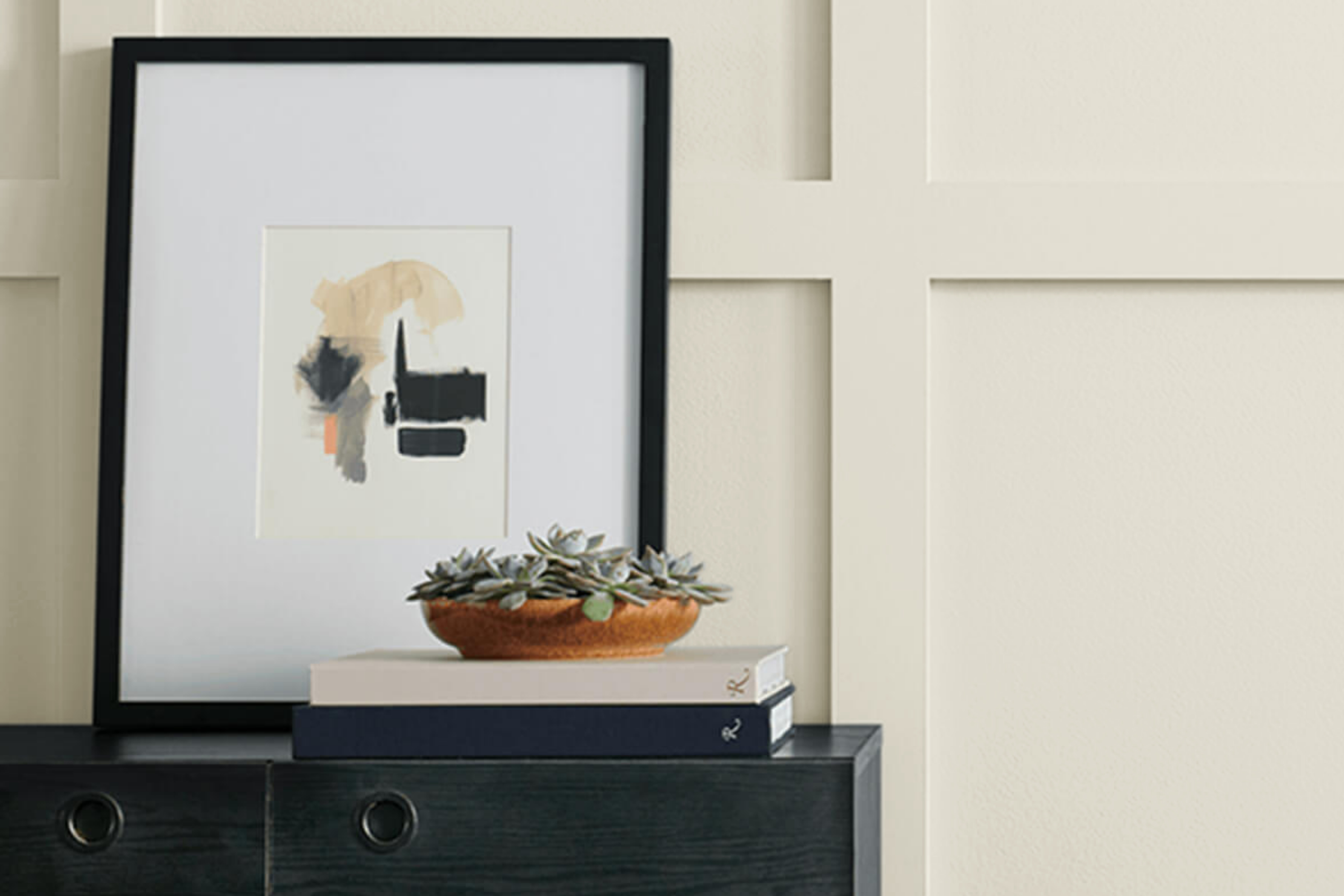
Every shade of paint has its distinct characteristics and ambiance it lends to a space. Among them, SW 9501 Oat Milk stands out as a versatile hue that can transform interiors and exteriors alike.
In this guide, we dive deep into this unique color, its undertones, coordinates, and ideal usage in various settings.
via sherwin-williams.com
What Color Is SW 9501 Oat Milk?
Table of Contents
SW 9501 Oat Milk is a nuanced shade reminiscent of the soft, comforting hue of a warm oat milk beverage. Possessing a delicate blend of beige and cream, this color exudes a timeless simplicity that stands out without overshadowing.
On interior walls, SW Oat Milk unfolds in a way that is both calming and inviting, creating spaces that are relaxing and serene. Its understated elegance makes it incredibly versatile, suitable for many interior design styles, from contemporary to traditional and from Scandinavian minimalism to rustic farmhouse.
Whether it’s a living room craving warmth or a bedroom seeking tranquility, SW Oat Milk offers an adaptable backdrop that can be both statement-making and harmonious.
housekeepingbay.com
Is It a Warm Or Cool Color?
SW 9501 Oat Milk is inherently warm, and this warmth can play out differently depending on the room’s orientation and lighting.
In north-faced rooms, which often receive cooler, indirect light, SW Oat Milk can appear slightly more muted but retains its warmth. This might give the room a cozy, cocoon-like feeling, softening the coolness that often characterizes northern exposures.
Conversely, in south-faced rooms flooded with natural light, SW Oat Milk can radiate its creamy-beige hue more vividly, emphasizing its warm undertones and creating a luminous, airy atmosphere.
Artificial lighting also plays a pivotal role in how SW Oat Milk is perceived. Under yellow or warm artificial lights, such as incandescent bulbs, the paint can appear even creamier, amplifying its warm nature.
Fluorescent lighting, on the other hand, can impart a cooler tone, though SW Oat Milk’s inherent warmth will still peek through. When selecting fixtures or bulbs, considering how they influence the wall color can lead to a more intentional and harmonious design outcome.
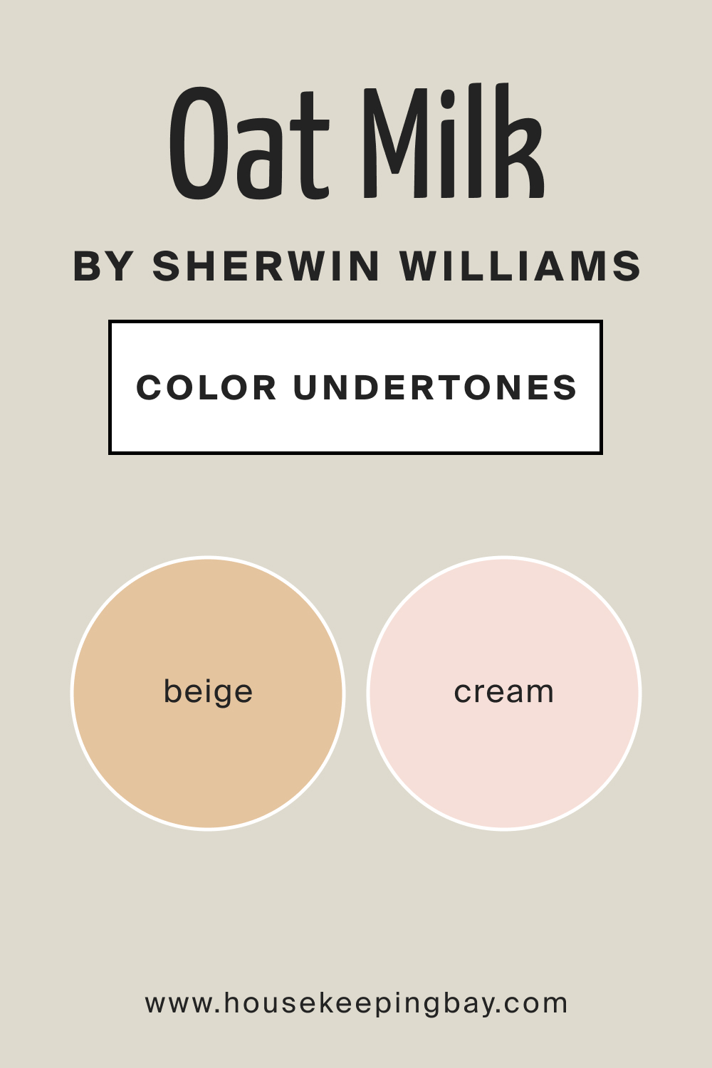
Undertones of SW 9501 Oat Milk
Undertones are the shades that emerge from beneath the primary color, subtly influencing and adding depth to the overall hue. SW 9501 Oat Milk is characterized by subtle undertones of beige and a hint of cream. These undertones play a crucial role in determining how color interacts with other shades in a room, the mood it creates, and its adaptability to different interior design styles.
For SW Oat Milk, its beige and creamy undertones exude a comforting warmth, making spaces feel welcoming and cozy. When paired with furnishings or decorations, these undertones can either be highlighted or subdued, thereby influencing the room’s overall aesthetic.
housekeepingbay.com
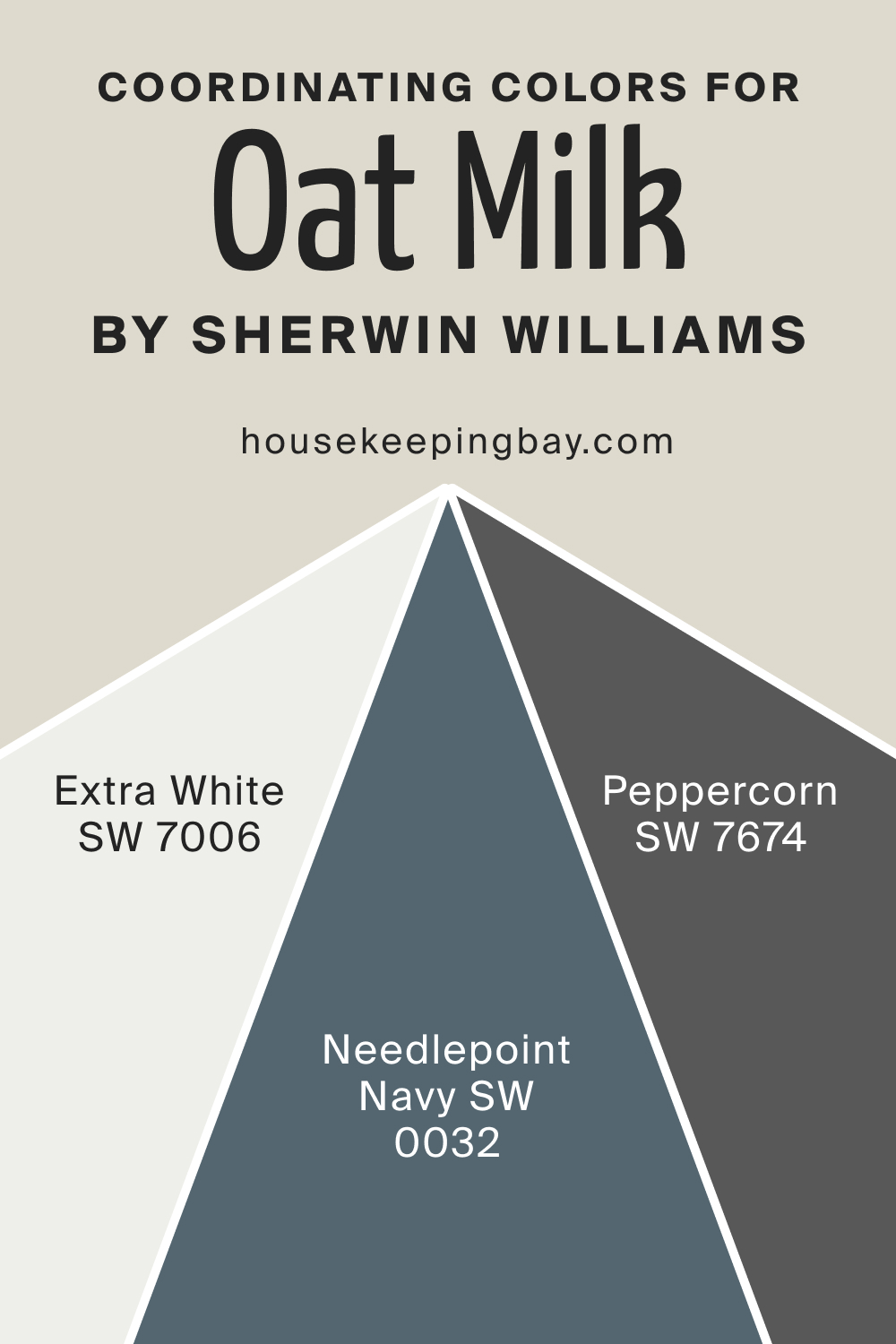
Coordinating Colors of SW 9501 Oat Milk
Coordinating colors are hues that harmoniously blend with the main color, enhancing the overall palette of a space. They can either be contrasting to create visual interest or similar for a harmonious feel. For SW Oat Milk, we recommend the following coordinating colors:
- SW Peppercorn : A deep gray that beautifully contrasts with the lightness of Oat Milk.
- SW Extra White : A pristine white that offers a clean juxtaposition to the creaminess of Oat Milk.
- SW Needlepoint Navy : A rich navy that adds depth and sophistication when paired with Oat Milk.
They will help you to reveal the true beauty of SW Oat Milk and achieve a balanced palette in your home.
housekeepingbay.com
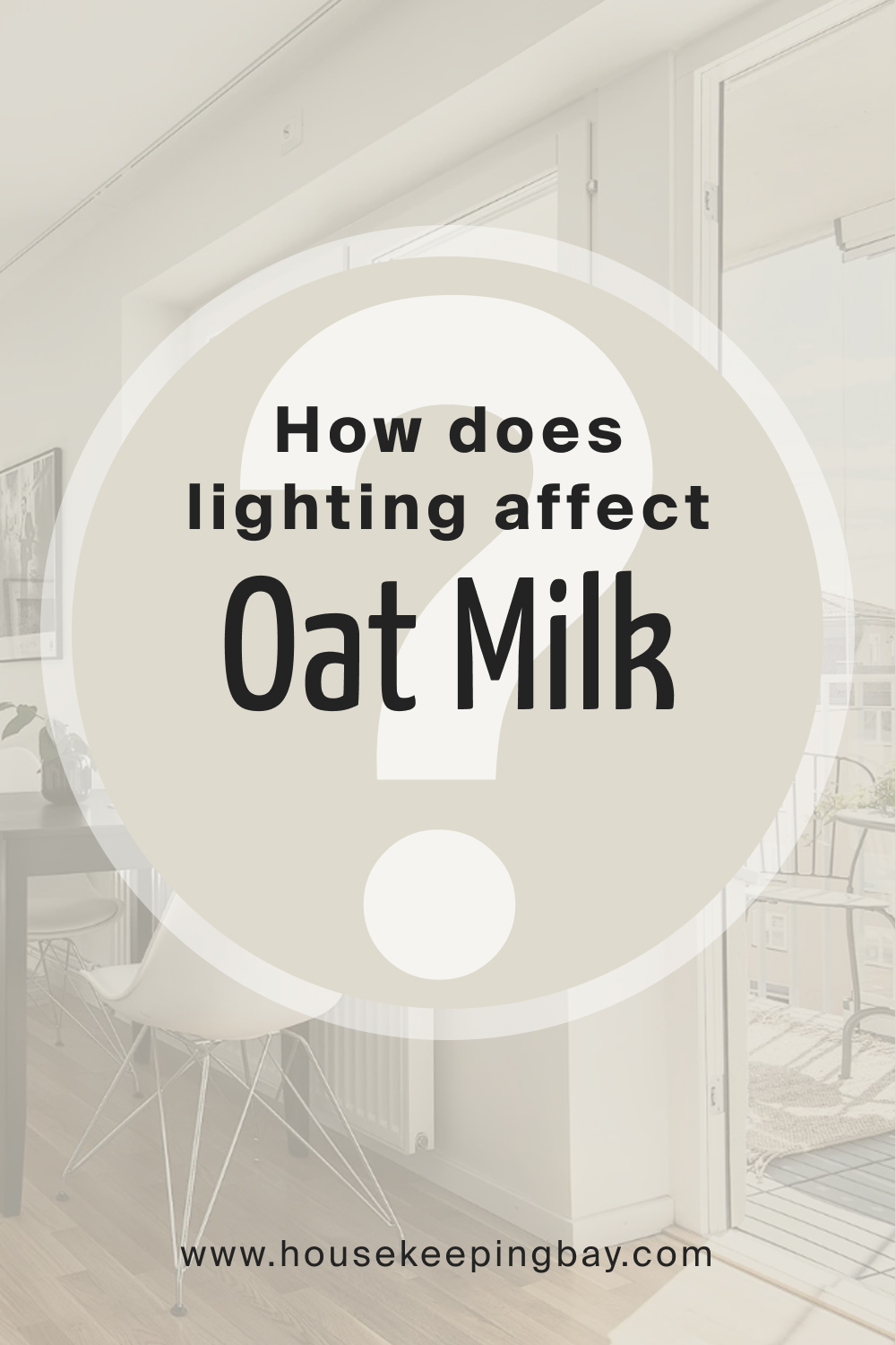
How Does Lighting Affect SW 9501 Oat Milk?
Lighting, whether natural or artificial, can dramatically transform the appearance of SW 9501 Oat Milk. Indoors, under soft, warm lighting, SW Oat Milk can accentuate its creamy undertones, creating a snug ambiance.
Conversely, cooler lighting may highlight its beige nuances, giving it a more neutral appeal. Outdoors, under the radiant sunlight, SW Oat Milk can appear brighter and more luminous, emphasizing its versatility. In shaded areas, its beige undertone might become more pronounced, offering a muted but still warm appearance.
housekeepingbay.com
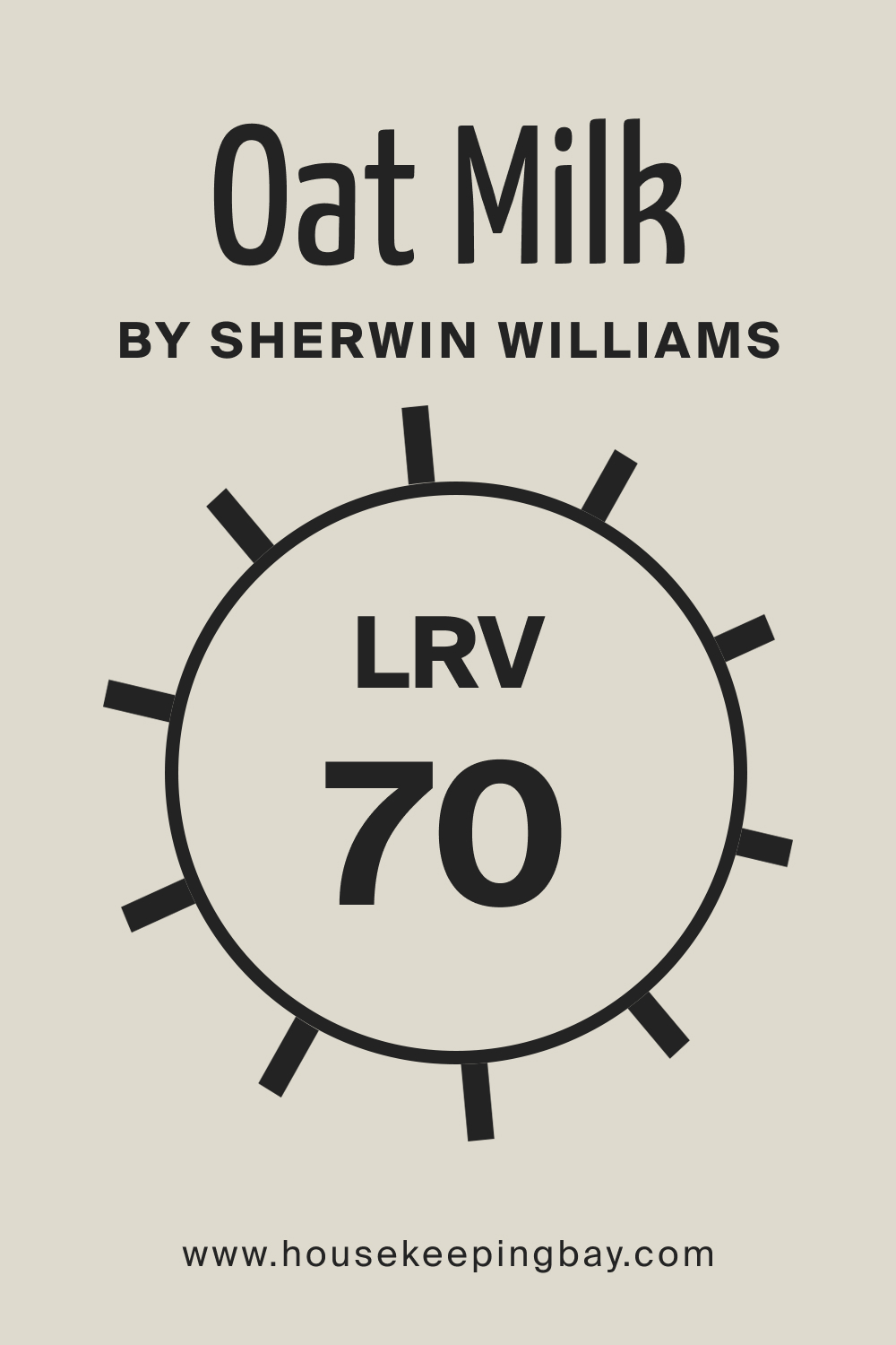
LRV of SW 9501 Oat Milk
The Light Reflectance Value (LRV) of SW 9501 Oat Milk is 70. LRV measures the percentage of light a paint color reflects. A high LRV, like 70, indicates the color reflects a substantial amount of light, making spaces feel brighter and larger.
This makes SW Oat Milk a fantastic choice for smaller rooms or spaces with limited natural light.
housekeepingbay.com
What is LRV? Read It Before You Choose Your Ideal Paint Color
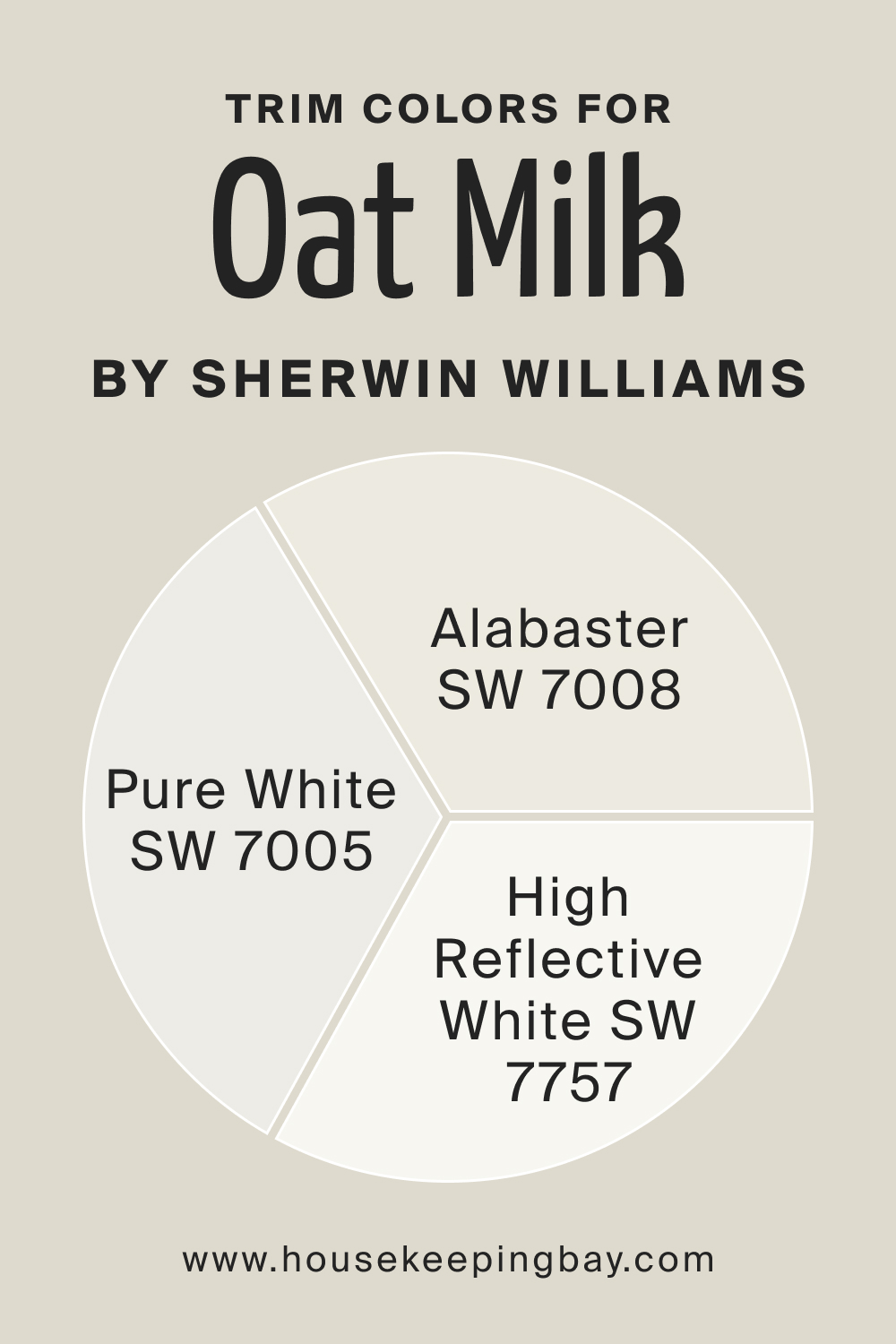
Trim Colors of SW 9501 Oat Milk
Trim colors are those used for molding, window frames, doors, and other architectural details, helping define spaces, add depth, and create contrast. For SW 9501 Oat Milk, try out the following colors:
- SW Pure White : A crisp, clean white that provides a stark contrast, making Oat Milk walls pop.
- SW Alabaster : A soft, muted white with warm undertones that seamlessly complements Oat Milk.
- SW High Reflective White : A bright, neutral white that offers a fresh and contemporary edge against Oat Milk.
housekeepingbay.com
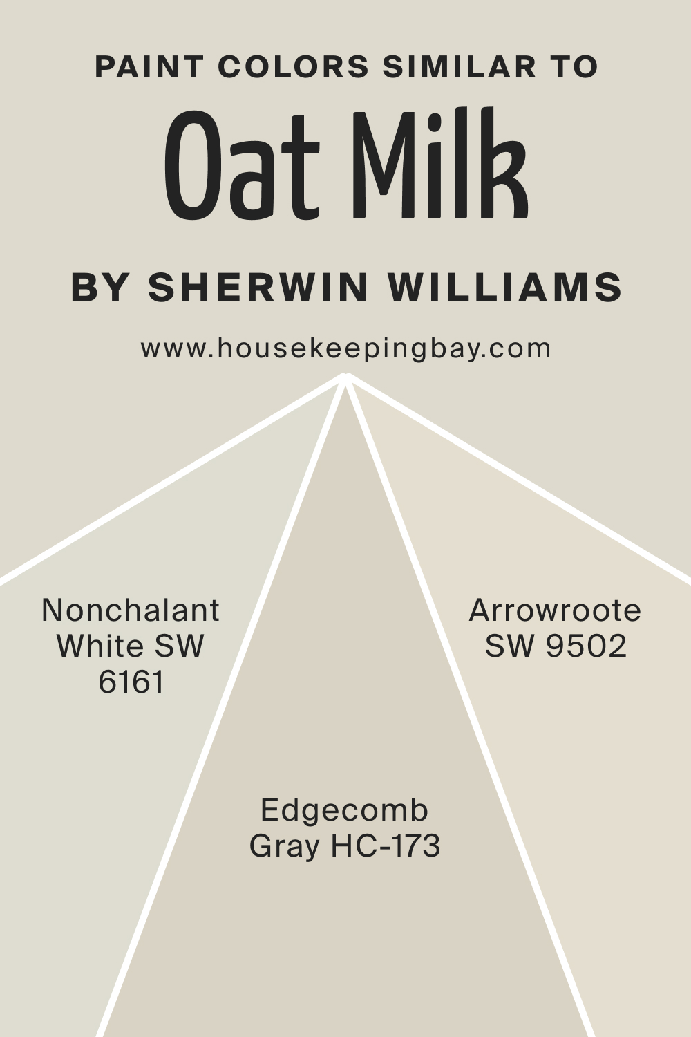
Colors Similar to SW 9501 Oat Milk
Knowing alternatives to a chosen paint color offers flexibility in design and helps when seeking a slight variation in tone or mood. For Oat Milk, we recommend the following alternative colors:
- SW Nonchalant White : A laid-back white with subtle beige undertones.
- SW Arrowroot : A gentle white with a hint of warmth, resembling natural fibers.
- BM Edgecomb Gray (HC-173) : A soft and warm neutral that is often considered a greige, a blend of gray and beige. Its understated elegance allows it to work well in various spaces, providing a subtle backdrop that complements a wide range of color schemes. With its soothing and versatile nature, Edgecomb Gray offers a similar visual comfort to SW Oat Milk, creating a serene and welcoming environment.
They are the closest color matches that will read almost the same on your walls.
housekeepingbay.com
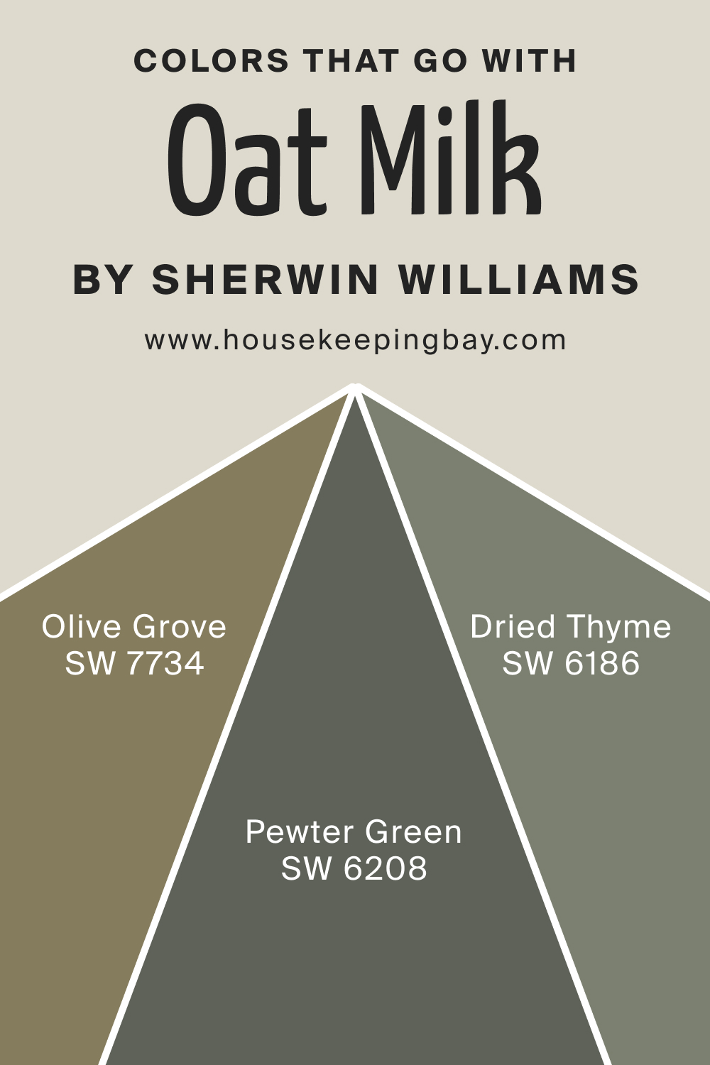
Colors That Go With SW 9501 Oat Milk
A balanced color palette can significantly influence one’s mood, creating atmospheres ranging from peaceful to invigorating. The harmony of colors in a space can either soothe or energize the occupants.
It’s essential to select colors that not only appeal to one’s aesthetic sense but also work cohesively together to achieve the desired effect. For SW Oat Milk, try out one of the following color options:
- SW Pewter Green : A muted green that adds a touch of nature and tranquility when paired with Oat Milk.
- SW Olive Grove : A deeper, earthy green that provides a grounding effect against the softness of Oat Milk.
- SW Dried Thyme : A soft herbal green that resonates with calmness, complementing Oat Milk’s serene vibe.
By harmonizing with such colors, SW Oat Milk can create a home environment that feels cohesive, inviting, and mood-enhancing.
housekeepingbay.com
How to Use SW 9501 Oat Milk In Your Home?
SW 9501 Oat Milk is a versatile hue that can be employed across various rooms and decor styles. Its subtle warmth and comforting undertones make it an excellent choice for bedrooms, living spaces, and even exteriors.
Suitable for both traditional settings, where its muted charm can shine, and contemporary spaces, where its neutral base can balance bolder elements, SW Oat Milk can seamlessly fit into modern, Scandinavian, rustic, and even coastal designs.
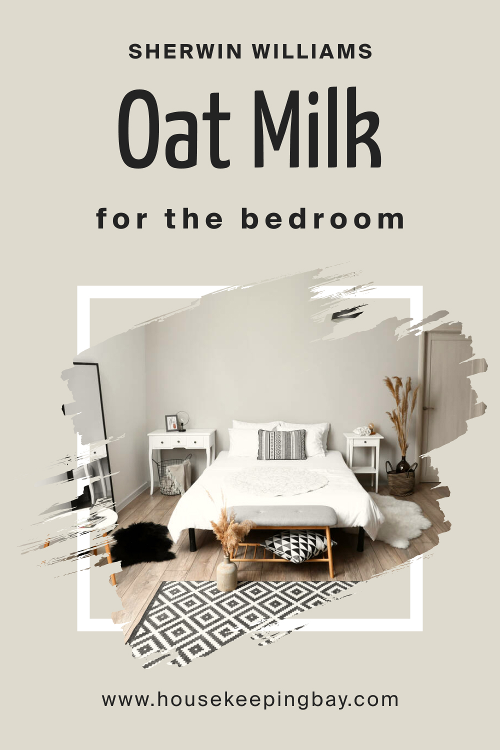
How to Use SW 9501 Oat Milk in the Bedroom?
The bedroom is a sanctuary, and Oat Milk lends itself perfectly to creating a peaceful, restful environment. Its beige-cream undertones exude a gentle warmth, fostering a cozy and inviting ambiance. Paired with soft textiles, like linen drapes or a plush rug, Oat Milk can transform a bedroom into a serene retreat where relaxation comes naturally.
housekeepingbay.com
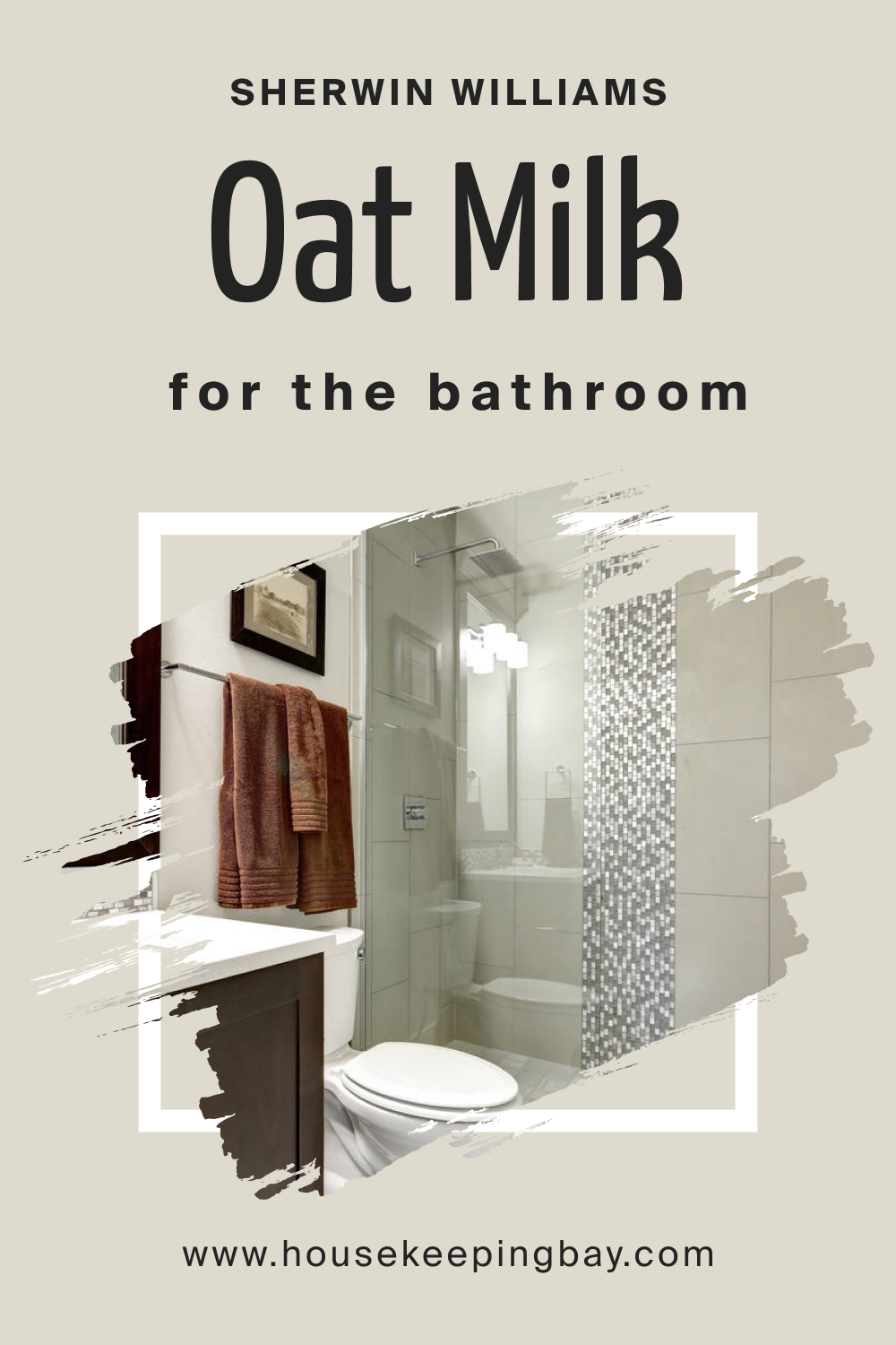
How to Use SW 9501 Oat Milk in the Bathroom?
For bathrooms, Oat Milk offers a fresh and airy aesthetic. Its light and neutral character can make smaller bathrooms appear more spacious and welcoming. Against bathroom fixtures, whether chrome, brushed nickel, or matte black, Oat Milk’s subtle warmth complements beautifully.
To enhance its spa-like feel, one can introduce natural wood elements and greenery, elevating the overall tranquility of the space.
housekeepingbay.com
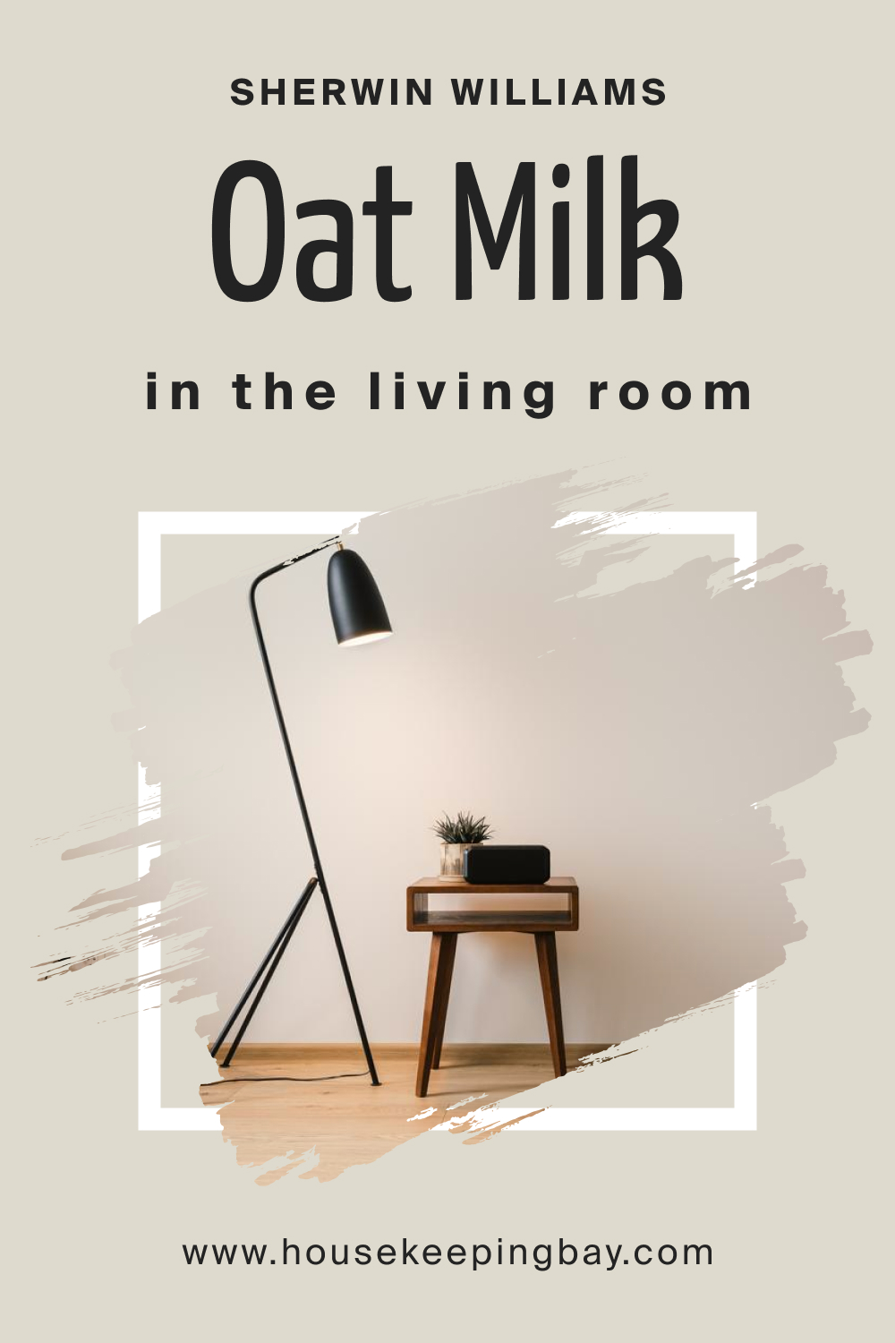
How to Use SW 9501 Oat Milk in the Living Room?
In the living room, Oat Milk can act as a versatile backdrop, setting a warm and inviting tone. Whether it’s against a modern, sleek sofa or an antique wooden coffee table, its adaptability shines.
Its neutral character allows for bolder accent colors, like deep blues or rich terracottas, to stand out, offering a balanced yet dynamic space ideal for gatherings and relaxation.
housekeepingbay.com
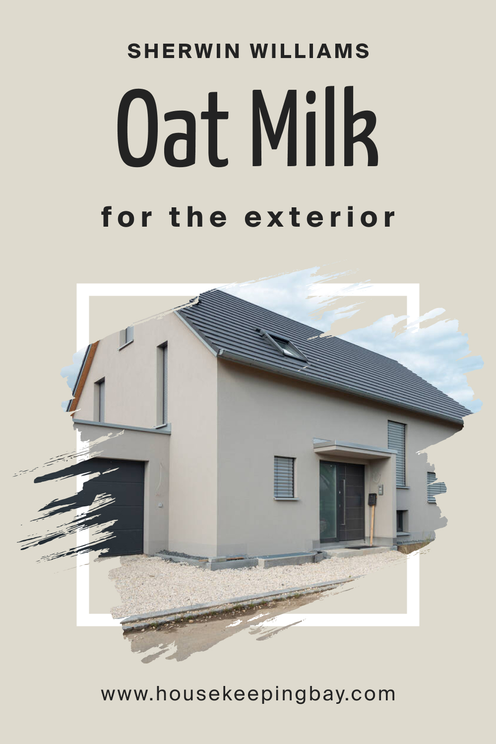
How to Use SW 9501 Oat Milk for an Exterior?
Exterior walls painted in Oat Milk radiate an understated elegance. This hue captures and reflects light beautifully, ensuring the home appears inviting, regardless of the time of day.
The color’s inherent warmth can blend harmoniously with natural elements, like stone pathways or lush gardens, creating a cohesive outdoor aesthetic. For a more polished look, consider using a darker contrasting color for the trims and doors.
housekeepingbay.com
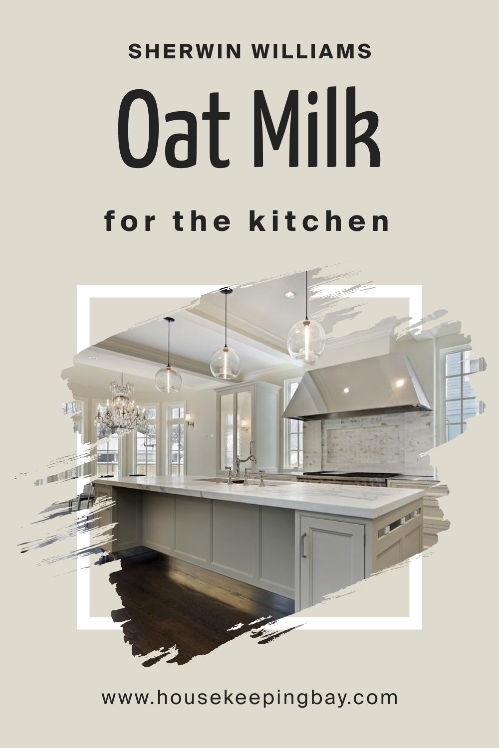
How to Use SW 9501 Oat Milk for the Kitchen?
Kitchens bathed in Oat Milk exude warmth and homeliness. As a neutral, it provides a calming backdrop against which colorful dishes, vibrant fruits, and kitchen decor can pop. Whether you’re aiming for a farmhouse aesthetic with wooden counters or a sleek modern vibe with marble countertops, SW Oat Milk’s adaptable character ensures it complements both seamlessly.
housekeepingbay.com
How to Use SW 9501 Oat Milk for the Kitchen Cabinets?
Using SW Oat Milk for kitchen cabinets can transform them into the room’s focal point. The soft hue works beautifully on cabinets, offering a neutral base that pairs well with most countertop materials, from granite to butcher block.
Brass or matte black handles can accentuate the cabinets, adding a touch of modernity. Moreover, the color’s inherent warmth ensures the kitchen remains inviting, fostering a space where both cooking and conversations flow effortlessly.

housekeepingbay.com
Comparing SW 9501 Oat Milk With Other Colors
When selecting a paint color, it’s essential to compare it with other similar shades. This comparison illuminates subtle differences, ensuring the hue aligns perfectly with the intended mood and decor of the space.
By contrasting colors, homeowners gain insights into undertones, brightness, and how a specific color may look during different times of the day. Comparisons also provide alternative options, allowing flexibility in design choices.
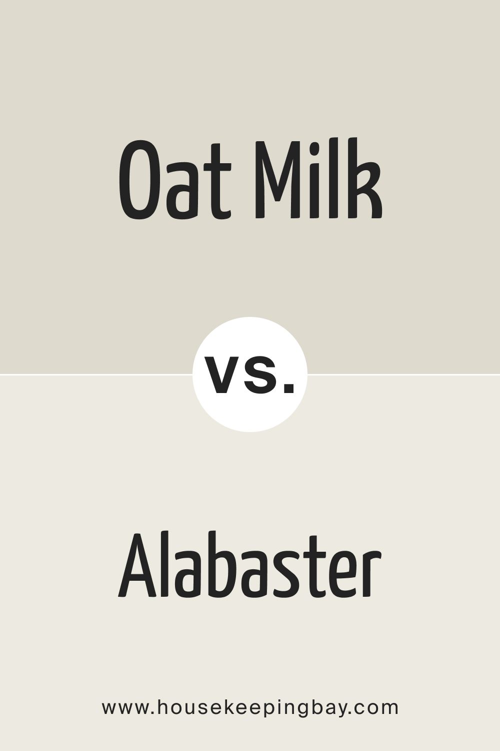
SW 9501 Oat Milk vs. SW 7008 Alabaster
SW Oat Milk and Alabaster both tread on the spectrum of off-whites, but their undertones set them apart. While SW Oat Milk leans towards beige-cream undertones, Alabaster has a slightly more grayish undertone, giving it a cooler feel.
In spaces where warmth is desired, SW Oat Milk could be more fitting, whereas Alabaster might excel in more modern, minimalistic settings.
housekeepingbay.com
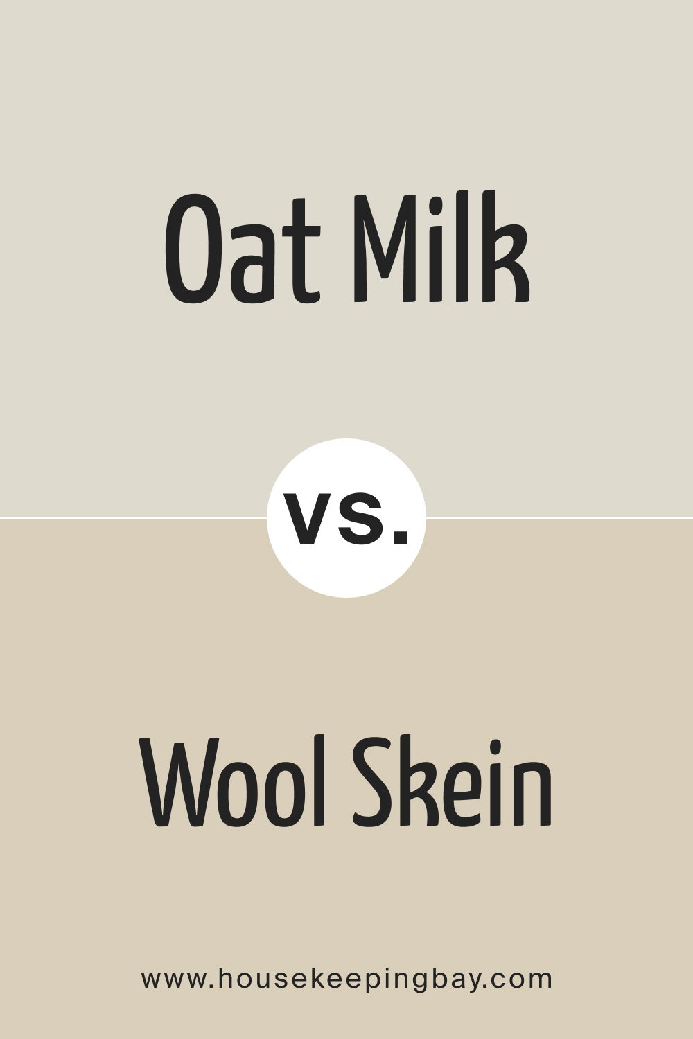
SW 9501 Oat Milk vs. SW 6148 Wool Skein
SW Wool Skein is a soft neutral with a touch of beige and gray, making it appear somewhat earthier compared to SW Oat Milk. While both are calming and versatile, Oat Milk offers a creamier warmth, while SW Wool Skein provides a muted, sophisticated hue ideal for contemporary designs.
housekeepingbay.com
SW 9501 Oat Milk vs. SW 7568 Newtral Ground
SW Newtral Ground is a balanced beige that doesn’t lean too warm or too cool. Next to Oat Milk, SW Newtral Ground feels more anchored and grounded. Oat Milk, with its lighter and creamier touch, can provide a more airy feel, whereas SW Newtral Ground can add depth to a space.
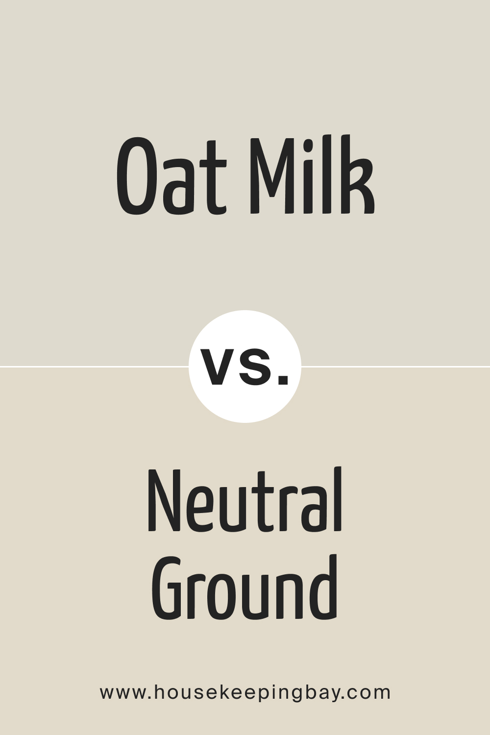
housekeepingbay.com
SW 9501 Oat Milk vs. SW 9504 Cold Foam
SW Cold Foam presents as a soft white with a hint of green undertone. This cool undertone makes it distinct from Oat Milk’s warm beige creaminess. In spaces where a fresh, slightly cool touch is preferred, Cold Foam might be the choice, whereas Oat Milk shines in cozy settings.
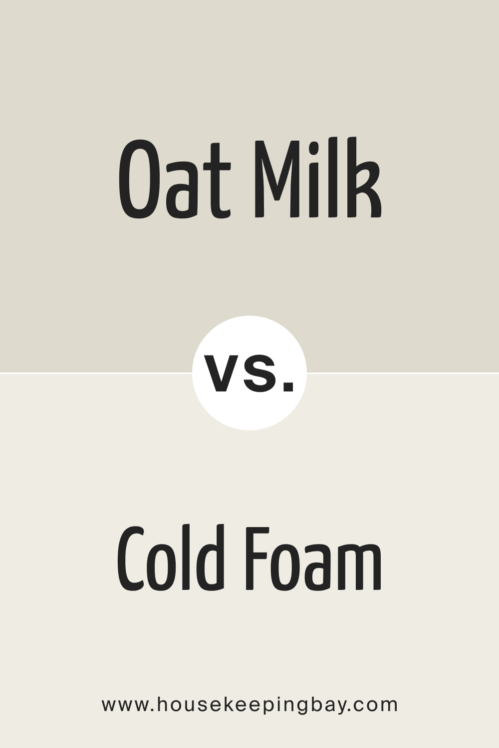
housekeepingbay.com
SW 9501 Oat Milk vs. SW 9503 Cheviot
SW Cheviot has a pale gray undertone , which gives it a cooler and more neutral feel than Oat Milk. While Oat Milk warms up a room, Cheviot offers a modern and sleek ambiance, especially suited for urban and minimalistic designs.
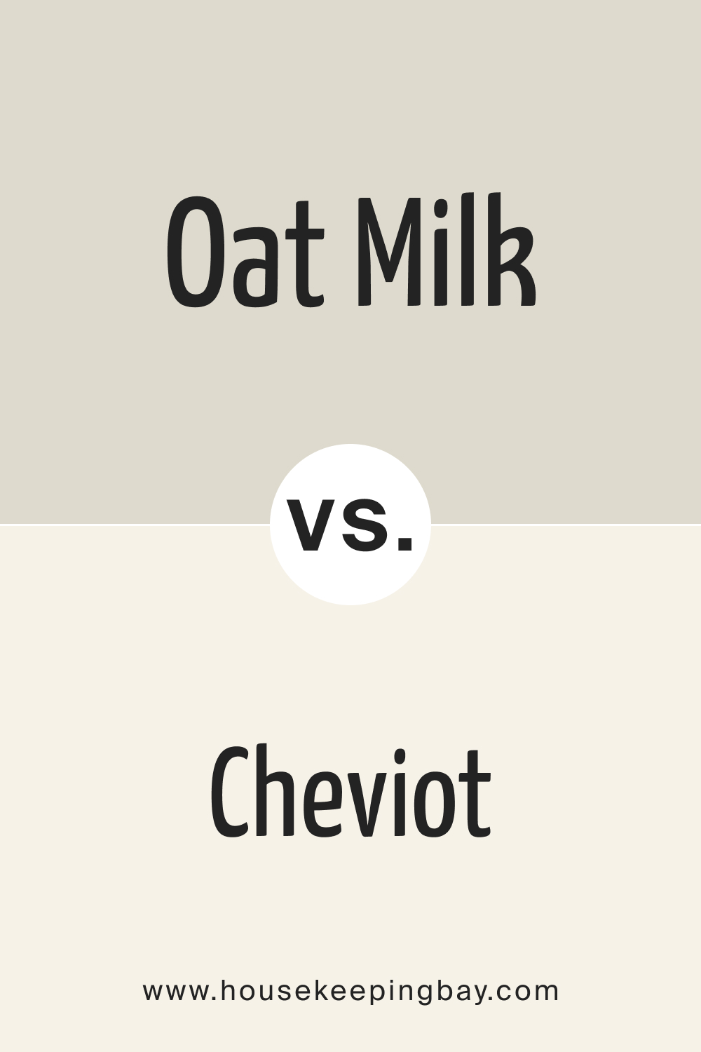
housekeepingbay.com
SW 9501 Oat Milk vs. SW 7566 Westhighland White
SW Westhighland White is a bright and crisp white, often perceived as more luminous compared to the subdued warmth of Oat Milk. In spaces where stark contrasts and modern vibes are desired, Westhighland White stands out, while Oat Milk offers a gentler ambiance.
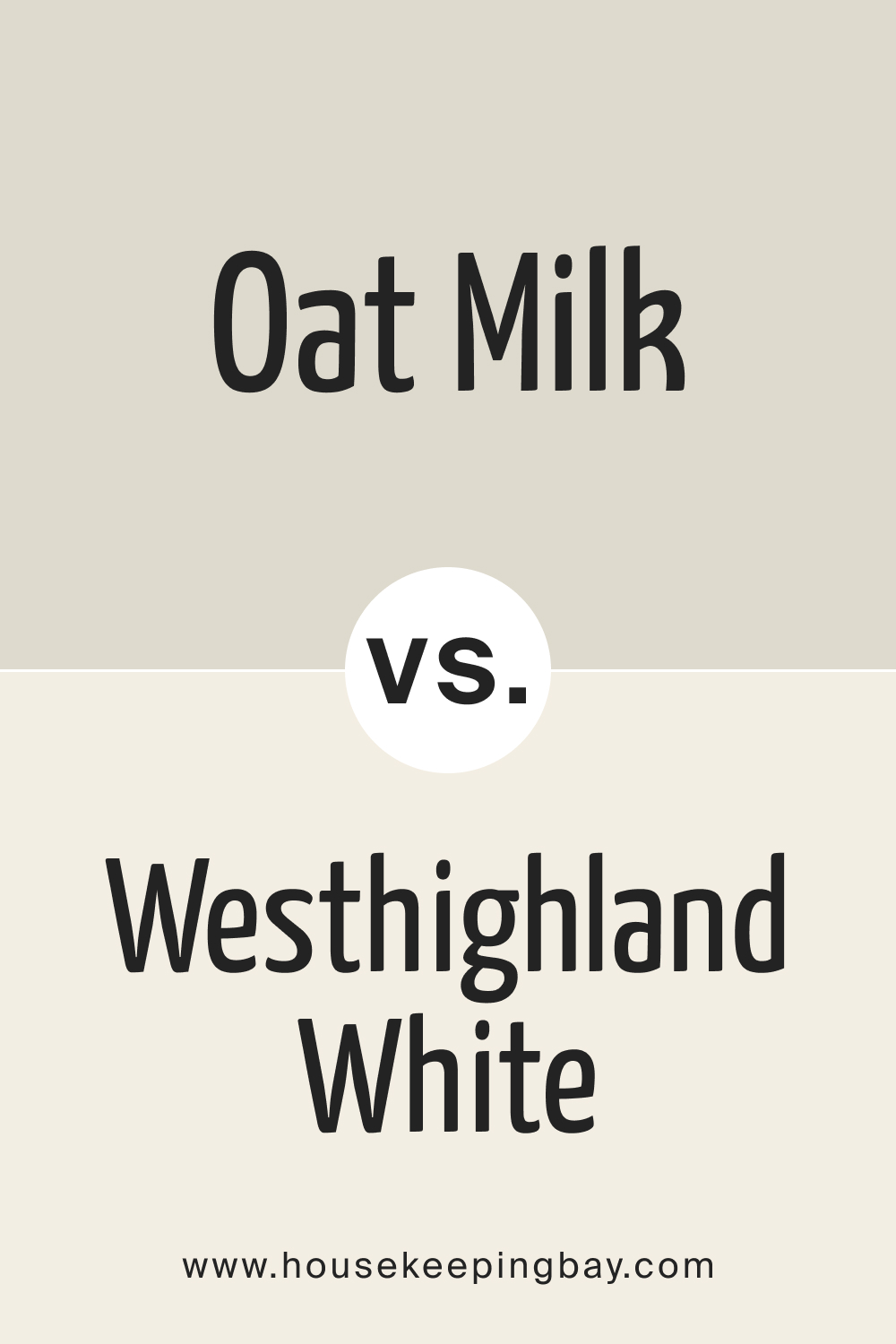
housekeepingbay.com
Conclusion
Colors, while appearing similar at first glance, can possess unique characteristics that set them apart. Understanding these nuances through comparisons like the ones above allows homeowners and designers to craft spaces with precision, ensuring that the chosen hues amplify the room’s intended mood and function.
SW 9501 Oat Milk, with its versatile warmth, proves to be a formidable option across various design spectra, but recognizing its distinctness from close alternatives refines the art of interior design.
housekeepingbay.com
Ever wished paint sampling was as easy as sticking a sticker? Guess what? Now it is! Discover Samplize's unique Peel & Stick samples. Get started now and say goodbye to the old messy way!
Get paint samples


Frequently Asked Questions
⭐What kind of undertones does SW 9501 Oat Milk have?
SW 9501 Oat Milk possesses subtle undertones of beige and cream, giving it a warm and comforting feel.
⭐Is SW 9501 Oat Milk suitable for exteriors?
Absolutely! Its high Light Reflectance Value (LRV) of 70 makes it a fantastic choice for exteriors, providing a timeless look that blends seamlessly with natural surroundings.
⭐How does lighting affect the appearance of SW 9501 Oat Milk?
Lighting can change the appearance of SW 9501 Oat Milk. In bright sunlight, it may appear lighter and more beige, while under dim artificial lighting, it might seem creamier or even slightly yellowish.
⭐Which trim colors pair best with SW 9501 Oat Milk?
Trim colors such as SW Pure White, SW Alabaster, and SW High Reflective White work wonders with Oat Milk, providing crisp boundaries that define spaces while complementing the wall color.
⭐Is SW 9501 Oat Milk a good choice for small rooms?
Yes, thanks to its high LRV, SW 9501 Oat Milk can make smaller rooms feel larger and brighter, making it an excellent choice for spaces with limited size or natural light.
3 thoughts on “Oat Milk SW 9501 Paint Color by Sherwin-Williams”
Leave a Reply


How does this color compare with off-whites or light grays?
Can SW 9501 Oat Milk be used in a kitchen with dark wood cabinets?
Certainly, Lisa! The warmth and neutral tone of Oat Milk can act as a soft contrast to dark wood cabinets, highlighting their richness and depth. It would create a balanced look in the kitchen.