Indigo Batik SW 7602 Paint Color by Sherwin Williams
SW 7602 Indigo Batik from Sherwin-Williams is not merely a shade; it’s an expression, a narrative, a vibrant depiction of culture and emotion, combining the depth of the ocean with the stability of the night sky.
SW 7602 Indigo Batik from Sherwin-Williams is not merely a shade; it’s an expression, a narrative, a vibrant depiction of culture and emotion, combining the depth of the ocean with the stability of the night sky. This color creates an environment that transcends aesthetic values, providing both visual comfort and spiritual tranquility.
Indigo Batik is unique and complex, influencing mood, perception, and ambiance, defining spaces with its rich and sophisticated nature.
via sherwin-williams.com
What Color Is SW 7602 Indigo Batik?
SW 7602 Indigo Batik is a majestic shade of blue that leans towards the deeper, more muted end of the spectrum. It combines the calmness and serenity of blue with a touch of sophistication, symbolizing depth, wisdom, and stability. It evokes the infinite sky and the mysterious sea, embodying both freedom and constraint, logic and emotion, peace and melancholy. Its versatility makes it suitable for various spaces and styles, enabling creative expression and dynamic design solutions.
SW Indigo Batik does more than fill a space with color; it fills it with emotion, story, and atmosphere. Its cool essence and multifaceted undertones make it a versatile choice, capable of transforming spaces, evoking feelings, and reflecting personality and style.
Whether it’s creating a serene sanctuary, a sophisticated setting, or a space filled with creative energy, SW 7602 Indigo Batik rises to the occasion, revealing its beauty and depth in every shade of light and every angle of view.
housekeepingbay.com
Table of Contents
Is it Warm Or a Cool Color?
SW 7602 Indigo Batik is classified as a cool color. Cool colors are often associated with calmness, relaxation, and tranquility. They are perceived as receding, making spaces appear more extensive and more open. In contrast to warm colors that excite and energize, cool colors like Indigo Batik create a soothing and refreshing atmosphere, conducive to concentration and reflection.
It imparts a sense of serenity and sophistication, making it an ideal choice for spaces intended for relaxation, contemplation, and focused activities.
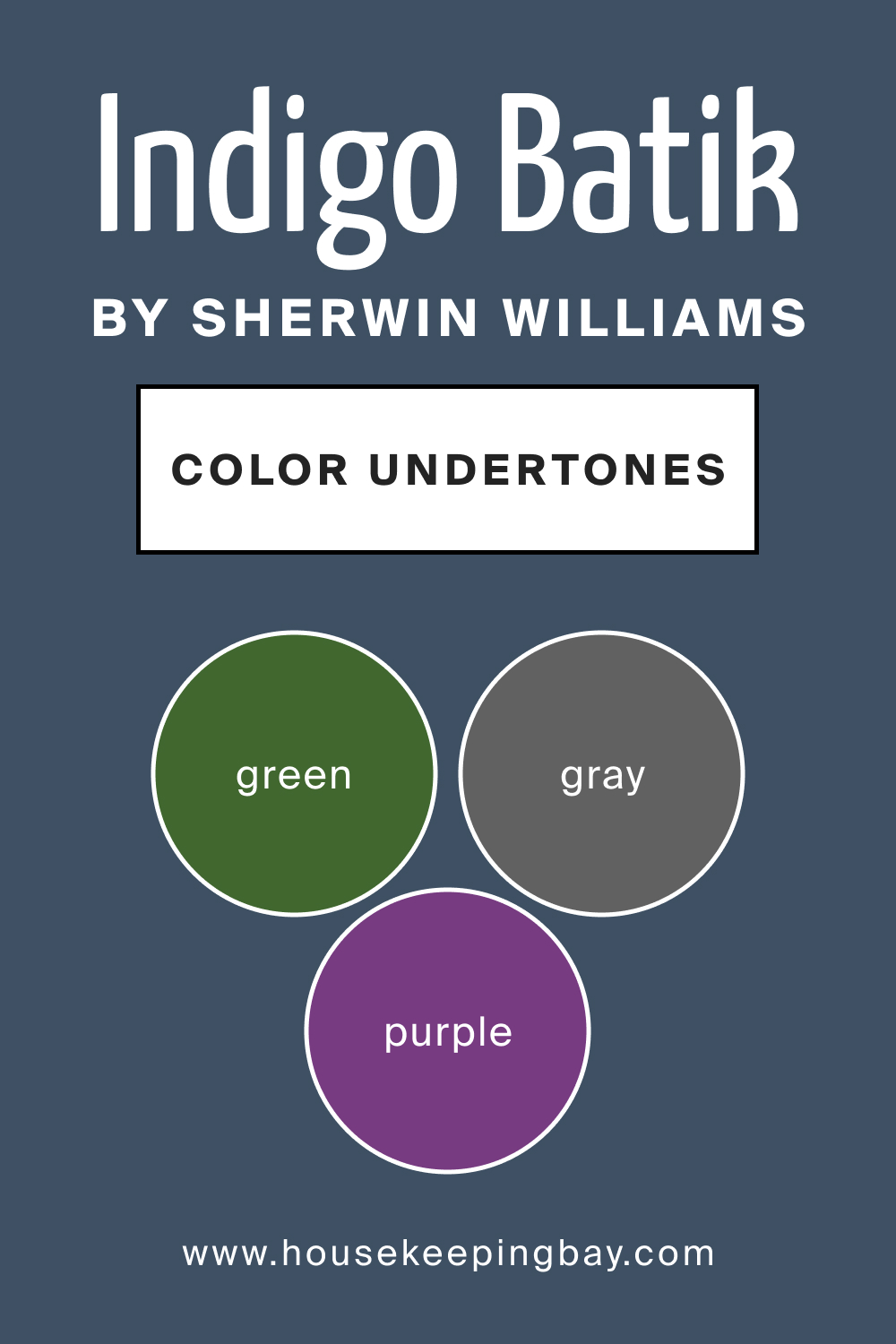
Undertones of SW 7602 Indigo Batik
The undertones of a color can significantly influence its overall appearance and interaction with other colors and light. SW 7602 Indigo Batik has intriguing undertones that enhance its complexity and versatility:
- Gray Undertone: This undertone mutes the vibrancy of Indigo Batik, making it more sophisticated and versatile. It adds a neutral balance, allowing the color to blend seamlessly with various palettes and materials, emphasizing elegance and subtlety.
- Green Undertone: The green undertone infuses a hint of natural freshness into Indigo Batik, creating a harmonious and balanced aesthetic. It makes the color more adaptable to different settings, establishing a connection between the indoor environment and the natural world.
- Purple Undertone: The hint of purple in Indigo Batik adds a touch of mystery and luxury to the shade. It elevates the color’s visual appeal, making it more dynamic and expressive, and introduces a sense of depth and richness, evoking feelings of creativity and imagination.
Its gray undertone makes it a harmonious companion to neutral shades, creating an environment that is elegant and understated. The green undertone bridges the gap between the built environment and nature, generating spaces that are refreshing and balanced.
And the hint of purple brings a dash of opulence and creativity, making Indigo Batik a canvas for artistic expression and innovative design.
housekeepingbay.com
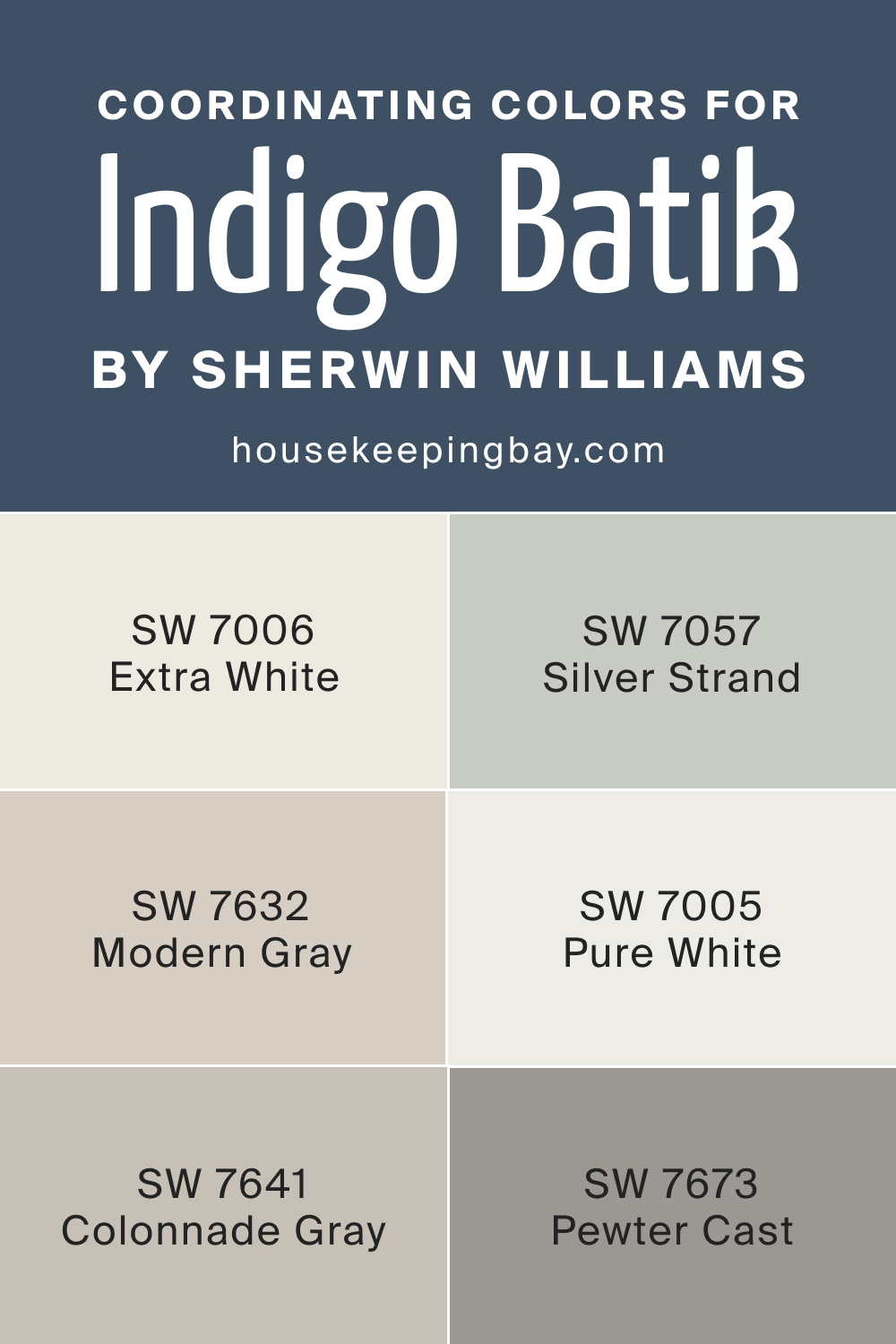
Coordinating Colors of SW Indigo Batik
Coordinating colors are colors that harmonize well together and create a balanced and visually appealing color scheme. They can be used to enhance each other, create mood, and set the tone of the space.
Typically, coordinating colors are chosen based on color theory, considering aspects like complementary, analogous, and monochromatic relationships to create aesthetically pleasing combinations. They help in achieving a cohesive look in design by tying different elements together.
- SW 7057 Silver Strand : This muted, sophisticated gray with a slight hint of blue creates a serene and elegant backdrop to the vibrant Indigo Batik, emphasizing its depth and richness.
- SW 7006 Extra White : A crisp and clean white that brings out the vibrancy and freshness of Indigo Batik, making spaces feel more open and airy.
- SW 7632 Modern Gray : A soft, neutral gray that complements the cool tones of Indigo Batik, creating a balanced and harmonious space.
- SW 7673 Pewter Cast : This shade is a balanced gray with a touch of green, highlighting the green undertones in Indigo Batik and creating a sophisticated, cohesive look.
- SW 7641 Colonnade Gray : A warm, muted gray that subtly contrasts with Indigo Batik, adding warmth and dimension to the color scheme.
- SW 7005 Pure White : The purity and brightness of this white color enhance the sophistication and depth of Indigo Batik, providing a refreshing balance to its coolness.
housekeepingbay.com
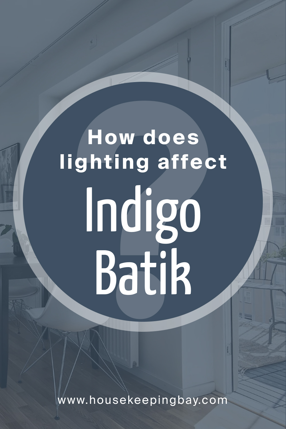
How Does Lighting Affect SW Indigo Batik?
Lighting plays a pivotal role in revealing the true essence of SW 7602 Indigo Batik. Natural light emphasizes its cool tones, making it appear more vibrant and refreshing, while artificial light can bring out its deeper, more muted undertones, showcasing the color’s richness and complexity.
Different types of artificial lighting, such as incandescent, fluorescent, or LED, can also alter the color’s appearance, either highlighting its blue tones or emphasizing its gray, green, or purple undertones.
The interplay between light and Indigo Batik creates dynamic and ever-evolving visual experiences, allowing the color to adapt and resonate differently in varying lighting conditions.
housekeepingbay.com
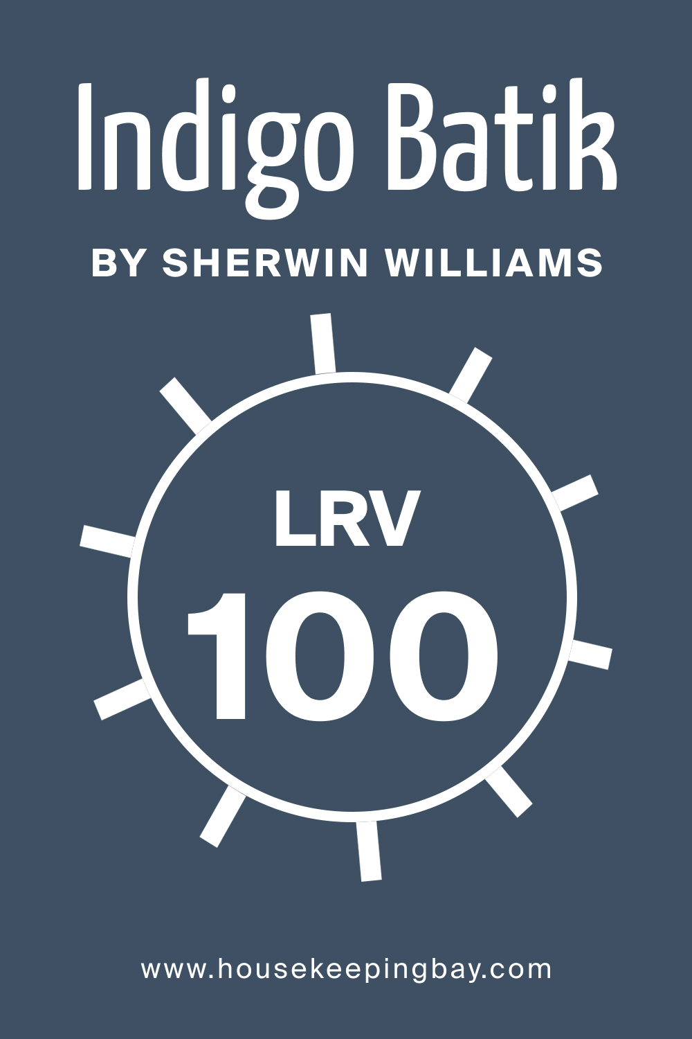
LRV of SW Indigo Batik
The Light Reflectance Value (LRV) of a color quantifies how much light it reflects, and it ranges from 0% (absolute black) to 100% (pure white). With an LRV of 100, SW 7602 Indigo Batik is situated on the lower end of the scale, reflecting only a small fraction of light and categorizing it as a deep, dark color. This implies that the color can make a space feel smaller, cozier, and more enclosed, adding a sense of intimacy and depth to the rooms where it is applied.
While its low LRV provides an opulent and enveloping feel, creating a focused and cocoon-like atmosphere, it also necessitates careful consideration of lighting, both natural and artificial.
Proper lighting is pivotal to prevent spaces with low LRV colors like Indigo Batik from feeling overly dark or cramped, and to highlight the color’s richness and complexity without overwhelming the space.
housekeepingbay.com
What is LRV? Read It Before You Choose Your Ideal Paint Color
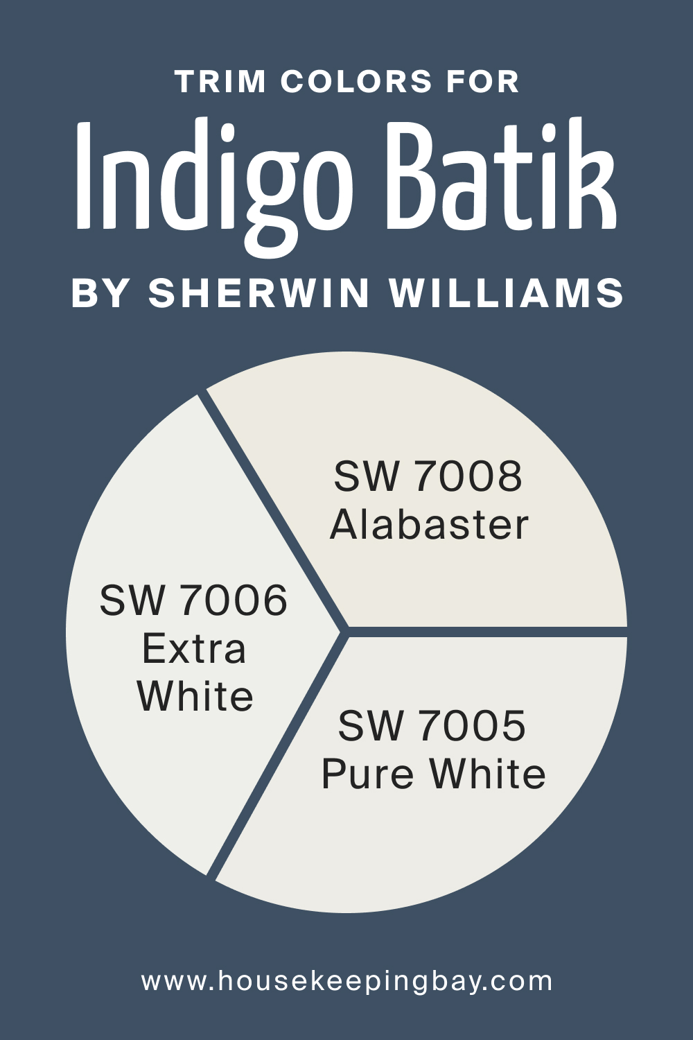
Trim Colors of SW Indigo Batik
When paired with SW Indigo Batik, shades of white can enhance its richness and depth while providing crisp contrast. Here are three suitable trim colors from Sherwin-Williams:
- SW 7005 Pure White : Pure White provides a clean and clear contrast to Indigo Batik, highlighting its depth and creating a refreshing balance in the space.
- SW 7006 Extra White : This is a bright and crisp white that can sharpen the appearance of Indigo Batik, making spaces feel more open and vibrant.
- SW 7008 Alabaster : Alabaster offers a warmer, softer contrast to Indigo Batik, softening its impact and adding a touch of coziness and warmth to the surroundings.
housekeepingbay.com
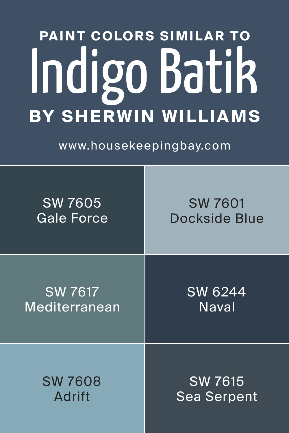
Colors Similar to SW Indigo Batik
Knowing alternative colors is crucial in interior design because it allows for flexibility and customization in achieving the desired aesthetic and mood for a space. Alternatives provide options to adapt to different lighting conditions, spatial configurations, and decorative elements within a room. They also offer solutions when the original choice is not available or suitable, ensuring that the overall design remains cohesive and harmonious. Additionally, exploring alternative colors can lead to the discovery of more appealing or fitting color combinations, enhancing the overall visual appeal and ambiance of the interior.
- SW 7601 Dockside Blue : A slightly lighter and more muted blue, blending subtleness with a serene presence.
- SW 7605 Gale Force : A deep, saturated shade of blue with a touch of gray, bringing forth a stormy and dramatic vibe.
- SW 7615 Sea Serpent : A dark, mysterious blue with greenish undertones, resonating with depth and sophistication.
- SW 7608 Adrift : A mid-toned blue with grayish undertones, portraying a sense of calmness and tranquility.
- SW 7617 Mediterranean : This is a vibrant, brighter blue with a touch of green, introducing a refreshing and lively ambiance.
- SW 6244 Naval : A rich, deep navy blue offering a classic and timeless aesthetic.
housekeepingbay.com
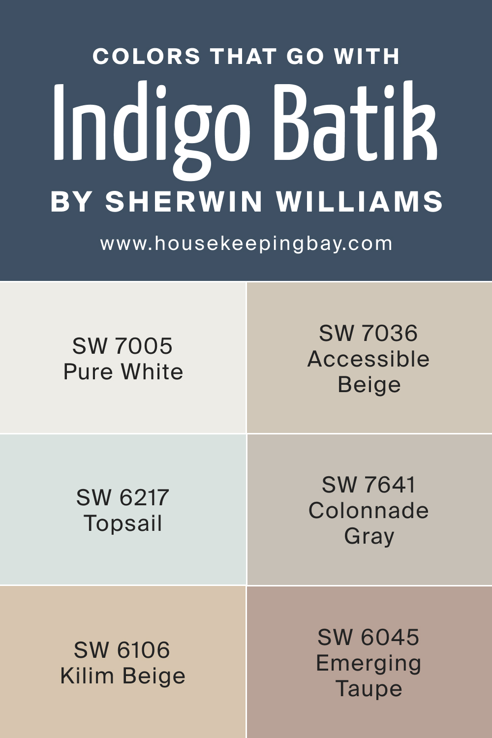
Colors That Go With SW Indigo Batik
Selecting a balanced color palette is vital because it creates a harmonious and cohesive environment in your home. A well-balanced palette enhances the aesthetic appeal of the space, impacting the perceived size, mood, and atmosphere of the rooms.
It also aids in seamlessly tying together various elements of the interior, from furniture to decorations, ensuring a unified and pleasing look.
Moreover, colors have a significant impact on one’s psychological well-being; hence, a balanced color scheme is essential to foster comfort, relaxation, and overall happiness within the living space.
- SW 7005 Pure White : A clean, crisp white which provides a refreshing and balancing contrast to the depth of Indigo Batik.
- SW 7036 Accessible Beige : A versatile, warm beige that can soften and warm up the coolness of Indigo Batik.
- SW 6106 Kilim Beige : This is a warm, neutral shade providing a subtle and harmonious contrast to Indigo Batik’s cool tones.
- SW 6217 Topsail : A light, airy aqua that adds a splash of freshness and a serene vibe when paired with Indigo Batik.
- SW 7641 Colonnade Gray : A warm, muted gray that subtly contrasts with Indigo Batik, adding dimension and warmth to the color scheme.
- SW 6045 Emerging Taupe : This neutral taupe introduces a sophisticated and grounding presence, harmonizing beautifully with the richness of Indigo Batik.
housekeepingbay.com
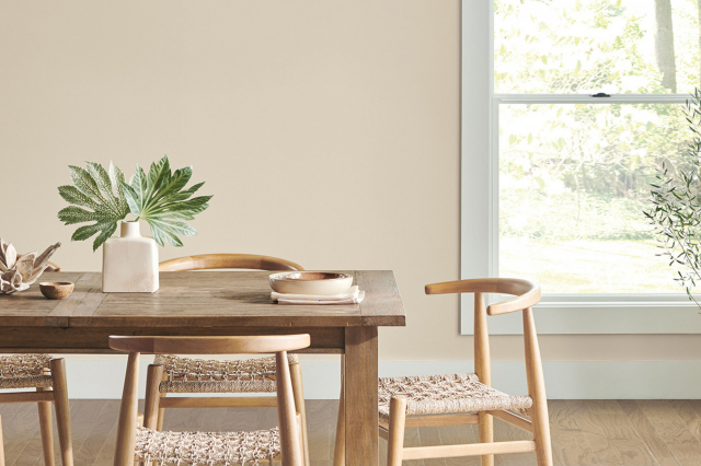
How to Use SW Indigo Batik In Your Home?
Knowing how colors work in your home is crucial as it directly influences the ambiance, perception of space, and overall aesthetics. Color impacts mood and emotion, and understanding its role ensures that spaces evoke the right feelings and serve their intended purpose effectively. The correct color implementation can transform a space, making it appear more spacious or cozy, lively or tranquil, depending on the desired outcome.
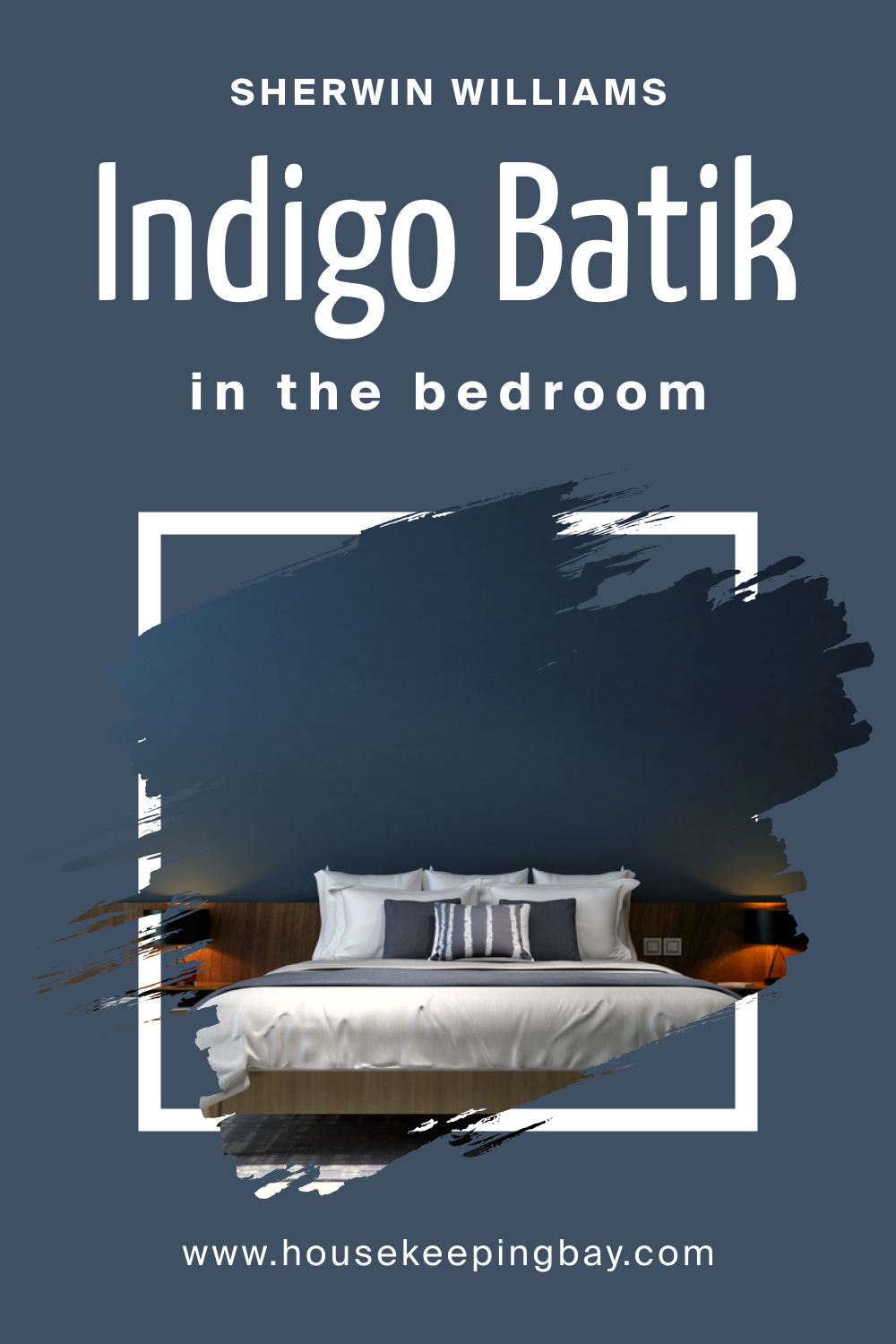
How to use SW Indigo Batik in the Bedroom?
In the bedroom, SW Indigo Batik can create a serene and calming atmosphere, ideal for relaxation and rest. Its deep, rich tones can bring a sense of coziness and intimacy to the space, making it a perfect retreat after a long day. When paired with lighter, softer colors or neutral tones, it can balance the room, preventing it from feeling too overwhelming or enclosed.
Using Indigo Batik on an accent wall can add a touch of sophistication and focal interest to the bedroom. This application allows for the creation of a harmonious color scheme with complementing tones on other walls, textiles, and decorative elements, ensuring a balanced and cohesive look while highlighting the depth and elegance of Indigo Batik.
housekeepingbay.com
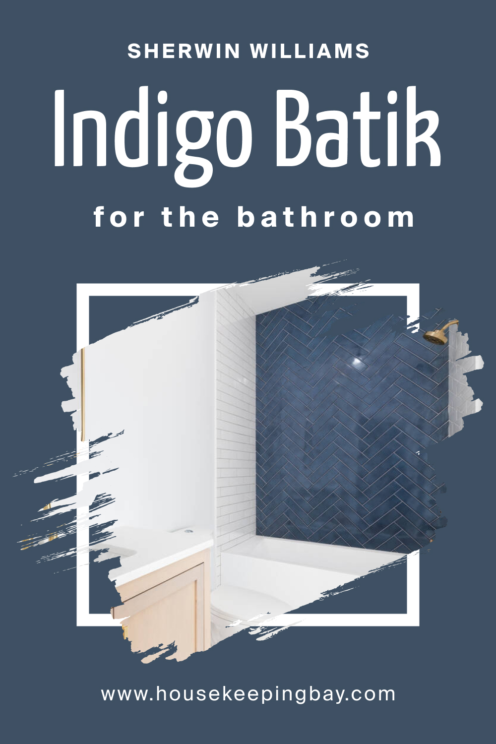
How to use SW Indigo Batik in the Bathroom?
In the bathroom, SW Indigo Batik can introduce a spa-like, tranquil environment. Its cool tones can evoke a sense of cleanliness and freshness. By complementing it with lighter tiles, fixtures, and accessories, it can create a striking contrast, making the space appear more vibrant and lively while maintaining its soothing aura.
Balancing SW Indigo Batik with elements like wood or metallic finishes can add warmth and richness to the bathroom. It allows for the integration of different textures and materials, enhancing the overall aesthetic appeal and making the space feel more luxurious and refined.
housekeepingbay.com
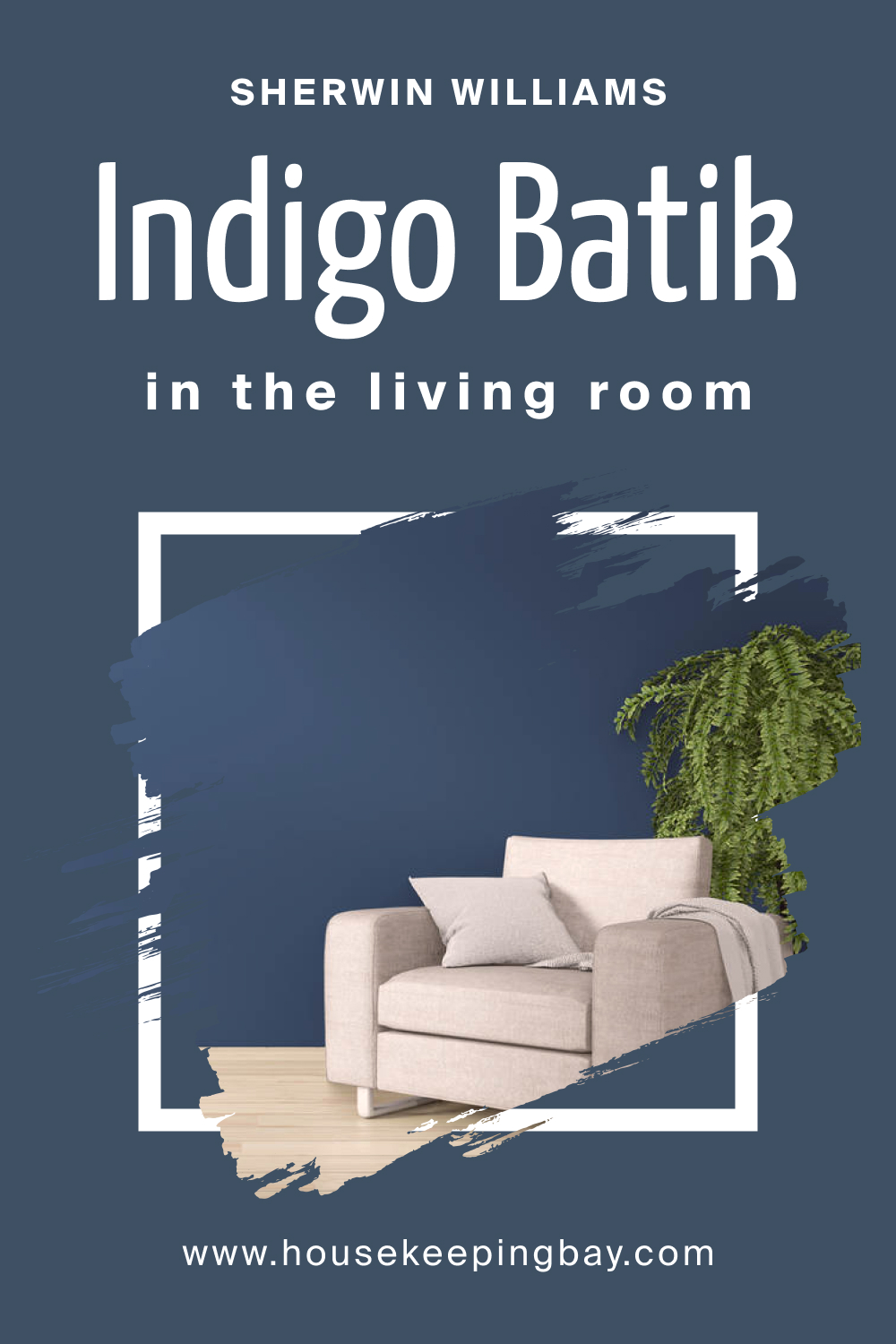
How to use SW Indigo Batik in the Living Room?
SW Indigo Batik can make a living room feel more inviting and cozy due to its deep, rich tones. By using it strategically, like on an accent wall or furniture pieces, it can serve as a beautiful focal point, drawing attention and adding a layer of sophistication to the room. When paired with lighter, neutral colors, it prevents the space from feeling too dark and allows for a balanced, harmonious look.
Incorporating Indigo Batik with varying textures and patterns in the living room can create a dynamic and engaging space. Complementing it with soft furnishings, rugs, and decorative items in coordinating colors can tie the room together, enhancing the overall comfort and aesthetic value of the living area.
housekeepingbay.com
How to use SW Indigo Batik for an Exterior?
For exterior applications, SW Indigo Batik can offer a bold, striking presence, setting the property apart with its depth and vibrancy. It works well with a variety of architectural styles, serving as a sophisticated backdrop to landscaping and outdoor elements. When coordinated with the right trim and accent colors, it can enhance the curb appeal and add a touch of elegance to the property.
When using SW Indigo Batik on the exterior, it’s essential to consider the surrounding environment and lighting conditions. The color can appear differently under natural light, and the surrounding landscape can influence its perception. Balancing it with lighter, complementary colors for trim, doors, and other details can ensure a harmonious and aesthetically pleasing appearance from the outside.

housekeepingbay.com
Comparing SW Indigo Batik With Other Colors
Comparing colors before using them in your home is essential to achieve a coherent and harmonious color scheme. Every color has its own character and interacts differently with other colors, influencing the overall ambiance and visual appeal of a space. By comparing colors, you can visualize how they will complement or contrast with each other, ensuring they work together to create the desired effect, whether it’s to soothe, energize, or focus.
Analyzing colors beforehand also aids in avoiding clashing and overly vibrant combinations that can disrupt the balance of the space. It allows for the assessment of how different tones, shades, and tints will interact in various lighting conditions and against different textures and materials within the room.
This step is pivotal for achieving a thoughtful and well-curated aesthetic, ensuring each color contributes to a unified and pleasing home environment.
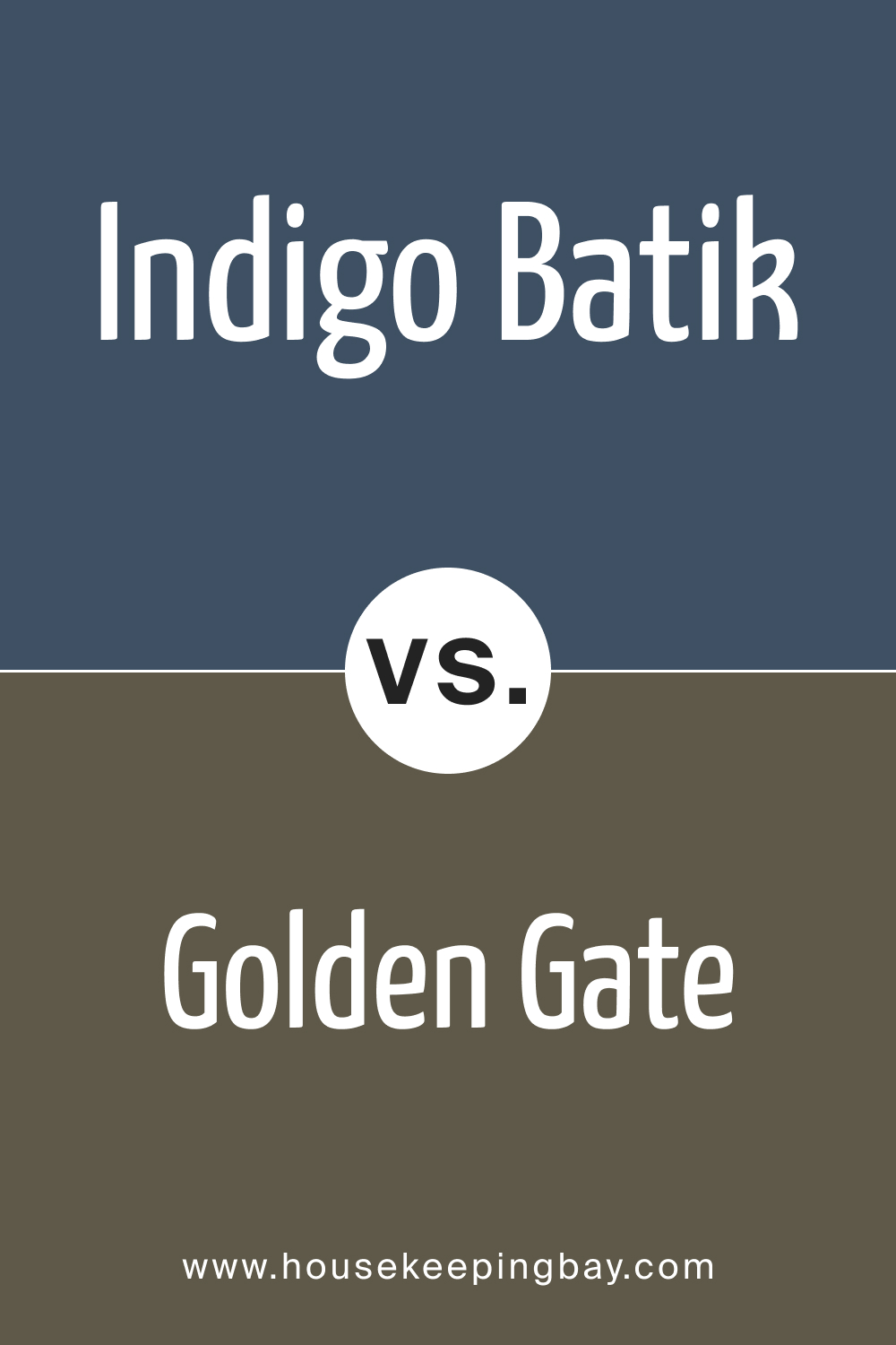
SW 7602 Indigo Batik vs. SW 7679 Golden Gate
Indigo Batik and Golden Gate , both by Sherwin-Williams, present contrasting color palettes. Indigo Batik is a deep, enriched blue, exuding a sense of calm and serenity, while Golden Gate is a bold, radiant orange, emitting warmth and vibrancy. These contrasting hues can complement each other well, providing a balanced and harmonious visual appeal when used together.
In interior design, Indigo Batik could serve as a soothing backdrop, whereas Golden Gate can act as an accentuating element, adding sparks of energy and enthusiasm to the living space. They can create an engaging visual dynamic, inviting a variety of decorative elements and textures to coexist beautifully.
housekeepingbay.com
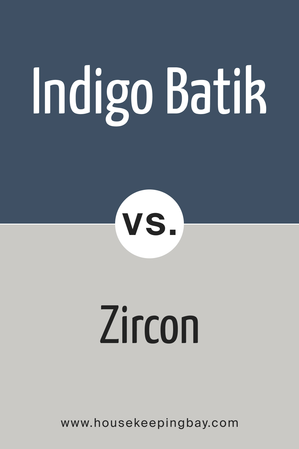
SW 7602 Indigo Batik vs. SW 7667 Zircon
Indigo Batik and Zircon showcase variations in the cool color spectrum. Indigo Batik is a deep, sophisticated blue, imparting tranquility and depth. In contrast, Zircon is a light gray with a hint of blue, projecting subtlety and neutrality. Zircon’s understated elegance can beautifully offset the intensity of Indigo Batik, creating a refined and harmonious atmosphere.
When incorporated together in interiors, Zircon can provide a subtle, neutral canvas allowing Indigo Batik to prominently stand out, enhancing the overall aesthetic richness and depth of the space, perfect for those seeking a serene and sophisticated ambiance.
housekeepingbay.com
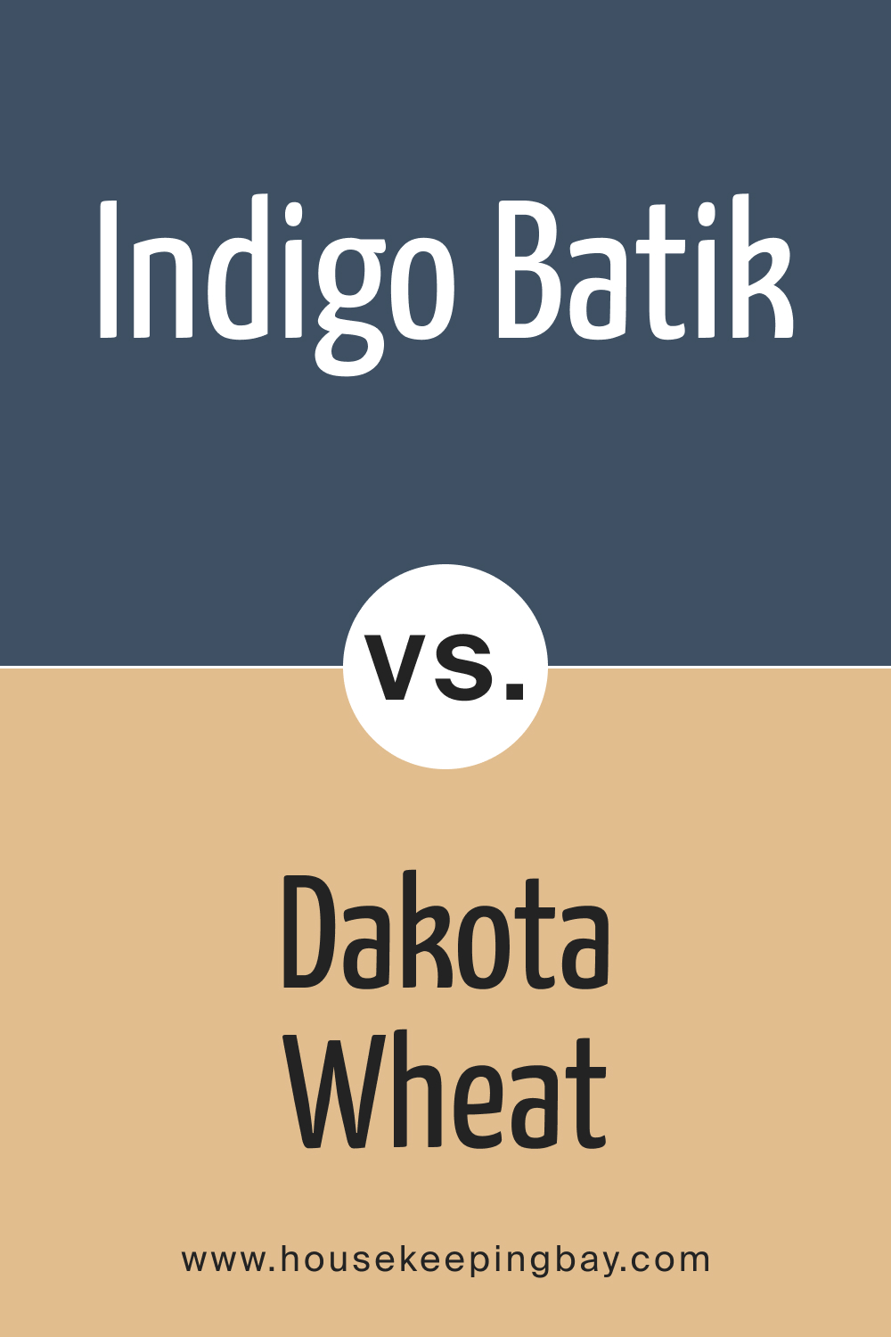
SW 7602 Indigo Batik vs. SW 9023 Dakota Wheat
Indigo Batik and Dakota Wheat represent contrasting color families—blue and beige, respectively. Indigo Batik is rich and tranquil, while Dakota Wheat is warm and earthy, adding a cozy and welcoming feel to any space. These colors can create a balanced and inviting color palette when combined, with Dakota Wheat lightening the mood and Indigo Batik adding depth.
Using Dakota Wheat as a base color can yield a calming, neutral environment, allowing the boldness of Indigo Batik to create striking focal points within a room, making it an ideal pair for creating spaces that are both relaxed and visually intriguing.
housekeepingbay.com
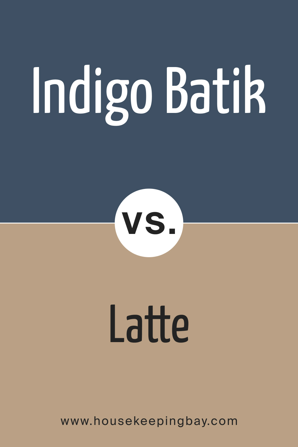
SW 7602 Indigo Batik vs. SW 6108 Latte
Indigo Batik, a deep and calming blue, contrasts beautifully with Latte , a warm and creamy brown. Latte can bring a comforting, homely feel, harmonizing with the cool tones of Indigo Batik to create a balanced and inviting atmosphere. This contrast offers both warmth and coolness, suitable for a variety of living spaces.
When integrating these colors into interior design, Latte can act as a warm, neutral backdrop, allowing the cool tones of Indigo Batik to pop, adding a serene and distinguished touch to the overall design, appealing to those who prefer a cozy yet sophisticated aesthetic.
housekeepingbay.com
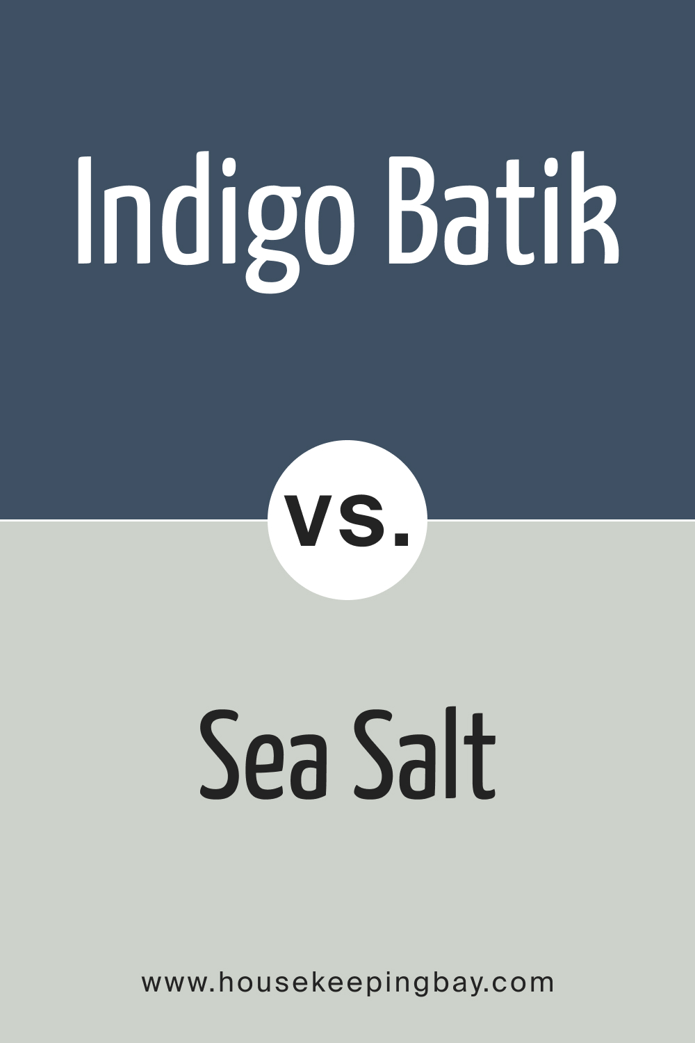
SW 7602 Indigo Batik vs. SW 6204 Sea Salt
When pairing Indigo Batik with Sea Salt , a balance of deep and light tones is achieved. Indigo Batik offers a sense of depth and serenity with its enriched blue, while Sea Salt, a crisp and airy greenish-gray, brings a breath of fresh air to spaces. These colors can work together harmoniously, providing a refreshing and calming aesthetic to interiors.
Sea Salt can act as a versatile neutral base, allowing the boldness of Indigo Batik to shine, crafting spaces that feel open, bright, and serene, suitable for those seeking a refreshing and tranquil environment.
housekeepingbay.com
SW 7602 Indigo Batik vs. SW 7710 Brandywine
Indigo Batik and Brandywine present a dynamic color contrast—Brandywine is a deep, rich red, offering warmth and vibrancy, while Indigo Batik brings cool, serene blue tones. These colors can create a striking, yet harmonious, color palette, full of depth and energy, suitable for creating impactful and lively interiors.
When these colors are juxtaposed, Brandywine can serve as a bold accent, enhancing the calming effect of Indigo Batik. This combination can offer a captivating and harmonious visual experience, ideal for those desiring spaces with both energy and tranquility.
housekeepingbay.com
Conclusion
SW 7602 Indigo Batik is not just a color; it is a journey, an exploration into the depths of emotion, culture, and design. Its cool nature and intricate undertones make it a versatile and sophisticated choice, suitable for a variety of spaces and styles. It embodies serenity and depth, wisdom and mystery, nature and luxury, creating environments that are both visually stunning and emotionally resonant.
Indigo Batik tells a story of balance and harmony, of connection and reflection, of elegance and innovation. It is a color that adapts and evolves, revealing its many facets in the dance of light and shadow.
Whether you are seeking to create a tranquil retreat, a sophisticated space, or a canvas for creative expression, SW 7602 Indigo Batik offers a world of possibilities, inviting you to explore its richness and beauty.
In every stroke of SW 7602 Indigo Batik, there lies an opportunity to transform a space, to evoke emotion, and to tell a story. It is a color that speaks to the soul, a color that, with its cool essence and multifaceted undertones, creates a symphony of visual and emotional harmony, leaving a lasting impression on every beholder.
housekeepingbay.com
Ever wished paint sampling was as easy as sticking a sticker? Guess what? Now it is! Discover Samplize's unique Peel & Stick samples. Get started now and say goodbye to the old messy way!
Get paint samples


Frequently Asked Questions
⭐How many coats of SW 7602 Indigo Batik are typically needed?
The number of coats needed for SW 7602 Indigo Batik depends on the surface, color being covered, and the quality of the paint, but generally, two coats are sufficient to achieve a uniform and durable finish.
⭐Is SW 7602 Indigo Batik easy to clean?
Yes, SW 7602 Indigo Batik is easy to clean, especially if formulated in a higher gloss finish or a specific durable interior paint, making it suitable for high-traffic areas or spaces prone to spills and stains.
⭐Can SW 7602 Indigo Batik be used in a room with a lot of sunlight?
Absolutely, SW 7602 Indigo Batik performs well in sunny rooms, its deep tones can provide a striking contrast to the bright sunlight, creating a balanced and vibrant atmosphere in the space.
⭐Is SW 7602 Indigo Batik suitable for small spaces?
Yes, while it is a deep color, SW 7602 Indigo Batik can be used effectively in small spaces when balanced with lighter colors, reflective surfaces, or adequate lighting to prevent the space from feeling cramped.
⭐Can I use SW 7602 Indigo Batik on the ceiling?
Certainly! Using SW 7602 Indigo Batik on the ceiling can create a dramatic and enveloping feel in a room, especially when paired with lighter wall colors to maintain balance.