Granite Peak SW 6250 Paint Color by Sherwin-Williams
Discover the beauty of this deep blue hue
SW 6250 Granite Peak is a versatile and distinctive color that can be a focal point in interior design. Its complex shades and compatibility with various styles have made it a popular choice for many homeowners and designers.
This article will delve into the different aspects of SW 6250 Granite Peak, from its color characteristics to its effect under various lighting conditions.
via sherwin-williams.com
What Color Is SW 6250 Granite Peak?
Table of Contents
SW 6250 Granite Peak is a deep blue color with a touch of gray. This color offers a calming yet robust appearance that blends well with various interior styles, especially in modern and coastal interiors. Its flexibility enables it to pair well with natural materials such as wood and stone, as well as metallic and glass textures.
The slate gray undertones offer an earthy feel that can add depth and sophistication to any room.
housekeepingbay.com
Is It a Warm Or Cool Color?
SW 6250 Granite Peak is categorized as a cool color. The coolness of this hue comes from its deep blue shade, which can create a calming and tranquil ambiance in the home. Its cooling effect can balance warmer elements in the room, thereby harmonizing the overall color scheme.
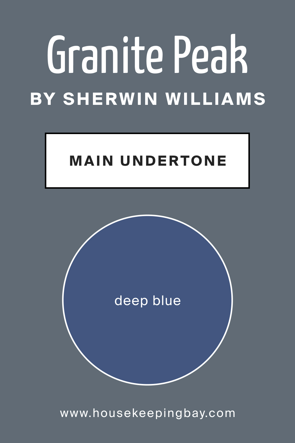
Undertones of SW 6250 Granite Peak
Undertones play a significant role in the way a color is perceived. SW 6250 Granite Peak has slate gray undertones that add to the richness of this deep blue color. These undertones help in creating an earthy and grounding effect, making it an appealing choice for creating a soothing environment.
housekeepingbay.com
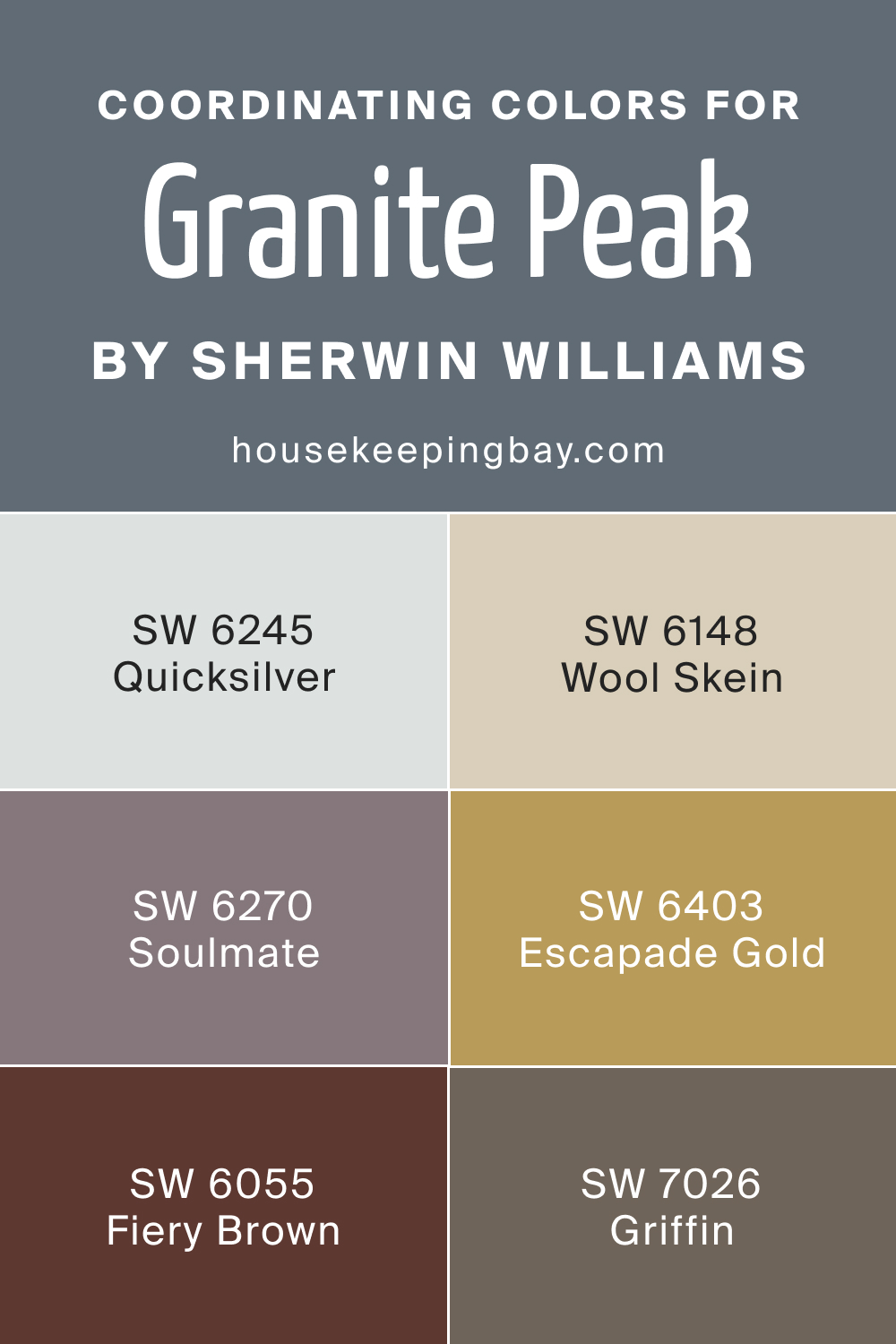
Coordinating Colors of SW 6250 Granite Peak
Coordinating colors are those that work harmoniously with a particular shade. For SW 6250 Granite Peak, coordinating colors include:
- SW 6245 Quicksilver : A soft gray with a silvery touch.
- SW 6148 Wool Skein : A warm beige that balances the coolness of Granite Peak.
- SW 6403 Escapade Gold : A bright gold that adds richness.
3 More Sherwin-Williams Colors:
- SW 7026 Griffin : A neutral gray that blends effortlessly.
- SW 6055 Fiery Brown : A bold brown that contrasts beautifully.
- SW 6270 Soulmate : A soft lavender that complements the blue.
housekeepingbay.com
How Does Lighting Affect SW 6250 Granite Peak?
Lighting plays a critical role in the appearance of SW 6250 Granite Peak. Under natural light, its blue hue may appear more vibrant, whereas artificial light might emphasize its gray undertones. In north-faced rooms, the color may seem cooler, while in south-faced rooms, it appears warmer. East and west-facing rooms offer different shades of color throughout the day, contributing to the dynamic appearance of Granite Peak.
housekeepingbay.com
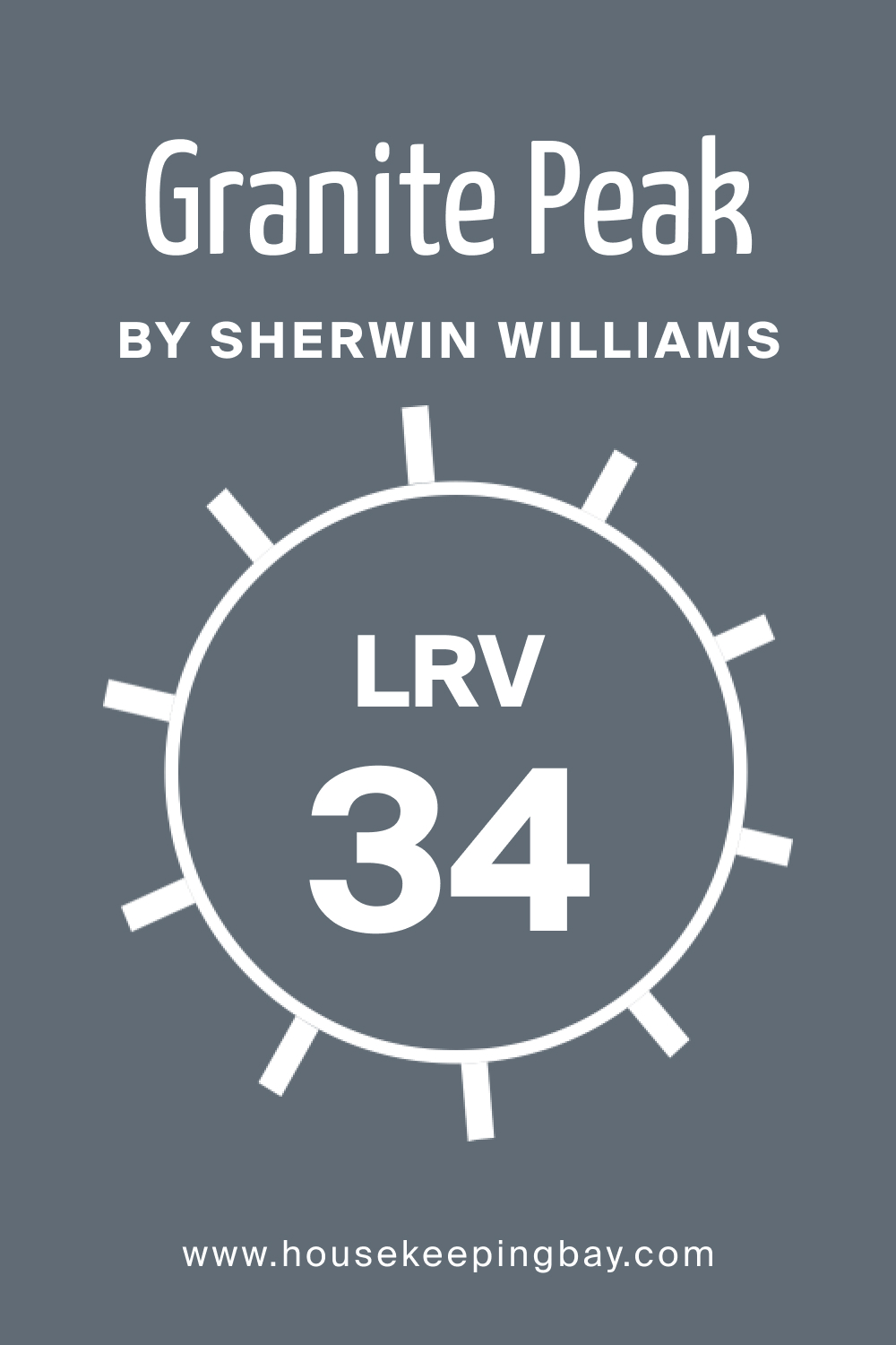
LRV of SW 6250 Granite Peak
LRV, or Light Reflectance Value, is a measure of how much light a color reflects. With an LRV of 34, SW 6250 Granite Peak is on the lower end of the scale, reflecting only a small amount of light. This means it will appear darker on the walls, creating a more intimate and cozy atmosphere. The low LRV value adds to its depth, making it suitable for feature walls or rooms where a more dramatic effect is desired.
housekeepingbay.com
What is LRV? Read It Before You Choose Your Ideal Paint Color
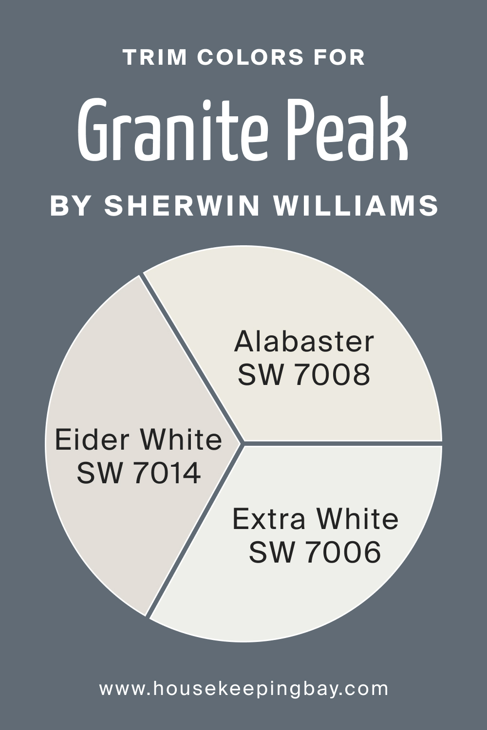
Trim Colors of SW 6250 Granite Peak
Trim colors accentuate the main wall color, and for SW 6250 Granite Peak, shades of white from Sherwin-Williams work beautifully. Here are several color options you might want to check out:
- SW 7014 Eider White : A soft white that provides a crisp contrast.
- SW 7006 Extra White : A pure white that brightens the space.
- SW 7008 Alabaster : A warm white that complements the blue undertones.
housekeepingbay.com
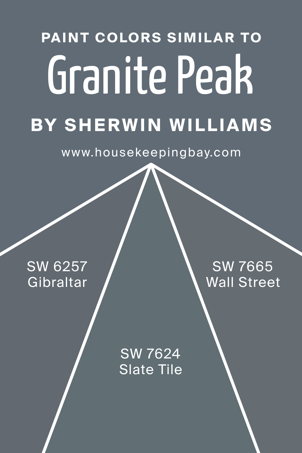
Colors Similar to SW 6250 Granite Peak
Knowing similar colors to SW 6250 Granite Peak is essential for finding alternatives or complements. For SW Granite Peak, we can suggest you three such colors:
- SW 6257 Gibraltar : A deep gray-blue.
- SW 7665 Wall Street : A solid, slate gray.
- SW 7624 Slate Tile : A sophisticated blue-gray.
housekeepingbay.com
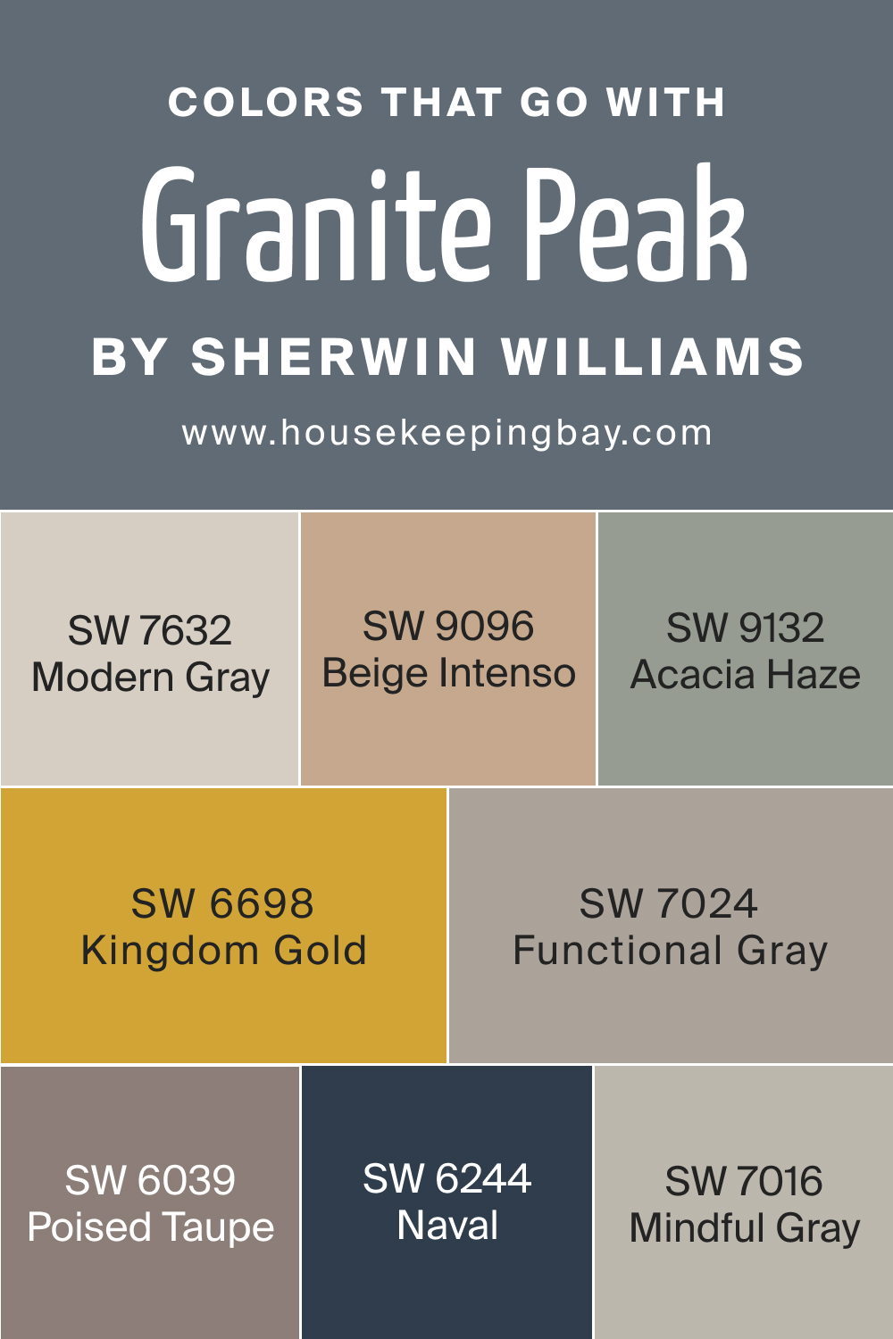
Colors That Go With SW 6250 Granite Peak
Colors that work well with SW 6250 Granite Peak add to its versatility. You might want to consider the following options for your home interiors:
- SW 7632 Modern Gray : A contemporary neutral.
- SW 6698 Kingdom Gold : A rich, royal gold
- SW 9096 Beige Intenso : A warm, inviting beige.
- SW 9132 Acacia Haze : A soft green-gray.
- SW 7024 Functional Gray : A practical, balanced gray.
Also, here are three additional colors to make the palette more varied:
- SW 6039 Poised Taupe : A timeless taupe.
- SW 6244 Naval : A strong naval blue.
- SW 7016 Mindful Gray : A neutral gray with warm undertones.
Together, these colors create an extensive palette that allows for creativity and harmony when working with SW 6250 Granite Peak, making it an alluring choice for a wide range of applications and styles.
housekeepingbay.com
How to Use SW 6250 Granite Peak In Your Home?
SW 6250 Granite Peak is a highly adaptable color that can be used across various rooms and design styles. Its deep blue shade with slate gray undertones makes it suitable for modern, coastal, and even traditional interiors. From accent walls in living rooms to bathroom vanities and exterior façades, this color provides a soothing yet striking presence.
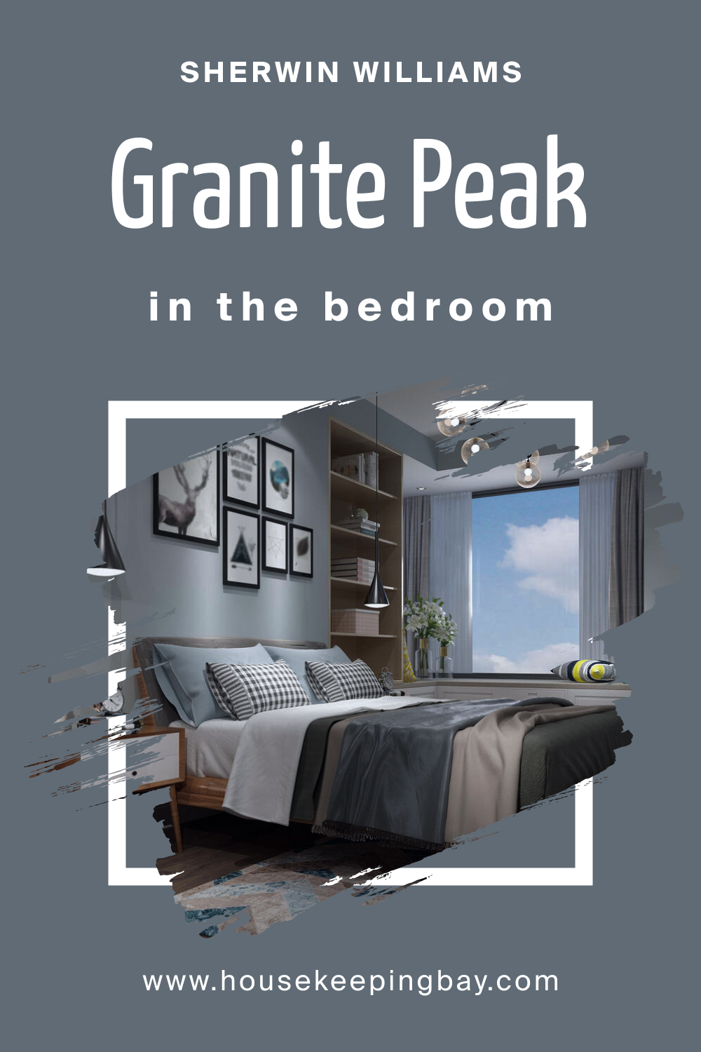
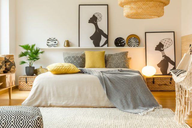
How to Use SW 6250 Granite Peak in the Bedroom?
In the bedroom, SW 6250 Granite Peak can create a serene and calming ambiance. Its cool, deep blue shade is perfect for encouraging relaxation and rest. Pair it with soft white textiles and natural wooden furniture for a tranquil retreat.
housekeepingbay.com
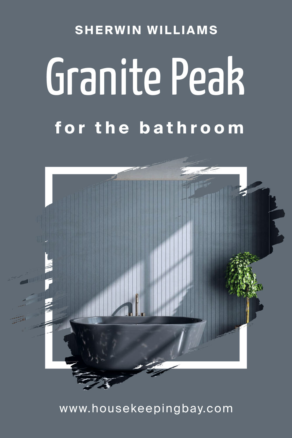
How to Use SW 6250 Granite Peak in the Bathroom?
In the bathroom, Granite Peak can provide a splash of color, turning an ordinary space into a soothing spa-like environment. Pair it with light-colored tiles and fixtures, and you have a refreshing space that energizes you for the day ahead.
housekeepingbay.com
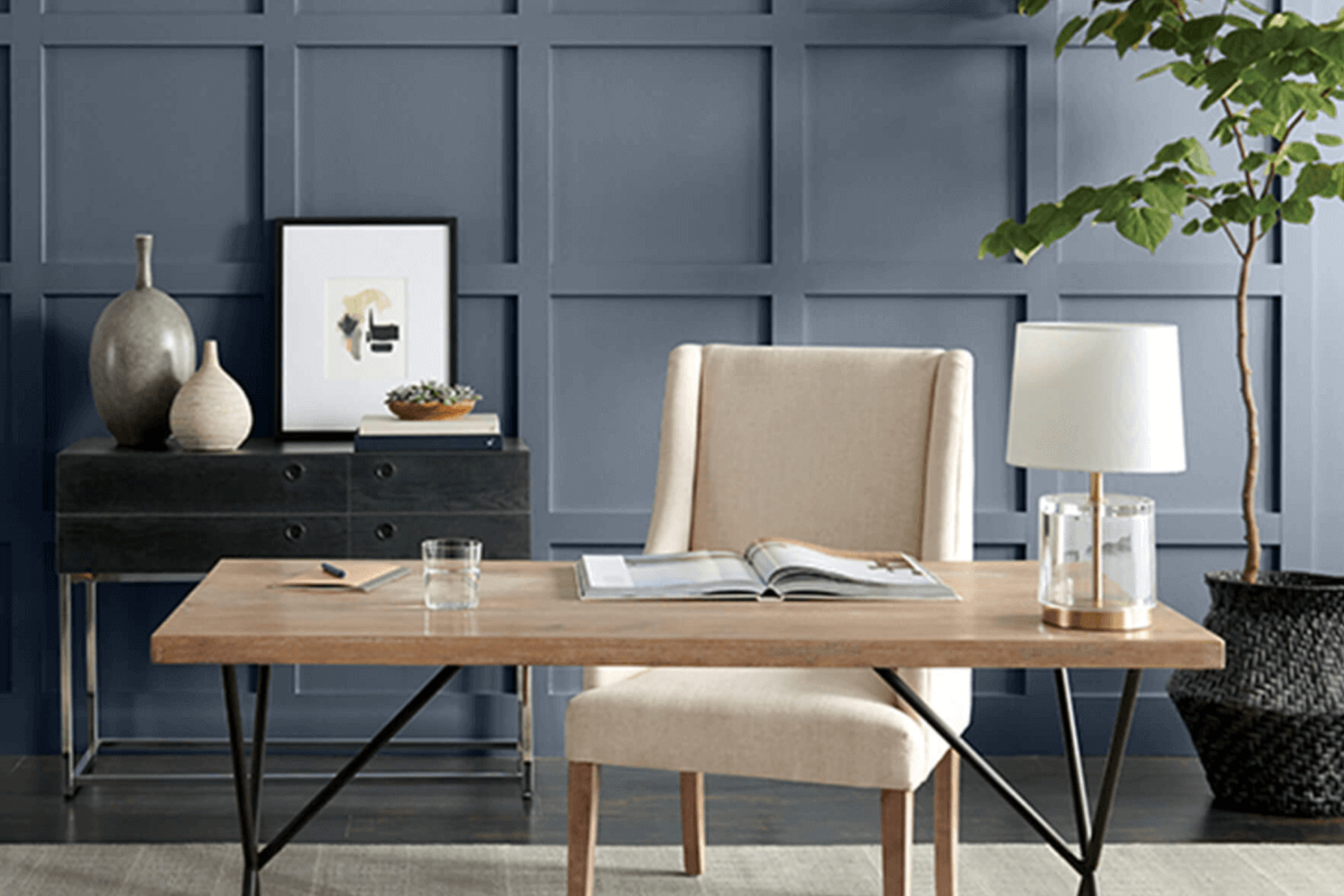
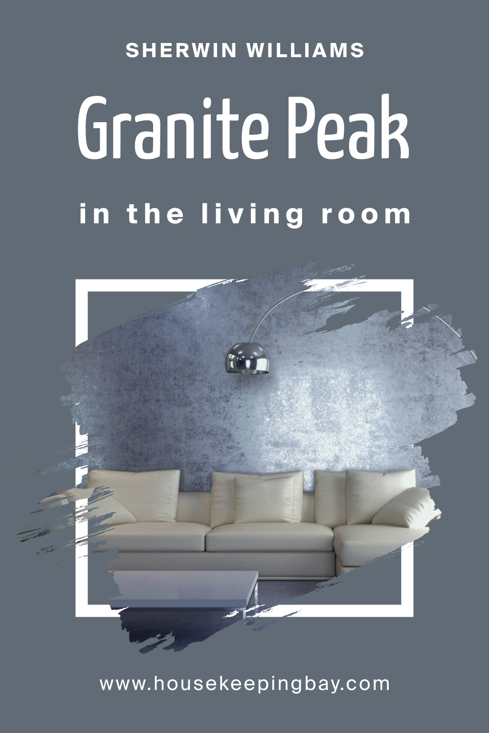
How to Use SW 6250 Granite Peak in the Living Room?
SW 6250 Granite Peak in the living room sets a tone of elegance and sophistication. Used as an accent wall or throughout the space, it pairs beautifully with light-colored furnishings and metallic accents. This color adds depth and character to the social heart of the home.
housekeepingbay.com
How to Use SW 6250 Granite Peak for an Exterior?
For exterior use, SW 6250 Granite Peak lends a timeless and dignified appearance. It’s robust enough to make a statement yet versatile enough to blend with various architectural styles. Combine it with white or light gray trim for a striking contrast.
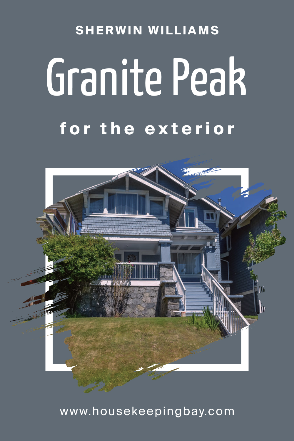
housekeepingbay.com
How to Use SW 6250 Granite Peak in the Kitchen?
The kitchen can also benefit from the charm of SW 6250 Granite Peak. It can be used on walls to create a balanced, inviting space, especially when paired with light-colored countertops and stainless steel appliances. The color’s depth adds a touch of luxury to the culinary space.
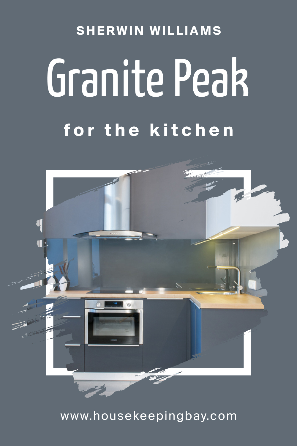
housekeepingbay.com
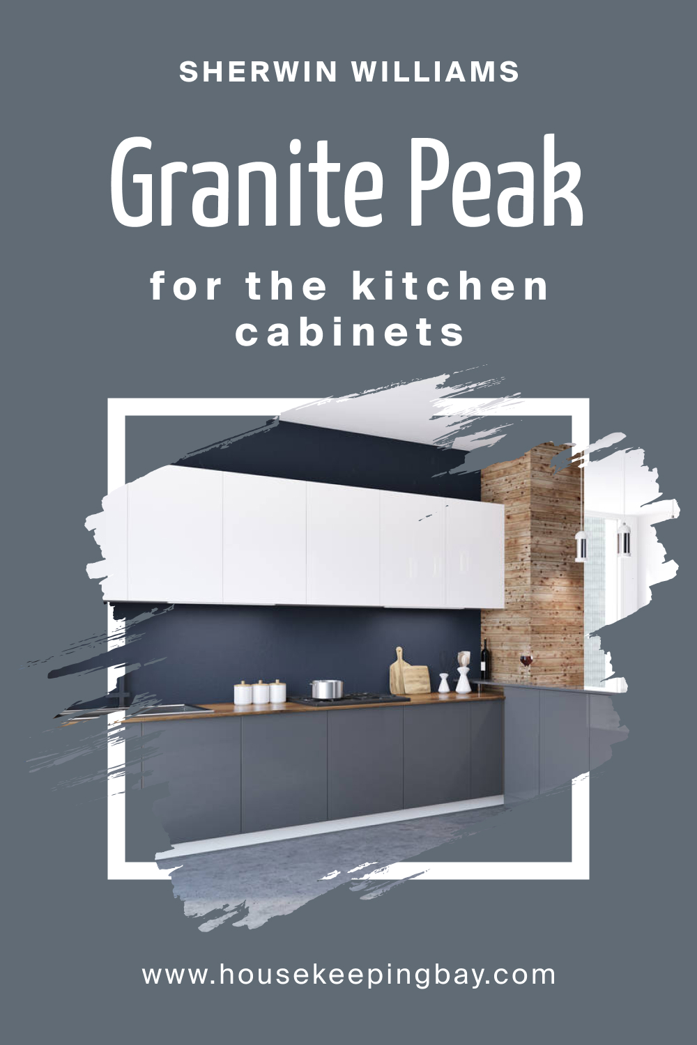
How to Use SW 6250 Granite Peak for the Kitchen Cabinets?
SW 6250 Granite Peak is an excellent choice for kitchen cabinets, adding a pop of color without overwhelming the space. Its deep blue with slate gray undertones creates an eye-catching focal point, especially when combined with brushed nickel hardware and light-colored countertops. The result is a kitchen that’s both contemporary and cozy.
Together, these applications of SW 6250 Granite Peak demonstrate the color’s versatility and adaptability across various spaces and styles in the home. Whether you’re looking to create a soothing bedroom or a bold kitchen, Granite Peak offers endless possibilities to express your design vision.
housekeepingbay.com
Comparing SW 6250 Granite Peak With Other Colors
Comparing colors is an essential part of interior design and decoration. It’s vital to understand how a specific shade interacts with others to create a cohesive color scheme. By comparing SW 6250 Granite Peak with other colors, you can assess compatibility, contrast, mood, and visual interest, allowing for more precise design decisions.
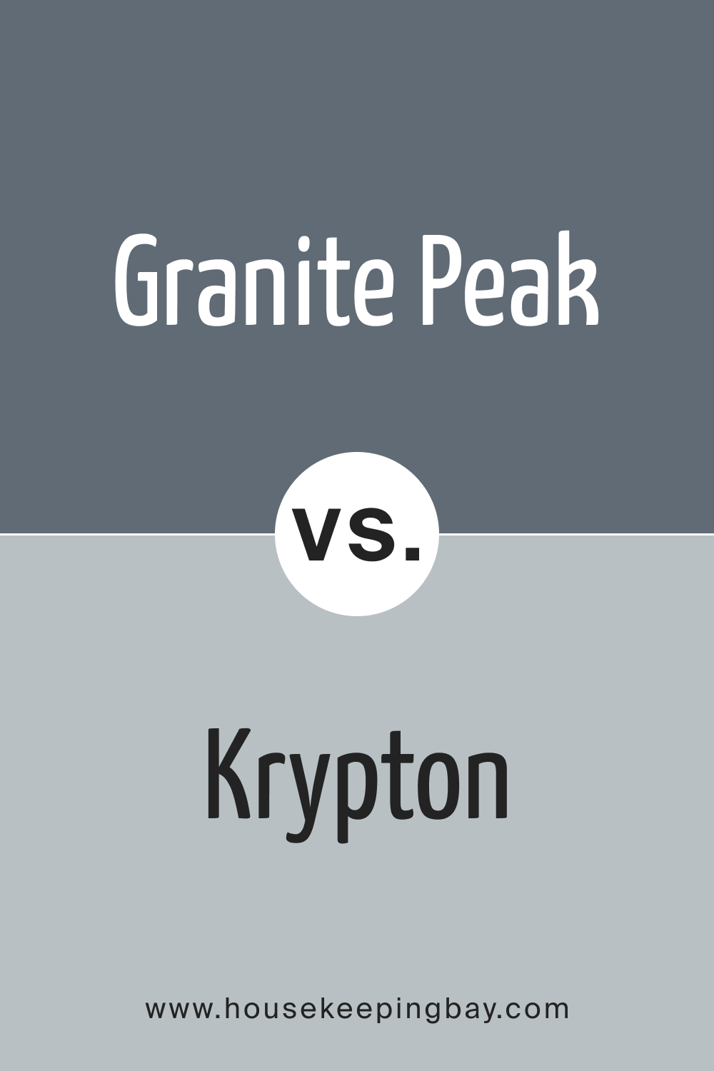
SW 6250 Granite Peak vs. SW 6247 Krypton Paint
Both Granite Peak and Krypton Paint fall in the cool color spectrum. While Granite Peak provides a deep blue shade with gray undertones, Krypton Paint is a lighter, softer blue. Granite Peak offers a more profound, sophisticated feel, whereas Krypton brings a breezy, airy touch. Together, they can create a balanced and harmonious palette or be used individually for different effects.
housekeepingbay.com
SW 6250 Granite Peak vs. SW 9138 Stardew
SW 9138 Stardew is a calming bluish-gray color. Compared to Granite Peak, Stardew is softer and subtler. Granite Peak’s richness and depth make it more assertive, while Stardew’s muted tone can provide a tranquil backdrop. These two colors could complement each other, with Granite Peak acting as an accent and Stardew as the main color.
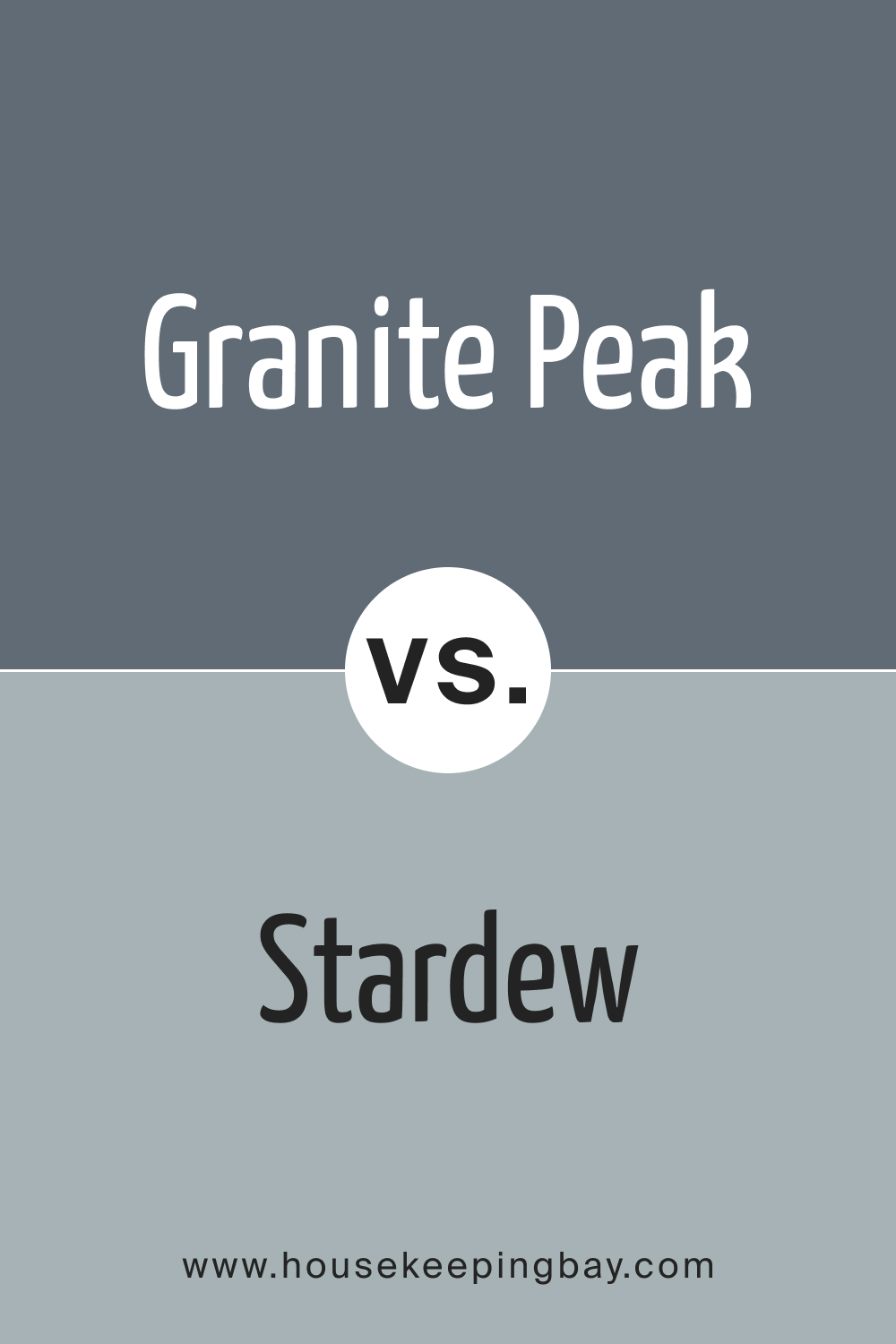
housekeepingbay.com
SW 6250 Granite Peak vs. SW 9154 Perle Noir
SW 9154 Perle Noir is a deep, dark black with a touch of shimmer. In contrast, Granite Peak is deep blue with gray undertones. Granite Peak is more approachable and warm compared to the stark boldness of Perle Noir. Using these two colors together can create a dramatic and elegant atmosphere.
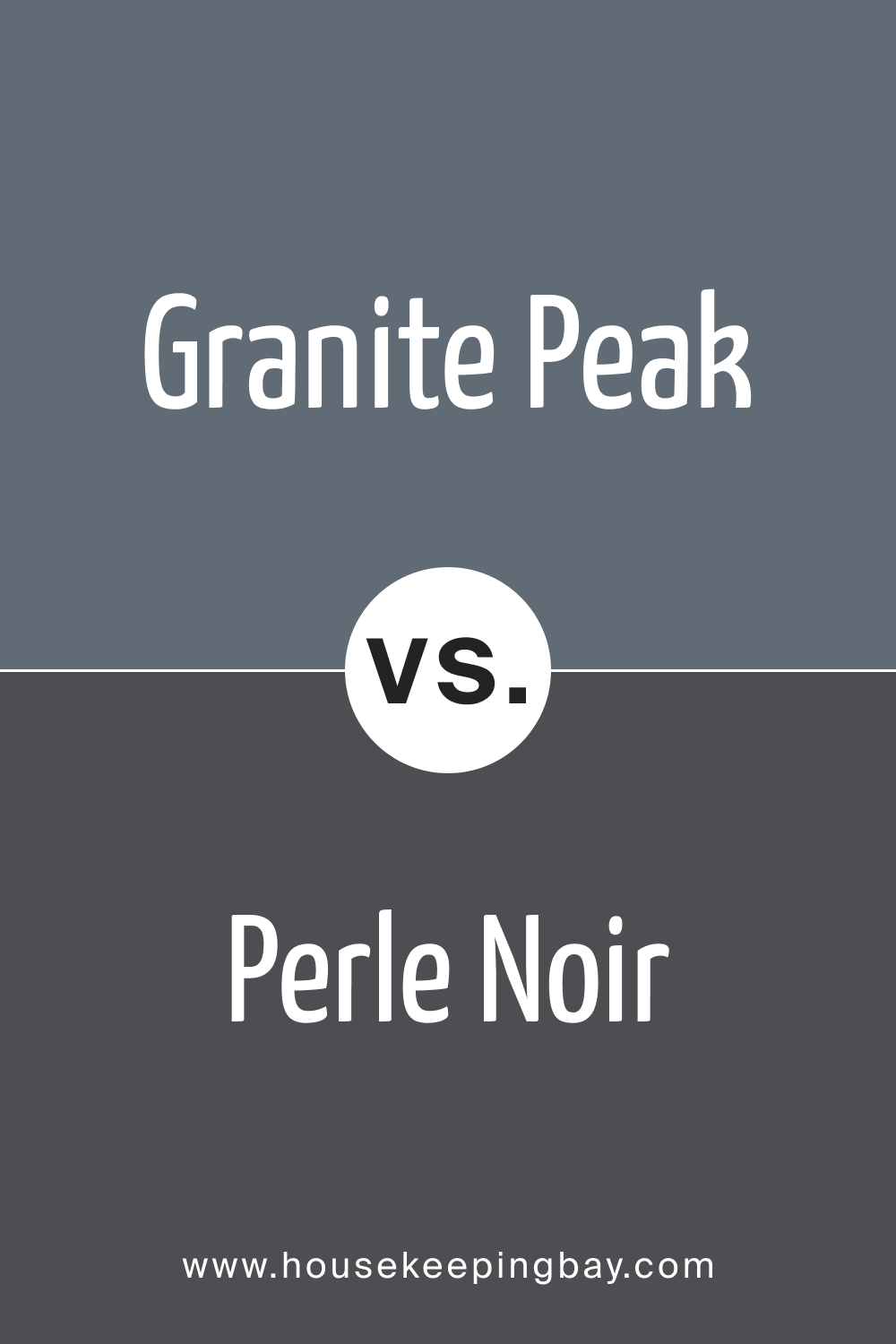
housekeepingbay.com
SW 6250 Granite Peak vs. SW 6249 Storm Cloud
SW Storm Cloud is a medium shade of blue with a touch of gray. Compared to Granite Peak, Storm Cloud is lighter but still carries a sense of depth. Both colors can work harmoniously in a coastal or modern design, with Granite Peak adding weight and Storm Cloud offering balance.
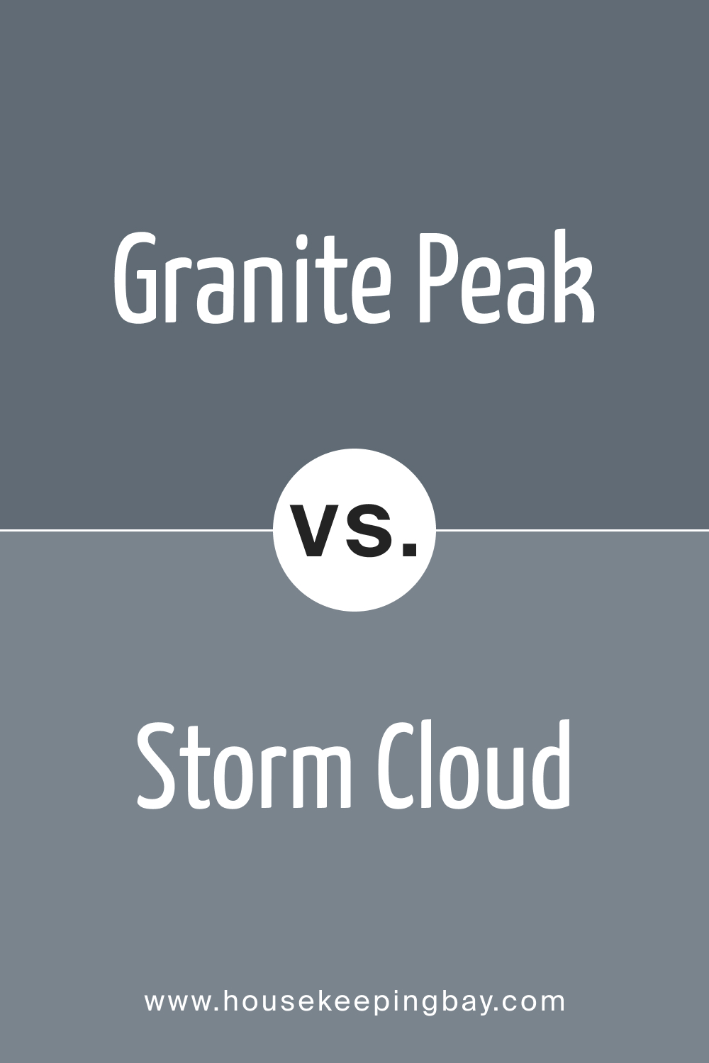
housekeepingbay.com
SW 6250 Granite Peak vs. SW 9132 Acacia Haze
SW Acacia Haze is a soft green-gray, providing a fresh and organic feel. Compared to Granite Peak, it brings a sense of nature and lightness. Granite Peak’s deep blue can anchor Acacia Haze’s airy quality, creating a layered and textured look in a room.
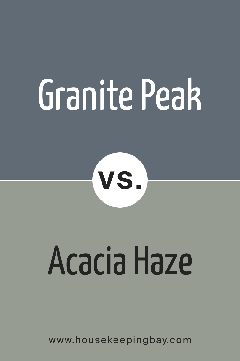
housekeepingbay.com
SW 6250 Granite Peak vs. SW 6257 Gibraltar
SW 6257 Gibraltar is a close relative to Granite Peak, with a gray-blue appearance. The differences lie in the depth and intensity, with Gibraltar being slightly lighter. When used together, they can create a gradient effect, or individually, they offer different moods, with Gibraltar being softer and Granite Peak more assertive.
housekeepingbay.com
Conclusion
SW 6250 Granite Peak is a versatile and rich color that can interact beautifully with various shades. Its comparison with other colors, from soft blues to deep blacks, reveals its potential to be a standout feature or a complementary element within diverse design schemes.
Understanding these comparisons allows for informed choices, paving the way for cohesive and aesthetically pleasing interior spaces. Whether you’re aiming for tranquility, sophistication, or a blend of both, Granite Peak offers endless opportunities to create the desired ambiance in your home.
housekeepingbay.com
Ever wished paint sampling was as easy as sticking a sticker? Guess what? Now it is! Discover Samplize's unique Peel & Stick samples. Get started now and say goodbye to the old messy way!
Get paint samples


Frequently Asked Questions
⭐What kind of undertones does SW 6250 Granite Peak have?
SW 6250 Granite Peak has slate gray undertones that give depth to its deep blue color. This characteristic allows it to blend well with various color schemes and interiors.
⭐Is SW 6250 Granite Peak a warm or cool color?
SW 6250 Granite Peak is considered a cool color. Its blue shade with gray undertones provides a calming and soothing presence, making it an excellent choice for bedrooms, bathrooms, and other tranquil spaces.
⭐What are some coordinating colors for SW 6250 Granite Peak?
Coordinating colors for SW 6250 Granite Peak include SW 6245 Quicksilver, SW 6148 Wool Skein, SW 6403 Escapade Gold, among others. These colors create harmonious combinations that can suit various design styles.
⭐How does lighting affect the appearance of SW 6250 Granite Peak?
Lighting can significantly affect how SW 6250 Granite Peak appears on walls. Natural light can enhance its depth, while artificial light may alter its appearance. It's advisable to test the color in the room's specific lighting conditions to get an accurate feel.
⭐What are some good trim colors to use with SW 6250 Granite Peak?
Suitable trim colors for SW 6250 Granite Peak include shades of white from the Sherwin-Williams brand, such as SW 7014 Eider White. These lighter shades create a beautiful contrast with the deep blue of Granite Peak.
3 thoughts on “Granite Peak SW 6250 Paint Color by Sherwin-Williams”
Leave a Reply


What style of furniture works best with this color in a living room?
Can I use SW 6250 Granite Peak in my small bathroom? Will it make the space feel smaller?
SW 6250 Granite Peak can be an excellent choice for a small bathroom. While it’s a deep color, pairing it with lighter fixtures, mirrors, and good lighting can actually add depth and sophistication to the space without making it feel cramped.