Crystalline SW 9691 by Sherwin Williams
Unveiling the Magic of the Ocean's Whisper
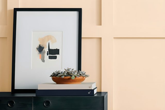
In the world of paint, finding just the right color can really change the look and feel of a space. SW 9691 Crystalline by Sherwin Williams is one such color that has grabbed the attention of homeowners and designers alike.
This particular shade, Crystalline, is a beautiful and serene color that brings a sense of calm and clarity to any room it adorns.
Often considered a hidden gem in Sherwin Williams’ expansive color collection, Crystalline offers a subtle balance between a refreshing aqua and a soft, gentle sky blue, making it a versatile choice for various design styles and spaces.
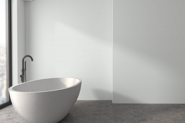
Whether you’re thinking of giving your living room a refreshing makeover, wanting to bring a peaceful ambiance to your bedroom, or aiming to create a soothing atmosphere in your bathroom, Crystalline could be the perfect pick.
Its ability to reflect light beautifully makes it an excellent option for enhancing the sense of space and openness in smaller rooms or areas without abundant natural light.
Moreover, its compatibility with a wide range of decor elements and colors, from crisp whites to natural wood tones and metallic accents, ensures that Crystalline is not just a color but a transformative design element.
So, if you’re looking to renew your space with a color that combines beauty, versatility, and a touch of tranquility, SW 9691 Crystalline by Sherwin Williams might just be the paint color you’ve been searching for.
via sherwin-williams.com
What Color Is Crystalline SW 9691 by Sherwin Williams?
CrystallineSW 9691 by Sherwin Williams is a refreshing, light turquoise that brings a gentle pop of color to any space. This hue strikes a balance between playful and serene, making it a versatile choice for various interior designs.
It has a soft, airy quality that can make small rooms feel larger and brighter, while in larger spaces, it adds a touch of whimsy without overwhelming the senses.
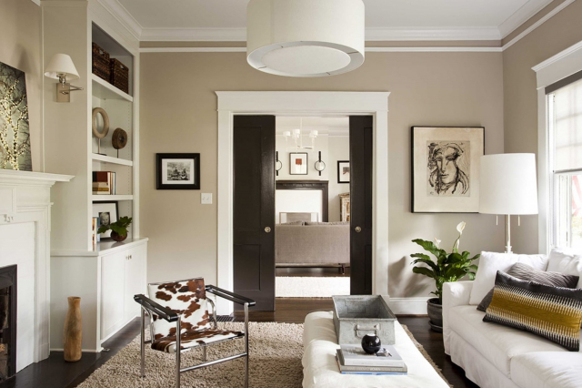
This color works particularly well in coastal, Scandinavian, and modern interior styles. Its light, breezy vibe is perfect for creating a beachy, relaxed feel that’s synonymous with coastal living.
In Scandinavian designs, Crystalline pairs beautifully with minimalistic furnishings and natural light, enhancing the clean, airy feel that this style is known for.
In modern interiors, it can serve as a subtle yet striking accent color that complements sleek lines and contemporary furnishings.
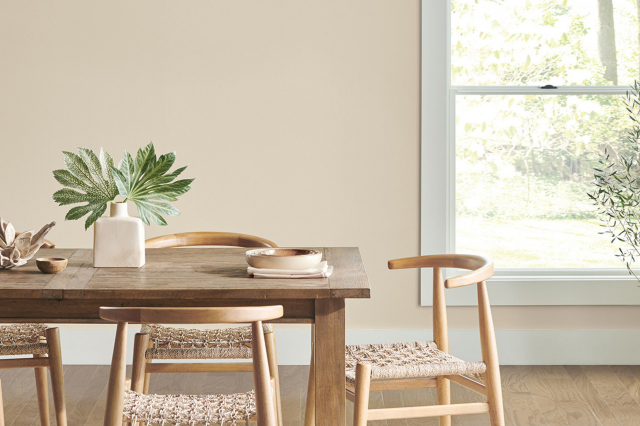
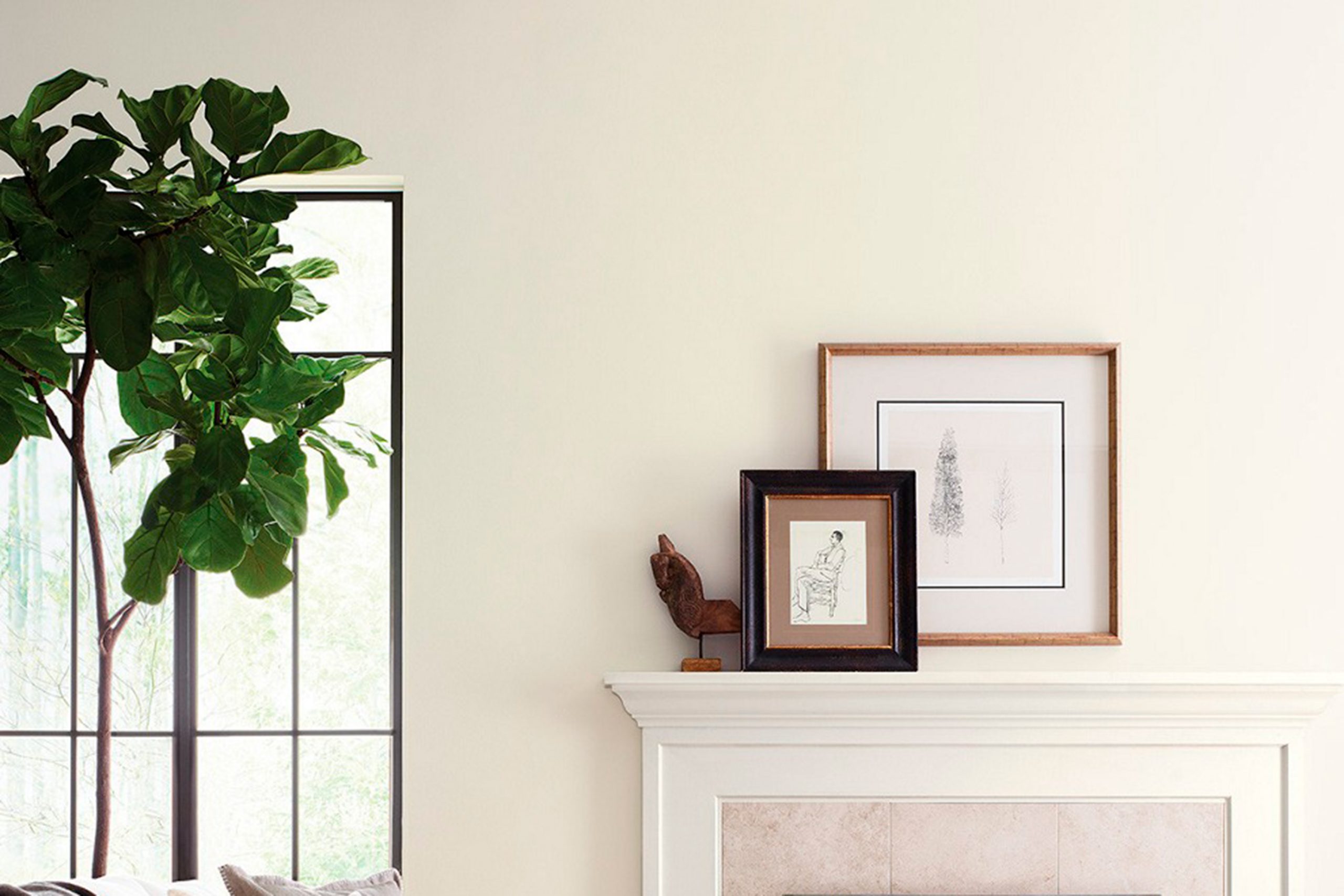
Crystalline pairs exceptionally well with light woods, such as pine or ash, adding warmth to the cool tones of the paint.
It also looks stunning when matched with materials like cotton, linen, and silk, creating a play of textures that can add depth and interest to a room.
To complete the look, metallic accents in silver or brushed nickel can add a touch of sophistication, making CrystallineSW 9691 a truly versatile color for any home.
housekeepingbay.com
Table of Contents
Is Crystalline SW 9691 by Sherwin Williams Warm or Cool color?
CrystallineSW 9691 by Sherwin Williams is a beautiful paint color known for its fresh and calming vibe. This particular shade is great for bringing a touch of serenity into any room of the house.
Its light and airy quality makes small spaces feel bigger and more open, which is a smart choice if you’re looking to enhance the feeling of space in your home.
The color can also influence the mood of a room. Because CrystallineSW 9691 has a peaceful and clean look, it can help create a relaxing atmosphere, perfect for bedrooms or bathrooms where you want to unwind.
In living areas, this shade works well to create a welcoming and comfortable environment, making it easier for everyone to chill out and feel at home.
Moreover, CrystallineSW 9691 is versatile enough to match various decor styles. Whether your home has a modern, minimalist, or even a rustic look, this color can fit right in.
By adding colorful accents or decorations, homeowners can really make the space feel personal and lively.
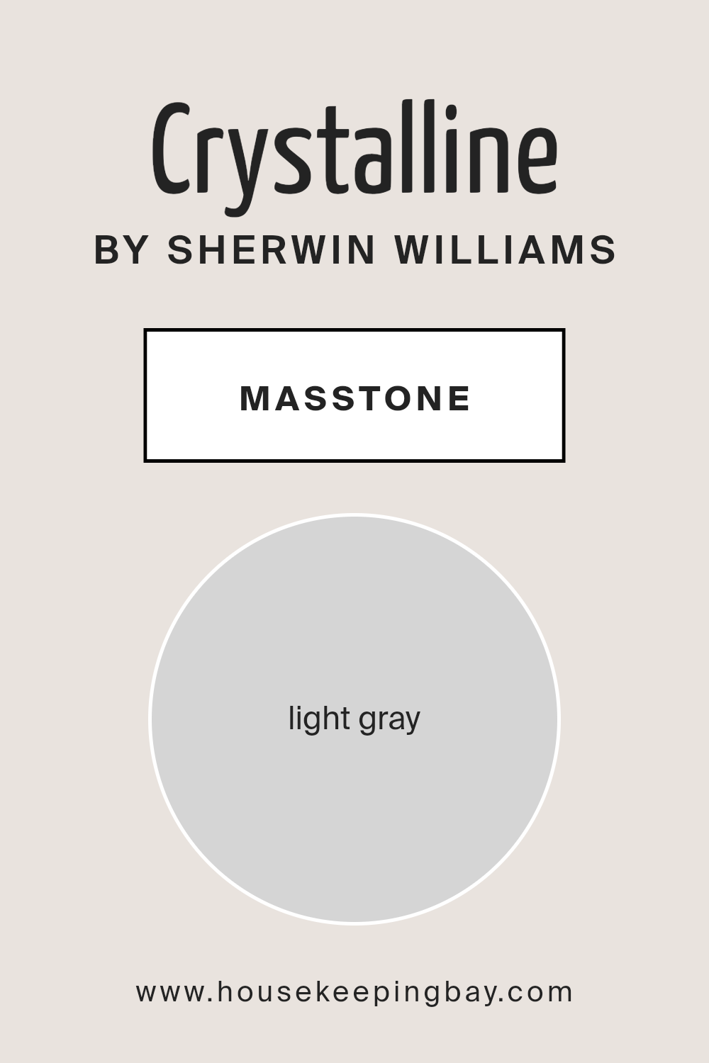
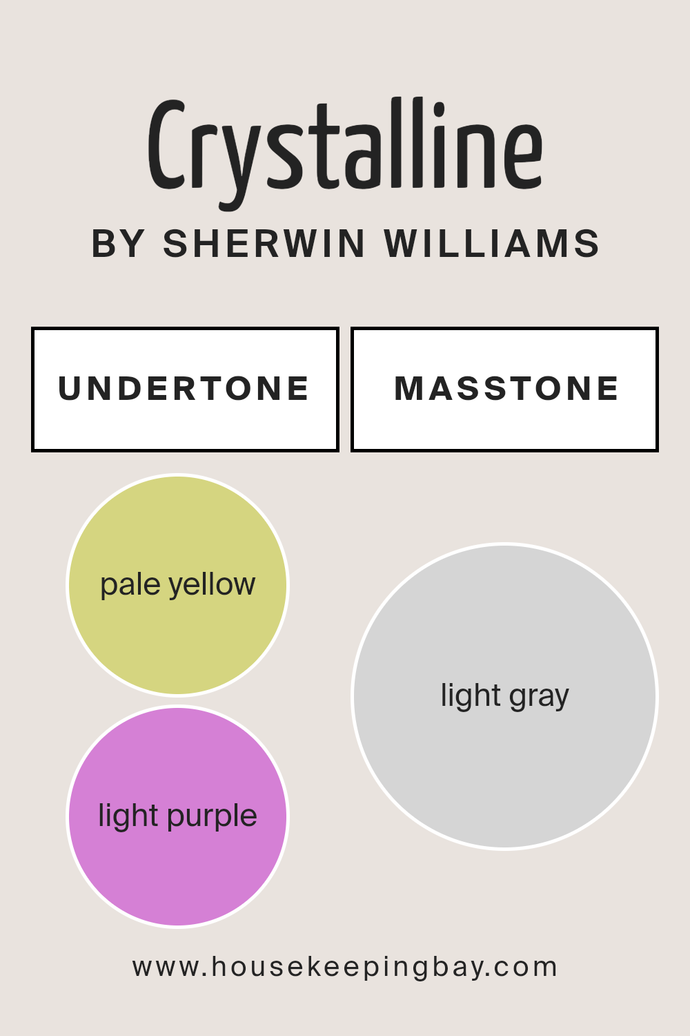
What is the Masstone of the Crystalline SW 9691 by Sherwin Williams?
CrystallineSW 9691 by Sherwin Williams has a masstone, or main color, of light gray, with the specific shade being #D5D5D5. This calm and soothing shade is versatile, making it a great choice for homes.
Its lightness means that it can make small rooms feel bigger and brighter, which is perfect for creating a sense of space.
Since light gray is such a neutral color, it works well with almost any other color, from bright and bold to soft and subtle, allowing for endless decorating possibilities.
This means you can easily add your personal touch to a room without worrying about clashing colors. Additionally, light gray walls can serve as a backdrop that makes your furniture or art stand out, acting almost like a canvas for your personal style.
It’s also great for creating a relaxed and welcoming atmosphere in your home, making it a popular choice for living rooms, bedrooms, and even bathrooms.
housekeepingbay.com
Undertones of Crystalline SW 9691 by Sherwin Williams
CrystallineSW 9691 by Sherwin Williams is a unique color that might seem straightforward at first glance, but it’s actually quite complex due to its undertones.
Imagine mixing a dab of pale yellow and a hint of light purple into a paint; these are the subtle colors lying beneath Crystalline’s surface.
Now, why do these undertones matter? They influence how we perceive the main color, adding depth and dimension that can shift based on lighting and surrounding colors.
In simple terms, undertones are like the color’s shadow, quietly affecting how it looks in different situations. For CrystallineSW 9691, the pale yellow brings a warm, sunny vibe to the paint, making spaces feel cozy and inviting.
On the other hand, the light purple undertone adds a touch of cool sophistication, providing a balance that keeps the yellow from feeling too intense.
When applied to interior walls, these undertones play a significant role in the room’s atmosphere. Under natural light, the pale yellow undertone of CrystallineSW 9691 can make a space feel brighter and more open.
However, in artificial light, the light purple might become more noticeable, adding a chic and serene feel to the room.
This duality means the color can adapt to different styles and settings, making it a versatile choice for anyone looking to give their walls a fresh look.
Whether you’re after a warm, inviting space or a cool, elegant ambiance, CrystallineSW 9691, with its unique blend of undertones, can help achieve the desired effect.
housekeepingbay.com
How Does Lighting Affect Crystalline SW 9691 by Sherwin Williams?
Lighting has a big impact on how we see colors. The time of day, the direction of natural light, and even the type of artificial light can change the way a color looks in a room.
Let’s explore how this works with a specific color, Crystalline SW 9691 by Sherwin Williams, in different lighting situations.
In artificial light, the type of bulb matters. LED or fluorescent lights can either make Crystalline SW 9691 look cooler, adding a bit of a blueish tint, or warmer, bringing out more of its green undertones, depending on the light’s color temperature.
This color, being light and airy, can appear more vibrant under bright white lights, while in softer, dimmer lighting, it might look more subdued and gentle.
In natural light, this color’s appearance varies throughout the day and depending on the room’s orientation:
North-faced rooms receive less direct sunlight, so they have cooler, softer light.
Here, Crystalline SW 9691 might look more muted and slightly more greyish, maintaining a calm and serene vibe.
- South-faced rooms get ample sunlight, making colors look brighter and more vivid. In such rooms, this color can appear lighter and more lively, enhancing its refreshing quality.
- East-faced rooms enjoy the warm, golden tones of the morning sun. Crystalline SW 9691 in these rooms can have a cheerful, vibrant look in the morning, turning softer and cooler as the day goes on.
- West-faced rooms get the evening light, which is warmer. This color in west-facing rooms would glow warmly in the late afternoon and evening, creating a cozy and inviting space.
In summary, Crystalline SW 9691’s appearance can shift remarkably depending on lighting. Its flexibility can work to your advantage, allowing this color to adapt and change mood from room to room and throughout the day.
housekeepingbay.com
What is the LRV of Crystalline SW 9691 by Sherwin Williams?
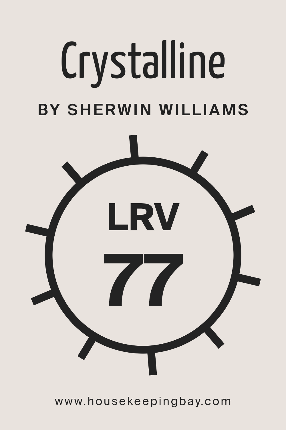
LRV stands for Light Reflectance Value, and it’s a scale from 0 to 100 that measures the percentage of light a paint color reflects back into the room.
A score of 0 means it’s a true black that absorbs all light, while a score of 100 reflects all the light, similar to pure white. This number is super handy when picking out paint colors because it tells you how light or dark a color will look on your walls once it’s up.
It’s not just about the color itself but also about how bright or dim your room will feel. If you’ve got a smaller room or one that doesn’t get a lot of natural light, a higher LRV can make the space feel airier and more open.
For Crystalline SW 9691, which has an LRV of 77.349, this means it’s a pretty light color that will reflect a lot of light back into the room.
Paint colors with high LRVs like this are great for making a space feel brighter and more inviting. In practice, this particular shade will likely lighten up the room, making it feel larger and more welcoming.
Since Crystalline is on the lighter end of the spectrum, it can help in spaces that need a boost of brightness without the starkness of using pure white.
This LRV score suggests that it’s an excellent choice for anyone wanting to refresh their space with a light and airy vibe.
housekeepingbay.com
What is LRV? Read It Before You Choose Your Ideal Paint Color
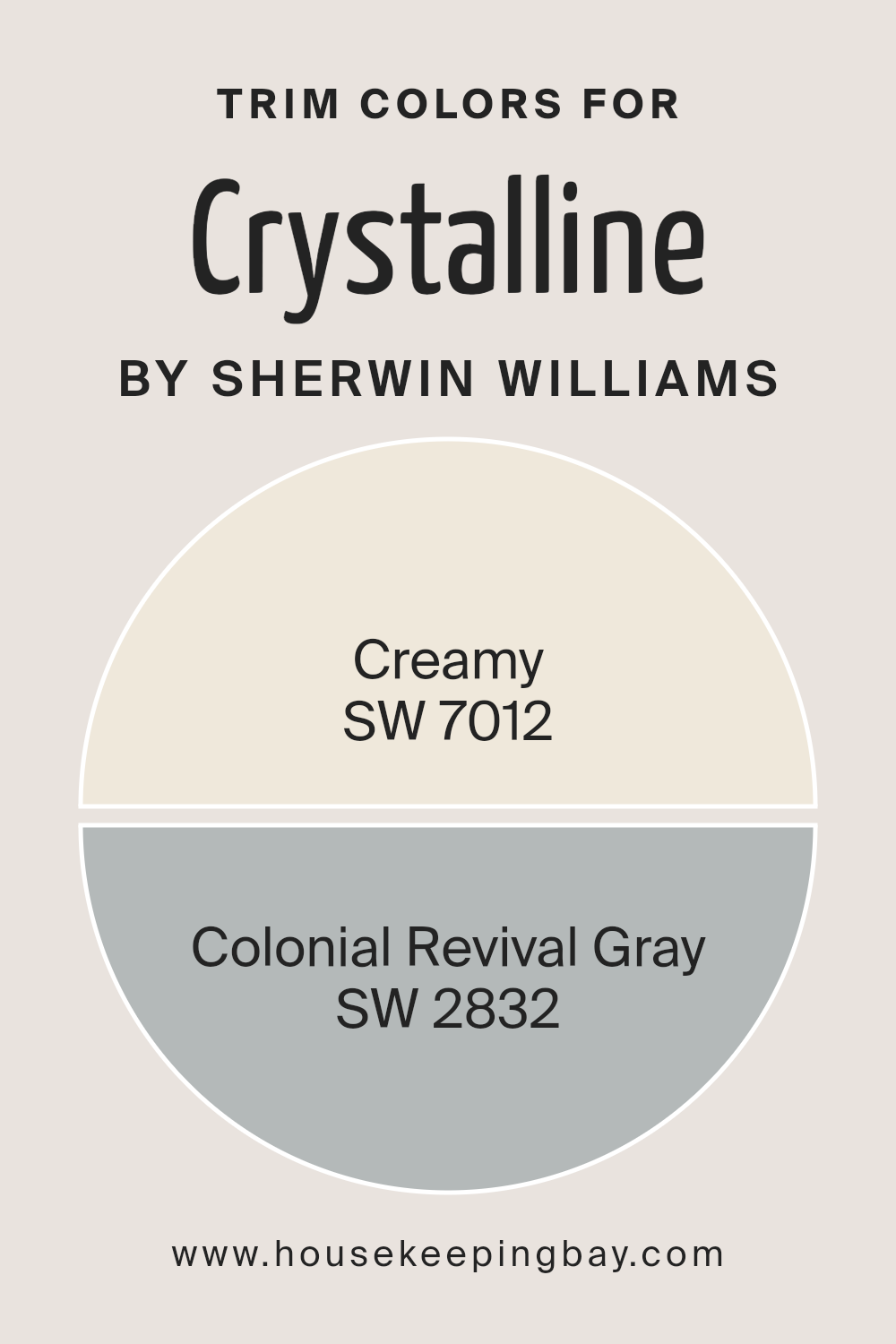
What are the Trim colors of Crystalline SW 9691 by Sherwin Williams?
Trim colors are specific shades used on the finishing architectural elements of a room, such as baseboards, moldings, door and window frames, and wainscoting.
These colors are vital in enhancing the overall appearance of a space, creating visually appealing contrasts, and complementing the main color palette.
For Crystalline SW 9691 by Sherwin Williams, a refreshing and serene hue, selecting the right trim colors can significantly impact the room’s ambiance and style.
Trim colors like SW 7012 – Creamy and SW 2832 – Colonial Revival Gray work harmoniously with Crystalline SW 9691 to add depth and definition to the spaces, subtly highlighting architectural details without overwhelming the primary color.
SW 7012 – Creamy is a soft, warm white with a buttery undertone that brings a cozy and inviting feel to any space.
It serves as a gentle contrast to Crystalline SW 9691, adding warmth to the cool undertones of the main color and ensuring that the room feels welcoming.
On the other hand, SW 2832 – Colonial Revival Gray is a mid-tone gray with a slightly warm undertone that offers a sophisticated and timeless look.
This color pairs well with the subtle green undertones of Crystalline SW 9691, providing a grounded but uplifted appearance that makes the architectural details stand out beautifully.
Together, these trim colors enhance the aesthetic appeal of a room, ensuring a polished and cohesive look.
You can see recommended paint colors below:
- SW 7012 Creamy
- SW 2832 Colonial Revival Gray
housekeepingbay.com
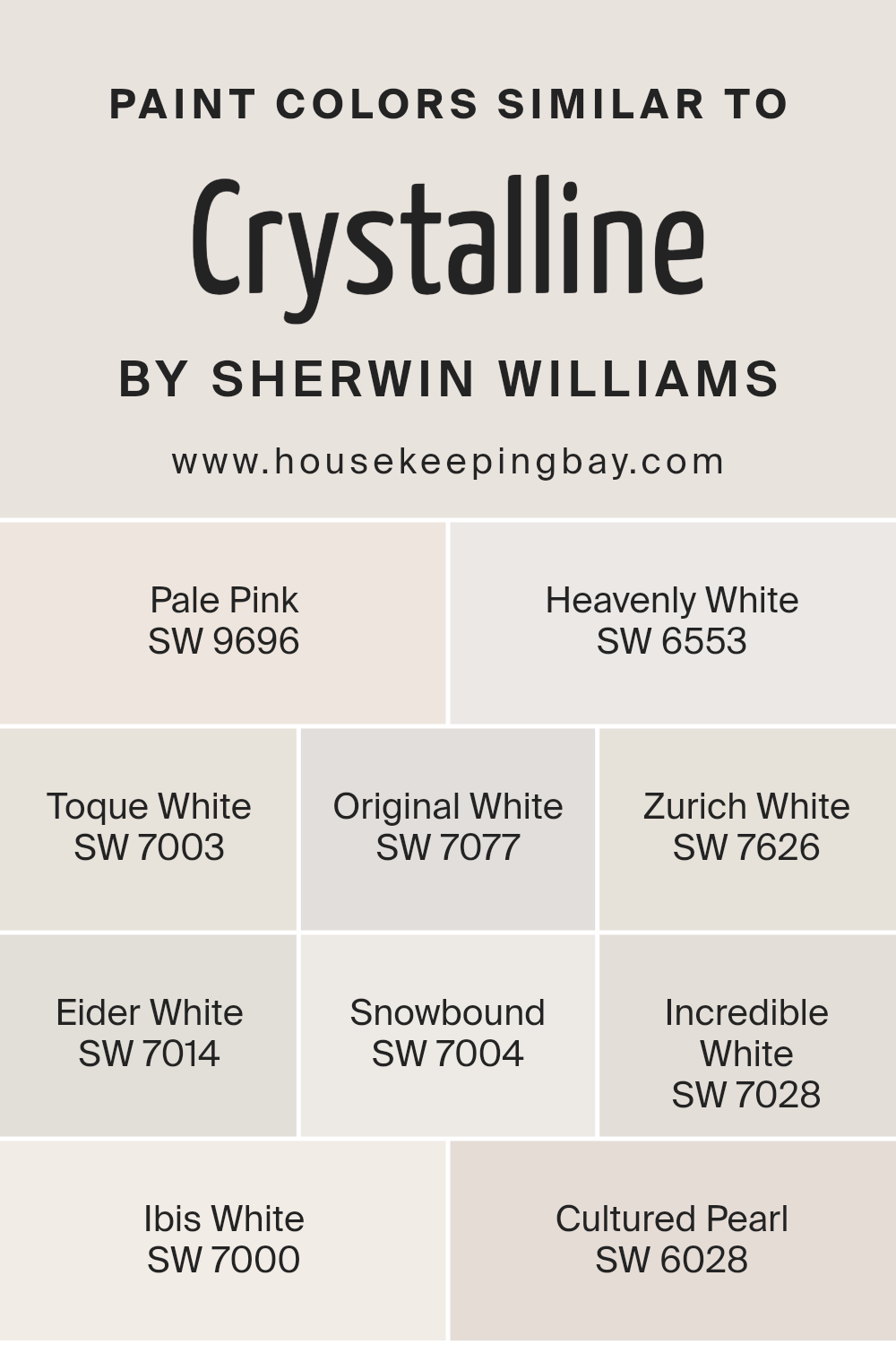
Colors Similar to Crystalline SW 9691 by Sherwin Williams
Choosing similar colors is essential for creating a harmonious and visually pleasing space, especially when working with a specific theme or mood in mind.
Similar colors, like the ones comparable to Crystalline SW 9691 by Sherwin Williams, play a crucial role in achieving a cohesive look.
Colors such as Pale Pink (SW 9696) add a subtle touch of warmth, making spaces feel welcoming without overwhelming them with color.
Heavenly White (SW 6553) offers a serene and peaceful foundation, perfect for creating a soft and airy atmosphere. Toque White (SW 7003) has a hint of gray, providing a neutral backdrop that complements a wide range of decor styles.
Original White (SW 7077) brings a crisp and clean feel to interiors, embodying freshness and simplicity. Zurich White (SW 7626), with its understated elegance, is versatile for use in any room, balancing light and shadow beautifully.
Eider White (SW 7014) has a touch of purple undertone, offering depth and sophistication to spaces. Snowbound (SW 7004) showcases a bright yet soft white that reflects light, making rooms appear larger.
Incredible White (SW 7028) blends seamlessly with other hues, bridging the gap between warmer and cooler tones. Ibis White (SW 7000) draws inspiration from nature, providing a calm and soothing ambiance.
Lastly, Cultured Pearl (SW 6028) introduces a delicate, almost imperceptible pink, infusing a room with elegance and charm. Together, these colors support a variety of design aesthetics, from modern minimalism to cozy traditional, by providing a balanced and adaptable palette.
You can see recommended paint colors below:
- SW 9696 Pale Pink
- SW 6553 Heavenly White
- SW 7003 Toque White
- SW 7077 Original White
- SW 7626 Zurich White
- SW 7014 Eider White
- SW 7004 Snowbound
- SW 7028 Incredible White
- SW 7000 Ibis White
- SW 6028 Cultured Pearl
housekeepingbay.com
How to Use Crystalline SW 9691 by Sherwin Williams In Your Home?
Crystalline SW 9691 by Sherwin Williams is a beautiful, refreshing paint color that homeowners love. This shade has a light, airy feel to it, making rooms look more spacious and welcoming.
It’s a fantastic choice for nearly any room in your house, from the living room and kitchen to bedrooms and even bathrooms.
Using Crystalline in your home can brighten up spaces that don’t get much light, making them feel more open and cheerful.
It’s perfect for creating a serene bedroom where you can relax or a vibrant living area that makes guests feel right at home.
This color pairs wonderfully with white trims for a crisp, clean look, but you can also match it with darker colors for a striking contrast.
For those looking to refresh their home’s look, Crystalline provides a subtle backdrop that easily blends with various decor styles, from modern to rustic.
Its versatility allows you to experiment with different textures and accent colors in furniture and decorations, making your home uniquely yours.
Whether you’re updating a single room or transforming your entire house, Crystalline SW 9691 offers a fresh, sophisticated look that’s easy to live with.
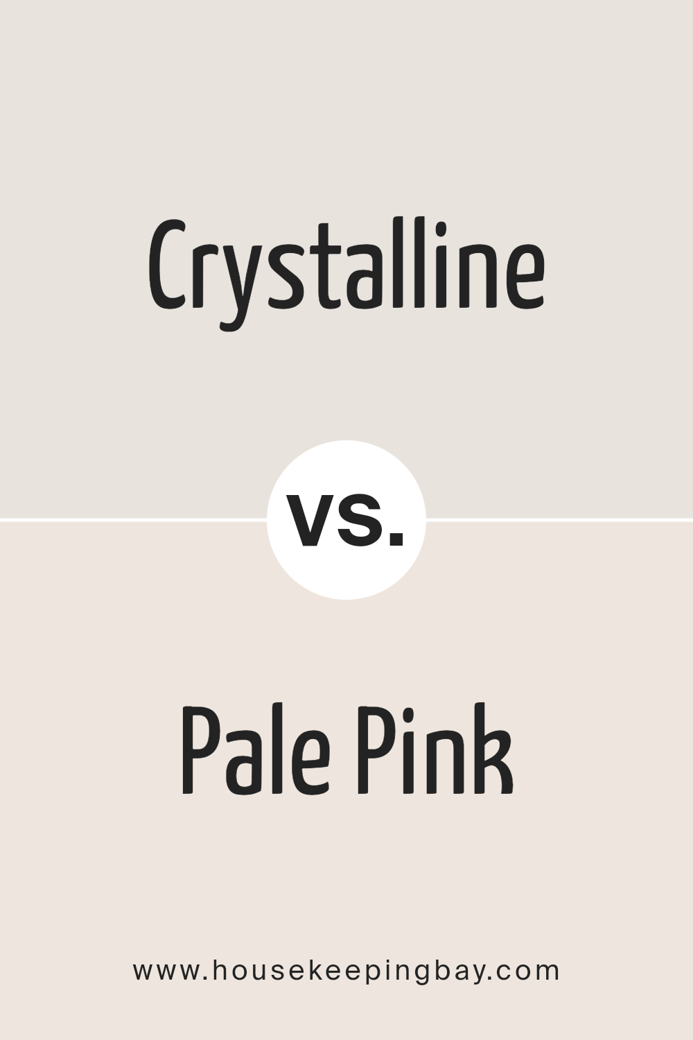
Crystalline SW 9691 by Sherwin Williams vs Pale Pink SW 9696 by Sherwin Williams
Crystalline SW 9691 and Pale Pink SW 9696 are two colors by Sherwin Williams that share a softness but differ in their core hues. Crystalline is a light, airy blue with a hint of green, making it feel refreshing and calming.
It’s like looking into a clear, tranquil pool of water, bringing a serene vibe to any space. On the other hand, Pale Pink is a gentle and warm color with a subtle blush tone.
It exudes a comforting and soothing quality, similar to the soft glow of morning light. While Crystalline leans towards a cool and breezy atmosphere, Pale Pink offers a cozy and tender touch.
Both colors are subtle and light, perfect for creating a peaceful and relaxing environment. However, the choice between them depends on whether you prefer the cool freshness of a sea breeze (Crystalline) or the warm embrace of a soft blanket (Pale Pink).
You can see recommended paint color below:
housekeepingbay.com
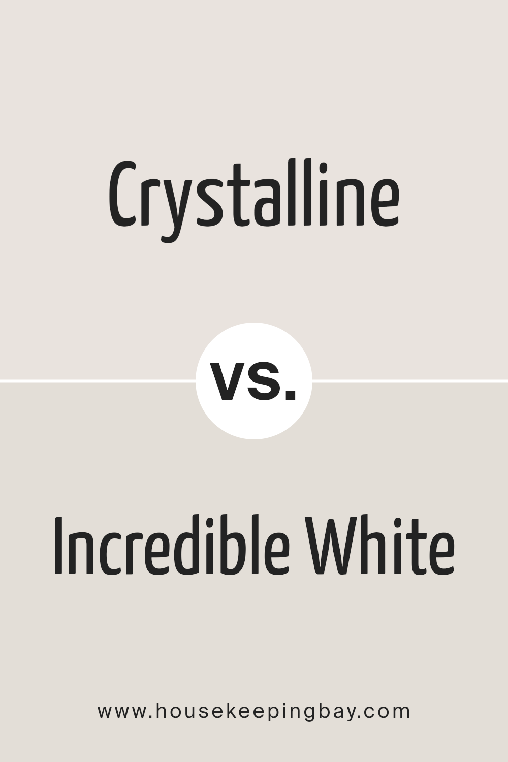
Crystalline SW 9691 by Sherwin Williams vs Incredible White SW 7028 by Sherwin Williams
The color Crystalline SW 9691 by Sherwin Williams is different from Incredible White SW 7028. Crystalline has a fresh, light green vibe that makes you think of springtime or the color of light mint.
It adds a pop of subtle color that’s really peaceful and calming, perfect for bringing a hint of nature into a room without being too bold. On the other hand, Incredible White is a soft, warm white color.
It’s very versatile, feeling cozy and welcoming, and works well in almost any space.
Unlike Crystalline, which brings in a specific color mood, Incredible White serves as a neutral backdrop, making it easy to pair with other colors and decor styles.
So, if you’re looking for something to add a gentle splash of color, Crystalline is a good pick. But if you want a color that’s easy to match with anything and always looks clean and fresh, Incredible White is the way to go.
You can see recommended paint color below:
housekeepingbay.com
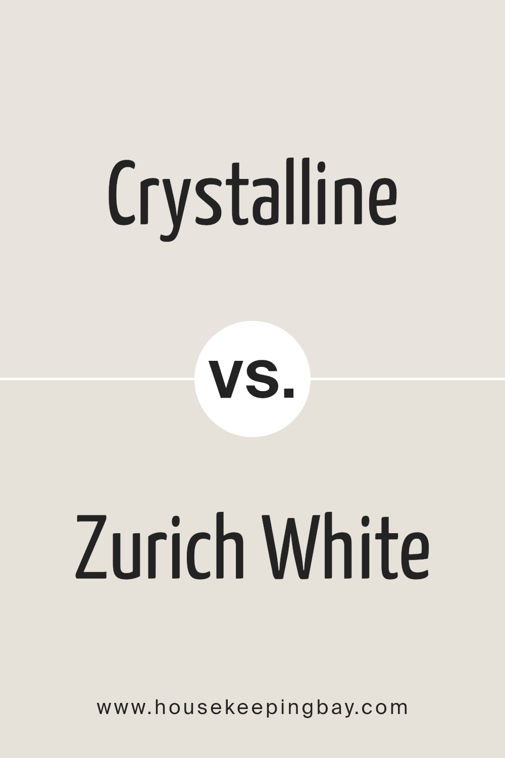
Crystalline SW 9691 by Sherwin Williams vs Zurich White SW 7626 by Sherwin Williams
Crystalline and Zurich White are two paint colors by Sherwin Williams, and they offer different vibes for rooms. Crystalline is a bright and fresh color that brings a light and airy feel to any space.
It’s like the clear blue of a sunny sky, making rooms feel more open and spacious. On the other hand, Zurich White is a soft and warm white with a hint of gray.
This color is great for creating a cozy and inviting atmosphere, making it perfect for living rooms or bedrooms where you want to relax.
While both colors can make a room look beautiful and well-lit, Crystalline has a more vibrant energy because of its subtle blue tones. Zurich White, with its creamy warmth, is better for a calm and soothing feel.
Whether you choose Crystalline or Zurich White depends on whether you want your room to have a splash of lightness and freshness or a gentle, welcoming vibe.
You can see recommended paint color below:
housekeepingbay.com
Crystalline SW 9691 by Sherwin Williams vs Eider White SW 7014 by Sherwin Williams
Crystalline SW 9691 by Sherwin Williams is a color that feels fresh and bright. It’s like looking at a light blue sky on a clear day. It has a subtle, cool touch, making spaces feel open and airy.
On the other hand, Eider White SW 7014 is a lot softer and leans towards a light gray with a hint of warmth. It’s the kind of color that can make a room feel cozy and welcoming without being too stark or cold.
When comparing the two, Crystalline is definitely cooler and more vibrant, bringing a splash of color that’s gentle yet noticeable.
Eider White is quieter, offering a neutral backdrop that can easily blend with other colors and decor styles.
If you’re trying to decide between them, think about what mood you want in your space. Crystalline will give a cheerful lift, while Eider White sets a calm and soothing tone.
You can see recommended paint color below:
housekeepingbay.com
Crystalline SW 9691 by Sherwin Williams vs Heavenly White SW 6553 by Sherwin Williams
Crystalline SW 9691 and Heavenly White SW 6553, both by Sherwin Williams, are unique colors that offer different vibes for any space. Crystalline is a light color with a hint of blue, giving off a fresh and airy feel.
It’s perfect for creating a soothing and calm atmosphere in a room, almost like bringing a gentle breeze indoors. On the other hand, Heavenly White is much closer to a pure white, but with a soft touch that prevents it from being stark or cold.
This color is great for making spaces feel bigger and brighter, as it reflects light beautifully.
While Crystalline brings a subtle dash of color and can add character without overwhelming, Heavenly White offers a clean slate, working well as a background for any decor style.
Whether you prefer the serene vibe Crystalline introduces or the open and airy feel of Heavenly White, each color has its charm, making spaces welcoming in their unique way.
You can see recommended paint color below:
- SW 6553 Heavenly White
housekeepingbay.com
Crystalline SW 9691 by Sherwin Williams vs Snowbound SW 7004 by Sherwin Williams
Crystalline and Snowbound, both by Sherwin Williams, are unique in their own ways. Crystalline has a fresh and airy feel, almost like looking at a clear sky on a sunny day.
It’s light but has a certain depth that gives spaces a breezy, open vibe. This color brings a sense of calm and serenity, making it perfect for rooms where relaxation is key.
On the other hand, Snowbound is a soft, warm white with a subtle hint of gray. Its understated elegance makes it a go-to for creating a cozy and welcoming atmosphere.
It’s like the first snowfall of the year, clean and crisp, yet inviting. Snowbound works well in almost any space, offering a neutral background that can let your furnishings and decor shine.
While both colors share a sense of tranquility, Crystalline leans more towards a cool, refreshing look, whereas Snowbound offers warmth and simplicity.
Choosing between them depends on the mood and tone you want to set for your space – Crystalline for a more vibrant, airy feel, and Snowbound for a soft, cozy ambiance.
You can see recommended paint color below:
housekeepingbay.com
Crystalline SW 9691 by Sherwin Williams vs Cultured Pearl SW 6028 by Sherwin Williams
Crystalline SW 9691 and Cultured Pearl SW 6028 are two Sherwin Williams colors that stand out for their elegance. Crystalline is a soft, airy shade of blue with a hint of green.
It brings to mind the clear, refreshing look of a gently flowing stream or the calm sky on a sunny morning. This color can make a room feel more spacious and tranquil, perfect for creating a serene atmosphere.
On the other hand, Cultured Pearl is a gentle gray with a warm undertone. It’s like the soft light of early morning, offering a cozy and inviting feel to any space.
This color is versatile and can easily blend with different decor styles, adding a touch of sophistication without overwhelming the senses.
When comparing the two, Crystalline has a cool, refreshing vibe, while Cultured Pearl offers warmth and comfort. Depending on what mood or style you’re aiming for in your space, each color has its unique charm.
Whether you want a touch of serene nature or a cozy, welcoming environment, these colors can help you achieve the look you desire.
You can see recommended paint color below:
housekeepingbay.com
Crystalline SW 9691 by Sherwin Williams vs Original White SW 7077 by Sherwin Williams
Crystalline SW 9691 by Sherwin Williams is a unique and fresh shade that can remind you of a serene, clear sky on a sunny day. It has a light, airy quality to it, making any space feel more open and welcoming.
This color is great for creating a calm and soothing atmosphere in a room, perfect for places where you want to relax and feel at peace.
On the other hand, Original White SW 7077 by Sherwin Williams is a classic, pure white color. It’s perfect for those looking for a clean and simple look.
This color can help make a small room appear bigger and brighter since it reflects light well. It’s versatile and works well in almost any room and pairs easily with any other color for accents and furnishings.
While Crystalline brings a subtle hint of color to refresh a space, Original White offers a blank canvas to decorate around.
Both colors have their unique charm, with Crystalline adding a gentle touch of color and Original White providing a crisp, clean backdrop.
You can see recommended paint color below:
housekeepingbay.com
Crystalline SW 9691 by Sherwin Williams vs Toque White SW 7003 by Sherwin Williams
Crystalline SW 9691 by Sherwin Williams is a fresh and uplifting color, kind of like the clear blue sky on a sunny day. It’s bright and has a cheerful vibe to it, making any room feel more open and breezy.
On the other hand, Toque White SW 7003 is a soft, warm white. This color is cozy and soothing, perfect for creating a relaxed atmosphere in your home.
While Crystalline can add a splash of lively energy and make things feel more vibrant, Toque White is about bringing in a sense of calmness and comfort.
Think of Crystalline like a cheerful burst of daylight, and Toque White as the gentle glow of morning light. Despite their differences, both colors have a way of making spaces feel welcoming, just in their own unique ways.
Whether you’re looking for something to brighten up your day or to help you unwind, these colors have got you covered.
You can see recommended paint color below:
housekeepingbay.com
Crystalline SW 9691 by Sherwin Williams vs Ibis White SW 7000 by Sherwin Williams
Crystalline SW 9691 and Ibis White SW 7000 by Sherwin Williams are two distinct colors you might be choosing between. Crystalline is a bright color that leans a bit towards blue.
It’s pretty light, giving off a fresh and airy feeling, kind of like looking at the sky on a clear day. It’s the kind of color that makes a room feel more open and relaxing.
On the other hand, Ibis White is also a light color, but it doesn’t have the blue hint. It’s more of a pure, soft white.
It’s really versatile and can make spaces feel bigger and brighter, but in a very subtle way, without the coolness of the blue in Crystalline.
If you’re trying to decide for a room, think about the vibe you want. Crystalline brings a bit more personality with its hint of blue, great for a calm, serene spot.
Ibis White is your go-to for creating a clean, minimal look that can match easily with almost any decor.
Both colors are light and airy, but your choice depends on whether you want that extra splash of coolness from Crystalline or the neutral simplicity of Ibis White.
You can see recommended paint color below:
housekeepingbay.com
Conclusion
In conclusion, Crystalline SW 9691 by Sherwin Williams is a unique color that provides a fresh and inviting atmosphere to any space. Its versatile tone makes it an ideal choice for those looking to add a touch of brightness and openness to their rooms.
The color can easily complement various decor styles, offering a subtle yet impactful backdrop that enhances the overall aesthetic of a home.
Choosing Crystalline SW 9691 is a smart move for anyone wanting to refresh their space with a modern and airy feel. Its ability to blend well with different textures and colors allows for creative freedom in decorating.
Whether applied in a living room, bedroom, or kitchen, this color promises to bring a sense of calm and clarity, making any room feel more spacious and welcoming.
housekeepingbay.com
Ever wished paint sampling was as easy as sticking a sticker? Guess what? Now it is! Discover Samplize's unique Peel & Stick samples. Get started now and say goodbye to the old messy way!
Get paint samples