Pale Pink SW 9696 by Sherwin Williams
Embracing Softness in Every Space
Welcome to the charming world of SW 9696 Pale Pink by Sherwin Williams, a paint color that brings a soft and soothing ambiance to any room.
This article aims to introduce you to the gentle appeal of Pale Pink, a color that can transform your space with its understated elegance.
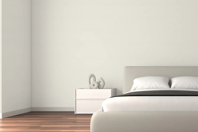
Whether you are looking to create a calming bedroom retreat, a welcoming living room, or a serene bathroom, SW 9696 Pale Pink offers a versatile solution that pairs well with various decor styles and preferences.
As one of Sherwin Williams’ carefully selected shades, Pale Pink stands out for its ability to add warmth without overpowering.
It’s a color that works wonders in spaces that need a touch of lightness and can complement both contemporary and traditional settings.
From its psychological effects of promoting tranquility and warmth to practical tips on color combinations and decor ideas, this article will guide you through everything you need to know about making the most of Pale Pink in your home.
Whether you’re repainting a single room or looking for a cohesive color scheme for your entire home, SW 9696 Pale Pink offers a unique blend of simplicity and sophistication.
Join us as we explore the beauty of this color and how it can enhance your living spaces, making them more inviting and comfortable.
via sherwin-williams.com
What Color Is Pale Pink SW 9696 by Sherwin Williams?
Pale Pink SW 9696 by Sherwin Williams is a soft, subtle shade that whispers of serenity and understated elegance. This color has a gentle warmth that can brighten spaces while maintaining a sense of calm and sophistication.
Its lightness offers a versatile backdrop that can either stand alone for a minimalist look or support bolder colors and patterns without clashing.
In terms of interior styles, Pale Pink is a natural fit for Modern Scandinavian and Contemporary designs, where its simplicity and lightness can enhance the airy, open feel typical of these aesthetics.
It also beautifully complements the romantic swirls and delicate features of Shabby Chic decor, adding to its dreamy, timeless appeal.
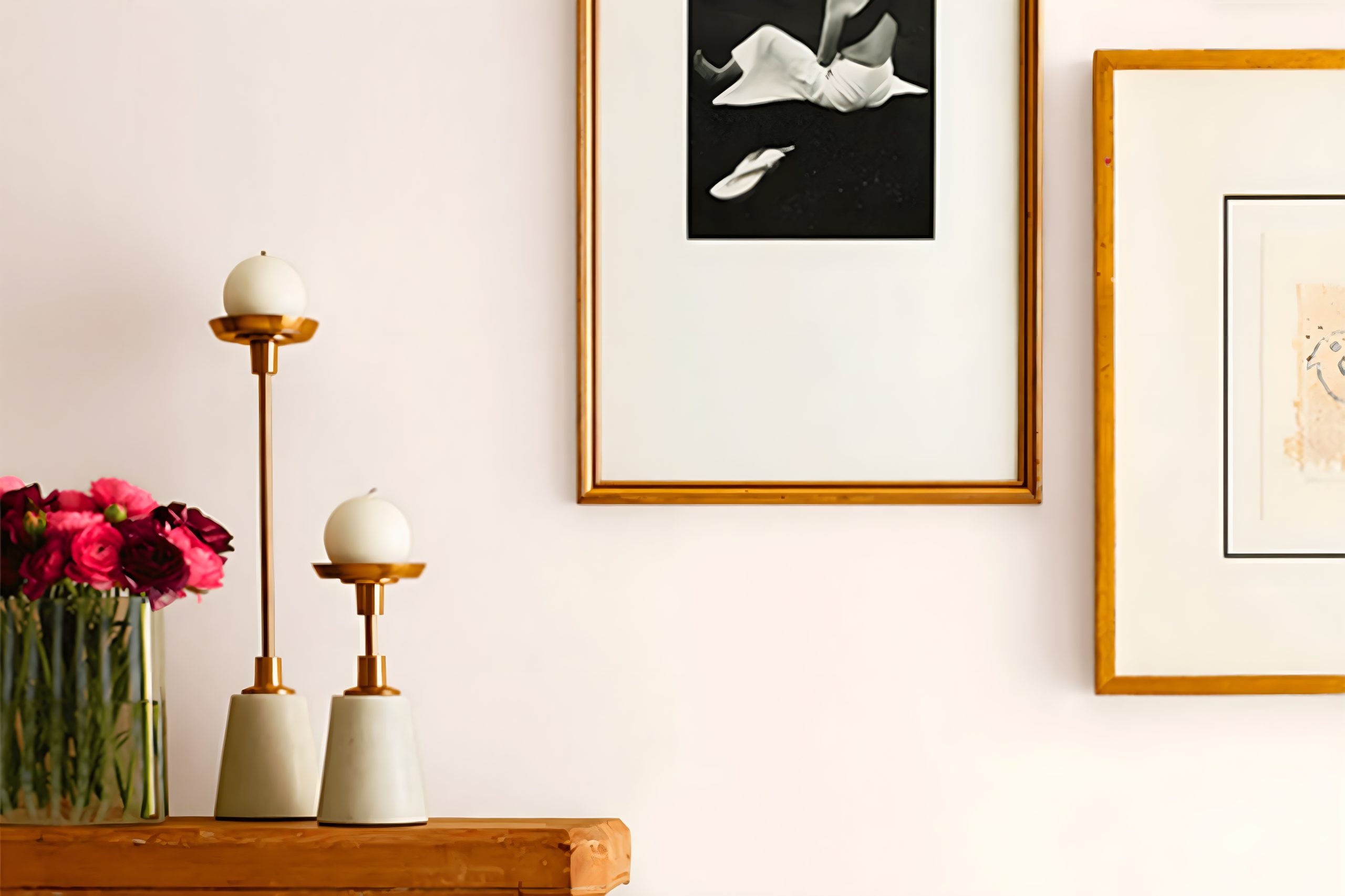
When considering materials and textures, Pale Pink pairs wonderfully with natural wood, adding warmth and organic texture to the space. It also works well with metallics like brushed gold or copper, introducing a touch of sophistication.
Against the smooth, cool surface of marble, Pale Pink balances with soft warmth, creating an elegant contrast. For textures, think about soft, plush fabrics like velvet or wool in neutral shades to maintain a cozy yet refined atmosphere.
This color enables a wide range of styling choices, supporting subtle elegance or a more dynamic, contrasting look.
housekeepingbay.com
Table of Contents
Is Pale Pink SW 9696 by Sherwin Williams Warm or Cool color?
Pale Pink SW 9696 by Sherwin Williams is a soft and gentle color that brings a sense of calm and warmth to any room. It’s like a quiet whisper in a busy world, offering a peaceful break from the noise.
This particular shade of pink has a very mild tone, making it easy to use in homes without overwhelming the space. Pale Pink can work magic in making small rooms appear a bit more open and airy, as light colors tend to do.
It’s perfect for creating a cozy nook or a relaxing bedroom where you can unwind after a long day.
Because it’s so subtle, Pale Pink pairs beautifully with a wide range of other colors, from crisp whites to deep navys. This flexibility allows homeowners to use it in various ways, whether as a main wall color or as accents throughout the home.
Its gentle vibe can also help soften more modern, stark designs, adding a touch of warmth to contemporary spaces. All in all, Pale Pink SW 9696 by Sherwin Williams is a versatile choice that can help make a house feel like a home.
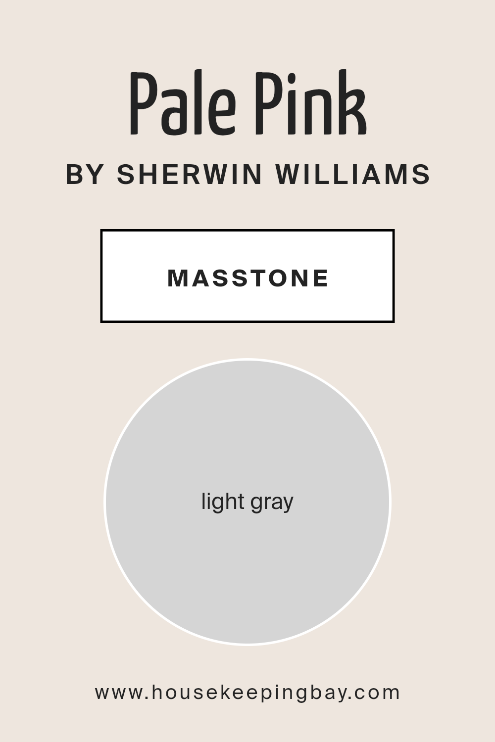
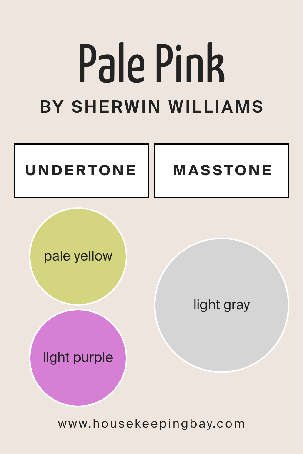
What is the Masstone of the Pale Pink SW 9696 by Sherwin Williams?
Pale Pink SW 9696 by Sherwin Williams, with its masstone of Light Gray (#D5D5D5), offers a unique and versatile option for home interiors.
This light gray masstone means that even though the color is named Pale Pink, it has a gray base that makes it more subdued than a typical pink.
This quality allows it to blend beautifully with a wide range of colors and home styles, from modern to classic.
Because of its gray undertone, Pale Pink doesn’t overpower a room but instead adds a gentle, soft touch of color. It can make small spaces appear larger and more open, thanks to its light-reflecting qualities.
It’s especially great for bedrooms, living rooms, or even bathrooms where you want a hint of color without overwhelming the senses. This color works well in homes because it creates a calm, soothing atmosphere.
It’s perfect for creating a space that feels cozy and inviting, making it a go-to choice for those looking to add a subtle touch of warmth and elegance to their home.
housekeepingbay.com
Undertones of Pale Pink SW 9696 by Sherwin Williams
Pale Pink SW 9696 by Sherwin Williams carries subtle hints of pale yellow and light purple in its undertones.
These undertones play a significant role in how we perceive the color, influencing its appearance under different lighting conditions and when placed next to other colors.
The pale yellow undertone adds a warm glow to the Pale Pink, making spaces feel welcoming and cozy. It softens the pink, ensuring it doesn’t come off as too sugary or girly, which makes it versatile for a variety of rooms, from living areas to bedrooms.
This warmth works well in spaces that get a lot of natural light, as the sunlight highlights the yellow undertones, making the walls seem to softly radiate warmth.
On the other hand, the light purple undertone brings a hint of sophistication and depth. It prevents the color from feeling flat or washed out by adding a layer of complexity.
This subtle purple quality can make the pale pink feel more mature and refined, which is excellent for spaces intended to have a tranquil or elegant atmosphere.
When Pale Pink SW 9696 covers interior walls, these undertones affect its compatibility with other colors and decors.
Furnishings in earthy tones or pastel accents can complement the warmth of the yellow undertone, while silver or grey decors can highlight the sophisticated purple undertone.
Therefore, the presence of these undertones makes Pale Pink a flexible and nuanced choice, capable of creating a range of moods and styles depending on its surroundings and lighting.
housekeepingbay.com
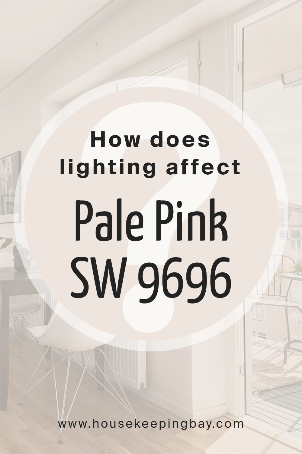
How Does Lighting Affect Pale Pink SW 9696 by Sherwin Williams?
Lighting plays a crucial role in how colors appear in our spaces. The same color can look different depending on the light it’s under.
Pale Pink SW 9696 by Sherwin Williams, like any color, can change its appearance dramatically in different lighting conditions. Let’s explore how this color behaves under various types of light and how it looks in rooms facing different directions.
Artificial light can affect colors in unpredictable ways because it varies greatly in color temperature. Bright LED lights can make Pale Pink look cooler and more reserved, potentially pulling out its subtle undertones, making it feel crisp and fresh.
Meanwhile, softer, warmer lights, like those from incandescent bulbs, can make Pale Pink look cozy and welcoming, enhancing its warmth and making it feel more comforting.
Natural light shows the truest color, but as the Earth rotates, natural light changes throughout the day. In the morning and late afternoon, when the sun is lower, natural light tends to be warmer, which can make Pale Pink look softer and more inviting.
At noon, when the sun is high, the light is much bluer, which might make the color appear slightly cooler and more muted.
In north-facing rooms, light is cooler and more consistent throughout the day. Here, Pale Pink might lean towards a cooler, more subtle version of itself, potentially looking a bit more neutral and understated.
In south-facing rooms, which get warmer, brighter light, the color can feel richer and warmer, making the room feel lively and bright.
East-facing rooms see the warm, gentle light of the morning, making Pale Pink feel soft and warm early in the day, but as the day progresses, it turns cooler, influencing the color to appear more muted.
West-facing rooms, on the other hand, get the strongest light in the late afternoon, which can make Pale Pink look vibrant and warm, truly coming to life in the evening light.
Understanding how lighting affects colors, especially a delicate color like Pale Pink SW 9696, can help create the exact mood you’re aiming for in your space, ensuring that the colors behave just as you wish under different lighting throughout the day.
housekeepingbay.com
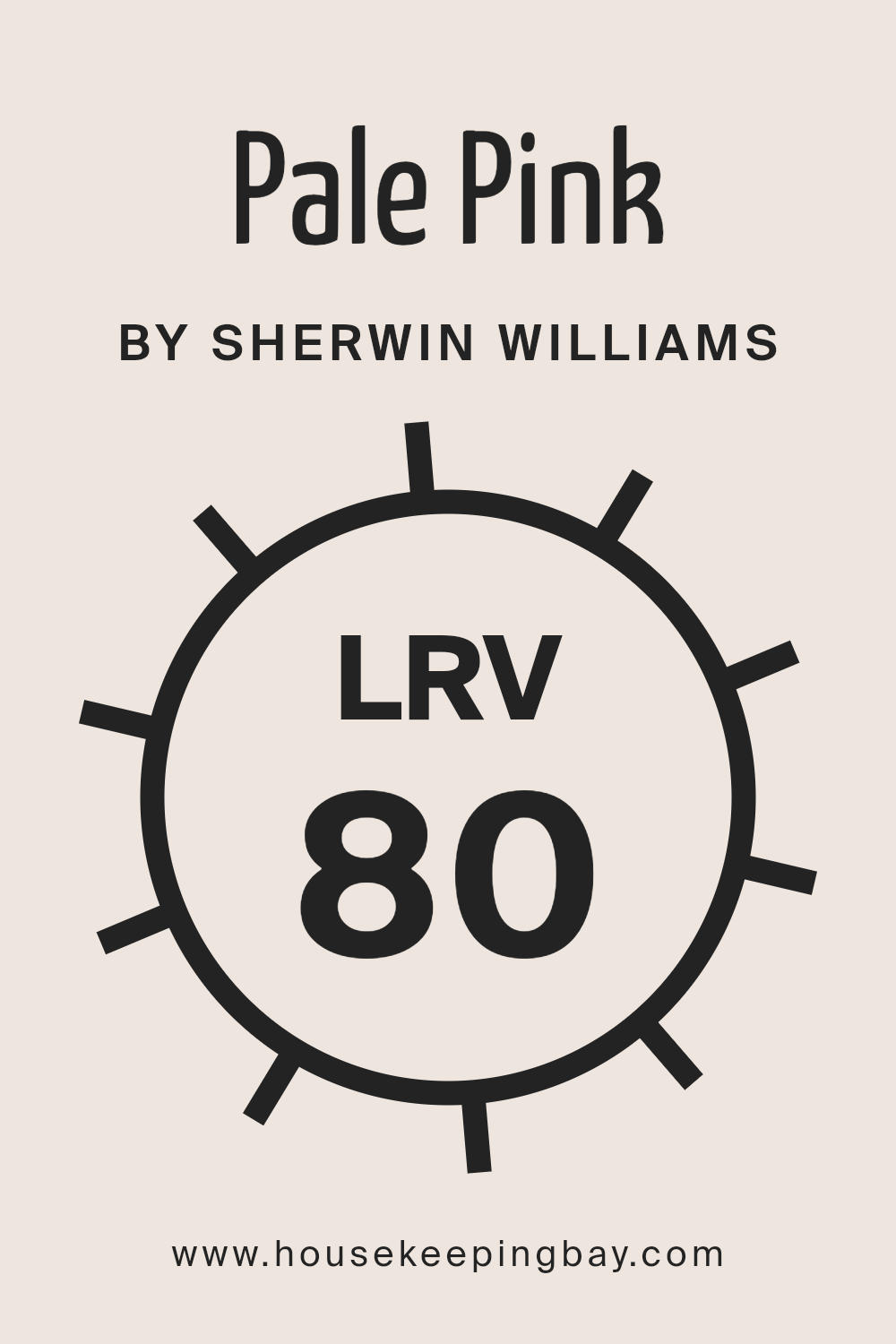
What is the LRV of Pale Pink SW 9696 by Sherwin Williams?
LRV, or Light Reflectance Value, is a measurement that tells us how much light a color reflects from or absorbs into a surface.
Imagine LRV on a scale from 0 to 100, where 0 means the color absorbs all the light (like true black) and 100 reflects all of it (like pure white).
This value is super useful when choosing paint colors because it helps predict how light or dark a color will look on your walls.
A higher LRV means the color will appear lighter, making rooms feel more open and airy, whereas a lower LRV color might make a space feel cozier or smaller by absorbing more light.
Regarding the specific color Pale Pink SW 9696 by Sherwin Williams, with an LRV of 79.784, it’s quite high on the scale. This means the color is going to reflect a lot of light, making it a good choice for making a space feel brighter and more spacious.
Because it’s a very light pink, this high LRV helps maintain the color’s soft, gentle appearance under most lighting conditions, without it feeling overwhelming or too intense.
In rooms with less natural light, Pale Pink can help enhance the brightness, while in well-lit areas, it will look airy and cheerful, making it a versatile choice for many spaces.
housekeepingbay.com
What is LRV? Read It Before You Choose Your Ideal Paint Color
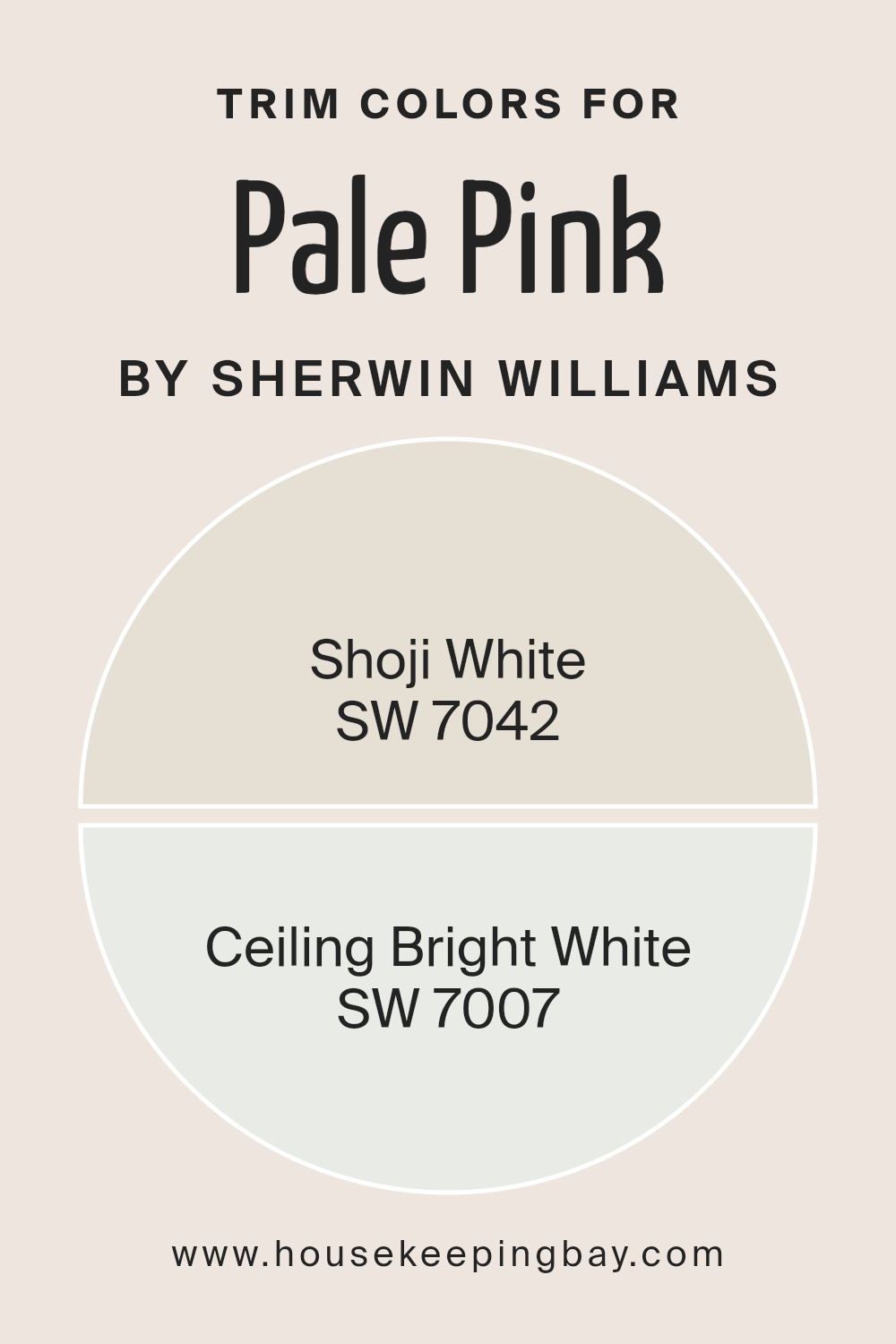
What are the Trim colors of Pale Pink SW 9696 by Sherwin Williams?
Trim colors are those used for the detailing in a room, such as baseboards, crown moldings, window frames, and door frames, which can dramatically influence the overall look and feel of a space.
When paired with a main wall color like Pale Pink SW 9696 by Sherwin Williams, selecting the right trim color is crucial because it frames the wall color, enhances the room’s architectural elements, and can either provide a subtle contrast or complement the main color, adding depth and character to the space.
For a color like Pale Pink SW 9696, using SW 7042 – Shoji White as a trim color brings a soft, warm touch that subtly contrasts with the gentle appeal of pale pink, ensuring the room feels welcoming and harmonious.
Shoji White has an understated elegance with just the right blend of warmth to make it versatile for any space. On the other hand, SW 7007 – Ceiling Bright White offers a crisp, clean look that can make the pale pink walls pop and the room feel more spacious and airy.
Ceiling Bright White is perfect for creating a sharp, fresh contrast that highlights the room’s best features while keeping the atmosphere light and open.
You can see recommended paint colors below:
housekeepingbay.com
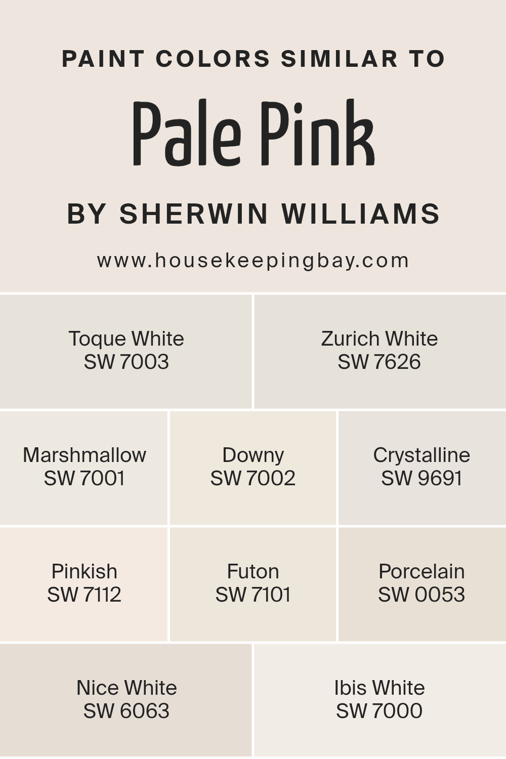
Colors Similar to Pale Pink SW 9696 by Sherwin Williams
Similar colors are important in design and decoration because they provide a subtle variation that can add depth and complexity to a space without overwhelming the senses.
When colors are too identical, a room can feel flat, but too much contrast can create a jarring experience. Colors like Pale Pink SW 9696 by Sherwin Williams strike a balance by offering a gentle warmth and a soft, welcoming feel.
Complementing it with similar shades can enhance this effect, creating a cohesive look that flows smoothly from one area to another.
For example, Toque White SW 7003 adds a creamy, almost imperceptible hint of yellow, giving a cozy glow that’s reminiscent of a quiet morning.
Zurich White SW 7626 brings in a slightly more pronounced gray undertone, suggesting the subtle shadows in well-lit spaces.
Marshmallow SW 7001 offers a touch of softness that feels like being wrapped in a light, fluffy blanket, while Downy SW 7002 provides a whisper of gray, reminiscent of a serene, cloudy sky.
Crystalline SW 9691 introduces a hint of freshness, like a gentle breeze through an open window. Pinkish SW 7112, true to its name, tips the scale slightly towards a tender pink hue, suggesting the gentle flush of early sunrise.
Futon SW 7101 leans towards a neutral beige, providing a sturdy foundation that’s both inviting and grounding. Porcelain SW 0053, with its subtle purity, evokes the clean, classic feel of finely crafted ceramics.
Nice White SW 6063 offers a touch of sophistication with its understated elegance. Ibis White SW 7000 finishes the palette with a crisp, clean brightness, reminding one of a peaceful day under a clear sky.
These shades work together to create an atmosphere that is both inviting and harmonious, demonstrating the power of similar colors in designing a space that feels both interconnected and beautifully varied.
You can see recommended paint colors below:
- SW 7003 Toque White
- SW 7626 Zurich White
- SW 7001 Marshmallow
- SW 7002 Downy
- SW 9691 Crystalline
- SW 7112 Pinkish
- SW 7101 Futon
- SW 0053 Porcelain
- SW 6063 Nice White
- SW 7000 Ibis White
housekeepingbay.com
How to Use Pale Pink SW 9696 by Sherwin Williams In Your Home?
Pale Pink SW 9696 by Sherwin Williams is a soft and gentle color that can add a touch of warmth and calm to any room in your home. It’s like a whisper of color, subtle yet inviting.
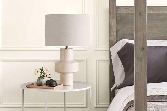
This shade of pink is so light, it almost acts as a neutral, making it super versatile and easy to pair with other colors. You could use it in a bedroom to create a cozy, restful environment, or in a bathroom for a light and airy feel.
It’s also perfect for a nursery, providing a soothing backdrop that’s soft on the eyes for both parents and baby.
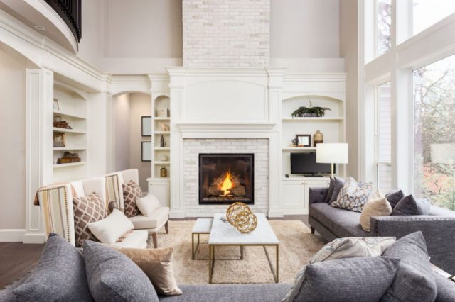
In the living room, Pale Pink can add a hint of color without overpowering the space, especially when used on one wall or as an accent.
If you’re not ready to commit to painting the entire wall, consider using it for furniture pieces or accessories like pillows and curtains. Pale Pink is a great way to add a bit of warmth to your home in a very subtle way.
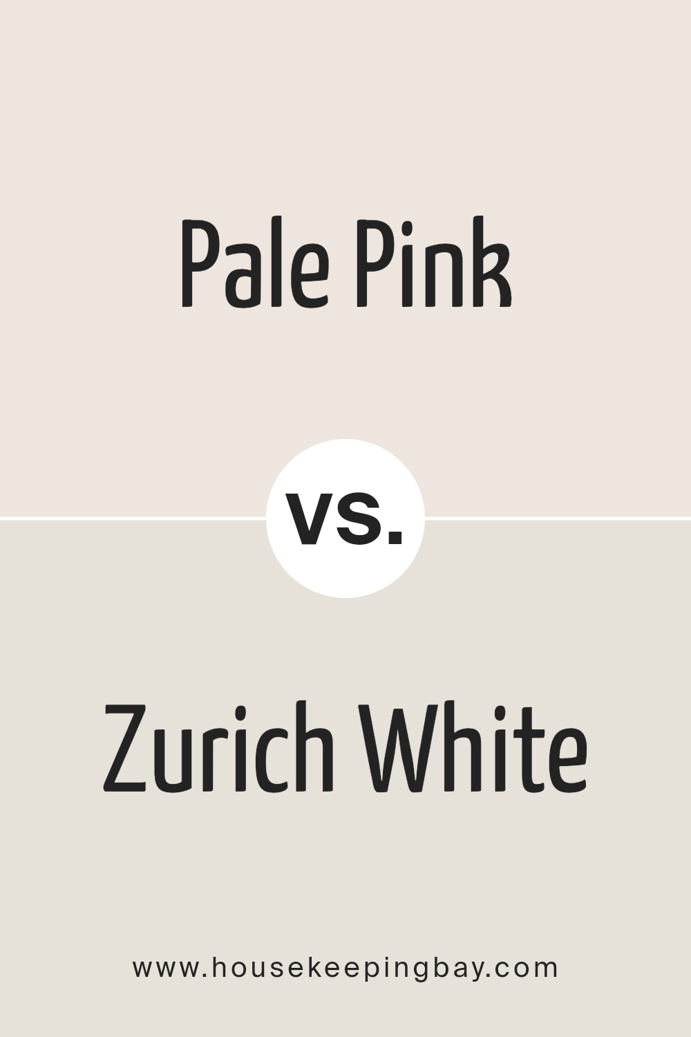
Pale Pink SW 9696 by Sherwin Williams vs Zurich White SW 7626 by Sherwin Williams
The first color we’re talking about is Pale Pink SW 9696 by Sherwin Williams, a gentle and subtle shade that feels soft and soothing.
It’s a kind of color that brings a touch of warmth and quiet cheerfulness to a room, making it perfect for creating a cozy and inviting atmosphere.
On the other hand, Zurich White SW 7626 by Sherwin Williams is not actually a stark white, but rather a soft, warm, off-white with a hint of gray.
This color is incredibly versatile and can light up a space giving it a clean and airy feel. It’s great for making small rooms appear larger and brighter.
When comparing these two, Pale Pink is definitely the one that adds a bit more personality and warmth, making a space feel more personal and comforting.
Zurich White, however, is the ultimate neutral, providing a timeless backdrop that can support any style or color scheme without overwhelming it.
Both colors offer a delicate way to enhance a room’s aesthetics, but their impact and vibe are distinctively different based on their unique tones.
You can see recommended paint color below:
housekeepingbay.com
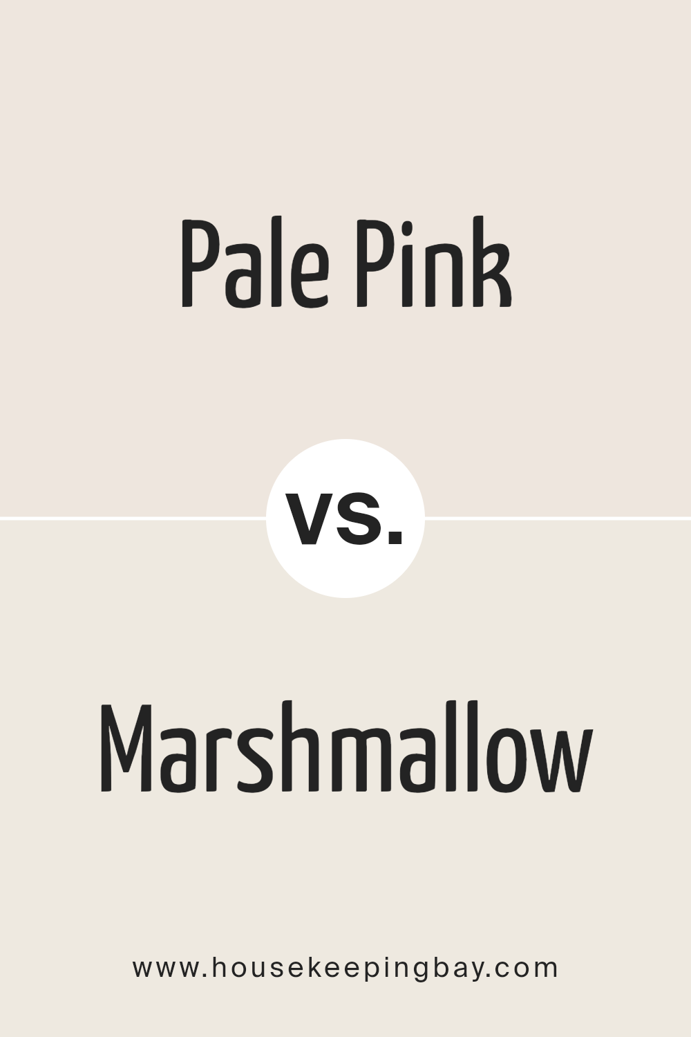
Pale Pink SW 9696 by Sherwin Williams vs Marshmallow SW 7001 by Sherwin Williams
Pale Pink SW 9696 by Sherwin Williams and Marshmallow SW 7001 are two gentle colors, each with its own unique vibe. Pale Pink is a soft, subtle pink shade that whispers calmness and simplicity.
It’s light and airy, bringing a touch of warmth and femininity to spaces without overpowering them. On the other hand, Marshmallow is a creamy white that’s as soothing as its name suggests.
It’s a versatile color, creating a clean and open feeling that can make small spaces appear larger and brighter.
While both colors share a lightness and an ability to uplift and refresh a room, their differences lie in their tones and the moods they set. Pale Pink adds a hint of color, ideal for creating a cozy, inviting atmosphere.
Marshmallow, being a neutral, offers a background that’s both serene and flexible, easily accommodating any decor style without conflict.
Together, they can harmonize beautifully, with Marshmallow providing a subtle backdrop that allows Pale Pink to gently stand out.
You can see recommended paint color below:
housekeepingbay.com
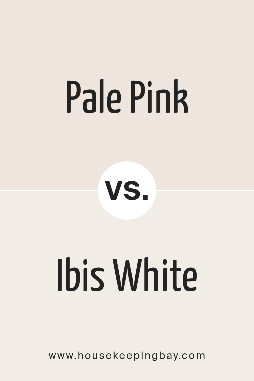
Pale Pink SW 9696 by Sherwin Williams vs Ibis White SW 7000 by Sherwin Williams
Pale Pink SW 9696 and Ibis White SW 7000, both by Sherwin Williams, have their unique charm. Starting with Pale Pink, it’s a soft, subtle shade that brings a gentle warmth to any space.
It’s like a whisper of color, just enough to add a touch of personality without overwhelming the senses. This color is great for creating a cozy, inviting atmosphere.
On the other hand, Ibis White SW 7000 is a clean, crisp white with a hint of warmth. It’s like a fresh start in a can, offering a bright and airy feel that can make small spaces appear larger and more open.
Ibis White is versatile, working well in any room and serving as a perfect backdrop for art, furniture, and accents.
When comparing the two, Pale Pink offers a hint of color and warmth, ideal for a soft, subtle statement. Ibis White is all about brightness and openness, making spaces feel clean and fresh.
Both colors have their place, depending on the vibe you’re going for.
You can see recommended paint color below:
housekeepingbay.com
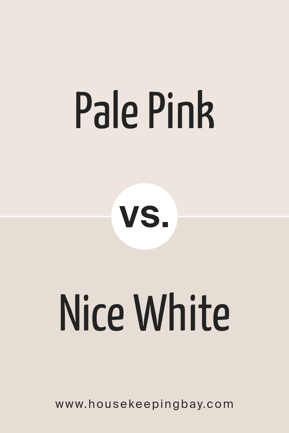
Pale Pink SW 9696 by Sherwin Williams vs Nice White SW 6063 by Sherwin Williams
Comparing Pale Pink SW 9696 and Nice White SW 6063 by Sherwin Williams, we see two subtle yet distinct shades. Pale Pink is a soft, gentle color, bringing a light, airy feel to any space.
It’s like a whisper of color, adding a touch of warmth without overwhelming the senses. It’s perfect for creating a soothing, peaceful atmosphere.
On the other hand, Nice White SW 6063 is a clean, crisp shade. It’s not just a simple white; it carries a hint of warmth, making spaces feel open and inviting.
It’s versatile, working well in any room to brighten and enlarge the feeling of the space.
Both colors offer their unique charm. Pale Pink adds a splash of delicate color, ideal for a cozy, comforting vibe. Nice White is the go-to for a fresh, clean look, laying a perfect backdrop for any decor style.
Together, they could complement each other beautifully, with Pale Pink providing a soft pop of color against the neutral, welcoming canvas of Nice White.
You can see recommended paint color below:
housekeepingbay.com
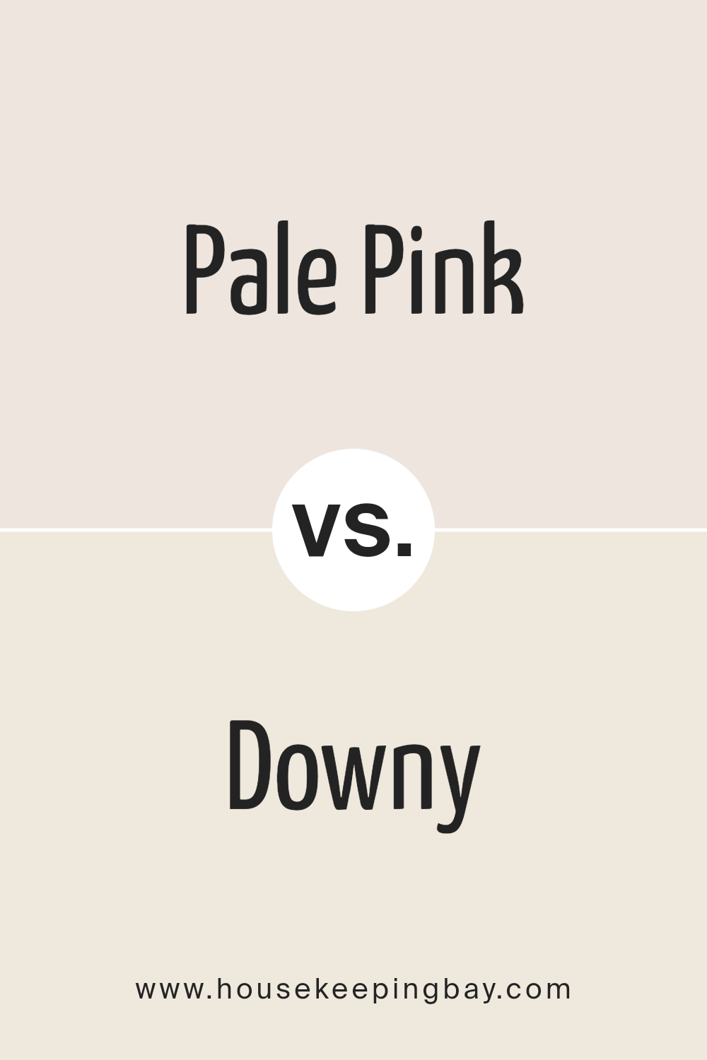
Pale Pink SW 9696 by Sherwin Williams vs Downy SW 7002 by Sherwin Williams
Pale Pink SW 9696 by Sherwin Williams and Downy SW 7002 are two subtle, calming colors that each offer a unique vibe to any space. Pale Pink is a soft, muted pink with a gentle, soothing look.
It’s like a quiet whisper, adding a touch of warmth and tenderness to rooms, ideal for creating a cozy and inviting atmosphere. On the other hand, Downy is a light, airy gray that leans towards a neutral palette.
It’s a versatile color, providing a clean, modern backdrop that pairs well with almost any decor style, from contemporary to traditional.
While Pale Pink brings a sweet, delicate charm, perfect for nurseries or restful bedrooms, Downy offers a serene, minimalist feel, excellent for living spaces or offices seeking a touch of sophistication without overwhelming the senses.
Both colors reflect natural light beautifully, but their impacts are distinct: Pale Pink infuses spaces with a heartwarming glow, whereas Downy creates a crisp, tranquil sanctuary.
You can see recommended paint color below:
housekeepingbay.com
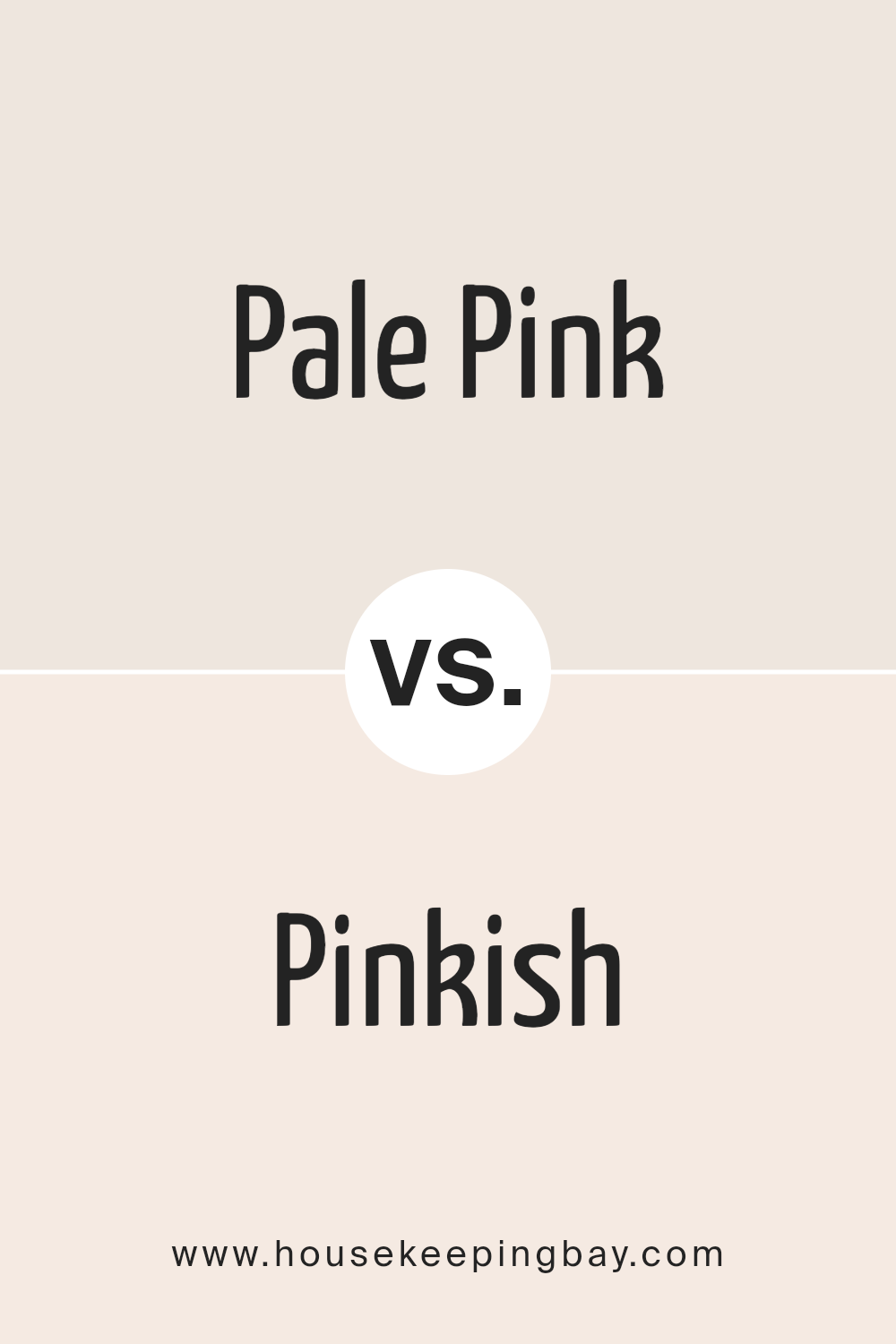
Pale Pink SW 9696 by Sherwin Williams vs Pinkish SW 7112 by Sherwin Williams
Pale Pink SW 9696 by Sherwin Williams and Pinkish SW 7112 by Sherwin Williams are two lovely shades, each with their own unique appeal. Pale Pink is a softer, more subdued shade, leaning towards a gentle, almost whisper-like tone.
It’s the kind of color that brings a calm and soothing vibe to any space, making it perfect for creating a peaceful, serene environment. On the other hand, Pinkish is a shade that holds a bit more vibrancy.
While still in the pink family, it carries a slightly richer, warmer presence, making it a great choice for adding a touch of warmth and subtle energy to a room.
Both colors share the charming quality of pink, but their different intensities and undertones offer versatile options for different moods and settings.
Pale Pink is your go-to for a soft, tranquil atmosphere, while Pinkish provides a cheerful, welcoming ambiance.
You can see recommended paint color below:
- SW 7112 Pinkish
housekeepingbay.com
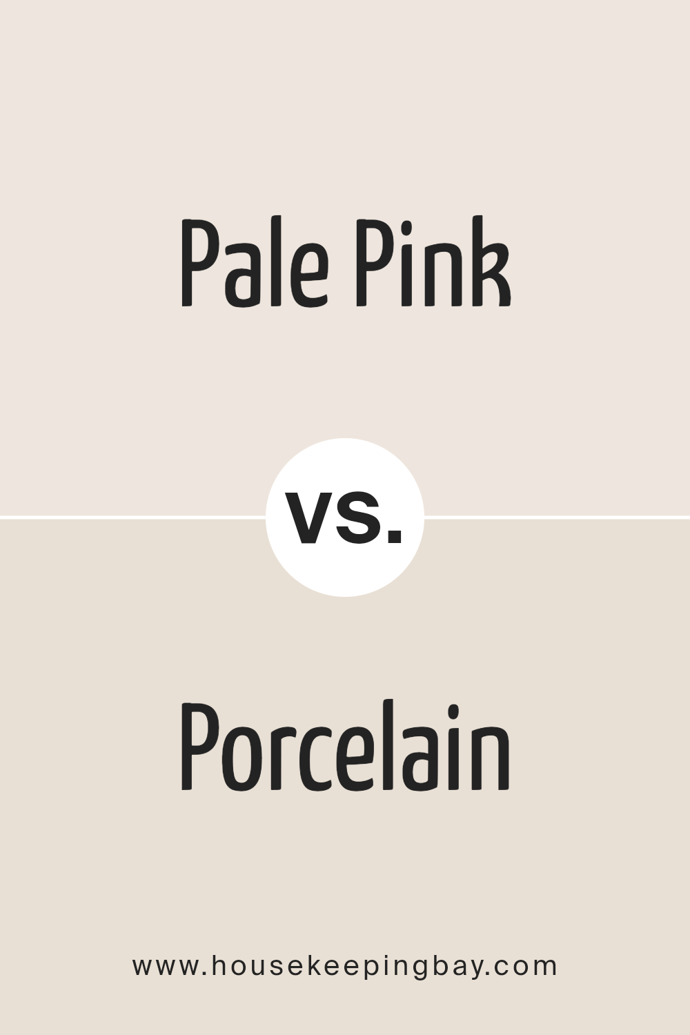
Pale Pink SW 9696 by Sherwin Williams vs Porcelain SW 0053 by Sherwin Williams
Pale Pink SW 9696 by Sherwin Williams is a light, soft pink with a gentle touch. It brings a soothing feel to a space, offering a sense of calm and warmth.
This color is great for creating a cozy and inviting atmosphere, perfect for bedrooms or spaces where relaxation is key.
Porcelain SW 0053 by Sherwin Williams, on the other hand, is a crisp, clean off-white with subtle undertones. This color is incredibly versatile and offers a fresh, airy quality to any room.
It’s excellent for making spaces feel bigger and brighter, suitable for kitchens, bathrooms, or any area you want to appear more open and light.
When comparing the two, Pale Pink adds a touch of color and warmth, creating a more intimate environment. Porcelain, being more neutral, acts as a blank canvas, allowing other elements in the room to stand out.
Both colors have their unique appeal, depending on the mood and feel you want to achieve in your space.
You can see recommended paint color below:
housekeepingbay.com
Pale Pink SW 9696 by Sherwin Williams vs Futon SW 7101 by Sherwin Williams
Pale Pink SW 9696 by Sherwin Williams is a soft, delicate color. It has a gentle vibe, making spaces feel light and airy. This color is great for creating a peaceful and relaxing atmosphere in any room.
It’s like a whisper of pink on the walls, adding just a hint of color without being overwhelming. Pale Pink is perfect for people who want a touch of femininity and warmth in their decor.
On the other hand, Futon SW 7101 by Sherwin Williams is a neutral, versatile shade. It’s a mix between beige and gray, often called “greige.” This color works well in almost any space because it’s so adaptable.
It can look more gray in some light and more beige in others, making it a great background color. Futon is the go-to choice for a clean, modern look that still feels cozy and inviting.
While Pale Pink adds a soft splash of color, Futon provides a neutral backdrop that can easily match with various decor styles.
Whether you’re looking for a hint of warmth with Pale Pink or a flexible neutral with Futon, both colors offer unique benefits for home decoration.
You can see recommended paint color below:
housekeepingbay.com
Pale Pink SW 9696 by Sherwin Williams vs Crystalline SW 9691 by Sherwin Williams
Pale Pink SW 9696 and Crystalline SW 9691 by Sherwin Williams are two distinct colors that offer different vibes for any space. Pale Pink is a soft, subtle shade that brings a warm and cozy feel to a room.
It’s like the gentle touch of a morning’s first light, offering a soothing presence that can make any space feel more welcoming and comfortable.
On the other hand, Crystalline is a cooler, fresh color that leans more towards a serene, calming blue-green. It’s reminiscent of a peaceful, crystal-clear sea, providing a refreshing and tranquil atmosphere that can help in creating a relaxed environment.
Where Pale Pink wraps you in a soft embrace, Crystalline gives you a breath of fresh air. Both colors stand out for their ability to transform a space, but the choice between them depends on the mood you’re looking to achieve: the comforting warmth of Pale Pink or the cool serenity of Crystalline.
You can see recommended paint color below:
- SW 9691 Crystalline
housekeepingbay.com
Pale Pink SW 9696 by Sherwin Williams vs Toque White SW 7003 by Sherwin Williams
Pale Pink SW 9696 by Sherwin Williams is a light and soft color that gives off a gentle feel. It’s the kind of color you might pick for a cozy, calm atmosphere. It’s not too bright but has just enough color to make a room feel warm and inviting.
On the other hand, Toque White SW 7003 by Sherwin Williams is a very light gray that almost looks white, but with a subtle hint of warmth. This color is great for making spaces look bigger and brighter.
It’s a very versatile color that can go well in any room, making it feel clean and fresh.
If you compare these two, Pale Pink adds a touch of color and warmth to a room, creating a soft, comforting feel. Toque White, however, is more about creating a light, airy space, with a clean and modern vibe.
Both colors offer a unique way to beautify a room, depending on what mood or style you’re going for.
You can see recommended paint color below:
housekeepingbay.com
Conclusion
In summary, the article about Pale Pink SW 9696 by Sherwin Williams presents this shade as a subtle yet impactful choice for interior spaces.
Described as a soft, gentle color, Pale Pink offers a fresh and airy feel that can lighten up any room without overpowering it.
The versatility of this hue is emphasized, highlighting its ability to harmonize with a wide range of decor styles, from modern to traditional, making it a go-to option for those looking to add a touch of sophistication and warmth to their home.
Furthermore, the article details how Pale Pink can be effectively used in various parts of the house, including bedrooms, living rooms, and even bathrooms, to create a comforting and inviting atmosphere.
Practical tips on color combinations and accessories are provided, suggesting that pairing Pale Pink with neutral tones or contrasting dark shades can enhance its beauty and appeal.
This color is portrayed as an excellent choice for anyone wanting to refresh their space with something that is both elegant and understated.
housekeepingbay.com
Ever wished paint sampling was as easy as sticking a sticker? Guess what? Now it is! Discover Samplize's unique Peel & Stick samples. Get started now and say goodbye to the old messy way!
Get paint samples