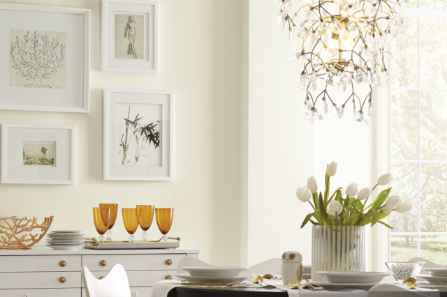
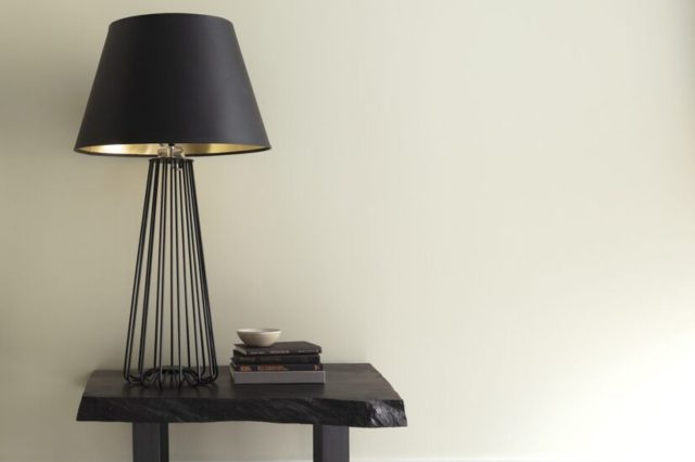
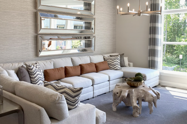
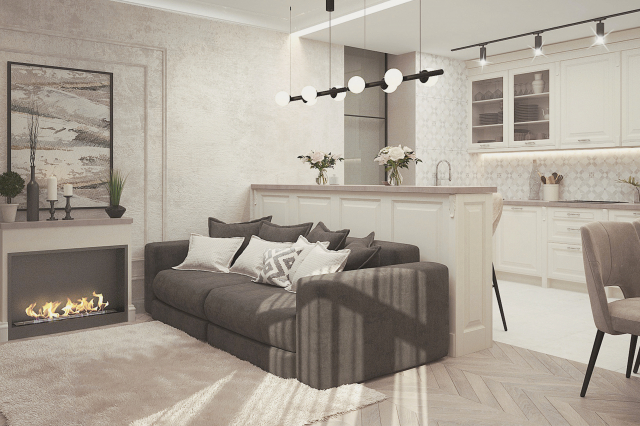
Original White SW 7077 by Sherwin Williams
Embracing the Timeless Elegance of Pure Simplicity
This shade of white is more than just a simple, plain color. It’s a go-to option for many homeowners and interior designers looking to create a fresh, clean look in a variety of spaces. Original White offers a perfect balance, not too cool and not too warm, making it an excellent choice for almost any room in your home.
Whether you’re looking to brighten up a small space, give an airy feel to a large room, or create a sleek, modern look, SW 7077 can help you achieve your vision.
The article will cover the basics of why Original White stands out in the vast sea of white paint options. It will provide insights into how this color can enhance different areas of a home, from living rooms to kitchens, and even exterior spaces.
By offering tips on complementary colors and design ideas, the article aims to inspire you to consider SW 7077 Original White for your next project, whether you’re updating a single room or transforming your entire home. With its universal appeal, Original White promises to bring a sense of renewal and clarity to any space it graces.
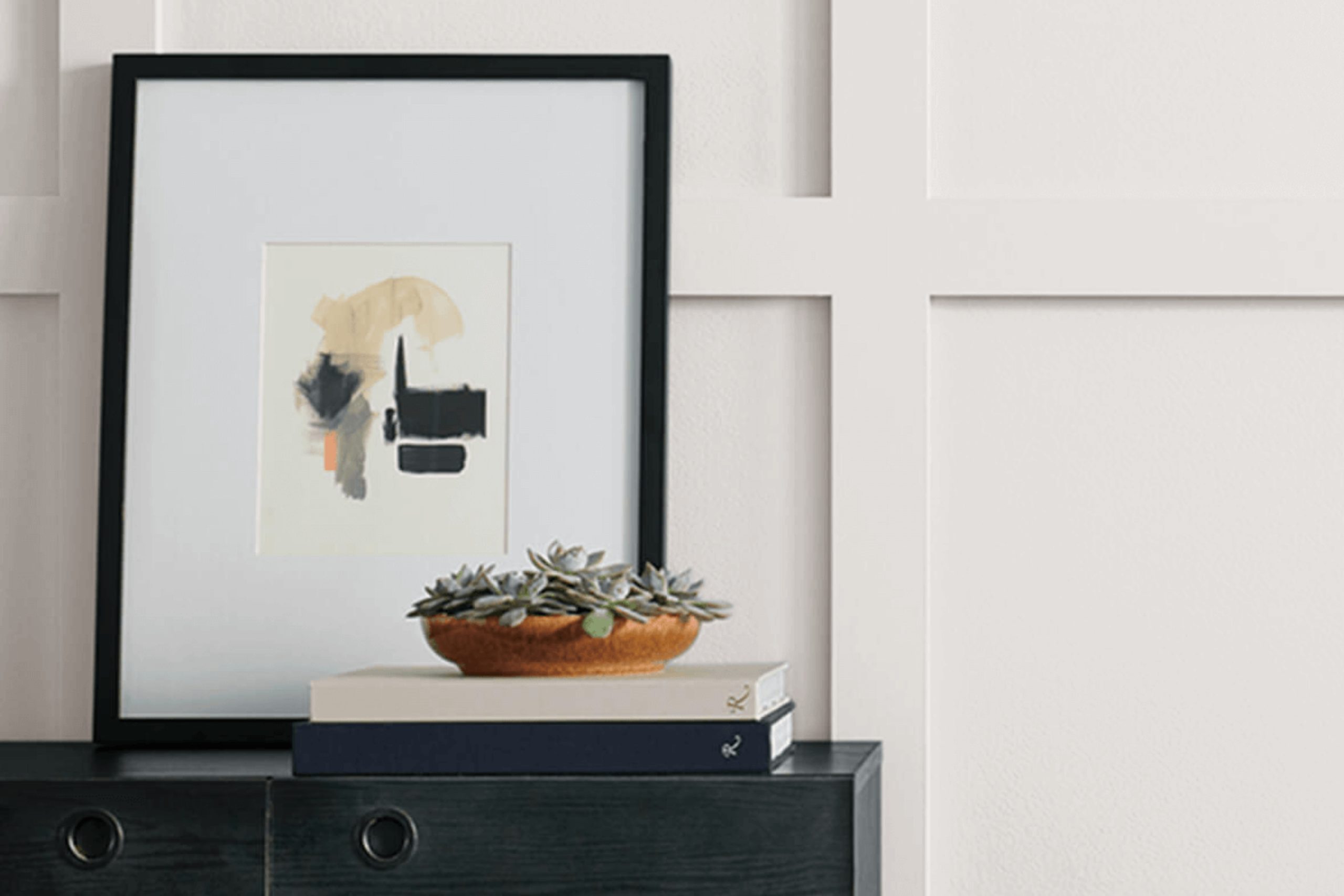
via sherwin-williams.com
What Color Is Original White SW 7077 by Sherwin Williams?
Original White SW 7077 by Sherwin Williams is a fresh and versatile shade of white that brings a sense of simplicity and cleanliness to any space. This color has a subtle warmth to it, making it ideal for creating a cozy and inviting atmosphere without overwhelming the senses. Its neutrality means it can complement a wide range of color palettes, allowing for flexibility in interior design choices.
This shade of white works particularly well in modern and minimalist interior styles, providing a clean backdrop that highlights architectural features and contemporary furniture. It’s also perfect for Scandinavian designs, where the emphasis is on light and airy spaces, enhancing the feeling of openness and tranquility.
When it comes to pairing Original White SW 7077 with materials and textures, it truly shines. This color pairs beautifully with natural wood, from pale birch to rich walnut, adding warmth and organic texture to the room.
Sleek metals like stainless steel or brushed nickel add a modern edge, while soft textiles in muted colors or bold patterns can introduce contrast and interest without overwhelming the space. Whether it’s soft, plush fabrics or smooth, glossy surfaces, Original White acts as the perfect backdrop, allowing these materials to stand out.
This makes it an incredibly versatile choice for those looking to create a space that feels both unified and dynamic.
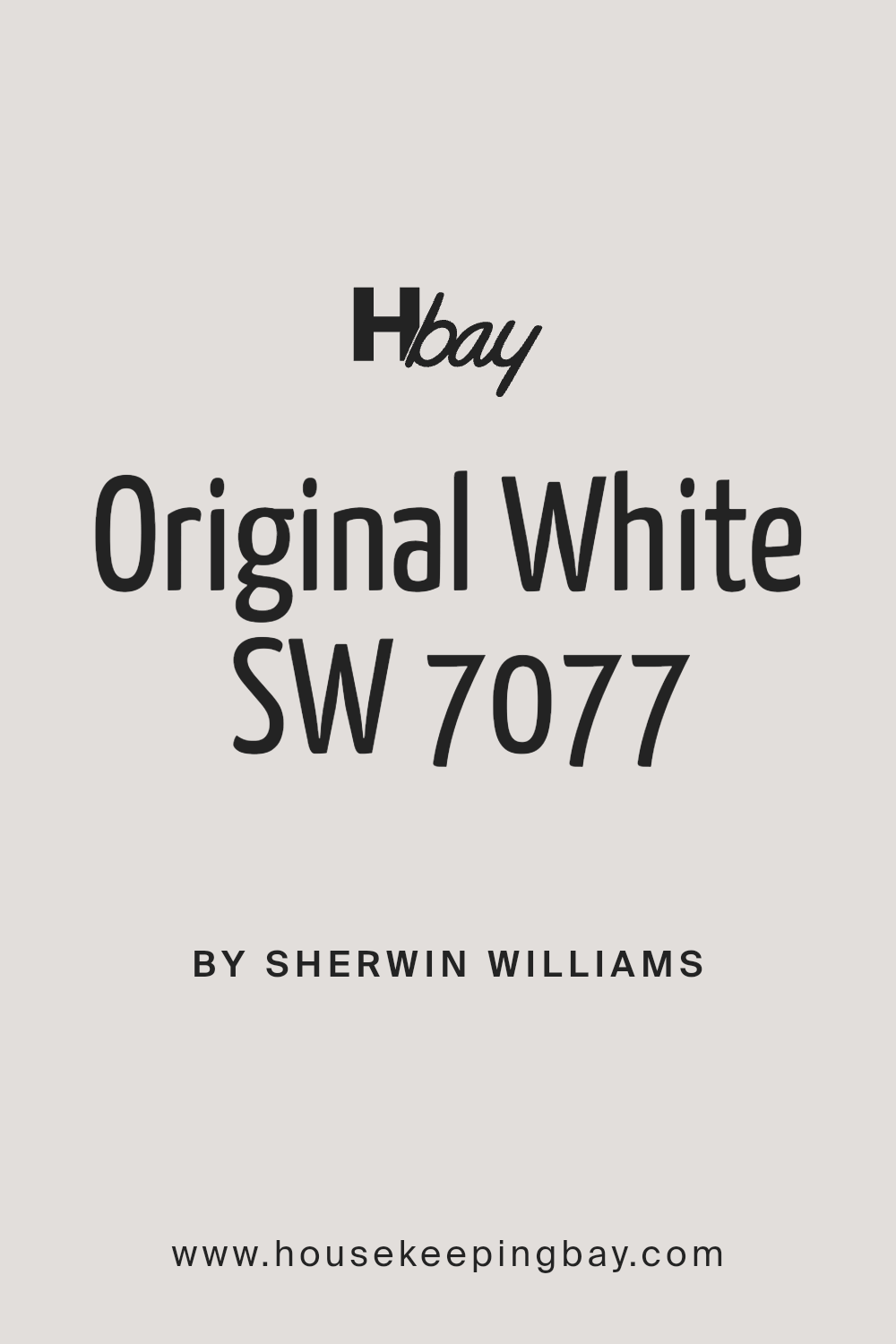
housekeepingbay.com
Table of Contents
Is Original White SW 7077 by Sherwin Williams Warm or Cool color?
Original White SW 7077 by Sherwin Williams is a paint color that has a unique charm and versatility, making it a popular choice for homes. This particular shade of white leans towards a soft, warm tone. Unlike some stark whites, it doesn’t feel cold or too bright. This means it can make rooms feel cozy and welcoming without overpowering the space with brightness.
One of the best things about Original White is how it works with different types of lighting. Whether a room gets a lot of natural sunlight or relies on artificial light, this color helps to create a pleasant, balanced ambiance. It’s great for walls, but also for trim and ceilings, offering a subtle contrast if paired with other colors.
Because of its neutral nature, Original White acts as a perfect background. It allows furniture and decor to stand out, giving homeowners the freedom to play with colors and textures in their space. Whether aiming for a modern minimalist look or something more traditional, Original White is a smart choice for bringing a sense of calm and understated elegance to any home.
What is the Masstone of the Original White SW 7077 by Sherwin Williams?
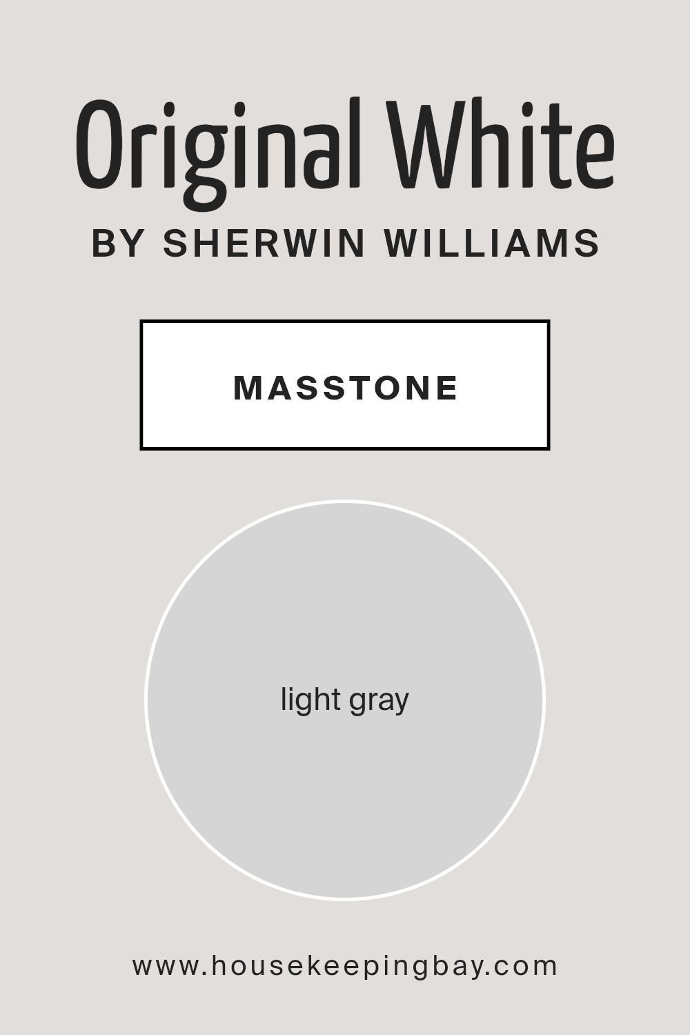
Original White SW 7077 by Sherwin Williams has a masstone, or the color you see when the paint is undiluted, that’s a light gray (#D5D5D5). This subtle hue plays a big role in how this color transforms spaces in homes. Being a light gray, Original White isn’t a stark or pure white. Instead, it brings a soft, gentle warmth that can make rooms feel cozy and inviting.
This shade is incredibly versatile, fitting into almost any decorating style, from modern to classic. It acts as a neutral backdrop that allows furniture and decor to stand out. Whether you’re painting a sunlit living area or a smaller, dimly lit room, Original White can open up the space, making it appear larger and more welcoming.
Its light gray tone also helps hide small imperfections on walls better than a pure white would, making it a practical choice for busy households.
housekeepingbay.com
Undertones of Original White SW 7077 by Sherwin Williams
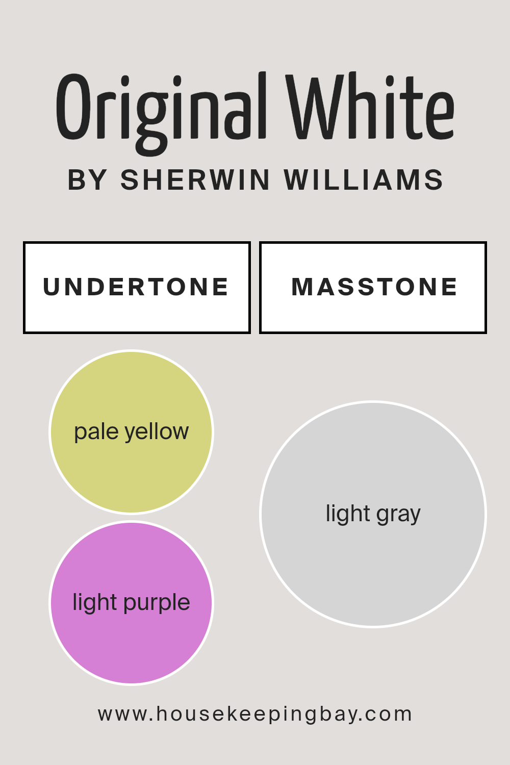
Original White SW 7077 by Sherwin Williams is a unique color that may seem simple at first glance but is actually quite complex due to its undertones. This color has subtle hints of pale yellow and light purple mixed into it. Understanding undertones is crucial because they can change how we perceive the main color. They can make a color appear cooler or warmer, and they affect how the color looks in different lighting conditions.
The pale yellow undertone in Original White adds a warm, inviting glow to the paint. This makes it an excellent choice for rooms where you want to create a cozy and welcoming atmosphere without using a color that feels too bold or intense. On the other hand, the light purple undertone adds a touch of coolness, which can help balance the warmth of the yellow, making the color more versatile.
When applied to interior walls, the undertones of Original White SW 7077 can subtly influence the room’s mood. In natural light, the pale yellow undertone may become more pronounced, giving the room a brighter, sunnier feel. In artificial lighting, the light purple might become more noticeable, adding a soft and serene quality to the space. This interplay between the undertones makes Original White a fascinating choice for those who want a color that can adapt and change with the lighting and mood of a room.
housekeepingbay.com
Coordinating Colors of Original White SW 7077 by Sherwin Williams
Coordinating colors are those that complement each other when used together in a design scheme, helping to enhance the overall aesthetic appeal of a space. When we look at Original White SW 7077 by Sherwin Williams, a classic versatile shade, we find a spectrum of coordinating colors that offer contrasting depths and harmonies.
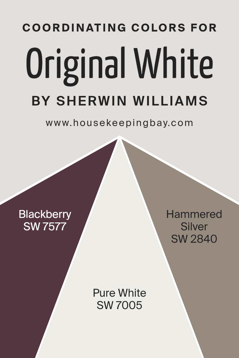
These colors include Blackberry SW 7577, Pure White SW 7005, and Hammered Silver SW 2840. Each of these coordinating colors works with Original White to create a varied and dynamic palette that can bring warmth, depth, or brightness to a room.
Blackberry SW 7577 presents a rich, deep hue that adds sophistication and a touch of mystery to spaces, providing a striking contrast to the lightness of Original White. This color is perfect for accent walls or furniture, bringing a cozy and luxurious feel. Pure White SW 7005, on the other hand, offers a crisp and clean look. It closely matches with Original White but with a slightly different tone, making it ideal for trims, ceilings, or even furniture, to create a seamless and cohesive space.
Finally, Hammered Silver SW 2840 introduces a metallic flair that can act as a bridge between the traditional and contemporary elements within a room. Its unique finish adds texture and interest, making it a great choice for accessories or feature walls.
Together, these coordinating colors provide a balanced palette that can be adapted to suit any style or preference, enhancing the beauty of Original White SW 7077 by Sherwin Williams.
You can see recommended paint colors below:
- SW 7577 Blackberry
- SW 7005 Pure White
- SW 2840 Hammered Silver
housekeepingbay.com
How Does Lighting Affect Original White SW 7077 by Sherwin Williams?
Lighting plays a crucial role in how we perceive colors. It can change the way a color looks, depending on whether it’s under natural sunlight or artificial light. Taking the color Original White SW 7077 by Sherwin Williams as an example, we can see how lighting affects its appearance in a room.
In natural light, colors can appear differently based on the direction the light comes from. Original White will show its true color best under natural sunlight, but the feeling it gives off will change depending on the room’s orientation.
In rooms facing north, which get cooler, softer light, Original White might look a tad more muted and cooler, giving the room a calm and serene vibe. South-facing rooms, on the other hand, receive more intense, warm light throughout the day, making Original White feel warmer and more inviting.
East-facing rooms get bright light in the morning, with a softer glow as the day progresses. In these rooms, Original White will appear bright and cheery in the morning, transitioning to a softer and more subtle white as the day goes on. West-facing rooms receive evening light, which can make Original White glow warm and welcoming in the afternoon and evening, offering a cozy atmosphere as the light changes.
Artificial light affects colors differently too. Under warm artificial lighting, Original White can take on a warmer tone, making a space feel snug and cozy. Cooler artificial lights, like some LEDs, can make the color look sharper and more precise, maintaining its neutrality but with a slightly different feel than under natural light.
So, whether Original White is in a room bathed in sunlight or under artificial lighting, its appearance can shift. It’s not just about the color itself, but also about the quality and direction of the light it receives, which altogether influences the mood and feel of the space.
housekeepingbay.com
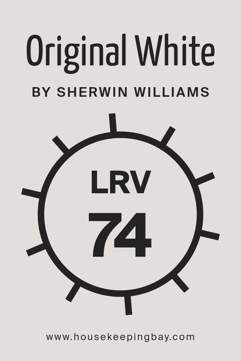
What is the LRV of Original White SW 7077 by Sherwin Williams?
LRV stands for Light Reflectance Value. It’s a measure that shows how much light a paint color will reflect or absorb when it’s applied to a wall. The scale runs from 0 to 100, with 0 being a totally black surface that absorbs all light and 100 being a perfectly white surface that reflects all light back. This is important because the amount of light a color reflects can significantly change how it looks in a room. Lighter colors will make a space feel more open and brighter since they reflect more light, while darker colors can make a room feel cozier but smaller since they absorb more light.
When we talk about the LRV of Original White (SW 7077) by Sherwin Williams, which is 73.55, this tells us it’s a fairly light color that will reflect a good amount of light back into the room. This means that when you use this color on your walls, it can help the space feel more airy and spacious.
It’s especially useful in rooms that don’t get a lot of natural light, as it can help make the most of the light that is available. However, it’s important to consider that even with a high LRV, the direction of the light and the type of lighting in the room can still affect how the color looks once it’s on your walls.
housekeepingbay.com
What is LRV? Read It Before You Choose Your Ideal Paint Color
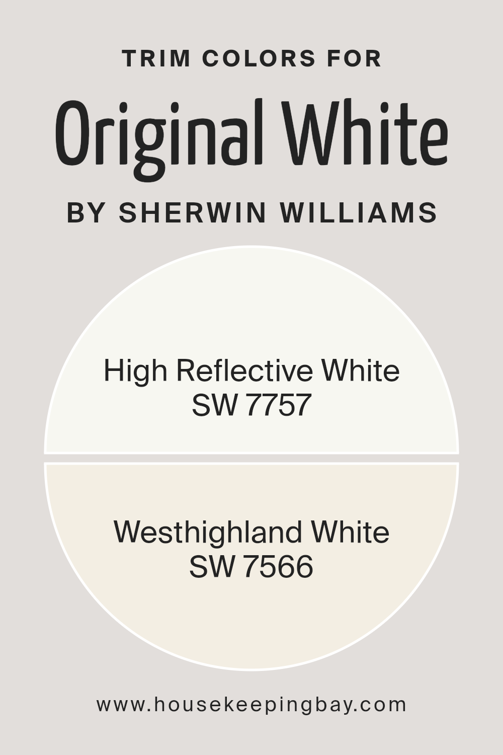
What are the Trim colors of Original White SW 7077 by Sherwin Williams?
Trim colors refer to the hues selected for the decorative aspects of a room or an exterior, such as door frames, window frames, baseboards, and moldings. These colors are meant to accentuate and complement the main color of the walls or exterior. In the case of Original White SW 7077 by Sherwin Williams, choosing the right trim colors is crucial because they can either subtly enhance the classic, crisp nature of the white or subtly add depth and contrast, enriching the overall aesthetics of the space. The choice of trim color can profoundly affect how the primary color is perceived, making it a key decision in painting projects.
For a clean, crisp look that maintains the purity of Original White SW 7077, High Reflective White SW 7757 is an excellent choice. This shade is almost mirror-like in its ability to reflect light, promoting a bright and airy feel that’s unmatched. It boosts the luminosity of a space without overshadowing the main color.
On the other hand, Westhighland White SW 7566 offers a slightly warmer tone, providing a soft contrast that enriches the overall feel of the space without creating a stark differentiation. This warmer white can introduce a subtle depth and warmth to interiors or exteriors, blending seamlessly with Original White for a sophisticated and cohesive look.
You can see recommended paint colors below:
housekeepingbay.com
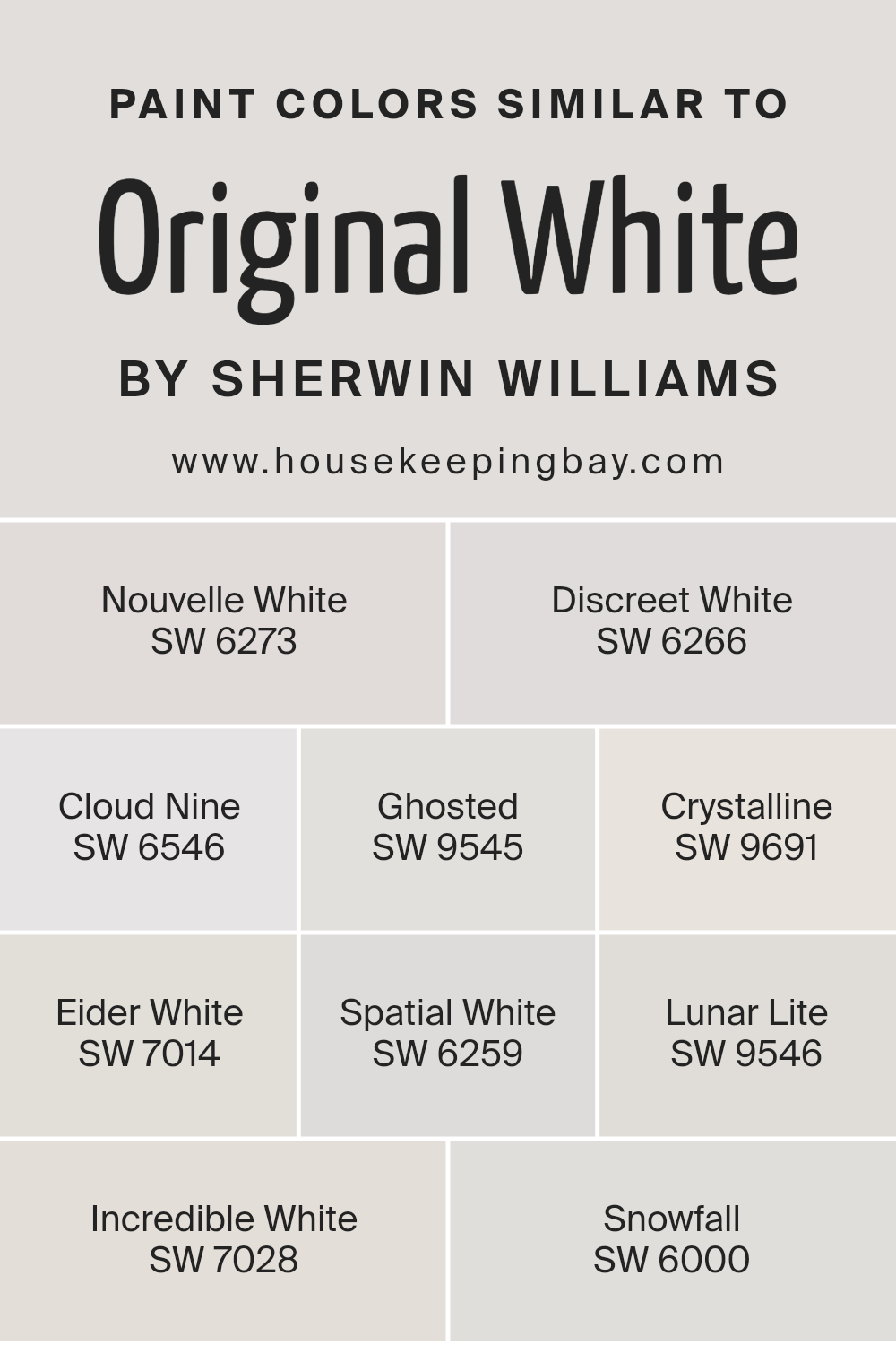
Colors Similar to Original White SW 7077 by Sherwin Williams
Similar colors play a significant role in creating a cohesive and soothing space, especially when they’re variations of a classic hue like Sherwin Williams’ Original White SW 7077. These shades are essentially family members that share a common base but differentiate slightly in tones, making them perfect to mix and match within a room or across a home for a harmonious effect.
They offer subtle distinctions without stark contrast, enabling a designer or homeowner to craft spaces that feel connected and fluid. For example, using different shades of white can add depth and interest to what might otherwise be a flat, monochromatic look. It allows for layering of textures and shades, thus enhancing the overall aesthetic without introducing discordant color splashes.
Take SW 6273 – Nouvelle White, a soft hue that brings a warm, inviting glow, perfect for living areas that seek a cozy ambiance. Meanwhile, SW 6266 – Discreet White, offers a cooler tone, suggesting a serene and calm space, ideal for bedrooms. SW 6546 – Cloud Nine has a light, airy feel, making it suitable for spaces that aim to be uplifting and bright.
SW 9545 – Ghosted and SW 9691 – Crystalline both lend an ethereal quality, with Ghosted providing a ghostly echo of coolness to a modern decor, and Crystalline, a clearer, more defined presence. SW 7014 – Eider White adds a touch of gray, offering sophistication to any room. SW 6259 – Spatial White provides a hint of neutrality, making it versatile across various settings.
SW 9546 – Lunar Lite is quintessentially delicate, illuminating spaces with a soft, moonlit glow.
SW 7028 – Incredible White enriches spaces with its grounded, earthy tone that’s both comforting and strong. Lastly, SW 6000 – Snowfall is pristine and inviting, delivering a fresh, clean palette. Each of these similar colors to Original White SW 7077 allows for creative freedom while maintaining a cohesive look and feel throughout any design project.
You can see recommended paint colors below:
- SW 6273 Nouvelle White
- SW 6266 Discreet White
- SW 6546 Cloud Nine
- SW 9545 Ghosted
- SW 9691 Crystalline
- SW 7014 Eider White
- SW 6259 Spatial White
- SW 9546 Lunar Lite
- SW 7028 Incredible White
- SW 6000 Snowfall
housekeepingbay.com
How to Use Original White SW 7077 by Sherwin Williams In Your Home?
Original White SW 7077 by Sherwin Williams is a classic and versatile paint color that homeowners love. It’s a soft, warm white that doesn’t overwhelm a space. Think of it as a cozy blanket for your walls, giving them just the right amount of warmth without being too stark or cold. This color is perfect for almost any room in your house, whether you’re freshening up your living room, kitchen, or bedroom.
Using Original White can make your home feel more open and airy. It’s great for smaller spaces, as it can help them appear larger. Plus, it acts like a blank canvas, letting your furniture and decor stand out. You can pair it with bold colors for a pop of contrast or keep things calm with soft, neutral tones.
If you’re not sure about changing an entire room, consider using Original White for trim, doors, or cabinets. It’s a simple way to brighten up your space without a huge commitment. No matter how you use it, Original White SW 7077 brings a fresh and inviting vibe to your home.
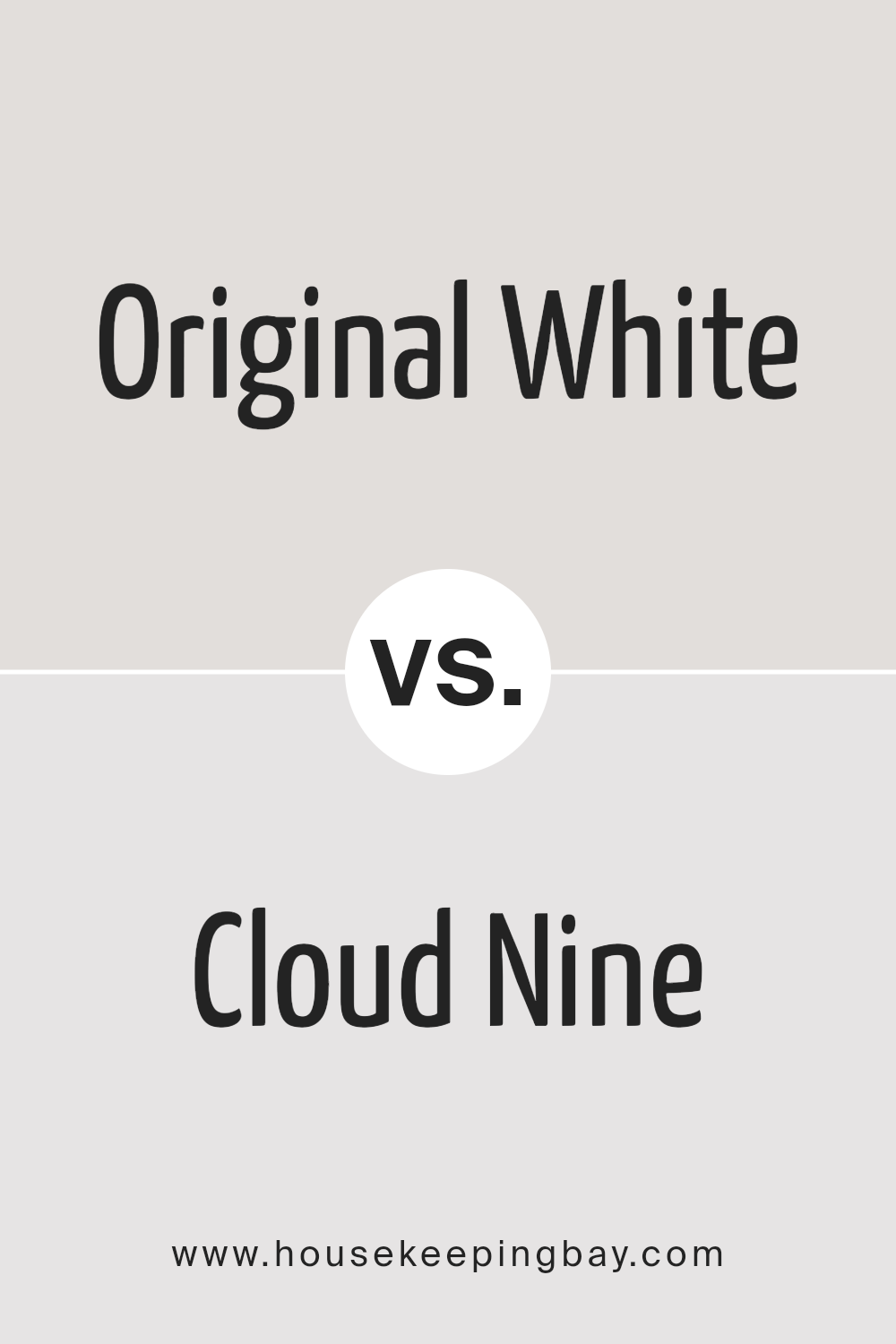
Original White SW 7077 by Sherwin Williams vs Cloud Nine SW 6546 by Sherwin Williams
Original White SW 7077 by Sherwin Williams and Cloud Nine SW 6546, also by Sherwin Williams, are both light colors, but they offer different vibes to a room. Original White is a pure, clean color. It’s the kind of white you might use if you want a space to feel fresh and open. It doesn’t have any noticeable undertones, so it’s great for a modern look or to make small spaces seem bigger.
On the other hand, Cloud Nine has a softer, slightly warmer feel. It’s not just plain white; it has a hint of something extra that makes it cozy. This color could be perfect for creating a more inviting and comfortable space, like a living room or a bedroom. It’s still light and airy, but with a touch of warmth that makes it feel more like home.
In summary, Original White is your go-to for a crisp, clean look, while Cloud Nine adds warmth to a space without sacrificing the light, airy feel of white.
You can see recommended paint color below:
- SW 6546 Cloud Nine
housekeepingbay.com
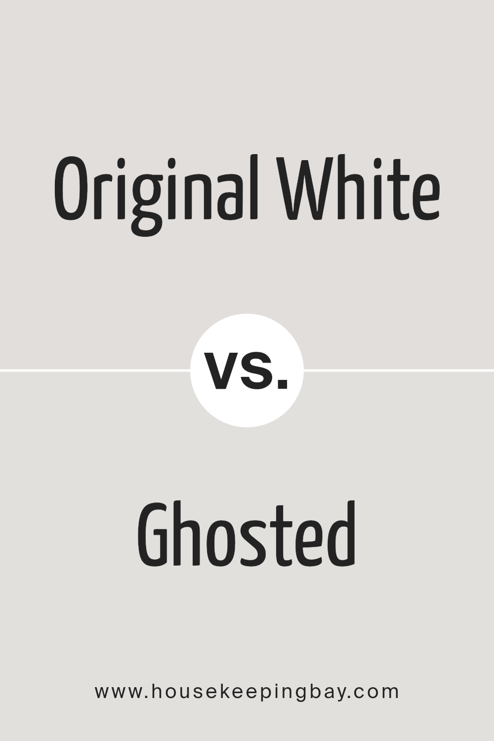
Original White SW 7077 by Sherwin Williams vs Ghosted SW 9545 by Sherwin Williams
Original White SW 7077 by Sherwin Williams and Ghosted SW 9545 by Sherwin Williams are two distinct paint colors with their own unique vibes. Original White is exactly what it sounds like: a classic, pure white. It’s the kind of white that’s perfect for creating a clean, crisp look in any room.
It reflects light beautifully, making spaces appear larger and more open. On the other hand, Ghosted is a bit more complex. It isn’t a pure white. Instead, it has subtle nuances that give it depth, making it a great choice if you want something with a bit more character than a straightforward white. It can add a soft, sophisticated touch to your space without overwhelming it with color.
While both colors are versatile and can work well in various settings, Original White is ideal for those looking for a clear, sharp backdrop, whereas Ghosted offers a gentler, more nuanced option.
You can see recommended paint color below:
housekeepingbay.com
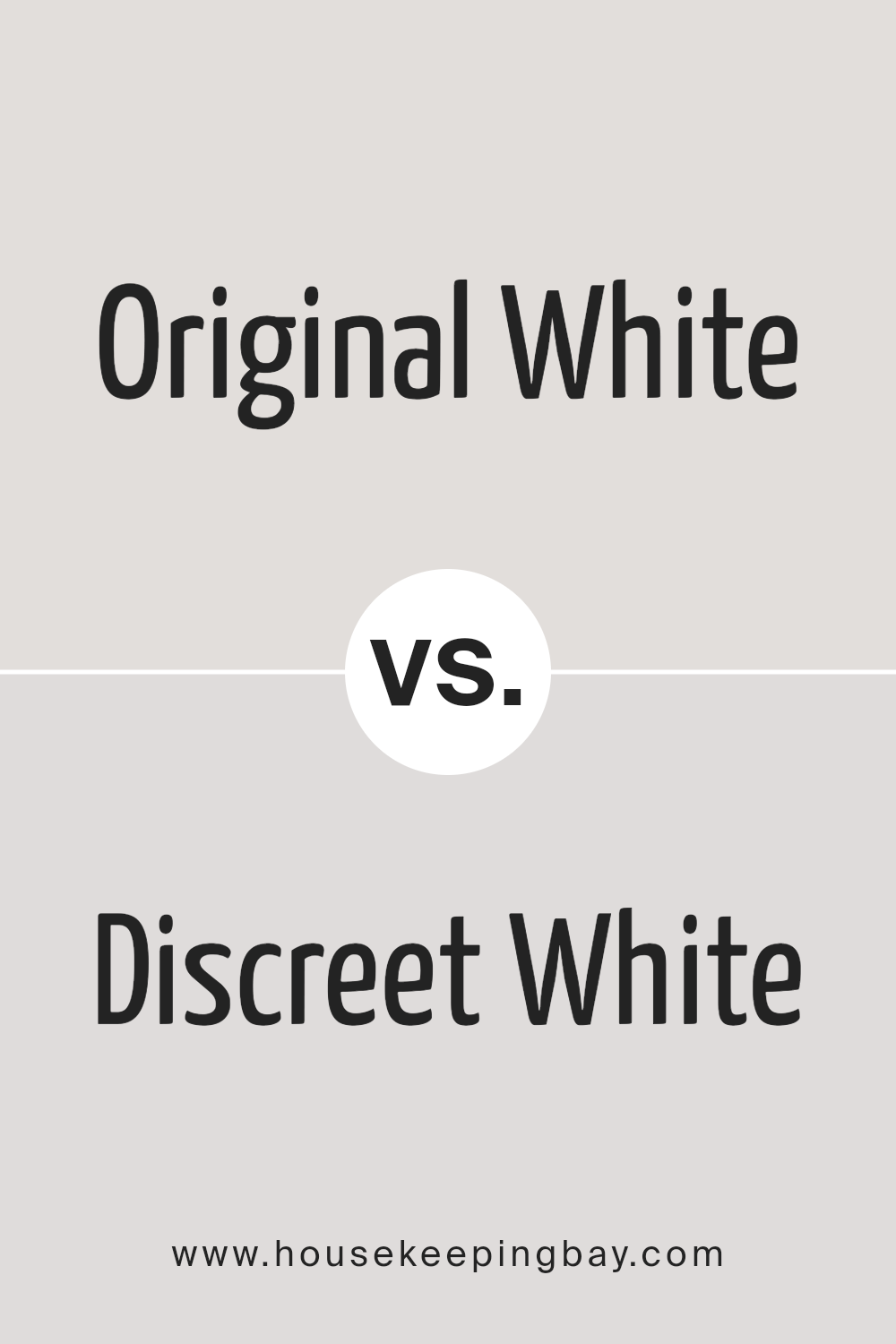
Original White SW 7077 by Sherwin Williams vs Discreet White SW 6266 by Sherwin Williams
Original White SW 7077 by Sherwin Williams is a classic and pure white color. It’s known for its simplicity and brightness, providing a fresh and clean look wherever it’s used. This color is perfect for creating a spacious feeling in any room, making it seem larger and more open. It works well in various settings, from modern to traditional designs, because of its versatility.
On the other hand, Discreet White SW 6266 by Sherwin Williams takes a softer approach. It is not a stark white but rather has a gentle hint of gray, giving it a warmer and more inviting feel. This color is ideal for those who prefer a white with a little more character and coziness, without moving too far from the neutral palette.
Discreet White adds a subtle sophistication and depth to spaces, making it a great choice for creating a calm and relaxing ambiance.
Both colors are excellent choices, depending on the mood and feel you want to achieve in your space. Original White is brighter and more refreshing, while Discreet White offers warmth and subtle elegance.
You can see recommended paint color below:
- SW 6266 Discreet White
housekeepingbay.com
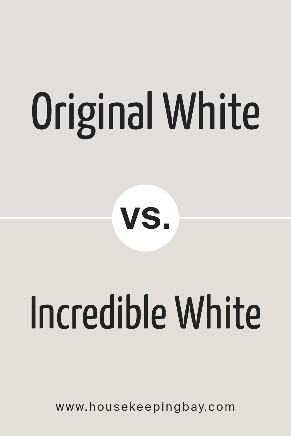
Original White SW 7077 by Sherwin Williams vs Incredible White SW 7028 by Sherwin Williams
Original White SW 7077 by Sherwin Williams is a clean and classic shade of white. It’s the kind of white that feels fresh and crisp, like a new beginning. It has a pure vibe that makes spaces feel open and light. This color is perfect if you’re looking for something straightforward and timeless.
On the other hand, Incredible White SW 7028, also by Sherwin Williams, is a slightly warmer tone of white. It’s not pure white but has a touch of warmth to it, making it feel cozy and welcoming. This color is great for creating a soft and soothing atmosphere in your home. It’s not stark; instead, it offers a gentle hug to the room, providing a comfortable backdrop that’s easy on the eyes.
In summary, Original White is your go-to for that classic, clean, and bright white, while Incredible White is ideal if you prefer a hint of warmth in your whites for a cozier feel.
You can see recommended paint color below:
housekeepingbay.com
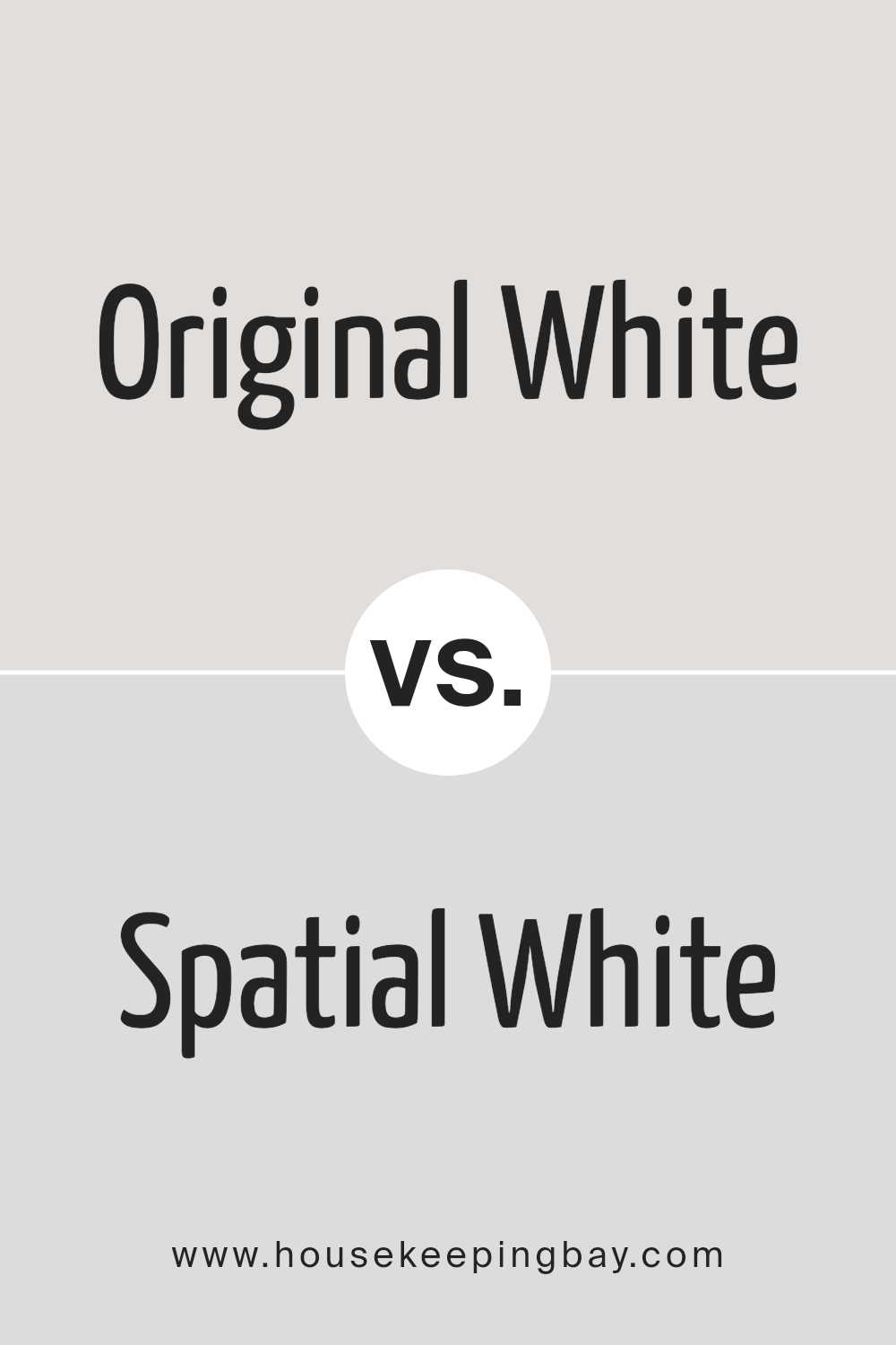
Original White SW 7077 by Sherwin Williams vs Spatial White SW 6259 by Sherwin Williams
Original White SW 7077 by Sherwin Williams is a pure and straightforward white. This color is great for creating a clean and fresh look in any space. It’s pretty much the go-to when you want a classic white that doesn’t lean too much towards any tones. It’s like a blank canvas, making it easy to match with any decor or style.
On the other hand, Spatial White SW 6259 by Sherwin Williams is also a white, but it’s different. It has a hint of grey, giving it a slightly cooler feel. This color is perfect for those who want a modern and sleek look. It’s a bit softer and subtler than Original White, making it great for rooms where you want a calm and peaceful feel. Spatial White can help make spaces feel more open and airy but with a touch of warmth thanks to its grey undertone.
In short, if you want a true, pure white, go for Original White. But if you’re looking for something with a bit more depth and a modern vibe, Spatial White is the way to go.
You can see recommended paint color below:
- SW 6259 Spatial White
housekeepingbay.com
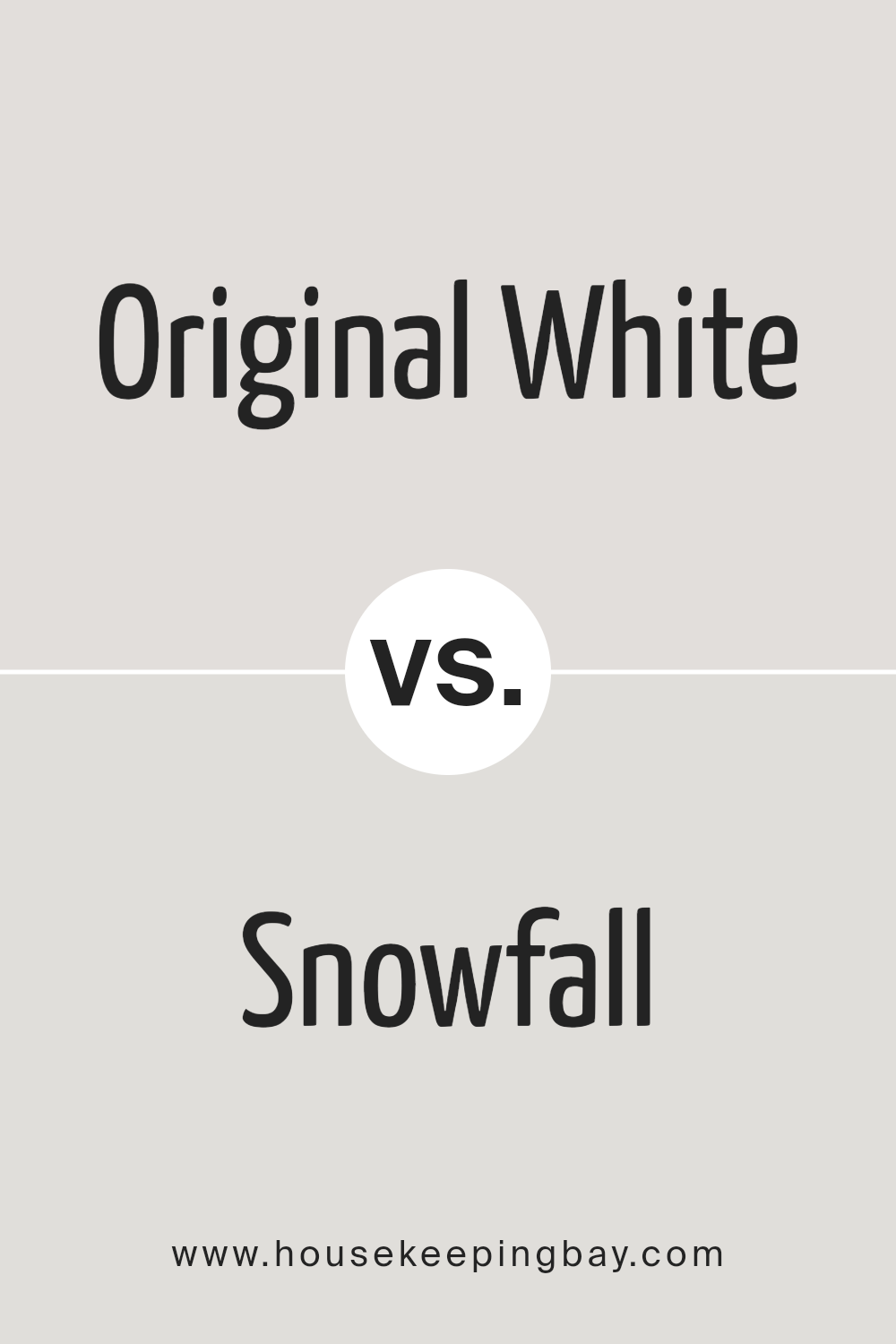
Original White SW 7077 by Sherwin Williams vs Snowfall SW 6000 by Sherwin Williams
Original White SW 7077 and Snowfall SW 6000 by Sherwin Williams are both white shades, but they have subtle differences. Original White is a warm white. It has a hint of creaminess, making spaces feel cozy and welcoming. It’s great for rooms where you want a soft, inviting atmosphere without going too bright.
On the other hand, Snowfall is a cooler white. It leans towards a pure, clean look, reminiscent of snow. This color can make a room feel fresh and crisp. It’s excellent for spaces that you want to give a more open and airy feeling without feeling sterile.
In summary, if you’re looking for a warmer, cozier white, Original White is the way to go. However, if you prefer a cleaner, more refreshing white, Snowfall would be a better choice. Either way, both colors are versatile and can work well in a variety of spaces.
You can see recommended paint color below:
housekeepingbay.com
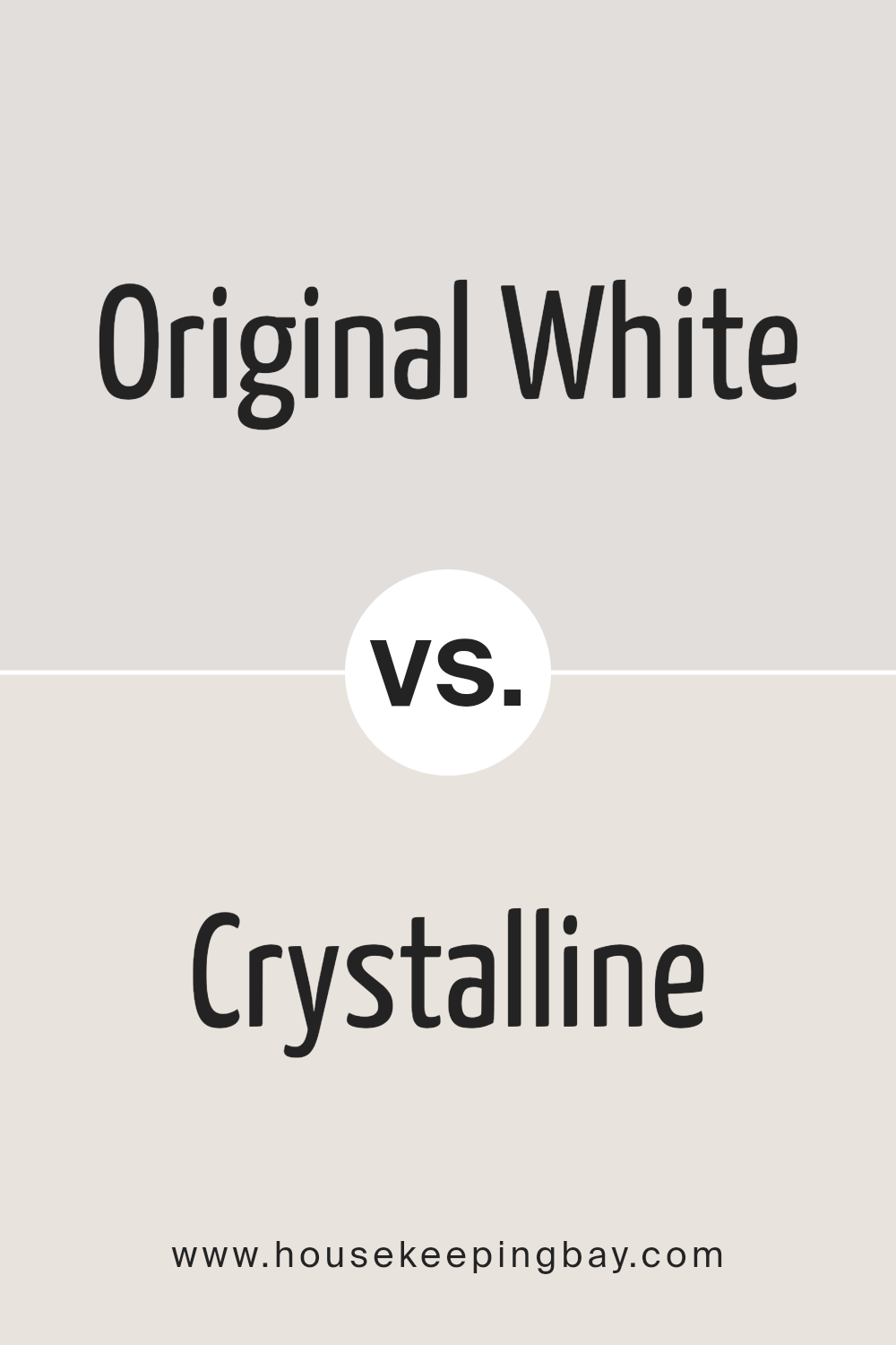
Original White SW 7077 by Sherwin Williams vs Crystalline SW 9691 by Sherwin Williams
Original White SW 7077 by Sherwin Williams and Crystalline SW 9691 by Sherwin Williams are both unique hues, each offering a distinct vibe for your space. Original White is a classic, pure white. It’s the go-to color when you want a clean and straightforward look. This shade is perfect if you’re aiming for a bright and airy feeling in a room, providing a fresh and open atmosphere.
On the other hand, Crystalline is a bit more playful and distinct. It has a gentle hint of green, giving it a soft, almost magical quality. This color is excellent for adding a touch of uniqueness without overwhelming a space. It’s subtle enough to stay in the background but adds a nice layer of personality to any room.
When choosing between them, consider the mood you’re going for. Original White keeps things simple and clear, while Crystalline adds a whisper of color to spice things up a bit.
You can see recommended paint color below:
- SW 9691 Crystalline
housekeepingbay.com
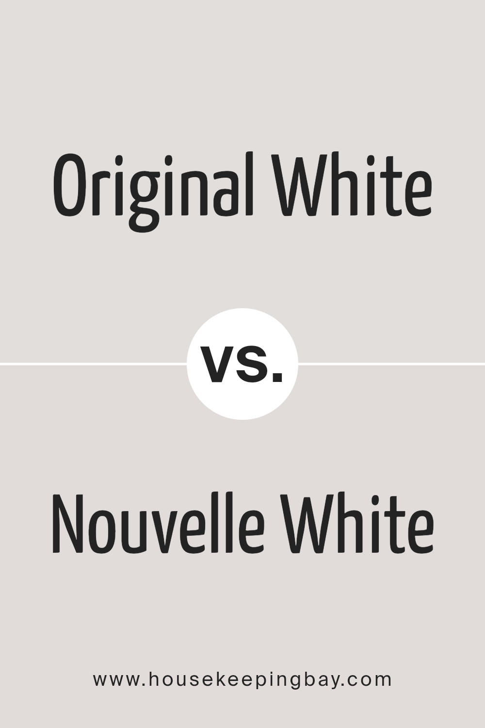
Original White SW 7077 by Sherwin Williams vs Nouvelle White SW 6273 by Sherwin Williams
Original White SW 7077 by Sherwin-Williams and Nouvelle White SW 6273 also by Sherwin-Williams, are two different shades of white that you can choose for your space. Original White has a pure, clean look that can make a room feel fresh and bright. It’s a great choice if you want a classic white that doesn’t lean towards any specific undertone.
On the other hand, Nouvelle White is a bit softer and has a slightly creamy feel to it, making it a cozy option for spaces where you want a warm and welcoming atmosphere. This color can help soften the edges of a room and is ideal for creating a gentle vibe.
While Original White is like a blank canvas, offering a stark, clear backdrop, Nouvelle White brings in a hint of warmth, making it less stark and more inviting. Choosing between them depends on whether you’re going for a crisp, vibrant setting with Original White or a softer, cozier mood with Nouvelle White.
You can see recommended paint color below:
- SW 6273 Nouvelle White
housekeepingbay.com
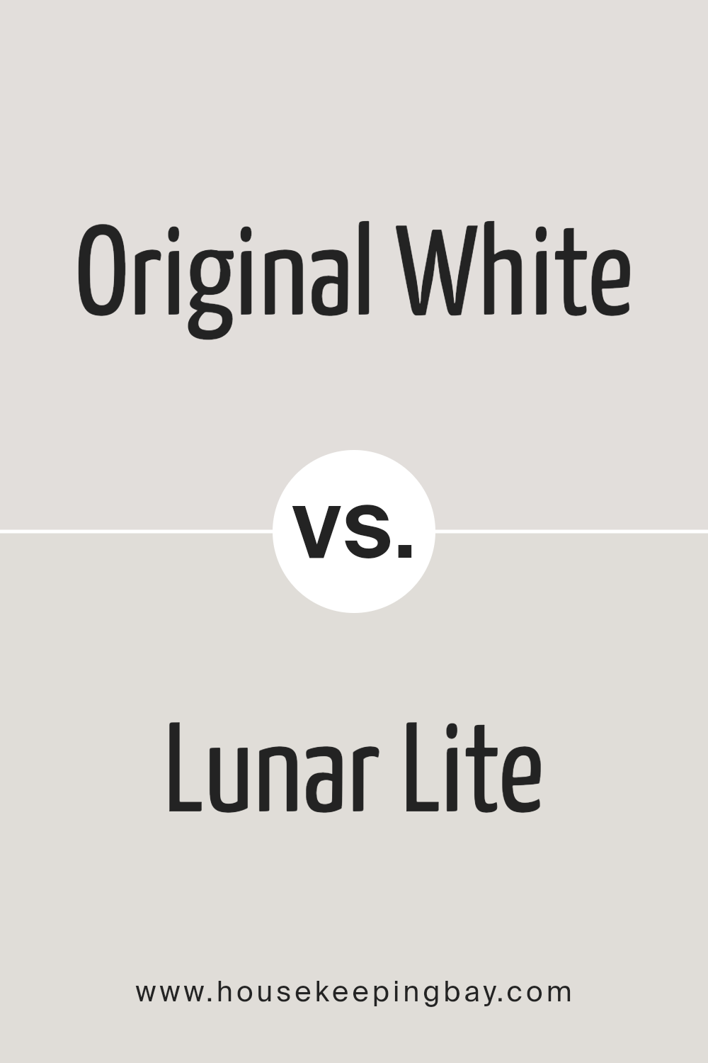
Original White SW 7077 by Sherwin Williams vs Lunar Lite SW 9546 by Sherwin Williams
Original White SW 7077 from Sherwin Williams is a classic, clean color. It’s the kind of white that feels fresh and can brighten up any space. Because it’s so pure, it works great as a base, meaning you can pair it with almost any other color to create a beautiful look in your home. It’s versatile, making it a solid choice for walls if you want a space to feel bigger and more open.
Lunar Lite SW 9546, on the other hand, is a different kind of color. While it’s still in the white family, it has a cooler, almost moonlight-like tone. It adds a subtle, modern touch to rooms without overwhelming them. If Original White is about brightness and openness, Lunar Lite brings in a hint of cool sophistication. It’s perfect for spaces where you want a hint of color without straying too far from white.
In summary, while both colors are white, Original White is your go-to for pure simplicity, and Lunar Lite offers a cooler, slightly more nuanced option.
You can see recommended paint color below:
housekeepingbay.com
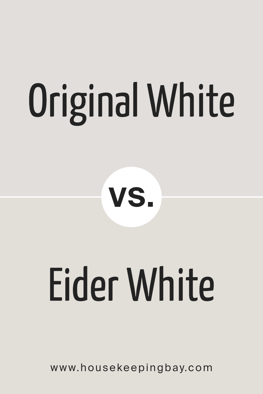
Original White SW 7077 by Sherwin Williams vs Eider White SW 7014 by Sherwin Williams
Original White SW 7077 by Sherwin Williams is a clean and clear shade that brings brightness to any space. It’s like a blank canvas, offering a fresh start or a crisp accent when matched with other colors. Eider White SW 7014, on the other hand, is a gentler option. It has a touch of gray, giving it a softer and slightly warmer feel compared to Original White.
This subtle hint of gray makes Eider White a great choice for creating a cozy and welcoming atmosphere without the starkness that sometimes comes with pure white. When placed side by side, Original White stands out as the more vibrant and pure hue, perfect for those looking for a sharp and straightforward white.
Eider White is ideal for those who prefer something less intense and more soothing, with its ability to add depth and warmth to spaces while maintaining a light and airy vibe.
You can see recommended paint color below:
housekeepingbay.com
Conclusion
Original White SW 7077 by Sherwin Williams is a versatile and timeless color that adds a touch of simplicity and elegance to any space. It’s a fantastic choice for those looking to create a serene and welcoming environment. As a shade that easily complements various decor styles and palettes, it serves as a reliable option for decorators aiming to achieve a clean and cohesive look throughout their homes or projects.
This paint color is particularly useful for spaces in need of a bright and airy feel, making rooms appear more spacious and light-filled. Whether it’s applied to walls, trim, or cabinets, Original White SW 7077 ensures a seamless and polished appearance. Its adaptability and the subtle warmth it brings make it a go-to choice for anyone looking to refresh their space with a classic and understated aesthetic.

housekeepingbay.com
Ever wished paint sampling was as easy as sticking a sticker? Guess what? Now it is! Discover Samplize's unique Peel & Stick samples. Get started now and say goodbye to the old messy way!
Get paint samples
