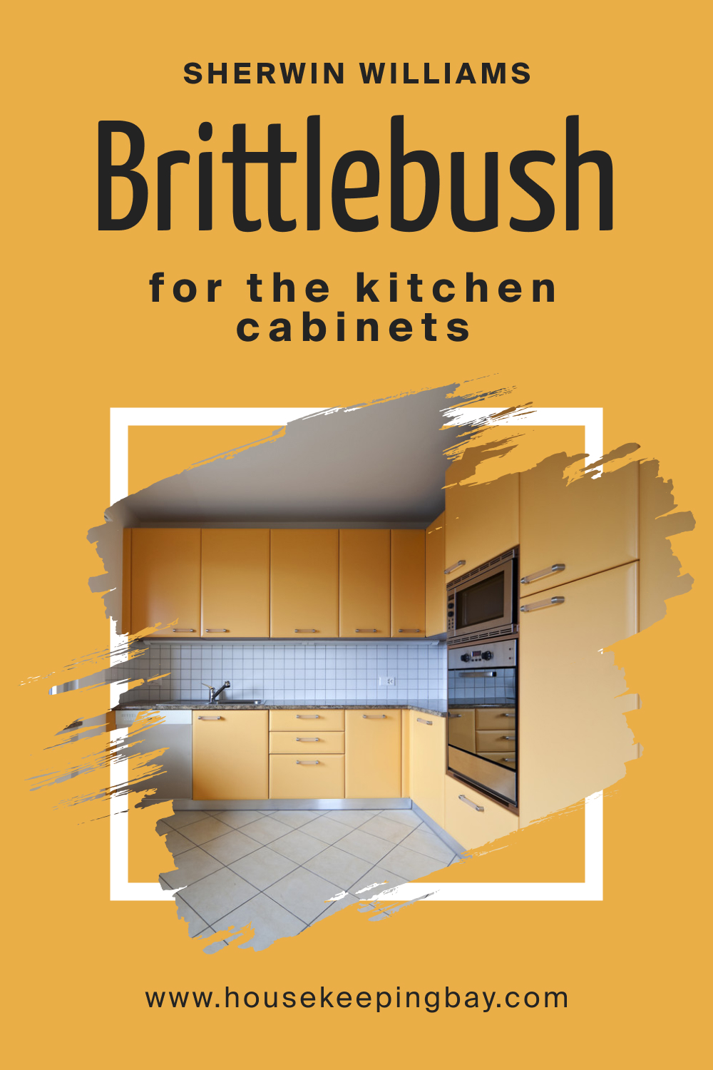
Brittlebush SW 6684 Paint Color by Sherwin-Williams
Choosing the right paint color for your home is more than just a matter of taste; it's about creating an atmosphere that resonates with your personal style.
Choosing the right paint color for your home is more than just a matter of taste; it’s about creating an atmosphere that resonates with your personal style. Among the myriad of options, Brittlebush SW 6684 stands out as a unique hue. This article delves into the specifics of this color, its undertones, whether it’s warm or cool, and its coordinating colors.
via sherwin-williams.com
What Color Is Brittlebush SW 6684?
Table of Contents
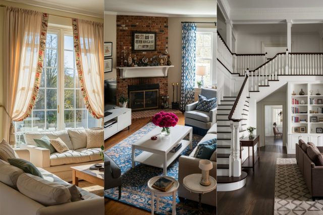
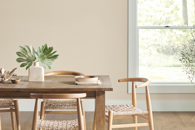
Brittlebush SW 6684 is a captivating color that brings a sense of warmth and earthiness to any interior. This hue is a subtle blend of soft brown with hints of a sun-kissed terracotta, reminiscent of the natural elements found in the desert at dusk. Its versatility makes it suitable for various interior styles, especially those that lean towards a rustic, bohemian, or modern farmhouse aesthetic.
The color works exceptionally well with natural materials like unfinished wood, linen fabrics, and rough-textured ceramics. It pairs beautifully with both matte and glossy finishes, allowing for a wide range of design possibilities.
In spaces with ample natural light, Brittlebush SW 6684 radiates a cozy, welcoming feel, while in dimly lit areas, it can create a more intimate and snug ambiance.
housekeepingbay.com
Is It a Warm Or Cool Color?
Brittlebush SW 6684 inherently possesses a warm character. This warmth emanates from its earthy base, making it an ideal choice for creating a comforting and inviting atmosphere in homes. Unlike cool colors, which tend to recede and create a sense of spaciousness, warm colors like Brittlebush SW 6684 advance toward the eye, making large rooms feel more intimate and cozy.
In home decor, this warm hue can be used to balance out cooler elements, such as metallic accents or gray-toned furnishings, providing a harmonious contrast. Its warmth is particularly effective in north-facing rooms, where it can counteract the cooler natural light, or in spaces where a sense of comfort and conviviality is desired.
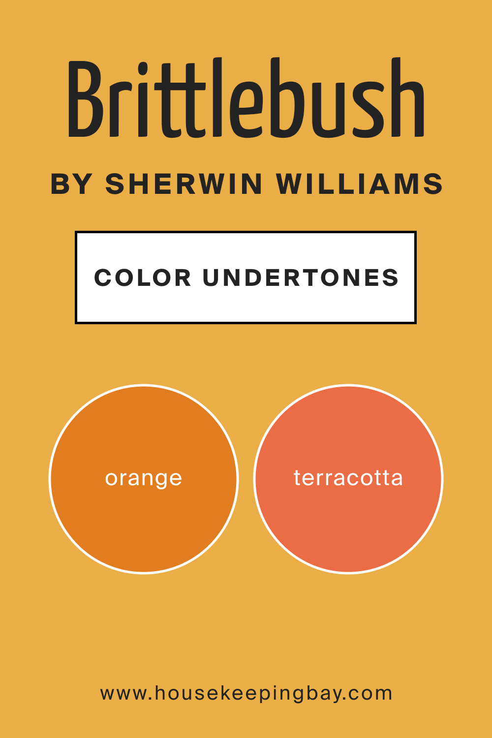
Undertones of Brittlebush SW 6684
The undertones of color play a crucial role in how it is perceived and how it interacts with other elements in a room. Brittlebush SW 6684 has a complex undertone that skews towards a muted orange or a soft terracotta. These undertones add depth and richness to the color, making it more dynamic than a straightforward brown.
In interior walls, these undertones can bring a room to life, especially under different lighting conditions. Natural daylight tends to bring out the warmer terracotta undertone, while artificial light can highlight its more muted, earthy aspect.
This chameleon-like quality makes Brittlebush SW 6684 a fascinating choice for walls, as it can transform the mood of a room from morning to night.
housekeepingbay.com
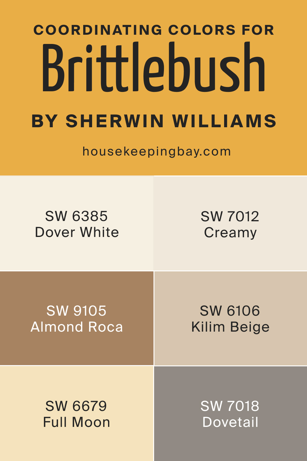
Coordinating Colors of Brittlebush SW 6684
Coordinating colors are hues that harmonize well with the primary color, either by complementing or contrasting it in a pleasing manner. For Brittlebush SW 6684, there are several coordinating colors that enhance its earthy charm.
- SW 6385 Dover White : A soft, creamy white that provides a crisp contrast, highlighting the warmth of Brittlebush SW 6684.
- SW 9105 Almond Roca : A rich, nutty beige that complements the earthy tones in Brittlebush, creating a seamless blend.
- SW 6679 Full Moon : A pale, gentle yellow that offers a subtle contrast, adding brightness and a sense of airiness.
Additionally, consider these coordinating colors:
- SW 7012 Creamy : A soothing off-white that adds a sense of calm and elegance.
- SW 6106 Kilim Beige : A warm beige that echoes the natural elements in Brittlebush, reinforcing its organic feel.
- SW 7018 Dovetail : A deep, grayish-brown that provides a bold contrast, accentuating the depth of Brittlebush.
housekeepingbay.com
How Does Lighting Affect Brittlebush SW 6684?
Lighting plays a pivotal role in how we perceive colors, and Brittlebush SW 6684 is no exception. In natural light, this color tends to reveal its warmer, earthier tones, making spaces feel cozy and inviting. The quality of natural light, however, varies depending on the orientation of the room.
In north-facing rooms, which receive cooler, softer light, Brittlebush may appear slightly more muted, emphasizing its brown undertones. South-facing rooms, bathed in warm, bright light, will enhance the color’s terracotta undertones, making it appear warmer and more vibrant.
In east-facing rooms, the morning light can make Brittlebush look particularly warm and welcoming, while in west-facing rooms, the evening light brings out its rich, earthy quality. Artificial lighting, on the other hand, can significantly impact how Brittlebush SW 6684 is perceived.
Warmer artificial lights, such as incandescent bulbs, will enhance its warm undertones, whereas cooler lights, like LEDs, might make it appear more neutral or muted.
housekeepingbay.com
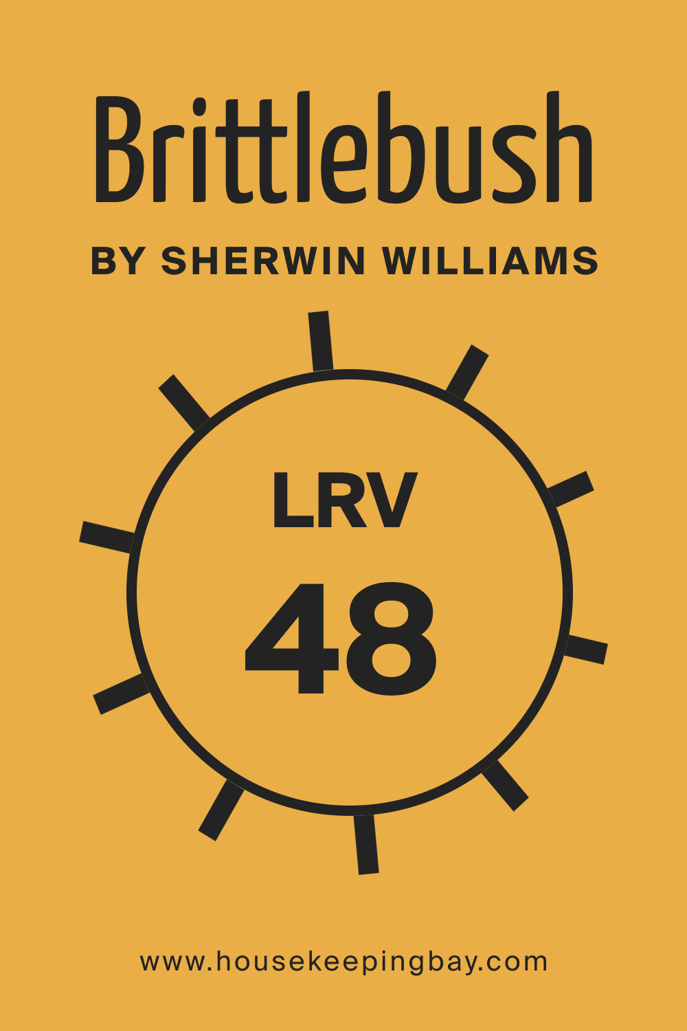
LRV of Brittlebush SW 6684
The Light Reflectance Value (LRV) of a color quantifies how much light a color reflects. Brittlebush SW 6684 has an LRV of 48, which places it in the mid-range spectrum. Colors with mid-range LRVs are versatile and balanced, neither too bright nor too dark.
This level of reflectance makes Brittlebush a suitable choice for a variety of spaces, offering enough brightness to make rooms feel open yet still providing a sense of warmth and intimacy.
In practical terms, the LRV of 48 means that Brittlebush will react moderately to lighting changes. In well-lit rooms, it will appear lighter and more vibrant, whereas in rooms with less light, it will take on a richer, deeper tone. This LRV level makes it a flexible choice for diverse lighting conditions, maintaining its character while subtly changing its mood based on the environment.
housekeepingbay.com
What is LRV? Read It Before You Choose Your Ideal Paint Color
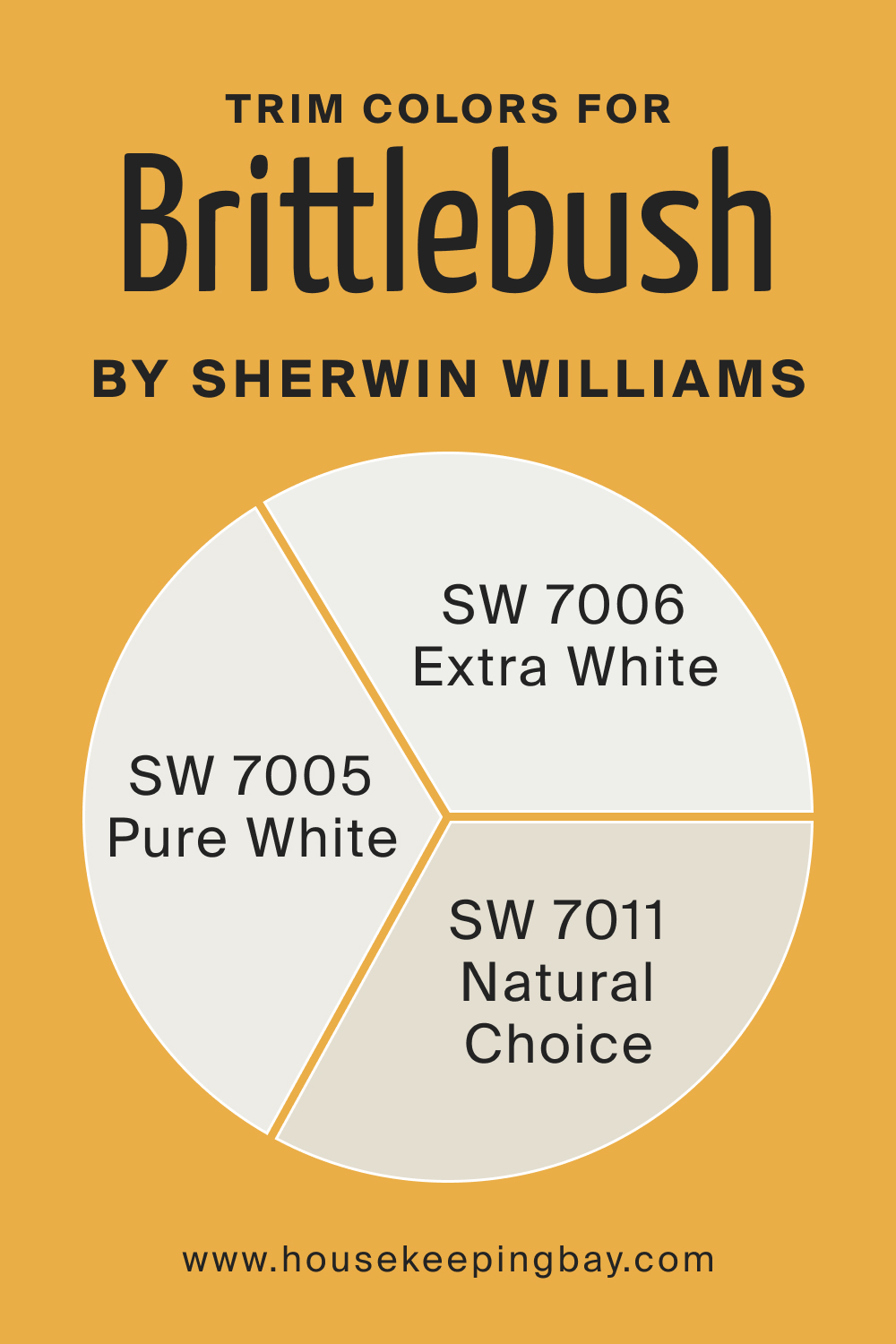
Trim Colors of Brittlebush SW 6684
Trim colors are essential in interior design as they frame and accentuate the walls, impacting the overall aesthetic. For Brittlebush SW 6684, choosing the right trim color is crucial to enhance its earthy charm. White shades are often preferred for trims as they provide a crisp, clean contrast, highlighting the wall color. Ideal trim colors for Brittlebush SW 6684 include:
- SW 7006 Extra White : A pure, bright white that creates a stark contrast, making Brittlebush stand out.
- SW 7005 Pure White : A slightly softer white with a hint of warmth, complementing the cozy feel of Brittlebush.
- SW 7011 Natural Choice : An off-white with subtle beige undertones, providing a more seamless transition from wall to trim.
housekeepingbay.com
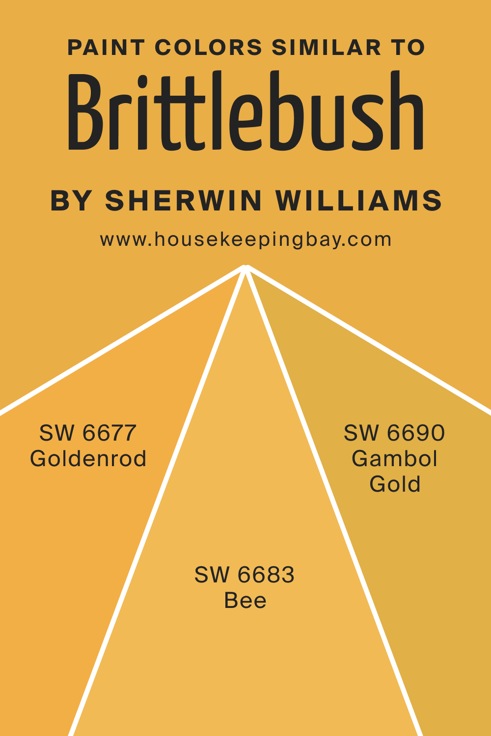
Colors Similar to Brittlebush SW 6684
Knowing similar colors to Brittlebush SW 6684 is crucial for design flexibility and for finding alternatives that fit specific tastes or lighting conditions. Three colors similar to Brittlebush include:
- SW 6677 Goldenrod : A rich, golden hue with a vibrant, sunny character, adding a more pronounced yellow undertone compared to Brittlebush.
SW 6690 Gambol Gold : A deep, warm gold that provides a bolder, more saturated alternative, offering a similar warmth but with increased intensity.
SW 6683 Bee : A bright, cheerful yellow with an energetic feel, lighter and more vibrant, yet maintaining the warm essence.
housekeepingbay.com
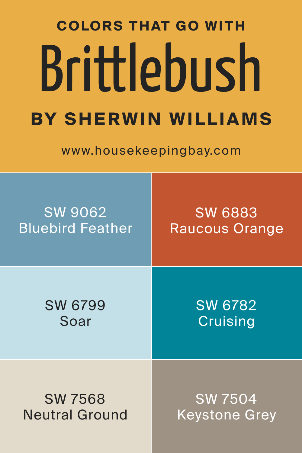
Colors That Go With Brittlebush SW 6684
The importance of using harmonious colors in the same room lies in creating a cohesive and aesthetically pleasing environment. For Brittlebush SW 6684, several Sherwin-Williams colors complement its warm, earthy tone:
- SW 6799 Soar : A soft, airy blue that contrasts beautifully with Brittlebush, creating a serene and balanced look.
- SW 9062 Bluebird Feather : A muted blue with gray undertones, offering a subtle and sophisticated complement.
- SW 6883 Raucous Orange : A bold, vibrant orange that pairs excitingly with Brittlebush for a dynamic and energetic palette.
- SW 7568 Neutral Ground : A neutral beige that harmonizes seamlessly, enhancing the warmth of Brittlebush.
- SW 6782 Cruising : A cheerful, light blue that adds a refreshing contrast and a sense of lightness.
- SW 7504 Keystone Grey : A balanced gray that provides a modern, sophisticated counterpoint to the earthiness of Brittlebush
These colors, when used with Brittlebush SW 6684, create diverse and appealing color schemes that can cater to various aesthetic preferences and design needs.
housekeepingbay.com
How to Use Brittlebush SW 6684 In Your Home?
Brittlebush SW 6684 is a versatile color that can be used in multiple rooms and aligns with various interior design styles. Its warm, earthy tone makes it perfect for creating a cozy and inviting atmosphere in living rooms, bedrooms, and kitchens. It complements rustic, bohemian, and modern farmhouse styles beautifully, adding a touch of nature-inspired tranquility.
In contemporary spaces, Brittlebush can serve as a rich accent wall, bringing depth and warmth. It’s also ideal for creating a welcoming exterior, particularly for homes with natural stone or wood elements.
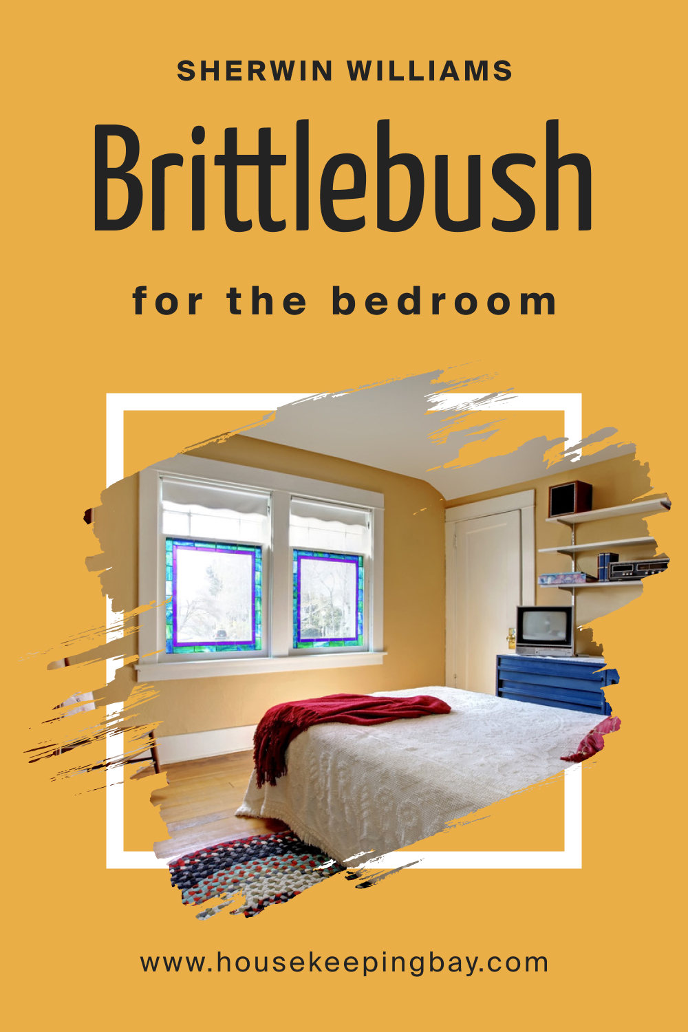
How to Use Brittlebush SW 6684 in the Bedroom?
In the bedroom, Brittlebush SW 6684 invites warmth and serenity, making it an excellent choice for walls. It pairs well with soft textiles and wooden furniture, enhancing the room’s comfort. For a balanced look, combine it with lighter shades for bedding and curtains.
This color works well in rooms with both ample natural light and those relying on softer, artificial lighting, adapting to create a restful retreat. Accentuate with plant greenery or earth-toned decor to amplify its natural essence.
housekeepingbay.com
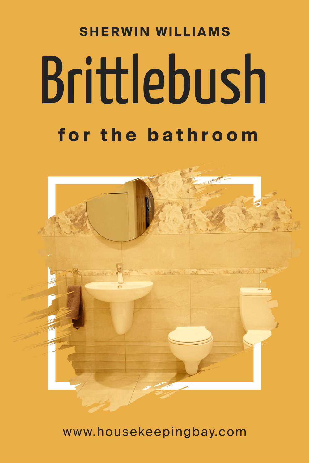
How to Use Brittlebush SW 6684 in the Bathroom?
Brittlebush SW 6684 in the bathroom can create a spa-like ambiance. It pairs exceptionally with natural elements like wood or stone, and when used on one or more walls, it provides a warm backdrop for white fixtures and fittings. For a harmonious look, combine it with neutral tiles and soft lighting.
This color can transform the bathroom into a relaxing, cozy space, ideal for unwinding after a long day.
housekeepingbay.com
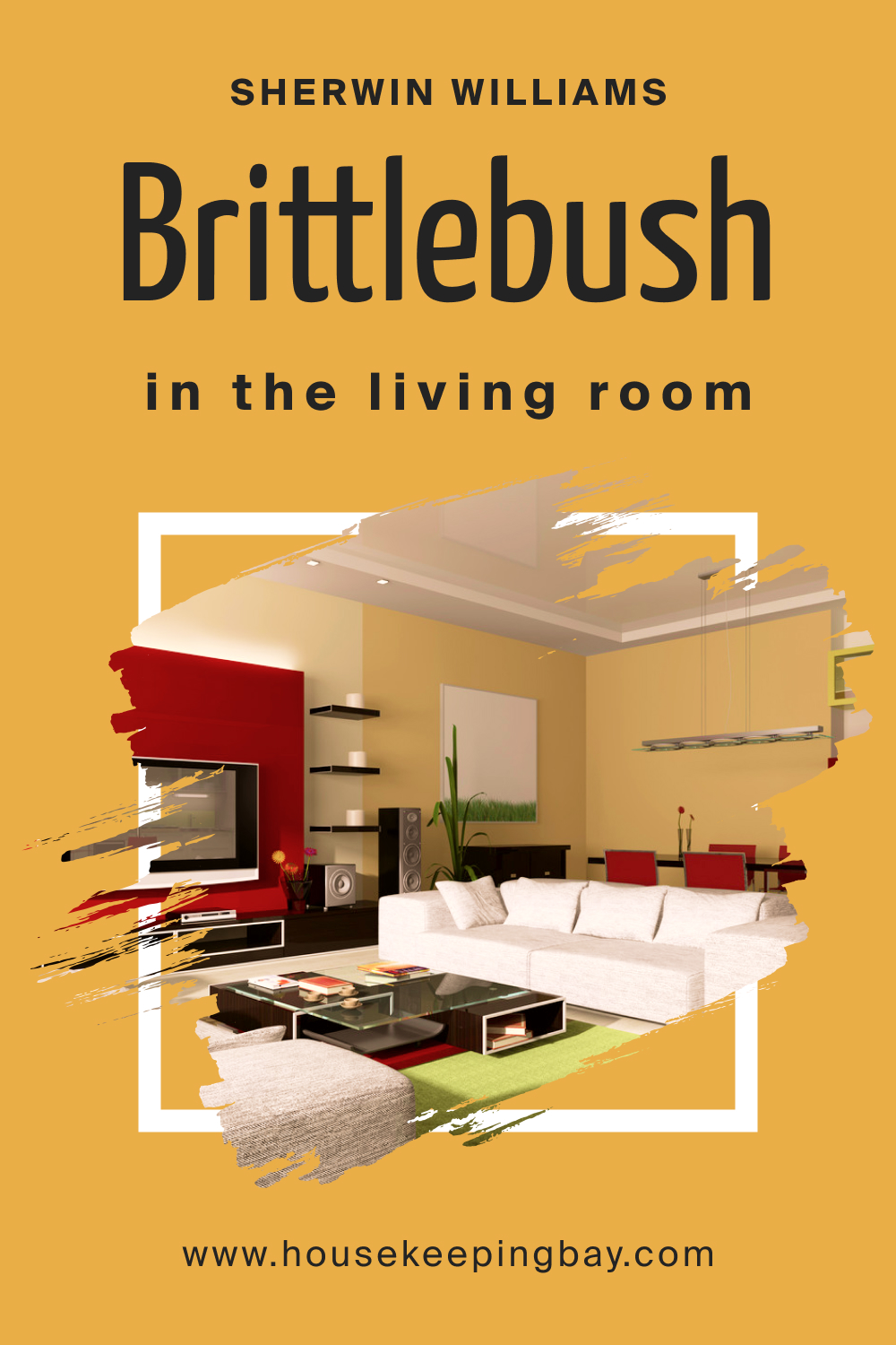
How to Use Brittlebush SW 6684 in the Living Room?
In the living room, Brittlebush SW 6684 can create a warm and inviting atmosphere. It’s excellent for an accent wall, especially behind a fireplace or a piece of statement furniture. This color coordinates well with a wide range of furniture, from light-colored sofas to dark wood tables.
Enhance the room’s coziness with plush textiles and rich, natural textures. For a contemporary twist, pair it with modern art pieces and metallic accents.
housekeepingbay.com
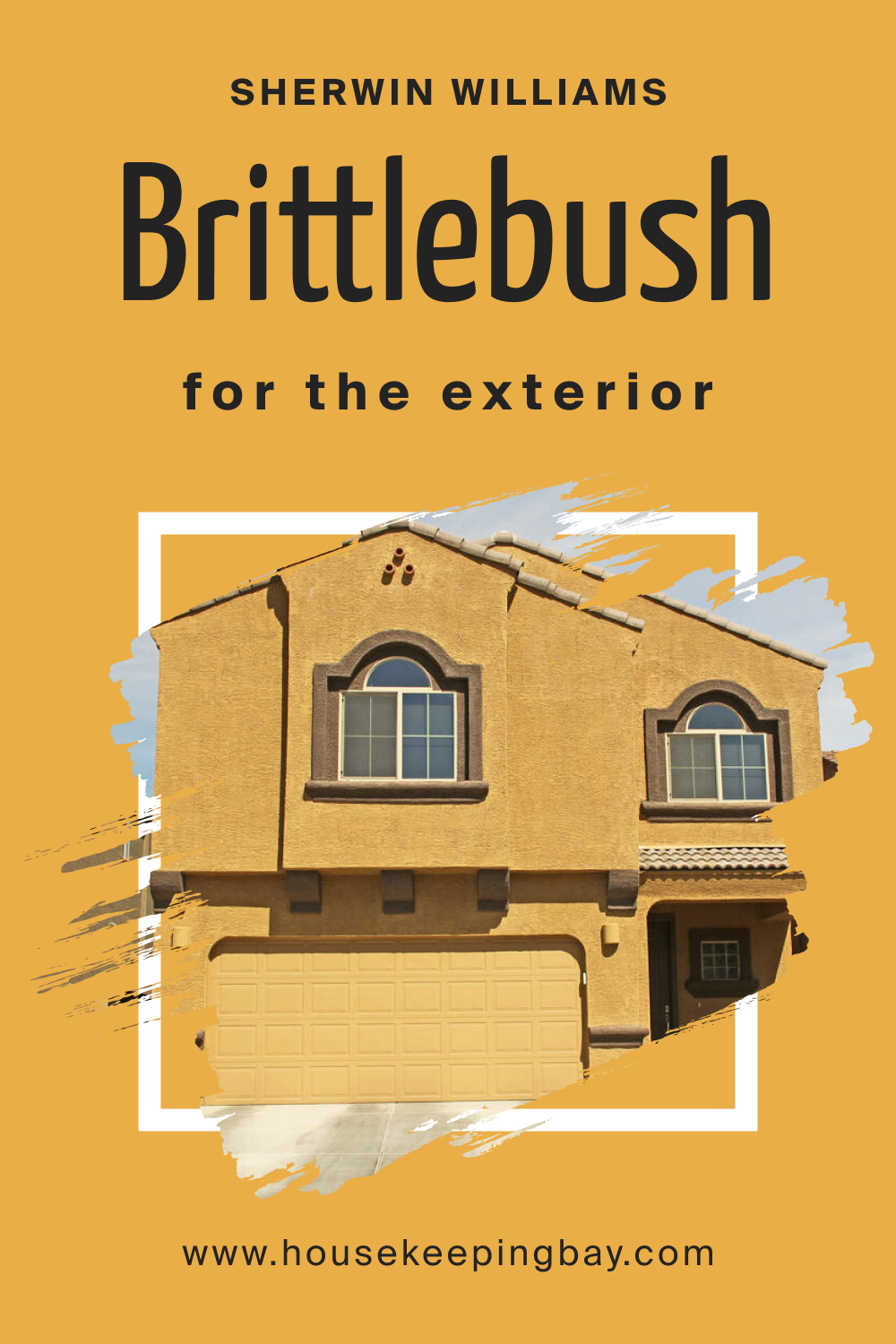
How to Use Brittlebush SW 6684 for an Exterior?
Brittlebush SW 6684 is a striking choice for home exteriors, especially for those seeking a warm, inviting curb appeal. It works well with natural exterior elements like stone and wood, creating a seamless transition from nature to home. This color is particularly stunning in environments with green landscapes, as it complements natural surroundings. Pair it with crisp white trims for a classic look or darker accents for a more modern feel.
housekeepingbay.com
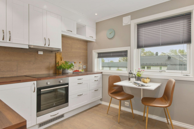
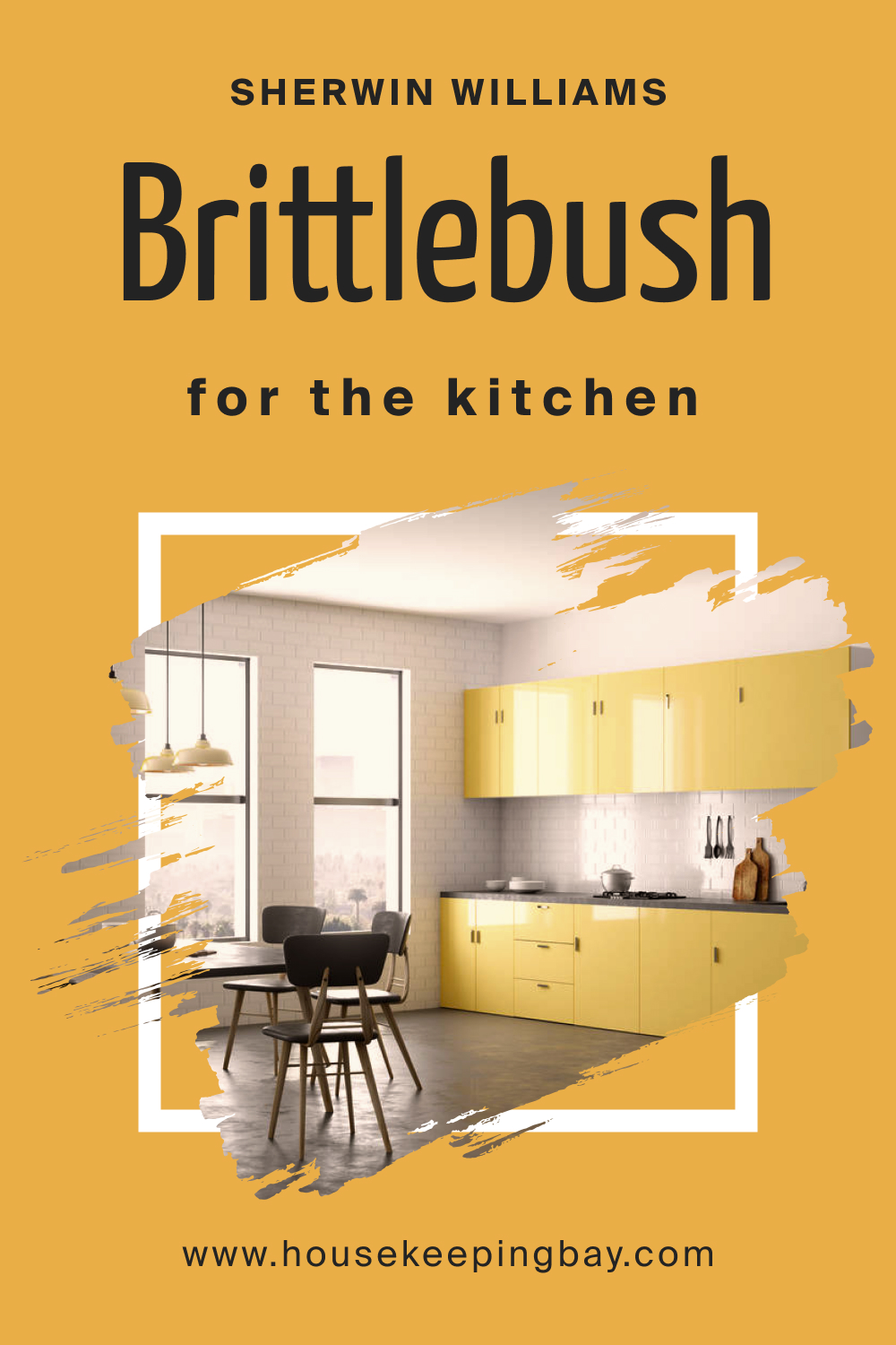
How to Use Brittlebush SW 6684 in the Kitchen?
In the kitchen, Brittlebush SW 6684 brings warmth and character. It’s ideal for walls, creating a cozy backdrop that complements both white and dark cabinetry. This color can also highlight a kitchen island or dining area, making them focal points of the room. Pair it with natural materials like wood or stone countertops and add copper or brass hardware for a sophisticated touch. Soft under-cabinet lighting will enhance its warm undertones, making the kitchen a welcoming space.
housekeepingbay.com
How to Use Brittlebush SW 6684 on the Kitchen Cabinets?
Using Brittlebush SW 6684 on kitchen cabinets can add a unique and warm touch to the space. This color is perfect for lower cabinets, paired with lighter upper cabinets or open shelving. It works well in kitchens with good natural lighting, as it can make the space feel grounded yet airy. Complement it with neutral countertops and backsplash tiles to keep the focus on the rich cabinet color. Adding antique brass or brushed nickel hardware can complete the look, offering a beautiful contrast and a hint of elegance.
housekeepingbay.com
Comparing Brittlebush SW 6684 With Other Colors
Comparing different colors is crucial in interior design to understand their individual characteristics and how they interact with each other. This comparison helps in creating a harmonious color palette, ensuring that the chosen colors complement each other and the space they are in. When comparing Brittlebush SW 6684 with other colors, we consider factors like undertones, warmth, and how they influence the mood of a room. This process aids in making informed decisions about color schemes, whether for a single room or an entire home.
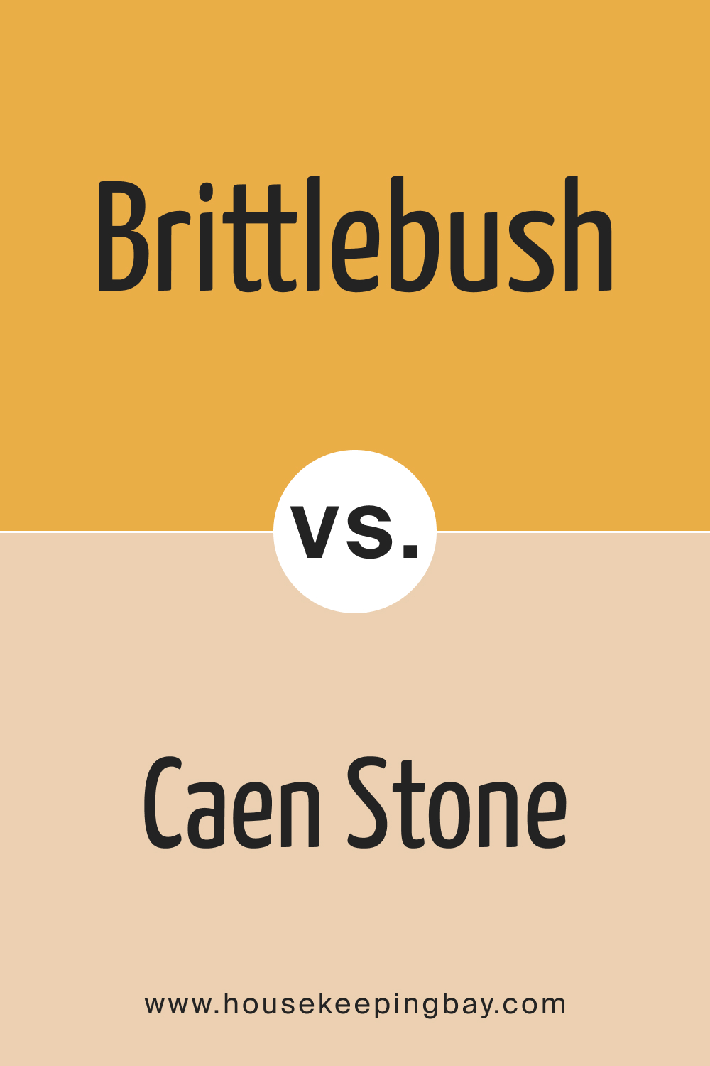
Brittlebush SW 6684 vs. SW 0028 Caen Stone
Brittlebush SW 6684 and SW 0028 Caen Stone both bring warmth to interiors, but they differ significantly in tone. Caen Stone is a lighter, more muted beige, providing a subtle, understated backdrop. In contrast, Brittlebush, with its richer, deeper terracotta undertones, creates a more pronounced statement.
While Caen Stone works well in spaces seeking a light and airy feel, Brittlebush is ideal for adding depth and warmth, especially in rooms that benefit from a cozy ambiance.
housekeepingbay.com
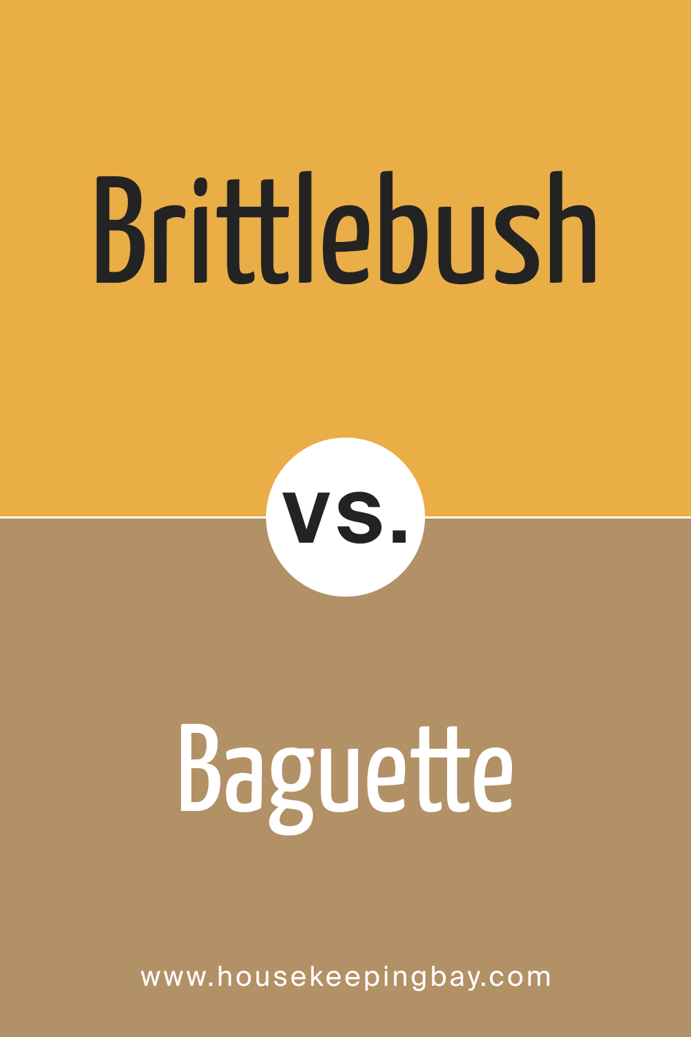
Brittlebush SW 6684 vs. SW 6123 Baguette
SW 6123 Baguette is a warmer, more golden-hued color compared to Brittlebush SW 6684. Baguette lends a sunny disposition to rooms, making spaces feel more open and vibrant. Brittlebush, with its earthier, more grounded feel, is better suited for creating intimate and cozy environments.
In terms of versatility, Baguette works well in high-traffic areas like kitchens and living rooms, while Brittlebush is ideal for creating a snug and inviting atmosphere in bedrooms and dens.
housekeepingbay.com
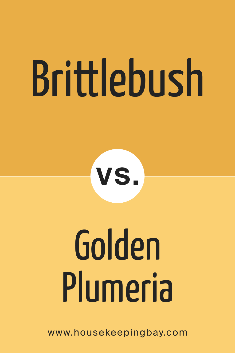
Brittlebush SW 6684 vs. SW 9019 Golden Plumeria
SW 9019 Golden Plumeria is a bolder, more saturated color compared to Brittlebush SW 6684. Golden Plumeria, with its radiant and lively character, can energize a space, making it feel more dynamic and playful. Brittlebush, on the other hand, exudes a more subdued elegance, suitable for creating a tranquil and sophisticated atmosphere. The choice between these two depends on the desired mood and energy of the room.
housekeepingbay.com
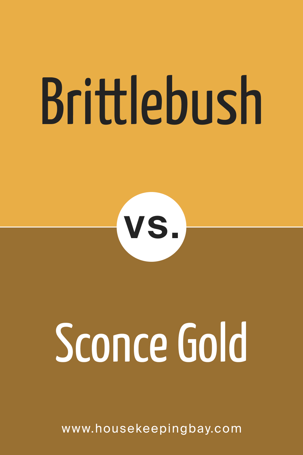
Brittlebush SW 6684 vs. SW 6398 Sconce Gold
SW 6398 Sconce Gold is closer to a traditional gold, offering a regal and classic appeal, whereas Brittlebush leans towards an earthy, natural aesthetic. Sconce Gold’s richness makes it a great choice for formal areas or spaces that need a touch of luxury. Brittlebush, with its more muted and natural appearance, is better suited for casual, relaxed environments.
housekeepingbay.com
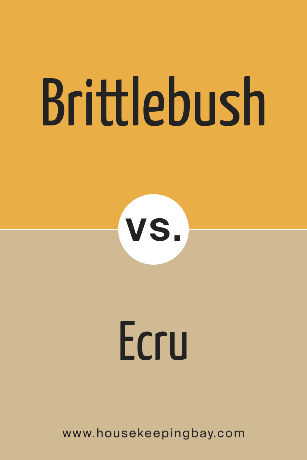
Brittlebush SW 6684 vs. SW 6135 Ecru
SW 6135 Ecru is a soft, creamy color that provides a neutral backdrop, contrasting with the deeper and more vibrant Brittlebush. Ecru is excellent for spaces that require a light and neutral color, offering flexibility in decor and styling. Brittlebush, with its distinctive warmth, is more suited for making a statement and creating a specific mood in a room.
housekeepingbay.com
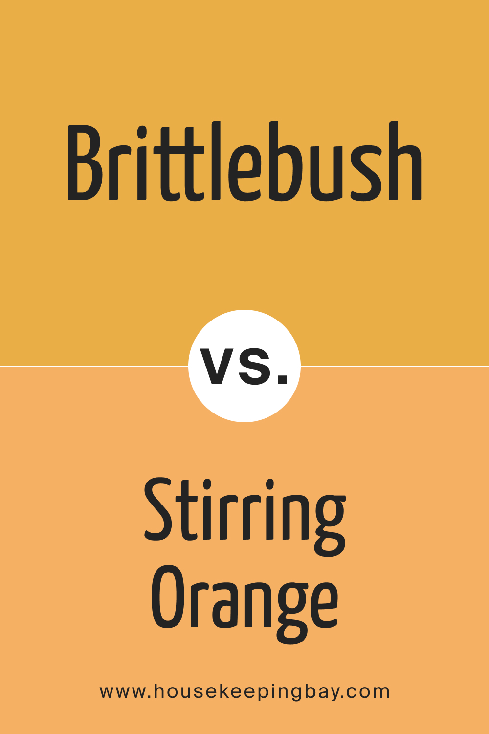
Brittlebush SW 6684 vs. SW 6889 Stirring Orange
SW 6889 Stirring Orange is a vivid, bright color that is more intense than Brittlebush. It’s a bold choice, suitable for accent walls or spaces where a high energy level is desired. Brittlebush, being more subdued, is better for larger wall areas and for creating a warm, inviting atmosphere without overwhelming the space.
housekeepingbay.com
Conclusion
Comparing Brittlebush SW 6684 with other colors from Sherwin-Williams highlights its unique position as a versatile, warm, and earthy hue. While each color has its strengths and ideal use cases, Brittlebush stands out for its ability to create cozy, inviting spaces. The choice of color ultimately depends on the desired aesthetic and the specific characteristics of each space.
Whether seeking to energize a room, create a tranquil retreat, or establish a sophisticated atmosphere, understanding the nuances of each color is key to achieving the perfect interior design.
housekeepingbay.com
Ever wished paint sampling was as easy as sticking a sticker? Guess what? Now it is! Discover Samplize's unique Peel & Stick samples. Get started now and say goodbye to the old messy way!
Get paint samples


Frequently Asked Questions
⭐What lighting conditions work best with Brittlebush SW 6684?
Brittlebush SW 6684 is versatile and responds well to various lighting conditions. In natural light, it reveals warmer, earthier tones, ideal for creating a cozy atmosphere. In north-facing rooms, it may appear more muted, while in south-facing rooms, it becomes warmer and more vibrant. Artificial lighting can also influence its appearance; warmer lights enhance its earthy tones, while cooler lights bring out its more neutral aspects.
⭐Can Brittlebush SW 6684 be used in small rooms?
Absolutely! Brittlebush SW 6684 can work well in small rooms, especially when aiming to create a cozy, intimate space. It pairs well with lighter trim colors and accents, which can help balance the room and prevent it from feeling too closed in. Using mirrors and adequate lighting can also help make a small room painted in Brittlebush feel more spacious.
⭐Is Brittlebush SW 6684 suitable for exteriors?
Yes, Brittlebush SW 6684 is a great choice for exteriors, particularly for those seeking a warm and inviting curb appeal. It harmonizes well with natural surroundings and materials like stone and wood. When used on exteriors, it's recommended to pair it with contrasting trim colors for a balanced look.
⭐What are the best coordinating colors for Brittlebush SW 6684?
Brittlebush SW 6684 pairs beautifully with a range of colors. For a harmonious look, consider using neutral beiges like SW 7012 Creamy or soft blues like SW 6799 Soar. For a bolder contrast, try pairing it with SW 6883 Raucous Orange or SW 9062 Bluebird Feather.
⭐How does the Light Reflectance Value (LRV) of Brittlebush SW 6684 affect its use in my home?
With an LRV of 48, Brittlebush SW 6684 is in the mid-range spectrum, making it versatile for various applications. This LRV means it's neither too bright nor too dark, making it adaptable to different room sizes and lighting conditions. In well-lit rooms, it appears lighter, while in less lit areas, it takes on a richer tone.