15 Best Bedroom Relaxing Paint Color Ideas from Sherwin Williams | Designers Are Loving Right Now
Create a calm, cozy bedroom with these top SW paint colors
It all starts with just the right paint color. From Sherwin Williams, there is so much variety in colors that can make any room a peaceful haven-one that encourages rest and relaxation. Whether it is soft white, airy blue, or a more grounded neutral, there is just the right shade to meet every personal style or preference.
Below, I have compiled some of the best bedroom colors by Sherwin Williams to inspire a cozy and inviting space. Each color has its different undertones and characteristics to help you find the shade that says it all in the perfect retreat.
housekeepingbay.com
Snowbound (SW 7004)
Snowbound is a soft, gentle white with no coldness from a pure white. It does have a hint of gray and an understated warmth, which makes it perfectly appropriate for the creation of a cozy, inviting bedroom. Snowbound is especially lovely in rooms with plenty of natural light for it reflects softly and keeps its freshness without appearing stark.
Snowbound works well in a bedroom setting with natural wood elements to accentuate a rustic or modern farmhouse feel. The undertones in Snowbound greatly help it transition into other rooms, making it an excellent choice for a consistent whole-home palette. Light or medium-toned accents can make the airy and calm atmosphere of Snowbound perfect for bedrooms where one goes to relax and rest. If you’re thinking of soft minimalism, then this color is a great choice.
Check the full Snowbound Guide HERE

Housekeepingbay.com
Alabaster (SW 7008)
Alabaster is a warm, creamy white with sufficient depth to avoid being jarring but still manages to feel clean and sophisticated without feeling cold. It is a go-to shade for anyone looking to have a bedroom filled with warmth. Alabaster has subtlety in its warmth, though it does possess that softness you would want in a quiet, spa-like setting.
Paired with light-toned woods, soft textures, and natural fibers, Alabaster creates a space that is timeless, at one with an overall peaceful ambiance. An added benefit of Alabaster is the decent reflection of light it provides, making rooms feel more open and airy but still offering just enough substance to add comforting weightiness to the room. Whether you are into the look of modern homes or more into a traditional type of style, Alabaster is flexible to work with and seems to blend well with just about any decor style. This furthers into both warm and cool accent colors to create an understatedly elegant vibe for the bedroom in beautiful ways.
Check the full Alabaster Guide HERE
Repose Gray (SW 7015)
Repose Gray is a light, warm gray color that creates a perfect restful setting. It adds warmth but in subtle hints, which rescues it from being too cold in those rooms that barely have any sun coming in. More than anything else, Repose Gray is remarkably the most adaptive since it works with most kinds of decor styles, ranging from contemporary to rustic, making it one of the most versatile choices for a bedroom.
In the bedroom, Repose Gray provides a balanced backdrop against which both warm and cool decor elements can shine. This color is ideal, too, if you desire contrast in your space, as it pairs beautifully with white or cream-colored trim. Soft neutrals and metallic accents are especially nice with Repose Gray and help to elevate its level of sophistication without overpowering the room. It is a popular choice for those looking for a bedroom that is serene and subtly deep, yet cozy enough.
Check the full Repose Gray Guide HERE
Sea Salt (SW 6204)
Sea Salt has a light, greenish-blue tone with an undertone of gray; it would go well in the bedroom because it makes one feel closely related to nature. The cool and subdued tone would build up a serene, coastal-inspired look that would be refreshing and yet calming in both feel and taste. Sea Salt does pretty well in reflecting natural light and sends airy, breezy effects in rooms without being too bold or vibrant.
Sea Salt is a nice complement to whites and creams in a bedroom for a clean look, or to natural elements like wicker, jute, and linen for a more organic feel. This color has been quite versatile between traditional and modern uses, which makes it a favorite for those wanting a spa-like, tranquil space. The understated hue of Sea Salt helps the room feel open, calm, and effortlessly peaceful, making it perfect for a restful retreat.
Check the full Sea Salt Guide + 26 Real Home Pictures HERE

Housekeepingbay.com
Pure White (SW 7005)
Pure White is one of the favorite shades for bedrooms to be bright yet soft and airy. This shade has a barely-there yellow undertone, which saves it from feeling cold, as some other whites do. This subtle warmth in Pure White makes it work both as a wall color and a trim color, thus creating a seamless monochromatic look in the bedroom.
Pure White is sharp and fresh in natural light, enhancing a room’s sense of space and openness. In company with natural materials like linen and wood, plus soft neutrals, you’ll create an airy, restful atmosphere. Pure White is versatile-it can fit almost any design style from minimalist to classic farmhouse-and it’s an extraordinary backdrop for layered textures and soft, tonal decor for a bedroom that feels both calm and timeless.
Check the full Pure White Guide HERE

Housekeepingbay.com
Accessible Beige (SW 7036)
Accessible Beige is a soft, warm beige that ushers an atmosphere of coziness yet neutrality into the bedroom. This color is slightly warm-biased but not overwhelmingly heavy, which provides a well-grounded and comforting atmosphere in your place of rest. Accessible Beige caters to a wide array of traditional and modern design aesthetics.
Accessible Beige will work beautifully in a bedroom with warm wood tones or cool accents, for one can easily play with texture and layer upon layer. Accessible Beige can take colorful decor or be the star with neutrals to add subtle sophistication without overwhelming a room. If it was paired with darker furnishings, Accessible Beige could provide a balanced look that is easy to live with and enjoy.
Check the full Accessible Beige Guide HERE

housekeepingbay
Comfort Gray (SW 6205)
Comfort Gray provides a pretty soft blue-green tone, with a bit more depth than Sea Salt. It’s a nice choice for a bedroom in need of color, yet not seeking too much saturation. This color provides such a relaxing and soothing effect; it would thus be perfect for places that should have this advantage.
Comfort Gray is sophisticated in the bedroom and pairs well with whites and soft neutrals for a very calming environment. The undertone of gray in Comfort Gray enables this color to take on various lighting conditions. It appears deeper when the setting is dimmer, yet it is soft and inviting when it’s brighter. This is a versatile shade that works great in coastal-inspired decor, farmhouse settings, and even in modern designs that call for a subdued color that is comfortable and refined in appeal.
Check the full Comfort Gray Guide HERE

housekeepingbay.com
Silver Strand (SW 7057)
Silver Strand is a light gray with subtle blue and green undertones. This creates a very sophisticated, modern look. The ideal people who would want such a color would be those desiring a fresh, airy bedroom with a certain amount of depth. The green and blue undertones to the gray add an interesting dimension to make the gray feel quite vibrant yet soothing.
In the bedroom, Silver Strand works wonders in a combination of crisp whites and soft pastels for a balanced, serene look. It can also work well with wood accents and metallic decor, bringing in an element of luxury without feeling too formal. The subtle complexity of Silver Strand makes it a great choice for modern, transitional, or even coastal-inspired bedrooms looking for a place where one can sit back, relax, yet in style.
Check the full Silver Strand Guide HERE
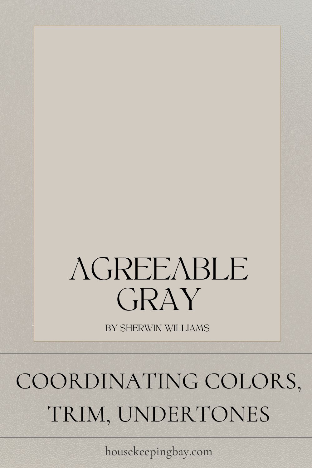
Agreeable Gray – SW 7029
Agreeable Gray is a soft, warm gray that widely appeals to many for its versatility. This shade steps just far enough into the warm scale to convey an inviting feeling without fully veering into being beige-which should serve as a great choice for rooms like bedrooms seeking comfort with subtlety in their backdrops. With a light reflectance value of 60, Agreeable Gray provides enough lightness to maintain openness while leaving a hint of contrast on the walls.
Agreeable Gray is a color that looks great in a bedroom and works well with both warm and cool tones. That means flexibility in furniture and decor choices that complement soft whites, blues, and natural wood tones to further enhance the cozy and inviting ambiance. This color works well with different light exposures and will work great in a north-facing room or south-facing, depending on whether it is going to have a warmer glow at a particular time of the day or soften into a gray tone. Agreeable Gray presents a classic balance of tones that feels timeless and comfortable in a restful space such as the bedroom.
Check the full Agreeable Gray Guide + 94 Real Life Homes HERE
housekeepingbay.com
Mindful Gray (SW 7016)
Mindful Gray is a sophisticated, mid-tone gray with enough warmth to feel inviting yet still deep enough to bring a sense of sophistication. It’s similar in depth to Repose Gray but quite a bit darker. Mindful Gray is perfect for bedrooms when looking for a cozy, grounded atmosphere that doesn’t get too dark. Since it has a very neutral warmth, it will work with most color schemes and simply allows one to refresh their decor without needing to change paint.
This Mindful Gray is beautiful in the bedroom with crisp white trim and works with both light and dark accent colors. It brings depth into a room without overpowering it, yet is the deepest of all shades provided here, which would work for those that want to have a little bit of contrast but keep things soft and relaxed. This color also brings a versatile canvas for layering textures-from cozy blankets and linens to woven baskets and wooden furniture. Mindful Gray is a steal for a sophisticated, soothing bedroom open to many styles.
Check the full Mindful Gray Guide HERE

housekeepingbay
Anew Gray (SW 7030)
Anew Gray strikes an excellent balance between gray and beige to create a very versatile taupe. Balance the warmth of a bedroom by warming it up in every sense without going too warm or cool. It is a down-to-earth yet cozy shade. The color will help a room feel well-rested, polished, yet inviting. Given the neutral undertones, Anew Gray can easily work with both warm and cool accent colors, being quite flexible.
Anew Gray strikes the right balance with the natural look of wood in a bedroom and soft textiles to add depth and comfort. It transitions well with light, adding warmth when the lighting is low and a subtle brightness when the rooms are more exposed. The traditional and modern decorations look great with this color, and that’s why it’s a favorite for anyone who wants a cozy yet timeless look with a modern twist.
Check the full Anew Gray Guide HERE

Housekeepingbay.com
Rainwashed SW 6211
Rainwashed is a soft, soothing blue-green that brings in a fresh cool feel ideal for bedroom haven. Lighter than Sea Salt, it has just enough vibrancy to make a room happy without overpowering it. It may evoke a relaxed atmosphere, refreshing yet calming. It’s an ideal choice for bedrooms where you want a bit of color but still keep things light and airy.
Rainwashed works well with whites, creams, and light wood tones for that breezy, coastal feel. In the bedroom, it provides a soothing backdrop against which soft textiles and natural elements work quite effectively to make the room cozy. The slight green undertone in Rainwashed gives it a bit of a spa quality that’s absolutely ideal for turning your bedroom into a haven of peace. It’s just great for rooms that need a soft, rejuvenating feel while still having that touch of personality.
Check the full Rainwashed Guide HERE

housekeepingbay.com
Creamy (SW 7012)
Creamy is a warm, inviting off-white that radiates subtle sunny glow into the bedroom. It retains softness, not being too yellow; hence, it’s ideal for exuding warmth and coziness in the room. This gentle softness of creamy hue enhances the traditional and rustic styles but will still be able to hold appeal for modern and contemporary designs.
Creamy will work marvelously in the bedroom, creating that airy feeling while at the same time offering a clean and fresh look. This color works well with natural wood, soft linens, and a neutral or pastel accent to generate a sense of balance in this relaxing setting. It goes well in rooms with ample natural light, although others may need just a touch of brightness. Its timeless warmth makes Creamy a great choice to add coziness to yet offer elegance in the setting of a bedroom.
Check the full Creamy Guide HERE

housekeepingbay.com
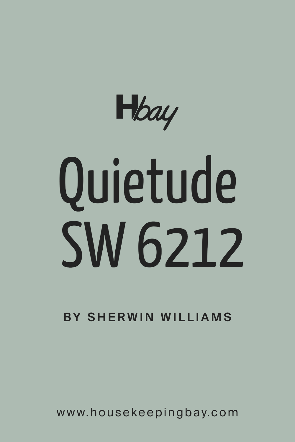
Quietude (SW 6212)
Quietude is a soft, subtle blue with green undertones that evokes an air of tranquility in the bedroom. It is a smidgen deeper than Rainwashed and should work well for people wanting a little more depth without going dark. This color combines both a modern and fresh feeling while bringing in an element of the outdoors inside, hence making it a good fit in a quiet bedroom retreat.
In the bedroom, Quietude is a perfect match for soft neutrals, whites, and natural textures that enforce its soothing feeling. It’s also absolutely perfect for coastal-inspired decor, modern minimalist looks, and even farmhouse styles, adding in soft color without any overwhelming feeling. This shade works especially well in rooms that get much natural light, as it subtly changes throughout the day with a shift in times and offers a dynamic yet always soothing atmosphere.
Check the full Quietude Guide HERE
housekeepingbay.com
Pavestone SW 7642
Pavestone is a warmly earthy gray with a hint of taupe, well suited to bedrooms that call for a cosseting, grounded color. It provides an air of warmth and richness without feeling too dark, in just the right way to create a bedroom with an enveloping and serene atmosphere. Its neutrality makes Pavestone versatile and adaptable to everything from rustic to contemporary.
It can also balance well with creamy whites and soft linens in the bedroom. It does great in spaces that really just need a little depth and dimension, including wood tones and metallic accents with cozy fabrics, making it quite agreeable. The warm undertones in Pavestone make it most suitable for rooms in which one is trying to achieve a sophisticated yet restful feel-a color both dignified and intimate.
Check the full Pavestone Guide HERE

housekeepingbay.com
Conclusion
Each of these Sherwin Williams colors brings something into the table to change a bedroom into an oasis of tranquility and comfort. Whether you are considering all the warm whites like Alabaster and Creamy, to softer blues and greens such as Sea Salt and Quietude, there is something for any mood or style out there.
Choosing the perfect paint color is about finding the one that complements not only the room’s light and decor but also provokes the right ambiance you want to make. Whether you like soft neutrals or a hint of color, these shades will help you create a soothing, cohesive look in the bedroom. Use color to create a haven where one can always retreat and recharge in peace daily.
