White Sail SW 9622 by Sherwin Williams
Embracing Serenity A Voyage Into Pristine Elegance
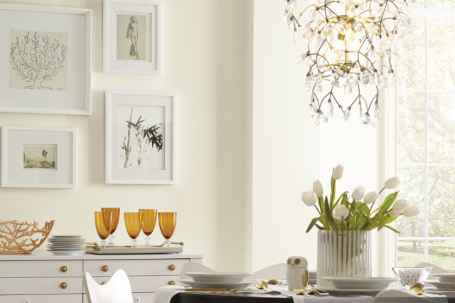
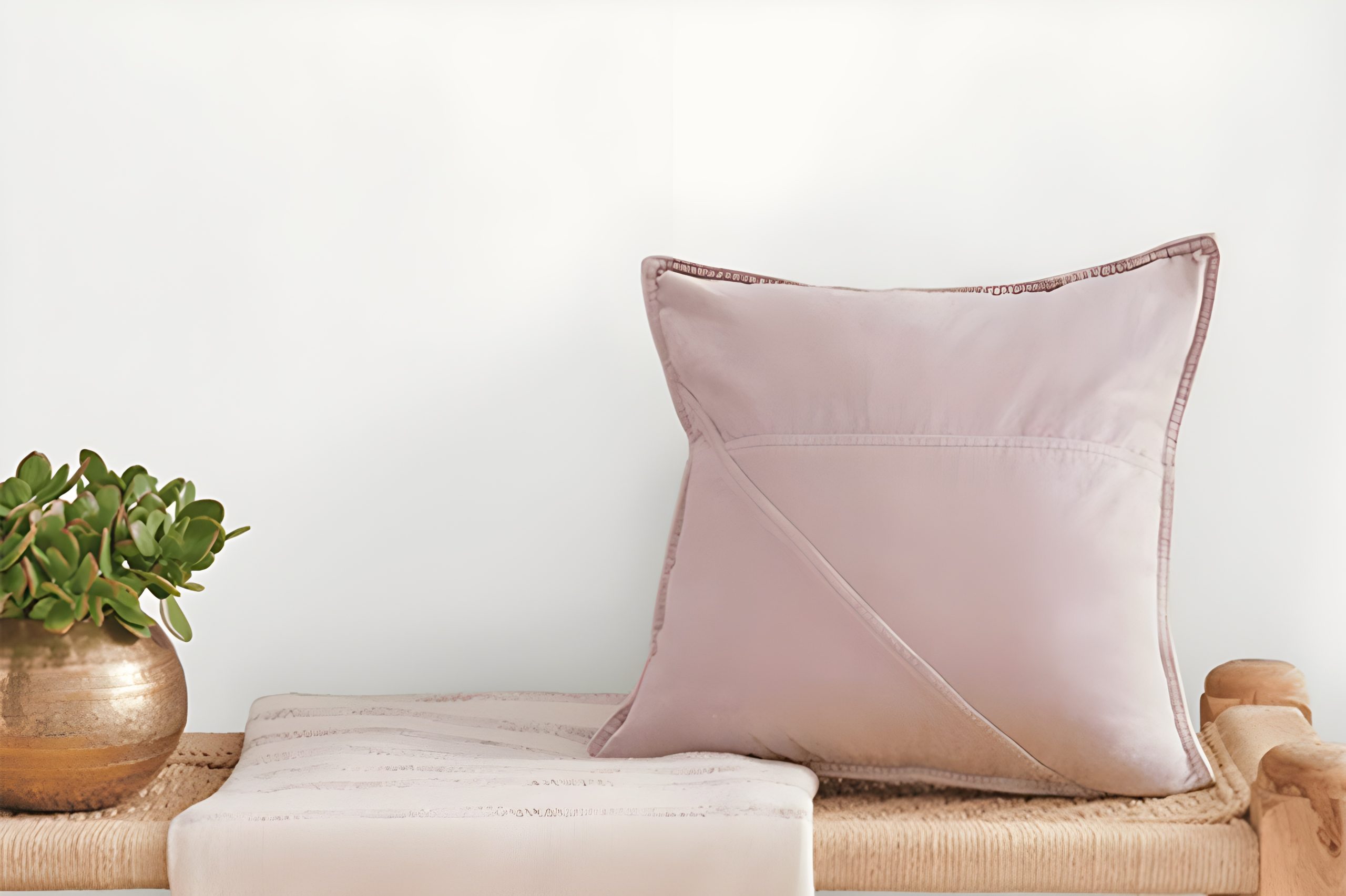
Introducing SW 9622 White Sail by Sherwin Williams, your go-to option for a fresh and breezy color that brings a sense of calm and simplicity into any space. This particular shade is like a breath of fresh air, perfect for anyone looking to refresh their home or office with a light and uplifting touch.
White Sail is not just any white; it’s a carefully crafted hue that reflects natural light beautifully, creating a serene and spacious feel in small and large areas alike.
Whether you are pondering a complete makeover or just aiming to brighten up a room, SW 9622 White Sail provides a versatile backdrop that pairs well with a wide range of decor styles, from modern and minimalist to cozy and rustic.
Its unique ability to adapt to different lighting conditions and complement various textures and materials makes it a highly sought-after choice for designers and homeowners.
So, if you’re aiming for a timeless look that adds a subtle elegance to your walls, White Sail by Sherwin Williams could be the perfect fit.
It’s amazing how a simple change of color can transform a room, and with SW 9622, you’re choosing a shade that promises to uplift and inspire.
via sherwin-williams.com
What Color Is White Sail SW 9622 by Sherwin Williams?
White Sail SW 9622 by Sherwin Williams is a soft, airy color that exudes serenity and simplicity. This hue is like a gentle whisper in a room, providing a clean and fresh backdrop that can effortlessly elevate any space.
Its subtle warm undertones ensure it’s not too stark or cold, making it a versatile choice for a wide range of decorating styles. Whether you’re aiming for a minimalist look, a cozy cottage vibe, or even a modern farmhouse aesthetic, White Sail can seamlessly tie your vision together.
This paint color works beautifully in rooms that serve as a sanctuary, such as bedrooms, living rooms, or bathrooms, where its calming presence can be fully appreciated.
Moreover, White Sail is an excellent choice for spaces that aim to highlight natural light, as it reflects light beautifully, making rooms appear brighter and more welcoming.
When it comes to pairing it with materials and textures, White Sail is quite accommodating.
It looks stunning with natural wood elements, from oak to walnut, enhancing their warmth and character. Textures like linen, cotton, and wool in soft furnishings add depth and interest to the clean canvas that White Sail provides.
For a bit of contrast, incorporating metals like brushed nickel or aged brass can add a touch of elegance to the understated beauty of this color. Overall, White Sail SW 9622 is a timeless choice that fosters a sense of peace and simplicity in interior spaces.
housekeepingbay.com
Table of Contents
Is White Sail SW 9622 by Sherwin Williams Warm or Cool color?
White Sail SW 9622 by Sherwin Williams is a beautiful paint color that brings a fresh and airy feel to any room. This color is like a gentle breeze in your home, making spaces feel open and welcoming.
Because of its soft and light nature, White Sail works great in small rooms or areas without much natural light, making them appear bigger and brighter.
Using White Sail on walls can also help highlight other colors or decorations in a room. It’s like a quiet background that lets other things shine.
For homeowners, this color is a smart choice because it is very flexible. Whether your style is modern, traditional, or anything in between, White Sail can fit right in.
It also has a calming effect, making it perfect for bedrooms or places where you want to relax. It’s like having a peaceful retreat right in your own home. White Sail by Sherwin Williams is a go-to paint color for anyone wanting to freshen up their space with a timeless and adaptable look.
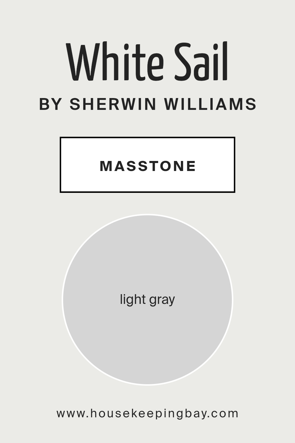
What is the Masstone of the White Sail SW 9622 by Sherwin Williams?
White Sail SW 9622 by Sherwin Williams has a masstone of light gray, coded #D5D5D5. Masstone means the main color you see straight out of the tin before it goes on the wall. Light gray is a super chill and flexible color. It’s like a gentle hug for your walls, not too bright but also not too dark – just perfectly in-between.
This color works wonders in homes because it’s super easy to match with all sorts of furniture and decorations, whether you’re into bold colors or more subdued tones.
Since it’s a light shade, it helps make rooms feel more spacious and airy, which is great for small spaces that need to feel bigger. Plus, it brings a clean and fresh vibe to any room without feeling cold or too industrial.
Think of it as a neutral backdrop that lets your personal style shine, whether in the living room, bedroom, or even the bathroom. Light gray walls are like the best kind of canvas, ready for whatever decor vibes you want to bring into your home.
housekeepingbay.com
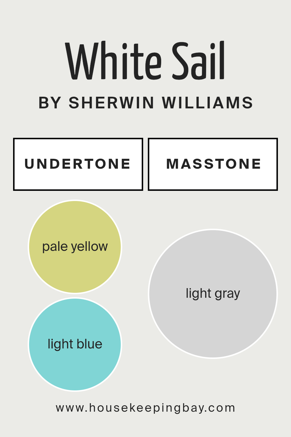
Undertones of White Sail SW 9622 by Sherwin Williams
White Sail SW 9622 by Sherwin Williams has interesting undertones that give it a unique charm. These are pale yellow and light blue. Even if these sound simple, they play a big role in how we see the color.
Undertones are like secret ingredients in a recipe. They can change how a main color looks. Imagine wearing a shirt that looks white indoors but shines a bit yellow in sunlight.
That’s the undertone at work. It’s what makes one white paint look cool and another warm, even when they seem the same at first glance.
With White Sail SW 9622, the pale yellow gives it a soft, warm glow. It’s like the gentle warmth of morning light. This means in spaces with a lot of sunlight, the walls might seem a touch cozier, thanks to this yellow whisper.
On the other hand, the light blue undertone adds freshness, like a mild breeze. It keeps the color from feeling too warm in bright rooms, balancing it out nicely.
On interior walls, these undertones affect the room’s vibe. The pale yellow makes spaces feel more welcoming and snug, perfect for living rooms or bedrooms where you want to relax. The light blue keeps it airy and light, great for bathrooms or kitchens.
Depending on the lighting, these undertones can make White Sail SW 9622 adapt, offering warmth or cool freshness, making the room feel just right.
housekeepingbay.com
How Does Lighting Affect White Sail SW 9622 by Sherwin Williams?
Lighting plays a big role in how we see colors. The color White Sail SW 9622 by Sherwin Williams is a good example to show how different lights can change the way a color looks.
When we talk about artificial light, it means the light that comes from light bulbs indoors. Under artificial light, White Sail can look warmer or cooler depending on the type of bulb. Warm bulbs can make it look creamier, while cool bulbs might give it a more crisp, bright appearance.
Natural light is the light from the sun. In natural light, White Sail can look very different during the day. In the morning and late afternoon, when the sunlight is softer, the color may look softer and slightly warm. Around noon, when the sun is brightest, White Sail may appear more vibrant and true to its base color.
Now, let’s talk about how this color works in rooms facing different directions:
North-faced rooms: These rooms get less direct sunlight, making them cooler and a bit darker. In north-facing rooms, White Sail might look a bit more muted and could have a slight gray tone because of the cooler, indirect light.
South-faced rooms: Rooms that face south get a lot of sunlight all day. This can make White Sail look brighter and more vivid. It might even have a slight warm glow at certain times of the day, making the room feel inviting.
East-faced rooms: These rooms get plenty of morning light. In the morning, White Sail will look warm and welcoming because of the soft, yellow-orange sunlight. As the day goes on and the sunlight moves away, the color might lose some of its warmth and look more neutral.
West-faced rooms: West-facing rooms get the evening light. This means White Sail can look very warm and cozy in the late afternoon and evening as the sun sets, casting a golden light. In the morning, though, the color may appear cooler and more subdued.
So, lighting can change how White Sail SW 9622 looks, making it a versatile color for different spaces and lighting conditions.
housekeepingbay.com
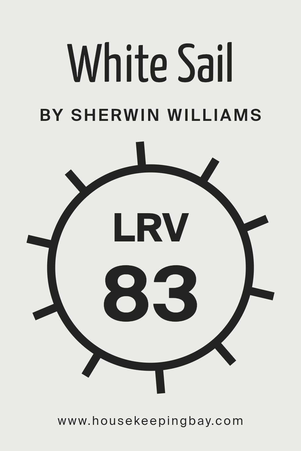
What is the LRV of White Sail SW 9622 by Sherwin Williams?
LRV stands for Light Reflectance Value. It’s a measure of how much light a paint color reflects or absorbs. This value ranges from 0 to 100, where 0 is completely black, absorbing all light, and 100 is pure white, reflecting all light. When you pick a paint color, knowing its LRV helps you understand how bright or dark the color will look in your space.
Simply put, the higher the LRV number, the more light the paint reflects, making the room look brighter. This is especially useful to know if you’re trying to make a small or dark room feel more open and airy.
In the case of White Sail SW 9622 by Sherwin Williams, which has an LRV of 82.88, this is a color that reflects a lot of light. It’s quite high on the LRV scale, meaning it will make your walls look very bright and spacious.
For rooms that don’t get a lot of natural sunlight, using a color with a high LRV like White Sail can help make the space feel lighter and more welcoming. However, the true effect of this bright color can vary depending on the direction your room faces and the amount of natural or artificial light it gets.
In well-lit areas, it could look very vibrant, while in dimmer spaces, it might offer a softly lit ambiance, making your space feel cozy yet still open and airy.
housekeepingbay.com
What is LRV? Read It Before You Choose Your Ideal Paint Color
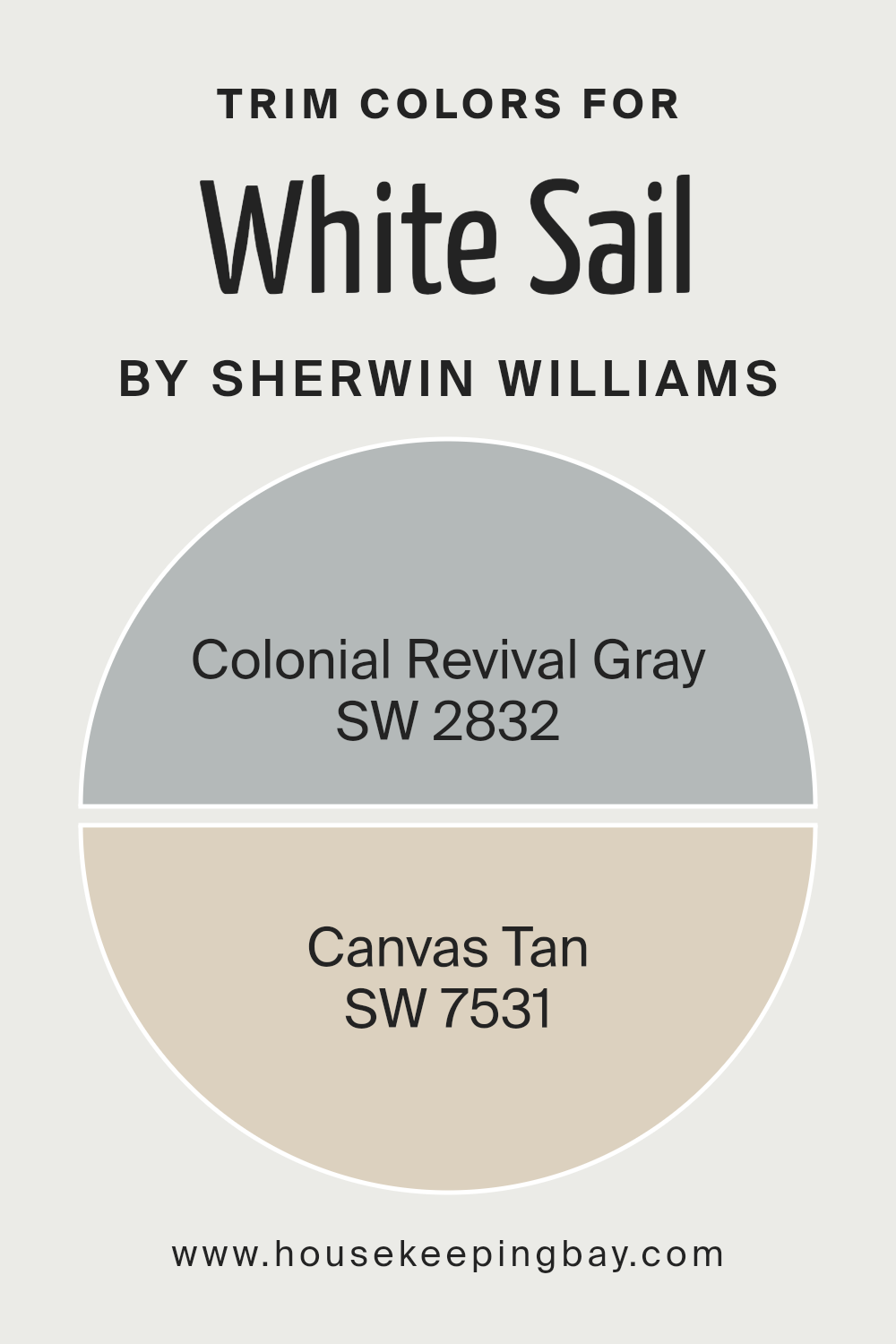
What are the Trim colors of White Sail SW 9622 by Sherwin Williams?
Trim colors are essentially the shades used for painting the borders or edges of walls, window frames, doors, and other architectural features in a room or on the exterior of a building. These colors play a crucial role in defining and accentuating the overall look of a space, acting as a frame that enhances the main color palette.
For a paint like White Sail SW 9622 by Sherwin Williams, which is a bright and airy hue, selecting the right trim colors can ground the space while adding depth and character.
Trim colors help in creating a cohesive look, ensuring that the walls don’t appear flat or monotonous but instead, have a beautifully finished appearance.
Using SW 2832 Colonial Revival Gray and SW 7531 Canvas Tan as trim colors for White Sail SW 9622 offers a sophisticated and subtle contrast that can elevate the aesthetic of any room. Colonial Revival Gray is a soft, warm gray with a timeless appeal, providing a gentle yet distinct boundary that complements the light and expansive feel of White Sail.
Meanwhile, Canvas Tan is a light, neutral beige that brings a sense of warmth and natural harmony, working beautifully alongside White Sail by adding a layer of richness without overwhelming the space. Together, these trim colors offer versatility and a refined backdrop, enriching the serene and welcoming ambiance created by White Sail SW 9622.
You can see recommended paint colors below:
- SW 2832 Colonial Revival Gray
- SW 7531 Canvas Tan
housekeepingbay.com
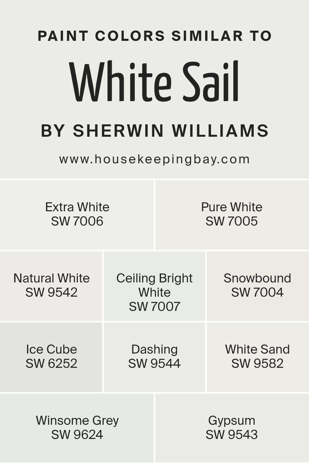
Colors Similar to White Sail SW 9622 by Sherwin Williams
Selecting similar colors to Sherwin Williams’ White SailSW 9622 is a smart strategy for creating a cohesive and harmonious look in any space. These colors, like SW 7006 – Extra White and SW 7005 – Pure White, work well because they share a common hue but vary slightly in tone and saturation, allowing for a subtle yet sophisticated blend when used together.
For instance, Extra White offers a crisp, clean feel akin to a blank canvas, while Pure White has a slightly softer touch, rendering a warm and inviting atmosphere.
Further down the palette, choices such as SW 9542 – Natural White and SW 7007 – Ceiling Bright White reflect a nuanced approach to design; Natural White carries an earthy, mellow quality, and Ceiling Bright White can make spaces appear more expansive by reflecting light efficiently.
The cooler undertones of colors like SW 7004 – Snowbound and SW 6252 – Ice Cube introduce a fresh, airy vibe, perfect for evoking a sense of calm. Meanwhile, shades like SW 9544 – Dashing and SW 9582 – White Sand incorporate gentle, sandy whispers, offering a touch of warmth without overwhelming the senses.
Rounding out the options, SW 9624 – Winsome Grey and SW 9543 – Gypsum present a slightly deeper exploration into the spectrum, with Winsome Grey providing a hint of sophistication and Gypsum acting as a bridge between the lighter whites and deeper tones.
Together, these colors can elevate any design project by creating layers of visual interest while maintaining a cohesive look.
You can see recommended paint colors below:
- SW 7006 Extra White
- SW 7005 Pure White
- SW 9542 Natural White
- SW 7007 Ceiling Bright White
- SW 7004 Snowbound
- SW 6252 Ice Cube
- SW 9544 Dashing
- SW 9582 White Sand
- SW 9624 Winsome Grey
- SW 9543 Gypsum
housekeepingbay.com
How to Use White Sail SW 9622 by Sherwin Williams In Your Home?
White Sail SW 9622 by Sherwin Williams is like a breath of fresh air for your home. It’s a shade of white that brings a light, clean feel to any space. Think of it as a blank canvas, waiting for you to add your personal touches. You can use White Sail in almost every part of your home.
In the living room, it can make the area look bigger and more inviting. For bedrooms, it creates a calm and peaceful setting, perfect for relaxing. In the kitchen, White Sail can make the space feel clean and fresh, a great backdrop for your family meals.
This color works well with other colors, too. You can pair it with bright colors to make them pop, or with soft, pastel shades for a gentle look. If you like the minimalist style, White Sail is perfect on its own for a simple, yet stylish look.
It’s also great for highlighting artwork or decorative pieces, making sure they catch the eye. With White Sail SW 9622, your home can feel more spacious, brighter, and welcoming.
White Sail SW 9622 by Sherwin Williams vs Extra White SW 7006 by Sherwin Williams
When looking at White Sail SW 9622 and Extra White SW 7006 by Sherwin Williams, it’s nice to consider how they differ, even if both are shades of white. White Sail has a soft and warm feel to it, kind of like a gentle hug from the sun.
This makes it perfect for spaces where you want a cozy and inviting vibe, without making the room look too bright or stark.
On the other hand, Extra White SW 7006 leans more towards a pure, crisp white. It’s the kind of color that can make a room look clear, fresh, and very open. This shade is great if you’re after a modern look or if you want to create a backdrop that makes other colors in your decor pop.
Both of these whites have their own charms. Your choice between them might depend on the mood you’re trying to set in your space. White Sail brings warmth and a hint of comfort, while Extra White offers a clean slate and brightness.
You can see recommended paint color below:
housekeepingbay.com
White Sail SW 9622 by Sherwin Williams vs Pure White SW 7005 by Sherwin Williams
Okay, let’s talk about two white colors from Sherwin Williams: White Sail SW 9622 and Pure White SW 7005. Imagine them as two different kinds of white paint you might use in your home.
First, White Sail SW 9622 is a soft and warm white. It’s like the gentle light at sunrise, cozy and inviting. This color can make a room feel welcoming and warm, perfect for living spaces where you want to relax.
On the other hand, Pure White SW 7005 is what you’d call a true white. It’s very clean and bright, without feeling too warm or too cool. Think of it as the classic white that can fit anywhere. Whether you’re painting walls, trim, or cabinets, Pure White can make a space feel fresh and clean.
So, if you need to pick between them, think about the mood you want to create. For a cozy, warm feel, go with White Sail. For a crisp, fresh look, Pure White is your best bet.
You can see recommended paint color below:
housekeepingbay.com
White Sail SW 9622 by Sherwin Williams vs Natural White SW 9542 by Sherwin Williams
White Sail SW 9622 by Sherwin Williams and Natural White SW 9542 also by Sherwin Williams are two nice colors to consider, each with its own vibe. White Sail has a clean and airy feel, much like a fresh breeze on a sunny day. It’s the kind of white that feels crisp and can brighten up a space instantly.
On the other hand, Natural White is a bit warmer. It has a soft touch that makes a room feel cozy and welcoming, like getting a gentle hug. This warmth makes it perfect for spaces where you want to relax or feel more at home.
Even though both colors are white, White Sail leans more towards purity and simplicity, while Natural White adds a dash of warmth, making each unique in setting the mood for a room. Choosing between them comes down to what feeling you want to create in your space.
You can see recommended paint color below:
housekeepingbay.com
White Sail SW 9622 by Sherwin Williams vs Snowbound SW 7004 by Sherwin Williams
White Sail SW 9622 by Sherwin Williams and Snowbound SW 7004 by Sherwin Williams are two popular shades that, at first glance, might seem quite similar. However, when you look at them closely, there are some subtle differences that set them apart. White Sail is a soft, warm white that gives off a cozy and inviting vibe.
It’s perfect for spaces where you want to add a bit of warmth without making the room feel smaller. On the other hand, Snowbound is a cooler, almost neutral white. It leans slightly towards gray, making it a great choice for modern spaces that aim for a clean, crisp look.
While both colors are great for making a room feel brighter and bigger, Snowbound’s slight gray undertone makes it more forgiving when it comes to marks and scuffs. In contrast, White Sail’s warmer tones bring a sunny atmosphere to a room. Choosing between them depends on the mood you want to create and the existing colors in your space.
You can see recommended paint color below:
housekeepingbay.com
White Sail SW 9622 by Sherwin Williams vs Winsome Grey SW 9624 by Sherwin Williams
White Sail SW 9622 by Sherwin Williams is a beautiful, pure white color. It’s like a clean canvas that can light up any room, making it feel fresh and open. This color is perfect for anyone looking to create a bright and airy vibe in their space. It’s really versatile, fitting in well whether you’re painting walls, trim, or cabinets.
On the other hand, Winsome Grey SW 9624 is a soft grey with subtle warm undertones. It’s not just any grey; it’s soothing and has a bit of warmth to it, making spaces feel cozy and inviting without being too dark.
This color works great for creating a gentle contrast with White Sail when used together in a room, providing a nice balance between light and calm.
Both colors go well together, offering a simple yet effective palette for any decorating style, from modern to traditional. Whether you’re going for a light and bright look with White Sail as the star or aiming for a soft, cozy ambiance with Winsome Grey, you can’t go wrong.
You can see recommended paint color below:
- SW 9624 Winsome Grey
housekeepingbay.com
White Sail SW 9622 by Sherwin Williams vs Dashing SW 9544 by Sherwin Williams
White Sail SW 9622 by Sherwin Williams is a soft, bright color that feels fresh and clean. It’s a lot like the color of a piece of plain paper or fresh snow. It has a very light, airy vibe and can make rooms look bigger and more open.
On the other hand, Dashing SW 9544 from Sherwin Williams is darker. It’s not super dark but has a rich, warm tone that makes spaces feel cozy and welcoming. While White Sail reflects a lot of light and can brighten up a room, Dashing warms it up and adds a bit of sophistication.
Think of White Sail as a daylight kind of color, making everything look crisp and clear. Dashing, though, is more like the golden light at sunset, giving everything a nice, warm glow. Both colors are pretty in their own ways but serve different moods and settings.
You can see recommended paint color below:
housekeepingbay.com
White Sail SW 9622 by Sherwin Williams vs Ice Cube SW 6252 by Sherwin Williams
White Sail SW 9622 by Sherwin Williams and Ice Cube SW 6252 by Sherwin Williams are both beautiful colors, but they have different vibes. White Sail is more like a soft, pure white. It’s the kind of color you might paint a whole room in to make it feel open and airy.
It’s very clean looking, without being too stark or cold. On the other hand, Ice Cube is a cool, light gray.
It’s not just gray, though; it has a subtle blue undertone that makes it feel fresh and modern. While White Sail brings a sense of brightness and expansiveness, Ice Cube adds a touch of cool sophistication.
Both colors are pretty light and can help make a space feel bigger, but Ice Cube offers a bit more depth and interest because of its cool undertones. Depending on what feel you’re going for in a room, either color could be a great choice, but they definitely have their own unique personalities.
You can see recommended paint color below:
housekeepingbay.com
White Sail SW 9622 by Sherwin Williams vs Ceiling Bright White SW 7007 by Sherwin Williams
White Sail SW 9622 and Ceiling Bright White SW 7007, both by Sherwin Williams, are beautiful white shades that can brighten up any space, yet they have some differences. White Sail has a warm undertone, making it feel cozy and inviting.
It’s a great choice if you want a space to have a soft, warm glow, perfect for living rooms or bedrooms where you want to create a relaxing atmosphere.
On the other hand, Ceiling Bright White SW 7007 has a cooler undertone, giving it a crisper, more vibrant feel. It’s excellent for spaces you want to feel energetic and bright, like kitchens or bathrooms.
Being a bit brighter than White Sail, Ceiling Bright White can also make ceilings appear higher and spaces look larger.
Both colors are versatile, but the choice between them depends on the mood you want to set and the specific characteristics of the space you’re decorating. Whether you prefer the warmth of White Sail or the brightness of Ceiling Bright White, each can add a fresh, clean look to your home.
You can see recommended paint color below:
housekeepingbay.com
White Sail SW 9622 by Sherwin Williams vs White Sand SW 9582 by Sherwin Williams
White Sail SW 9622 by Sherwin Williams and White Sand SW 9582 by Sherwin Williams are two shades that might seem similar at first glance but have their distinct characteristics upon closer inspection. White Sail is like a fresh sheet of paper, offering a pure and clean backdrop.
It is bright, with an airy feel that can make a room feel more open and spacious. On the other hand, White Sand leans towards a warmer tone, reminiscent of a slightly beige or off-white color. This warmth adds a cozy and welcoming touch to spaces, making it ideal for creating a comfortable environment.
While both colors are excellent choices for those looking to achieve a light and neutral palette, your decision might depend on the atmosphere you’re aiming to create. White Sail works wonderfully in modern and minimalistic designs due to its crispness.
White Sand, with its subtle warmth, is perfect for a more traditional or rustic aesthetic. Both shades offer versatility and can beautifully complement various decor styles, but the choice between a cooler or warmer white depends on the ambiance you wish to achieve in your space.
You can see recommended paint color below:
housekeepingbay.com
White Sail SW 9622 by Sherwin Williams vs Gypsum SW 9543 by Sherwin Williams
White Sail SW 9622 by Sherwin Williams and Gypsum SW 9543 by Sherwin Williams are two colors that you might think are quite similar at first glance since they’re both pretty light, but there are some differences worth noting. White Sail is a very clean, pure kind of white.
It’s the kind of white you might think of when you imagine a crisp, fresh look. It’s great for spaces where you want to add brightness because it reflects a lot of light.
On the other hand, Gypsum SW 9543 leans a bit more toward a soft, warm tone. It’s not as stark or sharp as White Sail. Instead, Gypsum offers a cozy, welcoming vibe. It’s like comparing the feeling of sunlight in the morning (White Sail) to the gentle warmth of a lit candle in the evening (Gypsum).
This slight warmth in Gypsum makes it excellent for creating a comfortable, inviting atmosphere.
So, while both colors are light and can help a room feel more open and airy, White Sail gives a more refreshing feel, and Gypsum gives a more soothing, warm atmosphere.
You can see recommended paint color below:
housekeepingbay.com
Conclusion
In conclusion, White Sail SW 9622 by Sherwin Williams is a color that stands out for its versatile nature and soothing appeal. It has the power to transform a space, making it feel more open, airy, and light-filled.
Ideal for anyone looking to brighten up their home or office, this shade offers a sense of calm and cleanliness without being too stark or sterile.
It works well with a variety of decor styles and color schemes, proving itself as a go-to option for those aiming to achieve a fresh and inviting atmosphere.
Moreover, White Sail SW 9622’s ability to blend seamlessly with other colors allows for creative freedom in design choices. Whether used as a dominant color for walls or as an accent to highlight specific areas, it supports a wide range of aesthetic preferences.
This color’s popularity is a testament to its functionality and aesthetic appeal, making it a favored choice among homeowners and interior designers alike. Its subtle warmth and natural light-enhancing properties make it an excellent choice for creating a peaceful and welcoming environment.
housekeepingbay.com
Ever wished paint sampling was as easy as sticking a sticker? Guess what? Now it is! Discover Samplize's unique Peel & Stick samples. Get started now and say goodbye to the old messy way!
Get paint samples