Dashing SW 9544 by Sherwin Williams
Unleashing Vibrance, One Shade at a Time
In the vibrant world of home decor and interior design, where color is both statement and symphony, Sherwin Williams’ SW 9544 Dashing stands out as a hue brimming with personality and poise.
This shade, part of Sherwin Williams’ extensive palette, offers a blend of warmth and allure that transforms spaces into sanctuaries of comfort and style. “Dashing” is not just a color; it’s a declaration of boldness and beauty, designed to breathe life into any room, making it resonate with elegance and charm.
Whether you’re a homeowner looking to revamp your living space, a professional interior designer in search of inspiration, or simply a color enthusiast, SW 9544 Dashing by Sherwin Williams presents a canvas of possibilities.
Its unique tone, capable of adding depth and sophistication to interiors, makes it a versatile choice for walls, accents, and trim alike. In this article, we delve into the essence of Dashing, exploring its characteristics, how it behaves in different lights, and its compatibility with decor styles and palettes.
Join us on a journey of discovering the potential of SW 9544 Dashing to transform ordinary spaces into captivating havens of color and creativity.
via sherwin williams
What Color Is Dashing SW 9544 by Sherwin Williams?
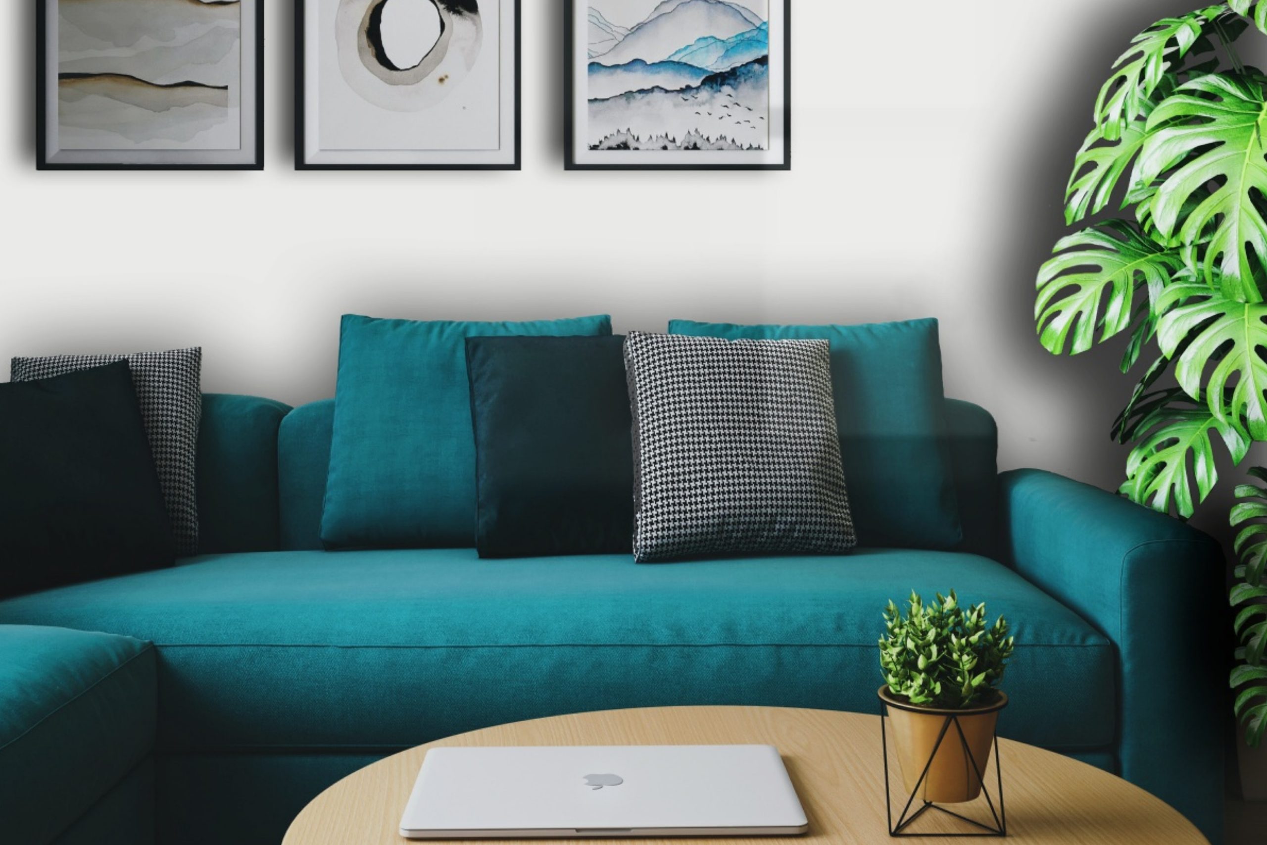
Dashing SW 9544 by Sherwin Williams is a color that exudes elegance and modernity, perfectly encapsulating the spirit of contemporary design. It is a sophisticated hue that occupies a unique space between deep blue and vibrant teal, giving it a dynamic quality that both soothes and invigorates the senses.
This versatile shade can effortlessly enhance the atmosphere of a space, bringing with it a sense of depth and personality.In terms of interior styles, Dashing SW 9544 thrives within modern and minimalist aesthetics, where its bold character can stand out as a focal point or complement a restrained color palette.
It is particularly well-suited to spaces that aim for an air of chic sophistication, such as urban lofts or contemporary living rooms. Additionally, its aquatic undertones make it an excellent choice for bathrooms or bedrooms, creating a serene escape that mirrors the tranquility of the ocean.
Dashing pairs splendidly with a variety of materials and textures, highlighting its adaptability. Natural wood, whether light oak or rich walnut, accentuates its warmth, bringing a balanced, organic feel to the environment. Metals like brushed nickel or polished brass provide a striking contrast, adding a touch of luxury and modernity.
When it comes to textures, the color harmonizes beautifully with soft, plush fabrics such as velvet or silk, adding a layer of tactile richness, while matte finishes on walls or furnishings underscore its contemporary appeal.
Embracing Dashing SW 9544 in your interior design ventures can transform a space, delivering a powerful statement that marries the best of modern sophistication with the beauty of the natural world.
housekeepingbay.com
Table of Contents
Is Dashing SW 9544 by Sherwin Williams Warm or Cool color?
Dashing SW 9544 by Sherwin Williams is a vibrant hue that brings energy and sophistication to any space in the home. This particular shade straddles the space between a deep, rich teal and a lively blue, making it versatile enough to adapt to various decorating styles and preferences. When applied to walls, Dashing SW 9544 acts as a striking backdrop that can either complement bold, vibrant accents or balance out neutral tones, adding depth and character to rooms without overwhelming them.
The unique appeal of Dashing SW 9544 lies in its ability to evoke feelings of creativity and calmness simultaneously. It’s a color that resonates well in spaces meant for relaxation and inspiration, like bedrooms and home offices.
Furthermore, its rich saturation ensures that it works beautifully with both natural and artificial lighting, changing subtly with the light to create dynamic and inviting spaces throughout the day.Incorporating Dashing SW 9544 in homes can also influence the perception of space. Darker colors traditionally make rooms feel more intimate and cozy, but the brightness in Dashing adds a spacious feel by reflecting light.
This makes it an excellent choice for any size of room, providing homeowners the flexibility to create either a snug retreat or an airy sanctuary.
With Dashing SW 9544, Sherwin Williams provides a robust palette for homeowners to express their style, whether through bold statement walls or thoughtful color accents, enhancing the overall ambiance of their homes.
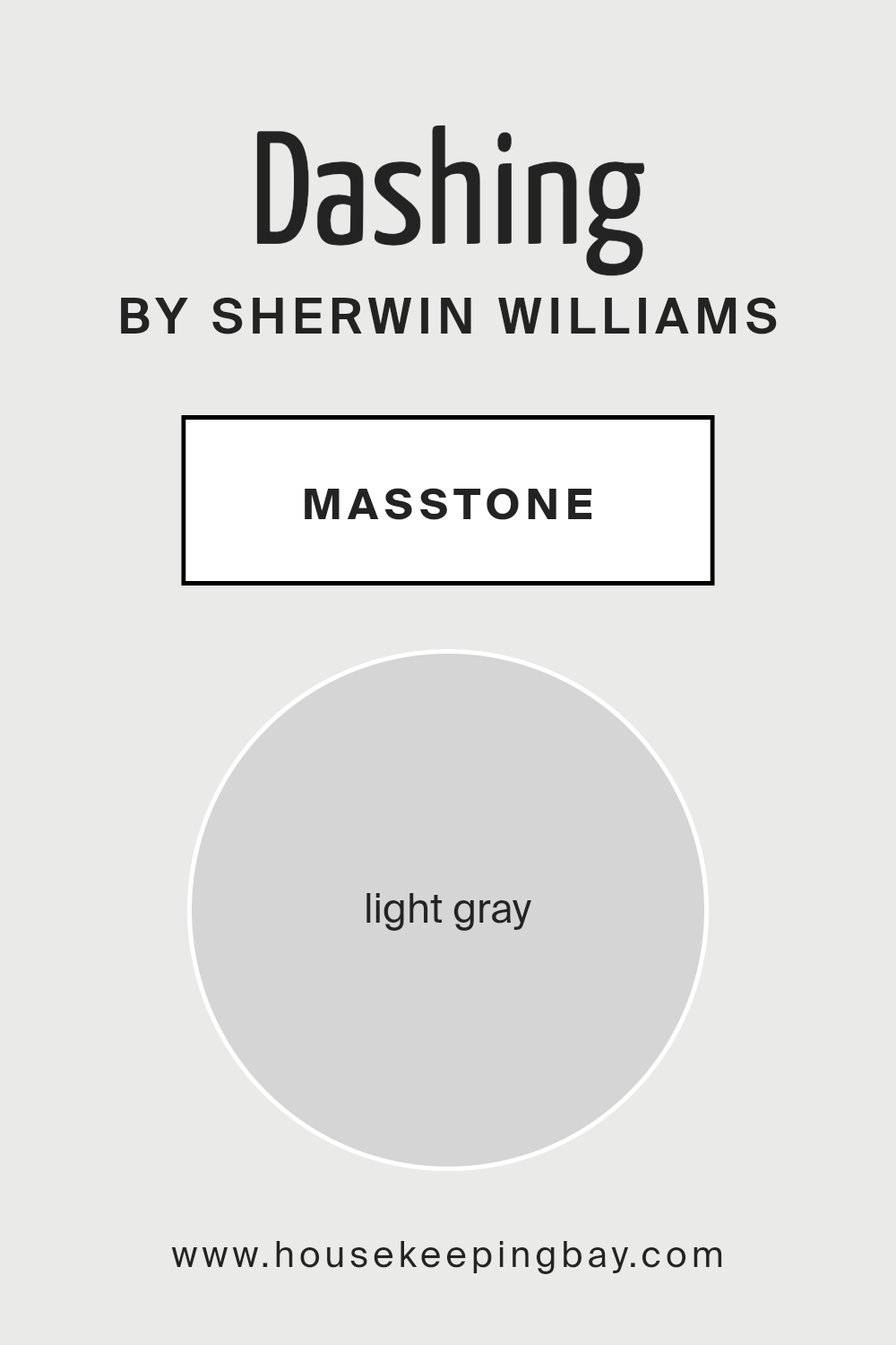
What is the Masstone of the Dashing SW 9544 by Sherwin Williams?
Dashing SW 9544 by Sherwin Williams, with its masstone of Light Gray (#D5D5D5), exudes a serene and sophisticated aura that has the remarkable ability to transform any space into a haven of calm and understated elegance. This specific shade of gray operates as a versatile backdrop, capable of complementing a wide array of color palettes, from vivid and bold hues to softer, more muted tones. It acts as a neutral foundation, which means it can easily adapt to various design aesthetics, whether it be modern minimalism, cozy Scandinavian, or even traditional.
The beauty of Dashing SW 9544 lies in its subtle warmth, offering a comforting presence that avoids the starkness often associated with cooler grays. In homes, its light-gray masstone provides a soft luminosity, enhancing the sense of space and openness in rooms, even in areas that may lack abundant natural light.
Furthermore, its timeless nature ensures longevity in design choices, making it a wise selection for those looking to create a space that remains stylish and appealing over time.
housekeepingbay.com
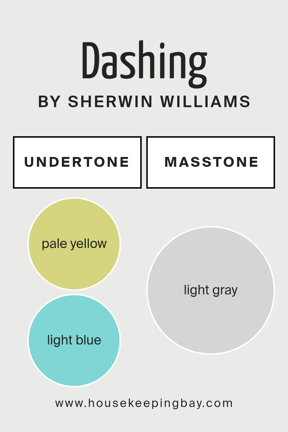
Undertones of Dashing SW 9544 by Sherwin Williams
Dashing SW 9544 by Sherwin Williams is not just a simple hue; it’s an amalgamation of subtleties that contribute to its overall charisma. The undertones of a paint color play a crucial role in defining its character and the way it interacts with light and surrounding elements. Specifically, for DashingSW 9544, the pale yellow (#D5D580) and light blue (#80D5D5) undertones introduce a nuanced complexity that enriches its appeal.
Pale yellow undertones inject a subtle warmth into the base color, radiating a soft, welcoming glow that can make spaces feel more inviting and cozy. This warmth is especially beneficial in rooms that receive less natural light, as it can create an illusion of sunlight filtering through.
On the other hand, light blue undertones offer a refreshing coolness, imparting a serene and tranquil ambiance. This cooling effect is particularly adept at balancing areas with excessive warmth, promoting a sense of calm and relaxation.In the context of interior walls, the interplay of these undertones in Dashing SW 9544 can dramatically affect the perception of space and mood. Depending on the lighting conditions, the color may lean more towards its warm pale yellow or cool light blue undertones, effectively changing the room’s atmosphere at different times of the day.
This dynamic quality makes Dashing SW 9544 a versatile choice for various interior styles and settings, capable of adapting and enhancing the existing decor and architectural features.Understanding the undertones of DashingSW 9544 is essential for homeowners and designers aiming to harness its full potential, allowing for strategic use in achieving the desired effect in a space.
Whether aiming for a cozy retreat or a refreshing sanctuary, DashingSW 9544, with its intricate undertones, offers a foundation upon which personal and inviting spaces can be curated.
housekeepingbay.com
How Does Lighting Affect Dashing SW 9544 by Sherwin Williams
Lighting plays a pivotal role in the perception of colors, shaping the way hues appear in different environments. The interaction between light and color is essential to understand for anyone looking to create a specific atmosphere in a space. The type, intensity, and direction of lighting can all drastically alter the appearance of a color.
For instance, Dashing SW 9544 by Sherwin Williams is a vibrant and dynamic color that can transform under various lighting conditions. In artificial light, depending on the temperature of the bulb (measured in Kelvins), Dashing can either appear warmer and more inviting under warm white to yellow-toned bulbs, or cooler and more subdued under cool white to daylight bulbs.
Artificial lighting tends to flatten colors, so the bold character of Dashing SW 9544 might be slightly muted, yet it maintains its vivacity and charm.In natural light, Dashing SW 9544 flourishes, revealing all its depth and complexity. The quality of sunlight throughout the day and the orientation of the room play significant roles in this transformation.
For north-faced rooms, which receive cooler, indirect light, Dashing might appear more serene and subtle, as the softer light emphasizes its cooler undertones. This makes the color feel calm and sophisticated, perfect for creating a tranquil space.
South-faced rooms bask in warmer, direct light for most of the day, which can amplify the warmth in Dashing SW 9544, making it appear brighter and more energetic. This orientation elevates the color’s vibrance, making spaces feel lively and cheerful.
East-faced rooms enjoy bright, warm light in the morning, which can make Dashing SW 9544 feel inviting and vibrant, gradually transitioning to a softer, more muted hue as the day progresses and the natural light becomes less intense.
Conversely, in west-faced rooms, Dashing SW 9544 would start in a more subdued state in the morning, with the color gradually becoming warmer and more dynamic towards the evening as it captures the warmer tones of the setting sun.In sum, Dashing SW 9544’s appearance is remarkably influenced by the type and direction of light, with each condition bringing out a different facet of this complex and engaging color.
housekeepingbay.com
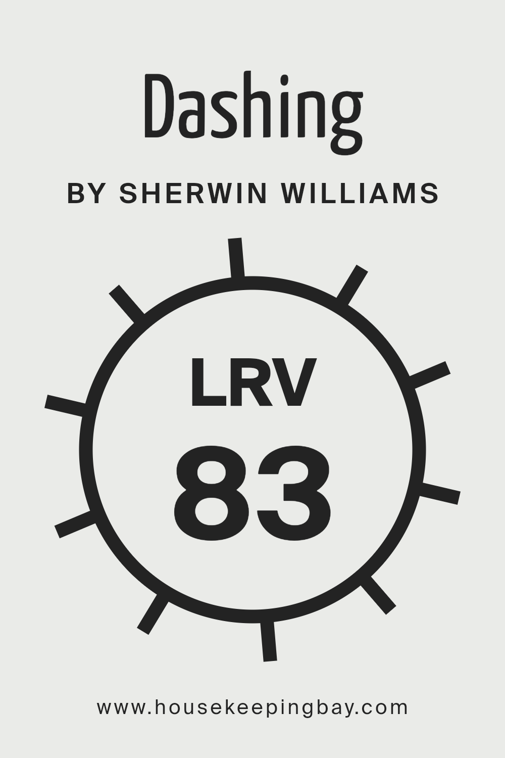
What is the LRV of Dashing SW 9544 by Sherwin Williams?
Light Reflectance Value (LRV) plays a crucial role in the world of color and design, offering insights into how light or dark a color will appear once applied to a surface. The LRV scale runs from 0 to 100, with 0 being the absolute black that reflects no light and 100 being pure white that reflects all light. This numeric value helps in determining how much visible and usable light a paint color will reflect in a given space, thus impacting the brightness, mood, and overall ambiance.
LRV is particularly vital for architects, interior designers, and property owners looking to maximize natural light or create specific effects within rooms. Colors with higher LRVs make spaces appear larger and more open, as they reflect more light, whereas colors with lower LRVs absorb more light, making rooms feel cozier and somewhat constricted.
With an LRV of 82.896, the color Dashing SW 9544 by Sherwin Williams falls into the category of colors that are highly reflective and will contribute significantly to making a space feel airy and bright. This high value indicates that Dashing SW 9544 will reflect a vast majority of light, reducing the need for artificial lighting during the day and contributing to a light and refreshing ambiance.
This can be particularly effective in smaller rooms or areas with limited natural light, as it can help to visually expand the space and make it feel more welcoming.
However, it’s important to consider the direction of the room and the quality of light it receives, as this LRV can also mean that in very bright, sun-exposed rooms, Dashing SW 9544 may feel overwhelmingly bright or lose some of its perceived color depth. Careful consideration of lighting conditions will ensure that this color performs beautifully in your desired space.
housekeepingbay.com
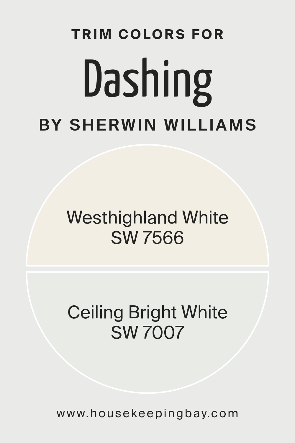
What are the Trim colors of Dashing SW 9544 by Sherwin Williams?
Trim colors, in the sphere of interior and exterior design, refer to the hues selected for the architectural elements that outline or frame spaces, including door frames, window frames, baseboards, and molding. These colors are pivotal in defining the aesthetic and character of a room or an exterior, creating contrast or harmony with the primary wall colors.
For Dashing SW 9544 by Sherwin Williams, a bold and dynamic shade, choosing the right trim color is crucial in either subtly complementing the vividness of the wall or in making a striking statement that frames and enhances the architectural features of the space.
When considering trim colors for DashingSW 9544, Sherwin Williams offers two exquisite options: SW 7566 – Westhighland White and SW 7007 – Ceiling Bright White. Westhighland White is a warm, creamy hue that provides a soft, elegant contrast to the vibrant DashingSW 9544, lending a classic and inviting feel to the space. It captures natural light beautifully, adding a layer of subtle brightness without overwhelming the primary color.
On the other hand, Ceiling Bright White is a crisp, pure white with a slightly cooler tone, offering a sharp contrast that can make the boldness of Dashing SW 9544 pop even more. This color is excellent for creating a clean, contemporary edge, making architectural details stand out with striking clarity. Both options serve to enhance the overall appeal of DashingSW 9544, depending on the desired effect, be it warm and traditional or bold and modern.
You can see the recommended paint colors below:
housekeepingbay.com
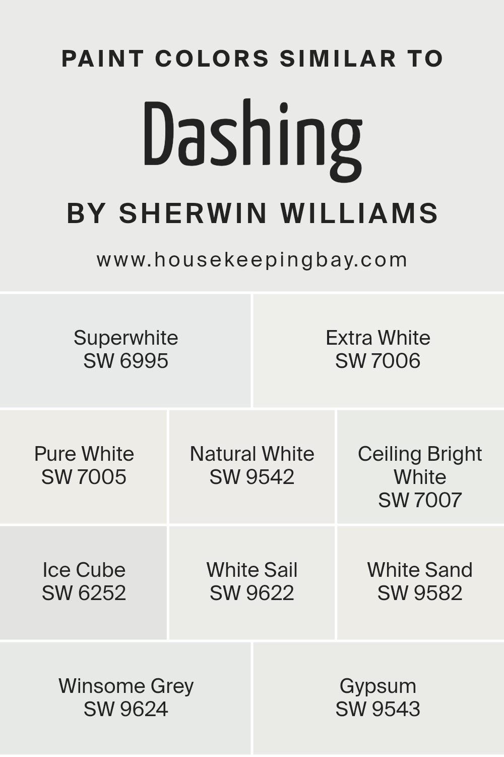
Colors Similar to Dashing SW 9544 by Sherwin Williams
Similar colors play a pivotal role in interior design and décor, offering a subtle yet impactful way to create harmony and balance within a space. These colors, akin to the nuances found in Dashing SW 9544 by Sherwin Williams, span a spectrum of whites and near-whites, each possessing unique undertones and brightness levels that define their distinct character. The importance of these similar colors lies in their ability to coexist harmoniously, allowing for a unified yet dynamic aesthetic.
They provide a canvas that can either stand alone in understated elegance or serve as a serene backdrop for bolder elements, showcasing versatility in function and style. Among these similar shades,
Superwhite exudes a clean, crisp essence, acting as a quintessential classic white that revitalizes spaces with its pure vibrancy.
Extra White, with its slightly cooler undertone, presents a pristine clarity that amplifies natural light, enhancing the spatial perception.
Pure White strikes a balance with a neutral-off-white that seamlessly blends warmth and coolness, making it a versatile choice for various settings.
Natural White offers a soft, inviting warmth, reminiscent of natural elements, perfect for creating cozy, ambient environments. Ceiling Bright White, with its ultra-reflective quality, maximizes light diffusion, elevating ceilings with an airy openness. Ice Cube introduces a subtle hint of blue, evoking a refreshing, crisp feel, akin to a breath of fresh air.
White Sail, with a touch of warmth, radiates a soft, welcoming glow, ideal for serene, light-filled rooms. White Sand carries a beige undertone, providing a warm, sandy hue that adds depth and coziness.
Winsome Grey delicately bridges the gap between white and grey, offering a soft, muted option that enhances spatial sophistication.
Lastly, Gypsum, with its tranquil and earthly essence, introduces a calming neutrality, making it a soothing choice that complements a wide range of palettes and textures.
Each color, while sharing a kinship with Dashing SW 9544, stands out for its unique ability to create spaces that reflect individual style and purpose.
You can see recommended paint colors below:
- SW 6995 Superwhite
- SW 7006 Extra White
- SW 7005 Pure White
- SW 9542 Natural White
- SW 7007 Ceiling Bright White
- SW 6252 Ice Cube
- SW 9622 White Sail
- SW 9582 White Sand
- SW 9624 Winsome Grey
- SW 9543 Gypsum
housekeepingbay.com
How to Use Dashing SW 9544 by Sherwin Williams In Your Home?
Dashing SW 9544 by Sherwin Williams is not just a color; it’s a statement. This rich, deep hue brings an unmatched level of sophistication and bold elegance to any living space. It embodies a modern yet timeless appeal, making it an excellent choice for those looking to infuse their home with a touch of luxury and confidence.
Whether you’re considering an accent wall in the living room to create a focal point, or contemplating a complete bedroom makeover for a cozy and intimate setting, Dashing SW 9544 offers versatility across various design styles, from modern to traditional.
For homeowners aiming to achieve a dramatic and stylish ambiance, Dashing SW 9544 can be applied to kitchen cabinets, paired with brass or gold hardware, to elevate the heart of the home into a stunning showpiece.
Alternatively, using this captivating color in a dining room can set the stage for memorable gatherings, enhancing the overall dining experience with its depth and intensity.
Moreover, for those willing to experiment, Dashing SW 9544 can also be used in smaller doses, such as on a statement piece of furniture or decorative trims, to bring warmth and vibrancy to the space without overwhelming it. Its rich character allows it to pair beautifully with a range of complementary shades, from soft neutrals to vibrant hues, offering endless possibilities for creating a harmonious and personalized interior space.
Dashing SW 9544 by Sherwin Williams vs White Sail SW 9622 by Sherwin Williams
Dashing SW 9544 and White Sail SW 9622 by Sherwin Williams present a harmonious yet contrasting color duo, offering a sophisticated palette for various design applications. Dashing, a deep and vibrant hue, captures attention with its rich saturation, embodying a sense of elegance and boldness.
This color conveys warmth and depth, making a strong statement in any space. In contrast, White Sail SW 9622 is a soft, serene white with subtle nuances that evoke a sense of calm and openness. Its lightness perfectly complements the intensity of Dashing, providing balance and a refreshing counterpoint.
White Sail has the capacity to brighten and enlarge a space, offering a clean backdrop that allows Dashing to stand out even more prominently. Together, these colors create a dynamic and sophisticated visual experience, marrying the boldness of a rich hue with the simplicity and purity of white, suitable for modern and traditional settings alike.
You can see recommended paint colors below:
- SW 9622 White Sail
housekeepingbay.com
Dashing SW 9544 by Sherwin Williams vs Ceiling Bright White SW 7007 by Sherwin Williams
Dashing SW 9544 by Sherwin Williams and Ceiling Bright White SW 7007 by Sherwin Williams serve distinct roles in the color palette, offering unique vibes and functionalities. Dashing SW 9544, resonating with depth and personality, is a robust color that captures attention and adds character to any space. Its saturated hue can create a focal point, offering warmth and inviting sophistication.
This color is versatile, ideal for statement walls, accents, or cozy room environments, bridging traditional and contemporary design.On the other hand, Ceiling Bright White SW 7007 embodies purity and clarity, providing a crisp, clean backdrop that enhances natural light and amplifies the sense of space. It’s a classic choice for ceilings and trim, helping to create a seamless transition between walls, offering a sense of continuity and openness.
The contrast between Dashing SW 9544 and Ceiling Bright White SW 7007 is stark yet complementary, allowing for a harmonious blend that can define spaces, accentuate architectural details, and elevate a home’s aesthetics.
You can see recommended paint colors below:
housekeepingbay.com
Dashing SW 9544 by Sherwin Williams vs White Sand SW 9582 by Sherwin Williams
Dashing SW 9544 and White Sand SW 9582, both by Sherwin Williams, present a study in harmonious contrast. Dashing is a bold choice, exuding confidence and depth. It draws inspiration from the richer side of the spectrum, delivering an ambiance of sophistication and drama. This color is perfect for creating focal points or adding a layer of warmth to space. On the other hand, White Sand embodies tranquility and light.
It is a soft, creamy white with just a hint of warmth, making it incredibly versatile for interiors. Its ability to reflect light brightens rooms, creating a sense of airiness and space.When these two colors come together, they create an elegant balance. Dashing, with its deep, inviting tone, provides a stunning backdrop for the serene and subtle White Sand.
This combination allows for a space that feels both grounded and uplifted, making it ideal for those seeking a dynamic yet cohesive interior palette. Together, they offer an appealing contrast, pairing vitality with calmness, that can adapt to both modern and traditional settings seamlessly.
You can see recommended paint colors below:
housekeepingbay.com
Dashing SW 9544 by Sherwin Williams vs Ice Cube SW 6252 by Sherwin Williams
Dashing SW 9544 and Ice Cube SW 6252, both from Sherwin Williams, present an interesting contrast in hues that could complement a variety of spaces and design preferences. Dashing SW 9544 exudes a bold and vibrant character, offering a rich, deep tone that can add sophistication and depth to any room. This color is ideal for making a statement, whether as an accent wall or enveloping the space for an immersive experience.
On the other hand, Ice Cube SW 6252 is a soft, muted tone that leans towards the cooler spectrum, offering a breath of freshness and tranquility. Its subtle nature makes it perfect for creating a serene and inviting atmosphere, ideal for bedrooms, bathrooms, or any space meant to soothe and relax.
The juxtaposition of Dashing’s intensity against Ice Cube’s calmness allows for a dynamic interplay of colors, enabling designers and homeowners to craft spaces that are both engaging and harmonious.
You can see recommended paint colors below:
housekeepingbay.com
Dashing SW 9544 by Sherwin Williams vs Winsome Grey SW 9624 by Sherwin Williams
Dashing SW 9544 and Winsome Grey SW 9624 by Sherwin Williams are two unique colors that offer subtle yet distinct atmospheres to any space.
Dashing is a vibrant, spirited color that carries an air of youthfulness and modernity. It’s a hue that resonates with energy and can perk up any room with its vivid charm. This makes it an excellent choice for spaces intended to stimulate creativity and joy, such as playrooms, creative studios, or lively common areas. Winsome Grey, on the other hand, is a sophisticated and versatile shade of grey with a calming presence.
It’s a color that exudes tranquility and elegance, making it perfect for areas where a serene and more mature atmosphere is desired. Bedrooms, living rooms, and home offices could benefit from Winsome Grey’s soothing effect, as it creates a peaceful backdrop that complements various decor styles seamlessly. While both colors are appealing in their own right, Dashing introduces a punch of energy, and Winsome Grey offers a gentle, refined sophistication.
Choosing between them ultimately depends on the intended mood and functionality of the space.
You can see recommended paint colors below:
- SW 9624 Winsome Grey
housekeepingbay.com
Dashing SW 9544 by Sherwin Williams vs Pure White SW 7005 by Sherwin Williams
Dashing SW 9544 and Pure White SW 7005, both by Sherwin Williams, embody distinct color personalities that cater to different aesthetic needs. Dashing SW 9544 belongs to a vibrant, energetic palette.
This shade is imbued with depth, bringing life and character to spaces. It’s a color that demands attention, suitable for creating focal points or for an adventurous room transformation. It invokes feelings of warmth and boldness, making it perfect for areas where dynamism and vibrance are desired.In contrast, Pure White SW 7005 is the epitome of simplicity and elegance.
As one of the most versatile shades, Pure White serves as an excellent backdrop for any color scheme, offering a crisp, clean look. It maximizes natural light, making spaces appear larger and more open. This color promotes a sense of calm and purity, making it ideal for creating a serene and inviting atmosphere.
While Dashing brings bold vibrance, Pure White offers a serene, bright canvas. Both colors serve distinct purposes – whether it’s to energize with Dashing or to refresh and open up spaces with Pure White.
You can see recommended paint color below:
housekeepingbay.com
Dashing SW 9544 by Sherwin Williams vs Gypsum SW 9543 by Sherwin Williams
“Dashing SW 9544” and “Gypsum SW 9543” by Sherwin-Williams are two unique colors with distinct personalities, yet they share a subtle harmony that allows them to be paired beautifully in interior spaces.
Dashing, as its name suggests, is a bold and vibrant color. It stands out with a depth that can add character and a focal point to any room. This color, with its energetic presence, is perfect for accent walls or elements intended to make a statement.On the other hand, Gypsum occupies the opposite end of the spectrum. It is a soft, serene, and almost ethereal shade.
Gypsum brings a sense of calm and spaciousness to a room, making it ideal for creating a tranquil and restful environment. Its understated elegance allows it to serve as a perfect backdrop for more assertive colors like Dashing.When used together, Dashing and Gypsum create a balanced and dynamic aesthetic.
Dashing draws the eye and injects life into the space, while Gypsum provides a soothing counterbalance, ensuring the area remains inviting and not overwhelming. This complementary pairing underscores the versatility of Sherwin-Williams’ color range, enabling homeowners to experiment with bold contrasts and nuanced interiors.
You can see the recommended paint color below:
- SW 9543 Gypsum
housekeepingbay.com
Dashing SW 9544 by Sherwin Williams vs Natural White SW 9542 by Sherwin Williams
Dashing SW 9544 and Natural White SW 9542 by Sherwin-Williams are two distinct hues that cater to different design aesthetics while residing within a sophisticated palette.
Dashing SW 9544 is a robust and vibrant color, presenting as a deep, dynamic tone that offers an air of elegance and confidence to any space. Its richness can anchor a room, providing a focal point or acting as a bold backdrop for decor. In contrast, Natural White SW 9542 leans towards a serene, pure, and inviting warmth, embodying a sense of calm and cleanliness.
Its subtle nuances offer versatility, making it an excellent choice for creating a bright, airy feel, or serving as a gentle complement to more assertive colors.
While Dashing demands attention with its depth and energy, Natural White charms with its understated sophistication and adaptability, crafting environments that feel welcoming and grounded. Together, these colors can harmonize within a space, striking a balance between boldness and tranquility.
You can see the recommended paint color below:
- SW 9542 Natural White
housekeepingbay.com
Dashing SW 9544 by Sherwin Williams vs Extra White SW 7006 by Sherwin Williams
“Dashing SW 9544” by Sherwin Williams is a vibrant, deeply saturated hue that exudes an energy and sophistication. It is a color that can make a bold statement in any space, imbuing it with a sense of creativity and dynamic appeal.
This color tends to draw attention and can be used as an accent or a dominant color in a room, pairing well with neutral tones to balance its intensity.On the other hand, “Extra White SW 7006” by Sherwin Williams represents purity, cleanliness, and simplicity. As a classic shade of white, it offers a versatile backdrop that can either calm the senses or amplify the vibrancy of other colors used in conjunction with it.
Extra White is perfect for spaces aiming for a minimalist aesthetic or wanting to maximize natural light, as its reflective quality can open up a room, making it appear larger and more airy.
Comparing the two, Dashing’s vibrant energy provides a stark contrast to Extra White’s serene and simplistic vibe. While Dashing invokes a sense of boldness and creativity, Extra White appeals to a sense of clarity and spaciousness. Both colors offer unique possibilities for transforming spaces, depending on the desired atmosphere and design goals.
You can see recommended paint colors below:
housekeepingbay.com
Dashing SW 9544 by Sherwin Williams vs Superwhite SW 6995 by Sherwin Williams
Dashing SW 9544 by Sherwin Williams and Superwhite SW 6995 by Sherwin Williams stand in stark contrast to one another, offering a vivid illustration of the versatility within Sherwin Williams’ color palette. Dashing, a color imbued with depth and richness, evokes an air of sophistication and warmth.
This hue can add a sense of drama and intensity to any space, making it ideal for creating focal points or accentuating design elements. Its saturated character allows it to stand strongly on walls, in furnishing, or in decorative accents, exuding confidence and elegance.On the other hand, Superwhite SW 6995, as its name suggests, leans towards the utmost purity and crispness of white.
It is characterized by its ability to reflect light, brightening spaces and imparting a sense of openness and airiness.
Superwhite serves as a perfect backdrop for any color scheme, offering a clean slate that enhances other colors and allows design elements to pop. Unlike Dashing, which adds depth and moodiness, Superwhite creates a feeling of expansion and clarity, making it ideal for minimalistic or contemporary designs.
Together, these colors showcase the range from deep, captivating tones to light, refreshing hues, each capable of creating distinct atmospheres and moods within a space.
You can see recommended paint colors below:
- SW 6995 Superwhite
housekeepingbay.com
Conclusion
Drawing on numerous opinions and insights throughout the article, it’s evident that Dashing SW 9544 by Sherwin-Williams stands out as a vibrant and dynamic color option for both interior and exterior spaces.
This particular shade, celebrated for its depth and versatility, exudes an air of sophistication and warmth, making it an ideal choice for those looking to inject personality and elegance into their surroundings. Its unique ability to create inviting atmospheres while simultaneously serving as a bold statement color allows it to adapt effortlessly to various design aesthetics, from contemporary to traditional, thereby proving its unparalleled adaptability and appeal.
Moreover, the application of Dashing SW 9544 extends beyond mere aesthetic enhancement, as it has also been noted for its psychological effects on spaces and inhabitants. The color’s richness and vitality are said to evoke feelings of comfort and creativity, making it an excellent catalyst for inspiring moods and enhancing productivity in spaces like living rooms, offices, and studios.
The widespread acclaim and preference for Dashing SW 9544 underscore its status as a distinguished choice within Sherwin-Williams’ extensive palette, further solidifying its role as a must-consider hue for designers and homeowners aiming to make a distinctive and impactful design statement.
housekeepingbay.com
Ever wished paint sampling was as easy as sticking a sticker? Guess what? Now it is! Discover Samplize's unique Peel & Stick samples. Get started now and say goodbye to the old messy way!
Get paint samples


