Decor White SW 7559 by Sherwin Williams
Elevating Spaces with Timeless Elegance
This shade of white stands out for its ability to bring a fresh and clean look to any space. Whether you’re looking to brighten up a room or give your home a modern update, Decor White is a versatile choice that can meet your needs.
With its subtle undertones, it pairs well with a wide range of colors and decor styles, making it a popular choice for homeowners and interior designers alike.Choosing the right paint color can sometimes be overwhelming, but Decor White offers a simple yet elegant solution. It can make small spaces appear larger and more inviting, or add a touch of sophistication to larger rooms.
Perfect for walls, trim, or cabinets, this shade of white can be the foundation of a minimalist design or serve as a backdrop for bolder colors and patterns.In this article, we’ll explore how SW 7559 Decor White by Sherwin Williams can transform your space, offering inspiration and practical tips for incorporating this stunning shade into your home.
Whether you’re updating one room or undertaking a whole-house makeover, Decor White could be the perfect starting point for your next project.
via sherwin-williams.com
What Color Is Decor White SW 7559 by Sherwin Williams?
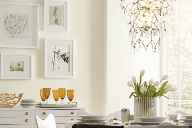
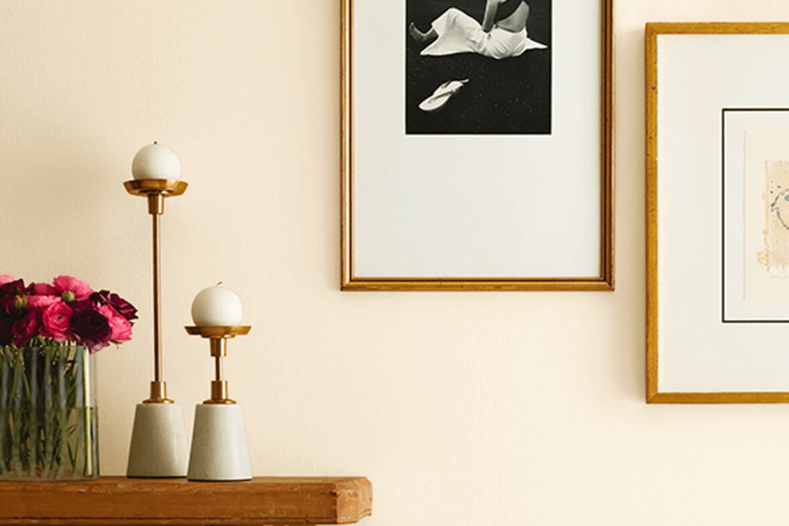
Decor White SW 7559 by Sherwin Williams is a versatile paint color with a warm, inviting tone. This shade of white has a softness to it, making it perfect for creating a soothing and comfortable atmosphere in any room. It’s not too stark or bright, which means it pairs beautifully with a wide range of decor styles and colors.
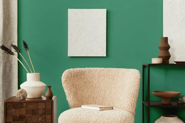
Ideal for achieving a timeless look, Decor White works exceptionally well in interior styles such as modern farmhouse, Scandinavian, and contemporary. Its neutral base allows it to blend seamlessly with natural materials and textures like wood, stone, and metals, enhancing the cozy feel of the space. In a room with plenty of natural light, Decor White reflects beautifully, amplifying the sense of openness and airiness.
This color shines when used in combination with textiles like cotton, linen, and wool, adding layers of texture and warmth to the overall design. It also pairs splendidly with both bold and muted colors, offering a backdrop that allows furnishings and art pieces to stand out. Whether applied on walls, trim, or cabinets, Decor White SW 7559 provides a fresh, clean canvas that’s adaptable to a variety of living spaces and design aesthetics.
housekeepingbay.com
Table of Contents
Is Decor White SW 7559 by Sherwin Williams Warm or Cool color?
Decor White SW 7559 by Sherwin Williams is a warm, inviting paint color that’s perfect for making spaces feel cozy and bright. This soft white shade has a touch of creaminess, which sets it apart from stark, pure whites. Because of its warm undertones, it pairs beautifully with a wide range of colors, from bold and dark hues to soft pastels. This versatility makes Decor White a great choice for any room in the house, whether you’re painting walls, trim, or cabinets.
In well-lit areas, Decor White can help enhance the natural light, making spaces seem larger and more open. In rooms with less natural light, it can help counteract the feeling of dimness, creating a more inviting atmosphere. Furthermore, this color works well with both modern and traditional decor, adding a subtle elegance without overwhelming the room’s aesthetic.
Choosing Decor White SW 7559 can transform your home into a warm, welcoming space that feels both comfortable and stylish.
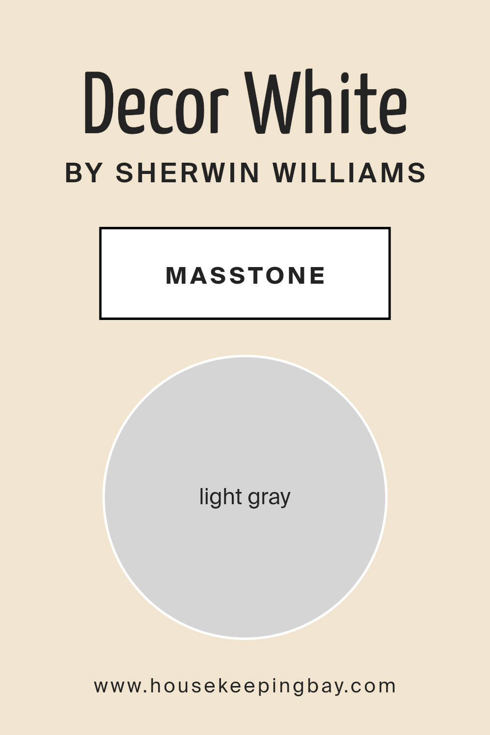
What is the Masstone of the Decor White SW 7559 by Sherwin Williams?
Decor White SW 7559 by Sherwin Williams has a masstone that can be closely linked to light gray, tagged with the color code #D5D5D5. This shade is super versatile and friendly for any home setting. What makes it special? Well, it’s able to spread a calm and clean vibe throughout any space, without being too bold or fading into the background. It’s like the perfect middle ground.
This light gray color brings a fresh and modern feel to rooms, making small spaces seem larger and more open. Because it’s so neutral, it pairs beautifully with almost any other color.
Whether you love bright pops of color in your decor or prefer a more understated look, Decor White SW 7559 has got you covered. Its light gray essence works wonders in areas with lots of natural light, reflecting it and making the room look brighter and more welcoming. Plus, it’s really forgiving when it comes to little marks and smudges, keeping your home looking neat.
housekeepingbay.com
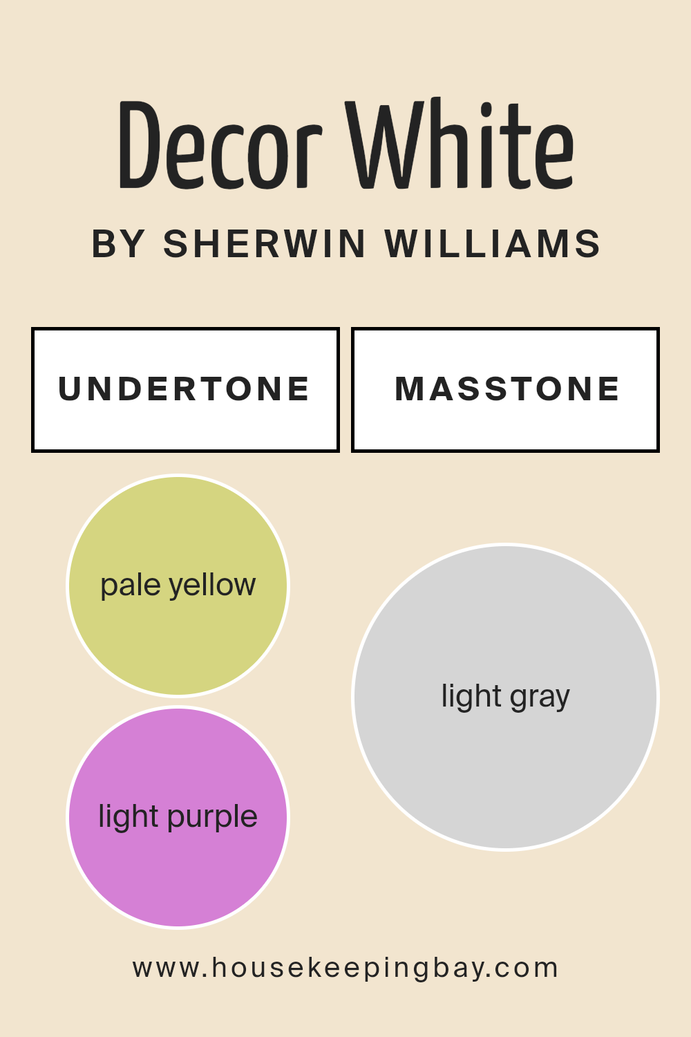
Undertones of Decor White SW 7559 by Sherwin Williams
Decor White SW 7559 by Sherwin Williams is a unique color that appears simple at first glance but has a complex personality because of its undertones. The two main undertones in this color are pale yellow and light purple. Undertones are subtle hues that influence the main color, affecting how it looks in different lighting conditions or when paired with other colors.
Pale yellow brings a warm and soft glow to Decor White, making it feel welcoming and cozy. In sunlight, this undertone can make the color look brighter and more vibrant, adding a subtle cheerfulness to a room.
The light purple undertone adds a hint of coolness, which can give the color a more sophisticated edge. This balance between the warmth of yellow and the cool vibe from purple means Decor White can work well in many spaces.
When used on interior walls, these undertones make Decor White SW 7559 very versatile. The pale yellow undertone can make a room feel sunnier on a cloudy day, creating an inviting atmosphere. At the same time, the light purple undertone can add depth and interest, preventing the color from appearing flat.
This makes Decor White a great choice for anyone looking to add a touch of elegance without overwhelming a space. Depending on the room’s lighting and the colors of furniture and decor, Decor White can shift from a warm, cozy white to a more refined, subtle hue. This adaptability makes it a popular choice for interior walls, capable of complementing various styles and preferences.
housekeepingbay.com
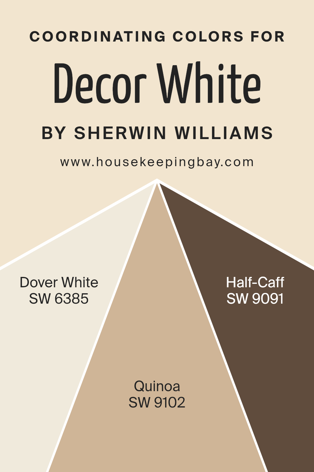
Coordinating Colors of Decor White SW 7559 by Sherwin Williams
Coordinating colors are those hues that work well together in harmony to enhance the overall aesthetic appeal of a space. They can either complement or contrast with each other, creating a cohesive look that adds depth and character to the decor.
For instance, if we take Decor White SW 7559 by Sherwin Williams, a fresh and clean shade, we can pair it with certain colors that elevate its simplicity to something more sophisticated. The idea is to choose colors that support the main color, allowing it to shine while contributing to the ambiance of the room.
Consider SW 6385 – Dover White, a soft, warm hue with a hint of creamy richness, perfect for creating a cozy and welcoming atmosphere. It pairs beautifully with Decor White, offering a subtle contrast that enhances the freshness of the space without overwhelming it.
SW 9102 – Quinoa, on the other hand, introduces a natural, earthy tone that grounds the color scheme, adding depth and warmth. Its understated elegance complements the crispness of Decor White, ensuring the room feels balanced and inviting. Lastly, SW 9091 – Half-Caff adds a touch of sophistication with its deeper, richer tone.
This color works wonders in adding a bit of drama and intensity to the palette, lending an air of refinement that ties the whole look together. These coordinating colors, when used thoughtfully, can transform a space, making it look well-curated and harmoniously designed.
You can see recommended paint colors below:
- SW 6385 Dover White
- SW 9102 Quinoa
- SW 9091 Half-Caff
housekeepingbay.com
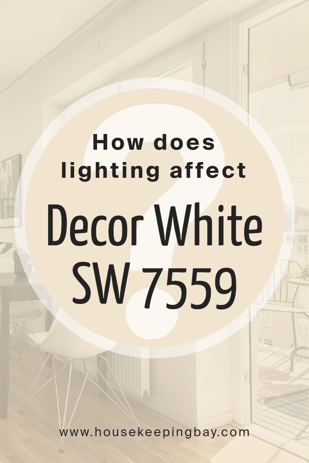
How Does Lighting Affect Decor White SW 7559 by Sherwin Williams?
Lighting has a huge impact on how colors appear in our environment. It’s like magic; the same color can look different under various types of light! When we talk about a specific color, such as Decor White SW 7559 by Sherwin-Williams, understanding how it interacts with light can help us use it effectively in our spaces.
In artificial light, Decor White SW 7559’s appearance can vary based on the type of bulbs you use. For example, LED lights that mimic daylight will keep the color looking bright and true to its natural tone. But, if you use warmer bulbs, this white can take on a cozier, slightly creamy appearance. It’s the kind of change that makes the same paint color versatile in different settings.
Now, let’s consider natural light, which changes throughout the day and depends on the direction your room faces. In north-faced rooms, light tends to be cooler and more consistent during the day. Here, Decor White SW 7559 might appear a bit sharper and crisper, maintaining a true white look without feeling cold.
- In south-faced rooms, where sunlight is warm and abundant, this color can feel brighter and more radiant. It reflects the natural light beautifully, making the room feel airy and lively.
- East-faced rooms get bright morning light, which means Decor White SW 7559 will look exceptionally vibrant in the mornings but softer as the day progresses. It’s perfect for spaces you use mostly in the morning.
- West-faced rooms, conversely, fill with warm afternoon light. In these rooms, the color can appear softer and warmer in the afternoon, creating a cozy atmosphere by the end of the day.
- In summary, lighting plays a key role in how Decor White SW 7559 looks in a room. Whether under artificial light or natural light, and depending on the room’s orientation, this color can transform from being sharply crisp to softly inviting, proving its versatility in various settings.
housekeepingbay.com
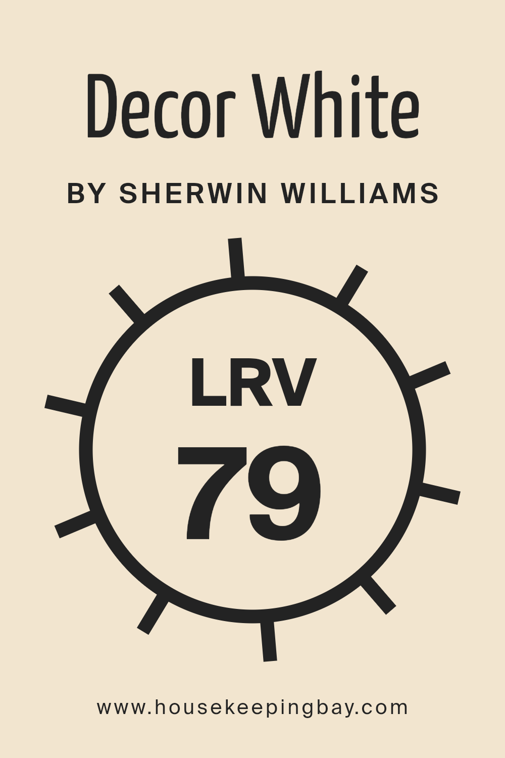
What is the LRV of Decor White SW 7559 by Sherwin Williams?
LRV stands for Light Reflectance Value, which is basically a measure of how much light a color reflects back into a room. This scale goes from 0 to 100, where 0 is completely black, absorbing all light, and 100 is pure white, reflecting all light. The LRV of a paint color can really change the way a room looks and feels.
Colors with higher LRVs make rooms feel brighter and more open because they reflect more light. On the other hand, colors with lower LRVs absorb more light, making spaces feel cozier but also potentially darker, which is something to keep in mind if your room doesn’t get a lot of natural light.
For Decor White SW 7559 by Sherwin Williams, with an LRV of 79.367, it’s on the higher end of the scale. This means it’s a color that will reflect a lot of light, making spaces feel airy and spacious. This particular shade of white can help brighten up a room, making it feel fresh and inviting, especially in areas that might not get a ton of natural sunlight.
Because of its high LRV, Decor White is a great choice for smaller spaces or rooms with limited light, as it can help make them appear larger and more welcoming. Just remember, the actual effect can vary depending on the direction your room faces and the amount of natural or artificial light it receives.
housekeepingbay.com
What is LRV? Read It Before You Choose Your Ideal Paint Color
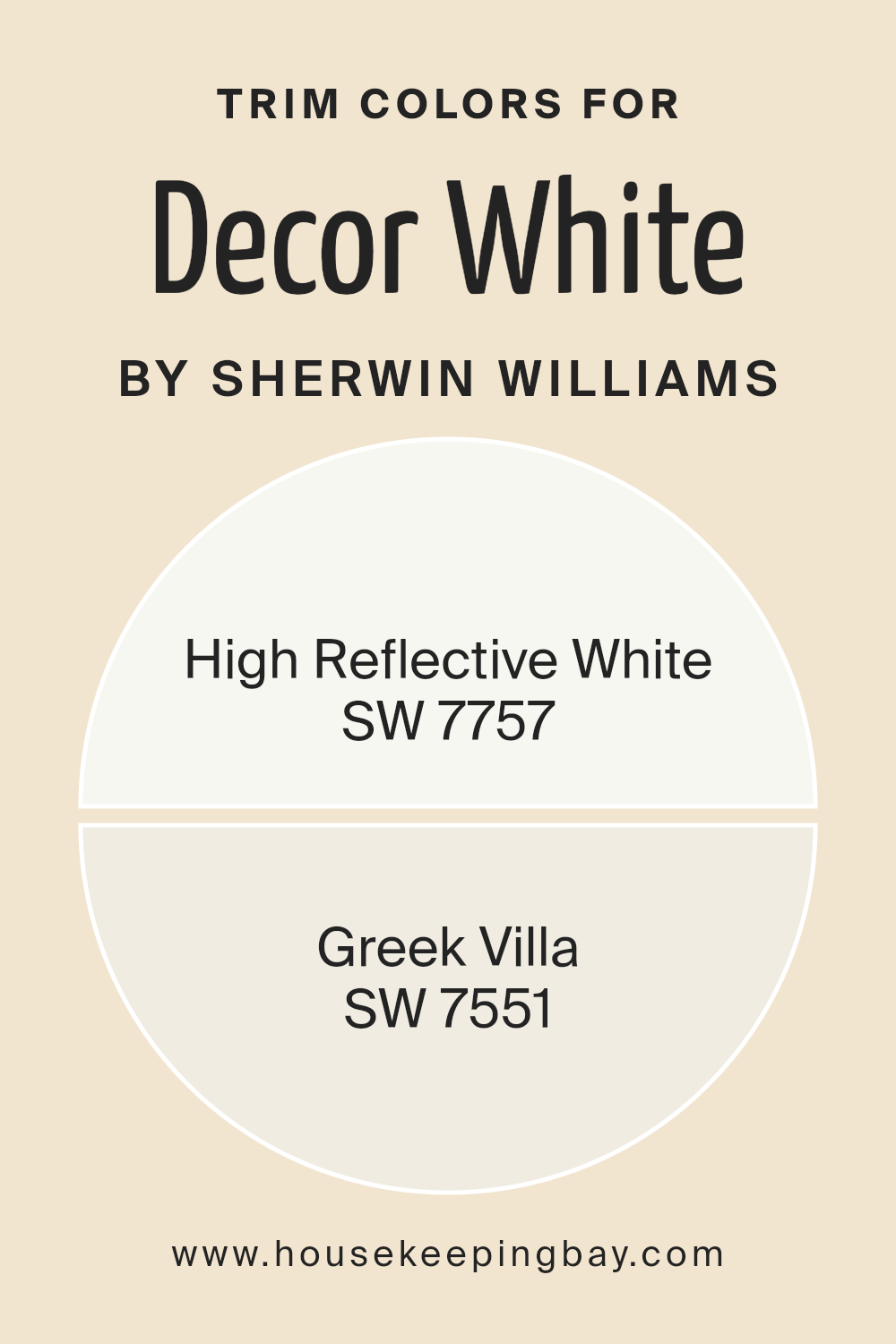
What are the Trim colors of Decor White SW 7559 by Sherwin Williams?
Trim colors, like the ones suggested alongside Decor White SW 7559 by Sherwin Williams, play a crucial role in defining the aesthetic and character of a space. They are the accent colors applied to molding, door frames, window frames, and other architectural features that frame or trim the edges of rooms and structures.
The right trim color can enhance the main wall color, highlight architectural details, and create a cohesive look throughout the space. For a classic and timeless choice like Decor White, selecting the perfect trim color can be essential in achieving a polished and harmonious interior design.
High Reflective White SW 7757 is a brilliant choice for trims, offering a clean and bright finish that reflects light beautifully, making spaces appear larger and more inviting. It’s a pure white that provides a crisp contrast to Decor White, emphasizing elegance without overwhelming the primary color.
On the other hand, Greek Villa SW 7551, with its slightly warm undertones, offers a softer approach. It complements Decor White by adding depth and warmth to the surroundings, creating a cozy and welcoming atmosphere. Both of these trim colors are versatile selections that can tie a room together, accentuating the beauty of Decor White while contributing to the overall aesthetic appeal of the space.
You can see recommended paint colors below:
housekeepingbay.com
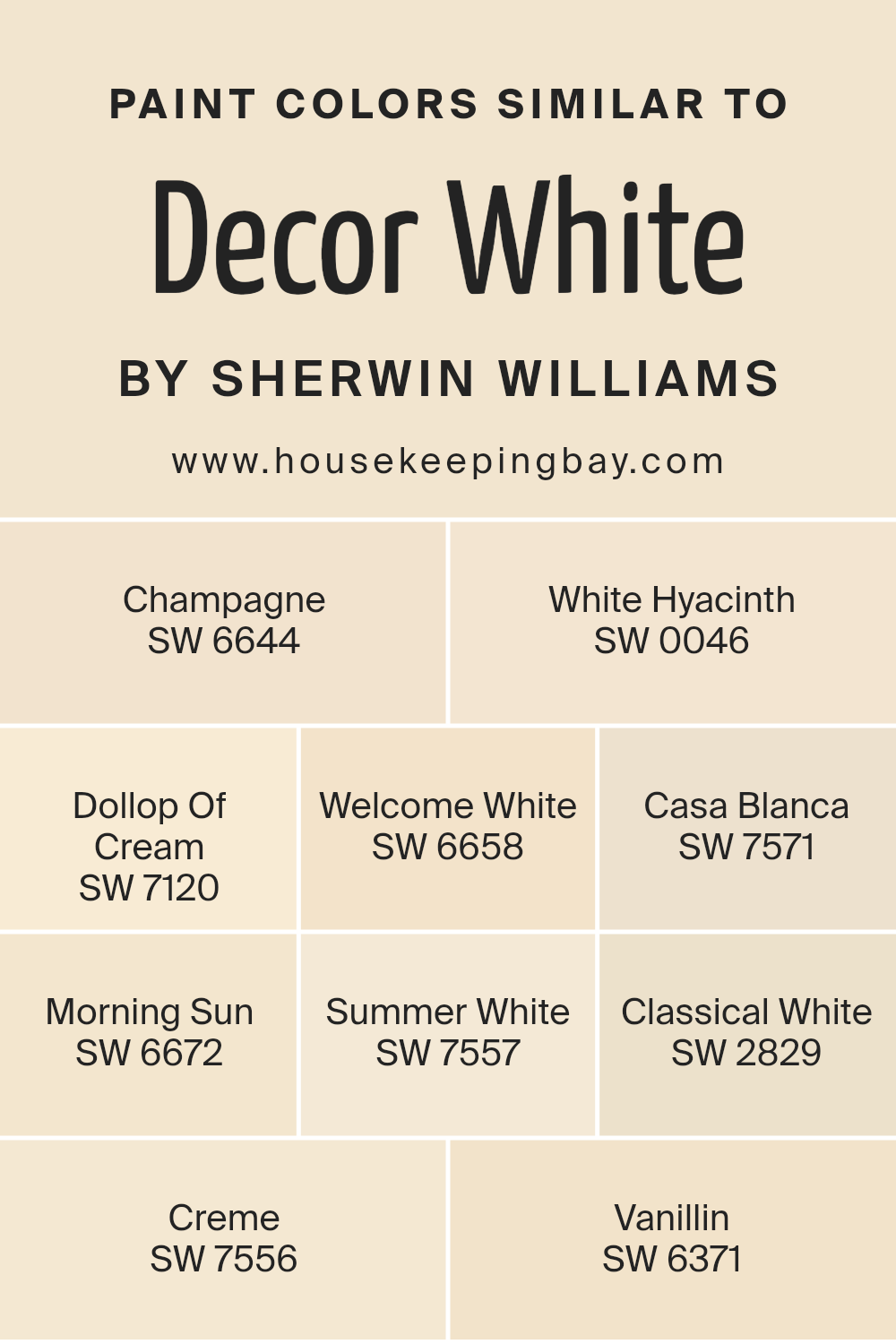
Colors Similar to Decor White SW 7559 by Sherwin Williams
Choosing similar colors is essential when you aim to create a cohesive and balanced look in your decor. These colors, all akin to Decor White SW 7559 by Sherwin Williams, offer a spectrum of hues that blend seamlessly with one another, facilitating a harmonious design.
By selecting shades like SW 6644 – Champagne, a light, airy option that mimics the bubbly delight, or SW 0046 – White Hyacinth, which reflects the subtle and delicate tones of the flower, you’re able to maintain a gentle and cohesive atmosphere throughout your space. Similarly, SW 7120 – Dollop Of Cream adds a touch of warmth, reminiscent of its namesake, adding a creamy texture to your canvas.
Continuing with SW 6658 – Welcome White, a welcoming and bright hue, and SW 7571 – Casa Blanca, which offers a hint of sophistication and elegance, these colors contribute to creating a welcoming and refined space. SW 6672 – Morning Sun brings a soft glow, echoing the serene start of a day, while SW 7557 – Summer White provides a whisper of warmth, evoking the feeling of summer breezes.
For those leaning towards a classic look, SW 2829 – Classical White offers timeless appeal, and SW 7556 – Creme presents a slightly richer tone, perfect for adding depth. Lastly, SW 6371 – Vanillin opens up the room with a dash of gentle yellow, suggesting a hint of sweetness and light. Together, these colors work in harmony, allowing for a design that is both coherent and beautifully layered.
You can see recommended paint colors below:
- SW 6644 Champagne
- SW 0046 White Hyacinth
- SW 7120 Dollop Of Cream
- SW 6658 Welcome White
- SW 7571 Casa Blanca
- SW 6672 Morning Sun
- SW 7557 Summer White
- SW 2829 Classical White
- SW 7556 Creme
- SW 6371 Vanillin
housekeepingbay.com
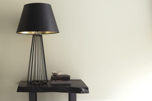
How to Use Decor White SW 7559 by Sherwin Williams In Your Home?
Decor White SW 7559 by Sherwin Williams is a lovely paint color that can make your home look fresh and inviting. This shade of white is warm, making it perfect for creating a cozy atmosphere in any room. You can use it in various parts of your house to brighten spaces and give them a clean, polished look. For example, painting your living room or bedroom walls with Decor White can help make the space feel larger and more open. It’s also great for kitchens and bathrooms, where you want a clean and airy vibe.
Since Decor White is neutral, it matches well with almost any other color. This means you can add furniture or décor in your favorite colors without worrying about them clashing with your walls. It’s also excellent for highlighting woodwork, molding, and trim in your home, making these features stand out beautifully.
Using Decor White in your home is a straightforward way to refresh your space, making it feel welcoming and comfortable for everyone.
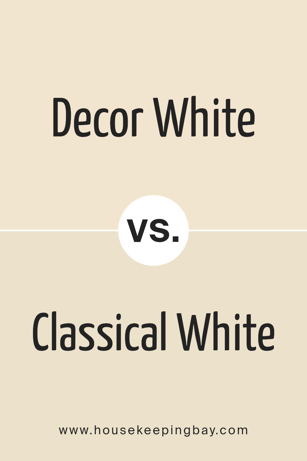
Decor White SW 7559 by Sherwin Williams vs Classical White SW 2829 by Sherwin Williams
Decor White SW 7559 by Sherwin Williams is a soft, welcoming shade that feels light and airy. It’s not too stark, making it a perfect choice for a cozy, bright look in rooms. On the other hand, Classical White SW 2829 leans towards a warmer, slightly richer tone. This color offers a hint of creaminess, making it ideal for spaces where you want a touch of warmth without losing the clean look of white.
While both colors are variations of white, Decor White is closer to a pure, simple white, giving a fresh and open feel. Classical White, with its subtle warmth, is excellent for creating a snug, inviting atmosphere. It’s especially good for rooms that could use a cozy lift.
Choosing between them depends on the vibe you’re going for. If you want a crisp, clean look, Decor White is your go-to. For a softer, more intimate ambiance, Classical White will do the trick. Both colors work beautifully in a variety of settings, adding their own unique touch to the space.
You can see recommended paint color below:
- SW 2829 Classical White
housekeepingbay.com
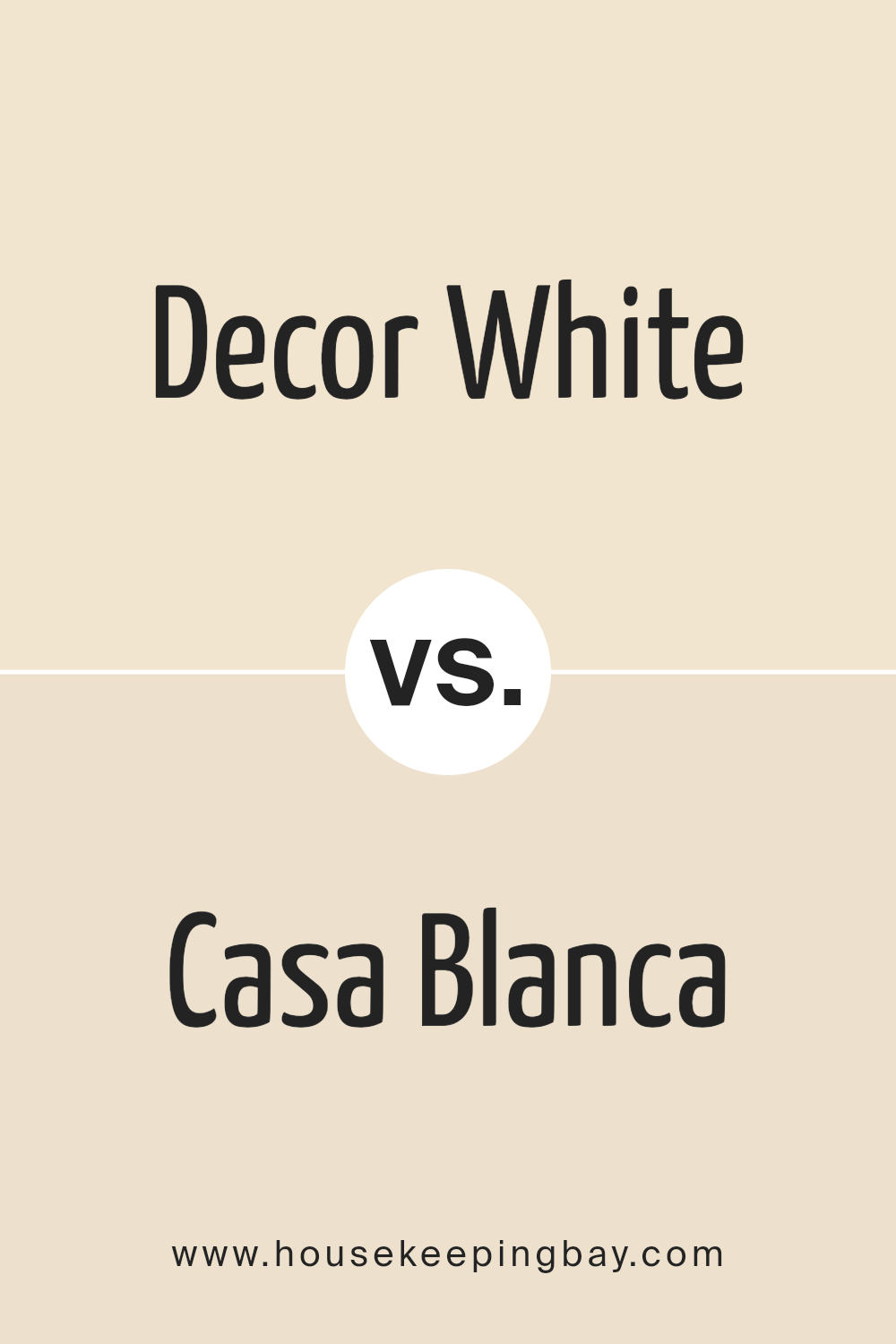
Decor White SW 7559 by Sherwin Williams vs Casa Blanca SW 7571 by Sherwin Williams
Decor White SW 7559 and Casa Blanca SW 7571 by Sherwin Williams are two beautiful shades that, while similar, have their subtle differences. Decor White leans more towards a pure, bright vibe, giving off a fresh and clean look. It’s the kind of white that really stands out, making spaces feel more open and airy.
On the other hand, Casa Blanca has a slightly warmer undertone. This makes it a cozy and welcoming color, perfect for creating a snug and inviting atmosphere in any room. While both colors are excellent choices for walls looking to brighten up a space, Decor White could be more suited for a modern, minimalist design because of its crispness.
Casa Blanca, with its warm hints, might be the better option for a homey, traditional look. Choosing between them depends on the mood you want to set and the theme of your room.
You can see recommended paint color below:
housekeepingbay.com
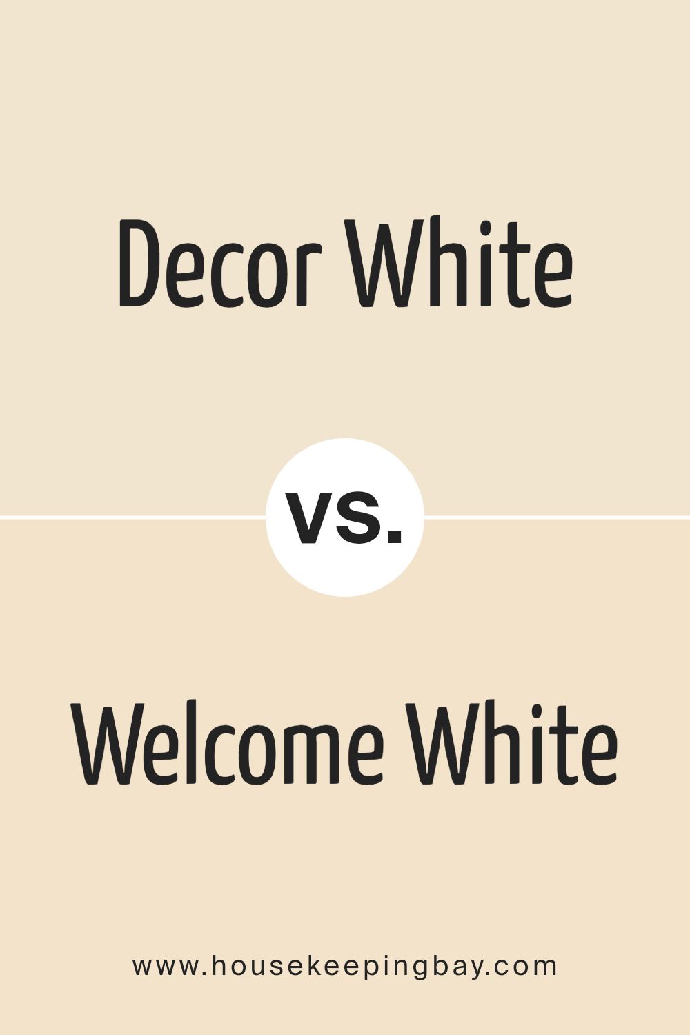
Decor White SW 7559 by Sherwin Williams vs Welcome White SW 6658 by Sherwin Williams
Decor White SW 7559 and Welcome White SW 6658 by Sherwin Williams are both white shades, but they have distinct vibes. Decor White has a warm undertone, making it feel cozy and inviting, perfect for a living room or bedroom where you want a soft, soothing atmosphere. It reflects light beautifully, brightening up spaces in a gentle way.
On the other hand, Welcome White leans more towards a crisp, clean look. It has a slightly cooler tone compared to Decor White, which makes it excellent for spaces where you want a fresh, airy feel, like kitchens and bathrooms. Welcome White can make small rooms appear bigger and brighter because of its reflective quality.
In a nutshell, if you’re going for a warm, cozy vibe, Decor White is your go-to. But if you prefer a cleaner, more refreshing look, Welcome White is the better choice. Both colors offer their unique charm, depending on the mood you want to create in your space.
You can see recommended paint color below:
- SW 6658 Welcome White
housekeepingbay.com
Decor White SW 7559 by Sherwin Williams vs Dollop Of Cream SW 7120 by Sherwin Williams
Decor White SW 7559 by Sherwin Williams and Dollop Of Cream SW 7120 from the same brand are both soft, warm hues, but they have some differences. Decor White is a clean, bright white that brings a fresh and airy feel to a room. It’s perfect for creating a sense of space and light.
On the other hand, Dollop Of Cream has a slightly richer, creamier tone. This color is warmer and has a more comforting vibe, adding a cozy touch to any space without feeling too heavy or overpowering. While Decor White is great for achieving a crisp, modern look, Dollop Of Cream offers a gentler, more inviting atmosphere. Both paint colors work well in a variety of settings, but your choice depends on the mood you want to create.
Decor White might be the go-to for a sleek, minimalist style, whereas Dollop Of Cream suits those looking for a soft, homey feel.
You can see recommended paint color below:
- SW 7120 Dollop Of Cream
housekeepingbay.com
Decor White SW 7559 by Sherwin Williams vs Morning Sun SW 6672 by Sherwin Williams
Decor White SW 7559 by Sherwin Williams is a soft, warm shade that can lighten up any room with its subtle presence. Its creamy tone makes it a great choice for creating a cozy and inviting atmosphere without being too stark or bright. This color works well in almost any space, providing a gentle backdrop that complements a wide range of decor styles and other colors.
On the other hand, Morning Sun SW 6672 is a cheerful, bright yellow that brings a splash of sunshine indoors. It’s a vibrant shade that can instantly make a room feel more lively and energetic. Because of its brightness, Morning Sun is perfect for spaces where you want to add a sense of joy and positivity. It pairs well with neutrals for a balanced look, but can also stand out as an accent color to draw attention.
Both Decor White and Morning Sun offer unique vibes – one being a calming, neutral base and the other, a lively pop of color. They can serve different purposes in home decorating, depending on the mood you want to create.
You can see recommended paint color below:
- SW 6672 Morning Sun
housekeepingbay.com
Decor White SW 7559 by Sherwin Williams vs Champagne SW 6644 by Sherwin Williams
Decor White SW 7559 and Champagne SW 6644, both by Sherwin Williams, are unique in their own ways. Decor White is a softer, more subtle shade. It’s kind of like a gentle white with a touch of warmth, making it perfect for creating a cozy and inviting atmosphere without being too stark or cold. It works really well in spaces where you want a clean look but with a bit more character than a pure white.
On the other hand, Champagne SW 6644 has a slightly golden tone, reminiscent of the bubbly drink it’s named after. It’s not just a simple off-white or beige; it’s got this cheerful warmth to it that can really brighten up a room. It’s great for areas where you want to add a bit of life and sophistication without going too bold or over the top.
Both colors offer an elegant, understated look, but the main difference lies in their undertones and the mood they set. Decor White leans towards a pure, calm vibe, while Champagne brings a bit of sparkle and warmth.
You can see recommended paint color below:
- SW 6644 Champagne
housekeepingbay.com
Decor White SW 7559 by Sherwin Williams vs Summer White SW 7557 by Sherwin Williams
Decor White SW 7559 and Summer White SW 7557 by Sherwin Williams are two colors that offer subtle yet distinct vibes to any space. Decor White is a soft, welcoming shade of white that brings a fresh and clean feel to rooms. It has a hint of warmth that makes it versatile for various decor styles, providing a bright and airy atmosphere.
Summer White, on the other hand, leans a bit more towards a warm, creamy tone. This color adds a cozy and comforting element to spaces, suggesting a gentle touch of sunlight. It’s perfect for creating a relaxed, summery feel indoors, regardless of the season.
Both colors are great choices for those looking to refresh their walls with a light palette. However, Decor White offers a slightly crisper look suitable for modern and minimalist designs, while Summer White brings warmth and a more inviting feel, ideal for traditional or rustic styles.
You can see recommended paint color below:
housekeepingbay.com
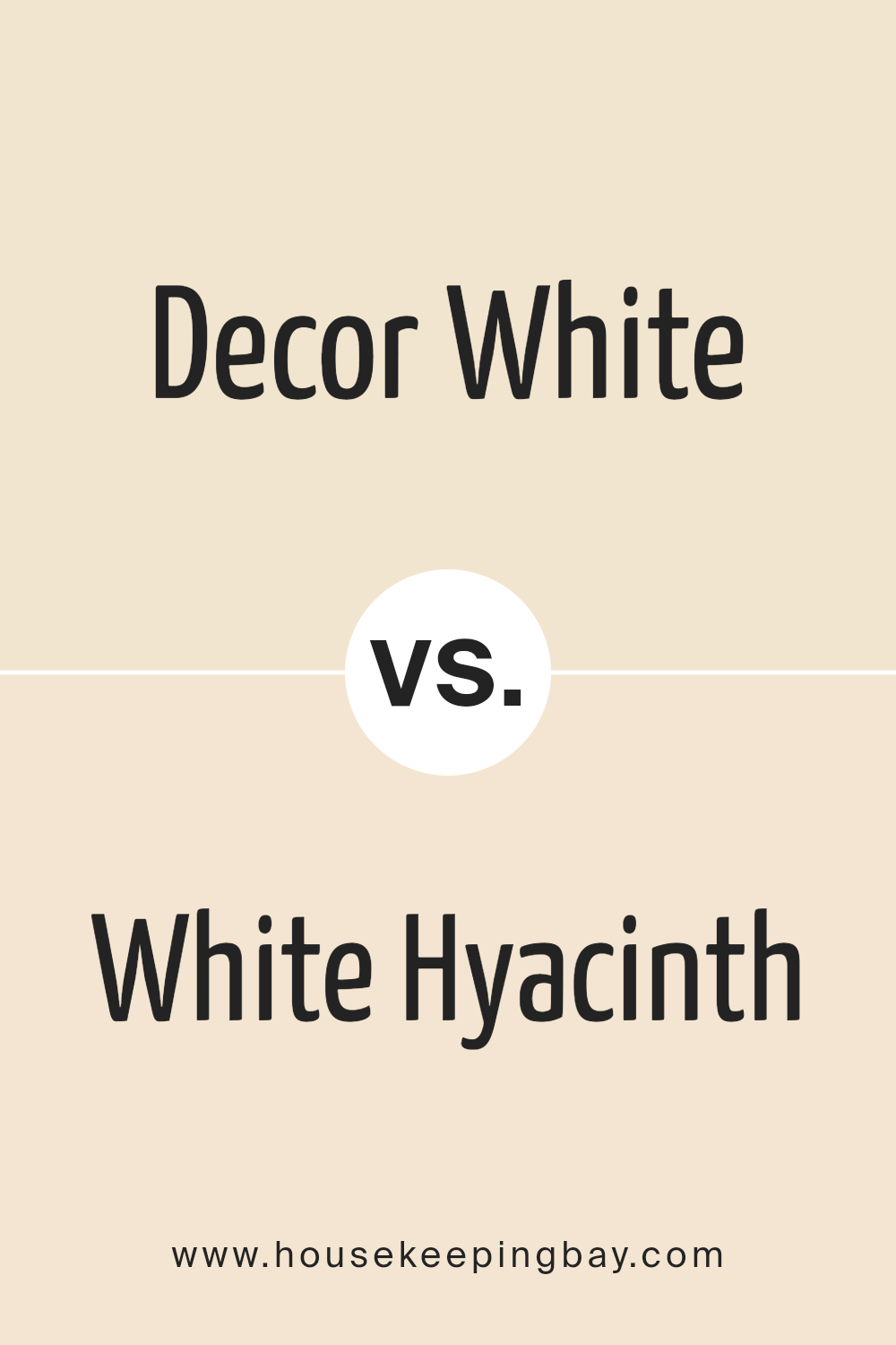
Decor White SW 7559 by Sherwin Williams vs White Hyacinth SW 0046 by Sherwin Williams
Decor White SW 7559 by Sherwin Williams is a cozy and warm shade of white that brings a soft and inviting feel to any room. It’s like the gentle glow of morning light, making spaces feel comfortable and welcoming. This color works well in living rooms and bedrooms where you want a calm and relaxing atmosphere. It has a creamy undertone that adds depth without overwhelming the space with too much color.
On the other hand, White Hyacinth SW 0046 by Sherwin Williams is a cleaner, brighter white. It has a crispness to it that feels like freshly washed linen drying in the sun. This shade is perfect for kitchens, bathrooms, or any area where you want a clean and refreshing look. It reflects light beautifully, making spaces appear larger and more open.
Both colors offer their unique charm. Decor White leans towards warmth and coziness, while White Hyacinth offers clarity and a sense of freshness. Depending on your space and the feel you’re going for, either of these whites could be the perfect choice.
You can see recommended paint color below:
housekeepingbay.com
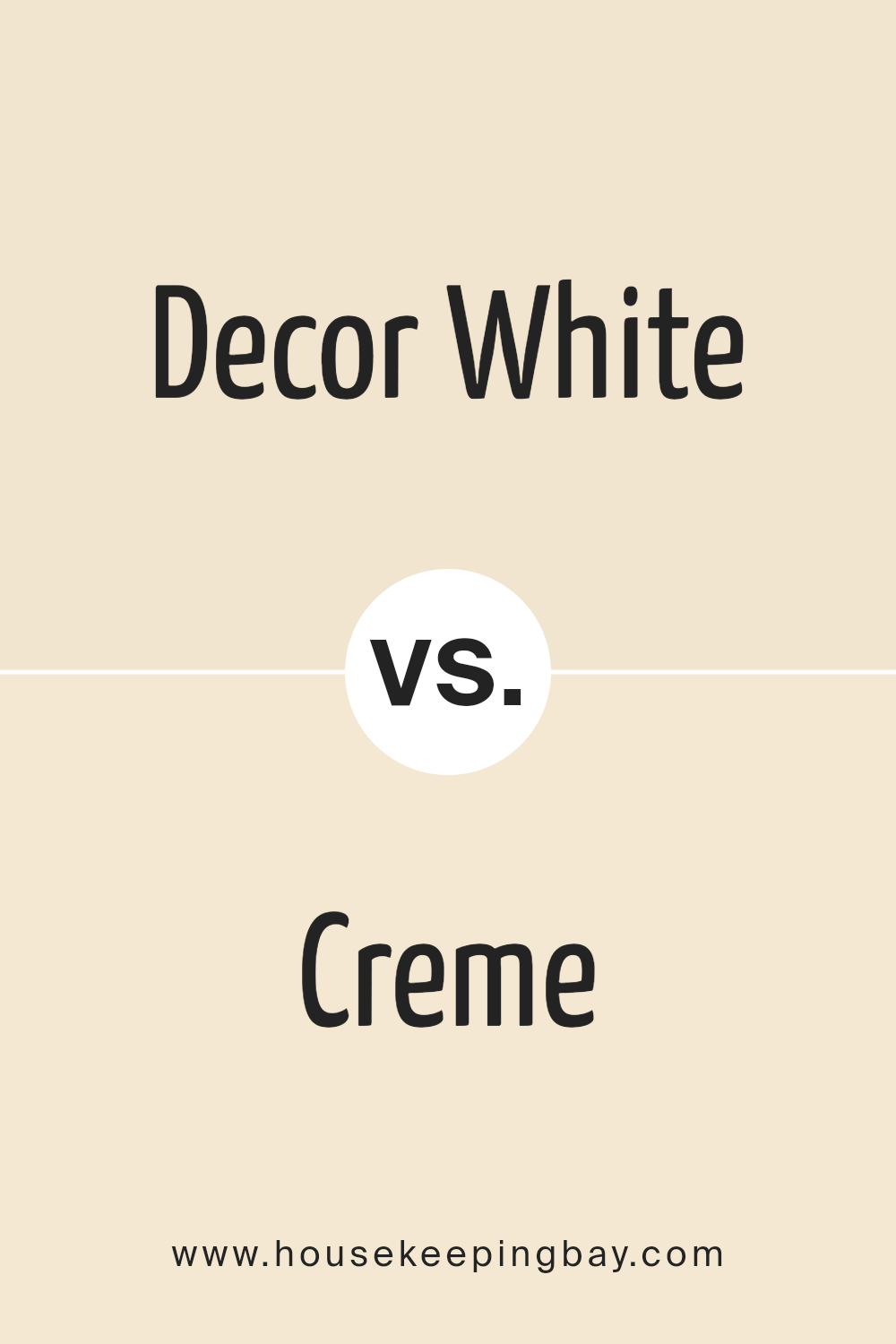
Decor White SW 7559 by Sherwin Williams vs Creme SW 7556 by Sherwin Williams
Decor White SW 7559 by Sherwin Williams and Creme SW 7556 by Sherwin Williams are two colors that offer their unique charm to any space. Decor White is a soft, welcoming white with a hint of warmth that keeps it from feeling cold or sterile. It’s like a gentle hug for your walls, providing a light, airy feel to any room. This color works well in spaces where you want a fresh, clean look without the starkness of a pure white.
On the other hand, Creme SW 7556 is a creamy, slightly richer hue that adds a bit of depth and coziness. It’s like the warmth of a well-loved, sunlit room, giving off a comforting vibe that’s inviting and homelike. Creme is perfect for areas where you desire a bit more warmth and character without overwhelming the space.
Both colors share a subtle elegance, yet the primary difference lies in their undertones and depth. Decor White leans towards a minimalistic approach, brightening spaces with its soft radiance, while Creme offers a cozy warmth, making it ideal for creating inviting, cozy environments. Choosing between them depends on the mood you wish to create: refreshing and airy with Decor White or snug and welcoming with Creme.
You can see recommended paint color below:
housekeepingbay.com
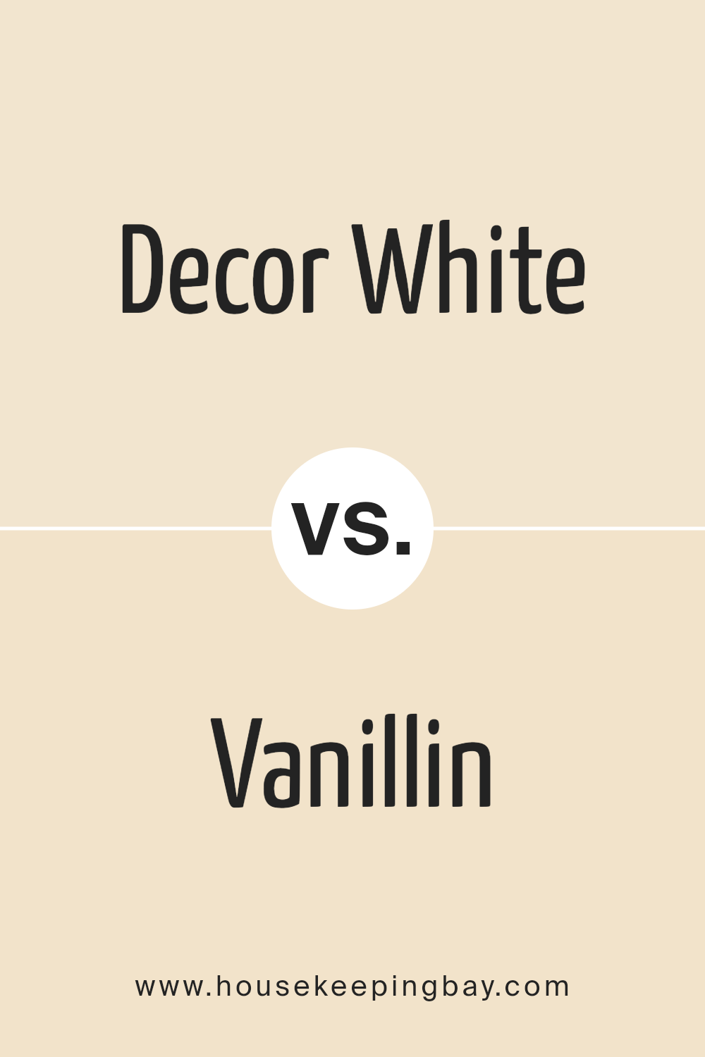
Decor White SW 7559 by Sherwin Williams vs Vanillin SW 6371 by Sherwin Williams
Decor White SW 7559 by Sherwin Williams is a welcoming, warm shade of white that brings a soft, inviting atmosphere to any space. It has a slight creamy tone that makes it less stark compared to pure white, creating a cozy and comfortable feeling in rooms. This color works well in almost any area of a home, providing a clean and fresh backdrop that complements various decor styles and colors.
On the other hand, Vanillin SW 6371 is a gentle, soothing shade of off-white with a hint of yellow undertone. This color adds a subtle warmth to spaces, making them feel more open and airy. Unlike the cooler and more neutral vibe of Decor White, Vanillin leans towards a warmer spectrum, offering a hint of cheerfulness and sunshine to interiors.
It’s great for spaces where you want to insert a touch of warmth without overwhelming the room with strong colors.
Both colors, Decor White and Vanillin, share a soft and subtle beauty but exist on slightly different spots within the white and off-white spectrum. Decor White leans toward a neutral, clean white, while Vanillin offers warmth with its yellow undertones.
You can see recommended paint color below:
- SW 6371 Vanillin
housekeepingbay.com
Conclusion
Decor White SW 7559 by Sherwin Williams stands out as a versatile and timeless choice for anyone looking to refresh their space with a clean and inviting atmosphere. This color exudes a sense of warmth and simplicity, making it an ideal backdrop for various decor styles, from modern minimalist to cozy farmhouse.
Its ability to blend seamlessly with other colors and materials allows for endless creative possibilities, ensuring that your space not only looks beautiful but also feels welcoming and comfortable.
Choosing Decor White SW 7559 is a smart decision for those seeking to enhance their home’s aesthetic appeal without overwhelming it with bold colors. Its subtle elegance invites light into the room, creating a brighter and more spacious feel. Whether you’re updating a single room or undertaking a full home makeover, Decor White SW 7559 provides a solid foundation that can transform your living environment into a serene and stylish sanctuary.
housekeepingbay.com
Ever wished paint sampling was as easy as sticking a sticker? Guess what? Now it is! Discover Samplize's unique Peel & Stick samples. Get started now and say goodbye to the old messy way!
Get paint samples