Vintage Taupe 2110-70 Paint Color by Benjamin Moore
The Delicate Hue of Modern Homes
In the dynamic world of interior design, colors play an essential role in crafting the ambience and feel of a space. Among the myriad of shades available, Vintage Taupe 2110-70 by Benjamin Moore stands out as a versatile and stylish choice for many homeowners.
Let’s delve into this shade’s essence and understand why it’s garnered admiration.
via benjamin moore
What Color Is Vintage Taupe 2110-70?
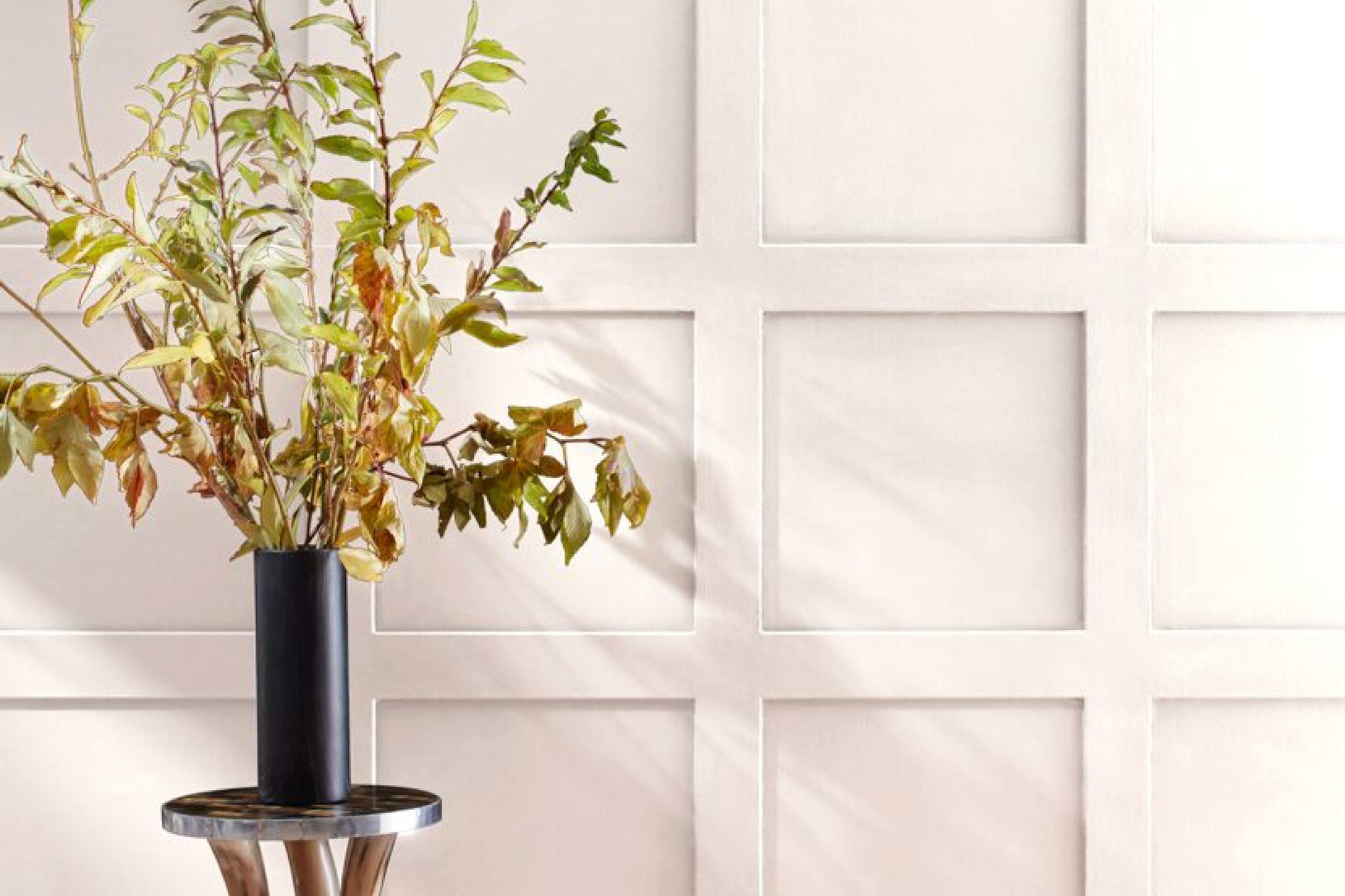
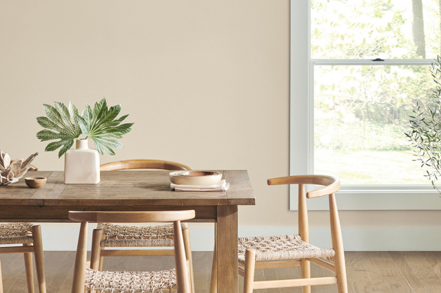
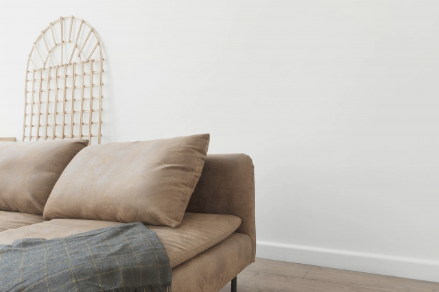
Vintage Taupe 2110-70 is a muted, sophisticated blend of grey and beige, often referred to as “greige”. The hue exudes a neutral tone, making it perfect for interiors that strive for a calm, cohesive feel. It’s ideally suited for minimalist, Scandinavian, and even bohemian design themes.
This color pairs exceptionally well with natural materials like wood, stone, and linen, accentuating their innate textures and characteristics.
housekeepingbay.com
Table of Contents
Is It a Warm Or Cool Color?
Vintage Taupe 2110-70 leans towards the warmer spectrum of colors. Its beige undertones give it a cozy feel, making spaces feel welcoming and intimate. Its warm nature allows it to serve as a backdrop in homes, making rooms feel more spacious and seamlessly blending with a variety of design elements.
Undertones of Vintage Taupe 2110-70
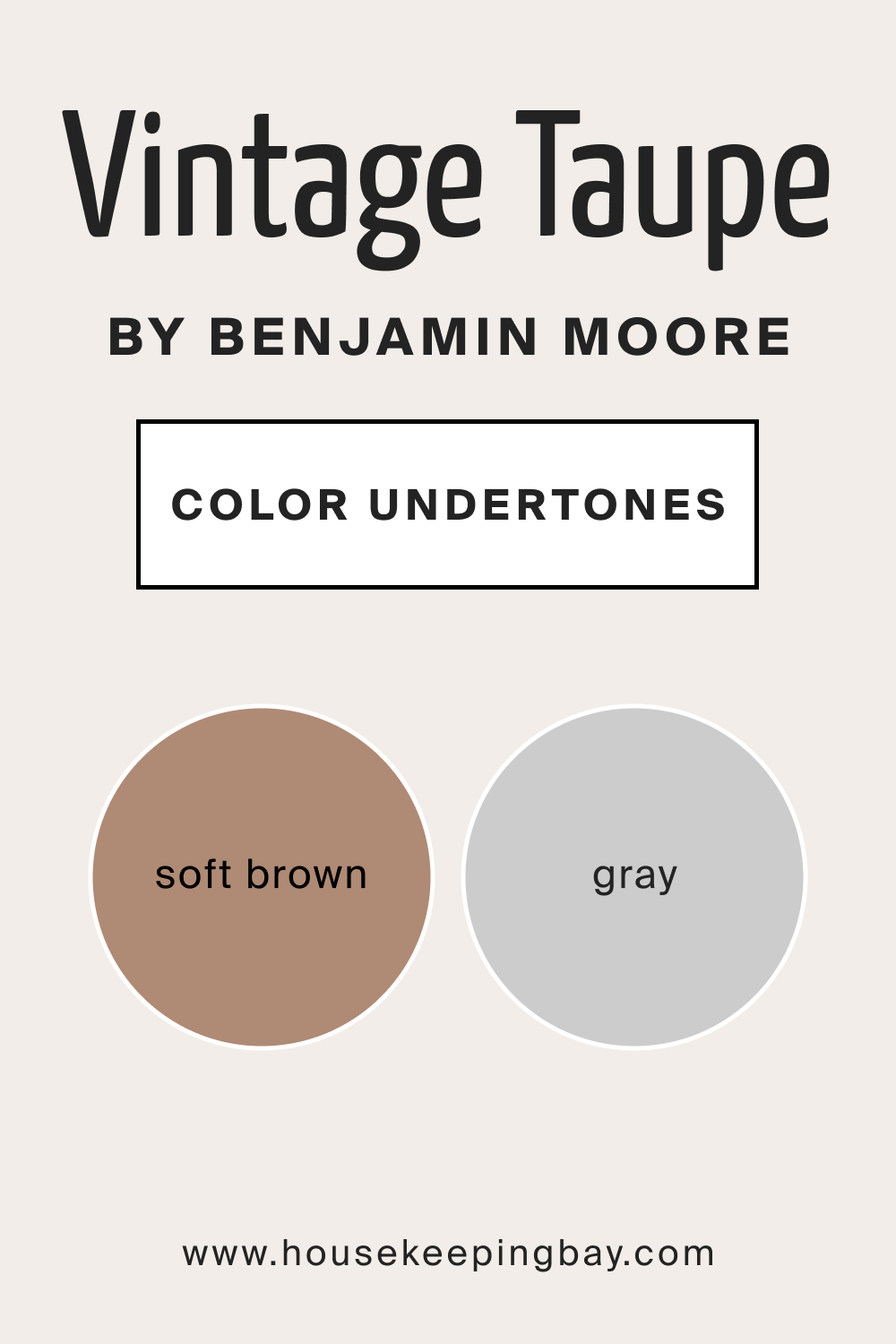
This color features subtle undertones of soft brown and grey. Undertones play a crucial role in dictating how a color interacts with other shades and lighting. The undertones in Vintage Taupe ensure that it remains neutral without becoming too cold or overly warm, granting it flexibility in diverse interior settings.
housekeepingbay.com
Coordinating Colors of Vintage Taupe 2110-70
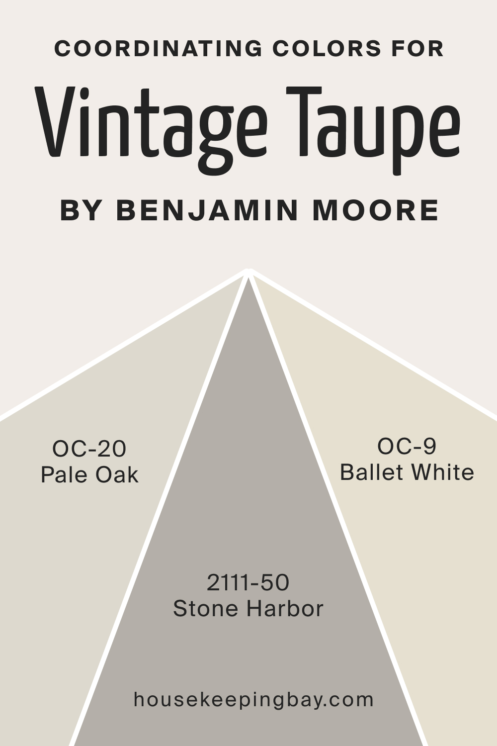
Coordinating colors are hues that harmonize and complement the primary color. For Vintage Taupe 2110-70, the following Benjamin Moore colors synchronize beautifully:
- BM Stone Harbor (2111-50) : A gentle grey that brings out a sophisticated contrast.
- BM Pale Oak (OC-20) : A light neutral tan, emphasizing the beige tones in Vintage Taupe.
- BM Ballet White (OC-9) : A creamy off-white, offering a soft juxtaposition.
housekeepingbay.com
How Does Lighting Affect Vintage Taupe 2110-70?
Lighting significantly impacts the way colors are perceived. BM Vintage Taupe, under artificial lighting, may seem slightly more beige, highlighting its warmer tones. In natural daylight, its grey undertones become more pronounced.
In north-facing rooms, where light is cooler, BM Vintage Taupe may appear more muted and subdued. Conversely, in south-faced rooms, it can feel warmer and more inviting.
East and west-facing rooms bring variable lighting throughout the day, with Vintage Taupe reflecting both its grey and beige characteristics.
housekeepingbay.com
LRV of Vintage Taupe 2110-70
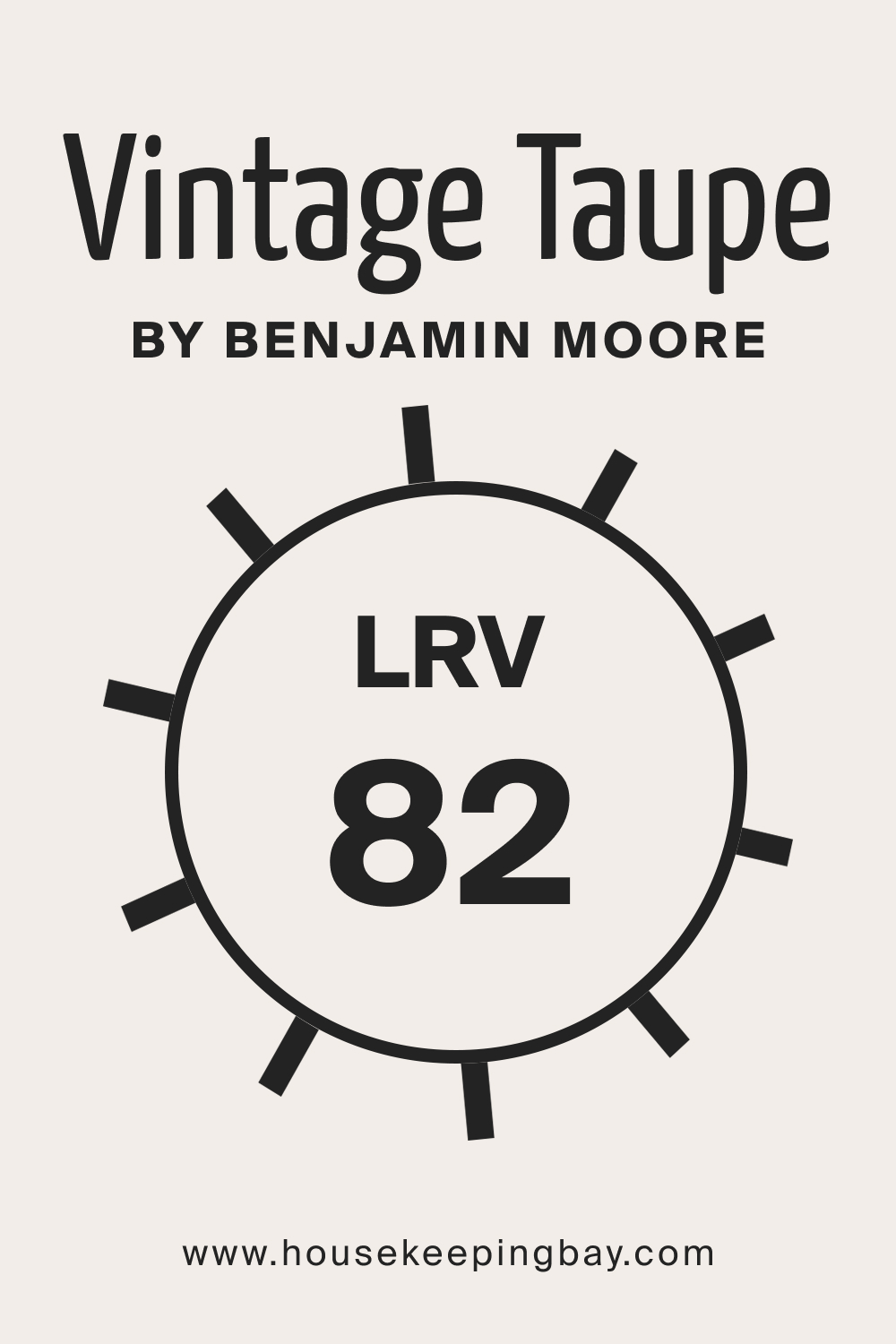
LRV, or Light Reflectance Value, indicates the amount of light a color reflects. With an LRV of 82, Vintage Taupe is on the higher end, meaning it reflects a significant amount of light. High LRV shades make rooms feel brighter and more open. Vintage Taupe 2110-70, with its considerable LRV, ensures that spaces remain light and airy.
housekeepingbay.com
What is LRV? Read It Before You Choose Your Ideal Paint Color
Trim Colors of Vintage Taupe 2110-70
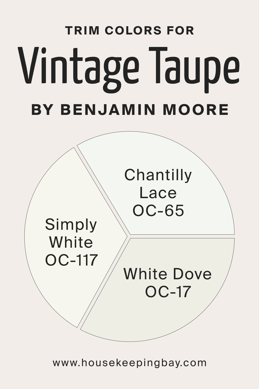
Trim colors highlight architectural details and create visual interest. Given BM Vintage Taupe’s neutrality, white shades are a stellar choice for trim. Consider using:
- BM White Dove (OC-17) : A soft white with a hint of warmth.
- BM Simply White (OC-117) : A clean, bright white.
- BM Chantilly Lace (OC-65) : A pure white, adding crispness to the room’s trim.
housekeepingbay.com
Colors Similar to Vintage Taupe 2110-70
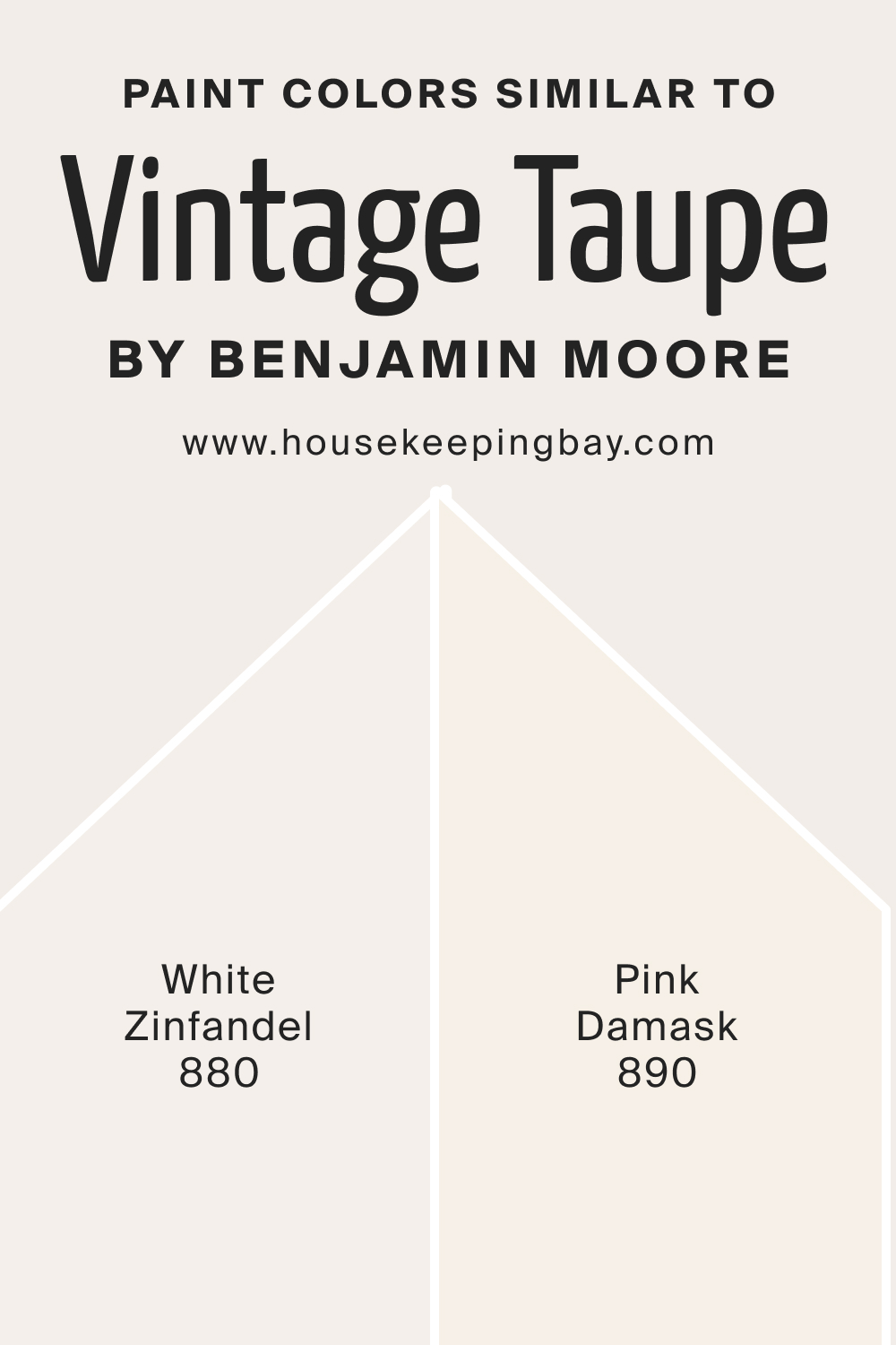
Knowing analogous colors aids in creating cohesive design schemes. Some similar colors for BM Vintage Taupe include:
- BM White Zinfandel 880 : A soft, muted rose that resonates warmth.
- BM Pink Damask 890 : A delicate blush pink that’s understated yet charming.
Both will work well as the initial color substitutes.
housekeepingbay.com
Colors That Go With Vintage Taupe 2110-70
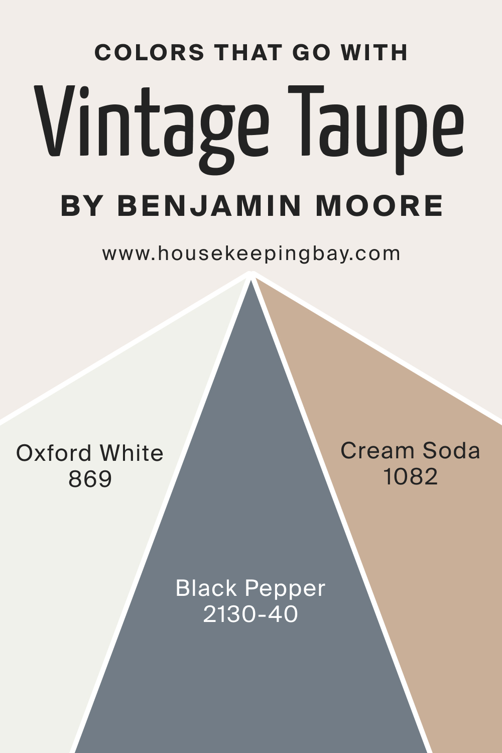
Pairing harmonious shades can turn a space into a design masterpiece. Along with BM Vintage Taupe, consider the following:
- BM Oxford White 869 : A pure, timeless white.
- BM Black Pepper 2130-40 : A rich, deep gray with cool undertones.
- BM Cream Soda 1082 : A warm, creamy beige that adds depth and dimension.
Incorporating colors that beautifully coalesce ensures a cohesive, stylish, and inviting ambiance. With Vintage Taupe 2110-70 at its core, your interior is poised for elegance and charm.
housekeepingbay.com
How to Use Vintage Taupe 2110-70 In Your Home?
Vintage Taupe 2110-70, with its warm and neutral undertones, is versatile for almost any room in the home. From living rooms to bathrooms, it provides a calming backdrop.
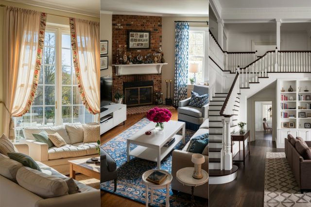
Given its chameleon-like ability to blend with various design elements, it’s ideal for modern, minimalist, Scandinavian, and even traditional interiors. Whether you’re aiming for a contemporary aesthetic or a classic feel, this shade promises flexibility and elegance.
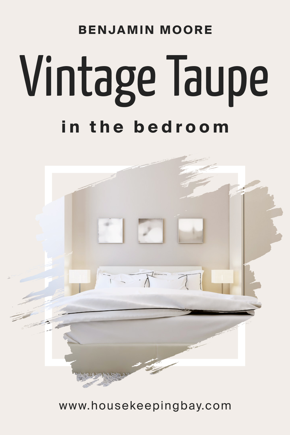
How to Use Vintage Taupe 2110-70 in the Bedroom?
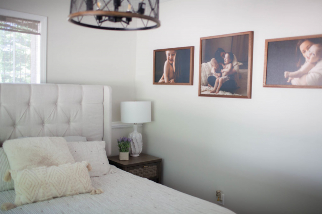
In bedrooms, Vintage Taupe 2110-70 offers a serene and inviting atmosphere. Its soothing tones make it perfect for walls, accentuating the coziness of the room. Pair it with soft linens, light wood furniture, and subtle lighting to cultivate a tranquil retreat.
housekeepingbay.com
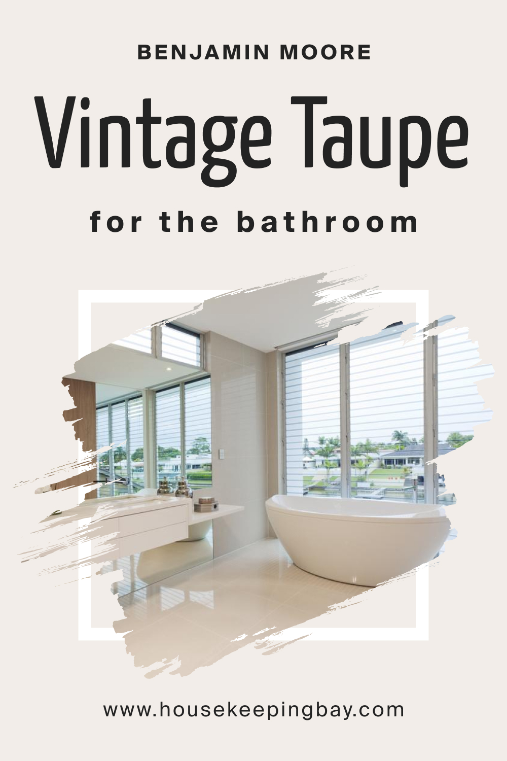
How to Use Vintage Taupe 2110-70 in the Bathroom?
Bathrooms can feel spa-like with Vintage Taupe. The color adds depth without overwhelming the space. Complement it with marble countertops, brushed nickel fixtures, and white towels for an elegant sanctuary.
housekeepingbay.com
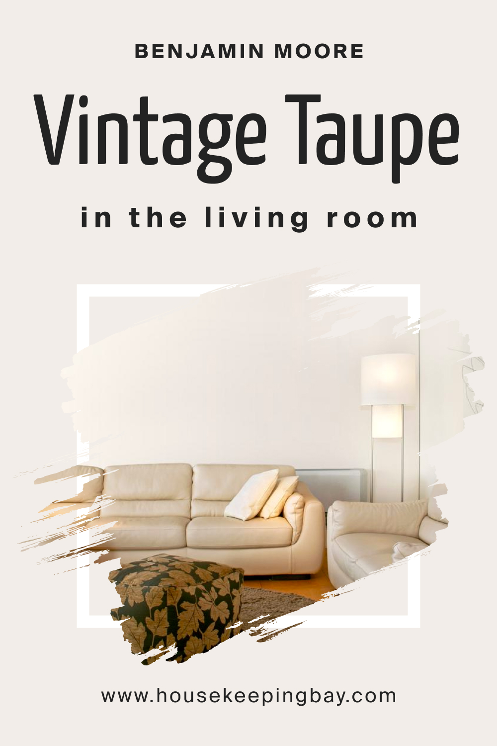
How to Use Vintage Taupe 2110-70 in the Living Room?
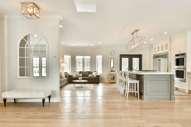
For living rooms, Vintage Taupe offers a sophisticated canvas. It bridges the gap between modernity and tradition, fitting with sleek furniture as well as vintage pieces. The shade aids in highlighting decor, art, and architectural features.
housekeepingbay.com
How to Use Vintage Taupe 2110-70 for an Exterior?
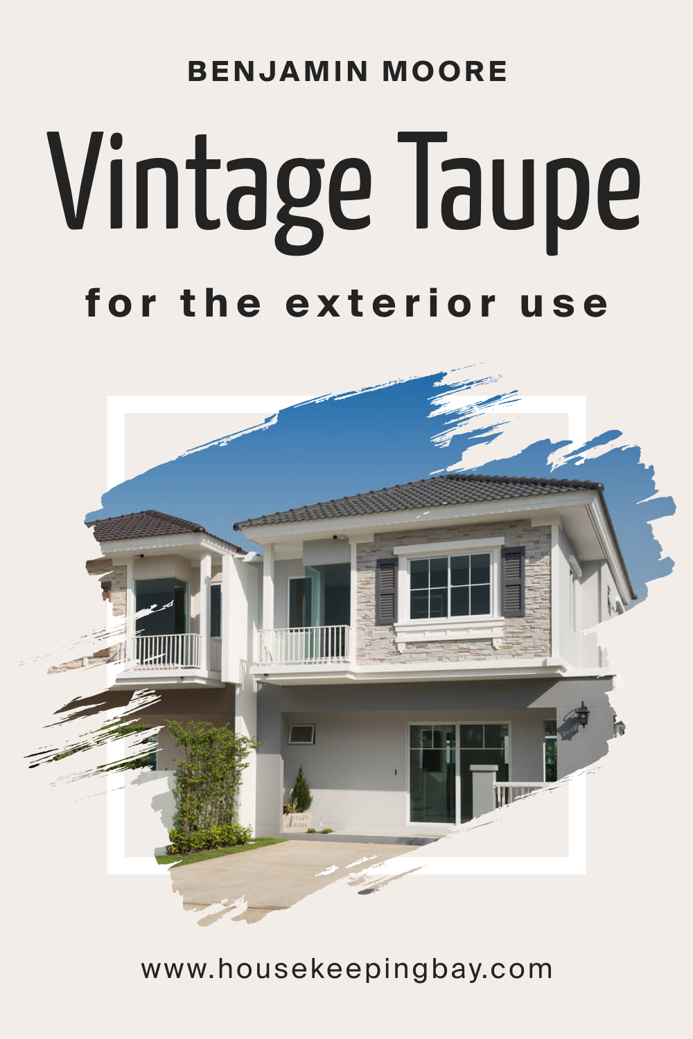
Vintage Taupe as an exterior color emanates a chic and timeless appeal. It’s neutral enough to blend with natural surroundings yet distinct enough to make a home stand out. Pair it with white trims and dark-toned doors for a balanced look.
housekeepingbay.com
How to Use Vintage Taupe 2110-70 in the Kitchen?
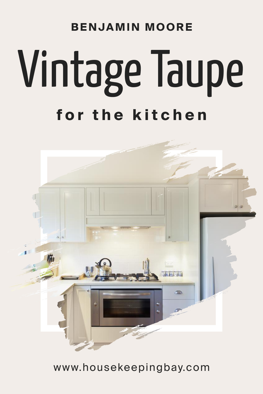
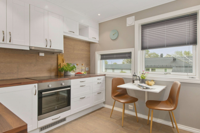
In kitchens, Vintage Taupe provides warmth and modernity. The color’s neutral palette allows for colorful kitchenware to shine, making the space lively yet harmonious.
housekeepingbay.com
Comparing Vintage Taupe 2110-70 With Other Colors
Understanding how colors compare ensures that the chosen hue fits your design vision. Comparing Vintage Taupe 2110-70 with other colors provides insight into its undertones, versatility, and unique characteristics.
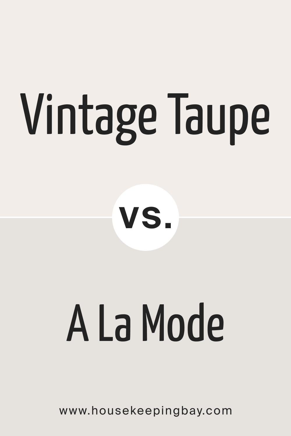
Vintage Taupe 2110-70 vs. BM A La Mode 2109-70
BM A La Mode leans more towards a light gray with subtle cool undertones, whereas Vintage Taupe has a warm, beige hint.
housekeepingbay.com
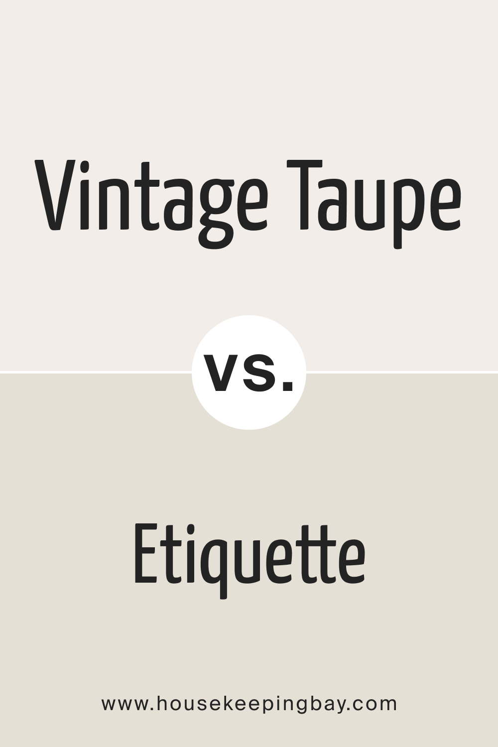
Vintage Taupe 2110-70 vs. AF-50 Etiquette
BM Etiquette is a cooler gray, offering a more crisp feel compared to the cozy warmth of Vintage Taupe.
housekeepingbay.com
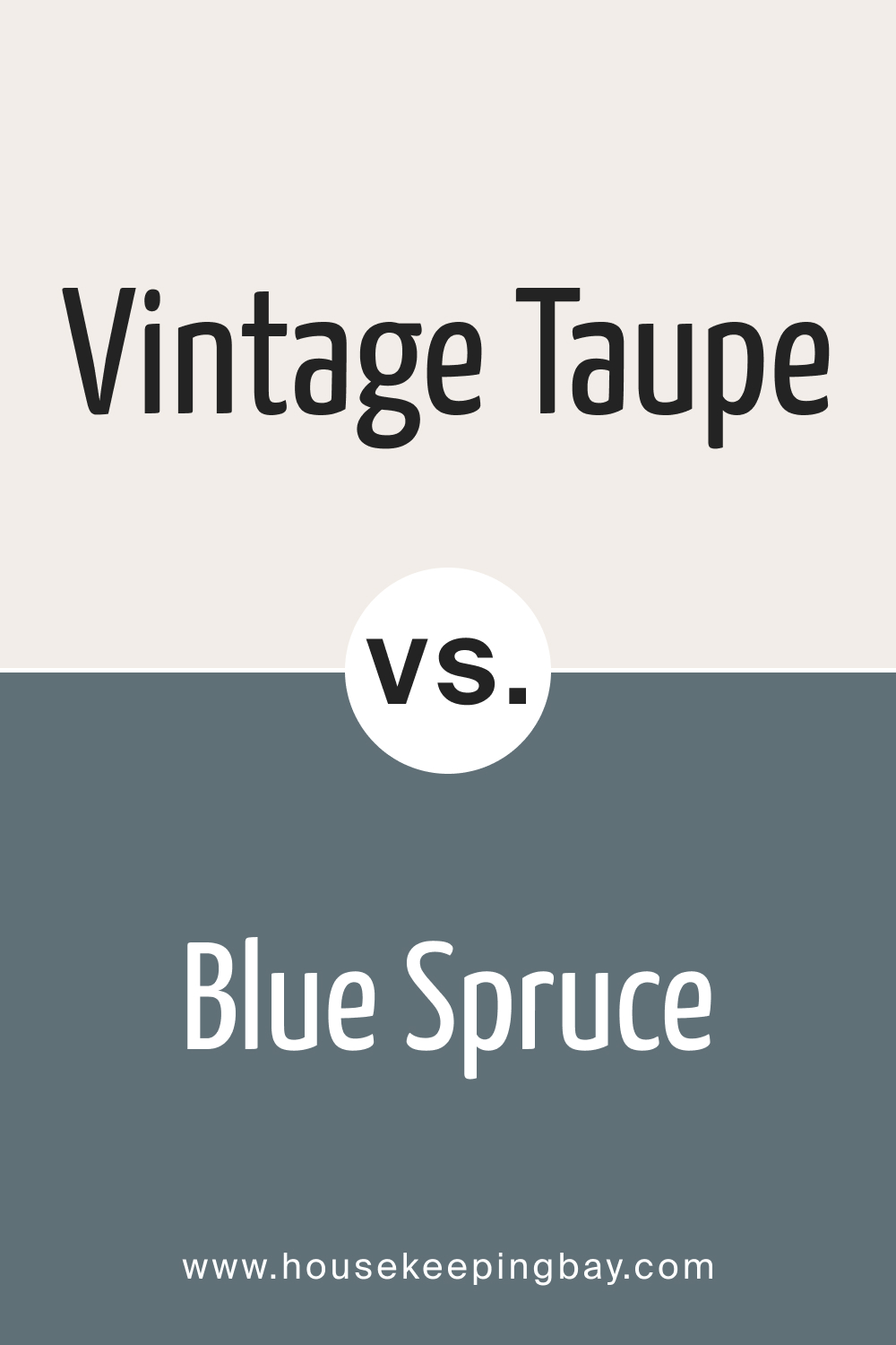
Vintage Taupe 2110-70 vs. BM 1637 Blue Spruce
BM Blue Spruce introduces a soft bluish tint, contrasting with Vintage Taupe’s neutral beige-gray blend.
housekeepingbay.com
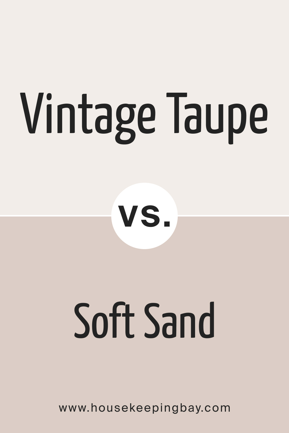
Vintage Taupe 2110-70 vs. BM Soft Sand 2106-60
BM Soft Sand is a gentle beige with yellow undertones, making it warmer than Vintage Taupe.
housekeepingbay.com
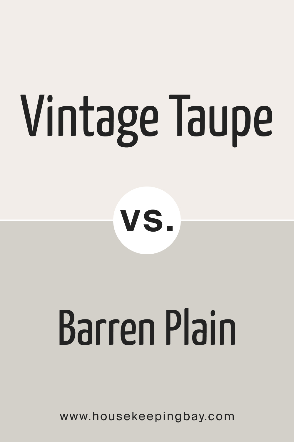
Vintage Taupe 2110-70 vs. BM Barren Plain 2111-60
BM Barren Plain , while still in the neutral family, has cooler undertones, providing a more muted backdrop than Vintage Taupe.
housekeepingbay.com
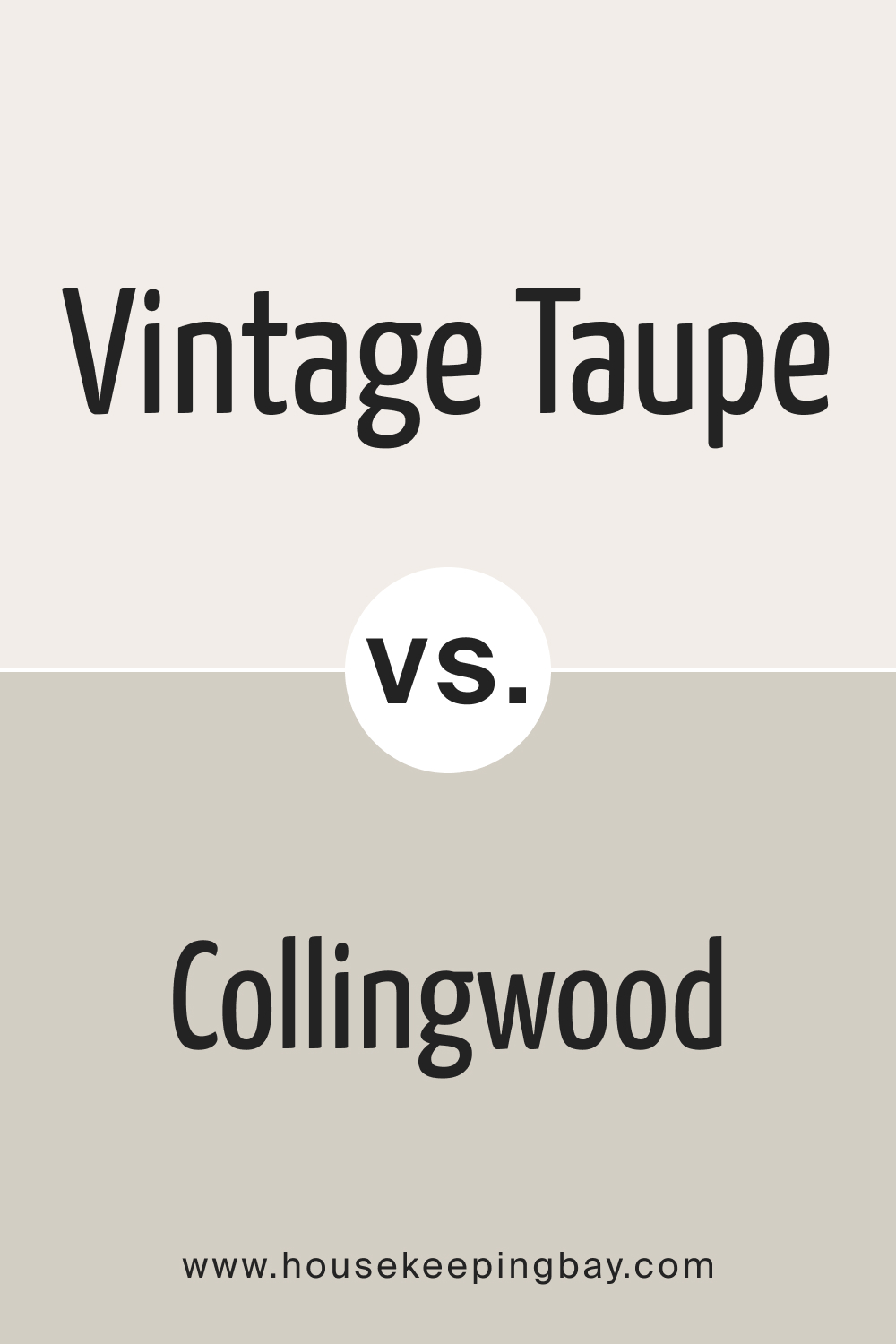
Vintage Taupe 2110-70 vs. BM Collingwood 859
BM Collingwood is a soft gray with lavender undertones, offering a different depth compared to Vintage Taupe’s earthy essence.
housekeepingbay.com
Conclusion
Vintage Taupe 2110-70, with its unique blend of gray and beige, stands out as a versatile color for various applications, both interior and exterior. When choosing the right shade for your space, understanding its undertones, comparisons, and optimal use cases is crucial.
Vintage Taupe proves time and again its adaptability and timeless charm, making it a favorite among homeowners and designers alike.
housekeepingbay.com
Ever wished paint sampling was as easy as sticking a sticker? Guess what? Now it is! Discover Samplize's unique Peel & Stick samples. Get started now and say goodbye to the old messy way!
Get paint samples



Frequently Asked Questions
⭐What kind of undertones does Vintage Taupe 2110-70 have?
Vintage Taupe 2110-70 boasts a delicate balance of soft brown and gray undertones, offering a sophisticated neutral "greige" shade.
⭐Is Vintage Taupe 2110-70 a warm or cool shade?
While Vintage Taupe 2110-70 sits on the neutral spectrum, it leans slightly towards the warmer side due to its beige undertones.
⭐In what rooms does Vintage Taupe 2110-70 work best?
Vintage Taupe 2110-70 is versatile and works beautifully in bedrooms, living rooms, bathrooms, and even on kitchen cabinets. Its neutral tone makes it adaptable to various spaces.
⭐How does lighting affect the appearance of Vintage Taupe 2110-70?
Lighting can influence how this color is perceived. In artificial lighting, it may seem more beige, while natural daylight can bring out its gray undertones.
⭐What are the coordinating colors for Vintage Taupe 2110-70 from the Benjamin Moore palette?
Coordinating shades include BM Stone Harbor, BM Pale Oak, and BM Ballet White, among others.
16 thoughts on “Vintage Taupe 2110-70 Paint Color by Benjamin Moore”
Leave a Reply


Can I use this color in the bathroom, considering the moisture and humidity?
How does Vintage Taupe 2110-70 look when paired with wooden furniture?
Vintage Taupe 2110-70 complements natural materials like wood beautifully. The color accentuates the grain and richness of wooden furniture, enhancing the overall ambiance.
Is Vintage Taupe 2110-70 suitable for a minimalist interior design?
Absolutely! Vintage Taupe’s neutral undertones make it a fantastic choice for minimalist designs. It provides a serene backdrop without overpowering the space.
I have a north-facing living room. Will Vintage Taupe 2110-70 work in that lighting condition?
In north-facing rooms with cooler light, Vintage Taupe 2110-70 may appear slightly more muted. However, its inherent warmth will still bring a cozy ambiance to your living room.
What trim colors would best complement Vintage Taupe 2110-70?
White trim colors, especially shades like BM White Dove, BM Simply White, and BM Chantilly Lace, work brilliantly with Vintage Taupe to create a crisp and elegant contrast.
The durability of the color largely depends on the paint finish you choose. For areas with high traffic or potential wear, consider a satin or semi-gloss finish which is easier to clean and more resistant to scuffs.
Is this color child-friendly, considering wear and tear?
The durability of the color largely depends on the paint finish you choose. For areas with high traffic or potential wear, consider a satin or semi-gloss finish which is easier to clean and more resistant to scuffs.
Can I use Vintage Taupe 2110-70 for exterior surfaces?
Absolutely! Vintage Taupe 2110-70 is not only restricted to interiors. Its timeless appeal and neutral shade make it suitable for exteriors, especially when paired with contrasting trim colors.
How does Vintage Taupe 2110-70 compare to other popular greiges in the market?
Vintage Taupe 2110-70 stands out due to its unique balance of gray and beige, offering a warm yet neutral appearance. While there are other greiges available, Vintage Taupe’s adaptability and elegance give it a distinctive edge.