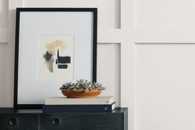
Porcelain SW 0053 by Sherwin Williams
Embracing the Elegance of Timeless Neutrals
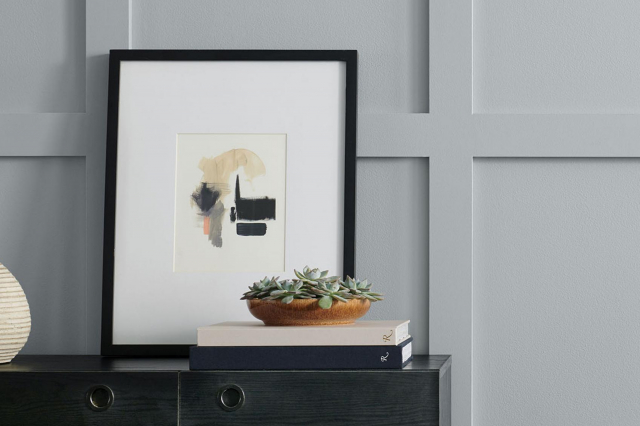
Introducing SW 0053 Porcelain by Sherwin Williams, a paint that truly brings a fresh and airy feel to any space. This particular shade of white is more than just a simple color; it’s a doorway to a brighter, more inviting home environment.
Imagine walking into a room and feeling an immediate sense of calm and clarity. That’s the power of SW 0053 Porcelain. It has a unique ability to reflect light in a way that makes spaces feel larger and more open, a perfect choice for anyone looking to refresh their home’s look.
What makes SW 0053 Porcelain stand out from other whites is its subtle warmth. Unlike cooler whites, which can sometimes feel stark or sterile, Porcelain offers a soft welcome, making it ideal for creating a cozy atmosphere in living areas, bedrooms, and even bathrooms.
Moreover, its versatility is unmatched; it can complement a wide range of decor styles, from modern to rustic, and everything in between.
Whether you’re considering a complete home renovation or simply want to update a single room, SW 0053 Porcelain is a fantastic choice. Its timeless elegance ensures it will remain a cherished color for years to come, making your investment worthwhile.
So, if you’re looking to infuse your space with a breath of fresh air, consider this beautiful shade. It promises to transform your home into a serene and inviting sanctuary.
via sherwin-williams.com
What Color Is Porcelain SW 0053 by Sherwin Williams?
Porcelain SW 0053 by Sherwin Williams is a light, almost ethereal shade that whispers tranquility and elegance into any space. Picture the softest hue of white with just a hint of warmth, like early morning light bathing a room in a gentle glow.
It’s subtle, serene, and incredibly versatile, which makes it perfect for creating a calm and welcoming atmosphere.
This color shines in a variety of interior styles, from minimalist designs that focus on simplicity and functionality to more classic and traditional spaces that play with texture and form.
It’s particularly effective in Scandinavian-inspired interiors, where its lightness can enhance the clean lines and natural materials characteristic of this style.
Porcelain can also bring a fresh and airy feel to coastal or beachy vibes, creating a sense of openness like a gentle sea breeze flowing through the home.
When it comes to pairing materials and textures, Porcelain is a dream. It complements natural wood tones beautifully, from pale ash to richer oaks, making spaces feel grounded yet lifted. Metals like brushed nickel or polished chrome add a modern twist, reflecting light and adding dimension.
In terms of fabrics, think cotton, linen, or even soft wool in light colors to maintain that sense of calm and coziness. Together, these elements create a harmonious space that feels both elegant and inviting.
housekeepingbay.com
Table of Contents
Is Porcelain SW 0053 by Sherwin Williams Warm or Cool color?
PorcelainSW 0053 by Sherwin Williams is a color that truly transforms a home. At its heart, it’s a soft, warm white with just a hint of creaminess, making it not too stark or cold. This balance is perfect for creating a welcoming atmosphere in any room.
Since it’s a neutral shade, it matches well with almost any color scheme or home style, from modern to rustic. You can use it on walls for a clean, elegant look, or on trim and cabinets for a subtle contrast with darker colors.
This color also has a way of making spaces feel more open and airy, which is great for smaller rooms or any area that needs a bit of a lift. Additionally, it does a fantastic job of reflecting natural light, brightening up the space even more.
Overall, PorcelainSW 0053 is an excellent choice for homeowners looking for a versatile and warm white that creates a cozy and inviting atmosphere in their home.
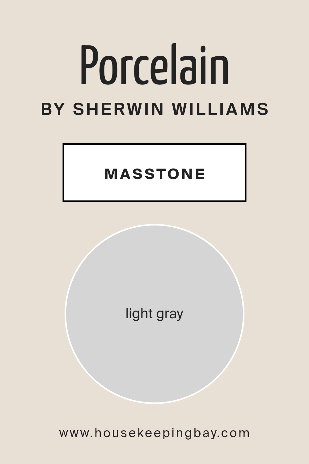
What is the Masstone of the Porcelain SW 0053 by Sherwin Williams?
PorcelainSW 0053 by Sherwin Williams is a color with a masstone of light gray, seen as #D5D5D5. This shade of gray is soft and subtle, making it a perfect choice for homes. The beauty of this light gray lies in its versatility. It can match easily with a wide range of colors, from bright and bold to soft and serene.
This means you can use it in almost any room, regardless of its style or the other colors present.
In spaces like living rooms or bedrooms, PorcelainSW 0053 creates a peaceful and calming atmosphere, making these areas more welcoming and relaxing. In busier spaces, like kitchens and bathrooms, it adds a clean and fresh look, helping these rooms feel more organized and spacious.
Because the color isn’t too dark or too light, it hides small marks and smudges better than pure white, making it a practical choice for homes.
This light gray can also make spaces feel bigger and brighter, especially in rooms that don’t get a lot of natural light. Overall, PorcelainSW 0053 is a great pick for adding a modern touch and a sense of calm to any home.
housekeepingbay.com
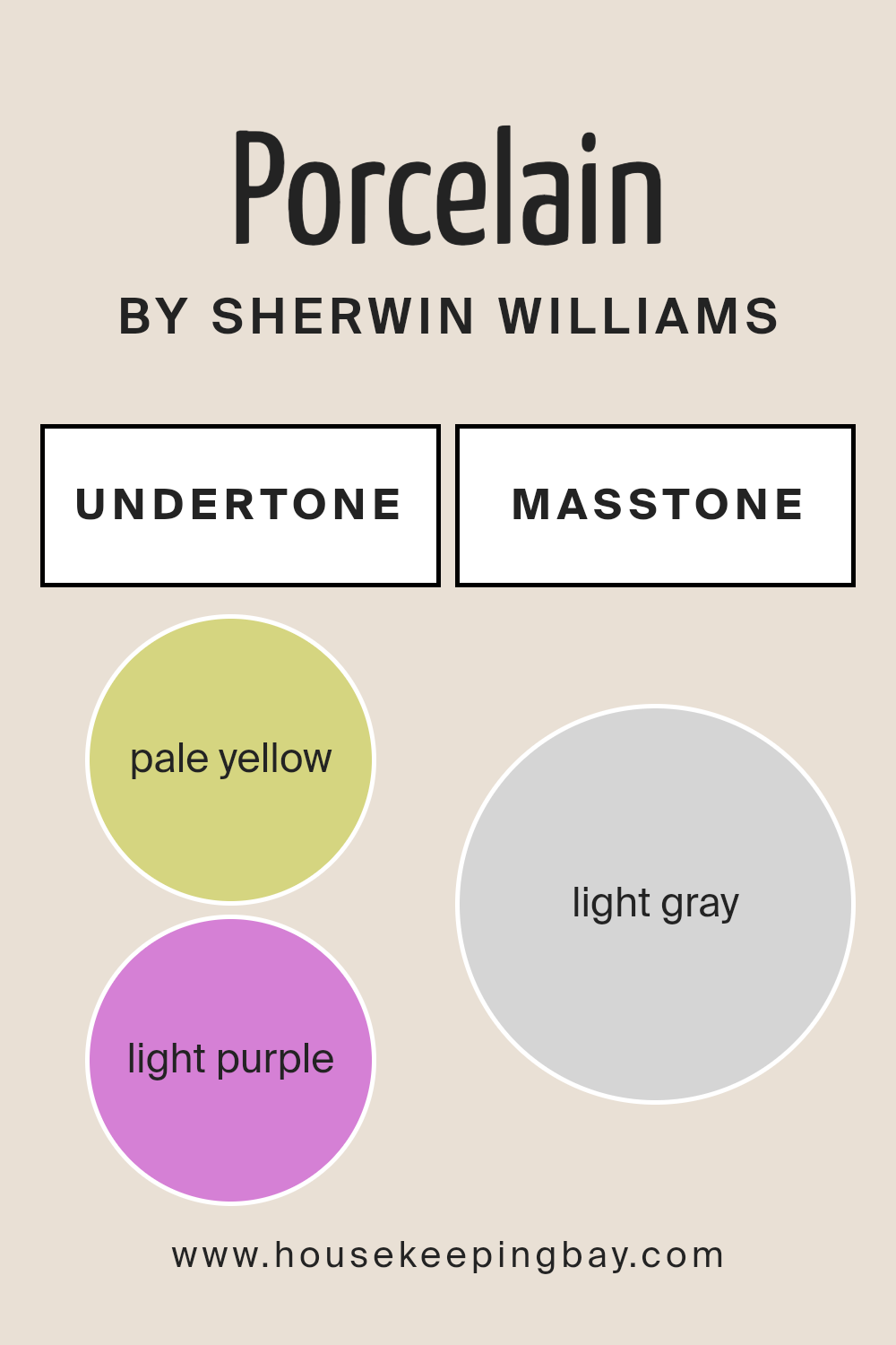
Undertones of Porcelain SW 0053 by Sherwin Williams
Porcelain SW 0053 by Sherwin Williams is a paint color that has a subtle and soothing feel, largely because of its undertones of pale yellow and light purple. Undertones are like hidden colors that are not immediately obvious but they influence how we see the main color.
Imagine undertones as quiet background music that sets a mood you might not consciously notice, but it changes how you feel about a room.
The pale yellow undertone adds a hint of warmth and light, like early morning sunshine gently filling a room. It makes spaces feel cozy and welcoming. In contrast, the light purple undertone adds a touch of coolness and sophistication, giving a room a calm and serene vibe.
Together, these undertones balance each other out, making Porcelain SW 0053 incredibly versatile.
When painted on interior walls, Porcelain SW 0053 transforms spaces in unique ways depending on the lighting and surrounding colors. In natural daylight, the pale yellow might be more pronounced, making the room feel bright and airy.
In artificial light, the light purple might stand out, bringing a more intimate and relaxed atmosphere. This means the color can look slightly different at various times of day or in different settings, adding depth and interest to the walls.
Porcelain SW 0053, with its special undertones, offers more than just a simple paint color; it brings a room to life in a gentle and subtle way.
housekeepingbay.com
Coordinating Colors of Porcelain SW 0053 by Sherwin Williams
Coordinating colors are essentially hues that complement each other when used together in a room, creating a harmonious and balanced look. They’re chosen based on their positions on the color wheel or their tonal similarities, ensuring that they enhance the primary color’s attributes without clashing.
For instance, when decorating with a primary color like Porcelain SW 0053 by Sherwin Williams, which is a soft, muted hue, selecting the right coordinating colors can add depth and interest to your space.
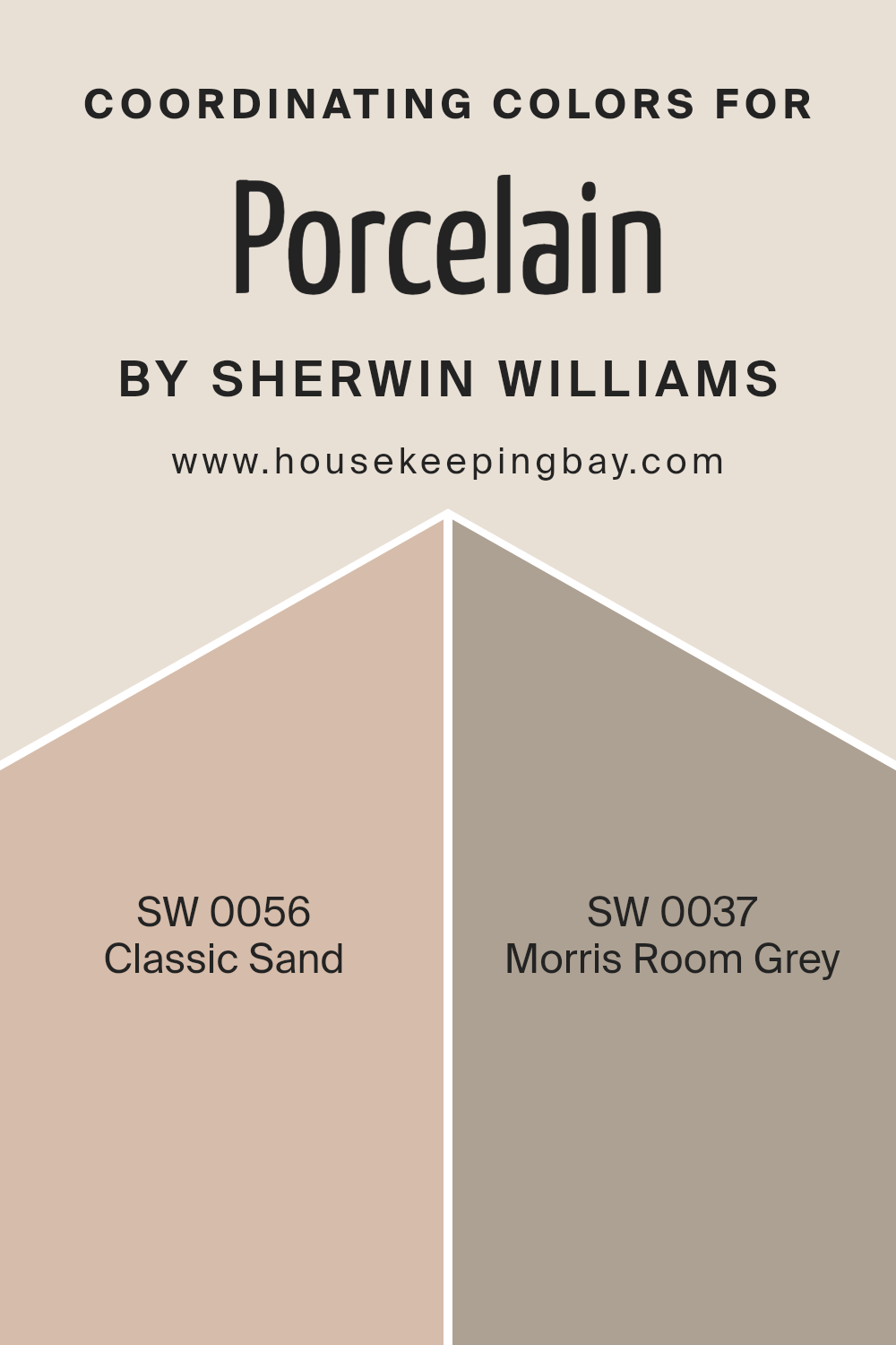
In the context of Porcelain SW 0053, a serene and airy shade reminiscent of a clear sky, Classic Sand SW 0056 and Morris Room Grey SW 0037 have been identified as coordinating colors.
Classic Sand is a warm, gentle beige that evokes the feeling of a peaceful desert at dawn, offering a subtle contrast that enriches the soothing quality of Porcelain without overwhelming it.
On the other hand, Morris Room Grey is a sophisticated, deep grey that mimics the shadows cast by the setting sun, providing a grounding effect that complements the light and breezy nature of Porcelain.
Together, these coordinating colors facilitate a versatile palette that can elegantly tie a room together, creating an inviting and cohesive space.
You can see recommended paint colors below:
- SW 0056 Classic Sand
- SW 0037 Morris Room Grey
housekeepingbay.com
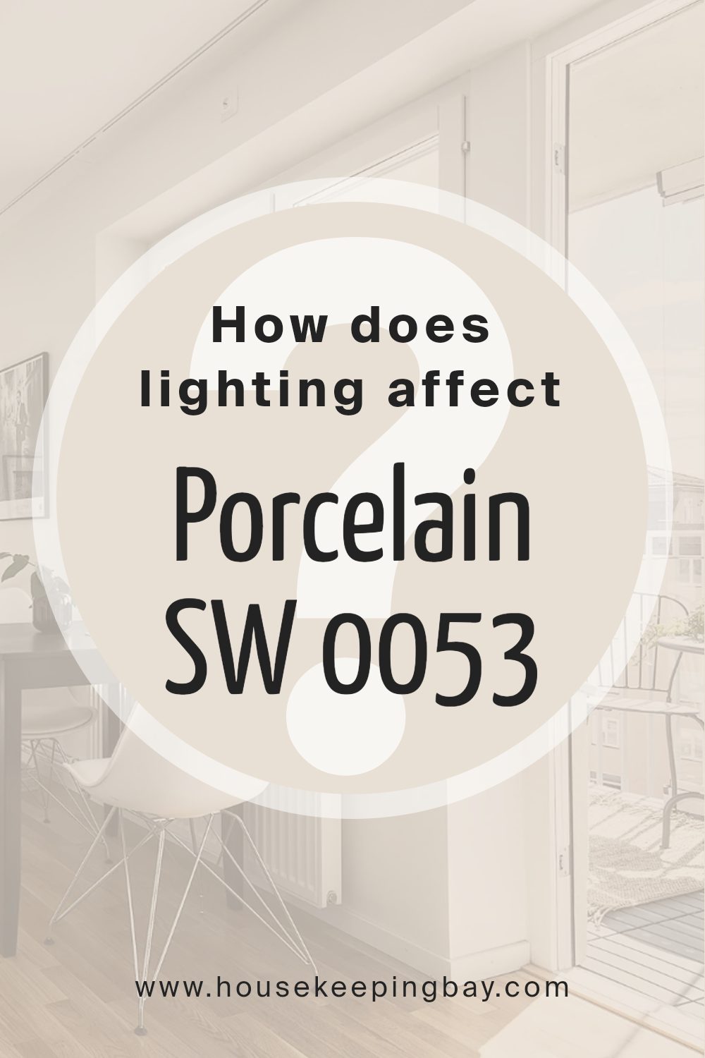
How Does Lighting Affect Porcelain SW 0053 by Sherwin Williams?
Lighting plays a crucial role in how we perceive colors, and this is especially true for paint colors like PorcelainSW 0053 by Sherwin-Williams. This particular shade can look different depending on the type of light it’s under and the direction of light it receives in a room.
In artificial light, such as LED or incandescent bulbs, the color PorcelainSW 0053 can take on different tones. Under warm artificial lighting, it may appear softer and slightly more inviting, with its creamy undertones becoming more pronounced, giving off a cozy vibe.
In cooler, more stark artificial light, Porcelain might look brighter and slightly more crisp, emphasizing its clean, neutral base.
In natural light, the appearance of Porcelain changes throughout the day and also depends on the direction the room faces. In north-faced rooms, which receive less direct sunlight and mostly cool, indirect light, Porcelain can look more consistent throughout the day but may lean towards a cooler, slightly more muted version of its true color.
This can give the room a calm and serene feeling, especially in spaces meant for relaxation.
South-faced rooms get a lot of direct sunlight, making them bright for most of the day. Here, Porcelain can really brighten up, showing off its warm undertones and creating an inviting and lively space. The natural brightness emphasizes the color’s softness, making the room feel airy and spacious.
In east-faced rooms, Porcelain receives strong, warm morning light but becomes cooler and more muted as the day progresses. Early in the day, the paint color will look vibrant and warm, creating a refreshing and energizing environment. As evening approaches, the color settles into a softer, more subtle hue.
West-faced rooms experience the opposite effect; the color starts cooler in the morning and becomes warmer and more vibrant in the afternoon and evening as the sun sets.
This changing light can make Porcelain move from appearing more neutral and understated in the morning to rich and warmly lit in the evening, making the space flexible for different uses throughout the day.
In summary, lighting conditions significantly impact how we see and feel about the color PorcelainSW 0053 by Sherwin-Williams. Its versatility under different lighting conditions makes it an excellent choice for various rooms and settings.
housekeepingbay.com
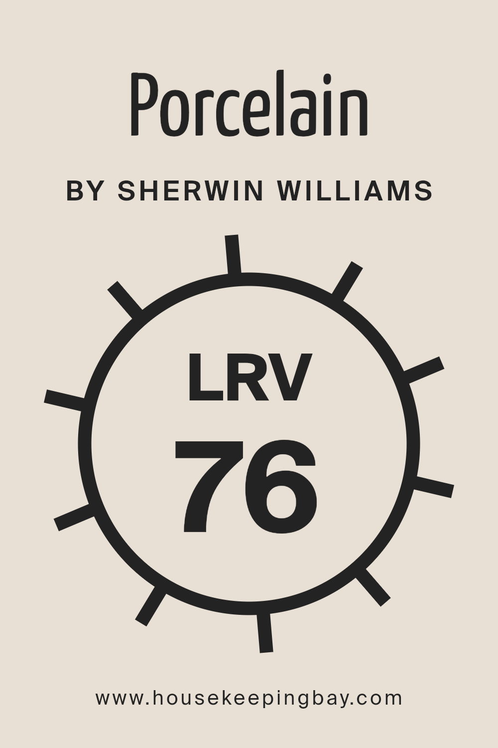
What is the LRV of Porcelain SW 0053 by Sherwin Williams?
LRV stands for Light Reflectance Value, and it’s a measure of the amount of visible and usable light that gets reflected from a surface when light shines on it. This measurement is given on a scale from 0 to 100, where 0 means complete absorption of light (totally black), and 100 reflects all light (completely white).
The LRV helps you understand how light or dark a color will look once it’s painted on the walls. It’s especially important when choosing paint colors because it affects how bright or moody a room might feel.
For example, a room painted in a color with a high LRV will generally appear brighter and more open, because more light is being reflected around the room.
Looking at the LRV of Porcelain (SW 0053) by Sherwin Williams, which is 75.615, we can tell it’s a color that reflects a lot of light. This high LRV means it will help make a space feel airy and bright.
When this color is applied to walls, it will significantly influence the ambiance of the room, making it perfect for spaces where you want to enhance natural light or give the impression of more space.
Since Porcelain SW 0053 has a high LRV, it’s also more forgiving with marks and smudges, as light colors do not show imperfections as easily as darker shades. This makes it a practical choice for busy areas or rooms that get a lot of use.
housekeepingbay.com
What is LRV? Read It Before You Choose Your Ideal Paint Color
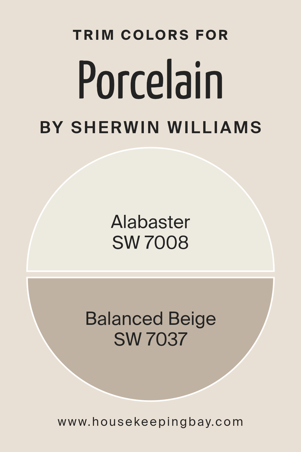
What are the Trim colors of Porcelain SW 0053 by Sherwin Williams?
Trim colors are the accents we choose to complement the main hues of our rooms, playing a critical role in highlighting the architectural features of a space.
Particularly when we talk about a specific shade like Porcelain SW 0053 by Sherwin Williams, selecting the right trim colors can enhance the delicate and refined nature of such a primary color.
By carefully choosing trim colors, homeowners can achieve a cohesive and visually appealing decor that subtly frames and emphasizes the beauty of the main wall color. In this context, trim colors act not only as a boundary between different surfaces but also as a bridge that ties the entire room’s aesthetic together.
Choosing SW 7008 – Alabaster as a trim color offers a gentle contrast to Porcelain SW 0053, adding a layer of warmth and brightness without overwhelming the space. Alabaster is a soft, creamy white with just enough depth to make architectural details pop against a lighter main color.
On the other hand, SW 7037 – Balanced Beige serves a different purpose. This hue provides a more grounded, earthy frame to the lighter Porcelain, enriching the room with a sense of stability and warmth. Balanced Beige is versatile, working well in various lighting conditions to ensure that the space retains its inviting atmosphere throughout the day.
Together, these trim colors can amplify the elegance of Porcelain SW 0053, creating a harmonious and welcoming space.
You can see recommended paint colors below:
- SW 7008 Alabaster
- SW 7037 Balanced Beige
housekeepingbay.com
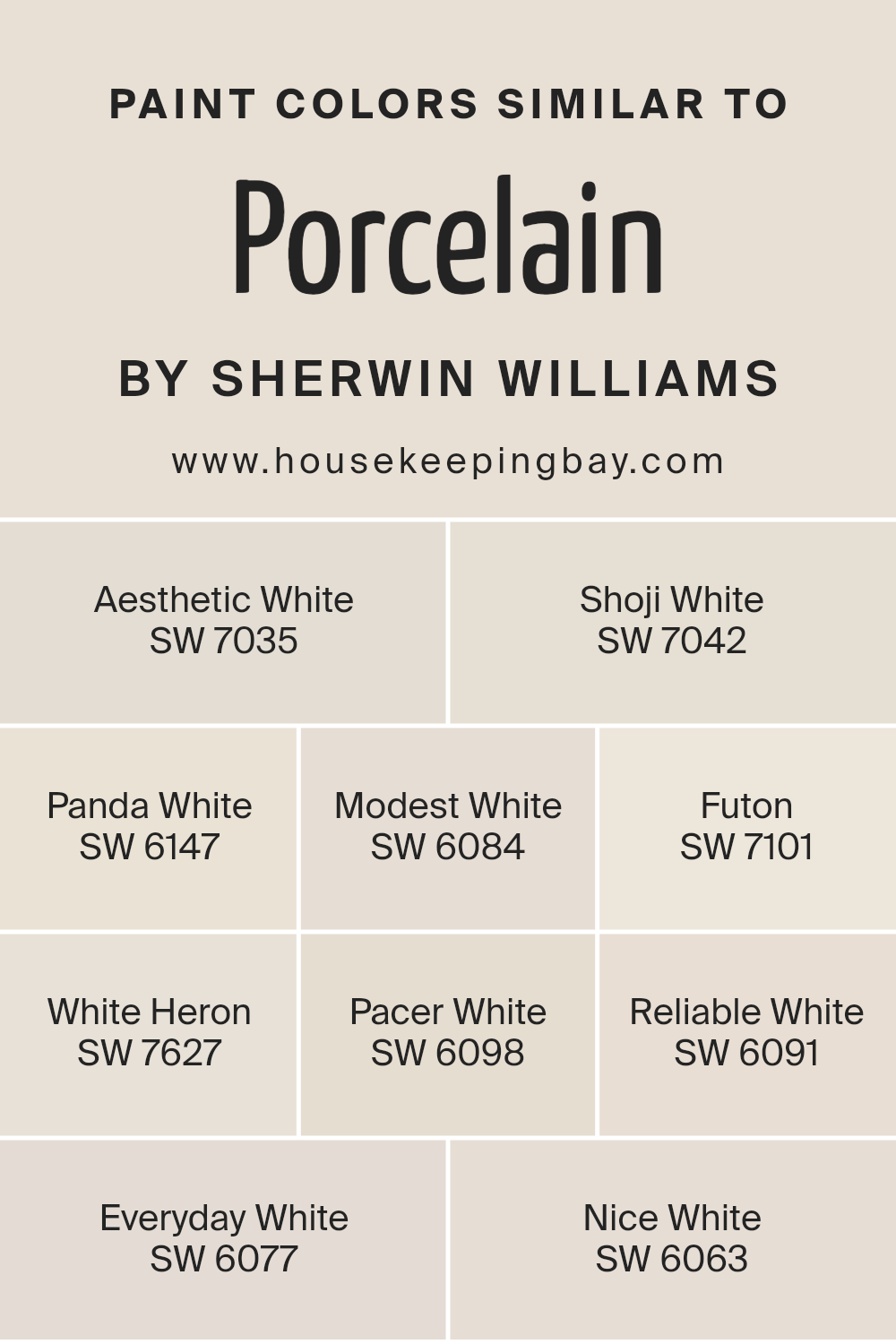
Colors Similar to Porcelain SW 0053 by Sherwin Williams
Similar colors play a critical role in design and decoration, particularly when creating a cohesive and harmonious look. Colors like Porcelain SW 0053 by Sherwin Williams and its counterparts, including Aesthetic White SW 7035, Shoji White SW 7042, and others, offer subtle variations that can significantly impact the mood and perception of a space.
These shades allow for layering and depth, providing an elegant, seamless transition throughout a room without sharp contrasts. Working with similar colors means you can experiment with shadows and highlights, adding complexity to a seemingly simple palette.
This approach is especially beneficial in achieving a specific aesthetic without deviating from the desired color theme.
Aesthetic White SW 7035 has a hint of warmth, making spaces feel inviting, while Shoji White SW 7042 leans towards a softer, slightly muted hue for a tranquil vibe. Panda White SW 6147 offers a balance of beige and white, perfect for a cozy, understated elegance.
Modest White SW 6084 strikes a delicate balance between cream and white, radiating a gentle, welcoming atmosphere. Futon SW 7101 brings a serene, light taupe that complements wood tones exquisitely. White Heron SW 7627, with its crisp brightness, enlightens any space with a fresh aura.
Pacer White SW 6098 introduces a creamy presence, adding warmth without overwhelming. Reliable White SW 6091 is the go-to for consistent, soft luminosity in a room. Everyday White SW 6077 has a grounded, earthy feel, offering stability and calm.
Lastly, Nice White SW 6063 dresses a room in a straightforward, uncluttered ambiance, perfect for minimalistic designs. Together, these colors showcase the power of similar hues in creating a cohesive yet dynamic and layered interior design scheme.
You can see recommended paint colors below:
- SW 7035 Aesthetic White
- SW 7042 Shoji White
- SW 6147 Panda White
- SW 6084 Modest White
- SW 7101 Futon
- SW 7627 White Heron
- SW 6098 Pacer White
- SW 6091 Reliable White
- SW 6077 Everyday White
- SW 6063 Nice White
housekeepingbay.com
How to Use Porcelain SW 0053 by Sherwin Williams In Your Home?
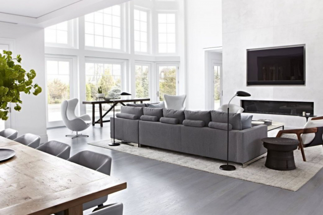
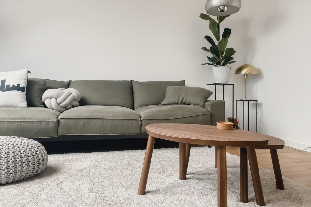
Porcelain SW 0053 by Sherwin Williams is a beautiful paint color that can add a fresh and clean look to any room in your home. It’s like a soft, gentle shade, sitting somewhere between white and a very light gray. This color is perfect if you want a space that feels open, airy, and inviting.
You can use Porcelain in various ways around your house. For example, it’s great for living rooms or bedrooms where you want to create a peaceful and calming atmosphere. Because it’s such a neutral color, it can match well with almost any furniture or decor style you already have.
This means you don’t need to worry about buying new items to fit the color scheme.
In the kitchen or bathroom, Porcelain can help reflect light, making these often smaller spaces appear bigger and more welcoming. Plus, it’s a good backdrop that allows fixtures and accessories to stand out, whether you prefer modern or traditional styles.
Overall, Porcelain SW 0053 offers a fresh, versatile option for anyone looking to update their home with a touch of simplicity and elegance.
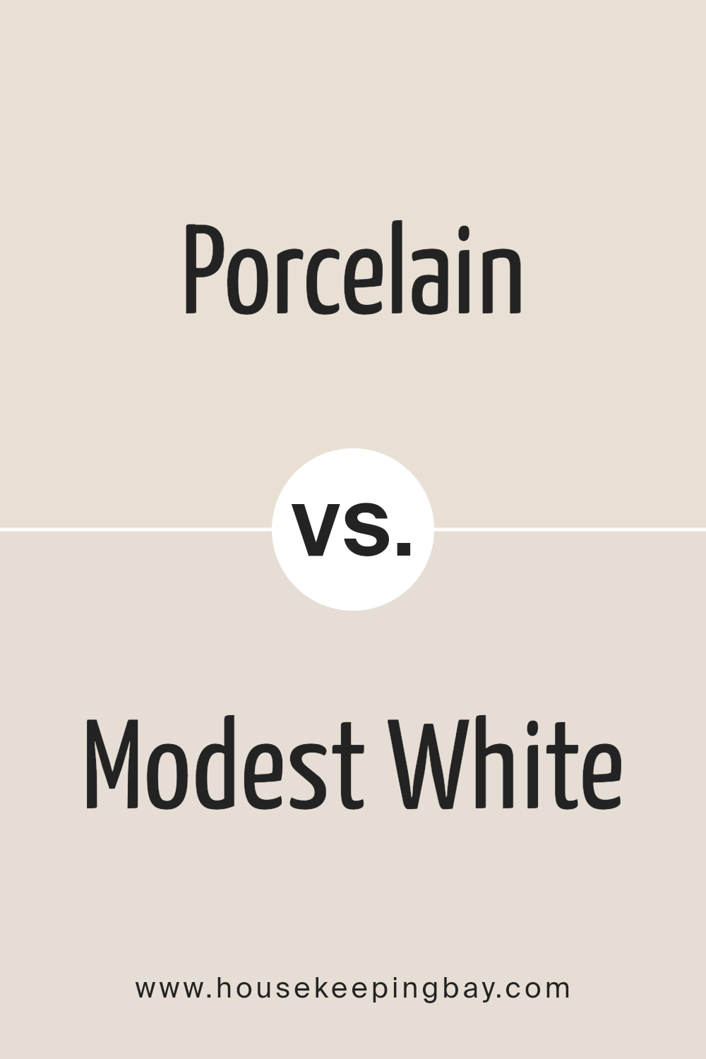
Porcelain SW 0053 by Sherwin Williams vs Modest White SW 6084 by Sherwin Williams
Porcelain SW 0053 and Modest White SW 6084 by Sherwin Williams are both soothing, soft colors, but they have distinct differences that set them apart. Porcelain is a light, airy color with a subtle cool undertone, giving it a clean and crisp appearance.
It’s like the color of a fresh snowfall or a soft cloud, making rooms feel spacious and serene. On the other hand, Modest White has a warmer tone, leaning slightly towards beige or off-white. This warmth makes it feel more inviting and cozy, perfect for creating a snug atmosphere in a home.
When comparing the two, Porcelain is better suited for those looking for a modern, minimalist look with a hint of freshness. Modest White is ideal for those aiming for a cozy, welcoming space with a neutral palette.
While both colors are versatile and can blend well with various decor styles, your choice depends on the mood and feel you want to achieve in your space.
You can see recommended paint color below:
housekeepingbay.com
Porcelain SW 0053 by Sherwin Williams vs White Heron SW 7627 by Sherwin Williams
Porcelain SW 0053 by Sherwin Williams and White Heron SW 7627 by Sherwin Williams are two beautiful colors, but they have some differences. Porcelain is a soft, warm white with a hint of beige. It’s like the creamy color of a vintage teacup.
This color makes rooms feel cozy and welcoming. It’s great for spaces where you want a touch of warmth without going too yellow or tan.
On the other hand, White Heron is a clean, bright white. It’s more like a fresh snowfall or a crisp white shirt. This color is perfect for making spaces feel open and airy. It has a more modern vibe and works well in places where you want to add brightness without any warmth.
In summary, if you’re looking for a color that adds a cozy warmth to your room, Porcelain is a great choice. But if you prefer something that makes your space feel brighter and more open, White Heron is the way to go.
Both are beautiful, but they serve different purposes depending on the look and feel you’re after.
You can see recommended paint color below:
housekeepingbay.com
Porcelain SW 0053 by Sherwin Williams vs Everyday White SW 6077 by Sherwin Williams
Porcelain SW 0053 by Sherwin Williams and Everyday White SW 6077 by Sherwin Williams are two shades that might seem similar at first glance but have some distinct differences. Porcelain SW 0053 has a soft, warm undertone that feels welcoming and cozy.
It’s a light color that can make small rooms feel bigger and brighter, adding a touch of elegance without being overwhelming. On the other hand, Everyday White SW 6077 leans more towards a neutral white, offering a clean and crisp look.
This color is great for spaces that want to achieve a modern and minimalist feel, as it pairs well with almost any decor style without competing for attention.
Despite both being in the white family, Porcelain’s warmth makes it ideal for creating a cozy atmosphere, while Everyday White’s neutrality is perfect for a sleek, contemporary vibe.
When choosing between them, consider the mood you want to set and the natural light in your space, as these factors will influence how each color looks in your home.
You can see recommended paint color below:
housekeepingbay.com
Porcelain SW 0053 by Sherwin Williams vs Pacer White SW 6098 by Sherwin Williams
Porcelain SW 0053 by Sherwin Williams and Pacer White SW 6098 from the same brand are both beautiful colors that can give your space a fresh and inviting look. However, they have their unique characteristics. Porcelain is a light, airy color that leans towards a clean, crisp white with a subtle hint of warm undertones.
It’s perfect for creating a serene and calm atmosphere in any room, making spaces feel larger and more open.
On the other hand, Pacer White is a bit warmer and deeper compared to Porcelain. It has a cozy vibe to it, with a creamier base that can add warmth to spaces without overwhelming them with too much color.
It’s ideal for someone looking to add a gentle touch of warmth to their interiors while maintaining a bright and inviting environment.
When deciding between the two, consider the mood you want to set in your space. Porcelain is great for a minimalist, bright look, while Pacer White is better for creating a soft, warm, welcoming feel.
You can see recommended paint color below:
housekeepingbay.com
Porcelain SW 0053 by Sherwin Williams vs Shoji White SW 7042 by Sherwin Williams
Porcelain SW 0053 and Shoji White SW 7042, both by Sherwin Williams, are two colors with their own unique appeal. Porcelain is a clean, crisp white with a hint of softness, making it perfect for creating a bright and airy space.
It has a subtle warmth that keeps it from feeling too stark, making it versatile for various settings, from modern to traditional.
On the other hand, Shoji White is a bit warmer and richer than Porcelain. It’s a soft, welcoming neutral with a creamy undertone, which adds a cozy vibe to any room. This color is great for those wanting a space that feels more lived-in and inviting, without veering too far from a neutral palette.
Both colors offer a fresh, clean backdrop, but the choice between them comes down to the mood you want to achieve. Porcelain leans towards a sharper, more pristine look, while Shoji White offers warmth and coziness.
Whether you’re aiming for a minimalist elegance or a snug, homely atmosphere will dictate which of these two hues best suits your space.
You can see recommended paint color below:
housekeepingbay.com
Porcelain SW 0053 by Sherwin Williams vs Reliable White SW 6091 by Sherwin Williams
Porcelain SW 0053 by Sherwin Williams and Reliable White SW 6091 are both light colors, but they have different vibes. Porcelain is a soft, cool white with a hint of gray. It gives off a calm and clean feel, making rooms look fresh and airy.
It’s great for spaces where you want a modern, minimalistic look without going too stark or cold.
On the other hand, Reliable White SW 6091 leans towards a warm, creamy hue. It’s not as crisp as Porcelain. This warmth makes it excellent for creating cozy and inviting spaces.
It works well in areas where you want comfort, like living rooms or bedrooms. Reliable White tends to add a bit of cheer and light without the cool edge.
In short, Porcelain is your go-to for a sleek, contemporary feel, while Reliable White suits spaces where a softer, more welcoming atmosphere is desired. Both colors are versatile, but the choice between them depends on the mood you want to set in your space.
You can see recommended paint color below:
housekeepingbay.com
Porcelain SW 0053 by Sherwin Williams vs Panda White SW 6147 by Sherwin Williams
Porcelain SW 0053 by Sherwin Williams and Panda White SW 6147 are two interesting shades to consider. Porcelain is a light, creamy color that can make a room feel warm and inviting.
It is subtle and has a kind of understated elegance, which works well in pretty much any space. It’s not just white; it has a hint of warmth that can soften the look of a room without overpowering it.
On the other hand, Panda White is a bit different. It leans more towards a soft, off-white with gray undertones. Panda White is perfect for those who want a white that’s not too stark but still looks clean and modern. It goes well in spaces that get a lot of natural light, as the light brings out the complexity of the color.
In short, if you’re going for a warm, cozy feel, Porcelain might be your pick. But if you prefer something that feels clean and contemporary, with a slight edge, Panda White could be the way to go. Both colors offer their own unique vibe, making them great choices depending on the look and feel you’re aiming for in your space.
You can see recommended paint color below:
housekeepingbay.com
Porcelain SW 0053 by Sherwin Williams vs Futon SW 7101 by Sherwin Williams
Porcelain SW 0053 by Sherwin Williams is a soft, creamy white color. It’s very peaceful and gives off a clean, fresh vibe. It’s like looking at a blank canvas, ready for anything. This color is perfect if you want a space that feels open and full of light.
Futon SW 7101 by Sherwin Williams is different. It’s more of a muted, cozy beige. Think of a warm, comfortable room that invites you to relax. Futon has a bit more color to it than Porcelain, making spaces feel snug and welcoming.
When you compare Porcelain and Futon, you’ll see that Porcelain is cooler and crisper, bringing a sense of freshness and spaciousness. Futon, on the other hand, warms things up. It’s like comparing the feeling of a bright, sunny morning to a cozy, lazy afternoon.
Depending on what mood you want for your room, you might choose the clear, clean look of Porcelain or the warm, welcoming vibe of Futon.
You can see recommended paint color below:
housekeepingbay.com
Porcelain SW 0053 by Sherwin Williams vs Nice White SW 6063 by Sherwin Williams
Porcelain SW 0053 by Sherwin Williams and Nice White SW 6063 by Sherwin Williams are two elegant colors, but they have some differences. Porcelain is a soft, warm white that has a cozy, welcoming vibe to it. It’s like the kind of white you’d see in a well-lit, comfortable living room, giving off a feeling of calm and ease.
On the other hand, Nice White is cooler and has a bit more of a clean, crisp feel. It’s the kind of color that makes spaces feel fresh and bright, perfect for making small rooms appear bigger and more airy.
While Porcelain might be better for someone looking for a warmer, softer atmosphere, Nice White is great for anyone wanting a modern, sharp look.
Both colors are versatile and can work well in many different spaces, but the choice between them comes down to what mood you’re aiming to create in your space.
You can see recommended paint color below:
- SW 6063 Nice White
housekeepingbay.com
Porcelain SW 0053 by Sherwin Williams vs Aesthetic White SW 7035 by Sherwin Williams
Porcelain (SW 0053) and Aesthetic White (SW 7035) by Sherwin Williams are two colors that might seem similar at first glance but have their own unique qualities. Porcelain is a light, almost ethereal color that brings a sense of calmness and simplicity to any space.
It’s like the soft glow of morning light, offering a clean and fresh vibe. This color works well in rooms that need a touch of understated elegance without overwhelming the senses.
On the other hand, Aesthetic White is a bit warmer and more inviting. It’s not just plain white; it has a cozy undertone that makes spaces feel more intimate and homely.
This color is perfect for creating a welcoming atmosphere, making it ideal for living rooms or bedrooms where comfort is key.
While both colors lend themselves to creating spaces that feel open and airy, Porcelain leans towards a cooler, more delicate palette, whereas Aesthetic White draws in warmth, making spaces feel more lived-in and cozy.
Choosing between them depends on whether you’re going for a crisp, fresh look or a soft, inviting ambiance.
You can see recommended paint color below:
housekeepingbay.com
Conclusion
In summary, the article on Porcelain SW 0053 by Sherwin Williams presents this color as a versatile and refreshing choice for various spaces. Its light and airy quality can effortlessly brighten up a room, making it feel more open and serene.
The paint’s subtle undertones provide a unique charm, allowing it to seamlessly blend with different decor styles and color palettes. This makes Porcelain SW 0053 a go-to option for anyone looking to refresh their space with a touch of elegance and calm.
Moreover, the durability and quality of Sherwin Williams paints, including Porcelain SW 0053, are highlighted as standout features. The paint not only transforms the look and feel of a room but also offers long-lasting coverage and resistance to daily wear and tear.
Homeowners and designers alike appreciate the practical benefits, such as easy maintenance and application, making it a practical choice for both new projects and home renovations. Ultimately, Porcelain SW 0053 is presented as a reliable and appealing choice for creating inviting and stylish spaces.
housekeepingbay.com
Ever wished paint sampling was as easy as sticking a sticker? Guess what? Now it is! Discover Samplize's unique Peel & Stick samples. Get started now and say goodbye to the old messy way!
Get paint samples