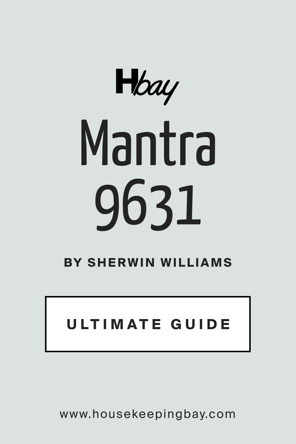
Mantra SW 9631 Paint Color by Sherwin-Williams
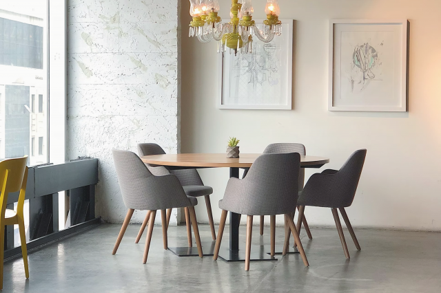
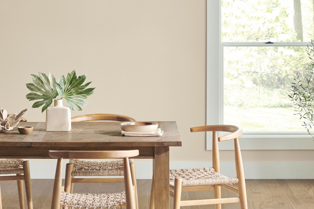
SW 9631 Mantra, a signature paint color from Sherwin-Williams, is a tone that has resonated with countless individuals seeking to strike a balance between contemporary aesthetics and timeless elegance.
SW 9631 Mantra, a signature paint color from Sherwin-Williams, is a tone that has resonated with countless individuals seeking to strike a balance between contemporary aesthetics and timeless elegance.
This color, characterized by its versatile nature, can adapt and complement diverse settings, allowing it to be a prime choice for designers and homeowners alike.
via plan home
What Color Is SW 9631 Mantra?
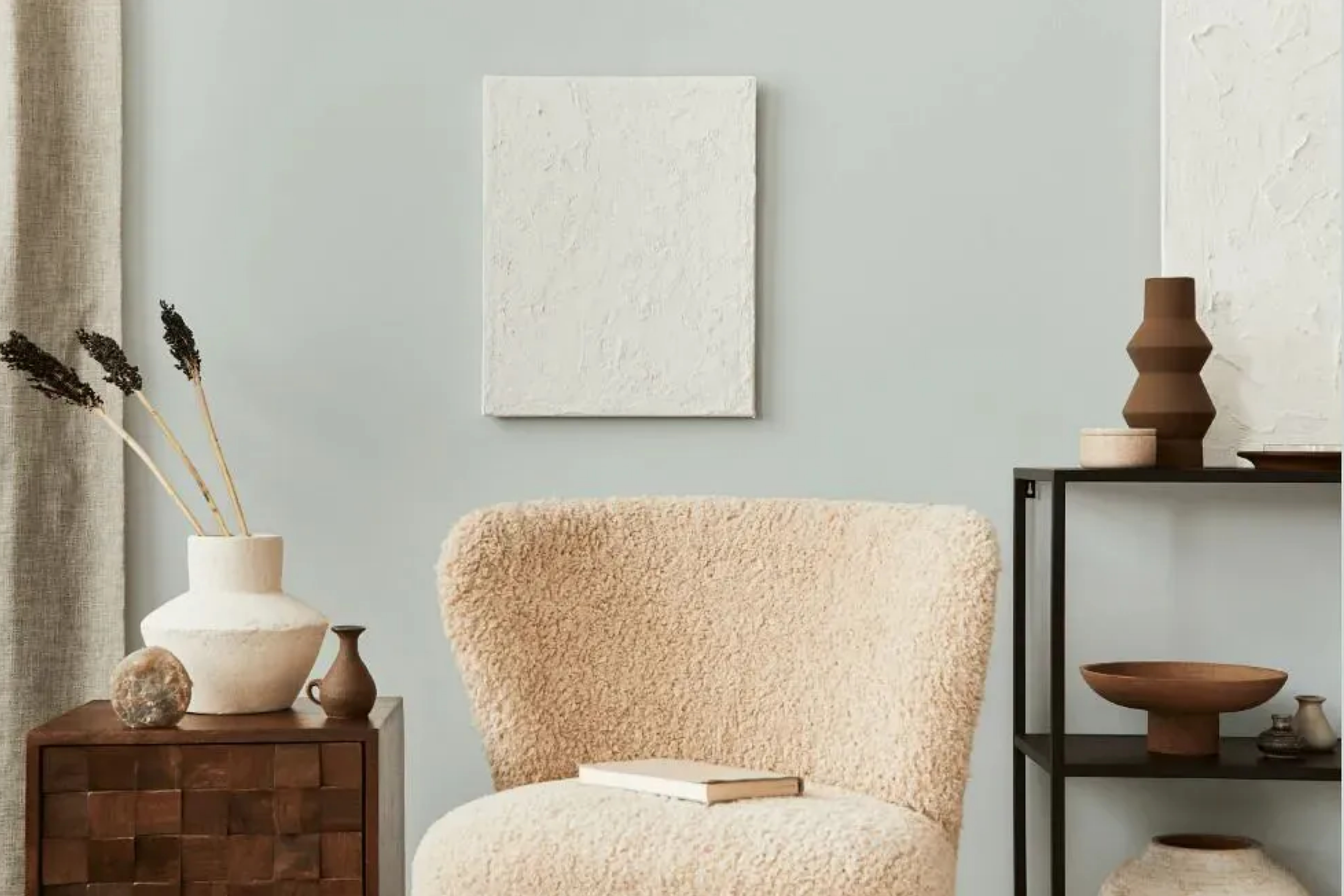
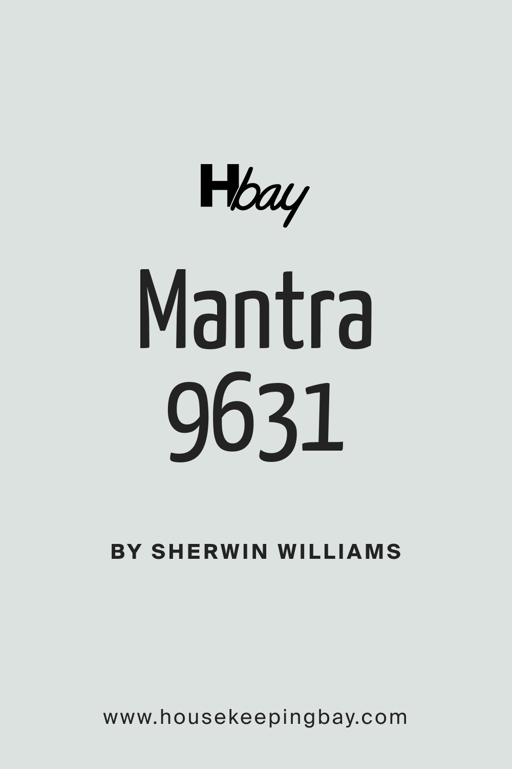
SW 9631 Mantra is best described as a sophisticated neutral, a color that combines subtlety with presence, making it capable of rendering spaces with a serene and welcoming ambiance. This hue, with its exquisite blend of gray and beige, falls into the category of ‘greige’, offering the calmness of gray with the warmth of beige. It is the embodiment of soft elegance, ideal for those who wish to curate spaces that are both tranquil and inviting.
housekeepingbay.com
Table of Contents
Is It a Warm Or a Cool Color?
The classification of SW 9631 Mantra can be somewhat intriguing, as it is neither distinctly warm nor decidedly cool. The beige elements present within it lend a warm, comforting feel, while the gray components imbue it with a cooler, more restrained character. This duality allows SW Mantra to achieve a harmonious equilibrium, making it a versatile choice adaptable to varied color palettes and design philosophies.
Undertones of SW 9631 Mantra
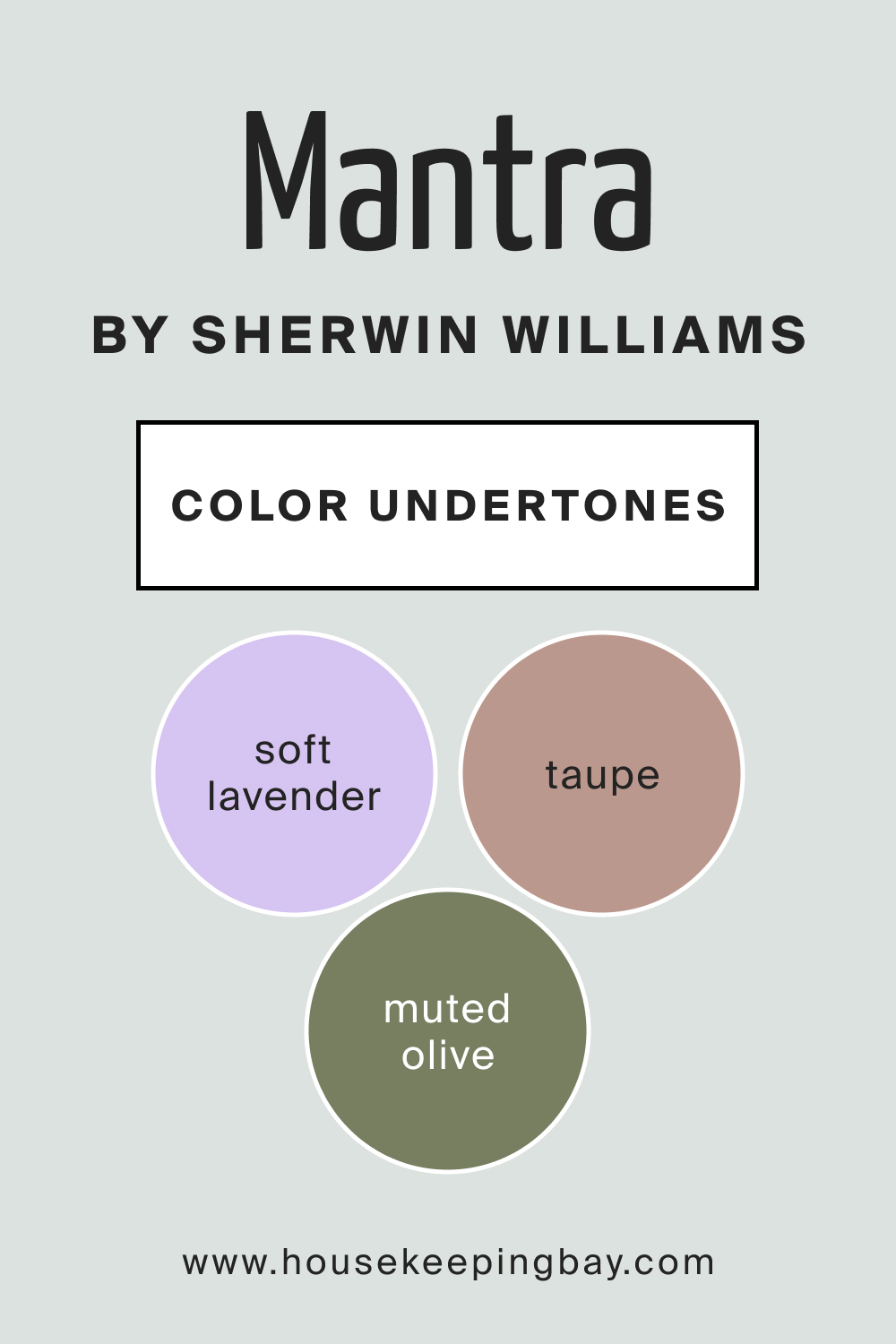
SW 9631 Mantra is unique in the sense that it houses a spectrum of undertones, allowing it to interplay beautifully with different lights and settings. Here are the three notable undertones that can be observed in this color:
Taupe Undertone:
The taupe undertone in SW Mantra adds a hint of earthiness to it, grounding the color and enhancing its compatibility with natural elements and textures, making it a favorite for spaces imbued with wooden and stone accents.
Soft Lavender Undertone:
This subtle undertone brings a whisper of freshness and softness to SW Mantra, allowing it to reflect light in a gentle, soothing manner. This lavender touch can elevate spaces by imparting a serene and airy feel, especially in areas abundant with natural light.
Muted Olive Undertone:
The muted olive undertone in Mantra introduces a delicate warmth and richness, enabling the color to pair well with both vibrant and subdued palettes. This undertone enriches SW Mantra’s versatility, allowing it to seamlessly blend into diverse aesthetic environments.
housekeepingbay.com
Coordinating Colors of SW 9631 Mantra
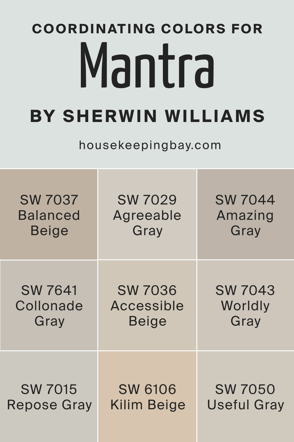
Coordinating colors are essential components in the realm of design, serving to create a harmonious and balanced visual experience within a space. These are colors that complement each other and work well together, enhancing the overall aesthetic and mood of a room. Coordinating colors can be either analogous, meaning they are next to each other on the color wheel, sharing a common color, or they can be complementary, sitting opposite each other on the color wheel.
The thoughtful selection and application of coordinating colors can amplify the beauty and impact of the main color, such as SW 9631 Mantra, allowing for the creation of spaces that are cohesive, visually pleasing, and emotionally resonant.
This color is a light, airy gray that complements Mantra by enhancing its serene and tranquil aura.
A warm, inviting beige, it harmonizes with SW Mantra’s subtleness, grounding spaces with an earthy touch.
This is a versatile medium gray that accentuates SW Mantra’s balanced nature, adding a refined sophistication to spaces.
This color is a neutral beige that amplifies Mantra’s warmth, adding to its welcoming and cozy demeanor.
SW 7050 Useful Gray :
A soft, lighter gray that highlights Mantra’s cooler elements, enhancing its calming presence in a room.
This is a balanced, neutral gray that aligns well with Mantra’s versatile nature, making it a suitable partner for diverse design schemes.
Three Additional Similar Colors You Might Want to Check
SW 7037 Balanced Beige :
A harmonious beige that mirrors Mantra’s adaptability, capable of blending seamlessly with various palettes.
This color is a delightful gray with warm undertones that resonate well with Mantra’s balanced and neutral demeanor.
SW 7044 Amazing Gray :
A complex gray with green undertones, it subtly enhances Mantra’s muted olive, creating a cohesive and elegant atmosphere.
housekeepingbay.com
How Does Lighting Affect SW 9631 Mantra?
The interplay between SW 9631 Mantra and lighting is profound, unveiling different facets of the color under varying light conditions. Under abundant natural light, Mantra’s soft lavender undertone shines through, creating an airy and fresh ambiance. It emits a tranquil and soothing feel, ideal for spaces where relaxation and peace are paramount.
Conversely, in spaces with limited or artificial light, Mantra tends to reveal its taupe and muted olive undertones more prominently, generating a warm, cozy, and enveloping atmosphere, perfect for creating intimate and comforting spaces.
The subtle shifts in its appearance under different lighting conditions exemplify Mantra’s dynamic and versatile nature, allowing it to cater to diverse aesthetic and mood preferences.
housekeepingbay.com
LRV of SW 9631 Mantra
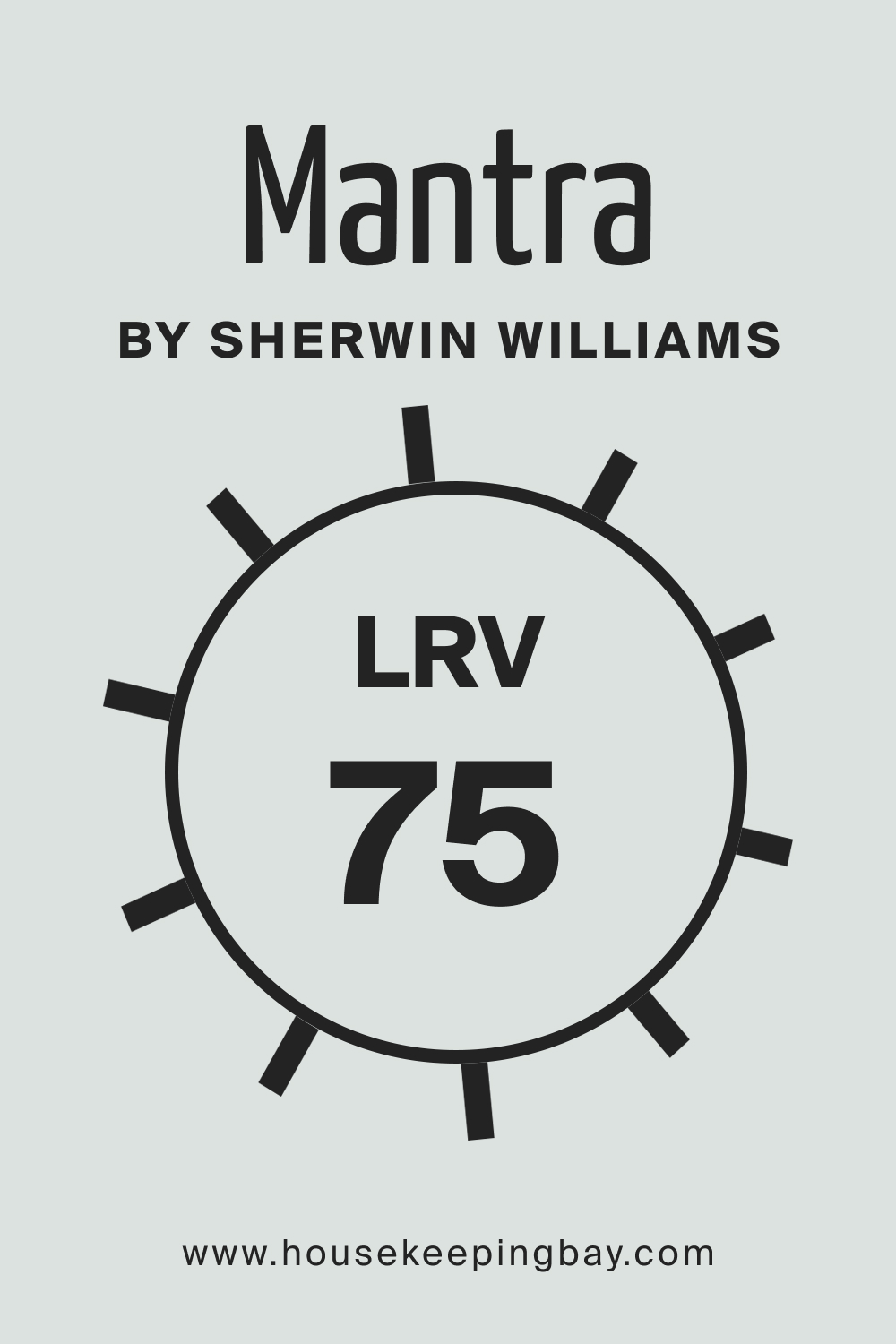
LRV, or Light Reflectance Value, is a measurement that quantifies the amount of light a color reflects, on a scale from 0 (absolute black, absorbing all light) to 100 (pure white, reflecting all light). The LRV of a paint color can significantly influence the perception of space; higher LRVs can make a space appear larger and more open, while lower LRVs can make a room seem smaller and more intimate.
SW 9631 Mantra, with its nuanced blend of grey and beige, has a moderate LRV of 75, striking a balance between reflection and absorption of light. This balanced LRV allows Mantra to maintain its versatile and adaptive nature, capable of fitting into various spatial and lighting conditions, thus making it an ideal choice for those who seek to create well-balanced and harmonious interiors.
housekeepingbay.com
What is LRV? Read It Before You Choose Your Ideal Paint Color
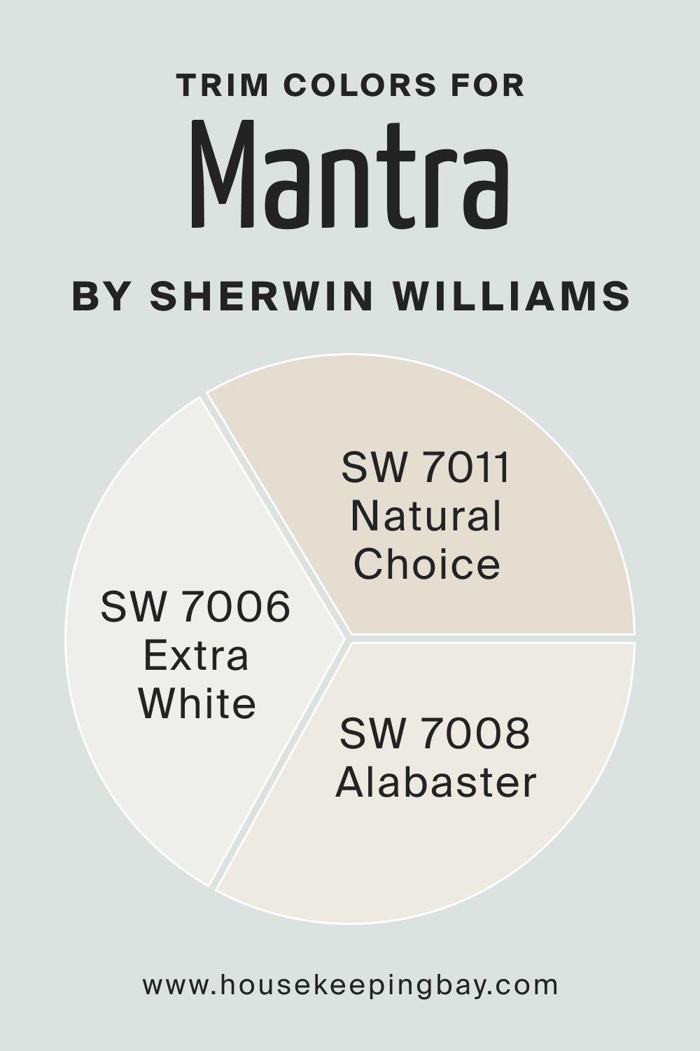
Trim Colors of SW 9631 Mantra
When selecting trim colors to pair with SW 9631 Mantra, opting for shades of white from the same brand can ensure a cohesive and harmonious aesthetic. Here are three shades of white from Sherwin-Williams that would beautifully complement Mantra:
SW 7006 Extra White :
This is a pure, brilliant white that can bring a crisp and clean contrast to Mantra, accentuating its nuanced tones and enhancing the overall brightness of the space.
SW 7008 Alabaster :
A softer and creamier white, Alabaster can lend a subtle and elegant contrast to Mantra, contributing to a warm and cozy ambiance.
SW 7011 Natural Choice :
This is a neutral, muted white that offers a subtle and harmonious contrast to Mantra, ideal for creating a tranquil and balanced environment.
housekeepingbay.com
Colors Similar to SW 9631 Mantra
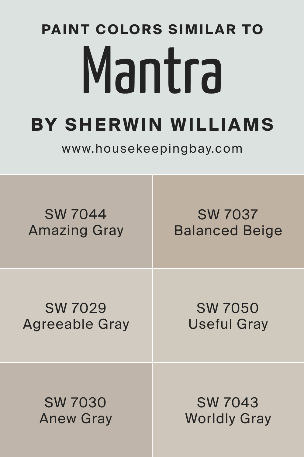
When looking within the Sherwin-Williams range for colors that closely align with SW 9631 Mantra, one can find several options that share a similar essence but vary slightly, providing subtle alternatives. Here are six such colors:
This color is a bit warmer and deeper but still retains the elegant neutrality of Mantra, suitable for those who prefer a slightly richer tone.
SW 7029 Agreeable Gray :
It is a lighter, more versatile grey that shares the balanced nature of Mantra but leans a bit more to the warmer side.
SW 7044 Amazing Gray :
This hue, with its subtle green undertones, offers a unique twist to the neutral grey of Mantra, adding a hint of earthiness to spaces.
SW 7037 Balanced Beige :
Balanced Beige is akin to Mantra in its adaptability but carries a bit more warmth, providing a cozier feel to the environment.
SW 7043 Worldly Gray :
This color is a harmonious neutral gray that resembles Mantra in its balanced approach but with a slightly cooler undertone.
SW 7050 Useful Gray :
Useful Gray is lighter and softer, maintaining the calmness of Mantra but with a more pronounced presence of cool undertones.
housekeepingbay.com
Colors That Go With SW 9631 Mantra
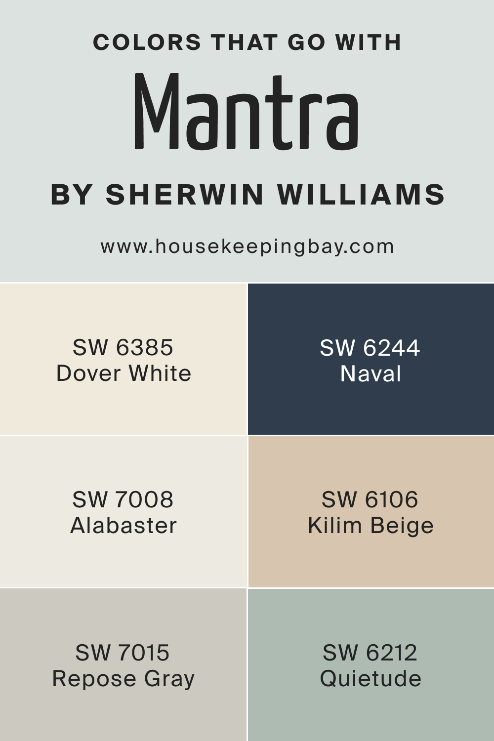
Pairing SW 9631 Mantra with the right colors can create a harmonious and aesthetically pleasing palette. Here are six colors that can beautifully coordinate with Mantra:
SW 6244 Naval :
This deep, rich navy blue provides a striking contrast to Mantra, adding a touch of sophistication and drama to spaces.
SW 7008 Alabaster :
A soft, creamy white, Alabaster can illuminate and elevate spaces with Mantra, creating a serene and airy ambiance.
SW 7015 Repose Gray :
This light, neutral gray complements Mantra beautifully, enhancing its tranquility and bringing a refined subtleness to spaces.
A warm, earthy beige, it blends harmoniously with Mantra, contributing a cozy and inviting feel to the environment.
This soft, creamy off-white introduces a warm, subtle contrast to Mantra, ideal for a balanced and soothing atmosphere.
SW 6212 Quietude :
A muted, calming blue-green, Quietude can introduce a refreshing and harmonious touch to spaces adorned with Mantra.
housekeepingbay.com
How to Use SW 9631 Mantra In Your Home?
Understanding how colors work in a home is crucial as colors play a pivotal role in creating the ambiance and feel of a space. They have the power to influence mood, perception, and even well-being. Choosing the right colors can evoke a sense of comfort and harmony, while a mismatched palette can disrupt the aesthetic flow and feel of the home. Therefore, knowing how to use colors like SW 9631 Mantra is essential to achieve a cohesive and balanced environment.
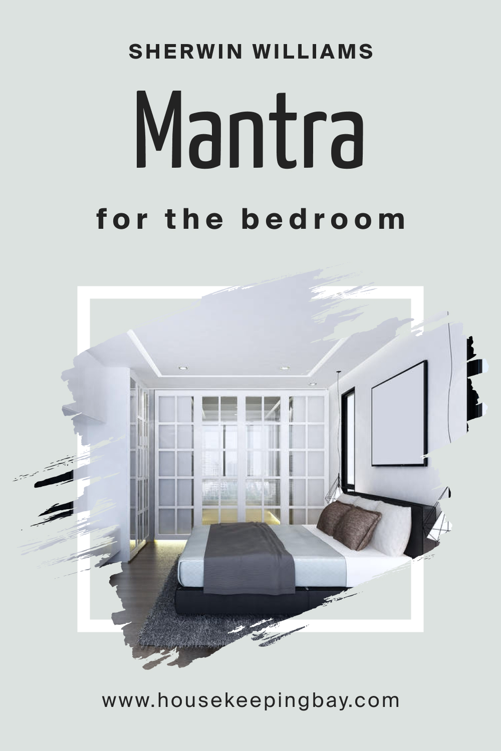
SW 9631 Mantra In the Bedroom
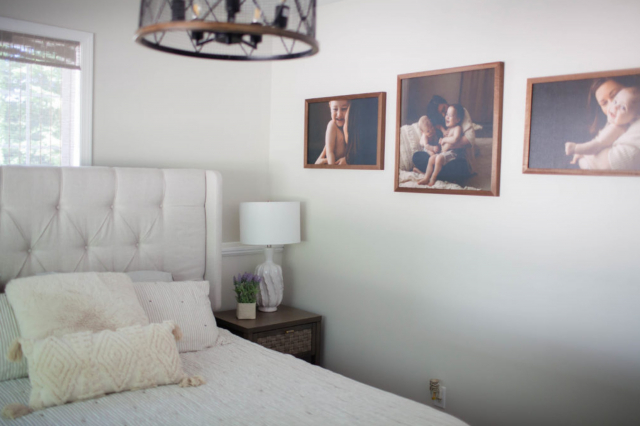
In the bedroom, SW 9631 Mantra can serve as a serene backdrop, creating a calming and restorative atmosphere conducive to relaxation and sleep. Its balanced nature allows it to work well with various color schemes and styles, whether one is aiming for a modern, minimalist look or a more traditional, cozy ambiance.
Pairing SW Mantra with soft, muted tones or rich, darker shades for accent walls, bedding, or accessories can create a harmonious and layered visual experience. The subtle undertones of Mantra can be highlighted or subdued depending on the accompanying colors and lighting, allowing for a customizable and personal touch to the bedroom design.
housekeepingbay.com
SW 9631 Mantra In the Bathroom
In bathrooms, SW 9631 Mantra can evoke a spa-like tranquility, making the space feel like a retreat. Its neutral and balanced character allows it to complement a variety of materials and finishes, from sleek, modern metals to rustic, natural stones.
Pairing SW Mantra with crisp whites or soft pastels can enhance the fresh and airy feel of the bathroom. Alternatively, combining it with bold, vibrant colors or deep, rich tones can add a sense of luxury and opulence, transforming the bathroom into a statement space that resonates with style and elegance.

housekeepingbay.com
SW 9631 Mantra In the Living Room
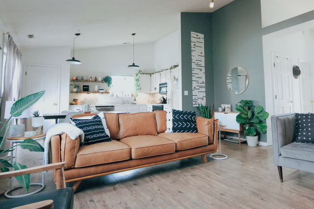
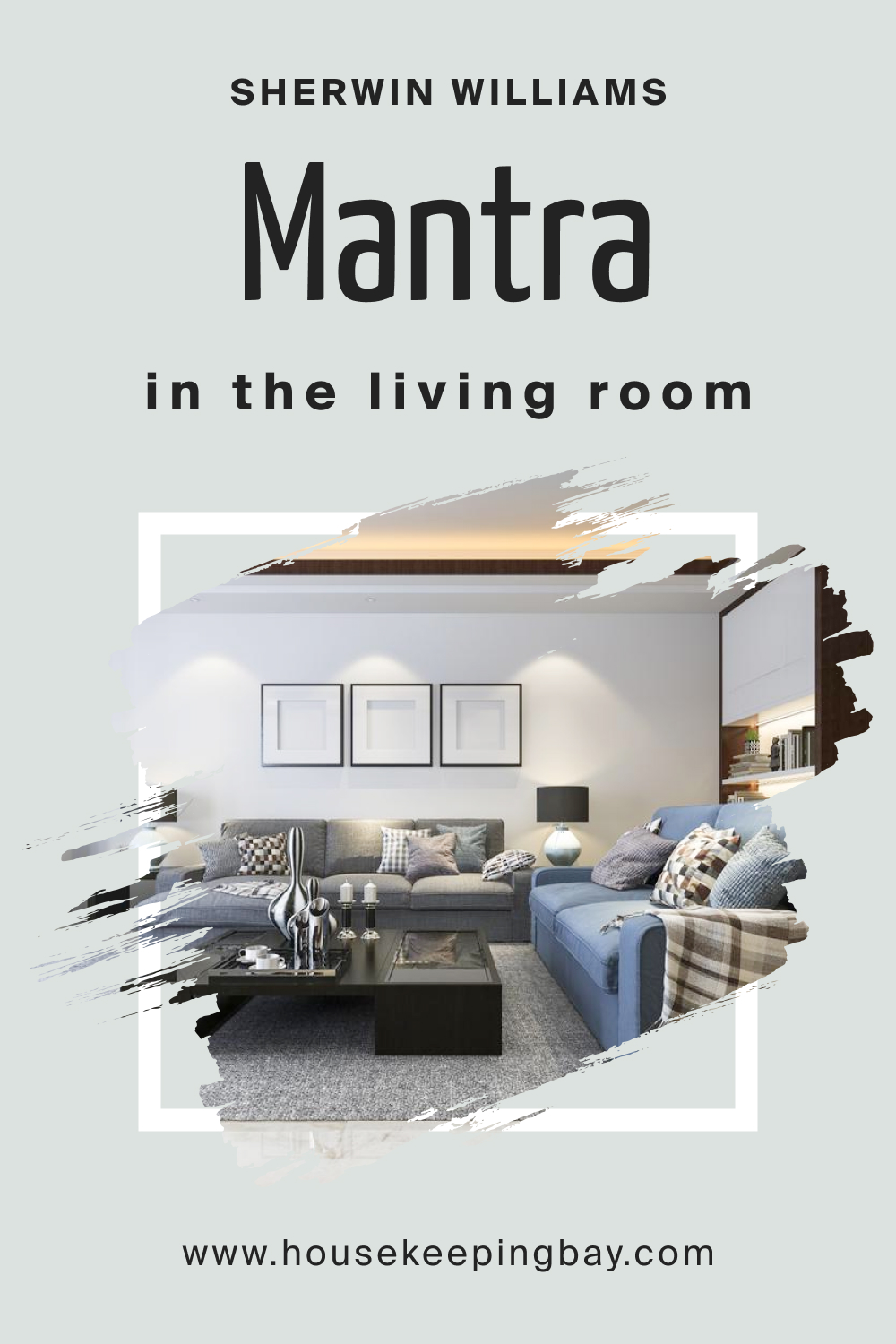
SW 9631 Mantra can be a perfect choice for the living room, offering a neutral and versatile backdrop that can accommodate a wide range of furniture, textures, and accents. Its balanced undertones can create a welcoming and harmonious environment, ideal for both relaxation and entertainment.
Integrating SW Mantra with vibrant colors can make the living room feel lively and dynamic, while pairing it with muted, softer tones can create a soothing and cohesive space. Its adaptability allows for a seamless blend of styles and palettes, enabling one to curate a living room that reflects personal taste and lifestyle.
housekeepingbay.com
SW 9631 Mantra For the Exterior
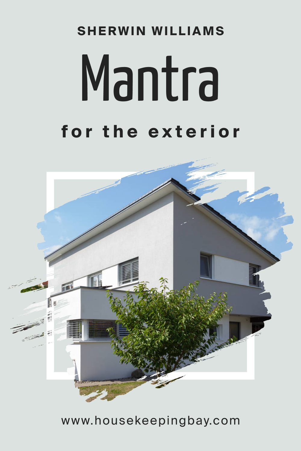
For exteriors, SW 9631 Mantra can contribute to a sophisticated and timeless curb appeal. Its neutral and adaptable nature allows it to harmonize with various architectural styles and landscape designs, creating a cohesive and inviting visual presentation.
Pairing SW Mantra with contrasting trim colors can accentuate architectural details, while coordinating it with similar tones can create a subtle and elegant exterior façade. Its versatility makes it suitable for both urban and rural settings, allowing it to enhance the overall appearance and charm of a home regardless of its location or design style.
housekeepingbay.com
Comparing SW Mantra With Other Colors
Comparing colors before using them in your home is crucial as each color invokes different emotions and reactions, and can dramatically affect the perception of space and light within a room. Ensuring the selected color complements existing decor, furniture, and lighting can create harmony and balance within the space.
SW 9631 Mantra vs. SW 6022 Breathless
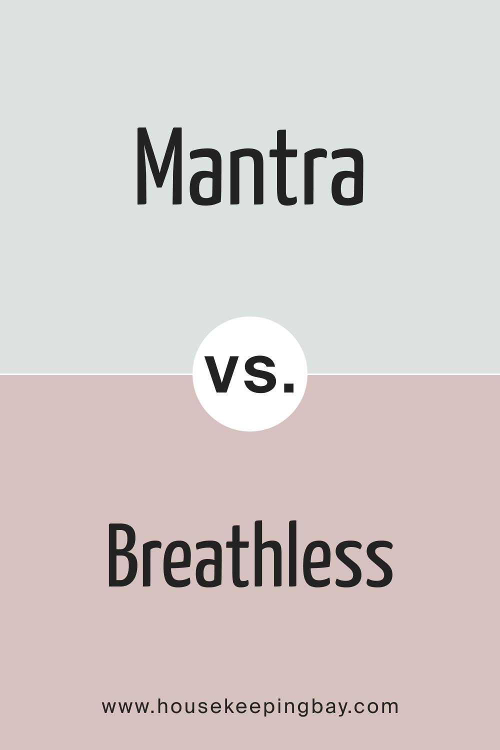
SW 9631 Mantra is a sophisticated, muted shade, often associated with mindfulness and meditation. When compared to SW 6022 Breathless , which has a softer, airy quality, Mantra provides a more grounded appearance, adding depth to spaces. Breathless is apt for spaces where a lighter, more serene environment is desired, making it ideal for bedrooms or reading nooks.
It’s crucial to contrast these colors against each other to ensure the ambiance they create aligns with the desired aesthetic and functionality of the space.
housekeepingbay.com
SW 9631 Mantra vs. SW 6001 Grayish
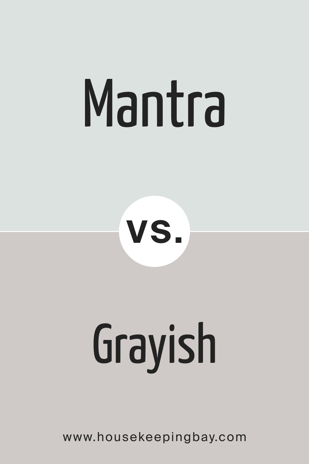
SW 9631 Mantra and SW 6001 Grayish are both neutral tones but diverge in terms of warmth and depth. Mantra has a deeper tone, giving a room a more anchored and contemplative feeling, suitable for spaces that demand focus and concentration. In contrast, Grayish, with its lighter, versatile hue, can make a room feel open and relaxed, perfect for casual, everyday spaces.
Comparing the two helps in deciding the kind of atmosphere one wants to establish, whether it is one of warmth and comfort or one of calm and reflection.
housekeepingbay.com
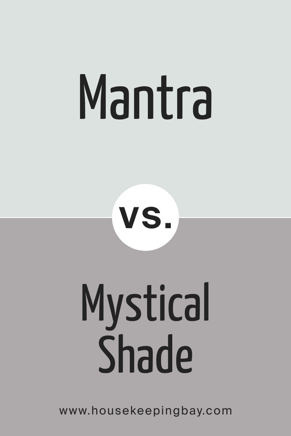
SW 9631 Mantra vs. SW 6276 Mystical Shade
Comparing SW 9631 Mantra with SW 6276 Mystical Shade is like comparing restraint with vibrancy. Mantra, being subtler, can act as a backdrop, allowing other colors or features to take center stage. Mystical Shade, however, has a richer, more dynamic presence, creating a focal point within a room. Understanding the impact of these colors is essential to create balanced and harmonious interiors, whether one aims for subtlety or a statement.
housekeepingbay.com
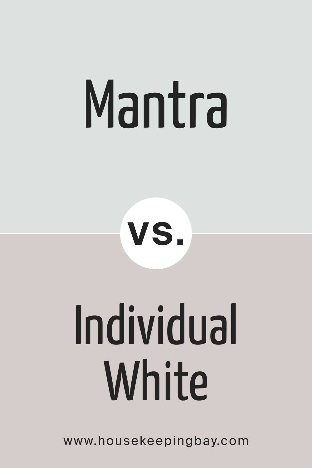
SW 9631 Mantra vs. SW 6008 Individual White
Mantra’s deeper, muted tones offer a more composed and structured appearance compared to SW 6008 Individual White . Individual White has a crisp, clean presence that brightens and enlarges spaces, suitable for areas requiring a sense of openness and clarity.
Assessing both Mantra and Individual White is pivotal in determining whether the room needs a disciplined, contemplative atmosphere or a fresh, expansive vibe.
housekeepingbay.com
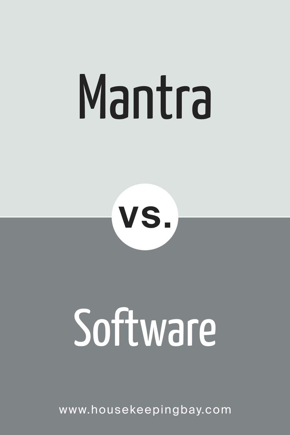
SW 9631 Mantra vs. SW 7074 Software
SW 9631 Mantra has a calming, neutral presence, contrasting sharply with the deeper, more intense SW 7074 Software . Software is suited for creating striking, dramatic interiors, possibly for areas meant for entertainment or where a bold aesthetic is preferred. Conversely, Mantra is more versatile, fostering a tranquil and balanced environment. Comparing the two is essential to achieve the desired impact, whether one seeks intensity and drama or peace and balance.
housekeepingbay.com
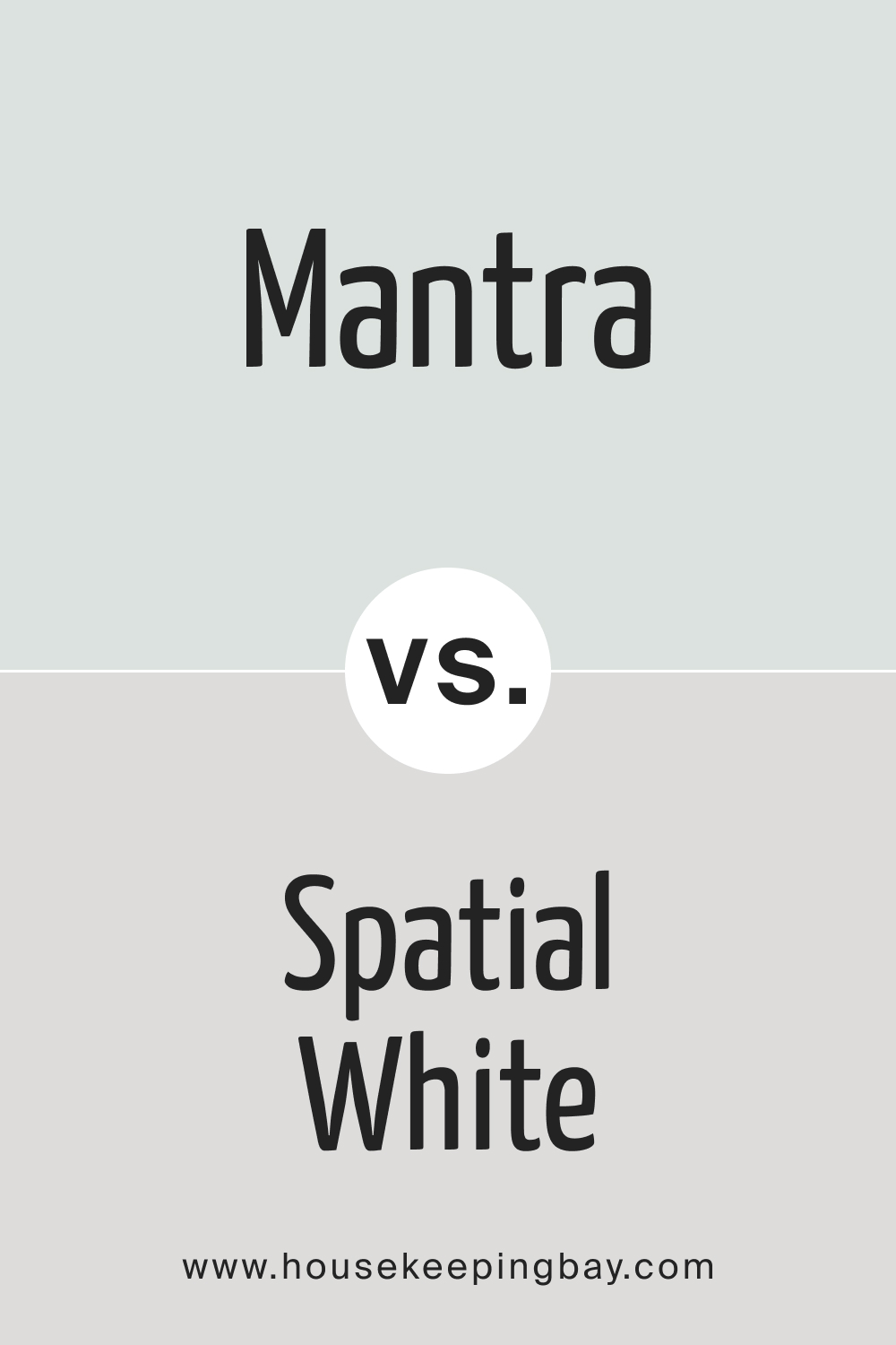
SW 9631 Mantra vs. SW 6259 Spatial White
When comparing SW 9631 Mantra and SW 6259 Spatial White , the latter brings a sense of spaciousness and light to interiors due to its lighter, ethereal quality. Mantra, with its depth and richness, provides a contemplative, cozy ambiance, suitable for more intimate and reflective spaces. Evaluating these colors side by side is essential to decide whether a room should evoke feelings of expansiveness and freedom or contemplation and coziness.
housekeepingbay.com
Conclusion
SW 9631 Mantra is more than just a color; it is a harmonious blend of versatility, elegance, and adaptability. Its intricate mix of gray and beige, along with its spectrum of undertones, allows it to morph and adapt, bringing uniqueness and character to every space it graces. It can convey warmth and coolness simultaneously, making it a go-to choice for those seeking to create spaces that are both stylish and timeless.
In a world where color can influence mood, perception, and experience, SW 9631 Mantra stands out as a symphony of hues, capable of striking the right chord in any design composition.
Whether one is looking to create a space that is calm and soothing, or vibrant and dynamic, Mantra offers a canvas on which myriad design dreams can be painted. It is a color that whispers elegance and screams versatility, truly a mantra for timeless design.
housekeepingbay.com
Ever wished paint sampling was as easy as sticking a sticker? Guess what? Now it is! Discover Samplize's unique Peel & Stick samples. Get started now and say goodbye to the old messy way!
Get paint samples




Frequently Asked Questions
⭐Is SW 9631 Mantra a warm or a cool color?
SW 9631 Mantra is generally considered a neutral color, with a balanced undertone, making it a versatile choice that can blend well with both warm and cool color schemes, depending on the surrounding colors and lighting conditions.
⭐Can SW 9631 Mantra be used for exterior painting projects?
Yes, SW 9631 Mantra can be used for exterior projects. Its muted and neutral tone can complement a variety of architectural styles and landscapes, providing a sophisticated and balanced appearance to the exterior of a home or building.
⭐How does SW 9631 Mantra look under artificial lighting?
The appearance of Mantra can vary under artificial lighting, depending on the type and color temperature of the light source. Warmer lights tend to emphasize the cozy aspects of Mantra, while cooler lights might bring out its neutral attributes, making the color appear more crisp.
⭐What is the recommended sheen level for SW 9631 Mantra?
The choice of sheen level depends on the desired aesthetic and functional needs of the space. For a more muted, sophisticated look, a matte or eggshell finish is recommended, while a satin or semi-gloss finish is suitable for areas that require easy cleaning and durability, such as kitchens or bathrooms.
⭐Is SW 9631 Mantra a good option for small rooms with little natural light?
Yes, SW 9631 Mantra can work well in smaller rooms with limited natural light. Its neutral and balanced tone can create a cozy and inviting ambiance without overwhelming the space. However, pairing it with lighter furnishings and decor can help enhance the sense of openness in the room.

