Truly Taupe SW 6038 by Sherwin Williams
Embracing the Elegance of Timeless Neutrals
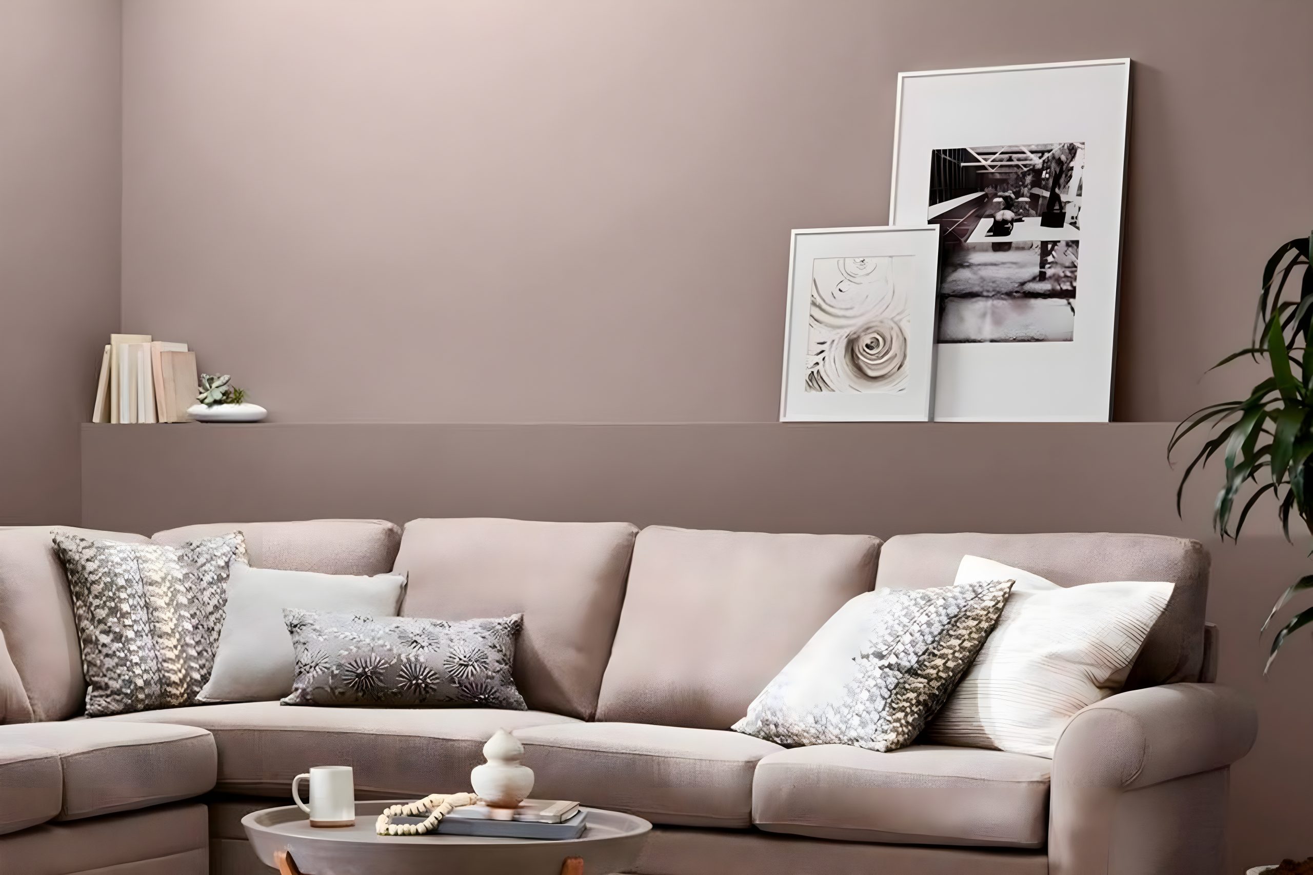
Welcome to our quick guide on SW 6038 Truly Taupe by Sherwin Williams – a versatile shade that’s taking the world of home décor by storm.
At first glance, Truly Taupe seems like a simple color, but there’s so much more to it than meets the eye.
This shade is a beautiful blend that sits perfectly between the warmth of brown and the understated elegance of gray, making it an ideal choice for those looking to add a touch of sophistication to their space without overwhelming it with color.
Truly Taupe is incredibly easy to work with.
Whether you’re giving your living room a makeover, aiming for a cozy atmosphere in your bedroom, or updating your kitchen’s look, this color has the flexibility to fit various styles and settings.
It pairs wonderfully with a wide range of colors, from soft pastels to vibrant hues, allowing you to experiment with different palettes in your home décor.
In this article, we’ll explore the unique qualities of SW 6038 Truly Taupe, offering tips on how best to use it in your decorating projects and what colors pair beautifully with it.
We’ll also look at the effects of lighting on this adaptable color and how it can change the mood of a room. So, if you’re considering a fresh look for your space, Truly Taupe is a shade that certainly deserves your attention.
via sherwin-williams.com
What Color Is Truly Taupe SW 6038 by Sherwin Williams?
Truly Taupe SW 6038 by Sherwin Williams is a unique blend of brown and gray, offering a warm, inviting feel without overpowering a space.
This versatile shade serves as a beautiful backdrop in many interior styles, particularly shining in settings that aim for a cozy, understated elegance such as contemporary, modern, and even traditional designs.
Its neutral tone acts as a perfect canvas, allowing furniture and decor to stand out, yet it’s distinct enough to make its own statement.
In terms of materials and textures, Truly Taupe pairs wonderfully with a wide range. For a sleek and modern look, consider combining it with polished metals like stainless steel or chrome, which contrast nicely with its warmth.
Natural elements, such as wooden furniture or woven baskets, bring out the earthy side of this color, enhancing a more organic, grounded vibe in the room.
Soft textures like velvet or wool in furnishings will add depth and comfort, creating a welcoming space that feels put together yet lived-in.
Truly Taupe’s adaptability extends to pairing well with both bold and muted color palettes, allowing for flexibility in design choices.
Whether you’re looking to create a serene retreat or a dynamic space with pops of color, Truly Taupe serves as an excellent foundation for exploring creative ideas in home decor.
housekeepingbay.com
Table of Contents
Is Truly Taupe SW 6038 by Sherwin Williams Warm or Cool color?
Truly Taupe SW 6038 by Sherwin Williams is a unique and versatile paint color.
It offers a perfect balance between a soft brown and a warm gray, making it a fantastic choice for those looking to add a touch of sophistication and warmth to their spaces without overwhelming them with too much color.
This shade is particularly good for rooms that could use a cozy yet modern feel.
What’s great about Truly Taupe is how it adapts to different lighting conditions. In rooms with lots of natural light, it can appear lighter and more gray, creating a serene and airy atmosphere.
In spaces with less natural light, it tends to show more of its warm brown tones, providing a snug and inviting feel. This adaptability makes it an excellent choice for any room in the house, from living rooms and bedrooms to kitchens and bathrooms.
Moreover, Truly Taupe pairs beautifully with a wide range of colors, from crisp whites and soft creams to bold and dark hues.
This flexibility allows homeowners to easily match it with their existing decor and furniture, making it a practical and stylish choice for home improvement projects.
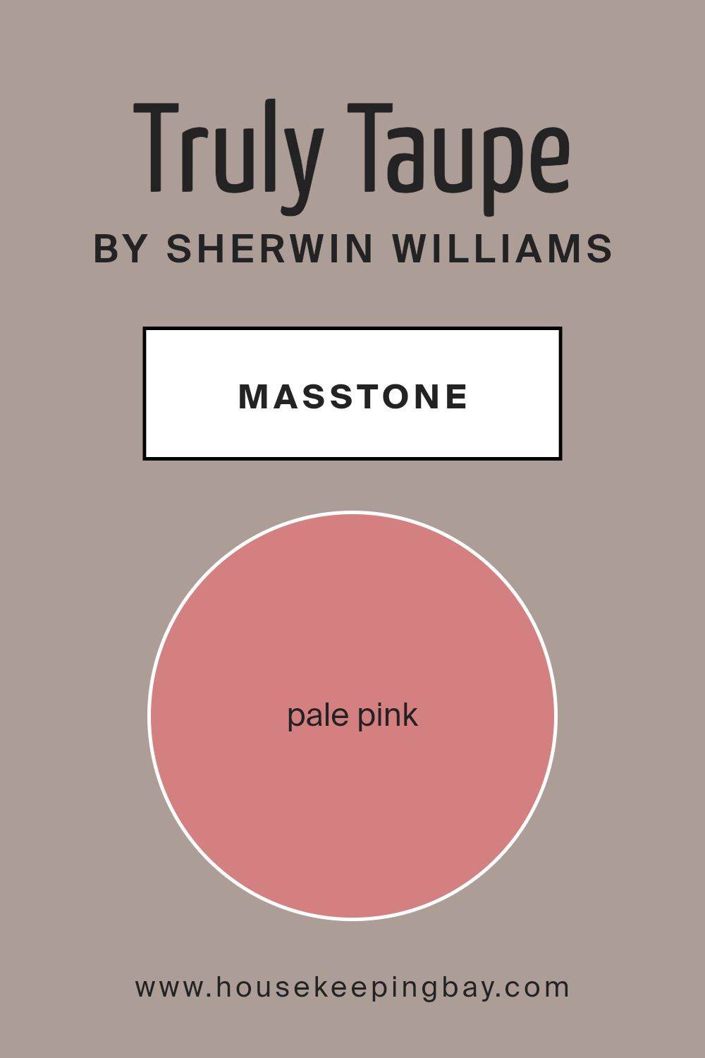
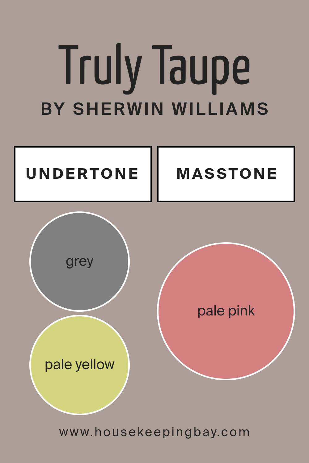
What is the Masstone of the Truly Taupe SW 6038 by Sherwin Williams?
Truly Taupe SW 6038 by Sherwin Williams is a unique color that closely resembles pale pink (#D58080) as its masstone. This means the underlying tone of the paint has a soft, gentle pink hue.
When applied to walls or used in home decor, this color brings a warm, inviting feel to any room. The pale pink masstone makes Truly Taupe versatile, fitting in with a wide range of decorating styles, from modern minimalist to cozy and traditional.
Since it’s not a stark or bold color, Truly Taupe works well in spaces where you want to create a calm and relaxing atmosphere, like bedrooms or living areas.
Its subtle pink undertone adds a touch of warmth to spaces that might otherwise appear cold or impersonal, making rooms feel more welcoming and lived-in.
This color is great for people looking to add a hint of color to their homes without overwhelming the space with something too bright or out of character.
It’s an excellent choice for anyone wanting to achieve a soft, subtle backdrop that easily blends with other colors and decor elements.
housekeepingbay.com
Undertones of Truly Taupe SW 6038 by Sherwin Williams
Truly Taupe SW 6038 by Sherwin Williams is a unique paint color that might seem simple at first glance, but it’s much more complex when you take a closer look because of its undertones.
Understanding undertones—those subtle hints of color that lie beneath the main shade—is key to picking the perfect paint color. For Truly Taupe, the undertones are grey and pale yellow.
Grey adds a cool, neutral backdrop, while pale yellow offers a touch of warmth, making this color incredibly versatile.
So, why do undertones matter so much? Well, they can significantly affect how we see the color in different lights and settings.
Depending on the time of day and the type of lighting in a room (natural or artificial), Truly Taupe can shift from appearing more like its grey undertones to showing off that warm, pale yellow vibe.
This chameleon-like quality means the color can adapt well to various interior styles and pair nicely with a wide range of furniture and decor.
When applied to interior walls, the grey and pale yellow undertones in Truly Taupe work together to create a cozy yet sophisticated atmosphere.
This balance means the color can make a space feel grounded and calm without feeling too dark or heavy. It’s excellent for living rooms, bedrooms, or any space where you want a hint of elegance without sacrificing comfort.
The undertones help ensure the color blends well with other elements in the room, making decorating a breeze.
housekeepingbay.com
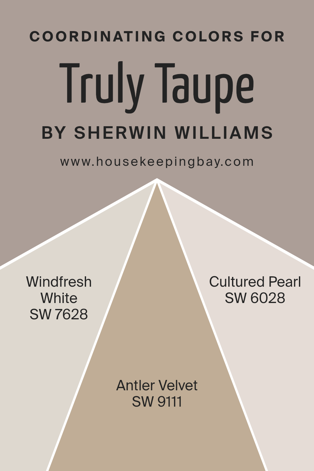
Coordinating Colors of Truly Taupe SW 6038 by Sherwin Williams
Coordinating colors are shades that complement each other, working in harmony to create a balanced and visually appealing space.
The idea is to pick colors that pair well with a primary color, in this case, Truly Taupe SW 6038 by Sherwin Williams, to enhance the overall aesthetic of a room.
These colors can be used across walls, furniture, and accents, providing a cohesive look without becoming monotonous. The magic of coordinating colors lies in their ability to bring out the best in each other, making spaces feel more put together and intentional.
For a soft and inviting backdrop, Windfresh White SW 7628 serves as an excellent coordinating color. It’s a clean, crisp white that brings a fresh breath of air into any space, complementing the warmth of Truly Taupe without overwhelming.
Then there’s Antler Velvet SW 9111, a rich and nuanced shade that adds a touch of sophistication and depth, perfectly echoing the earthy undertones of Truly Taupe.
On the lighter side, Cultured Pearl SW 6028 offers a serene and subtle contrast, a gentle hue that softens the overall look, ensuring the space feels open and airy.
Together, these colors offer a harmonious palette that enhances the beauty of Truly Taupe, allowing for a design that’s both cohesive and rich in depth.
You can see recommended paint colors below:
- SW 7628 Windfresh White
- SW 9111 Antler Velvet
- SW 6028 Cultured Pearl
housekeepingbay.com
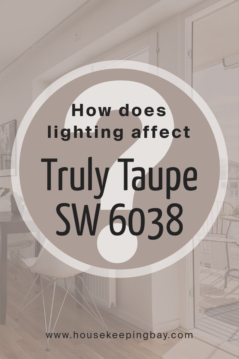
How Does Lighting Affect Truly Taupe SW 6038 by Sherwin Williams?
Light plays a huge role in how we see colors. It can change the way a color looks, sometimes quite dramatically. This is especially true for paint colors like Truly Taupe SW 6038 by Sherwin Williams.
The lighting, whether it’s coming from the sun or from bulbs in our homes, can affect how we perceive this color.
In artificial light, the type of bulb you use can make a difference. Warm bulbs can make Truly Taupe appear more cozy and inviting, giving it a slightly golden glow.
On the other hand, cool bulbs might bring out more of the gray tones in the paint, making the color look more crisp and modern.
Natural light has a different effect on Truly Taupe, depending on the direction of the room.
In north-facing rooms, which get less direct sunlight, Truly Taupe can appear more muted and cooler, enhancing the gray tones. This can give a calm and serene feeling to the room.
South-facing rooms get a lot of bright, direct sunlight, which can warm up the color, highlighting the taupe and making the space feel soft and warm throughout the day.
East-facing rooms enjoy the morning light, which is cooler and bluish. This can make Truly Taupe look more lively and fresh in the morning, gradually shifting as the day goes on.
By the afternoon, as the light fades, the color can return to its more muted, serene state.
In west-facing rooms, the warm, golden light of the afternoon and evening can really bring out the warmth in Truly Taupe, making it feel cozy and inviting. The color can look quite different in the afternoon than it does in the morning when the light is cooler.
Overall, the way Truly Taupe looks can vary a lot, depending on the light it’s in. This makes it a versatile color that can adapt to many spaces and styles, but it also means it’s important to test it out in your specific lighting conditions to see how it will truly look in your space.
housekeepingbay.com
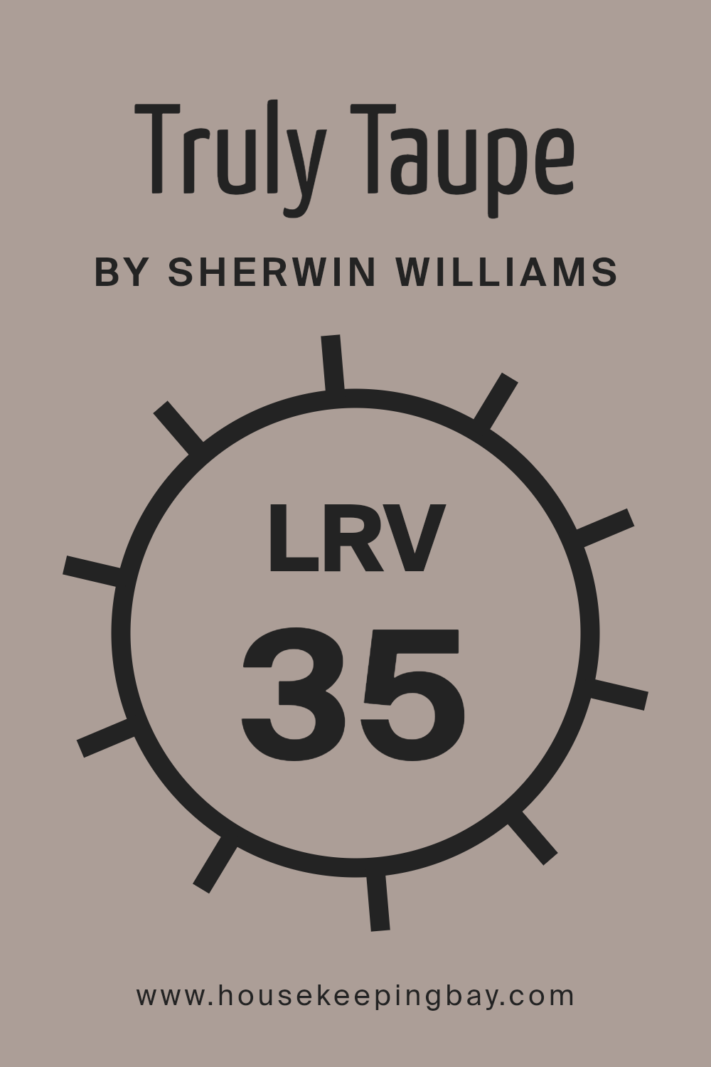
What is the LRV of Truly Taupe SW 6038 by Sherwin Williams?
LRV stands for Light Reflectance Value, which is a number that ranges from 0 to 100. This number tells you how much light a color reflects back into a room.
Colors with a higher LRV, closer to 100, reflect more light, making a space feel brighter and larger. On the other hand, colors with a lower LRV, closer to 0, absorb more light, creating a cozier and more intimate atmosphere.
This value is crucial when choosing a paint color because it helps you understand how the color will look under different lighting conditions and how it can affect the overall feel of a room.
Truly Taupe SW 6038 by Sherwin Williams has an LRV of 35.462, which means it’s on the darker side of the spectrum but still reflects a significant amount of light.
A color with this LRV will bring warmth and depth to a space without overwhelming it with darkness.
In rooms with plenty of natural light, Truly Taupe can appear more lively and dynamic, whereas, in spaces with less natural light, it might present a more subdued and cozy feel.
This particular LRV makes Truly Taupe versatile for various spaces, striking a balance between creating coziness and maintaining some brightness.
housekeepingbay.com
What is LRV? Read It Before You Choose Your Ideal Paint Color
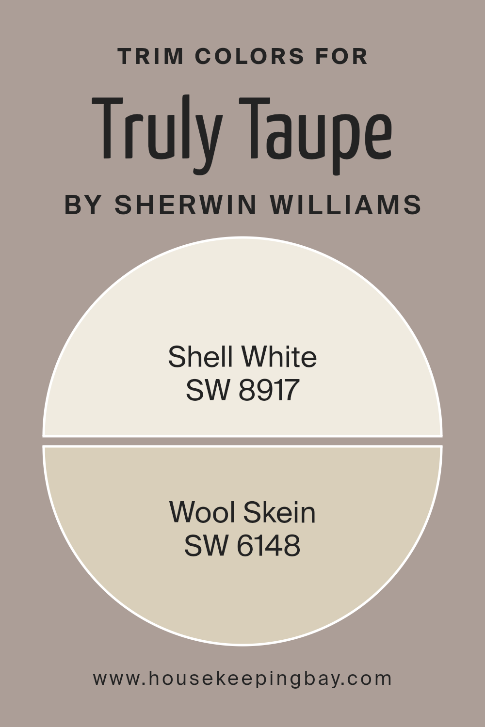
What are the Trim colors of Truly Taupe SW 6038 by Sherwin Williams?
Trim colors are the accent colors used on the finishing details of a room, like baseboards, moldings, window frames, and door frames, which can frame and complement the main color on the walls.
In the case of Truly Taupe SW 6038 by Sherwin Williams, the choice of trim colors is crucial because it can either subtly enhance the sophisticated and neutral tone of Taupe, or add a contrasting depth to enrich the overall aesthetics of the space.
Using either Shell White SW 8917 or Wool Skein SW 6148 as trim colors offers a way to create a harmonious balance with Truly Taupe, making the space feel thoughtfully designed and cohesive.
Shell White SW 8917 is a soft, warm white with a touch of creaminess, providing a gentle contrast against the grounding, mid-tone hue of Truly Taupe, adding a subtle brightness to the room without overwhelming it with starkness.
On the other hand, Wool Skein SW 6148, a soothing light beige with gray undertones, complements Truly Taupe by blending more naturally, enhancing the warmth of the space, and creating a seamless transition between the wall and trim.
These colors not only define the architectural features of the room with elegance but also contribute to the overall ambiance, making the choice of trim color an essential aspect of interior design.
You can see recommended paint colors below:
- SW 8917 Shell White
- SW 6148 Wool Skein
housekeepingbay.com
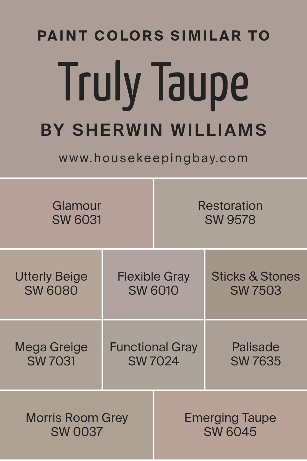
Colors Similar to Truly Taupe SW 6038 by Sherwin Williams
Similar colors play a vital role in design by creating a sense of harmony and balance, making spaces feel cohesive and thoughtfully planned.
Take, for instance, colors similar to Truly Taupe SW 6038 by Sherwin-Williams, such as Glamour, Restoration, Utterly Beige, Flexible Gray, Sticks & Stones, Mega Greige, Functional Gray, Palisade, Morris Room Grey, and Emerging Taupe.
These hues share a common foundation with Truly Taupe, allowing for fluid transitions and subtle variations in a space, which is key for achieving a polished look without the monotony of using a single color.
Glamour presents a muted warmth that brings elegance to any room, while Restoration offers a slightly aged look, perfect for adding character.
Utterly Beige is a soft, welcoming color that gives a room a comforting feel, and Flexible Gray introduces a versatile, modern edge.
Sticks & Stones has an earthy depth, ideal for grounding a space, whereas Mega Greige combines gray and beige for a rich, sophisticated tone.
Functional Gray leans towards a cooler palette, bringing a contemporary sharpness. Palisade has depth, adding a notable but refined statement. Morris Room Grey echoes the historic and timeless, fitting for spaces aiming for a classic charm.
Lastly, Emerging Taupe strikes a balance between warm and cool, creating an inviting and adaptable background.
These colors, surrounding the central hue of Truly Taupe, illustrate how similar shades can enhance the overall essence of design, allowing for creativity and personal expression within a harmonious color scheme.
You can see recommended paint colors below:
- SW 6031 Glamour
- SW 9578 Restoration
- SW 6080 Utterly Beige
- SW 6010 Flexible Gray
- SW 7503 Sticks & Stones
- SW 7031 Mega Greige
- SW 7024 Functional Gray
- SW 7635 Palisade
- SW 0037 Morris Room Grey
- SW 6045 Emerging Taupe
housekeepingbay.com
How to Use Truly Taupe SW 6038 by Sherwin Williams In Your Home?
Truly Taupe SW 6038 by Sherwin Williams is a versatile and stylish paint color that brings a cozy warmth to any room in your home.
It’s a unique shade that falls somewhere between brown and gray, making it the perfect neutral backdrop for both bold and soft color schemes.
Whether you want to create a calm and inviting living room, a sophisticated dining area, or a relaxing bedroom, Truly Taupe can help you achieve your vision.
You can apply this color to your walls to instantly give the space a modern and grounded feel. Pair it with crisp white trim for a fresh look, or combine it with darker furniture for a more dramatic effect.
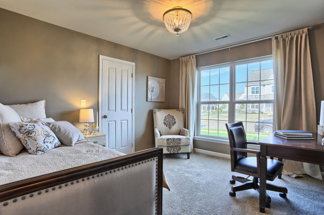
It also works beautifully in a home office where the neutral tone can help to create a focused and calming environment. Plus, because it’s a neutral shade, you can easily switch up your decor and accent pieces without having to repaint.
Truly Taupe is perfect for those looking to add a touch of elegance and comfort to their home.
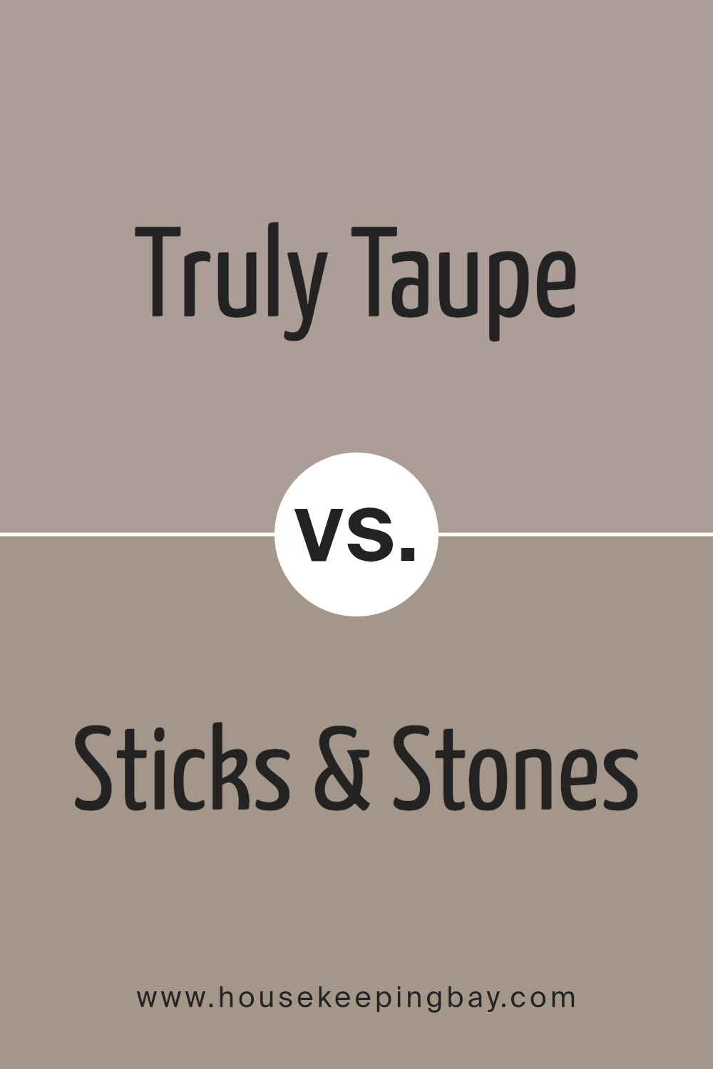
Truly Taupe SW 6038 by Sherwin Williams vs Sticks & Stones SW 7503 by Sherwin Williams
Truly Taupe SW 6038 and Sticks & Stones SW 7503, both from Sherwin Williams, offer unique yet complementary color options for home decor.
Truly Taupe is a soft, warm neutrals that combines hints of gray and brown, creating a cozy and inviting atmosphere. It’s versatile, fitting well in almost any room, and pairs nicely with a wide range of decor styles.
On the other hand, Sticks & Stones SW 7503 is a bit darker, leaning more towards a rich, earthy brown with subtle gray undertones. It offers a grounding effect and adds depth and sophistication to spaces.
Both colors are quite adaptable, but Truly Taupe shines in creating a lighter, more airy feel, while Sticks & Stones brings a strong, comforting presence to a room.
Depending on your style and the vibe you’re going for, each color has its strengths, with Truly Taupe offering a softer touch and Sticks & Stones providing a bolder statement.
You can see recommended paint color below:
- SW 7503 Sticks & Stones
housekeepingbay.com
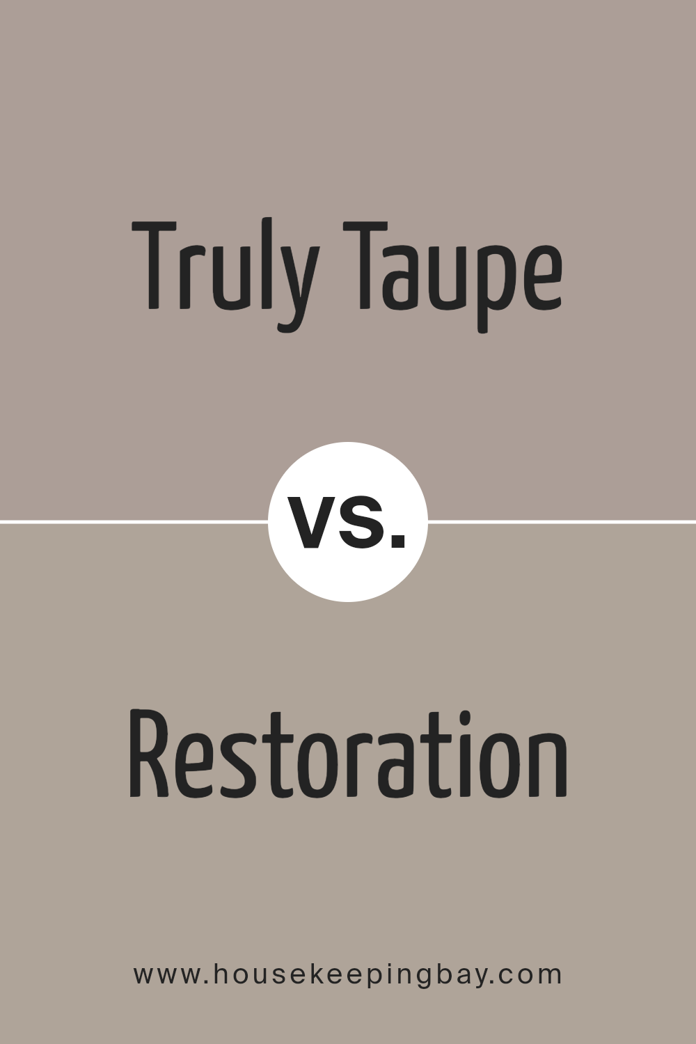
Truly Taupe SW 6038 by Sherwin Williams vs Restoration SW 9578 by Sherwin Williams
Truly Taupe SW 6038 and Restoration SW 9578, both from Sherwin Williams, are two unique colors with their individual charm. Truly Taupe is a warm, subtle shade that blends gray and brown, giving off a cozy and inviting vibe.
It is versatile and can easily fit into many decorating styles, making spaces feel grounded and elegant without overwhelming them.
On the other hand, Restoration SW 9578 leans towards a cooler, more understated ambiance. It’s a light, airy color with a blend of gray and blue tones, presenting a fresh and serene look.
This color can brighten up spaces while maintaining a sophisticated and calming atmosphere.
Both colors offer distinct moods and aesthetics to a room. While Truly Taupe adds warmth and richness, enhancing a welcoming and comfortable feel, Restoration brings a sense of peace and tranquility, ideal for creating a soothing and restful environment.
Depending on the atmosphere you wish to achieve, either color can transform a space beautifully.
You can see recommended paint color below:
- SW 9578 Restoration
housekeepingbay.com
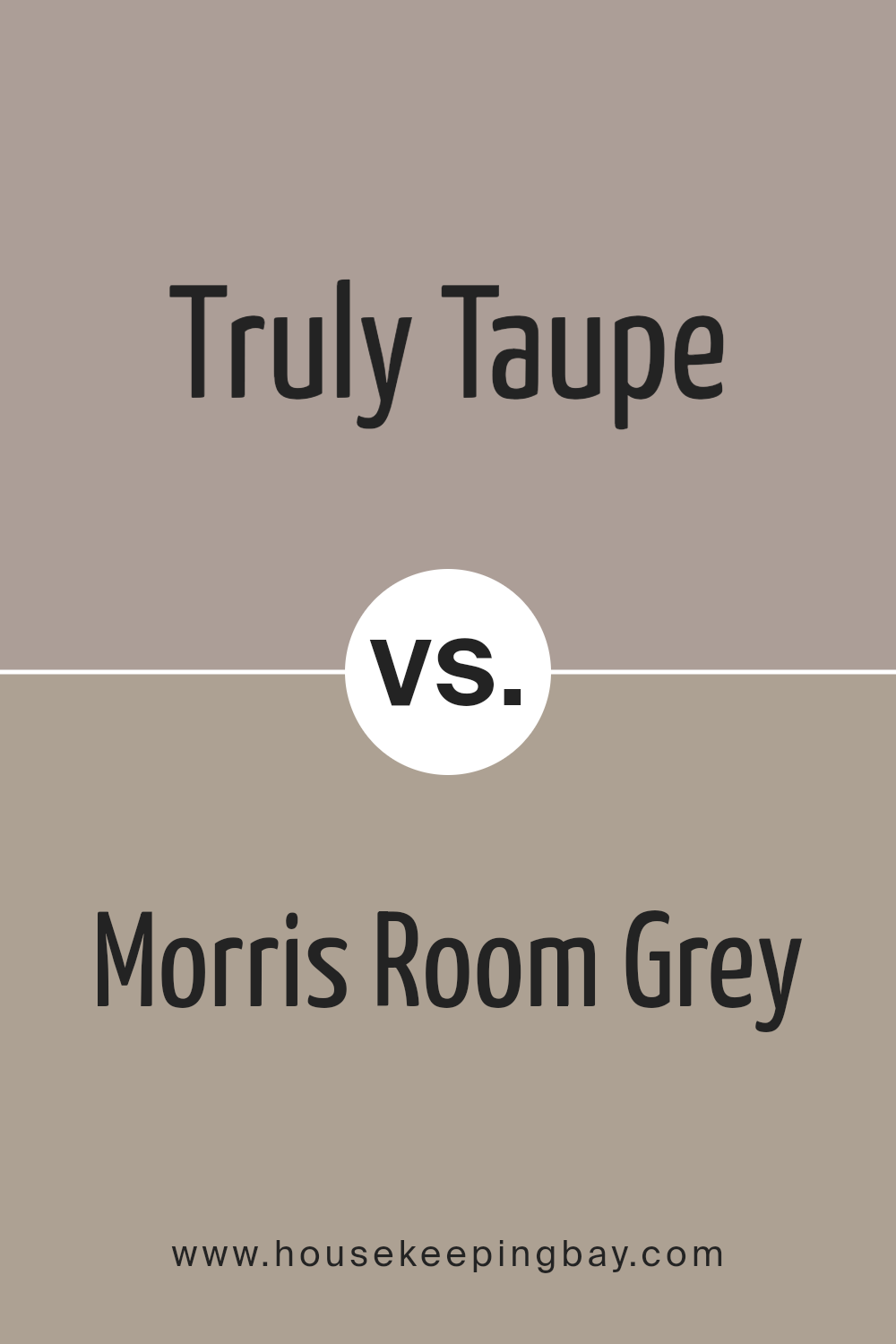
Truly Taupe SW 6038 by Sherwin Williams vs Morris Room Grey SW 0037 by Sherwin Williams
Truly Taupe SW 6038 by Sherwin Williams and Morris Room Grey SW 0037 are two distinct colors that bring their unique vibe to any space. Truly Taupe is a soft, warm grey with a hint of brown.
It gives off a cozy feeling, making it perfect for rooms where you want to relax and feel at home. Its warmth adds a subtle touch of comfort and elegance, making spaces feel inviting.
On the other hand, Morris Room Grey is a bit cooler and has a classic, timeless feel. It leans more towards a traditional grey, but with depth that adds character to a room.
This color works great in spaces where you want a more sophisticated or formal look, but it’s still soft enough to not feel too heavy or overpowering.
Both colors are versatile and can work well in various lighting conditions, but Truly Taupe offers warmth, whereas Morris Room Grey provides a cooler, more refined atmosphere.
Depending on what mood or style you’re aiming for, either color could be the perfect fit.
You can see recommended paint color below:
- SW 0037 Morris Room Grey
housekeepingbay.com
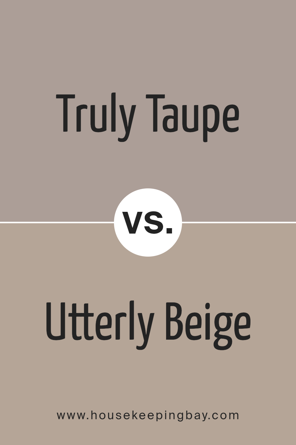
Truly Taupe SW 6038 by Sherwin Williams vs Utterly Beige SW 6080 by Sherwin Williams
Truly Taupe SW 6038 and Utterly Beige SW 6080, both by Sherwin Williams, offer subtle yet distinct hues that can significantly influence the mood and style of a room.
Truly Taupe leans towards a soft, warm gray with a hint of brown, giving it a cozy and inviting feel. Its versatility means it pairs well with a wide range of decor, making it an excellent choice for those seeking a neutral backdrop with a touch of warmth.
On the other hand, Utterly Beige is a warmer, more noticeable shade that closely resembles classic beige. It is light and airy, providing a comforting and welcoming ambiance to any space.
Unlike Truly Taupe, which balances between gray and brown, Utterly Beige offers a clearer, straightforward warm tone, potentially making spaces feel brighter and more open.
While both colors are highly adaptable, your choice between them might come down to the specific mood you want to set: Truly Taupe for a subtle, sophisticated feel, or Utterly Beige for a classic, cozy atmosphere.
You can see recommended paint color below:
- SW 6080 Utterly Beige
housekeepingbay.com
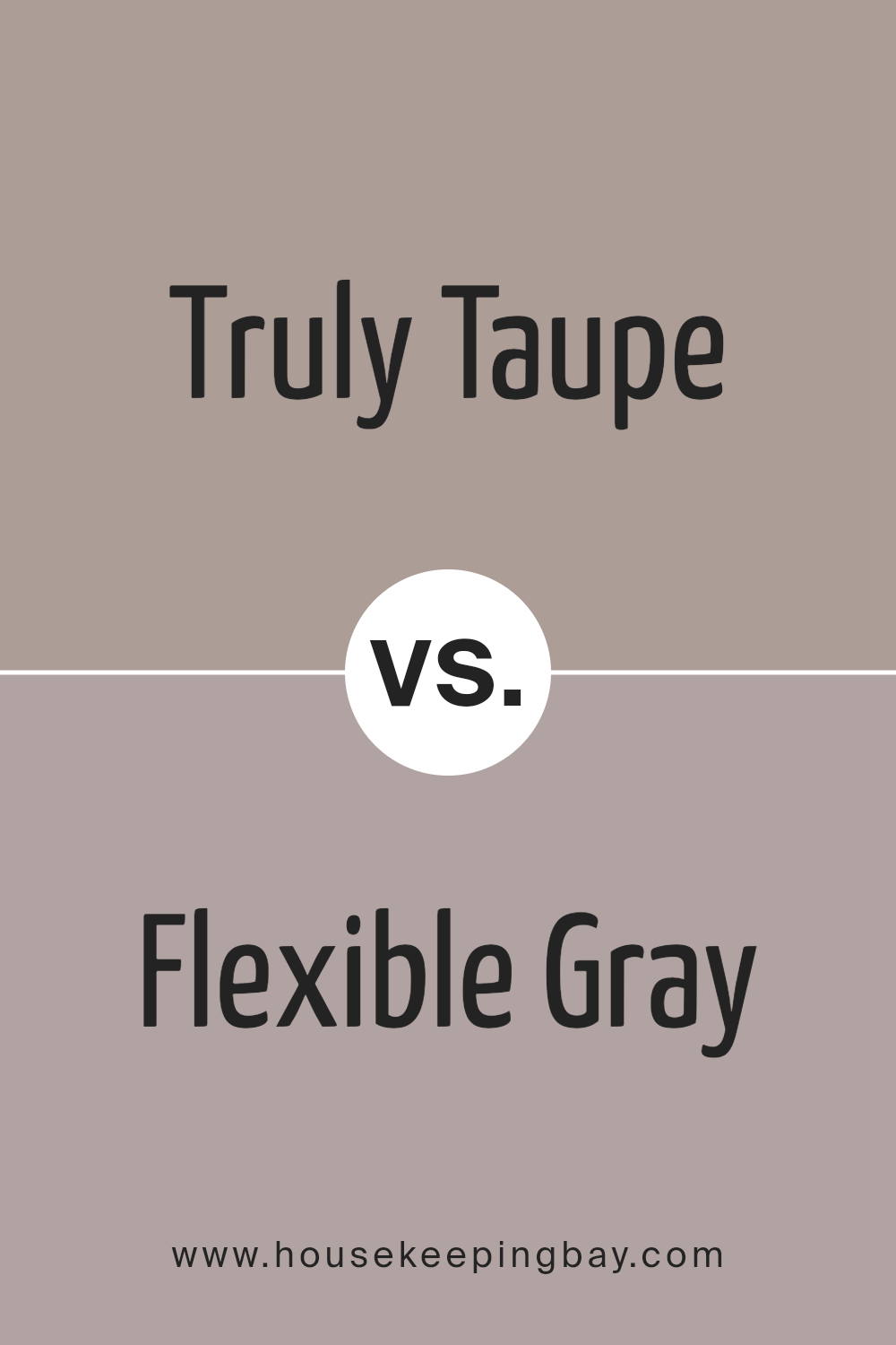
Truly Taupe SW 6038 by Sherwin Williams vs Flexible Gray SW 6010 by Sherwin Williams
Truly Taupe SW 6038 by Sherwin Williams and Flexible Gray SW 6010 both offer unique yet subtle tones for any space. Truly Taupe is a warm, cozy color that leans a bit towards brown, giving off a welcoming vibe.
It’s like a gentle hug for your walls, making rooms feel inviting. On the other hand, Flexible Gray is cooler and closer to a classic gray. This color has a modern feel, perfect for creating a calm, soothing atmosphere.
It’s like a cool breeze that refreshes a room without overwhelming it. When comparing the two, Truly Taupe brings warmth and a hint of earthiness, making it great for a living room or bedroom where you want to relax.
Flexible Gray, with its cooler tone, is better suited for spaces that aim for a more contemporary look, like bathrooms or offices. Both colors are versatile but serve different moods and aesthetics.
Whether you want a cozy retreat or a sleek space, choosing between Truly Taupe and Flexible Gray depends on the ambiance you’re aiming to achieve.
You can see recommended paint color below:
- SW 6010 Flexible Gray
housekeepingbay.com
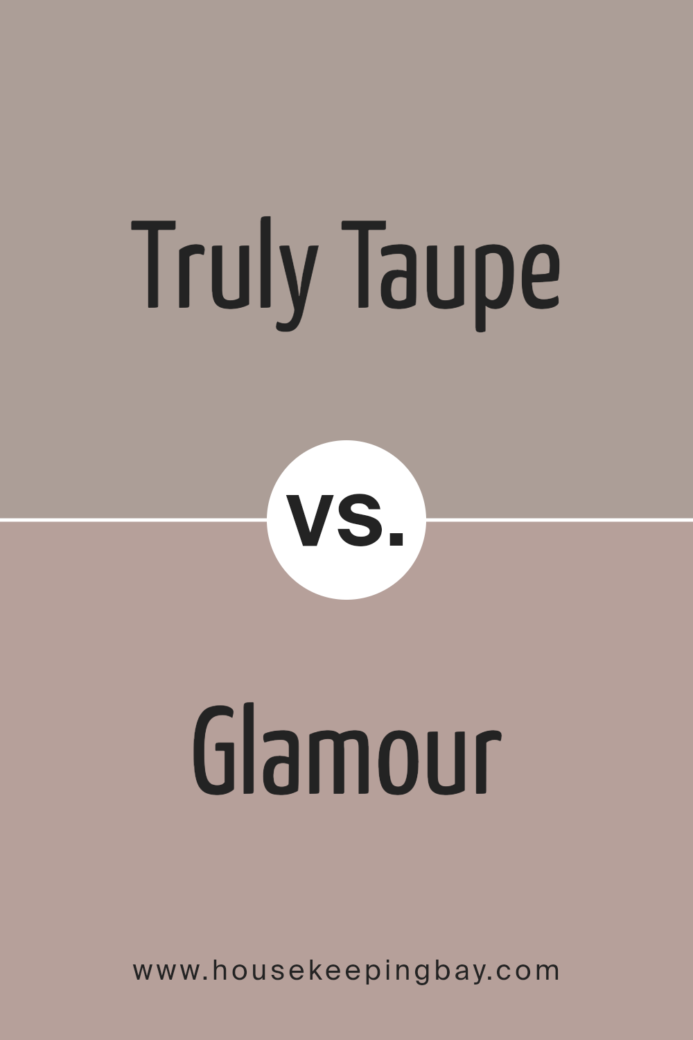
Truly Taupe SW 6038 by Sherwin Williams vs Glamour SW 6031 by Sherwin Williams
Truly Taupe and Glamour, both from Sherwin Williams, offer unique vibes for any room. Truly Taupe, as its name suggests, is a taupe color. It’s like a cozy, warm hug for your walls, giving off a feeling of comfort and simplicity.
It’s not too dark or too light, making it a great choice for a calm and inviting space. On the other side, Glamour takes things up a notch.
It’s a deeper, more striking color with a hint of rosiness. Imagine the warmth of a sunset wrapped around your room; that’s Glamour for you. It’s still cozy but adds a bit more drama and warmth compared to the softer, more muted presence of Truly Taupe.
Both colors can create lovely, cozy atmospheres, but Truly Taupe leans towards a neutral, understated elegance, while Glamour brings a warmer, more vibrant feel to a space.
You can see recommended paint color below:
- SW 6031 Glamour
housekeepingbay.com
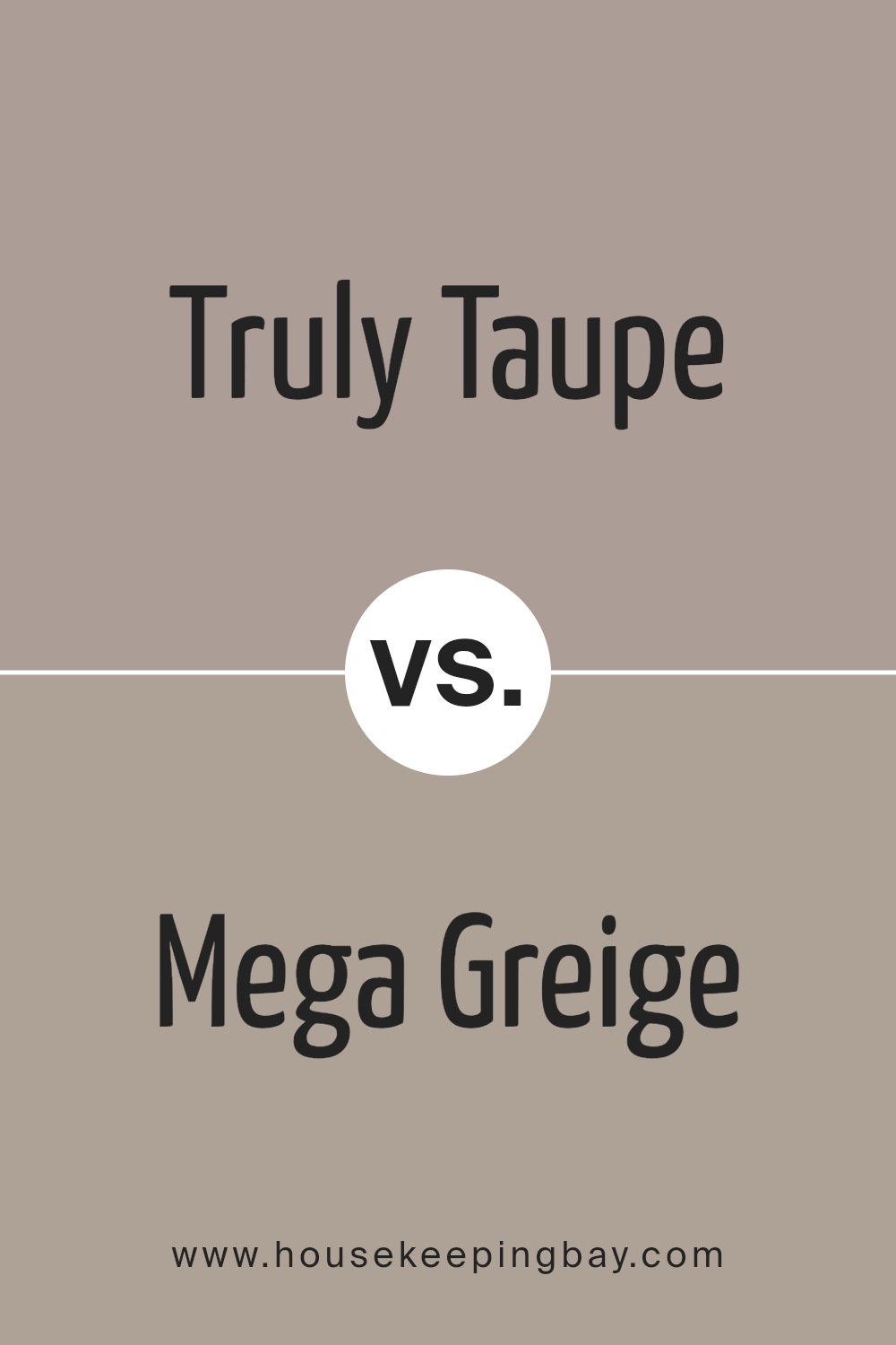
Truly Taupe SW 6038 by Sherwin Williams vs Mega Greige SW 7031 by Sherwin Williams
Truly Taupe SW 6038 by Sherwin Williams and Mega Greige SW 7031 by Sherwin Williams are two colors that are both subtle and sophisticated. Truly Taupe has a unique mix of brown and gray, giving it a warm, cozy feel.
It’s a versatile shade that works well in many spaces, adding a touch of elegance without overpowering the room.
On the other hand, Mega Greige is a deeper blend that leans more towards gray, with hints of brown. This color brings a strong sense of calm and neutrality, making it perfect for creating a serene space.
It’s a bit cooler compared to Truly Taupe and offers a solid base for decorating, whether you’re aiming for a modern look or something more traditional.
Both colors share a neutral palette, but Truly Taupe offers warmth, while Mega Greige provides a cooler, more understated background.
Depending on the atmosphere you want to create, choosing between them can drastically change the mood of a room.
Whether you’re after a comforting and homey feel with Truly Taupe or a more laid-back and refined ambiance with Mega Greige, both colors offer a beautiful backdrop to any living space.
You can see recommended paint color below:
housekeepingbay.com
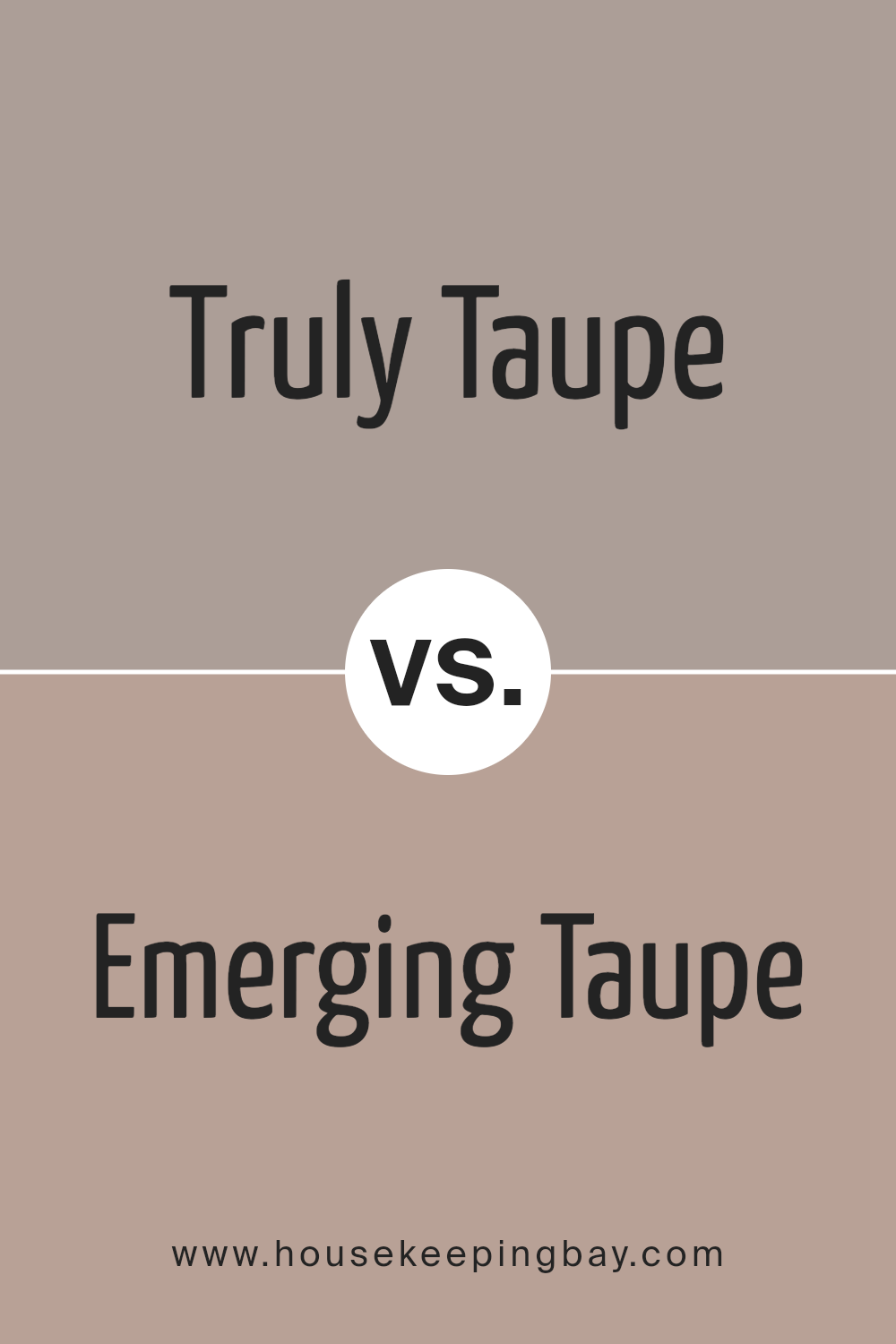
Truly Taupe SW 6038 by Sherwin Williams vs Emerging Taupe SW 6045 by Sherwin Williams
Truly Taupe SW 6038 and Emerging Taupe SW 6045 by Sherwin Williams are both beautiful colors that belong to the taupe family, but they have some differences.
Truly Taupe has a slightly darker tone, giving it a cozy and warm feeling. It’s perfect for creating a snug atmosphere in any room, making spaces feel more inviting and comfortable.
On the other hand, Emerging Taupe is lighter and has a softer vibe. This color can brighten up a space while still keeping that warm, neutral look that taupe is known for.
It’s great for making small rooms appear bigger and more open. While both colors offer a sense of warmth and neutrality, Truly Taupe leans towards a richer, deeper feeling, whereas Emerging Taupe offers a more gentle and airy ambiance.
Each color can beautifully complement a variety of decors, depending on whether you want to create a cozier feel or a more spacious and light environment.
You can see recommended paint color below:
- SW 6045 Emerging Taupe
housekeepingbay.com
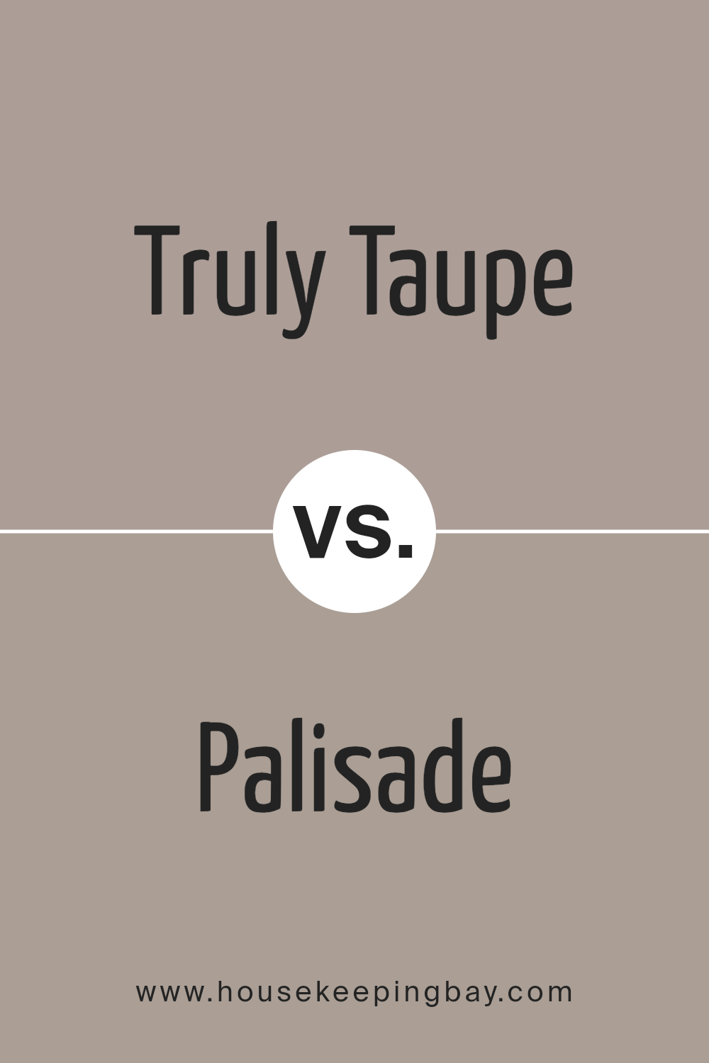
Truly Taupe SW 6038 by Sherwin Williams vs Palisade SW 7635 by Sherwin Williams
Truly Taupe SW 6038 by Sherwin Williams and Palisade SW 7635 by Sherwin Williams are two distinct colors worth comparing. Truly Taupe is a unique blend that brings a warm, cozy feel to any space.
It’s like a soft, comforting hug for your walls, offering a neutral backdrop that works well with a wide range of decor. It’s the kind of color that can make a room feel both inviting and stylish without trying too hard.
On the other hand, Palisade SW 7635 takes a slightly different lane. This color leans more towards the cooler side of the spectrum, offering a serene and calm vibe.
It’s like a breath of fresh air in any room, providing a tranquil background that’s perfect for spaces where you want to relax and unwind. Palisade has a way of making rooms look elegant and understated, giving off a chic and modern feel.
When deciding between Truly Taupe and Palisade, think about the vibe you’re going for.
If you want warmth and coziness, Truly Taupe is your go-to. But if you’re aiming for calm and serenity with a touch of modern elegance, Palisade is the way to shine.
You can see recommended paint color below:
- SW 7635 Palisade
housekeepingbay.com
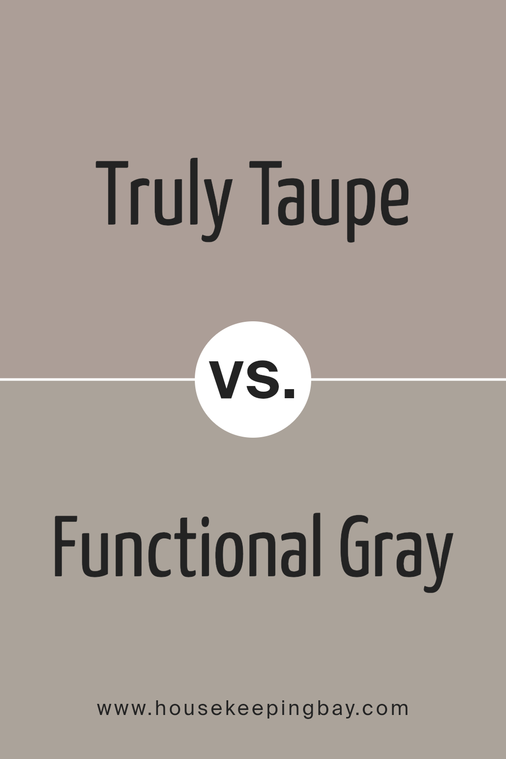
Truly Taupe SW 6038 by Sherwin Williams vs Functional Gray SW 7024 by Sherwin Williams
Truly Taupe SW 6038 and Functional Gray SW 7024 by Sherwin Williams are two unique colors that bring their own distinct vibes to a space. Truly Taupe is a warm, inviting color that feels like a cozy blanket.
It has a touch of softness and elegance, making it perfect for creating a soothing and welcoming atmosphere in any room. It’s not just brown; it’s got a hint of gray that adds a sophisticated twist.
On the other hand, Functional Gray is a cooler, more neutral shade of gray. It’s like the calm before the storm – not too dark, not too light, but just right for adding a modern and sleek look to your walls.
This color is versatile, working well in lots of different spaces because it doesn’t overpower the room but still adds character.
So, while Truly Taupe brings a warm and cozy feel with its soft brown-gray hue, Functional Gray offers a clean, contemporary vibe with its balanced gray tone.
Both are great choices, but your final pick depends on the mood you’re aiming for in your space.
You can see recommended paint color below:
- SW 7024 Functional Gray
housekeepingbay.com
Conclusion
In conclusion, Truly Taupe SW 6038 by Sherwin Williams stands as a versatile color choice for anyone looking to add a touch of sophistication and warmth to their space.
Its balanced blend of brown and gray hues offers a unique backdrop that works well with a variety of decor styles and color palettes. This makes it an ideal choice for those seeking a neutral color that is both stylish and easy to work with.
Moreover, Truly Taupe’s calming and inviting nature makes it a perfect option for creating serene and comfortable environments in homes or offices.
Whether used in large areas or as an accent, it contributes to creating spaces that are welcoming and cozy. The popularity of Truly Taupe SW 6038 is a testament to its timeless appeal and flexibility in interior design.
housekeepingbay.com
Ever wished paint sampling was as easy as sticking a sticker? Guess what? Now it is! Discover Samplize's unique Peel & Stick samples. Get started now and say goodbye to the old messy way!
Get paint samples