32 Trendy Farmhouse Exterior Paint Colors by Sherwin-Williams in 2025
Fresh, natural tones and modern classics to give your farmhouse real curb appeal
When I pull up to a house, the very first thing I notice isn’t the porch swing or the landscaping—it’s the color. Especially with farmhouse-style homes, paint tells the whole story before you even open the door.
For years, I’ve helped homeowners create a warm, grounded feeling on the outside of their homes just by adjusting the paint. The right color can make a house feel inviting, peaceful, and rooted—like it’s been loved for generations. And when it comes to finding the perfect paint, I almost always reach for Sherwin-Williams. Their quality holds up in all kinds of weather, and their palette is huge, but still thoughtfully curated.
In 2025, we’re seeing farmhouse exteriors move in a slightly softer, earthier direction. The bright whites are still around, but now they’re warmer. The darks have more depth—less black, more charcoal and deep green.
Neutrals are back too, but not in a flat way—they’re creamy, taupe-y, even sandy. These colors reflect what so many people want: comfort, calm, and a sense of being grounded.
Whether you’re repainting for the first time in decades or just want your home to stand out in the best way, picking the right color is where it all starts.
housekeepingbay.com
What Makes a Color ‘Farmhouse’?
I get asked this a lot: “What exactly is a farmhouse color?” And I always say—it’s not just about white walls and black trim. A real farmhouse color feels lived-in. It’s simple, not showy. It looks good with nature, with dirt on the boots, with an old tree in the yard.
Here’s what I look for when I choose a true farmhouse exterior color:
- Soft, muted tones — Nothing too sharp or neon. These colors should feel like they’ve been there a while, even if they’re fresh.
- Natural undertones — Think of soil, stone, clay, cotton, wheat. These tones feel grounded and cozy.
- Classic contrast — Many farmhouses use white or cream with darker trim. That contrast gives structure without being loud.
- A sense of warmth — Even if it’s a cool color, it shouldn’t feel cold or sterile. You want it to welcome people.
Two Types of Farmhouse Looks:
1. Traditional Farmhouse
- Usually white or off-white
- Black or forest green shutters
- Clean and simple
- Works best with wood or board-and-batten siding
2. Modern Farmhouse
- Charcoal, greige, even navy siding
- Crisp white trim or natural wood accents
- A little more bold, but still calm
- Popular with metal roofs and darker windows
What ties them together is balance. The colors shouldn’t fight the setting—they should fit.
Some designers might say color trends change fast. That’s true. But the feeling behind a good farmhouse color? That sticks. It’s about looking at a home and saying, “This feels right.”
Sherwin-Williams 2025 Color Trends Overview
Every year, I keep a close eye on what Sherwin-Williams releases in their color forecast. It gives me a good idea of where tastes are heading—not just in magazines, but in real neighborhoods, with real homes. And 2025? It’s all about comfort, softness, and tones that feel natural without being boring.
What’s Big This Year?
- Warm whites are replacing stark, icy whites.
- Greens are richer and more nature-inspired—like moss, olive, and even eucalyptus.
- Beige is back, but it’s more earthy and clay-based, not flat or dull.
- Deep charcoals and navy blues are used for contrast, not to overpower.
- Brown is growing—especially in trim, shutters, and front doors.
According to Sherwin-Williams, their 2025 Color of the Year is Persimmon SW 6339 — a soft, muted terracotta. It’s not a typical farmhouse shade, but it shows how we’re leaning warmer, softer, and a little nostalgic this year.
“In an era of permanence and comfort, people crave colors that feel both grounded and expressive.”— Sue Wadden, Director of Color Marketing at Sherwin-Williams
Even if you don’t use the Color of the Year itself, understanding these trend shifts helps you make smarter color choices. You want your home to look current—but also timeless enough that it still feels right ten years from now.
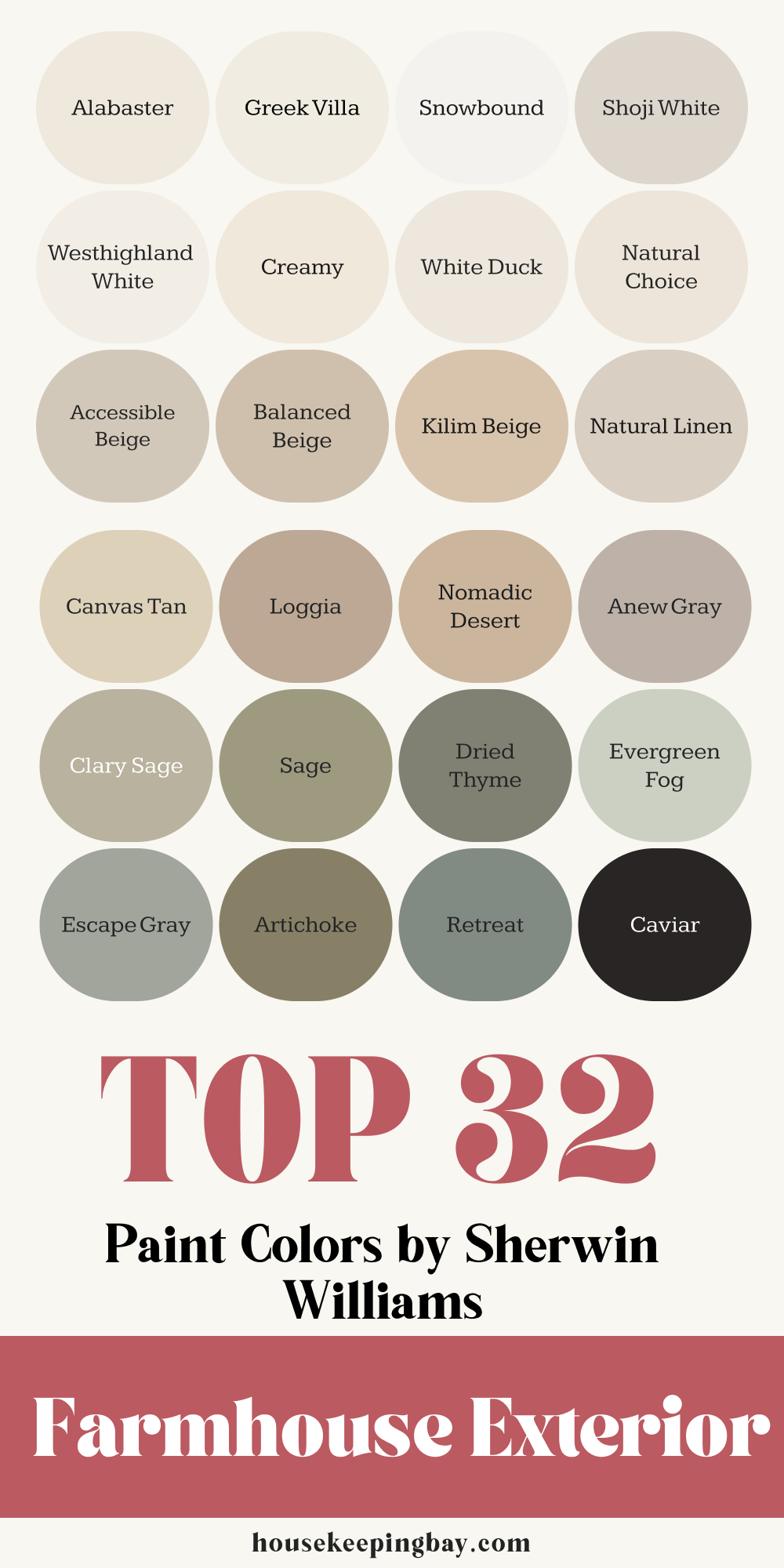
The 32 Best Farmhouse Exterior Paint Colors by Sherwin-Williams (2025)
These are the shades I trust the most when designing or refreshing farmhouse exteriors this year. I’ve split them into four easy-to-use categories, with notes on how and where I like to use each one.
1. Warm Whites & Creams
These feel clean but never cold. I love using these as base colors for siding or large barn-style facades.
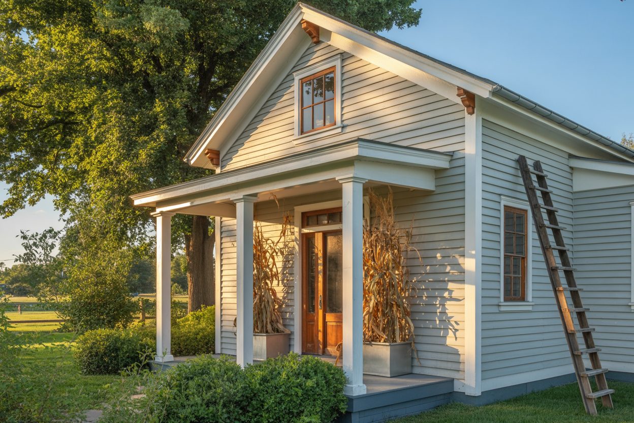
- Alabaster SW 7008 – A soft white with just enough warmth. Timeless and forgiving.
- Greek Villa SW 7551 – Creamy without being yellowy. Works well with wood tones.
- Snowbound SW 7004 – Slightly cooler white but still soft. Great for modern farmhouse trim.
- Shoji White SW 7042 – Has a hint of greige in it. Very natural looking.
- Westhighland White SW 7566 – Bright but grounded. Lovely with red brick or stone.
- Creamy SW 7012 – True to its name, a rich and milky white.
- White Duck SW 7010 – More beige than white, but subtle and calming.
- Natural Choice SW 7011 – Soft neutral with an organic vibe.
Tip: Pair these with darker accents to make your house feel crisp, not washed out.
via housekeepingbay.com
2. Earthy Neutrals & Beiges
Perfect when you want the house to settle into its surroundings without looking dull.
- Accessible Beige SW 7036 – Balanced and very popular. Doesn’t turn pink or green.
- Balanced Beige SW 7037 – Slightly deeper than Accessible Beige, adds weight.
- Kilim Beige SW 6106 – Warm and homey. Good with clay roof tiles.
- Natural Linen SW 9109 – A soft mix of beige and gray. Cozy but light.
- Canvas Tan SW 7531 – Light and creamy. Ideal for ranch-style homes.
- Loggia SW 7506 – Deeper, earth-toned beige. I love this for shutters.
- Nomadic Desert SW 6107 – Has a sun-baked look, great in hot climates.
- Anew Gray SW 7030 – Technically a greige, but leans warm. Reliable choice.
Note: These look best on stucco, wood, or stone exteriors.

3. Moody Greens & Nature-Inspired Hues
These are rich, rooted shades that give a modern twist to farmhouse looks.
- Clary Sage SW 6178 – Calming and fresh. Makes white trim pop.
- Sage SW 2860 – More historic in feel, amazing on older farmhouses.
- Rookwood Dark Green SW 2816 – Deep and dramatic. Pairs well with copper accents.
- Dried Thyme SW 6186 – A dusty green-gray that reads very elegant.
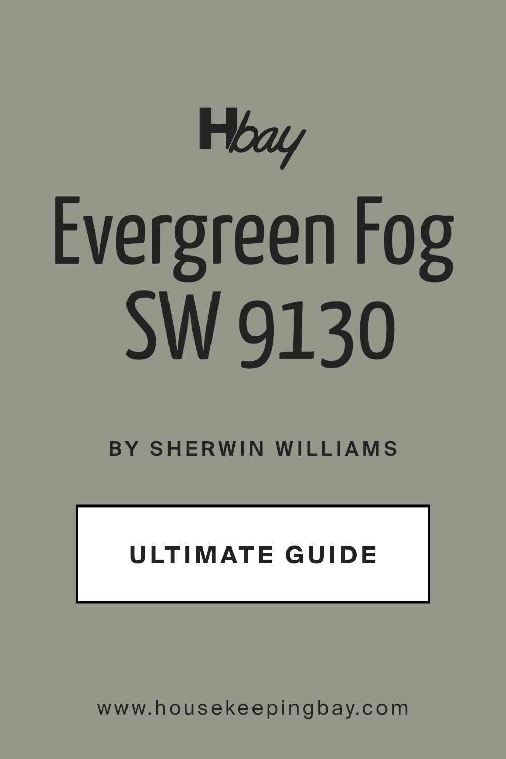
- Evergreen Fog SW 9130 – Sherwin-Williams’ 2022 Color of the Year, and still strong.
- Escape Gray SW 6185 – Soft and woodsy. Ideal with cedar.
- Artichoke SW 6179 – Warm olive tone, beautiful with black hardware.
- Retreat SW 6207 – Slightly cooler green, still earthy. Good for modern mix.
Try these for full-body color or accents like shutters and doors.
4. Bold Accents: Charcoals, Blacks & Deep Blues
These give farmhouse exteriors that sharp edge without going too modern.
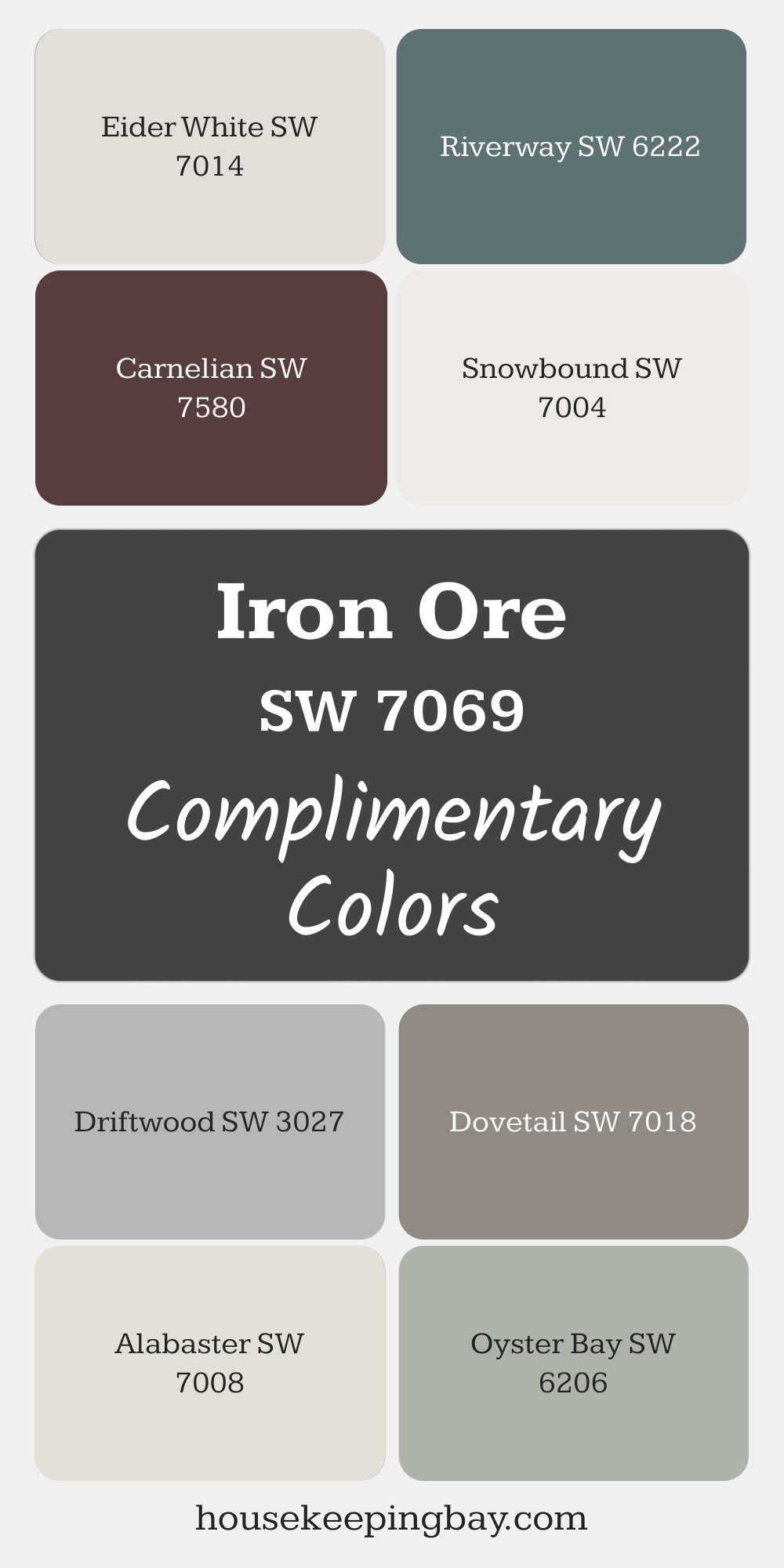
- Iron Ore SW 7069 – My go-to for doors and trim. Bold but not jet black.
- Tricorn Black SW 6258 – True black. Works when you want a strong contrast.
- Caviar SW 6990 – Black with a soft, elegant finish.
- Urbane Bronze SW 7048 – Sherwin-Williams Color of the Year 2021. Earthy and rich.
- Peppercorn SW 7674 – A charcoal gray that feels sophisticated, not industrial.
- Naval SW 6244 – Deep navy that’s both fresh and classic.
- Inkwell SW 6992 – Blue-black with serious depth.
- Cyberspace SW 7076 – Blue-gray that changes with light. I love it on shutters.
These add definition. Use sparingly but purposefully.
My Pro Tips for Picking the Right Exterior Color
Even with the perfect color list, people still end up overwhelmed or unhappy with how things turn out. Paint looks different outside. Sun, shadows, siding texture — it all changes things.
So here’s what I always tell my clients before they even touch a paintbrush.
1. Always Test the Color Outside
I can’t say this enough: sample it on your house. Not just on a board—on the actual wall. Paint a few large swatches (2′ x 2′ at least) on different sides of the house.
Let it sit for a few days. Look at it:
- In morning light
- At noon
- At sunset
- On cloudy days
You’ll be shocked how much it changes.
- Pay Attention to Your Light
Is your house in full sun most of the day? A color will look lighter.
Under trees or shade? That same color may turn muddy or dull.
If you live in a cloudy climate, go a touch warmer than you think. In a bright place like Arizona or Texas? Choose a softer, cooler tone to balance all that sun.
3. Think About the Texture of Your Siding
Paint looks very different on:
- Smooth stucco
- Rough wood
- Brick or stone
Textured surfaces often darken the look of paint. Smooth ones reflect more light.
4. Don’t Ignore What’s Around You
What color are your neighbors’ houses? Your roof? Your landscape? You want to stand out just enough — not look out of place.
Also, be sure to check any HOA restrictions. Some neighborhoods have rules you must follow.
5. Use the Rule of 3
You don’t need 10 colors. Just stick to three:
- Main siding color
- Trim color
- Accent color (for shutters, front door, maybe window sashes)
That’s it. Simple is beautiful.
What Not to Do:
- Don’t choose a color just because it looked good in a magazine. Try it first.
- Don’t skip primer or proper prep — even the best paint will fail on a bad surface.
- Don’t forget: a white house needs regular washing. It shows dirt more easily.
What I’d Tell You If You Were Standing Right Here
Picking a color for your farmhouse exterior isn’t just about what’s “on trend.” It’s about how you want your home to feel when you drive up to it every day. Calm. Welcoming. Like it belongs right where it is.
I’ve seen colors turn plain homes into standout ones, and I’ve seen trendy picks age badly just a year later. What always works? Staying true to the mood you want your house to give off, and paying attention to what’s around it — the land, the light, the people who live inside.
Sherwin-Williams makes it easier, because their paints are solid and their color stories are thoughtful. But even the best paint needs your vision to guide it.
So here’s what I’d do:
- Pick 2–3 favorites from the list above.
- Get the sample quarts.
- Paint those big test swatches outside.
- Watch them for a few days.
- Trust what feels right to you.
Paint is personal. That’s what makes it powerful.
And when your house finally gets that fresh coat? You’ll feel the difference every single time you come home.
housekeepingbay.com
