White Snow SW 9541 by Sherwin Williams
Purity of Winter's Palette
In the realm of interior and exterior design, selecting the perfect paint color is a pivotal decision that significantly impacts the overall ambiance of a space. Sherwin Williams, a trusted name in the paint industry, offers a wide range of colors suited for various design preferences and needs.
Among their extensive palette, SW 9541, known as White Snow, stands out as a particularly versatile and appealing choice for both homeowners and design professionals.
White Snow by Sherwin Williams is not just a mere white paint; it’s a nuanced shade that brings a fresh, clean look to any space. Its subtle undertones and bright finish make it an ideal backdrop for both contemporary and traditional settings, allowing for a seamless integration into any design style.
Whether applied to the walls of a cozy bedroom, the cabinets of a kitchen, or the siding of a home, White Snow has the remarkable ability to transform and elevate spaces with its pristine and inviting aesthetic.
This article aims to explore the characteristics of SW 9541 White Snow, providing insights into its versatility, how it interacts with different light sources, and suggestions for color pairings.
By considering its application in various settings and examining real-life examples, readers can gain a comprehensive understanding of how White Snow can enhance their design projects, making it a top contender for those looking to refresh their space with a clean and bright palette.
via sherwin-williams.com
What Color Is White Snow SW 9541 by Sherwin Williams?
White Snow SW 9541 by Sherwin Williams is a pristine and luminous shade that brings to mind the tranquil beauty of a freshly snow-covered landscape. This particular hue of white possesses an unblemished clarity, making it an ideal choice for creating a bright, airy, and inviting space.
Its pure and crisp nature allows it to reflect light beautifully, helping to enhance the sense of spaciousness within any room.
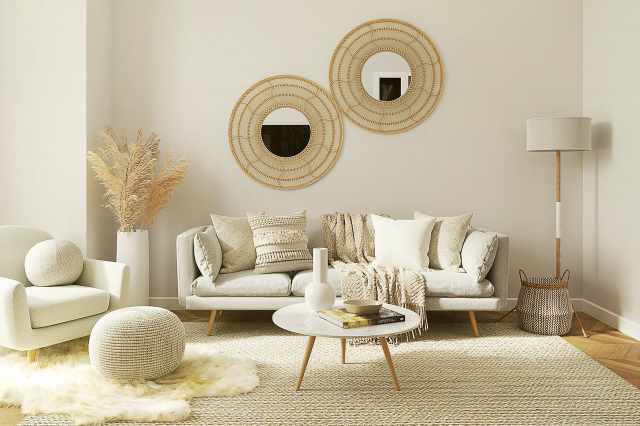
The versatility of White Snow makes it effortlessly adaptable across a wide range of interior styles. It serves as the perfect backdrop in minimalist designs, where the focus is on simplicity and the beauty of uncluttered spaces.
In modern and contemporary interiors, it complements sleek lines and geometric shapes, allowing for pops of color to stand out vividly. White Snow also harmonizes with Scandinavian aesthetics, where its brightness supports a clean, functional, and cozy environment emphasizing natural materials.
When it comes to pairing with materials and textures, White Snow SW 9541 is remarkably accommodating. It pairs splendidly with natural wood, from lighter oaks to darker walnuts, highlighting their grain and warmth.
Metals, whether it be polished chrome, brushed nickel, or matte black fixtures, stand out crisply against this serene shade.
For textures, soft, plush fabrics in furniture or window treatments add a tactile dimension that contrasts well with its smoothness, while natural stone or terracotta adds earthy elements, creating a harmonious balance.
By choosing White Snow SW 9541, one can ensure a timeless elegance that enhances a variety of interior styles and pairs exquisitely with a multitude of materials and textures.

housekeepingbay.com
Table of Contents
Is White Snow SW 9541 by Sherwin Williams Warm or Cool color?
White Snow SW 9541 by Sherwin Williams is a serene and luminous shade of white that brings a fresh, airy feel to any home. This particular white has a subtle coolness to it, which can help in creating a sense of spaciousness and light in rooms that may otherwise feel cramped or dark.
Its crisp nature makes it an ideal backdrop for showcasing artwork, furniture, and accent pieces, allowing their colors and textures to pop. When applied to walls, White Snow has the ability to reflect natural light, enhancing the overall brightness of a space.
This characteristic is especially beneficial in smaller rooms or those with limited light sources, as it can make such spaces appear larger and more welcoming. In the realm of home design, White Snow proves to be a versatile color, seamlessly fitting into a wide range of styles from modern minimalism to cozy farmhouse. I
t’s a color that can easily transition through time, adapting to changing decor and trends, making it a timeless choice for homeowners.
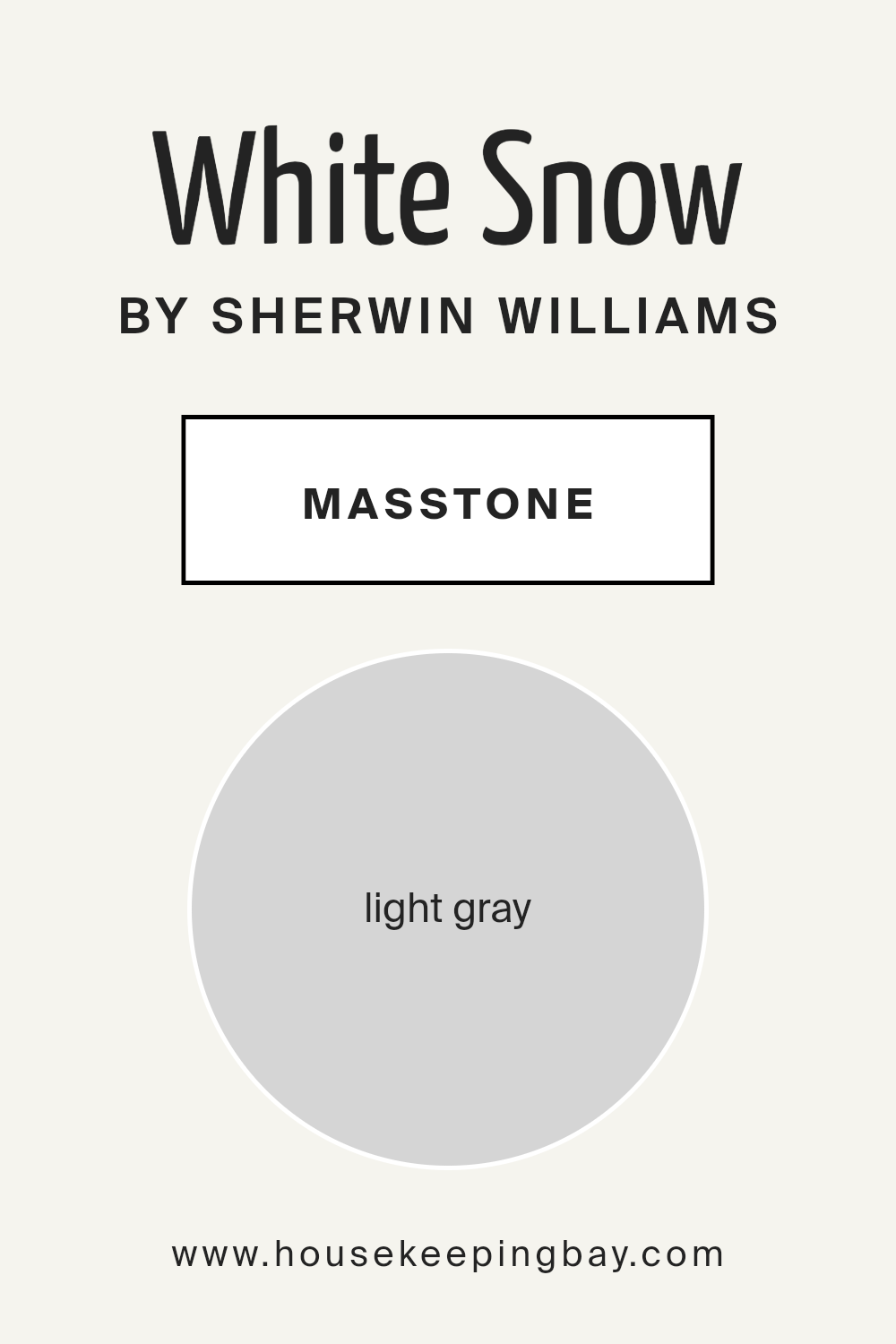
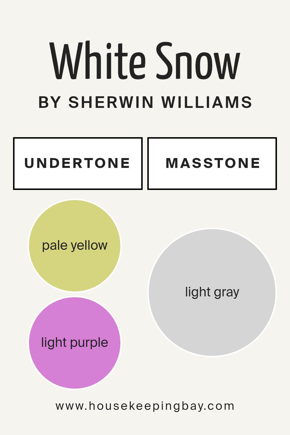
What is the Masstone of the White Snow SW 9541 by Sherwin Williams?
White Snow SW 9541 by Sherwin Williams, with its masstone of light gray (#D5D5D5), introduces a serene and sophisticated palette into home interiors. This nuanced shade stands out as a versatile backdrop, effortlessly complementing a wide range of design aesthetics from modern minimalist to cozy traditional.
The light gray masstone offers a subtle contrast against both bright whites and deeper hues, making it ideal for creating depth and interest in spaces without overwhelming them with color. In rooms with ample natural light, White Snow radiates a soft, airy quality, enhancing the sense of space.
In artificial light, it maintains its neutrality, ensuring a stable and calming ambiance which is crucial for areas where relaxation or focus is needed. Its inherent flexibility means White Snow can be applied across walls, trim, and even ceilings, unifying spaces with a cohesive and elegant touch.
This shade effectively balances warmth and coolness, making it a universally appealing choice for homes.
housekeepingbay.com
Undertones of White Snow SW 9541 by Sherwin Williams
Sherwin Williams’ White Snow SW 9541 is a nuanced shade that at its core appears to be a straightforward white. However, its unique character comes from the subtle undertones that influence its perception in various environments.
Specifically, this color houses pale yellow and light purple undertones, which add depth and dimension to its overall appearance. Understanding these undertones is crucial in recognizing how they can change the way we perceive the color.
Undertones play a pivotal role in color dynamics; they can modify a color’s temperature, making it appear warmer or cooler and affecting its compatibility with other colors. In the case of White Snow SW 9541, the pale yellow undertone introduces a hint of warmth, giving the white a slightly sunny aspect that can make spaces feel more inviting.
Conversely, the light purple undertone injects a whisper of coolness, adding a subtle layer of sophistication and complexity.
When applied on interior walls, the interplay of these undertones with natural and artificial light becomes apparent. During daylight, the pale yellow might become more dominant, creating a soft, welcoming atmosphere.
As the light changes, especially under artificial lighting, the light purple might come forth, lending a calm and serene vibe to the room.
This dynamic means White Snow SW 9541 can offer varying experiences throughout the day, making it a versatile choice for spaces seeking balance between warmth and coolness, without committing strongly to either.
The perception of this color in any room will also heavily depend on its relationship with surrounding colors, from furniture to décor, highlighting the importance of considering undertones in design decisions.
housekeepingbay.com
How Does Lighting Affect White Snow SW 9541 by Sherwin Williams?
Lighting significantly influences how we perceive colors, as it can alter their intensity and hue. An understanding of this effect is crucial when choosing paint colors for interiors.
White Snow SW 9541 by Sherwin Williams serves as an excellent illustration of how lighting conditions can impact the appearance of a color.
In artificial light, White Snow can exhibit varying qualities depending on the type of bulbs used. With warm-toned bulbs, this color can appear creamier, softening the ambiance of the room.
Cooler-toned lights, on the other hand, will maintain White Snow’s crispness, making the space feel more invigorating.
Natural light brings an additional layer of complexity to how White Snow is perceived, as the direction of the room significantly affects the color’s appearance. North-facing rooms tend to receive less direct sunlight, which can cause colors to appear cooler.
In such scenarios, White Snow might seem a bit more shadowy and less vibrant, creating a serene and calm atmosphere but without the stark brightness that might be expected in a more brightly lit space.
South-facing rooms receive an abundance of light throughout the day, which tends to be warmer. In these rooms, White Snow will look brighter and more radiant, enhancing its crispness and making the room feel airy and welcoming.
In east-facing rooms, the morning light can make White Snow glow with warmth, creating a cozy and peaceful start to the day. As the day progresses and the direct sunlight moves away, the color will gradually take on a cooler tone, maintaining a balance between warmth and freshness.
West-facing rooms experience the opposite effect, with cooler light in the morning transitioning to warmer, more intense sunlight in the afternoon and evening.
White Snow can transition from appearing gentle and subdued in the morning to vibrant and warm later in the day, accommodating various moods and activities throughout the day.
Thus, the impact of lighting on White Snow SW 9541 demonstrates the dynamic nature of colors, underscoring the importance of considering light conditions when selecting paint colors for any interior space.

housekeepingbay.com
What is the LRV of White Snow SW 9541 by Sherwin Williams?
Light Reflectance Value (LRV) measures the percentage of light a paint color reflects compared to the amount it absorbs. On a scale from 0, which represents pure black, absorbing all light, to 100, signifying pure white, reflecting all light, LRV helps in selecting colors that will influence the brightness and mood of a space.
This measurement is crucial when deciding on paint colors for interiors or exteriors, as it directly impacts the visual temperature and the perceived size of an area. Higher LRV values make rooms feel more spacious and brighter, while lower LRVs create a cozier, more enclosed vibe.
Accurate selection can significantly enhance natural lighting effectiveness, reduce the need for artificial light, and influence the atmosphere within a space.
With an LRV of 90.33, White Snow (SW 9541) by Sherwin Williams is very close to the top of the scale, indicating it is a color that reflects a vast majority of light. This characteristic makes it an excellent choice for spaces that aim to feel brighter, larger, and more open.
In such a well-lit environment, walls painted with White Snow will bounce back most of the natural light, diminishing the need for excessive artificial lighting during the day. This particular value suggests that the color is very light, which can enhance the sense of airiness and purity in a room.
The high LRV of White Snow makes it particularly suited for smaller spaces, dark rooms, or north-facing areas that receive limited sunlight, as it maximally utilizes whatever light is available to create a more inviting and lively space.

housekeepingbay.com
What is LRV? Read It Before You Choose Your Ideal Paint Color
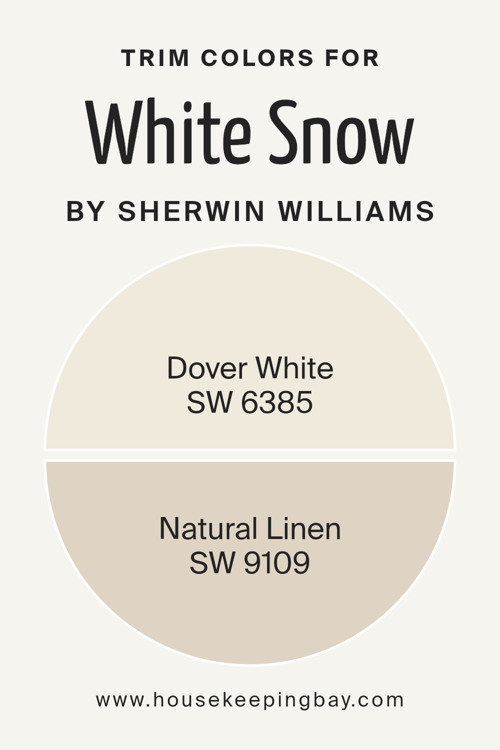
What are the Trim colors of White Snow SW 9541 by Sherwin Williams?
Trim colors, like the carefully selected SW 6385 – Dover White and SW 9109 – Natural Linen by Sherwin Williams, play a pivotal role in accentuating the architectural details and enhancing the overall aesthetics of a space painted with White Snow SW 9541.
These colors act as a frame, subtly defining and highlighting the edges, corners, and unique features of walls and ceilings, thereby bringing a harmonious balance and refined finish to the interior decor.
By carefully selecting a trim color that complements White Snow, homeowners and designers can create a cohesive and inviting atmosphere that elevates the visual appeal of the room.
Dover White SW 6385 is a warm, creamy hue that offers a soft contrast when used as a trim color against the crispness of White Snow SW 9541, adding a touch of coziness and comfort to the space without overwhelming it.
On the other hand, Natural Linen SW 9109 presents a slightly richer, neutral shade that leans towards a beige, providing a subtle, earthy edge to the trim that enriches the overall ambiance with a natural, understated elegance.
Together, these trim colors work synergistically with White Snow SW 9541, ensuring the space feels both welcoming and beautifully finished.
You can see recommended paint colors below:
- SW 6385 Dover White
- SW 9109 Natural Linen
housekeepingbay.com
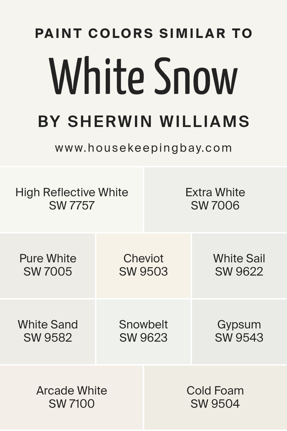
Colors Similar to White Snow SW 9541 by Sherwin Williams
Similar colors play a crucial role in achieving a seamless and cohesive aesthetic within any interior space. By utilizing shades and hues that closely align, designers are able to create themes that not only complement but also enhance surrounding elements.
The colors similar to White Snow SW 9541 by Sherwin Williams, such as High Reflective White SW 7757, Extra White SW 7006, and Pure White SW 7005, demonstrate the subtle but significant differences that can impact the ambiance of a room.
High Reflective White boasts a brilliant luminance, perfect for areas that benefit from a bright and airy feel, while Extra White has a slightly muted tone that offers a soft, sophisticated backdrop. Pure White, on the other hand, strikes a balance between the two, providing a crisp, clean look without being overly stark.
Expanding the palette to include shades like Cheviot SW 9503 and White Sail SW 9622 adds another layer of versatility, with Cheviot incorporating a gentle warmth and White Sail a hint of freshness, reminiscent of a sea breeze.
White Sand SW 9582 and Snowbelt SW 9623 further illustrate the range of atmospheres that can be achieved through nuanced differences in color temperature and saturation, with White Sand evoking the smoothness of a serene beach and Snowbelt reflecting the chill of a wintry landscape.
Gypsum SW 9543, Arcade White SW 7100, and Cold Foam SW 9504 each introduce subtle undertones — be it a touch of gray, a whisper of beige, or a faintly cool vibe — that can harmonize with a variety of decor styles, ensuring that no matter the visual intention, there’s a shade that perfectly captures the desired effect.
Through the careful selection and application of these colors, designers can craft spaces that feel both unified and dynamic, showcasing the power of similar colors in cultivating an environment that truly feels like home.
You can see recommended paint colors below:
- SW 7757 High Reflective White
- SW 7006 Extra White
- SW 7005 Pure White
- SW 9503 Cheviot
- SW 9622 White Sail
- SW 9582 White Sand
- SW 9623 Snowbelt
- SW 9543 Gypsum
- SW 7100 Arcade White
- SW 9504 Cold Foam
housekeepingbay.com
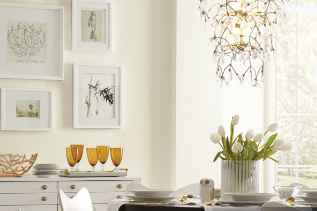
How to Use White Snow SW 9541 by Sherwin Williams In Your Home?
White Snow SW 9541 by Sherwin Williams is a pristine and elegant paint color that can breathe freshness into any space within your home. This hue boasts a crisp, clean quality that makes it an ideal choice for homeowners looking to introduce a sense of calm and serenity.
Its versatility allows it to serve as either a striking main color or a complementary accent, adaptable to a range of decorating styles from minimalist to contemporary or even traditional.
In living rooms, White Snow can make the space appear larger and more inviting, reflecting natural light beautifully during the day and maintaining a subtle glow in the evening. In bedrooms, it can create a peaceful sanctuary, promoting rest and relaxation.
For kitchens and bathrooms, this color offers a clean and hygienic appearance, providing a perfect backdrop for bold accents and vibrant accessories.
Moreover, White Snow is an excellent choice for trim, doors, and moldings, offering a crisp contrast to other wall colors. This adaptability ensures that it can seamlessly integrate with various textures and materials, from natural wood to modern metals, enhancing the overall aesthetic of your home.
White Snow SW 9541 by Sherwin Williams vs Gypsum SW 9543 by Sherwin Williams
White Snow SW 9541 and Gypsum SW 9543, both from Sherwin Williams, offer distinct tones for those seeking crisp, clean hues. White Snow stands out as the brighter of the two, bringing a pure, almost pristine quality to spaces. Its luminous nature makes it ideal for creating an expansive and airy feel, enhancing natural light in any room.
On the other hand, Gypsum introduces a subtle warmth with its slightly softer, off-white presence. This color leans towards a more natural, earthy tone, providing a comforting and cozy ambiance without darkening the room. It’s particularly suited for those aiming for a gentle touch of color, maintaining brightness but with a hint of warmth.
When used together, these colors harmonize beautifully, with White Snow offering a striking contrast against Gypsum’s muted warmth, making spaces feel balanced and inviting.
Perfect for a variety of designs, they cater to different aesthetic preferences while maintaining a cohesive look.
You can see recommended paint color below:
housekeepingbay.com
White Snow SW 9541 by Sherwin Williams vs Arcade White SW 7100 by Sherwin Williams
White Snow SW 9541 and Arcade White SW 7100 by Sherwin Williams are two distinct white shades that offer subtle nuances for various spaces. White Snow SW 9541 presents a pure, bright presence, akin to a fresh snowfall. It reflects light beautifully, making it an excellent choice for areas requiring a crisp, invigorating feel.
On the other hand, Arcade White SW 7100 leans towards a softer, warmer white. It harbors a slight undertone that adds a cozy, inviting quality to rooms, perfect for creating a serene and welcoming atmosphere.
While White Snow can energize a space with its radiant purity, Arcade White brings a gentle warmth, making each color suitable for different aesthetic goals and lighting conditions.
Architects and interior designers might select White Snow for a sleek, modern look, whereas Arcade White could be the preference for traditional or Scandinavian-inspired themes. Together, these shades provide versatile options for those looking to brighten their interiors with sophistication and subtlety.
You can see recommended paint color below:
- SW 7100 Arcade White
housekeepingbay.com
White Snow SW 9541 by Sherwin Williams vs Snowbelt SW 9623 by Sherwin Williams
White Snow SW 9541 by Sherwin Williams is a crisp, vibrant shade of white that conveys a sense of purity and clarity. Its bright, luminous quality makes it an excellent choice for creating an airy and open atmosphere in any space, reflecting light beautifully to enhance the sense of spaciousness.
On the other hand, Snowbelt SW 9623 presents a subtly different character. This color leans towards a cooler, slightly more reserved white tone. Its nuanced composition harbors a hint of gray, contributing to a serene and calming ambiance that is ideal for spaces intended to foster relaxation and tranquility.
While both colors share an inherent simplicity and elegance typical of white hues, White Snow offers a more radiant and energetic feel, whereas Snowbelt provides a tranquil and composed backdrop.
Each color serves distinct aesthetic preferences, making them versatile choices for a variety of design styles and settings.
You can see recommended paint color below:
- SW 9623 Snowbelt

housekeepingbay.com
White Snow SW 9541 by Sherwin Williams vs Extra White SW 7006 by Sherwin Williams
White Snow SW 9541 by Sherwin Williams and Extra White SW 7006 from the same brand are two distinct shades of white, each evoking its unique atmosphere. White Snow has a subtle warmth to it, suggesting a soft, serene quality akin to the quiet beauty of a snowy landscape.
It’s not stark, instead offering a gentle, inviting luminosity that can make spaces feel cozy yet bright. On the other hand, Extra White is crisper and more straightforward in its presentation. This color leans towards a pure, clean white, providing a vibrant foundation that can make other colors in a palette stand out more sharply.
It’s especially effective in spaces that aim for a modern, minimalist aesthetic, where the clarity and simplicity of the hue can create a strong, visually striking impact.
Comparing the two, White Snow offers a warmer, softer environment, while Extra White brings forth a bold, clear, and contemporary vibe.
You can see recommended paint color below:
housekeepingbay.com
White Snow SW 9541 by Sherwin Williams vs Cold Foam SW 9504 by Sherwin Williams
White Snow SW 9541 by Sherwin Williams and Cold Foam SW 9504 by Sherwin Williams are two distinct shades that offer unique aesthetics for various spaces. White Snow SW 9541 presents a pure, serene hue, reminiscent of a fresh, untouched snowfall.
This color illuminates spaces with its bright, clear presence, making it an ideal choice for creating a sense of openness and cleanliness. Its crispness can enhance natural light, making rooms feel more airy and spacious.
On the other hand, Cold Foam SW 9504 carries a subtly cooler undertone. While still light and relatively neutral, this shade offers a hint of depth that distinguishes it from the stark simplicity of White Snow.
It can soften a room’s ambiance without sacrificing brightness, providing a gentle, sophisticated touch to interiors. Cold Foam’s nuanced character makes it versatile for pairing with a wider range of colors and materials, ideal for those looking to add a modern, yet understated element to their space.
Together, these colors can be used in combination to create a layered, harmonious look, or individually to achieve a specific design intent—be it the stark, refreshing clarity of White Snow or the nuanced, understated elegance of Cold Foam.
You can see recommended paint color below:
housekeepingbay.com
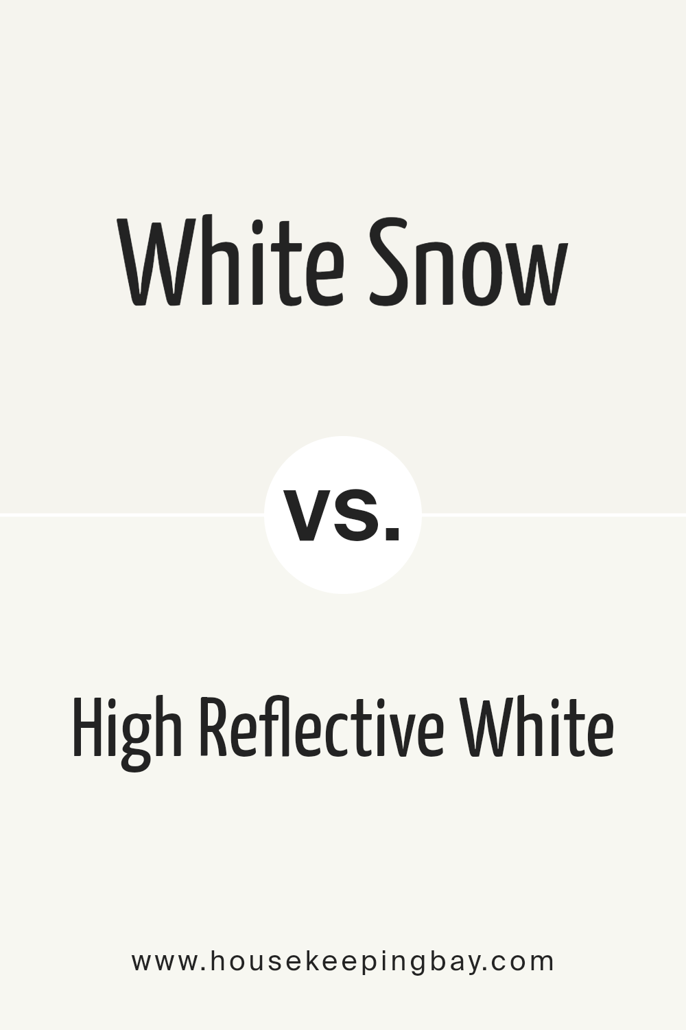
White Snow SW 9541 by Sherwin Williams vs High Reflective White SW 7757 by Sherwin Williams
White Snow SW 9541 and High Reflective White SW 7757 by Sherwin Williams are two distinct shades that offer subtle yet significant differences. White Snow presents a soft, clean hue with a slightly warm undertone, providing a cozy and inviting atmosphere to any space.
Its gentle nature allows it to blend seamlessly into various design aesthetics, making it a versatile choice for both modern and traditional settings.
On the other hand, High Reflective White is known for its pure, bright appearance. As one of the brightest whites in the Sherwin Williams collection, it features a stark, crisp quality without noticeable undertones.
This makes it an excellent choice for spaces requiring a vibrant, unadulterated white to enhance natural light or to act as a contrasting element against vibrant colors.
While both colors serve the purpose of bringing brightness and openness to a room, High Reflective White stands out for its ability to amplify light, whereas White Snow offers a warmer, more nuanced character.
Whether choosing between them for walls, trims, or accents, the decision hinges on the desired balance between warmth and luminosity in the design scheme.
You can see recommended paint color below:
housekeepingbay.com
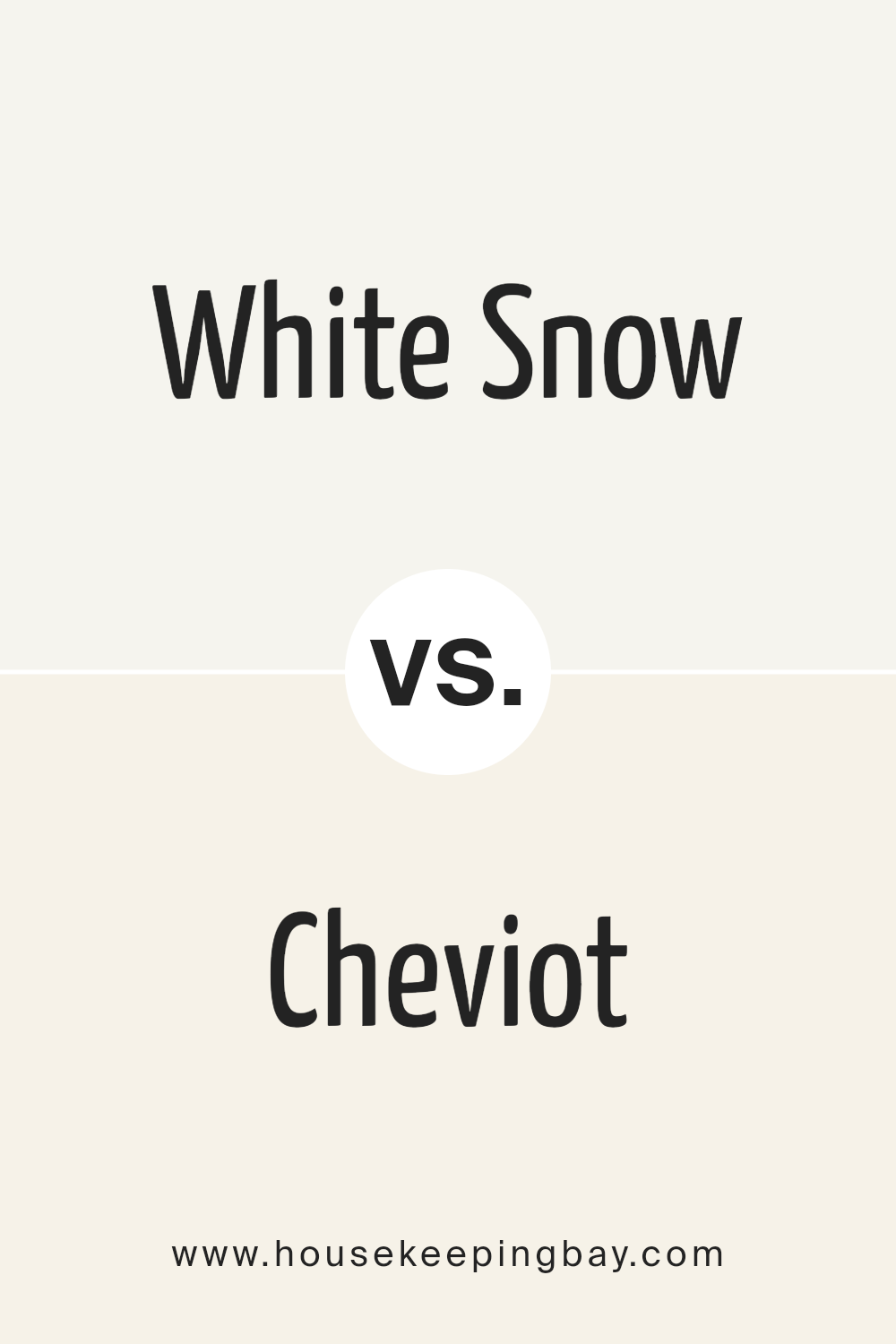
White Snow SW 9541 by Sherwin Williams vs Cheviot SW 9503 by Sherwin Williams
The two colors, White Snow SW 9541 and Cheviot SW 9503 by Sherwin Williams, offer subtly distinct nuances perfect for various settings and preferences. White Snow is the quintessential pure white, bringing a crisp, clean aura to any space.
Its luminous quality reflects light beautifully, making rooms appear larger and more inviting. This color is versatile, serving as a perfect backdrop for bold accents or a serene setting for minimalist designs.
On the other hand, Cheviot SW 9503 introduces a hint of warmth into its white base. It’s not just a simple white; its undertone adds a cozy, soft glow, ideal for creating a welcoming, gentle ambiance.
This color works wonderfully in spaces where a touch of warmth is desired without overpowering the room with color. It’s particularly suited for living areas and bedrooms where a subtle, soothing palette can enhance relaxation and comfort.
Both hues offer a unique take on white, with White Snow providing a sharper, more defined clarity, and Cheviot bringing warmth and softness, showcasing the diverse spectrum of white and its potential to transform spaces in different, yet equally appealing, ways.
You can see recommended paint color below:
housekeepingbay.com
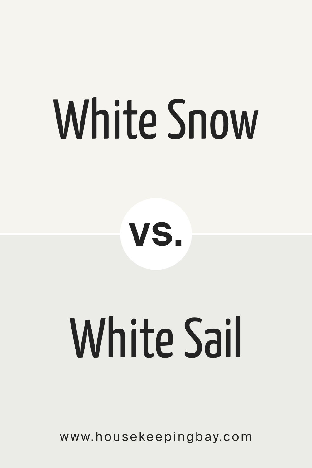
White Snow SW 9541 by Sherwin Williams vs White Sail SW 9622 by Sherwin Williams
White Snow SW 9541 by Sherwin Williams is a pristine shade that closely mirrors the pure, unblemished essence of its namesake. It exhibits a bright, refreshing character that can illuminate spaces, making them appear more expansive and airy.
This color is ideal for creating a sense of cleanliness and simplicity in any interior, offering a subtle backdrop that enhances natural light and complements various decor styles seamlessly.
In contrast, White Sail SW 9622 by Sherwin Williams presents itself with a slightly warmer tone, suggesting a softer, more comforting atmosphere. This color retains the freshness associated with white hues but with a hint of warmth that makes spaces feel more inviting and homely.
White Sail is versatile, working well in both modern and traditional settings, and its gentle warmth helps in crafting interiors that feel cozy yet spacious.
Both White Snow and White Sail offer distinct vibes—White Snow providing a crisp, luminous environment, and White Sail creating a cozy, welcoming ambiance. Each color has its unique charm, catering to different aesthetic preferences and design needs.
You can see recommended paint color below:
- SW 9622 White Sail
housekeepingbay.com
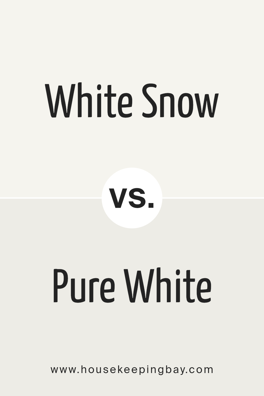
White Snow SW 9541 by Sherwin Williams vs Pure White SW 7005 by Sherwin Williams
White Snow SW 9541 and Pure White SW 7005 by Sherwin Williams are two distinctive shades that offer subtle yet impactful differences in a design context. White Snow is a bright, clean white with a slightly cool undertone, giving it a refreshing and crisp appearance.
It mirrors the pristine beauty of freshly fallen snow, bringing an airy and open feel to spaces. This color can amplify natural light, making rooms feel more expansive and vibrant.
In contrast, Pure White SW 7005 leans toward a warmer spectrum without becoming creamy or yellow, striking a fine balance between cool and warm tones. This versatility makes Pure White an excellent choice for a wide range of decorating styles, capable of creating a soft, inviting ambiance.
It’s particularly effective in spaces where a neutral backdrop is desired, one that unifies the elements within a room without competing for attention.
Comparatively, while both shades enrich spaces with their clarity and brightness, White Snow offers a cooler, more luminous feel, reminiscent of a winter landscape, whereas Pure White provides a more neutral canvas, adaptable to any setting.
Each brings its own unique characteristics to interior designs, allowing for personal preference and specific design needs to guide the choice between these two refined whites.
You can see recommended paint color below:
housekeepingbay.com
White Snow SW 9541 by Sherwin Williams vs White Sand SW 9582 by Sherwin Williams
White Snow SW 9541 by Sherwin Williams and White Sand SW 9582 by Sherwin Williams are two nuanced shades from the same color family with subtle differences that distinguish them. White Snow is a bright, crisp white that simulates the freshness of newly fallen snow.
Its purity and clarity make it a popular choice for creating spaces that feel open, airy, and infused with daylight. On the other hand, White Sand carries a slightly warmer tone, hinting at the natural color of sandy beaches.
This warmth gives interiors a cozy, welcoming atmosphere without veering too far from the neutral base that many designers and homeowners seek.
Comparatively, White Snow is ideal for modern, minimalist designs where the goal is to reflect maximum light and enhance a sense of space. White Sand, with its understated warmth, suits environments where a more relaxed, comforting aesthetic is desired.
Both colors are versatile, elevating various settings with their unique character—White Snow for its crisp luminosity and White Sand for its gentle warmth. Their differences lie mainly in the ambiance they create, offering options for diverse design preferences.
You can see recommended paint color below:
housekeepingbay.com
Conclusion
In conclusion, White Snow SW 9541 by Sherwin Williams emerges as a timeless and versatile color choice that suits a wide array of design styles and spaces. Its pure and balanced essence provides a perfect backdrop for both contemporary and traditional interiors, offering a sense of brightness and openness.
This color’s adaptability makes it a go-to option for homeowners and designers alike, aiming to create a fresh and inviting atmosphere.
Moreover, its ability to pair seamlessly with various textures and complement other colors enhances its appeal, making it an indispensable tool in the palette of anyone looking to elevate their space.
Whether used as a dominant color scheme or as an accent, White Snow SW 9541 stands out for its ability to bring a sense of calm and sophistication, proving its enduring relevance in the realm of interior design.

housekeepingbay.com
Ever wished paint sampling was as easy as sticking a sticker? Guess what? Now it is! Discover Samplize's unique Peel & Stick samples. Get started now and say goodbye to the old messy way!
Get paint samples