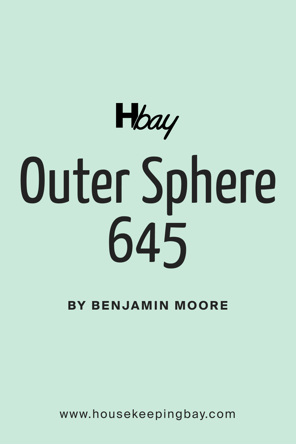
Outer Sphere 645 Paint Color by Benjamin Moore
Colors are more than just a visual experience.
Colors are more than just a visual experience. They evoke emotions, create moods, and tell stories. One such fascinating hue is Outer Sphere 645, which has garnered attention for its versatile role in interior design. In this article, we will explore the charm and applications of this unique shade.
via plan home
What Color Is Outer Sphere 645?
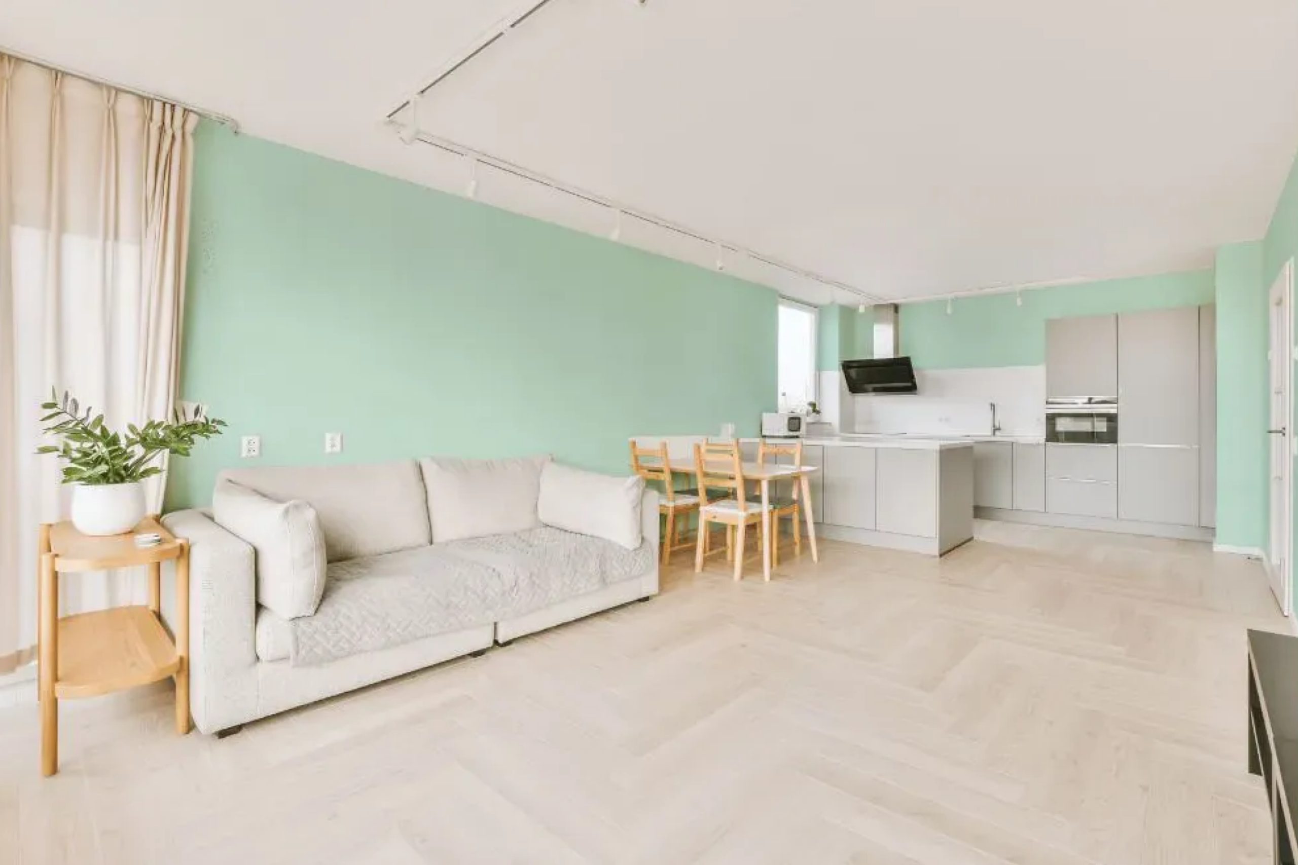
Outer Sphere 645 is an enchanting blend of subdued elegance and contemporary charm. It possesses a serene quality that is akin to the misty morning sky or the muted hues of vintage porcelain. This color is ideal for minimalist and Scandinavian designs, where its subtle undertones can effortlessly merge with natural woods, linens, and muted metals.
The softness of Outer Sphere 645 makes it a go-to choice for those looking to create calm, soothing spaces.
housekeepingbay.com
Table of Contents
Is It a Warm Or Cool Color?
Outer Sphere 645 subtly leans towards the cooler spectrum, reminiscent of a hushed whisper of winter mornings. Its cool undertone means it has the magic to provide a refreshing ambiance in homes. Cool colors tend to recede, making spaces appear larger and more airy, which is why Outer Sphere 645 is often chosen for smaller rooms or spaces that aim to evoke a sense of openness.
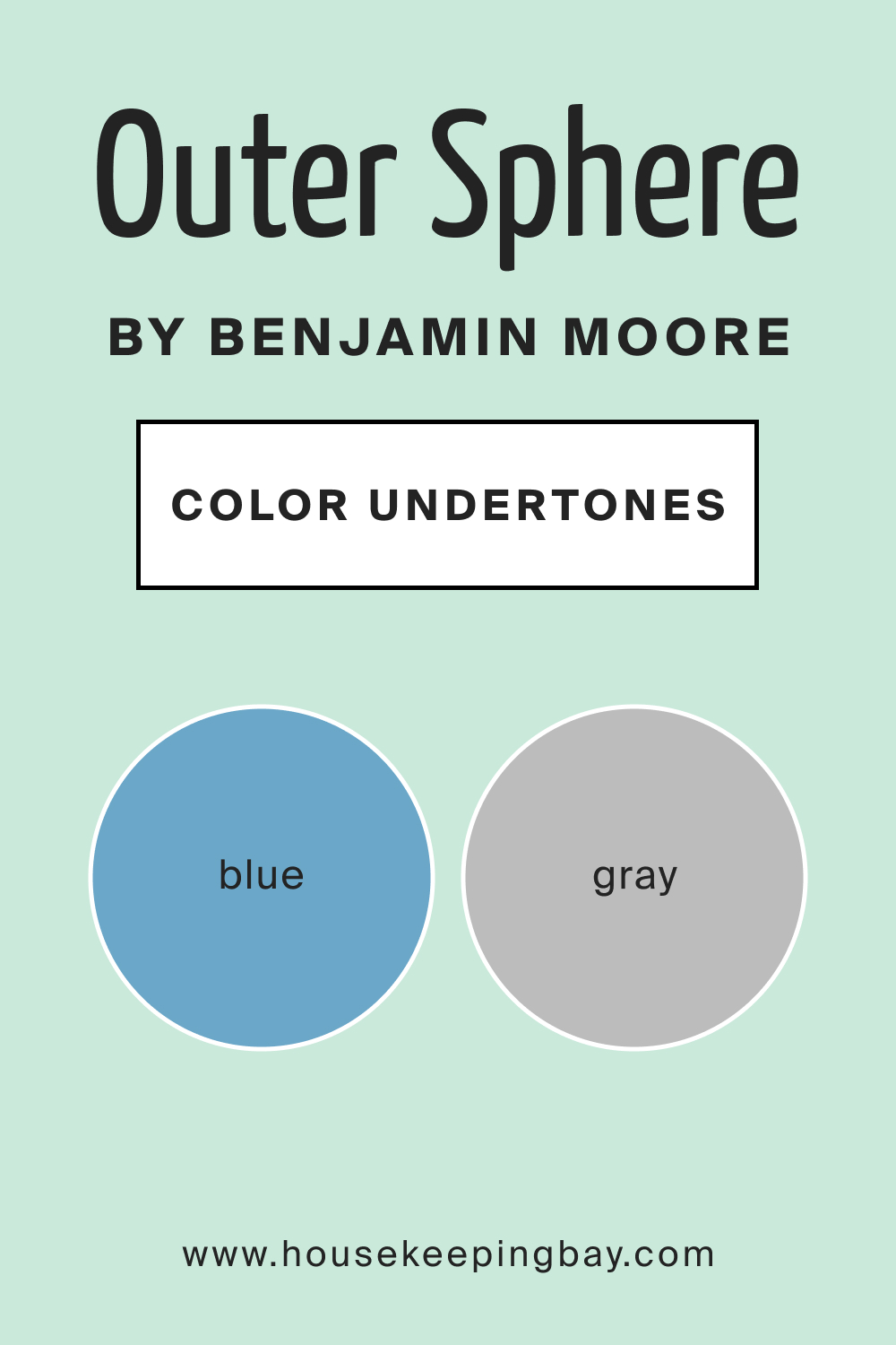
Undertones of Outer Sphere 645
Every color has layers, and the undertones of Outer Sphere 645 are no different. It flaunts delicate bluish-gray undertones that add depth and character. Undertones play a pivotal role in determining how a color will truly appear in a space, especially under different lighting. For Outer Sphere 645, these undertones help the paint transition beautifully on interior walls, giving it a versatile edge over monotone paints.
housekeepingbay.com
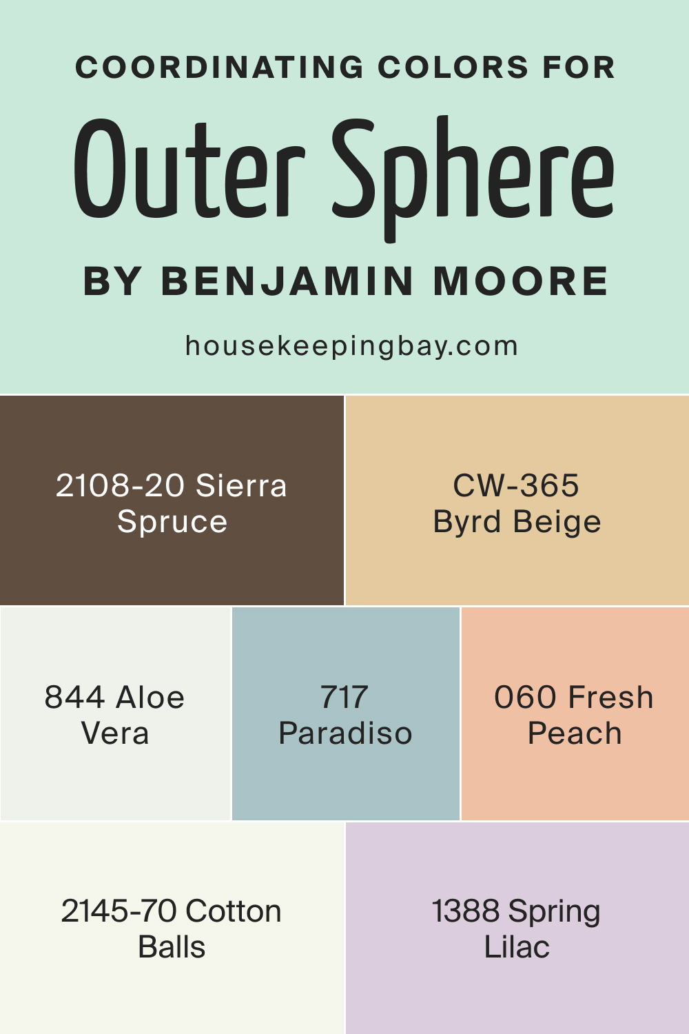
Coordinating Colors of Outer Sphere 645
Coordinating colors are those hues that harmoniously complement the main color. For Outer Sphere 645, its coordinating colors include:
- BM 844 Aloe Vera : A refreshing green with a hint of mint.
- BM 717 Paradiso : A rich tropical teal that evokes oceanic dreams.
- BM 2145-70 Cotton Balls : A pristine white with a touch of softness.
- BM 2108-20 Sierra Spruce : A deep forest green reminiscent of pine trees.
- BM 1388 Spring Lilac : A muted lilac shade.
- CW-365 Byrd Beige : A sandy beige with warm undertones.
- BM 060 Fresh Peach : A pastel peach echoing sunset skies.
housekeepingbay.com
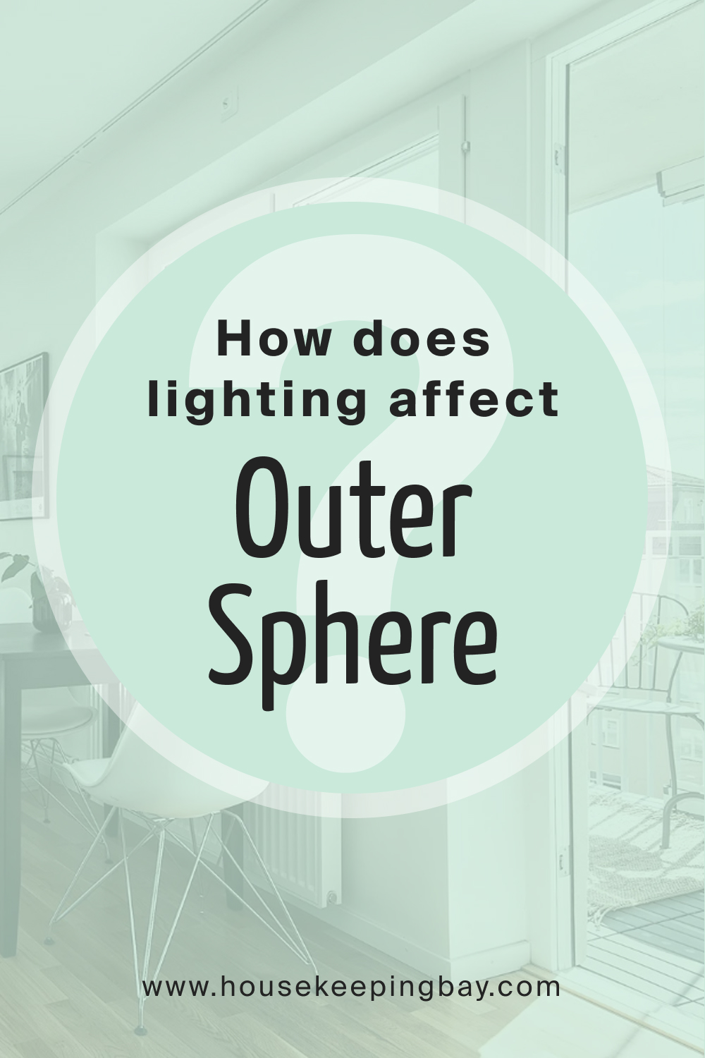
How Does Lighting Affect Outer Sphere 645?
Lighting is a game-changer for colors. In artificial light, Outer Sphere 645 can appear slightly cooler, with its gray undertones becoming more pronounced. Under natural daylight, it manifests its full depth, revealing subtle nuances. In north-facing rooms, the color might seem more muted and cooler, given the diffused light. South-facing rooms bring out its warmer side, with a gentle glow.
East and west-facing rooms offer a dynamic experience, with the shade changing from cool in the morning to warmer in the evening.
housekeepingbay.com
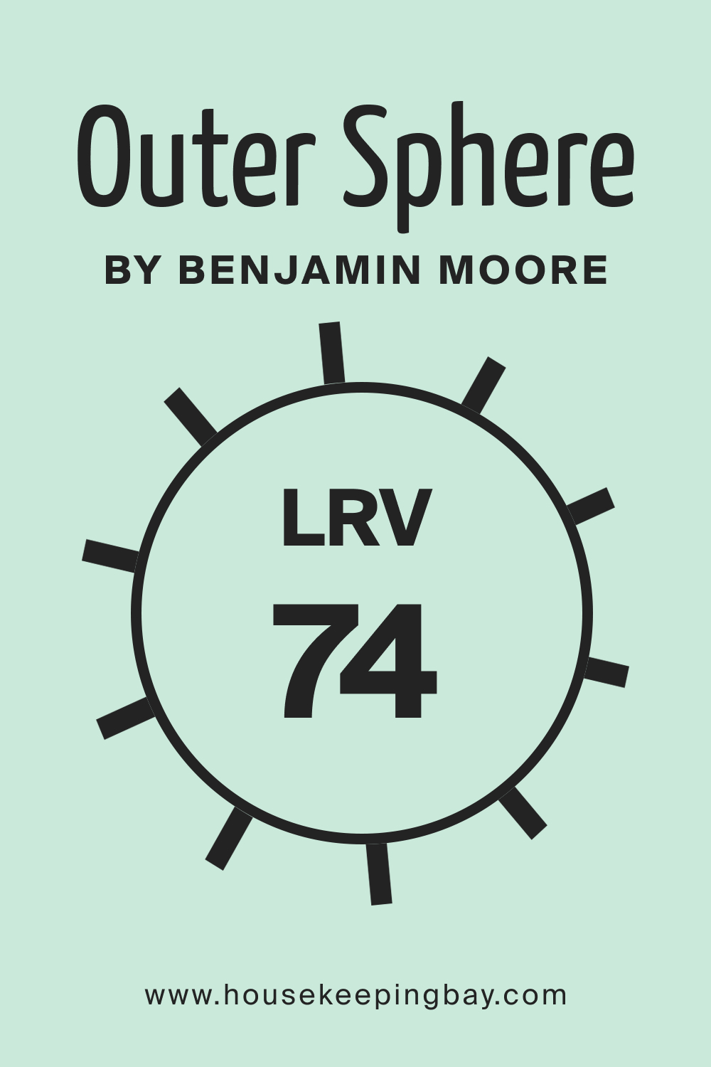
LRV of Outer Sphere 645
LRV, or Light Reflectance Value, measures the percentage of light a color reflects. At an LRV of 74, Outer Sphere 645 is considerably reflective, making rooms feel brighter and larger. A higher LRV value means the color will play well in spaces with limited natural light, enhancing luminosity.
housekeepingbay.com
What is LRV? Read It Before You Choose Your Ideal Paint Color
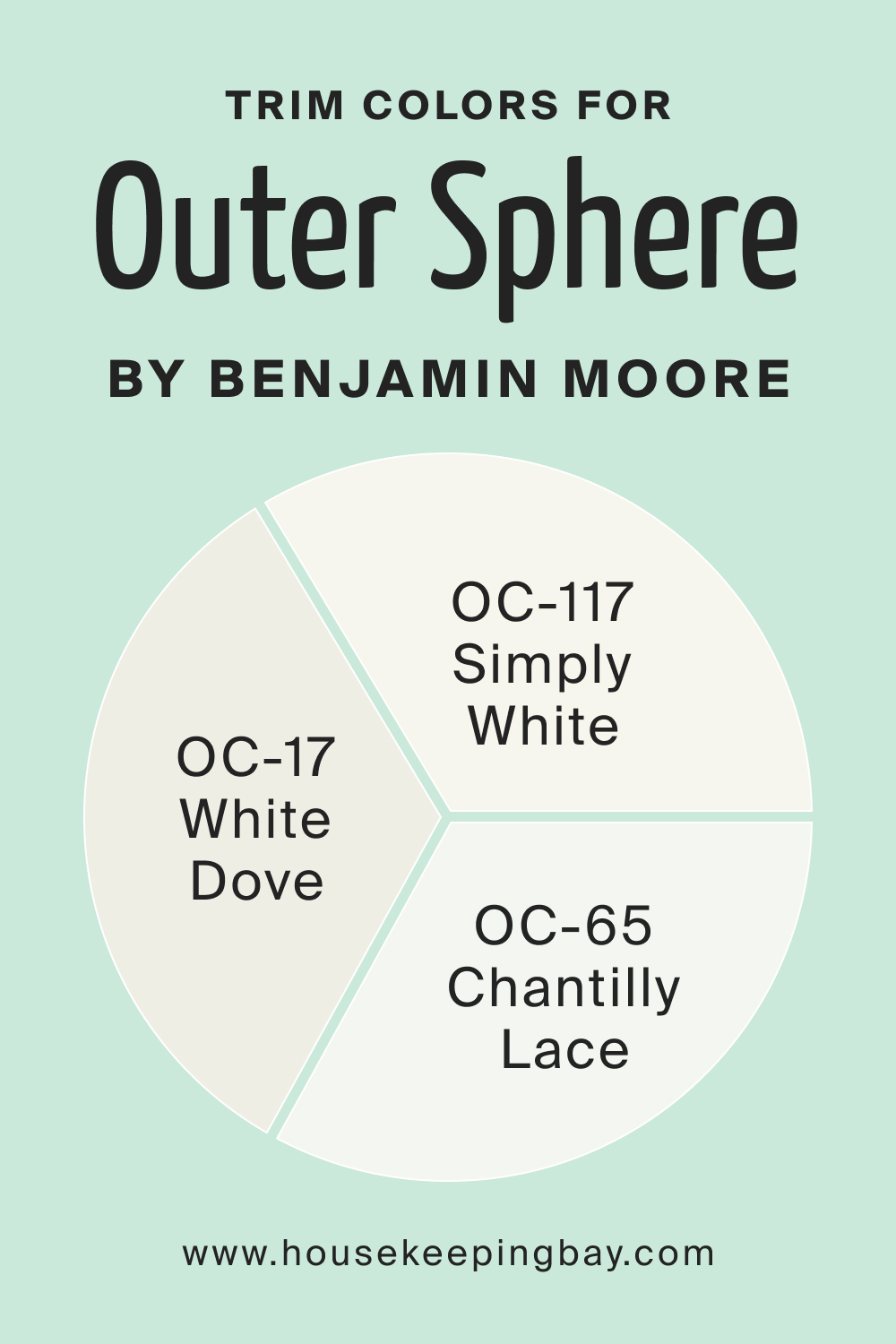
Trim Colors of Outer Sphere 645
Benjamin Moore’s Outer Sphere (645) is a subtle, sophisticated shade that can act as a neutral backdrop, allowing for a wide range of trim colors to complement it. Here are three white paint colors from Benjamin Moore that would work well as trim colors for Outer Sphere:
- Chantilly Lace (OC-65) : This is one of the purest whites offered by Benjamin Moore. Chantilly Lace has no obvious undertones, making it a crisp and clean choice for trim. It would provide a stark, clean contrast to Outer Sphere, emphasizing a modern and bright aesthetic.
- White Dove (OC-17) : A popular choice for trim, White Dove has a creamy undertone that makes it a soft, warm white without becoming too yellow. It is often lauded for its versatility and would complement Outer Sphere by softening the transition between the wall color and trim, thus ensuring a harmonious blend.
- Simply White (OC-117) : This color is a warm and welcoming white with a slight yellow undertone. Simply White was Benjamin Moore’s Color of the Year in 2016 and has become a favorite for its ability to pair well with most colors. It offers a softer edge against the coolness of Outer Sphere, providing balance and a touch of warmth.
Each of these trim colors would create a different effect when paired with Outer Sphere, from the sharp contrast of Chantilly Lace to the subtle warmth of Simply White.
When choosing the right white, consider the lighting conditions and other colors in your space, as whites can look different depending on their surroundings.
housekeepingbay.com
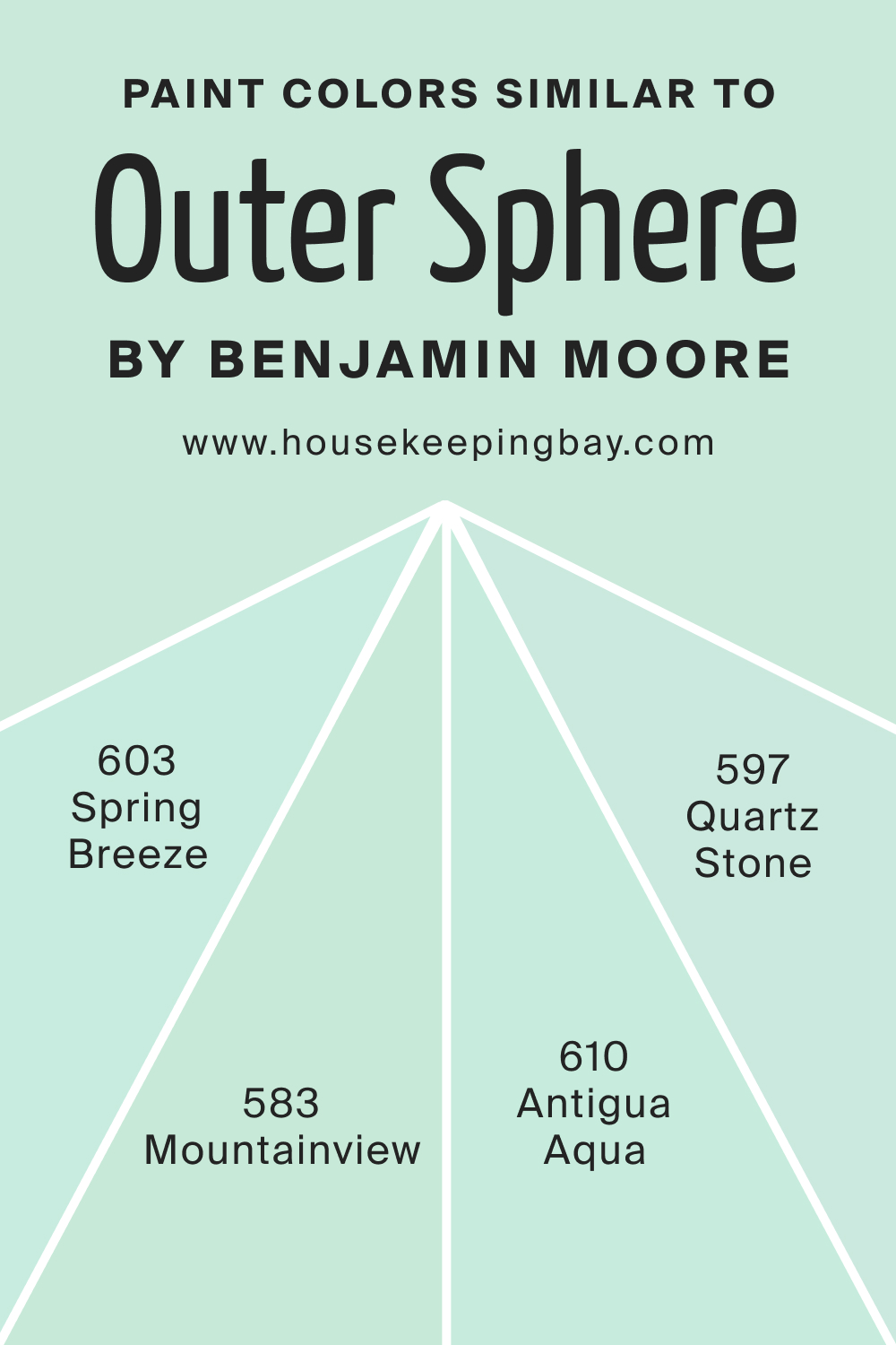
Colors Similar to Outer Sphere 645
Recognizing colors akin to a chosen shade can aid in achieving design cohesion. Although there seems to be a mix-up with the mentioned color, Abbey Brown 1225, we’ll focus on the provided similar colors:
- BM 583 Mountainview : A verdant green echoing mountain meadows.
- BM 603 Spring Breeze : A gentle pastel blue hinting at clear skies.
- BM 597 Quartz Stone : A soft gray with stony undertones.
- BM 610 Antigua Aqua : A Caribbean-inspired teal with refreshing vibes.
housekeepingbay.com
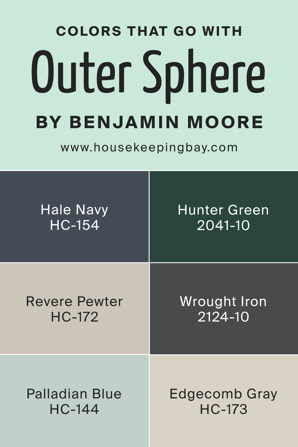
Colors That Go With Outer Sphere 645
Complementary colors elevate design aesthetics. Pairing other colors with Benjamin Moore’s Outer Sphere (645) can create various atmospheres in a space, from serene and calming to dynamic and contrasting. Here are six Benjamin Moore colors that coordinate well with Outer Sphere:
- Revere Pewter (HC-172) : This is a light gray with warm undertones, often referred to as the perfect “greige” — a mixture of gray and beige. It’s a very popular color that would complement the cooler tones of Outer Sphere by adding warmth and sophistication.
- Hale Navy (HC-154) : A deep, rich navy blue that can create a classic and nautical feel when paired with Outer Sphere. It’s a bold color that can act as an accent, providing a striking contrast and a touch of drama.
- Palladian Blue (HC-144) : This is a light, airy blue with a hint of green and gray. It has a calming effect, reminiscent of the sky on a clear day. When paired with Outer Sphere, Palladian Blue can bring a sense of tranquility and spaciousness to a room.
- Hunter Green (2041-10) : A deep, saturated green that can give a room an elegant and timeless look. It pairs nicely with Outer Sphere by drawing on natural color palettes, offering a grounding contrast with its rich earthiness.
- Wrought Iron (2124-10) : Not a typical black, Wrought Iron is a very dark gray that mimics the color of traditional ironwork. It’s less harsh than a pure black and would add depth and definition as an accent color with Outer Sphere.
- Edgecomb Gray (HC-173) : This is a soft, light gray with warm undertones. It’s an ideal neutral that creates a seamless flow with Outer Sphere, for those looking for a gentle and cohesive look throughout their space.
When you’re selecting colors to complement Outer Sphere, it’s important to consider the undertones in both the primary and accent colors to ensure they harmonize in the space. Always try to test your selected colors in the room itself, as lighting and surrounding elements can significantly impact the appearance of the paint.
housekeepingbay.com
How to Use Outer Sphere 645 In Your Home?
Outer Sphere 645 is a versatile shade that seamlessly integrates into various rooms, from intimate spaces like bedrooms to communal areas like living rooms. Its muted undertones make it apt for both modern and traditional designs. The color is a perfect fit for minimalist, Scandinavian, coastal, and contemporary styles, offering a tranquil backdrop that can be jazzed up with vibrant decor or kept understated for a calming ambiance.
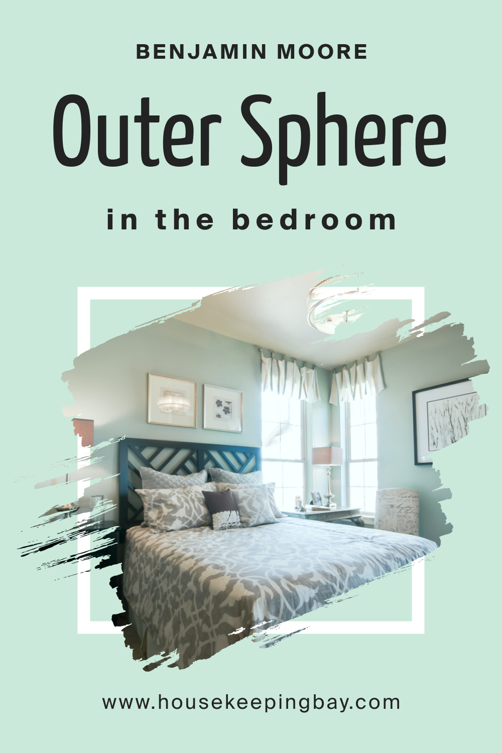
How to Use Outer Sphere 645 in the Bedroom?
The bedroom is a sanctuary, and Outer Sphere 645 enhances its serenity. The cool undertones of this shade evoke a sense of tranquility, making it perfect for creating a restful retreat. Paired with soft linens, wooden furnishings, and subtle lighting, it provides a soothing backdrop that encourages relaxation and rest.
housekeepingbay.com
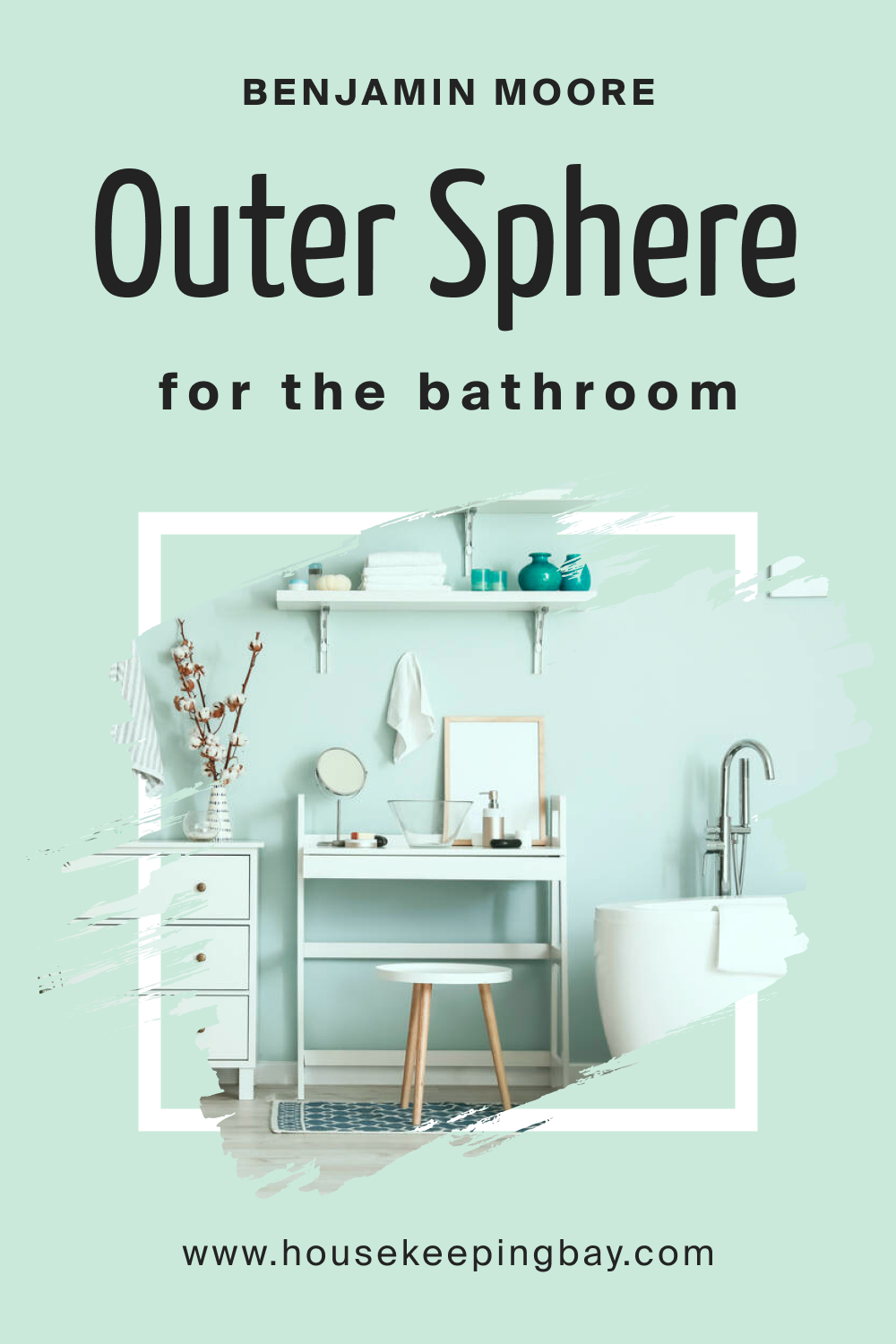
How to Use Outer Sphere 645 in the Bathroom?
In the bathroom, Outer Sphere 645 brings spa-like elegance. Its muted tones pair wonderfully with marble countertops, chrome fixtures, and white tiles. The color helps in making the space appear more expansive and airy. Complemented with fluffy white towels and indoor plants, it creates a refreshing oasis.
housekeepingbay.com
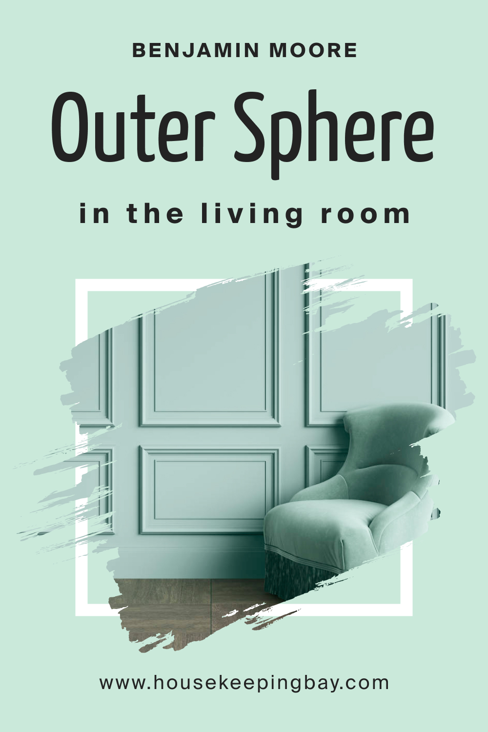
How to Use Outer Sphere 645 in the Living Room?
The living room, being a communal space, benefits from the inviting aura of Outer Sphere 645. The color lays a neutral foundation, allowing for bold accents, patterned rugs, and eclectic furnishings. Whether you’re aiming for a laid-back vibe or a sophisticated setting, this hue adapts, setting the stage for memorable moments.
housekeepingbay.com
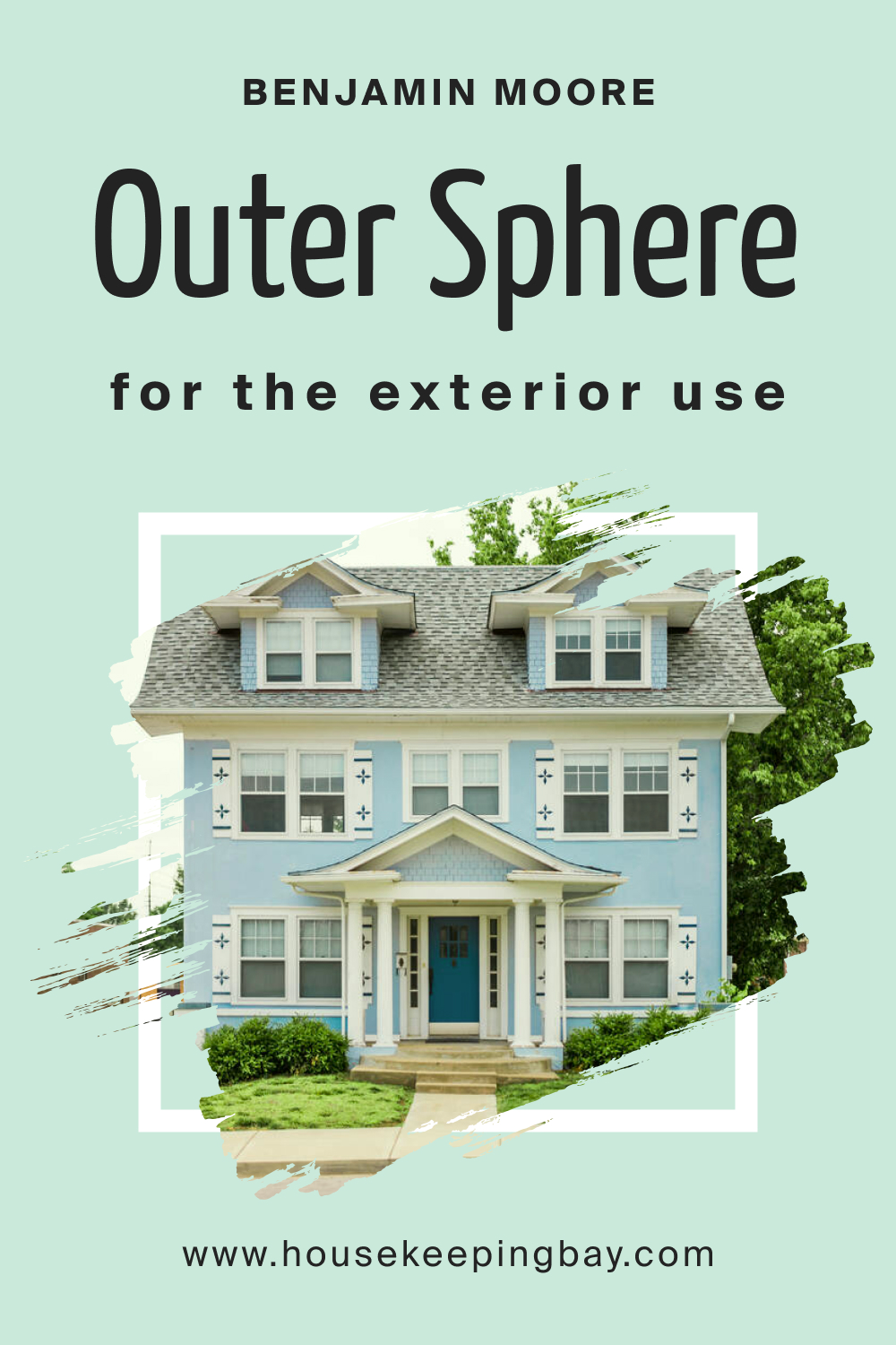
How to Use Outer Sphere 645 for an Exterior?
On exteriors, Outer Sphere 645 radiates a timeless appeal. It complements natural elements like stone pathways, wooden beams, and green landscaping. The color is durable enough to withstand varying weather conditions, ensuring your home appears inviting throughout the seasons, making it a popular choice for facades.
housekeepingbay.com
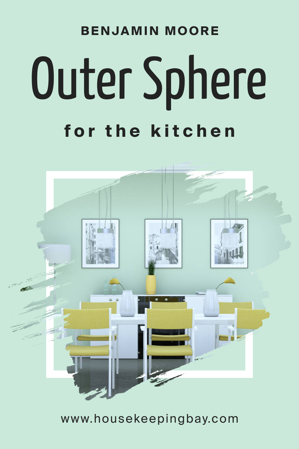
How to Use Outer Sphere 645 in the Kitchen?
Kitchens are the heart of a home, and Outer Sphere 645 adds warmth to this space. The color complements stainless steel appliances, wooden countertops, and mosaic backsplashes. With its calming presence, it offsets the hustle and bustle, making cooking and dining a delightful experience.
housekeepingbay.com
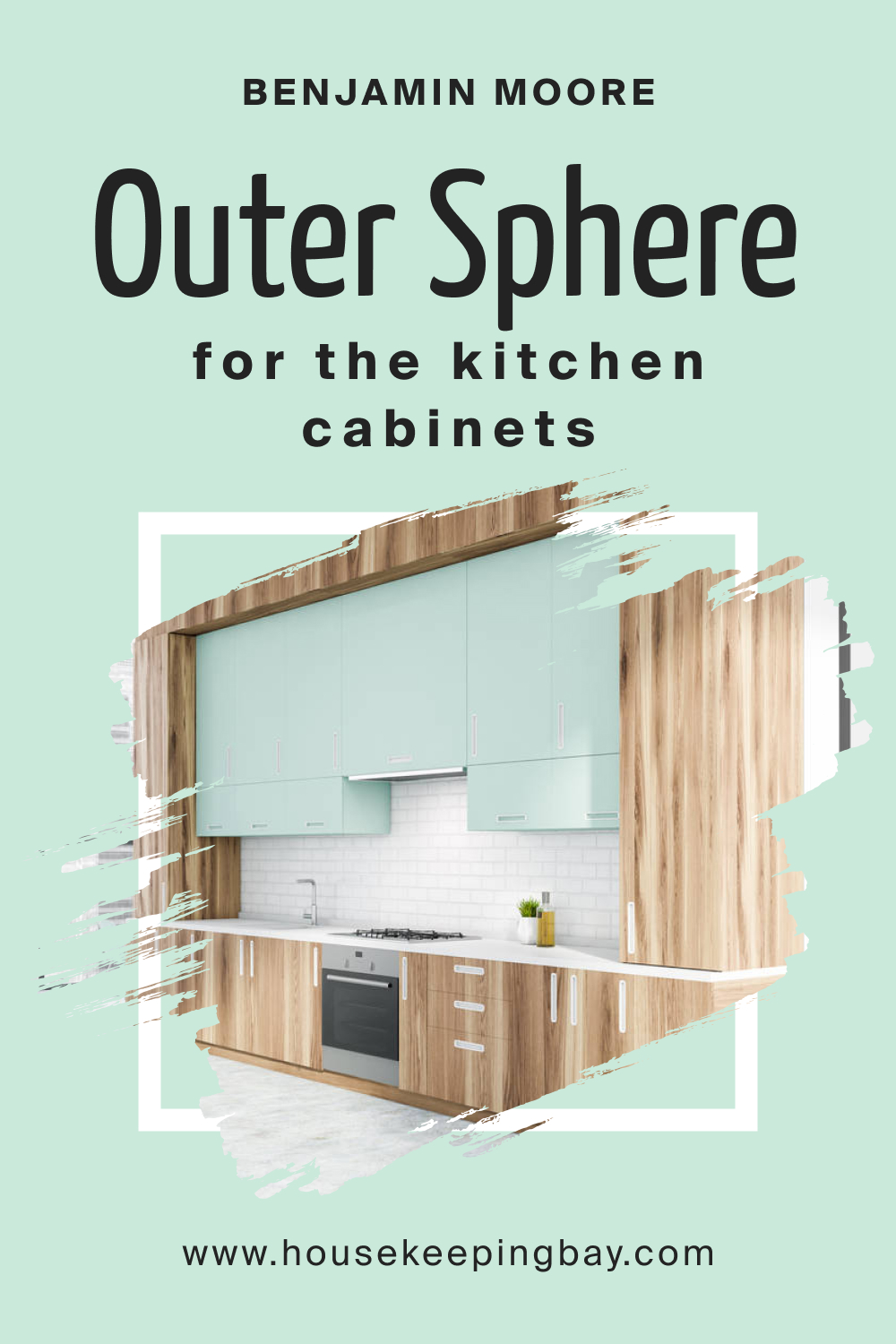
How to Use Outer Sphere 645 on the Kitchen Cabinets?
Cabinetry painted in Outer Sphere 645 instantly elevates the kitchen’s style quotient. The hue offers a contemporary twist to traditional cabinets and brings modern sleekness to modular designs. Paired with brass or chrome handles, the cabinets become a focal point, blending functionality with aesthetics.
housekeepingbay.com
Comparing Outer Sphere 645 With Other Colors
Understanding the subtleties between paint colors is essential for creating a harmonious design. Comparing shades helps identify undertones, versatility, and mood-evoking capabilities, ensuring you select the right hue for the desired ambiance. It also assists in coordinating decor elements and choosing complementary colors.
Here, we pit Outer Sphere 645 against six other distinct shades to understand its unique charm.
Outer Sphere 645 vs. BM 646 Hannity Green
Hannity Green carries an earthy elegance, reminiscent of dense forests after rainfall. While Outer Sphere 645 leans towards a cooler, muted ambiance, Hannity Green has a deep, warm underbelly. Where Outer Sphere offers tranquility, Hannity Green promises richness and depth, making it more suited for spaces seeking a grounded atmosphere.
housekeepingbay.com
Outer Sphere 645 vs. BM 648 Kokopelli Teal
Kokopelli Teal is a spirited shade, echoing the vibrancy of tropical oceans. Compared to the understated grace of Outer Sphere 645, Kokopelli Teal is bold and dynamic. While Outer Sphere whispers serenity, Kokopelli Teal shouts vivacity, apt for spaces that aim for a lively vibe.
housekeepingbay.com
Outer Sphere 645 vs. BM 649 Captivating Teal
Captivating Teal , true to its name, is alluring with a blend of blue and green undertones. It’s more vibrant than Outer Sphere 645 but has a certain softness. The comparison is akin to comparing a serene morning sky (Outer Sphere) to a twilight horizon (Captivating Teal) – both beautiful, yet distinctly different.
housekeepingbay.com
Outer Sphere 645 vs. BM 650 Highlands Green
Highlands Green is a robust shade, mirroring the rolling hills of the Scottish Highlands. Its earthiness contrasts with the ethereal quality of Outer Sphere 645. Where Outer Sphere feels like a gentle embrace, Highlands Green stands sturdy, offering a sense of security and depth.
housekeepingbay.com
Outer Sphere 645 vs. BM 623 Deep Sea
Deep Sea is a profound, mesmerizing shade reminiscent of oceanic abysses. Compared to Outer Sphere 645’s airy aura, Deep Sea offers intensity and mystery. It’s a hue that promises drama, making it the antithesis of Outer Sphere’s calm demeanor.
housekeepingbay.com
Outer Sphere 645 vs. BM 651 Brazilian Rainforest
Brazilian Rainforest is a lush, verdant green reflecting the vibrancy of Amazonian landscapes. Next to the muted elegance of Outer Sphere 645, Brazilian Rainforest seems exuberant. While Outer Sphere is apt for minimalist designs, Brazilian Rainforest beckons maximalist tendencies, brimming with life and zest.
housekeepingbay.com
Conclusion
Color comparisons are not just about spotting differences; they’re about understanding the emotion each shade evokes. Outer Sphere 645, with its unique blend of subtlety and sophistication, holds its own against a spectrum of greens and teals.
Its versatility makes it a valuable addition to any design palette, effortlessly transitioning between various aesthetics, proving that in the realm of interior design, sometimes it’s the quietest colors that speak the loudest.
housekeepingbay.com
Ever wished paint sampling was as easy as sticking a sticker? Guess what? Now it is! Discover Samplize's unique Peel & Stick samples. Get started now and say goodbye to the old messy way!
Get paint samples


Frequently Asked Questions
⭐What style of interior does Outer Sphere 645 best suit?
Outer Sphere 645 is a versatile hue that complements various interior styles. It is particularly well-suited for minimalist, Scandinavian, coastal, and contemporary designs due to its muted undertones and tranquil ambiance.
⭐Can I use Outer Sphere 645 for exteriors?
Absolutely! Outer Sphere 645 offers a timeless appeal to exteriors, harmonizing well with natural elements such as stone pathways, wooden beams, and green landscaping. It's also durable enough to withstand varying weather conditions.
⭐What undertones does Outer Sphere 645 possess?
Outer Sphere 645 boasts cool undertones. These subtle undertones help create a calming and serene environment in any space, making the color particularly appealing for areas where relaxation and tranquility are desired.
⭐How does Outer Sphere 645 look in different lighting conditions?
The appearance of Outer Sphere 645 can vary based on lighting. In natural light, its cool undertones are more pronounced, while artificial light might emphasize its depth. The color may appear cooler in north-facing rooms and warmer in south-facing ones.
⭐Which trim colors pair well with Outer Sphere 645?
Trim colors in shades of white from the same brand complement Outer Sphere 645 beautifully. Consider using soft whites or off-whites to create a crisp and refined contrast.