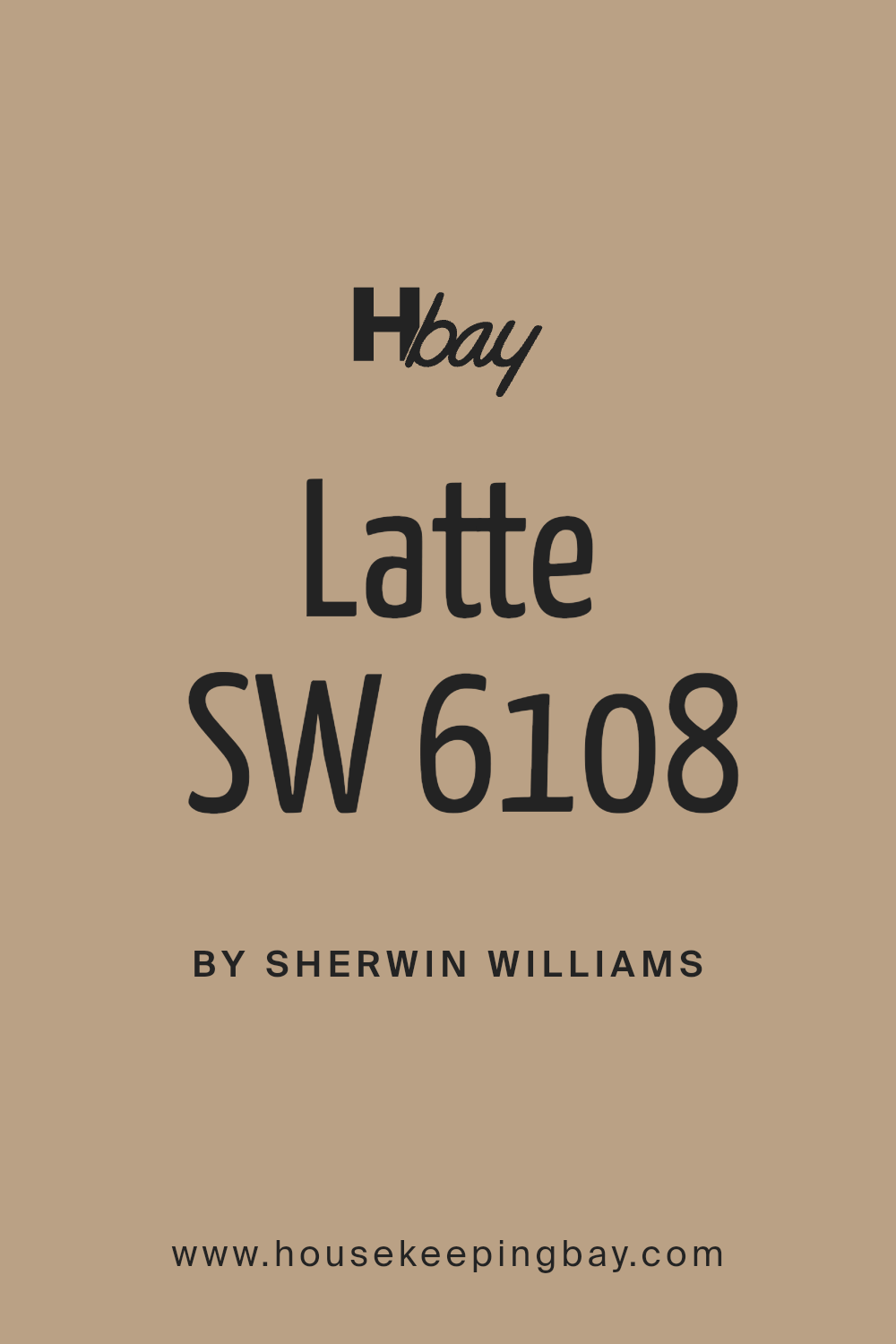
Latte SW 6108 by Sherwin Williams
Warm Elegance Redefined Uniting Cozy Charm with Modern Style
Are you considering giving your walls a fresh coat of paint and seeking the perfect shade? You may want to consider SW 6108 Latte by Sherwin Williams. This inviting color is a warm and creamy beige that provides a subtle, sophisticated backdrop for any room in your home.
Its versatility allows it to blend seamlessly with various decorations and furniture styles, making it a popular choice for living spaces, bedrooms, and even kitchens.
SW 6108 Latte strikes a beautiful balance between warmth and neutrality, making it an ideal choice if you wish to create a cozy yet light atmosphere. It’s particularly effective in rooms that receive plenty of natural light, where the sun accentuates its creamy undertones, providing a soft, soothing ambiance. This shade is also excellent for accent walls, pairing splendidly with deeper and contrasting colors to add visual interest to any space.
Whether you’re updating a single room or planning a complete renovation, SW 6108 Latte by Sherwin Williams could be the perfect hue to enhance your décor while keeping a classy, timeless feel.
via angi.com
What Color Is Latte SW 6108 by Sherwin Williams?
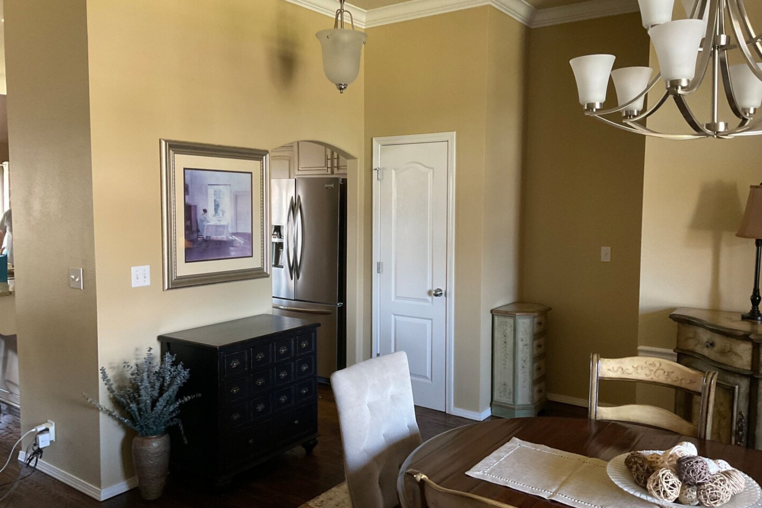
Latte SW 6108 by Sherwin Williams is a warm, comforting beige with subtle hints of cinnamon. This inviting color creates a cozy and welcoming atmosphere, making it perfect for living spaces where people gather and relax. The creamy richness of Latte offers a versatile backdrop that complements a variety of decorating themes.
This shade works particularly well in traditional, rustic, and shabby chic interior styles. Latte teams perfectly with natural materials like wood, accentuating its depth and warmth. Furniture pieces in rich dark wood or lightly stained pine will both stand out against a Latte backdrop.
In a rustic setting, combining it with textured materials such as burlap, linen, and wool adds a touch of rustic charm to the environment.
For a shabby chic decor, pair Latte with distressed furniture and soft pastel accents to create a gentle, inviting space. Fabrics like soft cotton and delicate lace work beautifully against the neutral, creamy tone of Latte.
Latte SW 6108 is also an excellent choice for those seeking to create a serene and homely space without making a bold color statement. Its neutral palette allows for flexibility in switching up decor items such as cushions, curtains, and rugs according to season or preference, ensuring the space always feels fresh and harmonious.
housekeepingbay.com
Is Latte SW 6108 by Sherwin Williams Warm or Cool color?
Latte SW 6108 by Sherwin Williams is a warm, inviting neutral color that brings a cozy and comfortable feel to any room in the home. This shade of brown has a rich creaminess, much like the coffee drink it’s named after, making it a versatile choice for decorating.
Latte SW 6108 works well in living rooms, bedrooms, and dining areas, providing a soft backdrop that complements a variety of decor styles and colors.
Using Latte SW 6108 on walls helps to create a soothing environment, ideal for spaces where relaxation is a priority. Its neutral tone also allows for flexibility in changing accent colors over time. This shade pairs beautifully with brighter colors for a playful contrast or subtle hues for a more harmonious look. Additionally, Latte helps to enhance natural light, making spaces feel larger and more open.
Considering its adaptability and warm undertone, Latte SW 6108 by Sherwin Williams is a smart choice for those looking to give their home a fresh yet timeless look.
What is the Masstone of the Latte SW 6108 by Sherwin Williams?
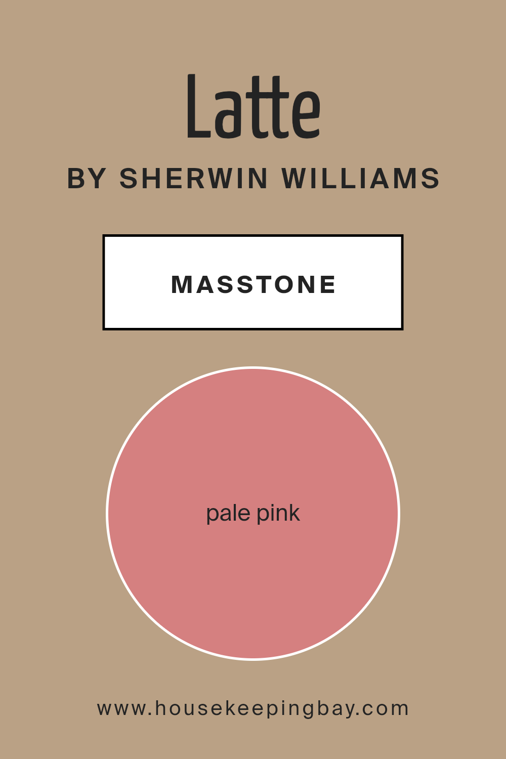
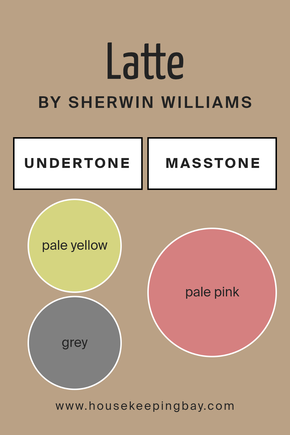
LatteSW 6108 by Sherwin Williams, with its masstone of Pale Pink (#D58080), brings a gentle warmth to any room. This soft pink shade gives an inviting, cozy touch that makes spaces feel comfortable and relaxed. It’s not too bright but has enough color to add a friendly, subtle charm.
Because it is mild, it pairs well with many other colors, from soft whites and grays to even more vibrant shades. This versatility makes it perfect for living rooms, bedrooms, or even a kitchen, enhancing the overall ambience with its soft presence.
Using Pale Pink in homes can make small rooms seem larger and more open because of its light reflecting qualities. It’s also great for spaces that lack natural light, adding a bit of brightness without being overpowering.
This color’s ability to work well in different types of lighting and various decor styles ensures it can beautifully complement various design aesthetics.
housekeepingbay.com
Undertones of Latte SW 6108 by Sherwin Williams
LatteSW 6108 by Sherwin Williams is a complex paint color that has multiple undertones influencing its overall appearance. These undertones – pale yellow, grey, mint, light purple, light gray, orange, lilac, yellow, light blue, olive, light green, pink, purple, fuschia, red, violet, and brown – interplay to create a dynamic effect that shifts under different lighting conditions and when paired with various decor styles and colors.
Understanding undertones is crucial because they can subtly change how colors look on your walls. For example, in LatteSW 6108, the presence of grey and light gray undertones can cool down what might otherwise be a warmer beige, making it more versatile and nuanced.
On the other hand, hints of orange, red, and brown bring warmth, giving the color a cozy, welcoming feel.
When used on interior walls, LatteSW 6108 can produce varying effects depending on the room’s natural and artificial lighting as well as surrounding colors. In a room with ample sunlight, the warmer undertones like yellow and orange might become more prominent, creating a soft, warm glow.
In spaces with less light, the grey and light gray might dominate, lending the room a more sophisticated, muted appearance.
Overall, the rich blend of undertones in LatteSW 6108 makes it a flexible choice for interior design, capable of complementing a wide range of styles and palettes.
Whether creating a soothing background or serving as a standout feature in a room, this color can adapt beautifully to different settings and moods, enhancing the visual appeal of any space.
housekeepingbay.com
Coordinating Colors of Latte SW 6108 by Sherwin Williams
Coordinating colors are shades that complement each other well and work harmoniously within a design to create a balanced and visually pleasing atmosphere. When used skillfully, coordinating colors enhance the overall aesthetic and help in achieving a specific mood or style in a space.
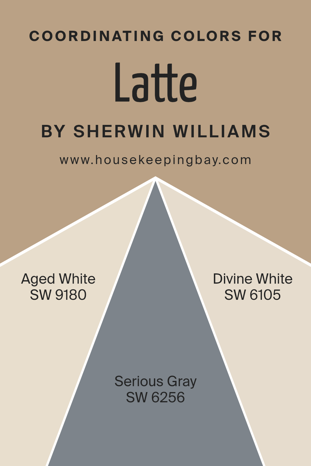
For example, Latte SW 6108 by Sherwin Williams pairs beautifully with a carefully selected group of coordinating colors such as Aged White SW 9180, Serious Gray SW 6256, and Divine White SW 6105.
Aged White SW 9180 is a warm, creamy hue that adds a soft and inviting touch to your walls, acting as a gentle contrast to the deeper tones of Latte. This color is perfect for creating a cozy and soothing environment. Serious Gray SW 6256, as the name suggests, introduces a robust, modern look with its deep and dramatic shade.
It works well in areas where a strong visual impact is desired, providing a sophisticated backdrop that complements the warmer undertones of Latte. Divine White SW 6105 is lighter and has a celestial, airy quality to it, making it ideal for brightening spaces and adding a subtle nuance when paired with the richer, darker tones of Latte.
You can see recommended paint colors below:
- SW 9180 Aged White
- SW 6256 Serious Gray
- SW 6105 Divine White
housekeepingbay.com
How Does Lighting Affect Latte SW 6108 by Sherwin Williams?
Lighting plays a critical role in how we perceive colors. The type, intensity, and color of light can alter our perception of color in various ways. Different lighting conditions can make the same color look different at different times and in different places.
Take the color “Latte SW 6108” by Sherwin Williams as an example. This color is a warm, neutral shade that can look different under varying lighting conditions. In natural light, “Latte SW 6108” appears softer and more vibrant, reflecting the true characteristics of its warm undertones. This soothing color can help create a cozy and inviting atmosphere in a room.
In artificial light, such as LED or incandescent lighting, the perception of “Latte SW 6108” might change. Under warm artificial light, the color will maintain its rich and creamy appearance.
However, under cooler artificial light, it might appear slightly muted, with the risk of losing some of its warmth and depth.
Room orientation also affects how “Latte SW 6108” is perceived:
1. North-Faced Rooms: These rooms usually get less direct sunlight, which might make “Latte SW 6108” appear a bit darker and more muted. The cooler, indirect light can make the warmer tones less pronounced.
2. South-Faced Rooms: Here, the ample sunlight can enhance the warmth of “Latte SW 6108,” making it appear lively and vibrant throughout the day. It’s an ideal choice for rooms facing this direction as it maximizes the color’s potential.
3. East-Faced Rooms: In the morning, “Latte SW 6108” will glow warmly as it catches the first rays of the sun. However, as the day progresses and the natural light diminishes, the color can look softer and more subdued.
4. West-Faced Rooms: Afternoon and evening light can enrich “Latte SW 6108,” bringing out its warm undertones. As the sun sets, the color can appear deeper, offering a cozy ambiance.
Understanding how lighting affects colors like “Latte SW 6108” helps in making informed decisions about paint colors based on room orientation and lighting conditions, ensuring that the colors perform beautifully in every space.
housekeepingbay.com
What is the LRV of Latte SW 6108 by Sherwin Williams?
LRV stands for Light Reflectance Value, which is a measure showing the percentage of light a paint color reflects back into a room. This value ranges from 0, which means no light is reflected and it absorbs all light, like a true black, up to 100, where it reflects all light, similar to pure white.
LRV is crucial for understanding how light or dark a color will look once applied to your walls. It also helps in picking the right colors for a given space based on how much natural or artificial light that space receives. Colors with high LRV make rooms feel airier and more open, while low LRV colors can make rooms feel smaller but cozier.
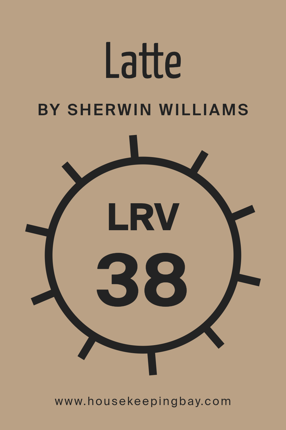
Speaking specifically about Latte SW 6108 by Sherwin Williams, which has an LRV of 37.573, it falls into the category of darker mid-tone colors. This means it reflects a moderate amount of light but still retains a rich, fuller quality.
When applied on walls, Latte SW 6108 will not lighten up a space as much as colors with higher LRVs but it will definitely add a warm, inviting tone. It’s particularly suited for spaces where a cozy, welcoming atmosphere is desired, possibly benefiting rooms that already receive a good amount of natural light to prevent them from feeling too enclosed.
Choose this kind of color to give a room character without overwhelming it with darkness.
housekeepingbay.com
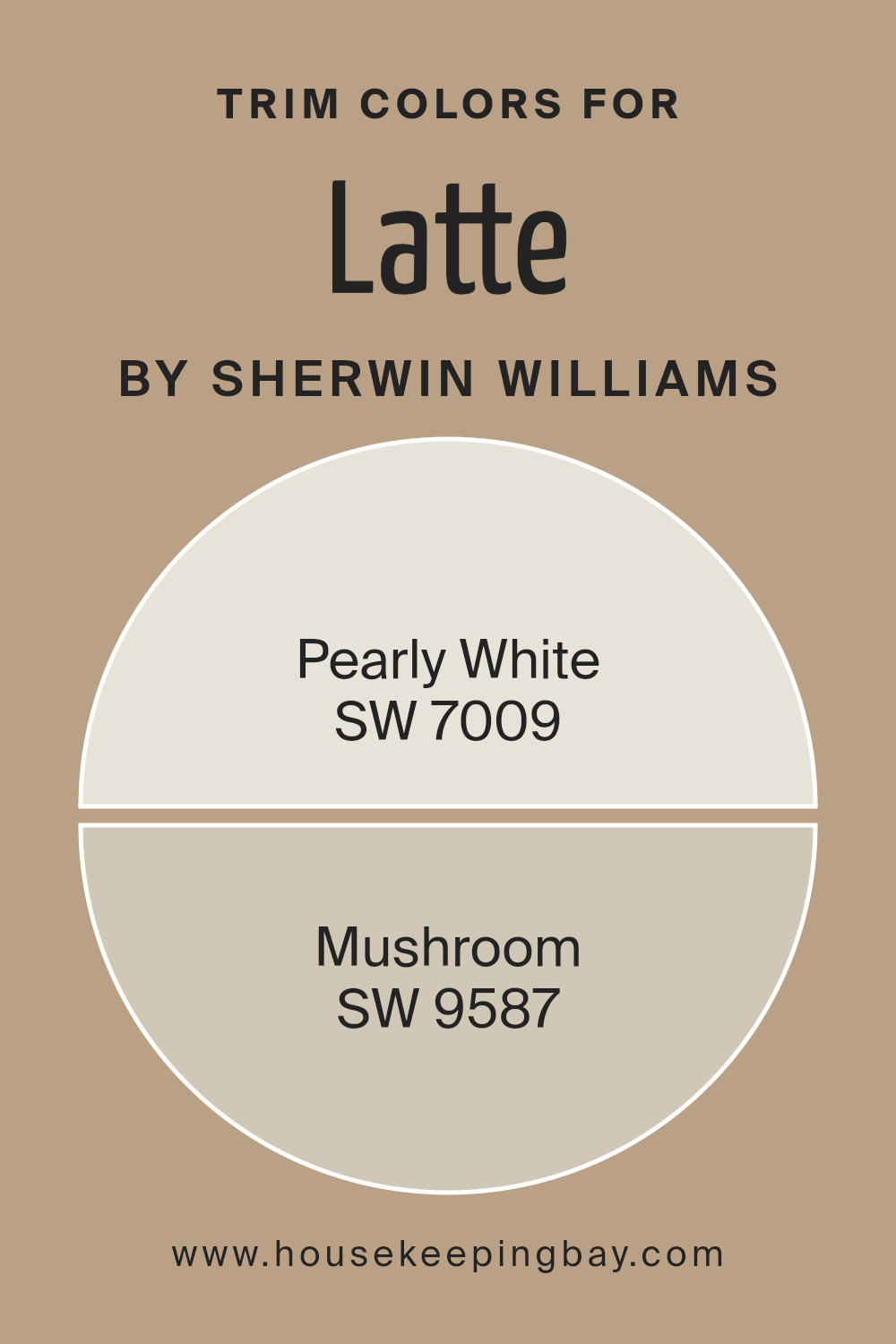
What are the Trim colors of Latte SW 6108 by Sherwin Williams?
Trim colors, such as Pearly White and Mushroom by Sherwin-Williams, play a crucial role in outlining and accentuating the features of a room, much like a frame complements a painting. These colors are used on moldings, door frames, window frames, and other architectural elements to add contrast and definition against wall colors such as Latte SW 6108.
The right trim color can subtly highlight these details, enhancing the overall aesthetic and ensuring that different elements within a space are visually connected.
Pearly White SW 7009 is a soft, creamy white that offers a gentle contrast when paired with the warmer tones of Latte SW 6108. This color provides a fresh and clean look, making it ideal for creating a serene and inviting atmosphere. Mushroom SW 9587, on the other hand, is a warm, earthy taupe that brings a sense of depth and warmth to the surroundings.
It works wonderfully with Latte SW 6108 to establish a cozy and cohesive environment, perfect for spaces where a comforting and understated elegance is desired.
You can see recommended paint colors below:
housekeepingbay.com
Colors Similar to Latte SW 6108 by Sherwin Williams
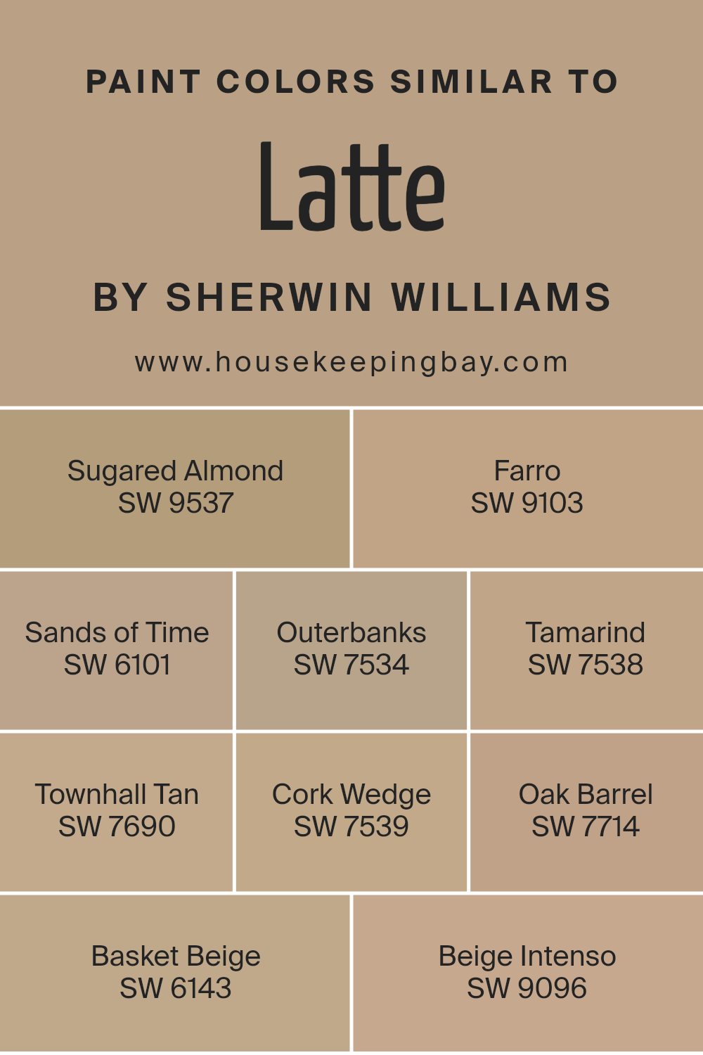
Similar colors are crucial in interior design because they create a seamless visual flow from one room to another, giving the space a cohesive look. When colors are similar, they have a calming effect, as the eye does not need to constantly adjust to contrasting tones.
Colors like Latte SW 6108 by Sherwin Williams offer a warm, inviting backdrop, making them ideal for creating a harmonious space. Furthermore, similar colors can enhance the sense of space in a room, making smaller rooms feel larger and more open.
For instance, SW 9537 – Sugared Almond provides a subtle creaminess similar to the gentle warmth of Latte, establishing a soothing atmosphere. SW 9103 – Farro adds a touch of earthen tones, resembling the softness of sand, akin to a quiet beach setting.
Moving towards a slightly darker hue, SW 6101 – Sands of Time offers a dusky beige that echoes the quiet moments of early dusk. SW 7534 – Outerbanks has an organic feeling, a bit deeper, reminding one of a sturdy branch.
The rich color of SW 7538 – Tamarind resembles the dark spices and brings a robust character into the mix. SW 7690 – Townhall Tan pulls from historic elements, giving off a reliable and time-tested vibe.
Meanwhile, SW 7539 – Cork Wedge has a natural, cork-like appearance that fits perfectly into any serene setting. SW 7714 – Oak Barrel carries the depth and solidity of aged wood, comforting and strong. SW 6143 – Basket Beige reminds one of handwoven fibers, light and airy.
Lastly, SW 9096 – Beige Intenso holds a bit more depth, anchoring the lighter tones with its dense hue. Each of these colors complements Latte SW 6108, ensuring any combination will enhance the overall warmth and continuity of your home decor.
You can see recommended paint colors below:
- SW 9537 Sugared Almond
- SW 9103 Farro
- SW 6101 Sands of Time
- SW 7534 Outerbanks
- SW 7538 Tamarind
- SW 7690 Townhall Tan
- SW 7539 Cork Wedge
- SW 7714 Oak Barrel
- SW 6143 Basket Beige
- SW 9096 Beige Intenso
housekeepingbay.com
Colors that Go With Latte SW 6108 by Sherwin Williams
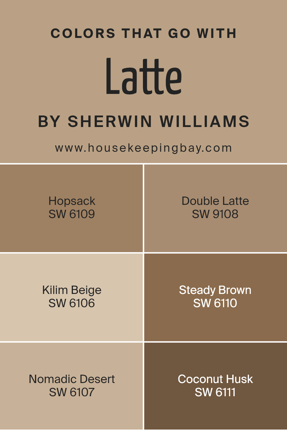
Choosing complementary colors for Latte SW 6108 by Sherwin Williams is essential because they help create a harmonious and aesthetically pleasing space. By pairing Latte SW 6108 with colors like Hopsack, Double Latte, Kilim Beige, Steady Brown, Nomadic Desert, and Coconut Husk, homeowners achieve a balanced and inviting atmosphere.
These hues blend well because they share warm undertones that naturally complement each other, offering a seamless visual flow in any room, which is especially important in open layouts or spaces where cohesion is desired.
Each coordinating color contributes distinct characteristics that enhance the depth and interest of an area. Hopsack SW 6109 is a darker shade that adds a rich, earthy element which works well for accent walls or furniture pieces.
Double Latte SW 9108 is a deeper, more intense version of Latte itself, providing a subtle contrast while maintaining color integrity throughout the space. Kilim Beige SW 6106 offers a lighter, softer touch that can brighten rooms and make them appear more spacious.
Steady Brown SW 6110, true to its name, provides a solid, grounding effect, perfect for anchoring lighter tones in furnishings or decor. Nomadic Desert SW 6107 gives a slightly more golden hue, enhancing the warm undertones of Latte and making the environment feel more welcoming.
Lastly, Coconut Husk SW 6111 adds a unique, slightly organic touch to the palette, resembling the natural color of a coconut’s shell, ideal for adding a natural, earthy flair to your setup. By carefully selecting these complementary colors, your decorating approach feels coherent, thoughtful, and ultimately more polished.
You can see recommended paint colors below:
- SW 6109 Hopsack
- SW 9108 Double Latte
- SW 6106 Kilim Beige
- SW 6110 Steady Brown
- SW 6107 Nomadic Desert
- SW 6111 Coconut Husk
housekeepingbay.com
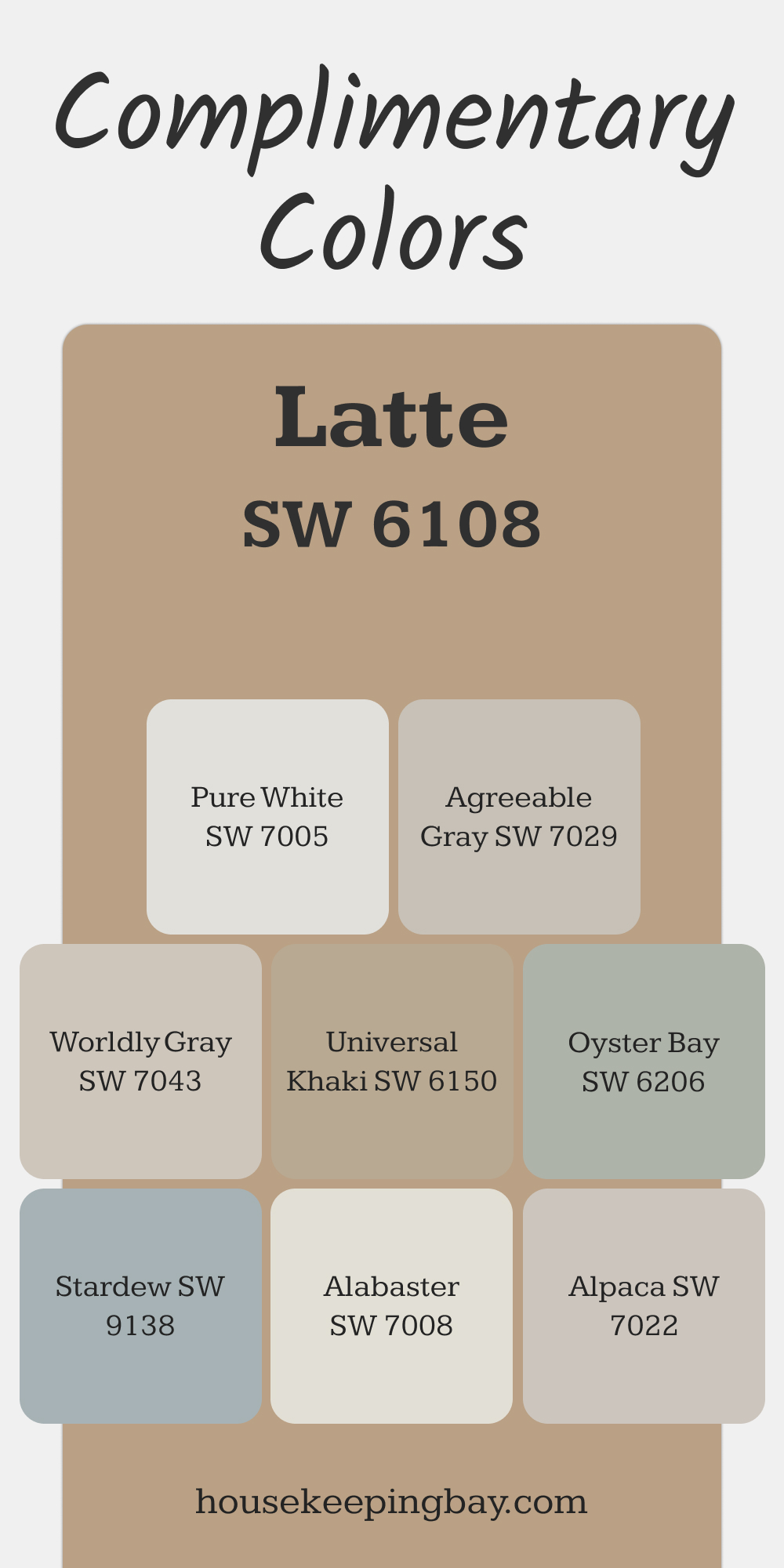
Complimentary Colors for Latte SW 6108 Paint Color by Sherwin Williams
Latte by Sherwin Williams is a warm and inviting paint color that pairs beautifully with a variety of shades. Pure White and Alabaster offer a bright, clean contrast, while Worldly Gray and Agreeable Gray add soft, subtle balance. These combinations create a cozy yet polished look.
For a touch of color, Oyster Bay and Stardew bring a gentle hint of green and blue, adding character without overpowering. Universal Khaki and Alpaca are versatile accents, blending seamlessly for a harmonious feel.
via housekeepingbay.com
How to Use Latte SW 6108 by Sherwin Williams In Your Home?
Latte SW 6108 by Sherwin Williams is a warm, inviting paint color that brings a sense of coziness to any room in your home. This soothing beige has slight hints of pink and brown, making it versatile for pairing with a variety of decor styles, from rustic to modern.
When used in living or dining areas, Latte helps create a welcoming atmosphere where family and guests can feel comfortable and relaxed. In bedrooms, this color adds a soft, calming backdrop, perfect for resting and unwinding.
Latte works exceptionally well with rich, dark woods in furniture and flooring, enhancing the natural textures in the home. It also pairs beautifully with softer, lighter textiles, adding a balanced contrast. For those looking to add warmth and a neutral elegance to their space, applying Latte SW 6108 to walls is an excellent choice. It’s also ideal for various accent pieces throughout the home, like bookshelves or kitchen cabinets, providing subtle depth and warmth.
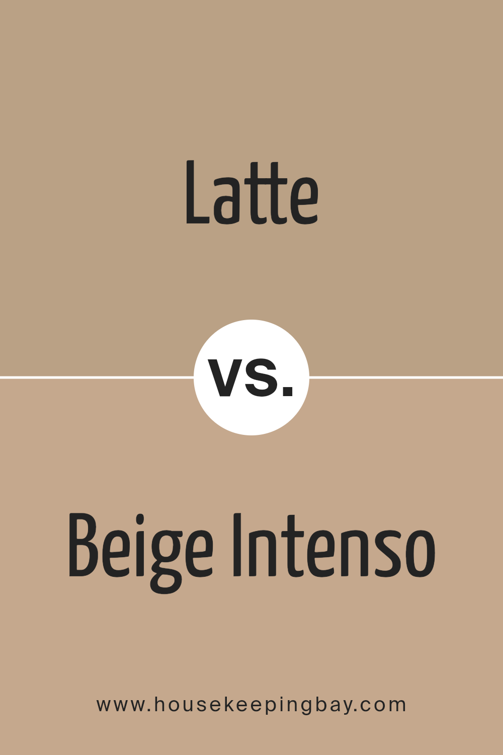
Latte SW 6108 by Sherwin Williams vs Beige Intenso SW 9096 by Sherwin Williams
The two colors, Latte SW 6108 and Beige Intenso SW 9096 by Sherwin Williams, are both neutral hues but have distinct tones. Latte SW 6108 is a warm, inviting beige that carries soft brown undertones. This color is versatile, making it suitable for creating a cozy and comfortable atmosphere in any room. It pairs well with darker browns and creamy whites for a balanced look.
Beige Intenso SW 9096, in contrast, has a deeper, more pronounced beige color that leans towards a slightly richer and more intense appearance. This shade adds depth and sophistication to spaces, ideal for an elegant setting. It works exceptionally well with stronger colors like dark greens or blues, providing a solid foundation for bolder design choices.
Both colors offer great flexibility in home decor, suiting various styles from modern to traditional. Whether used on walls or as accent colors, these beiges help achieve a serene and welcoming environment.
You can see recommended paint color below:
- SW 9096 Beige Intenso
housekeepingbay.com
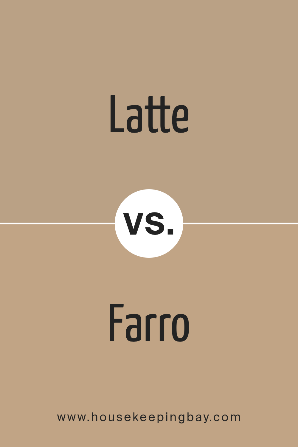
Latte SW 6108 by Sherwin Williams vs Farro SW 9103 by Sherwin Williams
Latte SW 6108 and Farro SW 9103, both by Sherwin Williams, present subtle yet distinct differences in their hues. Latte offers a rich, creamy color, reminiscent of a freshly brewed coffee with a generous amount of milk. This warm, inviting shade works well in living spaces and bedrooms where comfort and coziness are key.
In comparison, Farro SW 9103 leans towards a lighter, beige tone with a hint of gray. It provides a neutral backdrop, suitable for modern and minimalist decors. Farro has a subtle coolness, making it a versatile option for various rooms, particularly in settings that aim for a clean and contemporary look.
Overall, while both colors provide a sense of warmth, Latte adds a deeper, cozier feel with its coffee-like tone, whereas Farro offers a lighter, more understated elegance with its beige-gray composition. Both paints are excellent for creating a welcoming atmosphere, yet they cater to different aesthetic preferences and uses.
You can see recommended paint color below:
- SW 9103 Farro
housekeepingbay.com
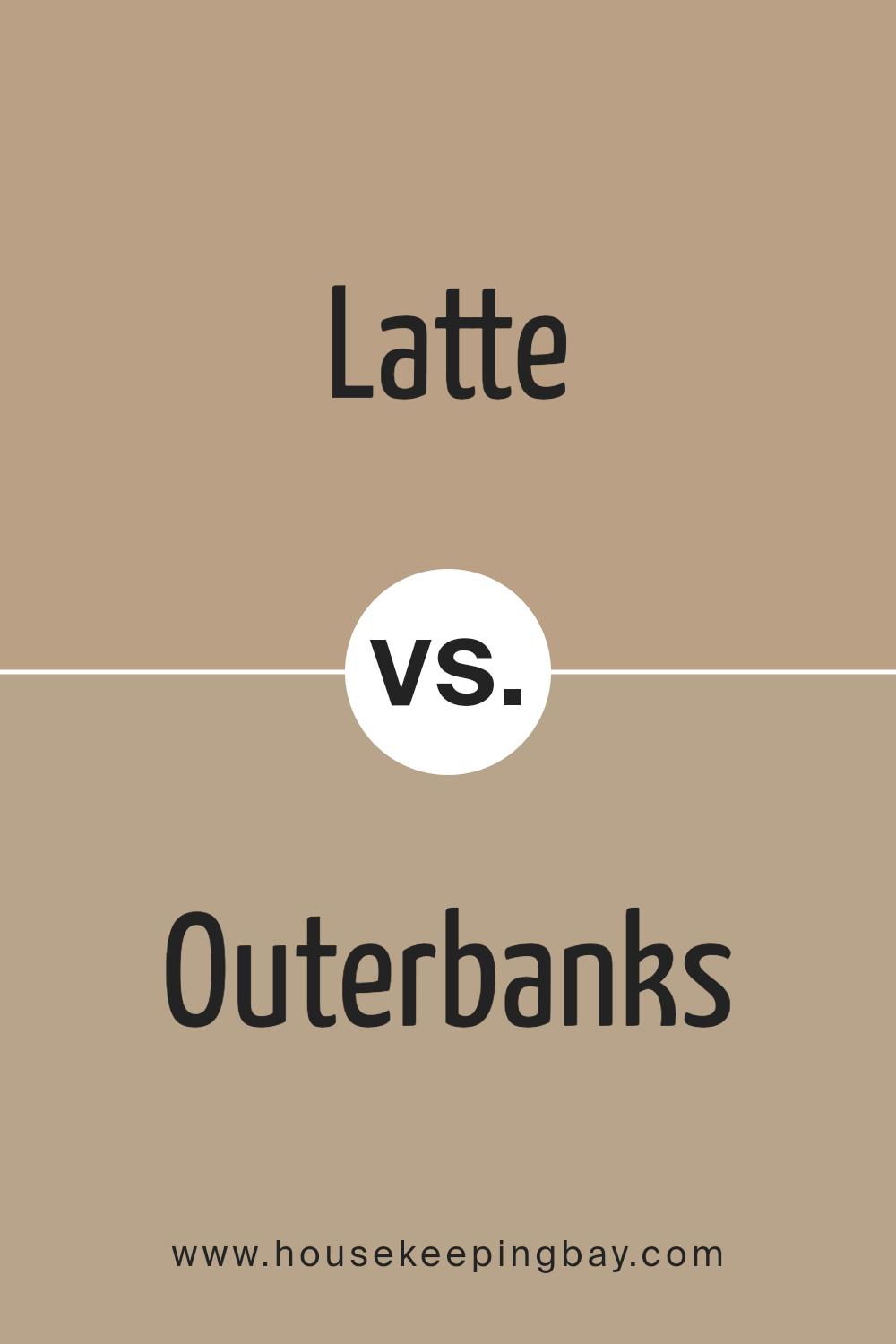
Latte SW 6108 by Sherwin Williams vs Outerbanks SW 7534 by Sherwin Williams
Latte SW 6108 by Sherwin Williams is a warm and cozy beige color that often brings a sense of comfort and simplicity to any room. It has a soft, inviting tone that pairs well with a variety of decorating styles, making it versatile for use in living rooms, bedrooms, and kitchens.
Outerbanks SW 7534, also by Sherwin Williams, is a darker, more subdued shade compared to Latte. It features a rich taupe color that suggests sophistication and grounding. This color works well in spaces that require a bit of boldness without overwhelming the senses, such as dining rooms or entryways.
While Latte provides a light, airy feel, ideal for creating a relaxed and open atmosphere, Outerbanks offers a stronger, more defined presence, suitable for adding depth and interest to a space. Both colors complement each other well, with Latte brightening areas where Outerbanks adds solidity and focus.
You can see recommended paint color below:
- SW 7534 Outerbanks
housekeepingbay.com
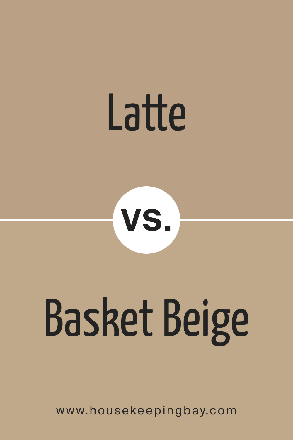
Latte SW 6108 by Sherwin Williams vs Basket Beige SW 6143 by Sherwin Williams
Latte SW 6108 by Sherwin Williams is a warm, inviting neutral shade that mimics the creamy richness of a well-made latte. It has a cozy, comforting feel, making it a great choice for areas where you want a welcoming atmosphere, like living rooms or family rooms.
Basket Beige SW 6143, also by Sherwin Williams, is slightly lighter than Latte. It pulls more towards a classic beige, offering a subtle, understated look. Basket Beige is versatile and can work beautifully in various spaces, providing a clean and calm backdrop that complements different decor styles and colors.
Both colors are neutral, but Latte SW 6108 tends to add a bit more warmth due to its richer undertones, while Basket Beige SW 6143 provides a lighter, more open feel. Depending on the lighting and space, each color can help create a different mood and style, making them flexible for use in various home decorating projects.
You can see recommended paint color below:
- SW 6143 Basket Beige
housekeepingbay.com
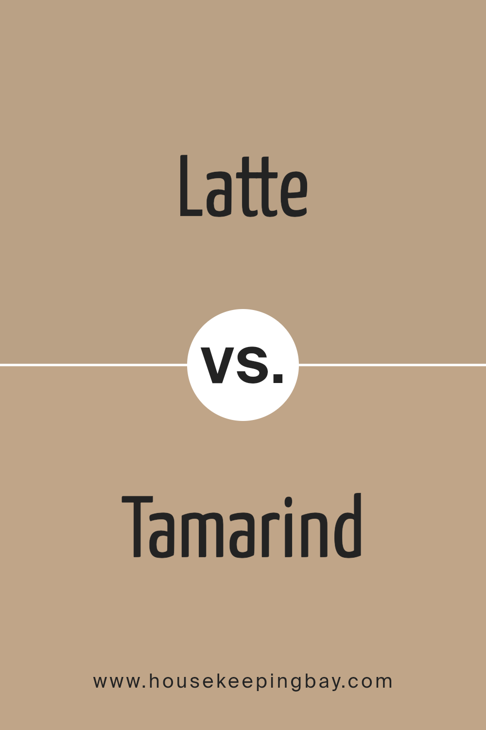
Latte SW 6108 by Sherwin Williams vs Tamarind SW 7538 by Sherwin Williams
Latte SW 6108 by Sherwin Williams is a warm, welcoming beige with a soft, creamy appearance. It’s the kind of color that easily complements various decor styles, from rustic to modern, making it versatile for any space.
On the contrary, Tamarind SW 7538 carries a deeper and richer tone, resembling a dark brown with hints of gray. This color provides a strong presence in a room, offering warmth and depth which can create a cozy and somewhat sophisticated atmosphere.
While Latte can help make a small room feel larger and brighter because of its lighter tone, Tamarind works well in larger spaces or as an accent wall, where its intensity won’t overpower the room. Pairing these two colors can add visual interest to a space, as the contrast between light and dark can draw the eye naturally around the room.
Both colors can work beautifully together, enhancing furniture and features within the space.
You can see recommended paint color below:
- SW 7538 Tamarind
housekeepingbay.com
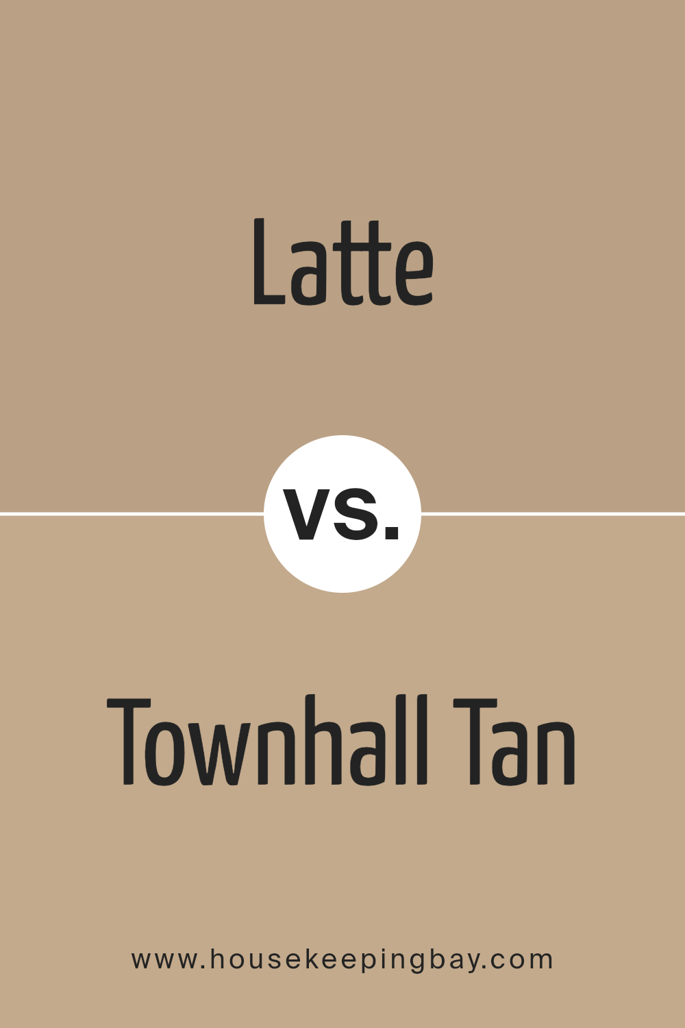
Latte SW 6108 by Sherwin Williams vs Townhall Tan SW 7690 by Sherwin Williams
Latte SW 6108 by Sherwin Williams is a warm beige that brings a cozy and inviting atmosphere to any space. It’s particularly good for those who prefer a neutral yet warm backdrop. The softness of Latte makes it an excellent choice for living rooms or bedrooms, where a soothing effect is desired.
In contrast, Townhall Tan SW 7690 is a deeper, more saturated tan color. It has stronger brown undertones, giving it a rich, earthy quality that can make a room feel more grounded and secure. This color works well in areas that benefit from a bolder, yet still neutral, shade such as dining rooms or entryways.
Overall, while both colors share a neutral base, Latte SW 6108 offers a lighter, creamier feel, and Townhall Tan SW 7690 provides a more robust presence with its deeper tan tones. Each color supports different aesthetic goals but maintains versatility for various decorating styles.
You can see recommended paint color below:
housekeepingbay.com
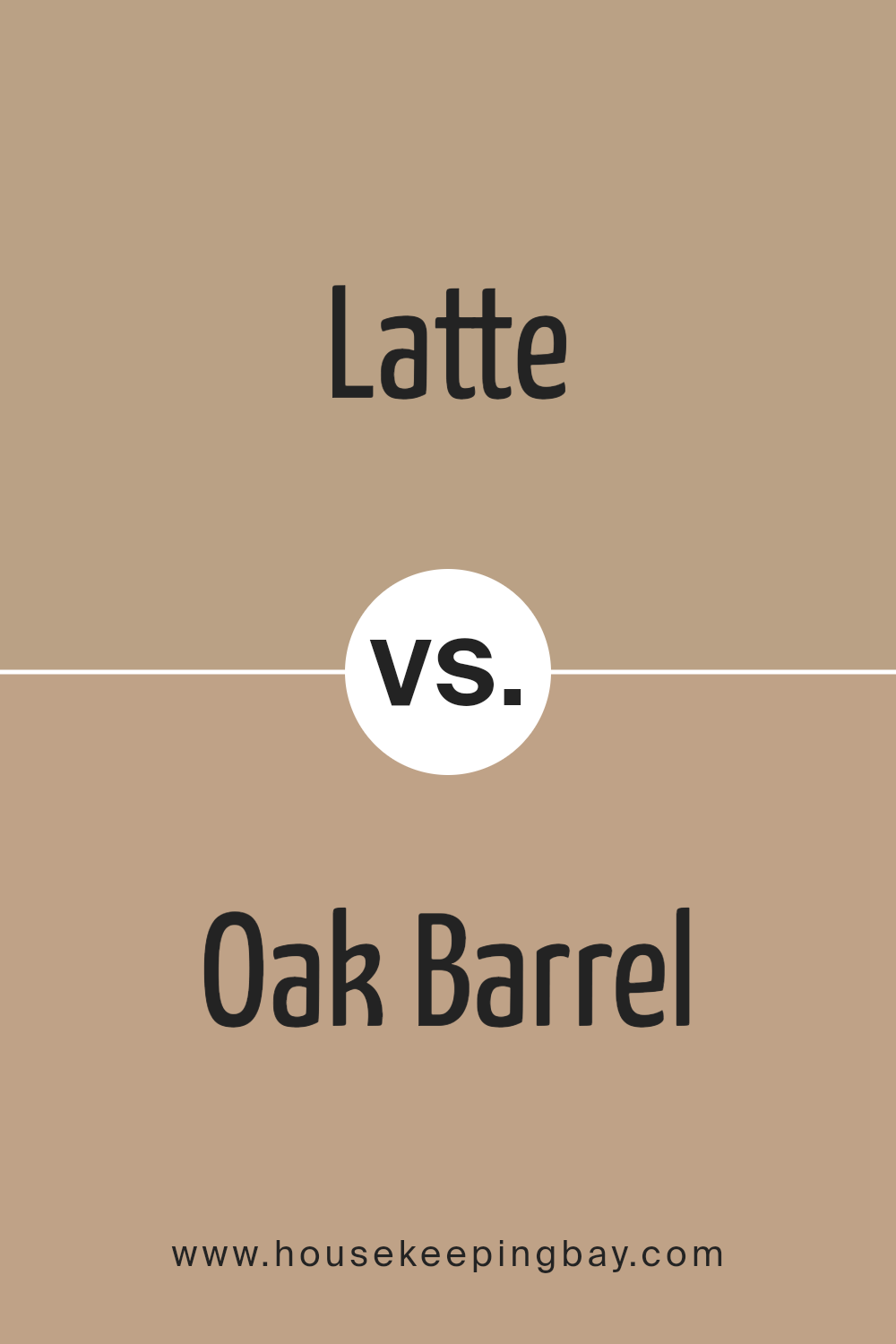
Latte SW 6108 by Sherwin Williams vs Oak Barrel SW 7714 by Sherwin Williams
Latte SW 6108 by Sherwin Williams is a warm, creamy beige that provides a cozy and soothing feel to any space. This color tends to be versatile, pairing well with a wide range of decor styles from modern to rustic. It is particularly effective in living areas and bedrooms where a light, inviting atmosphere is desired.
Oak Barrel SW 7714, also by Sherwin Williams, is a darker, richer brown with a hint of gray. This hue adds a sophisticated and grounding effect, making it ideal for spaces where a strong, supportive color is needed. It works well in larger rooms or on accent walls to create a focal point without overwhelming the space.
Both colors offer unique advantages depending on the mood and style you want to achieve. Latte SW 6108 can make a room feel larger and more open, while Oak Barrel SW 7714 can provide dramatic flair and depth. Together, they can complement each other beautifully in a color scheme.
You can see recommended paint color below:
- SW 7714 Oak Barrel
housekeepingbay.com
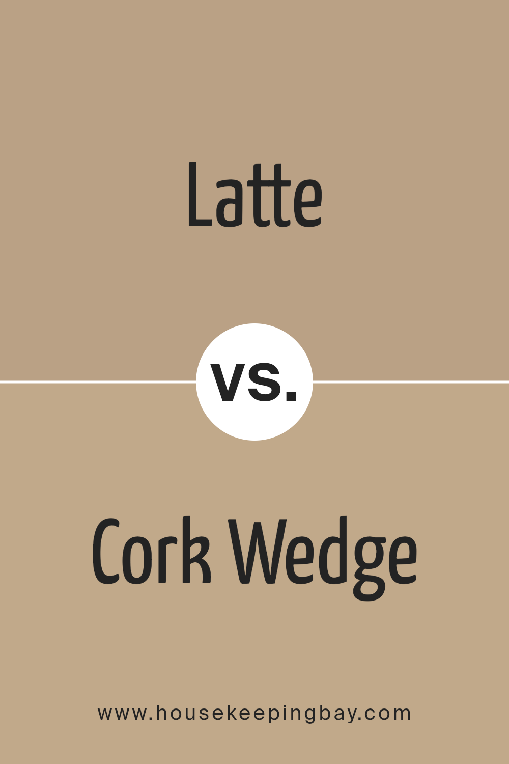
Latte SW 6108 by Sherwin Williams vs Cork Wedge SW 7539 by Sherwin Williams
Latte SW 6108 by Sherwin Williams is a warm and inviting beige that gives off a cozy, welcoming vibe. It’s light enough to make small spaces appear bigger and works well in areas that get a lot of natural light or those needing a soft, neutral backdrop. It pairs beautifully with brighter colors and wood finishes, enhancing a natural and relaxed atmosphere.
Cork Wedge SW 7539, by contrast, is a darker, richer beige. This color adds depth and warmth to a room, making it ideal for larger spaces or accent walls. It creates a more intimate feel and stands out as a bold neutral that can anchor a space with its earthy tone.
Both colors, Latte and Cork Wedge, offer versatility and can complement a variety of decor styles, from modern to traditional, but they serve different purposes with their varying depths. Latte is better for an overall calming effect, while Cork Wedge makes a strong statement.
You can see recommended paint color below:
- SW 7539 Cork Wedge
housekeepingbay.com
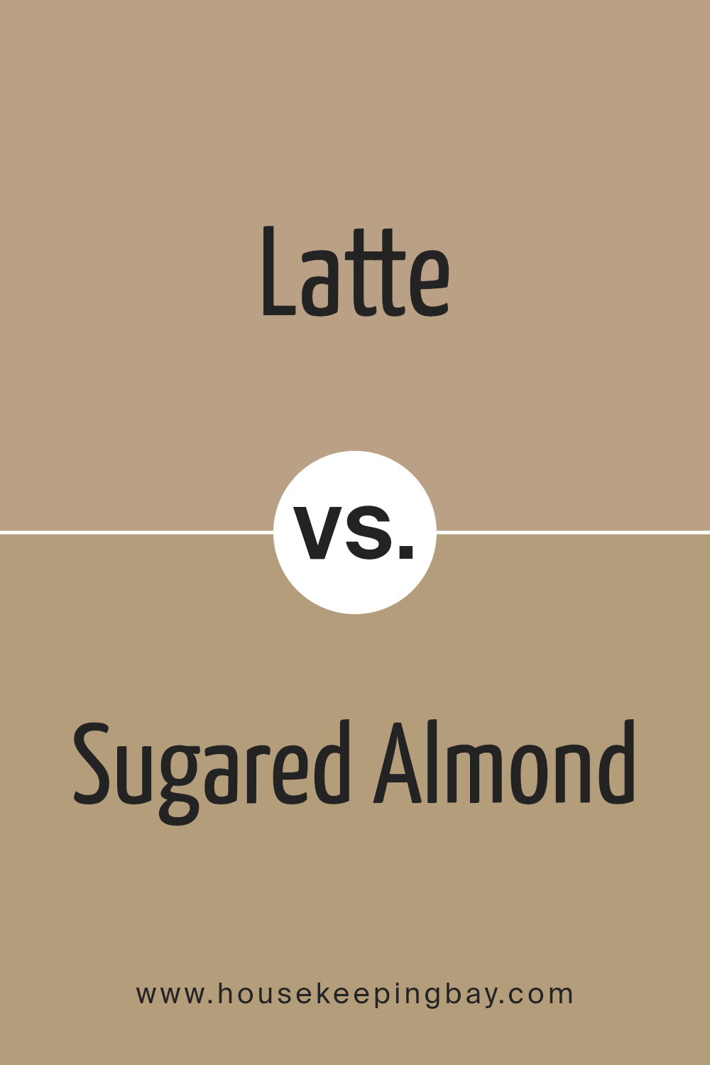
Latte SW 6108 by Sherwin Williams vs Sugared Almond SW 9537 by Sherwin Williams
Latte SW 6108 by Sherwin Williams is a warm, inviting shade that reminds one of a creamy cup of coffee. It has a cozy, comforting presence, making it an excellent choice for living rooms or dining spaces. The richness of this color provides a solid foundation for a variety of decor styles, from rustic to modern.
Sugared Almond SW 9537, also by Sherwin Williams, offers a much lighter, delicate vibe. This pale pink hue is gentle and subtle, perfect for creating a soft, airy feel in a room. It works especially well in bedrooms or bathrooms where a touch of serenity is desirable.
While both colors share a warmth that can enhance the visual appeal of a space, Latte brings depth and solidity, whereas Sugared Almond adds a hint of softness and light. Each color has its unique charm, making them suitable for different applications depending on the desired atmosphere.
You can see recommended paint color below:
- SW 9537 Sugared Almond
housekeepingbay.com
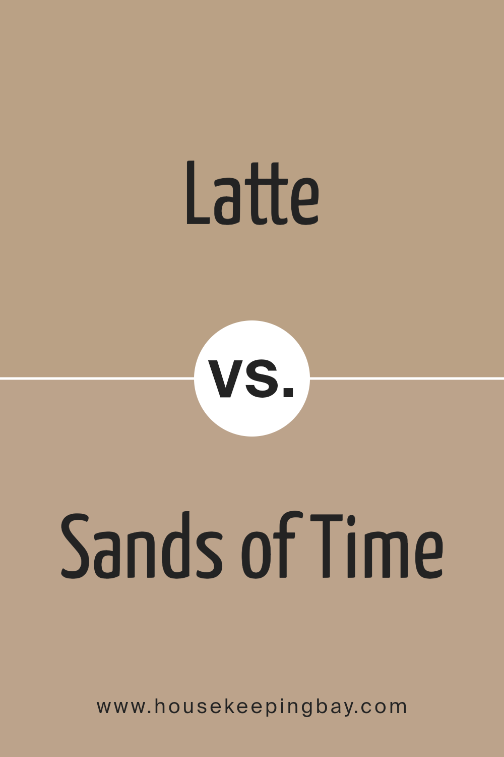
Latte SW 6108 by Sherwin Williams vs Sands of Time SW 6101 by Sherwin Williams
Latte SW 6108 by Sherwin Williams is a warm, inviting beige that leans slightly toward a deeper, richer hue. This color creates a cozy atmosphere, making it perfect for living spaces where comfort is key. It pairs well with darker woods and can provide a soothing backdrop for various decor styles.
Sands of Time SW 6101, however, is a lighter beige with a soft, neutral palette. This color is versatile and can brighten up a room while maintaining a subtle, calming presence. It’s especially suitable for smaller spaces or areas with less natural light, as it can help make the space feel larger and more open.
Both colors offer a neutral base, but Latte has a richer depth, which adds a sense of warmth to any room. In contrast, Sands of Time offers a lighter, more airy feel, ideal for creating a serene and inviting ambiance. Together, they can complement each other well in different parts of a home.
You can see recommended paint color below:
- SW 6101 Sands of Time
housekeepingbay.com
Conclusion
In summing up, SW 6108 Latte by Sherwin Williams offers a warm and inviting hue that can significantly enhance the aesthetic appeal of your home. This versatile color works beautifully in a variety of spaces, from living rooms and kitchens to bedrooms, creating a cozy, welcoming atmosphere.
Whether you’re looking to create a statement wall or refresh your entire home, Latte provides a solid base that pairs well with numerous decor styles and other colors.
Its ability to adapt to both traditional and modern interiors makes it a go-to choice for anyone looking to improve their living space. Moreover, Latte maintains a timeless quality, ensuring that your space remains stylish and appealing through the years.
If you’re planning a home renovation or simply want to update a room, consider SW 6108 Latte for a change that is both subtle and impactful, making your home feel refreshed and lively.
housekeepingbay.com
Ever wished paint sampling was as easy as sticking a sticker? Guess what? Now it is! Discover Samplize's unique Peel & Stick samples. Get started now and say goodbye to the old messy way!
Get paint samples
