Hopsack SW 6109 by Sherwin Williams
The Rich Hue That Transforms Spaces
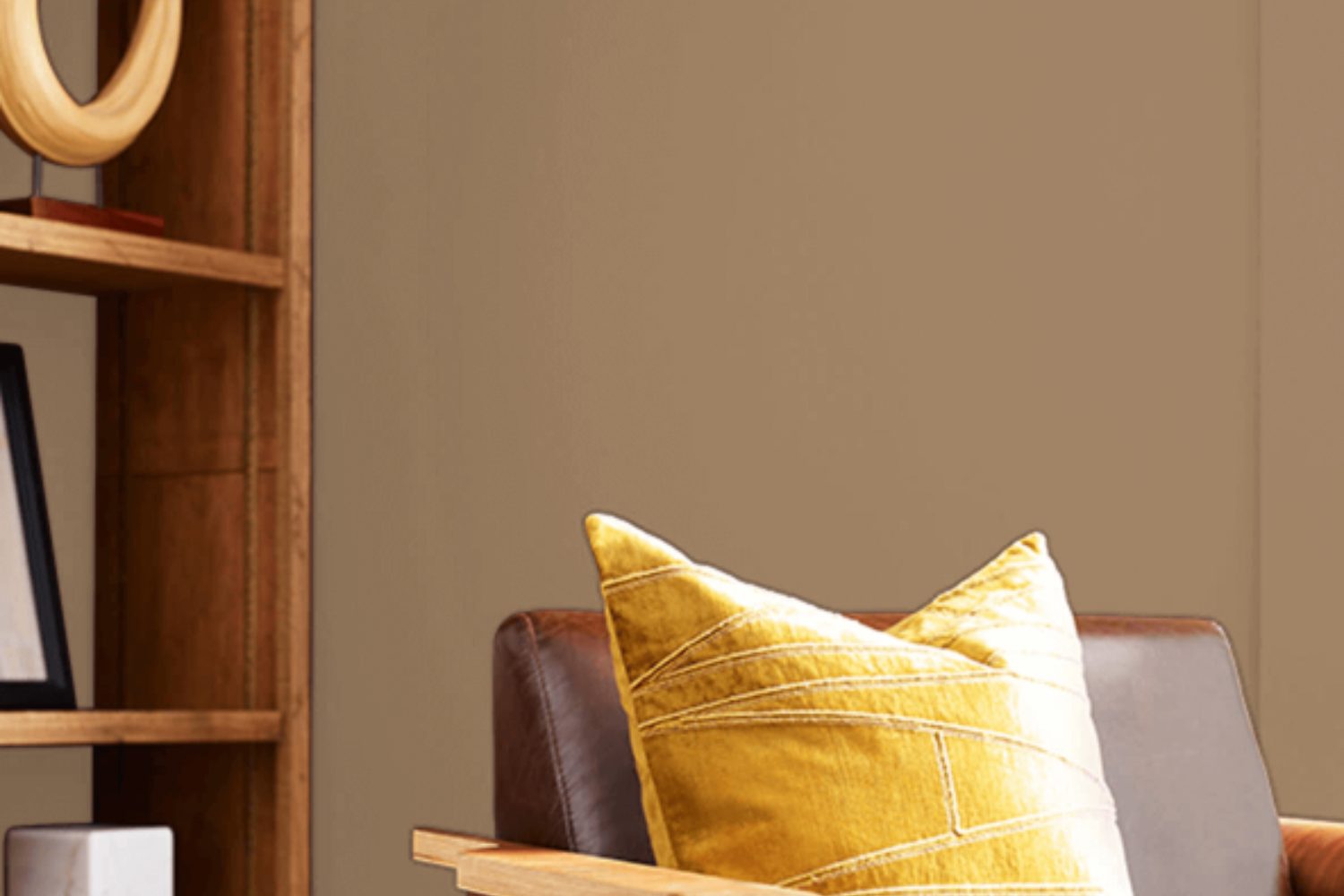
If you’re looking for a paint color that brings a warm and inviting feeling to your room, SW 6109 Hopsack by Sherwin Williams might just be what you need. This color is like a cozy blanket; it wraps your space in comfort, making it feel like home. It’s a beautiful, earthy shade that has a unique way of adding character and depth to your walls without overwhelming the room.
Choosing the right paint color is a big decision, but Hopsack makes it easier for you to decide. It’s incredibly versatile, fitting in perfectly whether your home decor is modern, traditional, or anything in between. This paint will help you create a space that feels welcoming and put together.
When you use Hopsack, you’re not just painting your walls; you’re giving your room a personality makeover. This shade has the power to transform dull spaces into lively areas where memories are made. It works wonderfully in living rooms, bedrooms, and even kitchens, adding a touch of warmth wherever it goes.
In short, if you want your home to feel more inviting and cozy, SW 6109 Hopsack is a fantastic choice. It’s not just about changing the color of your walls; it’s about creating a backdrop for your life’s moments. Give it a try, and see how it can transform your space into a place where you love to spend time.
by sherwin williams
What Color Is Hopsack SW 6109 by Sherwin Williams?
Hopsack SW 6109 by Sherwin Williams is a unique and versatile color, perfect for those looking to add a touch of warmth and sophistication to their home. It’s a rich, earthy hue that lies somewhere between a muted brown and a soft, welcoming amber. This shade brings a cozy yet refined atmosphere to any room, making spaces feel more inviting and comfortable.
The beauty of Hopsack lies in its adaptability. It works amazingly well in a variety of interior styles, especially in rustic, farmhouse, traditional, and even modern settings. Its natural essence makes it an excellent choice for creating a grounded, serene environment, encouraging relaxation and ease.
When considering materials and textures to pair with Hopsack, think natural and rustic. It goes beautifully with warm wood tones, from light pine to deep mahogany, enhancing the wood’s natural patterns and bringing a sense of earthiness to the decor. Leather pieces in a similar warm spectrum complement Hopsack exceptionally well, adding a touch of luxury and durability. For textiles, opt for soft, textured fabrics like wool, cotton, or linen in neutral tones to maintain a harmonious and balanced look. These combinations will ensure your space feels cohesive, well-thought-out, and inviting.
housekeepingbay.com
Is Hopsack SW 6109 by Sherwin Williams Warm or Cool color?
HopsackSW 6109 by Sherwin Williams is a warm, versatile paint color that brings a cozy and welcoming feel to any room in a home. Its earthy tones make it a perfect choice for creating a comfortable atmosphere that feels like home. This color has a unique ability to complement a variety of decor styles, from modern to rustic, making it quite adaptable for different spaces. Hopsack can make small spaces appear more inviting and larger rooms feel more connected and intimate, showing its flexibility in use.
In homes, Hopsack serves as a great backdrop for furniture and artworks, allowing them to stand out without overwhelming the senses. It pairs well with natural materials like wood, leather, and metal, enhancing the warm, earthy vibes of a space. This color also adapts well to different lighting conditions, offering a beautiful depth that shifts subtly from day to night. Moreover, Hopsack can easily be paired with brighter colors for a lively contrast or with neutral tones for a soothing environment. This adaptability makes it a favored choice for homeowners looking for a color that can grow and change with their evolving style over time.
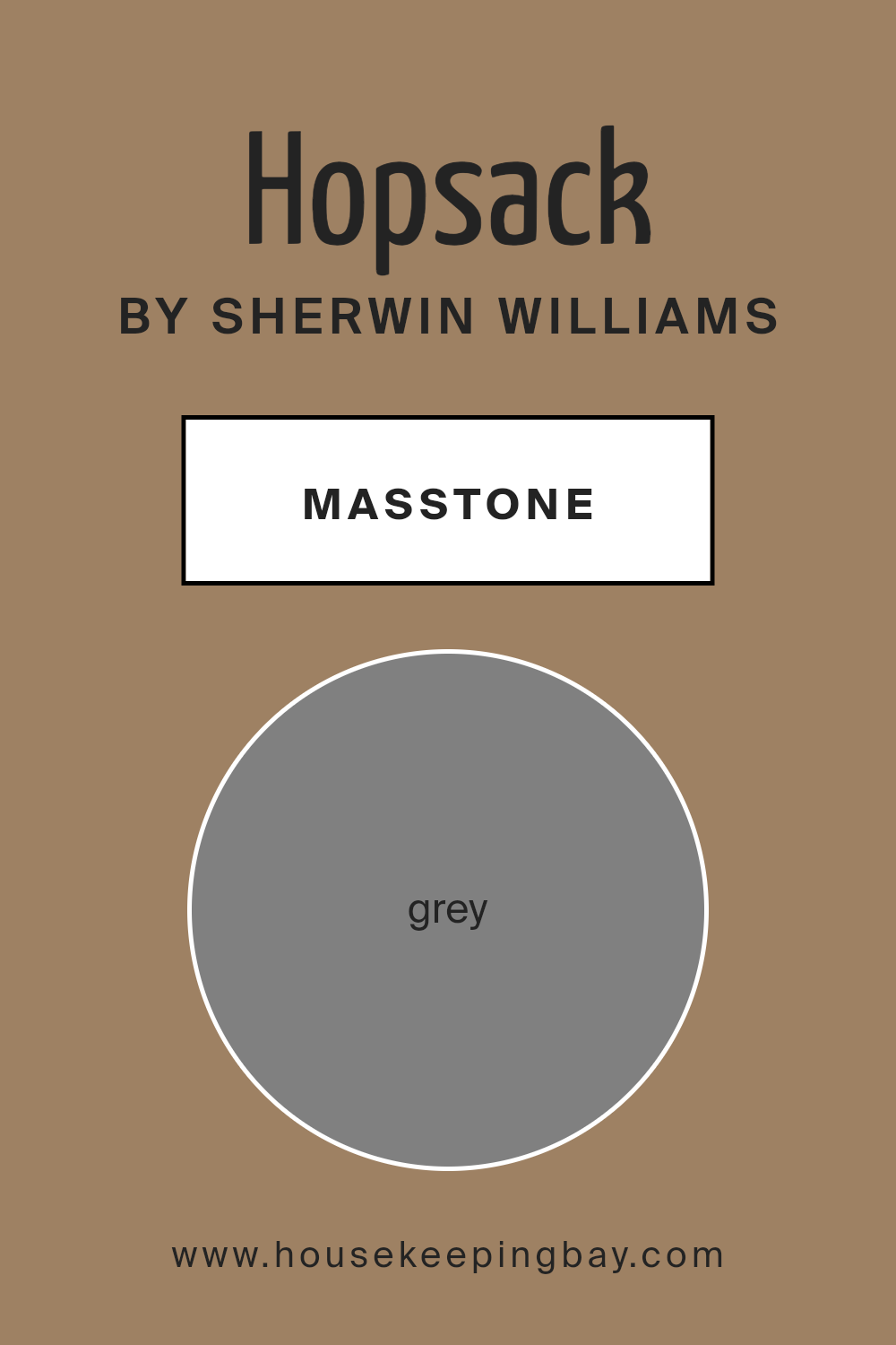
What is the Masstone of the Hopsack SW 6109 by Sherwin Williams?
Hopsack SW 6109 by Sherwin Williams has a masstone of grey, which means its purest form has a grey color at its base. This grey foundation makes Hopsack a versatile color that’s easy to use in homes. Because it has a grey undertone, Hopsack doesn’t lean too warm or too cool, making it a great choice for many different spaces and styles. It’s like a chameleon; it can fit in almost anywhere, from living rooms to bedrooms, adding a touch of sophistication without overwhelming the space.
This neutral feature allows Hopsack to work well with a wide range of other colors, from bright and bold to soft and subtle. It can serve as a calming backdrop that lets your furniture and decor take center stage, or it can stand on its own for a clean, minimalist look. The versatility of Hopsack, with its grey masstone, makes it a popular choice for homeowners who want a color that’s both stylish and easy to incorporate into their home’s design.
housekeepingbay.com
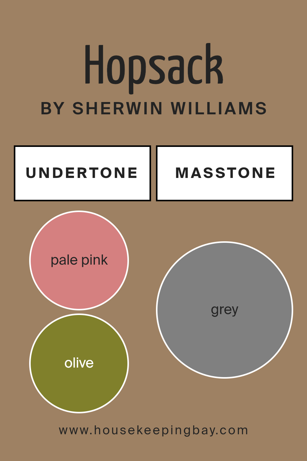
Undertones of Hopsack SW 6109 by Sherwin Williams
Hopsack SW 6109 by Sherwin Williams is a versatile color with a rich blend of undertones. Imagine it as a canvas that subtly shifts in appearance under different lighting and surroundings. Due to its complex nature, the color can pull hints of pale pink, olive, orange, and a whole spectrum of other subtle shades like mint, purple, pale yellow, and more. This wide range of undertones impacts how we perceive the color in general. For instance, in a room flooded with natural light, Hopsack may radiate warmth, drawing out its orange or pale yellow vibes. In contrast, in a dimly lit room, it might lean towards its olive or brown undertones, giving the space a cozier feel.
On interior walls, Hopsack’s adaptability makes it a chameleon of sorts. The surrounding decor and natural versus artificial light play a significant role in which undertones stand out. For example, against dark wood furniture, its dark green or brown undertones might become more pronounced, enriching the room’s atmosphere. Paired with bright, airy fabrics, lighter undertones like pale pink or light turquoise can make the space feel more open and welcoming.
This color’s ability to morph slightly with its surroundings and lighting conditions allows for flexibility in interior design. It can serve as a warm, inviting backdrop in a living room, a cozy hue in a bedroom, or a sophisticated choice for a home office. The undertones of Hopsack SW 6109 ensure that it’s not just a static color but a dynamic element of any room, subtly interacting with the elements around it to create a unique and personalized space.
housekeepingbay.com
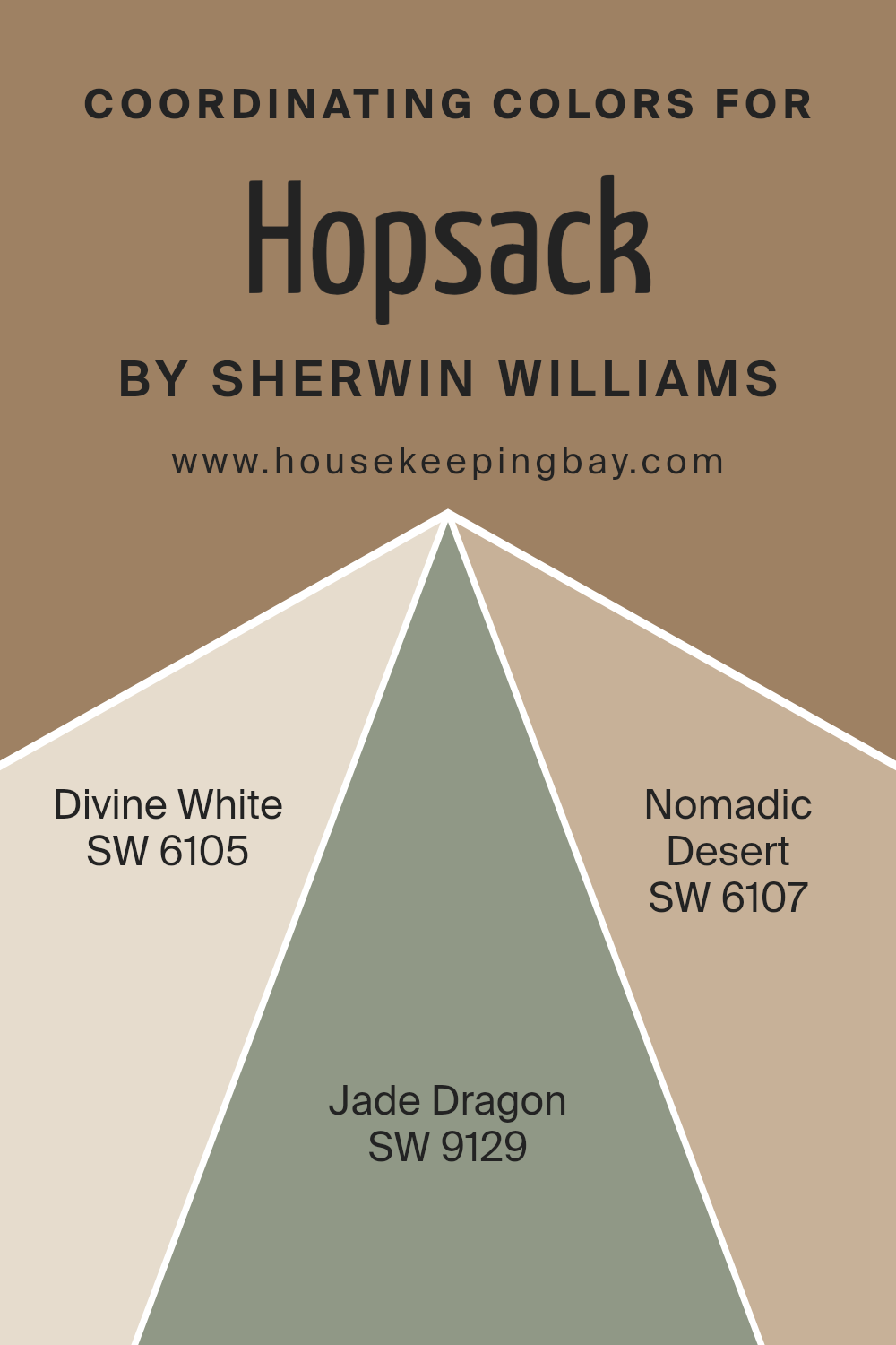
Coordinating Colors of Hopsack SW 6109 by Sherwin Williams
Coordinating colors are hues that work well together to create a visually appealing and harmonious look in any space. These colors, chosen carefully, can complement a primary color, such as Hopsack SW 6109 by Sherwin Williams, enhancing the overall aesthetic appeal of a room. By selecting coordinating colors, you ensure the space feels balanced and thoughtfully designed. This process involves understanding color theory and how different shades interact with each other, creating a cohesive palette that brings out the best in your primary color choice.
For a color like Hopsack SW 6109, which is a warm, inviting neutral, choosing the right coordinating colors can really make a space feel welcoming and put-together.
- SW 6105 – Divine White is a soft, creamy white that offers a subtle contrast to Hopsack, brightening up spaces without overwhelming them.Its lightness brings a fresh, airy feel, making it an excellent choice for trim or ceilings.
- SW 9129 – Jade Dragon adds a touch of natural elegance with its muted green hue, reminiscent of serene, mossy forests. It provides a calming, organic contrast to the earthiness of Hopsack.
- Lastly, SW 6107 – Nomadic Desert is a sandy beige that harmonizes beautifully with Hopsack, lending a cozy, cohesive look to the room.
Its warmth pairs well with the rustic qualities of Hopsack, creating a space that feels welcoming and grounded. Together, these coordinating colors work to enhance the beauty and warmth of Hopsack SW 6109, allowing for a range of design possibilities that feel both cohesive and distinct.
You can see recommended paint colors below:
- SW 6105 Divine White
- SW 9129 Jade Dragon
- SW 6107 Nomadic Desert
housekeepingbay.com
How Does Lighting Affect Hopsack SW 6109 by Sherwin Williams?
Lighting plays a crucial role in how we see colors in our surroundings. It can change the way a color appears, making it look different under various light sources. This is because light affects our color perception, influencing the brightness, hue, and contrast of colors. HopsackSW 6109 by Sherwin Williams is a great example to explore these effects, as its warm, versatile nature reacts in unique ways under different lighting conditions.
- In artificial light, such as from LED or fluorescent bulbs, HopsackSW 6109 can appear warmer or cooler depending on the bulb’s temperature. Warm artificial light can enhance its cozy, welcoming vibe, making it seem richer and more inviting. On the other hand, cooler artificial light might make it appear slightly muted, reducing its warmth slightly but still maintaining its appealing aesthetic.
- Natural light has a diverse impact on HopsackSW 6109, highly dependent on the orientation of the room. In north-facing rooms, which receive less direct sunlight and are generally filled with cooler, softer light, HopsackSW 6109 might appear slightly muted and cooler, yet it retains a sense of warmth that can make the room feel cozy despite the less abundant light.
South-facing rooms bathe in abundant natural light for most of the day, which can intensify HopsackSW 6109, making it appear brighter and even more vibrant. The color can truly shine in these conditions, offering a warm, lively vibe that’s both inviting and comforting.
In east-facing rooms, the morning light can make HopsackSW 6109 look exceptionally warm and vibrant, creating a welcoming atmosphere that’s especially lovely in living areas and kitchens. As the day progresses and the light shifts, the color maintains its warmth but might take on a softer appearance.
West-facing rooms receive the evening light, which means HopsackSW 6109 can vary in appearance throughout the day. In the afternoon and evening, as the sunlight becomes warmer and golden, the color can appear richer and more intense, adding a cozy, serene feeling to the space, especially during sunset.
In conclusion, HopsackSW 6109’s reaction to different lighting conditions demonstrates the importance of considering light when choosing paint colors. Its ability to adapt yet consistently provide warmth and comfort makes it a versatile choice for any space.
housekeepingbay.com
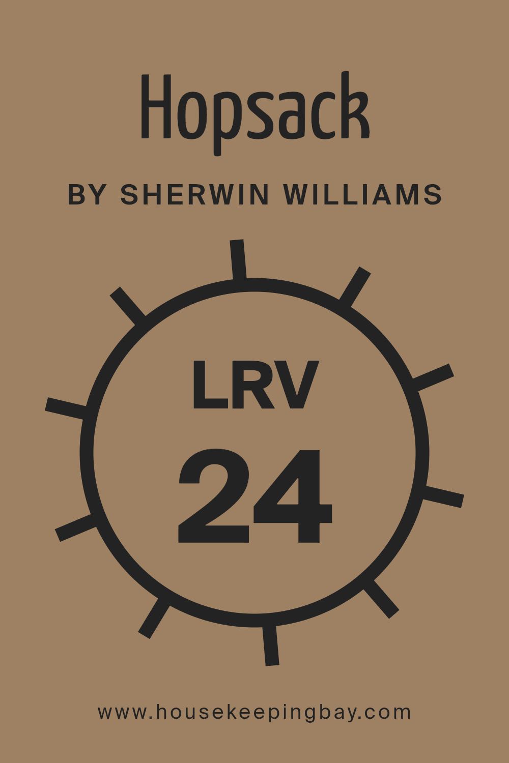
What is the LRV of Hopsack SW 6109 by Sherwin Williams?
For the color Hopsack SW 6109 by Sherwin Williams, which has an LRV of 23.85, this means it’s on the darker end of the scale. It will absorb more light than it reflects, creating a cozy and more intimate atmosphere in a room. This could make it an excellent choice for creating a warm, inviting space, but it also means you might need to consider additional lighting if you’re using it in a room without much natural light.
In smaller or poorly lit spaces, this LRV could make the room feel smaller or more enclosed, so the impact of Hopsack SW 6109’s LRV is significant in planning the feel and functionality of indoor spaces.
housekeepingbay.com
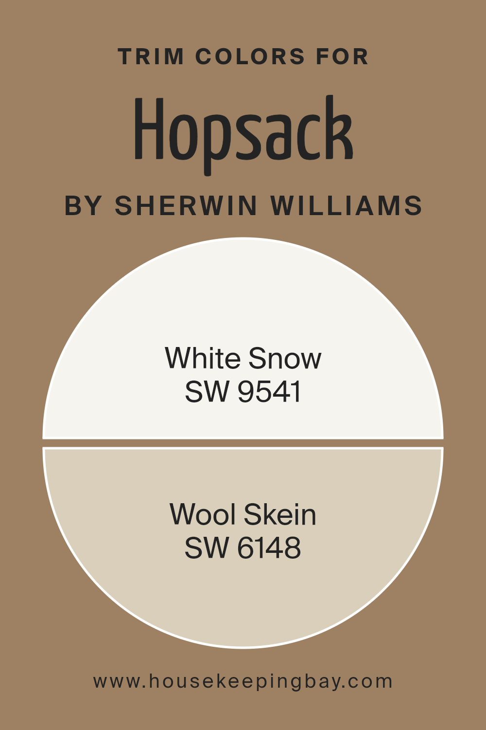
What are the Trim colors of Hopsack SW 6109 by Sherwin Williams?
Trim colors play a vital role in enhancing and complementing the main color used on walls, in this case, Hopsack SW 6109 by Sherwin Williams. These specific colors for trims, such as SW 9541 – White Snow and SW 6148 – Wool Skein, are chosen carefully to either contrast or blend with the wall color, leading to a finished look that appears more polished and thoughtfully designed. The purpose behind selecting a trim color is not only to define architectural details but also to influence the overall feel and ambiance of a space. When used effectively, these colors can make wall colors pop, add depth to the room, or even make a space feel more cohesive.
White Snow, as the name suggests, is a crisp, clean white that brings an airy and fresh feel to any room. It contrasts beautifully with Hopsack SW 6109, providing a classic and timeless look that can brighten and open up a space. Wool Skein, on the other hand, is a warm, neutral beige that offers a subtle contrast, creating a soft and inviting appearance. This color works well to soften the transition between the wall color and the trim, adding a layer of sophistication without overwhelming the primary hue of the walls. Both colors have their unique advantages, depending on the desired effect and the room’s existing decor and lighting.
You can see recommended paint colors below:
- SW 9541 White Snow
- SW 6148 Wool Skein
housekeepingbay.com
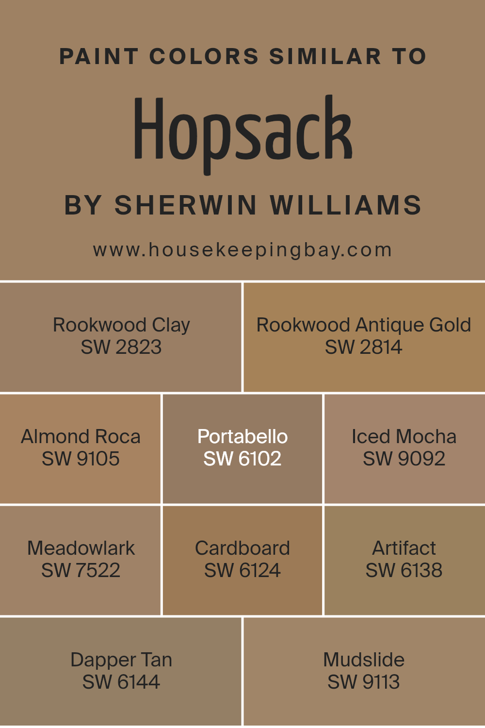
Colors Similar to Hopsack SW 6109 by Sherwin Williams
Understanding why similar colors are essential, especially those akin to Hopsack SW 6109 by Sherwin Williams, reveals the intricacies of creating a cohesive and inviting space. Similar colors, like those of Hopsack, work together harmoniously to establish a visually appealing environment.
They subtly balance each other, allowing for a seamless transition from one shade to another. This closeness in color creates depth and adds dimension without overwhelming the senses, making them ideal for crafting a space that feels both unified and expansive.
- Rookwood Clay SW 2823 and Rookwood Antique Gold SW 2814 bring warmth into a room, radiating a cozy, rustic charm.
- Almond Roca SW 9105 introduces a gentle, creamy hue, perfect for softening edges and adding light.
- Portabello SW 6102 and Iced Mocha SW 9092 offer a grounding, earthy presence, mimicking the natural beauty of the outdoors.
- Meadowlark SW 7522 brightens spaces with its gentle, sunny disposition, while Cardboard SW 6124 imbues them with a mellow, soft tan that’s both comforting and inviting. Artifact SW 6138 lends an antique, rich warmth, suggesting a touch of history and depth.
- Dapper Tan SW 6144 and Mudslide SW 9113, with their rich, welcoming tones, round out the palette, ensuring any space feels both sophisticated and homely.
Together, these shades illustrate the beauty and utility of working within a similar color spectrum, allowing for a refined and harmonious aesthetic.
You can see recommended paint colors below:
- SW 2823 Rookwood Clay
- SW 2814 Rookwood Antique Gold
- SW 9105 Almond Roca
- SW 6102 Portabello
- SW 9092 Iced Mocha
- SW 7522 Meadowlark
- SW 6124 Cardboard
- SW 6138 Artifact
- SW 6144 Dapper Tan
- SW 9113 Mudslide
housekeepingbay.com
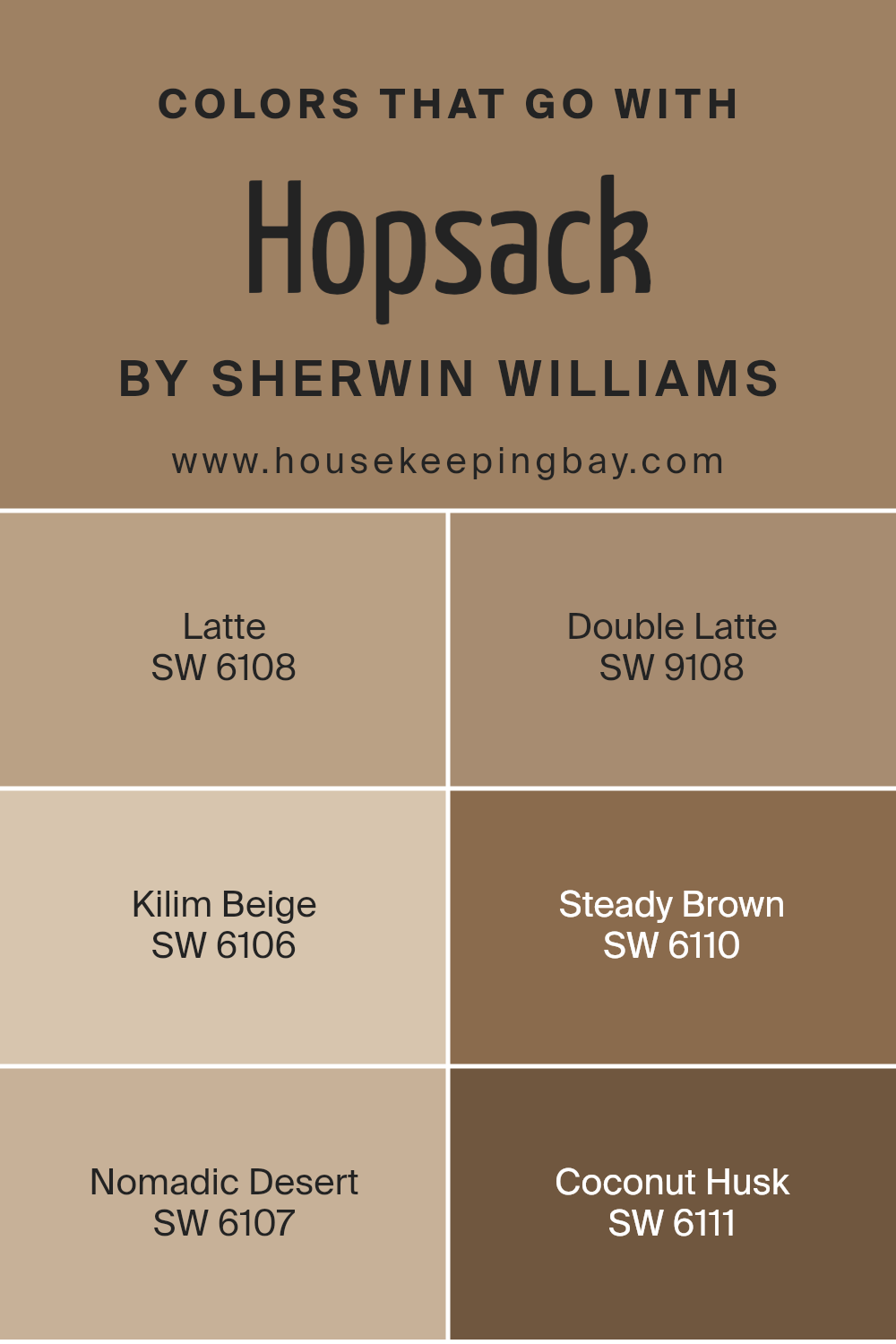
Colors that Go With Hopsack SW 6109 by Sherwin Williams
Choosing the right colors to pair with Hopsack SW 6109 by Sherwin Williams is crucial for creating a harmonious and visually appealing space. These colors have been carefully selected to complement Hopsack, ensuring that any decor or design project looks cohesive and well thought out. Whether you’re decorating a room, painting furniture, or adding accents, these coordinating colors work together to enhance the warm, neutral base of Hopsack, making your design projects look professional and inviting.
- Latte SW 6108 is a warm, inviting beige that pairs seamlessly with Hopsack, offering a lighter contrast that’s perfect for creating a cozy, inviting space.
- Double Latte SW 9108, as the name suggests, is a deeper, richer version of Latte, providing a more pronounced contrast against Hopsack while maintaining that warm, comforting vibe.
- Kilim Beige SW 6106 is a soft, neutral beige with a slight pink undertone, adding a touch of warmth to rooms without overpowering them, and works well with Hopsack for a subtle, refined look. Steady Brown SW 6110 is a strong, earthy brown that grounds the palette, offering depth and solidity when used alongside Hopsack.
- Nomadic Desert SW 6107, a soft, warm beige with earthy undertones, complements Hopsack by adding a layer of subtle complexity to the color scheme.
- Lastly, Coconut Husk SW 6111 offers a rich, dark brown that brings an element of nature and boldness, creating a striking contrast that highlights the versatility of Hopsack.
Together, these colors create a palette that is both versatile and harmonious, enhancing the natural beauty of Hopsack and making your design choices stand out.
You can see recommended paint colors below:
- SW 6108 Latte
- SW 9108 Double Latte
- SW 6106 Kilim Beige
- SW 6110 Steady Brown
- SW 6107 Nomadic Desert
- SW 6111 Coconut Husk
housekeepingbay.com
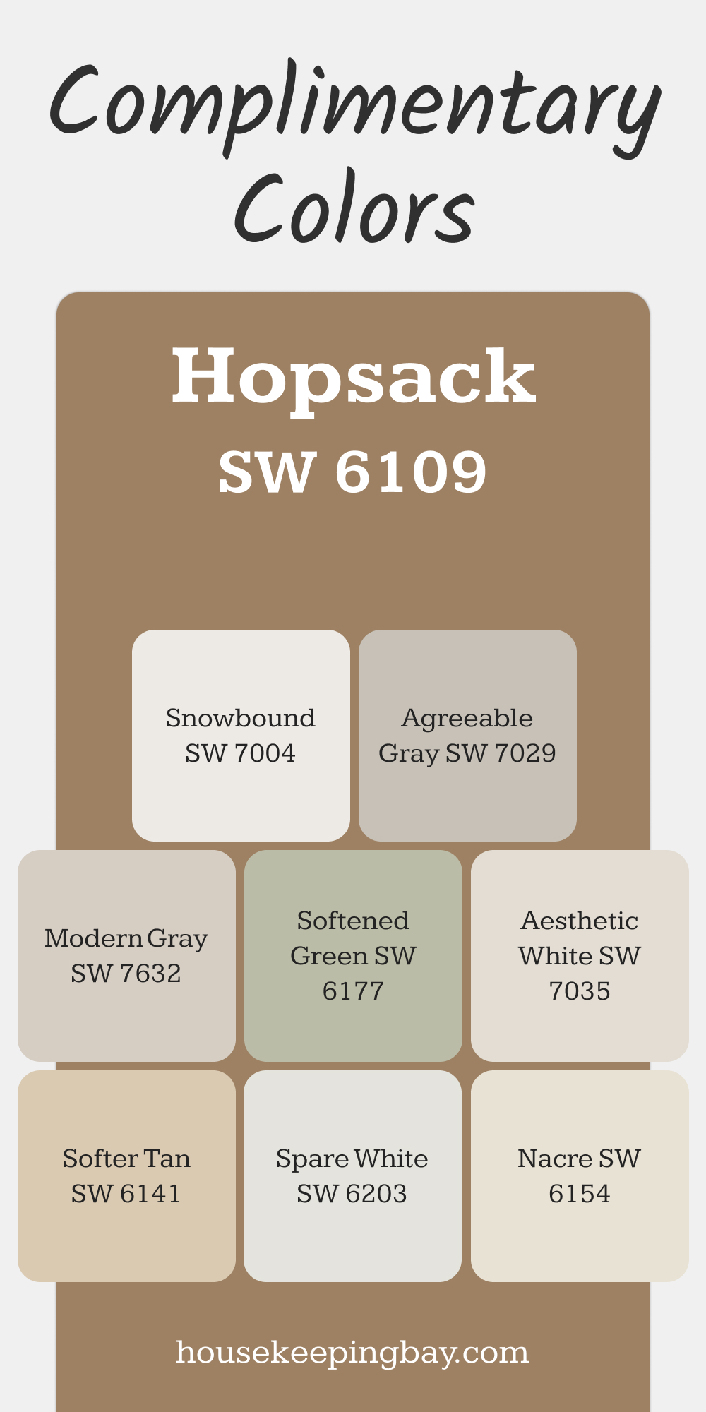
Complimentary Colors for Hopsack SW 6109 Paint Color by Sherwin Williams
Hopsack pairs beautifully with a range of tones to enhance its natural warmth. Softer Tan and Nacre bring a cohesive, earthy feel, while Snowbound and Aesthetic White add brightness for contrast. These combinations create a comfortable and welcoming look.
For subtle accents, Spare White and Agreeable Gray provide a gentle backdrop. Softened Green introduces a hint of nature, while Modern Gray balances everything with its understated elegance.
via housekeepingbay.com
How to Use Hopsack SW 6109 by Sherwin Williams In Your Home?
Hopsack SW 6109 by Sherwin Williams is a warm, inviting paint color that brings a sense of coziness and comfort to any room in your home. Its earthy tones make it versatile, allowing it to complement a wide range of furniture and decor styles. You can use Hopsack in your living room to create a welcoming space for family and friends. It’s also great for bedrooms, adding a soft, nurturing backdrop that helps promote relaxation and rest.
In the kitchen, Hopsack can warm up the space, making it feel homey and inviting. Paired with white cabinets or tiles, it creates a lovely contrast that’s both modern and timeless. Similarly, in bathrooms, this color can add depth and warmth, making your baths more spa-like and serene.
Hopsack isn’t just for walls; you can use it on cabinets or as an accent color to add character and charm to various nooks and crannies throughout your home. It’s a paint color that’s easy to love and live with, no matter where you decide to use it.
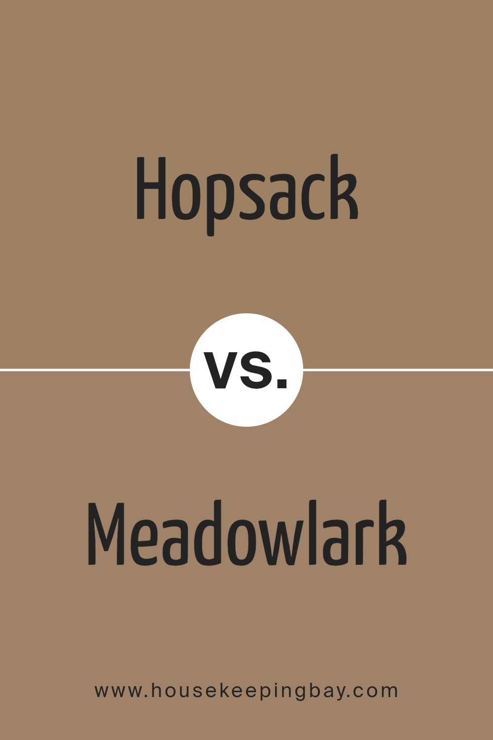
Hopsack SW 6109 by Sherwin Williams vs Meadowlark SW 7522 by Sherwin Williams
Hopsack SW 6109 and Meadowlark SW 7522 are two colors from Sherwin Williams, each with its own unique vibe. Hopsack is a warm, sandy beige, giving off a cozy and inviting feel. It’s pretty neutral, so it blends well in any room, making spaces feel calm and spacious. On the other hand, Meadowlark is a gentle, soft green that has a fresh and peaceful vibe. This color has the power to bring a touch of nature inside, making rooms feel alive and soothing.
While Hopsack leans more toward earthy tones, perfect for creating a grounded atmosphere, Meadowlark offers a hint of color, ideal for lightening up a space and introducing a serene, natural element. Both are great choices, but your pick might depend on whether you’re looking for the simplicity and versatility of a neutral or the quiet, refreshing energy of a green.
You can see recommended paint color below:
- SW 7522 Meadowlark
housekeepingbay.com
Hopsack SW 6109 by Sherwin Williams vs Almond Roca SW 9105 by Sherwin Williams
Hopsack SW 6109 and Almond Roca SW 9105 by Sherwin Williams are two warm, welcoming colors, but they bring different vibes to a room. Hopsack is a rich, deep tan that feels cozy and earthy. It’s a bit darker and can make a space feel snug and grounded. On the other hand, Almond Roca is lighter, leaning towards a creamy, soft beige. This color is more about brightness and opening up a space, making it seem airier and more relaxed.
If you’re choosing between them, think about the mood you want. Hopsack is great for a touch of elegance and warmth, making rooms feel more intimate. Almond Roca, however, is perfect for a gentle, fresh look that can make small spaces seem bigger and more inviting. Both are versatile, but your choice depends on whether you prefer a cozy cave or a light, uplifting environment.
You can see recommended paint color below:
- SW 9105 Almond Roca
housekeepingbay.com
Hopsack SW 6109 by Sherwin Williams vs Artifact SW 6138 by Sherwin Williams
Hopsack SW 6109 and Artifact SW 6138 by Sherwin Williams are both unique and beautiful colors, but they serve different moods and settings. Hopsack is a warm, earthy beige that brings a cozy and welcoming feel to any room. It’s light enough to make a space feel airy but has enough depth to add character and warmth. On the other hand, Artifact is a richer, deeper taupe that leans towards a sophisticated, muted brown.
It offers a more grounded, serene vibe, creating a feeling of stability and comfort. While Hopsack might be perfect for someone looking to brighten up a space and give it a soft, inviting feel, Artifact would be the go-to for those wanting to add a touch of elegance and depth. Both colors coordinate well with a wide range of decor, but Hopsack suits lighter, more casual spaces, whereas Artifact is ideal for adding a refined touch to a room.
You can see recommended paint color below:
- SW 6138 Artifact
housekeepingbay.com
Hopsack SW 6109 by Sherwin Williams vs Dapper Tan SW 6144 by Sherwin Williams
Hopsack SW 6109 and Dapper Tan SW 6144 by Sherwin Williams are both warm, welcoming colors, but they have their own unique vibes. Hopsack is a lighter, softer color that brings a cozy, comfortable feel to a room. It’s like the gentle touch of morning sunlight in a quiet, peaceful space. On the other hand, Dapper Tan is deeper and richer, reminiscent of vintage leather or the warmth of a well-loved wooden furniture piece. It offers a sense of stability and classic elegance to any space it adorns.
While Hopsack might be the go-to for creating a bright and airy feel, Dapper Tan is perfect when you want to add depth and a touch of sophistication. Whether used together or separately, both colors provide a beautiful backdrop for living spaces, highlighting furnishings and décor without overwhelming them. In essence, Hopsack is your light, breezy day, whereas Dapper Tan brings the warmth and comforting embrace of dusk.
You can see recommended paint color below:
- SW 6144 Dapper Tan
housekeepingbay.com
Hopsack SW 6109 by Sherwin Williams vs Rookwood Antique Gold SW 2814 by Sherwin Williams
Hopsack SW 6109 and Rookwood Antique Gold SW 2814 are two colors by Sherwin Williams that carry distinct vibes for any space. Hopsack is like a warm, sandy beige that feels cozy and inviting, kind of like a soft, comfy blanket on a cool day. It’s light enough to make a room feel airy and spacious but has enough depth to add character.
On the other hand, Rookwood Antique Gold has a richer, deeper tone, reminiscent of a golden autumn afternoon or the patina on an old brass candlestick. It’s a shade that adds a touch of elegance and timelessness to a room, making it feel grounded and sophisticated. While Hopsack brings a light, neutral base that’s versatile for many settings, Rookwood Antique Gold offers a bolder statement, great for creating a focal point or adding warmth. Both colors are beautiful in their own right, depending on the look and feel you want to achieve in your space.
You can see recommended paint color below:
- SW 2814 Rookwood Antique Gold
housekeepingbay.com
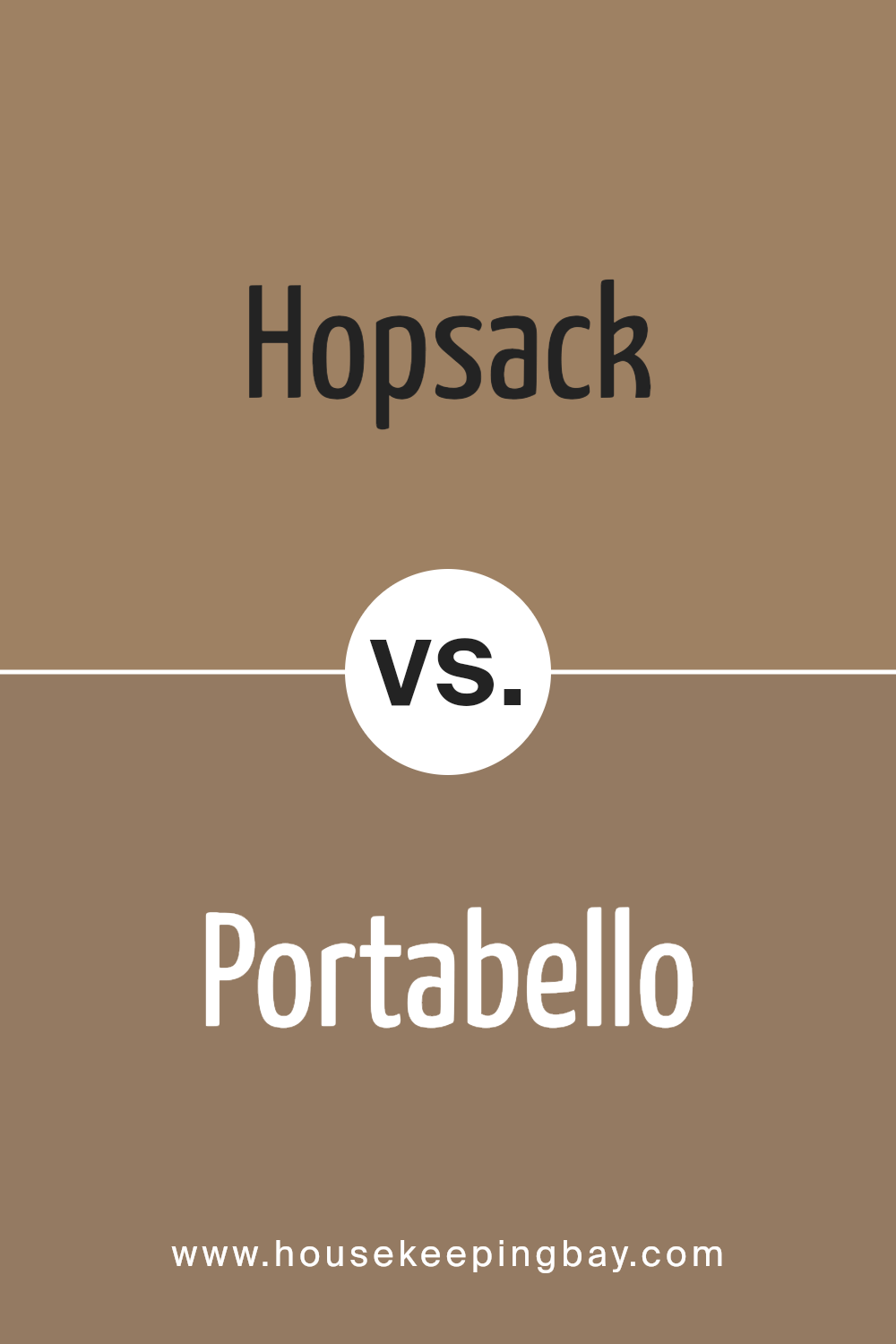
Hopsack SW 6109 by Sherwin Williams vs Portabello SW 6102 by Sherwin Williams
Hopsack SW 6109 and Portabello SW 6102, both from Sherwin Williams, are two warm, inviting colors that share some similarities but also have their distinct characteristics. Hopsack is a soft, earthy beige with a welcoming vibe. It has a light, airy feel and is versatile enough to work in various spaces, adding a gentle warmth without overwhelming the room.
On the other hand, Portabello SW 6102 is a deeper, richer color. It leans more towards a brown with a subtle grey undertone, giving it a sophisticated and cozy appearance. This color is perfect for creating a more dramatic and cozy ambiance in spaces, making it ideal for areas where you want to add depth and warmth.
While both colors bring warmth and earthiness to a space, Hopsack offers a lighter, more neutral backdrop, potentially making a room feel larger and more open. Portabello, with its deeper tone, provides a strong presence, ideal for making a statement or accentuating a cozy corner. Choosing between them depends on the effect you want to achieve—light and breezy with Hopsack or rich and grounding with Portabello.
You can see recommended paint color below:
- SW 6102 Portabello
housekeepingbay.com
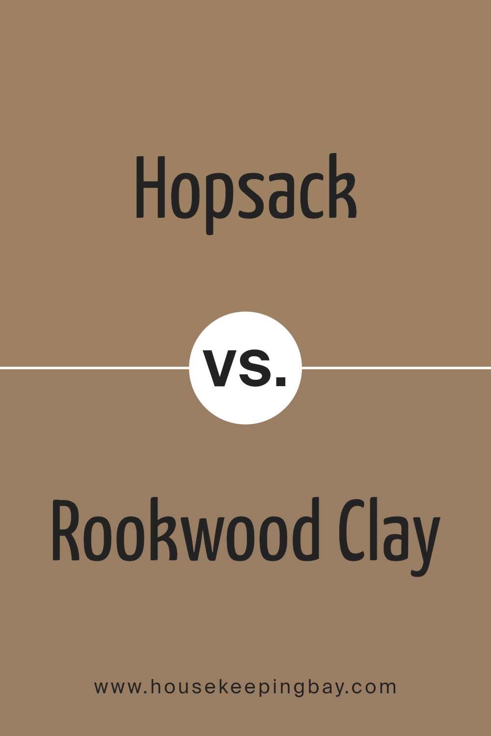
Hopsack SW 6109 by Sherwin Williams vs Rookwood Clay SW 2823 by Sherwin Williams
Hopsack SW 6109 and Rookwood Clay SW 2823 by Sherwin Williams are two warm, welcoming colors, but they have their differences. Hopsack is a light, sandy beige with a touch of warmth, making it perfect for creating a cozy and inviting atmosphere in any room. It’s versatile, blending well with many decor styles and color palettes, providing a soft backdrop that’s easy on the eyes.
On the other hand, Rookwood Clay is a deeper, richer shade, pulling more towards earthy, terracotta tones. It’s a color that adds depth and warmth to spaces, making it ideal for accent walls or areas where you want to add a bit of drama without overwhelming the room. Rookwood Clay stands out for its ability to bring a natural, grounded feel to interiors, offering a slightly more pronounced statement compared to the gentler hug of Hopsack.
Both colors share a warm essence but differ in intensity and mood they bring to spaces. Hopsack offers a light, airy feel, whereas Rookwood Clay gives a stronger, earthier touch.
You can see recommended paint color below:
- SW 2823 Rookwood Clay
housekeepingbay.com
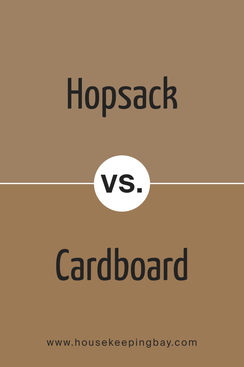
Hopsack SW 6109 by Sherwin Williams vs Cardboard SW 6124 by Sherwin Williams
Hopsack SW 6109 and Cardboard SW 6124 by Sherwin Williams are both warm, neutral colors, but they have their own unique qualities. Hopsack has a bit more richness to it, leaning toward a medium brown with a hint of olive green, making it feel cozy and welcoming. It’s a color that can make a room feel grounded without being too dark. On the other hand, Cardboard is lighter, more like a soft, sandy brown. It’s a versatile color that brings warmth to spaces without overwhelming them, making it perfect for creating a light and airy feel.
Though both colors share a neutral palette, Hopsack offers a deeper, more enveloping warmth, perfect for spaces where you want to add a bit of sophistication. Cardboard, being lighter, is great for making smaller spaces appear larger and brighter. In summary, Hopsack suits areas where a rich, cozy vibe is desired, while Cardboard is ideal for lighter, more open-feeling spaces.
You can see recommended paint color below:
- SW 6124 Cardboard
housekeepingbay.com
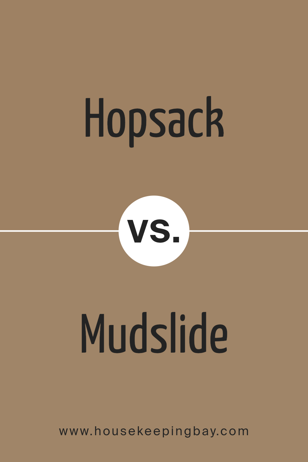
Hopsack SW 6109 by Sherwin Williams vs Mudslide SW 9113 by Sherwin Williams
Hopsack SW 6109 by Sherwin Williams is a warm, earthy beige tone that feels cozy and welcoming. It’s a kind of color that could light up any space without being too overpowering, making it perfect for living rooms or bedrooms where you want a soft, natural vibe. On the other hand, Mudslide SW 9113 is also a warm color but leans more towards a richer, darker brown. It suggests a sense of sophistication and comfort, making it a great choice for creating a strong, inviting atmosphere in spaces like studies or dining rooms.
While both colors share a warmth that could complement a variety of decors, Hopsack is lighter and more neutral, offering flexibility in pairing with other colors. Mudslide, with its deeper tone, provides a bold statement yet remains grounded, ideal for areas where you want to add a bit more drama or luxury. In essence, both are beautiful, warm choices but serve different moods and settings within a home.
You can see recommended paint color below:
- SW 9113 Mudslide
housekeepingbay.com
Hopsack SW 6109 by Sherwin Williams vs Iced Mocha SW 9092 by Sherwin Williams
Hopsack SW 6109 by Sherwin Williams and Iced Mocha SW 9092 by Sherwin Williams are two beautiful colors with distinct vibes. Let’s look at how they compare!
Hopsack is a warm, earthy color that looks a bit like a light, sandy brown. It makes you think of cozy, inviting spaces. It’s the sort of color that feels like a gentle hug for your room, adding a soft, welcoming atmosphere.
On the other hand, Iced Mocha is a cooler, more subdued shade. It’s like the name suggests – think of the light, creamy brown of your favorite coffee drink, but with a hint of coolness. This color adds a touch of elegance and calm to any space, making it feel more sophisticated and relaxed.
While Hopsack brings warmth and coziness, Iced Mocha offers a sleek, calming vibe. Both are beautiful and can create lovely, inviting spaces, but your choice depends on the mood you want to set. Do you want warm and earthy or cool and relaxed?
You can see recommended paint color below:
- SW 9092 Iced Mocha
housekeepingbay.com
Conclusion
When you’re considering giving your space a fresh coat of paint, SW 6109 Hopsack by Sherwin Williams is an excellent choice. This particular shade brings a warm and cozy vibe, making any room feel more welcoming. Perfect for living rooms, bedrooms, or any area where you want to add a touch of comfort, Hopsack has a versatile appeal that meshes well with various decor styles.
Think of the hue as a hug for your walls. Its earthy tone serves as a fantastic backdrop, letting your furniture and decor pieces stand out without overpowering them. Whether you’re aiming for a rustic charm or a modern twist, Hopsack adapts effortlessly, providing a solid foundation for your decorating ambitions. Plus, its soothing nature makes it an ideal pick for creating a relaxed, serene environment.
If you’re someone who values a space that feels like home, incorporating SW 6109 Hopsack can bring that vision to life. You’ll find that it pairs beautifully with both light and dark accents, offering flexibility in your design choices. So, whether you’re revamping a single room or planning an overhaul of your entire home, consider Hopsack for a look that’s both timeless and inviting.
housekeepingbay.com
Ever wished paint sampling was as easy as sticking a sticker? Guess what? Now it is! Discover Samplize's unique Peel & Stick samples. Get started now and say goodbye to the old messy way!
Get paint samples


