68 Dining Room Paint Color Ideas
Handpicked colors to make your dining room feel warm, calm, or bold
When people walk into a dining room, they don’t always notice the wall color first — but it shapes how they feel. It sets the mood for everything from Sunday brunch to Thanksgiving dinner. Over the years, I’ve seen how even small changes in color can make a room feel warmer, more inviting, or even more elegant.
I remember one family who thought their dining room felt too stiff. They weren’t hosting much. After a quick color change — something warmer, cozier — suddenly, they were having people over every week. The space felt alive again. That’s the power of the right paint.
For this list, I’m sharing my top 68 dining room paint color ideas, all from Sherwin-Williams and Benjamin Moore — because those are the two brands I trust most in my work. Their color ranges are rich, reliable, and easy to match with furniture and light fixtures.
Let’s start with colors that always make people feel comfortable — the warm ones.
housekeepingbay.com
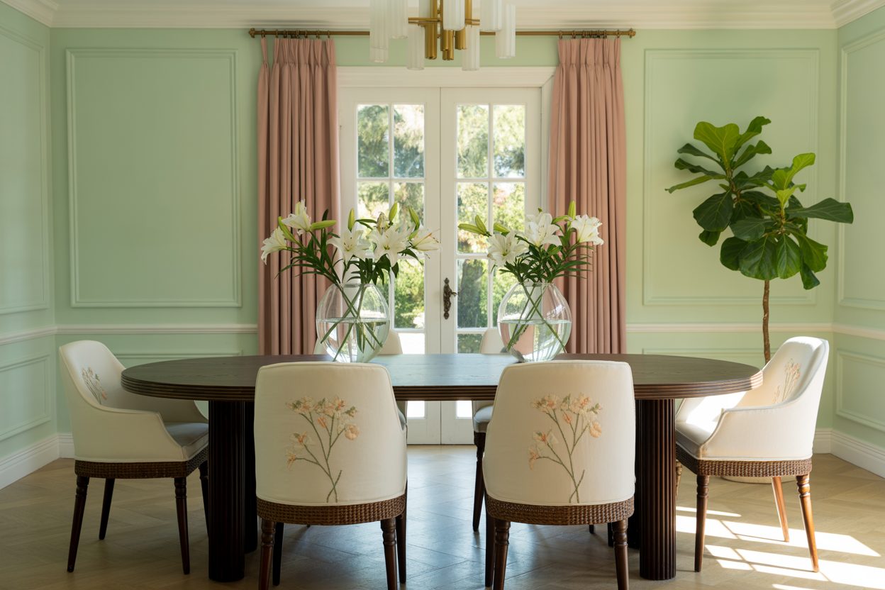
Warm Colors That Bring Everyone Together
Warm colors work like a cozy blanket. They make the room feel alive and welcoming. I often suggest warm shades to clients who love big family dinners or hosting friends. These colors make the food look richer, the lighting feel softer, and the conversations last longer.
Here are some of my favorite warm-toned shades from Sherwin-Williams and Benjamin Moore.
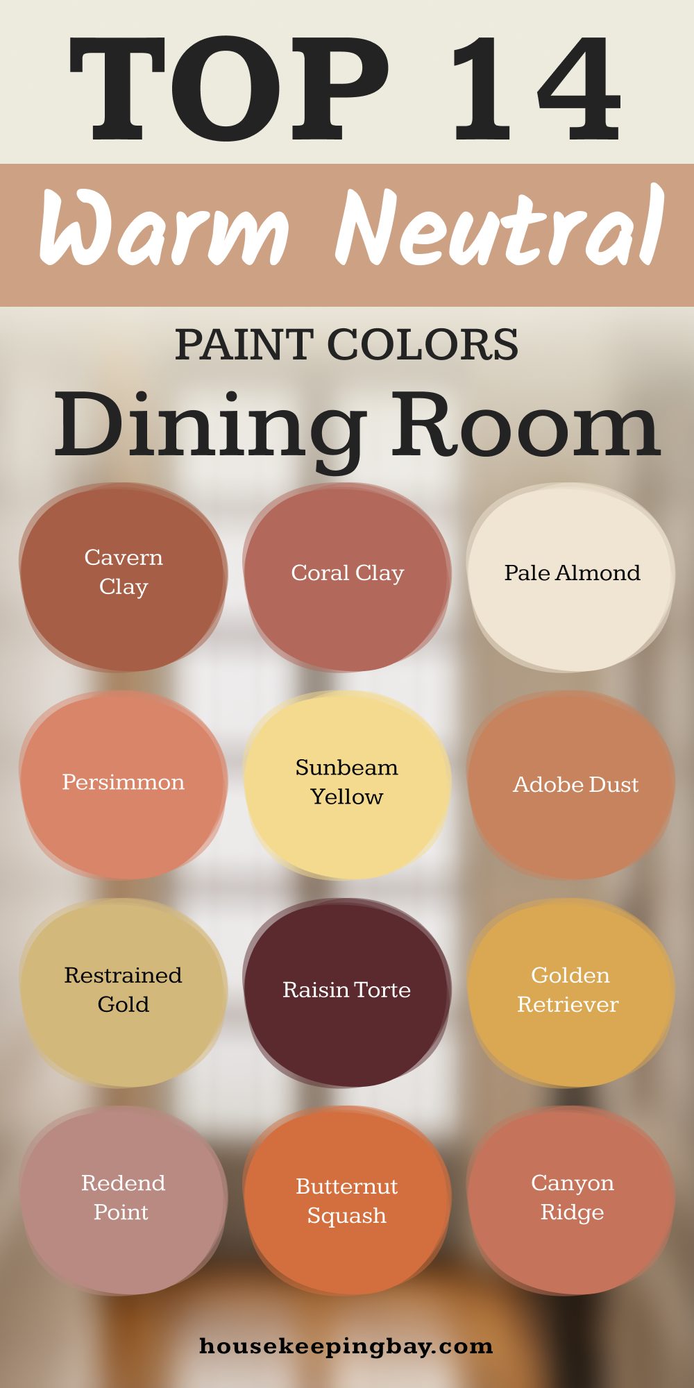
Sherwin-Williams Warm Dining Room Colors
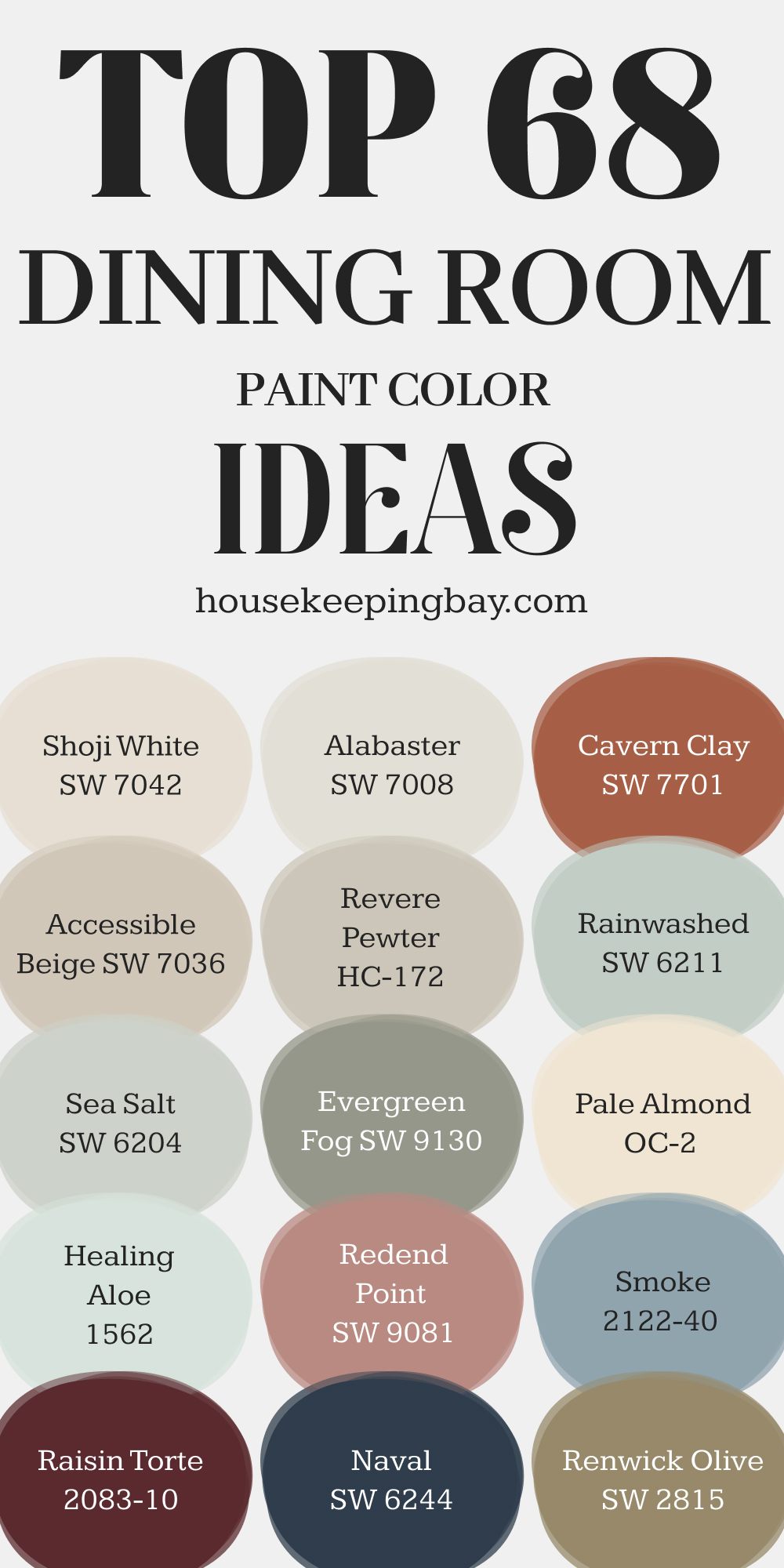
- Cavern Clay (SW 7701)
A rich, earthy terracotta. It adds depth without feeling too dark. Works great with wood tones and greenery. - Persimmon (SW 6339)
A soft orange that feels both happy and grounded. Especially lovely in natural daylight. - Restrained Gold (SW 6129)
Golden without being flashy. I love this in traditional dining rooms with white trim. - Redend Point (SW 9081)
Sherwin-Williams’ 2023 Color of the Year. It’s a muted clay-pink that brings calm energy. - Coral Clay (SW 9005)
Has that beachy vibe without being bright. Feels cheerful but grounded. - Sunbeam Yellow (SW 0078)
Light and buttery — it lifts a room without overpowering. - Wheat Grass (SW 6408)
A yellow with a green undertone. Perfect with rustic or farmhouse-style tables.
Benjamin Moore Warm Dining Room Colors
- Raisin Torte (2083-10)
A dramatic wine-red, great for candlelit dinners and darker wood furniture. - Butternut Squash (2164-30)
Exactly what it sounds like — warm, vibrant, and pairs beautifully with brass or copper fixtures. - Pale Almond (OC-2)
A light, creamy neutral that still carries warmth. Great with beige or natural linens. - Adobe Dust (2175-40)
Earthy and sun-kissed. It works well in dining rooms with big windows. - Burnt Peanut Red (2081-10)
Bold and fun, but not too loud. I once used this in a retro-styled dining nook — it turned out amazing. - Golden Retriever (2165-30)
Not just a cute name. This color has a golden warmth that suits both modern and vintage homes. - Canyon Ridge (997)
Somewhere between coral and terracotta — cozy and unique.
These warm shades are all about comfort, connection, and a little bit of joy. They tend to bring people closer — not just visually, but emotionally. I’ve used them in both small apartments and large family homes, and they always seem to bring warmth into the room.
housekeepingbay.com
Cool Colors for Calm and Collected Dining
Sometimes, people want their dining room to feel relaxed — like a place to slow down. Cool colors like blue, green, and soft teal do that. They make the room feel more quiet and peaceful, especially at night with low lighting. I often suggest these for smaller gatherings or for homes where the dining area connects to a calm kitchen or living space.
Here are some of my favorite cool-toned colors from Sherwin-Williams and Benjamin Moore.
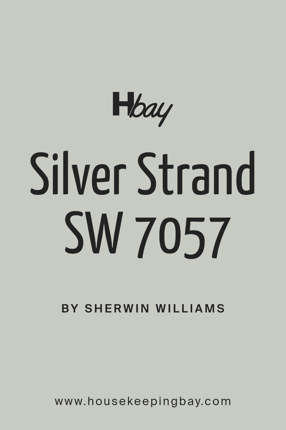
Sherwin-Williams Cool Dining Room Colors
- Sea Salt (SW 6204)
My go-to soft greenish-blue. It changes slightly with the light, which keeps it interesting. It’s subtle, clean, and calming. - Misty (SW 6232)
A pale blue-gray. This works beautifully in rooms with white trim and soft lighting. It reminds me of early morning fog. - Rain (SW 6219)
A gentle blue with a slight green undertone. Looks gorgeous with wood and brass accents. - Comfort Gray (SW 6205)
Despite the name, it leans more green than gray. It’s very peaceful and works with almost any wood tone. - Silver Strand (SW 7057)
Light blue with a gray touch. A bit cooler than Sea Salt, and great for modern homes. - Aloof Gray (SW 6197)
On the gray side of sage — it’s understated and calm. - Quietude (SW 6212)
A soft teal. I’ve used this in several beachside homes — works like magic.
Benjamin Moore Cool Dining Room Colors
- Boothbay Gray (HC-165)
A classic blue-gray. I’ve used this in Colonial-style homes and even some lofts. It adds a little formality but still feels calm. - Woodlawn Blue (HC-147)
Soft, sweet, and perfect with white trim and natural light. - Palladian Blue (HC-144)
A gentle blend of blue and green — feels like coastal air. This one’s very popular and easy to live with. - Healing Aloe (1562)
Soft green with a touch of blue. Ideal if you want something more natural but still clean. - Gray Cashmere (2138-60)
I’ve used this in homes with open floor plans — it blends well across rooms. - Smoke (2122-40)
This is a muted blue-gray, elegant and very easy on the eyes. Adds subtle drama. - Beach Glass (1564)
A little more muted than Healing Aloe, great in dining rooms with lots of light.
These cool shades help tone things down and make the room feel thoughtful. People tend to linger longer when the room feels calm — and that’s something I’ve noticed in nearly every home I’ve painted with these colors.
Neutrals That Always Work
Neutral doesn’t mean boring. In fact, some of the most inviting dining rooms I’ve worked on were done in soft greys, warm beiges, or classic greige tones. These colors let your furniture, art, and lighting do the talking — but they still set the mood.
Neutrals are ideal for anyone who:
- Likes to change decor often
- Has bold furniture or art
- Wants the dining room to connect to nearby rooms without clashing
Here are my favorite neutral paint colors for dining rooms — from both Sherwin-Williams and Benjamin Moore.
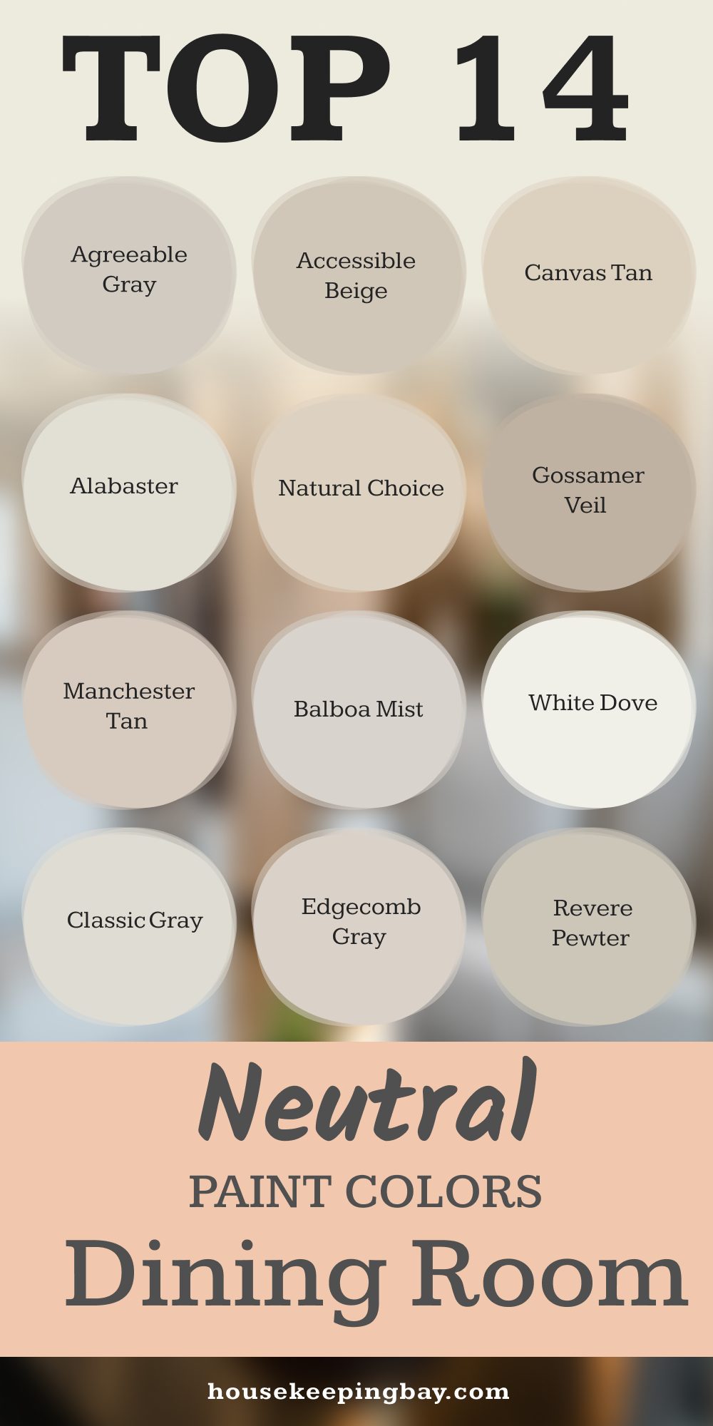
Sherwin-Williams Neutral Dining Room Colors
- Accessible Beige (SW 7036)
Soft, warm, and reliable. Not too gray, not too tan — just right. This is a favorite for staging homes too. - Agreeable Gray (SW 7029)
Possibly Sherwin-Williams’ most popular neutral. It’s a warm gray that works with nearly any color scheme. - Alabaster (SW 7008)
A warm, creamy white. Not stark at all. I use this when someone wants a classic, cozy feel. - Gossamer Veil (SW 9165)
A cooler greige that adds depth. Looks modern without being cold. - Natural Linen (SW 9109)
Very soft, warm beige. Pairs beautifully with white wainscoting or dark wood tables. - Modern Gray (SW 7632)
Clean and a bit more sophisticated. Good for transitional style homes. - Shoji White (SW 7042)
Off-white with a whisper of warmth. Perfect if you want the walls to fade into the background but still feel soft.
Benjamin Moore Neutral Dining Room Colors
- Revere Pewter (HC-172)
A true classic. This greige has been around for years for a reason. It balances warmth and coolness perfectly. - Edgecomb Gray (HC-173)
A warm, soft greige that never feels too yellow or too flat. I’ve used it dozens of times. - Classic Gray (OC-23)
Pale and elegant. Great in dining rooms that get a lot of light. - White Dove (OC-17)
My favorite soft white. It works beautifully in traditional or modern spaces. - Balboa Mist (OC-27)
Slightly warmer than Classic Gray, with a subtle lavender undertone in some lights. - Manchester Tan (HC-81)
Light, warm, and timeless. It adds comfort without shouting. - Feather Down (OC-6)
A calming off-white. Use this if you want to keep things simple but polished.
Neutrals are all about balance. They can support bold centerpieces, moody lighting, or strong wood grains. And honestly, they make a dining room feel like a safe, welcoming place — whether it’s for a family dinner or a quiet glass of wine after a long day.
housekeepingbay.com
Moody Dining Rooms for Drama and Charm
Sometimes, you want a dining room that feels more special — more intentional. These are the rooms where people lean in during conversations, light candles even on a weekday, and where dinner lasts just a little longer. Darker, richer paint colors help create that feeling.
I usually suggest these shades for formal dining rooms or open spaces where you want to create contrast. Add some warm lighting and soft textures, and they’ll never feel too heavy.
Here are the moody colors I reach for most often from Sherwin-Williams and Benjamin Moore.
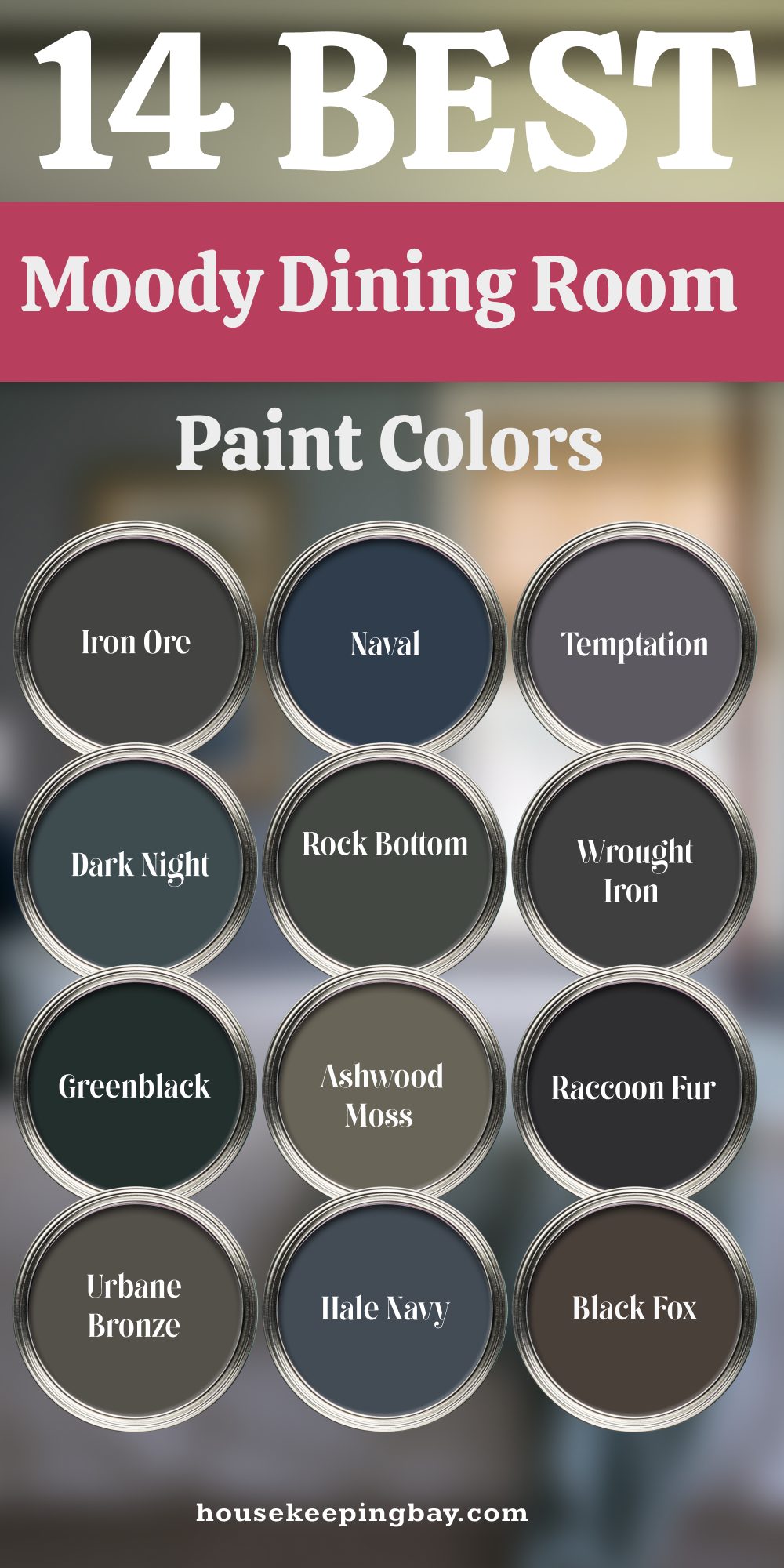
Sherwin-Williams Moody Dining Room Colors
- Naval (SW 6244)
A deep navy that feels classic and bold. It pairs well with brass, white trim, or rustic wood. - Iron Ore (SW 7069)
One of the best dark charcoals out there. Not quite black, but just enough depth. Makes white trim pop. - Greenblack (SW 6994)
Somewhere between black and a deep forest green. Very dramatic — I used this once in a room with leather chairs and candlelight… unforgettable. - Black Fox (SW 7020)
A warm black-brown. Works great if you want something deep but not cold. - Urbane Bronze (SW 7048)
Sherwin-Williams’ 2021 Color of the Year. A rich, earthy gray-brown. - Rock Bottom (SW 7062)
A moody green-gray. If you love olive tones, this one feels grounded and elegant. - Dark Night (SW 6237)
Bold navy with a little teal. It has a richness that feels very high-end.
Benjamin Moore Moody Dining Room Colors
- Hale Navy (HC-154)
A true design favorite. Strong and stable, and somehow works in both modern and traditional spaces. - Raccoon Fur (2126-20)
Almost-black with a blue undertone. Very rich and mysterious. - Ashwood Moss (CSP-870)
A soft, muted forest green. Great for a rustic, cozy dining room. - Wrought Iron (2124-10)
Not quite black — a smoky, softened version that doesn’t overpower the room. - Temptation (1609)
A deep gray-violet. One of the most underrated colors for dining rooms, in my opinion. - Newburg Green (HC-158)
Somewhere between blue and green, with a stately, historic feel. - Caponata (AF-650)
A rich eggplant tone. This one turns every meal into an occasion.
Moody colors don’t make a room feel small if they’re balanced with the right lighting, texture, and contrast. I’ve seen dining rooms painted in charcoal or navy that feel incredibly warm — even romantic. It’s all about how you finish the room: wood, linen, brass, or even velvet can make these colors feel luxurious, not heavy.
housekeepingbay.com
Light & Airy Colors for Smaller Dining Rooms
Small dining rooms need a little extra help to feel open and welcoming. That’s where pale pastels, gentle whites, and light-toned neutrals come in. These colors reflect light and make the room feel bigger, fresher, and less crowded — especially when paired with mirrors or lighter furniture.
When clients want a brighter, softer mood, these are the shades I often recommend.
Sherwin-Williams Light Dining Room Colors
- Origami White (SW 7636)
Clean and creamy with a whisper of warmth. Doesn’t feel sterile — just simple and fresh. - Site White (SW 7070)
Pale, modern, and cool-toned. Great in homes with lots of natural light. - Snowbound (SW 7004)
A slightly warm white that doesn’t go yellow. It adds just enough softness to the room. - Window Pane (SW 6210)
A very pale blue-green. Light, breezy, and cheerful — like a spring morning. - Lily (SW 6693)
A super soft pastel yellow that makes even the smallest rooms feel happy. - North Star (SW 6246)
Gentle blue-gray. Doesn’t fight with other colors in the room. - Shell White (SW 8917)
Has a faint blush undertone. It feels warm, not pink — very cozy.
Benjamin Moore Light Dining Room Colors
- Chantilly Lace (OC-65)
Crisp and pure. I use this when I want the cleanest, brightest feel possible. - Navajo White (947)
A warm, soft off-white with a creamy base. Perfect with vintage or rustic furniture. - Barely Beige (1066)
A very light beige-pink. Sweet and subtle. - Harbor Haze (2136-60)
A light, coastal blue. Adds freshness without stealing the spotlight. - Ballet White (OC-9)
Very light greige with a creamy warmth. One of my favorites for rooms that get morning sun. - Spring in Aspen (954)
Barely-there yellow with a cheerful glow. This can turn a gloomy room into something lovely. - Paper White (1590)
Pale gray with a hint of blue. Clean and calm — good for rooms with a lot of reflective surfaces.
These airy colors do wonders for smaller or darker dining rooms. They bounce light, soften shadows, and make the room feel just a little more open. And if you love layering decor — florals, ceramics, or light wood — these shades make everything shine a bit brighter.
housekeepingbay.com
Tips on Picking the Right Finish for Your Dining Room
Finish matters. It affects how the color looks on the wall, how light bounces, and even how easy it is to clean. Over the years, I’ve learned that picking the right finish is just as important as the right shade.
Here’s what I tell my clients — plain and simple:
The Main Types of Paint Finishes
- Flat / Matte
- Looks soft and velvety
- Hides wall flaws well
- Not easy to clean, so I usually skip this for dining rooms
- Eggshell
- Slightly more sheen than flat
- Soft glow, easy to clean
- My favorite finish for dining rooms — forgiving, but still polished
- Satin
- Smoother and shinier than eggshell
- Very cleanable
- Good for families with kids or if you’re near the kitchen
- Semi-Gloss
- Shiny and reflective
- Best for trim, not full walls — unless you want a dramatic look
- High-Gloss
- Super shiny — almost mirror-like
- Rarely used on walls, but can be amazing on furniture or ceiling details
My Quick Tips
- If your walls are textured or have dents, avoid glossy finishes — they’ll highlight every flaw.
- For formal dining rooms, eggshell or satin adds the right amount of depth and elegance.
- If your dining room gets a lot of fingerprints (especially near chairs), satin is easier to wipe down.
- Want a subtle luxury look? Pair eggshell walls with semi-gloss trim for that quiet contrast.
Finish is one of those small details that most people overlook — but it can totally shift the feel of your room. I’ve had clients repaint a whole space just to change the finish, and suddenly the color felt right. That’s how much it matters.
So… What Color Will Your Story Start With?
Color isn’t just decoration — it’s how you set the mood for the people you care about. Whether it’s Sunday pancakes, birthday dinners, or quiet evenings with someone you love, your dining room holds stories. And the wall color? It shapes every one of them.
From soft creams to moody navies, we’ve gone through 68 hand-picked colors from Sherwin-Williams and Benjamin Moore — the two brands I trust the most in my work. I hope these ideas give you a clearer picture of how your dining room can feel, not just look.
You don’t need a big renovation to make your home feel better. Sometimes, a single coat of paint is enough to shift the energy completely.
So, which color spoke to you? Warm and welcoming? Calm and cool? Maybe something bold? Whatever you pick — make sure it tells your story.
And if you’re still unsure? My best advice: get a sample, paint a little square on the wall, and live with it for a day or two. Your walls will tell you what they need — they always do.
housekeepingbay.com
