Persimmon SW 6339 by Sherwin Williams
Flaming Hues: Reviving Your Space with Warmth
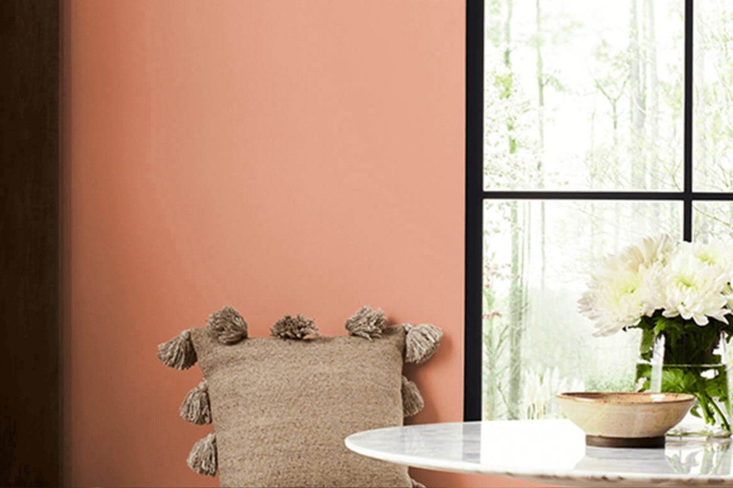
Exploring the vibrant world of paint colors can transform any space, and if you’re looking for a bold yet sophisticated option, SW 6339 Persimmon by Sherwin Williams could be the perfect choice. This rich, deep orange shade brings warmth and energy to any room, making it both inviting and stylish. Whether you’re aiming to add a splash of color to your living room, kitchen, or bedroom, Persimmon offers a versatile solution that pairs well with a range of décor styles from modern to traditional.
The beauty of using SW 6339 Persimmon lies in its ability to create a focal point in a space without overwhelming it. This shade has the unique ability to uplift and add personality to any area, making it feel more cozy and welcoming. It works exceptionally well with natural light, glowing vibrantly during the day, and transitions gracefully into the evening with a rich, warm hue that enhances the ambiance of the space.
Incorporating Persimmon into your home isn’t just about making a statement; it’s also about crafting an environment that reflects warmth, creativity, and comfort. Whether you choose to paint an entire room, create an accent wall, or use it for decorative touches, SW 6339 Persimmon by Sherwin Williams is a color that promises to transform your space into a lively and inviting haven.
by Sherwin Williams
What Color Is Persimmon SW 6339 by Sherwin Williams?
Persimmon SW 6339 by Sherwin Williams is a unique and vibrant color that brings warmth and energy into any space. It’s a bold orange with a hint of red, making it striking yet inviting. This color is like a cheerful embrace that adds a lively punch without overwhelming a room.
Persimmon is incredibly versatile and can work well in a variety of interior styles. It’s perfect for adding a pop of color in modern and contemporary spaces, bringing a fresh and dynamic look. In bohemian and eclectic interiors, it complements rich textures and varied patterns, adding depth and cohesion. For more traditional settings, Persimmon can add a modern twist without straying too far from classic aesthetics.
This color pairs beautifully with natural materials and textures, creating a balanced and harmonious look. Think of combining it with the softness of natural wood, which can help to ground the vibrancy of Persimmon, or pairing it with leather accents for a sophisticated touch. Fabrics like linen or cotton in neutral tones also work well, providing a soft backdrop that allows Persimmon to stand out. Metals like brass or copper can add a hint of glamour and warmth, complementing the richness of Persimmon in a subtle yet striking way.
In conclusion, Persimmon SW 6339 by Sherwin Williams is a bold and versatile color that can bring warmth, energy, and a touch of sophistication to any space, pairing wonderfully with a variety of materials and textures to suit different interior styles.
housekeepingbay.com
Is Persimmon SW 6339 by Sherwin Williams Warm or Cool color?
PersimmonSW 6339 by Sherwin Williams is a warm and vibrant color that has a lively impact on any space within a home. This rich, orange-hued paint brings an inviting atmosphere to rooms, making them feel cozy and energetic. When used in living areas or kitchens, PersimmonSW 6339 adds a burst of cheerfulness and can make the space feel more welcoming. Its boldness allows for creative interior designs, either as a striking accent wall or through decorative accessories to complement neutral tones.
The brightness of PersimmonSW 6339 also plays a significant role in how it influences mood. Colors have a way of affecting our feelings, and this particular shade tends to evoke happiness and inspire creativity. It’s an excellent choice for fostering a sociable environment, encouraging lively conversations among family and friends.
In spaces that receive a lot of natural light, PersimmonSW 6339 can appear even more vibrant, enhancing the room’s overall aesthetic. However, in rooms with less natural light, it can add warmth, making the space feel snug and comfortable. This versatility makes PersimmonSW 6339 a fantastic option for various rooms and design preferences, offering a unique blend of warmth and energy to homes.
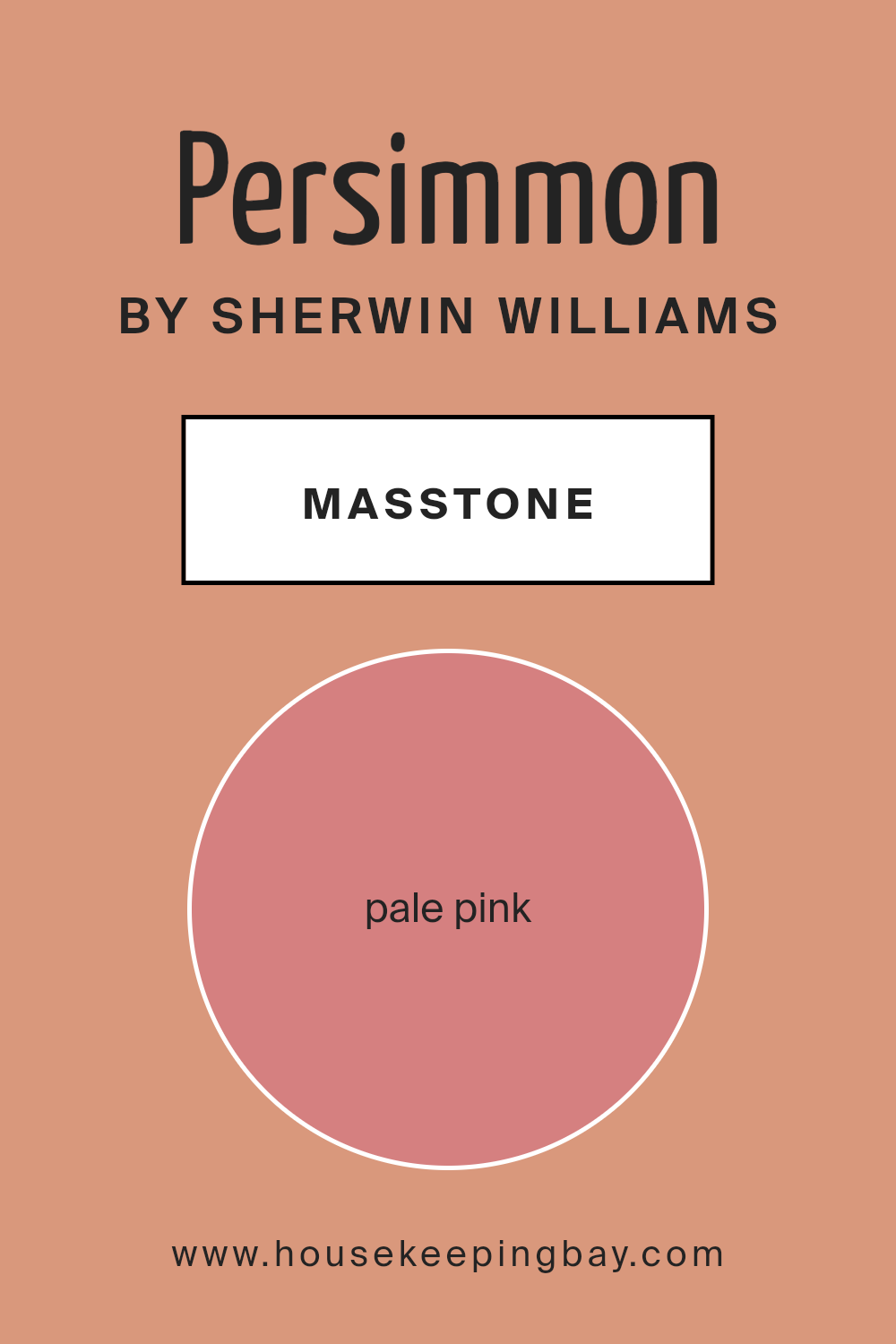
What is the Masstone of the Persimmon SW 6339 by Sherwin Williams?
PersimmonSW 6339 by Sherwin Williams has a masstone – or main color impression – of Pale Pink (#D58080). This gentle, soothing shade of pink brings a warm and inviting atmosphere to any home. When used on walls, it creates a soft backdrop that makes rooms feel cozy and welcoming. Unlike bolder, brighter colors that grab attention, Pale Pink works its magic quietly, blending in beautifully with various decor styles from modern to rustic.
This subtle hue has the power to make spaces feel larger and more open, as light colors naturally reflect light better than dark ones. It’s a versatile color, too, working well in bedrooms for a restful vibe, in living rooms for a touch of warmth, or even in bathrooms for a serene retreat feel. For those looking to add a touch of color without overwhelming their space, PersimmonSW 6339 hits the mark. It’s easy on the eyes and pairs wonderfully with whites, greys, and even bolder colors, allowing for flexibility in design choices while maintaining a peaceful and inviting home ambiance.
housekeepingbay.com
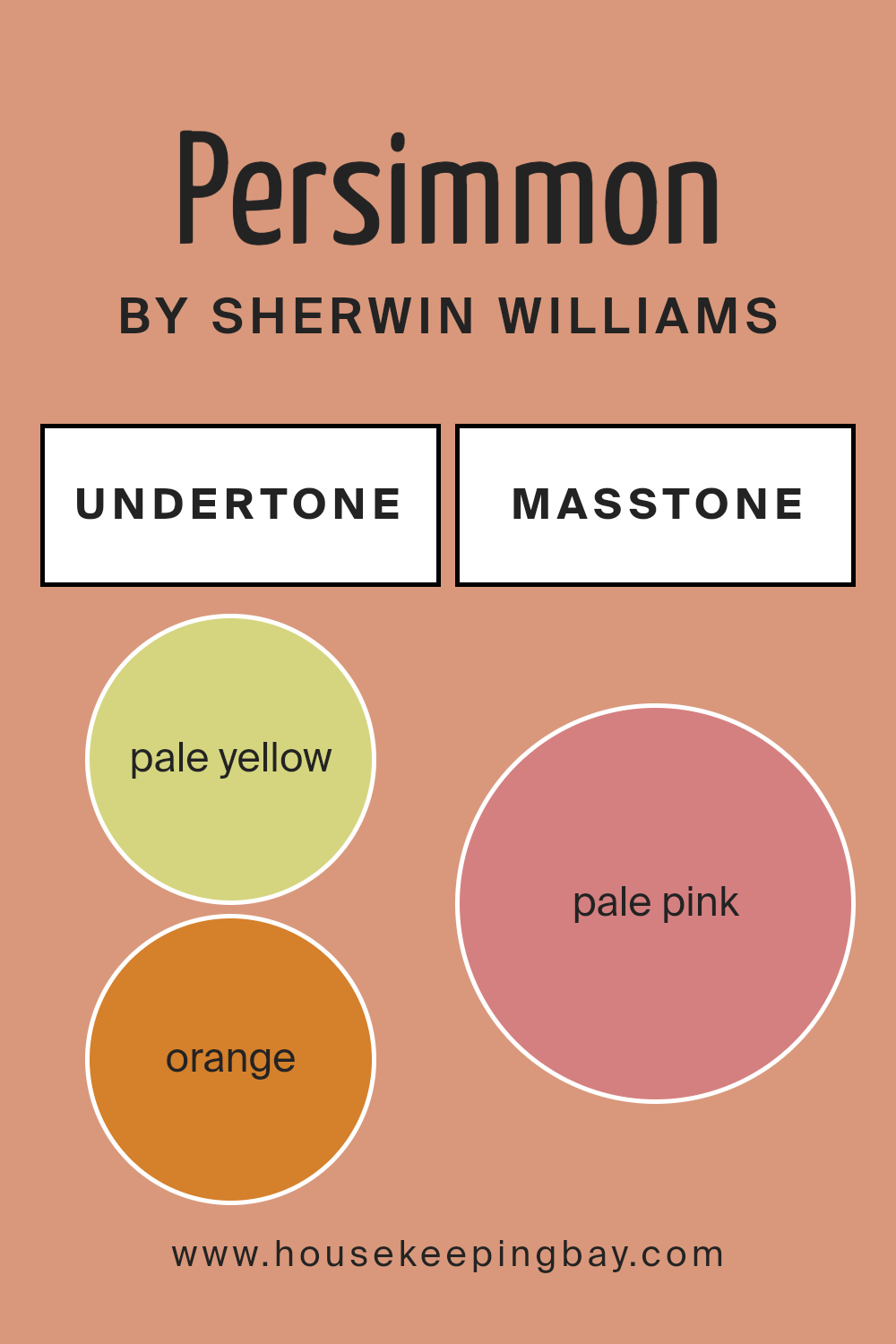
Undertones of Persimmon SW 6339 by Sherwin Williams
The color PersimmonSW 6339 by Sherwin Williams is not just a simple color. It’s like a box of crayons melted together, creating a unique shade. This paint might look like one color at first glance, but it actually has hints of many different colors hidden inside it. Think of it like when you’re adding different toppings to your ice cream; every scoop tastes a bit different.
In this case, PersimmonSW 6339 carries hints of pale yellow, orange, light purple, grey, yellow, light gray, mint, pink, olive, lilac, light green, red, light blue, fuchsia, purple, brown, and violet. These undertones are sneaky because they change how the color looks depending on the light and what’s around it. For example, with more sunlight, you might notice the yellow or orange tones more, making the room feel warm and cozy. On a cloudy day, grey or light blue might stand out, giving the space a cooler vibe.
When you put PersimmonSW 6339 on your interior walls, these undertones play a big part in setting the mood. If your room has a lot of natural light, the warmth of orange and yellow undertones can make it feel welcoming and lively. In spaces with less light, the cooler tones like light purple or grey might become more noticeable, giving the room a calm and sophisticated feel.
So, using a color like PersimmonSW 6339 is a smart way to add depth and interest to your space. It’s not just painting your walls; it’s adding a layer of personality and mood that can change and grow with you.
housekeepingbay.com
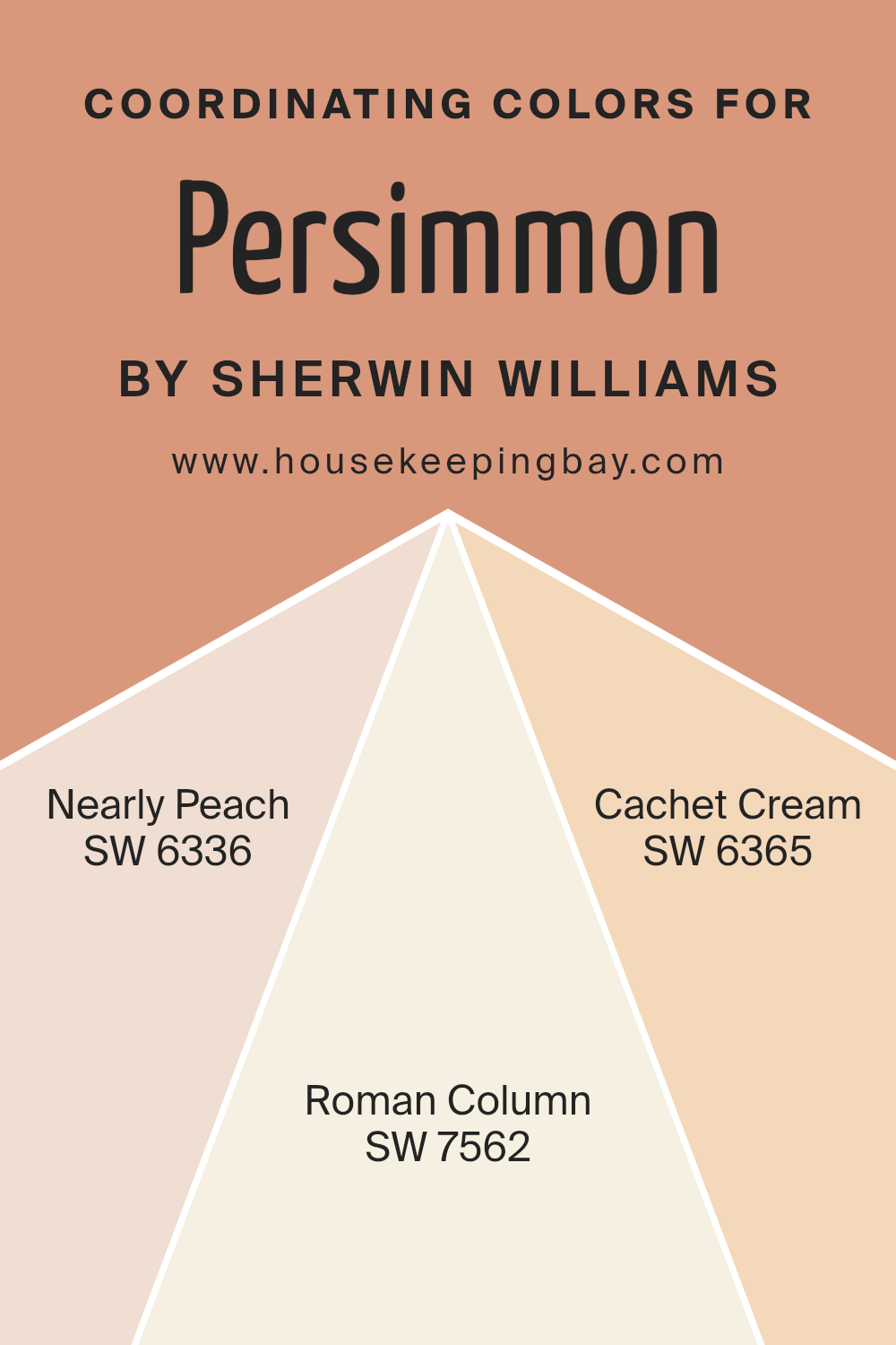
Coordinating Colors of Persimmon SW 6339 by Sherwin Williams
Coordinating colors are shades that complement each other harmoniously on a color scheme, working together to enhance the aesthetic appeal of a space. When used skillfully, these colors can add depth, contrast, and visual interest to any room. For Persimmon SW 6339 by Sherwin Williams, a vibrant and warm hue, selecting the right coordinating colors is key to creating a balanced and appealing look. Three such coordinating colors that pair beautifully with Persimmon are Nearly Peach SW 6336, Roman Column SW 7562, and Cachet Cream SW 6365.
Nearly Peach SW 6336 is a soft, understated color that offers a subtle contrast to the boldness of Persimmon, giving a room a soothing and gentle ambiance. Its light and airy feel can open up a space, making it appear brighter and more inviting. Roman Column SW 7562, on the other hand, is a classic and neutral shade that provides a solid foundation for Persimmon. It works well to ground the space and bring a sense of stability and calmness, making it an excellent choice for balancing the dynamic energy of Persimmon.
Finally, Cachet Cream SW 6365, with its warm and cozy undertones, harmonizes with Persimmon to create a welcoming and comfortable environment. This color can help to soften the overall look and infuse the room with a sense of warmth and homeliness. Together, these coordinating colors offer a versatile palette to enhance the beauty and character of any space adorned with Persimmon SW 6339.
You can see recommended paint colors below:
- SW 6336 Nearly Peach
- SW 7562 Roman Column
- SW 6365 Cachet Cream
housekeepingbay.com
How Does Lighting Affect Persimmon SW 6339 by Sherwin Williams?
Lighting plays a crucial role in how we see and experience colors. The color of a room can completely change depending on the type of light it’s under. This phenomenon is especially true for a unique color like Persimmon SW 6339 by Sherwin Williams.
- In artificial light, Persimmon SW 6339 can look warmer and more vibrant. If you have warm-toned light bulbs, this paint color will seem even more inviting and cozy, making it perfect for spaces where you want a welcoming atmosphere. Under cooler, LED lights, the color might lose a bit of its warmth, appearing slightly muted but still maintaining its rich hue.
- Natural light brings another dimension to Persimmon SW 6339. The quality and angle of sunlight can significantly affect how this color is perceived. In north-faced rooms, which get less direct sunlight, Persimmon might look more subdued and softer. Since the natural light in these rooms tends to be cooler, it can slightly dampen the warmth of the color, giving it a more delicate appearance.
- South-faced rooms bathe in abundant sunlight, which will make Persimmon SW 6339 appear brighter and even more dynamic. In these spaces, the color can truly come to life, displaying its full range of warmth and depth. It creates a lively and energetic ambiance, perfect for living spaces or any area where you spend a lot of time during the day.
- In rooms facing east, morning light will make Persimmon look warm and inviting, perfect for starting the day on a positive note. As the day progresses and the direct sunlight moves away, the color will retain its warmth but become less intense, offering a soft and cozy feeling into the afternoon.
- West-facing rooms present a reverse scenario. Throughout the morning, Persimmon SW 6339 will display a more muted version of itself due to the indirect light. However, as the evening approaches and sunlight fills the room, the color warms up significantly, offering a stunning glow that enhances the space with a sense of warmth and energy, perfect for relaxation and evening gatherings.
Understanding how lighting affects colors like Persimmon SW 6339 can help you choose the right placement and lighting options to maximize the beauty and impact of your space.
housekeepingbay.com
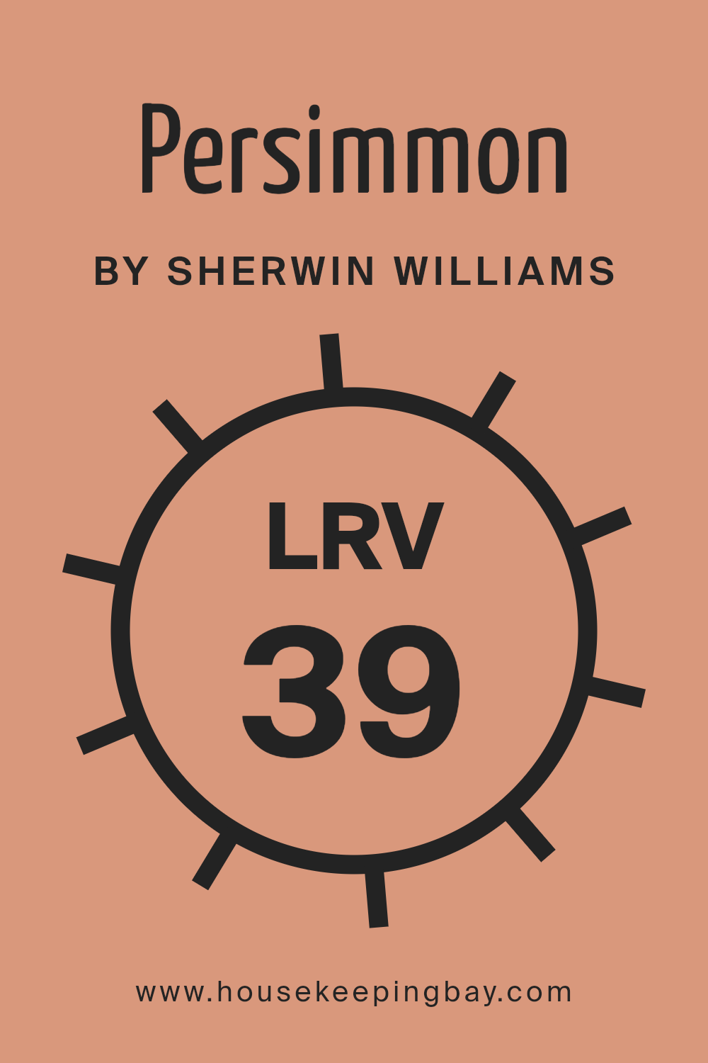
What is the LRV of Persimmon SW 6339 by Sherwin Williams?
LRV stands for Light Reflectance Value. In simple terms, it’s a measure of how much light a color reflects or absorbs. This value ranges from 0 to 100, where 0 means it absorbs all light (think of a deep, dark color like black) and 100 means it reflects all light (like pure white). The LRV helps people understand how bright or dark a color will look once it’s painted on a wall. For instance, if you choose a color with a high LRV for a room, it will reflect more light, making the room look brighter and larger. On the other hand, a color with a low LRV will absorb more light, which can make a space feel cozier but smaller.
In the case of Persimmon SW 6339 by Sherwin Williams, with an LRV of 38.723, this color is on the darker side of the scale, meaning it doesn’t reflect a lot of light.
In a well-lit room, this rich color can add warmth and depth, bringing a cozy and inviting atmosphere. However, in a room with less natural light, using a color with this LRV might make the space feel smaller or darker than it actually is. This LRV rating tells us that Persimmon will not brighten up a space as much as a color with a higher LRV would, but it can add character and moodiness that could be perfect for certain spaces or design goals.
housekeepingbay.com
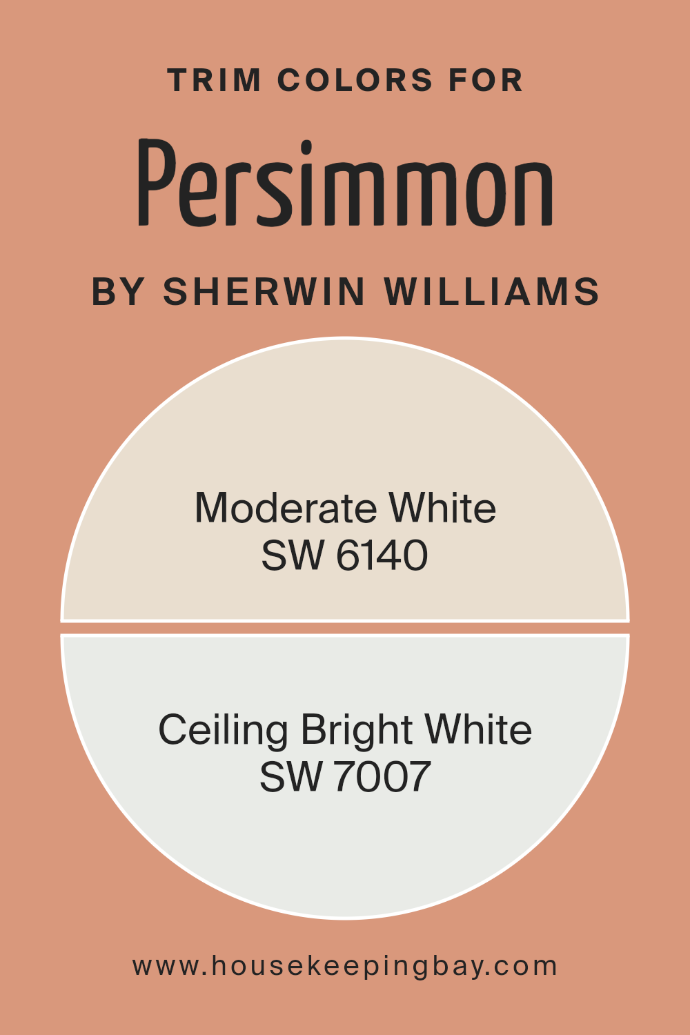
What are the Trim colors of Persimmon SW 6339 by Sherwin Williams?
Trim colors refer to shades used to accentuate or highlight the architectural features of a room like door frames, baseboards, moldings, and window trims. They play a critical role in defining the aesthetic and mood of a space. When paired with Persimmon SW 6339 by Sherwin Williams, a vibrant and warm hue, choosing the right trim colors is essential to either complement or subtly contrast with the wall color, ensuring an inviting and cohesive look. Moderate White SW 6140 and Ceiling Bright White SW 7007 are two excellent choices for trim colors with Persimmon SW 6339, as they can balance its boldness without overwhelming it, helping to create a harmonious and polished interior.
Moderate White SW 6140 is a soft, warm white with a hint of neutrality, making it versatile for use with Persimmon SW 6339. It adds a subtle, soothing contrast, enhancing the rich depth of Persimmon without clashing with its warmth. On the other hand, Ceiling Bright White SW 7007 is a crisp, clean white, which brings a fresh and brightening effect to the room.
It sharply defines the edges and architectural details against Persimmon SW 6339, creating a striking visual effect that draws the eye. Both colors offer unique ways to complement the robust shade of Persimmon, ensuring the room feels balanced and thoughtfully designed.
You can see recommended paint colors below:
housekeepingbay.com
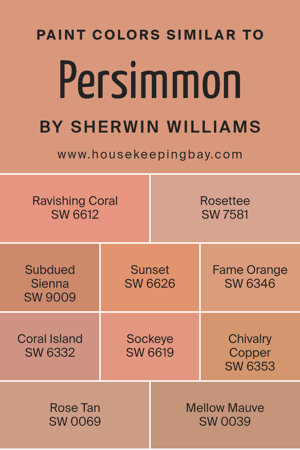
Colors Similar to Persimmon SW 6339 by Sherwin Williams
Similar colors play an essential role in creating visually harmonious spaces, especially when considering a specific color like Persimmon SW 6339 by Sherwin Williams. These colors share common undertones or are within the same color range, allowing for a seamless blend across a decor scheme. They offer subtle variations that can highlight architectural features, create depth, and add interest without overwhelming the eye. For example, using similar colors like SW 6612 – Ravish Coral and others provides a palette that can easily transition from room to room, giving a cohesive look while allowing each space to have its own character.
Each color, while similar to Persimmon, brings its own unique vibe. Ravishing Coral is a vibrant, energetic hue that brightens spaces with a playful spirit. Rosette leans into a soft floral elegance, perfect for creating a soothing, romantic atmosphere. Subdued Sienna offers a more grounded, earthy feel, ideal for adding warmth. Sunset gives off the last light’s glow, rich and inviting.
Fame Orange exudes confidence with its bold, dynamic presence. Coral Island offers a lighter, breezy charm that’s refreshing. Sockeye, with its deep, saturated appearance, makes a striking statement. Chivalry Copper has a timeless, noble quality, adding a touch of sophistication. Rose Tan brings a subtle, understated elegance, perfect for more reserved designs. Lastly, Mellow Mauve provides a gentle touch of nostalgia, calming and comforting. Through these colors, one can craft spaces that reflect personal style while maintaining visual harmony and interest.
You can see recommended paint colors below:
- SW 6612 Ravishing Coral
- SW 7581 Rosettee
- SW 9009 Subdued Sienna
- SW 6626 Sunset
- SW 6346 Fame Orange
- SW 6332 Coral Island
- SW 6619 Sockeye
- SW 6353 Chivalry Copper
- SW 0069 Rose Tan
- SW 0039 Mellow Mauve
housekeepingbay.com
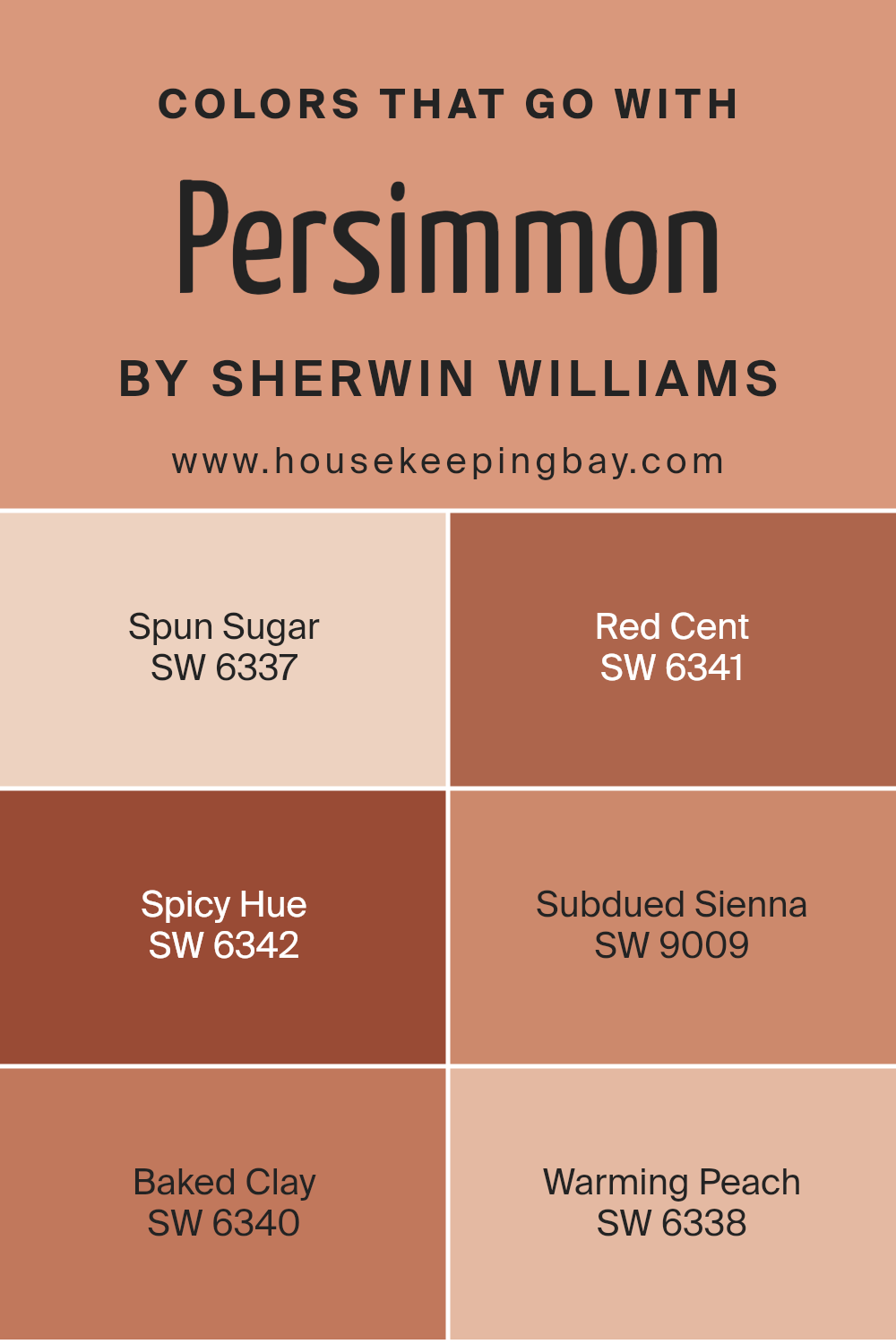
Colors that Go With Persimmon SW 6339 by Sherwin Williams
Colors that pair with Persimmon SW 6339 by Sherwin Williams play an essential role in creating a cohesive and visually appealing space. This vivid, orangey-red hue brings warmth and energy to any room, but the key to using it effectively lies in selecting the right complementary colors. When you find the perfect matches, such as SW 6337 – Spun Sugar, SW 6341 – Red Cent, SW 6342 – Spicy Hue, SW 9009 – Subdued Sienna, SW 6340 – Baked Clay, and SW 6338 – Warming Peach, you create a harmonious palette that enhances the beauty and impact of Persimmon.
Spun Sugar is a soft, pale pink that introduces a gentle contrast to Persimmon’s boldness, creating a light and airy feel. Red Cent offers a deep, rich copper tone that works well with Persimmon, adding a sophisticated edge. Spicy Hue is a robust terracotta that pairs seamlessly with Persimmon to evoke a warm, earthy vibe.
Subdued Sienna, as its name suggests, is a muted reddish-brown that complements Persimmon’s vibrancy without competing for attention. Baked Clay is another terracotta-inspired shade but with a slightly more muted, grounded feel, perfect for adding depth. Finally, Warming Peach brings a soft, peachy glow that enhances Persimmon’s warmth, creating a cozy and inviting atmosphere. Together, these colors form a palette that not only works with Persimmon but elevates it, making any space feel more inviting and complete.
You can see recommended paint colors below:
- SW 6337 Spun Sugar
- SW 6341 Red Cent
- SW 6342 Spicy Hue
- SW 9009 Subdued Sienna
- SW 6340 Baked Clay
- SW 6338 Warming Peach
housekeepingbay.com
How to Use Persimmon SW 6339 by Sherwin Williams In Your Home?
Persimmon SW 6339 by Sherwin Williams is a vibrant, warm color that brings cheer and coziness to any space in your home. Think of it as a hug from the sun, perfect for adding a pop of color to your living environment. Let’s talk about how you can use this joyful shade around your house.
For starters, painting an accent wall with Persimmon can instantly brighten up your living room or bedroom, creating a focal point and sparking energy. It’s like having a burst of happiness on your wall, inviting you to relax and enjoy the space.
In the kitchen, consider painting your cabinets or an island in Persimmon for a welcoming vibe that stimulates conversation and appetite. It’s a color that says “come on in and make yourself at home.”
Don’t shy away from using it in smaller spaces, like a powder room or a reading nook, where it can warm up the area without overwhelming it.
Accessories like pillows, vases, or artwork in Persimmon can also add a lively splash to neutral rooms, effortlessly bringing life and personality to your home.
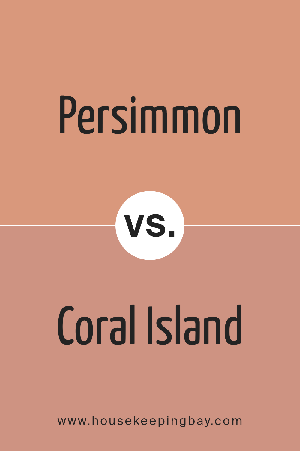
Persimmon SW 6339 by Sherwin Williams vs Coral Island SW 6332 by Sherwin Williams
Persimmon SW 6339 and Coral Island SW 6332, both from Sherwin Williams, are two vibrant colors with their own unique appeal. Persimmon is a rich, warm orange that brings a cozy and inviting atmosphere to any space. It’s bold and lively, making it perfect for adding a statement or pop of color in a room.
On the other hand, Coral Island is a softer, more subdued color. It leans more towards a pinkish-orange hue, reminiscent of a beautiful sunset or the natural color of coral. This color creates a calming and relaxing ambiance, ideal for spaces where you want to unwind. While both colors share an orange base, Persimmon stands out for its deeper, fiery tone, which can energize a space. Coral Island offers a gentle and serene vibe, making it great for creating a peaceful retreat. Choosing between them depends on the mood you want to create, with Persimmon being more assertive and Coral Island offering a softer touch.
You can see recommended paint color below:
- SW 6332 Coral Island
housekeepingbay.com
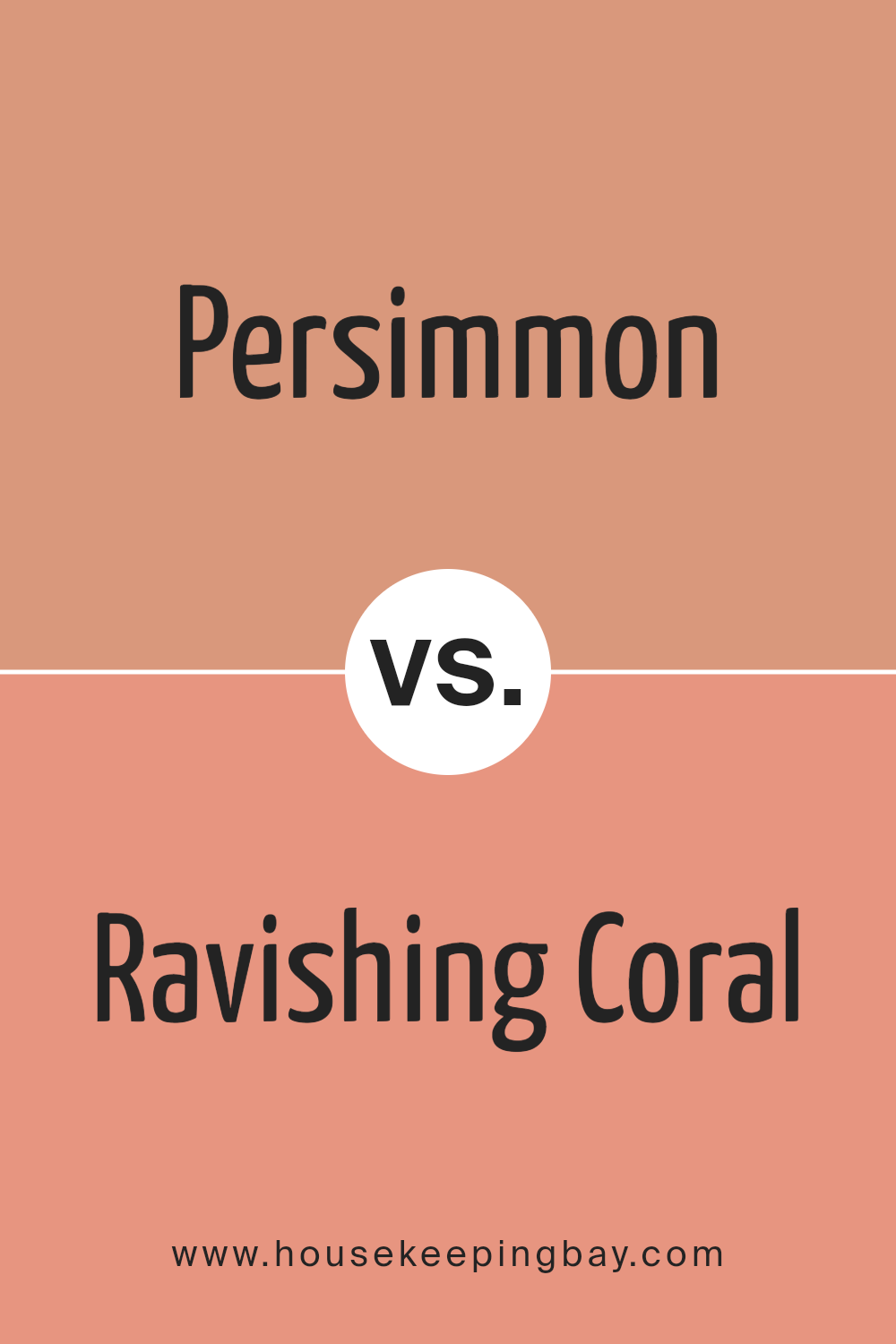
Persimmon SW 6339 by Sherwin Williams vs Ravishing Coral SW 6612 by Sherwin Williams
Persimmon SW 6339 and Ravishing Coral SW 6612, both by Sherwin Williams, are bright and lively colors. Persimmon has a deeper, rich orange hue that feels warm and cozy. It’s like the color of a ripe persimmon fruit, offering a strong pop of color that can make a space feel welcoming and energetic.
On the other hand, Ravishing Coral SW 6612 is lighter and leans more towards a pink-orange shade. It’s a soft, cheerful color that brings a playful and light atmosphere to a room. Think of the glow during a beautiful sunrise – that’s the vibe Ravinding Coral gives off.
Both colors are great for adding vibrancy to a space but in different ways. Persimmon packs a bold punch, suitable for a feature wall or to energize a room, whereas Ravishing Coral is perfect for creating a gentle, uplifting mood without overwhelming the space. Depending on what feel you’re going for, either color can brighten up a room beautifully.
You can see recommended paint color below:
- SW 6612 Ravishing Coral
housekeepingbay.com
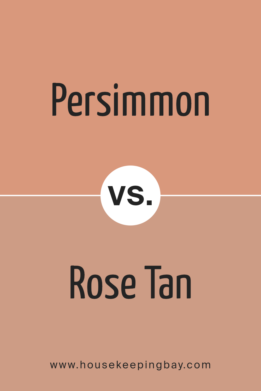
Persimmon SW 6339 by Sherwin Williams vs Rose Tan SW 0069 by Sherwin Williams
The Persimmon SW 6339 color by Sherwin Williams is a vibrant, warm shade that sort of reminds you of the orange fruit it’s named after. It’s got a lively feel to it, making any space pop with energy and brightness. Imagine the color of autumn leaves or a beautiful sunset; that’s Persimmon for you. It’s bold and can make a strong statement in any room.
On the other hand, Rose Tan SW 0069 is a softer, more subdued color. It leans towards a gentle pink with a hint of beige, giving it a very soothing and calm feel. It’s the kind of color you might choose for a relaxing space, where you want to feel at ease. Think of the softness of flower petals or a cozy morning glow; that’s the vibe of Rose Creek.
Both colors add their unique touch to a space, with Persimmon bringing a burst of energy and Rose Creek offering a peaceful and serene atmosphere. Whether you’re looking to brighten up a room or create a soft, inviting space, these colors do the job well in their own ways.
You can see recommended paint color below:
- SW 0069 Rose Tan
housekeepingbay.com
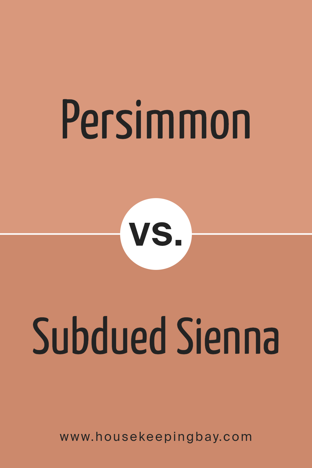
Persimmon SW 6339 by Sherwin Williams vs Subdued Sienna SW 9009 by Sherwin Williams
Persimmon SW 6339 and Subdued Sienna SW 9009 are two colors from Sherwin Williams that have their unique vibes. Persimmon is a vibrant, cheerful color. It’s like the bright orange of a ripe persimmon fruit. This color brings energy and warmth to any space, making it pop with brightness and liveliness. It’s perfect for adding a punch of color to a room that needs a cheerful touch.
On the other hand, Subdued Sienna SW 9009 has a more muted, earthy quality. It’s like looking at a softer, more muted shade of clay. Subdued Sienna has warmth, but in a more understated, relaxed way. It’s great for creating a cozy, welcoming feel in a room without overwhelming the space with too much brightness.
Both colors can make a room feel warm and inviting, but Persimmon does it with a bold, energetic burst of color, while Subdued Sienna achieves it with a calm, grounded presence. Whether you choose the lively Persimion or the comforting Subdued Sienna depends on the mood you want to set for your space.
You can see recommended paint color below:
- SW 9009 Subdued Sienna
housekeepingbay.com
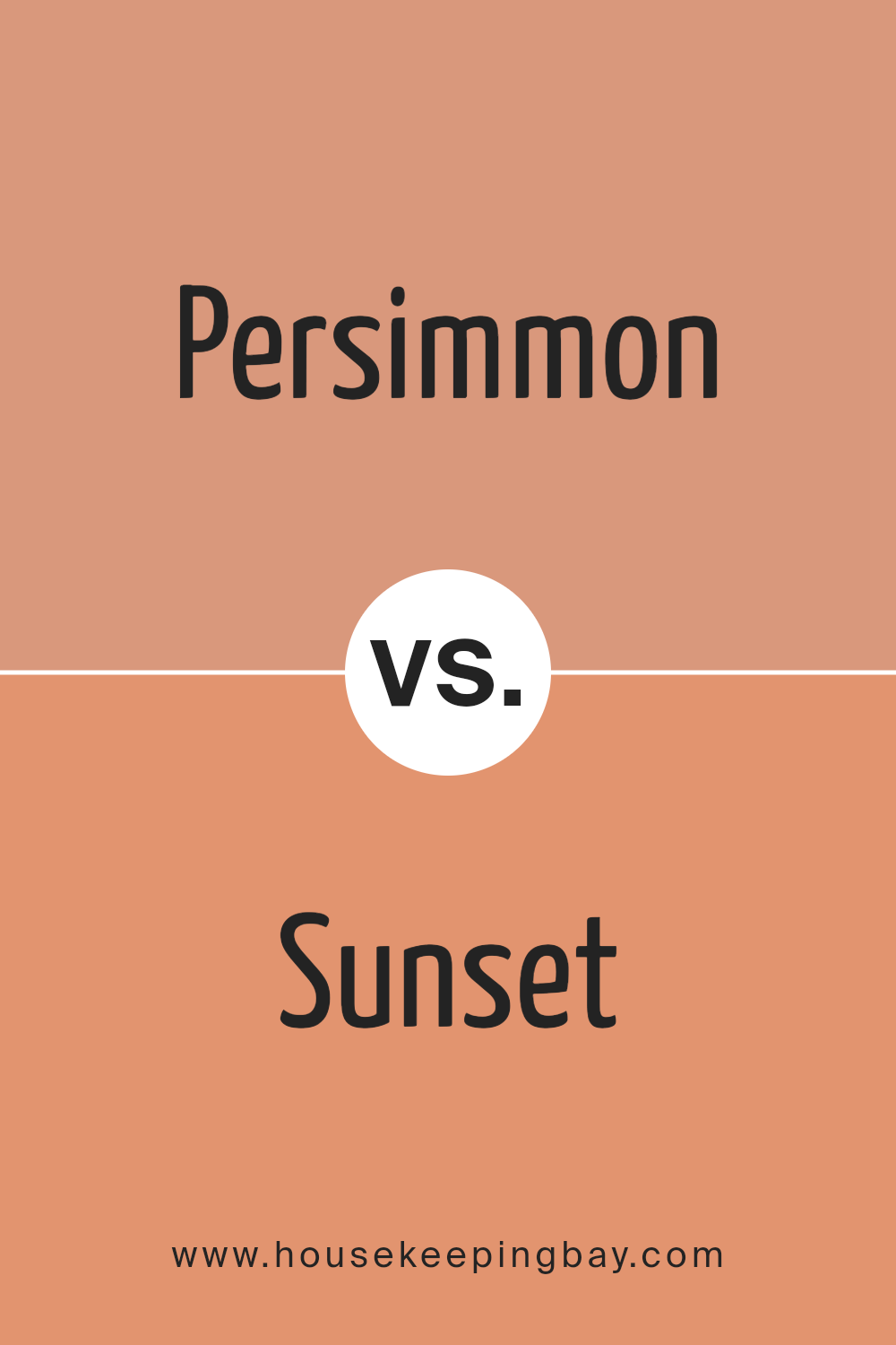
Persimmon SW 6339 by Sherwin Williams vs Sunset SW 6626 by Sherwin Williams
Persimmon SW 6339 and Sunset SW 6626 from Sherwin Williams are two colors that add warmth and vibrancy to any space. Persimmon is like a bright, cheerful orange with a hint of red, making it stand out and bring a cozy, inviting feel to rooms. It’s like the color of a ripe persimmon fruit, hence the name, and it’s great for creating a bold, playful accent wall or adding a pop of color through décor.
On the other hand, Sunset SW 6626 leans more towards a deep, rich red with an orange undertone. It reminds you of the sky when the sun is just about to set, with its stunning blend of reds and oranges. This color is perfect for those looking to add a dramatic flair to their space, offering a strong and energizing vibe.
While both colors are warm and lively, Persimmon is lighter and leans more towards orange, offering a more playful and inviting atmosphere. Sunset, with its deeper red-orange hue, provides a sense of drama and intensity. Depending on the mood you want to set and the space you’re decorating, either color could be the right choice.
You can see recommended paint color below:
- SW 6626 Sunset
housekeepingbay.com
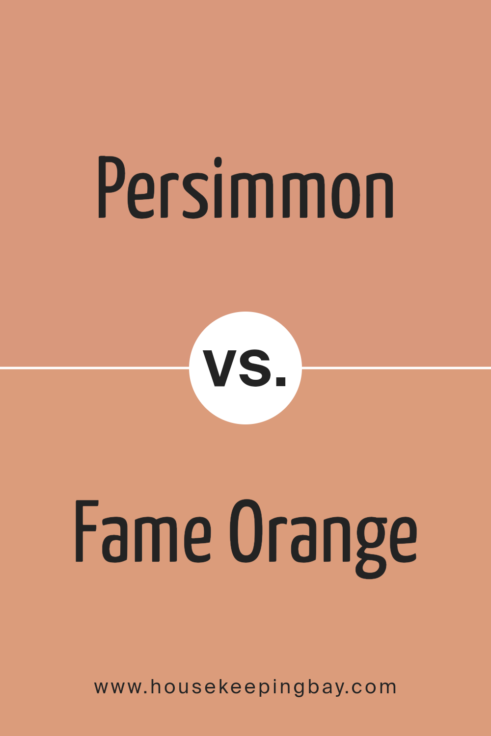
Persimmon SW 6339 by Sherwin Williams vs Fame Orange SW 6346 by Sherwin Williams
Persimmon SW 6339 by Sherwin Williams and Fame Orange SW 6346 by Sherwin Williams are two vibrant colors that definitely catch the eye. Persimmon is a unique shade that blends the warmth of orange with red’s depth. It’s a lively color that can add a cozy, welcoming vibe to any space. It’s like the color of a ripe persimmon fruit, which makes it stand out and feel inviting.
On the other hand, Fame Orange SW 6346 is also an energetic color, but it leans more towards a classic orange. It’s bright and cheerful, bringing a sense of playfulness and fun to a room. Fame Orange can make a bold statement and is perfect for areas where you want to add a punch of vibrant color.
Both colors are similar because they’re both from the orange family, but they offer distinctly different vibes because of their unique undertones. Persimmon has a softer, more muted feel due to its blend with red, while Fame Orange is all about boldness and brightness, perfect for creating an engaging atmosphere. Whether you’re aiming for a cozy warmth or a lively splash, choosing between these two depends on the atmosphere you want to create.
You can see recommended paint color below:
- SW 6346 Fame Orange
housekeepingbay.com
Persimmon SW 6339 by Sherwin Williams vs Chivalry Copper SW 6353 by Sherwin Williams
Persimmon SW 6339 by Sherwin Williams is a vibrant, orangey-red color that stands out with its lively hue. It’s a bold choice that can add warmth and energy to any space. This color is great for creating a focal point in a room or adding a pop of color to liven up the atmosphere.
On the other hand, Chivalry Copper SW 6353 by Sherwin Williams has a deeper, burnt orange tone that feels both rich and cozy. It’s a bit more subdued than Persimmon, making it ideal for those looking for a color that’s both warm and inviting without being too loud. Chivalry Copper works well in spaces where you want to add a sense of sophistication and comfort.
While both colors are warm and have orange tones, Persimmon is brighter and more eye-catching, whereas Chivalry Copper offers a more grounded and refined ambiance. Choosing between them depends on the mood you’re aiming to create in your space, with Persimmon being the go-to for a more vibrant feel and Chivalry Copper for a cozier, understated elegance.
You can see recommended paint color below:
- SW 6353 Chivalry Copper
housekeepingbay.com
Persimmon SW 6339 by Sherwin Williams vs Rosettee SW 7581 by Sherwin Williams
Persimmon SW 6339 by Sherwin Williams and Rosettee SW 7581 are two warm colors that each bring their unique vibe to a space. Persimmon stands out with its orange-red hue, making it a bold and lively choice for walls or accents. It’s the kind of color that can add energy and a playful touch to any room, perfect for creating a vibrant atmosphere.
On the other hand, Rosettee offers a calmer, more understated elegance with its pinkish-red tone. It’s softer and more subtle than Persimmon, making it a great option for spaces where you want a touch of warmth without overwhelming the senses. Rosettee works well in bedrooms or living areas where a gentle, soothing presence is desired.
Both colors are warm and inviting but serve different moods and settings. Persimmon brings a dynamic burst of energy, while Rosettee provides a delicate, comforting ambiance.
You can see recommended paint color below:
- SW 7581 Rosettee
housekeepingbay.com
Persimmon SW 6339 by Sherwin Williams vs Mellow Mauve SW 0039 by Sherwin Williams
Persimmon SW 6339 by Sherwin Williams is a vibrant, warm color that falls somewhere between red and orange. It’s a lively hue that brings energy and brightness to a space, making it feel both inviting and cozy. This color is perfect for someone looking to add a pop of color to their room, as it can easily become the focal point of any area.
On the other hand, Mellow Mauve SW 0039 by Sherwin Williams is a softer, more understated color. It’s a gentle blend of pink and purple, creating a serene and soothing atmosphere. This color is great for spaces where relaxation and calmness are desired, like bedrooms or living areas. Its subtle elegance provides a versatile backdrop that can complement various styles and accessories.
While Persimmon exudes warmth and energy, Mellow Mauve offers a feeling of calmness and sophistication. Both colors have their unique charm and can dramatically change the mood of a room, depending on what you’re aiming for.
You can see recommended paint color below:
- SW 0039 Mellow Mauve
housekeepingbay.com
Persimmon SW 6339 by Sherwin Williams vs Sockeye SW 6619 by Sherwin Williams
Persimmon SW 6339 and Sockeye SW 6619 are two colors offered by Sherwin Williams, each bringing its unique vibe to spaces. Persimmon is like a warm, soft hug in color form. It has a cozy orange glow that feels welcoming and comforting. Think of the gentle light of early morning or the calming shades of autumn leaves. It’s not too bright, sitting perfectly in a space where you want warmth without overwhelming brightness.
On the other hand, Sockeye SW 6619, steps things up a notch. It’s a bolder, more vibrant shade, leaning closer to a fiery red than an orange. Sockeye reminds you of the bold colors of sunset or the rich tones found in some flowers. It’s a color that stands out, making a statement in any room it’s used in.
While Persimmon offers a softer, more muted presence, Sockeye demands attention, bringing energy and dynamism. Both colors can create beautiful, inviting spaces, but they cater to different moods and aesthetics. Persimmon works well in areas for relaxation, whereas Sockeye is better suited for spaces that aim to stimulate and energize.
You can see recommended paint color below:
- SW 6619 Sockeye
housekeepingbay.com
Conclusion
The Persimmon SW 6339 by Sherwin Williams stands out as a vibrant, statement-making color. Its warm, inviting tones can bring a sense of cheerfulness and energy to any space. Well-suited for accent walls, accessories, or even door colors, Persimmon adds a playful yet sophisticated touch to interiors. Whether you’re looking to spice up a kitchen or add coziness to a living room, this color can effectively transform the mood and aesthetic of a room.
Adopting this bold hue requires some thoughtful consideration in pairing with other colors and elements within a space. However, the payoff is a visually stimulating environment that can stimulate creativity and warmth. Persimmon works exceptionally well with neutral shades, providing a beautiful contrast that highlights its richness without overwhelming the senses. Incorporating this color shows a willingness to experiment and a desire to create spaces that are both unique and welcoming.
housekeepingbay.com
Ever wished paint sampling was as easy as sticking a sticker? Guess what? Now it is! Discover Samplize's unique Peel & Stick samples. Get started now and say goodbye to the old messy way!
Get paint samples


