Worn Khaki SW 9527 Paint Color by Sherwin-Williams
A deep dive into the color’s specifics
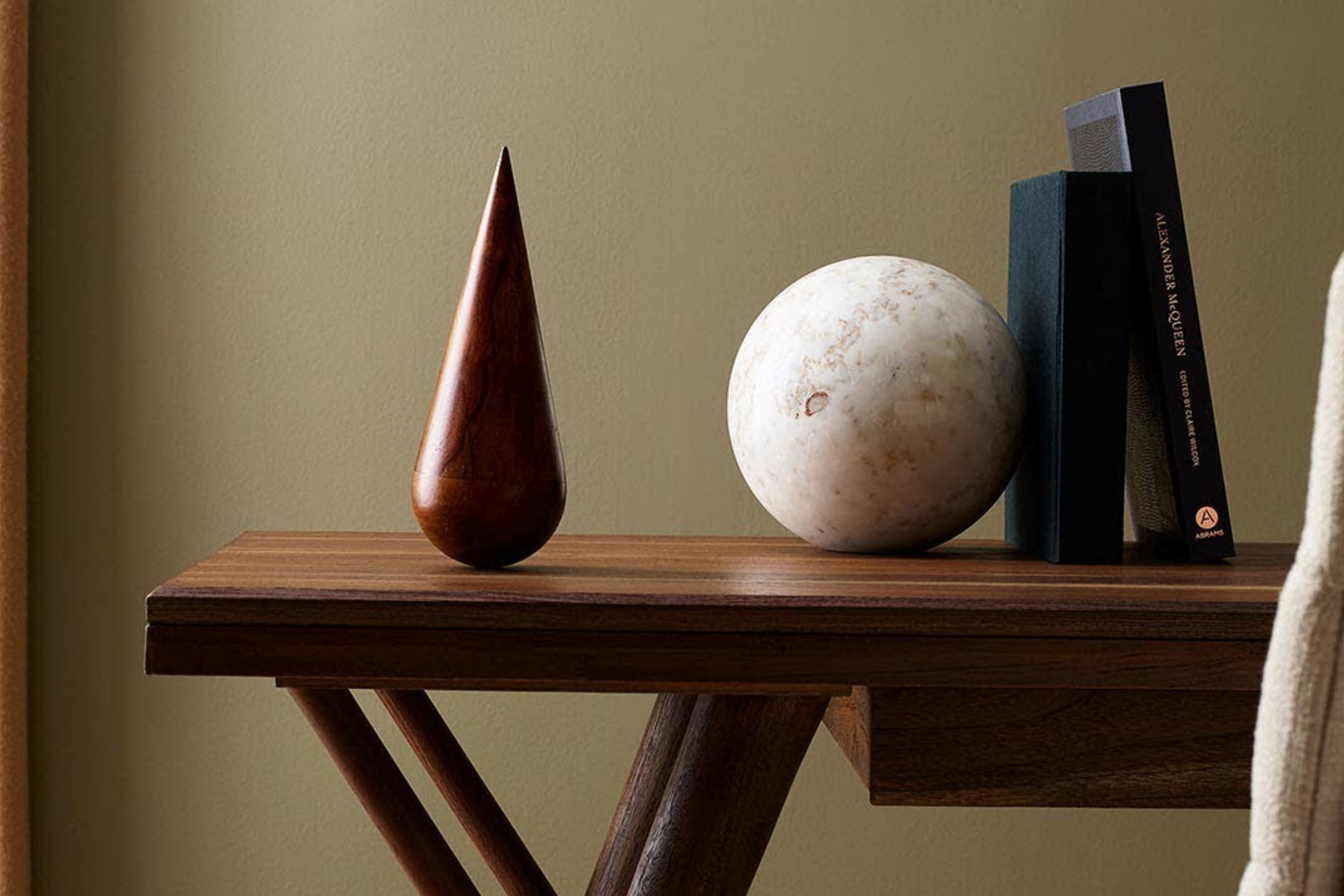
The world of color is an ever-evolving realm that frequently sees shifts in trends, aesthetics, and applications. One such color that has been generating buzz in interior design circles is SW 9527 Worn Khaki by Sherwin-Williams.
Let’s delve into the nuances, characteristics, and applications of this unique shade.
via sherwin-williams.com
What Color Is SW 9527 Worn Khaki?
Table of Contents
SW 9527 Worn Khaki can best be described as a muted, earthy beige with a gentle hint of olive green. This shade channels the imagery of a khaki garment worn over time, showcasing an effortless blend of neutrality and warmth. Worn Khaki is versatile and finds its strength in various interior styles, from modern minimalism to rustic farmhouses.
It pairs beautifully with natural materials like wood, stone, and linen, evoking an earthy ambiance that’s both calming and grounding.
housekeepingbay.com
Is It a Warm Or Cool Color?
SW 9527 Worn Khaki leans towards the warmer side of the spectrum, but its muted tone lends it a slightly neutral demeanor. This warmth allows it to introduce a cozy and inviting feel to homes, especially in living areas and bedrooms. The underlying warmth ensures that spaces don’t feel stark or cold, particularly in minimalistic or contemporary settings.
Undertones of SW 9527 Worn Khaki
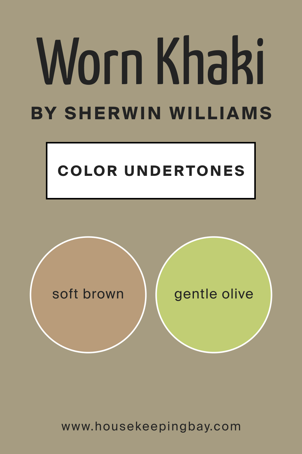
Every color possesses undertones that subtly influence its appearance. For Worn Khaki, the undertones are a gentle olive and soft brown. These undertones influence how the color manifests, especially when placed against other shades or under different lighting conditions.
On interior walls, these undertones can make the color appear slightly greener or browner, depending on surrounding elements and lighting.
housekeepingbay.com
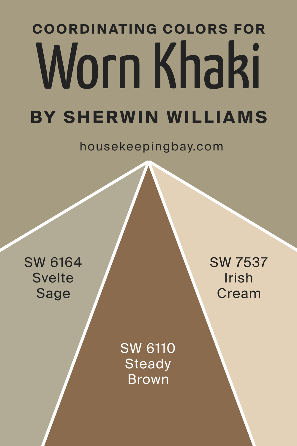
Coordinating Colors of SW 9527 Worn Khaki
Coordinating colors are hues that harmoniously complement a primary color. For SW Worn Khaki, coordinating colors include muted olive greens, soft browns, and subtle beiges. Some examples are:
- Muted Olive (SW 6164 Svelte Sage ): A subdued green that emphasizes the olive undertones of Worn Khaki.
- Soft Bark (SW 6110 Steady Brown ): A gentle brown that highlights the earthy warmth of this color.
- Delicate Beige (SW 7537 Irish Cream ): A light beige that contrasts and lifts the depth of Worn Khaki.
housekeepingbay.com
How Does Lighting Affect SW 9527 Worn Khaki?
Lighting plays a pivotal role in how we perceive color. In natural light, Worn Khaki can appear brighter and more prominent, with its olive undertones becoming more apparent. Under artificial lighting, especially yellow-toned lights, it might lean more toward its brown undertones. As for room orientation:
- North-faced rooms: The color might seem cooler and more muted.
- South-faced rooms: Worn Khaki will likely appear warmer and brighter.
- East-faced rooms: Morning light can bring out its earthy tones.
- West-faced rooms: Evening light can make the color feel cozier and more muted.
housekeepingbay.com
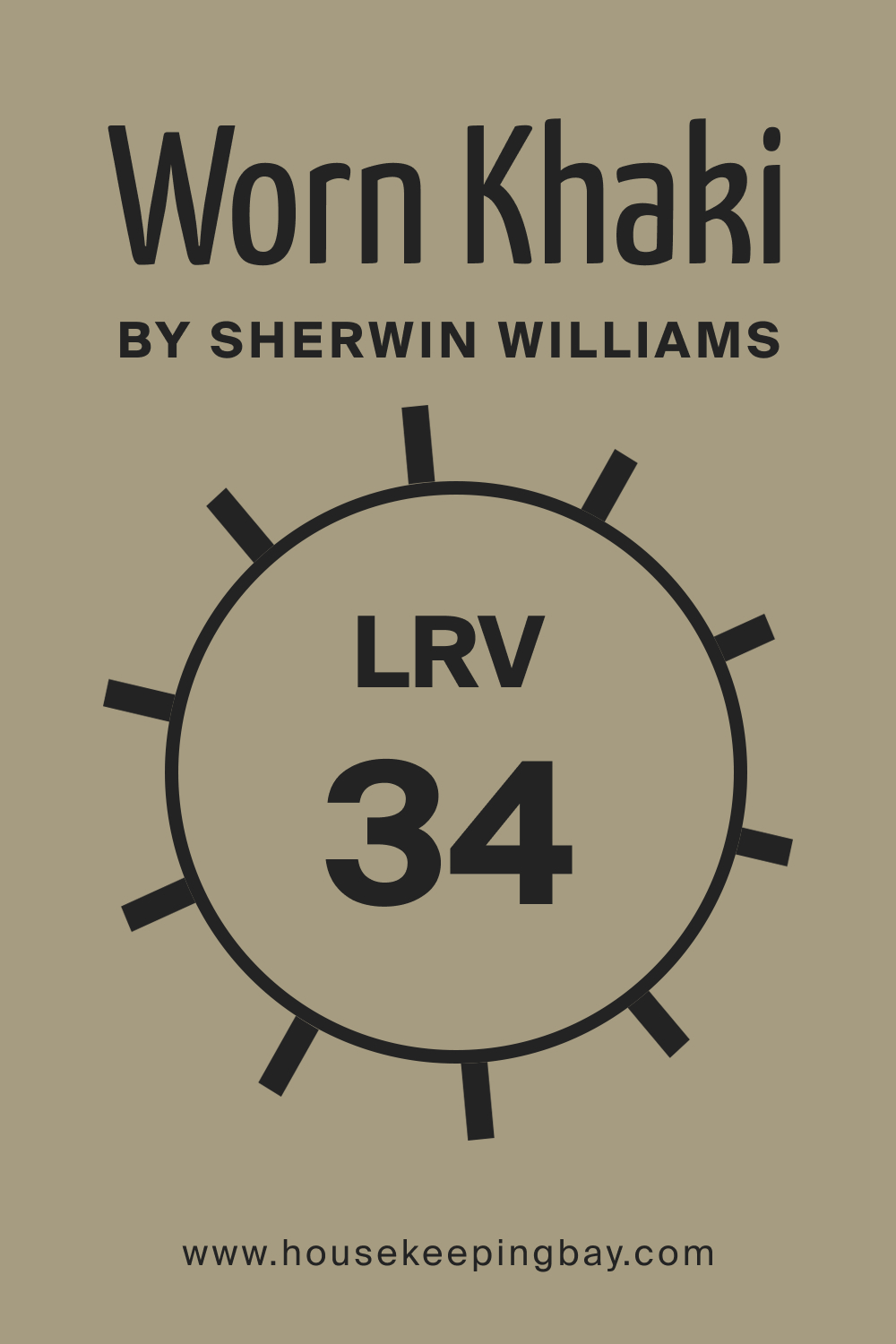
LRV of SW 9527 Worn Khaki
Light Reflectance Value (LRV) indicates how light or dark a color appears by measuring the amount of light a color reflects. With an LRV of 34, Worn Khaki is in the mid-range, reflecting a decent amount of light without being too bright. This means it can add depth to a space without making it feel closed in.
housekeepingbay.com
What is LRV? Read It Before You Choose Your Ideal Paint Color
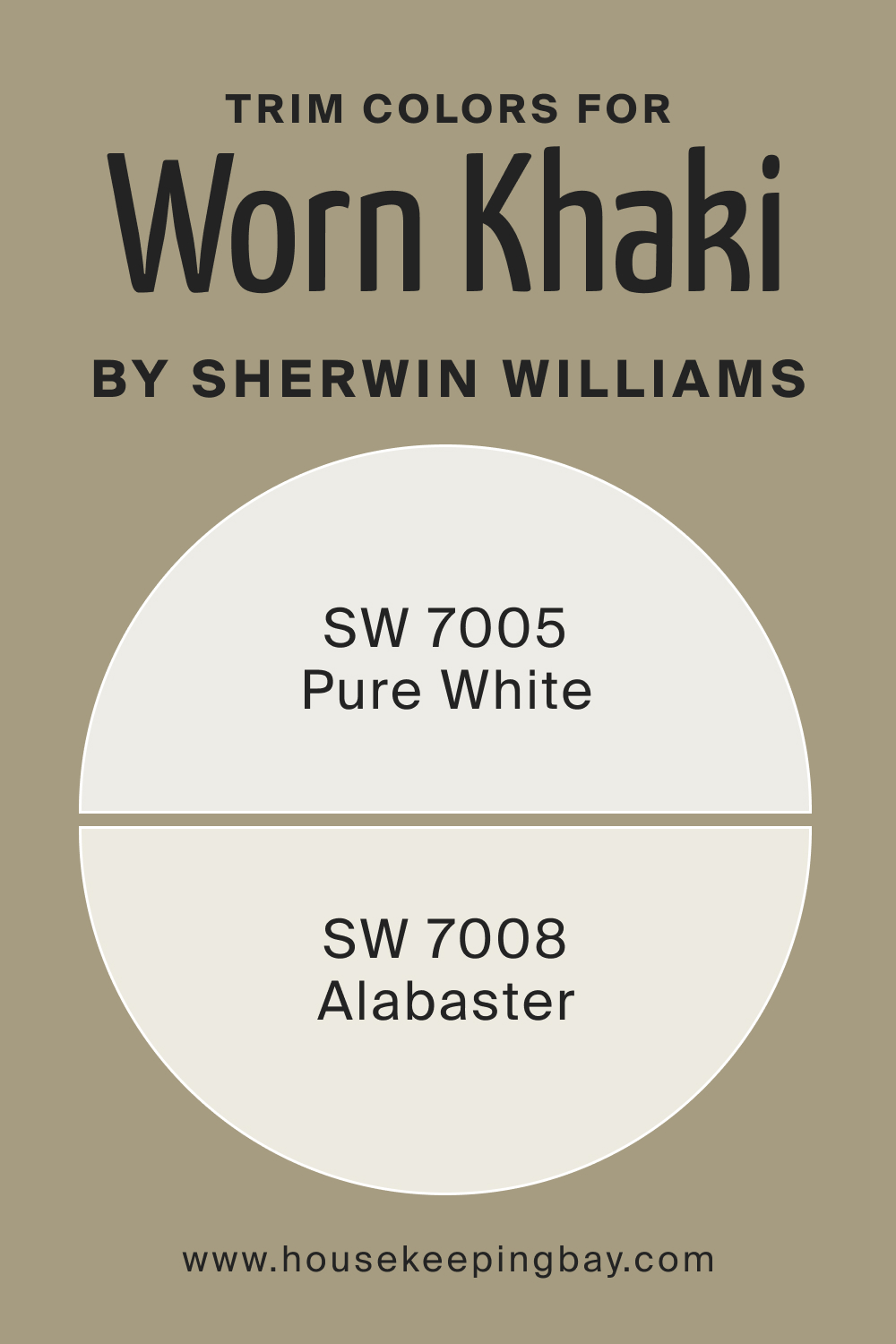
Trim Colors of SW 9527 Worn Khaki
Trim colors accentuate and frame walls. For Worn Khaki, shades of white from Sherwin-Williams, like SW 7005 Pure White and SW 7008 Alabaster, can offer a crisp contrast, highlighting its earthy tones.
housekeepingbay.com
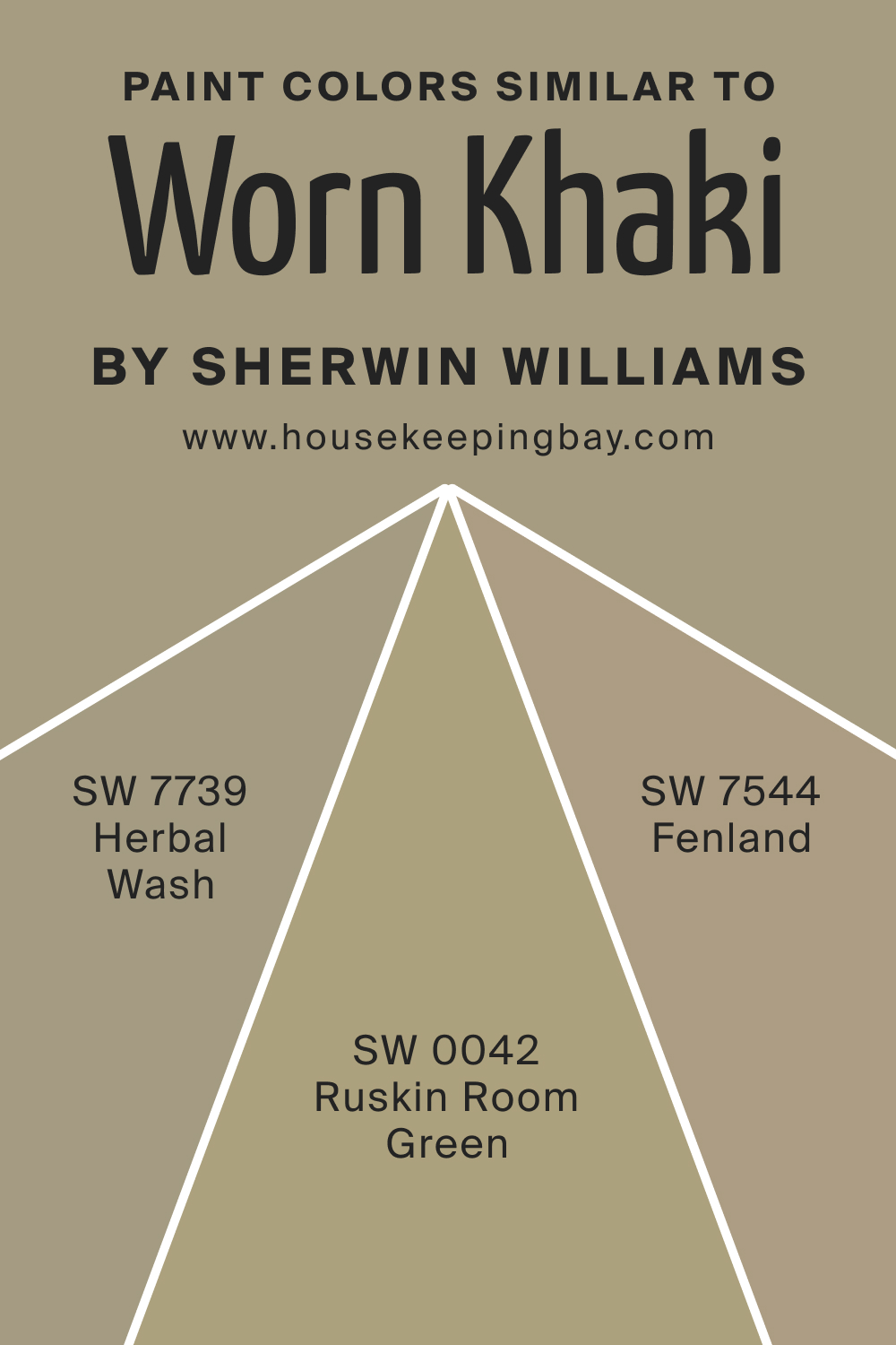
Colors Similar to SW 9527 Worn Khaki
Knowing similar colors aids in broadening design choices. For SW Worn Khaki, we recommend the following color alternatives that read nearly the same:
- SW 7739 Herbal Wash leans towards green
- SW 7544 Fenland is a muted beige with a hint of green
- SW 0042 Ruskin Room Green is a deeper green with brown undertones.
housekeepingbay.com
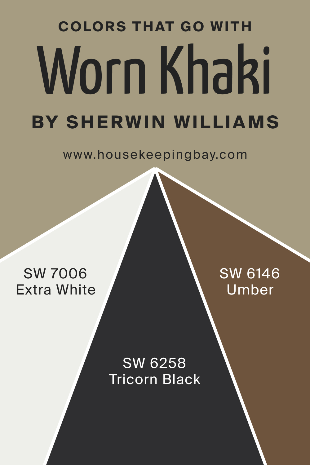
Colors That Go With SW 9527 Worn Khaki
Complementary colors enhance the primary color’s beauty. SW Worn Khaki pairs elegantly with the following paint colors:
- SW 7006 Extra White (a crisp white)
- SW 6258 Tricorn Black (a deep black)
- SW 6146 Umber (a rich brown) .
These hues beautifully harmonize with SW Worn Khaki, creating balanced and cohesive interior palettes.
housekeepingbay.com
How to Use SW 9527 Worn Khaki In Your Home?
SW 9527 Worn Khaki is a versatile shade that can gracefully adorn any room in your home. From the calming vibes of bedrooms to the welcoming feel in living areas, its earthy tone exudes a relaxed ambiance. It’s perfect for contemporary, rustic, Scandinavian, and even boho-chic interiors. The subdued nature of Worn Khaki also allows it to be a neutral backdrop for bolder furnishings or art pieces.
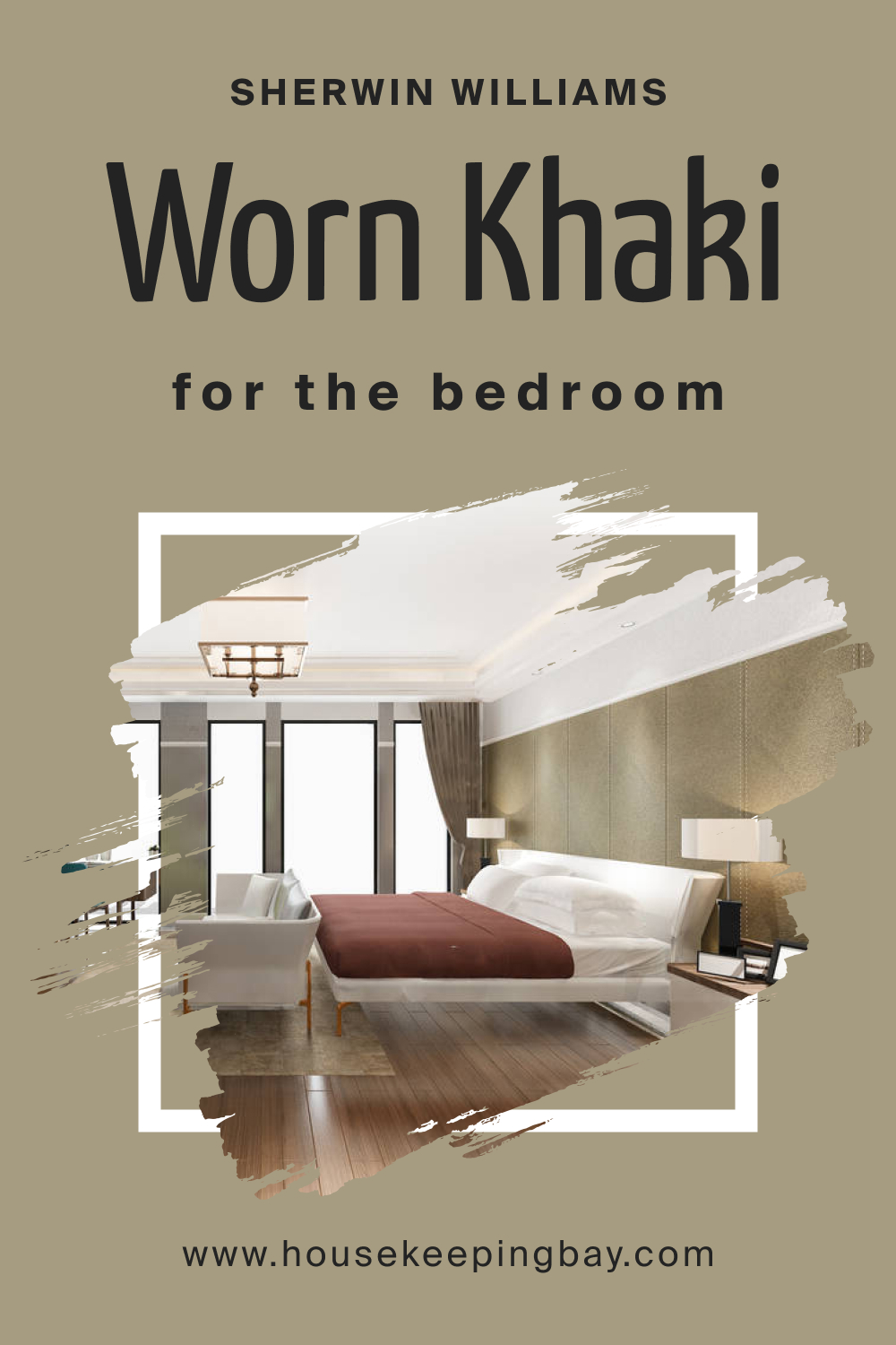
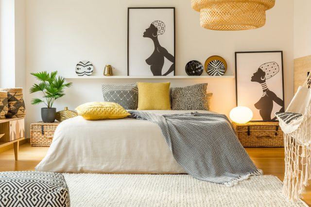
How to Use SW 9527 Worn Khaki in the Bedroom?
In bedrooms, Worn Khaki introduces a serene and calming atmosphere, ideal for rest and relaxation. Its muted olive-brown undertones subtly infuse the room with warmth. Paired with soft linens, wooden furnishings, and gentle lighting, it transforms bedrooms into peaceful retreats.
housekeepingbay.com
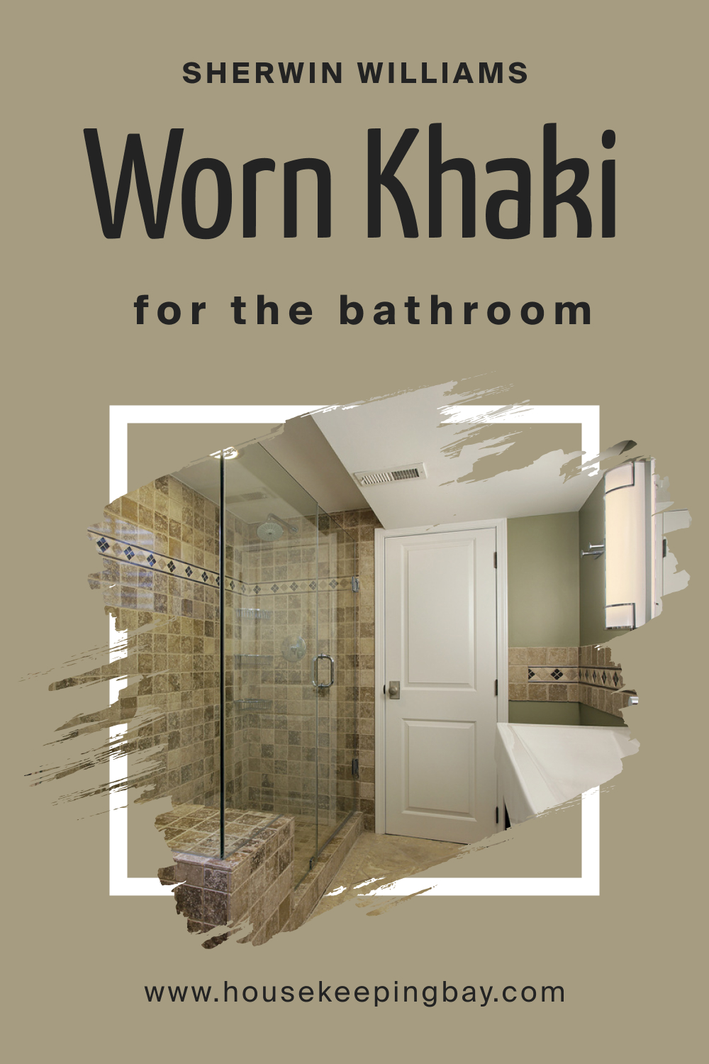
How to Use SW 9527 Worn Khaki in the Bathroom?
Bathrooms can benefit from the earthy warmth of Worn Khaki. Its subtle greenish undertone can bring a touch of nature into this personal space. Complemented with white fixtures, natural stone, and plants, the shade evokes a spa-like feel, turning daily rituals into therapeutic experiences.
housekeepingbay.com
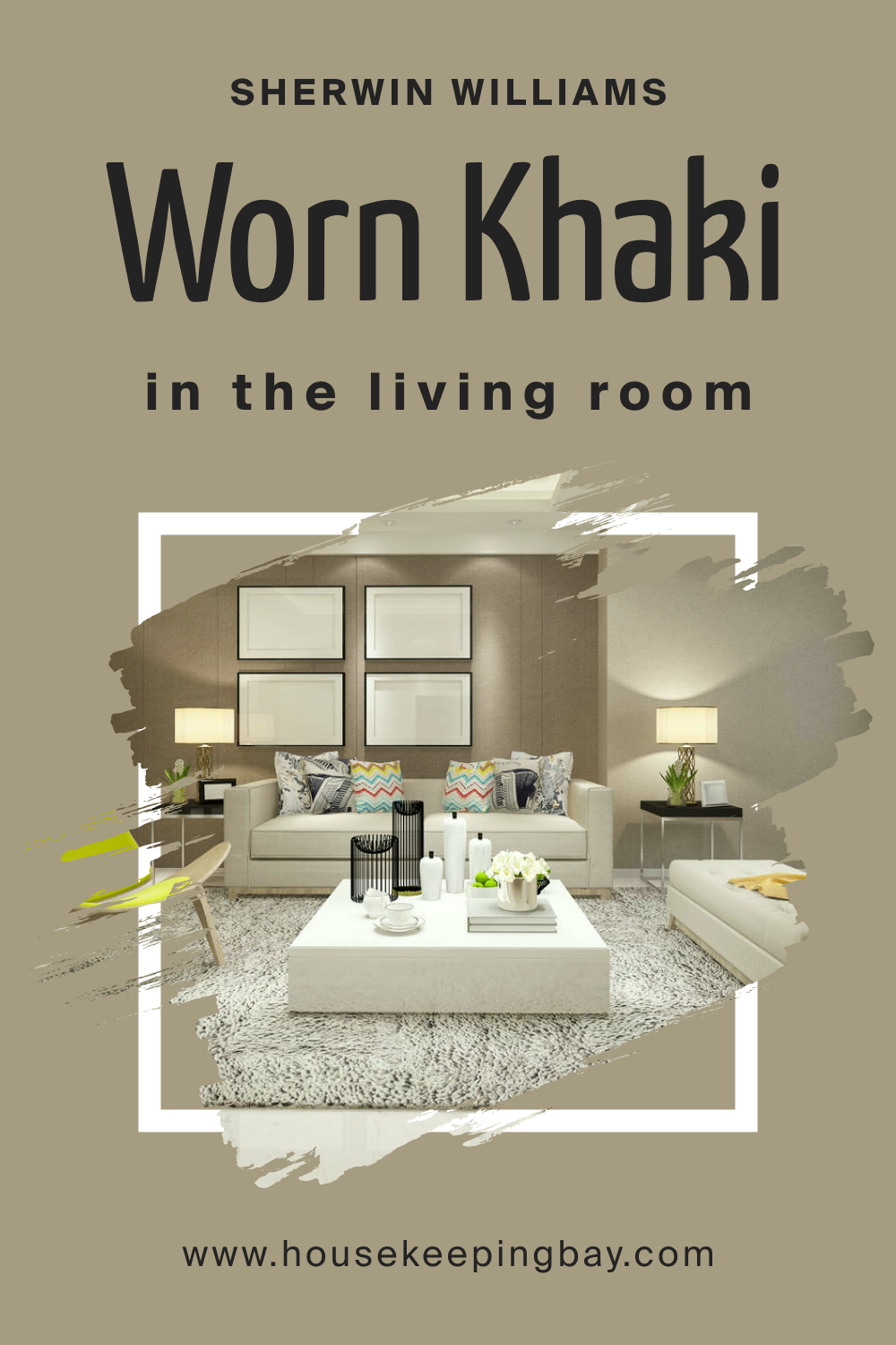
How to Use SW 9527 Worn Khaki in the Living Room?
In living areas, Worn Khaki serves as a perfect neutral canvas. Its warm tones embrace and uplift the space, ensuring a cozy gathering spot for family and friends. Pair it with textured rugs, soft throws, and vibrant art pieces to create a well-balanced, inviting ambiance.
housekeepingbay.com
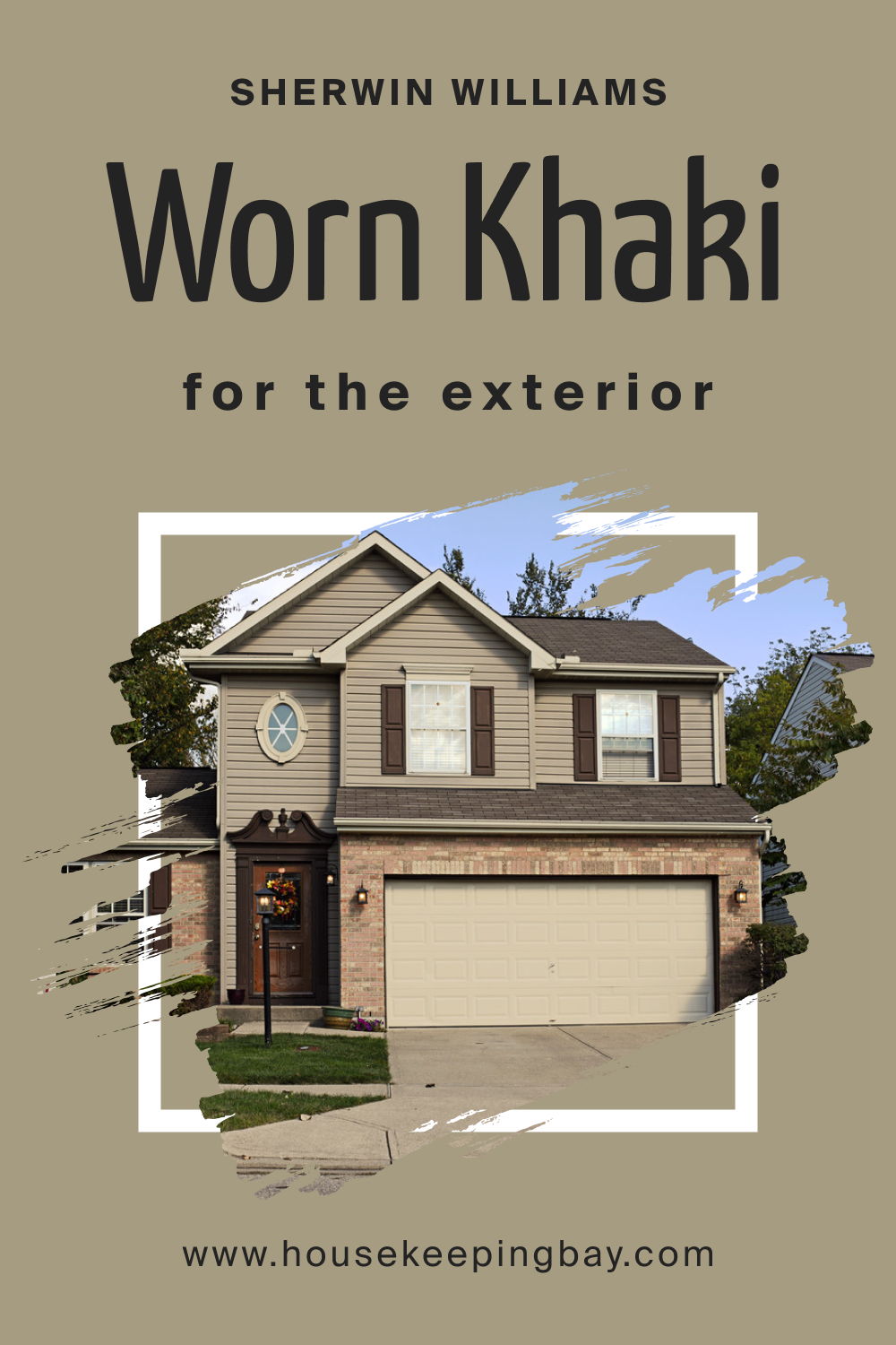
How to Use SW 9527 Worn Khaki for an Exterior?
SW Worn Khaki is also apt for exteriors, adding an earthy elegance to homes. It complements natural landscaping, wooden patios, or stone pathways. When used alongside crisp white trims or deep-toned accents, it gives homes a timeless appeal, harmonizing beautifully with nature’s elements.
housekeepingbay.com
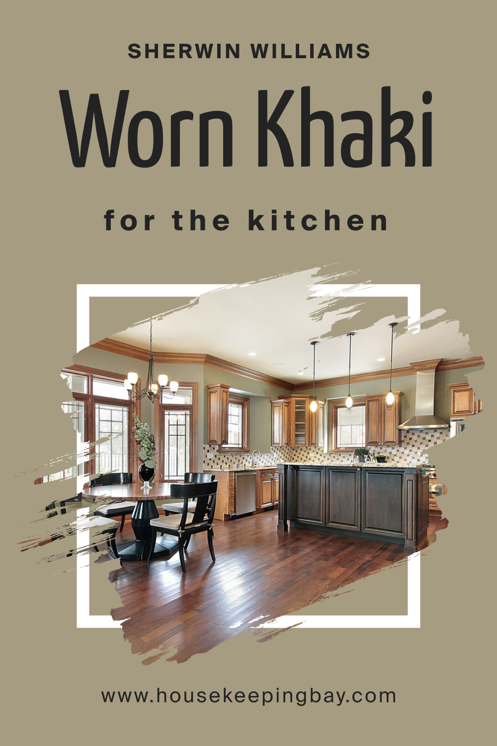
How to Use SW 9527 Worn Khaki in the Kitchen?
In kitchens, Worn Khaki introduces an earthy, grounded vibe. It pairs well with wooden countertops, stainless steel appliances, and tiled backsplashes. The shade can instantly warm up the culinary space, making it both stylish and functional. Add some plants or herbs on the window sill to accentuate its nature-inspired undertones.
housekeepingbay.com
How to Use SW 9527 Worn Khaki for the Kitchen Cabinets?
SW Worn Khaki is a delightful choice for kitchen cabinets. Its muted tone provides a refreshing departure from the traditional whites or woods. When used on cabinetry, it brings a sophisticated yet rustic feel. Complement with brass or matte black hardware for a refined finish, and watch your kitchen transform into a culinary masterpiece.

housekeepingbay.com
Comparing SW 9527 Worn Khaki With Other Colors
Color comparison is vital because each shade creates distinct moods, atmospheres, and effects. By contrasting colors, one can discern undertones, warmth, depth, and versatility better. This understanding aids in making informed decisions when choosing palettes for home interiors, ensuring harmonious and aesthetically pleasing outcomes. Comparing SW 9527 Worn Khaki with other colors offers a comprehensive understanding of its utility and effect.
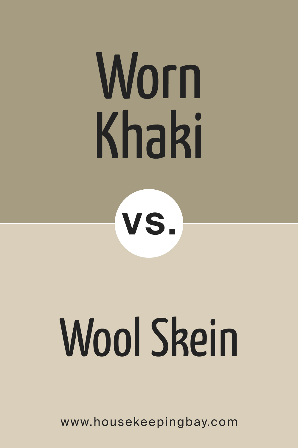
SW 9527 Worn Khaki vs. SW 6148 Wool Skein
SW Wool Skein is a neutral beige with warm undertones. While both colors are grounded, Worn Khaki leans more towards an earthy green, and Wool Skein has a more traditional beige outlook. Wool Skein might feel slightly more sunlit, while Worn Khaki exudes a mature, muted ambiance.
housekeepingbay.com
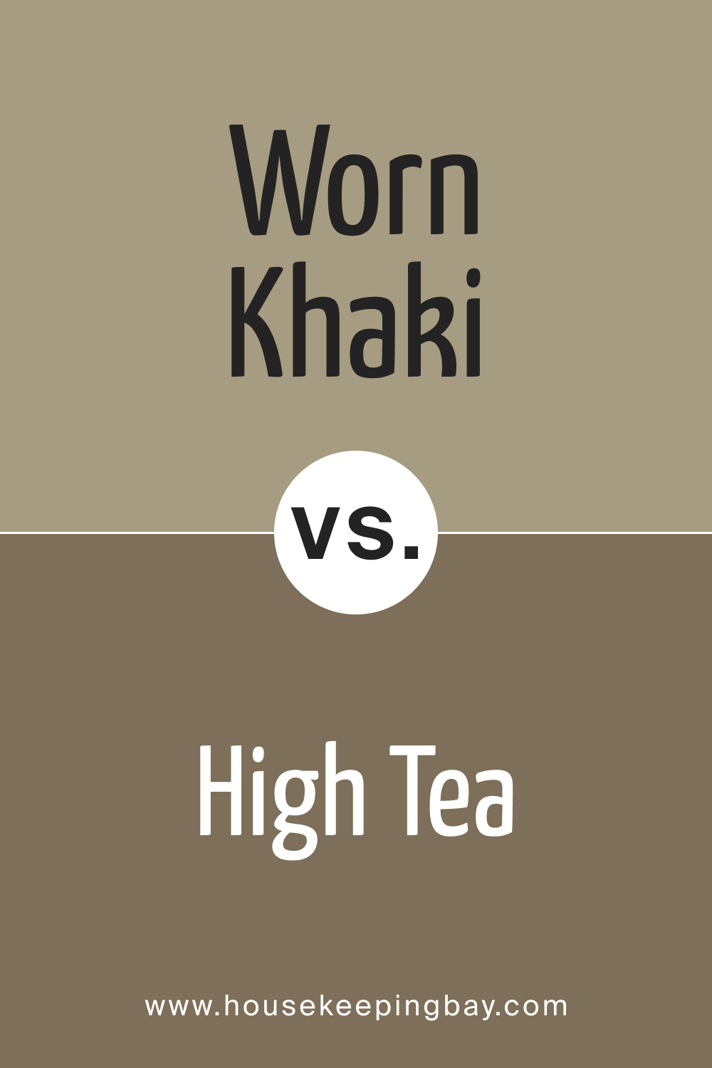
SW 9527 Worn Khaki vs. SW 6159 High Tea
SW High Tea is a muted, mid-tone green with earthy undertones. Compared to Worn Khaki, it’s noticeably greener but maintains the same subdued and warm feel. High Tea brings a more nature-inspired vibe, while Worn Khaki remains neutral with a hint of green.
housekeepingbay.com
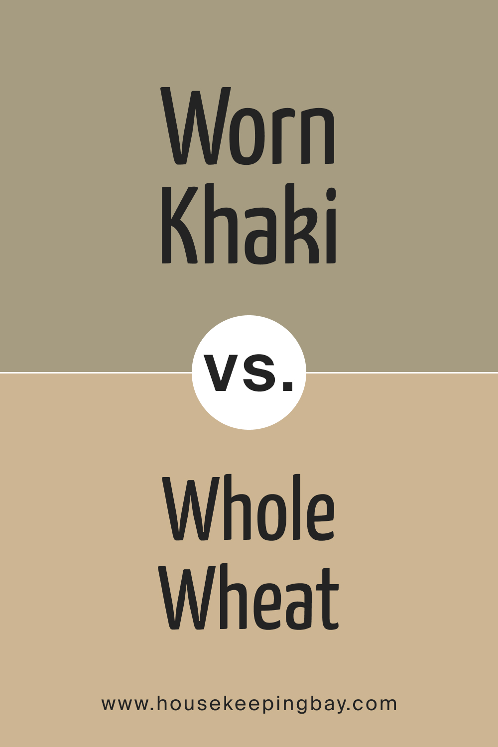
SW 9527 Worn Khaki vs. SW 6121 Whole Wheat
SW Whole Wheat is a warm , sandy beige, leaning towards a golden hue. While Worn Khaki and Whole Wheat both radiate warmth, Whole Wheat leans more towards the sunnier side, whereas Worn Khaki embraces an earthy, olive essence.
housekeepingbay.com
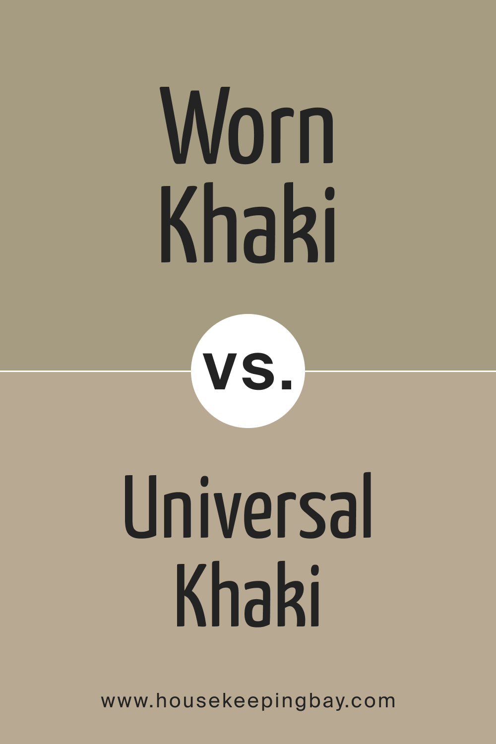
SW 9527 Worn Khaki vs. SW 6150 Universal Khaki
SW Universal Khaki , true to its name, is a definitive khaki shade with a balanced blend of green and beige. Worn Khaki, on the other hand, is more muted and leans slightly more towards beige. Both exude a natural feel, but Universal Khaki is more classic.
housekeepingbay.com
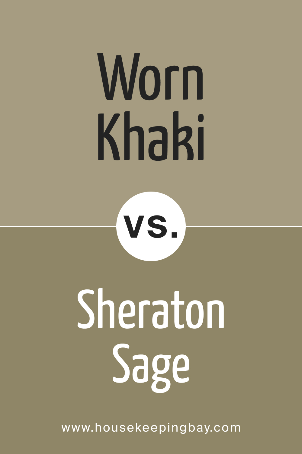
SW 9527 Worn Khaki vs. SW 0014 Sheraton Sage
SW Sheraton Sage is a soft, gray-green shade. When placed beside Worn Khaki, Sheraton Sage brings out more pronounced gray undertones, making it cooler. Worn Khaki feels warmer and earthier in comparison.
housekeepingbay.com
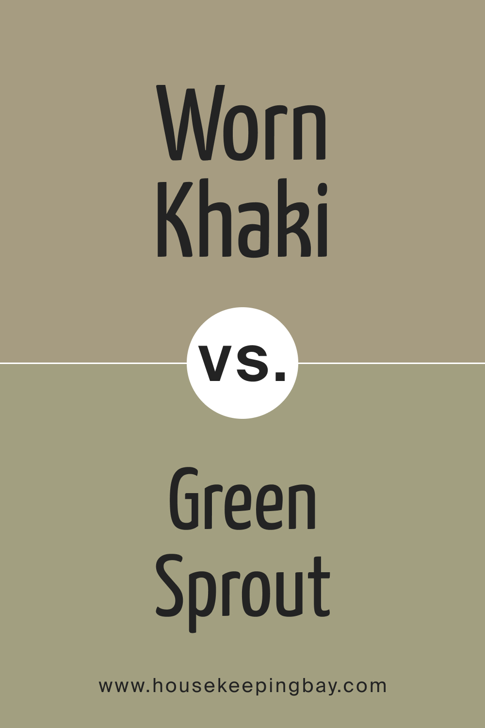
SW 9527 Worn Khaki vs. SW 7728 Green Sprout
SW Green Sprout is a lively, fresh green, contrasting significantly with the subdued nature of Worn Khaki. While Worn Khaki evokes feelings of vintage and nostalgia, Green Sprout infuses spaces with vitality and vibrancy.
housekeepingbay.com
Conclusion
The SW 9527 Worn Khaki is more than just a color – it’s a nuanced blend of earthy tones that captures the timeless essence of nature and tranquility. Its versatility makes it a cherished choice for homeowners and designers alike, seamlessly fitting into diverse design themes.
When chosen thoughtfully alongside complementing or contrasting shades, Worn Khaki can truly transform spaces, making them warm, inviting, and everlastingly stylish.
housekeepingbay.com
Ever wished paint sampling was as easy as sticking a sticker? Guess what? Now it is! Discover Samplize's unique Peel & Stick samples. Get started now and say goodbye to the old messy way!
Get paint samples


Frequently Asked Questions
⭐What design styles does SW 9527 Worn Khaki best suit?
Worn Khaki is versatile and fits well with contemporary, rustic, Scandinavian, and even boho-chic interiors.
⭐Is Worn Khaki considered a neutral shade?
Yes, Worn Khaki is a neutral with earthy green undertones, making it a subtle yet distinct choice for various spaces.
⭐Which rooms in the home are best suited for Worn Khaki?
From living rooms and bedrooms to kitchens and exteriors, Worn Khaki's versatility allows it to be used throughout the home.
⭐What are some recommended coordinating colors for Worn Khaki?
Colors such as SW 7006 Extra White, SW 6258 Tricorn Black, and SW 6146 Umber complement Worn Khaki beautifully.
⭐Does lighting play a significant role in how Worn Khaki looks?
Absolutely! The way Worn Khaki appears can change based on lighting conditions – from natural sunlight to artificial illumination.
4 thoughts on “Worn Khaki SW 9527 Paint Color by Sherwin-Williams”
Leave a Reply


How does this shade look in smaller spaces?
Worn Khaki can work beautifully in smaller spaces, especially when complemented with lighter colors and good lighting. It can make the area feel cozy yet expansive.
Has anyone paired Worn Khaki with brighter, more vivid colors?
Absolutely! While Worn Khaki is muted and earthy, it can serve as a calming backdrop for bolder, more vibrant shades. This allows for pops of color without overwhelming the space.