20 + Ideas Of Autumn Color Palette
Discover beautiful earthy colors that will add an autumn vibe to your home
If you are tired of the existing interior color palette in your home and would like to refresh it a bit for the upcoming autumn months, you might face the challenge of choosing the suitable colors to meet your requirement.
In this article, we will share twenty awesome color palettes with you. Each of them contains beautiful colors that resemble the natural colors of the fall. This way, you will be able to add a thoughtful and warm vibe of autumn days to your home.
And since we will offer many different color palettes, you will have a chance to choose the one that will fit your interior best of all!
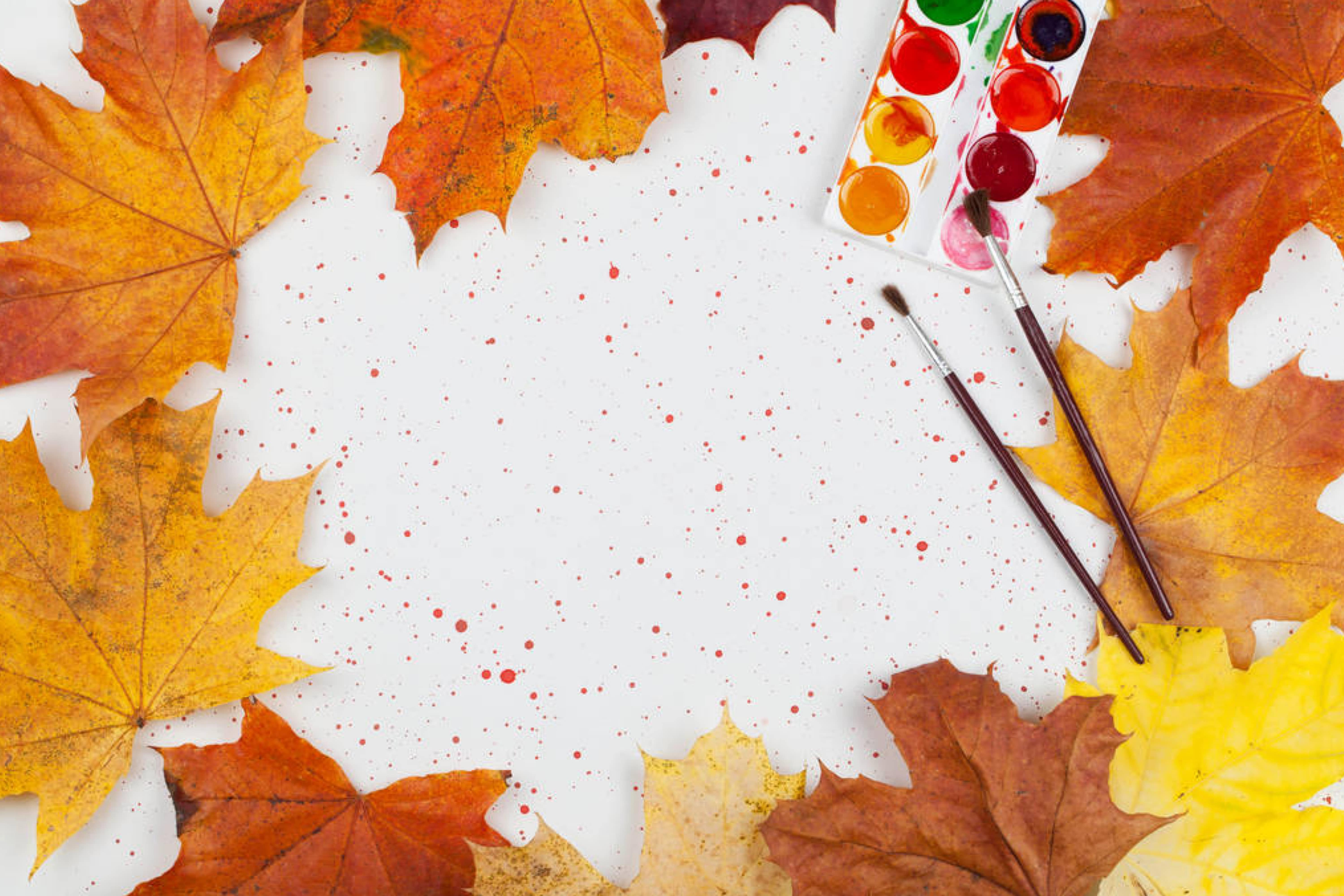
daniilphoto via VistaCreate
20 Autumn Color Combinations to Brighten Up Your Space
Autumn is the season that we associate with earthy and natural colors like sage green, chestnut brown, deep red, warm yellow, and glowing orange. If you think of a typical autumn palette, you will imagine earthy and warm enough colors.
However, this is what makes people think that autumn colors are mostly the same and thus can’t be used to create a varied and colorful interior.
Below, you can find proof of a completely different statement! We offer twenty gorgeous color palettes to you that carry autumn vibes, fresh, warm, and filled with color.
Most of them contain traditional autumn colors, but you can also find several palettes that stand out and read differently. This variety of color options will help you find the palette that will meet your needs and incorporate into your home interior better.
Table of Contents
Vibrant Autumn Color Palette
This palette is exactly what it’s called. Vibrant shades of warm orange (brighter and more muted) and red with orange undertones create a sunny and flame-like impression. With these colors, you will definitely add warmth and brightness to any room!
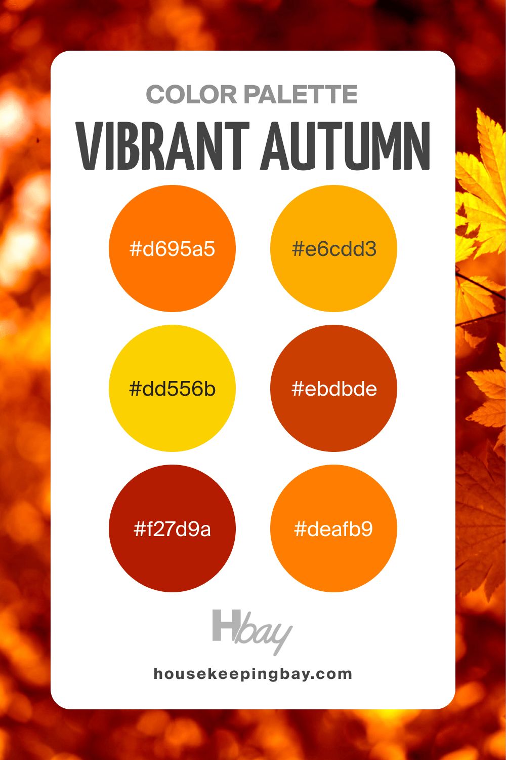
housekeepingbay.com
Autumn Color Palette Aesthetic
If you are looking for a varied color palette that still doesn’t read too bright, this Aesthetic color combination is the right choice. Yellow, green, orange, dark magenta are all muted and balance perfectly with each other.
The palette reminds you of the colors of autumn fruit and vegetables like aubergines, persimmon, and apples, filling the space with the natural and refreshing vibe.
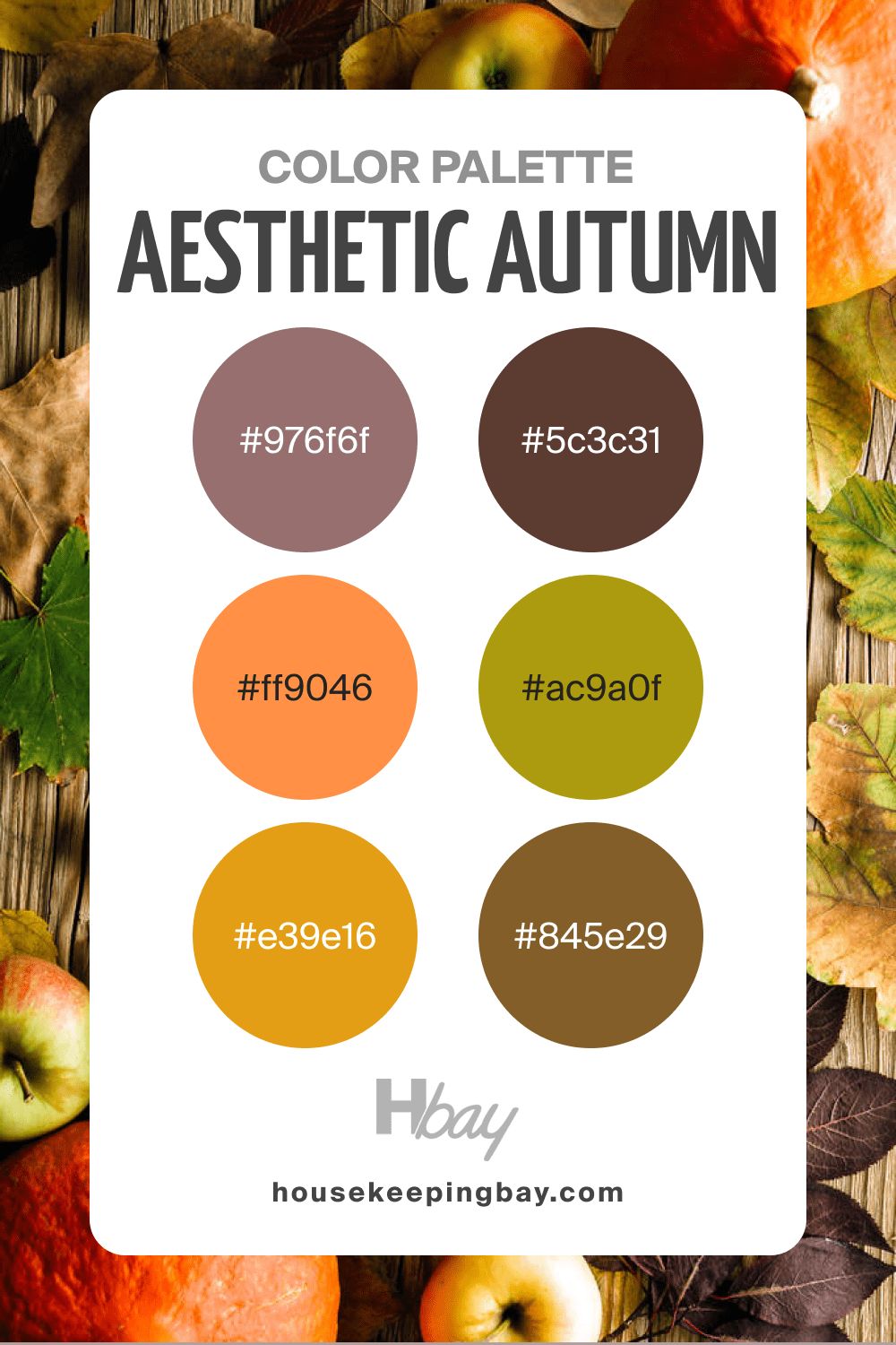
housekeepingbay.com
Autumn Color Palette Soft
This palette is an ideal choice for those who prefer calm yet colorful color combinations. Soft orange, green, and medium light shades of red-orange make this palette versatile enough to be used in different rooms.
But no matter where you use these colors, they will add a cozy and homey vibe to any space.
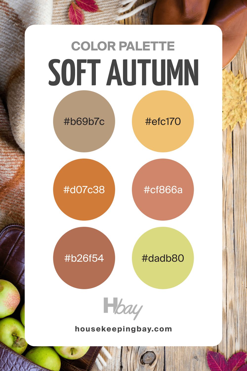
housekeepingbay.com
Autumn Color Palette Green
This palette will make you feel like you are in the forest. Calming, muted, and deep shades of green will remind you of leaves and moss. And since this palette contains both lighter and darker shades of green that have distinct undertones, you can easily pair any of these colors to create more exciting combinations!
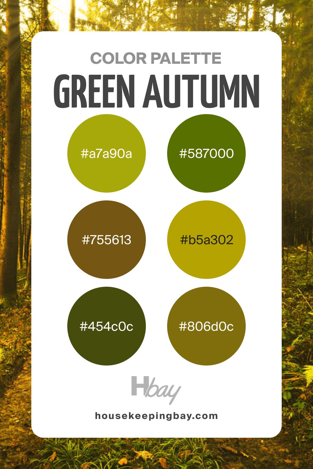
housekeepingbay.com
Earthy Autumn Color Palette
With the help of colors in this palette, you can add a note of elegance and style to any space in your home. Dark green and brown pair nicely with muted oranges and mustard yellow here. The overall impression is calm, home-like, and very natural.
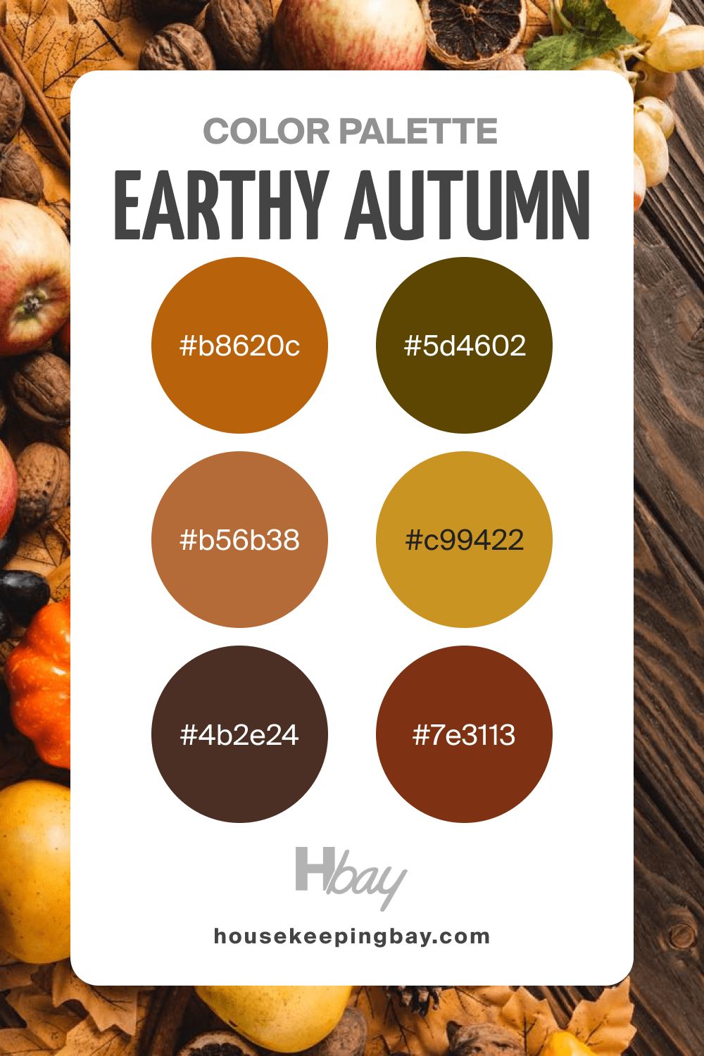
housekeepingbay.com
Autumn Color Palette Pastel
This is another calm-toned palette that offers you subtle and versatile colors. These powdered shades of very light orange with creamy and pinkish undertones paired with warm chocolate browns will create a lovely and very homey atmosphere, reminding you of warm woolen crochet blankets, knitted socks, and a cup of cocoa by the fireplace!
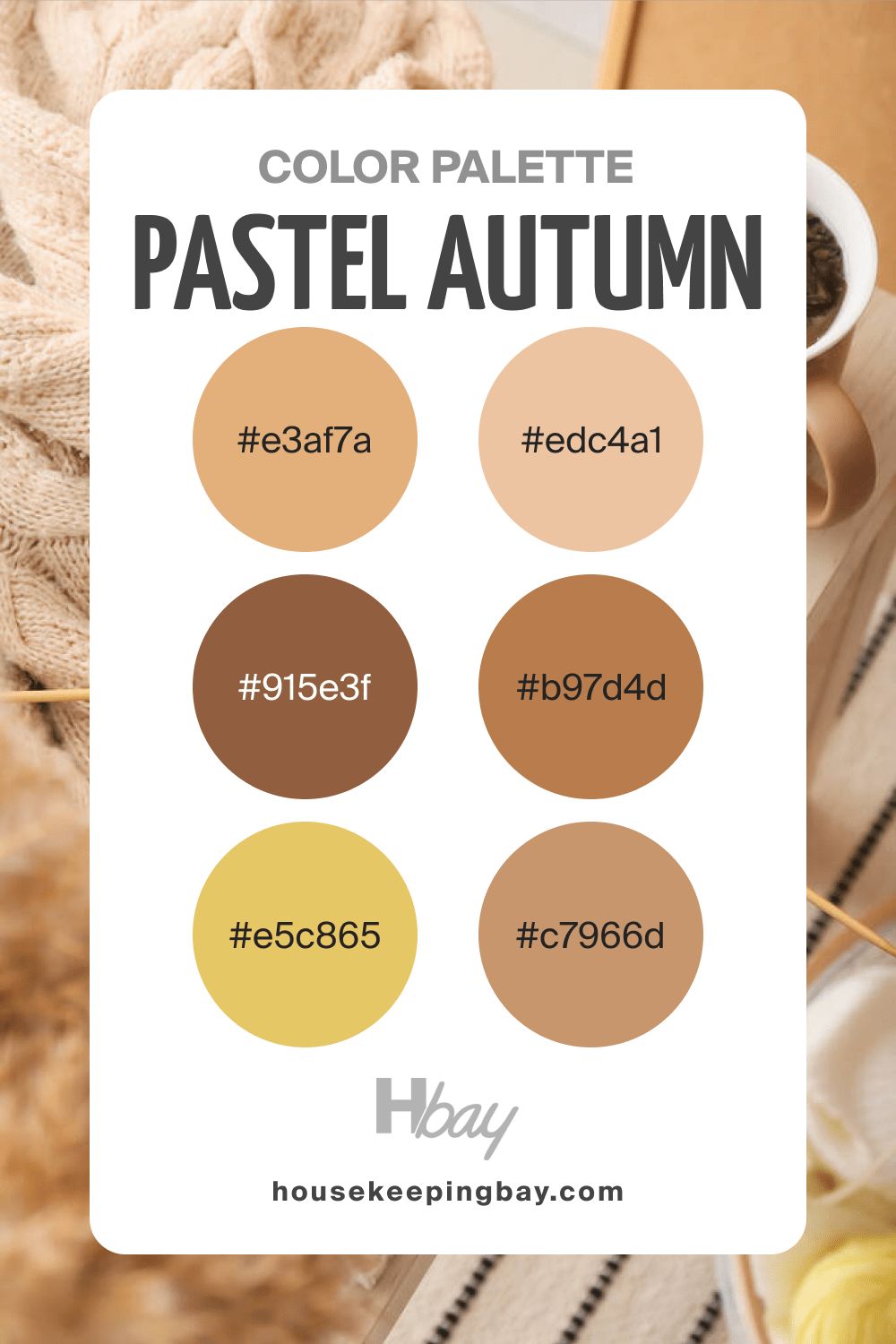
housekeepingbay.com
Autumn Color Palette Yellow
This palette is pretty bright, so use it carefully! Since it is monochromatic, we recommend you use only one or two colors from it to warm up the space. But since it contains both lighter and deeper shades of yellow, and paint colors in it have different undertones, you will easily find the matching color combinations.
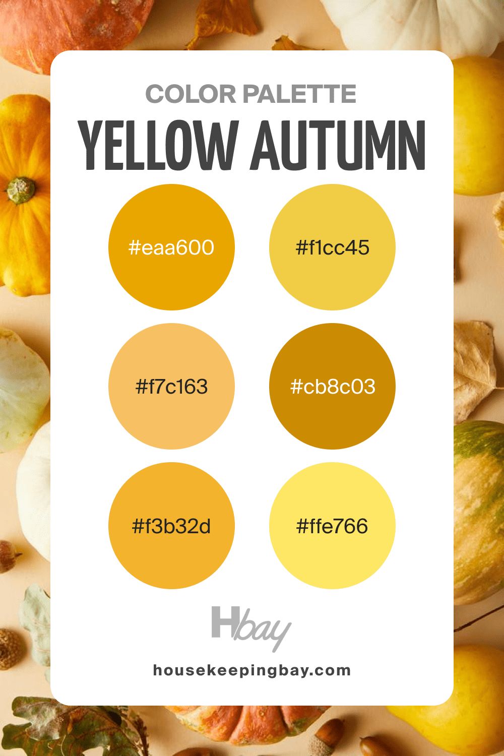
housekeepingbay.com
Autumn Color Palette Orange
This is another monochromatic color palette that contains lighter and darker shades of the same color (orange). It means you should use one or two colors from it and choose those that create a noticeable contrast. Otherwise, the space will read too monotonous and overloaded with color.
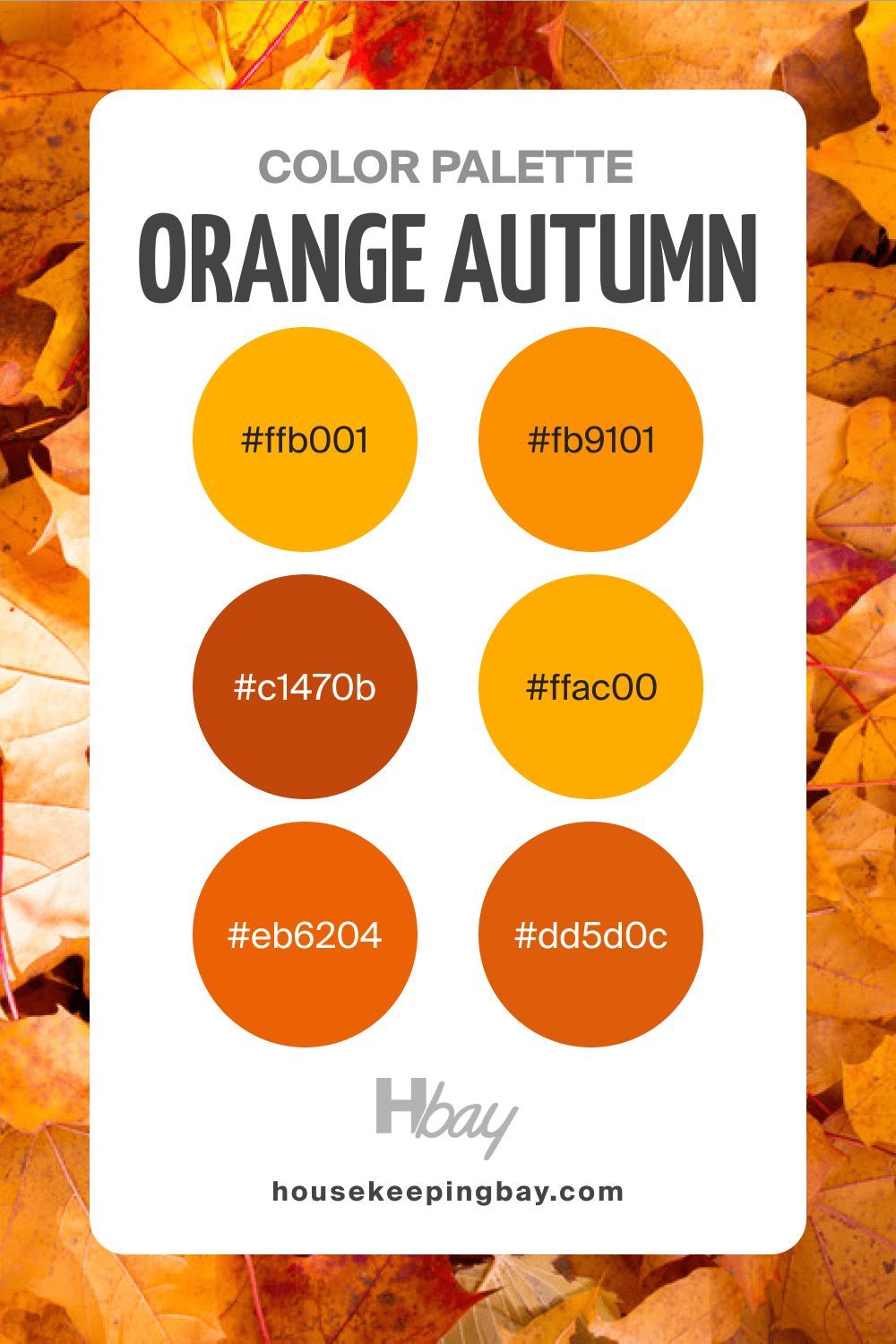
housekeepingbay.com
Autumn Color Palette Muted
Just as the name says, this palette consists of muted shades of blue, yellow, orange, and a few other autumn colors. However, it doesn’t read dark or dull, especially if you pair these colors with whites and add a couple of brighter color accents to add vividness to the space!
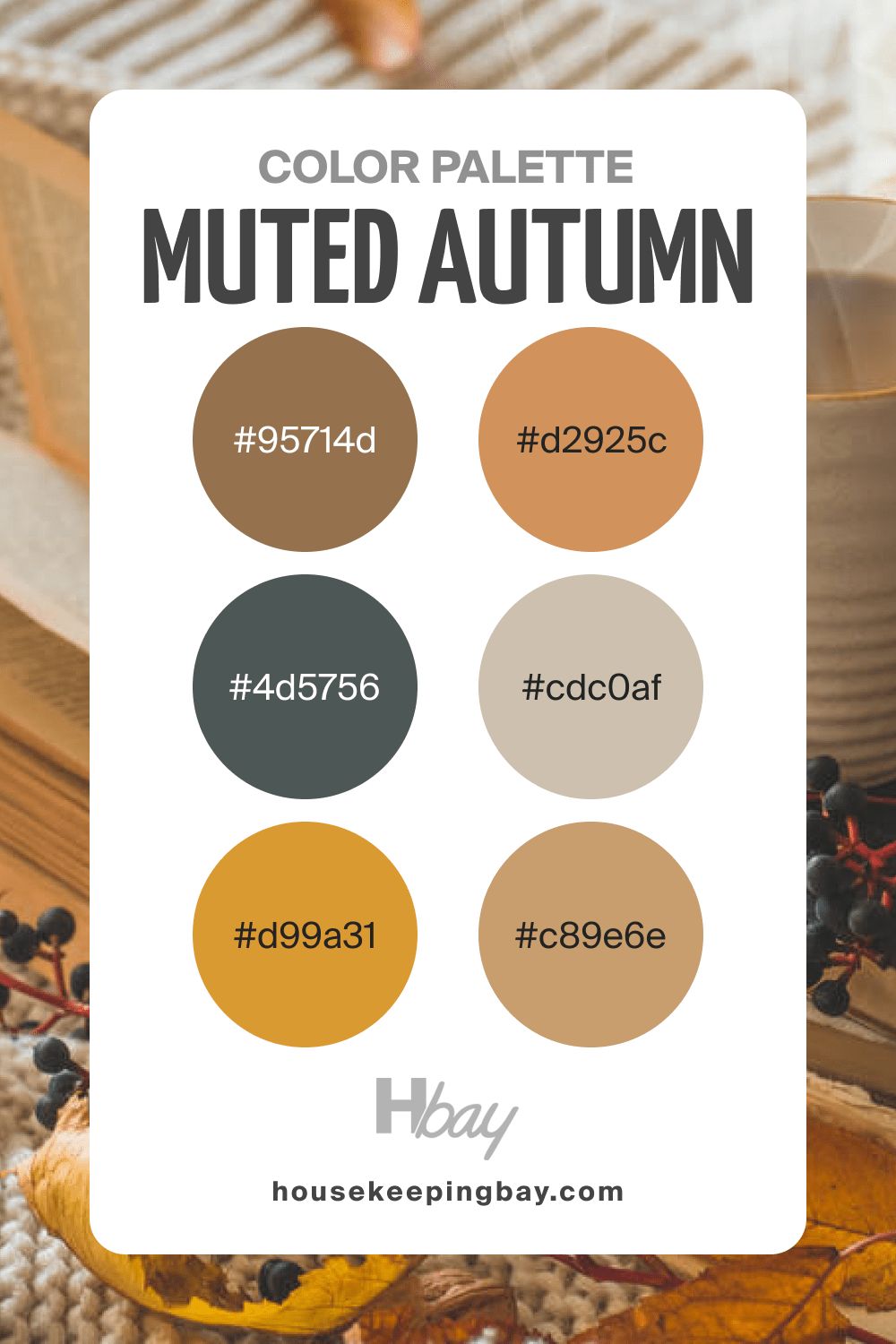
housekeepingbay.com
Autumn Color Palette Deep
This is the darkest color palette of all, so use it very carefully! It will add a pinch of drama to any space thanks to very deep and dark shades of red, green, and brown. We would not recommend you use all these colors in the same space, but you can select one or two to make the room look more unique and personalised.
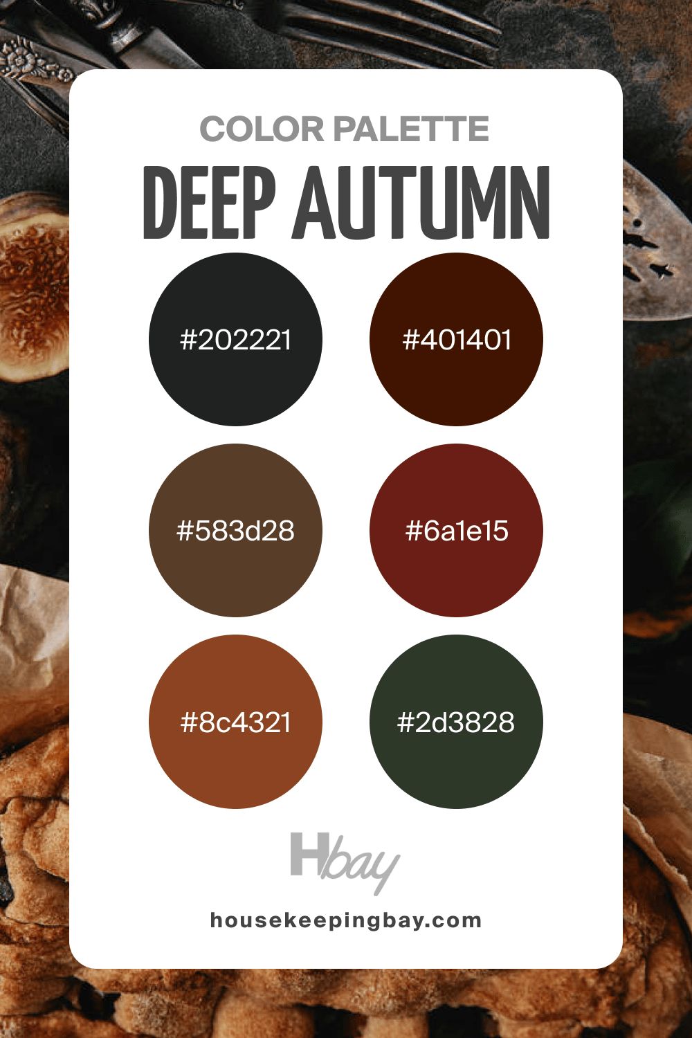
housekeepingbay.com
Autumn Color Palette Purple
With different shades of purple, this is another monochromatic color palette on the list. However, its color may look fairly deep and sometimes even dark, so remember to “dilute” this palette with lighter and brighter paint colors.
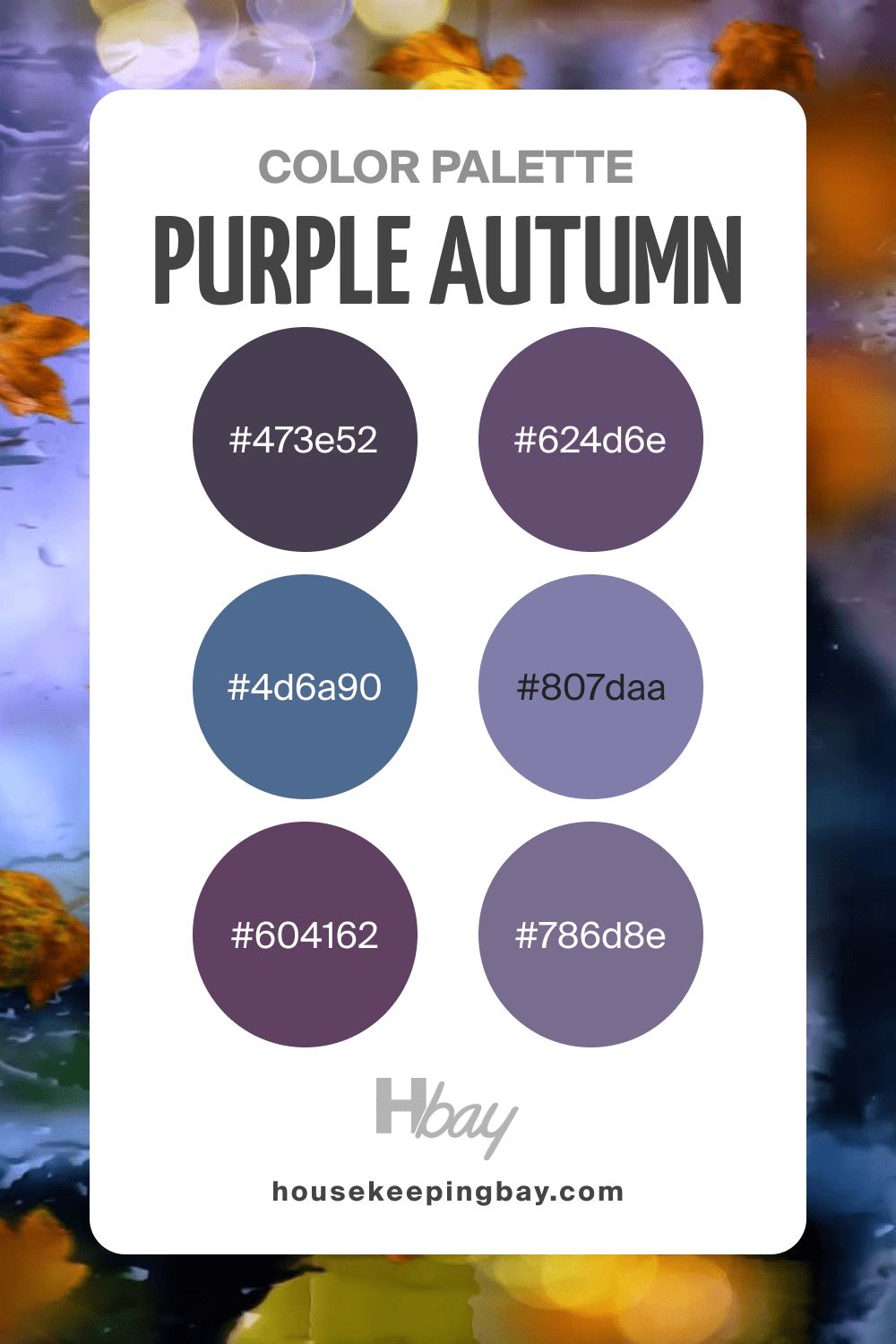
housekeepingbay.com
Autumn Color Palette Seasons
The colors used in this palette remind you of the seasonings in the kitchen, like black and red pepper, cinnamon, and nutmeg. These earthy colors pair with persimmon orange and aubergine purple colors that greate a balanced and warm-toned vibe.
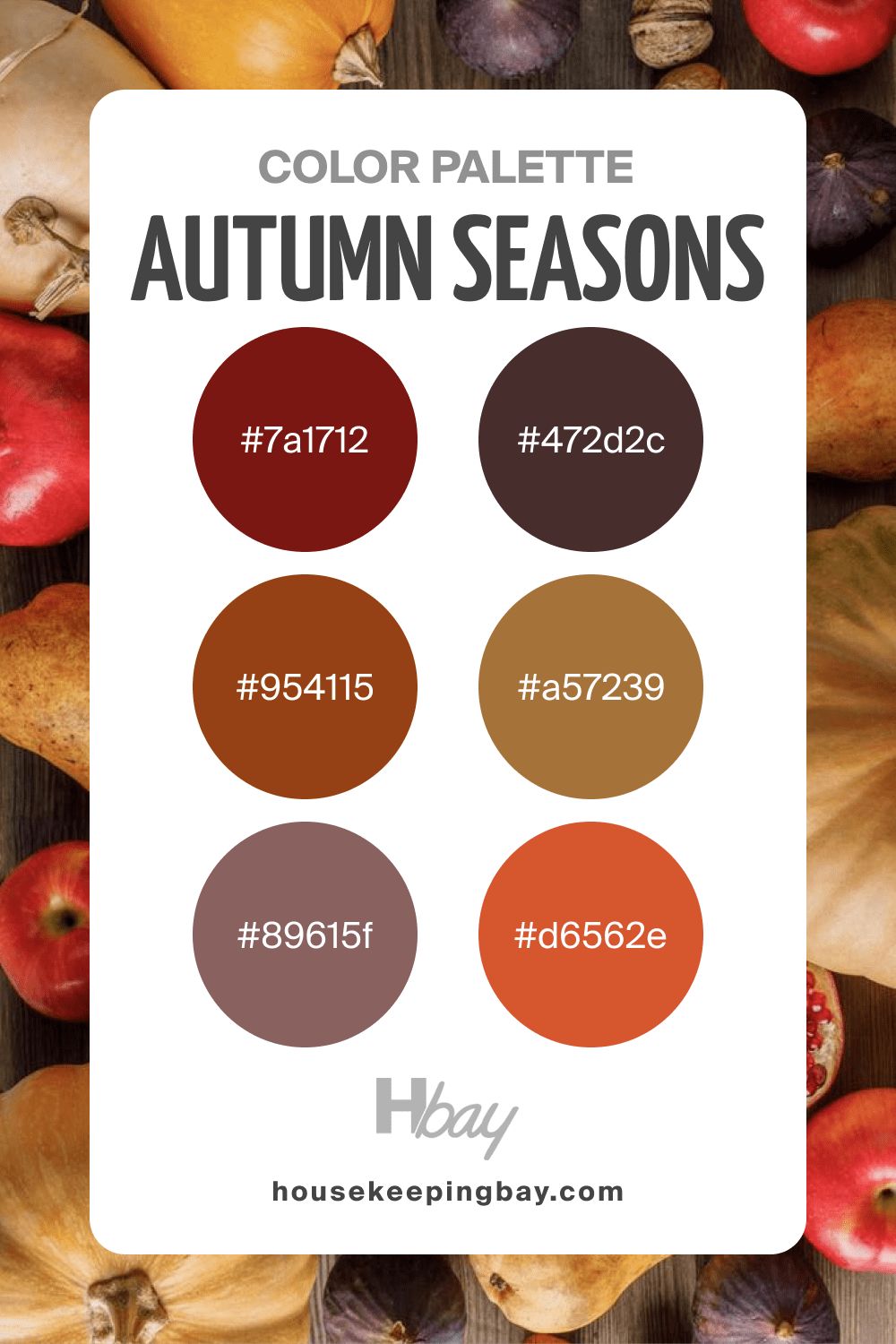
housekeepingbay.com
Autumn Color Palette Blue
Although this palette is called blue, its colors have pronounced green undertones. But the general impression is not cold at all! On the contrary, these colors look pleasantly calming and tranquil, reminding you of a rainy day with sunbeams gleaming in the puddles.
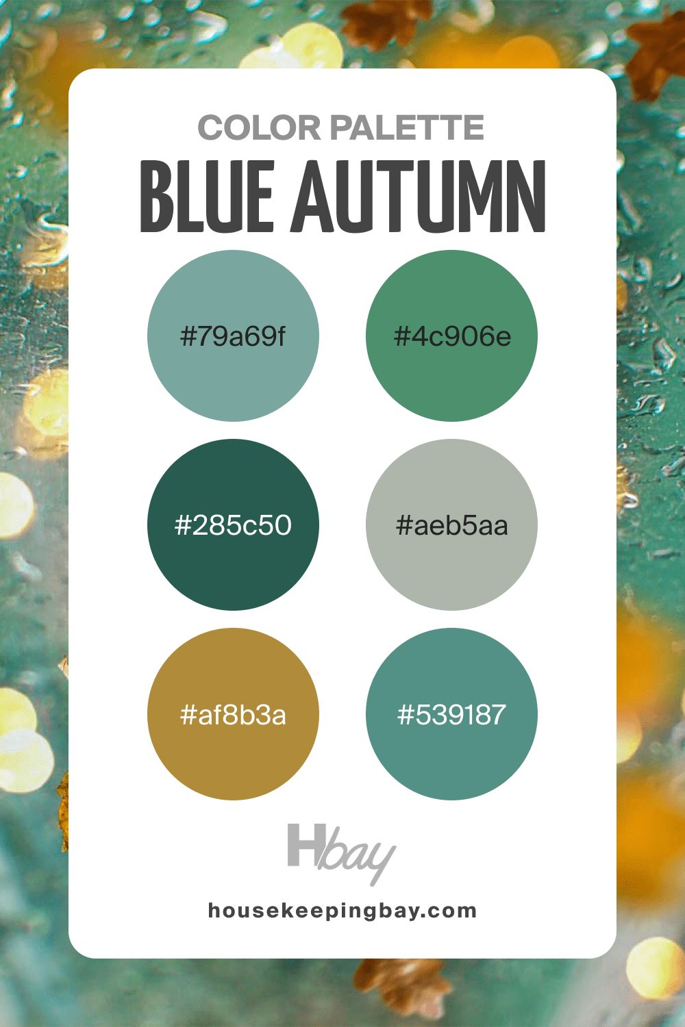
housekeepingbay.com
Light Autumn Color Palette
These warm and cozy colors will make you think of home-baked goodies like buns and cinnamon rolls! Turmeric yellow, muted orange, as well as muted reds with pinkish undertones will add a nostalgic and heart-warming vibe to any room.
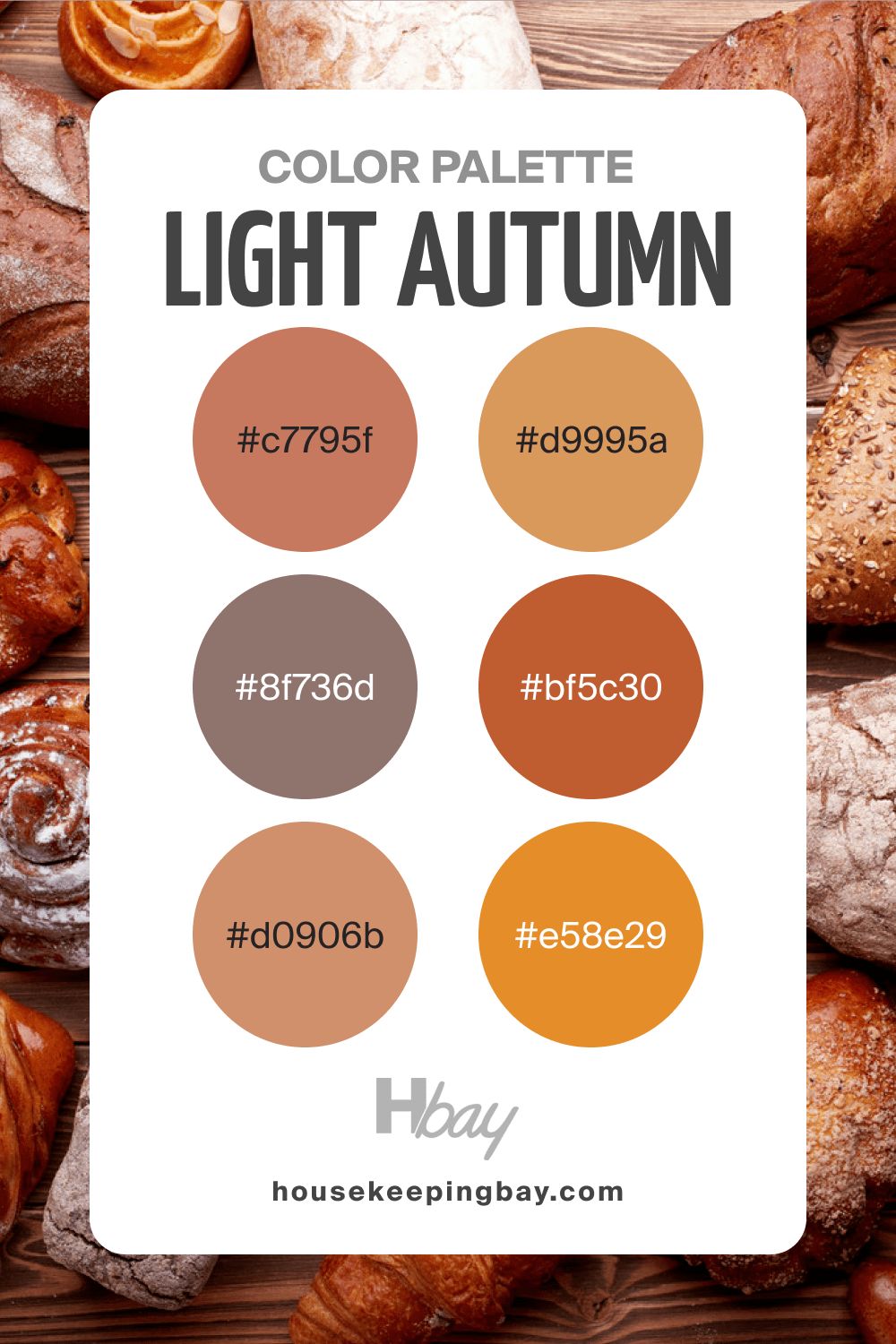
housekeepingbay.com
Autumn Color Palette Navy
Dark blues pair with the muted green and greenish browns here, creating a fairly deep yet not too dark palette. It will be perfect for adding a bit of color emphasis to a room, but we would still recommend you use lighter colors to make these colors read less “heavy”.
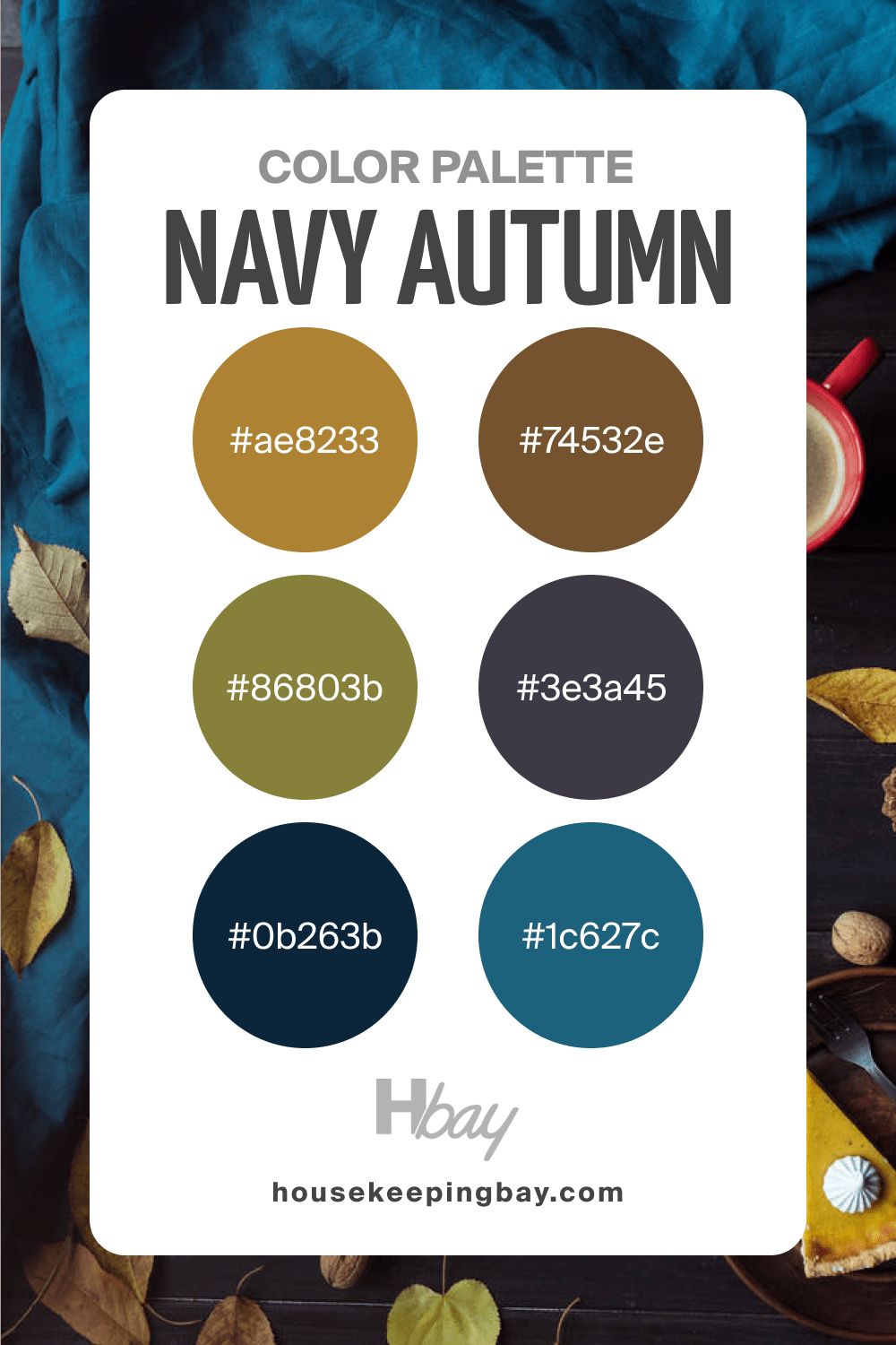
housekeepingbay.com
Autumn Color Palette Minimal
This palette contains colors that create a timber-like feeling when you look at them. Muted greens, lighter and darker, pair with warmer oranges and earthy reddish browns. This palette will be perfect for countryside-style homes, as well as for the interiors with wooden elements and stone decor/floors.
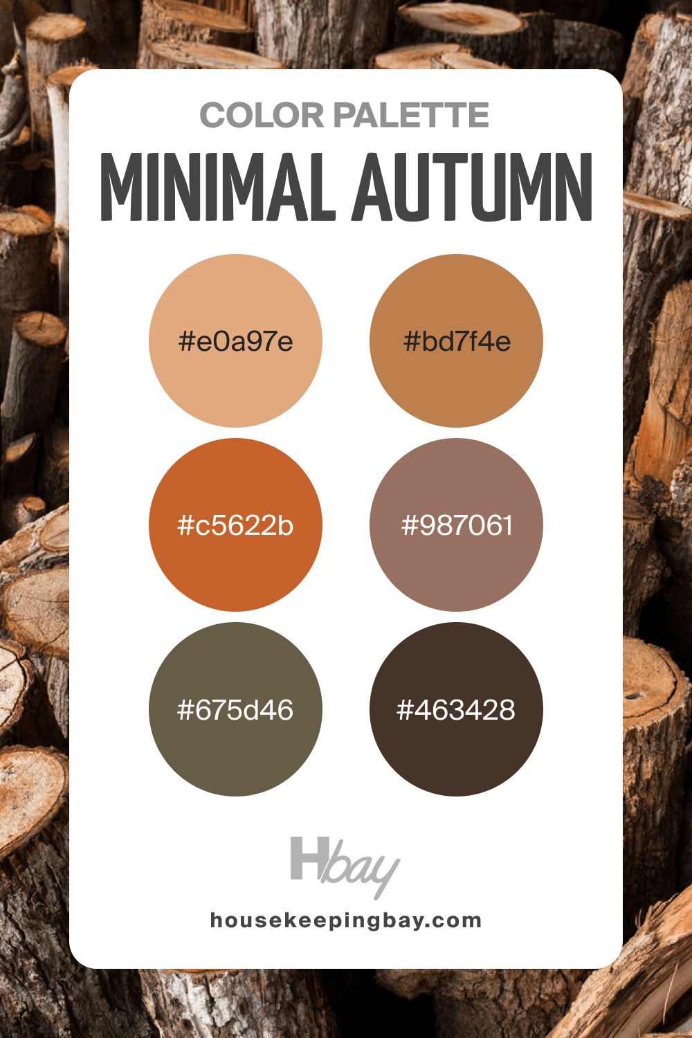
housekeepingbay.com
Autumn Color Palette Dark
Despite its name, this palette doesn’t read too dark. However, it does contain quite deep shades of red, sometimes with brownish undertones. There is also a dark brown color here that can be used for accentuating the space.
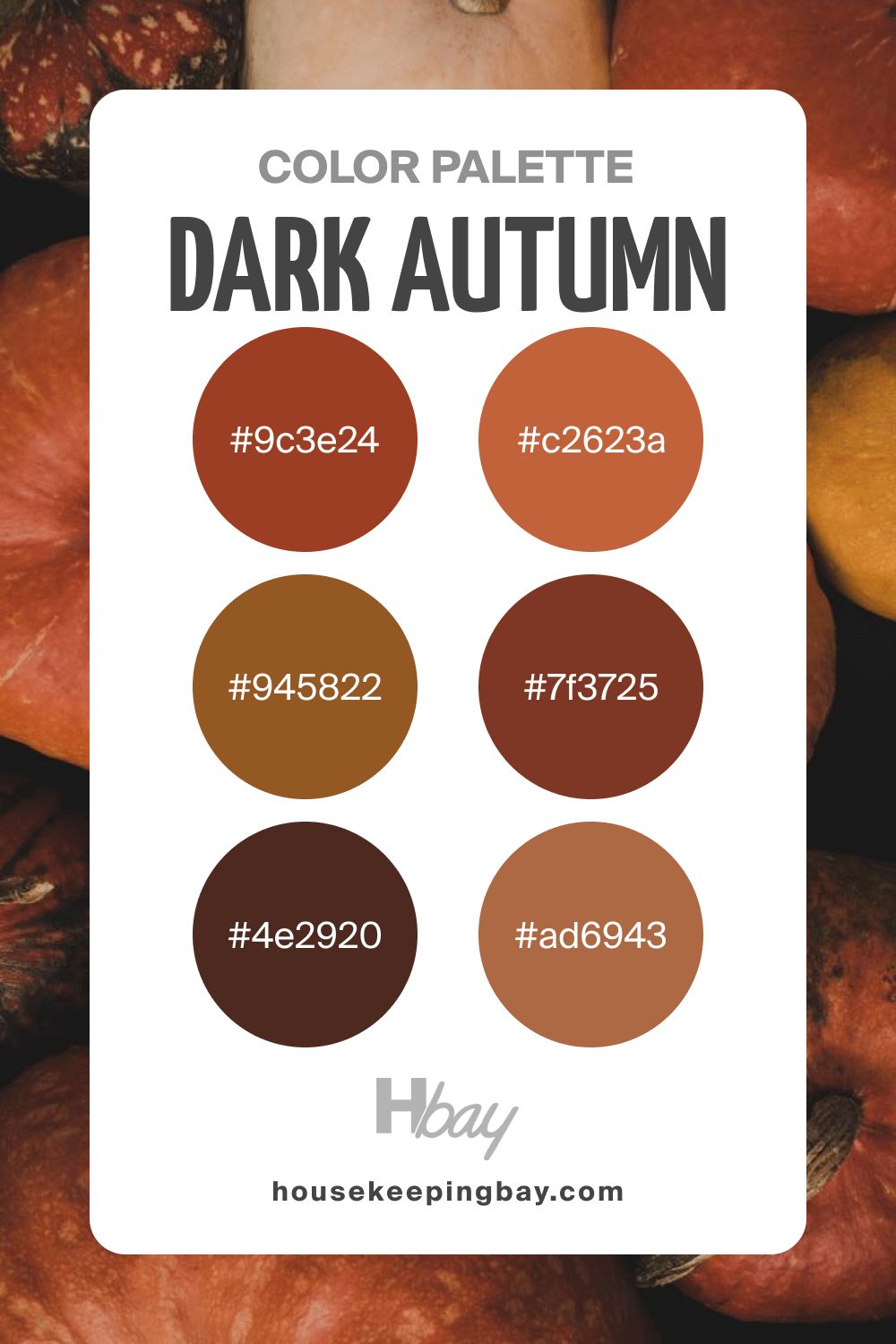
housekeepingbay.com
Autumn Color Palette Rust
Rust doesn’t look appealing, but this palette proves the opposite. With these bright and vivid shades or orange and red, it does look pronounced and saturated!
However, since it’s monochromatic, you’d better stick to a couple of colors only, ensuring they read contrasting enough.
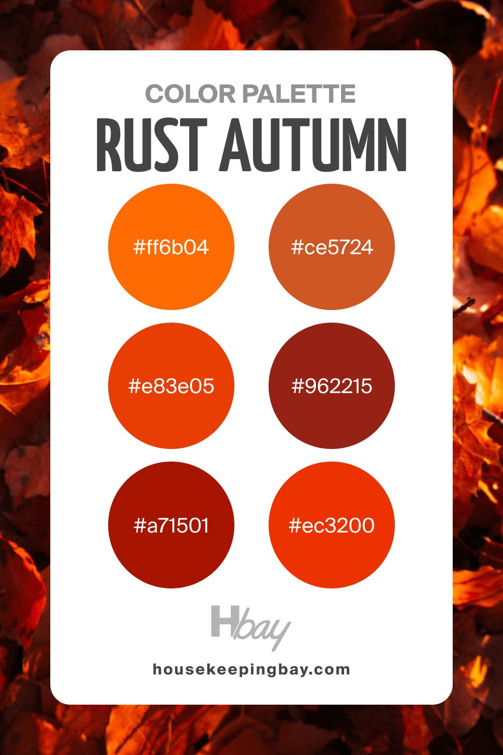
housekeepingbay.com
Autumn Color Palette Gold
You should use this palette if your goal is to add a pinch of brightness and joy to your home! Juicy lemony yellow shade pairs with softer oranges here, being followed by reddish oranges. This palette will bring an atmosphere of autumn streets covered with leaves and a flow or fresh air to your home.
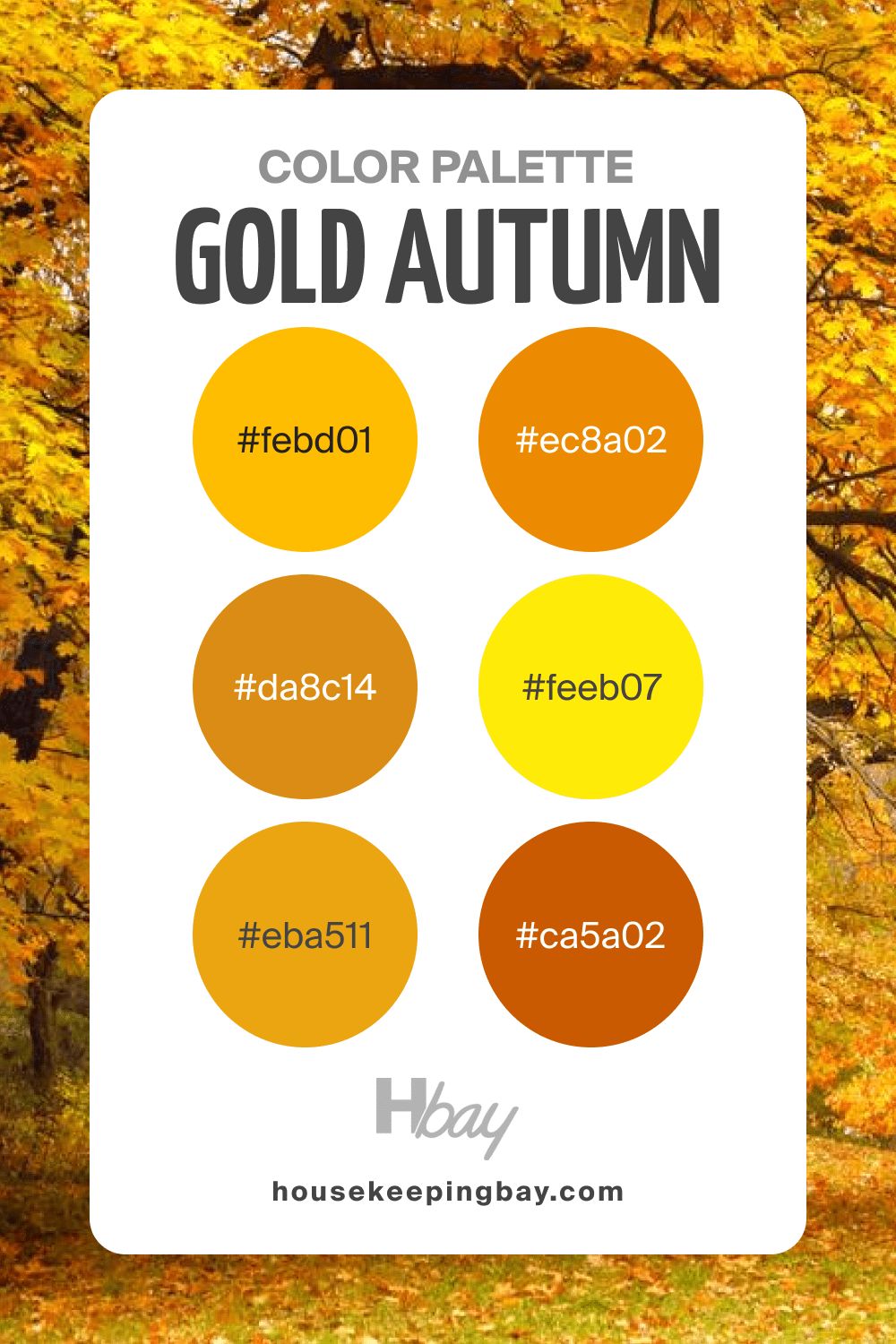
housekeepingbay.com
Autumn Color Palette Neutral
The colors in this palette are muted and perfectly balanced, which means you can pair them as you wish. You won’t find bright or vivid colors here. Instead, this palette gives a homey and calming feeling.
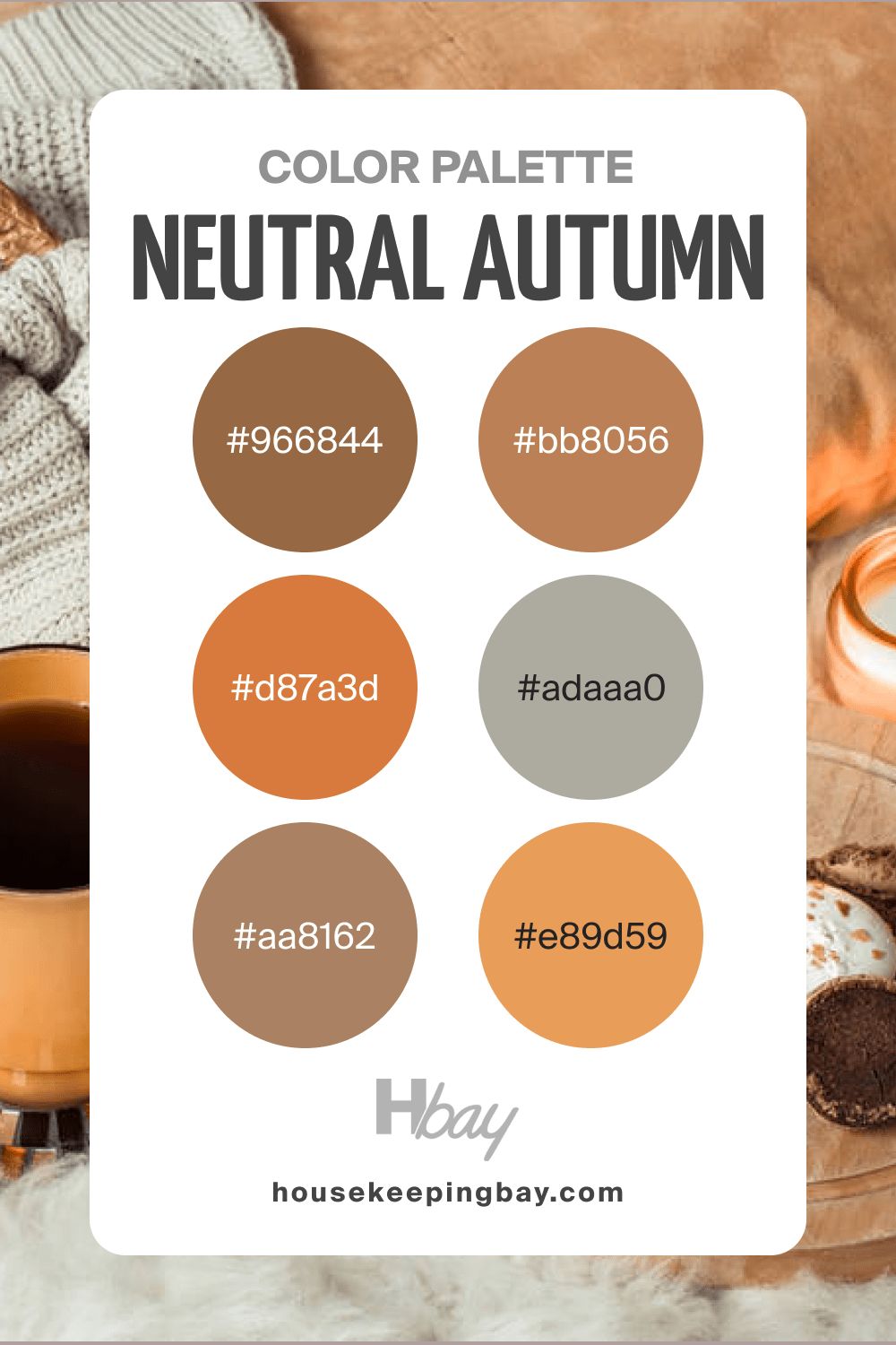
housekeepingbay.com
How to Use These Color Palettes In Autumn?
As you can see, the color palettes we offer are pretty varied. Also, they have certain distinctions. Some of these color combinations are more or less similar, containing different shades of only two colors (like orange and brown), for example. On the other hand, some palettes consist of more than two colors and read differently in tone.
These features will affect the way you use these color palettes in your home. For instance, if you choose a palette that contains several distinct colors (e.g., Aesthetic Autumn), you can use its colors on different surfaces and items in a room.
But if you stick to a palette that is more monochromatic, it’s ok to use only one or two colors from it in your home to avoid overloading the space with the color.
Remember the simple rule of thumb: although each palette contains several colors, it doesn’t mean you must use all of them in your home! Choose those that will work best of all in it.
How to Use Monochrome With Reddish Brown and Sage?
If you have a monochrome color palette in your home (or in one of its rooms), you might want to add some color to the space. At this point, you must remember that monochrome-colored rooms will always have more impact if you add an accent color. In this particular case, you can add either sage green or red-brown to create a contrasting feeling in the room.
For example, you can paint an accent wall with one of these colors, or use sage or reddish brown accents on decor elements in the space, such as cushions, curtains, lampshades, carpets, etc.
annmartianova80 via VistaCreate
Using Muted Tones
If you want to create a calm and balanced atmosphere in your home, muted color palettes will be perfect for you. However, you should know how to use them correctly to get the desired effect.
For example, it’s best to avoid using muted shades everywhere in a room. Otherwise, the space may read too monotonous and boring. Besides, muted shades tend to add a dusk vibe to spaces.
This is why remember to use whites along with yoru muted earthy paints! White will add brightness and air to any room, as well as highlight the natural beauty of the muted tones.
Rules For Combining Warm Shades With Rich Autumn Colors
If you choose a color palette with rich and saturated colors, consider pairing them with warmer and less intense colors to “dilute” the saturation a bit.
For example, if your palette contains rich red, yellow, or orange, you might want to pair them with calmer and warmer beiges that have warm and earthy tones.
They will create a balanced background for the more intense colors, allowing them to reveal their beauty. As a result, the palette of the space will be adequately balanced.
However, you might go the opposite way and use those rich autumn colors as prevailing ones (e.g., to paint the walls). In this case, you should still add subtle and warmer hues to balance them.
For instance, in a room with rich green walls, leave the ceiling and trim white and use lighter and warmer colors on furniture upholstery, carpets, etc.
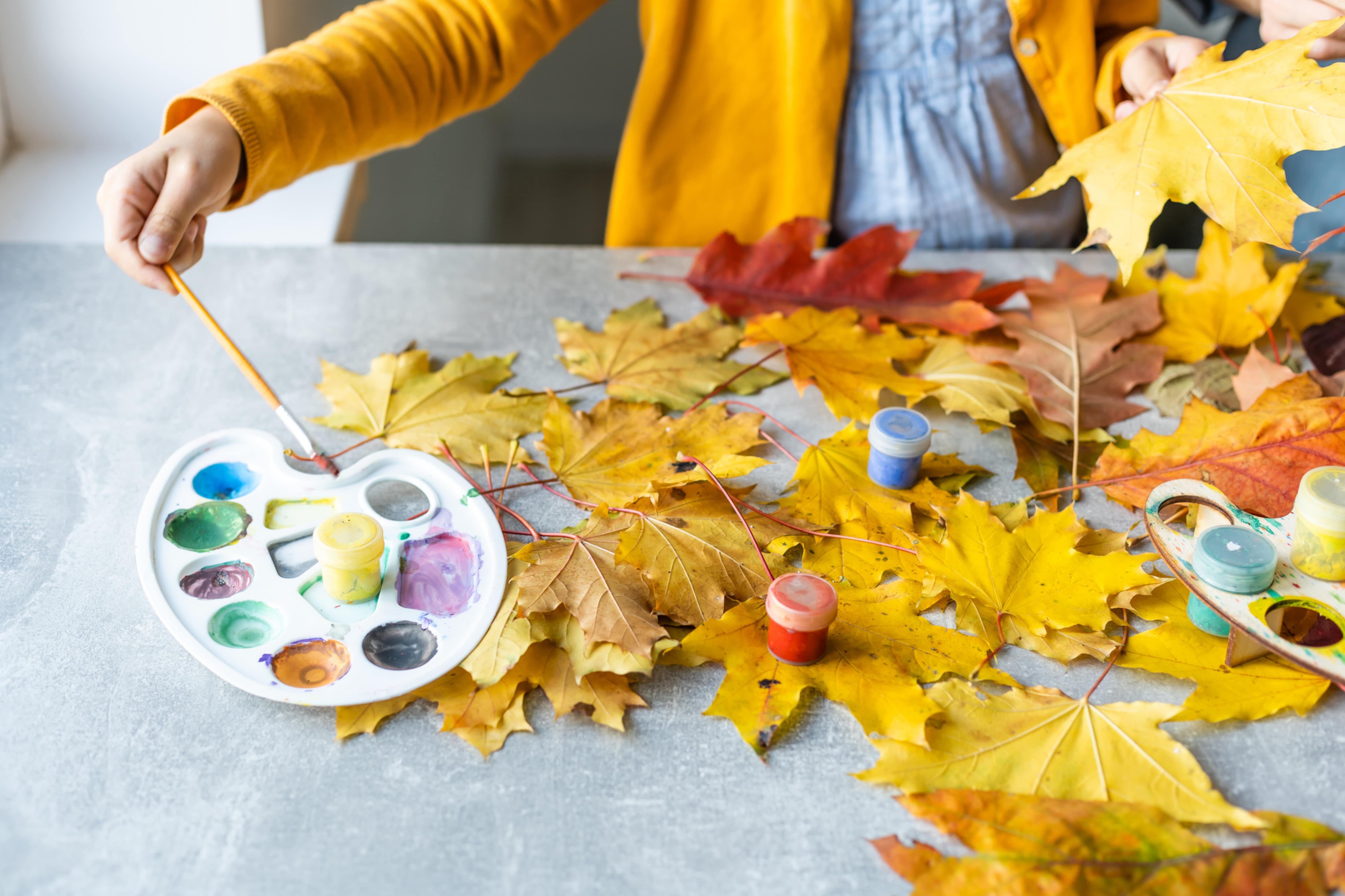
svetik-81 via VistaCreate
What Colors Are Good In Autumn?
To create an autumn vibe in your home, it’s best to opt for traditional autumn-like colors. They are typically red, green, brown, yellow, orange, and gray. Sometimes, you may find deeper shades of blue and purple there, but these colors are less common.
Anyway, even for the autumn-style interior, you should always consider the atmosphere you want to get in your room. If your goal is to create a cozy and welcoming feeling, use warm and earthy colors like beiges, browns, warmer yellows, etc.
But if you’re fond of cool-toned color schemes, you might want to consider cooler greens, blues, and their combinations.
What Fall Color Goes With Blue?
If you choose blue is the leading color in the space, you might want to know what colors will work well with it. Of course, it depends on the shade of blue used, as well as on its undertones.
But usually, muted and darker blues work nicely with blue-green colors, soft whites, mustard-yellows and light sage greens. However, note that all the colors should be mid-tone and pretty muted! Bright and juicy shades will not fit in this palette!
But if you want to use brighter colors with the blue being the major color in the space, you can pair it successfully with brighter yellows and orange, as well as with deeper wine red shades and neutral whites.
daniilphotos via VistaCreate
Conclusion
Now you know more about autumn color palettes that you can use in your home to get a natural and calming yet cozy and welcoming vibe. Autumn colors are lovely with their earthy tones and warmth that perfectly unite with the rich hues and sometimes even vivid hues!
With all color palettes you discovered today, and with all the tips and life hacks we shared, you will create a lovely, homey, and pleasant environment in your house or apartment with the help of these fabulous colors.
Ever wished paint sampling was as easy as sticking a sticker? Guess what? Now it is! Discover Samplize's unique Peel & Stick samples. Get started now and say goodbye to the old messy way!
Get paint samples


Frequently Asked Questions
⭐Can I use the Autumn palette in autumn only?
No, you can use these colors any time you want! The palette is named this way because of the resemblance with the colors of autumn.
⭐Is it possible to use colors from different palettes in the same room?
Technically, you can, but it requires a strong knowledge and understanding of color theory, as well as skills.
⭐Can these colors be used on exterior walls?
Some of them can, but not all of them.