Wenge AF-180 Paint Color by Benjamin Moore
Wenge AF-180, a color derived from the prestigious Benjamin Moore color palette, stands out as an evocative and dynamic shade that breathes life into any space.
Wenge AF-180, a color derived from the prestigious Benjamin Moore color palette, stands out as an evocative and dynamic shade that breathes life into any space. Its intricacies and nuances are foundational to building atmospheres that are both engaging and comforting.
In this article, we will explore the depths of Wenge AF-180, its undertones, coordinating colors, effects under different lighting conditions, LRV, trim colors, similar colors, and complementary colors, providing a comprehensive insight into its application in interior designs.
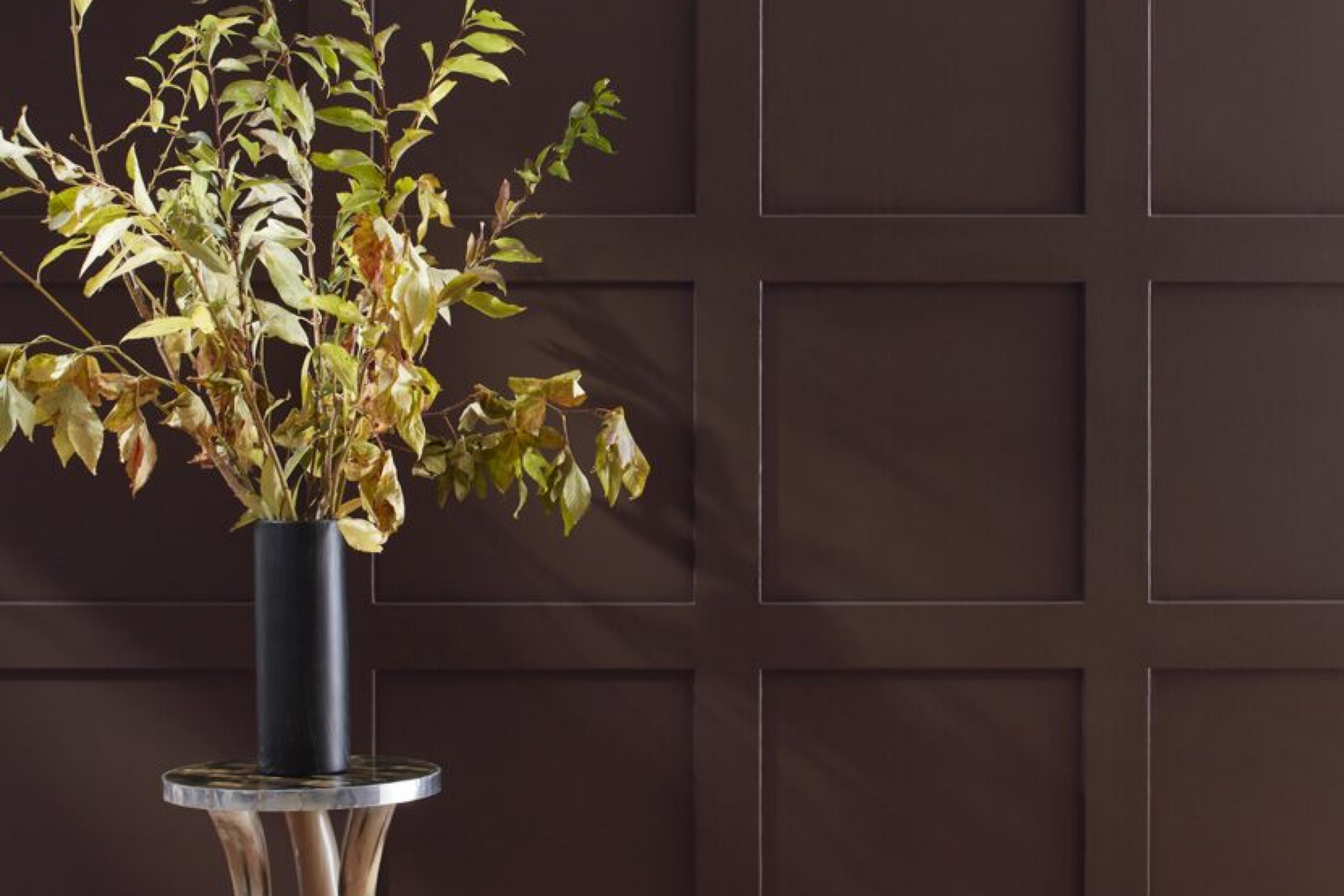
via benjamin moore
What Color is Wenge AF-180?
Table of Contents
Wenge AF-180 is a deep, rich brown color, drawing its inspiration from the tropical Wenge tree’s heartwood. It is a color known for its distinctive earthy tones, balancing intensity and subtlety. This versatile shade is perfect for traditional and contemporary interior styles, giving a touch of sophistication and timeless beauty.
Wenge AF-180 pairs seamlessly with a variety of textures and materials like wood, stone, and metal, making it a prime choice for designers aiming for elegance and warmth in their spaces.
housekeepingbay.com
Is it a Warm or Cool Color?
Wenge AF-180, with its brown richness, inclines more towards being a warm color. The warm characteristic of Wenge AF-180 allows it to create cozy and inviting atmospheres within homes. This warmth allows it to work marvelously in living rooms and bedrooms, imparting a sense of comfort and relaxation. It also synergizes well with cool colors, establishing balanced and harmonious interiors, conducive to a variety of moods and preferences.
Undertones of Wenge AF-180
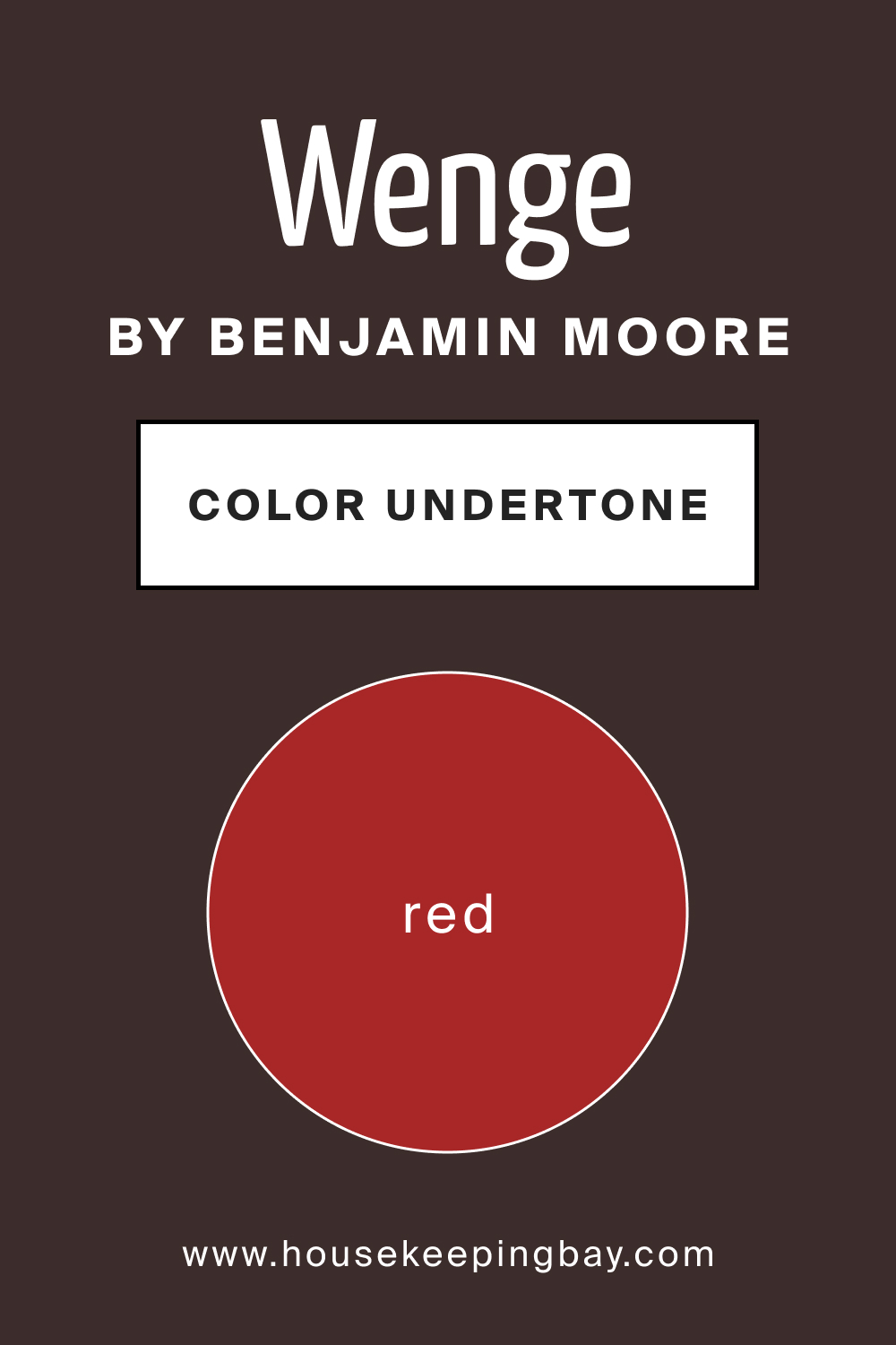
The undertones of Wenge AF-180 are integral in enhancing its beauty and versatility. It boasts subtle reddish undertones, imbuing spaces with a mild, inviting warmth. These undertones influence how we perceive this color, adding layers to its visual impact. The distinctive undertones of Wenge AF-180 accentuate its presence on interior walls, offering a fluidity that enhances its compatibility with diverse design elements and color schemes.
housekeepingbay.com
Coordinating Colors of Wenge AF-180
Coordinating colors are crucial as they enhance the main color, creating harmonious and balanced aesthetics. Wenge AF-180 finds its companions in the following hues:
- soft beiges (AF-155 Weimaraner ),
- muted greys (OC-52 Gray Owl )
- delicate creams (OC-96 Gentle Cream )
These coordinating colors, with their subtle elegance, accentuate the richness of Wenge AF-180. Three additional colors that coordinate well are HC-112 Tate Olive, and OC-79 Old Fashioned Peach, each adding a distinct flair and character when paired with Wenge AF-180.
How Does Lighting Affect Wenge AF-180?
Lighting plays a pivotal role in manifesting the essence of colors. Wenge AF-180 reveals different facets of its character under varying light conditions. Under artificial light, its richness is amplified, creating a more intimate atmosphere. In contrast, natural light accentuates its warmth, breathing life into spaces.
The color behaves differently in rooms with different orientations; it exudes a softer glow in south-facing rooms, where it receives abundant light, while in north-facing rooms, its depth and intensity are more pronounced.
The interaction between Wenge AF-180 and light in east and west-facing rooms depends on the time of the day, offering a dynamic visual experience.
housekeepingbay.com
LRV of Wenge AF-180
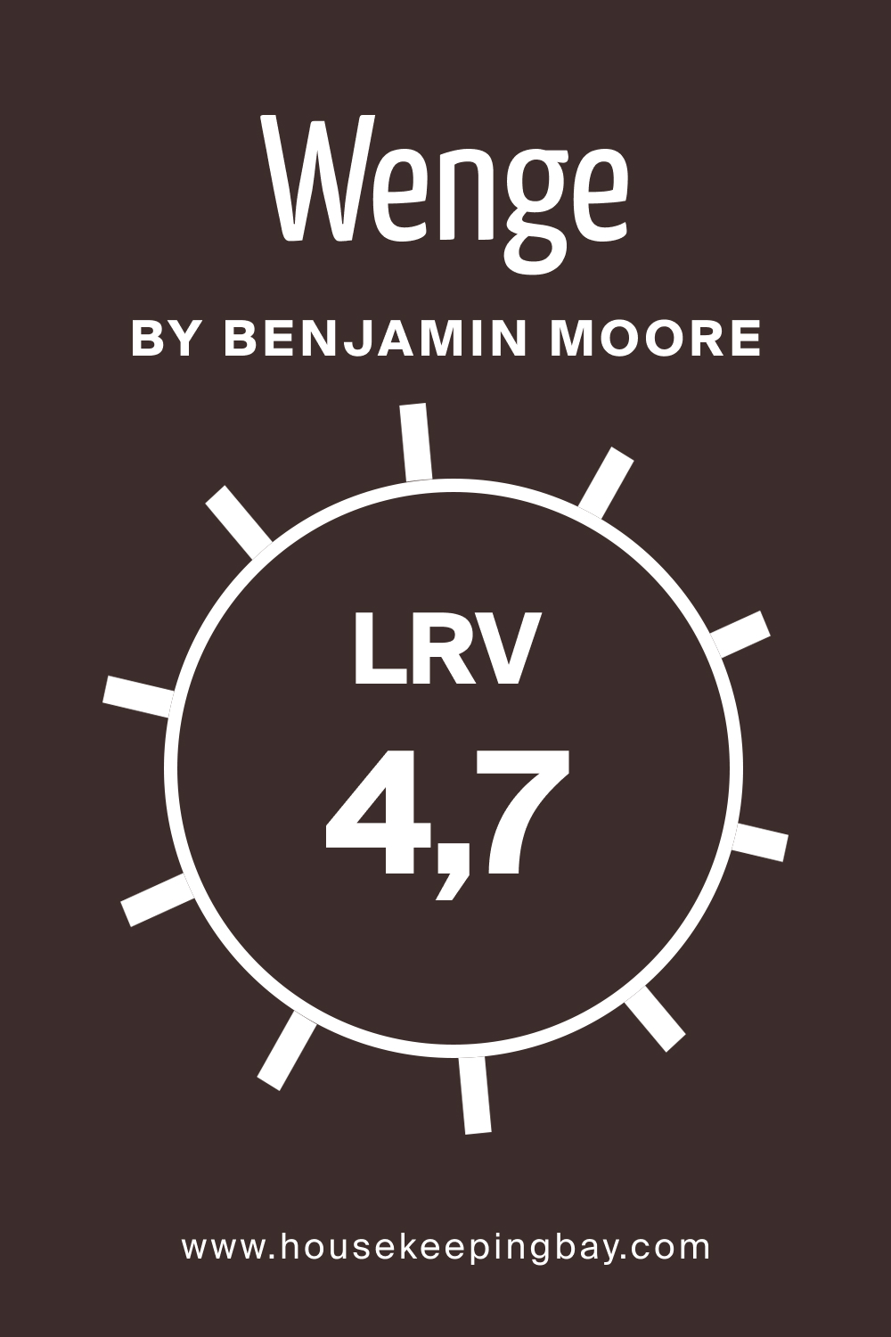
The Light Reflectance Value (LRV) of a color, denoted in a scale from 0 to 100, represents how much light a color reflects. Wenge AF-180 has an LRV of 4.7, meaning it’s on the darker side of the spectrum, absorbing more light than it reflects.
This low LRV value implies that Wenge AF-180 imparts a sense of coziness and intimacy to a room, making spaces appear smaller and more enclosed, an effect that can be balanced with lighter furnishings and décor.
housekeepingbay.com
What is LRV? Detailed Guide
Trim Colors of Wenge AF-180
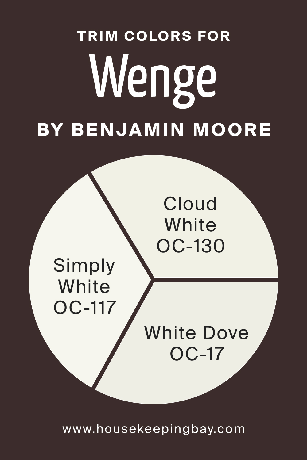
Choosing the right trim color is vital to frame and accentuate the main color. For Wenge AF-180, shades of white like Cloud White, Simply White, and White Dove from Benjamin Moore serve as the ideal trim colors. They provide a crisp contrast, enhancing the elegance and depth of Wenge AF-180, while also maintaining a seamless transition between walls and trims.
housekeepingbay.com
Colors Similar to Wenge AF-180
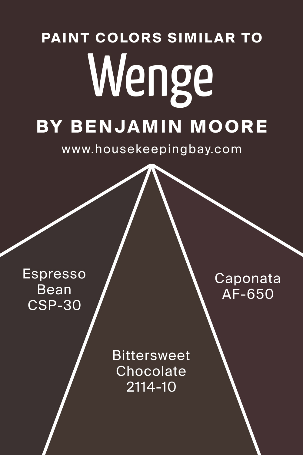
Identifying colors similar to Wenge AF-180 like
- CSP-30 Espresso Bean ,
- AF-650 Caponata ,
- BM 2114-10 Bittersweet Chocolate
enables more flexibility in design choices. Espresso Bean is deep and intense, enveloping spaces in a warm embrace. Caponata, with its rich and luxurious feel, adds a touch of sophistication. Bittersweet Chocolate is serene and grounding, establishing a solid foundation for various design elements.
housekeepingbay.com
Colors That Go with Wenge AF-180
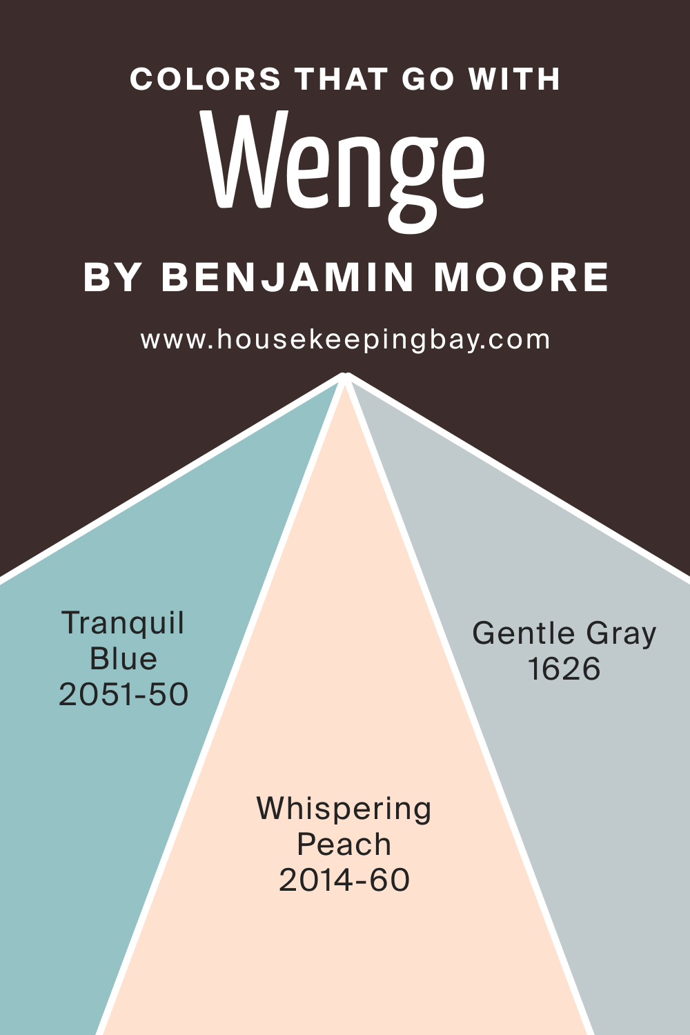
Knowing the colors that synchronize well with Wenge AF-180 is pivotal for a coherent and appealing design. Neutral tones, soft pastels, and lighter shades of brown synergize well with it. Additional colors that harmonize are Whispering Peach, Tranquil Blue, and Gentle Gray. Each of these colors, with its unique attributes, complements the Wenge AF-180, enhancing its versatility and applicability in diverse interiors.
housekeepingbay.com
How to Use Wenge AF-180 In Your Home?
Wenge AF-180 is versatile and can be used in various rooms including bedrooms, bathrooms, and living rooms, adapting to diverse design aesthetics like contemporary, rustic, and traditional. This color excels in creating atmospheres that are inviting and soothing.
Its earthy, warm tones pair well with both bold and subtle hues, allowing for creative freedom in designing spaces that reflect individual tastes and preferences.
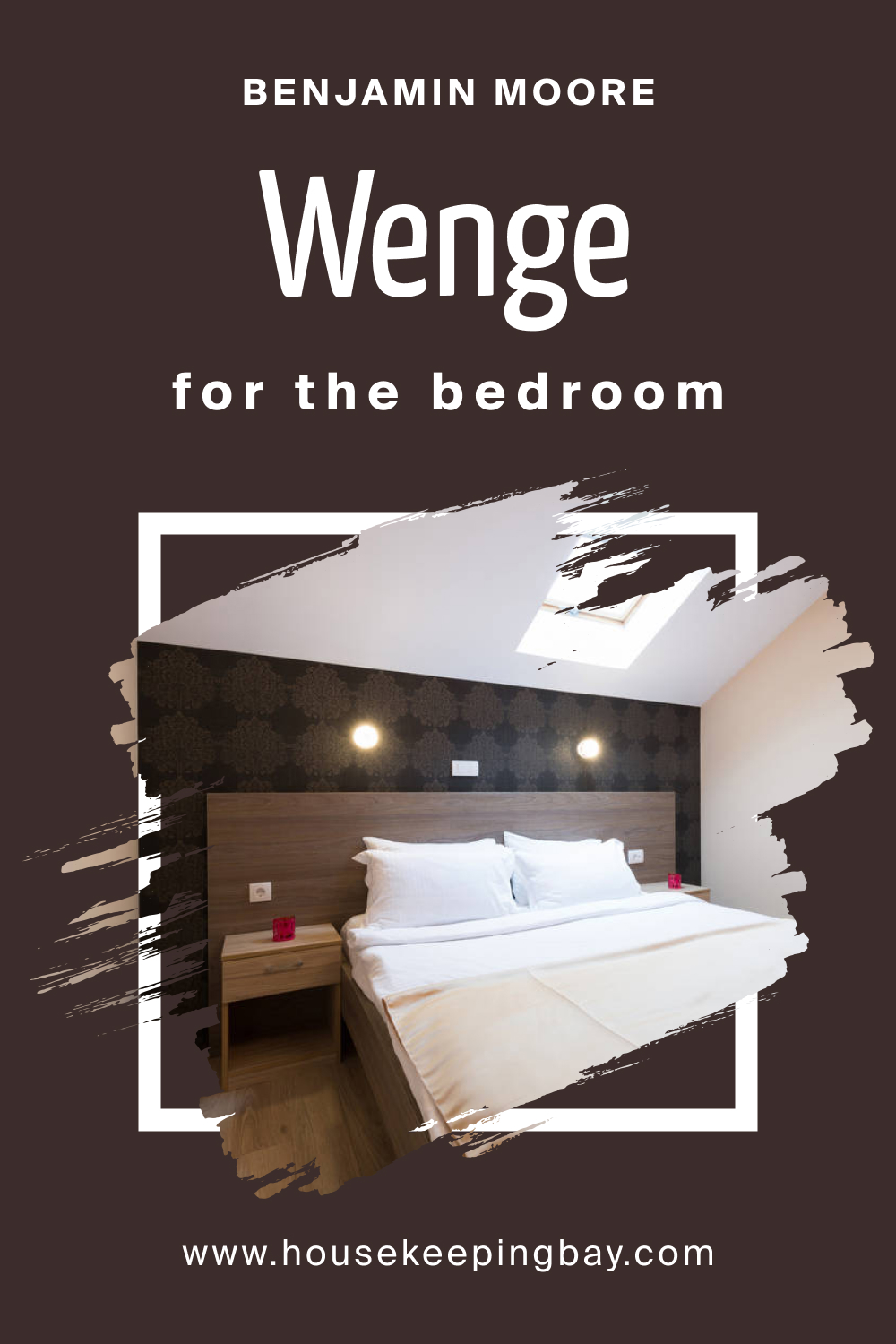
How to Use Wenge AF-180 in the Bedroom?
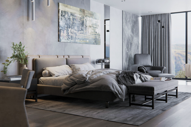
In bedrooms, Wenge AF-180 can create a cozy, relaxing sanctuary, contributing to a peaceful and rejuvenating atmosphere. It pairs beautifully with soft textiles and muted accents, providing a backdrop that is both grounding and uplifting. The warm undertones of Wenge AF-180 can complement wooden furnishings and light-colored fabrics, creating a balanced and harmonious sleeping space.
housekeepingbay.com
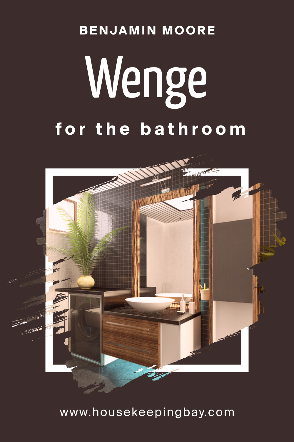
How to Use Wenge AF-180 in the Bathroom?
evate the space by imparting a spa-like, tranquil ambiance. Complemented by lighter tiles and fixtures, it can add depth and dimension. The warm, rich tones of Wenge AF-180 contrast well with metallic accents and glossy surfaces, reflecting a refined elegance and sophistication in bathroom design.
housekeepingbay.com
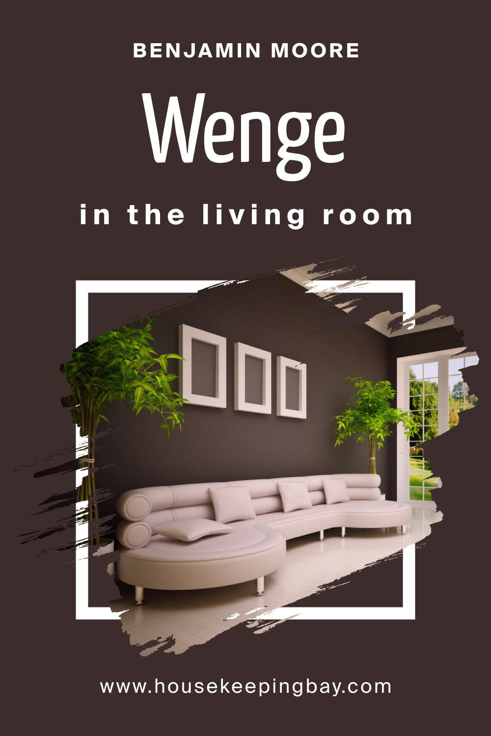
How to Use Wenge AF-180 in the Living Room?
In the living room, Wenge AF-180 can act as a stunning backdrop for diverse furniture styles and decorative elements. It harmonizes well with natural textures and vibrant accent colors, bringing a sense of warmth and sophistication to the space. This color also enhances the aesthetic appeal of artworks and decorative pieces, making them pop against its rich background.
housekeepingbay.com
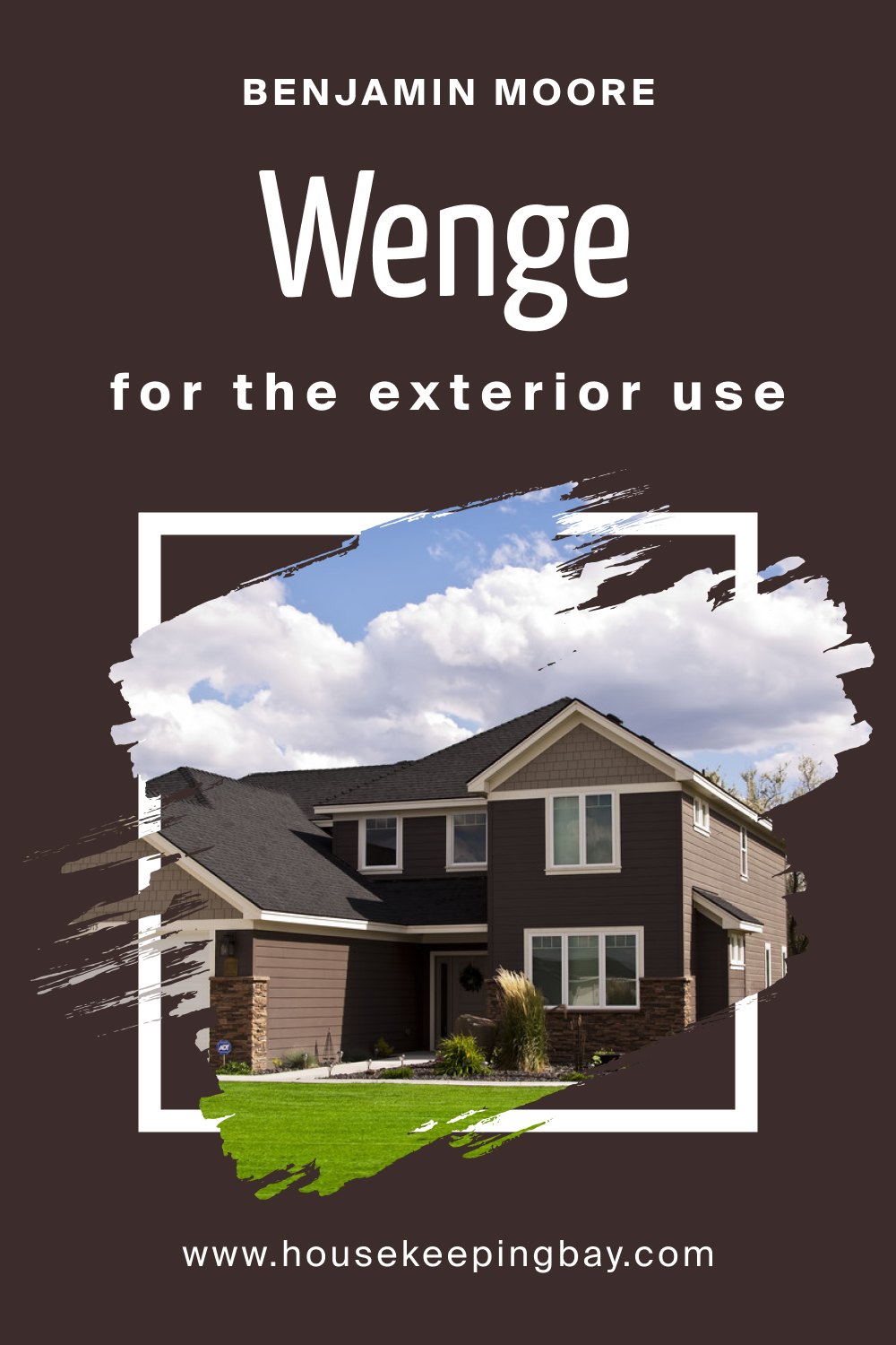
How to Use Wenge AF-180 for an Exterior?
For exteriors, Wenge AF-180 lends a timeless and elegant appeal, creating a striking contrast with the surrounding landscape. It’s especially captivating when paired with white trims and natural stone elements.
This color can withstand the test of time and trends, offering a visually appealing and harmonious facade that complements various architectural styles.
housekeepingbay.com
How to Use Wenge AF-180 in the Kitchen?
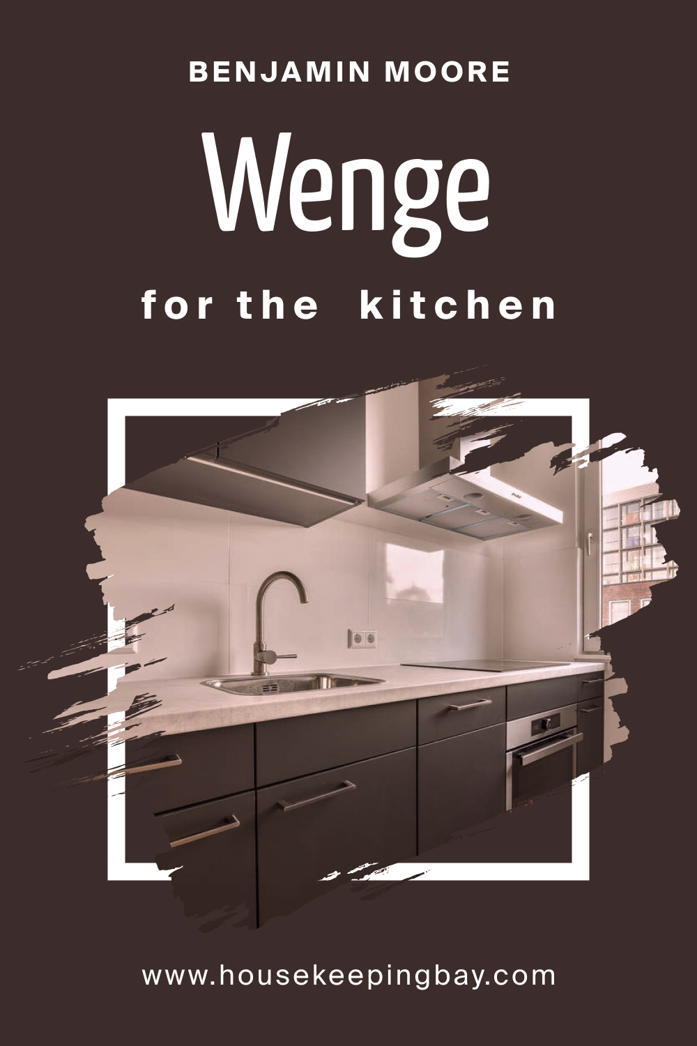
In kitchens, Wenge AF-180 can create a warm and inviting cooking space. It pairs well with stainless steel appliances and wooden countertops, blending modernity with rustic charm. The rich, earthy tones of Wenge AF-180 can be balanced with lighter shades and open shelving, creating a kitchen that is both functional and stylish.
housekeepingbay.com
How to Use Wenge AF-180 for the Kitchen Cabinets?
Wenge AF-180 is a sublime choice for kitchen cabinets, offering depth and sophistication. When paired with lighter wall colors and backsplashes, it adds a touch of luxury and contrast, making the kitchen feel more spacious and airy. The richness of Wenge AF-180 enhances the visual appeal of kitchenware and decor, allowing for a kitchen design that is cohesive and aesthetically pleasing.
Comparing Wenge AF-180 With Other Colors
Comparing Wenge AF-180 with other colors is essential to understand its versatility and to determine which hues best complement it in various settings. Such comparisons offer insights into how different colors can impact the mood, dimension, and overall aesthetic of a space, allowing for informed and harmonious design choices.
Wenge AF-180 vs. BM 2174-20 Cinnamon
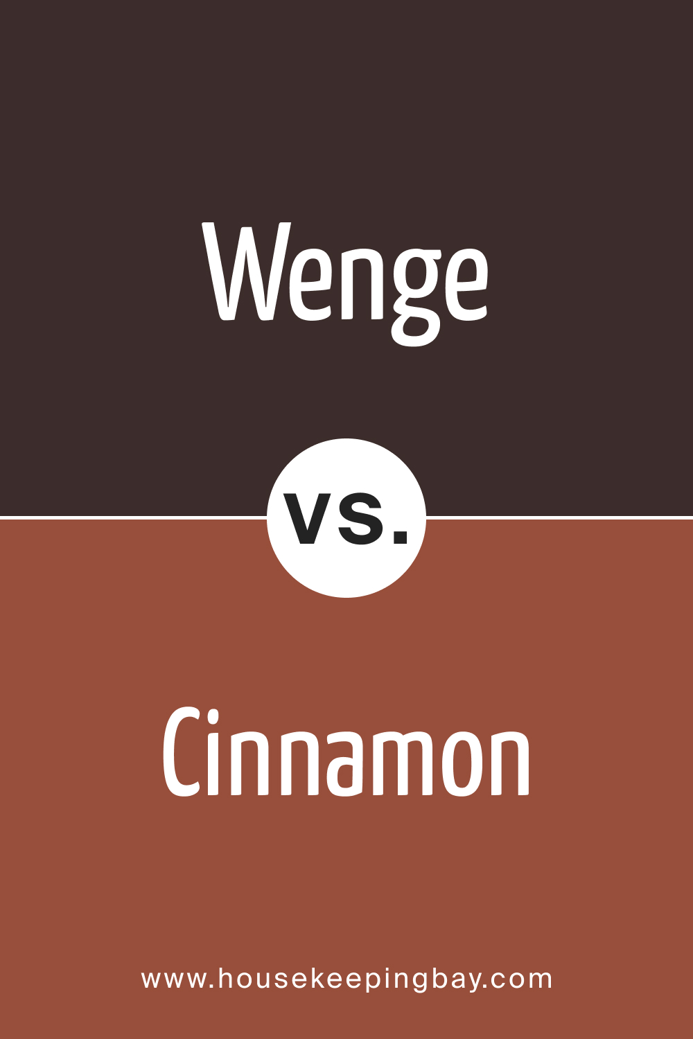
Cinnamon is a spicy, warm shade with a reddish-brown undertone. When compared to Wenge AF-180, Cinnamon feels lighter and more vibrant, introducing a sense of liveliness and energy. Wenge, with its deeper, subdued richness, provides a contrasting, grounding effect, creating a balanced, sophisticated atmosphere when paired with the zest of Cinnamon.
housekeepingbay.com
Wenge AF-180 vs. BM 2127-20 Black Ink
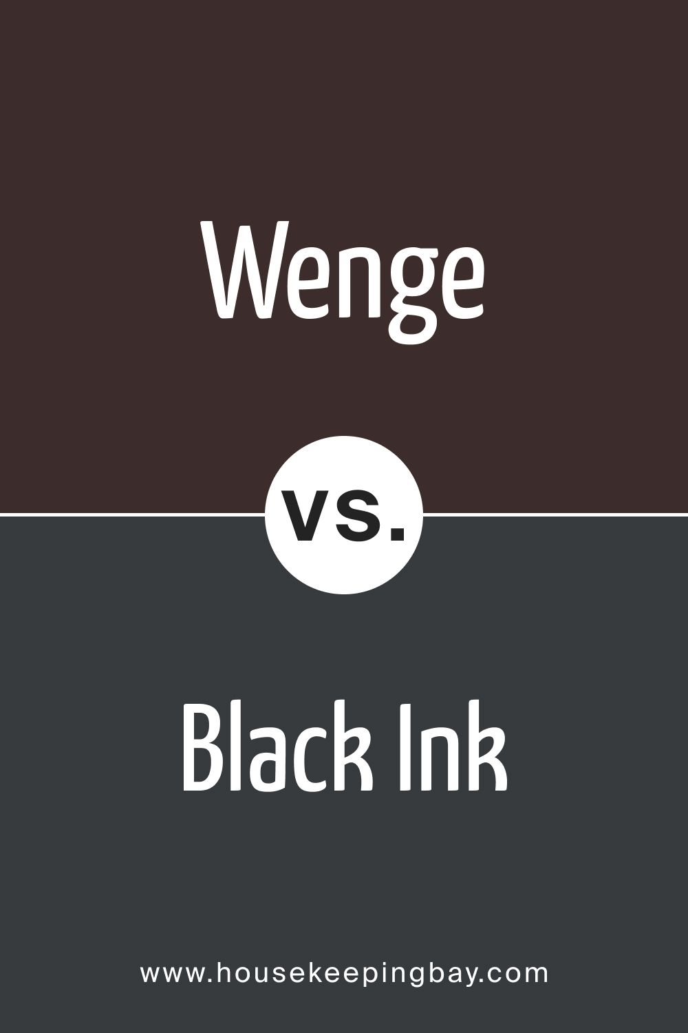
Black Ink is a solid, true black color that provides maximum contrast and a dramatic flair. Wenge AF-180, with its warm, brown undertones, feels softer and more inviting compared to the stark intensity of Black Ink. When used together, they can create a striking balance between warmth and drama, enhancing the architectural elements of a space.
housekeepingbay.com
Wenge AF-180 vs. BM 2133-10 Onyx
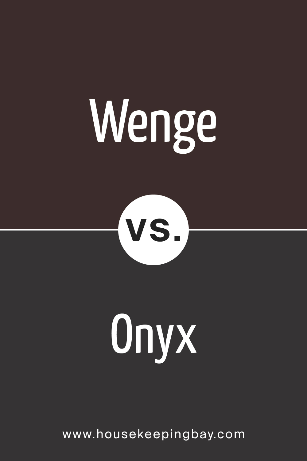
Onyx is a deep, dark grey with a neutral undertone. It offers a sense of elegance and subtlety in contrast to the warm richness of Wenge AF-180. The combination of Wenge and Onyx can create a serene and sophisticated environment, where the softness of Onyx complements the depth of Wenge, producing interiors with layered visual interest.
housekeepingbay.com
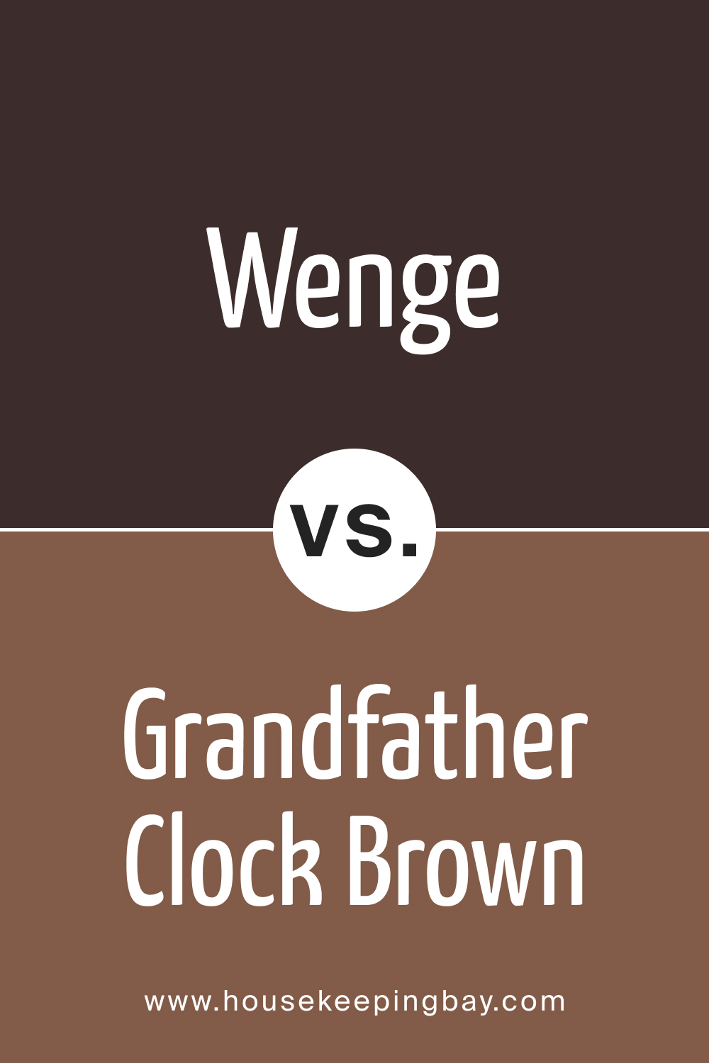
Wenge AF-180 vs. BM 2096-30 Grandfather Clock Brown
Grandfather Clock Brown is a robust, traditional brown with a touch of red. When compared, it appears more lively and radiant next to the subdued elegance of Wenge AF-180. The combination of these colors creates a warm, classic ambiance, ideal for spaces that aim to evoke a sense of timelessness and comfort.
housekeepingbay.com
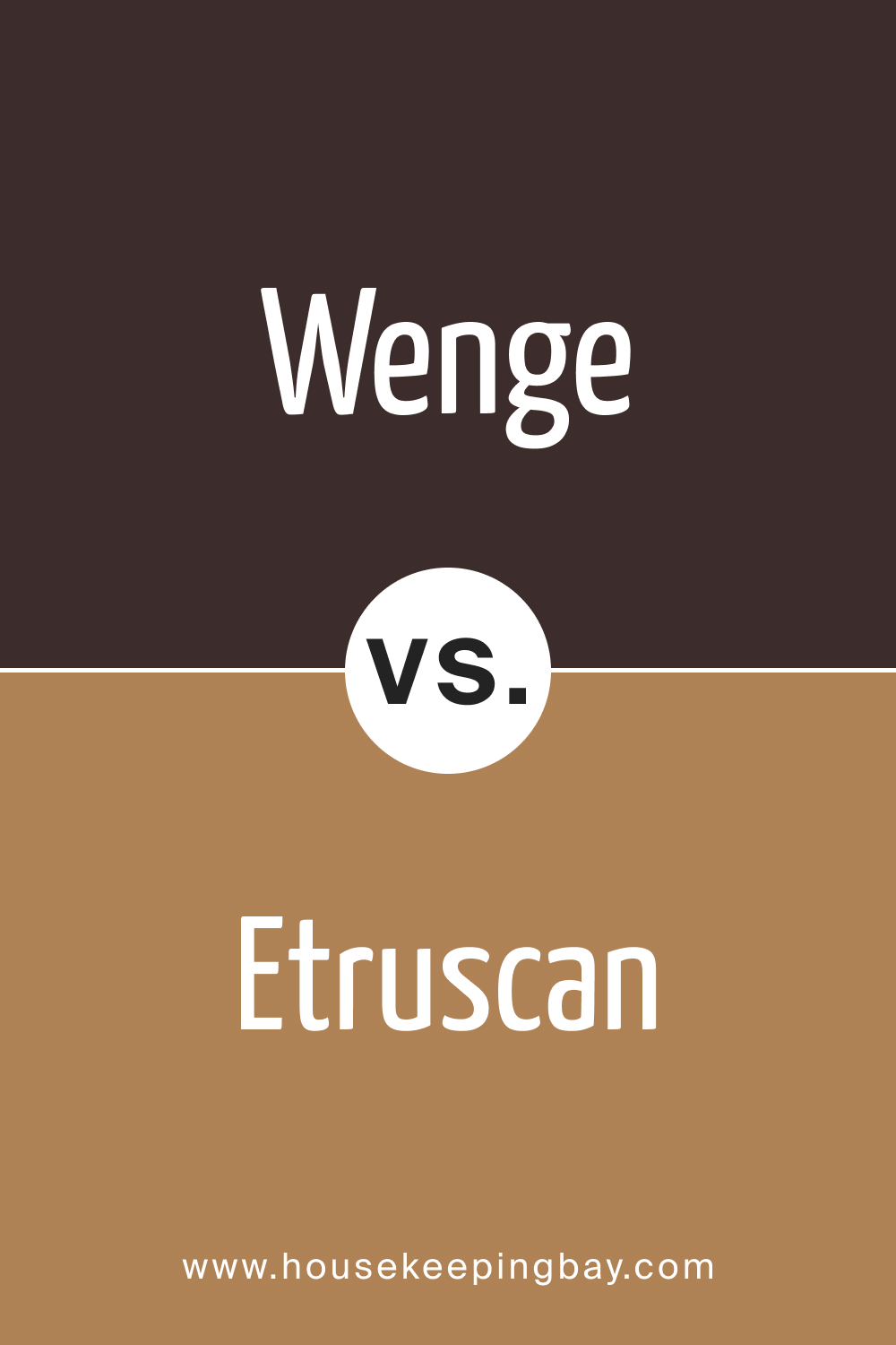
Wenge AF-180 vs. AF-355 Etruscan
Etruscan is a mid-toned, earthy color with a blend of red and brown. It appears more luminous and dynamic compared to the deep, serene aura of Wenge AF-180. When paired, they bring forth a harmonious blend of vibrancy and tranquility, enriching spaces with a diverse palette that is both grounded and stimulating.
housekeepingbay.com
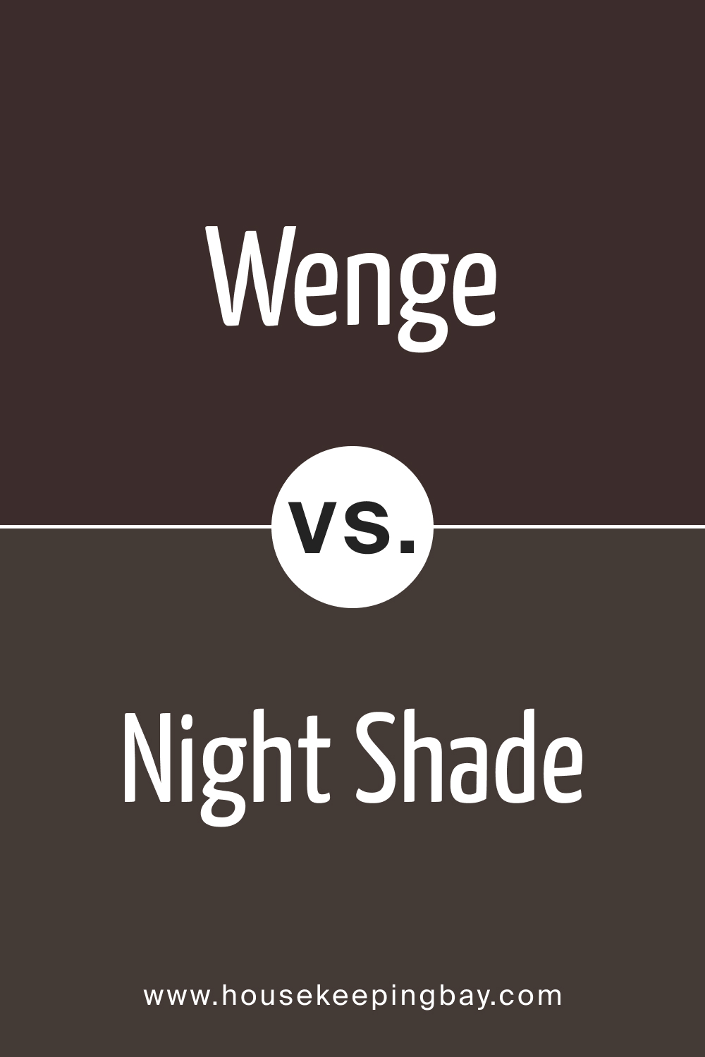
Wenge AF-180 vs. BM 2116-10 Night Shade
Night Shade is a deep, intense purple-black, providing a mysterious and luxurious ambiance. Against Wenge AF-180, it stands out with its unique, dark elegance, offering an exotic contrast to Wenge’s warm, earthy richness. The interplay between these colors can create interiors filled with drama, luxury, and sophistication.
housekeepingbay.com
Conclusion
Wenge AF-180 is not just a color; it is an experience, a statement of elegance, warmth, and sophistication. Its versatile nature, enriched by its warm undertones and coordinating colors, makes it a timeless choice for various interior styles. The low LRV of Wenge AF-180 creates an intimate and cozy atmosphere, while the appropriate trim colors frame its beauty impeccably.
The understanding of similar and complementary colors enables designers to explore a plethora of design possibilities, making Wenge AF-180 a cherished choice in the world of interior design.
housekeepingbay.com
Ever wished paint sampling was as easy as sticking a sticker? Guess what? Now it is! Discover Samplize's unique Peel & Stick samples. Get started now and say goodbye to the old messy way!
Get paint samples



Frequently Asked Questions
⭐Can Wenge AF-180 be used in smaller rooms?
Yes, Wenge AF-180 can be used in smaller rooms, but due to its low LRV, it might make the space appear more compact. Balancing it with lighter colors and adequate lighting can counteract this effect, maintaining a sense of openness.
⭐Is Wenge AF-180 suitable for exteriors?
Absolutely. Wenge AF-180 is versatile and can add a timeless and elegant appeal to exteriors, especially when contrasted with lighter trims and natural elements.
⭐What are the best trim colors to use with Wenge AF-180?
Shades of white like Cloud White, Simply White, and White Dove from Benjamin Moore serve as ideal trim colors, providing a crisp contrast and enhancing the elegance and depth of Wenge AF-180.
⭐Can Wenge AF-180 be used in a kitchen?
Yes, Wenge AF-180 can create a warm and inviting cooking space, especially when balanced with lighter shades and open shelving, providing a functional and stylish kitchen.
⭐Is Wenge AF-180 easy to coordinate with other colors?
Indeed, Wenge AF-180 is highly versatile and coordinates well with a range of colors from soft beiges and muted greys to vibrant accent colors, offering flexibility in design choices.
12 thoughts on “Wenge AF-180 Paint Color by Benjamin Moore”
Leave a Reply



Is this color kid-friendly?
Wenge AF-180 can indeed create a cozy and welcoming environment for kids. However, its dark tones may show scratches and marks more prominently, so it’s advisable to use durable, washable paint finishes in areas used by children.
What color furnishings go well with Wenge AF-180?
Furnishings in neutral tones, soft pastels, and light woods pair wonderfully with Wenge AF-180. Its warm, earthy richness complements a variety of colors and textures, allowing for a harmonious and balanced interior décor.
Can it be used for a feature wall in the living room?
Definitely! Wenge AF-180 can create a stunning feature wall in the living room. Its depth and richness can accentuate artworks and decorative pieces, making them pop and adding a focal point to the room that is both engaging and elegant.
Does it work well with metallic accents?
Yes, the rich, warm tones of Wenge AF-180 contrast beautifully with metallic accents, creating a refined and luxurious ambiance in any room. It complements gold, silver, and bronze accents exceptionally well, enhancing their shine and elegance.
Would this color suit a minimalist design style?
Absolutely! Wenge AF-180 can be a beautiful backdrop for minimalist designs. Its deep, rich tones provide a subtle sophistication that complements the simplicity and functionality of minimalist aesthetics, adding depth without overwhelming the space.
How does Wenge AF-180 look in natural light?
In natural light, Wenge AF-180 reveals its warm and earthy tones more prominently, enhancing its richness and adding a lively touch to the space. It can transform spaces into inviting and comforting environments, especially during the golden hour, when its warm undertones are accentuated.