Polar Bear SW 7564 by Sherwin Williams
Embrace the Warmth of Ultimate Serenity
This color is more than just a paint option; it’s a transformative hue that brings a soft, airy feel to any space. Known for its balanced warmth and invigorating brightness, Polar Bear transcends the typical boundaries of white, offering a soothing backdrop that complements a wide array of decor styles – from minimalist to eclectic and everything in between.
Polar Bear’s charm lies in its ability to enhance natural light, making it an excellent choice for rooms of any size, giving the illusion of a more expansive and welcoming space. It’s particularly appealing to those seeking a clean, crisp look without the starkness sometimes associated with pure white.
Designers and homeowners alike praise its flexibility, noting how it pairs beautifully with bold colors, soft pastels, and natural elements like wood and stone.
Choosing the right white can be daunting, given the plethora of options available, but Polar Bear stands out for its subtle nuance and warmth, making it a go-to choice for those looking to create a tranquil and inviting atmosphere.
Whether it’s used on walls, trim, or as an accent, SW 7564 Polar Bear by Sherwin Williams offers a timeless elegance that can elevate the aesthetic of any interior design project.
vis sherwin-williams
What Color Is Polar Bear SW 7564 by Sherwin Williams?
Table of Contents
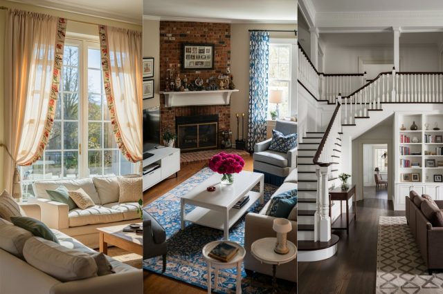
Sherwin Williams’ Polar Bear SW 7564 exudes an air of tranquility and serene elegance, embodying a warm, comforting shade of off-white that brings a subtle brightness into any space. This color is sophisticated yet versatile, providing a perfect canvas for a range of interior styles, from minimalist and contemporary to cozy farmhouse and chic Scandinavian designs. Its gentle warmth makes it particularly adept at creating an inviting atmosphere without overwhelming the senses, allowing for a seamless blend of relaxation and refined aesthetics.
Polar Bear pairs exceptionally well with natural materials and textures, enhancing the tactile experience of a room. It complements the rich, organic tones of wood, from light, breezy maple to deeper walnut hues, creating a harmonious balance between warmth and coolness.
In combination with soft, plush fabrics such as wool, linen, and cotton, it adds a layer of comfort and coziness, making spaces feel more inviting and livable. Metals like brass, copper, and brushed nickel also pair beautifully with this shade, introducing a touch of sleek sophistication and modernity to the overall design palette.
In spaces where natural light is abundant, Polar Bear reflects and amplifies the light, making rooms appear more spacious and airy. Conversely, in dimly lit areas, its warm undertones help retain a sense of coziness and warmth. As such, it is a fantastic choice for living rooms, bedrooms, and even kitchens, where it can create a seamless flow and continuity when paired with marbles and granites.
Polar Bear’s adaptive nature makes it a go-to choice for those looking to achieve a balanced, peaceful, and elegant home environment.
housekeepingbay.com
Is Polar Bear SW 7564 by Sherwin Williams Warm or Cool color?
Polar Bear (SW 7564) by Sherwin Williams is not merely a paint color; it’s a transformative tool for any living space. As part of the expansive Sherwin Williams palette, Polar Bear stands out for its soft, warm undertone that radiates comfort and serenity. This shade is a quintessential white with a slightly creamy texture that avoids the starkness or clinical feel some pure whites can convey, making it exceptionally versatile for various home styles, from traditional to modern minimalism.
The genius of Polar Bear lies in its ability to reflect natural light, thereby enhancing the brightness and perceived spaciousness of a room. This quality makes it an excellent choice for smaller spaces or rooms with limited natural light, as it can visually expand the area and imbue it with a warm, welcoming glow.
Moreover, its neutrality offers a perfect backdrop, allowing for limitless decor options, from bold and vibrant hues to subdued, earthy tones, ensuring that personal style preferences can be easily expressed.
In homes, Polar Bear can be used across walls, trim, and ceilings, providing a cohesive and continuous look that contributes to a sense of calm and order.
Its warm undertone also means it pairs beautifully with a broad spectrum of colors, textures, and materials—be it rich hardwood floors, sleek marble countertops, or soft, plush fabrics, making it a universally appealing choice for creating a serene and inviting home environment.
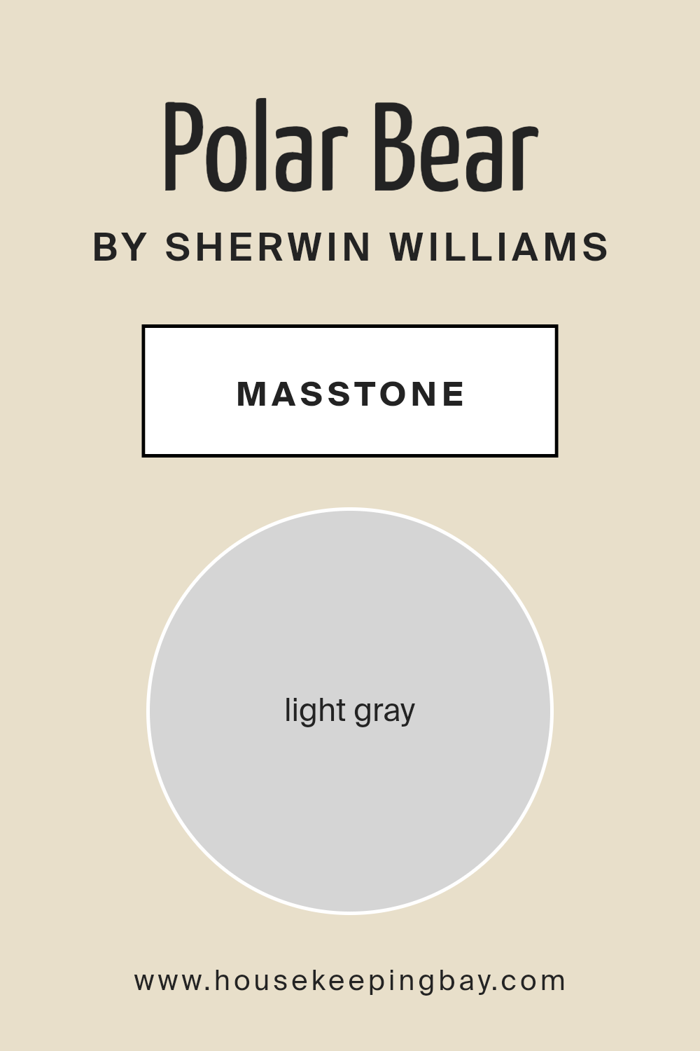
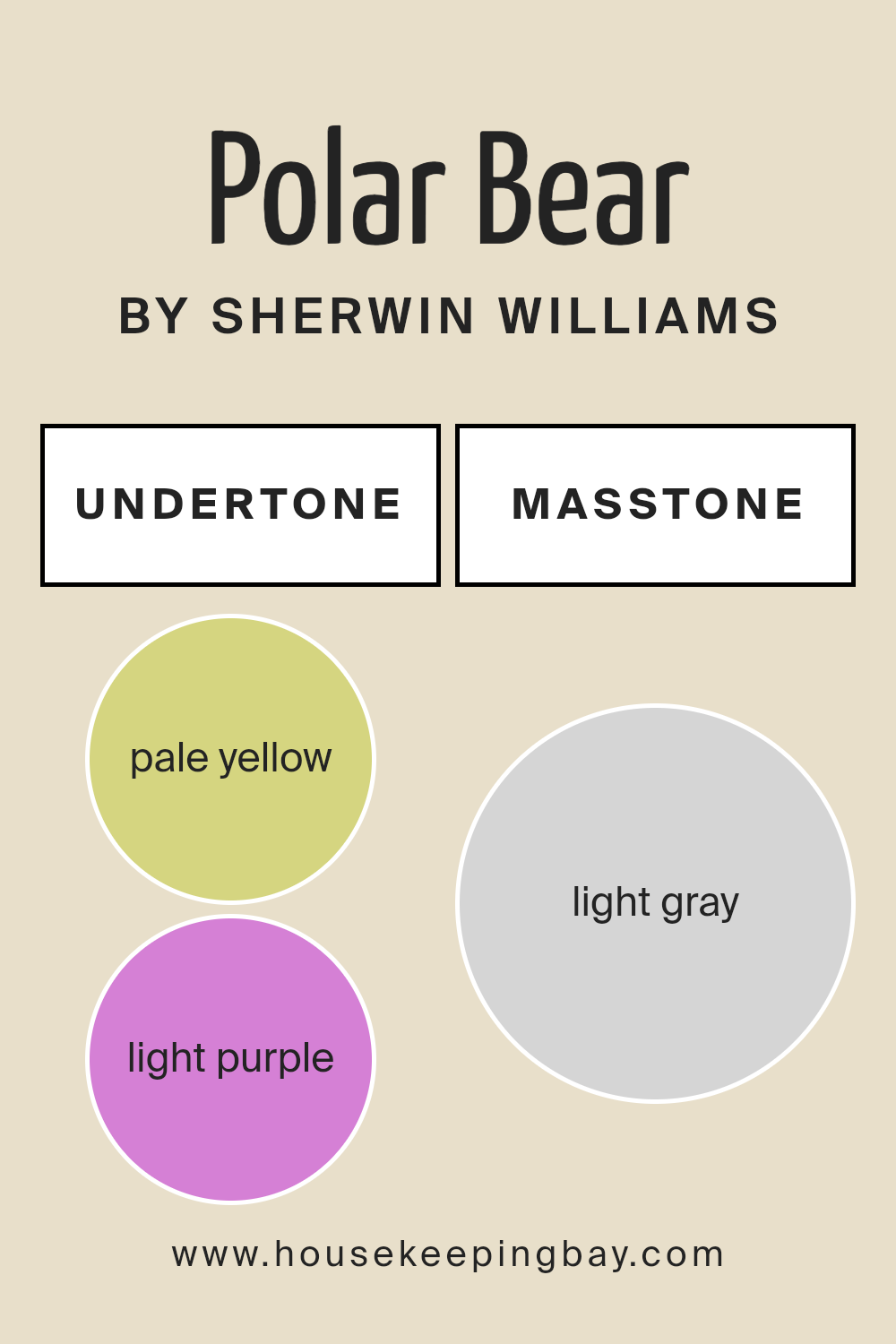
What is the Masstone of the Polar Bear SW 7564 by Sherwin Williams?
Polar Bear SW 7564 by Sherwin Williams, with its masstone of light gray (Hex code #D5D5D5), offers a versatile and understated elegance that can transform any space into a serene oasis. This particular shade of gray maintains a warm undertone, making it exceptionally adaptable and inviting. Unlike deeper grays, its lightness brings an airy and open feel to rooms, enhancing natural light and making spaces appear larger and more welcoming.
The subtle neutrality of Polar Bear ensures it works harmoniously with a wide range of color palettes, from bold and vibrant hues to more muted, earthy tones. This makes it an ideal backdrop for showcasing artwork, furniture, and decorative accents without overpowering them. In homes, its adaptability translates into a timeless color choice for walls, capable of supporting various interior styles, from contemporary and minimalistic to cozy and traditional.
Additionally, Polar Bear’s light gray masstone contributes to a calming atmosphere, encouraging relaxation. Its capacity to reflect light positively impacts mood and energy levels, making it a popular choice for living rooms, bedrooms, and even home offices. As a result, Polar Bear SW 7564 doesn’t just create visually appealing spaces; it helps in crafting environments that improve overall well-being.
housekeepingbay.com
Undertones of Polar Bear SW 7564 by Sherwin Williams
Polar Bear SW 7564 by Sherwin Williams is a captivating shade that might seem straightforward at a first glance, but its beauty is deeply enhanced by subtle and intricate undertones. This color, at its core, harbors pale yellow and light purple undertones, which influence its perception and application profoundly.
Undertones in paint colors are secondary hues that influence the primary color’s overall appearance, which becomes noticeable under certain lighting conditions or when juxtaposed against specific shades. The pale yellow undertone adds warmth, infusing spaces with a cozy, inviting glow, making rooms feel more luminous and airy.
Contrarily, the light purple undertone introduces a touch of cool sophistication, offering a subtle balance to the warmth of yellow. This interplay between warmth and coolness makes Polar Bear incredibly versatile.
When applied to interior walls, the undertones of Polar Bear SW 7564 have a transformative effect. In rooms with ample natural light, the pale yellow undertone brightens, creating an illusion of expansiveness and openness. Meanwhile, in spaces with cooler, artificial light, the light purple undertone might become more pronounced, adding a nuanced depth that enhances the space’s aesthetic appeal.
This duality ensures that Polar Bear can complement a wide range of décor styles and color palettes, adapting fluidly to the changing dynamics of light and space within a home.
Ultimately, the unique undertones of Polar Bear SW 7564 enrich its application on interior walls, allowing designers and homeowners to craft spaces that feel both comforting and sophisticated.
housekeepingbay.com
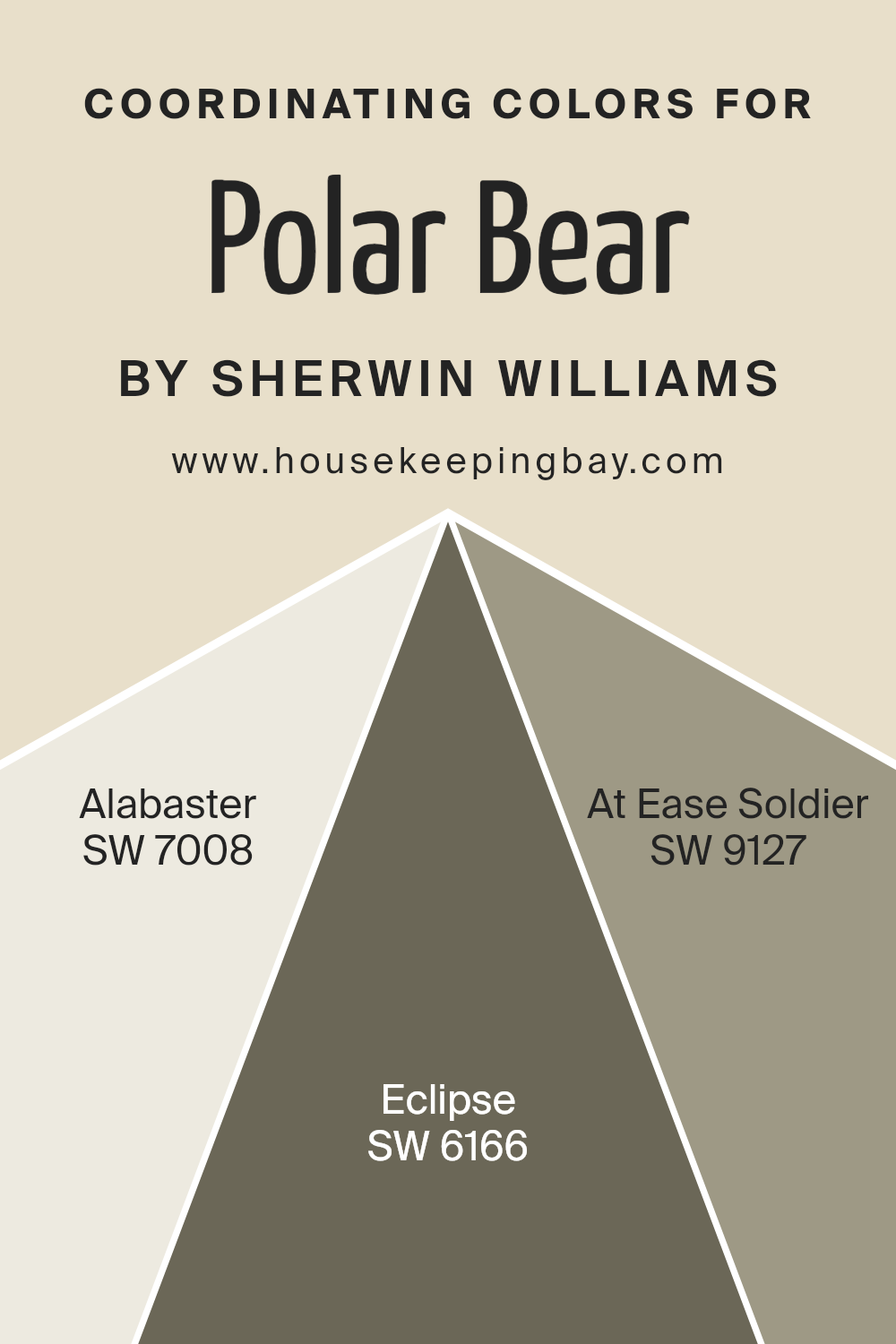
Coordinating Colors of Polar Bear SW 7564 by Sherwin Williams
Coordinating colors are hues that complement each other when used together in interior design or art, creating aesthetically pleasing combinations. These colors have been selected based on their ability to enhance the characteristics of a primary color, in this case, Polar Bear SW 7564 by Sherwin Williams.
Coordinating colors serve to balance, highlight, or contrast the main hue, depending on their place on the color wheel, ensuring that the overall look achieves the desired emotion or ambiance. The magic lies in how these coordinating colors interact with Polar Bear SW 7564, a serene and inviting shade of white.
Sherwin Williams’ Alabaster SW 7008 is a warm, soft white that radiates comfort and simplicity, making it an ideal complement to the crispness of Polar Bear SW 7564. It adds a layer of warmth without overwhelming, creating spaces that feel open and peaceful. Eclipse SW 6166, on the other hand, presents a profound, dark gray that introduces a dramatic contrast.
This rich hue can give depth and definition when paired with Polar Bear SW 7564, anchoring lighter and airy designs. At Ease Soldier SW 9127 completes the palette as a muted, soothing green that brings a sense of tranquility and nature-inspired freshness.
This versatile color works harmoniously with the airy Polar Bear SW 7564, bridging the gap between the serene white and more intense shades like Eclipse, ensuring a cohesive and balanced visual impact.
You can see recommended paint colors below:
- SW 7008 Alabaster
- SW 6166 Eclipse
- SW 9127 At Ease Soldier
housekeepingbay.com
How Does Lighting Affect Polar Bear SW 7564 by Sherwin Williams?
Lighting significantly influences our perception of colors. The impact of light sources, whether natural or artificial, can alter the appearance of paint colors on our walls, affecting the mood and ambiance of a room. This phenomenon occurs because colors do not inherently possess color; they reflect wavelengths of light, which our eyes interpret as color. Thus, the type and quality of light in a space can change how a color looks.
Consider the color Polar Bear (SW 7564) by Sherwin Williams, a warm, inviting shade of off-white with subtle undertones that can lean towards a creamy or slightly gray hue depending on the lighting conditions. In artificial light, the qualities of the light source—whether it’s LED, fluorescent, or incandescent—can impact how Polar Bear appears.
LEDs with a cooler temperature might enhance its gray undertones, making the space feel more modern and crisp. In contrast, warmer incandescent lights might highlight its creamy side, creating a cozier, more welcoming atmosphere.
In natural light, the orientation of the room plays a pivotal role in how Polar Bear is perceived. North-facing rooms receive indirect, cooler light, which can make this color appear more muted and closer to its gray undertones, thus providing a serene and calm ambiance. South-facing rooms, basking in warm, direct sunlight for most of the day, allow Polar Bear to show its warmth more, enhancing the creamy undertones and making the room feel brighter and more inviting.
Rooms facing east bathe in the warm, golden light of the morning but become cooler and somewhat dimmer in the afternoon, making Polar Bear shift from a bright, cheerful white in the morning to a more subdued, neutral tone by the afternoon.
Conversely, west-facing rooms get a softer light in the morning, which then intensifies by sunset, causing this color to transition from a gentle, soft hue in the morning to a warm, glowing tone in the evening, potentially emphasizing the warmth of the paint as the sun sets.
Understanding how lighting affects colors like Polar Bear by Sherwin Williams can greatly aid in making informed decisions about paint choices, ensuring that the colors in your home align with the desired mood and atmosphere of each space.
housekeepingbay.com
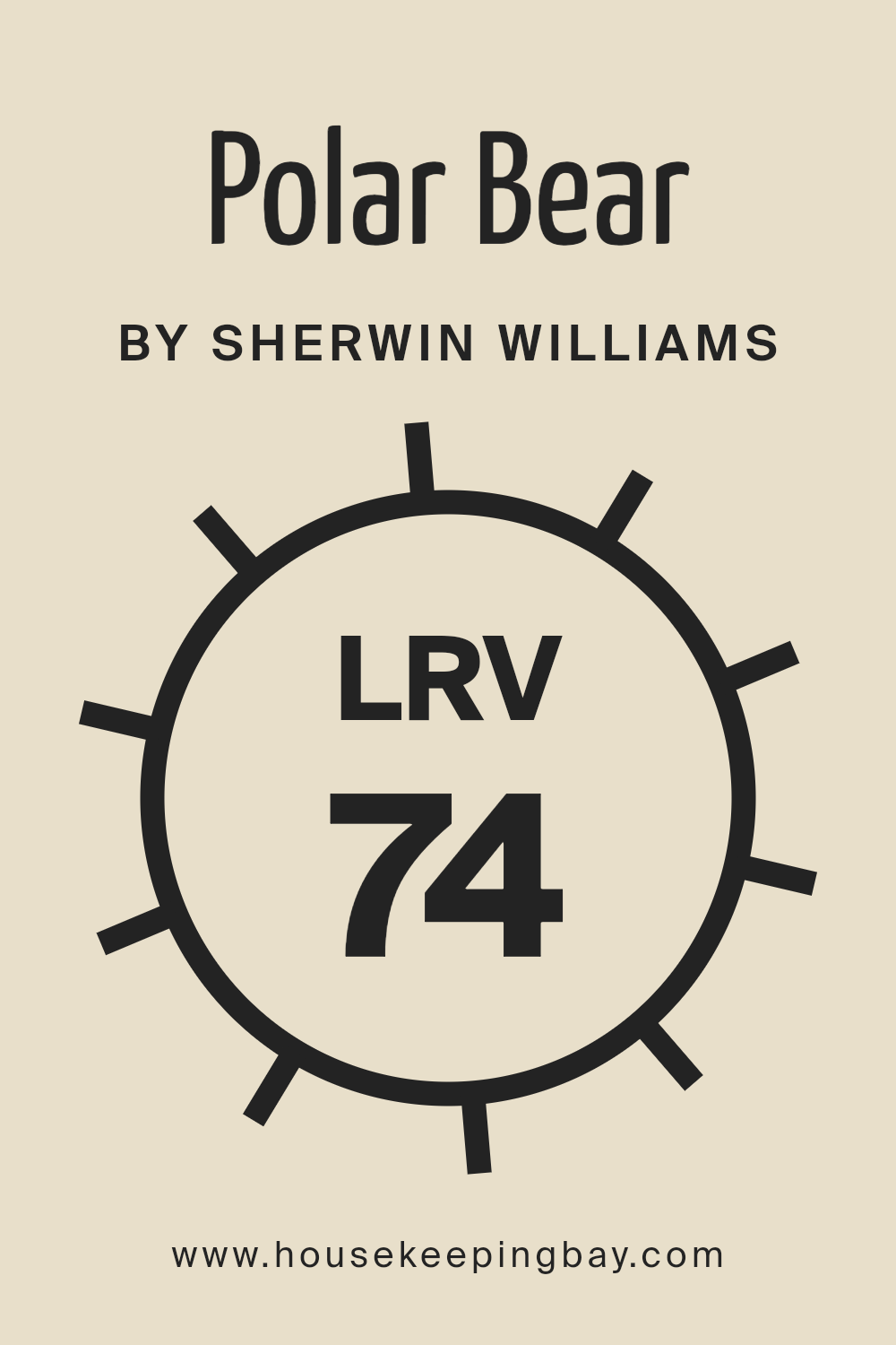
What is the LRV of Polar Bear SW 7564 by Sherwin Williams?
LRV stands for Light Reflectance Value, a metric used to measure the amount of visible and usable light that a paint color reflects or absorbs when dry. Expressed on a scale from 0 to 100, LRV numbers closer to 0 indicate darker shades that absorb more light, while numbers closer to 100 represent lighter shades that reflect more light.
This measurement is crucial for interior designers, architects, and homeowners as it impacts how light or dark a color appears in a given space, influencing the atmosphere and spatial perceptions. A higher LRV can make a room feel more open and airy, as more light is reflected around the space, while a lower LRV can create a cozier, more enveloped feeling, absorbing more light and, hence, seemingly reducing the sense of space.
With an LRV of 74.208, Polar Bear (SW 7564) by Sherwin Williams reflects a substantial amount of light, categorizing it as a light color that can significantly influence the brightness and feel of a room. This high LRV means that Polar Bear is capable of making spaces appear more expansive and welcoming by bouncing back most of the light that hits its surface.
This characteristic is particularly beneficial in rooms that receive limited natural light or are smaller in size, as it can help to artificially enhance the light levels and sense of space within these areas.
However, the actual impact of this LRV on the appearance of the color can still vary depending on the room’s lighting conditions, both natural and artificial, emphasizing the importance of considering the space’s unique characteristics when choosing paint colors.
housekeepingbay.com
What is LRV? Read It Before You Choose Your Ideal Paint Color
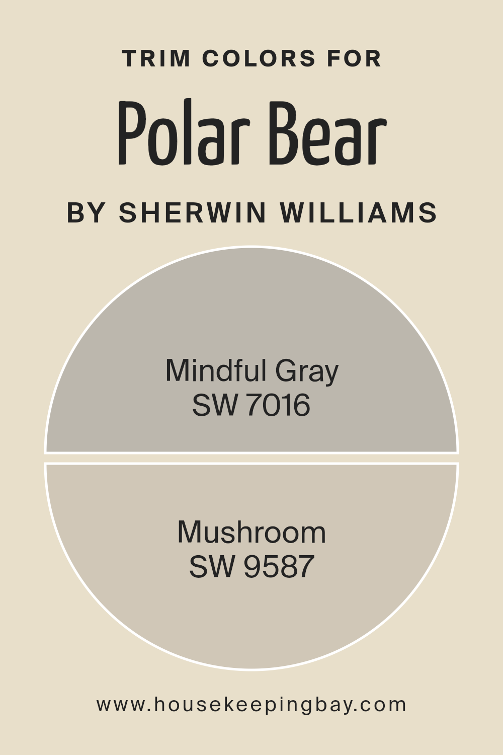
What are the Trim colors of Polar Bear SW 7564 by Sherwin Williams?
Trim colors are essential accents in interior design, serving as a defining boundary that enhances the esthetic appeal of a space by creating contrast or cohesion with the primary wall color. For example, when using Polar Bear SW 7564 by Sherwin Williams, a crisp and clean white hue that brings an airy and bright feeling to any room, selecting the right trim color is crucial.
It not only highlights architectural details but can also influence the overall mood and dimension of the space. Trim colors can make the wall color pop, define the architecture of the room, and add depth and character to the space.
Choosing Mindful Gray SW 7016, a soft, warm gray that carries a sense of mindfulness and tranquility, as a trim color for Polar Bear SW 7564, is an excellent choice for creating a subtle contrast that is both sophisticated and grounding.
This combination is perfect for spaces aiming for a serene and harmonious ambience. On the other hand, Mushroom SW 9587, a rich, earthy taupe that evokes a sense of stability and warmth, offers a bolder contrast to the crispness of Polar Bear SW 7564.
This pairing introduces an organic, inviting feel, making it ideal for creating cozy and comfortable living environments. Both Mindful Gray and Mushroom, through their distinctive qualities, complement Polar Bear SW 7564 in ways that heighten the visual interest and warmth of spaces, proving the significance of carefully selected trim colors in interior design.
You can see recommended paint colors below:
housekeepingbay.com
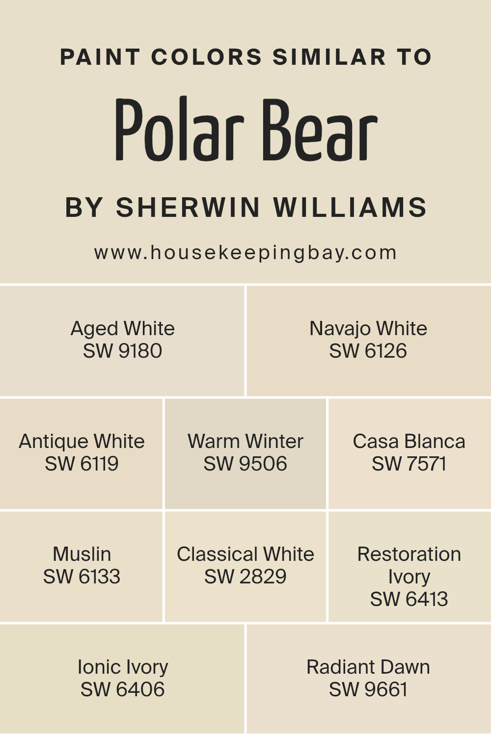
Colors Similar to Polar Bear SW 7564 by Sherwin Williams
Selecting similar colors to Polar Bear SW 7564 by Sherwin Williams is essential in creating a cohesive, visually appealing aesthetic in any space, as these colors share a unifying hue that bridges the gaps between them, enabling a subtle and sophisticated palette. Similar colors such as Aged White, Navajo White, Antique White, Warm Winter, Casa Blanca, Muslin, Classical White, Restoration Ivory, Ionic Ivory, and Radiant Dawn each bring their own unique qualities while maintaining a harmonic relationship. This range, from the historical charm of Aged White to the subtle brightness of Radiant Dawn, opens up possibilities for layering and contrast without the risk of visual discord.
For example, Aged White exudes an understated elegance, reminiscent of gently worn surfaces that whisper stories of the past, while Navajo White offers a creamier, slightly deeper tone that wraps a room in warmth.
Antique White recalls the patina of timeless treasures, creating a soft backdrop full of depth. Warm Winter, with its inviting hue, suggests the cozy glow of hearthlight. Casa Blanca leans into a more definitive warmth, hinting at sunlit sands.
Muslin wraps spaces in a delicate, almost ethereal light, whereas Classical White brings a refined, pure brightness to interiors. Restoration Ivory and Ionic Ivory both introduce historical undertones, one with a bit more gravity, the other lighter, uplifting spaces with their aged beauty.
Radiant Dawn closes the palette on a hopeful note, its subtle luminosity reminiscent of early morning light. Each color, while similar, plays with light and texture in such a way that, when used together, can create a space that feels both harmonious and rich with dimension.
You can see recommended paint colors below:
- SW 9180 Aged White
- SW 6126 Navajo White
- SW 6119 Antique White
- SW 9506 Warm Winter
- SW 7571 Casa Blanca
- SW 6133 Muslin
- SW 2829 Classical White
- SW 6413 Restoration Ivory
- SW 6406 Ionic Ivory
- SW 9661 Radiant Dawn
housekeepingbay.com
How to Use Polar Bear SW 7564 by Sherwin Williams In Your Home?
Polar Bear SW 7564 by Sherwin Williams is a warm and inviting shade of off-white, reminiscent of the creamy tones found in the artic animal’s fur. This soft and understated color exudes a sense of tranquility and elegance, making it a versatile choice for any room in your home. Its neutral base allows it to seamlessly blend with a wide range of color palettes and interior styles, from minimalist and modern to traditional and cozy.
Using Polar Bear in your home can create a bright and welcoming atmosphere. Consider painting your living room or bedroom walls with this hue to serve as a subtle backdrop that brings a sense of calm and relaxation. Its reflective quality can help to enhance natural light, making spaces appear larger and more airy.
For a more sophisticated look, pair it with darker tones like navy or charcoal for a striking contrast, or complement it with soft pastels for a tender, harmonious space.
Accessories and textiles in vibrant colors can stand out beautifully against a Polar Bear backdrop, allowing for personalization and style expression. Whether you’re aiming for a serene retreat or a stylish entertaining area, Polar Bear SW 7564 offers a delightful canvas to build upon.
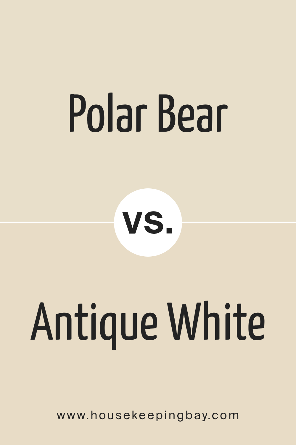
Polar Bear SW 7564 by Sherwin Williams vs Antique White SW 6119 by Sherwin Williams
Polar Bear SW 7564 and Antique White SW 6119 by Sherwin Williams are both neutral colors, but they offer distinct tones that set them apart in interior spaces. Polar Bear is a soft, warm white with a slightly creamy undertone, giving it a welcoming and gentle ambiance.
Its warmth makes it a versatile choice for rooms that aim for a cozy yet bright feel, as it reflects light beautifully without becoming stark or cold.
On the other hand, Antique White SW 6119 leans towards a more classic, muted palette with a deeper, richer creaminess than Polar Bear. Its undertones are more pronounced, offering a hint of beige that adds depth and warmth, creating an elegant and timeless look. This color is ideal for spaces that seek a sophisticated touch, blending well with a wide range of decors and accentuating wood finishes and natural materials.
While both colors provide a neutral backdrop suitable for various design styles, Polar Bear is preferable for those seeking a brighter, more airy space, whereas Antique White is the go-to for a more traditional, cozy feel. Their subtle differences in tone and depth can significantly influence the atmosphere and aesthetic of a room.
You can see recommended paint color below:
housekeepingbay.com
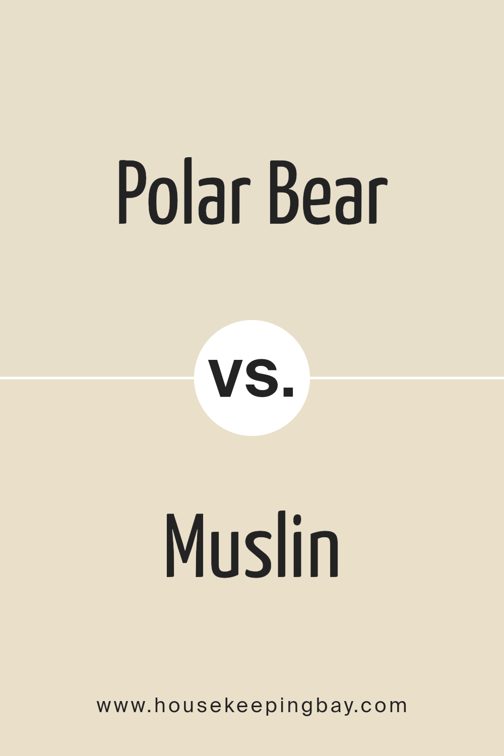
Polar Bear SW 7564 by Sherwin Williams vs Muslin SW 6133 by Sherwin Williams
Polar Bear SW 7564 and Muslin SW 6133 by Sherwin Williams are two nuanced colors that offer subtle yet distinct tones for walls that crave a touch of warmth. Polar Bear is a soft, warm white, with a creamy undertone that brings a cozy, welcoming feel to any space. This color shines in well-lit areas, reflecting light beautifully and creating an illusion of a more spacious environment. Its versatility allows it to blend seamlessly with a variety of decor styles, from modern to traditional.
Muslin SW 6133, on the other hand, is a light, muted beige with a slightly warmer undertone. This color exudes a natural, earthy vibe, making it perfect for creating a serene and inviting atmosphere. Muslin offers a touch of depth compared to Polar Bear, making it suitable for spaces where a richer, more enveloping feel is desired.
While both colors are designed to enhance the feeling of light and space, Polar Bear leans towards a crisp, clean aesthetic, whereas Muslin offers a hint of warmth and sophistication. The choice between them depends on the desired ambiance and the interplay with other colors and elements in the room.
You can see recommended paint color below:
housekeepingbay.com
Polar Bear SW 7564 by Sherwin Williams vs Ionic Ivory SW 6406 by Sherwin Williams
Polar Bear SW 7564 and Ionic Ivory SW 6406, both from Sherwin Williams, embody the subtlety and tranquility that neutral colors offer, yet they convey distinct moods and stylistic impressions within a space. Polar Bear presents as a soft, creamy white with a warm undertone that radiates a welcoming, gentle ambiance. It’s a versatile color that can brighten up spaces while maintaining a cozy feel. Ideal for walls, it serves as a perfect backdrop for both vibrant and subdued color palettes, enhancing natural light in a room.
Ionic Ivory, on the other hand, leans slightly towards a beige hue, encapsulating a richer, deeper warmth compared to Polar Bear. Its undertone has a touch of yellow, offering an earthy, inviting quality that suggests comfort and serenity. Ionic Ivory is superb for creating a snug, intimate atmosphere, particularly well-suited for bedrooms and living areas where warmth is key.
Though both shades promote warmth and neutrality, Polar Bear stands out for its ability to make spaces appear larger and brighter, whereas Ionic Ivory introduces depth and coziness, making it ideal for creating inviting, reflective spaces.
You can see recommended paint color below:
housekeepingbay.com
Polar Bear SW 7564 by Sherwin Williams vs Navajo White SW 6126 by Sherwin Williams
Polar Bear SW 7564 and Navajo White SW 6126, both from Sherwin Williams, present nuanced but distinct differences that cater to varied aesthetic preferences and design needs. Polar Bear is a soft, warm white with a slightly creamy undertone that radiates a cozy and inviting ambiance.
Its neutral base makes it incredibly versatile for any space, serving as an excellent backdrop that can either stand alone for a minimalist look or complement bold accents and textures without overwhelming them.
On the other hand, Navajo White SW 6126 steps away from the starkness often associated with white, embracing a richer, more pronounced creamy hue. This color is steeped in warmth, making rooms feel more enclosed and intimate. It’s ideal for those wishing to create a snug and welcoming environment, particularly in spaces that crave a touch of elegance without sacrificing comfort.
Whilst both colors share a base of warmth and neutrality, Polar Bear leans toward a lighter, more subtle approach, offering freshness and brightness. Navajo White, however, dives deeper into warmth, providing a robust option for those seeking a cozier, more enveloping atmosphere.
Each color, therefore, holds its unique charm, with Polar Bear favoring minimalist designs and Navajo White catering to richer, more traditional spaces.
You can see recommended paint color below:
housekeepingbay.com
Polar Bear SW 7564 by Sherwin Williams vs Restoration Ivory SW 6413 by Sherwin Williams
Polar Bear SW 7564 and Restoration Ivory SW 6413, both by Sherwin-Williams, offer unique aesthetic qualities for their respective places on the color wheel. Polar Bear is a warm, inviting white, with undercurrents that hint towards a soft, creamy vanilla.
This color suggests a subtle, yet undeniable, sense of coziness and comfort, making spaces feel open and airy without being stark. It is particularly suited for creating a tranquil and serene environment, reflecting ample light to make rooms appear more expansive.
On the other hand, Restoration Ivory SW 6413 is a deeper, more pronounced hue than Polar Bear. It leans into a beige spectrum, presenting a richer, earthier tone that exudes warmth and sophistication.
This color introduces a welcoming depth to walls, providing a cozy backdrop that complements a wide range of decorating styles, from rustic to contemporary. Restoration Ivory embodies a sense of stability and grounding, offering an elegant contrast to the lighter, breezier Polar Bear.
Together, these colors can harmonize within a space, with Polar Bear serving as a refreshing neutral base and Restoration Ivory adding character and warmth through accent pieces or adjoining rooms.
You can see recommended paint color below:
- SW 6413 Restoration Ivory
housekeepingbay.com
Polar Bear SW 7564 by Sherwin Williams vs Warm Winter SW 9506 by Sherwin Williams
When comparing “Polar Bear” (SW 7564) and “Warm Winter” (SW 9506) by Sherwin Williams, we explore a nuanced contrast between two shades that cater to different aesthetic preferences within neutral territories. Polar Bear presents as a soft, serene white with a subtle warmth beneath its exterior, evoking a sense of calmness and purity. It’s an ideal choice for spaces aiming to achieve a bright, airy feel, reflecting natural light beautifully and making rooms appear more spacious.
On the other hand, Warm Winter delves into a deeper, richer territory, offering a cozy hue that straddles the line between beige and gray. This color embodies comfort and sophistication, crafting an inviting atmosphere that’s perfect for creating a snug, intimate environment. Its earthy tones bring warmth to spaces, making it excellent for rooms that aim for a more enclosed, warm ambiance.
Both colors share a versatility that allows them to blend seamlessly with a variety of decor styles and color palettes. However, the key difference lies in their underlying tones and the spatial perceptions they inspire – Polar Bear opens and brightens spaces, while Warm Winter envelops them in warmth.
You can see recommended paint color below:
housekeepingbay.com
Polar Bear SW 7564 by Sherwin Williams vs Casa Blanca SW 7571 by Sherwin Williams
Polar Bear SW 7564 and Casa Blanca SW 7571, both from Sherwin Williams, are sophisticated neutrals that bring warmth and light to spaces, yet each holds a unique essence. Polar Bear is the lighter of the two, offering a bright, crisp white that easily illuminates any room it graces. It has a clean and refreshing quality, making it ideal for modern, minimalist designs or to create a sharp contrast with bold colors.
Casa Blanca, on the other hand, veers towards a softer, creamier palette. It still maintains the neutrality but adds a touch of warmth, reminiscent of the natural color of antique lace or rich cream. This hue brings an inviting coziness to spaces, making it perfect for creating a tranquil, comfortable atmosphere in both traditional and contemporary settings.
Though both colors share a foundational neutrality, Polar Bear leans towards a cooler spectrum, offering clarity and brightness, while Casa Blanca provides a warm embrace, enriching spaces with its subtle, creamy undertones. Both colors reflect Sherwin Williams’ expertise in creating versatile, sophisticated shades that cater to various aesthetic preferences and design needs.
You can see recommended paint color below:
housekeepingbay.com
Polar Bear SW 7564 by Sherwin Williams vs Radiant Dawn SW 9661 by Sherwin Williams
“Polar Bear SW 7564” and “Radiant Dawn SW 9661” by Sherwin Williams present distinctive nuances that cater to varied aesthetic preferences and design needs. “Polar Bear” is a warm, inviting off-white with a subtle cream undertone, creating a cozy and comfortable ambiance in any space. Its versatility allows it to seamlessly blend with a wide range of color palettes, making it a popular choice for creating a soft, neutral background that exudes tranquility and light.
On the other hand, “Radiant Dawn” embodies a more pronounced, vibrant character. This color is a bright, cheerful green with hints of blue, providing a fresh and energizing feel. Its vivacity makes it ideal for spaces that aim to inspire creativity and vitality. While it can serve as a striking accent, its luminosity is well-suited for rooms that benefit from a splash of cheerfulness and a connection to the outdoors.
Comparatively, “Polar Bear” appeals to those seeking a gentle, serene foundation, offering flexibility in decor choices, whereas “Radiant Dawn” caters to a bolder aesthetic, injecting life and dynamism into a space. Both colors reflect Sherwin Williams’ commitment to offering a diverse palette to meet various design philosophies and preferences.
You can see recommended paint color below:
- SW 9661 Radiant Dawn
housekeepingbay.com
Polar Bear SW 7564 by Sherwin Williams vs Aged White SW 9180 by Sherwin Williams
Polar Bear SW 7564 and Aged White SW 9180 by Sherwin Williams are two distinctive shades that cater to different design preferences while maintaining an aesthetic subtlety. Polar Bear, a crisp and refreshing white, possesses a bright, almost pure white appearance that exudes a sense of cleanliness and simplicity. It’s particularly effective in spaces seeking a modern, airy feel, allowing for a vivid contrast against bold colors and playing beautifully with natural light to create a sense of expansion and openness.
On the other hand, Aged White SW 9180 introduces a warmer, more nuanced approach to white. This color features an undertone that leans towards beige, offering a softer, more inviting ambiance. Aged White, true to its name, suggests a timeless quality, reminiscent of vintage charm or an antique patina.
This color works wonderfully in settings where a cozy, slightly rustic aesthetic is desired, providing a comforting backdrop that pairs well with a wide range of decor, from traditional to contemporary.
Comparatively, Polar Bear is the go-to for a sharper, vibrant environment, while Aged White caters to spaces aiming for warmth and a lived-in, welcoming feel. Both colors serve distinct purposes and evoke different moods, making the choice between them a matter of personal preference and the specific design goals of a space.
You can see recommended paint color below:
housekeepingbay.com
Polar Bear SW 7564 by Sherwin Williams vs Classical White SW 2829 by Sherwin Williams
Polar Bear SW 7564 by Sherwin Williams and Classical White SW 2829 by Sherwin Williams both offer a serene backdrop for any space, but they present subtle differences that can influence the mood and perception of a room.
Polar Bear is a warm, soft white that veers towards a creamy beige under certain lighting conditions, adding a cozy, inviting glow to interiors. Its warmth makes it particularly effective in spaces that aim for a comforting and welcoming atmosphere, blending smoothly with a wide range of colors and finishes.
On the other hand, Classical White SW 2829 leans more towards a pure, crisp white with a slightly cooler undertone compared to Polar Bear. This quality gives it a timeless elegance, making it a great choice for achieving a classic, bright, and open feel in a room. It reflects light beautifully, helping to create the illusion of more space and is particularly well-suited for areas that aim to strike a balance between traditional charm and modern simplicity.
Both colors serve as versatile backgrounds, but the choice between them depends largely on the desired ambiance: Polar Bear for a warmer, more enveloping space, and Classical White for a crisp, clean, and classic environment.
You can see recommended paint color below:
- SW 2829 Classical White
housekeepingbay.com
Conclusion
The article about Polar Bear SW 7564 by Sherwin Williams dives into the versatile nature of this paint color, emphasizing how it seamlessly blends warmth and brightness to create serene and inviting spaces. Polar Bear stands out as a neutral color that harbors a subtle warmth, making it an excellent choice for those wanting to cultivate a cozy yet refined aesthetic in their homes or offices.
Its ability to reflect light beautifully enhances the spatial perception of any room, making smaller spaces appear larger and more open. The review highlights Polar Bear’s compatibility with various decor styles and its adaptability in different light conditions, reiterating its status as a go-to choice for designers and homeowners seeking a reliable and adaptable neutral paint color.
Moreover, the article underscores the practical benefits of choosing Sherwin Williams’ Polar Bear SW 7564, such as its high-quality formulation that ensures durability and ease of application. Testimonials within the review praise the paint for its exceptional coverage and the way it transforms spaces into more welcoming and vibrant environments.
The color’s flexibility in pairing with other colors and materials is also noted, with special mention of its effectiveness in accentuating wood tones, metallic finishes, and soft textiles. In conclusion, Polar Bear SW 7564 is celebrated not just for its aesthetic appeal but also for its role in creating dynamic, uplifting, and harmonious interiors, making it a standout choice among Sherwin Williams’ offerings.
housekeepingbay.com
Ever wished paint sampling was as easy as sticking a sticker? Guess what? Now it is! Discover Samplize's unique Peel & Stick samples. Get started now and say goodbye to the old messy way!
Get paint samples