Palisade SW 7635 by Sherwin Williams
Unveiling Subtle Elegance: A Journey into Sophisticated Neutrals
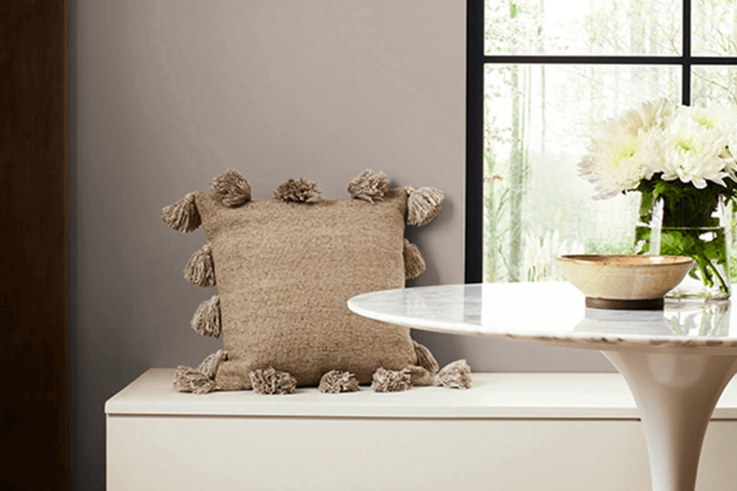
When choosing a paint color for your home, there are countless shades and tones to consider. SW 7635 Palisade by Sherwin Williams is a popular choice among those looking to create a cozy and inviting atmosphere in their space. This color is a unique blend of grey and beige, often referred to as “greige,” which makes it versatile enough to work beautifully in various settings and with different decor styles.
SW 7635 Palisade can help you create a peaceful backdrop for your living room, bedroom, or any room that needs a touch of calm. Its warm undertones add a refined yet subtle character to walls, bringing a sense of comfort to any area of your home. Whether you’re aiming for a modern, minimalist look or something more classic and traditional, this color adapts well.
This shade is especially good at enhancing natural light. If your room has large windows or gets plenty of sunlight, Palisade will reflect this light, making the space look more open and welcoming. Moreover, if you’re considering resale, neutral colors like Palisade are appealing to potential home buyers, which could be beneficial.
I recommend testing Palisade with swatches on your walls to see how it looks throughout the day as natural light changes.
This approach will ensure that you are as satisfied with your choice in different lighting conditions as you are with its potential to refresh your home’s look.
sherwin-williams.com
What Color Is Palisade SW 7635 by Sherwin Williams?
Table of Contents
PalisadeSW 7635 by Sherwin Williams is a subtle gray hue that softly blends hints of blue, making it ideal for creating a serene and inviting atmosphere in any room. This color boasts a versatility that works beautifully in modern and traditional settings, lending itself well to a clean, streamlined look or a more classic approach.
Ideal for spaces where calm and restfulness are priorities, such as bedrooms and bathrooms, PalisadeSW 7635 pairs excellently with natural materials like light woods, which highlight its subtle warmth, and stone textures, which contrast its softness with ruggedness. Fabrics like linen or soft cotton enhance the comfortable feel, making spaces feel more homely.
In terms of interior styles, PalisadeSW 7635 shines in Scandinavian designs due to its minimalistic yet warm nature. It also suits contemporary themes well, particularly when aiming for a chic, understated aesthetic. Additionally, this color complements coastal styles, where its hint of blue echoes the colors of the sea and sky, and relaxed furnishings amplify a beachy, laid-back vibe.
For those looking to update their space, pairing PalisadeSW 7635 with metallic fixtures in brushed nickel or soft brass can add a touch of elegance without overpowering the room’s gentle charm. This color ensures a flexible backdrop that supports a variety of textures and accessories, enabling personal expression through decor.
housekeepingbay.com
Is Palisade SW 7635 by Sherwin Williams Warm or Cool color?
PalisadeSW 7635 by Sherwin Williams is a unique shade that blends the serenity of soft gray with hints of blue. This versatile hue brings a gentle calmness to any room, making it ideal for spaces where relaxation is key, such as bedrooms and living rooms. Its subtlety allows it to pair well with a wide range of decor styles, from modern to traditional, enhancing the aesthetics without overpowering.
PalisadeSW 7635 reflects natural light softly, creating an airy, open feel in a space. This quality is particularly beneficial in smaller rooms or areas with limited natural light, helping them appear more spacious and welcoming. Its neutral yet distinctive tone serves as a perfect backdrop for various color schemes, allowing for flexibility in accent colors and furniture choices.
This color not only soothes but also adds a touch of sophistication, making any home look polished and well-coordinated.
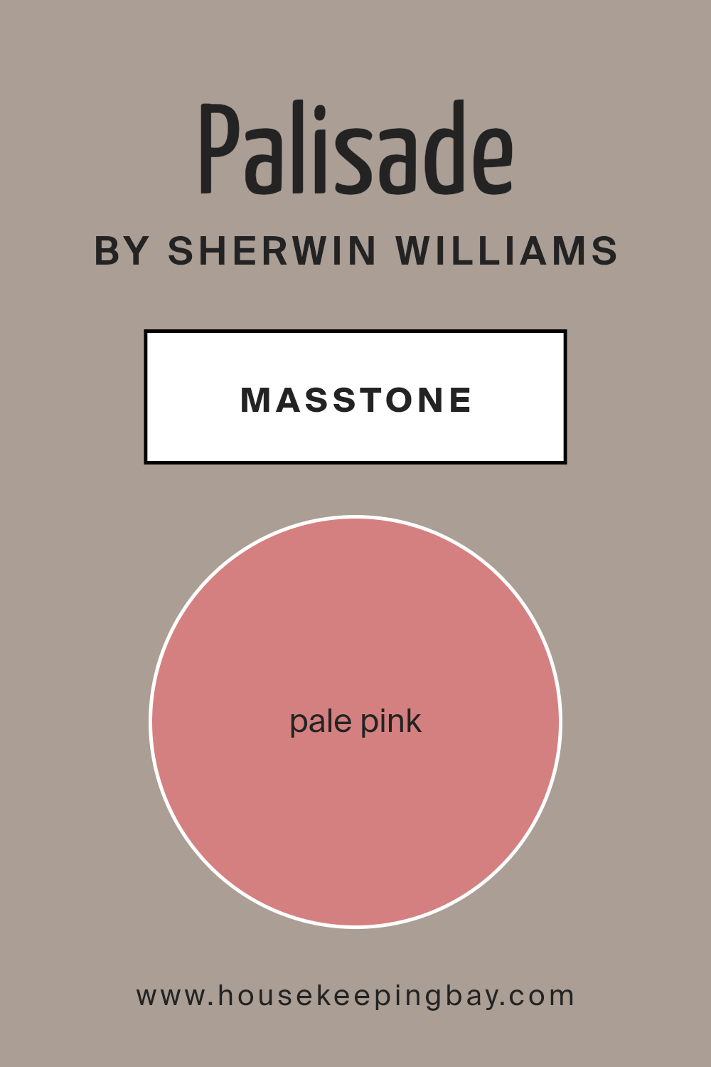
What is the Masstone of the Palisade SW 7635 by Sherwin Williams?
PalisadeSW 7635 by Sherwin Williams shows up as a gentle pale pink, similar to the shade of a soft rose (#D58080). This masstone creates a soothing backdrop in any room, adding a touch of warmth without being too bold or overwhelming. Its subtlety makes it versatile, fitting nicely into many areas of a home such as bedrooms, living spaces, or even bathrooms.
This color’s calming quality can make rooms feel more inviting and comfortable, ideal for relaxation after a long day. Additionally, pale pink works well with a wide range of decor styles, whether modern, classic, or eclectic. It pairs beautifully with soft neutrals like whites and greys, enhancing other colors and bringing a cohesive look to interiors.
If you’re looking for a paint color that provides a delicate charm and creates a peaceful atmosphere, PalisadeSW 7635 could be an excellent choice.
housekeepingbay.com
Undertones of Palisade SW 7635 by Sherwin Williams
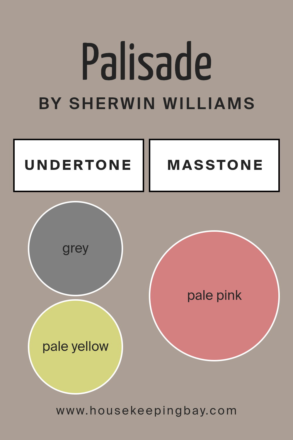
Sherwin Williams’ PalisadeSW 7635 is a unique paint color that varies greatly depending on light and surrounding colors due to its diverse undertones. Undertones are subtle colors that influence a primary paint color, affecting how it looks in different settings. PalisadeSW 7635 includes soft shades like grey, pale yellow, mint, and light purple, along with stronger hints of olive, orange, and brown. This mix makes the color versatile and adaptable.
In interior settings, these undertones play a significant role in how Palisade SW 7635 interacts with lighting and furniture. For example, the grey and light gray undertones provide a neutral base, making it easy to pair with modern and minimalist decors.
In natural light, the pale yellow and light green can make the walls look more vibrant and airy, which is excellent for living spaces needing a touch of freshness.
The more pronounced undertones like olive, orange, and brown give PalisadeSW 7635 a warm, cozy feel, ideal for spaces like bedrooms or studies where a calm, inviting atmosphere is desired. However, the presence of cooler undertones like lilac and light blue ensures that the color maintains a balanced look, never leaning too heavily warm or cool.
This blend of undertones means PalisadeSW 7635’s appearance can shift delightfully with different furnishings and lighting conditions, giving homeowners the flexibility to use it in various interior spaces without the color feeling out of place.
This adaptability is crucial for ensuring the walls complement rather than clash with the room’s overall aesthetic.
housekeepingbay.com
Coordinating Colors of Palisade SW 7635 by Sherwin Williams
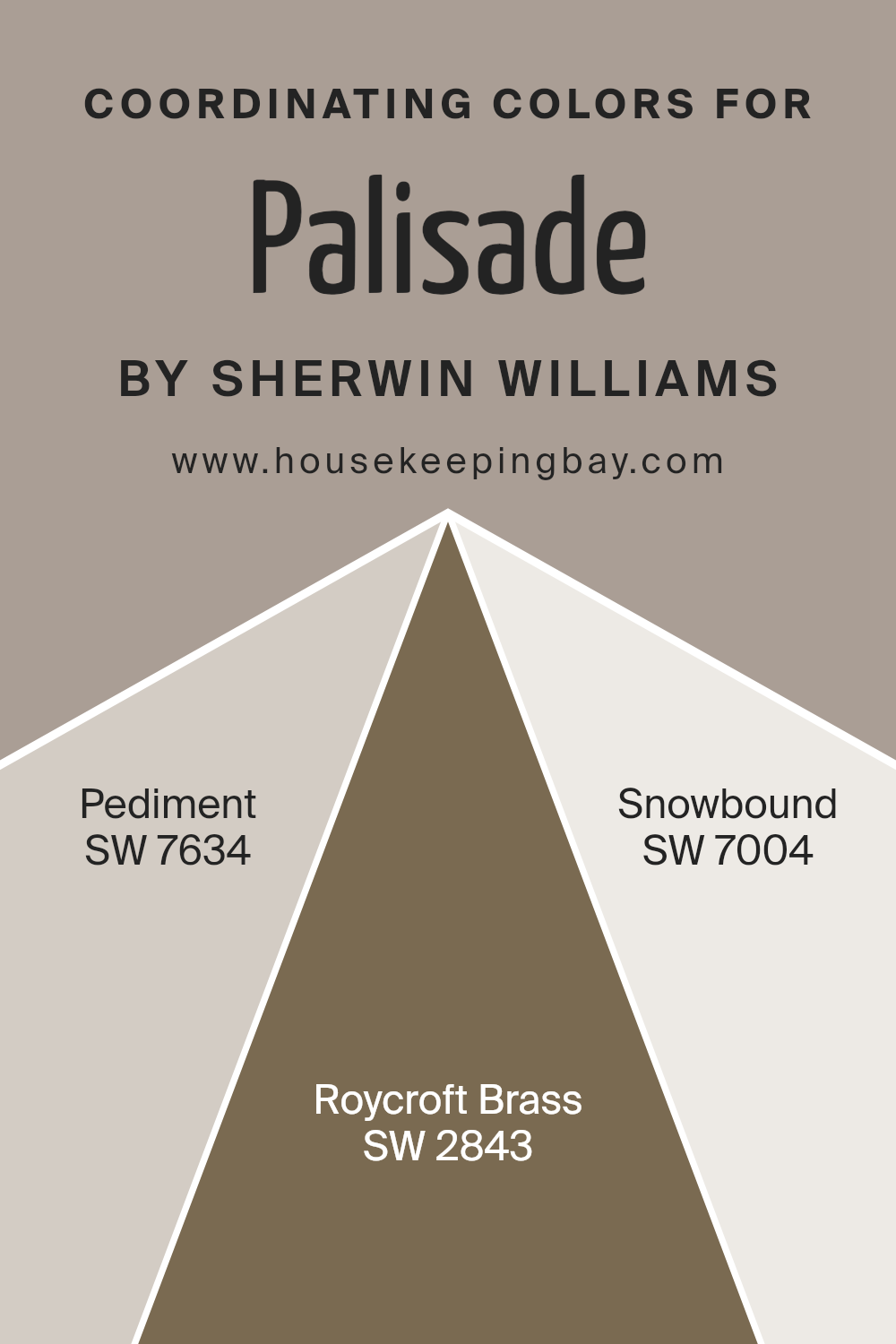
Coordinating colors are complementary shades that harmonize with a primary color to enhance the overall aesthetic of a space. In the case of Palisade SW 7635 by Sherwin Williams, a sophisticated neutral hue, there are several coordinating colors that work well to create a balanced and appealing color scheme.
These coordinating colors can be used for different elements in a room, such as walls, trim, accents, and furniture, providing a cohesive look.
One such coordinating color is Pediment SW 7634, a gentle gray with a warm undertone that pairs nicely with the deeper tones of Palisade, adding a subtle contrast without overwhelming the senses. Roycroft Brass SW 2843 offers a richer, golden hue that adds a touch of warmth and elegance, perfect for creating a cozy and inviting atmosphere.
Meanwhile, Snowbound SW 7004, a clean and bright white, offers a crisp contrast that helps to highlight and define spaces, making it ideal for trim and ceilings to provide a fresh and airy feeling to the room. Using these coordinating colors together results in a well-rounded and aesthetic visual experience.
You can see recommended paint colors below:
- SW 7634 Pediment
- SW 2843 Roycroft Brass
- SW 7004 Snowbound
housekeepingbay.com
How Does Lighting Affect Palisade SW 7635 by Sherwin Williams?
Lighting significantly influences how colors appear in different environments. The color PalisadeSW 7635 by Sherwin Williams, a deep, warm gray, showcases this effect vividly. In various lighting conditions, PalisadeSW 7635 can exhibit shifts in its perceived hue and intensity, reshaping the ambiance of a room.
Under artificial light, such as LED or incandescent bulbs, PalisadeSW 7635 tends to warm up, highlighting its brown undertones. This warmer appearance makes the color feel cozy and welcoming, ideal for living spaces and bedrooms where comfort is key.
In natural light, the color shows a more true-to-swatch gray. As natural light tends to be cooler, especially in north-facing rooms, PalisadeSW 7635 might appear slightly cooler and more neutral, making it a good choice for creating a calm, serene environment. In a north-facing room, which receives less direct sunlight and generally carries a cooler, bluer light, this color might seem slightly more austere but still maintains its sophisticated warmth.
Conversely, in south-facing rooms exposed to abundant, warmer sunlight throughout the day, PalisadeSW 7635 will look warmer and more vibrant. It helps create a lively yet grounded atmosphere, and the color works especially well in areas requiring a touch of elegance without overpowering brightness.
East-facing rooms deal with the bright, warm light of the morning sun but become cooler as the day progresses. Here, PalisadeSW 7635 will transition from a vivid, warmly lit hue in the mornings to a cooler, more muted tone by the afternoon, offering a dynamic feel throughout the day.
In west-facing rooms, the color faces the opposite effect: cooler mornings followed by intense, warm light in the late afternoon and evening. PalisadeSW 7635 takes on a richer, more welcoming look later in the day, making spaces perfect for evening relaxation.
Understanding these interactions between light and color can help in choosing the right paint for a room based on its orientation and the desired mood or effect.
housekeepingbay.com
What is the LRV of Palisade SW 7635 by Sherwin Williams?
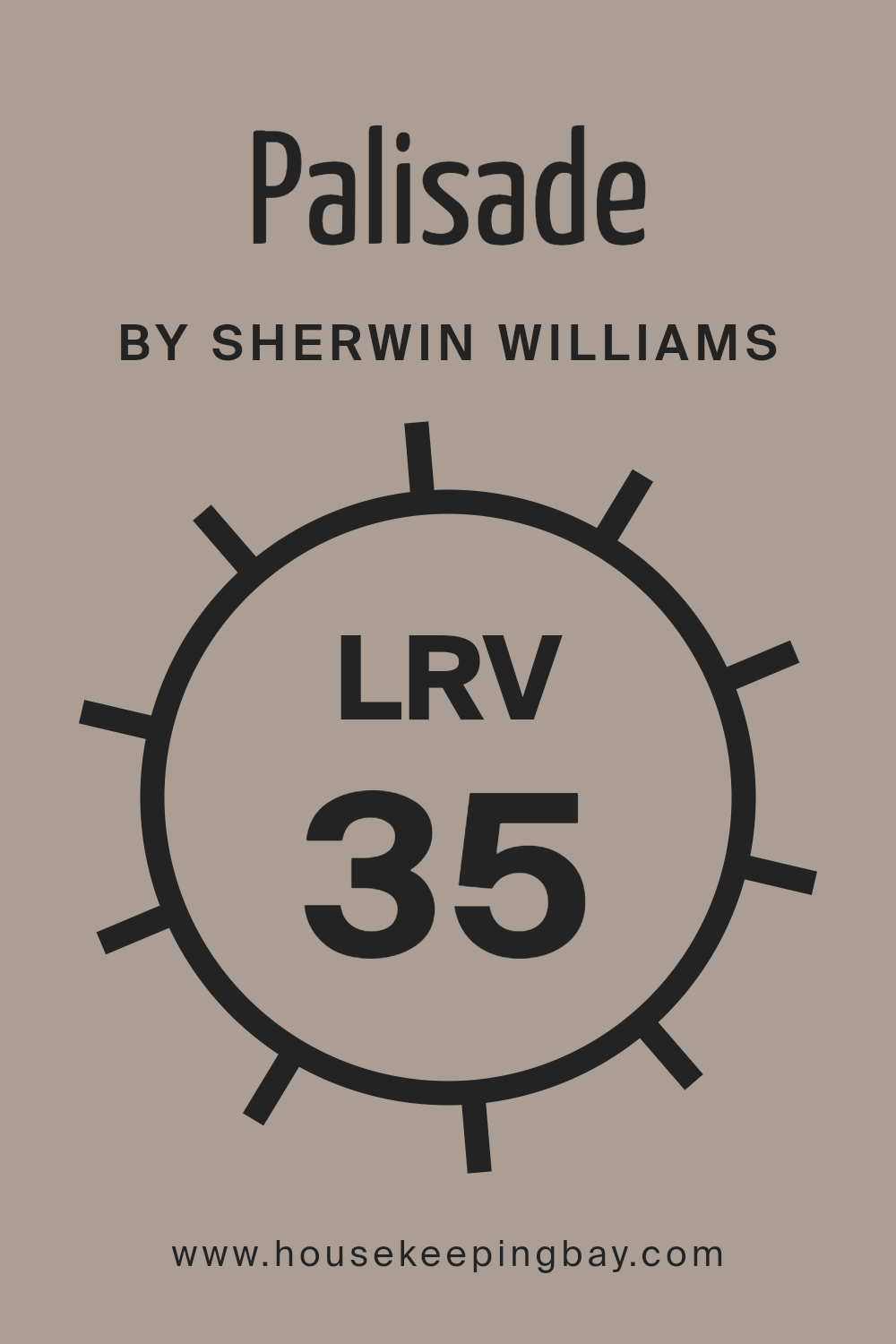
LRV stands for Light Reflectance Value, which measures the percentage of light a paint color reflects back into the room compared to the light it absorbs. On a scale from 0 to 100, a higher LRV means the color reflects more light, making a room feel brighter and more open. Conversely, a lower LRV indicates that a color absorbs more light, which can make a space appear cozier but smaller.
For the color PalisadeSW 7635 by Sherwin Williams, with an LRV of 35.156, it falls in the medium range of light reflection.
This means it isn’t extremely dark nor is it very light. Colors with this level of LRV are versatile but are better suited for rooms that already benefit from a fair amount of natural light or are larger in size. In such conditions, PalisadeSW 7635 can offer a balanced appearance, maintaining warmth without making the space feel too enclosed.
housekeepingbay.com
What are the Trim colors of Palisade SW 7635 by Sherwin Williams?
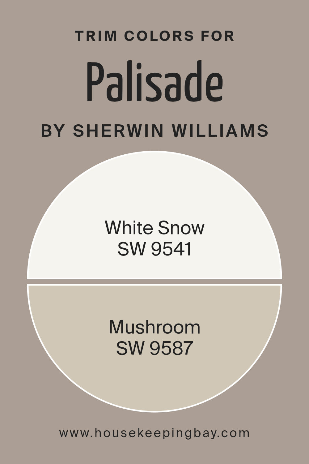
Trim colors are specific shades used to highlight the architectural features of a room, such as door frames, window sills, and baseboards. When paired with a main wall color like Palisade SW 7635 by Sherwin Williams, trim colors can help define and shape the space, adding contrast and depth to the overall design.
For Palisade SW 7635, which is a lush, earthy neutral, choosing the right trim colors is crucial for creating a balanced and visually appealing look. Using trim colors like SW 9541 – White Snow or SW 9587 – Mushroom can complement this dominant shade, bringing out its natural richness while respecting the desired aesthetic.
SW 9541 – White Snow is a pure, bright white that offers a crisp and clean contrast to the deep, warm tones of Palisade SW 7635. This color is perfect for creating a fresh, airy look that enhances the room’s lighting. SW 9587 – Mushroom, on the other hand, is a soft, muted beige that brings a subtle, organic touch to the space. It aligns closely with the earthy vibe of Palisade SW 7635, promoting a cohesive and soothing environment without overwhelming the senses. Each trim color provides its distinct impact, allowing for personalization of space that reflects individual taste and style preferences.
You can see recommended paint colors below:
housekeepingbay.com
Colors Similar to Palisade SW 7635 by Sherwin Williams
Choosing similar colors, such as those akin to Palisade SW 7635 by Sherwin Williams, plays a crucial role in achieving a cohesive look in any interior space. Using similar colors helps to create a seamless visual flow, making rooms appear more spacious and tied together.
By employing variations of a particular hue, designers can provide depth and detail while maintaining a unified aesthetic throughout the environment. These similar colors work together by sharing a common base or undertone, providing a subtle yet effective variation that enhances textures and architectural details without overwhelming the senses.
For instance, SW 0023 – Pewter Tankard is a deep, soothing gray with a touch of blue, adding a serene mood to the ambiance. SW 7633 – Taupe Tone offers a warm, earthy gray that brings a soft and cozy feel to any room. SW 9578 – Restoration introduces a darker, moodier gray that can act as a bold statement or grounding element.
SW 6080 – Utterly Beige is a comforting neutral with a beige tint, perfect for creating a light and airy feel. SW 6038 – Truly Taupe blends gray with a hint of brown, providing a sophisticated balance. SW 7503 – Sticks & Stones features a muted blend of brown and gray, ideal for adding a rustic touch.
SW 7045 – Intellectual Gray leans towards a smoky gray, lending an air of intelligence and formality. SW 7031 – Mega Greige combines gray and beige in a rich recipe that offers warmth and versatility. SW 7024 – Functional Gray is a practical and straightforward hue that fits seamlessly into numerous design schemes. SW 0037 – Morris Room Grey closes the circle with a strong, traditional gray that anchors and defines spaces.
You can see recommended paint colors below:
- SW 0023 Pewter Tankard
- SW 7633 Taupe Tone
- SW 9578 Restoration
- SW 6080 Utterly Beige
- SW 6038 Truly Taupe
- SW 7503 Sticks & Stones
- SW 7045 Intellectual Gray
- SW 7031 Mega Greige
- SW 7024 Functional Gray
- SW 0037 Morris Room Grey

housekeepingbay.com
Colors that Go With Palisade SW 7635 by Sherwin Williams
Choosing the right complementary colors for Palisade SW 7635 by Sherwin Williams is vital because it ensures that the spaces in your home appear properly coordinated and visually appealing. These colors work together to create a harmonious palette that enhances the beauty and atmosphere of a room.
For example, Colonnade Gray SW 7641 offers a gentle gray that acts as a neutral backdrop, making it very adaptable for various decor styles. Pussywillow SW 7643 is a deeper gray that gives a subtle hint of sophistication and warmth, perfect for creating a more cozy and inviting space.
Skyline Steel SW 1015 is another excellent companion with a light, airy gray that brings a soft, soothing feel to the environment, ideal for spaces meant to be calm and relaxing. Pavestone SW 7642, a robust gray with earthen undertones, adds a solid grounding element, which works well in areas that benefit from a stronger, more defined color presence.
Modern Gray SW 7632 offers a mild, warmer hue that brightens spaces delicately without overpowering, and is fantastic for smaller rooms to give the illusion of more space.
Lastly, Sticks & Stones SW 7503 blends beige and gray for a balanced, versatile color that works well to merge elements from different color families seamlessly. Using these colors together with Palisade SW 7635 can dramatically enhance the cohesion and overall aesthetic of your rooms.
You can see recommended paint colors below:
- SW 7641 Colonnade Gray
- SW 7643 Pussywillow
- SW 1015 Skyline Steel
- SW 7642 Pavestone
- SW 7632 Modern Gray
- SW 7503 Sticks & Stones

housekeepingbay.com
How to Use Palisade SW 7635 by Sherwin Williams In Your Home?
Palisade SW 7635 by Sherwin Williams is a versatile paint color that fits well in many areas of a home. Its hue lies somewhere between green and blue, providing a soothing yet fresh feel that works great in various settings. You can use this color in spaces where you relax and unwind, like bedrooms or living rooms.
It pairs well with both light and dark furniture, offering flexibility in decorating. Kitchens also look great in Palisade, as it offers a clean, inviting backdrop that complements wooden cabinets or white countertops. Bathrooms painted in Palisade give off a calm, serene vibe, which is perfect for a spa-like environment.
For those looking to add a touch of subtlety to their home office or study, Palisade offers a nice balance, stimulating focus and calmness. Outside the house, consider using it for exterior trims to give your home a unique touch. Whatever the use, Palisade SW 7635 can bring a fresh and soothing feel to any room.
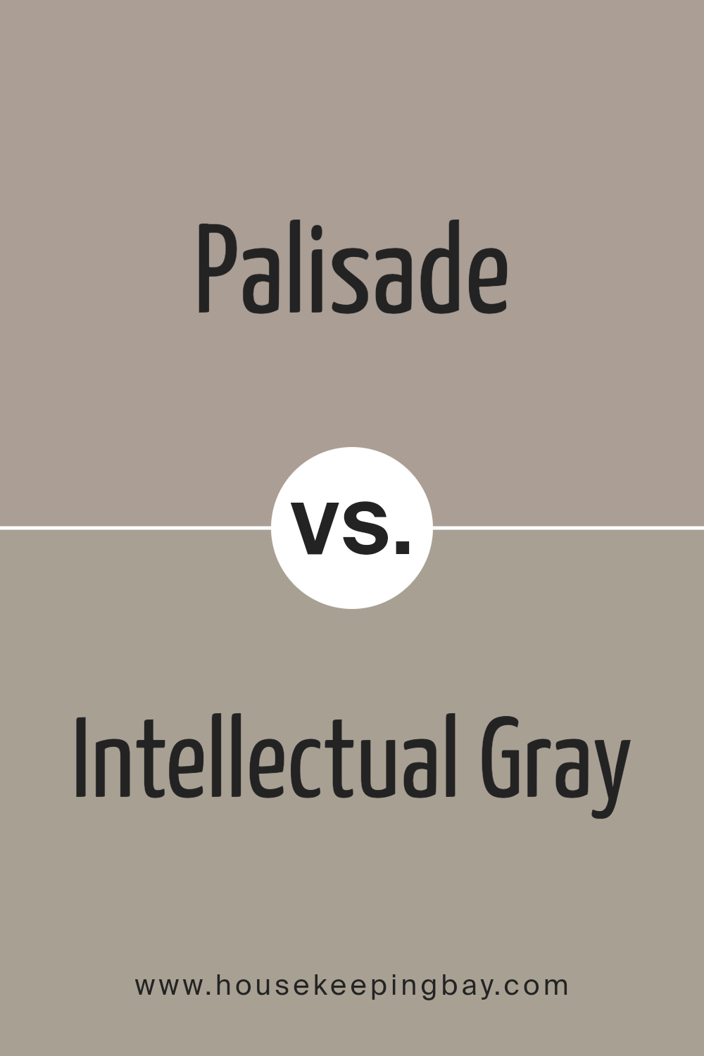
Palisade SW 7635 by Sherwin Williams vs Intellectual Gray SW 7045 by Sherwin Williams
Palisade SW 7635 by Sherwin Williams and Intellectual Gray SW 7045 are two distinct shades that offer varying atmospheres to spaces. Palisade is a warm taupe that provides a soft, cozy feeling, making it perfect for living rooms or bedrooms where a calming effect is desired. Its earthy tones help create a welcoming, serene environment.
Intellectual Gray, however, leans towards a cooler, more balanced gray that has the versatility to fit into modern or traditional decors seamlessly. It’s particularly effective in areas where a neutral, sophisticated backdrop is needed, such as home offices or kitchens.
Both colors are subtle yet impactful, but while Palisade adds warmth with its brown undertones, Intellectual Gray offers a sharper, more contemporary look with its balanced gray composition.
You can see recommended paint color below:
housekeepingbay.com
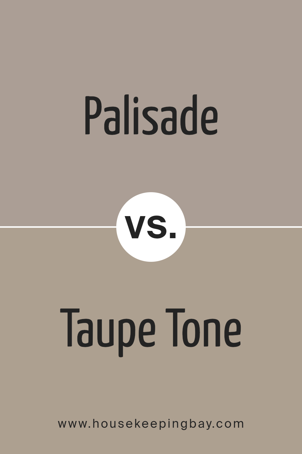
Palisade SW 7635 by Sherwin Williams vs Taupe Tone SW 7633 by Sherwin Williams
Palisade SW 7635 by Sherwin Williams is a gentle, earthy hue that leans towards a light taupe. This color provides a warm and soothing ambiance, ideal for creating a cozy and inviting atmosphere in any room. It pairs beautifully with both dark and light furniture, making it versatile for various home decor styles.
Taupe Tone SW 7633, also from Sherwin Williams, is slightly darker and richer than Palisade. It has a more pronounced gray influence which gives it a neutral yet grounding effect. This color is perfect for those who prefer a subtle, yet impactful aesthetic in their space. It works well in areas that require a sense of calm and understated elegance.
Both colors share a natural affinity for creating peaceful environments, but their differing undertones mean Palisade offers warmth, whereas Taupe Tone provides a cooler, more muted backdrop. Consequently, your choice between them might depend on the mood you wish to achieve in your space and the other colors and materials you plan to use.
You can see recommended paint color below:
housekeepingbay.com
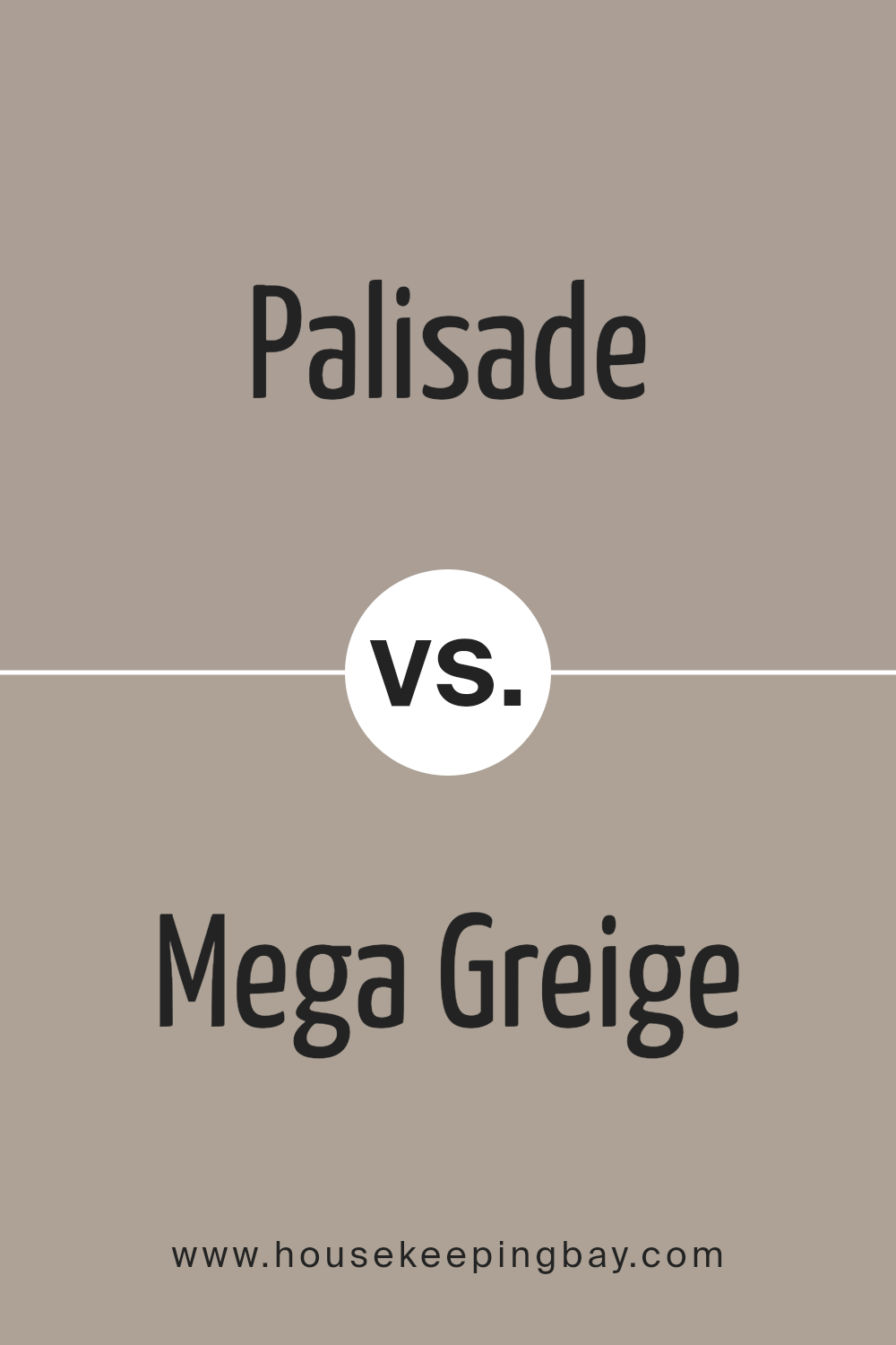
Palisade SW 7635 by Sherwin Williams vs Mega Greige SW 7031 by Sherwin Williams
Palisade SW 7635 and Mega Greige SW 7031, both from Sherwin Williams, offer unique tones suitable for various spaces. Palisade is a softer, lighter gray that carries subtle hints of beige, making it versatile for rooms needing a gentle, calming atmosphere. Its lightness brightens spaces effectively, giving a fresh and airy feel.
In contrast, Mega Greige is a deeper, warmer shade that mixes gray with robust beige undertones. This color provides a cozy, inviting ambiance, ideal for areas where a sense of comfort is desired. It works well in larger spaces or rooms with plenty of natural light, as its richness can make small spaces feel smaller.
Both colors coordinate well with a range of decor styles, from modern to traditional, depending on the accompanying design elements. While Palisade suits spaces seeking a light, neutral backdrop, Mega Greige excels in settings that aim for a bolder, yet still neutral, impact.
You can see recommended paint color below:
housekeepingbay.com
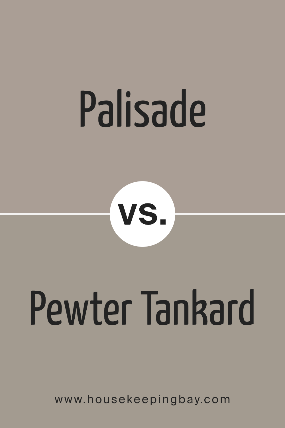
Palisade SW 7635 by Sherwin Williams vs Pewter Tankard SW 0023 by Sherwin Williams
Palisade SW 7635 by Sherwin Williams is a soft, neutral gray that brings a sense of calm and simplicity to any space. It serves as a versatile backdrop that pairs well with various decor styles and colors, making it a great choice for living rooms, bedrooms, or kitchens. The warmth in its undertone provides a cozy atmosphere, making spaces feel welcoming and lived-in.
Pewter Tankard SW 0023, also by Sherwin Williams, is a deeper, bolder gray that offers a stronger statement. This color has more intensity than Palisade, giving it a more dramatic look that can add depth and sophistication to a room. It works particularly well in areas that benefit from a striking visual impact, like accent walls or cabinetry.
While both colors are grays, Palisade is lighter and warmer, thus creating a more subtle and airy feel. Pewter Tankard, with its darker and cooler tone, offers a more prominent and defined presence, ideal for highlighting specific areas or features within a space.
You can see recommended paint color below:
- SW 0023 Pewter Tankard
housekeepingbay.com
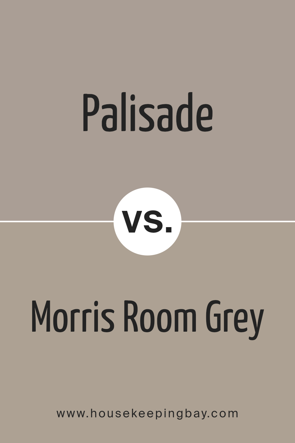
Palisade SW 7635 by Sherwin Williams vs Morris Room Grey SW 0037 by Sherwin Williams
Palisade SW 7635 by Sherwin Williams is a soft taupe that leans towards a warm beige with subtle gray undertones. It creates a cozy and inviting atmosphere in any room, perfect for living spaces or bedrooms where a calm, soothing presence is desired. This color works well to bring a sense of warmth and is versatile enough to pair with various decor styles, from modern to rustic.
In contrast, Morris Room Grey SW 0037 is a deeper, medium shade of gray with earthy undertones. It presents a more grounded and solid feel, making it suitable for spaces that benefit from a more pronounced but neutral backdrop. It pairs well with wood finishes and metallic accents, enhancing a sophisticated and mature look in spaces like home offices or dining rooms.
Both colors offer a neutral palette, but Palisade’s warmer tones provide a soft backdrop, while Morris Room Grey offers a stronger, more defined presence.
You can see recommended paint color below:
- SW 0037 Morris Room Grey
housekeepingbay.com
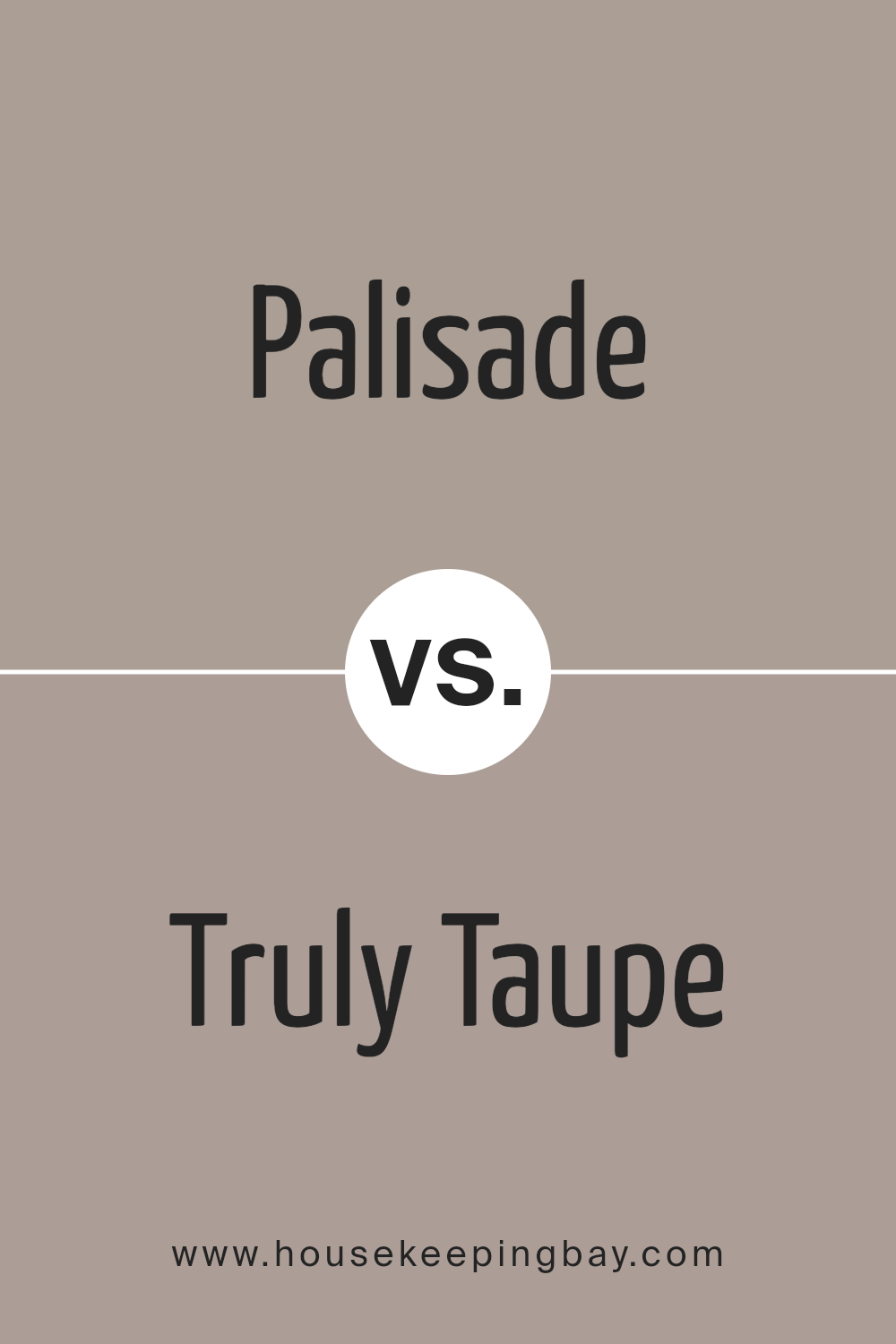
Palisade SW 7635 by Sherwin Williams vs Truly Taupe SW 6038 by Sherwin Williams
Palisade SW 7635 by Sherwin Williams is a warm beige with subtle gray undertones. It provides a soft, neutral backdrop that’s versatile for various settings, from living rooms to bedrooms. This color tends to create a cozy and inviting atmosphere in a space, making it feel comfortable and relaxed.
On the other hand, Truly Taupe SW 6038 is a bit darker, blending beige with deeper gray tones. This color is perfect for those looking to add a bit of sophistication and depth to their room without overwhelming it with too dark a shade. It works well in areas that require a touch of elegance, such as dining rooms or home offices.
While both colors offer a neutral palette, Palisade leans towards a lighter, warmer tone, making spaces feel more open and airy. Truly Taupe, with its richer, cooler tones, provides a more grounded and formal feel. Each can be used effectively to achieve different aesthetic effects in a home’s decor.
You can see recommended paint color below:
housekeepingbay.com
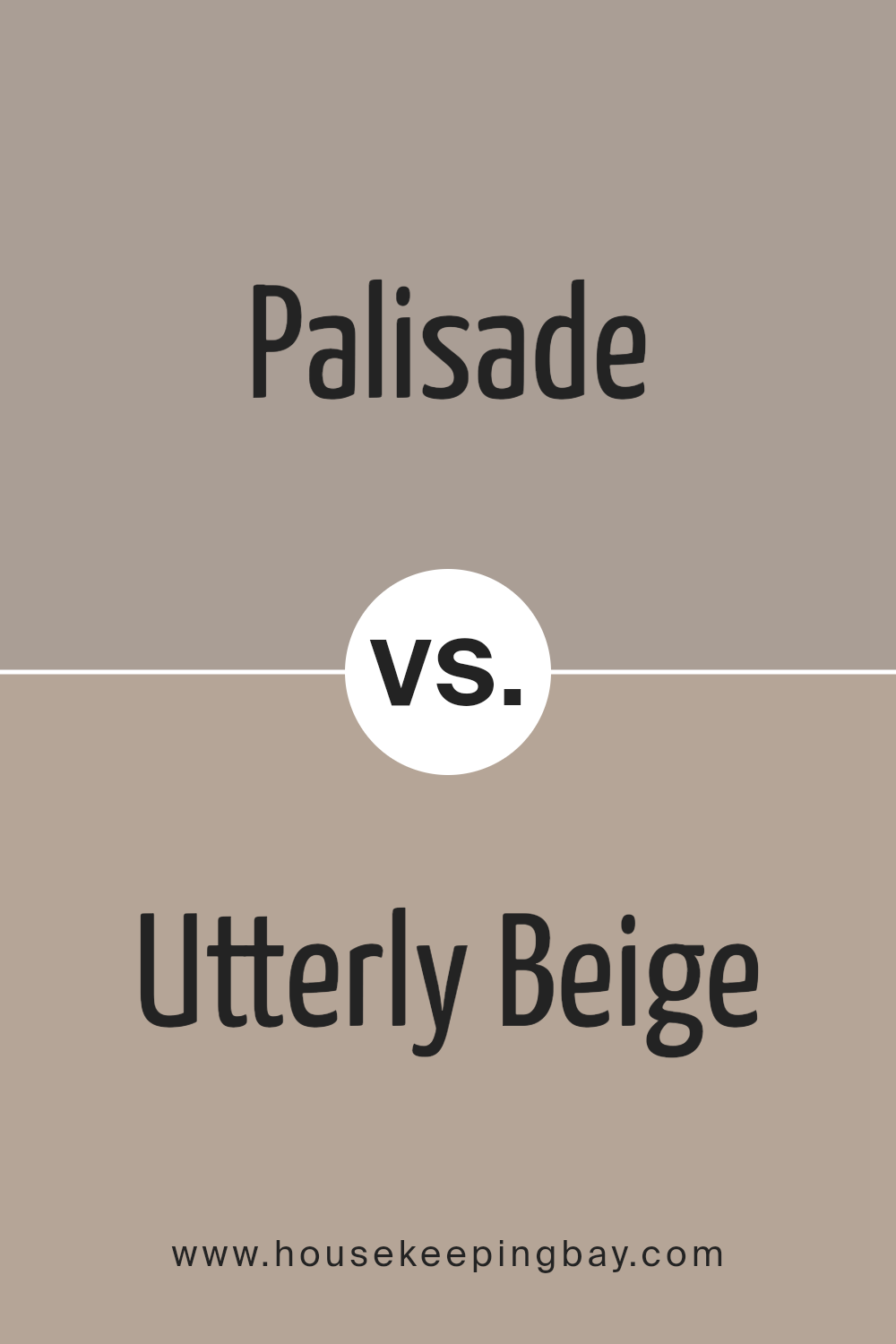
Palisade SW 7635 by Sherwin Williams vs Utterly Beige SW 6080 by Sherwin Williams
Palisade SW 7635 by Sherwin Williams is a warm, deep gray that provides a calming, neutral backdrop in any space. This shade can easily blend with various decor styles, giving rooms an elegant and contemporary feel. It works well in living areas and bedrooms where a subdued, soothing ambiance is desired.
In contrast, Utterly Beige SW 6080, also by Sherwin Williams, is a softer, lighter beige tone. It imparts a cozy, welcoming vibe, making it perfect for creating a relaxed environment. This color is versatile for spaces like kitchens and living rooms, aiming to enhance natural light and add a touch of warmth.
Both colors offer unique qualities but serve different purposes based on the mood and style you want to achieve in a room. Palisade lends a more sophisticated touch, while Utterly Beige allows for a lighter, airier atmosphere.
You can see recommended paint color below:
- SW 6080 Utterly Beige
housekeepingbay.com
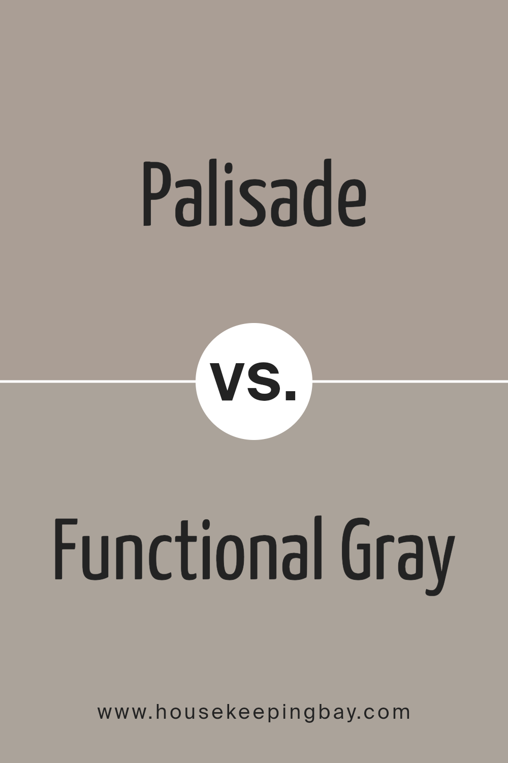
Palisade SW 7635 by Sherwin Williams vs Functional Gray SW 7024 by Sherwin Williams
Palisade SW 7635 by Sherwin Williams is a soft, warm neutral beige with a cozy vibe, making it perfect for creating a relaxed and inviting atmosphere in any room. It has a slightly earthy tone that pairs well with a variety of decor styles, from rustic to modern. This color naturally enhances spaces with a gentle and soothing presence, making it an ideal choice for living areas and bedrooms.
In contrast, Functional Gray SW 7024 is a cooler, mid-tone gray with a subtle blue undertone. This color offers a more contemporary and sleek look, suitable for spaces that aim for a more modern aesthetic. It works well in both natural and artificial light, providing a stable and neutral background that complements bolder colors and various textures in furniture and accessories.
Both colors offer unique qualities for different decorating goals: Palisade leans towards warmth and comfort, while Functional Gray offers a chic and sophisticated backdrop.
You can see recommended paint color below:
- SW 7024 Functional Gray
housekeepingbay.com
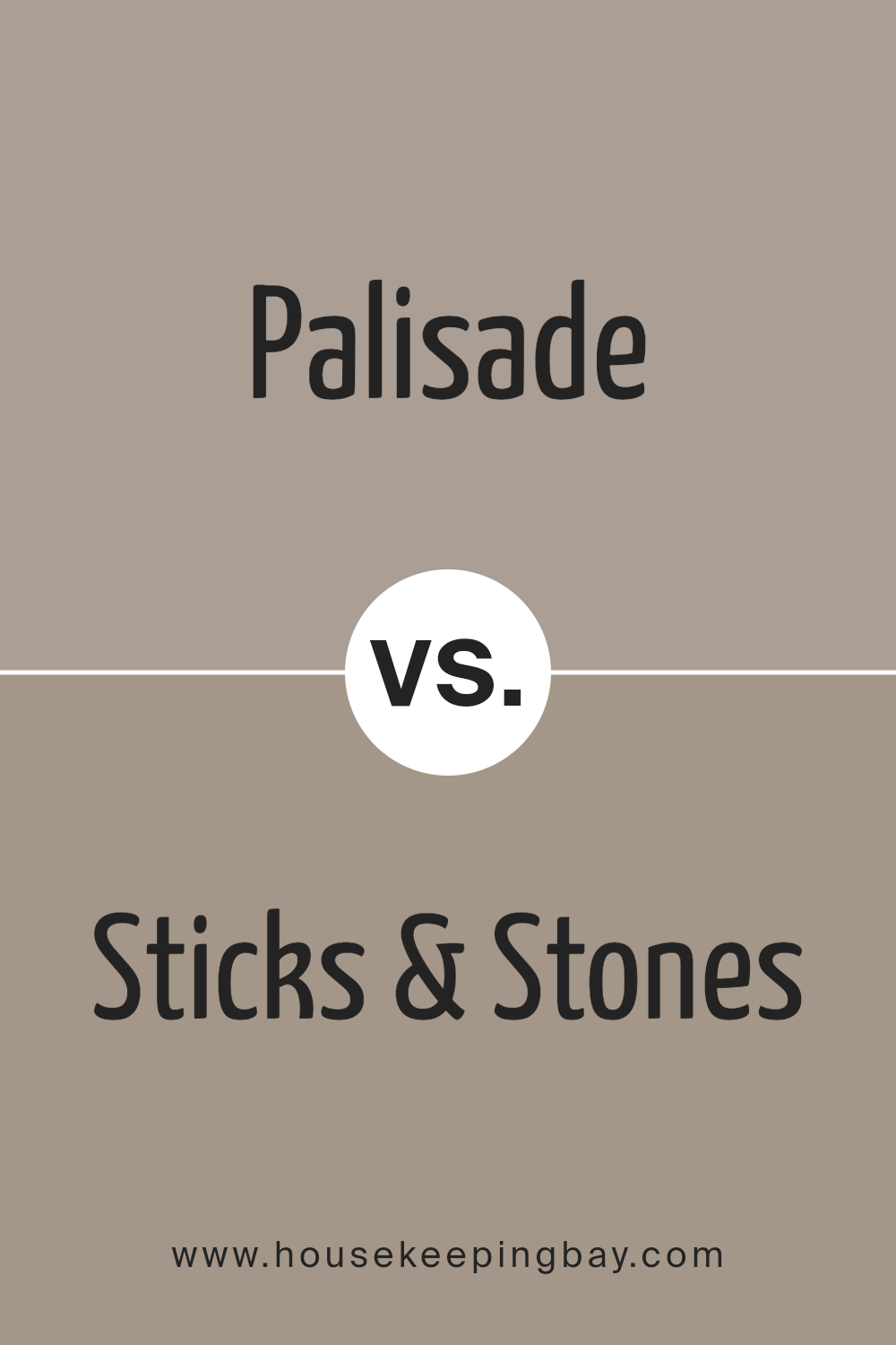
Palisade SW 7635 by Sherwin Williams vs Sticks & Stones SW 7503 by Sherwin Williams
Palisade SW 7635 by Sherwin Williams is a soft, muted beige with warm undertones, making it a cozy and welcoming choice for any space. It’s a versatile color that works well in living areas or bedrooms, providing a neutral backdrop that complements various decor styles and colors.
Sticks & Stones SW 7503, on the other hand, is a deeper, richer taupe shade. This color adds a bit more drama and intensity to a room, ideal for creating a focal point or adding depth. It suits areas like dining rooms or studies where a more sophisticated vibe is desired.
While both colors share an earthy base, Palisade is lighter and airier, promoting a sense of calm and openness. Sticks & Stones, with its darker tone, offers warmth and a sense of grounding. The choice between them depends on the desired mood and function of the room.
You can see recommended paint color below:
housekeepingbay.com
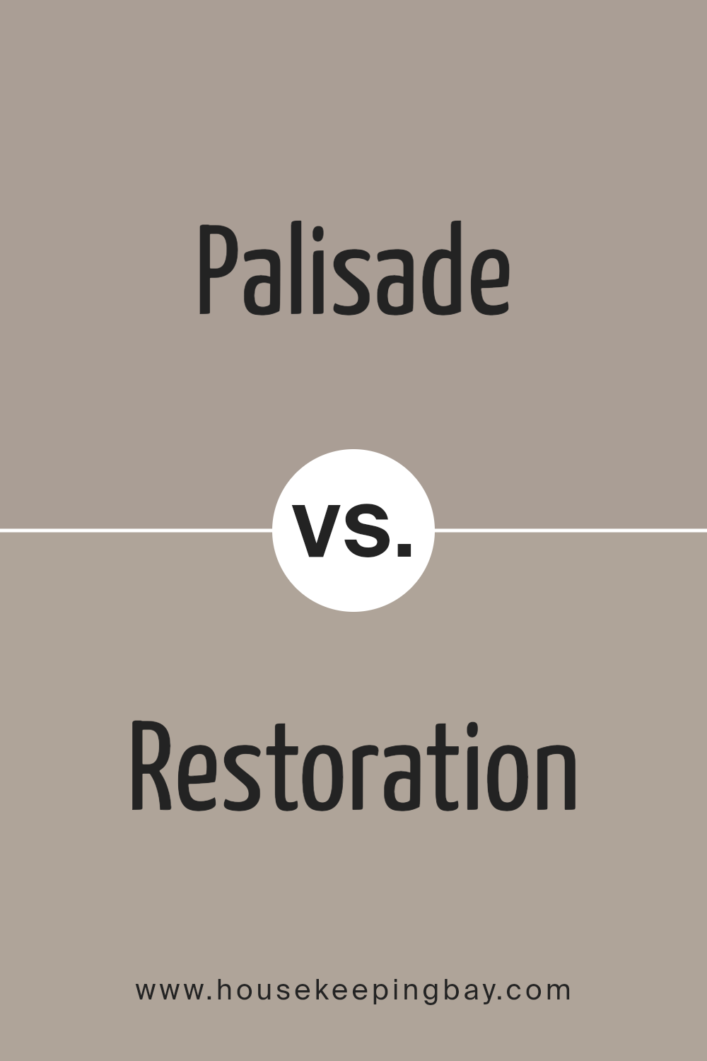
Palisade SW 7635 by Sherwin Williams vs Restoration SW 9578 by Sherwin Williams
Palisade SW 7635 by Sherwin Williams is a warm, muted beige color with subtle gray undertones, creating a cozy and inviting ambiance in any space. It pairs well with various decor styles, offering a neutral backdrop that allows furniture and art to stand out.
In contrast, Restoration SW 9578 is notably cooler, presenting a deep, rich gray with slight blue undertones, giving off a more sophisticated and modern vibe. This color provides an elegant foundation that complements metallic fixtures and modern furnishings, making spaces look more refined and tailored.
While Palisade lends itself to a softer, homier feel, Restoration sets a bolder, more dramatic tone. Both colors work beautifully in different contexts—Palisade is great for a relaxed, comforting environment, whereas Restoration suits those looking for a sleek, contemporary look.
You can see recommended paint color below:
- SW 9578 Restoration
housekeepingbay.com
Conclusion
In conclusion, SW 7635 Palisade by Sherwin Williams is an ideal choice for anyone seeking a sophisticated and calming wall color for their home or workspace. Its unique grayish-green tone creates a serene atmosphere and pairs well with a wide variety of decor styles, making it a versatile option.
Whether you wish to refresh your living room, bedroom, or even your office, Palisade offers a soothing presence that can help improve focus and relaxation.
This paint color particularly suits those who want to maintain a subtle yet impactful aesthetic. Its ability to adapt to various lighting conditions ensures that it consistently presents a beautiful hue throughout the day. Moreover, its compatibility with both modern and traditional furnishings means that you can use it without needing to revamp your entire space.
Given its durability and quality, investing in SW 7635 Palisade by Sherwin Williams is a wise decision for creating a peaceful and inviting space that you will enjoy spending time in.
housekeepingbay.com
Ever wished paint sampling was as easy as sticking a sticker? Guess what? Now it is! Discover Samplize's unique Peel & Stick samples. Get started now and say goodbye to the old messy way!
Get paint samples
