Opal OC-73 Paint Color by Benjamin Moore
A Dive into Its Aesthetic Appeal and Functional Application
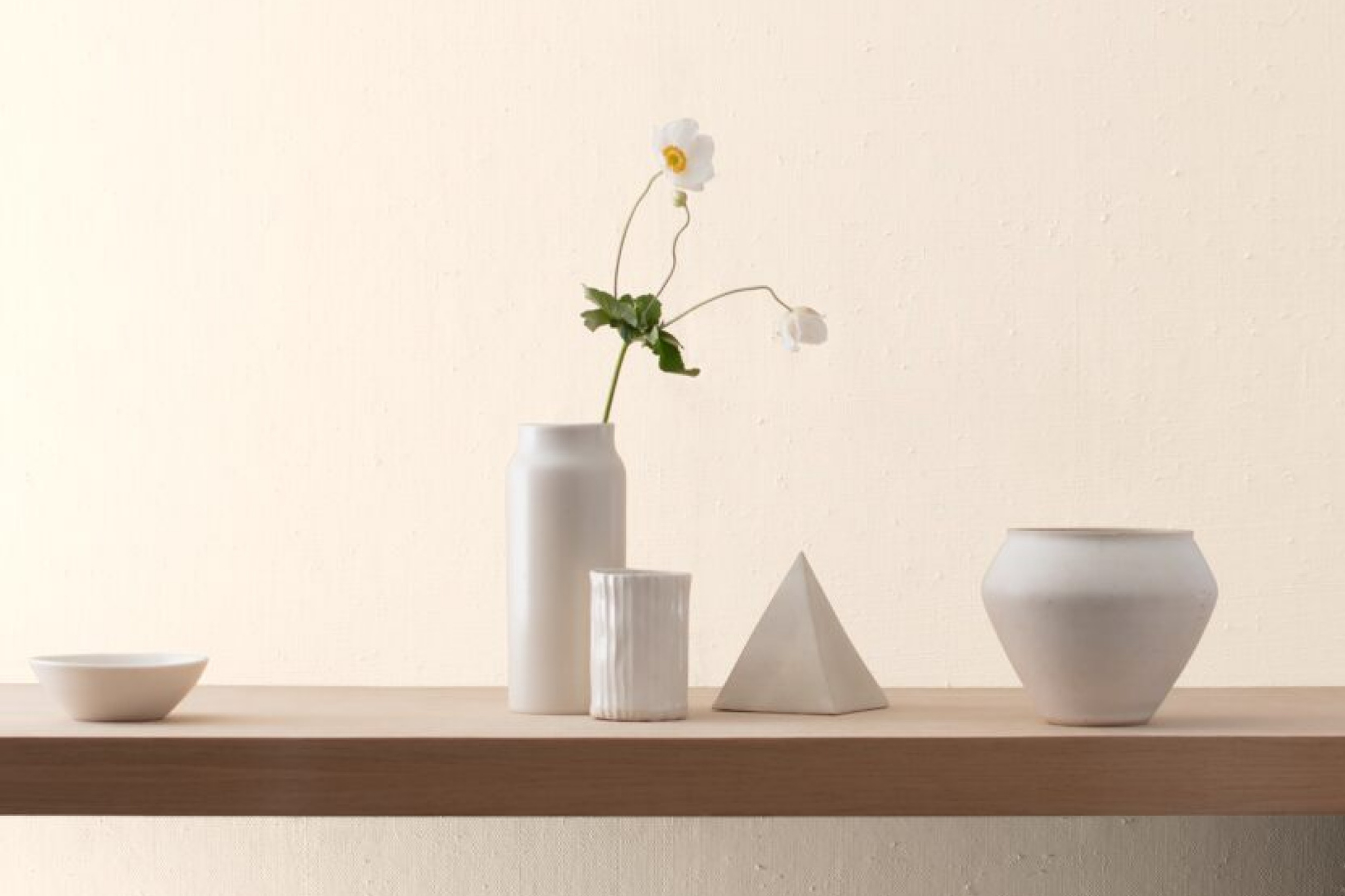
Opal OC-73, by the renowned Benjamin Moore brand, has steadily gained popularity in recent times as a favorite shade for home interiors. The color is not just a shade; it’s a statement, encompassing mood, ambiance, and character.
via benjamin moore
What Color Is Opal OC-73?
Opal OC-73 is a gentle, airy, and subtly sophisticated shade that borders between soft white and a light grayish hue. The color encapsulates the serenity of misty mornings, giving it an ethereal touch. Opal OC-73 works wonders in modern minimalist, coastal, and Scandinavian interior styles.
Its versatile nature pairs exceptionally well with raw woods, marble, and textured fabrics like linen, giving a room a harmonious and cohesive appearance.
housekeepingbay.com
Table of Contents
Is It a Warm Or Cool Color?
Opal OC-73 leans more towards the cool spectrum, but its adaptability makes it easily blend into both warm and cool settings. Its cool undertone lends a refreshing calm to spaces, which is why it functions so well in homes, creating a restful ambiance.
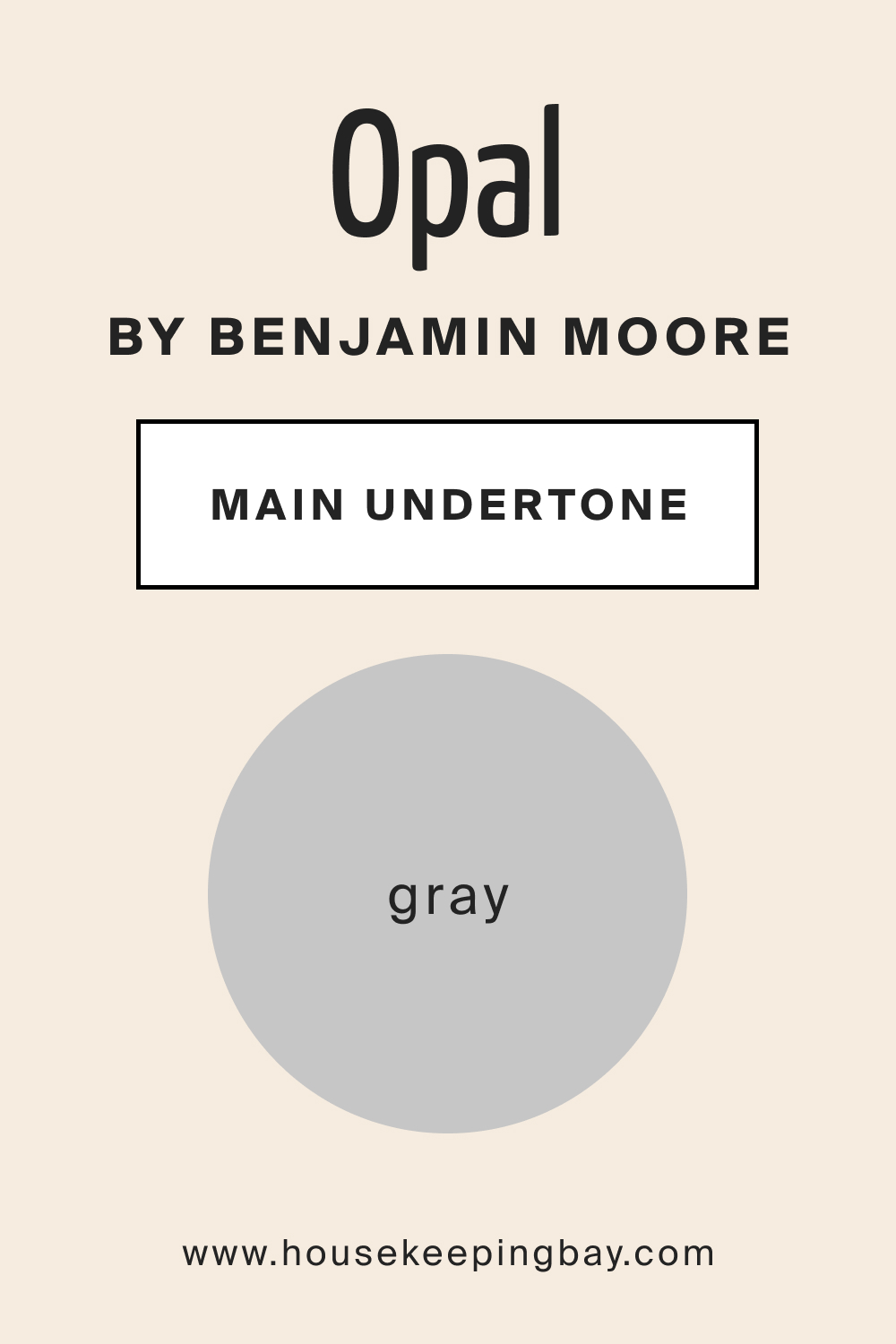
Undertones of Opal OC-73
Every color has undertones that can subtly shift under different circumstances. Opal OC-73 carries a hint of gray, which plays with light and space uniquely. These undertones can dictate how pronounced or muted the color appears, directly impacting its harmony with other shades in the room.
housekeepingbay.com
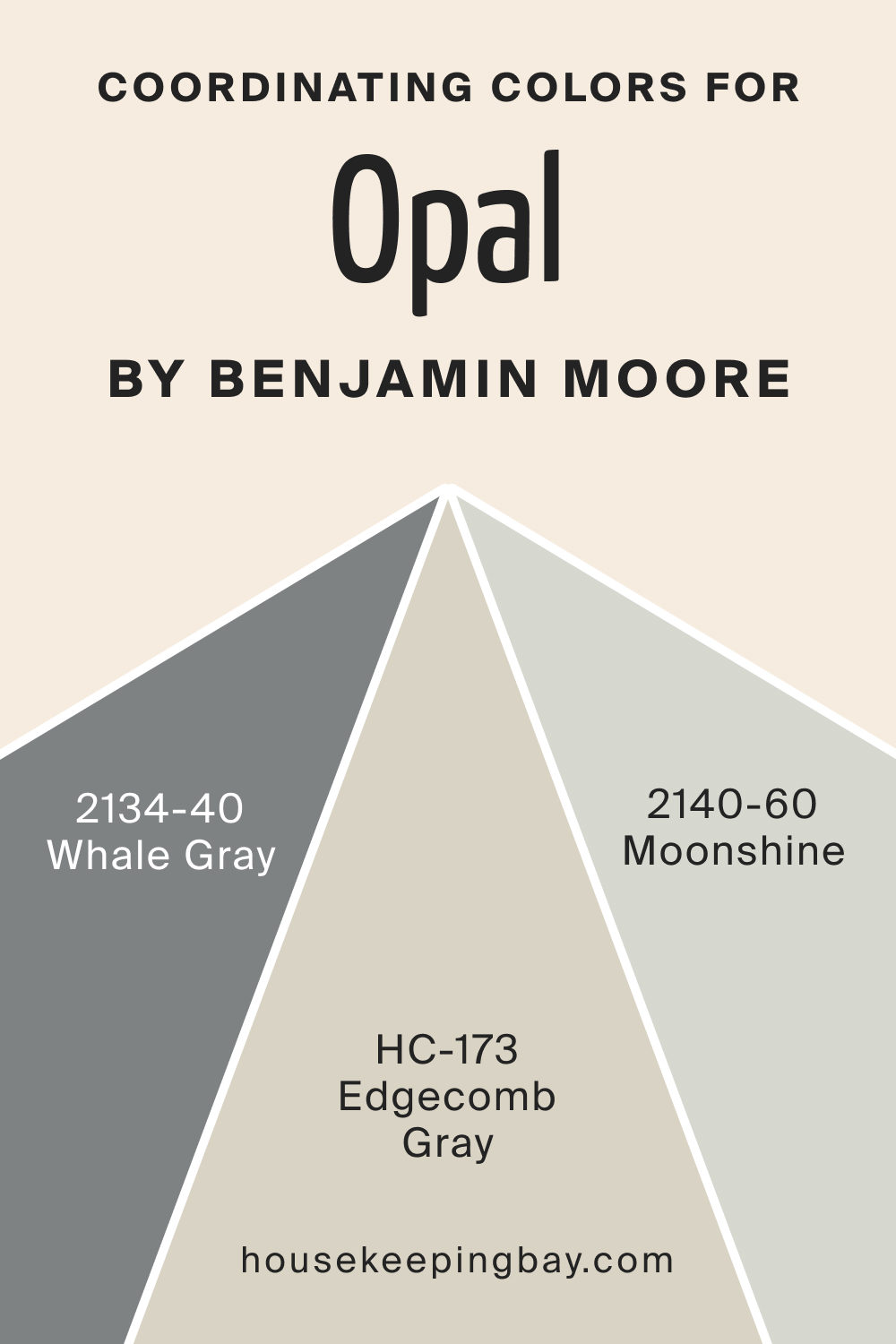
Coordinating Colors of Opal OC-73
Coordinating colors are those that share a similar hue family, complementing and enhancing the primary shade. For Opal OC-73, the following Benjamin Moore colors make perfect companions:
- Whale Gray (2134-40) : A deeper, serene shade of gray.
- Moonshine (2140-60) : A subtle, muted shade with blue undertones.
- Edgecomb Gray (HC-173) : A neutral gray-beige, exuding warmth and sophistication.
housekeepingbay.com
How Does Lighting Affect Opal OC-73?
Lighting plays a pivotal role in perceiving color. Natural daylight showcases Opal OC-73 in its purest form, casting a soft, soothing aura. However, under artificial light, especially warmer bulbs, the gray undertones might emerge more prominently.
North-faced rooms may render it slightly more muted due to lesser direct sunlight, while south-faced rooms will emphasize its brightness. East-facing rooms, with morning light, can make it appear cooler, whereas west-facing rooms can lend a warmer, rosier tone by sunset.
housekeepingbay.com
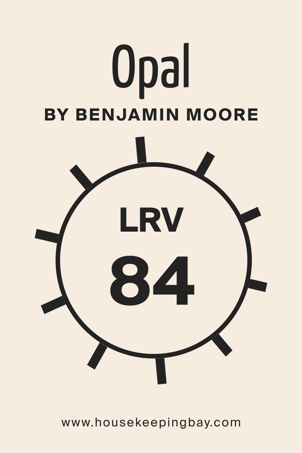
LRV of Opal OC-73
LRV, or Light Reflectance Value, represents the percentage of light a color reflects. With an LRV of 84, Opal OC-73 is highly reflective, making spaces appear larger and more open. Higher LRVs, like with this shade, optimize natural light effectively, bringing out the color’s depth and dimension.
housekeepingbay.com
What is LRV? Read It Before You Choose Your Ideal Paint Color
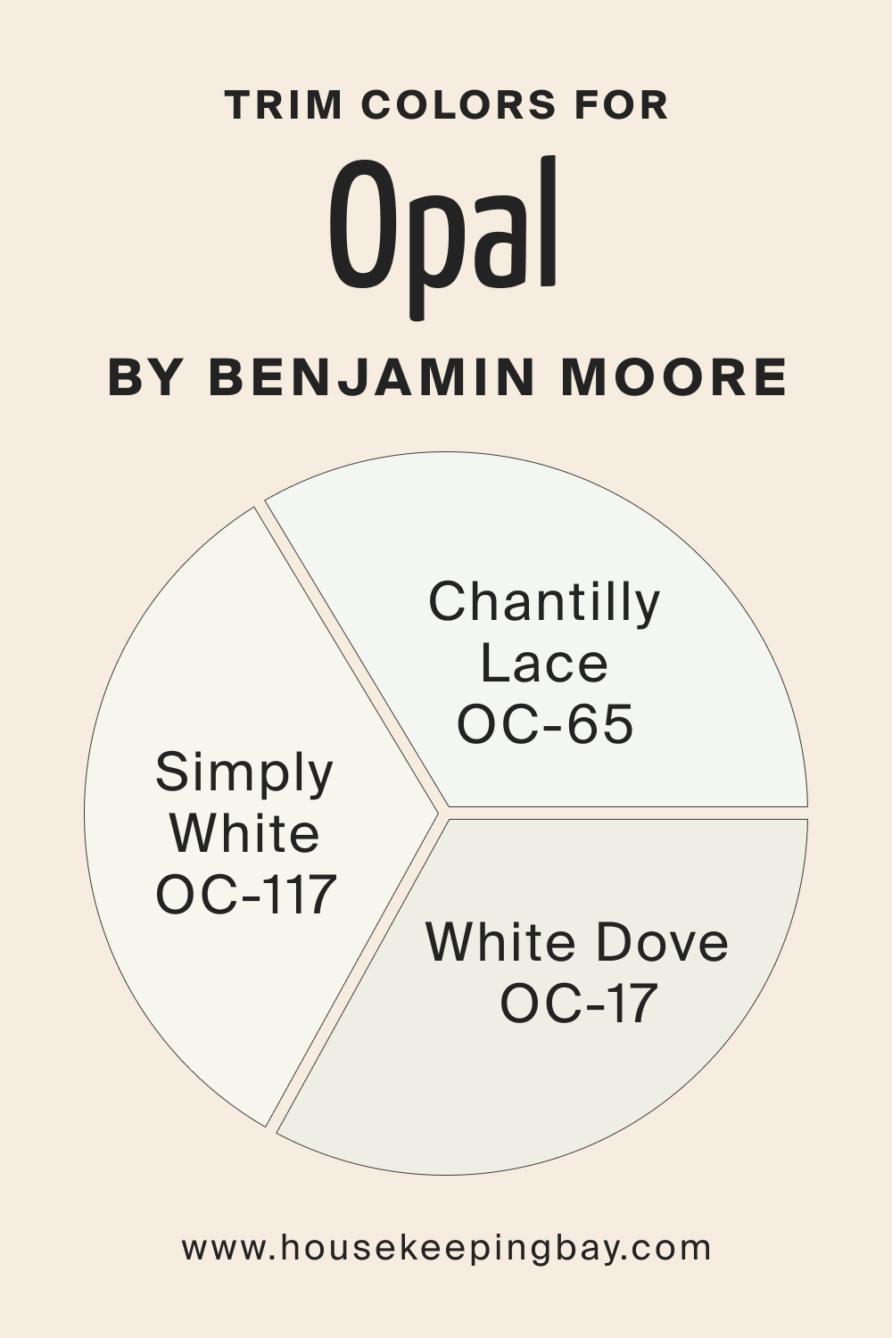
Trim Colors of Opal OC-73
Trim colors are the accents that outline and highlight architectural features. For Opal OC-73, soft white shades can be a perfect match. Benjamin Moore’s Chantilly Lace (OC-65), White Dove (OC-17) , and Simply White OC-117 would beautifully enhance its subtle elegance.
housekeepingbay.com
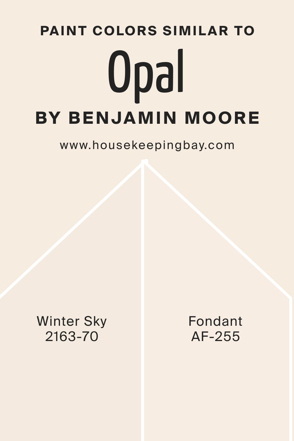
Colors Similar to Opal OC-73
Knowing similar colors offers versatility in design choices. We suggest you the following color alternatives that can work instead of OC-73 Opal paint color:
- BM Winter Sky (2163-70) leans a tad bluer, reminiscent of crisp winter mornings.
- BM Fondant (AF-255) , meanwhile, is a richer hue, adding a touch of luxe warmth.
housekeepingbay.com
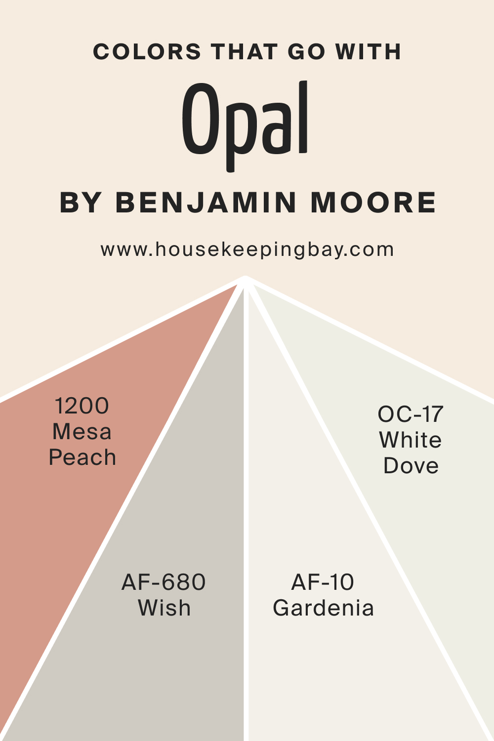
Colors That Go With Opal OC-73
Complementary colors create a balanced palette. Try pairing OC-73 Opal with these colors to achieve a harmonious palette:
- BM Mesa Peach (1200) offers a peachy warmth
- AF-680 Wish provides a beige-gray contrast
- OC-17 White Dove is a versatile off-white
- Gardenia (AF-10) is a creamy, elegant white
When paired with Opal OC-73, these shades contribute to a harmonious and inviting ambiance.
housekeepingbay.com
How to Use Opal OC-73 In Your Home?
Opal OC-73’s versatile hue offers countless applications throughout the home. Ideal for living rooms, bedrooms, and bathrooms, its soothing undertones evoke calm and serenity. Moreover, its neutral nature means it easily fits into various interior design styles, from contemporary and minimalist to coastal and traditional.
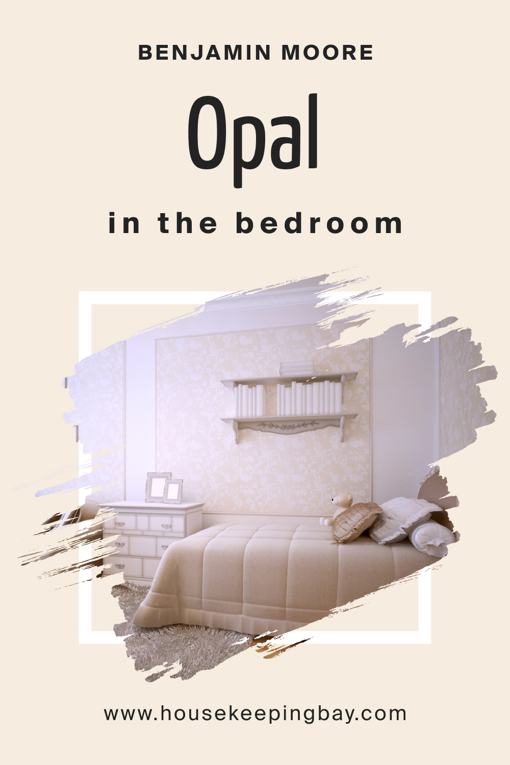
How to Use Opal OC-73 in the Bedroom?
Opal OC-73 is the embodiment of tranquility, making it perfect for bedrooms. Its soft undertones create a relaxing environment, fostering restful sleep. Paired with light wooden furnishings and soft textiles, it establishes an ethereal sleep sanctuary.
housekeepingbay.com
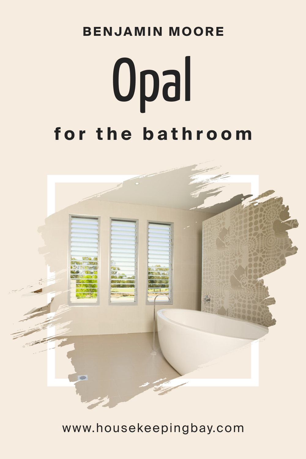
How to Use Opal OC-73 in the Bathroom?
In bathrooms, Opal OC-73 can conjure a spa-like ambiance. Its serene undertones juxtapose beautifully against marble or ceramic tiles. Paired with metallic fixtures, it lends a modern yet timeless appeal.
housekeepingbay.com
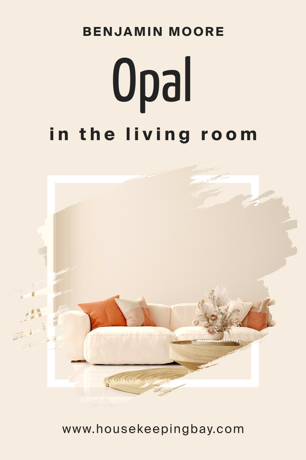
How to Use Opal OC-73 in the Living Room?
This shade exudes sophistication in living areas. It complements natural light, making spaces feel airy and expansive. Accenting with bold or pastel decor pieces can truly make it shine, creating a well-balanced space for relaxation and entertainment.
housekeepingbay.com
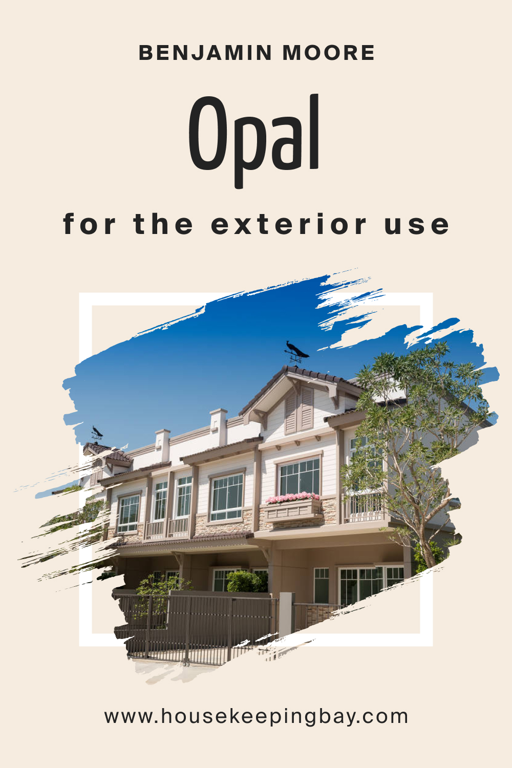
How to Use Opal OC-73 for an Exterior?
Opal OC-73 can beautifully modernize home exteriors. Its light-reflecting properties can make a residence stand out subtly, offering a welcoming aura. Paired with darker trims, the contrast can be captivating.
housekeepingbay.com
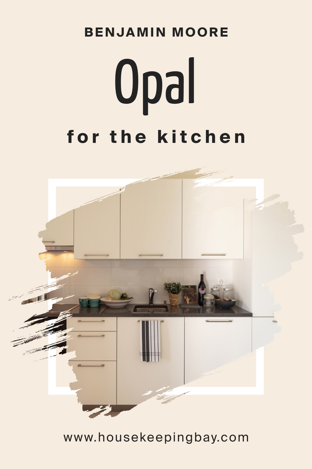
How to Use Opal OC-73 in the Kitchen?
A kitchen adorned with Opal OC-73 feels clean and refreshing. Its neutrality provides a canvas for experimenting with colored kitchenware and decorative elements. The color harmonizes with both stainless steel and wooden finishes.
housekeepingbay.com
Comparing Opal OC-73 With Other Colors
Comparing colors is vital in ensuring they coexist harmoniously within a space. It helps identify undertones, contrasts, and complementary hues. While Opal OC-73 is unique, understanding how it measures against other colors can guide design choices.
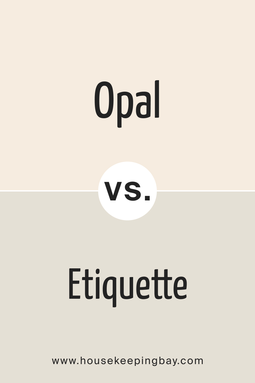
Opal OC-73 vs. AF-50 Etiquette
BM Etiquette is a subtle gray, presenting a cooler appearance compared to BM Opal’s warmer, softer persona.
housekeepingbay.com
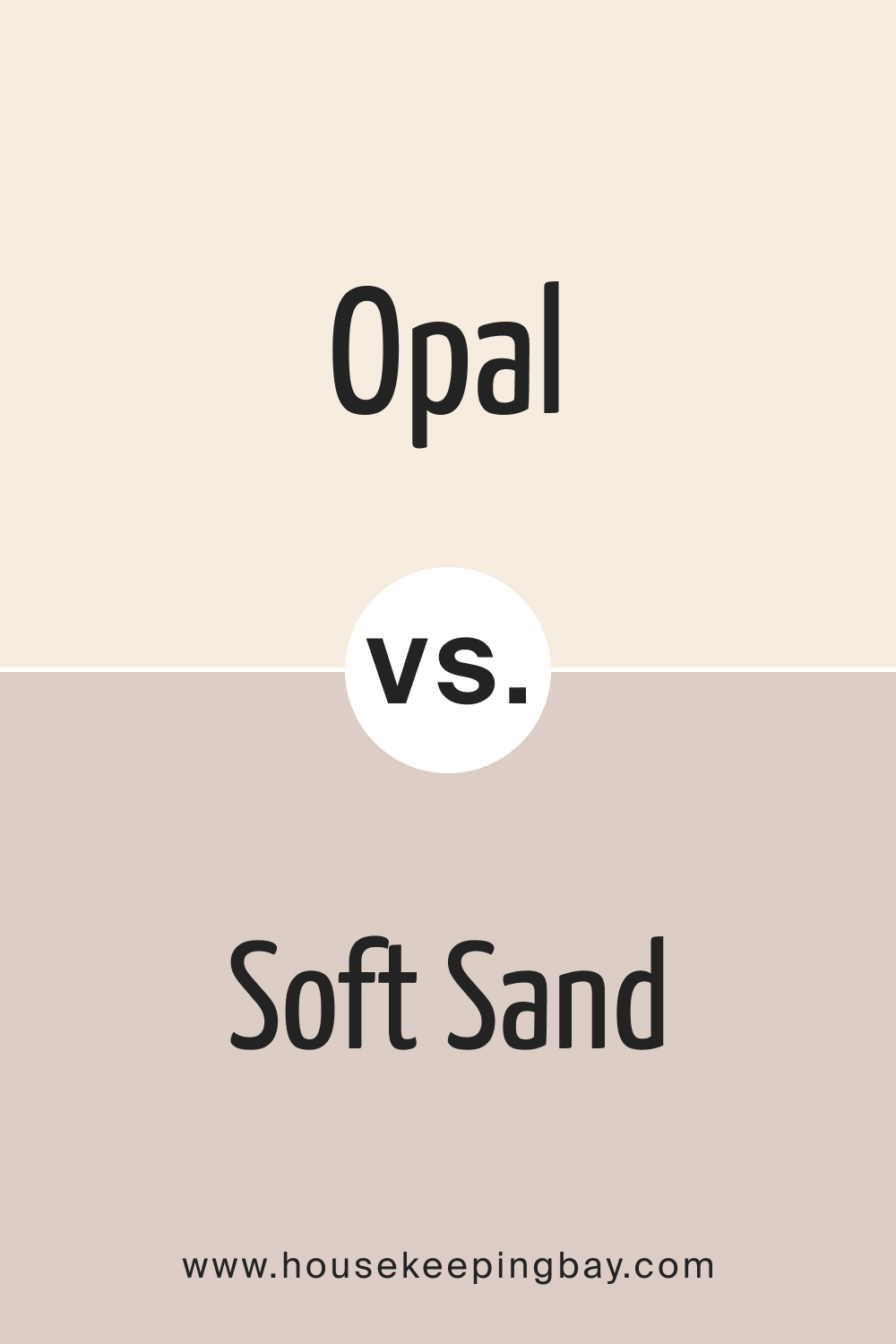
Opal OC-73 vs. BM Soft Sand 2106-60
BM Soft Sand is warmer and reminiscent of sun-kissed beaches, while Opal OC-73 retains a cooler, misty ambiance.
housekeepingbay.com
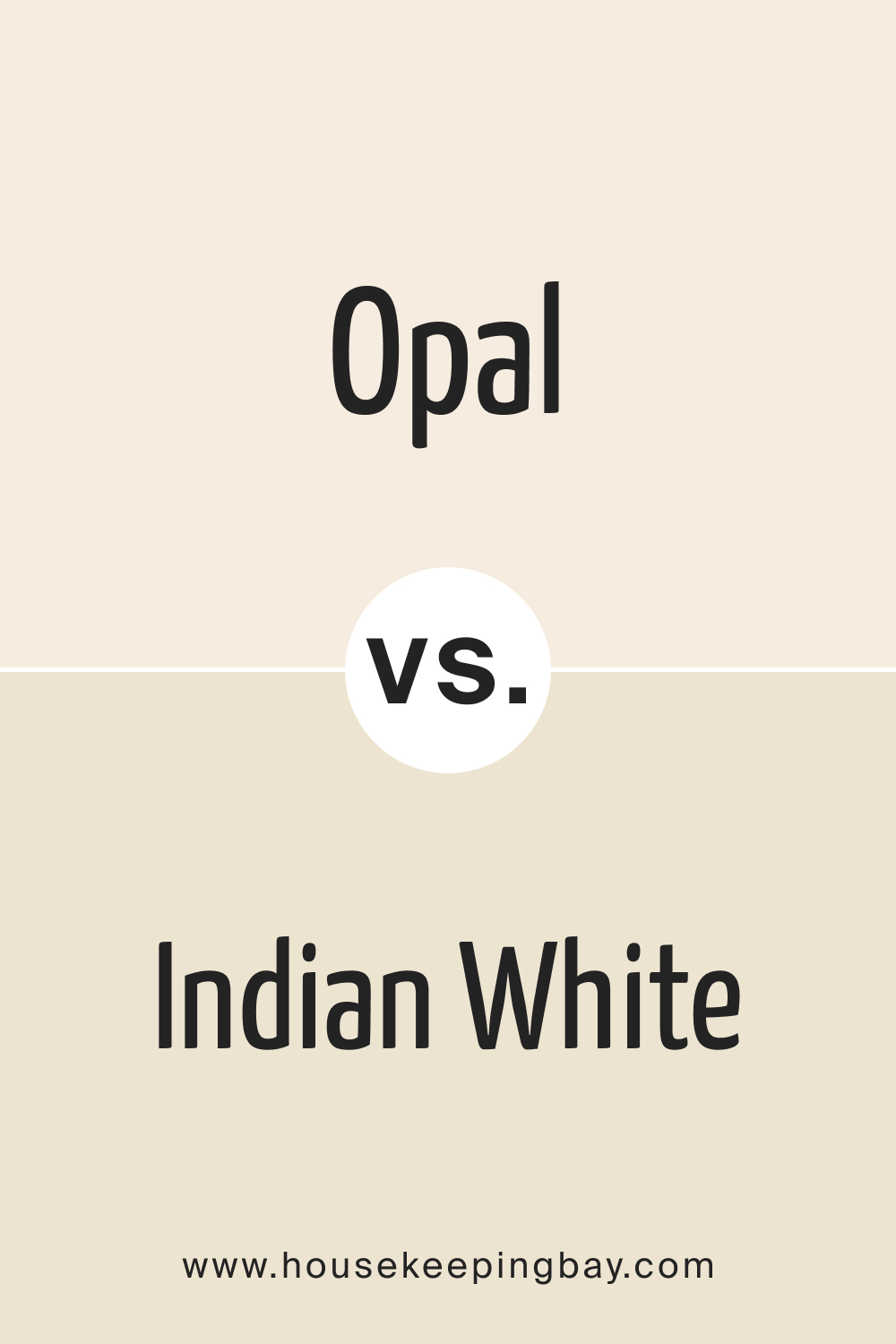
OC-73 Opal vs. BM Indian White
Both BM Opal and Indian White belong to Benjamin Moore’s sophisticated array of neutrals. While Opal leans towards a muted grayish hue, Indian White presents a gentle beige undertone reminiscent of aged parchment or soft sand.
When set side by side, Indian White seems to have a slightly warmer presence, making spaces feel cozy and grounded. Choosing between the two would depend on whether you’re aiming for a cooler or a marginally warmer ambiance in your space.
housekeepingbay.com
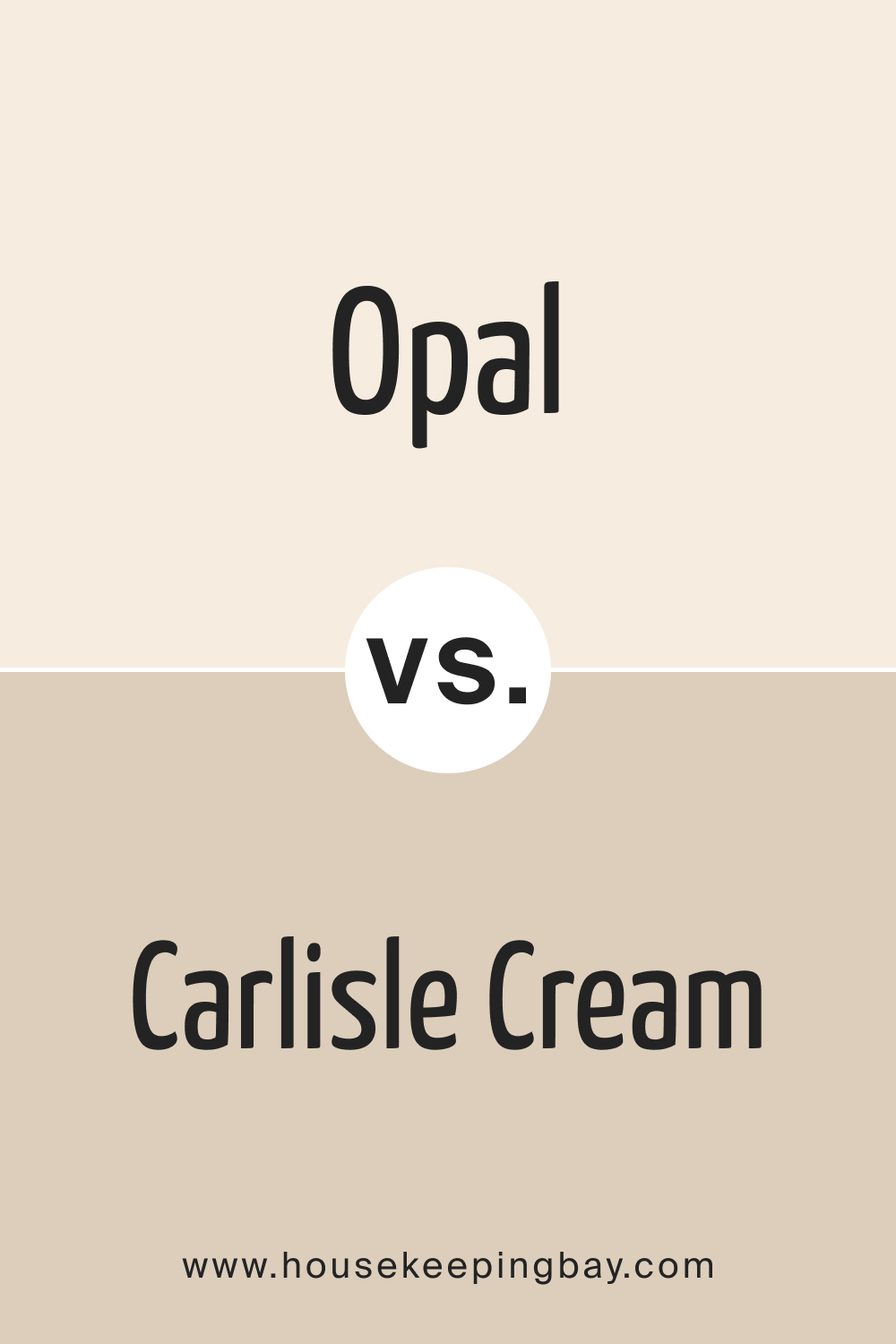
OC-73 Opal vs. BM Carlisle Cream 1031
BM Opal and Carlisle Cream stand on different spectrums of the neutral palette. Opal, with its soft grayish tint, exudes a contemporary serenity. On the other hand, Carlisle Cream carries with it a hint of yellow, evoking images of sunlit mornings and buttery pastries.
In rooms with ample sunlight, Carlisle Cream would gleam brighter, whereas Opal would maintain its muted elegance regardless of the lighting condition.
housekeepingbay.com
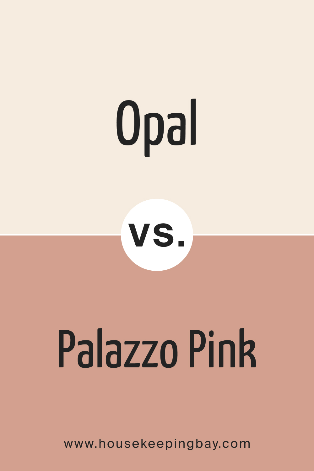
OC-73 Opal vs. BM Palazzo Pink 1193
Comparing BM Opal with Palazzo Pink is akin to juxtaposing a cloudy sky with a blush sunset. Opal’s gray undertones provide a neutral backdrop, versatile and calming. In contrast, Palazzo Pink introduces a gentle rosy hue to interiors, imbuing them with a romantic, almost vintage charm.
While both shades are undeniably elegant, your preference would be steered by whether you desire the ethereal romance of Palazzo Pink or the modern tranquility of Opal.
housekeepingbay.com
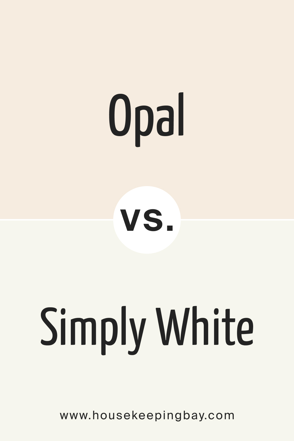
OC-73 Opal vs. OC-117 Simply White
When BM Opal is set against Simply White one can truly appreciate the subtle intricacies of neutral hues. Simply White, as its name suggests, is a pure and unadulterated white. It’s crisp, clean, and has the ability to make spaces look expansive.
BM Opal, in contrast, carries with it a whisper of gray. It’s still light and airy but offers a tad more depth than Simply White. If you’re looking for a pristine, classic backdrop, Simply White is your hue. However, if you seek a touch of modern nuance in your neutral, Opal might be the way to go.
housekeepingbay.com
Conclusion
Opal OC-73 by Benjamin Moore emerges as a versatile and timeless choice for homeowners and interior designers alike. Its unique blend of neutral undertones strikes a balance between modern sophistication and cozy charm, making it apt for varied applications, be it tranquil bedrooms or contemporary kitchens.
When paired thoughtfully with complementary colors and decor elements, Opal OC-73 has the potential to transform spaces, evoking an ambiance of serenity and elegance. This shade truly underscores the power of neutrals in interior design, proving that subtlety, when done right, can leave a lasting impression.
housekeepingbay.com
Ever wished paint sampling was as easy as sticking a sticker? Guess what? Now it is! Discover Samplize's unique Peel & Stick samples. Get started now and say goodbye to the old messy way!
Get paint samples


Frequently Asked Questions
⭐Why is Opal OC-73 considered a versatile shade for home interiors?
Opal OC-73 is versatile due to its unique blend of neutral undertones, allowing it to seamlessly fit into a wide array of interior styles — from contemporary to traditional. Its muted yet inviting hue provides a backdrop that can either stand out or blend in, depending on the homeowner's vision.
⭐Can Opal OC-73 be used in areas with a lot of natural light, such as sunrooms or open-concept spaces?
Absolutely! Opal OC-73 thrives in spaces with ample natural light. The brightness of the light accentuates the color's calming properties, making spaces feel more expansive and airy.
⭐How does Opal OC-73 compare to other popular neutral shades in the Benjamin Moore range?
While Benjamin Moore boasts a range of neutrals, Opal OC-73 stands out for its soft gray undertones. Unlike some neutrals that lean towards beige or stark white, Opal OC-73 offers a balanced middle ground, exuding both warmth and coolness in appropriate measures
⭐What are some recommended trim colors to pair with Opal OC-73?
Opal OC-73 pairs beautifully with crisp whites like Benjamin Moore's Chantilly Lace (OC-65) or White Dove (OC-17). These whites provide a clean contrast, emphasizing the walls and making the space look more defined.
⭐Is Opal OC-73 suitable for exteriors, given its light hue and LRV value?
Yes, Opal OC-73 is a great choice for exteriors. Its LRV value of 84 ensures it reflects a significant amount of light, making the residence stand out subtly. When used on exteriors, it provides a modern yet welcoming appearance, especially when contrasted with darker trims or accents.
17 thoughts on “Opal OC-73 Paint Color by Benjamin Moore”
Leave a Reply


Can I pair this with wooden furnishings?
Certainly! Opal OC-73 harmonizes wonderfully with wooden elements, from light Scandi woods to darker, rich mahoganies, creating a balanced ambiance.
How does Colonial Cream OC-77 compare to more yellowish creams?
Is this shade suitable for a minimalist design?
Opal OC-73 is perfect for minimalist interiors. Its neutral, calming hue acts as a blank canvas, complementing the minimalist aesthetic beautifully.
How does Opal OC-73 compare to BM Winter Sky?
While both are neutrals, BM Winter Sky leans a bit bluer, evoking crisp winter mornings. Opal OC-73, on the other hand, is more muted with soft gray undertones.
I have a south-facing living room. Will this color work?
Yes, in a south-facing room, Opal OC-73 will bask in natural light, emphasizing its brightness and making your space feel airy.
Can I use Opal OC-73 for my kitchen cabinets?
Absolutely! Opal OC-73 on kitchen cabinets provides a contemporary and clean appearance, especially when paired against darker countertops or backsplashes.
How does this shade look in artificial lighting?
Under artificial lighting, especially warmer bulbs, Opal OC-73’s gray undertones might emerge more, lending a cozy feel to the space.
What ceiling color would complement Opal OC-73 walls?
A classic choice would be a crisp white like Benjamin Moore’s Chantilly Lace (OC-65). It provides a clean contrast, making the Opal OC-73 walls stand out.
Does Opal OC-73 lean more towards a cool or warm undertone?
Opal OC-73 has a predominantly cool undertone with its gentle grayish hue, but its versatility means it can seamlessly fit into both warm and cool environments.