Echelon Ecru SW 7574 by Sherwin Williams
Embracing Elegance in Every Space
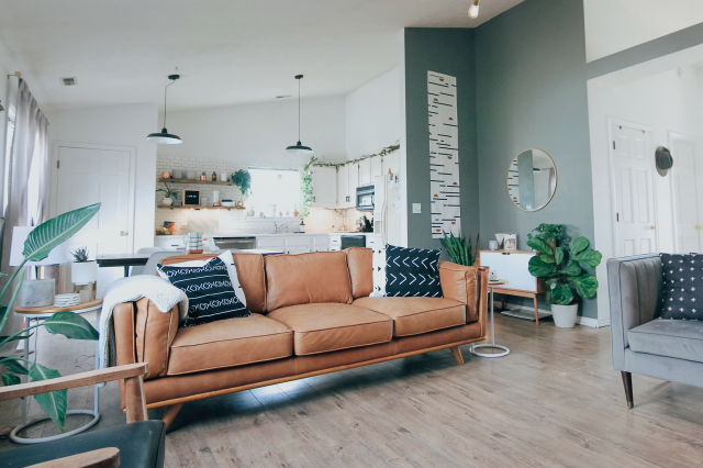
As a part of the Sherwin Williams collection, Echelon Ecru stands out for its timeless charm. Acting as a neutral, yet with enough depth to make a statement, it offers a perfect backdrop for a myriad of design aesthetics from minimalist to lavish. Not just limited to walls, this color finds its way embellishing cabinets, exteriors, and even furniture, showcasing its flexibility.
In the following sections, we’ll explore the nuances of SW 7574, providing insights on its best applications, complementary colors, and tips from design experts on how to integrate this sophisticated shade into your decor.
Whether you’re renovating a quaint cottage or styling a sleek, modern loft, Echelon Ecru holds the potential to elevate your space to new heights of style.
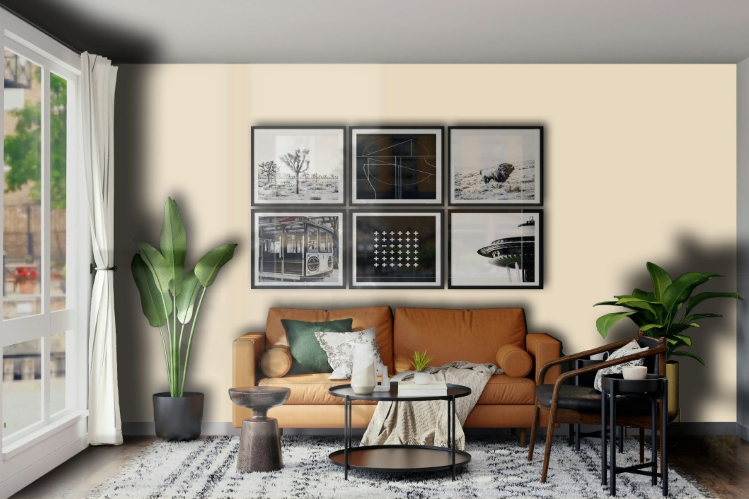
via sherwin-williams.com
What Color Is Echelon Ecru SW 7574 by Sherwin Williams?
Table of Contents
Echelon Ecru SW 7574 by Sherwin Williams is a sophisticated and nuanced hue that embodies the warmth and timelessness of traditional ecru with a contemporary twist. This color, a soft and understated shade of beige, possesses an inviting warmth that makes spaces feel both comfortable and elegantly refined. Echelon Ecru strikes a delicate balance between a comforting neutral and a subtle statement, making it versatile for a myriad of applications.
In the realm of interior styles, Echelon Ecru shines in settings that aim for a chic, serene atmosphere. It is particularly well-suited for minimalistic designs, where its simplicity enhances a clean and uncluttered look. However, its warmth and versatility also make it an excellent choice for country, coastal, and modern farmhouse interiors, where it complements natural materials and adds a layer of coziness.
This color pairs exquisitely with a wide range of materials and textures, reinforcing its adaptability. In spaces that feature wood, from light oak to richer walnut tones, Echelon Ecru brings out the natural beauty of the grain, creating a harmonious interplay between warmth and elegance. Paired with metal accents, it can help soften the industrial edge, adding a layer of sophistication.
In rooms that employ fabrics, whether cotton, linen, or wool, this hue works well to enhance the tactile quality of the materials, making them appear even more inviting. The choice of Echelon Ecru in an interior scheme creates a canvas that allows materials and textures to stand out, making it a truly versatile backdrop that enriches the overall aesthetic of any space.

housekeepingbay.com
Is Echelon Ecru SW 7574 by Sherwin Williams Warm or Cool color?
Echelon Ecru SW 7574 by Sherwin Williams is a sophisticated and versatile paint color that exudes warmth and elegance. As part of the Sherwin Williams palette, it is a testament to the brand’s commitment to creating hues that enhance the beauty and functionality of living spaces. This particular shade is a soft, warm neutral with an earthen undertone, making it an ideal choice for creating a cozy and inviting atmosphere in homes. Its adaptability allows it to seamlessly blend with a wide range of decor styles, from traditional to modern.
The beauty of Echelon Ecru lies in its ability to act as both a complementary background and a standalone feature color. In well-lit spaces, it radiates a gentle warmth, amplifying natural light and making rooms feel more spacious and airy. In spaces with less natural light, it introduces depth and coziness without the heaviness often associated with darker colors.
This balance makes Echelon Ecru a perfect choice for living rooms, bedrooms, and kitchens, where it contributes to a serene and welcoming environment.
The color’s soft neutrality also provides an excellent canvas for showcasing art, furniture, and accent pieces, allowing individual tastes and personalities to shine through. Echelon Ecru’s understated elegance encourages creativity in interior design, making it a go-to option for homeowners and designers looking to create spaces that are both stylish and comfortable.
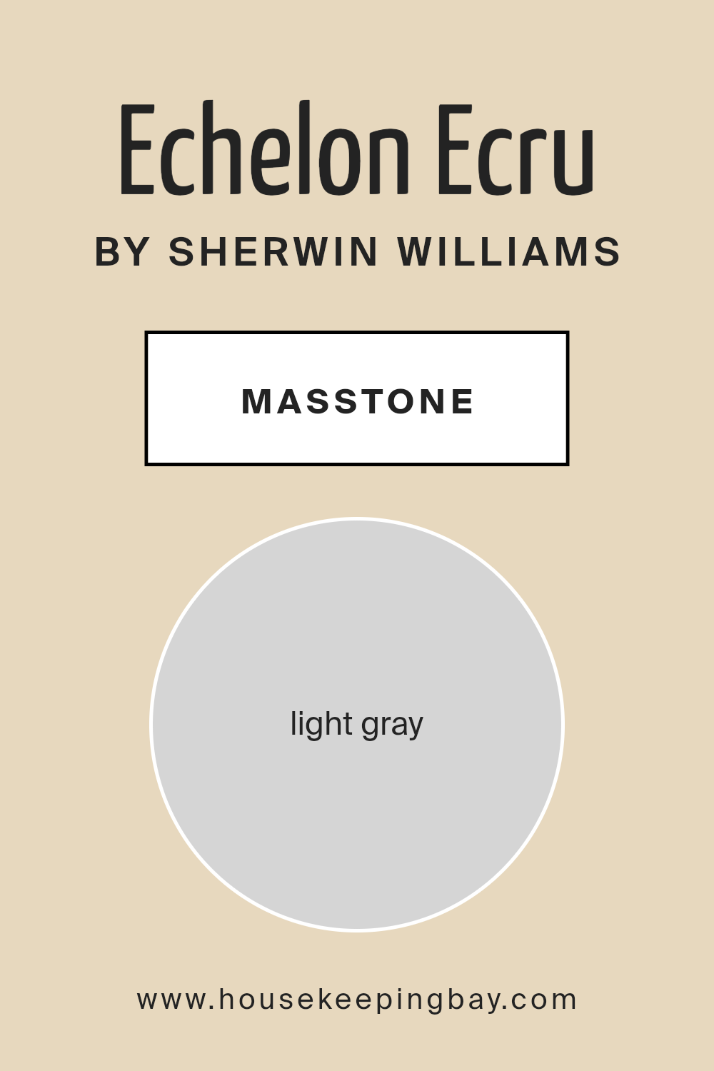
What is the Masstone of the Echelon Ecru SW 7574 by Sherwin Williams?
Echelon Ecru SW 7574 by Sherwin Williams, defined by its masstone of Light Gray (#D5D5D5), is a hue that brings a refined subtlety into any home. This particular gray operates as a foundation for versatility, easily adapting to an array of decor styles and palettes. Its lightness offers a freshness that can make spaces appear larger and more inviting, an essential feature for both small and expansive rooms.
The inherent neutrality of Echelon Ecru’s masstone ensures it can harmonize with both warm and cool tones, allowing for endless color combinations and thematic decorations without overwhelming the senses.
This color’s potency lies in its ability to balance light reflection and absorption, creating environments that feel naturally lit, but never stark or cold. Its gentle presence can elevate minimalist spaces with understated elegance or inject a calming backdrop to more vibrant, eclectic interiors. In homes, Echelon Ecru is not merely a shade but a tool for softening transitions between spaces, enhancing architectural features, and crafting an atmosphere of serene sophistication. Its adaptability and timeless nature make it an enduring choice for homeowners aiming to blend functionality with style.
housekeepingbay.com
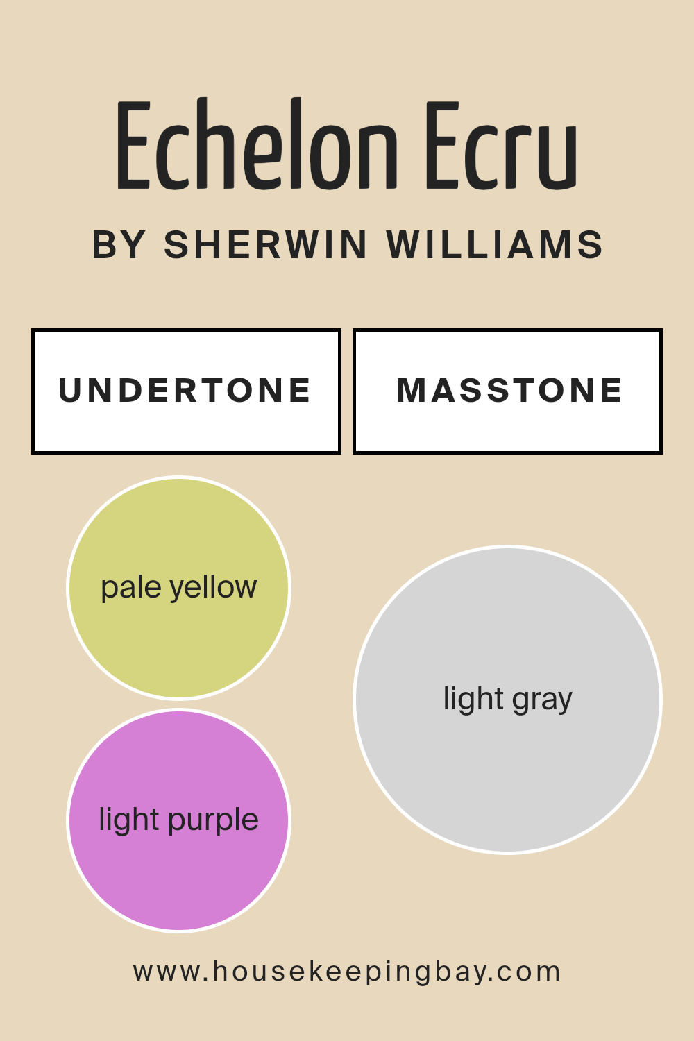
Undertones of Echelon Ecru SW 7574 by Sherwin Williams
Echelon Ecru SW 7574 by Sherwin Williams is a nuanced shade that belies its apparent simplicity, thanks to the subtle interplay of its undertones—pale yellow and light purple. These undertones contribute a remarkable depth and complexity to this color, influencing not only its perception but its versatility within interior spaces.
Undertones are the underlying qualities of color that may not be immediately apparent but shine through under certain lighting conditions or when juxtaposed with other colors. They are essentially the color’s backbone, affecting how warm, cool, or neutral a shade appears.
For Echelon Ecru, the pale yellow undertone adds a hint of warmth and light, evoking a sense of brightness and airiness. Conversely, the light purple undertone introduces a cool, subtle depth, providing a counterbalance that enhances the richness of the hue.
When applied to interior walls, Echelon Ecru’s unique combination of undertones plays a transformative role. In spaces with abundant natural light, the pale yellow undertone can make the room feel more inviting and sunlit, imparting a gentle, soothing ambiance. In artificial light or during the evening, the light purple undertone might become more pronounced, lending the room an elegant, serene feel. This duality allows Echelon Ecru to adapt to various settings and decor styles, from modern minimalism to cozy traditionalism, making it a versatile choice for designers and homeowners aiming to create spaces that feel both refined and welcoming.
The effect of its undertones demonstrates how critical these subtle hues are in determining the overall impact of a color in any given space, influencing mood, perception, and the aesthetic cohesion of a room.
housekeepingbay.com
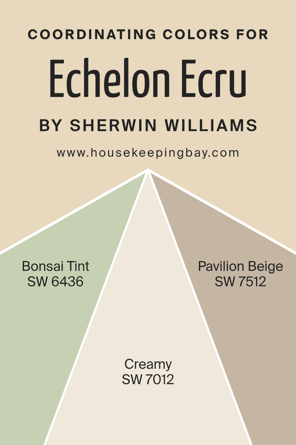
Coordinating Colors of Echelon Ecru SW 7574 by Sherwin Williams
Coordinating colors are shades that complement each other pleasingly when used together within a space. They are chosen based on their positions within the color wheel and their ability to create a harmonious and balanced look. Coordinating colors can share a certain level of saturation or temperature, be adjacent to each other on the color wheel, or even be a mix of contrasting shades that together, enhance the aesthetic of an environment. For Echelon Ecru SW 7574 by Sherwin Williams, a sophisticated, warm neutral, selecting the right coordinating colors can add depth and character to the living spaces.
SW 6436 – Bonsai Tint, is a subtle, muted green with a hint of gray, creating a serene and soothing atmosphere. It draws inspiration from nature, making it an excellent choice for bringing a sense of calm and tranquility into a room, especially when paired with the warmth of Echelon Ecru.
SW 7012 – Creamy, on the other hand, is a soft, warm white with a velvety depth, making spaces feel bright and inviting. Its warmth complements the cozy earthiness of Echelon Ecru, ensuring spaces feel open and airy. Finally, SW 7512 – Pavilion Beige, is a classic beige with a refined elegance.
It strikes a perfect balance with Echelon Ecru, enhancing the space with a sophisticated, understated glamor, especially in well-lit areas. Together, these coordinating colors create a cohesive, inviting palette that enriches the warm base of Echelon Ecru, allowing for a multitude of design possibilities that can appeal to various tastes and styles.
You can see recommended paint colors below:
- SW 6436 Bonsai Tint
- SW 7012 Creamy
- SW 7512 Pavilion Beige
housekeepingbay.com
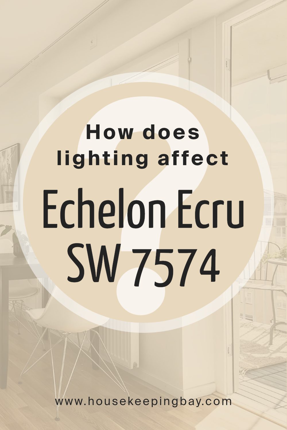
How Does Lighting Affect Echelon Ecru SW 7574 by Sherwin Williams?
Lighting plays a crucial role in how we perceive colors in our environment. The color of light, whether it’s natural daylight or artificial light, can significantly alter the appearance of colors in a room. This interaction is crucial when considering paint choices, such as Sherwin Williams’ Echelon Ecru SW 7574, a warm, inviting neutral shade with understated elegance.
In artificial light, the type of bulb used can affect how Echelon Ecru is perceived. Incandescent bulbs, which produce a warm, yellowish light, can enhance the warmth of Echelon Ecru, making it appear cozier and more inviting. LED or fluorescent bulbs, which can have cooler color temperatures, might make this color appear slightly paler or even shift it towards a cooler tone, depending on the specific light quality.
In natural light, Echelon Ecru’s appearance can change dramatically throughout the day and depending on the orientation of the room. North-facing rooms receive less direct sunlight, which can make colors appear cooler. Here, Echelon Ecru might lose some of its warmth and appear more muted, maintaining a very sophisticated and calm aesthetic.
South-facing rooms, bathed in abundant direct sunlight for most of the day, can bring out the best in Echelon Ecru, highlighting its warm, creamy quality. This orientation tends to make colors look brighter and more vibrant, so Echelon Ecru will feel especially welcoming here.
East-facing rooms receive strong sunlight in the morning, when the light is warm and golden. This morning light can make Echelon Ecru look very soft and warm, creating a gentle, inviting ambiance. As the day progresses and the direct sunlight moves away, the color may become more subdued.
West-facing rooms, conversely, get the afternoon and evening light, which can be warmer and more intense than morning light. Echelon Ecru will bask in this warm glow, becoming more pronounced and lively in these conditions, especially during the golden hour before sunset.
Understanding how light affects color, and specifically how it interacts with shades like Echelon Ecru SW 7574, can help in making informed decisions about paint colors for your space, ensuring that the color behaves as you expect throughout the day and in different lighting conditions.
housekeepingbay.com
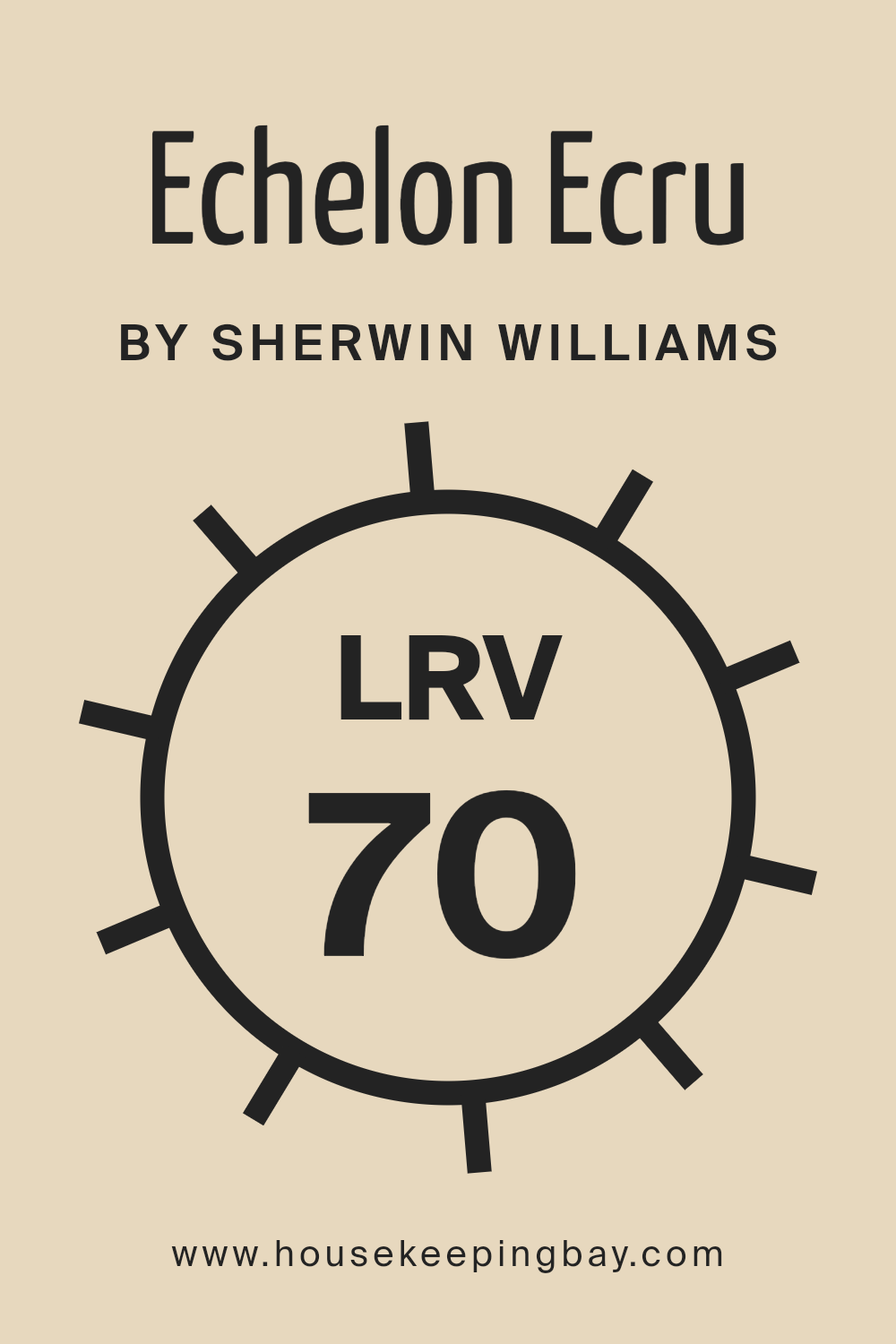
What is the LRV of Echelon Ecru SW 7574 by Sherwin Williams?
LRV, or Light Reflectance Value, is a measure used to indicate the percentage of visible and usable light that a color reflects from or absorbs into a painted surface. It’s a scale from 0 to 100, with 0 being pure black, absorbing all light and heat, and 100 being pure white, reflecting all light and heat.
LRV plays a critical role in interior and exterior design as it affects not only the brightness of a room but also its ambiance. Colors with higher LRVs make spaces appear larger and more open by reflecting more light, while colors with lower LRVs create a cozier, more intimate atmosphere by absorbing more light.
Choosing the right LRV can enhance natural light, reduce the need for artificial lighting, and even impact energy consumption within a space.
Echelon Ecru SW 7574 by Sherwin Williams, with an LRV of 69.903, is quite high on the LRV scale, indicating it’s a light color that reflects a considerable amount of light. In context, this means Echelon Ecru is versatile and capable of making spaces feel airier and more expansive.
It’s especially suitable for rooms that are smaller, darker, or those with fewer windows. In terms of aesthetics, its high LRV provides a neutral backdrop that can brighten up a space and serve as an excellent canvas for a wide range of decor. This particular color, with its warm undertone, can also add a subtle, cozy warmth to the walls, enriching the room’s overall atmosphere while maintaining a sense of openness and light.
housekeepingbay.com
What is LRV? Read It Before You Choose Your Ideal Paint Color
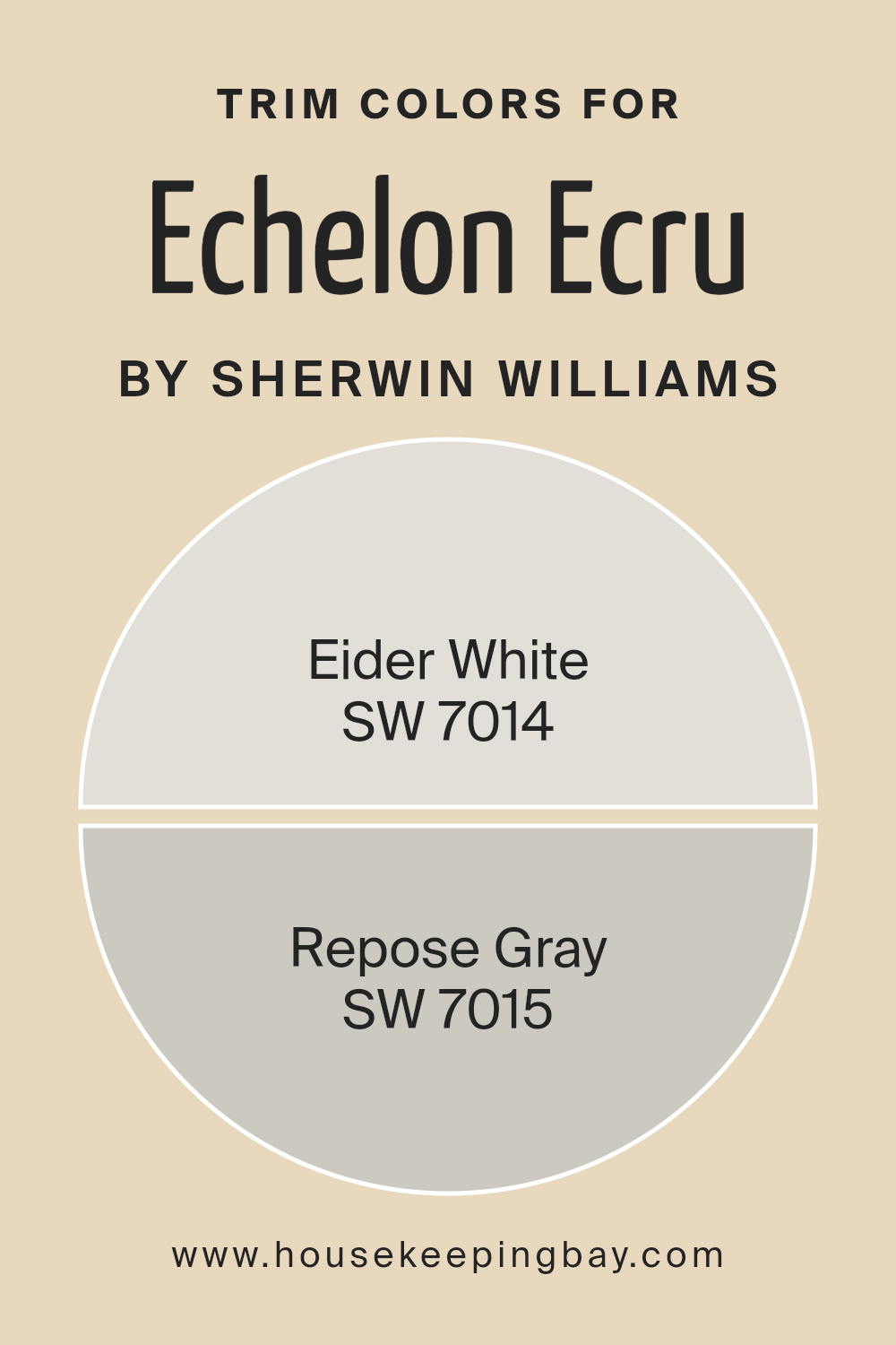
What are the Trim colors of Echelon Ecru SW 7574 by Sherwin Williams?
Trim colors are selected to complement or contrast the main color of a wall, emphasizing architectural details or framing features such as windows and doors. For Echelon EcruSW 7574 by Sherwin Williams, a warm, inviting hue, choosing the right trim colors can enhance its appeal and create a balanced, cohesive look.
SW 7014 – Eider White and SW 7015 – Repose Gray serve as excellent options for trim, providing a subtle or striking delineation from the wall color, depending on the desired effect. The choice of trim color can significantly impact the overall aesthetic, making it a key consideration in any decorating plan.
SW 7014 – Eider White offers a serene and soft touch with its light, almost ethereal quality, making it an ideal contrast against the deeper warmth of Echelon Ecru. This pairing can brighten and uplift spaces, creating a sense of openness and light.
On the other hand, SW 7015 – Repose Gray brings a contemporary edge with its cooler, yet inviting, gray tone, offering a gentle contrast that enhances the sophistication of Echelon Ecru. This combination can lend a modern yet timeless appeal to interiors, proving the importance of selecting the right trim colors to complement the primary palette.
You can see recommended paint colors below:
- SW 7014 Eider White
- SW 7015 Repose Gray
housekeepingbay.com
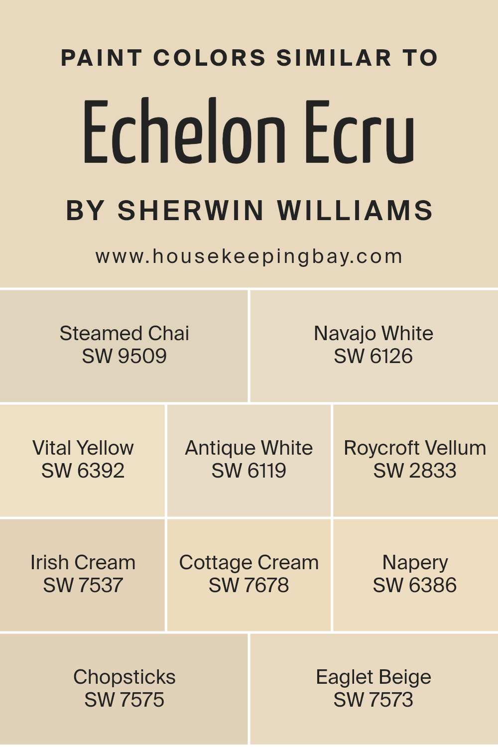
Colors Similar to Echelon Ecru SW 7574 by Sherwin Williams
In the realm of color theory, similar colors play a vital role in creating a cohesive and harmonious look. When it comes to interior design, choosing paint colors that share a kinship brings a sense of balance and fluidity within a space.
Colors similar to Echelon Ecru SW 7574 by Sherwin Williams, such as Steamed Chai SW 9509 and Navajo White SW 6126, exemplify this perfectly. Steamed Chai is a serene and inviting hue that captures the warmth of a steaming cup of tea, making spaces feel welcoming and cozy.
Navajo White, on the other hand, is a creamy, soft tone that echoes the quiet calm of dawn, providing a backdrop that’s both uplifting and unassuming.
Vital Yellow SW 6392 and Antique White SW 6119 further enrich the palette, offering a sunny disposition and a timeless elegance, respectively. Vital Yellow bursts with an energy that can brighten any room, serving as an accent that’s both bold and playful. Antique White whispers of the past with its subtle, nuanced beauty, making spaces feel grounded and serene.
The sequence continues with colors like Roycroft Vellum SW 2833 and Irish Cream SW 7537, which bring an earthy depth and a smooth, sophisticated creaminess to the mix. These hues work together to craft environments that feel curated and connected, encouraging a seamless transition from room to room.
With each color, such as Cottage Cream SW 7678 and Napery SW 6386, adding its own unique voice and vibe, the collective palette becomes a symphony of shades that resonate with warmth, elegance, and a touch of joy. Chopsticks SW 7575 and Eaglet Beige SW 7573 round out the selection, grounding the scheme with their earthy, muted tones that serve as versatile backdrops for any design aesthetic.
You can see recommended paint colors below:
- SW 9509 Steamed Chai
- SW 6126 Navajo White
- SW 6392 Vital Yellow
- SW 6119 Antique White
- SW 2833 Roycroft Vellum
- SW 7537 Irish Cream
- SW 7678 Cottage Cream
- SW 6386 Napery
- SW 7575 Chopsticks
- SW 7573 Eaglet Beige
housekeepingbay.com
How to Use Echelon Ecru SW 7574 by Sherwin Williams In Your Home?
Echelon Ecru SW 7574 by Sherwin Williams is a versatile and refined paint color that has gained popularity for its ability to bring a sense of sophistication and warmth to any space. Anchoring itself as a neutral yet distinctive hue, Echelon Ecru embodies the perfect blend of beige and white, making it a superb choice for those seeking a cozy, inviting atmosphere within their home. This inviting shade serves as an excellent backdrop for a variety of design styles, from rustic farmhouse to modern minimalism, providing a serene and welcoming environment.
When used in a living room or bedroom, Echelon Ecru creates a soothing canvas that enhances natural light, making the space appear larger and more open. Its warm undertones complement wood finishes and natural textures, adding depth and character. In kitchens and bathrooms, this color pairs beautifully with cabinetry and tiles, offering a timeless elegance that transcends fleeting design trends.
Echelon Ecru also excels in versatility. It can serve as a stand-alone color scheme or work harmoniously with bold accents, such as navy blue or deep green, allowing for personalization and creativity in decorating. For those looking to achieve a harmonious balance of comfort and style, Echelon Ecru SW 7574 provides a foundation that supports a wide range of decor choices, making it an invaluable asset in crafting a space that feels both refined and genuinely welcoming.
Echelon Ecru SW 7574 by Sherwin Williams vs Navajo White SW 6126 by Sherwin Williams
Echelon Ecru SW 7574 and Navajo White SW 6126, both by Sherwin Williams, offer subtle yet distinct hues for those seeking a warm, inviting ambiance in their space. Echelon Ecru leans towards a soft, serene beige, providing a neutral backdrop that exudes elegance and tranquility. Its understated tone makes it versatile, ideal for creating a calming effect in rooms that aim for a minimalist or sophisticated aesthetic.
On the other hand, Navajo White offers a slightly warmer palette, with a hint of creamy yellow undertones that bring a cozy, welcoming feel to the environment. It captures the essence of sunlight, adding brightness and warmth to spaces that need a touch of cheerfulness without overwhelming the senses.
While both colors promote a sense of comfort and ease, Echelon Ecru serves those desiring a more refined, subtle elegance, whereas Navajo White caters to those looking for warmth and a gentle uplift in their surroundings.
You can see recommended paint color below:
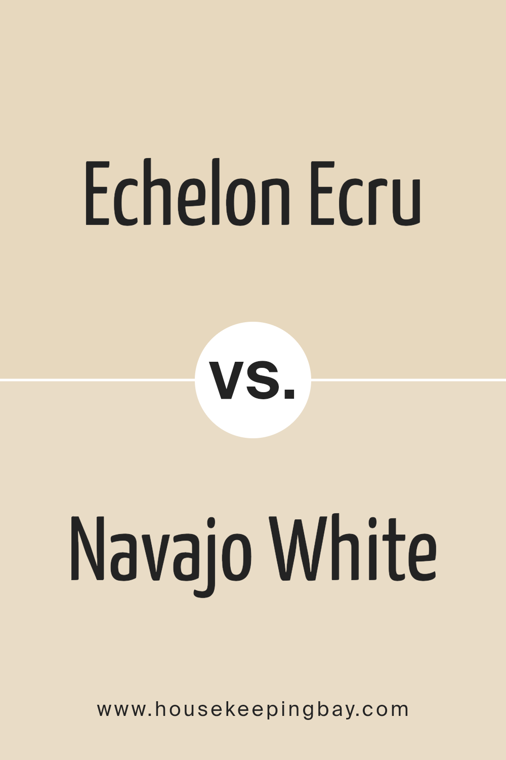
housekeepingbay.com
Echelon Ecru SW 7574 by Sherwin Williams vs Irish Cream SW 7537 by Sherwin Williams
Echelon Ecru SW 7574 and Irish Cream SW 7537 by Sherwin Williams are two nuanced shades that capture the essence of refined neutrals, offering subtlety and warmth to any space. Echelon Ecru leans into a soft, muted beige with a hint of gray, presenting as a serene backdrop that exudes an understated elegance.
This color is versatile, acting as a sophisticated canvas that allows decor elements to stand out, while also providing a tranquil and airy feel to interiors. In contrast, Irish Cream offers a slightly warmer, creamier hue, reminiscent of the smooth, rich tones found in its namesake.
This color brings a cozy warmth to rooms, wrapping spaces in a comforting embrace that’s inviting and homely. While both colors share a base in the neutral palette, the key difference lies in their undertones and warmth, with Echelon Ecru being cooler and more reserved, and Irish Cream exuding a warmer, more inviting glow.
Together, they represent the spectrum of warmth and neutrality that can cater to diverse design aesthetics, from minimalist to country.
You can see recommended paint color below:
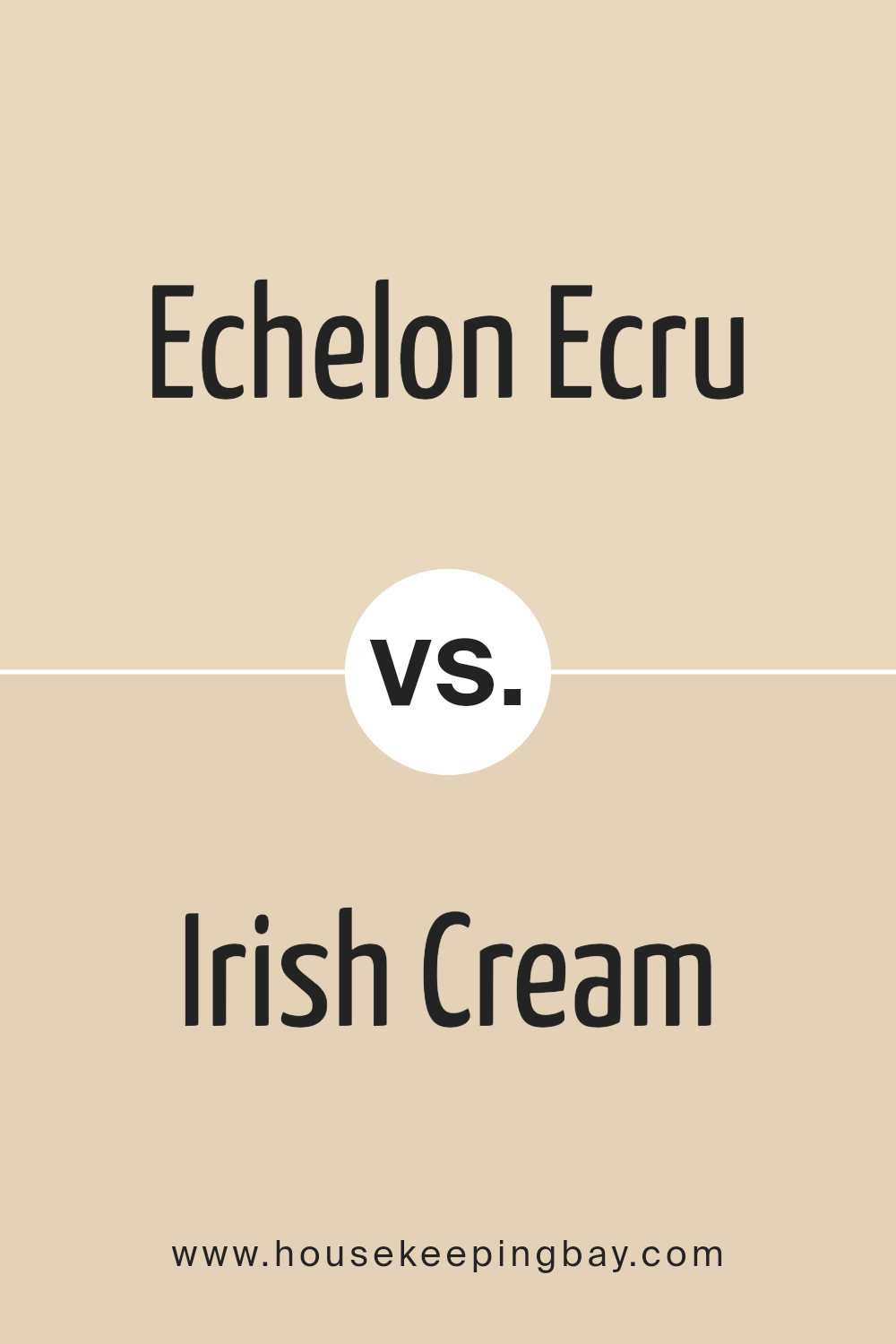
housekeepingbay.com
Echelon Ecru SW 7574 by Sherwin Williams vs Steamed Chai SW 9509 by Sherwin Williams
Echelon Ecru SW 7574 and Steamed Chai SW 9509 are both elegant colors by Sherwin Williams that can create warm and inviting spaces, but they offer distinct vibes due to their underlying tones and lightness. Echelon Ecru leans towards a soft, warm beige that carries an understated elegance, making it highly versatile for various applications, from traditional to contemporary designs. Its neutrality is perfect for creating a serene and cozy atmosphere, serving as an excellent backdrop for both bold and soft color schemes.
On the other hand, Steamed Chai offers a slightly darker and richer tone, reminiscent of a light, creamy coffee. This color is more pronounced than Echelon Ecru, providing a stronger presence yet maintaining a soothing warmth. It’s perfectly suited for creating intimate and comforting spaces, adding depth and warmth without overwhelming a room’s aesthetic.
While both colors share a warm base, the main difference lies in their intensity and the mood they set. Echelon Ecru is subtler, promoting a light, airy feel, whereas Steamed Chai, with its cozier and slightly more enveloping quality, establishes a more defined and warm ambiance. These characteristics make them suitable for different spaces and design objectives, depending on the desired outcome of warmth, depth, and ambiance.
You can see recommended paint color below:
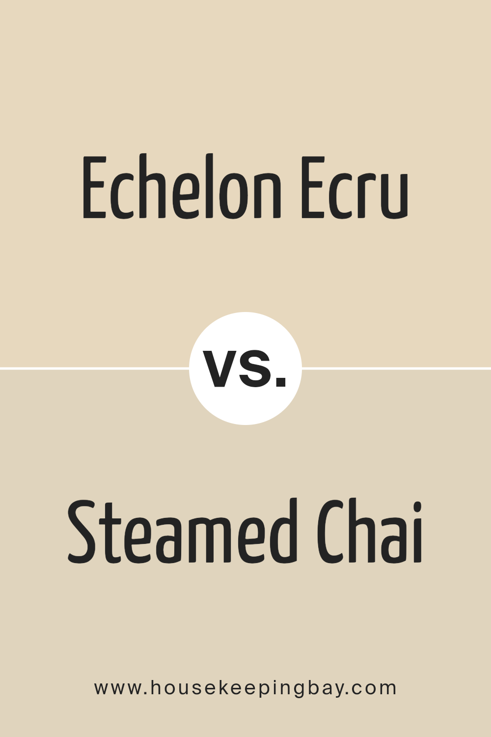
housekeepingbay.com
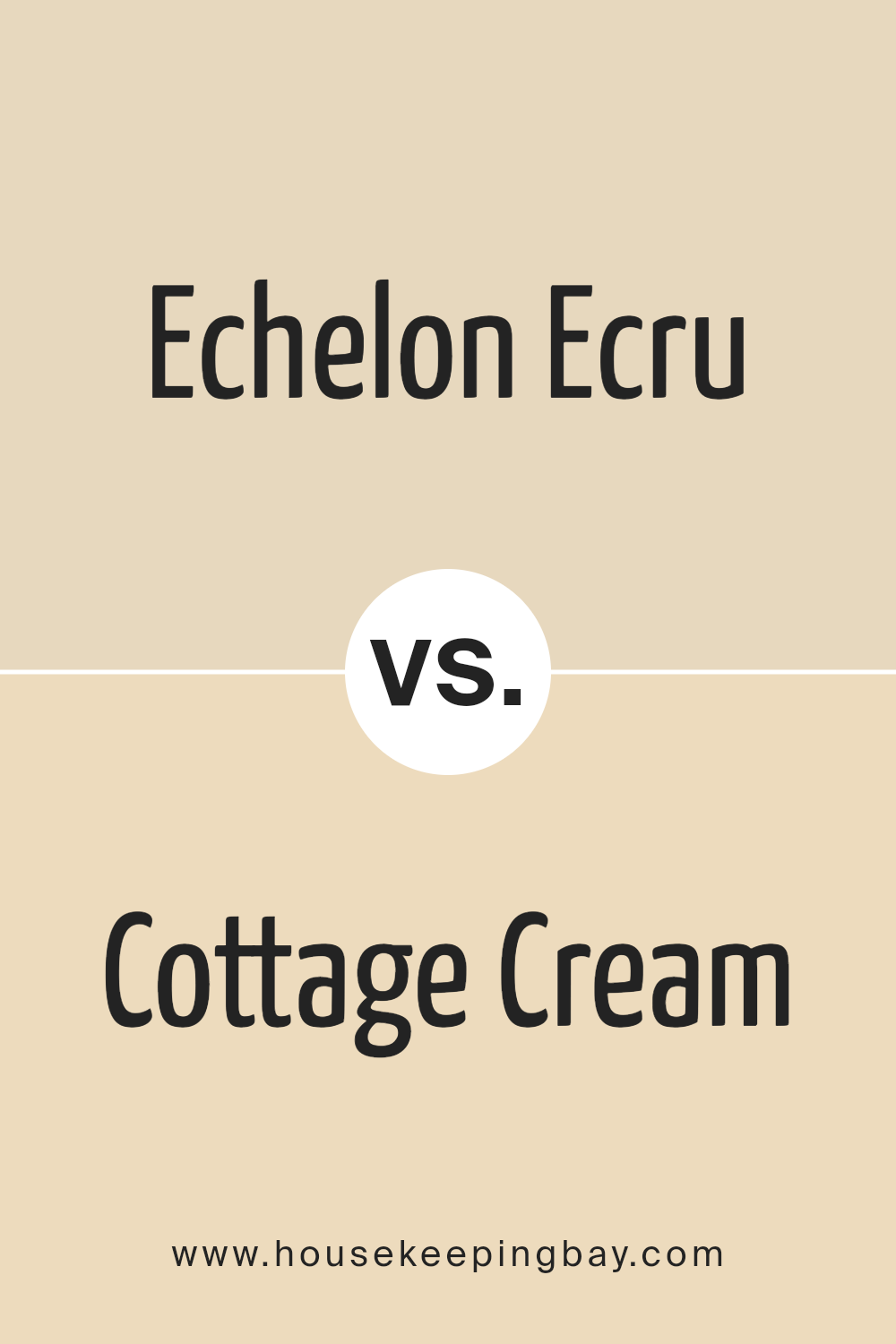
Echelon Ecru SW 7574 by Sherwin Williams vs Cottage Cream SW 7678 by Sherwin Williams
Echelon Ecru SW 7574 and Cottage Cream SW 7678, both from Sherwin-Williams, occupy a similar palette but serve distinct design purposes with their nuanced differences. Echelon Ecru lands as a refined, elegant hue, embodying a sophisticated blend of beige and light gray. This color whispers subtlety and offers a serene backdrop, making any room feel tranquil yet stylish. Its versatility allows it to seamlessly integrate into diverse decor themes, from contemporary minimalism to classic charm, adapting with quiet grace.
On the other hand, Cottage Cream SW 7678 distinctly leans towards a warmer, inviting spectrum. This color is reminiscent of a sunlit, creamy façade, evoking a sense of welcome and coziness. It’s perfect for spaces intended to be bright and heartwarming, offering a gentle hug of light.
Cottage Cream exudes a more buttery tone, creating a comfortable and cheerful ambiance. It’s an ideal choice for areas where you seek to instill joy and embrace the warmth, from kitchens to living rooms.
In summary, while Echelon Ecru offers a sophisticated, neutral canvas, Cottage Cream brings a cheerful warmth, making each suitable for crafting specific moods and atmospheres in interior spaces.
You can see recommended paint color below:
- SW 7678 Cottage Cream
housekeepingbay.com
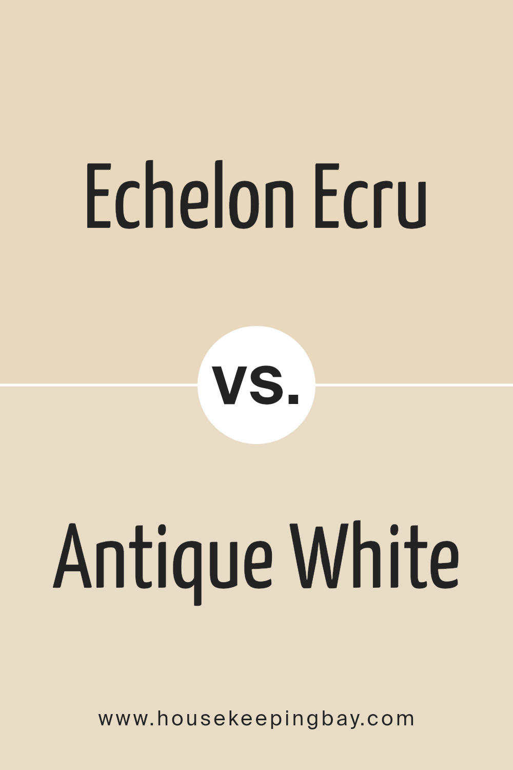
Echelon Ecru SW 7574 by Sherwin Williams vs Antique White SW 6119 by Sherwin Williams
Echelon Ecru SW 7574 and Antique White SW 6119 by Sherwin Williams are both elegant, warm neutrals, yet they present distinct characteristics in their tones, making each suited for particular moods or settings. Echelon Ecru leans towards a soft, creamy beige, embodying a subtle sophistication with a touch of warmth that makes spaces feel welcoming yet refined. Its understated quality allows it to serve as a serene background, easily complementing a wide range of colors and decor styles.
On the other hand, Antique White SW 6119 shifts towards a lighter, softer palette, channeling a vintage charm. It has a slightly yellower undertone compared to Echelon Ecru, offering a hint of coziness and comfort. This hue invokes a sense of nostalgia and timeless elegance, making spaces feel lived-in and inviting.
In summary, while both colors share a neutral base, Echelon Ecru offers a hint more richness and depth, suitable for those looking for a subtle statement. Antique White, with its lighter, creamier approach, is perfect for creating a bright, airy, and soothing environment. Choosing between them depends on the desired ambiance and the specific attributes one wants to highlight in a space.
You can see recommended paint color below:
housekeepingbay.com
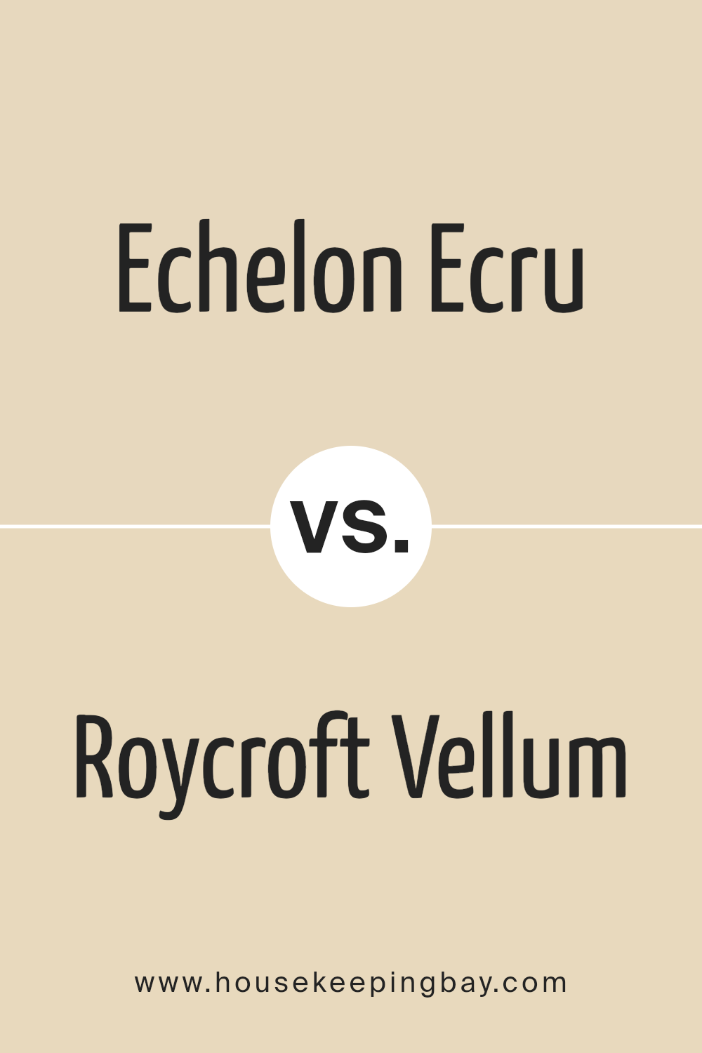
Echelon Ecru SW 7574 by Sherwin Williams vs Roycroft Vellum SW 2833 by Sherwin Williams
Echelon Ecru SW 7574 and Roycroft Vellum SW 2833, both colors by Sherwin Williams, offer distinct yet harmonious hues, perfect for those seeking to create warmth and sophistication in their space. Echelon Ecru SW 7574 is a light, airy beige with a soft, welcoming vibe. It hints at a sandy, almost neutral warmth, making it extremely versatile for different interior design styles, from contemporary to classic. It casts a subtle, underlying warmth that can brighten and open up a space, making it feel inviting and cozy.
Contrastingly, Roycroft Vellum SW 2833 steps into the realm with a deeper, richer tone. This color carries a bit more depth than Echelon Ecru, presenting a muted, earthy beige with underpinnings of yellow and green, which adds a layer of sophistication and traditional charm.
While maintaining the warmth, Roycroft Vellum offers a stronger presence, making it ideal for highlighting architectural details or as a focal point in a room without overwhelming the space.
Both colors complement each other beautifully, with Echelon Ecru offering a lighter backdrop that allows the depth and character of Roycroft Vellum to stand out as an accent or feature. Whether used together or independently, each brings its unique essence to interior spaces, facilitating a range of aesthetic mood and design flexibility.
You can see recommended paint color below:
- SW 2833 Roycroft Vellum
housekeepingbay.com
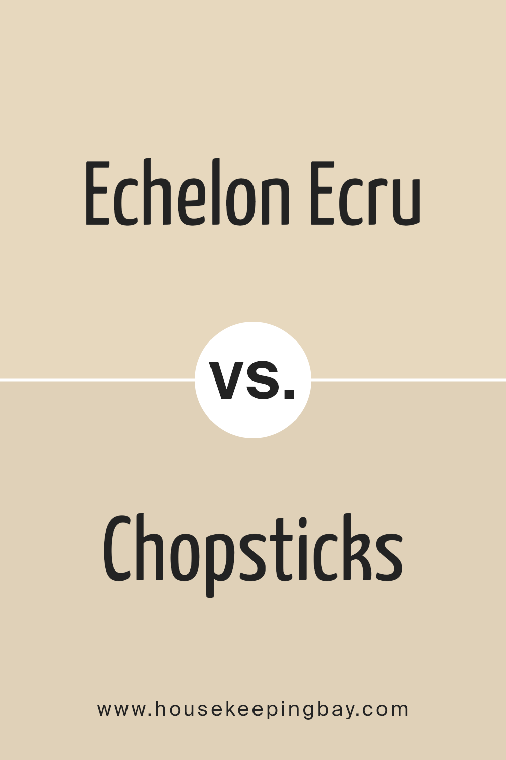
Echelon Ecru SW 7574 by Sherwin Williams vs Chopsticks SW 7575 by Sherwin Williams
Echelon Ecru SW 7574 and Chopsticks SW 7575 by Sherwin Williams are closely related in their hue and belong to a warm, inviting palette that’s often sought after for creating cozy and serene environments. Echelon Ecru steps forward with a slightly lighter, creamy tone that exudes a soft, elegant vibe. This color can illuminate spaces, making them appear more expansive and welcoming, while still retaining a touch of warmth that prevents it from feeling sterile or too bright.
On the other hand, Chopsticks inches towards a deeper, richer hue, incorporating more earthy undertones that evoke a sense of stability and groundedness. This color, while still warm, brings a slightly more pronounced depth to spaces, making it ideal for accenting areas or for use in rooms where a more enveloping, cozy feel is desired.
In comparison, while both colors share a base warmth that makes them versatile for a range of spaces, Echelon Ecru offers a brighter approach conducive to creating airy and light-filled rooms. Meanwhile, Chopsticks lends itself to creating more intimate, snug environments. The choice between them hinges on the desired ambiance and the specific undertones and depth one wishes to infuse into their space.
You can see recommended paint color below:
housekeepingbay.com
Echelon Ecru SW 7574 by Sherwin Williams vs Vital Yellow SW 6392 by Sherwin Williams
Echelon Ecru SW 7574 and Vital Yellow SW 6392, both by Sherwin Williams, are distinctly diverse in their color personalities and aesthetic impacts. Echelon Ecru is a sophisticated, serene, and versatile hue, residing in the realm of soft, warm neutrals. This color evokes a sense of calm and is conducive to creating a relaxed, understated elegance in any space. It serves as a perfect backdrop, allowing other colors to shine or effortlessly stands alone for a minimalist chic look.
On the other hand, Vital Yellow is vibrant, energetic, and imbued with optimism. As a bold, bright shade of yellow, it demands attention and can invigorate any space with its lively presence. This color is ideal for creating focal points, adding pops of color, or energizing a room with a sunny disposition.
The contrast between Echelon Ecru’s subtle warmth and Vital Yellow’s dynamic vibrancy offers a wide palette range. While Echelon Ecru lends itself to a soft, sophisticated ambiance, Vital Yellow injects vitality and cheer, each creating distinctly different moods and styles.
Whether used independently or in a complementary manner, these colors reflect Sherwin Williams’ versatility in catering to varied aesthetic preferences and design needs.
You can see recommended paint color below:
- SW 6392 Vital Yellow
housekeepingbay.com
Echelon Ecru SW 7574 by Sherwin Williams vs Eaglet Beige SW 7573 by Sherwin Williams
The two shades, Echelon Ecru (SW 7574) and Eaglet Beige (SW 7573) by Sherwin Williams, provide a subtle yet distinct choice in the realm of neutral paint colors. Echelon Ecru presents itself as a warm, inviting hue with a slightly creamy undertone, reminiscent of a soft, sunlit linen.
This color tends to bring an airy and open feel to spaces, making rooms look more expansive and welcoming. On the other hand, Eaglet Beige leans closer to a classic beige, marked by its depth and a richer, earthier base. It offers a sense of groundedness and stability, making it an ideal choice for creating a cozy and nurturing environment.
When comparing these colors side by side, Echelon Ecru would likely illuminate a room with its subtle brightness and could potentially pair well with a wide range of decor styles, from modern to country. Eaglet Beige, drawing on a stronger color presence, can anchor a room with more defined color relations and works well in spaces aiming for a warm, robust aesthetic. Both colors offer flexibility in design, yet selecting between them comes down to the desired ambiance and lighting of the room, with Echelon Ecru bringing a lighter touch and Eaglet Beige introducing a deeper warmth.
You can see recommended paint color below:
- SW 7573 Eaglet Beige
housekeepingbay.com
Echelon Ecru SW 7574 by Sherwin Williams vs Napery SW 6386 by Sherwin Williams
Echelon Ecru SW 7574 and Napery SW 6386, both by Sherwin-Williams, offer subtle yet distinct differences that cater to various design preferences. Echelon Ecru SW 7574 exudes a sophisticated air, leaning more towards a soft, light beige with a neutral base that effortlessly complements contemporary and traditional spaces alike. This color brings a serene and inviting atmosphere to interiors, reflecting natural light beautifully to make rooms appear more spacious and airy.
On the other hand, Napery SW 6386, while still in the neutral palette, shifts slightly towards a warmer, golden-yellow undertone. This hue provides a cozy warmth that makes it perfect for creating inviting, comforting spaces. It pairs well with a wide range of decor styles, from rustic to modern, adding a layer of richness and depth that enhances wood tones and natural materials.
In comparison, while both colors share a neutral foundation, Echelon Ecru’s cooler, lighter beige offers a more refined, subtle elegance. In contrast, Napery’s warmer, golden tones bring a hearty, welcoming vibe to interiors. Your choice between them would depend on the desired mood and aesthetic of your space—Echelon Ecru for a crisp, clean look, or Napery for a warmer, more enveloping atmosphere.
You can see recommended paint color below:
- SW 6386 Napery
housekeepingbay.com
Conclusion
The Echelon Ecru SW 7574 by Sherwin Williams embodies a sophisticated and adaptable palette suitable for a variety of design aspirations. This particular shade of ecru offers a warm, inviting tone that effortlessly complements both contemporary and traditional spaces.
Its versatility allows it to act as a serene backdrop for bold accents or stand out as a subtle statement piece in a minimalist setting. The inherent warmth of Echelon Ecru enhances the perceived comfort and coziness of a room, making it a favored choice among homeowners and interior designers alike.
The nuanced blend of beige and gray in Echelon Ecru lends itself to a myriad of color combinations, supporting a wide range of decorative styles from rustic to modern. It has the unique ability to brighten spaces while maintaining a sense of calm and elegance, reflecting Sherwin Williams’ commitment to creating hues that inspire creativity and well-being. As a testament to its adaptability and timeless appeal, Echelon Ecru SW 7574 emerges as a top contender for those seeking to infuse their living environments with a sense of balance, sophistication, and warmth.
housekeepingbay.com
Ever wished paint sampling was as easy as sticking a sticker? Guess what? Now it is! Discover Samplize's unique Peel & Stick samples. Get started now and say goodbye to the old messy way!
Get paint samples