Top 29 Blue-Grey Paint Colors by Sherwin-Williams (My Personal Picks)
The perfect mix of cool calm and soft neutrals
Choosing paint sounds simple… until you’re standing in front of a wall of swatches that all somehow look the same. I’ve been there too, and I know how frustrating it can be to pick a color that looks just right in every room and every light.
Blue-grey is the one that almost always saves the day. It’s cool but not cold. Calm but not boring. It works in homes that feel modern, traditional, coastal, or clean farmhouse.
I’ve painted countless walls with different shades of this combo, and I’ve seen how much it helps people feel grounded, cozy, and “at home.” There’s a balance in it that feels safe — like soft jeans, cloudy skies, or cozy winter mornings.
So here it is: my favorite 29 blue-grey colors from Sherwin-Williams. Not just from a designer’s perspective — but from someone who’s stood in your shoes, held up 12 samples, and thought “which one won’t make me regret this in two weeks?”
housekeepingbay.com
Why Blue-Grey Paint Works So Well
Blue and grey are both considered cool colors, but together they do something special. Blue brings peace and trust. Grey adds subtlety and softness. It’s no surprise that a study by YouGov found blue is the world’s most popular color across all age groups and genders (source).
Where I use it most:
- Bedrooms: For a relaxed, easy vibe.
- Living rooms: Especially if you want it to feel light but not stark.
- Cabinets: Gorgeous when paired with gold or black hardware.
- Exteriors: Especially those facing lots of sunlight.
Famous architect Richard Meier once said:
“White is the most wonderful color because within it you can see all the colors of the rainbow.”
I feel the same about blue-grey — it picks up light in ways that make it subtly shift from hour to hour, and season to season.
My Tips for Picking the Right Blue-Grey
Before we jump to the full list, I want to share what I always tell my clients:
Light changes everything.
- North-facing rooms make blue-greys feel cooler and more “stormy.”
- South-facing rooms add a golden glow that can soften or even dull the blue.
Warm vs. Cool
- Cool blue-greys lean icy or silvery.
- Warm blue-greys may have a hint of green or even purple in them.
Finishes matter
- Flat or matte: Best for walls you don’t touch often.
- Eggshell or satin: More durable, adds a slight sheen. My go-to for most living areas.
- Semi-gloss: For trim, doors, or high-traffic zones.
Now, let’s get to what you came here for!
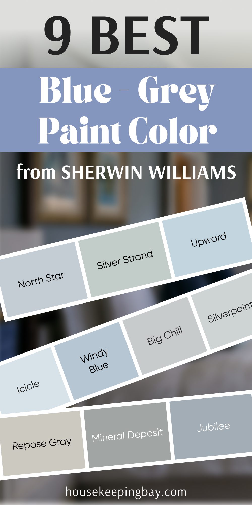
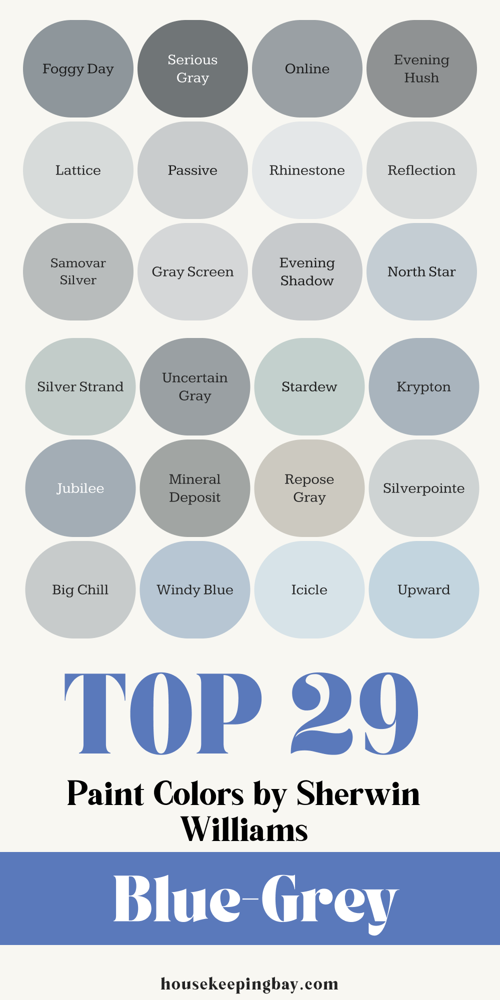
Top 29 Blue-Grey Paint Colors by Sherwin-Williams
Grouped to help you choose easier — based on tone and where I’ve loved using them.
Pale & Airy Tones
(Best for smaller rooms, ceilings, or anyone wanting light and calm)
- Misty (SW 6232)
This one always feels peaceful. I love it for bedrooms and hallways. Looks soft in every light.
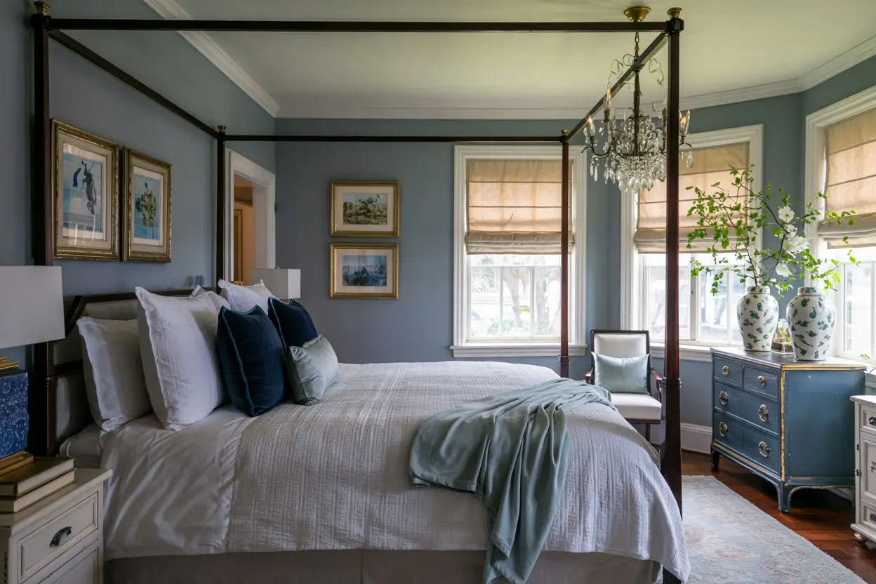
👉 Feels clean without being cold. - Olympus White (SW 6253)
Very light, almost off-white with a blue wink. Great for modern kitchens or laundry rooms. - North Star (SW 6246)
Barely-there blue that changes with the light. I’ve used this in nursery designs — it’s calm and dreamy. - Rhinestone (SW 7656)
Almost like a whisper of color. When clients say “I want just a hint,” this is what I show them. - Evening Shadow (SW 7662)
Cool and airy with a little more personality. I like this for bathrooms.
housekeepingbay.com
Soft Midtones
(For anyone who wants color without going bold)
- Gray Screen (SW 7071)
This is one of Sherwin-Williams’ top-selling greys. And yes — it has a blue undertone that shows up beautifully in daylight. - Samovar Silver (SW 6233)
Sits perfectly between grey and blue. A quiet, elegant choice for living rooms. - Lattice (SW 7654)
Feels fresh and a tiny bit coastal. Looks stunning with white trim. - Passive (SW 7064)
I call this one “safe but never boring.” A subtle, soothing grey with blue breath underneath. - Reflection (SW 7661)
Cool and clean. Almost like fresh linen. Looks best with silver fixtures.
housekeepingbay.com

Deeper, Dramatic Options
(If you want more depth or contrast — think accents, cabinets, exteriors)
- Evening Hush (SW 7667)
Moody and cozy. It reads more grey but the blue peeks through at dusk. - Online (SW 7072)
More masculine, even a little industrial. I’ve used it on office walls — makes a statement. - Serious Gray (SW 6256)
True to its name. Deep and weighty. Looks amazing with leather furniture or rustic textures. - Foggy Day (SW 6235)
There’s a softness here, even with the depth. Perfect for dramatic dining rooms. - Wall Street (SW 7665)
Almost stormy. Has power and elegance. I love this one on built-ins.
housekeepingbay.com
Best for Exteriors
(Test in sunlight and shade — these hold up great in both)
- Uncertain Gray (SW 6234)
Soft but striking on exteriors. Doesn’t wash out in bright light. - Stardew (SW 9138)
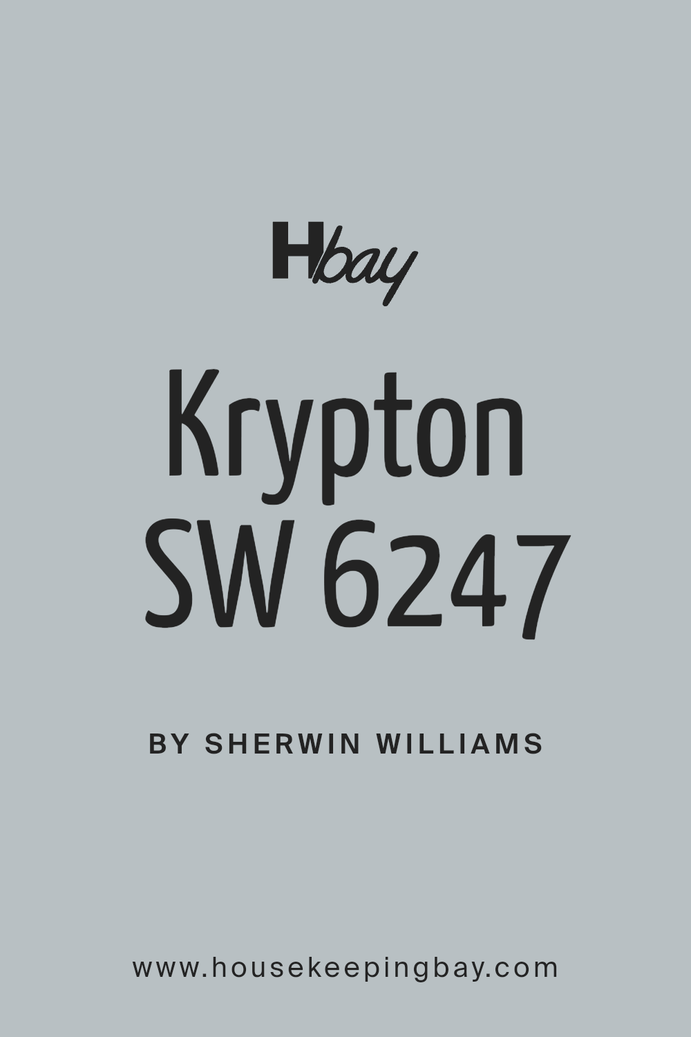
Has a tiny green undertone that works so well outside. Looks natural, grounded. - Krypton (SW 6247)
Stays strong in sunlight. I used this on a cottage and it made white trim pop beautifully. - Jubilee (SW 6248)
Great for coastal-style homes. It’s happy, but grounded. - Mineral Deposit (SW 7652)
Feels earthy and modern at the same time. Goes with both stone and brick.
Neutrals with Just a Hint of Blue
(These are the trickiest but also the most flexible — look grey until the light hits just right)
- Repose Gray (SW 7015)
Technically a greige, but there’s a whisper of blue in cooler light. It’s one of my “always works” colors. - Silverpointe (SW 7653)
Clean and polished. Looks great in kitchens with stainless steel. - Big Chill (SW 7648)
The name fits. It’s calm, sleek, and subtle. - Windy Blue (SW 6240)
Leans more blue than grey, but still quiet enough for whole rooms. - Icicle (SW 6238)
A frozen breath of color. Perfect for ceiling accents. - Upward (SW 6239)
One of my top choices for modern nurseries. It’s cheerful but not bright. - Silver Strand (SW 7057)
Almost everyone loves this one. It’s soft, flexible, and never overpowering. Works well with wood tones. - Sleepy Blue (SW 6225)
Just like it sounds. Feels like a cozy nap on a rainy day. - Lazy Gray (SW 6254)
This has personality. Slightly more blue than grey. Looks lovely with light oak floors.
Common Mistakes to Avoid with Blue-Grey Paints
I’ve seen so many people fall in love with a swatch… only to hate it once it’s on all four walls. Blue-greys can be tricky if you don’t watch out for these common missteps:
1. Skipping the Sample Test
Please, always test before committing.
What looks like a soft misty grey in the store can turn into a baby boy’s nursery blue at home — or worse, a cold steel wall.
What I recommend:
- Get sample pots (Sherwin-Williams sells these for ~$9).
- Paint two coats on a large poster board.
- Move it around your room during the day and night.
2. Not Looking at Undertones
Blue-grey shades come with hidden extras: purple, green, and even taupe undertones. And they will show up — especially near wood floors, tiles, or colored upholstery.
Example:
“Silverpointe” can lean green in yellow-toned light.
“Misty” may look slightly purple in some rooms.
Tip from me:
Hold your paint swatch next to a plain white sheet of paper. The undertone jumps out more clearly.
3. Ignoring Light Direction
Light can either warm up or cool down your paint. If you skip this step, your wall might end up looking way different than you imagined.
North-facing rooms = cooler, often bring out the blue
South-facing rooms = warmer, can neutralize some of the blue
East/West = changes through the day (test in morning and afternoon!)
4. Choosing the Wrong Finish
Blue-grey can look chalky or patchy in the wrong sheen.
Here’s how I decide:
- Flat/Matte: Bedrooms, ceilings
- Eggshell/Satin: Living rooms, hallways, kitchens
- Semi-gloss: Cabinets, trim, doors
Finish affects how the color reads — especially with natural or artificial light bouncing around.
5. Letting Trends Pick for You
Yes, I know “Repose Gray” and “Silver Strand” are everywhere on Pinterest.
But the trendiest choice isn’t always the right one for your home, lighting, or feeling. Let your gut (and your sample test) decide. The goal isn’t to impress anyone — it’s to feel happy every time you walk in.
Before You Grab a Paintbrush…
Blue-grey is the color I come back to again and again — not just because it’s pretty, but because it feels right. It calms the noise. It matches just about anything. And it helps a home feel pulled together without screaming for attention.
But picking the right blue-grey takes more than just liking it in a photo. You have to see it in your own light, next to your own furniture, in the middle of your own life.
Here’s what I always tell my clients — and now, I’m telling you:
Test before you paint.
Trust your eye, not just the name.
Pick the one that makes your whole body feel a little softer when you look at it.
(Yes, really.)
In the end, the right shade of blue-grey should feel like the background to your best moments — quiet, steady, and just the way you like it.
And if you’re stuck between two?
Pick the one that made you smile a little more.
housekeepingbay.com
