Serious Gray SW 6256 by Sherwin Williams
Power of Subdued Elegance
Are you considering a fresh coat of paint for your living space? If you’re in search of a color that brings sophistication and modern elegance, SW 6256 Serious Gray by Sherwin Williams might be the perfect choice for you. This shade of gray offers a subdued yet impactful aesthetic that can enhance the look and feel of any room.
Whether you’re transforming your living room, bedroom, or kitchen, Serious Gray provides a sleek backdrop that complements a wide range of decor styles.
In this article, you’ll learn more about how to use Serious Gray in your home to create inviting and stylish spaces. So, get ready to revamp your home with this refined color that promises to add a touch of class to your interiors!
sherwin-williams.com
What Color Is Serious Gray SW 6256 by Sherwin Williams?
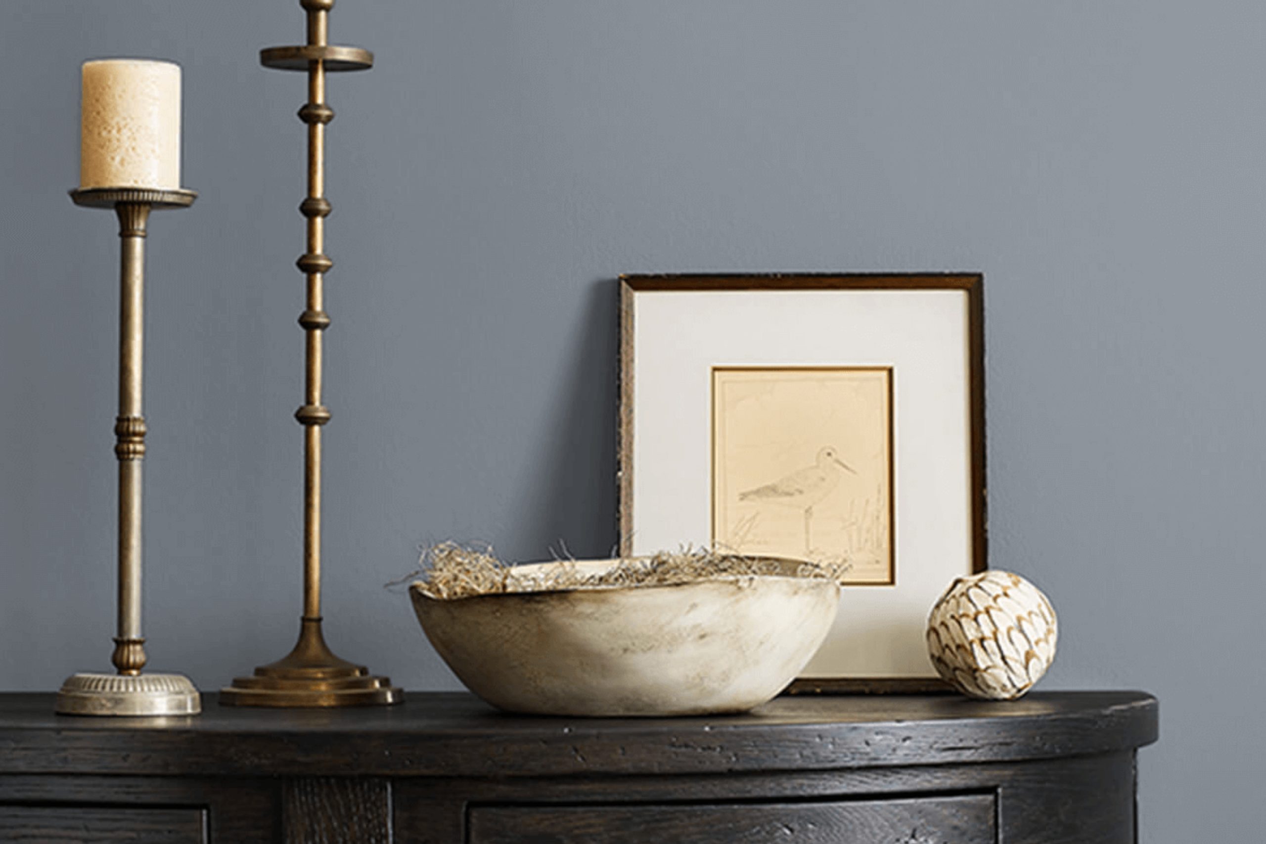
Serious Gray SW 6256 is a sophisticated and versatile hue from Sherwin Williams. This color leans towards a deep, cool gray, offering a subtle hint of blue undertones. Its muted nature makes it excellent for creating a serene and composed ambiance in any room. The paint has a refined finish that compleates modern decor styles like minimalist, contemporary, and industrial.
Serious Gray works exceptionally well in spaces meant for focus and rest, such as home offices and bedrooms. It pairs beautifully with natural materials like exposed wood and stone, enhancing their rich textures. Metal accents in silver or nickel also complement this gray, adding a sleek touch to the overall decor.
Additionally, fabrics like linen and wool in light neutral colors create a soft contrast with Serious Gray, making the space feel warm and inviting. This gray shade also pairs well with glass elements, which can help keep the space feeling airy and bright.
When used in well-lit areas, Serious Gray projects an understated elegance, making it a suitable choice for those looking to achieve a polished interior without the fuss.
housekeepingbay.com
Is Serious Gray SW 6256 by Sherwin Williams Warm or Cool color?
Serious Gray SW 6256 by Sherwin Williams is a versatile and sophisticated gray shade that adapts well to various spaces in a home. Its unique tone can create a cozy, modern atmosphere in living rooms and bedrooms. The color’s neutral quality allows it to serve as a solid backdrop, making it perfect for showcasing artwork or vibrant furniture pieces.
In smaller rooms, Serious Gray can help to give the illusion of space while still offering depth and warmth, unlike lighter grays. This shade also works well in various lighting conditions, maintaining its richness and depth without skewing too cold or too warm.
It is particularly effective in spaces that get a mix of natural and artificial light. When paired with crisp whites or contrasting darks, Serious Gray adds a subtle, refined touch, enhancing the overall aesthetic of a home without overwhelming the senses.
Its flexibility and understated elegance make it a practical choice for many homeowners.
What is the Masstone of the Serious Gray SW 6256 by Sherwin Williams?
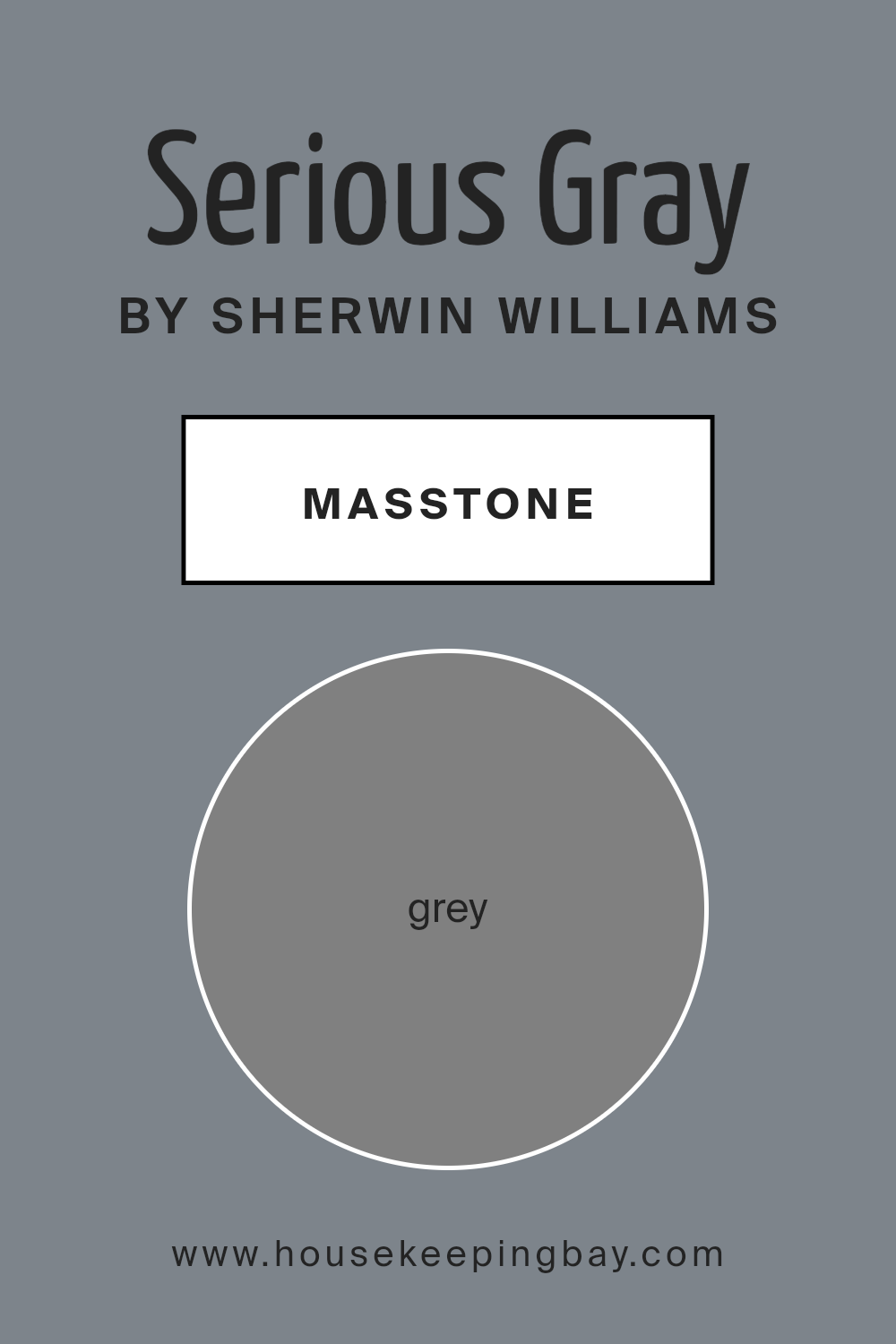
Serious Gray SW 6256 by Sherwin Williams, represented by the masstone Grey (#808080), is a balanced, neutral shade of gray that offers a sophisticated and muted backdrop for any room in the house. This particular shade is not too dark or too light, making it very versatile and easy to use in various home styles, from modern to traditional.
The neutrality of Serious Gray means it can easily pair with brighter colors for a lively contrast or with other neutrals for a more subdued, cohesive look.
In a home setting, Serious Gray works well in spaces that benefit from a calm and understated atmosphere. It’s ideal for living rooms, bedrooms, and home offices where you want a background color that doesn’t overpower your decor but instead complements it.
Its ability to adapt to different lighting conditions is another advantage, looking consistently beautiful whether in a room flooded with natural light or in a space with more subdued artificial lighting. This color helps create a serene and welcoming space without demanding too much attention.
housekeepingbay.com
Undertones of Serious Gray SW 6256 by Sherwin Williams
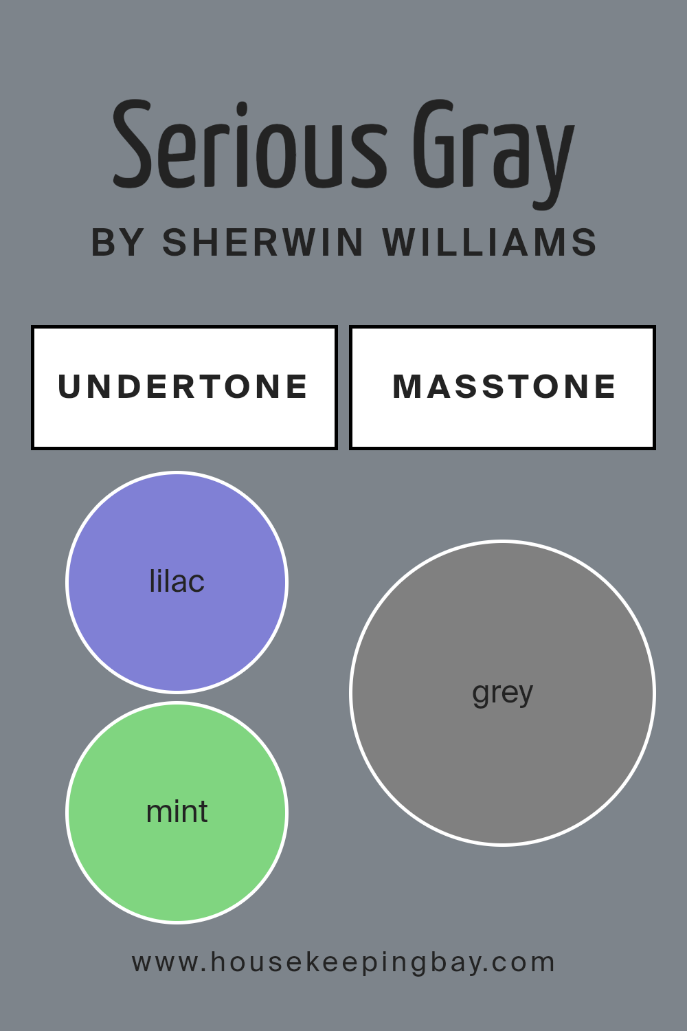
Serious Gray SW 6256 by Sherwin Williams is a versatile and sophisticated color that can create different moods depending on its undertones. Undertones are subtle colors that lies beneath the main color, which can change under different lighting conditions or when paired with other colors.
Serious Gray has complex undertones, including hues like lilac, mint, and pale pink, which can bring a cool and calming effect. Darker undertones like navy and dark green give it a grounded and stable presence.
In an interior setting, the undertones of Serious Gray can greatly affect the overall ambiance of a room. For instance, when lit with natural light, the lilac and light blue undertones might become more prominent, giving the room a fresher, more airy feel.
On the other hand, in artificial or dim lighting, the darker undertones like navy or dark grey might stand out, creating a more intimate and cozy atmosphere.
Because of these varying undertones, Serious Gray is quite adaptive. In a bedroom, the soft undertones of purple and pale pink might promote a soothing environment, ideal for rest. In a living room, the richer undertones like brown and dark green can give a sophisticated and rich look, particularly when paired with complementary furniture and décor.
Therefore, while choosing this color for interior walls, it’s essential to consider the room’s lighting and the colors of the surrounding elements to fully utilize the potential of Serious Gray’s undertones.
housekeepingbay.com
Coordinating Colors of Serious Gray SW 6256 by Sherwin Williams
Coordinating colors are hues that complement a primary color, creating a visually harmonious palette. They can enhance or soften the main color, depending on their selection and placement. When working with a base color like Serious Gray SW 6256 by Sherwin Williams, which is a deep, muted gray, choosing the right coordinating colors is essential for achieving a balanced look.
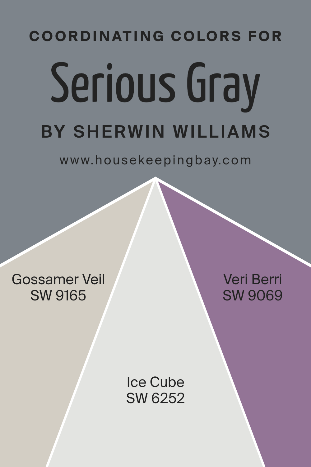
Gossamer Veil SW 9165 is a soft neutral shade that provides a clean contrast to Serious Gray, lightening the overall mood without overwhelming the senses. Ice Cube SW 6252 offers a light blue hue that brings a subtle freshness and a sense of calm to spaces dominated by darker shades such as Serious Gray.
Meanwhile, Veri Berri SW 9069 injects a bold berry tone that can enliven a room, adding a vibrant pop to the sober seriousness of gray, perfect for accents and focal points. These colors work together to make any space cohesive yet dynamic, ensuring an appealing and welcoming atmosphere.
You can see recommended paint colors below:
- SW 9165 Gossamer Veil
- SW 6252 Ice Cube
- SW 9069 Veri Berri
housekeepingbay.com
How Does Lighting Affect Serious Gray SW 6256 by Sherwin Williams?
Lighting plays a crucial role in how colors are perceived in any space. The color Serious Gray SW 6256 by Sherwin Williams, like many other colors, can look very different depending on the type and amount of light it is exposed to.
- Artificial light: Under artificial lighting, Serious Gray can appear stronger and more solid. In warm light, such as that from standard incandescent bulbs, the color might seem slightly softer and more welcoming. Fluorescent lighting, which is cooler, could give the paint a sharper, more austere look. This shows that the mood and function of a room with this color can change significantly with different artificial lights.
- Natural light: In natural light, the true character of Serious Gray is more apparent. Natural light reveals the complexity of this hue, highlighting its rich undertones. The color adapts subtly throughout the day with the changing light, appearing more lively during peak sunlight hours and more subdued towards the evening.
Room Orientation:
– North-faced rooms: Rooms that face north often receive less direct sunlight and can make colors appear cooler. Serious Gray in a north-facing room could seem more stern and shadowy, making the space feel more reserved and formal.
– **South-faced rooms: The ample sunlight in south-facing rooms can warm up Serious Gray, softening its appearance and making the room look more inviting and cozy.
– East-faced rooms: In east-facing rooms, the morning light can make Serious Gray look vibrant and fresh. As the day progresses and the direct sunlight moves away, the color may return to a cooler tone.
– West-faced rooms: In rooms facing west, afternoon and evening light can intensify Serious Gray, making it look more dramatic and prominent toward the end of the day.
In conclusion, the appearance of Serious Gray SW 6256 varies significantly with lighting conditions and room orientation, affecting both its aesthetic impact and the atmosphere it creates in a space.
housekeepingbay.com
What is the LRV of Serious Gray SW 6256 by Sherwin Williams?
LRV stands for Light Reflectance Value, a measure showing how much light a paint color can reflect back into a room. This value can range from 0, which means no light is reflected and the surface is perfectly black, to 100, indicating that the surface is completely reflective, like a mirror.
LRV helps in choosing paint colors by giving an idea of how light or dark a color might look once applied to walls. It’s particularly useful in figuring out if a color can make a room feel brighter or smaller, as lighter colors tend to make spaces appear larger and more open by reflecting more light.
In the case of Serious Gray SW 6256 by Sherwin Williams, with an LRV of 22.705, this color is on the darker side, reflecting only about 22.7% of light. This means it could make a room feel more closed in or smaller, especially if the area doesn’t get a lot of natural light. When used in spaces with ample lighting, however, its rich depth can enhance the room, giving it a cozy and sophisticated ambiance.
The low LRV suggests that it works well for creating a focal point or accentuating wall features, as it can draw attention against lighter colors.

housekeepingbay.com
What are the Trim colors of Serious Gray SW 6256 by Sherwin Williams?
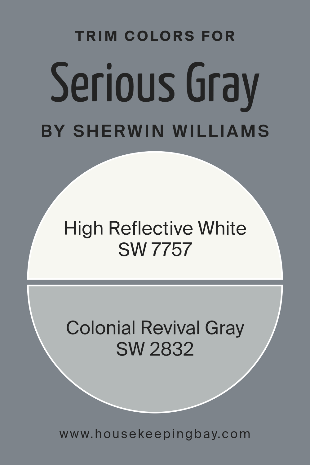
Trim colors, such as SW 7757 – High Reflective White and SW 2832 – Colonial Revival Gray, are essential for complementing and highlighting the main color of a space, in this case, Serious Gray SW 6256 by Sherwin Williams.
Opting for a trim color like High Reflective White can create a sharp, clean contrast that frames and accentuates the elegant, deep tones of Serious Gray, giving a fresh and polished look to any room.
On the other hand, using a softer, more understated trim color like Colonial Revival Gray can unify the space with a more seamless transition, softening the edges and allowing the walls to blend beautifully for a sophisticated outcome.
High Reflective White is a bright, crisp white that effectively reflects light, thereby enhancing the overall brightness and feeling of space in a room. This makes it an excellent choice for trim, bringing out the depth and richness of darker shades like Serious Gray.
Meanwhile, Colonial Revival Gray is a light, warm gray that offers a subtle contrast, providing a gentle delineation without the sharpness of a more contrasting white. This color is perfect for creating a harmonious and cohesive look that ties together the elements of a room with grace and softness.
You can see recommended paint colors below:
- SW 7757 High Reflective White
- SW 2832 Colonial Revival Gray
housekeepingbay.com
Colors Similar to Serious Gray SW 6256 by Sherwin Williams
Similar colors play a vital role in design, creating a sense of harmony and coherence in spaces. They are crucial for achieving a seamless aesthetic, allowing for gradual transitions and subtle contrasts that enhance the overall appeal without overwhelming the senses.
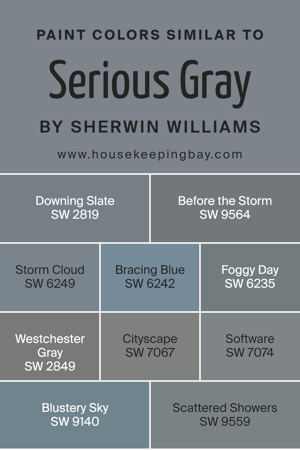
When colors like Serious Gray SW 6256 by Sherwin Williams are used alongside hues such as SW 2819 Downing Slate or SW 9564 Before the Storm, they create a balanced visual flow. These shades are particularly useful in crafting sophisticated environments where each color supports the next, building upon a unified theme.
For example, SW 2819 Downing Slate offers a deep, rich tone that serves as a grounding element, perfect for accent walls or furniture pieces. Similarly, SW 9564 Before the Storm provides a slightly lighter, more atmospheric quality that recalls the calm before a rainstorm, ideal for creating moody interiors.
Continuing with this theme, SW 6249 Storm Cloud and SW 6242 Bracing Blue offer a cooler palette, reminiscent of overcast skies and brisk winds, suitable for a modern look. SW 6235 Foggy Day, as the name suggests, introduces a muted, soft grey that mimics an early morning mist, fantastic for serene, minimalist spaces.
Further down the spectrum, SW 2849 Westchester Gray and SW 7067 Cityscape introduce a touch of urban sophistication with their subtly different grey undertones, crucial for office spaces or contemporary homes. Next, SW 7074 Software leans towards a softer, lighter grey which seamlessly blends into peaceful settings.
Rounding up the collection, SW 9140 Blustery Sky and SW 9559 Scattered Showers offer a refreshing hint of blue, enhancing spaces with a breath of fresh air and an open sky feeling, perfect for invigorating any area of the home. These similar colors, when used together, ensure a cohesive yet dynamic palette that enriches the aesthetic appeal of any space they adorn.
You can see recommended paint colors below:
- SW 2819 Downing Slate
- SW 9564 Before the Storm
- SW 6249 Storm Cloud
- SW 6242 Bracing Blue
- SW 6235 Foggy Day
- SW 2849 Westchester Gray
- SW 7067 Cityscape
- SW 7074 Software
- SW 9140 Blustery Sky
- SW 9559 Scattered Showers
housekeepingbay.com
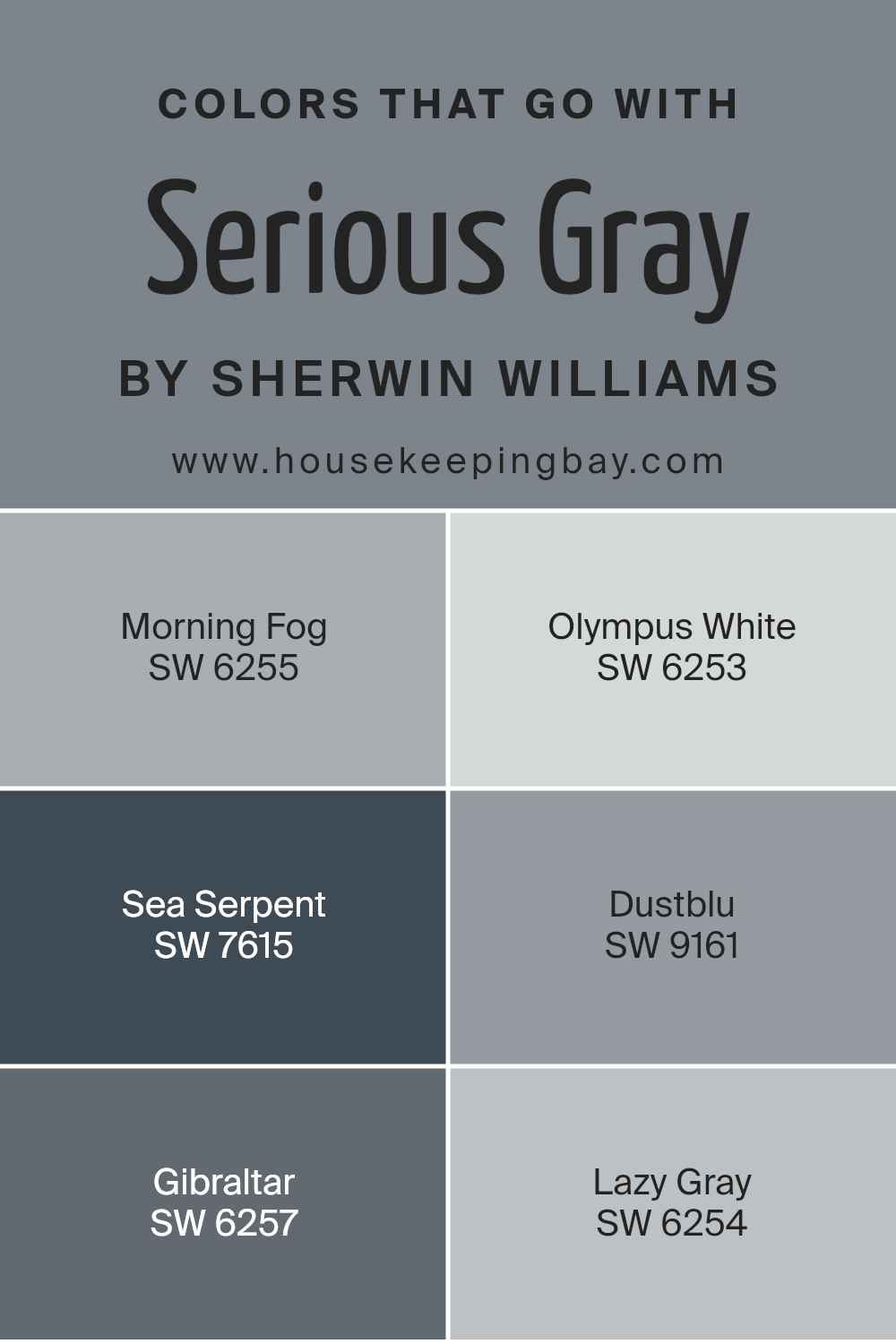
Colors that Go With Serious Gray SW 6256 by Sherwin Williams
Choosing the right colors to pair with Serious Gray SW 6256 by Sherwin Williams is crucial for achieving a cohesive and appealing look in any space. This particular shade of gray provides a strong foundation that supports a variety of complementary colors, enhancing the overall aesthetic of a room. Correctly paired, these colors add depth and a sense of balance, allowing for a professional and polished appearance.
For instance, Morning Fog SW 6255 presents a subtle, lighter gray that can brighten up spaces while maintaining a harmonious connection with Serious Gray. Similarly, Olympus White SW 6253 offers a softer, almost ethereal feel, providing a gentle contrast that highlights the robust tones of Serious Gray.
Moving to a bolder spectrum, Sea Serpent SW 7615 is a deep, rich blue-green that can act as an accent, bringing richness and depth to the muted tones of Serious Gray. Dustblu SW 9161, with its unique dusty blue hue, pairs nicely by adding a slightly colorful yet understated element.
Gibraltar SW 6257 is another sturdy choice, offering a darker gray that enriches the texture and layering of shades in a room. Lastly, Lazy Gray SW 6254, slightly lighter than Serious Gray, could be used for adjacent walls or as a complementary background, facilitating a smooth visual transition across spaces.
These colors, when used with Serious Gray, help create a well-rounded, stylish environment.
You can see recommended paint colors below:
- SW 6255 Morning Fog
- SW 6253 Olympus White
- SW 7615 Sea Serpent
- SW 9161 Dustblu
- SW 6257 Gibraltar
- SW 6254 Lazy Gray
housekeepingbay.com
How to Use Serious Gray SW 6256 by Sherwin Williams In Your Home?
Serious Gray SW 6256 by Sherwin Williams is a versatile color, perfect for adding a sophisticated touch to any room in your home. This shade of gray falls on the cooler side, offering a modern, chic look that works well in various spaces.
You can use Serious Gray in your living room on all walls for a sleek, uniform appearance. It pairs beautifully with white trim, enhancing its modern vibe. In the bedroom, Serious Gray promotes a calm and restful atmosphere, ideal for relaxation after a long day.
It’s also an excellent choice for kitchen cabinets, giving the space a fresh and updated look. For those who prefer a subtle contrast, combine Serious Gray with brighter colors like blues or yellows, or use it in a gradient effect with lighter and darker grays. This color is truly flexible and can help freshen up your home without overpowering your existing décor.
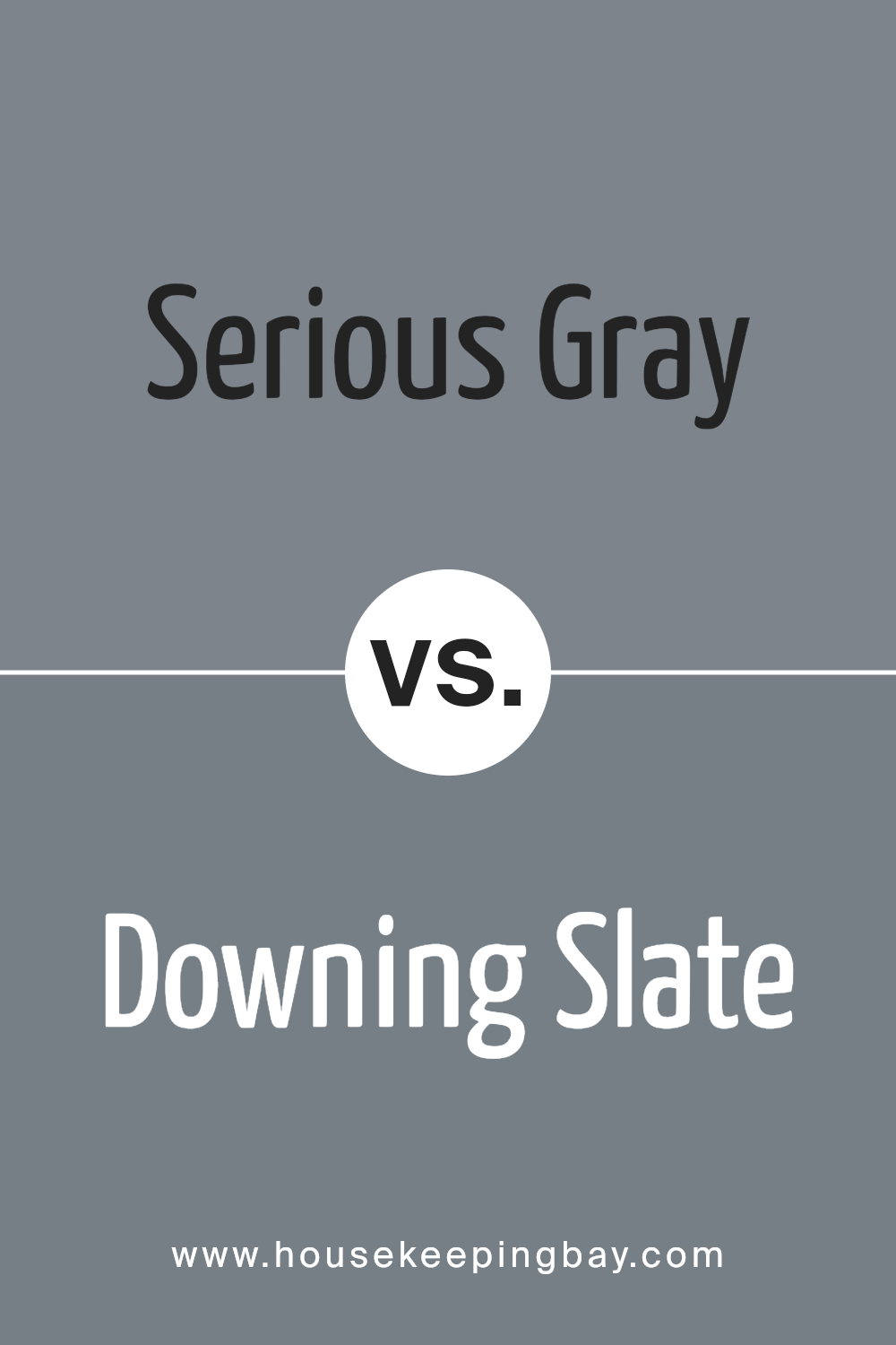
Serious Gray SW 6256 by Sherwin Williams vs Downing Slate SW 2819 by Sherwin Williams
Serious Gray SW 6256 by Sherwin Williams is a subdued, anchoring shade of gray that has a hint of blue, making it versatile for various spaces. Its calming nature suits environments where focus and seriousness are required, such as home offices or studies.
In contrast, Downing Slate SW 2819 is darker and richer, leaning more towards a charcoal hue with slightly warmer undertones. This makes Downing Slate ideal for creating cozy and intimate atmospheres, perfect for living rooms or bedrooms where comfort is key.
Both colors offer a sophisticated palette, but Serious Gray provides a lighter, more subtle backdrop, while Downing Slate delivers more drama and presence due to its depth. Depending on the desired mood and functional use of a room, either color could enhance the space effectively.
You can see recommended paint color below:
- SW 2819 Downing Slate
housekeepingbay.com
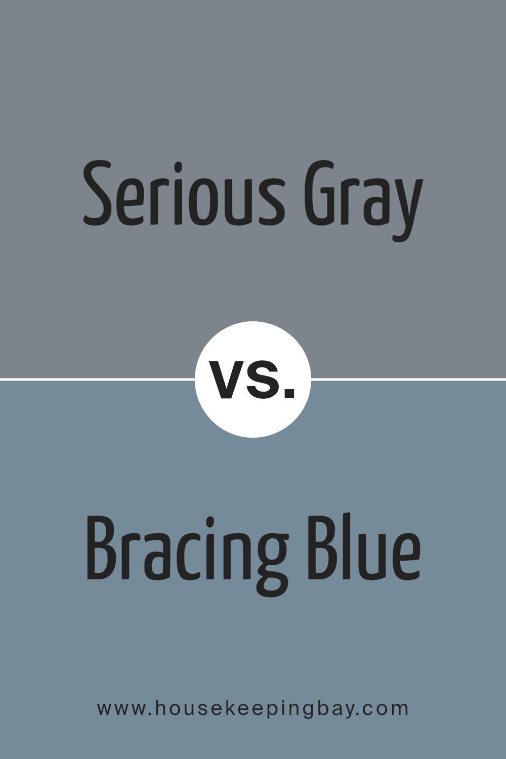
Serious Gray SW 6256 by Sherwin Williams vs Bracing Blue SW 6242 by Sherwin Williams
Serious Gray SW 6256 by Sherwin Williams and Bracing Blue SW 6242 are both sophisticated colors that serve distinct purposes in home decor. Serious Gray is a deep, muted gray with a balanced, neutral tone, making it perfect for creating a calm, soothing atmosphere in rooms like living spaces or bedrooms. This gray works well with a variety of decor styles, providing a strong foundation that complements bolder colors or acts as the main hue for a minimalist design.
Bracing Blue, on the contrary, is a vibrant mid-tone blue with a refreshing quality that adds a lively burst of color to any space. Ideal for bathrooms or kitchens, this shade pairs beautifully with white trim for a crisp, clean look. It can inject a sense of energy and cheerfulness into a room, contrasting nicely against lighter or neutral tones.
Both colors offer unique advantages depending on the mood and functionality desired in a space. Their versatility in matching various decor elements makes them popular choices for interior design.
You can see recommended paint color below:
- SW 6242 Bracing Blue
housekeepingbay.com
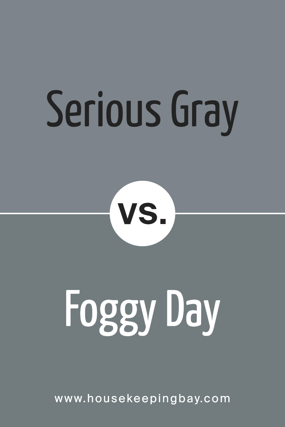
Serious Gray SW 6256 by Sherwin Williams vs Foggy Day SW 6235 by Sherwin Williams
Serious Gray SW 6256 by Sherwin Williams is a deep, sophisticated gray with cool undertones, making it perfect for creating a subtle, yet powerful statement in a space. It evokes a feeling of calmness and professionalism, ideal for office spaces or modern living areas. Its solidity and depth can make smaller rooms feel more enclosed yet elegant.
Foggy Day SW 6235 by Sherwin Williams is a lighter, softer gray with a more neutral balance, providing a versatile backdrop that works well in various settings, from bedrooms to kitchens. Its gentle nature makes it easier to pair with vibrant colors, bringing a relaxed yet fresh look to any room.
Both colors offer unique moods and can be used effectively to achieve different design goals. Serious Gray adds drama and depth, while Foggy Day introduces a light, airy feel. Choosing between them depends on the desired atmosphere and room functionality.
You can see recommended paint color below:
- SW 6235 Foggy Day
housekeepingbay.com
Serious Gray SW 6256 by Sherwin Williams vs Cityscape SW 7067 by Sherwin Williams
Serious Gray SW 6256 by Sherwin Williams is a muted, soothing gray with a subtle blue undertone that gives it a calming presence. This color is versatile and can serve as a gentle backdrop in various settings, making it perfect for creating a serene and inviting atmosphere.
In contrast, Cityscape SW 7067, another Sherwin Williams shade, is a deeper, more pronounced gray. It has a stronger, more urban feel, suitable for modern spaces seeking a bold yet elegant touch. Cityscape can add depth to a room and works well in areas that benefit from a more dramatic look.
Both colors are part of the gray family but cater to different aesthetic desires and functional uses, with Serious Gray providing a softer, lighter approach and Cityscape offering a stronger visual statement.
You can see recommended paint color below:

housekeepingbay.com
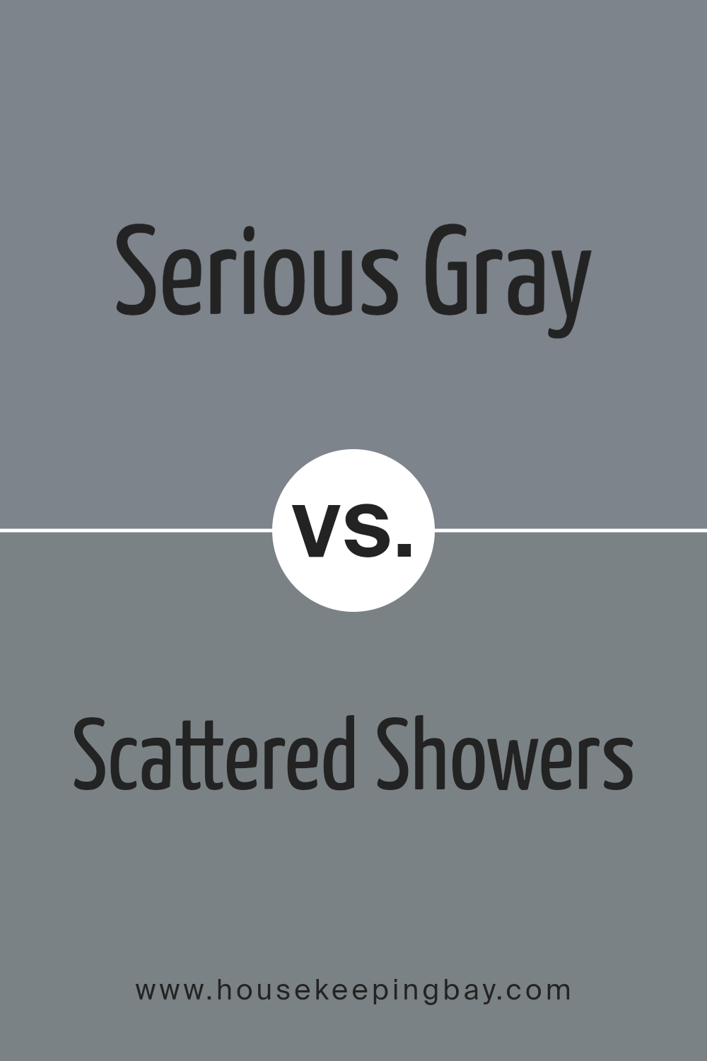
Serious Gray SW 6256 by Sherwin Williams vs Scattered Showers SW 9559 by Sherwin Williams
Serious Gray SW 6256 by Sherwin Williams is a solid, deep gray with a slight blue undertone, giving it a cool and composed feel. This color works well in spaces meant for focus and professionalism, such as home offices or modern living rooms. Its sophistication makes it easy to pair with a variety of décor styles, from contemporary to industrial.
Contrastingly, Scattered Showers SW 9559 is a lighter, softer gray that carries a subtle hint of blue. This color is gentle and airy, making it perfect for creating a soothing atmosphere in bedrooms or bathrooms. Its lighter tone provides a refreshing and calm vibe, which can help in making smaller spaces appear more open and inviting.
Both colors offer unique qualities: Serious Gray brings depth and formality, while Scattered Showers offers a lighter, more relaxed aesthetic. This makes each suitable for different purposes and moods within home environments.
You can see recommended paint color below:
- SW 9559 Scattered Showers
housekeepingbay.com
Serious Gray SW 6256 by Sherwin Williams vs Software SW 7074 by Sherwin Williams
Serious Gray SW 6256 by Sherwin Williams is a dark gray that provides a sophisticated and grounded feel to any room. It’s soothing yet strong, making it an excellent choice for creating a mature and formal atmosphere in spaces like home offices or dining rooms.
Software SW 7074, also by Sherwin Williams, is a cooler, softer gray with blue undertones. This color is versatile and tends to offer a more modern and tech-savvy vibe, which is perfect for living areas or bedrooms, providing a calm, collected presence.
Both colors are from the gray palette, but Serious Gray leans towards a deeper, more pronounced tone, suitable for more traditional decor. In contrast, Software’s lighter, cooler tone fits well with contemporary styles and can make small spaces appear larger. Their distinct undertones and depth create different feelings, making them suitable for different purposes and settings.
You can see recommended paint color below:

housekeepingbay.com
Serious Gray SW 6256 by Sherwin Williams vs Westchester Gray SW 2849 by Sherwin Williams
Serious Gray SW 6256 by Sherwin Williams is a deep, neutral gray with subtle blue undertones, which provides a calm and sophisticated look to any space. It works well in modern decor and can also suit traditional settings, making it quite versatile. This shade can make small spaces appear larger and is great for areas where focus and serenity are desired.
Westchester Gray SW 2849, also by Sherwin Williams, is a lighter gray that leans slightly towards green undertones. This color is softer and warmer compared to Serious Gray, giving rooms a cozier and more inviting feel. It is ideal for living areas, kitchens, or any space where a friendly and welcoming atmosphere is important.
Both colors provide a contemporary feel, with Westchester Gray offering a gentler approach and Serious Gray presenting a more formal aesthetic. Choosing between them depends on the desired mood and the specific function of the space.
You can see recommended paint color below:
- SW 2849 Westchester Gray

housekeepingbay.com
Serious Gray SW 6256 by Sherwin Williams vs Before the Storm SW 9564 by Sherwin Williams
Serious Gray SW 6256 by Sherwin Williams is a deep, subtle gray that carries a sense of strength and sophistication. It’s perfect for creating a calm, grounded feeling in a space, making it ideal for areas like home offices or living rooms where a touch of formality is appreciated. This color coordinates well with a variety of decor styles, from modern to traditional, thanks to its neutral yet bold undertone.
Before the Storm SW 9564, also by Sherwin Williams, leans towards a cooler, blue-gray hue, reflecting a soothing, serene vibe. This color is lighter than Serious Gray and offers a fresh feel, suitable for bedrooms or bathrooms where a gentle, relaxing atmosphere is desired. Before the Storm can make small rooms appear more spacious and airy due to its lighter shade.
Both colors provide unique aesthetic appeals and can significantly influence the mood and style of a room, depending on how they are applied and combined with other design elements.
You can see recommended paint color below:
- SW 9564 Before the Storm

housekeepingbay.com
Serious Gray SW 6256 by Sherwin Williams vs Storm Cloud SW 6249 by Sherwin Williams
Serious Gray SW 6256 by Sherwin Williams is a subdued, mature shade that brings a sense of calm and neutrality to a space. It is a versatile gray that pairs well with various decor styles, from modern to traditional, lending a clean and understated elegance. This shade can work beautifully in areas where you want to minimize distractions and create a serene backdrop, such as bedrooms and home offices.
Storm Cloud SW 6249, conversely, is a deeper, more dramatic gray-blue hue. This color adds depth and a hint of sophistication to any room, making it ideal for accent walls or spaces where a stronger visual impact is desired. Storm Cloud can also evoke a cozy and inviting atmosphere, making it perfect for living areas or reading nooks.
While both colors share a gray base, Serious Gray leans towards a pure, straightforward gray, whereas Storm Cloud offers a blend of gray with blue undertones, presenting a richer and more layered appearance.
You can see recommended paint color below:

housekeepingbay.com
Serious Gray SW 6256 by Sherwin Williams vs Blustery Sky SW 9140 by Sherwin Williams
Serious Gray SW 6256 by Sherwin Williams is a deep, subdued gray with a balanced tone that offers a sophisticated backdrop for various decor styles. This color tends to work well in rooms that need a touch of formality or a modern twist, making spaces look polished and well-coordinated.
Blustery Sky SW 9140, also by Sherwin Williams, is a cooler tone with a bluish-gray hue that brings a fresh and airy feel to interiors. It suits spaces where a calm and serene atmosphere is desired, such as bedrooms and bathrooms. The blue undertones in Blustery Sky can make it an excellent choice for pairing with lighter colors and natural elements.
When comparing the two, Serious Gray offers more of an anchor, providing a strong base color that can ground a room, while Blustery Sky adds a lighter, more refreshing touch, good for opening up a smaller or darker space. Both colors are versatile, but their utilities differ depending on the ambient mood and functional requirements of a space.
You can see recommended paint color below:
- SW 9140 Blustery Sky

housekeepingbay.com
Conclusion
In conclusion, SW 6256 Serious Gray by Sherwin Williams is an excellent choice for anyone looking to create a sophisticated and modern aesthetic in their space. This gray shade offers a solid balance, being neither too dark nor too light, making it highly versatile for various parts of the home, from living rooms to bedrooms.
Its ability to pair seamlessly with both bright and subdued colors allows for flexible design options, enabling you to mix and match according to your taste and the mood you aim to set.
When using Serious Gray, you’ll find it gives off a clean, subtle backdrop that complements contemporary furniture, art pieces, and textiles. Whether you’re looking to revamp a single room or planning a full home renovation, this color can serve as a reliable foundation that pulls different elements together harmoniously.
As you decide on the perfect paint for your next project, consider SW 6256 Serious Gray for its dependable nature and aesthetic appeal. This color not only enhances the other colors and decor it accompanies but also stands strong on its own, making it a smart pick for anyone aiming to achieve a fresh, refined look in their home.
housekeepingbay.com
