Upward SW 6239 by Sherwin Williams
Elevate Your Space with a Sky-Inspired Hue
Upward is not just any ordinary blue; it’s a gentle hue that brings a sense of calm and serenity to any space. This particular color is part of Sherwin Williams’ expansive palette, known for its versatility and ability to complement a wide range of interior designs and decors.
The beauty of Upward lies in its subtle strength. It’s a color that can transform a room into a peaceful retreat, without overwhelming it with intensity. Whether you’re looking to refresh your living room, bedroom, or even a bathroom, Upward provides a fresh and airy feel that’s both inviting and relaxing.
Throughout the article, readers will get an in-depth look at how Upward can be utilized in different parts of the home. From pairing it with complementary colors to tips on choosing the right accessories and lighting, the article aims to provide valuable insights for anyone looking to revitalize their space with this beautiful shade.
Whether you’re a seasoned interior designer or someone simply looking to update your home’s look, this article on SW 6239 Upward by Sherwin Williams promises to offer inspiration and practical advice to help you create a space that feels both beautiful and uniquely yours.
via sherwin-williams.com
What Color Is Upward SW 6239 by Sherwin Williams?
UpwardSW 6239 by Sherwin Williams is a soothing shade of blue that leans toward the lighter side, offering a fresh and airy feel. It’s a color that brings to mind the clear sky on a bright morning, providing a sense of calm and openness to any space it graces.
This hue is versatile, able to fit seamlessly into various interior styles, particularly shining in modern, coastal, and Scandinavian designs due to its cool and clean nature.
In modern settings, Upward pairs beautifully with minimalist furnishings, metallic accents like silver or chrome, and glass elements, creating a sleek and sophisticated look.
For a coastal vibe, combining it with whites, sandy beiges, and light woods will evoke the relaxed feel of a beachside cottage. In Scandinavian interiors, Upward works wonderfully with natural materials such as light wood, wool, and linen, contributing to a cozy yet understated aesthetic.
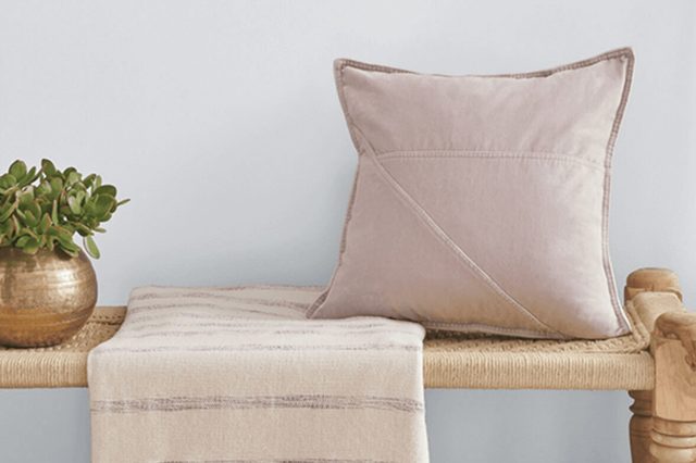
UpwardSW 6239 is also great for pairing with a variety of materials and textures. Smooth, polished surfaces highlight its cleanliness, while soft fabrics like velvet or chunky knits bring out its comforting aspect.
Whether it’s the main color on walls or used as an accent, this Sherwin Williams shade can help to create a space that feels both invigorating and tranquil.
housekeepingbay.com
Table of Contents
Is Upward SW 6239 by Sherwin Williams Warm or Cool color?
UpwardSW 6239 by Sherwin Williams is a unique and gentle color that can make any room in your home feel more welcoming and peaceful. Think of it like the softness of the sky on a clear, early morning.
It’s a kind of light blue that’s not too bright or overpowering, making it really versatile and easy to match with other colors and decor styles.
Putting UpwardSW 6239 on your walls can make small spaces seem bigger and more open because light colors like this tend to give an illusion of more space. It’s also cool and calming, so it’s perfect for places where you want to relax like bedrooms or bathrooms.
Plus, this color does a great job of reflecting natural light, which can make your home feel brighter and more cheerful.
Whether you want a modern look or something more traditional, UpwardSW 6239 has the special ability to fit in seamlessly. It encourages a serene and comforting atmosphere, making your home a lovely place to unwind.
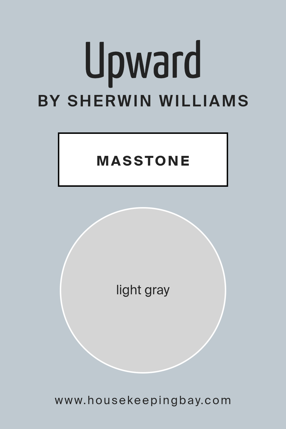
What is the Masstone of the Upward SW 6239 by Sherwin Williams?
UpwardSW 6239 by Sherwin Williams is a unique paint color that’s light gray, with its masstone having a specific shade that can be described as #D5D5D5. This particular hue of gray brings a fresh and airy feel to any home.
When you use this color on walls, it opens up the space, making rooms look bigger and more inviting.
This effect is especially useful in smaller homes or rooms that don’t get a lot of natural light, as the light gray helps to bounce light around the room, brightening it up.
The beauty of UpwardSW 6239 lies in its versatility. This color can fit into many decor styles, from modern and minimalistic to cozy and traditional. It provides a neutral backdrop that allows furniture and decor pieces to stand out.
Whether you pair it with vibrant colors or keep to a more muted palette, this light gray adapts without clashing. It’s an excellent choice for homeowners looking to refresh their spaces with a color that’s easy to work with and can create a peaceful, calming atmosphere in their home.
housekeepingbay.com
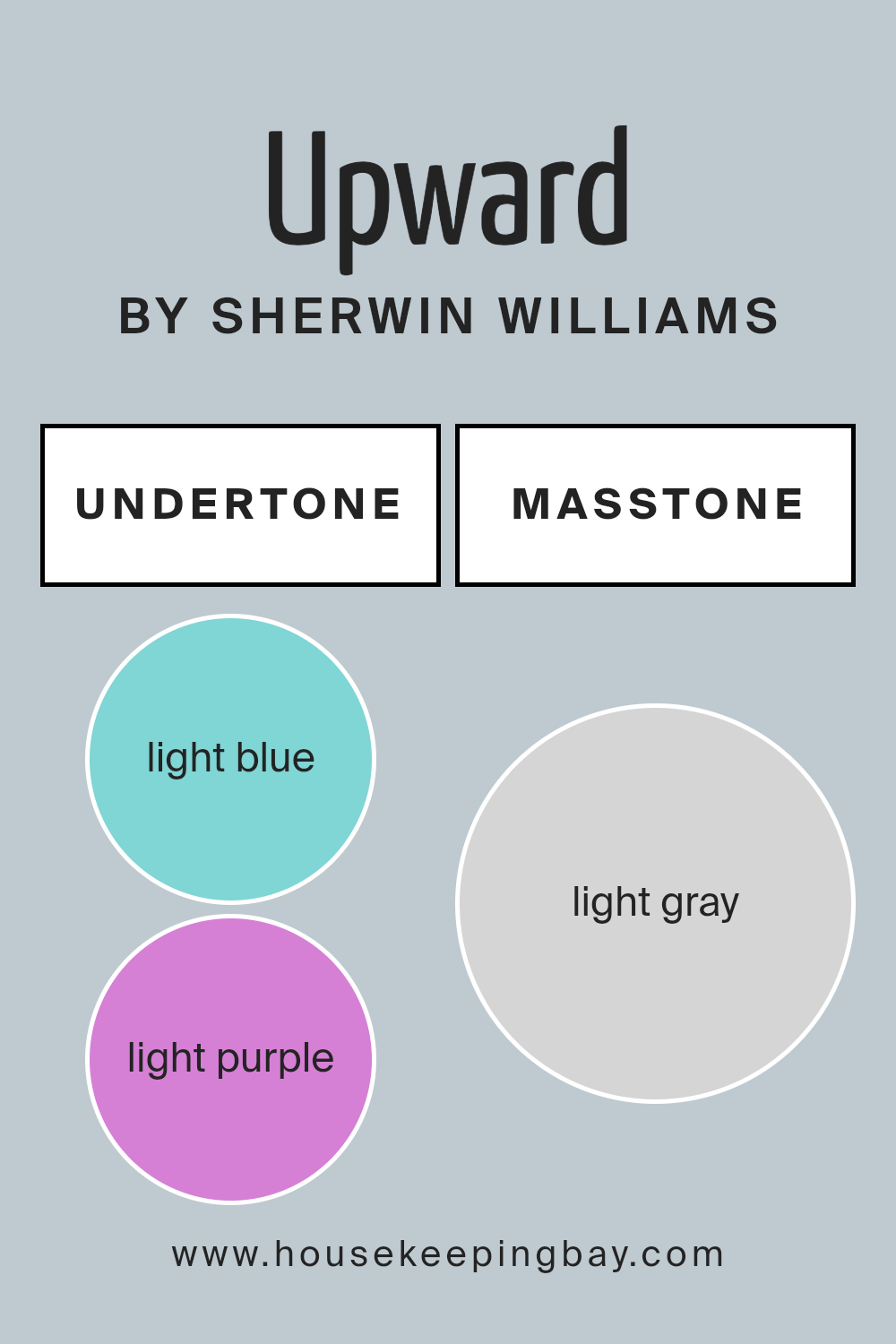
Undertones of Upward SW 6239 by Sherwin Williams
Upward SW 6239 by Sherwin Williams is a unique paint color because it’s not just a simple shade; it has subtle undertones that really bring it to life. Specifically, it carries light blue (#80D5D5) and light purple (#D580D5) undertones.
These undertones are like hidden colors that can change how we see the main color under different lights or when paired with other colors.
Undertones play a big role in how we perceive color. They can make a color feel warmer or cooler, and they can even influence how the color looks throughout the day as natural light changes.
For Upward SW 6239, the light blue and light purple undertones add depth and complexity, making it more than just a standard paint color.
When this color is used on interior walls, the light blue and light purple undertones work together to create a soft, inviting atmosphere. The light blue undertones may make a room feel more open and airy, while the light purple undertones add a touch of coziness and warmth.
This makes Upward SW 6239 a versatile choice for walls because it can help create a space that feels both spacious and comfortable. Additionally, these undertones can softly play off of different furnishings and decors, allowing for a range of creative interior styles.
housekeepingbay.com
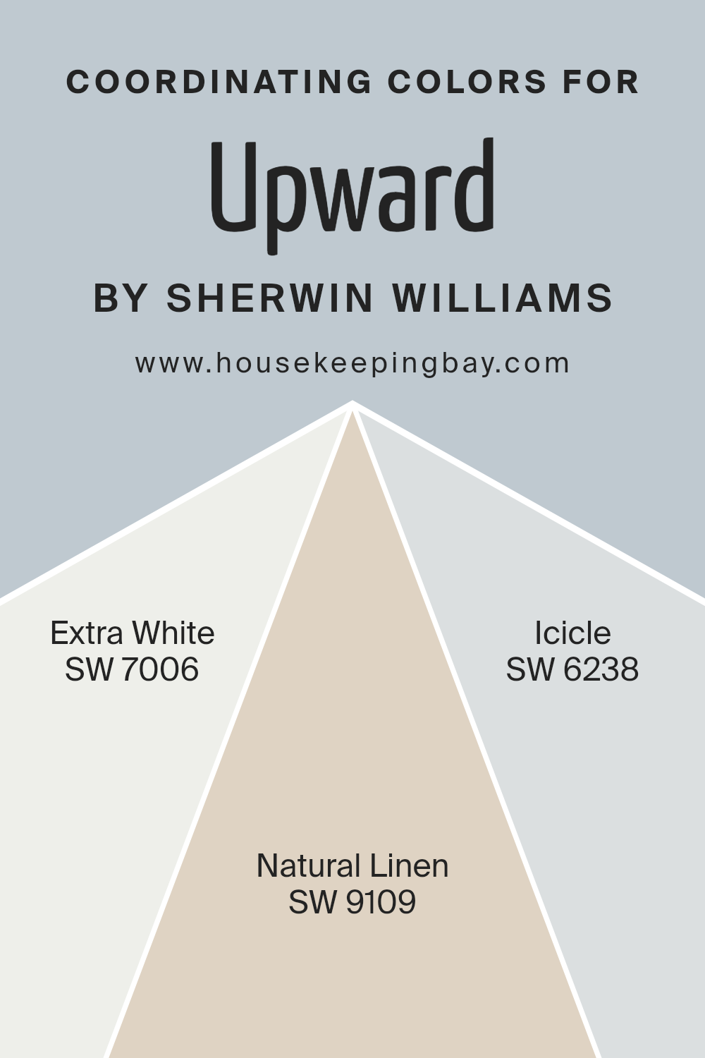
Coordinating Colors of Upward SW 6239 by Sherwin Williams
Coordinating colors are hues that complement each other when used together in a space, either by creating harmonious contrasts or by enhancing a unified color scheme.
These colors are selected based on their ability to support and enrich the main color, ensuring a visually appealing and balanced look.
For instance, when working with a sophisticated shade like Upward SW 6239 by Sherwin Williams, which offers a serene and airy feel, choosing the right coordinating colors is crucial to achieve a cohesive interior design.
SW 7006 – Extra White is a pristine and luminous shade that brings a crisp and clean look to any space, making it ideal for enhancing the light and spaciousness of a room painted with Upward SW 6239.
It acts as a perfect background, allowing the main color to stand out while maintaining a fresh and inviting atmosphere. On the other hand, SW 9109 – Natural Linen introduces a subtle, warm beige that adds depth and warmth to the palette, complementing the cool tones of Upward without overpowering the room’s serene ambiance.
This color is perfect for creating a cozy and comfortable feel. Lastly, SW 6238 – Icicle is a light, nearly ethereal grey with cool undertones that harmonizes beautifully with Upward, providing a subtle contrast and enhancing the space with its quiet elegance.
Together, these coordinating colors offer a range of options for creating a harmonious color scheme that feels both welcoming and stylish.
You can see recommended paint colors below:
- SW 7006 Extra White
- SW 9109 Natural Linen
- SW 6238 Icicle
housekeepingbay.com
How Does Lighting Affect Upward SW 6239 by Sherwin Williams?
Lighting can significantly change how we perceive colors. The same color can appear differently under various light sources. This is crucial to remember when choosing paint for your rooms, such as UpwardSW 6239 by Sherwin Williams.
Let’s explore how this color behaves under different lighting conditions and in rooms with various orientations.
Under artificial light, the true nature of UpwardSW 6239 can vary. In rooms with warm-toned bulbs, this color might seem softer and more soothing. It could lean towards a cozier, slightly more muted appearance, perfect for creating a calm atmosphere in the evening.
On the other hand, in cooler-toned LED or fluorescent lighting, UpwardSW 6239 might look brighter and more vivid, maintaining its integrity but with a fresher feel.
In natural light, UpwardSW 6239 also shows its versatility. Its perception changes throughout the day and depends on the room’s orientation:
- North-faced rooms receive less direct sunlight, which might make UpwardSW 6239 appear slightly cooler and more subtle, emphasizing its calming properties. It’s ideal for creating a serene space that feels light and airy even without abundant sunshine.
- South-faced rooms bathe in warm sunlight for the most part of the day, which can warm up the color, making it look brighter and more vibrant. UpwardSW 6239 will thrive in these conditions, offering a cheerful and welcoming vibe.
- East-faced rooms enjoy the morning light, which is cooler and bluer. Here, UpwardSW 6239 will look fresher and brighter in the morning, transitioning to a softer tone as the day progresses and natural light diminishes.
- West-faced rooms get the afternoon and evening light, which is warmer. This color will appear warmer and cozier later in the day, perfect for relaxing evenings.
In summary, UpwardSW 6239’s appearance flexibly adapts to different lighting conditions and room orientations. Whether under artificial light or natural sunlight, and regardless of the room’s direction, this color maintains its beauty, altering subtly to match its environment.
housekeepingbay.com
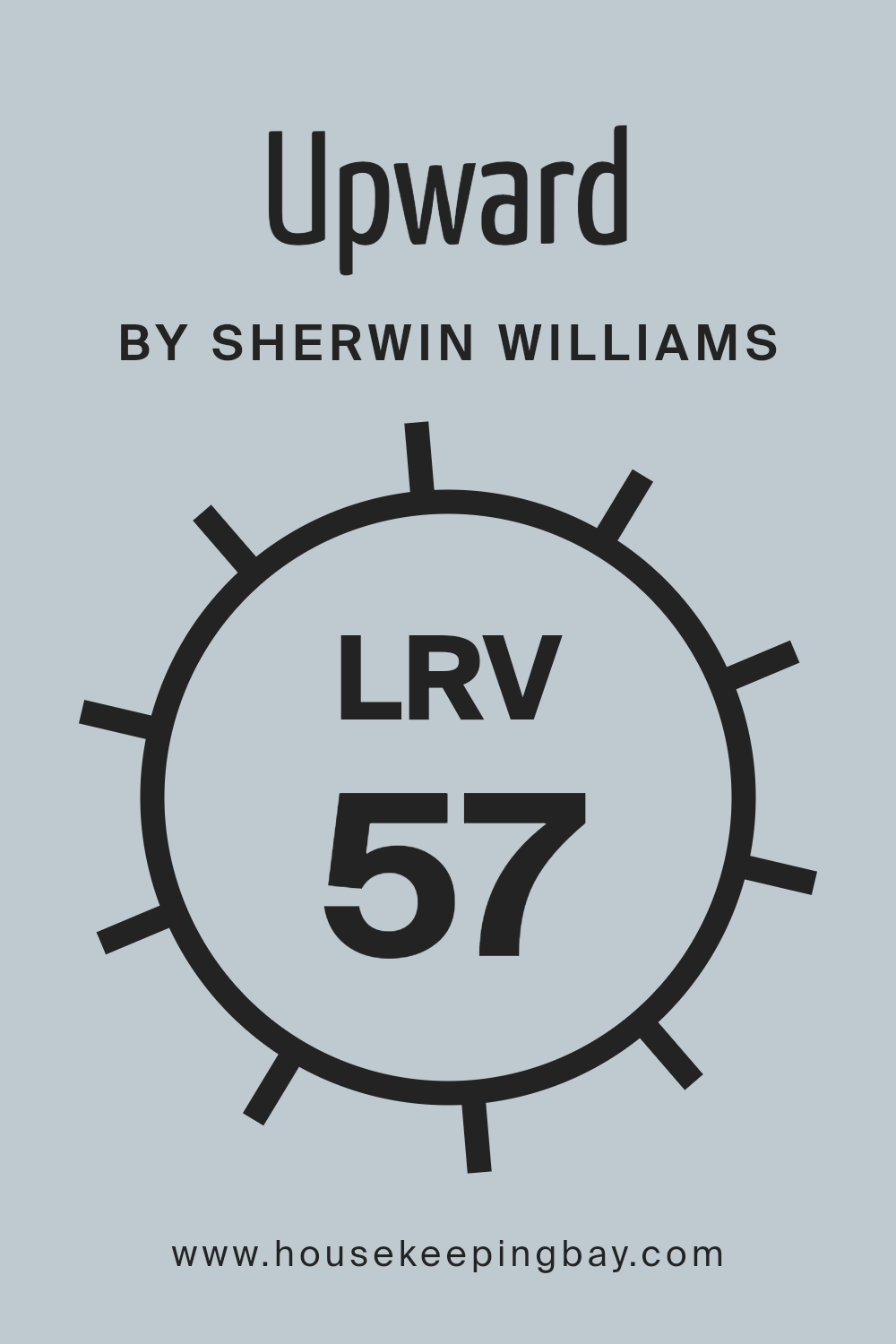
What is the LRV of Upward SW 6239 by Sherwin Williams?
LRV stands for Light Reflectance Value, which is a measure showing the percentage of light a paint color reflects back into the room as compared to the light that falls on it.
LRV values range from 0 to 100, with 0 being the absolute black that absorbs all light and doesn’t reflect any, and 100 being pure white, reflecting all the light that hits it.
The higher the LRV, the lighter the color appears, and the more it will brighten up a space by reflecting more light around the room. This measure is really useful when deciding paint colors for your interiors, as it helps in understanding how light or dark a color will look on your walls and how it might change under various lighting conditions throughout the day.
With an LRV of 57.401, Upward SW 6239 by Sherwin Williams falls into the mid-range category, meaning it’s neither too light nor too dark. This LRV indicates that it will reflect a fair amount of light without overpowering a space with brightness.
In practical terms, this means Upward will bring a moderate level of light reflection to your walls, making the room feel comfortably illuminated without the harsh brightness that comes from colors with a much higher LRV.
This particular shade can effectively enhance the ambiance of a room, imparting a sense of calm and openness, especially in spaces that receive a decent amount of natural light.
The LRV of 57.401 makes it a versatile color option that can adapt well to different settings and lighting conditions, making your space feel warm and inviting.
housekeepingbay.com
What is LRV? Read It Before You Choose Your Ideal Paint Color
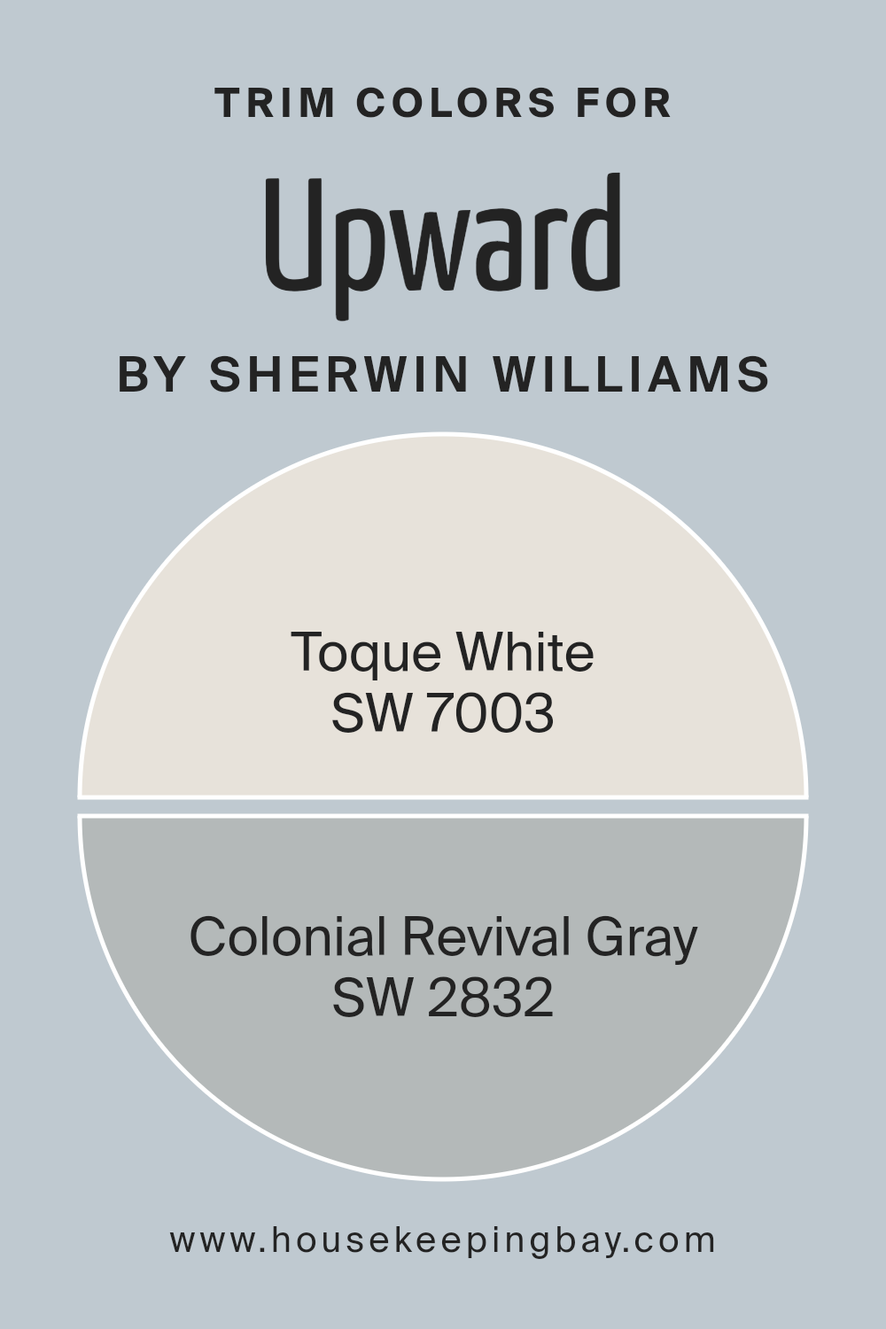
What are the Trim colors of Upward SW 6239 by Sherwin Williams?
Trim colors are essentially the hues selected for the architectural elements on a home or building, such as window trims, door frames, baseboards, and crown molding. They play a crucial role in defining and accentuating the overall aesthetic of a space.
Choosing the right trim color can enhance the visual appeal of a room, creating striking contrasts or seamless blends with the wall color.
For a color like Upward SW 6239, a gentle and airy shade by Sherwin Williams that brings a sense of tranquility and open space to any room, selecting complementary trim colors is key to achieving a cohesive look.
Toque White SW 7003, offers a soft, neutral backdrop that works beautifully as a trim color alongside Upward. Its subtle warmth adds a refined edge to spaces, balancing out the coolness of Upward, without overwhelming it, making the room feel inviting and well put together.
Colonial Revival Gray SW 2832, on the other hand, is a slightly deeper tone that provides a sophisticated contrast to Upward’s lighter hue. Using it as a trim color introduces an element of depth and definition to spaces, elegantly framing the serene expanse of Upward.
Both colors support the main hue by creating a visually interesting environment that’s both welcoming and stylish.
You can see recommended paint colors below:
- SW 7003 Toque White
- SW 2832 Colonial Revival Gray
housekeepingbay.com
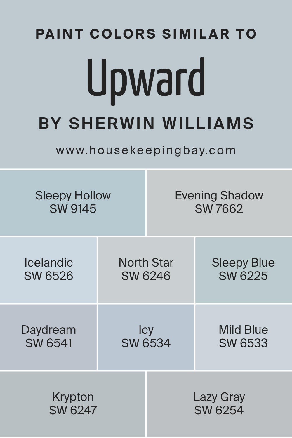
Colors Similar to Upward SW 6239 by Sherwin Williams
Similar colors play a crucial role in design and aesthetics, providing a cohesive and harmonious look. Colors like Upward SW 6239 by Sherwin Williams and its similar hues, such as Sleepy Hollow SW 9145 and Evening Shadow SW 7662, create a serene and calming atmosphere.
These colors share a gentle vibe, with Sleepy Hollow bringing a dusky, muted teal that whispers tranquility, while Evening Shadow offers a softer, more subdued tone, almost like the hush of twilight.
Icelandic SW 6526, North Star SW 6246, and Sleepy Blue SW 6225 further illuminate the palette with their airy and light qualities. Icelandic gently hints at a fresh, wintry morning sky, whereas North Star leans into a slightly cooler, almost mystical light grey, perfect for a peaceful retreat.
Sleepy Blue, true to its name, has a lullaby effect, enveloping rooms in a soothing, dreamy comfort. Extending the range, Daydream SW 6541, Icy SW 6534, Mild Blue SW 6533, Krypton SW 6247, and Lazy Gray SW 6254 present a spectrum from soft, ethereal blues to gentle greys, giving designers a versatile toolbox.
Daydream offers a splash of subdued cerulean, inviting a playful, yet relaxed mood. Icy and Mild Blue, close kin, blend seamlessly, reflecting the clear, crisp days of early spring.
Krypton and Lazy Gray subtly shift the mood, bringing in a cooler, more neutral tone, perfect for creating a modern, understated elegance in any space. Together, these shades support each other, allowing for a fluid and adaptable color scheme that can suit any taste or purpose.
You can see recommended paint colors below:
- SW 9145 Sleepy Hollow
- SW 7662 Evening Shadow
- SW 6526 Icelandic
- SW 6246 North Star
- SW 6225 Sleepy Blue
- SW 6541 Daydream
- SW 6534 Icy
- SW 6533 Mild Blue
- SW 6247 Krypton
- SW 6254 Lazy Gray
housekeepingbay.com
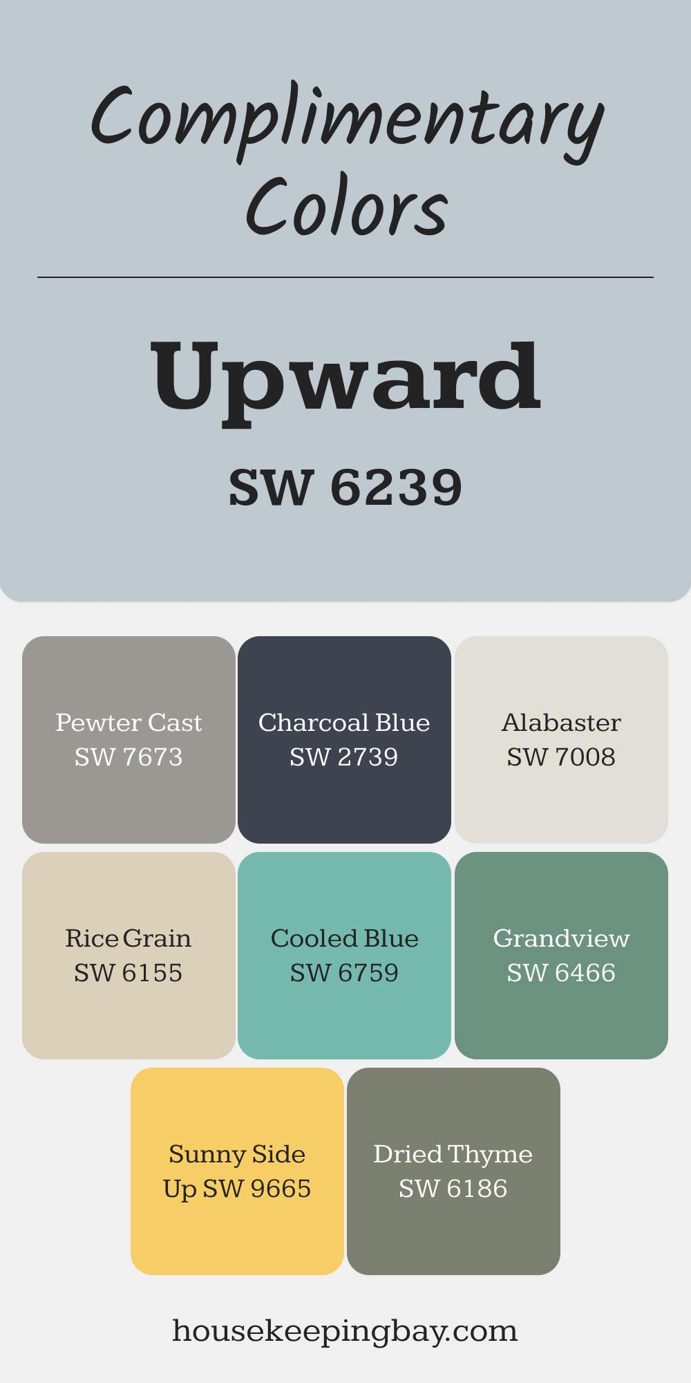
Complimentary Colors for Upward SW 6239 Paint Color by Sherwin Williams
Upward SW 6239 pairs beautifully with soft tones like Alabaster and Rice Grain, offering a subtle contrast that’s easy on the eyes. Add depth with Pewter Cast or Charcoal Blue for a more dramatic look. These shades complement Upward perfectly, bringing balance to your walls.
For a pop of color, try Sunny Side Up and Grandview to brighten up the space, while Dried Thyme and Cooled Blue give a refreshing, cool vibe. These colors together create a harmonious atmosphere, giving your room a fresh, cohesive feel.
via housekeepingbay.com
How to Use Upward SW 6239 by Sherwin Williams In Your Home?
Upward SW 6239 by Sherwin Williams is a lovely shade of blue that brings a calm and serene feeling into any space. This color is versatile; it can fit well in various rooms like bedrooms, bathrooms, or even living areas.
Using Upward, you can create a soothing atmosphere that’s perfect for relaxing after a long day. It pairs nicely with white trim or furniture, providing a classic, crisp look. If you’re looking for a bit of a modern twist, combining it with grey tones or soft yellows can give your home a fresh vibe.
For those who like a bit of creativity, Upward can also be great for accent walls. It draws attention without overwhelming the space. In a bedroom, it can help in setting a peaceful mood, making it easier to unwind and sleep.
In a home office, it might aid in maintaining focus and calmness. Regardless of how you use it, Upward SW 6239 can help in transforming your home into a more relaxing and beautiful place.
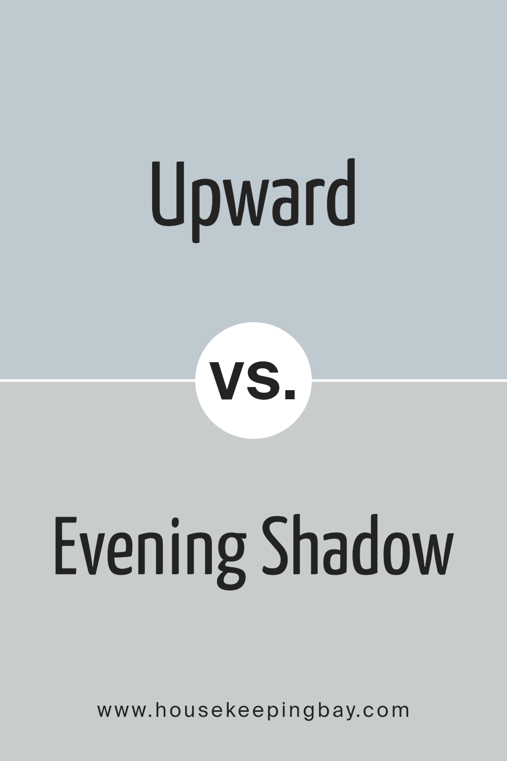
Upward SW 6239 by Sherwin Williams vs Evening Shadow SW 7662 by Sherwin Williams
Upward SW 6239 by Sherwin Williams is a light, airy blue that gives a sense of calm and relaxation. It’s the kind of color that makes a room feel more spacious and peaceful, perfect for creating a serene atmosphere.
On the other hand, Evening Shadow SW 7662 is a cooler, gray shade that carries a modern and sleek vibe. This color is subtle yet sophisticated, making it ideal for adding a touch of elegance to any space without overwhelming it.
When comparing the two, Upward brings a brighter and more uplifting energy due to its blue hues, while Evening Shadow offers a more grounded and contemporary feel because of its gray tones.
Both colors provide a beautiful backdrop for a variety of decor styles, but Upward might be better suited for those looking for a refreshing and invigorating ambiance, whereas Evening Shadow works well for those aiming for a chic and polished look.
Together, they could complement each other in a space, balancing light and sophistication.
You can see recommended paint color below:
- SW 7662 Evening Shadow
housekeepingbay.com
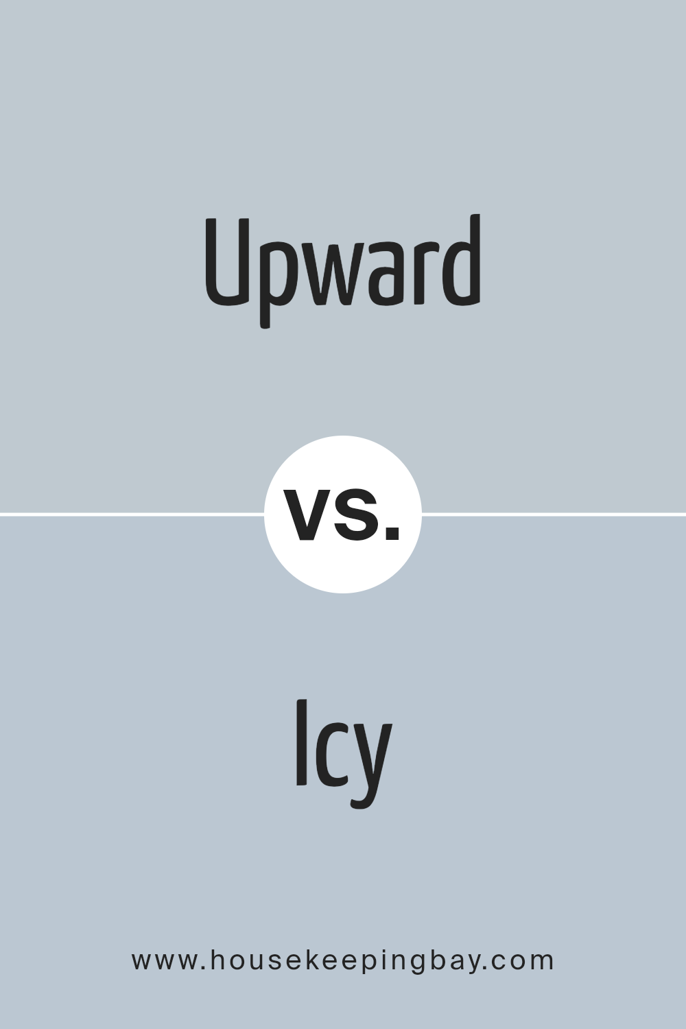
Upward SW 6239 by Sherwin Williams vs Icy SW 6534 by Sherwin Williams
“Upward” SW 6239 and “Icy” SW 6534 are two colors by Sherwin Williams that present a calming vibe, but in different ways. “Upward” is a soft, airy blue with a touch of lavender, offering a peaceful and serene feel.
It’s like looking up into a clear, light sky. This color can make spaces feel more open and relaxed. On the other hand, “Icy” SW 6534 is a cooler, more minty blue with a hint of green. It gives off a crisp and fresh feel, reminiscent of a gentle, early morning breeze.
While “Upward” brings a warm and cozy touch, perfect for creating a tranquil retreat, “Icy” leans towards a lively and refreshing mood, ideal for invigorating a space.
Both colors are great for adding a splash of calmness, but your choice between them depends on whether you’re going for a warm, snug feel or a cool, rejuvenating atmosphere.
You can see recommended paint color below:
- SW 6534 Icy
housekeepingbay.com
Upward SW 6239 by Sherwin Williams vs Icelandic SW 6526 by Sherwin Williams
Upward SW 6239 by Sherwin Williams is a calming, soft blue with a subtle gray undertone, creating a soothing effect that is ideal for creating a peaceful space. It brings a gentle sense of tranquility, perfect for bedrooms or quiet, reflective spaces in a home.
On the other hand, Icelandic SW 6526 is a lighter, airier blue with hints of green, giving it a refreshing and slightly more vibrant feel. This color evokes the feeling of a breezy, clear sky or the crispness of the ocean, making it great for adding a touch of freshness to any room.
While both colors share a base in the blue family, Upward leans towards a muted, serene blue-gray that offers depth and sophistication, whereas Icelandic presents a brighter, more cheerful tone that energizes the space without overwhelming it.
Choosing between them depends on the mood you want to set: calming and grounded with Upward, or light and uplifted with Icelandic.
You can see recommended paint color below:
- SW 6526 Icelandic
housekeepingbay.com
Upward SW 6239 by Sherwin Williams vs Daydream SW 6541 by Sherwin Williams
Upward SW 6239 by Sherwin Williams and Daydream SW 6541 each have their own unique feel. Upward is a soft, soothing blue with a peaceful vibe, making it a great choice for creating a calm and serene setting.
It’s like looking up at a clear, light blue sky. On the other hand, Daydream is a more vibrant, slightly greenish-blue. It’s fresh and lively, bringing a splash of energy to any space. Think of Daydream as the color of the ocean in a tropical paradise, bright and inviting.
When comparing the two, Upward feels cooler and more understated, perfect for a quiet, reflective space. Daydream, with its punchier, more vivid tone, is better suited for areas where you want to add a bit more personality and cheerfulness.
Both colors are beautiful in their own way, but the choice between them comes down to what mood you want to set in your room.
You can see recommended paint color below:
- SW 6541 Daydream
housekeepingbay.com
Upward SW 6239 by Sherwin Williams vs Sleepy Blue SW 6225 by Sherwin Williams
Upward SW 6239 and Sleepy Blue SW 6225, both by Sherwin Williams, are two shades that offer distinct vibes for any room. Upward is a light, airy blue that feels like a fresh, bright morning sky.
It has a calming effect yet retains a sense of cheerfulness and vibrancy, making spaces seem more open and welcoming. On the other hand, Sleepy Blue is a softer, more muted hue. It leans towards a tranquil, serene atmosphere, reminiscent of a quiet, peaceful afternoon.
While Upward brings an energizing freshness, Sleepy Blue offers a soothing retreat, ideal for relaxing spaces like bedrooms or bathrooms. Both colors, while rooted in blue, serve different moods and settings.
Upward is great for invigorating spaces, encouraging light and breathability, whereas Sleepy Blue is perfect for creating a cozy, serene corner in your home. Choosing between them depends on the feeling you wish to inspire in your space.
You can see recommended paint color below:
- SW 6225 Sleepy Blue
housekeepingbay.com
Upward SW 6239 by Sherwin Williams vs Lazy Gray SW 6254 by Sherwin Williams
Upward SW 6239 by Sherwin Williams is a light, refreshing blue with a hint of softness, making spaces feel airy and open. It’s like a breath of fresh air in a room, giving off calm and serene vibes.
This color is great for creating a soothing environment, perfect for bedrooms or bathrooms where you want to relax.
Lazy Gray SW 6254, on the other hand, is a subtle, cozy gray with a warm undertone. It’s not too dark or too light, making it incredibly versatile for any room.
This color brings a sense of comfort and simplicity, creating a neutral background that can match with various decor styles. It’s like a soft blanket wrapped around a room, offering a comforting feel.
When comparing the two, Upward leans towards a refreshing and calming mood with its light blue tones, ideal for creating a serene retreat. Lazy Gray offers a neutral, comforting feel, suitable for a minimalist or warm-hearted space.
Both colors serve different moods and atmospheres but are equally great for making a space feel welcoming and polished.
You can see recommended paint color below:
- SW 6254 Lazy Gray
housekeepingbay.com
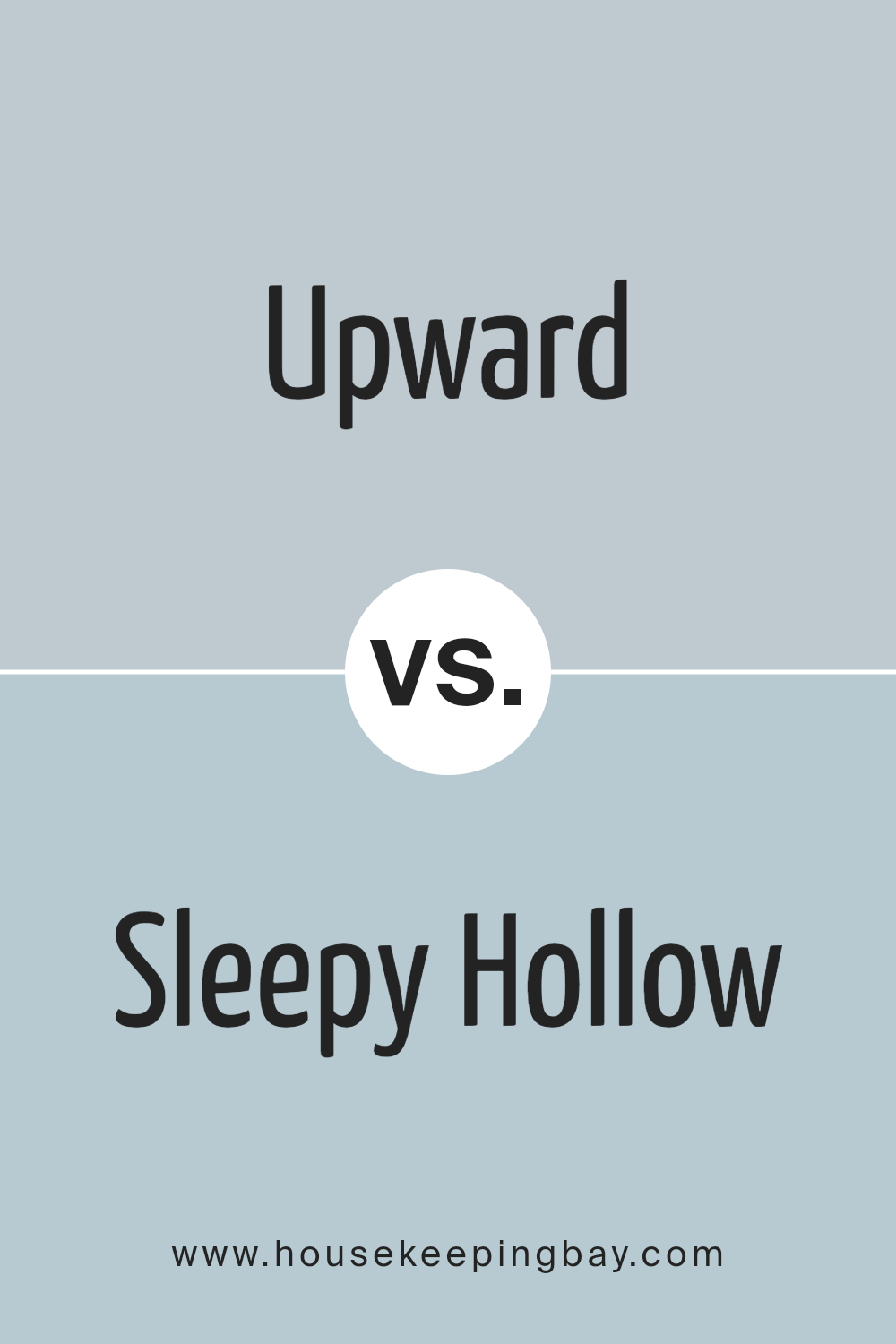
Upward SW 6239 by Sherwin Williams vs Sleepy Hollow SW 9145 by Sherwin Williams
Upward SW 6239 by Sherwin Williams is a gentle, sky-like blue that brings a sense of calm and openness to any space. It’s light and airy, making rooms feel more spacious and bright.
This color has a subtle freshness to it, perfect for creating a soothing environment. It works well in bedrooms, bathrooms, or any area where a peaceful vibe is desired.
On the other hand, Sleepy Hollow SW 9145 takes a deeper, more mysterious path. It’s a darker shade of blue with a hint of gray, giving it a more sophisticated and cozy feel.
This color adds depth and character to spaces, making it ideal for adding a touch of elegance to living areas or bedrooms. It can create a cozy nook or a dramatic feature wall, offering a more anchored and serene atmosphere than Upward.
While both colors share a base hue, Upward is lighter and more open, ideal for creating a breezy feel, whereas Sleepy Hollow provides depth and warmth for a more enveloped and intimate ambiance.
You can see recommended paint color below:
- SW 9145 Sleepy Hollow
housekeepingbay.com
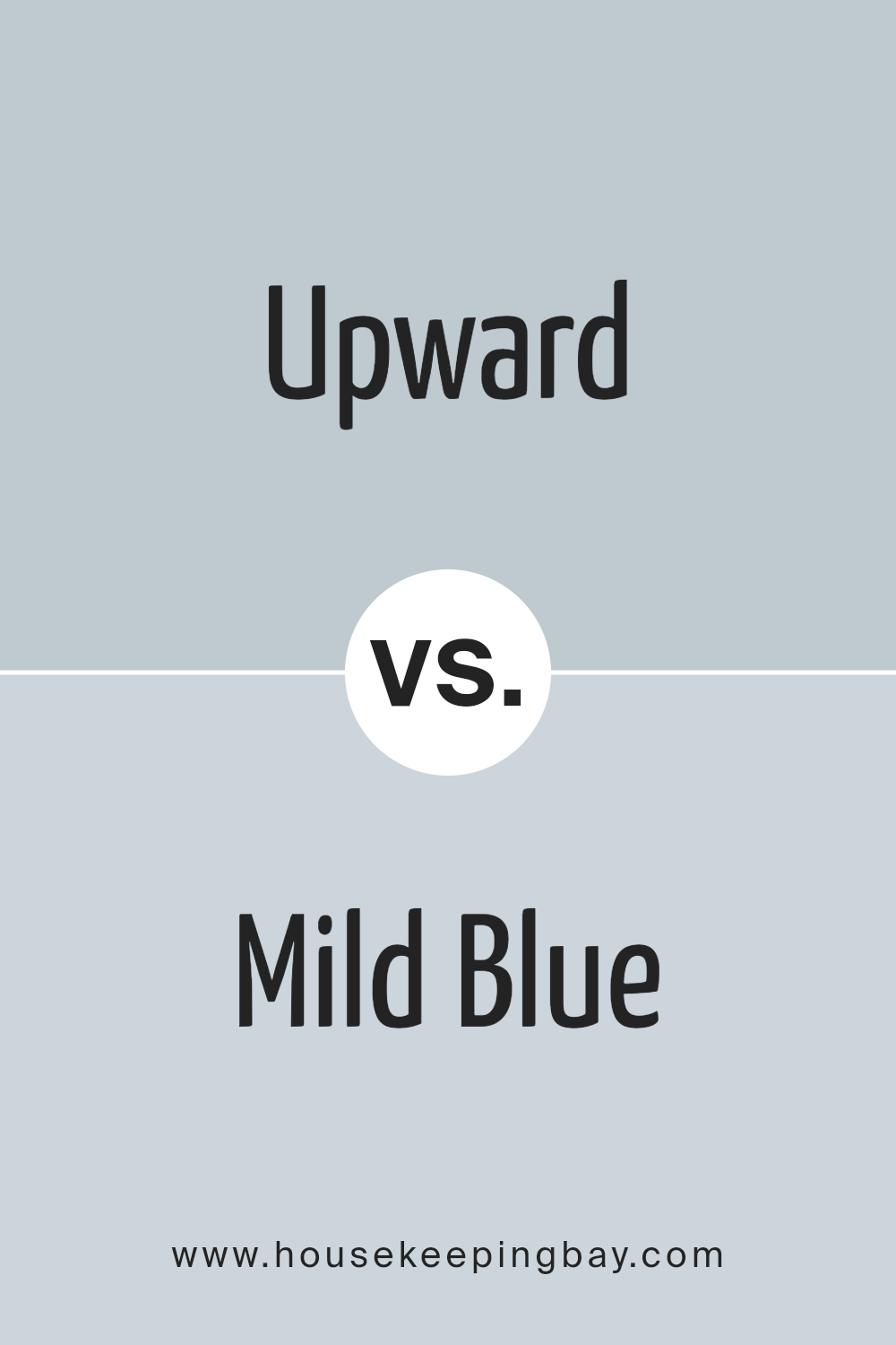
Upward SW 6239 by Sherwin Williams vs Mild Blue SW 6533 by Sherwin Williams
Upward SW 6239 by Sherwin Williams is a soft, serene blue that brings a calm and tranquil feel to any space. It’s like looking up into a clear, light blue sky on a sunny day.
This color is gentle and has a peaceful vibe, making it perfect for creating a relaxing environment in rooms like bedrooms or bathrooms.
On the other hand, Mild Blue SW 6533 by Sherwin Williams is another blue hue, but with a slightly different character. It’s a bit deeper and more pronounced than Upward, offering a touch more richness and a subtle hint of vibrancy.
While still calming, Mild Blue has a freshness that can liven up a space without overwhelming it.
Both colors share a blue base, but Upward leans towards a lighter, airier feel, whereas Mild Blue brings a bit more depth and energy. Depending on the mood you’re aiming to set, Upward is ideal for a soft, tranquil look, while Mild Blue can add a touch of dynamism to a serene setting.
You can see recommended paint color below:
housekeepingbay.com
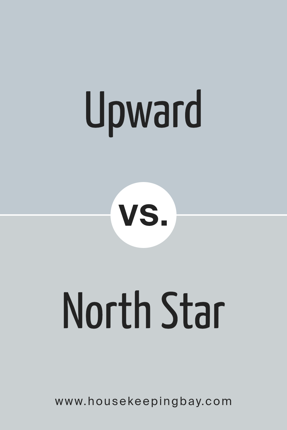
Upward SW 6239 by Sherwin Williams vs North Star SW 6246 by Sherwin Williams
Upward SW 6239 by Sherwin Williams and North Star SW 6246 are both unique colors, but they’re not the same. Upward is a light, soothing blue that feels airy and open, kind of like a clear sky on a sunny day.
It’s a color that makes spaces feel more spacious and relaxing, perfect for creating a calm atmosphere in any room.
On the other hand, North Star SW 6246 leans more towards a soft, light gray with a hint of blue. It’s a neutral color that’s really versatile, meaning it can fit in with almost any style or space.
North Star brings a sense of serenity and sophistication, making it ideal for those who want a modern look that’s not too overpowering.
Both Upward and North Star are great for bringing a fresh vibe into your home, but they do it in slightly different ways. Upward adds a more distinct blue touch, while North Star offers a subtler, chic look with its blend of gray and blue.
You can see recommended paint color below:
- SW 6246 North Star
housekeepingbay.com
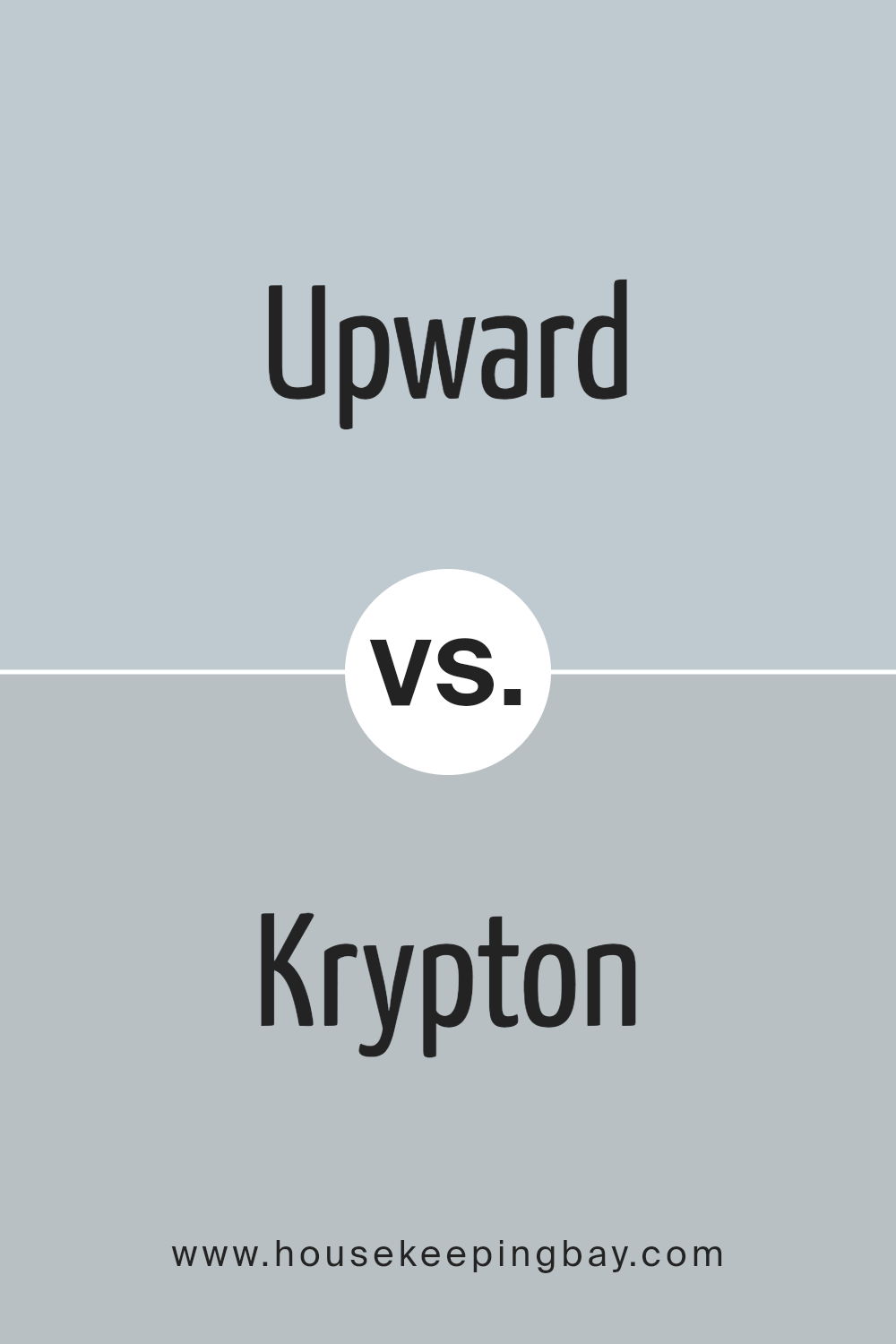
Upward SW 6239 by Sherwin Williams vs Krypton SW 6247 by Sherwin Williams
Upward SW 6239 and Krypton SW 6247 by Sherwin Williams are two unique colors that add different vibes to any space. Upward is a soft, soothing blue with a hint of gray. It feels like the color of a clear, peaceful sky just after sunrise, offering a sense of calm and serenity.
Think of it as a gentle hug from your favorite cozy blanket, perfect for creating a relaxing atmosphere in bedrooms or bathrooms.
Krypton, on the other hand, is a cooler, more muted blue-gray. It’s like the color of a stormy sea or the sleek, modern look of steel. This color brings a sophisticated, yet tranquil feel to a room.
It’s ideal for spaces where you want a bit of a modern edge without losing the sense of calm.
Both colors share a connection through their blue-gray tones, yet they offer distinctly different vibes. Upward leans towards a warmer, inviting feel, while Krypton strikes a more contemporary, chic note.
Whether you’re looking to create a cozy, welcoming space or a sleek, modern look, these colors offer beautiful options for your home.
You can see recommended paint color below:
- SW 6247 Krypton
housekeepingbay.com
Conclusion
In summary, the color Upward SW 6239 by Sherwin Williams presents a refreshing and soothing choice for those looking to enhance the ambiance of their spaces.
This particular shade offers a subtle blend of blue that brings to mind the serenity of the sky just after dawn. Its gentle hue is ideal for creating a peaceful retreat in any room, promoting a tranquil atmosphere that encourages relaxation and reflection.
Moreover, Upward SW 6239 proves to be a versatile color option that can complement a wide range of decor styles, from modern minimalist to cozy cottage.
Its ability to pair well with both bold and subdued color palettes makes it a fitting choice for anyone aiming to infuse their home with a sense of calmness and clarity. Whether applied to a bedroom, bathroom, or living area, Upward SW 6239 has the potential to transform ordinary spaces into serene sanctuaries.
housekeepingbay.com
Ever wished paint sampling was as easy as sticking a sticker? Guess what? Now it is! Discover Samplize's unique Peel & Stick samples. Get started now and say goodbye to the old messy way!
Get paint samples