Wall Street SW 7665 by Sherwin Williams
Shades of Sophistication
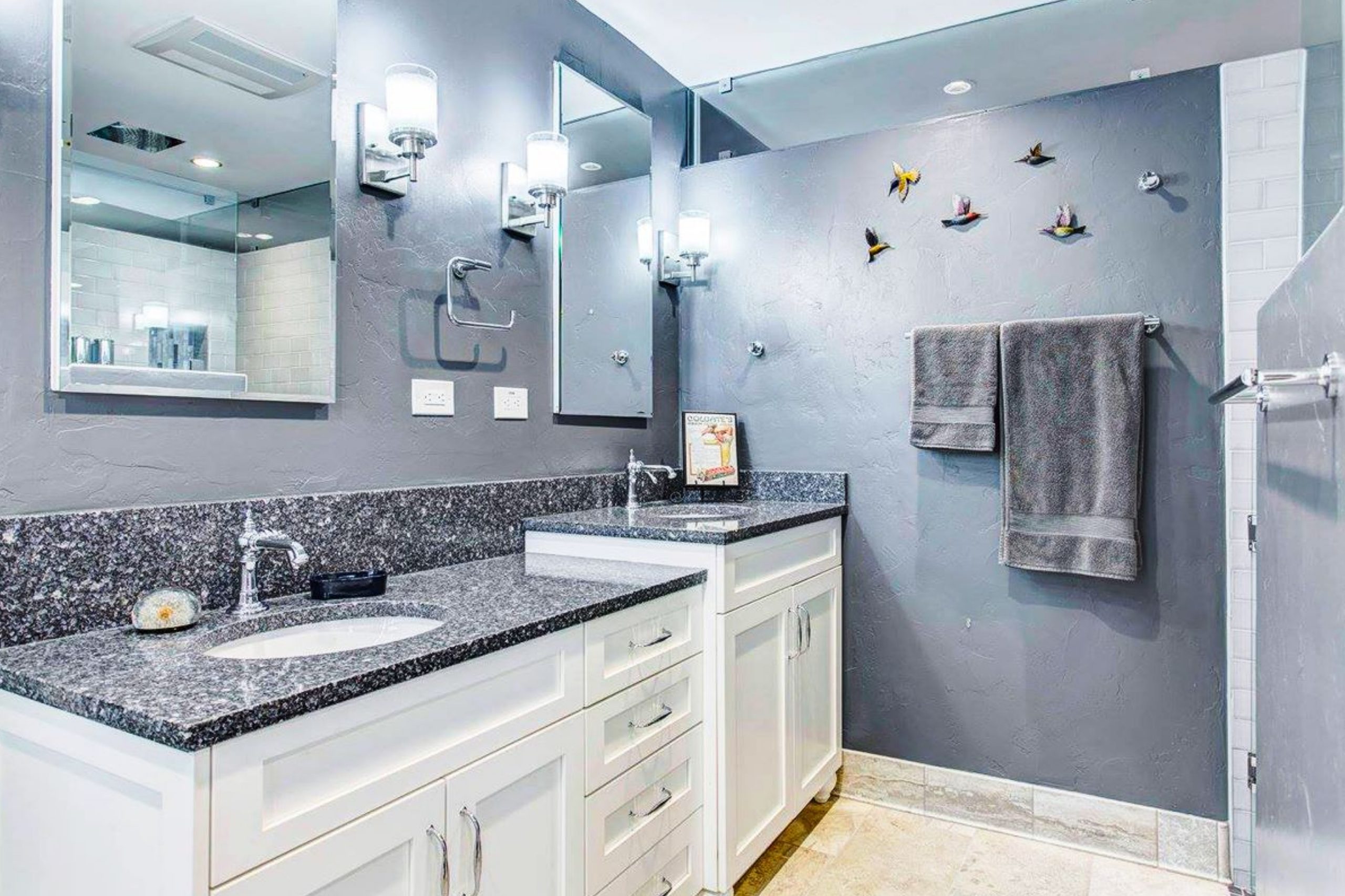
If you’re considering a fresh paint color for your space, you should definitely check out SW 7665 Wall Street by Sherwin Williams. This shade brings a strong dose of sophistication and style. Known for its deep charcoal hue, it can create an impressive backdrop that stands out and makes furnishings really pop.
Perfect for adding a sense of depth to any room, Wall Street works exceptionally well in modern-themed spaces or anywhere you want to establish a professional or sleek vibe.
Its versatility also extends to different room types, whether it’s your home office, a cozy bedroom, or a spacious living room.
Furthermore, pairing this color with lighter shades or vibrant accents can balance its boldness, making it adaptable to various design tastes.
If you’re planning to refresh your place, Wall Street could provide that fresh, new look you’re hoping to achieve. Consider how it aligns with your current décor and how it could enhance the aesthetics of your environment.
johnkilmer.com
What Color Is Wall Street SW 7665 by Sherwin Williams?
Wall Street SW 7665 by Sherwin Williams is a sophisticated gray tone that exudes confidence and understated elegance. This rich color can work beautifully in contemporary, minimalist, and even traditional interior styles. Its maturity and subtlety make it an excellent choice for creating a serene yet powerful ambiance in spaces such as home offices, studies, and dining rooms.
Wall Street pairs well with various materials and textures that help to create a balanced and refined space. This shade complements natural elements like wood, enhancing the warm tones of oak or walnut. It is also a perfect backdrop for metallic finishes like brushed silver or matte black, providing a modern touch that can feel both industrial and chic.
For furniture and fabrics, Wall Street works seamlessly with smooth leather, velvet, and linen, offering a tactile experience that adds depth and comfort to the room. Textured accents such as knitted throws or woven rugs introduce a cozy element, making the space feel inviting.
Opt for this color if you’re looking for a versatile backdrop that supports a range of styles and textures, bringing together different elements in a cohesive and stylish manner.

housekeepingbay.com
Is Wall Street SW 7665 by Sherwin Williams Warm or Cool color?
Wall Street SW 7665, a paint color by Sherwin Williams, is a sophisticated shade of gray that brings a subtle, yet powerful impact to any room in a home. This color has a cool undertone, making it an excellent choice for modern and minimalist interiors. Wall Street’s versatility allows it to work beautifully in various spaces, from bedrooms and living rooms to kitchens and bathrooms.
When used in a home, this color can create a serene and inviting atmosphere, making spaces feel more open and airy. It is particularly effective in rooms with ample natural light, as the light emphasizes the smooth and soothing qualities of the gray.
Additionally, Wall Street pairs well with a range of other colors, from bright and bold hues to soft neutrals, providing flexibility in decor and styling.
It’s an ideal backdrop for both contemporary furniture and classic pieces, allowing individual decor elements to stand out. This paint color is a practical choice for anyone looking to give their home a chic, cohesive look without overwhelming the senses.
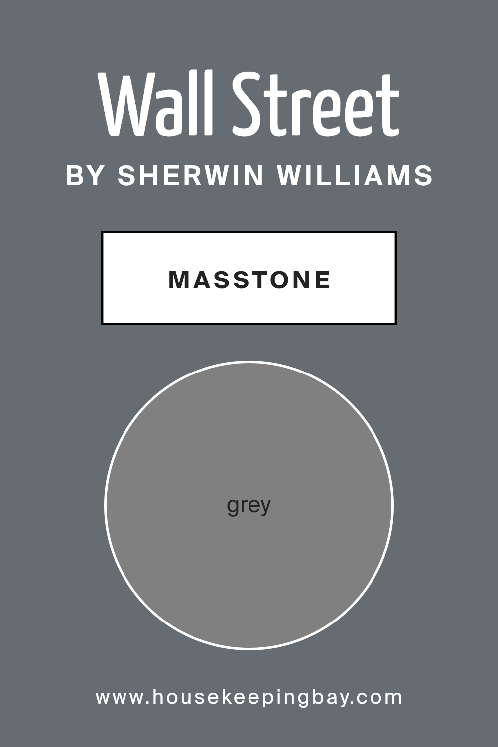
What is the Masstone of the Wall Street SW 7665 by Sherwin Williams?
Wall Street SW 7665 by Sherwin Williams is a rich, distinctive grey paint color that can significantly influence the ambiance of any home. The masstone of this color is a true grey, which means it doesn’t lean too heavily towards either blue or brown. This neutrality makes it incredibly versatile and an excellent choice for various spaces, from living rooms to bedrooms.
Grey has a calming effect, making it ideal for creating a peaceful atmosphere in your home. Wall Street SW 7665 provides a sophisticated backdrop that can make other colors in a room pop, whether it’s bright cushions or a colorful piece of art. It’s also fantastic for smaller spaces, as the clean, simple shade can help make a room appear larger and more open.
Additionally, the subtlety of Wall Street SW 7665 allows it to blend seamlessly with different textures and finishes, from sleek modern furniture to rustic wood accents, enhancing the overall aesthetic without overpowering it. This color is both practical and stylish, proving that a simple grey can indeed be deeply impactful in interior design.
housekeepingbay.com
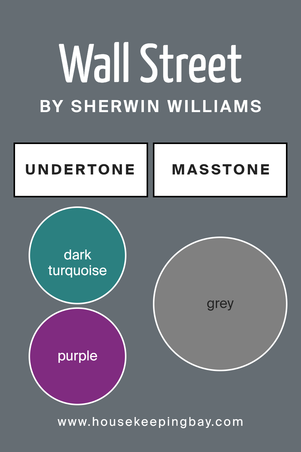
Undertones of Wall Street SW 7665 by Sherwin Williams
Wall Street SW 7665 by Sherwin Williams has a wide range of undertones, making it a versatile paint color. Undertones are subtle colors that influence how we perceive the main color in different lighting conditions. For example, dark turquoise, purple, and olive undertones can make Wall Street appear more vibrant under certain lights, while brown, dark grey, and navy might give it a serious, almost sober look in other conditions.
Interior walls painted with Wall Street SW 7665 can show these varied undertones depending on the natural or artificial lighting in a room and the surrounding colors from furniture and decor. If a room has lots of natural light, you might notice lighter undertones like mint, pale pink, or light turquoise becoming more prominent, giving the room a fresher look. In spaces with dimmer lighting, darker undertones like dark green, brown, or dark blue might stand out, lending the room a more grounded and enclosed feel.
The diverse undertones also mean that Wall Street can shift in appearance next to different colors. For instance, placing a light purple curtain next to a Wall Street-painted wall may bring out more purple undertones, whereas an olive green sofa could highlight the greenish undertones of the wall.
Therefore, when choosing accessories and additional colors for décor, consider how the undertones of Wall Street SW 7665 will interact with them. This consideration will help in achieving a harmonious look that complements the main wall color and enhances the overall aesthetic of the space.
housekeepingbay.com
Coordinating Colors of Wall Street SW 7665 by Sherwin Williams
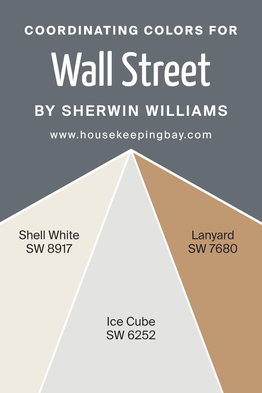
Coordinating colors are selected to complement a primary color, enhancing the overall aesthetic of a room or design scheme. In the case of Wall Street SW 7665 by Sherwin Williams, a deep, sophisticated shade, the recommended coordinating colors include SW 8917 Shell White, SW 6252 Ice Cube, and SW 7680 Lanyard.
These coordinating shades work together to create a balanced, harmonious look. They are chosen based on their ability to support the main color, allowing it to stand out while providing a polished, cohesive appearance.
SW 8917 Shell White is a soft, clean white that offers a fresh contrast to the darker tones of Wall Street, making it ideal for trim and ceilings for a crisp finish. SW 6252 Ice Cube presents a pale, neutral blue with a hint of coolness, which pairs well with Wall Street for a subtle, refreshing vibe. Lastly, SW 7680 Lanyard is a robust navy that complements Wall Street by adding depth and interest to the space, perfect for accent walls or furniture.
Together, these colors contribute to a well-rounded color scheme that enhances the primary color without overwhelming it.
You can see recommended paint colors below:
- SW 8917 Shell White
- SW 6252 Ice Cube
- SW 7680 Lanyard
housekeepingbay.com
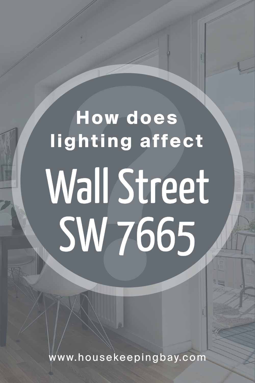
How Does Lighting Affect Wall Street SW 7665 by Sherwin Williams?
Lighting plays a critical role in how we perceive colors. Different light sources can change how a color looks, whether it’s from natural sunlight or artificial lighting. For example, Wall Street SW 7665 by Sherwin Williams may appear different under various lighting conditions.
In artificial light, such as LED or incandescent bulbs, the color Wall Street SW 7665, a deep grayish-blue, can shift based on the type of bulb used. Incandescent bulbs, which emit a warm yellow light, could make this color appear slightly warmer and more muted, while LED bulbs, often emitting a cooler light, might enhance its blue tones, giving it a sharper, more vibrant appearance.
In natural light, the appearance of Wall Street SW 7665 can vary significantly during the day depending on the direction the room faces:
- North-faced rooms: These rooms receive less direct sunlight, which can make colors appear more consistent throughout the day but potentially slightly darker and cooler. Wall Street SW 7665 might look more distinctly gray in these conditions, enhancing its subdued qualities.
- South-faced rooms: These rooms benefit from abundant natural light most of the day, which can make Wall Street SW 7665 look lighter and more lively. The blue tones might stand out more vibrantly here.
- East-faced rooms: Morning light in these rooms is bright and warm, possibly making Wall Street SW 7665 appear softer and more blue in the morning, fading to a cooler tone as the light diminishes throughout the day.
- West-faced rooms: Evening light brings warmth and brightness, potentially warming up the blue tones of Wall Street SW 7665, allowing it to appear richer and more dynamic during sunset hours.
Understanding these nuances allows better decisions when choosing paint colors for different rooms based on their orientation and the type of light they receive. Colors can dramatically affect the mood and feel of a space, and careful consideration of lighting can ensure that the color behaves as desired.
housekeepingbay.com
What is the LRV of Wall Street SW 7665 by Sherwin Williams?
LRV stands for Light Reflectance Value, a measurement that reflects how much light a paint color reflects back into a room. LRV is measured on a scale from 0 to 100, where 0 is pure black, absorbing all light, and 100 is pure white, reflecting all light.
This measurement helps in selecting paint colors by indicating how light or dark a color will appear once applied to the walls. A higher LRV means the color will appear lighter and can make a room feel more open and brighter, while a lower LRV means the color will absorb more light, making the space appear cozier and smaller.
Regarding the color Wall Street (SW 7665) by Sherwin Williams with an LRV of 14.886, this indicates it’s a darker shade. Such a low LRV suggests that Wall Street will not reflect much light. Instead, it will absorb most of the light, which could make small spaces feel even smaller or give a room a more intimate feeling.
This character makes it ideal for larger rooms or spaces where a sense of warmth or formality is desired. It’s also ideal for accent walls or for rooms that get plenty of natural light to balance its dark tone.

housekeepingbay.com
What are the Trim colors of Wall Street SW 7665 by Sherwin Williams?
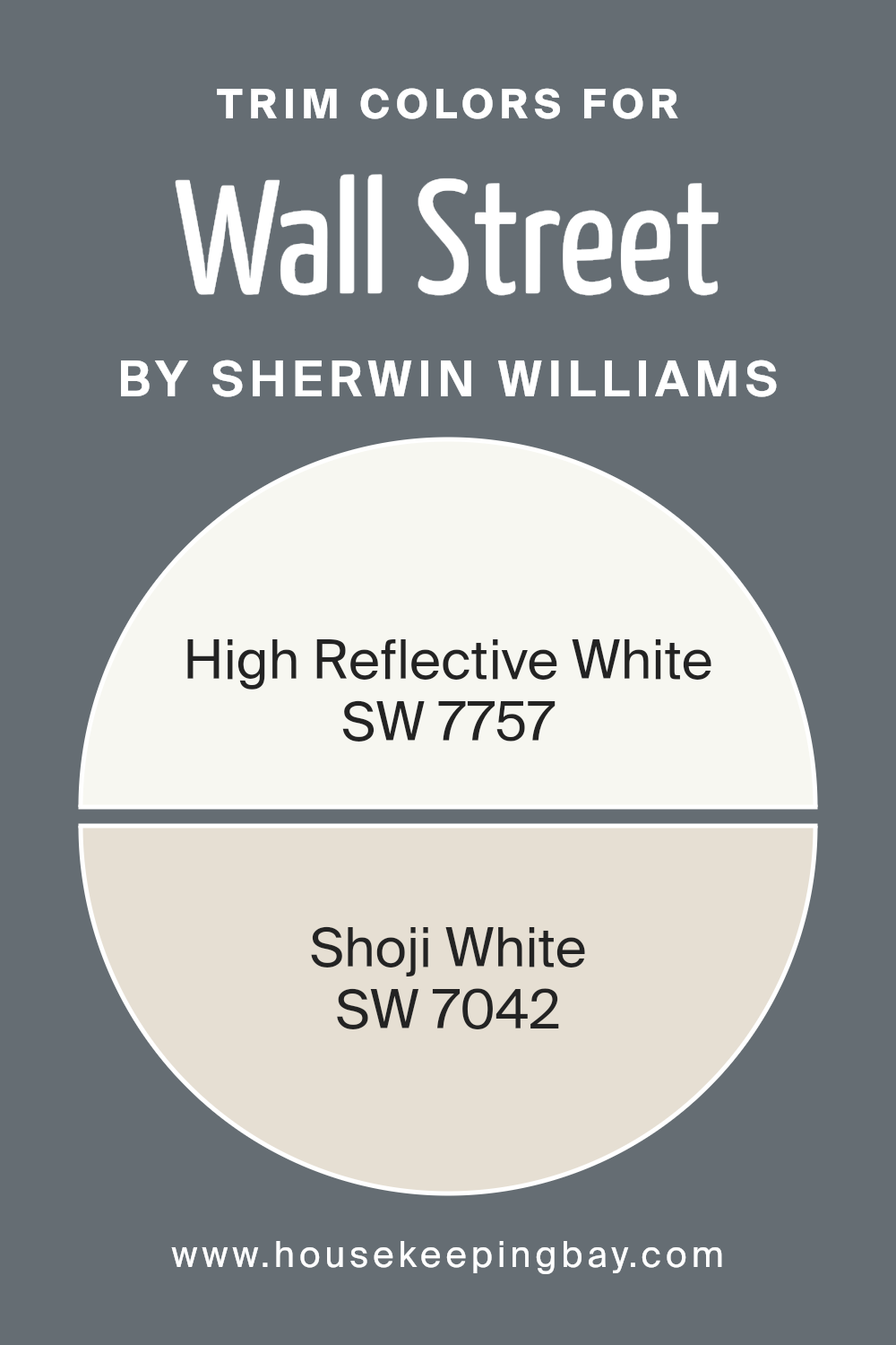
Trim colors are the shades used for painting the architectural details and accents like door frames, moldings, and baseboards that contrast with or complement the primary wall colors. For example, Wall Street SW 7665 by Sherwin Williams can be paired effectively with trim colors such as SW 7757 – High Reflective White and SW 7042 – Shoji White.
These trim colors help in defining the spaces crisply by highlighting the architectural features, making the rooms appear more structured and neat. Moreover, the right trim colors can add a subtle yet impactful visual interest to the spaces and make the predominant colors pop, thus enriching the overall aesthetic appeal of a room.
High Reflective White SW 7757 is a pure, bright white that acts as a versatile backdrop for other colors, providing a clean and fresh look. This color reflects light beautifully, making it an excellent choice for trims, especially in spaces that benefit from a spacious and airy atmosphere.
On the other hand, Shoji White SW 7042 offers a soft, warm white hue that brings a gentle sophistication to the trim, creating a soothing contrast without overwhelming the primary color.
Its understated elegance works well in various settings, complementing both bold and muted wall colors effectively.
You can see recommended paint colors below:
housekeepingbay.com
Colors Similar to Wall Street SW 7665 by Sherwin Williams
Selecting harmonious colors is vital in painting and decor as it creates a cohesive aesthetic, enhances mood, and ensures spaces feel balanced. Similar colors, like those akin to Wall Street SW 7665 by Sherwin Williams, provide a sense of unity and fluidity in spaces, making rooms appear thoughtfully designed and well-coordinated.
Using colors that share a common hue yet vary slightly in brightness or saturation allows for subtlety in design, offering a sophisticated spectrum while maintaining a singular style theme.
Colors such as Before the Storm SW 9564 and Grays Harbor SW 6236, introduce a chilled gray tone that possesses the ability to soften spaces without overpowering them. Night Out SW 9560 and Web Gray SW 7075 give off a deeper gray essence which works well to anchor lighter tones or to add dramatic flair in targeted areas. Slightly bluer, Slate Tile SW 7624 and Smoky Blue SW 7604 reflect the calm of the ocean’s depths, perfect for creating serene spaces. Gibraltar SW 6257 and Outerspace SW 6251, offer a rock-like robustness to the ensemble, providing great backdrops in areas needing grounding. Granite Peak SW 6250 and Roycroft Pewter SW 2848, both have an earthy base, ideal for adding a touch of nature-inspired neutrality to interiors. Together, these colors blend to enhance the environment subtly yet effectively.
You can see recommended paint colors below:
- SW 9564 Before the Storm
- SW 6236 Grays Harbor
- SW 9560 Night Out
- SW 7075 Web Gray
- SW 7624 Slate Tile
- SW 7604 Smoky Blue
- SW 6257 Gibraltar
- SW 6251 Outerspace
- SW 6250 Granite Peak
- SW 2848 Roycroft Pewter

housekeepingbay.com
Colors that Go With Wall Street SW 7665 by Sherwin Williams
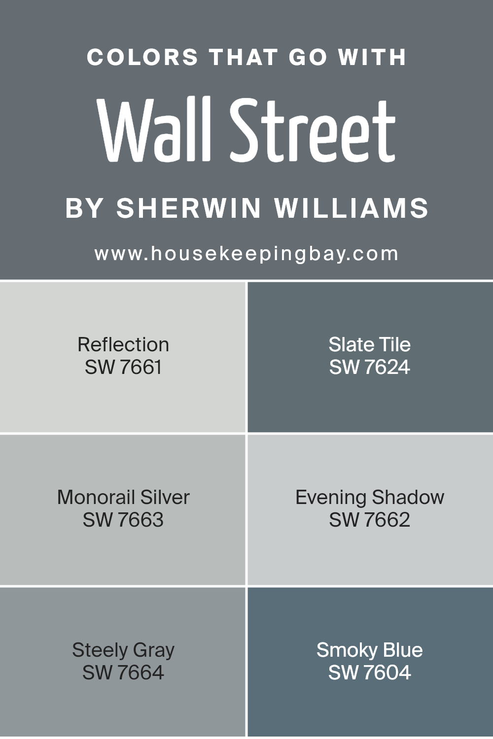
Selecting the right colors to complement Wall Street SW 7665 by Sherwin Williams is essential for creating a cohesive and attractive look in any space. The colors Reflection SW 7661, Slate Tile SW 7624, Monorail Silver SW 7663, Evening Shadow SW 7662, Steely Gray SW 7664, and Smoky Blue SW 7604 work harmoniously with Wall Street to build an atmosphere that can enhance any room’s design and mood. Choosing colors that complement each other ensures that the environment feels well-coordinated and pleasing to the eye.
Reflection SW 7661 is a soft light gray that brings a subtle brightness, perfect for balancing the darker tones of Wall Street. Slate Tile SW 7624 offers a rich blue-gray hue, adding a layer of sophistication and depth.
Monorail Silver SW 7663 has a muted silver tone that introduces a modern and sleek touch. Evening Shadow SW 7662 is a deeper gray that provides a calming effect, softening the overall appearance. Steely Gray SW 7664 gives off a strong presence with its bold gray shade, perfect for creating a striking contrast.
Lastly, Smoky Blue SW 7604 has a dusty blue color that infuses a hint of color while maintaining a serene and cohesive look with Wall Street. Combining Wall Street with these selections allows for a versatile palette that can adapt to various styles and preferences.
You can see recommended paint colors below:
- SW 7661 Reflection
- SW 7624 Slate Tile
- SW 7663 Monorail Silver
- SW 7662 Evening Shadow
- SW 7664 Steely Gray
- SW 7604 Smoky Blue
housekeepingbay.com
How to Use Wall Street SW 7665 by Sherwin Williams In Your Home?
Wall Street SW 7665 by Sherwin Williams is a sophisticated gray paint color that blends well with various home styles. Its rich tones provide a versatile backdrop for both modern and traditional furnishings and decor.
This shade can be particularly effective in living rooms or bedrooms where a calming, neutral palette is desired. Wall Street sets a subtle, refined atmosphere, making it a great choice for spaces aiming for a professional or serene vibe.
Applying Wall Street in smaller rooms, like a bathroom or study, can give the illusion of a bigger space when paired with crisp white trims and light-colored flooring. In larger areas, it works beautifully with bold color accents such as blues, yellows, or greens to create a balanced, visually interesting environment.
It also complements wood textures and metallic fixtures, making it easy to integrate into kitchen cabinetry or as an elegant base for a home office. Overall, Wall Street is an adaptable paint choice that can help achieve a chic, cohesive look throughout your home.
Wall Street SW 7665 by Sherwin Williams vs Outerspace SW 6251 by Sherwin Williams
Wall Street SW 7665 by Sherwin Williams is a sophisticated shade of gray that offers a strong yet neutral base, perfect for modern living spaces aiming for a professional and polished look. This color has enough depth to stand out on its own while maintaining a classic appeal that complements various design elements.
In contrast, Outerspace SW 6251, also by Sherwin Williams, presents a deeper, almost charcoal gray that can bring a more dramatic and bold atmosphere to a room. Its richness provides an excellent backdrop for accent colors, and it can create a cozy and inviting environment despite its darker tone.
Both colors provide excellent options for those looking to introduce gray into their décor. Wall Street is lighter and more subtle, excellent for broader applications, while Outerspace offers a stronger statement, perfect for accent walls or furniture elements.
You can see recommended paint color below:

housekeepingbay.com
Wall Street SW 7665 by Sherwin Williams vs Granite Peak SW 6250 by Sherwin Williams
Wall Street SW 7665 by Sherwin Williams is a rich, deep gray that adds a sophisticated touch to any space. It has a strong presence and works well in both modern and traditional interiors, lending a sense of elegance and formality. This color is ideal for creating a focal point in a room or making a bold statement.
Granite Peak SW 6250, also by Sherwin Williams, is a slightly lighter shade of gray compared to Wall Street. It is versatile and neutral, ideal for those looking to create a subtle, calming atmosphere in their home. Granite Peak is perfect for living areas and bedrooms where a softer touch is desired.
Although both colors are grays, Wall Street is deeper and more intense, making it better suited for dramatic spaces or accent walls. Granite Peak, with its lighter tone, offers a gentler approach that can make small rooms appear more spacious. Both colors can be complemented with a variety of decor styles and hues.
You can see recommended paint color below:

housekeepingbay.com
Wall Street SW 7665 by Sherwin Williams vs Roycroft Pewter SW 2848 by Sherwin Williams
Wall Street SW 7665 by Sherwin Williams is a refined gray shade with a cool, sophisticated undertone, perfect for creating a modern and sleek look in any space. It pairs well with bright colors and metallic finishes, giving a contemporary feel.
In contrast, Roycroft Pewter SW 2848 is a deeper, warmer gray that projects a more traditional ambiance. This color offers a cozy, inviting feel, ideal for settings where a sense of calm and comfort is desired, such as living rooms or bedrooms.
While Wall Street lends itself more to a crisp, urban aesthetic, Roycroft Pewter is better suited for a rustic or classical decor, reflecting a subtle hint of nostalgia. Both colors are versatile, but their different undertones and depth can influence the mood and style of a room significantly.
You can see recommended paint color below:
- SW 2848 Roycroft Pewter

housekeepingbay.com
Wall Street SW 7665 by Sherwin Williams vs Before the Storm SW 9564 by Sherwin Williams
Wall Street SW 7665 by Sherwin Williams is a deep, charcoal gray with subtle blue undertones. This shade is quite sophisticated and can add a sense of formal elegance to a space. It works well in areas that require a serious tone or in settings where a dark, rich color is needed to make a bold statement.
In contrast, Before the Storm SW 9564 is a lighter gray that carries a slightly cooler, more neutral tone. This color is versatile and provides a softer, more approachable atmosphere compared to Wall Street. Before the Storm can be used in various rooms to create a calm, soothing environment without overwhelmingly dark hues.
Overall, while both colors share a gray palette, Wall Street offers a deeper, more intense atmosphere, while Before the Storm leans towards a lighter, more open feel. This difference makes Wall Street better suited for dramatic impacts, whereas Before the Storm is ideal for creating a peaceful, airy space.
You can see recommended paint color below:
- SW 9564 Before the Storm

housekeepingbay.com
Wall Street SW 7665 by Sherwin Williams vs Night Out SW 9560 by Sherwin Williams
Wall Street SW 7665 by Sherwin Williams is a sophisticated gray shade with subtle blue undertones that makes it a versatile choice for many spaces, lending a professional yet cozy feel. It’s light enough to keep rooms looking open and airy while providing enough depth to make a statement. This color works well in office spaces, living rooms, and bedrooms, offering a calm and collected ambiance.
In contrast, Night Out SW 9560 is a much deeper shade, leaning toward a charcoal color with strong blue influences. This color is bold and impactful, ideal for creating dramatic accents or cozy, intimate spaces. It’s perfect for feature walls, media rooms, or anywhere you want to add depth and a touch of formality.
Both colors offer unique vibes – Wall Street is more about subtle elegance, and Night Out presents a dramatic flair. Each can set a different tone and mood in a space depending on how they are used.
You can see recommended paint color below:
- SW 9560 Night Out

housekeepingbay.com
Wall Street SW 7665 by Sherwin Williams vs Gibraltar SW 6257 by Sherwin Williams
Wall Street SW 7665 by Sherwin Williams is a rich, deep gray that provides a sense of sophistication and professionalism. It’s ideal for spaces intended to have a formal, authoritative look. This color can make small areas appear more intimate and is versatile enough to be paired with a variety of decor styles and colors.
Gibraltar SW 6257, also by Sherwin Williams, is a slightly lighter gray with blue undertones, giving it a cooler feel compared to Wall Street. Gibraltar offers a refreshing and calm atmosphere, making it a great choice for bedrooms or bathrooms where a soothing ambiance is desired.
Both colors are neutral, yet Gibraltar leans towards a more serene vibe, while Wall Street tends towards a bolder, more dramatic flair. Depending on your room’s purpose and desired mood, each color has unique attributes that can enhance the environment. Gibraltar may contribute to a peaceful retreat, whereas Wall Street might align better with areas of focus and formality.
You can see recommended paint color below:
- SW 6257 Gibraltar

housekeepingbay.com
Wall Street SW 7665 by Sherwin Williams vs Slate Tile SW 7624 by Sherwin Williams
Wall Street SW 7665 by Sherwin Williams is a sophisticated shade of gray with deep blue undertones, giving it a refined yet distinct appearance. It enhances spaces, promoting a feeling of sleek professionalism and timeless style. This color is ideal for those looking to create an atmosphere of subtle elegance and is versatile enough to fit various decor styles and preferences.
In contrast, Slate Tile SW 7624 by Sherwin Williams leans towards a bold and darker gray, enriched with blue-green undertones. It provides a stronger visual impact and projects an aura of strength and stability. Ideal for making dramatic statements, Slate Tile works well in areas where a touch of seriousness and depth is desired.
Both colors offer unique aesthetics but cater to different moods and settings. Wall Street is more about understated class, while Slate Tile is about bold expressions. Each brings its charm to interiors, depending on the desired ambiance and functional needs of the space.
You can see recommended paint color below:
- SW 7624 Slate Tile

housekeepingbay.com
Wall Street SW 7665 by Sherwin Williams vs Web Gray SW 7075 by Sherwin Williams
Wall Street SW 7665 by Sherwin Williams is a sophisticated shade of gray that carries subtle blue undertones. This color projects a serene and balanced energy, making it ideal for spaces meant to evoke calmness and professionalism. It works well in offices or study rooms, where focus and a composed environment are key.
Web Gray SW 7075, also by Sherwin Williams, is a darker gray that leans towards charcoal. It provides a strong and grounding presence, which can add depth and seriousness to any room. This shade is perfect for creating a bold statement, particularly in areas meant for gatherings such as living rooms or dining areas.
Both colors share a gray base, but Wall Street is lighter and cooler, offering a more airy and open vibe, while Web Gray is deeper and warmer, fostering a cozy and enveloping feel. Depending on the mood you wish to set, each color has distinct advantages for different spaces.
You can see recommended paint color below:
- SW 7075 Web Gray

housekeepingbay.com
Wall Street SW 7665 by Sherwin Williams vs Smoky Blue SW 7604 by Sherwin Williams
Wall Street SW 7665 by Sherwin Williams is a deep gray that carries a solid, almost charcoal-like presence, making it a strong choice for spaces intended to have a sophisticated, professional feel. This color works well in formal areas and can be particularly striking in a home office or dining room. Its muted tone pairs excellently with bright whites or metallic accents, providing a classic yet modern ambiance.
In comparison, Smoky Blue SW 7604 by Sherwin Williams is a rich, mid-tone blue with a smoky undertone. This color can create a serene and inviting atmosphere perfect for bedrooms or living rooms. It has a calming effect and tends to soften the overall feel of a space.
When paired with light neutrals or warm woods, Smoky Blue can really pop, making it versatile for both traditional and contemporary styles.
Overall, while Wall Street offers a stern and bold gray, Smoky Blue offers a softer, more comforting blue, each setting distinct moods for different spaces.
You can see recommended paint color below:
- SW 7604 Smoky Blue

housekeepingbay.com
Wall Street SW 7665 by Sherwin Williams vs Grays Harbor SW 6236 by Sherwin Williams
Wall Street SW 7665 and Grays Harbor SW 6236 by Sherwin Williams are both shades of gray, yet they offer distinct tones that could suit different moods and spaces. Wall Street SW 7665 is a deeper gray, which lends a stronger, more assertive ambiance to a room, ideal for creating a sophisticated and classic look. This shade might work well in formal areas or places where a sense of gravity is desired.
Grays Harbor SW 6236, meanwhile, is a lighter and softer gray. This color provides a more relaxed and airy feel, making it perfect for bedrooms, bathrooms, or spaces intended for rest and unwinding. The lighter tone can also help to make a small room appear bigger and brighter.
Both colors are versatile enough to blend with various decor styles and color palettes, yet each will impact the room’s aesthetic and emotional feel differently. Whether looking for drama and elegance or a calm retreat, selecting between these grays hinges on the desired atmosphere for the space.
You can see recommended paint color below:

housekeepingbay.com
Conclusion
SW 7665 Wall Street by Sherwin Williams is an ideal choice if you’re looking for a deeply sophisticated color to enhance your space. This shade of gray strikes a perfect balance between professional and modern aesthetics, making it versatile for both home and office environments. Whether you’re updating a living room or redesigning an office, Wall Street provides a solid foundation that complements various decor styles and colors.
Using Wall Street in your space can create a sense of calm and order, making it easier for you to concentrate and feel comfortable. It’s particularly effective in areas where focus and tranquility are crucial, such as study rooms or workspaces.
Additionally, the color is incredibly adaptive; whether paired with bold colors for a dynamic contrast or with soft hues for a more cohesive look, it maintains its distinct character.
When you choose Wall Street, you are not just painting your walls; you are setting a tone of understated elegance. This color is not overpowering, but its depth adds character and mood to any room. It’s a choice that unlikely goes out of style due to its timeless appeal.
Overall, incorporating SW 7665 Wall Street into your space is not merely about changing a wall color—it’s about transforming the essence of your rooms in a way that enhances your decor and aligns with your lifestyle. For anyone looking to add a touch of sophistication to their environment, Wall Street is certainly a color to consider.
housekeepingbay.com
