Uncertain Gray SW 6234 by Sherwin Williams
Finding Cozy Balance in Any Room
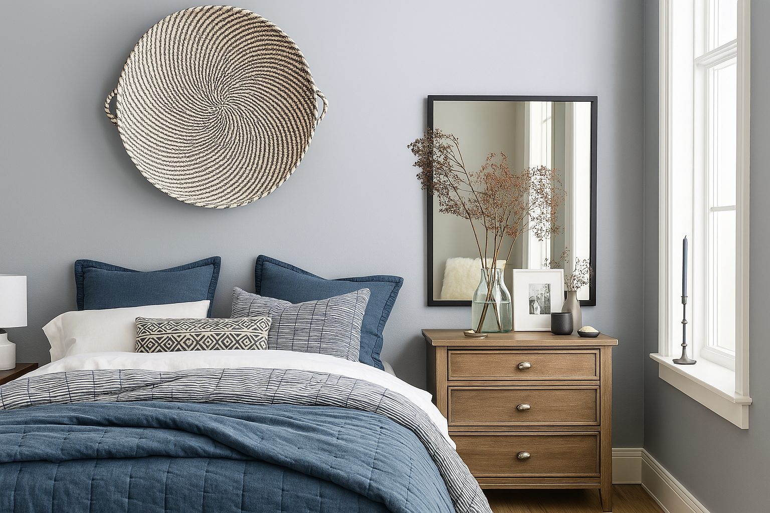
Choosing the right paint color can be a challenging task, especially when you want something that complements your space effortlessly. Meet SW 6234 Uncertain Gray by Sherwin Williams, a shade that brings just the right amount of softness and sophistication to any room. It’s a color that whispers elegance and calmness, making it an ideal choice for those who appreciate subtlety and a refined aesthetic.
Uncertain Gray is a hue that walks the line between gray and greige, offering a balanced and pleasing background for your interiors. It’s neither too warm nor too cool, which means it can adapt beautifully to different lighting conditions, presenting a lovely neutrality throughout the day.
This makes it perfect for spaces where you want a serene setting, whether it’s your living room, bedroom, or even a cozy reading nook.
As you consider Uncertain Gray, think about the mood you want to set. It provides a clean slate for furniture and decor, allowing for flexibility in design choices.
Whether you’re aiming for a modern look with sharp lines and minimalist furniture or a more traditional design with rich textures, this color can support and enhance your vision.
Uncertain Gray invites a sense of calm and balance into your home, a perfect backdrop for your daily life.
via hackrea.net
What Color Is Uncertain Gray SW 6234 by Sherwin Williams?
Table of Contents
Uncertain Gray SW 6234 by Sherwin Williams is a versatile and subtle gray that contains hints of both warm and cool undertones. This makes it adaptable to various lighting conditions and spaces. In daylight, it can reflect more of a cooler tone, while under warmer light, it can acquire a soft and inviting warmth. This chameleon-like nature makes it ideal for many interior styles.
In modern and minimalist spaces, Uncertain Gray complements clean lines and simple forms, allowing furniture and decorative elements to shine. In traditional or transitional settings, it serves as a gentle backdrop that highlights intricate moldings and classic furnishings.
This particular shade pairs beautifully with natural materials like wood, including both deep, rich tones and lighter, washed finishes. Metal accents, such as brushed nickel or matte black hardware, enhance its contemporary edge. Textures such as soft linen, wool, or velvet add depth, whereas using glass or ceramics can create a sense of elegance and sophistication.
Uncertain Gray SW 6234 works well in spaces looking for balance and understated charm. It harmonizes effortlessly, creating a welcoming atmosphere that’s both soothing and stylish, making it a popular choice for living rooms, bedrooms, and even kitchens.
housekeepingbay.com
Is Uncertain Gray SW 6234 by Sherwin Williams Warm or Cool color?
Uncertain Gray SW 6234, by Sherwin Williams, offers a versatile and subtle choice for any room. The color sits comfortably between light gray and beige, resulting in a shade that feels both warm and cool depending on surrounding light and decor. In homes, Uncertain Gray acts like a neutral backdrop, allowing other decorative elements to stand out.
Its soft tone harmonizes easily with various styles, making it suitable for modern and traditional settings. In rooms with plenty of natural light, this gray can appear brighter and airier, adding a sense of openness. In dimly lit spaces, it takes on a cozier feel, making rooms inviting and comfortable.
Furniture pieces in bold colors or dark wood finishes complement the gentle hue, creating a balanced effect. Uncertain Gray’s adaptability helps homeowners effortlessly create spaces that feel both calm and sophisticated, making it a popular choice for living rooms and bedrooms alike.
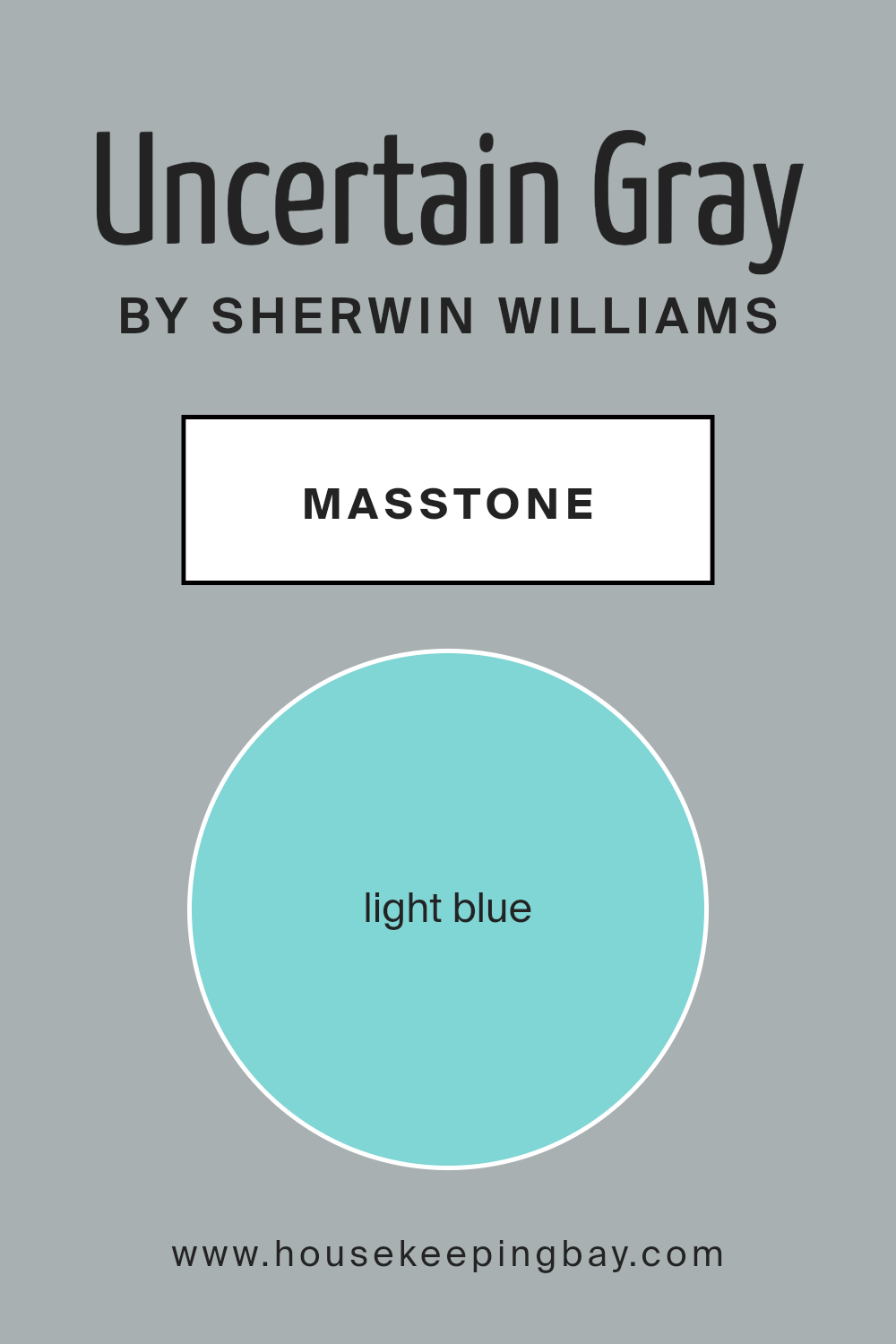
What is the Masstone of the Uncertain Gray SW 6234 by Sherwin Williams?
Uncertain Gray SW 6234 by Sherwin Williams has an interesting masstone. It leans towards a light blue, specifically the shade #80D5D5. This subtle blue influence brings a calming effect to spaces, making it perfect for creating a peaceful atmosphere in a home. The inclusion of blue in the masstone helps soften the gray, adding a gentle, airy feel to any room.
In living areas or bedrooms, this color can contribute to a restful, serene environment. It’s versatile enough to work with various design styles, from modern to traditional. When paired with other colors, Uncertain Gray harmonizes well with whites, soft pinks, or muted greens, allowing for easy incorporation into existing color schemes.
The light blue undertone helps rooms feel more open and refreshing, ideal for spaces that may not receive ample natural light. With Uncertain Gray, homes feel more inviting and relaxing, setting a soothing backdrop wherever used.
housekeepingbay.com
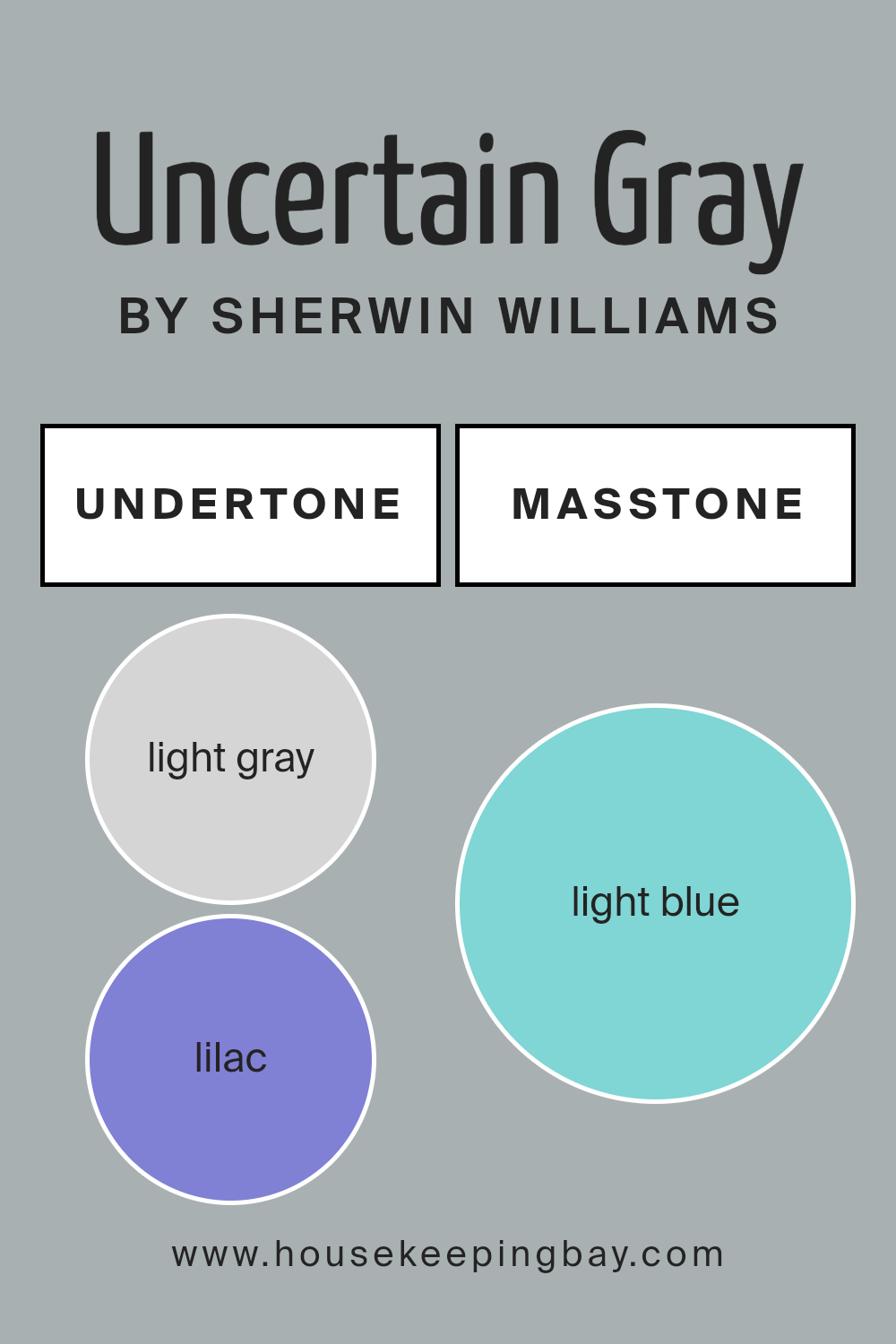
Undertones of Uncertain Gray SW 6234 by Sherwin Williams
Uncertain Gray SW 6234 by Sherwin Williams offers a unique color experience, shaped by its undertones. Undertones are subtle hints of color that influence how we perceive the main shade. For Uncertain Gray, these undertones include light gray, lilac, mint, light purple, pale yellow, gray, pale pink, turquoise, blue, light turquoise, and dark turquoise.
These undertones affect how we see the color by adding depth and variety. In some light, Uncertain Gray may appear cooler or warmer, depending on the mix of undertones present.
For instance, lilac and light purple undertones could introduce a soft, calming feeling, while mint and pale yellow add a fresh touch. The gray and turquoise tones contribute to a balanced, sophisticated look.
On interior walls, Uncertain Gray can shift in appearance based on lighting and surrounding colors. In natural light, the pale grays and lilac might become more pronounced, creating a serene environment. Artificial light may highlight the mint, blue, or turquoise undertones, adding vibrancy to the room.
Therefore, Uncertain Gray can suit different moods and styles, making it a flexible choice for various spaces. Whether in a bedroom or living room, this shade adapts, offering a versatile background that complements diverse decor.
housekeepingbay.com
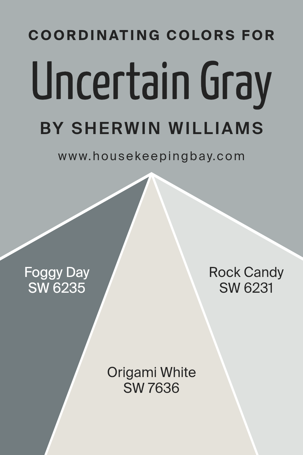
Coordinating Colors of Uncertain Gray SW 6234 by Sherwin Williams
Coordinating colors are those that pair well with a primary color to create a harmonious and pleasing palette. They typically share similar tones or complementary shades, helping to create a balanced and unified look in a space. When working with Uncertain Gray (SW 6234) from Sherwin Williams, it’s essential to choose coordinating colors that enhance its subtle, calming quality without overpowering it.
Foggy Day (SW 6235) is a perfect partner for Uncertain Gray. It brings a touch of depth with its soft blue undertone, adding a gentle contrast. Origami White (SW 7636) serves as a versatile choice, offering a clean, light backdrop that brightens any room while maintaining the soft sophistication of the gray.
Lastly, Rock Candy (SW 6231) is a delicate, cool white that carries a hint of blue, seamlessly connecting with Uncertain Gray to ensure a cohesive look. Together, these colors create a serene, inviting environment, perfectly suited for any home.
You can see recommended paint colors below:
housekeepingbay.com
How Does Lighting Affect Uncertain Gray SW 6234 by Sherwin Williams?
Lighting plays a crucial role in how we perceive colors. It can change the appearance of paint colors, making them look different under various conditions. Uncertain Gray SW 6234 by Sherwin Williams is a versatile gray that shifts based on lighting.
In natural light, Uncertain Gray reflects the surroundings more accurately. Rooms facing north receive less direct sunlight, making light cooler and softer. In these spaces, Uncertain Gray might appear more bluish or cooler, which could make the room feel calm but slightly dim.
South-facing rooms receive plenty of sunlight for most of the day. In these rooms, Uncertain Gray can take on a warmer tone as sunlight tends to have a yellowish tint. This warmth can enhance the coziness of the space but might make the gray appear less crisp.
East-facing rooms get direct sunlight in the morning. In the early hours, the light is warm, giving Uncertain Gray a slightly warmer hue. As the day progresses and sunlight fades away, the color can appear more neutral or slightly cooler.
West-facing rooms catch sunlight in the afternoon and evening. During these times, the light is warm and intense, potentially causing Uncertain Gray to look warmer and more vibrant. Earlier in the day, the color might seem more subdued and neutral.
Under artificial lighting, colors can change significantly based on the type of light bulbs used. Incandescent bulbs emit a warm, yellow light, which can make Uncertain Gray seem warmer.
Fluorescent lighting typically offers cooler tones, which can introduce a bluer tint to the gray. In rooms with LED lighting, depending on whether the LEDs give off a warm or cool light, the perception of Uncertain Gray will alter accordingly.
Understanding how light affects Uncertain Gray helps in choosing the right location and bulbs to achieve the desired effect in your home.
housekeepingbay.com
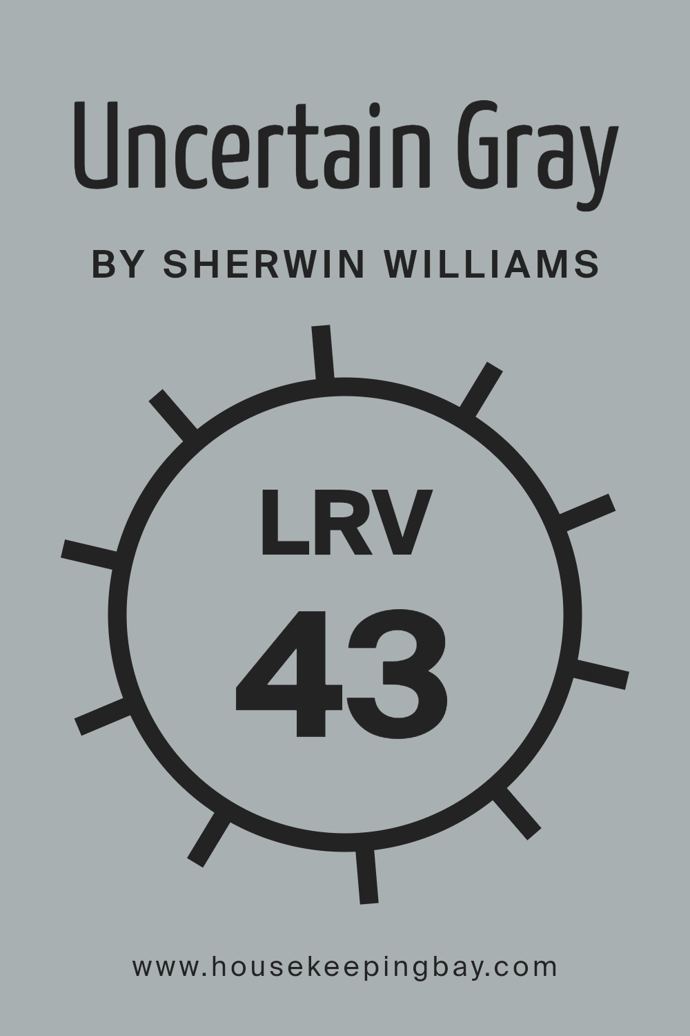
What is the LRV of Uncertain Gray SW 6234 by Sherwin Williams?
LRV stands for Light Reflectance Value. It’s a measure of how much light a color reflects compared to how much it absorbs. The scale runs from zero, which means the color absorbs all light (pure black), to 100, where the color reflects all light (pure white). With an LRV of 42.726, Uncertain Gray by Sherwin Williams falls in the mid-range.
This means it is neither too light nor too dark. Colors with such LRVs are often versatile because they can reflect some light to keep rooms feeling open, yet provide enough depth to avoid feeling washed out.
For Uncertain Gray, an LRV of 42.726 means it will appear balanced in most lighting conditions. In a room with plenty of natural light, it may look softer and slightly lighter, adding a balanced touch without overwhelming the space. In a room with less natural light, the color could appear a bit darker and might show more of its underlying tones.
This particular LRV allows Uncertain Gray to serve as an excellent backdrop, providing a subtle depth and leaving room for other colors and furnishings to stand out without clashing. It’s a flexible choice for those who want a neutral that isn’t too stark or too dull.
housekeepingbay.com
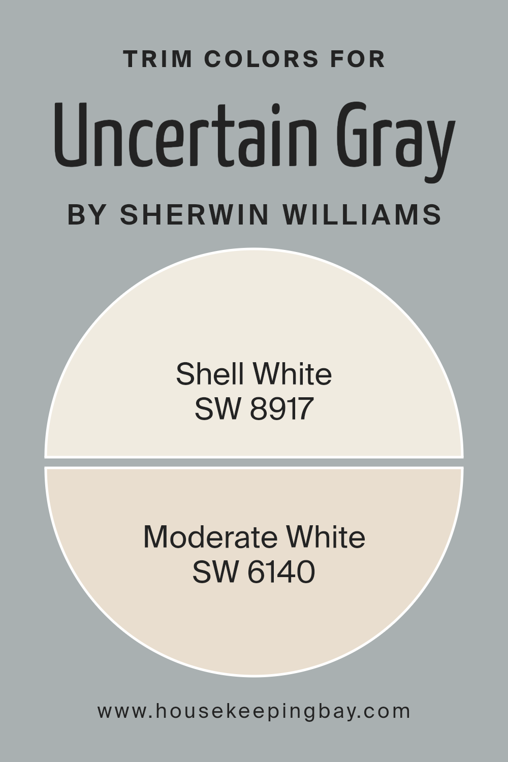
What are the Trim colors of Uncertain Gray SW 6234 by Sherwin Williams?
Trim colors refer to the paint colors used for the moldings, baseboards, window frames, and other architectural accents in a room. These colors play a crucial role in enhancing the overall appearance of any space by providing contrast, depth, and visual interest.
Using the right trim color with Uncertain Gray SW 6234 by Sherwin Williams can highlight its cool and calming qualities. Uncertain Gray, a beautiful medium gray with subtle blue undertones, benefits from a complementary trim color to make it stand out while maintaining harmony within the room.
Trim colors like SW 8917 Shell White and SW 6140 Moderate White are excellent choices because they provide a soft, clean contrast that adds elegance without overwhelming the senses.
Shell White SW 8917 is a warm, soft white with delicate hints of cream. It adds brightness and a subtle warmth, making the Uncertain Gray feel inviting and pleasantly balanced.
On the other hand, Moderate White SW 6140 has a slightly deeper tone with neutral undertones that offer a cozy and welcoming feel. It pairs nicely with Uncertain Gray by adding depth and refinement to the overall palette. Using these trim colors with Uncertain Gray creates a sophisticated look while emphasizing the beauty of the walls and detailed elements around the room.
You can see recommended paint colors below:
housekeepingbay.com
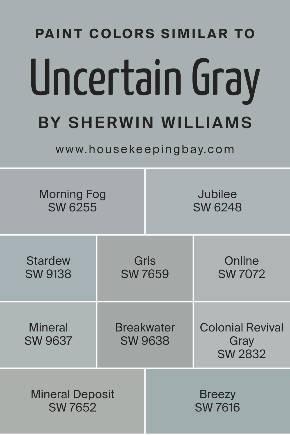
Colors Similar to Uncertain Gray SW 6234 by Sherwin Williams
Similar colors play a crucial role in creating harmonious interiors that are pleasing to the eye. The subtle variations in shades can make a space feel cohesive and inviting. When working with a color like Uncertain Gray from Sherwin Williams, finding colors with similar undertones can enhance the overall aesthetic.
Colors like SW 6255 Morning Fog bring a soft, misty blue that feels serene and calming. SW 6248 Jubilee offers a touch of warmth with its muted gray-blue tone, providing a comforting backdrop. Stardew, SW 9138, adds a gentle blue-green hue that feels fresh yet balanced. SW 7659 Gris is a deeper gray that adds depth and sophistication to any room
Online, SW 7072, carries a modern, light gray tone that complements contemporary spaces beautifully. Mineral, SW 9637, has a muted grayness with a hint of blue, perfect for a subtle contrast. Breakwater, SW 9638, takes on a slightly deeper tone, adding richness without overwhelming the senses.
Colonial Revival Gray, SW 2832, brings a sense of history with its classic gray hue, lending timeless elegance to any design.
Mineral Deposit, SW 7652, combines gray with a hint of green for a natural, earthy feel, while Breezy, SW 7616, invokes a feeling of airiness with its delicate blue-gray shade. Together, these colors work in harmony, offering a spectrum of subtle differences that allow for flexibility in design while maintaining a unified look.
You can see recommended paint colors below:
- SW 6255 Morning Fog
- SW 6248 Jubilee
- SW 9138 Stardew
- SW 7659 Gris
- SW 7072 Online
- SW 9637 Mineral
- SW 9638 Breakwater
- SW 2832 Colonial Revival Gray
- SW 7652 Mineral Deposit
- SW 7616 Breezy
housekeepingbay.com
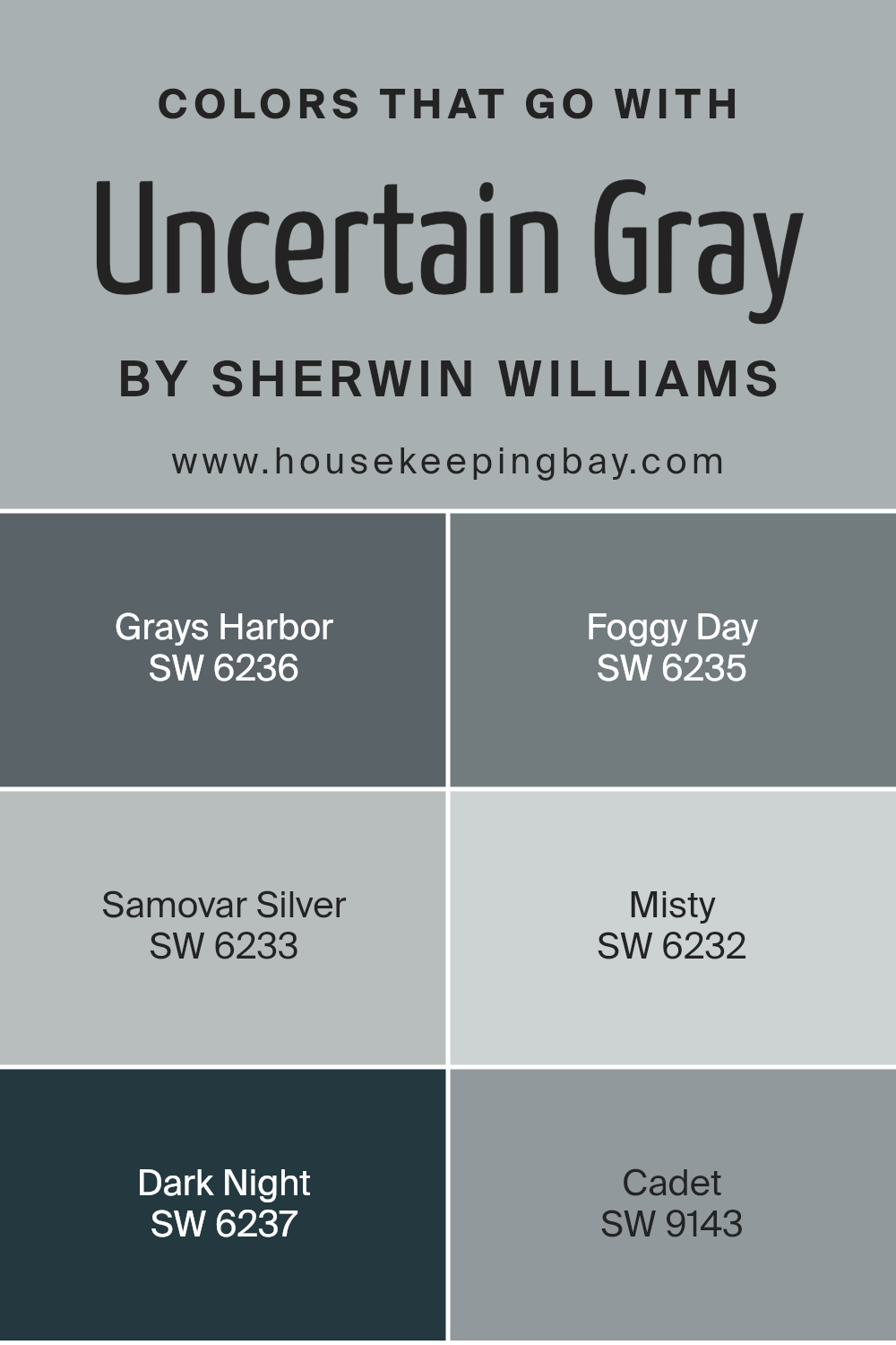
Colors that Go With Uncertain Gray SW 6234 by Sherwin Williams
Colors that complement Uncertain Gray SW 6234 by Sherwin Williams create a harmonious and balanced atmosphere. By pairing it with coordinating hues, you add depth and texture to a room, turning it into a cohesive space. For example, SW 6236 – Grays Harbor is a deep, mysterious blue that adds a sophisticated contrast to Uncertain Gray.
This pairing offers a calming backdrop that is both rich and inviting. SW 6235 – Foggy Day is a soft gray with a slightly cooler undertone, perfect for creating a serene and gentle atmosphere without losing the room’s brightness.
Samovar Silver SW 6233 is a light and silvery gray that gives a crisp, clean impression, while Misty SW 6232 offers a pale, ethereal blue-gray, providing an airy and light feeling. For a bolder touch, Dark Night SW 6237, a dramatic navy, can bring depth and intrigue to your space, offering an anchor for the lighter shades.
SW 9143 – Cadet, a muted blue-gray, blends seamlessly with Uncertain Gray, providing a subtle touch of color that enhances the room’s overall style. These hues carefully combined with Uncertain Gray create a balanced and visually appealing environment.
You can see recommended paint colors below:
- SW 6236 Grays Harbor
- SW 6235 Foggy Day
- SW 6233 Samovar Silver
- SW 6232 Misty
- SW 6237 Dark Night
- SW 9143 Cadet
housekeepingbay.com
How to Use Uncertain Gray SW 6234 by Sherwin Williams In Your Home?
Uncertain Gray SW 6234 by Sherwin Williams is a versatile and subtle paint color. It sits between gray and beige, also known as “greige.” Many people find this color soothing and easy on the eyes, making it ideal for almost any room in a house. In living rooms, Uncertain Gray creates a calm and welcoming atmosphere.
It pairs nicely with both modern and traditional furniture. In bedrooms, the gentle hue helps create a peaceful space for rest. If used in a kitchen, it works well with stainless steel appliances and white cabinets, giving a clean and fresh look.
Additionally, this color is an excellent choice for bathrooms, providing a spa-like setting when combined with white tiles or fixtures. For those who want a cohesive look throughout their home, Uncertain Gray can serve as a unifying wall color, bringing different elements together without overpowering them. With its neutrality, it allows you to add colorful accents or artwork easily.
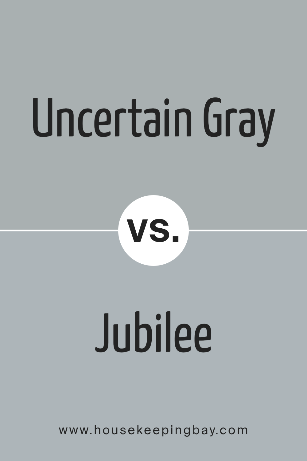
Uncertain Gray SW 6234 by Sherwin Williams vs Jubilee SW 6248 by Sherwin Williams
Uncertain Gray SW 6234 and Jubilee SW 6248 by Sherwin Williams are two gray shades that offer unique characteristics. Uncertain Gray is a versatile, soft gray with subtle undertones that can appear slightly warm depending on the lighting. It provides a calm, neutral backdrop, making it suitable for living rooms or bedrooms.
Jubilee, in contrast, has a cooler edge with noticeable blue undertones. This gives it a slightly more modern and contemporary feel, ideal for spaces like bathrooms or kitchens where a fresher vibe is desired. Jubilee can bring a gentle hint of color without overwhelming the room.
Both shades work well in various settings, but their undertones set them apart. Uncertain Gray leans towards a cozy ambiance, while Jubilee lends a cooler, airy atmosphere. Consider the natural light in your space to see which color aligns with your desired mood and complements your existing decor.
You can see recommended paint color below:
- SW 6248 Jubilee
housekeepingbay.com
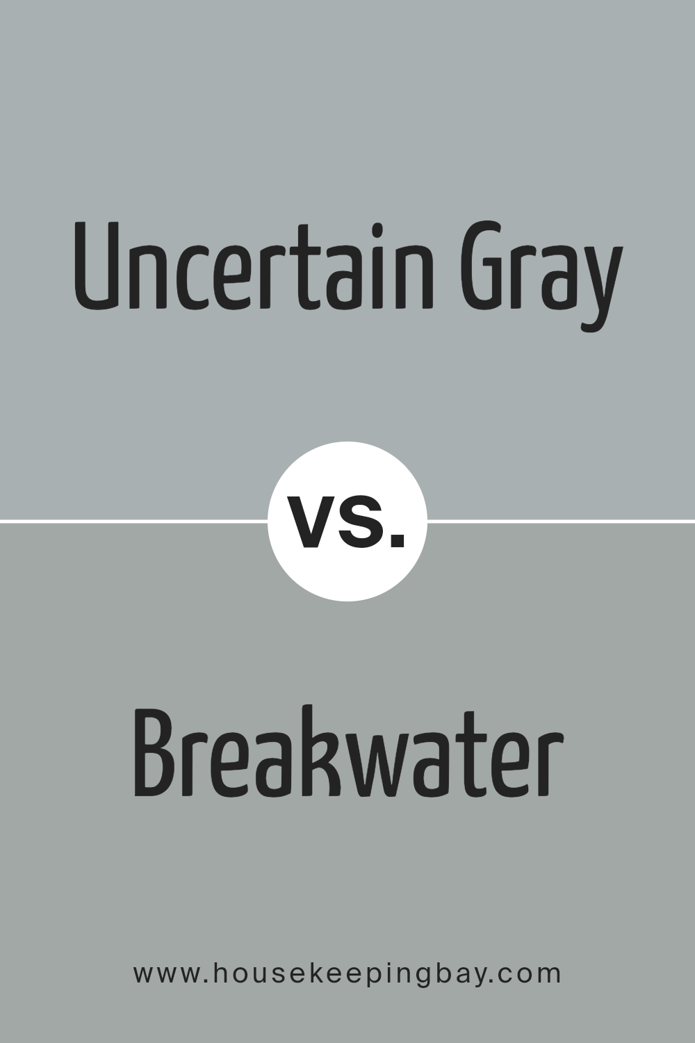
Uncertain Gray SW 6234 by Sherwin Williams vs Breakwater SW 9638 by Sherwin Williams
Uncertain Gray SW 6234 and Breakwater SW 9638, both by Sherwin Williams, share similarities yet hold unique characteristics. Uncertain Gray stands as a balanced neutral, combining gray with subtle blue undertones, offering a calm and adaptable presence. It fits well in various spaces without overwhelming, creating a sense of gentle sophistication.
Breakwater SW 9638, by comparison, introduces a slightly warmer feel. It blends gray with a hint of green, giving it a softer, more earthy vibe. This slight warmth can make a room feel cozier and more inviting, while still maintaining a modern edge.
While both colors are versatile, Uncertain Gray leans cooler and more refined, making it suitable for minimalist or contemporary settings. Breakwater, with its warmth and touch of nature, might suit spaces looking for a bit more comfort and organic appeal. Both can adapt well in different settings, adding subtle depth without dominating the atmosphere.
You can see recommended paint color below:
- SW 9638 Breakwater
housekeepingbay.com
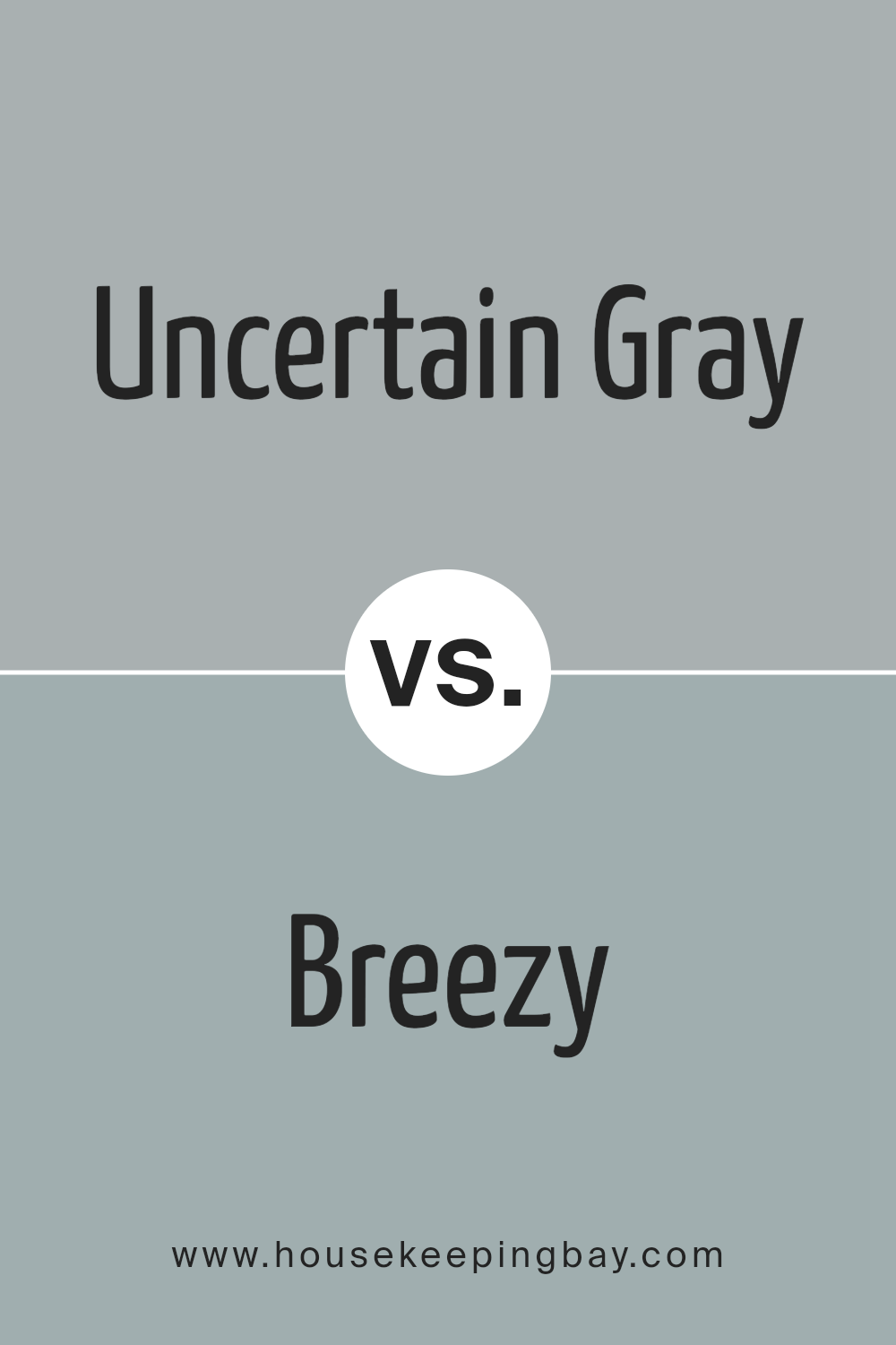
Uncertain Gray SW 6234 by Sherwin Williams vs Breezy SW 7616 by Sherwin Williams
Uncertain Gray SW 6234 by Sherwin Williams offers a soft, neutral tone with cool undertones. It appears as a balanced mix of gray, creating a calm and understated look. Its versatility makes it well-suited for various spaces and complements a wide range of decor styles. This color fosters a sense of quiet sophistication, ideal for living rooms or bedrooms seeking a subtle backdrop.
In contrast, Breezy SW 7616 by Sherwin Williams introduces a more vibrant feel with its light blue hue. This color brings an airy, fresh atmosphere to any room, evoking a sense of openness and energy. Breezy engages well with natural light, making spaces feel larger and more inviting.
It pairs beautifully with white or light wood accents, setting a serene yet lively vibe, perfectly suited for bathrooms, kitchens, or other spaces needing a splash of cheerfulness and brightness.
You can see recommended paint color below:
housekeepingbay.com
Uncertain Gray SW 6234 by Sherwin Williams vs Mineral Deposit SW 7652 by Sherwin Williams
Uncertain Gray SW 6234 and Mineral Deposit SW 7652, both by Sherwin Williams, offer different yet subtle vibes. Uncertain Gray is a medium-toned gray with a hint of warmth. It feels cozy and adaptable, working well in various settings. Its slight warmth makes it a versatile choice, creating a calm and inviting atmosphere. It often pairs nicely with whites and other muted colors, adding depth without being overpowering.
Mineral Deposit SW 7652, in contrast, leans cooler. It is a soft gray that can carry a slight blue undertone, lending a refreshing airy feel to spaces. This cool tone makes it excellent for modern or minimalist designs. It can brighten a room by reflecting more light, often complementing whites and darker shades beautifully.
Both colors provide neutral backgrounds, but Uncertain Gray adds warmth, whereas Mineral Deposit introduces a cool, airy touch. Their subtle differences let them shine in unique ways, depending on desired ambiance.
You can see recommended paint color below:
- SW 7652 Mineral Deposit

housekeepingbay.com
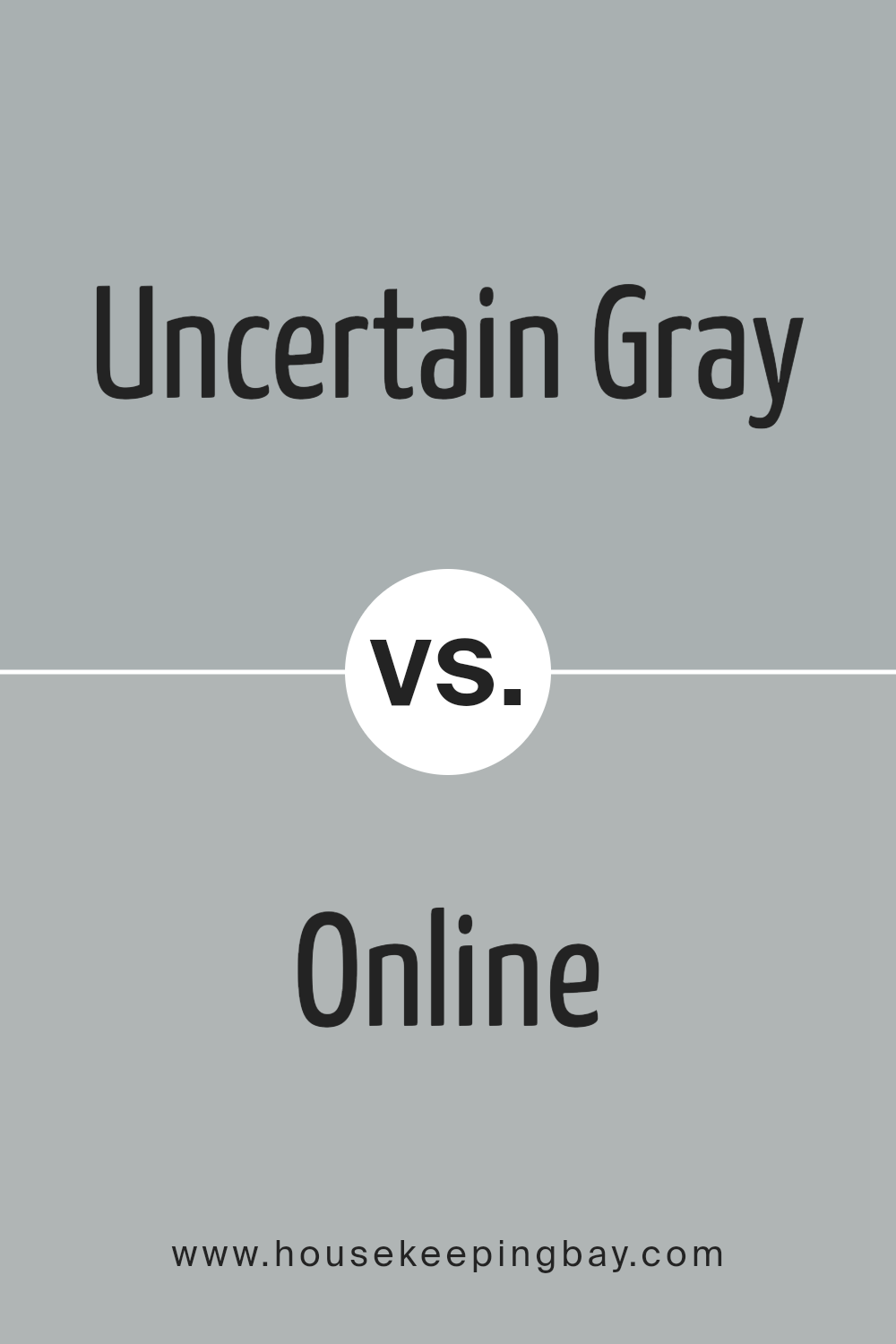
Uncertain Gray SW 6234 by Sherwin Williams vs Online SW 7072 by Sherwin Williams
Uncertain Gray (SW 6234) and Online (SW 7072) by Sherwin Williams are two different shades of gray that can change the mood of a room. Uncertain Gray is a warm gray, almost with a hint of beige, which makes spaces feel cozy and inviting. It’s a versatile shade that blends well with earth tones and soft colors.
Online, in contrast, is a cooler gray with a slight blue undertone, giving it a crisp, modern look. This color works well in spaces with a lot of natural light, as it enhances the fresh, airy feel.
Together, these hues can create interesting contrasts in a home: Uncertain Gray adding warmth and comfort, and Online contributing a sense of cleanliness and modernity.
Choosing between them often depends on the room’s lighting and the overall vibe you want—the cozy warmth of Uncertain Gray or the sleek coolness of Online.
You can see recommended paint color below:
housekeepingbay.com
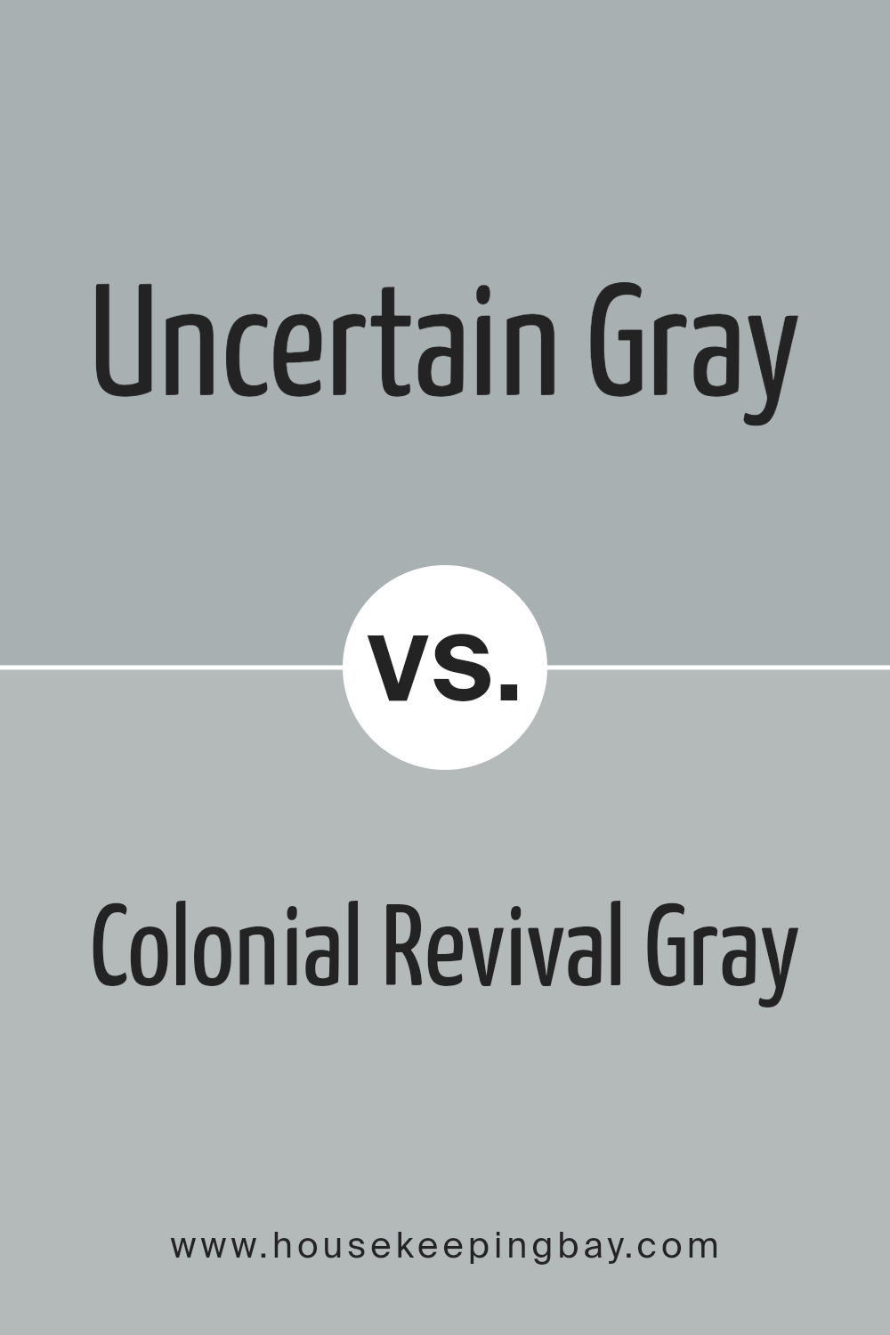
Uncertain Gray SW 6234 by Sherwin Williams vs Colonial Revival Gray SW 2832 by Sherwin Williams
Uncertain Gray (SW 6234) and Colonial Revival Gray (SW 2832) by Sherwin Williams each bring a unique feel to a space. Uncertain Gray is a soft, muted gray with blue undertones, offering a cool, calming effect that works well in contemporary settings. It’s versatile, playing nicely with both warm and cool colors, making it an excellent backdrop for modern decor.
In contrast, Colonial Revival Gray leans towards a warm, traditional gray with hints of green. This color embraces a historical vibe, offering more depth and an inviting warmth. It’s perfect for those seeking a classic look, often paired with richer, deeper colors to highlight its timeless appeal.
Both grays have their charm: Uncertain Gray is more subtle and modern, while Colonial Revival Gray adds a touch of classic elegance. Choosing between them depends on the atmosphere you want to create in your space—whether it’s a fresh, contemporary appeal or a cozy, timeless one.
You can see recommended paint color below:
housekeepingbay.com
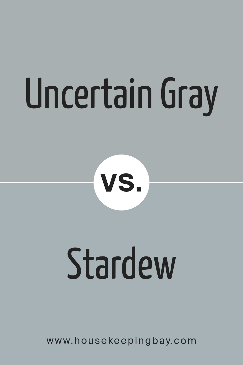
Uncertain Gray SW 6234 by Sherwin Williams vs Stardew SW 9138 by Sherwin Williams
Uncertain Gray SW 6234 by Sherwin Williams is a cool, muted gray that exudes calmness and sophistication. It is a versatile color that fits well in modern and contemporary spaces, providing a neutral backdrop that allows other elements in the room to stand out. Its balanced mix of undertones makes it adaptable, working well with both warm and cool accents.
Stardew SW 9138 by Sherwin Williams, a cool blue-gray, carries a gentle hint of blue, adding a touch of warmth to a space without overpowering it. It evokes a slightly more relaxed and inviting feel compared to Uncertain Gray. This makes Stardew a wonderful choice for areas where one seeks to instill a sense of coziness or serenity.
Both colors offer flexibility, yet Uncertain Gray feels more neutral, while Stardew introduces a bit of color, creating subtle distinction in interior settings.
You can see recommended paint color below:
housekeepingbay.com
Uncertain Gray SW 6234 by Sherwin Williams vs Mineral SW 9637 by Sherwin Williams
Uncertain Gray SW 6234 and Mineral SW 9637, both by Sherwin Williams, offer different moods in home decor. Uncertain Gray SW 6234 is a versatile medium gray that creates a calm and neutral backdrop. It works well with different styles, adding a touch of sophistication. Because of its balanced tone, it suits living rooms, bedrooms, or offices, providing a subtle yet soothing environment.
Mineral SW 9637, while also a gray, has a warmer undertone. This gives it a cozier and more inviting feel. Mineral is perfect for spaces where you want warmth without straying far from a neutral palette. It brings depth to any room, making it a great choice for dining areas or entryways, where a welcoming atmosphere is desired.
While Uncertain Gray presents a more traditional gray, Mineral adds a hint of warmth, creating distinct yet complementary styles for home interiors.
You can see recommended paint color below:
housekeepingbay.com
Uncertain Gray SW 6234 by Sherwin Williams vs Gris SW 7659 by Sherwin Williams
Uncertain Gray SW 6234 by Sherwin Williams presents a gentle mix of grey with hints of blue, providing a soothing, balanced feel. This color creates a calm, soft atmosphere, often making spaces feel serene and restful. It’s a versatile color that works well in both modern and traditional settings, blending easily with other shades.
Gris SW 7659 by Sherwin Williams, however, leans towards a purer grey with a slightly warm undertone. It offers a more straightforward grey appearance, bringing a solid, anchoring presence to a room. Gris tends to provide a more neutral backdrop, allowing other colors and decorative elements in the room to stand out.
While both colors offer neutral grey tones, Uncertain Gray gives off a cooler vibe with its blue tint, adding a touch of airiness. Gris delivers a more classic grey experience, perfect for those seeking a true grey look without additional color nuances.
You can see recommended paint color below:
- SW 7659 Gris
housekeepingbay.com
Uncertain Gray SW 6234 by Sherwin Williams vs Morning Fog SW 6255 by Sherwin Williams
Uncertain Gray SW 6234 and Morning Fog SW 6255 are two serene colors from Sherwin Williams, but each has its own character. Uncertain Gray is a soft, muted gray with a slightly warm undertone. It offers a sense of calm and works well in spaces where you want a neutral backdrop that feels cozy. It pairs well with natural elements like wood and earth tones.
Morning Fog, on the other hand, has a slightly cooler tone. It carries a hint of blue, making it feel crisp and sophisticated. This makes it a good choice for areas where you want a refreshing atmosphere, like a bathroom or kitchen.
Morning Fog can complement white accents and metal finishes, adding a modern touch.
Both colors are versatile, but the choice depends on whether you prefer the slight warmth of Uncertain Gray or the cooler touch of Morning Fog.
You can see recommended paint color below:
housekeepingbay.com
Conclusion
Through my exploration of this hue, I found it remarkable in how it balances both modern and classic aesthetics. The gentle neutrality of Uncertain Gray provides a backdrop that feels calm and adaptable, making it suitable for various spaces and moods.
I noticed how this shade works harmoniously with different textures and materials, whether used in a living room, bedroom, or even a kitchen. Its subtle undertones allow it to change character under different lighting conditions, adding depth and interest without overwhelming the senses.
In my experience, Uncertain Gray serves as an excellent canvas for personal expression, allowing other design elements to shine while maintaining its own unique charm. This color encourages creativity in combining brighter accents or more muted tones, depending on the ambiance I wish to create.
Overall, Uncertain Gray has proven itself to be a dependable choice for those seeking a timeless yet contemporary look. Its ability to blend seamlessly into any setting while offering a sense of calm and understated elegance makes it a top pick for anyone looking to refresh their home.
housekeepingbay.com
Ever wished paint sampling was as easy as sticking a sticker? Guess what? Now it is! Discover Samplize's unique Peel & Stick samples. Get started now and say goodbye to the old messy way!
Get paint samples


