16 Best Paint Colors to Tone Down Orange Wood
Make Your Orange Wood Work for You—Not Against You
You might not hate your floors or cabinets — but sometimes, that orange glow makes everything feel a little…off. I’ve walked into so many homes where the wood is beautiful on its own, but once the wrong wall color is added, it starts to fight with everything else.
I get it. Replacing all that wood isn’t always realistic — whether it’s oak floors, dated trim, or older cabinets, paint is your easiest fix.
In this article, I’ll show you 16 soft, calm shades that actually work with orange-toned wood instead of against it. Some warm, some cool, but all tried-and-true in real homes.
Let’s make your wood feel intentional — not like a leftover from the ’90s.
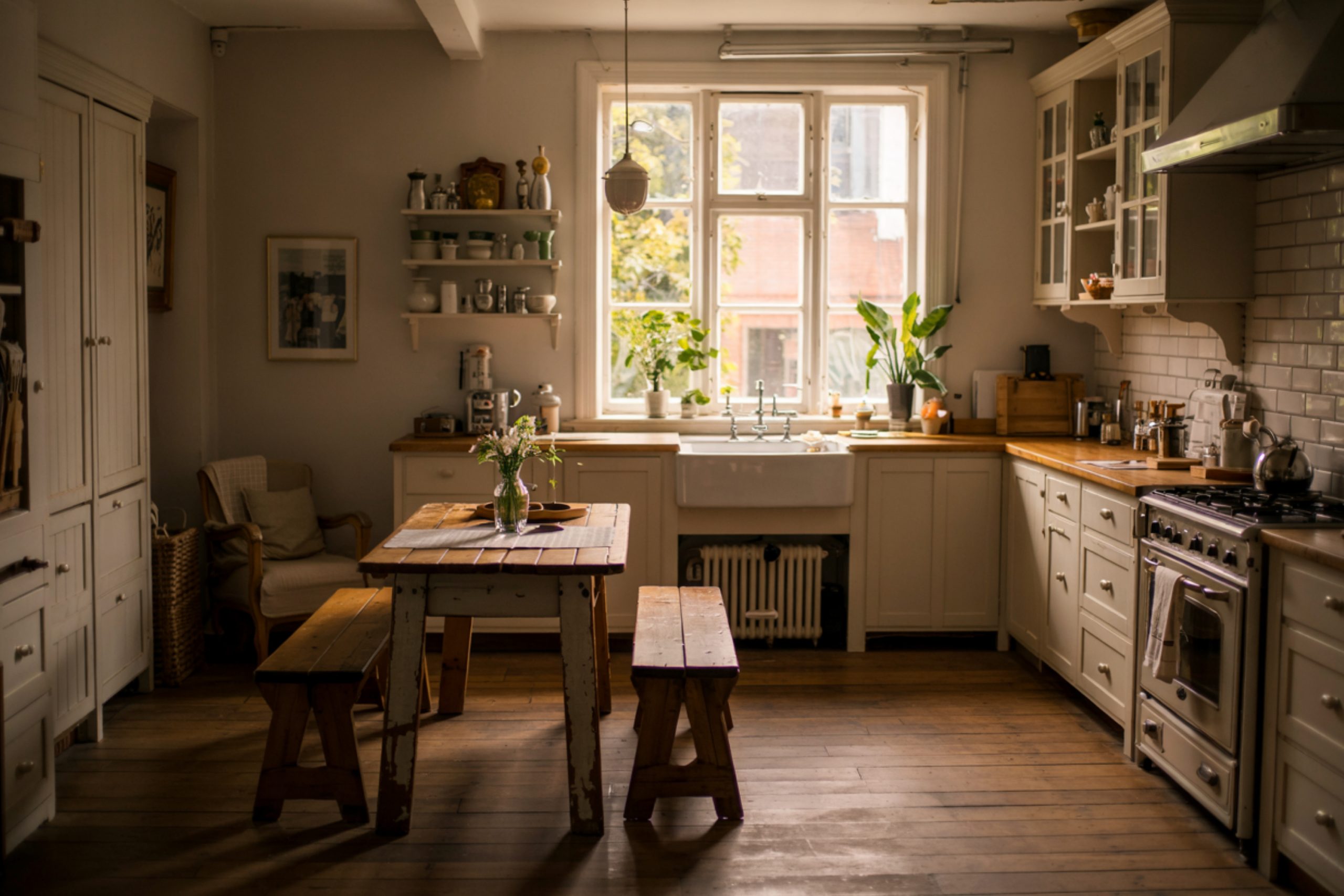
via housekeepingbay.com
Why Orange Wood Can Be So Tricky
Table of Contents
Orange-toned wood — like oak, cherry, or maple with that golden finish — has a strong personality. And it’s usually the kind that takes over the whole room if you’re not careful.
I’ve seen it in kitchens, living rooms, even hallways: the cabinets are glowing, the trim feels loud, and the floors are pulling too much warmth.
Add the wrong paint — especially a stark white or a yellow-based cream — and the wood suddenly looks even more orange.
What we want is balance. Not to erase the wood, but to soften it. Let it feel like part of the design, not something you’re working around.
Shea McGee once said,
“Balance is the key. When something feels too warm, I cool it down. When it’s too cold, I warm it up.”
And that’s exactly the trick here.
There’s also the practical side:
According to the National Association of Home Builders, over 54% of homes built before 2005 still have original wood features in kitchens and trim. That’s a lot of orange out there.
But don’t worry — you don’t need to sand or stain. We’re just going to shift the backdrop.
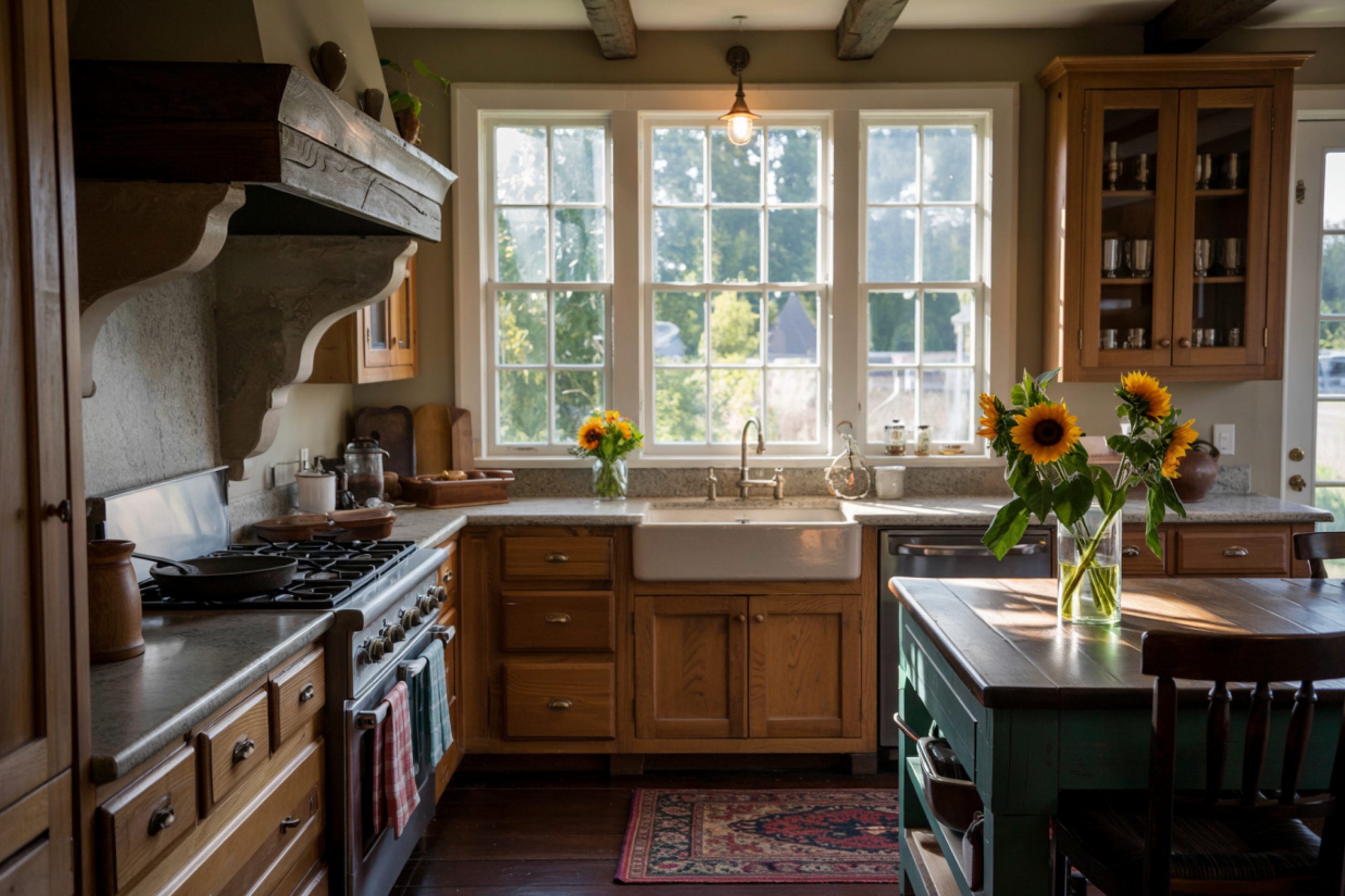
via housekeepingbay.com
How to Choose a Shade That Balances the Warmth
When you’re working with orange-toned wood, your paint color needs to calm things down, not compete.
Here’s what I always tell my clients:
✅ Look For:
- Soft neutrals with just enough warmth to blend
- Greige (a mix of gray and beige) — it works like magic
- Muted whites with creamy or gray undertones
- Anything that feels subtle and doesn’t shout
🚫 Avoid:
- Cool whites (they make the wood look even more orange)
- True yellows or gold-based creams
- Very dark colors — unless your room gets tons of light
My quick tip:
Always test a large swatch next to your floors, trim, or cabinets. Paint a poster board or use peel-and-stick samples (like from Samplize). Look at it during the day and at night. You’d be surprised how different it can feel.
Lighting matters. Natural light brings out more orange. Cool LED bulbs might flatten everything. A warm white LED usually shows colors more honestly.
Now that you know what to look for — let’s get to the fun part.
The 16 Best Colors to Try
These Shades Calm Things Down Without Making It Dull
When orange wood is the loudest thing in the room, the right paint color can settle everything. These are the shades I’ve seen work again and again in real homes — let’s group them by vibe.
🟤 Warm Neutrals That Work With the Grain
These colors feel cozy but never clash. They lean warm, but in a soft, natural way.
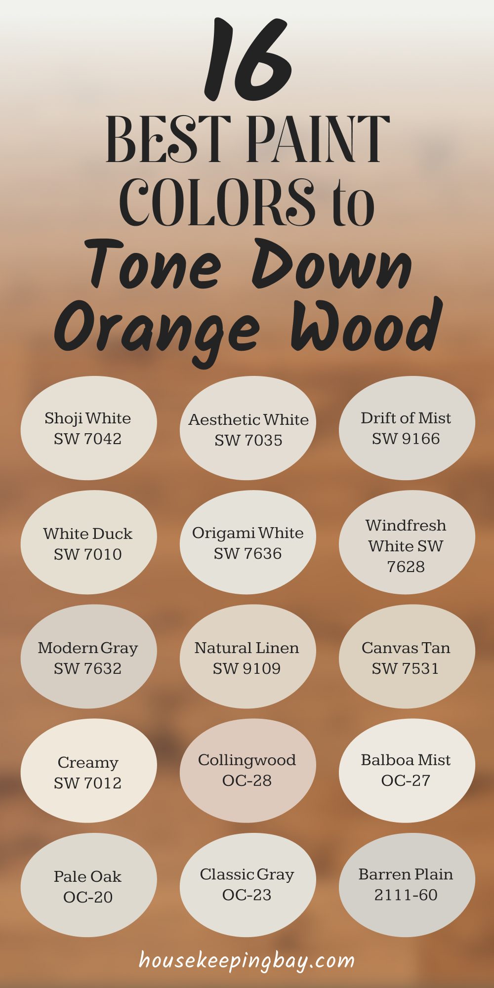
1. White Duck – SW 7010
A creamy neutral with a little gray in it. Looks amazing with honey oak and older maple.
2. Natural Linen – SW 9109
Light beige with warmth but no yellow. Very calm. Great for bedrooms or halls.
3. Canvas Tan – SW 7531
Classic and easy. Has a vintage softness that makes older wood feel charming.
4. Creamy – SW 7012
Not too yellow, not too bright. I love this for kitchens with oak cabinets.
5. Modern Gray – SW 7632
This one’s a greige. Slight warmth, very balanced. Makes orange floors settle down instantly.
via housekeepingbay.com
⚪ Soft Whites That Don’t Clash
These whites have a tiny bit of warmth or gray in them, which keeps things mellow.
6. Shoji White – SW 7042
A whisper of greige in a white base. Pairs beautifully with wood trim.
7. Aesthetic White – SW 7035
Very light beige-white, never stark. Perfect for open floor plans.
8. Drift of Mist – SW 9166
Calm, airy, just a touch of gray. Brightens without overwhelming.
9. Origami White – SW 7636
A clean look without the icy feel. Works with any wood tone.
10. Windfresh White – SW 7628
A hidden gem. Soft and pale with a cool touch — great if your wood feels too warm.
⚫ Cooler Grays and Greige That Add Balance
These help tone things down if you want more contrast but still want it to feel cozy.
11. Collingwood – OC-28 (Benjamin Moore)
A favorite. Greige that always reads neutral. Looks stunning next to orange floors.
12. Balboa Mist – OC-27
Softer than Collingwood, but same greige family. Elegant and quiet.
13. Pale Oak – OC-20
Light, warm greige. Feels airy but still grounding.
14. Classic Gray – OC-23
Cooler than Pale Oak, still soft. If your wood is very orange, this helps balance it.
15. Barren Plain – 2111-60
The coolest tone on this list — soft violet-gray. Great if you want contrast without going blue.
✳️ Bonus Pick:
16. Natural Choice – SW 7011 (if you’re open to one more)
Subtle beige with soft warmth. Looks especially good with older wood furniture and trim.
See the Difference in Real Homes
Let me tell you, nothing beats seeing how these colors actually look in a real room with orange-toned wood. Over the years, I’ve worked with so many clients who were convinced their floors or cabinets were a lost cause — until we got the paint right.
Example 1: Shoji White + Oak Cabinets
One client had golden oak cabinets in a small kitchen. They were thinking of painting them, but we tried Shoji White on the walls first. The result? The cabinets instantly looked softer, more intentional. It gave the room a modern, lived-in feel without a full renovation.
Example 2: Collingwood + Cherry Floors
Another home had reddish cherry floors that overwhelmed everything. We used Collingwood on the walls, and suddenly the red tones faded back. The space felt calmer, more grown-up.
They didn’t even realize how much the wrong paint had been making everything feel off.
Example 3: Creamy + Pine Trim
This one was a cozy family room with lots of light pine trim. The homeowner had tried bright white before and hated how harsh it felt. Creamy made it feel warm and cohesive — like it all belonged.
These small changes made the wood feel like a design choice instead of a leftover from another decade.
How to Pick the Right Color for Your Home
You’ve got the list — now let’s make sure you land on the one that actually works in your space.
Start with This:
1. Pick 3 favorites from the list
Choose based on what you’re drawn to and what makes sense for your lighting. If you’ve got tons of natural light, most of these will look lighter. If not, lean toward the warmer tones.
2. Order large samples
I always recommend Samplize — they send real paint swatches with peel-and-stick backing. You can also just buy a sample pot and brush it onto white poster board.
Don’t paint directly on the wall if you have strong colors underneath — it throws everything off.
3. Test in different light
Look at each sample in the morning, afternoon, and evening. Also near wood trim, floors, or cabinets. Some paints turn yellow or green depending on light. Some stay true all day.
4. Compare side-by-side
Seeing two or three colors next to each other helps you instantly see which one feels right. Trust your reaction — if something feels “off,” it probably is.
5. Think about the rest of your home
You don’t need every room to match, but having a flow in undertone really helps. If you’re using Pale Oak in the living room, Classic Gray or Balboa Mist might work nicely in an adjacent hallway.
Want a shortcut?
When in doubt, I always reach for:
- Collingwood if I need a safe greige
- Shoji White for a soft white that feels calm
- Natural Linen for something cozy but not boring
They’ve saved me more times than I can count.
via housekeepingbay.com
Before You Pick Up the Roller
If you’ve been staring at your orange-toned floors or cabinets thinking, “Something just doesn’t feel right,” — it’s probably the wall color.
You don’t have to rip anything out. You don’t have to fight the wood. The right neutral can shift the whole mood of your home.
I’ve seen it work over and over — a calm, soft backdrop makes even the boldest wood feel grounded.
Try a few of these shades. Take your time with samples. And trust that small changes really can make a big difference.
You already have beautiful elements in your home. You just need the right paint to let them shine — without the orange stealing the show.
via housekeepingbay.com
