Waterscape SW-6470 by Sherwin Williams
All you need to know about this beautiful paint color to use it correctly
There are so many paint colors on the market these days, that one may often find it rather complicated to pick the best shade that will be optimal for the home walls. This is why it is important for every homeowner to understand the difference in how paint colors work on the walls at least a bit.
And even if you prefer using more or less simple colors and shades for your interior paint projects (for example, such as Waterscape SW-7615 by Sherwin Williams), it is good to know more about them anyway. And if you decide to make use of this particular color, you will find this article very handy for yourself.
After you read it, you are going to learn what type of color the Waterscape paint is, what its undertones and coordinating colors are, and moreover, how this magnificent color reacts to different types of lighting in your home. In addition, we will tell you what rooms it is best to be used in, and what similar colors, as well as what trim colors, you can use.
society6 via VIstaCReate
Waterscape SW-6470 By Sherwin Williams. What Kind Of Color Is It?
When you see a paint color that you have never used before, it’s like meeting a new person. The very first thing you should do is to learn more about what color it is. If you have never used or even seen SW Waterscape color before, this is the right time to find out a bit more about it.
To begin with, we need to say that Sherwin Williams Waterscape is a perfect mint green paint color, as Encycolorpedia says. We would say that it is neither too childish nor too bright. Instead, it can be considered a perfect example of soothing paint color for your interior walls.
Those of you who are looking for a paint color that is tranquilizing and at the same time sophisticated, pay attention to Waterscape! It would be a great alternative. This paint color is cool-toned with slightly chilled green undertones.
This is why it will be making your space feel cool and calm at all times. A perfect option for those who live in areas with the hot climate or just seeking something cooling!
Also, if you are not a fan of pastel colors, you should take a closer look at this minty shade. We would definitely not classify it as pastel or something saturated! Rather, we would define this paint color as the one that is a perfect blend of both!
And now let’s dive deeper and see what undertones this delicate color hides under its surface, and also, how it would react to different types of light when applied to the walls.
housekeepingbay.com
Table of Contents
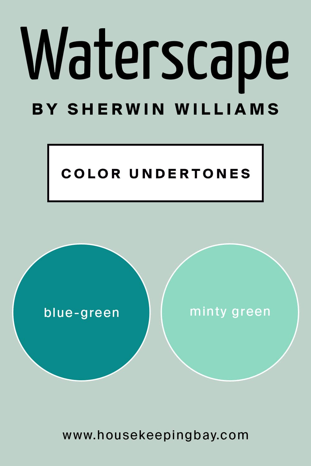
SW Waterscape Undertones
Being aware of the paint color undertones is very important! In fact, you need to learn about them even before you buy this paint. Like that, you will be able to tell in advance how exactly the particular color will look on your walls.
As for the Sherwin Williams Waterscape paint color, this minty green has rather prominent blue-green undertones. In fact, the main undertone is green, but depending on the lighting in your home and in each particular room, it may change. In this case, the paint color will read greener or may even show some noticeable bluish undertones.
This is why, before you buy a couple of cans of this magnificent paint color, we recommend you double-check what type of lighting will be in the room that you want to apply it in.
housekeepingbay.com
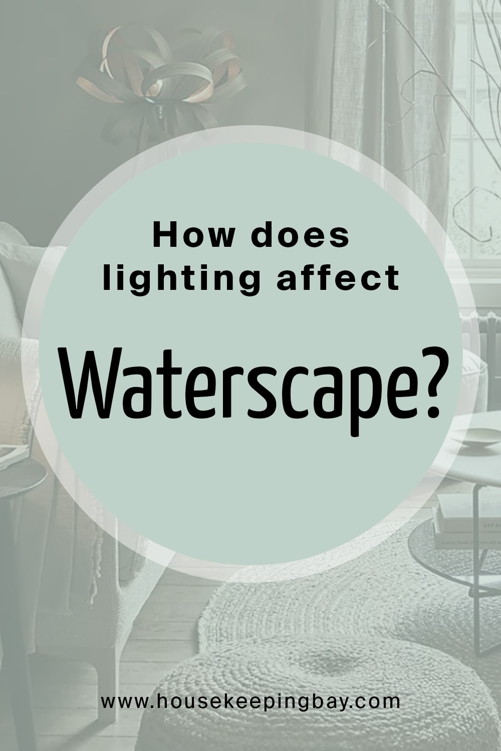
How Does Lighting Affect SW Waterscape Color?
Before you apply any paint color to your walls, you should check how it will react to different types of light. See, some colors remain almost without changes no matter how well (or how bad) they are lit. On the other hand, there are colors that react to light quite actively, being even able to transform quite significantly! So if you don’t want to find completely another color on your walls, we suggest you make sure that this nuance is considered in advance.
housekeepingbay.com
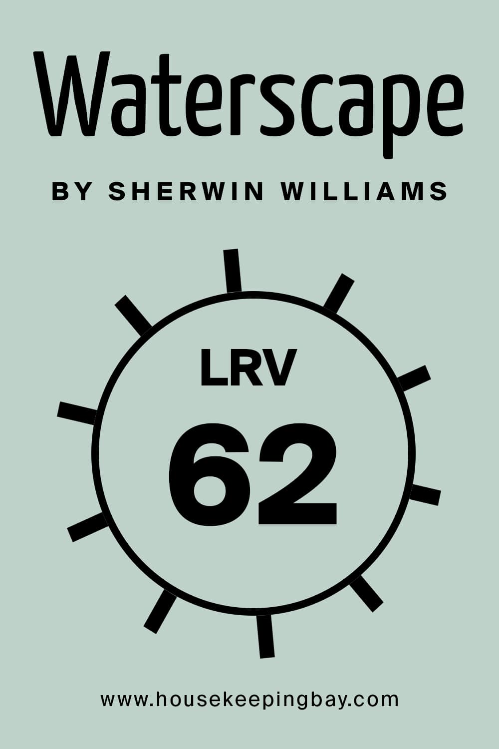
And the very first thing you should take into consideration is the LRV (light reflectance value) of the chosen color. For Sherwin Williams Waterscape, the LRV is 62. It means that this minty green color is situated somewhere in the middle of the color scale, being between medium to light. At this point, you should remember that the lesser the LRV value, the darker the paint color is, and vice versa.
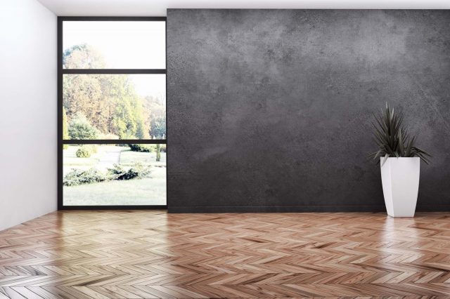
Speaking of SW Waterscape, due to its rather high reflectivity, this paint color can be successfully used in smaller spaces of your home. It will make the space look visually bigger and create an illusion of a waste area.
In general, the more natural light you have in your room, the brighter it will be with this paint on the walls. But perhaps, in a room with excessive heights and very large windows, this minty color will look way too light! Also, consider that in a room with poor light, this paint color will look significantly darker.
Like this, now you are better informed about this beautiful and calming minty-green color with delicate blue undertones. But in order to be able to make it work even better for you, we suggest you read on and find out what else this paint hides.
housekeepingbay.com
What is LRV? Read It Before You Choose Your Ideal Paint Color
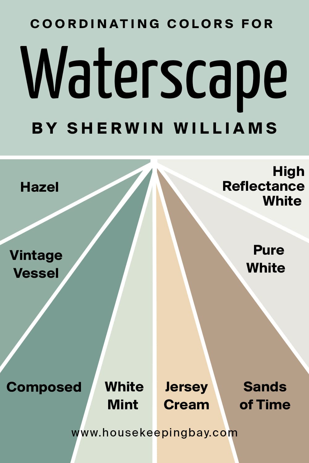
SW Waterscape Coordinating Colors
If you know what coordinating colors your paint has, it gives you a lot of advantages. When you know what colors work as coordinating ones for the paint you are going to apply to your walls, you can make your living space look more harmonious and better balanced in terms of color.
So, if you choose this aqua-toned minty green, we recommend you think about using such colors as off-whites, whites, shades of browns, tans, and greys as a base. And as an accent, a gleaming yellow shade will work great.
If you use SW Waterscape and you are looking for a monochromatic scheme to create in your home, we would recommend incorporating the following colors:
- SW 6471 Hazel
- SW 9050 Vintage Vessel
- SW 6472 Composed
On the other hand, for a contrasting color scheme, consider using the following options instead:
- SW 6441 White Mint
- SW 6379 Jersey Cream
- SW 6101 Sands of Time
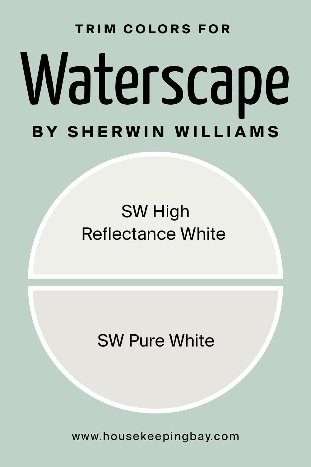
As for trims, moldings, and ceilings, the best choice will be to use such paint colors as:
- SW Pure White for a creamy texture
- SW High Reflectance White for a crisp texture
housekeepingbay.com
What Is the Best Trim Color For SW Waterscape?
Everyone knows that the best and the most universal trim color is white. It simply fits the majority of paint colors. This color works ideally for nearly any other paint color when applied to the trims. And luckily, SW Waterscape is not an exception.
However, if you are not sure what white paint color exactly it is best to choose to combine with this wonderful deep blue, consider using SW Pure White if you want to get a creamy texture, and SW High Reflectance White for a crisp texture.
housekeepingbay.com
Paint Colors Similar to SW Waterscape
It is good to know what other colors can be used instead of the one that you are planning to apply in your home. This information might be handy, for example, if you can’t find exactly the color you thought of initially. Also, looking for an alternative is a good idea if you are not sure about the undertones of the color, and how it might react to light.
Anyway, no matter the reason, being aware of similar paint colors is a good idea. In particular, even though these colors look similar, they might still differ in undertones or reflectivity. But there is one nuance you should always remember: there are no two colors that are alike!
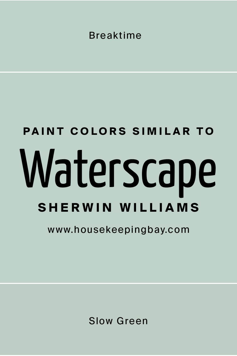
And that is why we would like to suggest two very closely related paint colors to you that can be used instead of SW Waterscape:
- SW 6463 Breaktime
- SW 6456 Slow Green
SW 6463 Breaktime
This color is sharing the most similarities with the Waterscape. The distinction is that SW Breaktime is a green color that is slightly lighter than the Waterscape. Breaktime color is more crisp and cool. It also has a more childish touch to it, unlike the Waterscape, which is more soothing and subtle.
SW Slow Green
SW Slow Green color is slightly off the route. See, it is pure green paint color. But its significant feature is that it appears creamy in certain natural light conditions. If we compare Slow Green With Waterscape, we will see that they share almost similar LRVs.
Still, Slow Green color reads as a warmer, more welcoming, and more inviting one when used in the common areas of the home.
housekeepingbay.com
Where In Your Home Can SW Waterscape Be Used?
One great thing about this delicate and calming paint color is that you can use it literally anywhere and everywhere! It will look the same refreshing and awesome in any room of your house or apartment. But of course, in such interior designs as Coastal, Scandinavian, and some modern designs it will work much better.
As for the specific rooms, we suggest you read on and find out how this color will work in each of them.
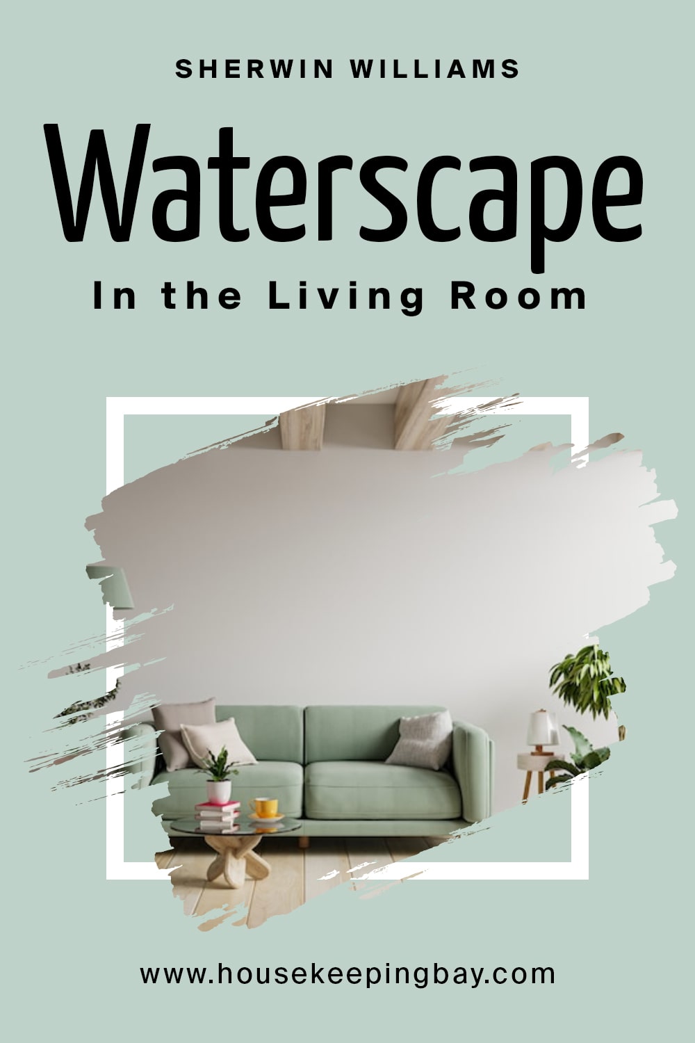
SW Waterscape in the Living Room
Those of you who have a modern, Coastal-style, or Scandinavian-style living room will find this paint color a number one option! However, note that, if you want to create a cozy atmosphere there, this color will not be the perfect match for you. The only exception could be made if you also use some off-whites and beiges along with it.
Except for this nuance, SW Waterscape creates an elegant and exquisite vibe, especially if paired with hardwood floors and pale natural stone as a decorative element.
housekeepingbay.com
SW Waterscape in the Cabinets And Kitchen Cabinets
For such a bold paint color like Sherwin Williams Sea Serpent, you need to make sure that you add a fresh coat on the cabinets, especially the lower ones, for a sense of contrast. For this purpose, you can either choose to pair it with whites or lighter grays for the upper cabinets and backdrop wall. A brass or gold-tinted finish for the handles and drawers will complete the entire look of the area.

housekeepingbay.com
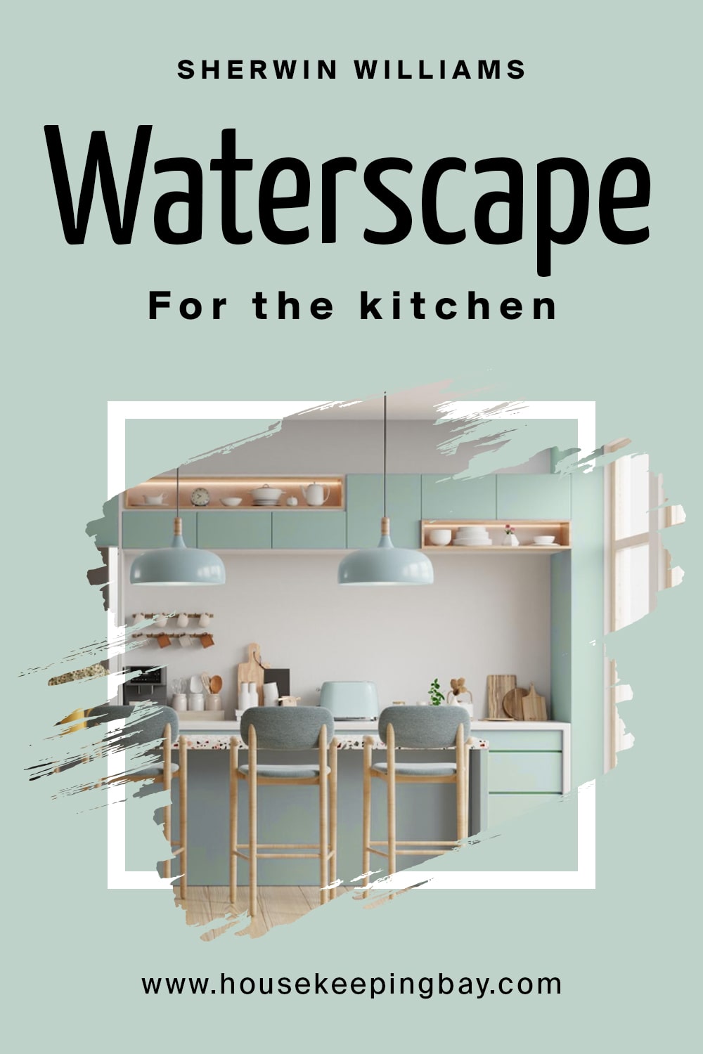
SW Waterscape in the Kitchen
For the kitchen, this color is great because it is so calm and stress-relieving! You can paint all four walls with it if you want, especially if you are into a Cape Cod style. Or you may paint only your backdrop with it, leaving your kitchen cabinets white, or vice versa. By the way, this color pairs great with white granite countertops and chrome or brushed steel handles.
housekeepingbay.com
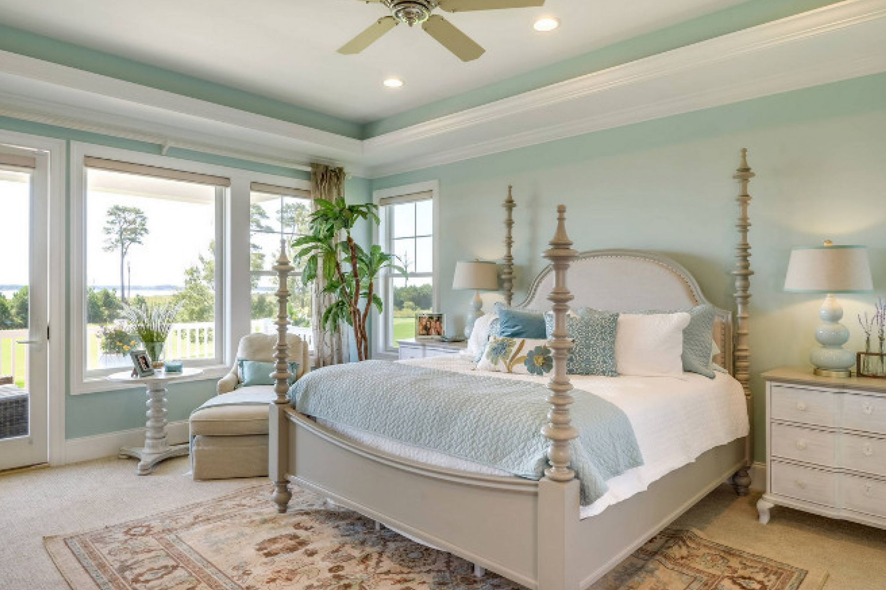
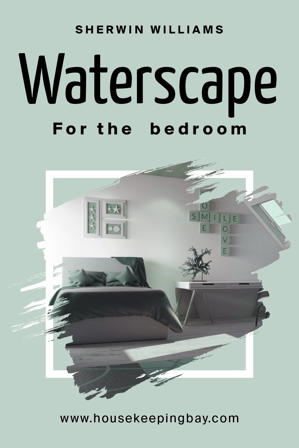
SW Waterscape in the Bedroom
This soothing paint color with green and blue undertones is one of the best options for your bedroom, as well as a nursery, by the way! It creates a very tranquil and calming vibe which is ideal for this space.
It will be better if you paint the accent wall with this color and let the rest be white, off-white, or greys. Also, the cabinetry and door frames are better painted in either white or off-white.
housekeepingbay.com
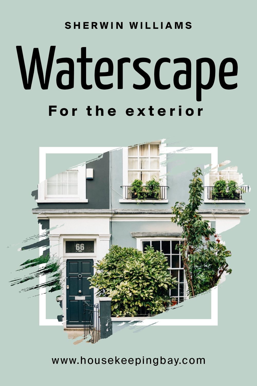
Exterior Use of a SW Waterscape
The Sherwin Williams Waterscape color will always be a wonderful color choice for exterior use. In particular, it works great on front doors and…on the ceilings of porches and balconies! Speaking of balconies, this cooling color will create a soothing and relaxing vibe, that’s why it is so popular.
Like this, now you know where in your home (and where outside of it) this color can be used to create a mesmerizing feeling and make you feel proud of the space you live in.
housekeepingbay.com
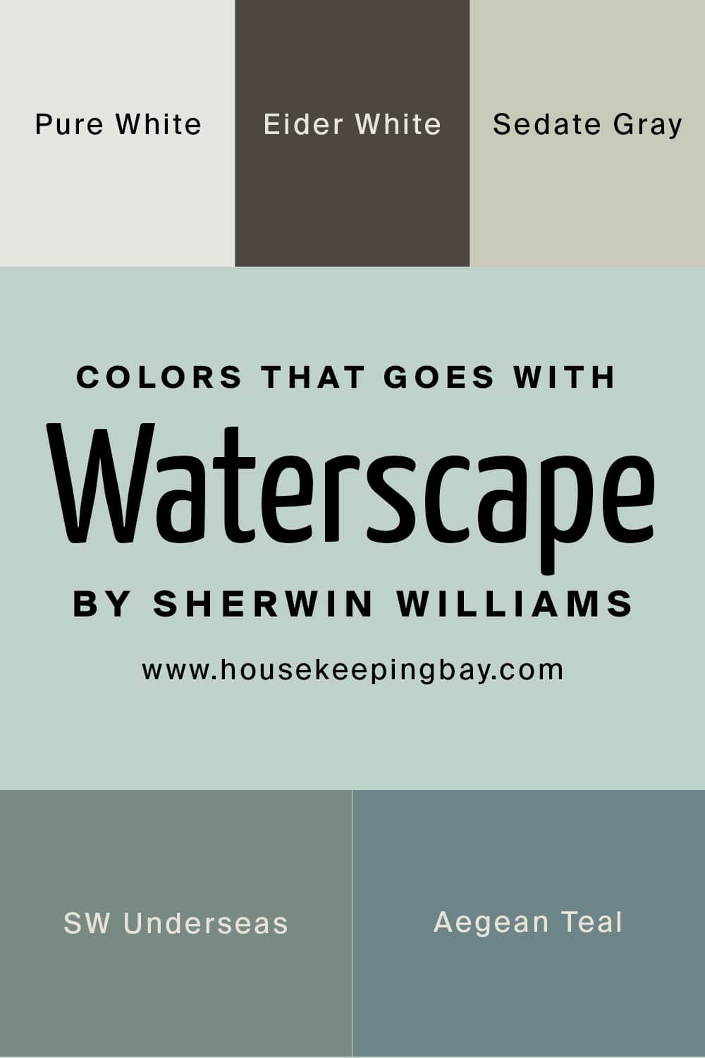
Colors It Goes With SW Waterscape
It is always handy to be aware of a few colors that the paint you like goes best with. Like that, you will be able to create a harmonious and well-balanced color palette in your home. So if you choose SW Waterscape as your major color, consider the following options that will match it better than others:
- SW Pure White
- SW Black Fox
- SW Sedate Gray
- SW Underseas
- BM Aegean Teal
housekeepingbay.com
Other Similar Colors to Compare SW Waterscape With
To help you understand what color SW Waterscape is better, we prepare a few other colors that look more or less similar to it. When comparing them, you can see clearly what makes the Waterscape color stand out and helps it to be not like other colors.
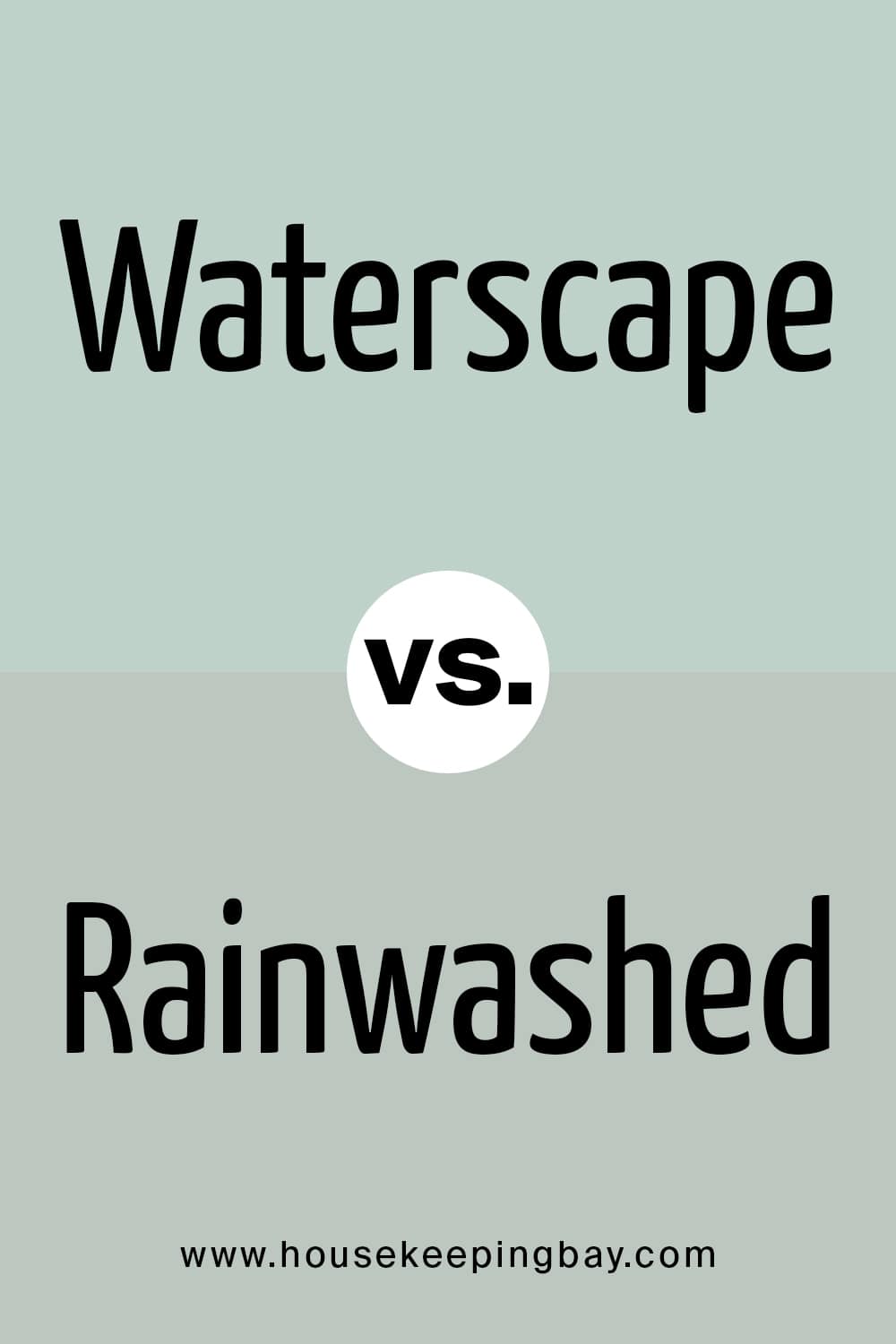
Waterscape vs Rainwashed
These two colors look almost the same. We say almost because, if you put them side by side, you will notice that Rainwashed is somewhat brighter than the Waterscape. In addition, Rainwashed has more bluish undertones, whilst Waterscape shows more greenish ones.
housekeepingbay.com
Waterscape vs Sea Salt
These two are not at all alike! Sea Salt is a mix of green and gray, and that gray part shows up very prominently if you compare this color with the Waterscape. In this pair of colors, Waterscape will look nearly blue in fact. And in general, this pair of colors can’t be called a good combo unless you use other colors as well, for example, off-whites and light beiges.
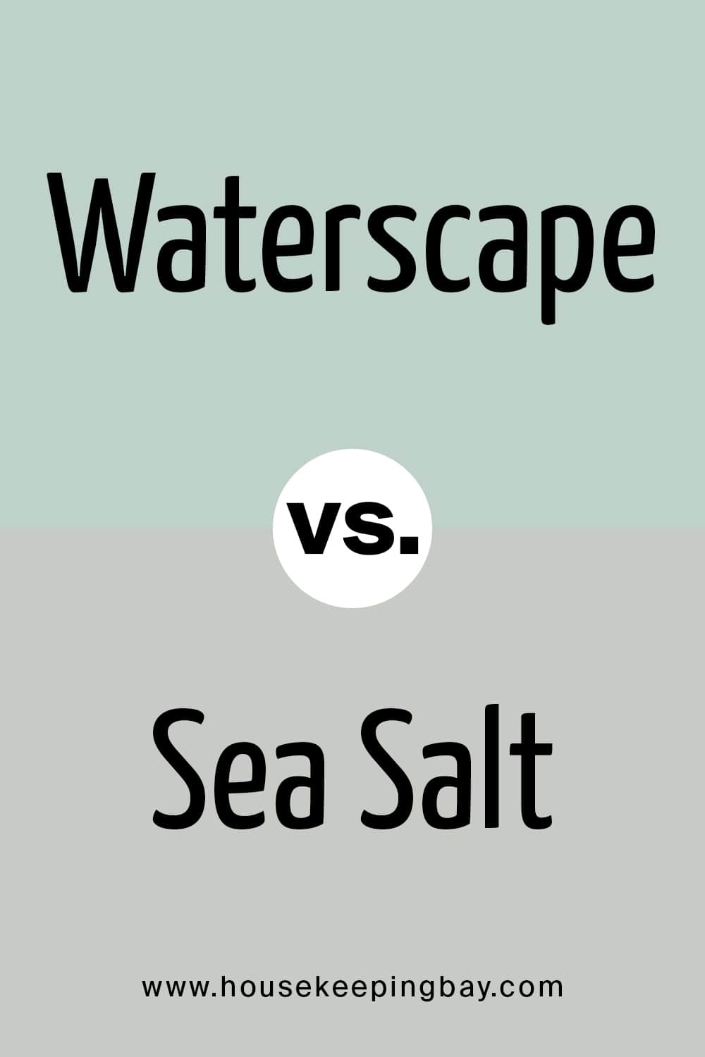
housekeepingbay.com
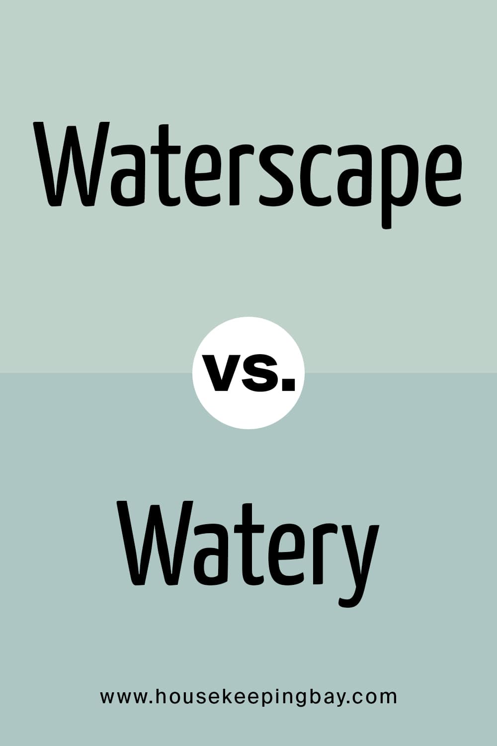
Waterscape vs Watery
Watery is a bright and absolutely charming blue color, and in comparison to it, Waterscape reveals its greenish undertones more prominently. Nevertheless, even though both colors are cool-toned, they should not be used together.
housekeepingbay.com
Now that you know more about the beautiful and soothing paint color called Waterscape by Sherwin Williams, you will be able to make the most out of it when using this minty green in your home.
housekeepingbay.com
Ever wished paint sampling was as easy as sticking a sticker? Guess what? Now it is! Discover Samplize's unique Peel & Stick samples. Get started now and say goodbye to the old messy way!
Get paint samples


Frequently Asked Questions
⭐Is SW Waterscape green?
No, this color is not quite gree, though it does have green (and blue) undertones.
⭐Will SW Waterscape combine well with black colors?
This is not a good choice since black is way too contrasting. Try lighter colors, e.g. grays.
⭐Can I use Waterscape in my laundry room?
Absolutely! This color will be great for both a small room anad for a big laundry space.