Vaguely Mauve SW 6015 by Sherwin Williams
Subtle Elegance in a Whisper of Color
Welcome to our article on SW 6015 Vaguely Mauve by Sherwin Williams, a unique paint color that has caught the attention of many homeowners and interior designers.
This soothing shade is a subtle mix of gray with a soft purple undertone, offering a fresh and versatile option for those looking to add a hint of sophistication to their spaces without overwhelming them.
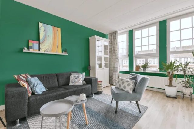
Ideal for a variety of settings, Vaguely Mauve has the ability to transform any room into a tranquil and cozy retreat, making it a fantastic choice for bedrooms, living rooms, and even bathrooms.
As we explore the nuances of this charming color, we’ll take a closer look at how it behaves in different lighting conditions, which can significantly affect its appearance, shifting from a cooler gray to a warmer, more pronounced mauve.
Furthermore, we’ll provide tips on coordinating colors, suggesting complementary shades that can enhance the beauty of Vaguely Mauve and create harmonious color schemes for your decorating projects.
Whether you’re planning a complete makeover or just looking to refresh a single room, Vaguely Mauve offers a sophisticated palette that can breathe new life into your home.
Join us as we explore the potential of this beautiful color, offering inspiration and practical advice for incorporating it into your personal space.
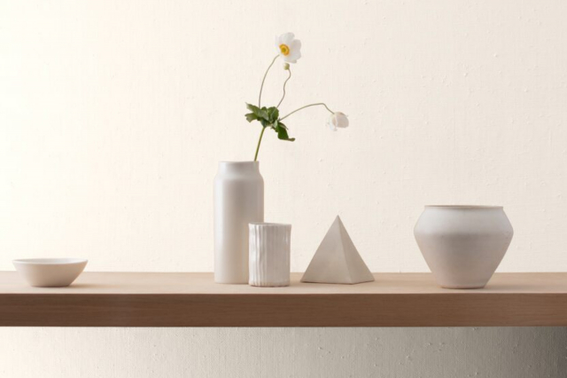
via sherwin-williams.com
What Color Is Vaguely Mauve SW 6015 by Sherwin Williams?
Vaguely Mauve SW 6015 by Sherwin Williams is a unique color that lives somewhere between pink and purple. It’s not too bold, but it has just enough depth to make a statement.
This color is soft, making it perfect for creating a calm and welcoming atmosphere in any room.
Vaguely Mauve works great in various interior styles, particularly in spaces looking for a touch of elegance without overdoing it. It’s ideal for modern minimalist designs, where its subtle hue adds warmth without cluttering the aesthetic.
It also shines in vintage or shabby chic decor, where its gentle nature complements distressed furniture and antique finishes. Additionally, this color fits well in romantic or feminine spaces, offering a backdrop that’s both sophisticated and inviting.
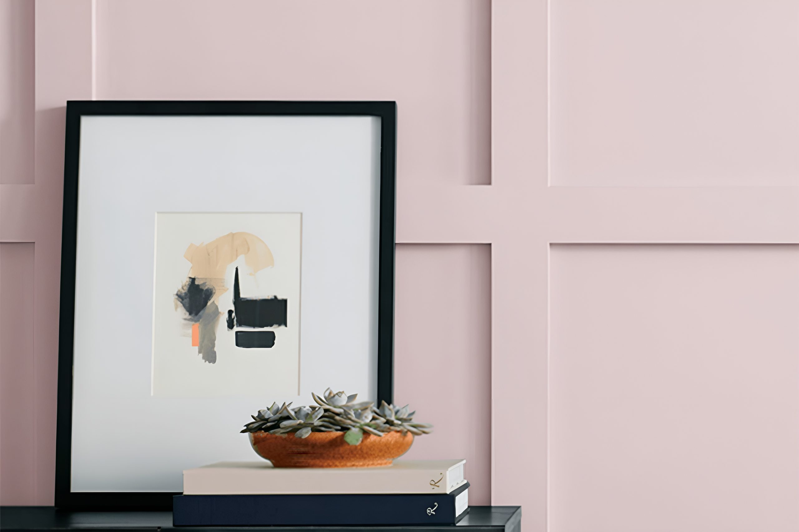
When it comes to pairing with materials and textures, Vaguely Mauve is versatile. It looks stunning alongside natural wood, adding a cozy vibe to the room.
It also pairs beautifully with metals like gold or copper, bringing out a luxurious feel. For textiles, think soft, plush fabrics like velvet or silk to enhance the cozy, upscale look.
Against rougher textures like burlap or linen, it offers a delightful contrast that’s both unexpected and eye-pleasing. Overall, Vaguely Mauve is a subtle yet powerful color that can bring warmth and character to your space.
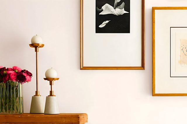
housekeepingbay.com
Table of Contents
Is Vaguely Mauve SW 6015 by Sherwin Williams Warm or Cool color?
Vaguely Mauve SW 6015 by Sherwin Williams is a unique and subtle paint color that can really make a difference in a home. This shade is a soft blend of pink and purple, creating a gentle mauve that’s not too bold but still adds a bit of personality to a space.
t’s like a quiet whisper in a room that brings a sense of calm and relaxation. Because of its understated elegance, Vaguely Mauve works well in many different areas of a home.
It’s fantastic for bedrooms, where its soothing tones can help create a peaceful retreat for rest. In living rooms, it adds a touch of warmth and sophistication without overpowering the space.
Since it’s not a strong color, it pairs nicely with a wide range of decor styles and other colors. From modern to traditional, it can tie a room together, making the space feel cohesive and thoughtfully designed.
If you’re looking to refresh your home with a color that’s both beautiful and easy to live with, Vaguely Mauve might be the perfect choice.
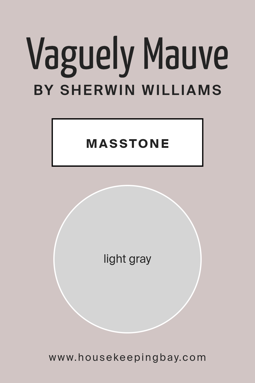
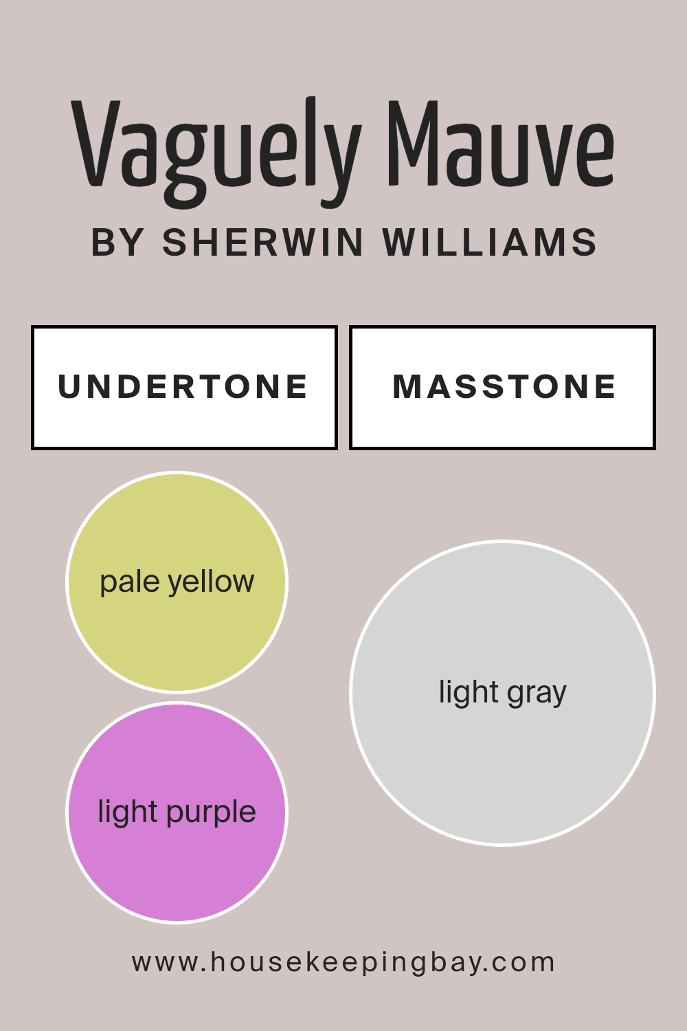
What is the Masstone of the Vaguely Mauve SW 6015 by Sherwin Williams?
Vaguely Mauve SW 6015 by Sherwin Williams has a masstone, or main color, that looks like light gray (#D5D5D5). This means when you put it on your wall, the first color you notice is a soft, light gray.
This special color can make your home feel cozy and calm. It’s not too bright or too dark, so it goes well in lots of different rooms, like living rooms, bedrooms, or even kitchens.
Because it’s a sort of light gray, it’s super easy to mix with other colors. You can add brighter colors like blue pillows or a bright rug, and they’ll look great against the soft background.
Or, if you prefer a more peaceful vibe, you can stick with other soft colors to keep everything feeling gentle and relaxed.
This color also helps make small spaces look a bit bigger and more open because light colors reflect light better than dark colors do. So, using Vaguely Mauve in your home can make your rooms feel more spacious and welcoming.
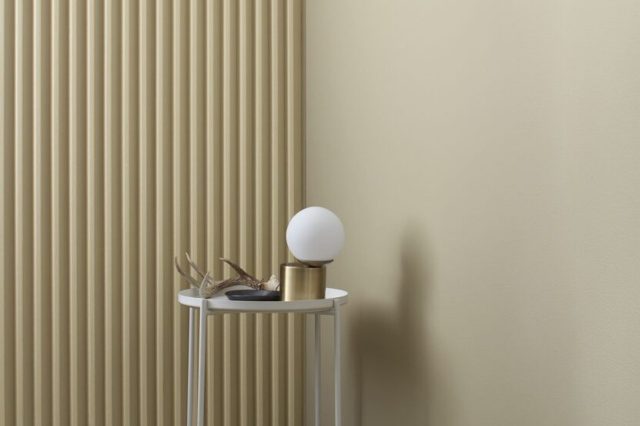
housekeepingbay.com
Undertones of Vaguely Mauve SW 6015 by Sherwin Williams
Vaguely Mauve SW 6015 by Sherwin Williams is a unique color blend. It’s not just a simple shade; it carries hints of pale yellow and light purple in its mix. Let’s explain this in easy terms.
Imagine adding a tiny bit of different colored powders into a clear base. These bits, or ‘undertones’, change how the main color looks. They’re like secret ingredients that can make a color warm, cool, or something in-between.
Undertones play a big role in how we see colors. They can make a shade look different under various lights or next to other colors.
For Vaguely Mauve, its pale yellow and light purple undertones bring a special twist. Even though it’s called mauve, those underlying hints add depth, making it more than just a plain wall color.
When applied to interior walls, the effect of these undertones becomes quite noticeable. In natural daylight, the light purple undertone might give the walls a soft, welcoming aura.
Meanwhile, in artificial light, the pale yellow may come forward, adding a cozy, soothing vibe to the room.
This makes Vaguely Mauve a versatile choice for spaces, adapting its feel with the changing light, thus greatly impacting the mood and appearance of any room.
housekeepingbay.com
Coordinating Colors of Vaguely Mauve SW 6015 by Sherwin Williams
Coordinating colors are colors that complement each other beautifully when used together in a design. They enhance the aesthetics of a space, ensuring that colors flow harmoniously without clashing.
These colors are usually chosen based on their positions on the color wheel or their tones, shades, and tints.
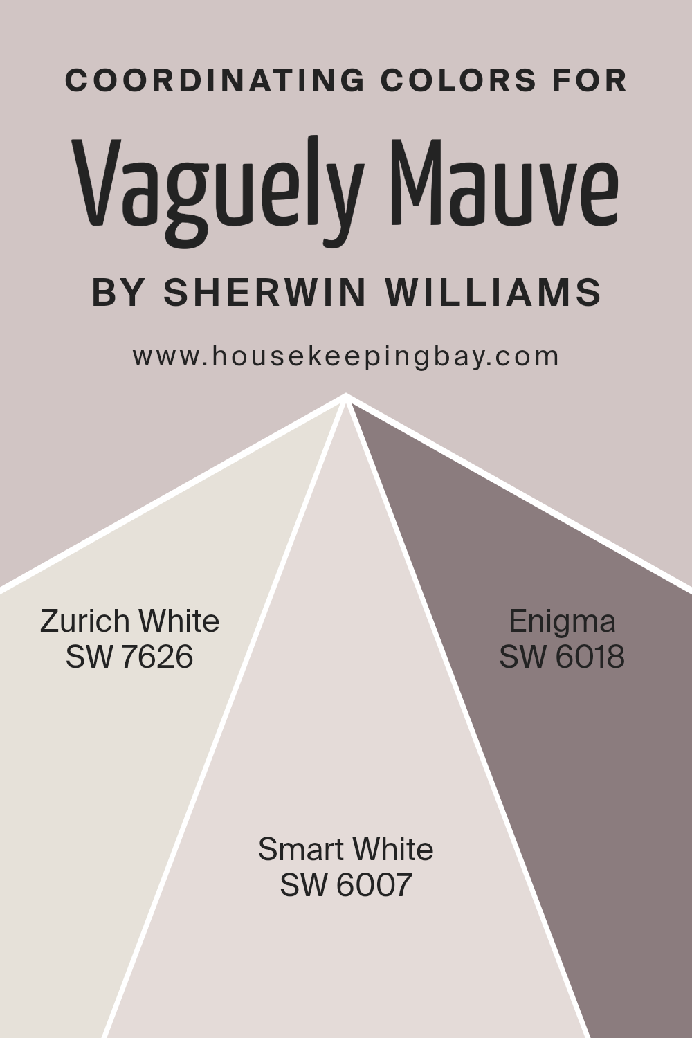
When it comes to coordinating colors for Vaguely Mauve SW 6015 by Sherwin Williams, a soft and subtle shade, several colors work well to create a balanced and appealing palette.
The chosen coordinating colors include Zurich White SW 7626, Smart White SW 6007, and Enigma SW 6018.
Zurich White is a soft and warm white with a hint of beige, making it an excellent background color that allows Vaguely Mauve to stand out without overpowering it.
Smart White, on the other hand, is a crisp and clean white that offers a sharp contrast, highlighting the plush softness of Vaguely Mauve.
Enigma brings a mysterious and deep tone into the mix, providing a rich backdrop that enhances the depth and sophistication of the palette.
Together, these coordinating colors offer a range of possibilities, allowing for the creation of a space that feels both coordinated and effortlessly stylish.
You can see recommended paint colors below:
- SW 7626 Zurich White
- SW 6007 Smart White
- SW 6018 Enigma
housekeepingbay.com
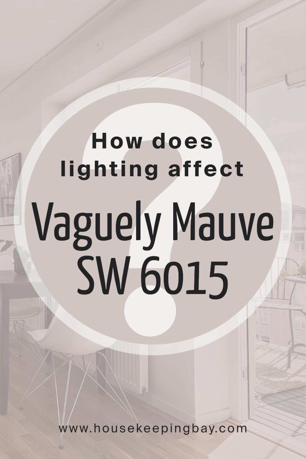
How Does Lighting Affect Vaguely Mauve SW 6015 by Sherwin Williams?
Lighting plays a crucial role in how we perceive colors. The same color can look different under various light sources because light affects the way colors appear to our eyes.
This phenomenon is especially true for paint colors, such as Vaguely Mauve SW 6015 by Sherwin Williams, a unique shade that can transform based on the lighting conditions it’s exposed to.
In artificial light, Vaguely Mauve SW 6015 might look different depending on the type of bulbs used. Warmer bulbs can make it appear cozier and slightly richer, enhancing its mauve tones.
Cooler bulbs, on the other hand, might bring out a more subdued, almost neutral quality in the color, making it appear more understated.
Natural light has its own impact on Vaguely Mauve. In a room with lots of natural sunlight, this color can look very vibrant and alive, with its subtle mauve tones becoming more pronounced.
However, the direction of the room in relation to the sun plays a big part in this transformation.
North-facing rooms typically get less direct sunlight, so Vaguely Mauve might appear cooler and more subdued in these spaces, emphasizing its grey undertones. It creates a calming and serene atmosphere.
South-facing rooms get a lot of bright, warm sunlight throughout the day. Here, Vaguely Mauve can reveal a softer, warmer side, making the room feel welcoming and cozy.
East-facing rooms are filled with bright light in the morning and cooler, softer light in the afternoon.
Vaguely Mauve will likely look more lively and warm in the morning, then gradually become cooler and more gentle as the day progresses.
West-facing rooms experience the opposite effect, with softer light in the morning that becomes warm and bright in the afternoon.
In these rooms, Vaguely Mauve will start the day looking more muted and become warmer and more vibrant by the evening.
Overall, lighting can significantly alter the appearance of Vaguely Mauve SW 6015, making it a versatile color choice that can adapt to various lighting conditions and room orientations.
housekeepingbay.com
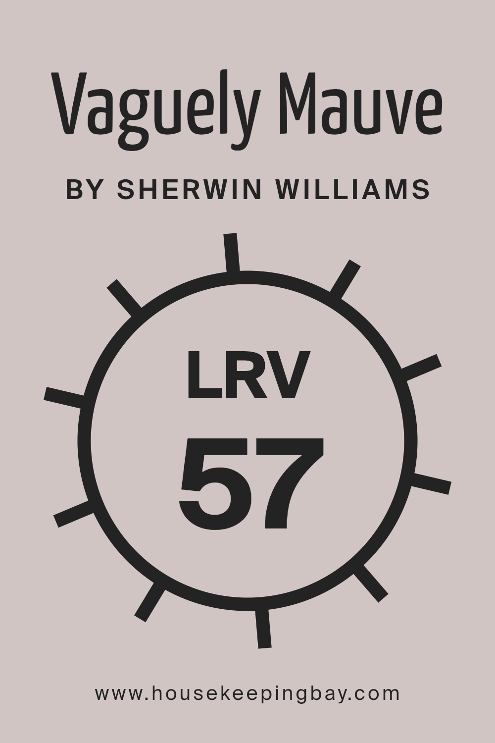
What is the LRV of Vaguely Mauve SW 6015 by Sherwin Williams?
LRV stands for Light Reflectance Value, and it’s a measure that tells us how much light a color reflects compared to how much it absorbs.
Imagine LRV on a scale from 0 to 100, where 0 means the color is really dark, like a deep black that doesn’t reflect much light, and 100 means the color is super bright, like a clean, shiny white that reflects most of the light that hits it.
This number helps you understand how a paint color will look in your space, depending on how much natural or artificial light you have in the room.
So, if you choose a color with a high LRV, your room might feel brighter and more open because it reflects more light around the space.
The color Vaguely Mauve (SW 6015) by Sherwin Williams has an LRV of 57.228, which puts it in the middle range. This means it’s neither too bright nor too dark but somewhere comfortably in the middle.
It’s a balanced choice that can bring a nice, gentle warmth to a room without overwhelming it with brightness.
Because of this moderate LRV, Vaguely Mauve can work well in a variety of lighting conditions, absorbing some light while also reflecting a fair amount.
This makes the color versatile, able to adapt to different settings and moods you want to create in your space. Whether your room gets a lot of sunlight or relies more on lamps and ceiling lights, Vaguely Mauve can help make the space feel inviting and cozy.
housekeepingbay.com
What is LRV? Read It Before You Choose Your Ideal Paint Color
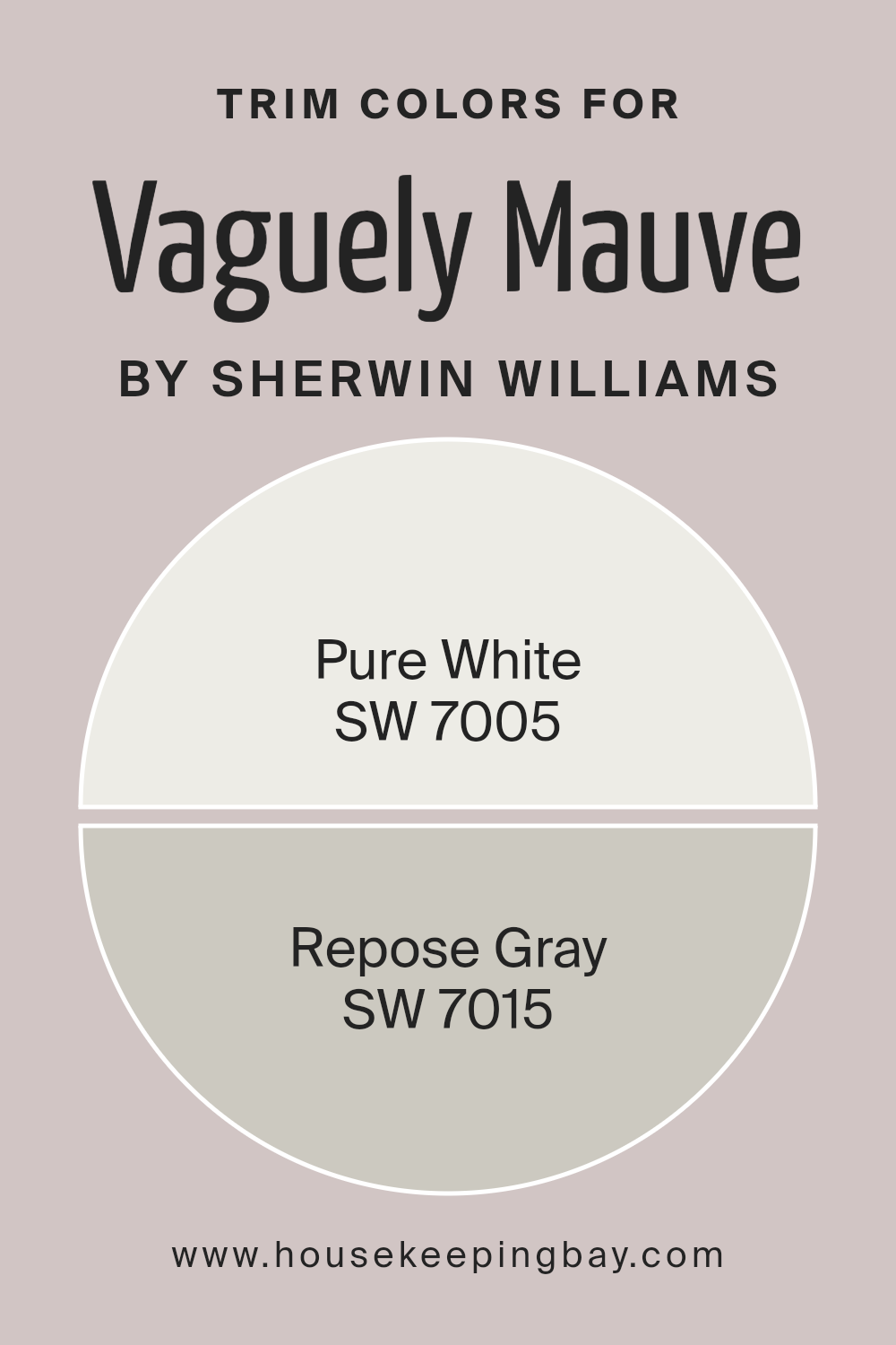
What are the Trim colors of Vaguely Mauve SW 6015 by Sherwin Williams?
Trim colors are specific shades used on the edges, frames, and borders of walls, doors, windows, and other architectural features in a space to accentuate or contrast with the main wall color.
When it comes to a subtle and sophisticated color like Vaguely Mauve SW 6015 by Sherwin Williams, selecting the right trim colors can significantly enhance its appearance and impact.
Trim colors play a vital role in defining the character of a room, adding depth, and highlighting architectural details.
They can transform a simple room into a more elegant and stylish space by creating a visual framework that complements the wall color.
Using SW 7005 – Pure White as a trim color offers a crisp and clean contrast to Vaguely Mauve, making the walls stand out with a fresh and bright look.
Pure White is a timeless and versatile shade that brings a sense of clarity and openness to any space, making it appear larger and more inviting.
On the other hand, SW 7015 – Repose Gray as a trim color provides a softer, more subtle contrast. Repose Gray is a warm and neutral gray that adds a modern and sophisticated touch, pairing beautifully with Vaguely Mauve to create a cozy and harmonious atmosphere.
These trim colors, when used thoughtfully, can elevate the overall aesthetic of a room, enhancing the beauty and elegance of Vaguely Mauve.
You can see recommended paint colors below:
- SW 7005 Pure White
- SW 7015 Repose Gray
housekeepingbay.com
Colors Similar to Vaguely Mauve SW 6015 by Sherwin Williams
Similar colors play a crucial role in interior design and decorating because they create harmony and a seamless visual experience.
For instance, when decorating with a base color like Vaguely Mauve by Sherwin Williams, incorporating similar colors can enrich the ambiance without overwhelming the senses.
Colors such as Unfussy Beige, White Truffle, and Studio Mauve share a subtle connection with Vaguely Mauve, each adding a layer of complexity and warmth.
Unfussy Beige brings a soft, comforting beige tone to spaces, promoting a serene and welcoming atmosphere, while White Truffle offers a light, creamy presence that brightens rooms with a gentle elegance.
Studio Mauve, on the other hand, introduces a deeper shade, providing a hint of sophistication and depth.
Furthermore, colors like Breathless and Grayish contribute to a refined palette by adding breathy lightness and a cool, neutral sophistication, respectively.
Breathless serves as a whisper of color, perfect for creating a peaceful retreat, whereas Grayish blends gray and beige to offer versatility in pairing with both warm and cool colors.
Closer to the heart of Vaguely Mauve, Angora, Individual White, and Sensitive Tint extend the palette with their unique charm.
Angora adds a soft, woolen warmth, enveloping rooms in coziness, and Individual White presents a clean slate with a subtle, underlying warmth, establishing a crisp, fresh look.
Sensitive Tint whispers softness into the mix, allowing for a gentle infusion of color. As we explore deeper hues, Minute Mauve and Destiny bring the collection full circle.
Minute Mauve mirrors the complexity of early dusk, offering a tranquil, muted purple, while Destiny casts a serene glow, bridging the gap between lavender and gray with exquisite grace.
Together, these colors weave a cohesive narrative, enhancing the beauty of spaces with their interconnected hues.
You can see recommended paint colors below:
- SW 6043 Unfussy Beige
- SW 6029 White Truffle
- SW 0062 Studio Mauve
- SW 6022 Breathless
- SW 6001 Grayish
- SW 6036 Angora
- SW 6008 Individual White
- SW 6267 Sensitive Tint
- SW 7078 Minute Mauve
- SW 6274 Destiny
housekeepingbay.com
How to Use Vaguely Mauve SW 6015 by Sherwin Williams In Your Home?
Vaguely Mauve SW 6015 by Sherwin Williams is a gentle, soft color that blends hints of gray with a touch of purple to create a soothing, understated shade.
Perfect for those seeking a calm and relaxing atmosphere in their home, it works wonders in bedrooms, living rooms, or even bathrooms, offering a peaceful vibe.
Its versatility allows it to pair well with a variety of decor styles, from modern and minimalist to cozy and traditional. You can use it as a main color on your walls to set a serene background, or apply it to a single accent wall for a subtle pop of color.
Additionally, Vaguely Mauve pairs beautifully with white trim, giving a clean, fresh look, or with darker furnishings for a bit of contrast. It’s an excellent choice for anyone looking to add a touch of elegance and warmth to their home environment without going too bold.
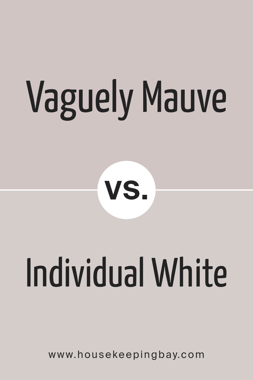
Vaguely Mauve SW 6015 by Sherwin Williams vs Individual White SW 6008 by Sherwin Williams
Vaguely Mauve SW 6015 by Sherwin Williams and Individual White SW 6008 by Sherwin Williams are two distinct colors with their own unique appeal.
Vaguely Mauve is a soft, subtle color that leans towards pink and purple tones. It gives off a gentle and soothing vibe, perfect for creating a cozy atmosphere in any room. It’s a kind of color that can add a touch of warmth to spaces without overwhelming them.
On the other hand, Individual White is a lot lighter, offering a clean and airy feel.
It is incredibly versatile and can easily brighten up a space, making it appear larger and more open. This color works well in almost any setting and pairs beautifully with other colors to create a balanced look.
In comparison, while Vaguely Mauve adds warmth with its pink-purple hues, Individual White gives a room a fresh and open feel.
Choosing between them depends on the mood you want to create: cozy and warm with Vaguely Mauve or bright and spacious with Individual White.
You can see recommended paint color below:
- SW 6008 Individual White
housekeepingbay.com
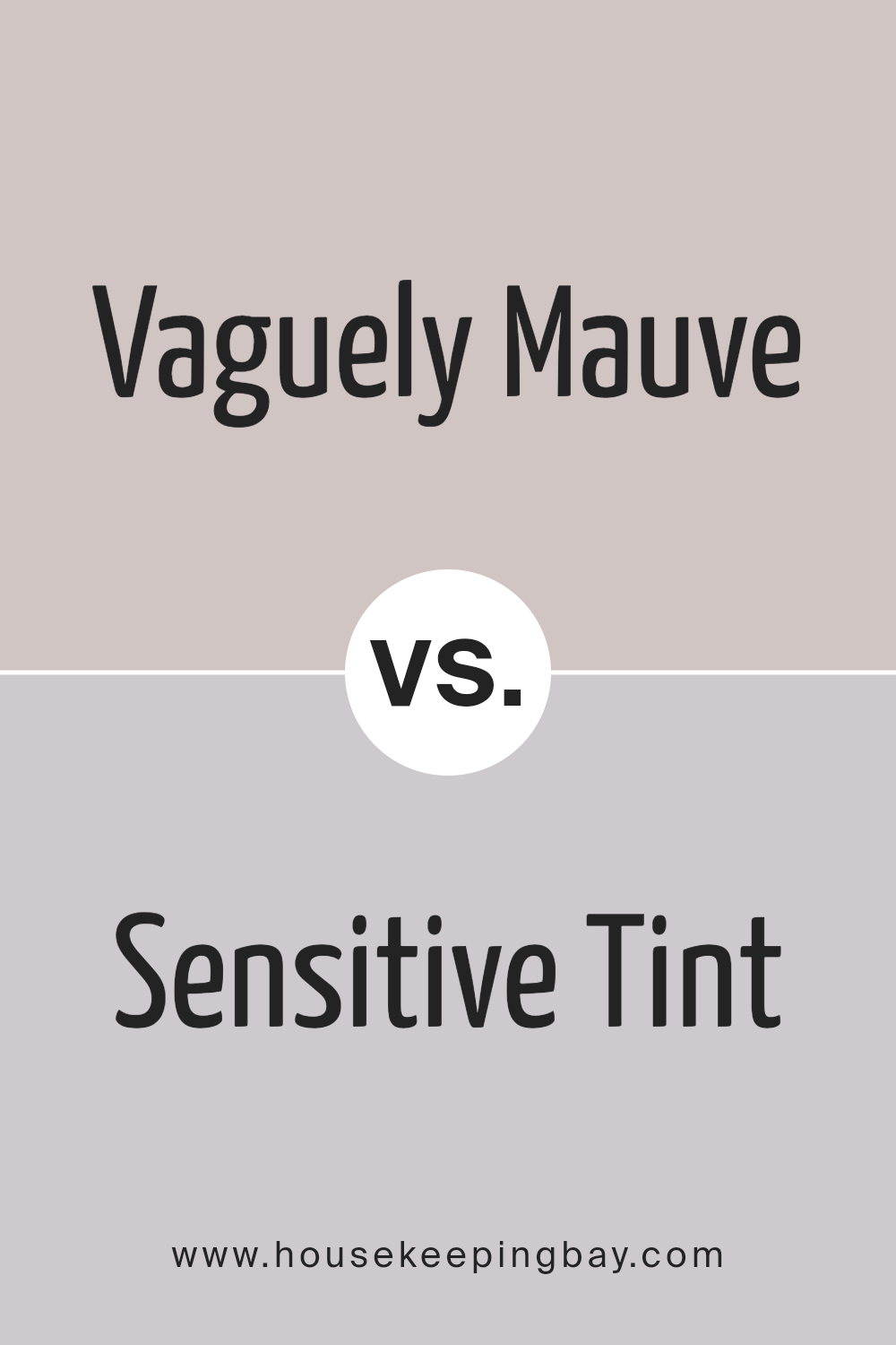
Vaguely Mauve SW 6015 by Sherwin Williams vs Sensitive Tint SW 6267 by Sherwin Williams
Vaguely Mauve SW 6015 by Sherwin Williams and Sensitive Tint SW 6267 are two paint colors that bring their own unique vibes to a room. Vaguely Mauve has a hint of purple, giving it a soft, cozy feel.
It’s like a gentle hug for your walls, warm and slightly muted, perfect for creating a calm and welcoming space. On the other hand, Sensitive Tint is cooler, leaning towards a subtle, soft greyish-purple.
It’s light, airy, and gives off a fresh and clean vibe, making rooms feel more spacious and open.
While Vaguely Mauve adds warmth and a touch of color, making spaces feel snug and protected, Sensitive Tint is all about creating a serene, tranquil environment.
Both colors are soft and subtle but impact a room’s atmosphere in their own ways.
Vaguely Mauve works well in bedrooms and living areas where you want a cozy feel, whereas Sensitive Tint is perfect for bathrooms and kitchens for that crisp, fresh look.
You can see recommended paint color below:
- SW 6267 Sensitive Tint
housekeepingbay.com
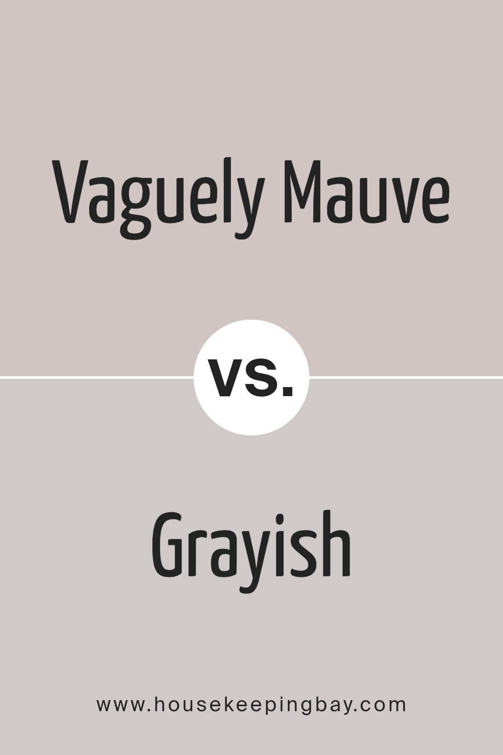
Vaguely Mauve SW 6015 by Sherwin Williams vs Grayish SW 6001 by Sherwin Williams
Vaguely Mauve SW 6015 by Sherwin Williams and Grayish SW 6001 by Sherwin Williams are two unique colors, each with its own personality.
Vaguely Mauve is a subtle, soft tone that blends hints of purple and pink, bringing a warm and gentle feel to any space. It’s the kind of color that can add a touch of coziness and calm to rooms, perfect for creating a serene environment.
On the other hand, Grayish SW 6001 leans more towards a soft, neutral gray with a hint of blue undertone. It’s incredibly versatile, fitting well in many spaces, from modern to traditional.
Grayish can make rooms feel more spacious and airy, providing a sleek and contemporary look. When comparing the two, Vaguely Mauve offers a warmer, more inviting atmosphere, while Grayish gives a cooler, more refined vibe.
Both colors are beautiful in their own right and can be used to achieve different aesthetics in your home.
ou can see recommended paint color below:
- SW 6001 Grayish
housekeepingbay.com
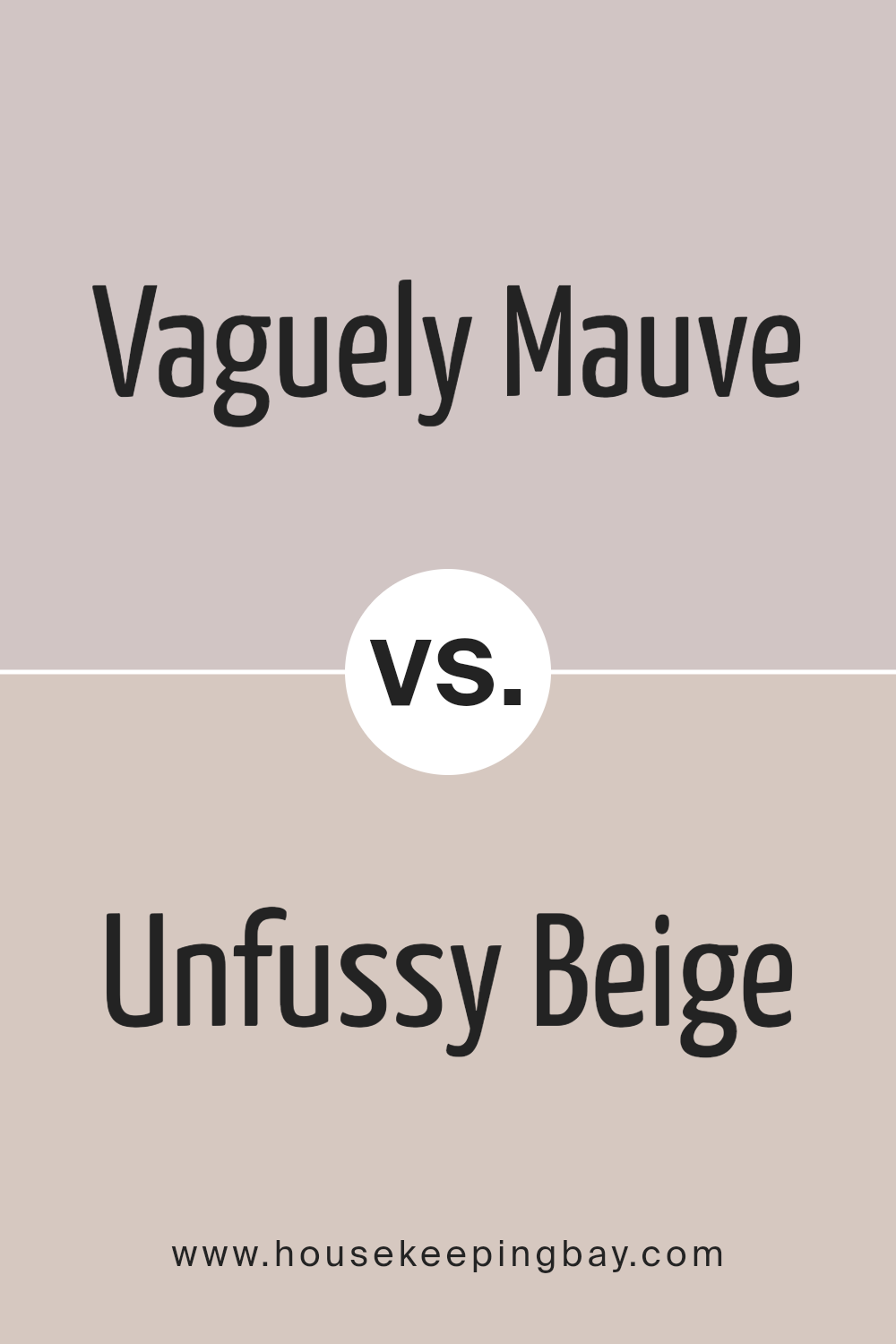
Vaguely Mauve SW 6015 by Sherwin Williams vs Unfussy Beige SW 6043 by Sherwin Williams
When looking at Vaguely Mauve SW 6015 and Unfussy Beige SW 6043 by Sherwin Williams, there’s a noticeable difference between the two colors despite both having a subtle, soft appearance.
Vaguely Mauve carries a gentle hint of purple, giving off a calm and soothing vibe that’s perfect for creating a serene space. This color leans towards a cooler palette but maintains warmth, making it versatile for various rooms.
On the other hand, Unfussy Beige is exactly what its name suggests – a straightforward, clean beige that brings warmth and simplicity.
It’s a color that defines understated elegance and can easily complement different decor styles, from modern to traditional. This shade is warm and inviting, making any room feel cozy and welcoming.
Both colors are excellent choices for those wanting to create a relaxed and inviting atmosphere in their homes. Vaguely Mauve adds a subtle touch of color, while Unfussy Beige offers a classic look that never goes out of style.
Depending on the mood you want to set, either color provides a great foundation for layering with other hues and textures.
You can see recommended paint color below:
- SW 6043 Unfussy Beige
housekeepingbay.com
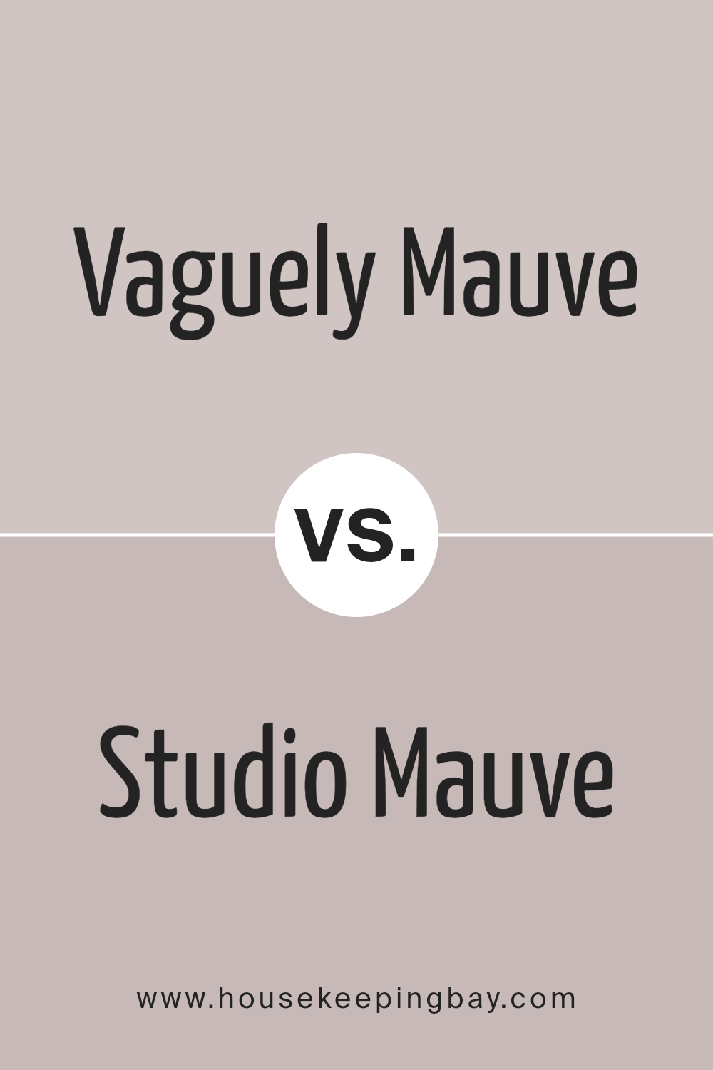
Vaguely Mauve SW 6015 by Sherwin Williams vs Studio Mauve SW 0062 by Sherwin Williams
Vaguely Mauve SW 6015 by Sherwin Williams and Studio Mauve SW 0062, also by Sherwin Williams, are two shades that might seem similar at first glance, but they have their own unique characteristics.
Starting with Vaguely Mauve, this color is soft and subtle.
It’s a bit like a gentle hint of lavender mixed with gray, making it a perfect, soothing backdrop for any room looking for a touch of calmness without being too bold.
On the other hand, Studio Mauve has a more distinct presence. It’s deeper and richer, leaning towards a more pronounced mauve tone that stands out a bit more on walls.
This color brings a stronger sense of personality and warmth, making it ideal for spaces where a cozy, welcoming feel is desired.
In essence, while both colors share a familial mauve base, Vaguely Mauve is lighter and more understated, great for a subtle, calming effect.
Studio Mauve, meanwhile, offers a bit more drama and warmth, perfect for creating a cozy, inviting space.
You can see recommended paint color below:
- SW 0062 Studio Mauve
housekeepingbay.com
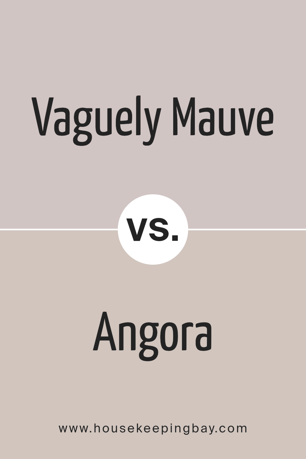
Vaguely Mauve SW 6015 by Sherwin Williams vs Angora SW 6036 by Sherwin Williams
“Vaguely Mauve” by Sherwin Williams is a soft, gentle color that leans towards a muted pink with a touch of gray. It’s the kind of color that feels calming and soothing, perfect for creating a cozy atmosphere in any room.
Imagine the soft hue of the sky at dawn, that’s the vibe “Vaguely Mauve” brings to a space.
On the other hand, “Angora” by Sherwin Williams is a warmer, creamier color. It’s like the color of a soft, fluffy angora sweater, hence the name.
It’s a bit richer and deeper than “Vaguely Mauve,” offering a subtle, inviting warmth that can make a room feel welcoming and snug.
While “Vaguely Mauve” has a cooler, more restrained pink tone, “Angora” is warmer and leans more towards beige. Both colors are great for creating a peaceful, gentle feel in a space, but they do it in slightly different ways.
“Vaguely Mauve” brings a hint of cool serenity, while “Angora” wraps you up in warm, creamy comfort.
You can see recommended paint color below:
- SW 6036 Angora
housekeepingbay.com
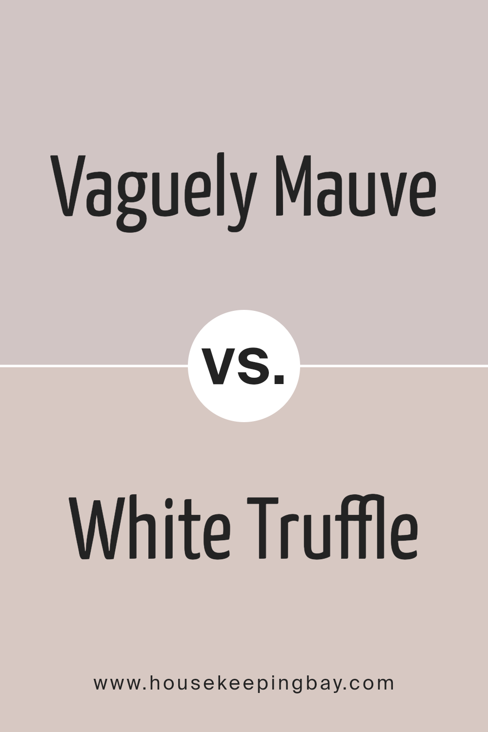
Vaguely Mauve SW 6015 by Sherwin Williams vs White Truffle SW 6029 by Sherwin Williams
Vaguely Mauve SW 6015 and White Truffle SW 6029 by Sherwin Williams are two unique colors, each with its own charm. Vaguely Mauve is a subtle, soft shade that leans towards a gentle pink with hints of grey.
It has a cozy and calming effect, making it perfect for creating a soothing and welcoming space. It’s versatile, working well in bedrooms, living rooms, or even bathrooms for a touch of warmth without overpowering the space.
On the other hand, White Truffle SW 6029 is a light, creamy color with a warm undertone. It’s not a stark white but has a richness that adds depth and a sense of snugness to any room.
It’s great for spaces where you want to enhance natural light while keeping the atmosphere warm and inviting. White Truffle can complement various design styles, from modern to rustic, making it a go-to choice for many.
Together, Vaguely Mauve and White Truffle can create a harmonious and balanced look. Their warmth and subtlety blend well, allowing for a room that feels both elegant and comforting.
You can see recommended paint color below:
- SW 6029 White Truffle
housekeepingbay.com
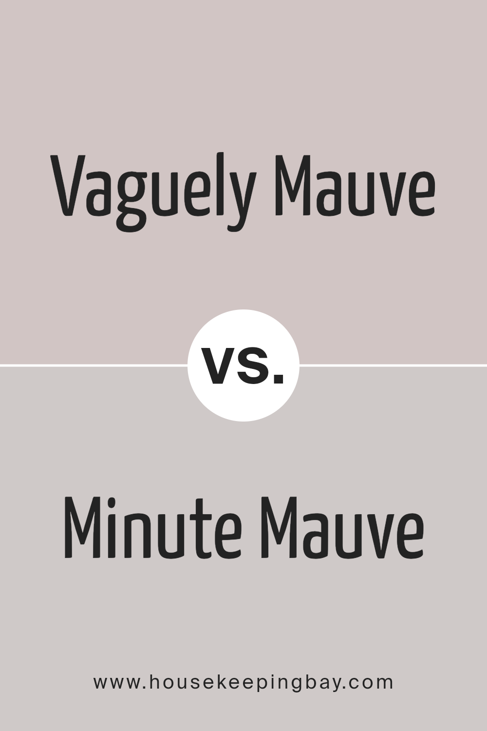
Vaguely Mauve SW 6015 by Sherwin Williams vs Minute Mauve SW 7078 by Sherwin Williams
Vaguely Mauve SW 6015 and Minute Mauve SW 7078 by Sherwin Williams are both beautiful colors that share a family resemblance being shades of mauve, yet they have their unique touches.
Vaguely Mauve has a subtle, soft, and warm tone to it. It’s almost like looking at a gentle blush on someone’s cheeks, giving off a cozy and comforting vibe. It’s great for rooms where you want a hint of color without overwhelming the senses.
On the other hand, Minute Mauve is a bit more muted and leans towards a cooler, more understated elegance.
It’s like the first light of dawn, soft and soothing, but with a hint of mystery. This color works well in spaces where you’re aiming for a modern and serene atmosphere.
While both colors add a charming touch of mauve to any space, Vaguely Mauve brings warmth and coziness, whereas Minute Mauve offers a cooler, more refined elegance.
Depending on what feeling you want to create in your room, either of these shades could be the perfect choice.
You can see recommended paint color below:
- SW 7078 Minute Mauve
housekeepingbay.com
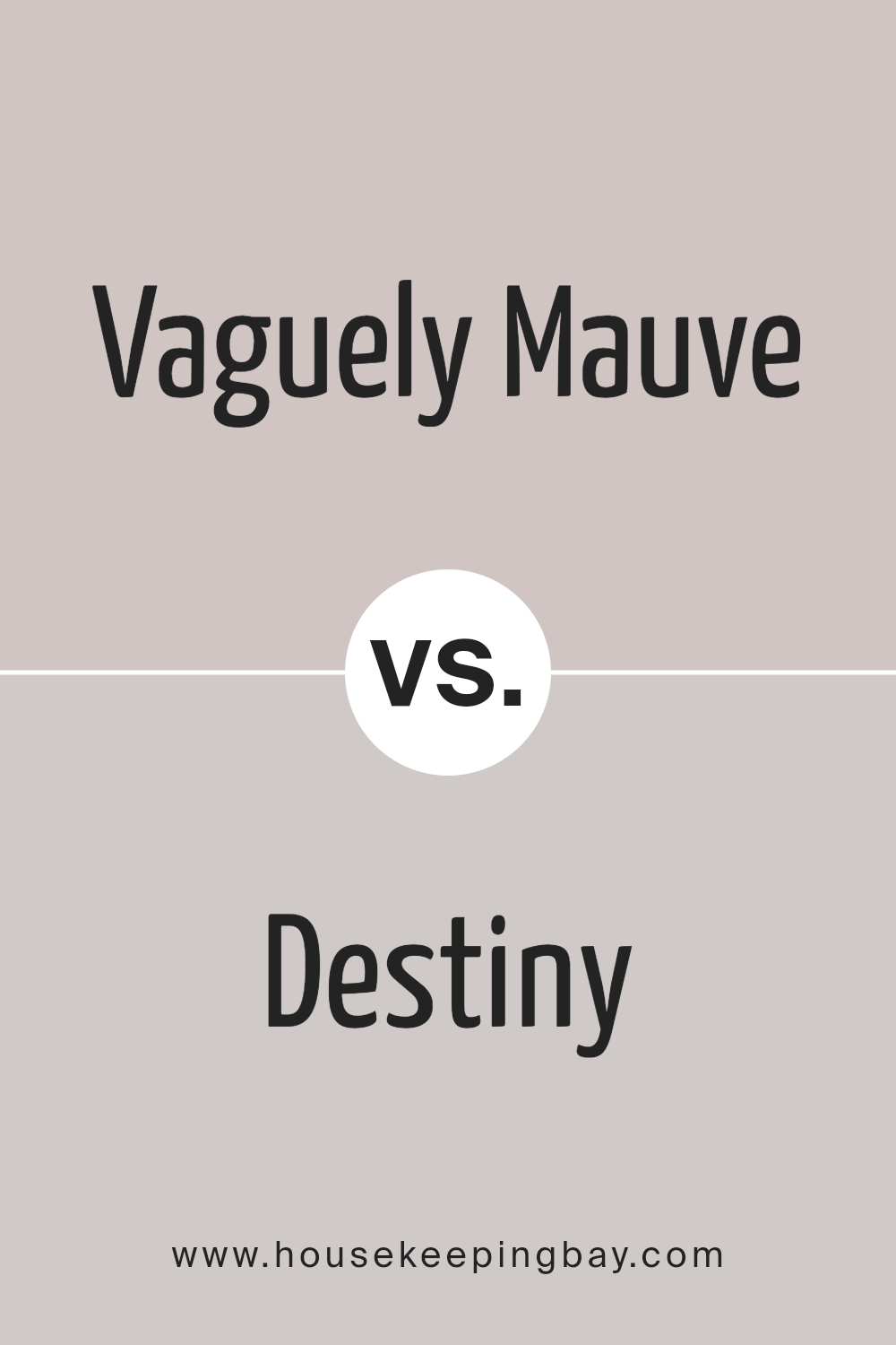
Vaguely Mauve SW 6015 by Sherwin Williams vs Destiny SW 6274 by Sherwin Williams
Vaguely Mauve SW 6015 and Destiny SW 6274, both from Sherwin Williams, offer unique takes on subtle, soothing colors. Vaguely Mauve leans towards a soft, muted pink with a touch of gray, giving it a cozy, warm feel that’s perfect for creating a calm and welcoming atmosphere.
It’s like a gentle hug for your walls, making spaces feel snug and serene.
On the other hand, Destiny SW 6274 is a light, airy blue with hints of gray, offering a cooler, more tranquil vibe.
It’s reminiscent of a clear sky on a peaceful morning, bringing a sense of openness and quiet elegance to any room.
Destiny invites a refreshing and calming energy, promoting relaxation and thoughtfulness.
While both colors are understated and sophisticated, the main difference lies in their undertones and the mood they set.
Vaguely Mauve warms up a room with its soft pinkish hue, whereas Destiny cools down spaces with its breezy, light blue touch.
Whether you’re aiming for a warm embrace or a breath of fresh air, these colors offer lovely options for creating inviting, beautiful spaces.
You can see recommended paint color below:
housekeepingbay.com
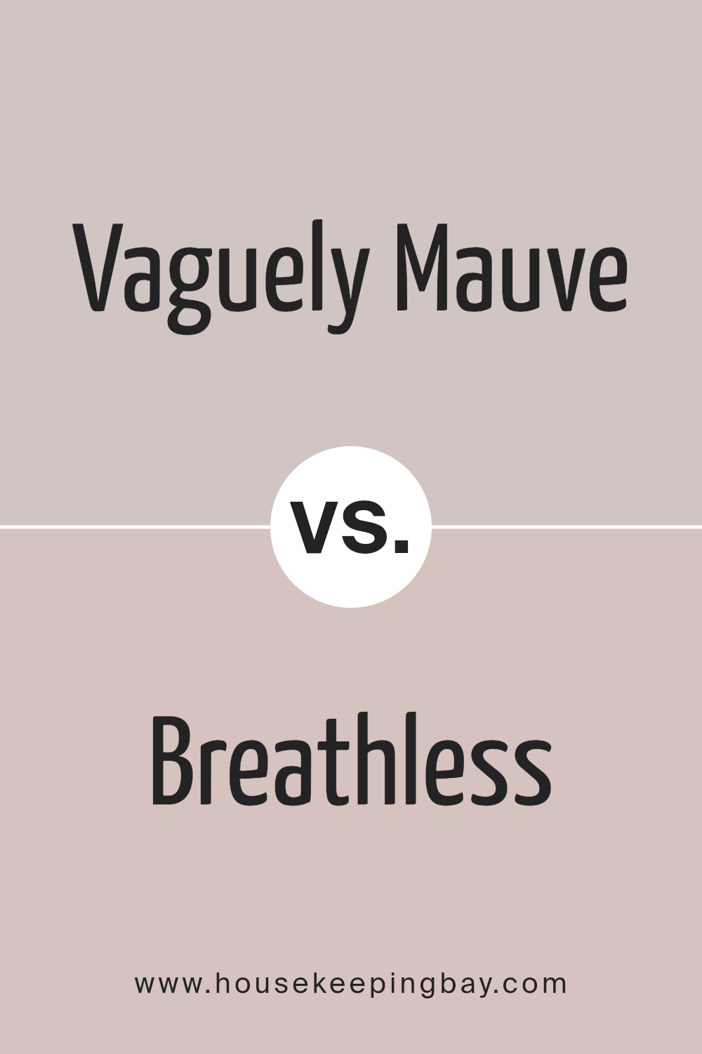
Vaguely Mauve SW 6015 by Sherwin Williams vs Breathless SW 6022 by Sherwin Williams
Main color “Vaguely Mauve SW 6015” by Sherwin Williams is a unique color that’s not fully pink and not exactly purple.
It sits nicely in the middle, giving off a soft, warm vibe that can make any room feel cozy and inviting without being too bold. It’s ideal for those looking to add a touch of femininity and warmth to their space without going over the top.
On the other hand, “Breathless SW 6022” is another Sherwin Williams shade that’s more on the neutral side.
It’s a very light, almost pastel, gray that can sometimes give off a slight lavender tone under specific lighting.
This color is perfect for creating a serene, calming environment. It’s subtle enough to work in any room, making it a great option for those wanting a clean, minimalist look.
Both colors are beautiful in their own right, but they serve different purposes.
“Vaguely Mauve” adds a bit of color and warmth, whereas “Breathless” keeps things cool and understated, making it easier to match with a wide range of decor styles.
You can see recommended paint color below:
- SW 6022 Breathless
housekeepingbay.com
Conclusion
In summary, Vaguely Mauve SW 6015 by Sherwin Williams presents itself as a unique and subtle color choice for those looking to add a touch of sophistication and warmth to their spaces.
This color strikes a delicate balance, offering a blend of muted purple and soft gray tones that can effortlessly complement a wide range of decorating styles.
Its versatility allows it to stand out as an elegant backdrop in a living room, creating a cozy and inviting atmosphere, or serve as a serene and calming presence in a bedroom, providing a perfect setting for relaxation.
Moreover, Vaguely Mauve’s understated beauty makes it an ideal option for anyone seeking to refresh their home with a modern yet timeless hue.
Unlike more vibrant purples, its softness does not overpower a room but rather enhances the space with a sophisticated and contemporary feel.
Whether one is aiming to update a single room or painting the entire exterior of a house, Vaguely Mauve offers a harmonious balance that is both stylish and soothing, making it a go-to color for homeowners and designers alike.
housekeepingbay.com
Ever wished paint sampling was as easy as sticking a sticker? Guess what? Now it is! Discover Samplize's unique Peel & Stick samples. Get started now and say goodbye to the old messy way!
Get paint samples