Destiny SW 6274 by Sherwin Williams
Unveiling the Elegance of Serenity: A Color's Voyage
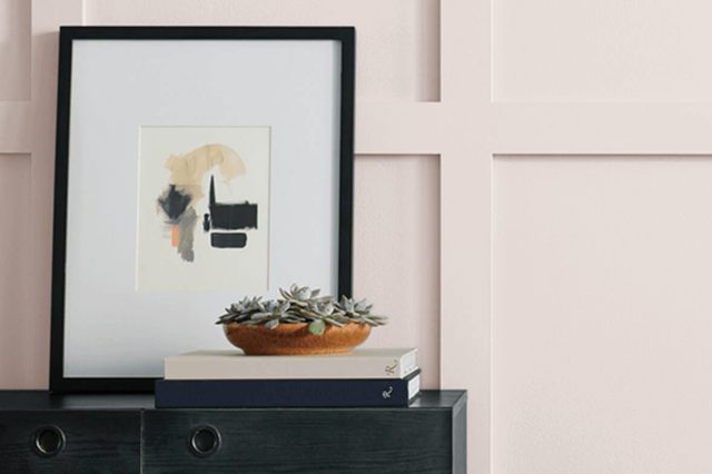
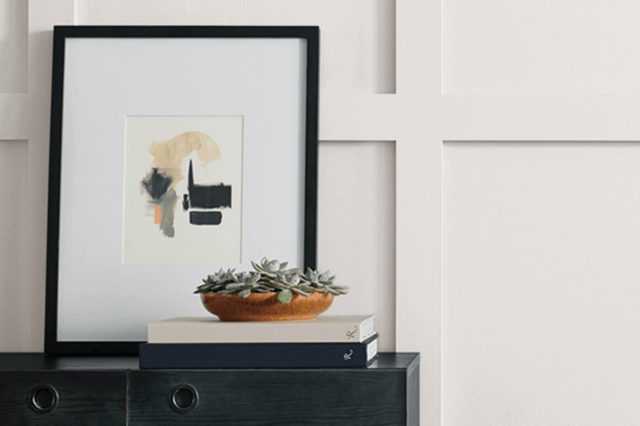
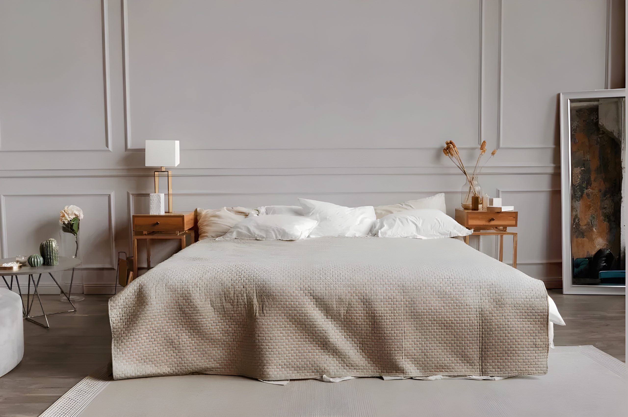
In the world of paint, finding the perfect shade that brings a room to life is akin to hitting the jackpot. Enter the shade SW 6274 Destiny by Sherwin Williams, a color that has quietly stolen the hearts of interior decorators and homeowners alike.
At its core, Destiny is a unique blend that walks the fine line between understated elegance and inviting warmth. Its versatility is its superpower, able to transform any space into a serene oasis or a sophisticated setting with equal ease.
This particular shade belongs to a palette that Sherwin Williams has carefully curated, ensuring it complements a wide array of styles, furnishings, and accent colors.
Whether you’re looking to revamp your living room, bedroom, or even the kitchen, Destiny welcomes a sense of calm and refinement without overwhelming the senses.
It’s not just a paint; it’s a statement of style that adds depth and character to walls that were once just blank canvases.Choosing the right paint color is a journey of discovering the mood and atmosphere you want to create in your home.
SW 6274 Destiny serves as a gentle nudge in the direction of tranquility and elegance, making it a top contender for those who aim to craft a space that feels both sophisticated and welcoming.
via sherwin-williams.com
What Color Is Destiny SW 6274 by Sherwin Williams?
DestinySW 6274 by Sherwin Williams is a soothing and versatile color that sits beautifully between the realms of gray and blue. This unique hue brings a gentle calmness to any space, making it a perfect choice for those looking to create a serene environment.
Its muted tone provides a subtle backdrop that can enhance a variety of interior styles without overwhelming the senses.
This color works exceptionally well in interior designs that aim for a modern, minimalist, or Scandinavian aesthetic. Its cool undertones pair beautifully with natural materials like light woods, stone, and cotton, adding a layer of texture and warmth to the space.
For a more contemporary look, incorporating metals such as brushed nickel or stainless steel can add a sleek, sophisticated touch that complements DestinySW 6274’s understated elegance.
In terms of textures, DestinySW 6274 works well with soft, plush fabrics like wool or velvet to create a cozy and inviting atmosphere. It also pairs nicely with smooth, matte finishes on furniture and fixtures, lending a modern and chic feel to the room.
This color’s adaptability makes it an excellent choice for living rooms, bedrooms, and bathrooms, where its calming effect can be fully appreciated.
Whether you’re looking to create a peaceful retreat or a stylish, modern space, DestinySW 6274 offers a solid foundation that can be easily tailored to your personal style.

housekeepingbay.com
Table of Contents
Is Destiny SW 6274 by Sherwin Williams Warm or Cool color?
DestinySW 6274 by Sherwin Williams is a unique color that can transform the look and feel of any home. This shade can best be described as a soft, muted purple with gray undertones, making it a versatile choice for various spaces.
It’s not too bold or overpowering, which means it can fit in well with other colors and decor styles. This makes it a great option for living rooms, bedrooms, or even bathrooms, where you want a touch of uniqueness without overwhelming the space.
The gray undertones in DestinySW 6274 help it pair nicely with modern and minimalistic designs, acting as a subtle backdrop that allows furniture and artwork to stand out. In homes with plenty of natural light, this color can appear lighter and more ethereal, adding a sense of calm and spaciousness to the room.
In spaces with less light, it offers a cozy, snug ambiance without making the room feel smaller or cramped.
Overall, DestinySW 6274 can be a brilliant addition to a home, offering a blend of sophistication and warmth that can elevate the look of any room.
Its ability to adapt according to the lighting and the colors it’s paired with makes it a highly versatile choice for homeowners looking to add a touch of elegance to their interiors.
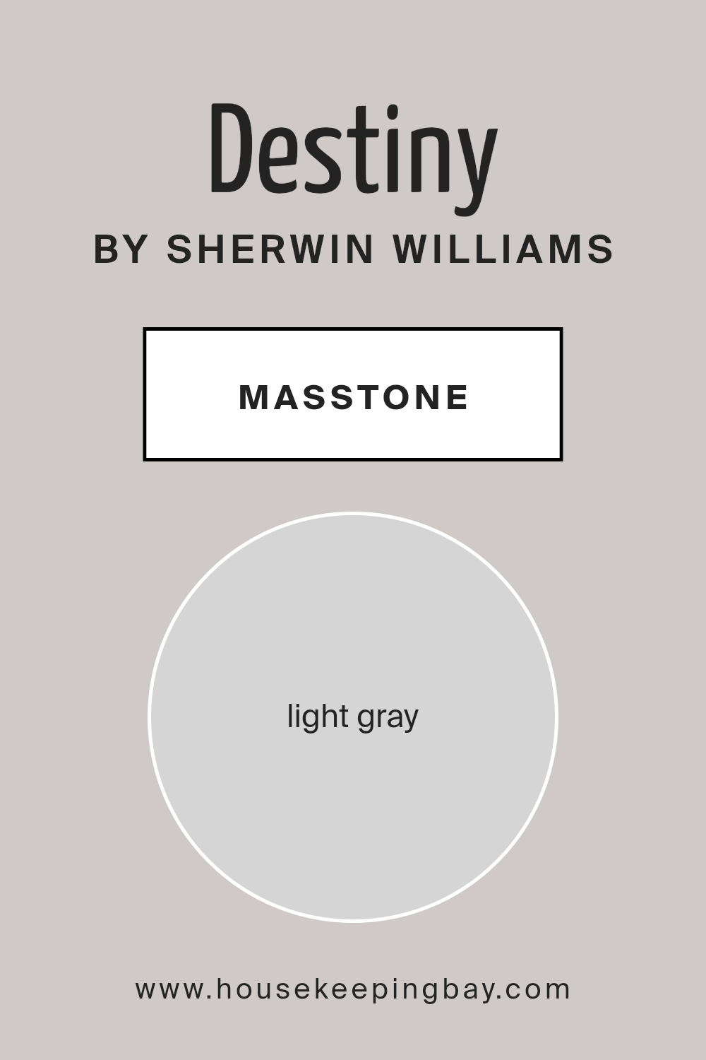
What is the Masstone of the Destiny SW 6274 by Sherwin Williams?
DestinySW 6274 by Sherwin Williams has a masstone, or main color, of light gray, tagged as #D5D5D5. This means when you look at the color straight on, without it being mixed or in different lights, it looks like a soft, light gray. This kind of color is super versatile, making it a great choice for homes.
Since it’s a light gray, it brings a fresh and airy feel to any room, making spaces look bigger and more open.
It’s kind of like a background color that lets your furniture and decorations pop, without overpowering them. Plus, light gray is easy to match with other colors.
Whether you love bold colors or prefer more neutral tones, this shade of light gray works well with almost anything. It’s also really calming, which is perfect for rooms where you want to relax, like bedrooms and living rooms.
Overall, DestinySW 6274 adds a clean and cozy feel to homes, making it a popular choice for anyone looking to refresh their space.
housekeepingbay.com
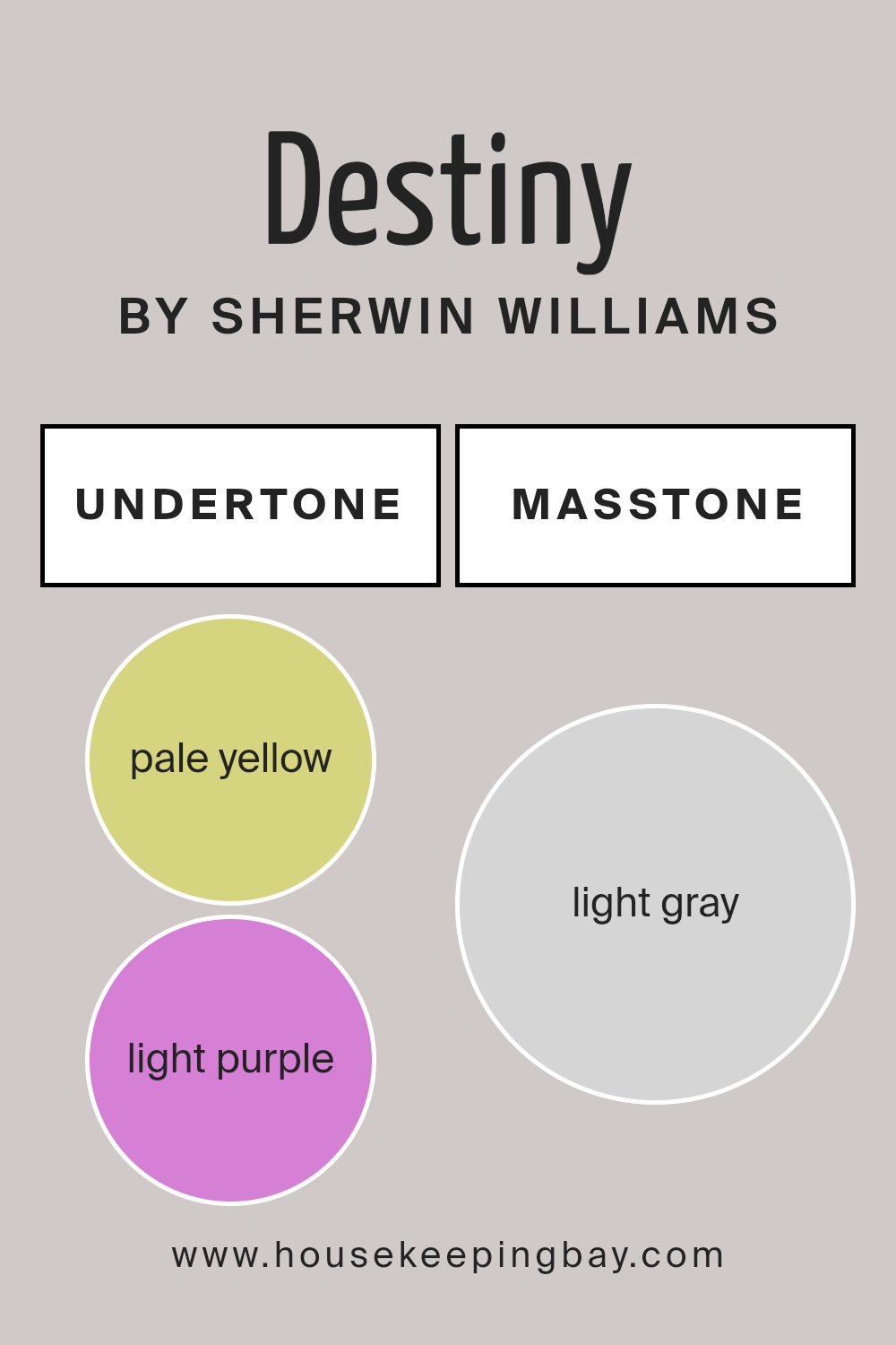
Undertones of Destiny SW 6274 by Sherwin Williams
DestinySW 6274 by Sherwin Williams is a unique color that hides more than what meets the eye at first glance. When you look closely, it reveals its undertones: a soft pale yellow and a gentle light purple. Undertones are like secret ingredients in a color recipe.
They can subtly change how we see a color, depending on the light and what’s around it. Think of undertones as the color’s mood, affecting how it feels in a room.
With the pale yellow undertone in DestinySW 6274, there’s a hint of warmth, like soft sunlight in the morning. It makes spaces feel inviting and cozy. On the other hand, the light purple undertone adds a touch of cool sophistication.
It’s like a whisper of elegance that shows up more in certain lights, especially in the late afternoon or in rooms with northern exposure.
When you put DestinySW 6274 on interior walls, these undertones work together in an interesting way. In bright, sunny rooms, the pale yellow might shine a bit more, making the room feel warm and welcoming.
In rooms with less natural light, the light purple might step up, giving the space a calm and refined atmosphere.
This makes DestinySW 6274 a versatile color choice, able to create different moods in your home based on the room’s lighting and direction.
housekeepingbay.com
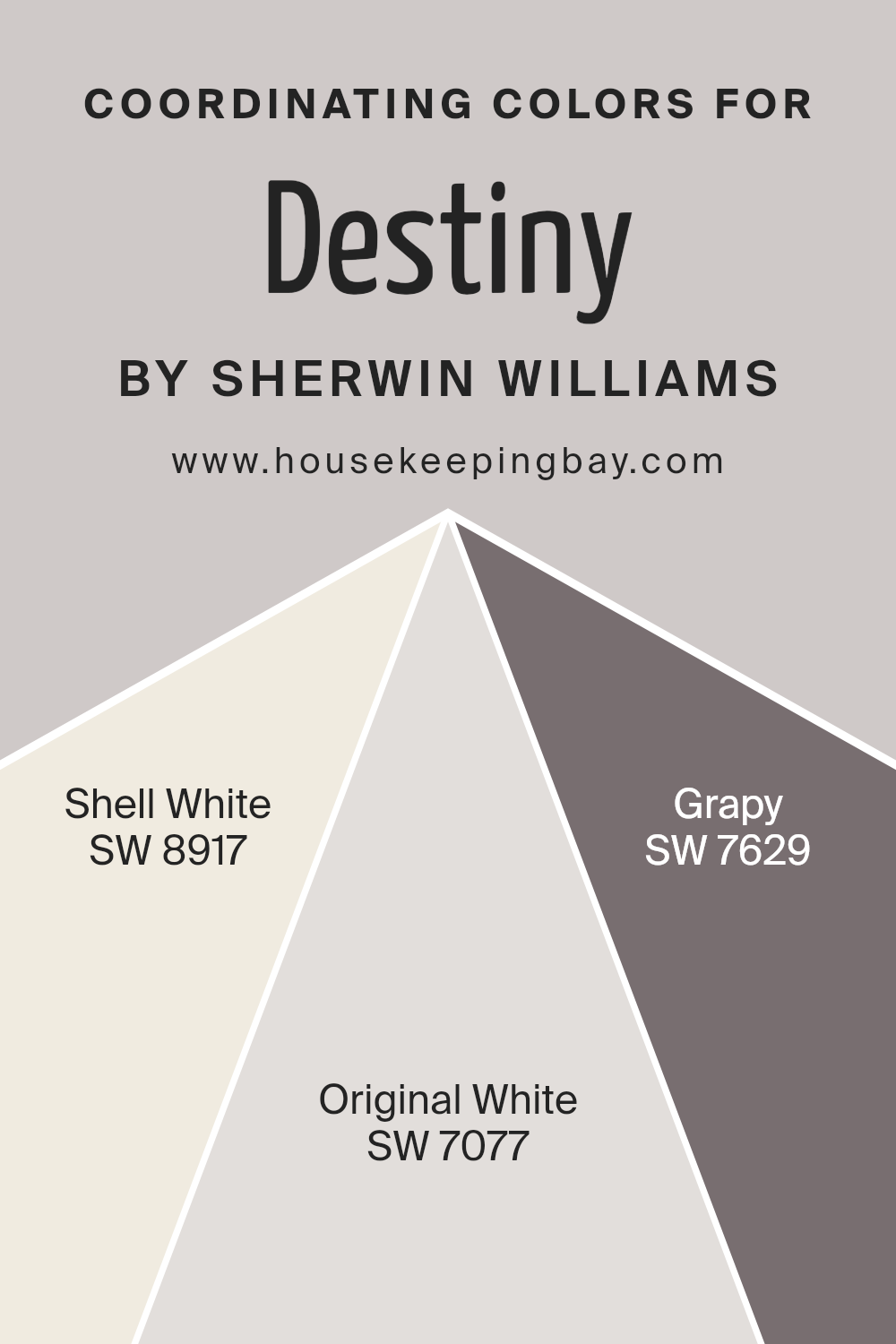
Coordinating Colors of Destiny SW 6274 by Sherwin Williams
Coordinating colors are shades that harmonize with a primary color, enhancing the overall aesthetic of a space without competing for attention. They work by balancing the visuals, offering a pleasing palette that can make any area look cohesive and thoughtfully designed.
For the specific Sherwin Williams color, DestinySW 6274, three coordinating colors have been identified to complement its unique tone: SW 8917 – Shell White, SW 7077 – Original White, and SW 7629 – Grapy.
SW 8917 – Shell White is a soft, subdued white with a warm undertone that brings a calm and soothing tone to the environment. It works beautifully with DestinySW 6274 by providing a gentle backdrop that allows the main color to stand out without overwhelming the senses.
Then there’s SW 7077 – Original White, a crisp and clean shade that offers a fresh and airy feel. This color adds a dose of brightness to spaces, highlighting the versatility of DestinySW 6274 when paired together.
Lastly, SW 7629 – Grapy is a unique addition to the palette, presenting a muted, sophisticated hue with a deep, rich undertone. It contrasts nicely with DestinySW 6274, adding depth and character to the overall color scheme.
Together, these coordinating colors offer a harmonious and appealing combination that can elevate any design project.
You can see recommended paint colors below:
- SW 8917 Shell White
- SW 7077 Original White
- SW 7629 Grapy
housekeepingbay.com
How Does Lighting Affect Destiny SW 6274 by Sherwin Williams?
Lighting plays a key role in how we perceive colors. This is because different light sources can change the appearance of a color, making it look brighter, darker, or even completely changing its hue.
When it comes to the color DestinySW 6274 by Sherwin Williams, lighting can significantly influence how this particular shade appears in a space.
Under artificial light, DestinySW 6274 can seem warmer and more inviting. This is because most indoor lights, like incandescent bulbs, have a yellowish glow, which adds warmth to colors. So, in rooms with a lot of artificial lighting, DestinySW 6274 might lose a bit of its natural hue and appear softer and cozier.
In natural light, DestinySW 6274 can show its true color, which might be more vibrant and true to the swatch. The quality of natural light, however, varies depending on the time of the day and the room’s orientation.
North-facing rooms receive less direct sunlight, making them cooler in tone. In these rooms, DestinySW 6274 might appear slightly grayish and subdued. The color won’t change dramatically but expect it to lean towards a softer, more muted version of its original hue.
South-facing rooms, on the other hand, get plenty of sunlight, which can make DestinySW 6274 look brighter and even more lively. The natural brightness enhances the color, making it appear warmer and more vibrant throughout the day.
East-facing rooms receive strong light in the morning, which can make DestinySW 6274 look very vibrant and fresh in the morning light. As the day progresses, and the natural light fades, the color can turn softer and more subdued.
West-facing rooms bask in the warm, orange light of the afternoon and evening. This can intensify the warmth of DestinySW 6274, making it appear warmer and richer during these times.
In summary, the look of DestinySW 6274 can vary significantly depending on the type and amount of light it is exposed to. Whether warmed by artificial lighting or highlighted by natural sunlight, its appearance can shift, presenting a wide range of moods depending on the room’s orientation and light sources.
housekeepingbay.com
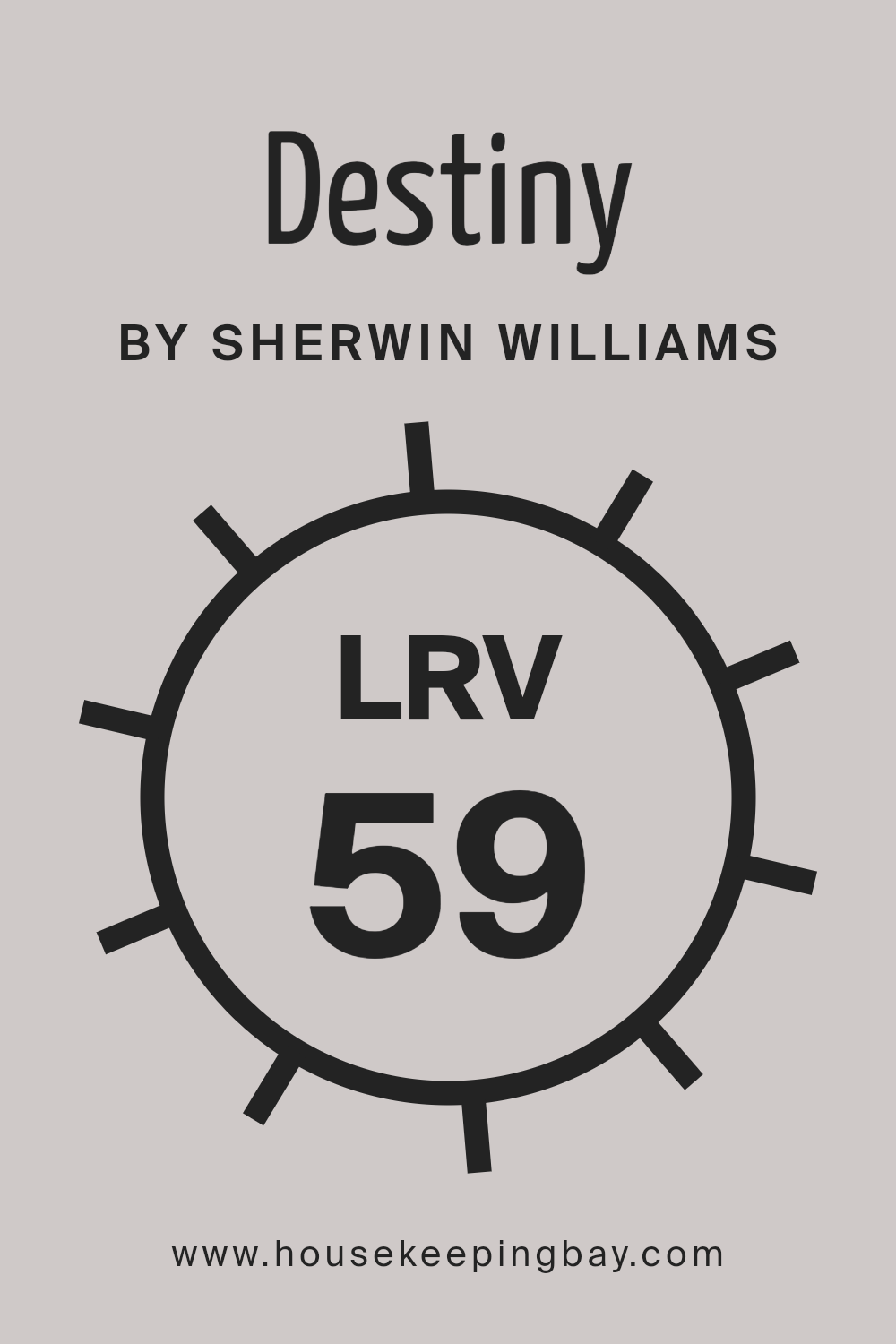
What is the LRV of Destiny SW 6274 by Sherwin Williams?
LRV stands for Light Reflectance Value. It’s a number that tells you how much light a color reflects back into a room, compared to how much it absorbs. Imagine you have a scale from 0 to 100, where 0 is completely black, absorbing all light, and 100 is pure white, reflecting all light back.
Colors with higher LRV make spaces feel brighter because they reflect more light. On the other hand, colors with lower LRV can make a room feel cozier but darker, as they absorb more light.
The LRV of DestinySW 6274 by Sherwin Williams is 58.987. This means it’s more on the lighter side, reflecting a good amount of light without being overly bright. In a room, this color can help create a light, uplifting atmosphere, making the space feel airy and open.
It’s a versatile color, working well in spaces that get a lot of natural light or even in darker rooms where you want to maximize the impact of the available lighting. With an LRV close to 59, DestinySW 6274 strikes a nice balance, making it a flexible option for various home spaces.
housekeepingbay.com
What is LRV? Read It Before You Choose Your Ideal Paint Color
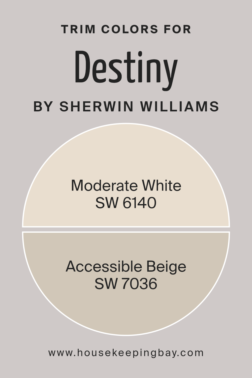
What are the Trim colors of Destiny SW 6274 by Sherwin Williams?
Trim colors play a crucial role in painting and decorating spaces, serving as a finishing touch that can significantly enhance the aesthetic appeal and overall look of a room or exterior.
Specifically, when discussing a paint color like Destiny SW 6274 by Sherwin Williams, the choice of trim color can either complement or contrast with the wall color to create a desired effect.
For instance, by selecting the right trim colors, you can highlight architectural details, create a sense of cohesion, or frame a room to make it feel more spacious or cozier.
The trim, which includes elements like baseboards, window casings, and crown molding, acts as a visual frame for your space, and the colors chosen for it are instrumental in defining the room’s character and ambiance.
Choosing trim colors such as Moderate White SW 6140 or Accessible Beige SW 7036 for Destiny SW 6274 walls is a strategy to maintain a soft, seamless transition or a gentle contrast that enhances visual interest without overwhelming the space.
Moderate White isn’t just white; it’s a soft, warm hue that adds a subtle brightness to spaces, making it a perfect companion for the calm and serene Destiny, ensuring the room feels cohesive yet distinct.
On the other hand, Accessible Beige is a light, welcoming neutral that brings a grounded, comforting feel to the trim, promising to frame Destiny-painted walls in a manner that’s soothing and inviting.
These choices underline the importance of selecting trim colors thoughtfully to complement the primary wall color, ensuring the space feels balanced and beautifully put together.
You can see recommended paint colors below:
- SW 6140 Moderate White
- SW 7036 Accessible Beige
housekeepingbay.com
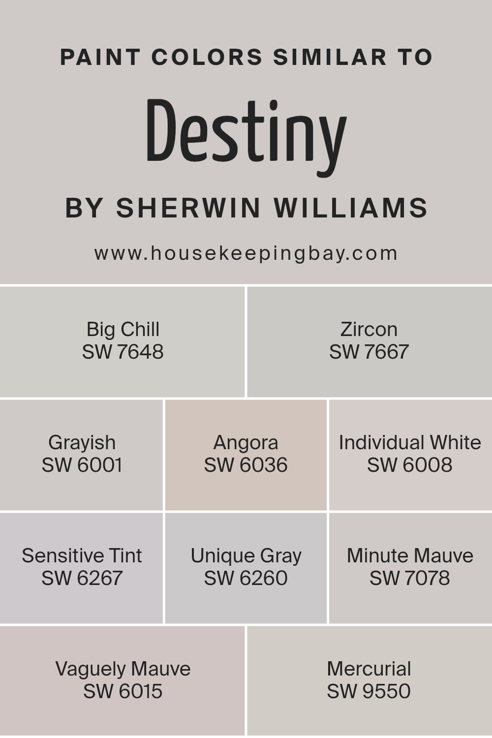
Colors Similar to Destiny SW 6274 by Sherwin Williams
Similar colors play a crucial role in design, creating a seamless and coherent look that can enhance the aesthetic appeal of any space.
Using shades like those similar to DestinySW 6274 by Sherwin Williams, such as Big Chill, Zircon, Grayish, Angora, Individual White, Sensitive Tint, Unique Gray, Minute Mauve, Vaguely Mauve, and Mercurial, offers a spectrum of hues that harmoniously blend with each other.
These shades range from soft greys to gentle mauves, providing a versatile palette for decorating. Using similar colors in a design scheme helps to create a sense of unity and flow, making spaces feel more cohesive and thoughtfully put together.
Big Chill is a light grey that brings a fresh and calm atmosphere to any room, embodying a breezy and airy feel. Zircon is a slightly deeper grey, offering a hint of sophistication and serenity, perfect for a calming retreat.
Grayish, as the name suggests, is a blend of grey and beige, imparting warmth and versatility. Angora is a soft, taupe-grey that exudes elegance and a subtle sense of comfort. Individual White is a soft white with a hint of grey, creating a clean and inviting space.
Sensitive Tint is a pale lavender-grey, adding a touch of tranquility and softness. Unique Gray offers a deeper tone, bringing a modern edge with its rich hue. Minute Mauve is a whisper of mauve that lends a delicate and refined touch.
Vaguely Mauve is a bit more pronounced, offering depth and intrigue with its muted purple undertones. Lastly, Mercurial is a complex grey with lavender undertones, adding a layer of sophistication.
Together, these colors work to create spaces that are both cohesive and rich in depth, proving that the thoughtful use of similar colors can transform any area into a harmonious and inviting environment.
You can see recommended paint colors below:
- SW 7648 Big Chill
- SW 7667 Zircon
- SW 6001 Grayish
- SW 6036 Angora
- SW 6008 Individual White
- SW 6267 Sensitive Tint
- SW 6260 Unique Gray
- SW 7078 Minute Mauve
- SW 6015 Vaguely Mauve
- SW 9550 Mercurial
housekeepingbay.com
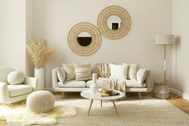
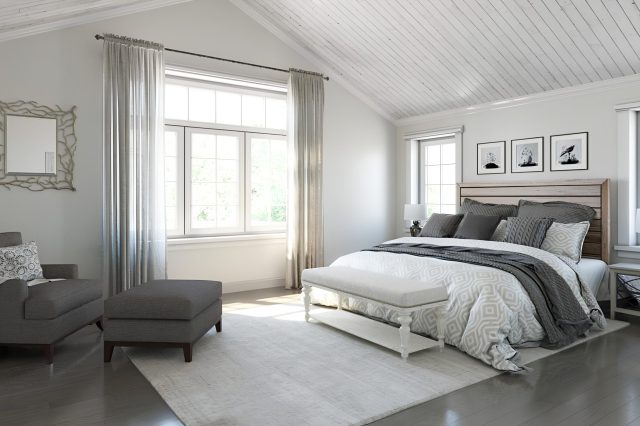
How to Use Destiny SW 6274 by Sherwin Williams In Your Home?
Destiny SW 6274 by Sherwin Williams is a beautiful paint color that brings a fresh and calming vibe to any room in your home. Imagine transforming your bedroom into a peaceful sanctuary where you can relax after a busy day.
This color has a soft, almost misty quality that works well with different decorating styles, whether you’re into modern, minimalistic looks or prefer a more traditional feel.
You can use Destiny to paint your walls, creating a serene backdrop for your furniture and artwork.
It’s also great for smaller projects, like giving an old piece of furniture a new lease on life. Pair it with light, neutral colors for a subtle, elegant look, or contrast it with bold, dark colors for a more dramatic effect.
Incorporating Destiny SW 6274 into your home is a simple way to add a touch of tranquility to your living spaces. Whether it’s the main color theme or an accent, it can make your home feel more inviting and comfortable.
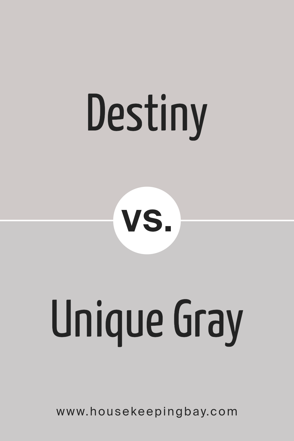
Destiny SW 6274 by Sherwin Williams vs Unique Gray SW 6260 by Sherwin Williams
The colors Destiny SW 6274 and Unique Gray SW 6260, both from Sherwin Williams, offer distinct vibes for any space. Destiny is a deeper shade that carries a serene and calm aura, making it perfect for creating a cozy atmosphere.
It’s like a gentle hug for your walls, providing a sense of comfort and tranquility. On the other hand, Unique Gray leans towards a softer, more subtle gray that brings a modern and sophisticated touch. It’s incredibly versatile, easily fitting into various decor styles without overpowering the room.
Together, these colors could complement each other well in a space, with Destiny adding depth and warmth, while Unique Gray lightens the mood with its refreshing feel. Ideal for anyone looking to mix a cozy vibe with contemporary elegance.
You can see recommended paint color below:
- SW 6260 Unique Gray
housekeepingbay.com
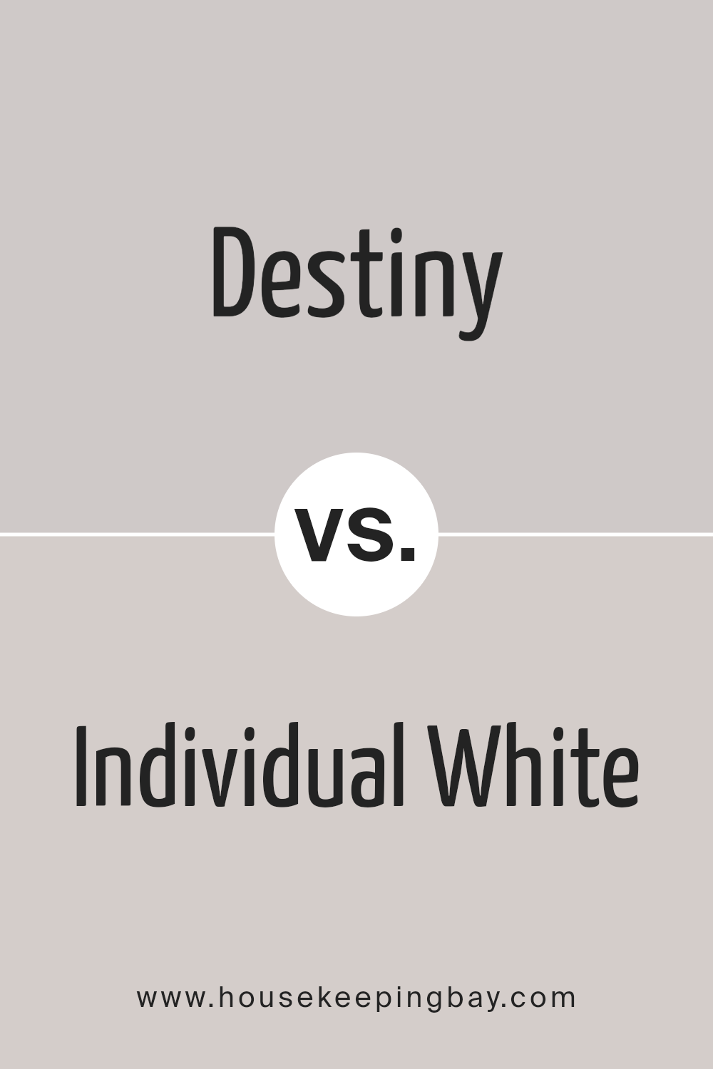
Destiny SW 6274 by Sherwin Williams vs Individual White SW 6008 by Sherwin Williams
Destiny SW 6274 by Sherwin Williams and Individual White SW 6008 by Sherwin Williams are two unique shades that offer different vibes for any space. Destiny is a soft, muted shade that carries a hint of gray, making it a versatile choice for those who want a bit of color without overwhelming a room.
It’s subtle and cozy, perfect for creating a tranquil atmosphere.
On the other hand, Individual White is a warm white with a touch of creaminess, giving it a welcoming feel. It’s ideal for making spaces look brighter and larger, offering a clean and crisp backdrop for any decor style.
When comparing these two, Destiny brings a cooler, more serene mood, while Individual White creates a light and airy feel. Destiny can be great for adding depth and interest to rooms without getting too bold, whereas Individual White is excellent for an open, minimalist look.
Both colors work well in various settings, from modern to traditional, but their effects on a room’s ambiance are distinctly different.
You can see recommended paint color below:
- SW 6008 Individual White
housekeepingbay.com
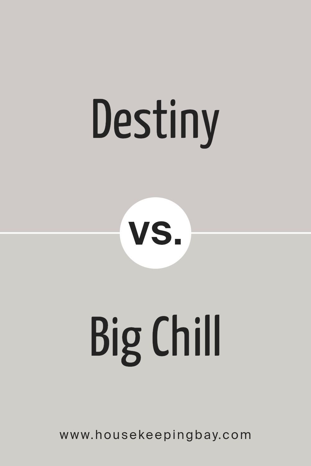
Destiny SW 6274 by Sherwin Williams vs Big Chill SW 7648 by Sherwin Williams
Destiny SW 6274 and Big Chill SW 7648, both by Sherwin Williams, are unique colors that offer different vibes for any space. Destiny is a deeper, more intense color.
It has a richness that can make a room feel cozy and inviting. Think of Destiny as a warm hug – it’s a color that seems to pull you in and make spaces feel more intimate.
On the other hand, Big Chill is like a breath of fresh air. It’s lighter and has a cool tone, making it perfect for creating a calm and serene atmosphere. It’s the kind of color that can help make a small room look bigger or give a fresh, clean look to any space.
When comparing these two, Destiny adds warmth and depth, while Big Chill gives off a cool and relaxed vibe. Both are beautiful in their own right and can dramatically change the mood of a room, depending on what you’re going for.
You can see recommended paint color below:
housekeepingbay.com
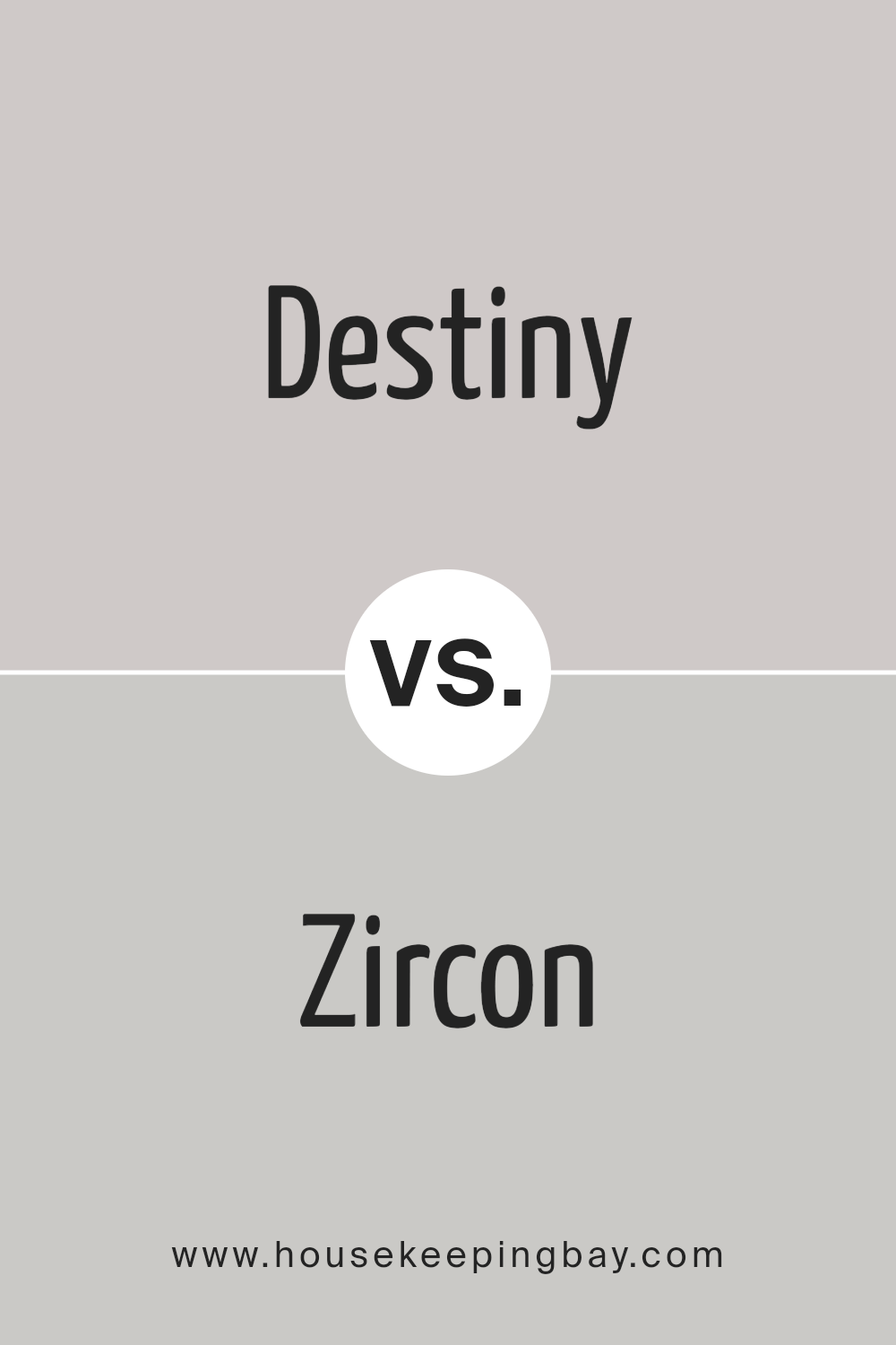
Destiny SW 6274 by Sherwin Williams vs Zircon SW 7667 by Sherwin Williams
Destiny SW 6274 and Zircon SW 7667 are two distinct colors from Sherwin Williams that bring different vibes to a space. Destiny is a soft, muted purple with a hint of gray, giving a calm and soothing feel to any room.
It’s gentle and subtle, making it perfect for creating a peaceful and relaxing area. On the other hand, Zircon is a light gray with cool undertones. This color is versatile, fitting well in a variety of settings. It offers a clean and fresh look, making spaces appear more spacious and brighter.
While Destiny adds a touch of warmth and coziness with its purple-gray hue, Zircon provides a crisp and modern ambiance with its pure gray shade.
Both colors work well in homes, but your choice between them would depend on the mood you’re aiming to achieve; cozy and serene with Destiny or sleek and contemporary with Zircon.
You can see recommended paint color below:
- SW 7667 Zircon
housekeepingbay.com
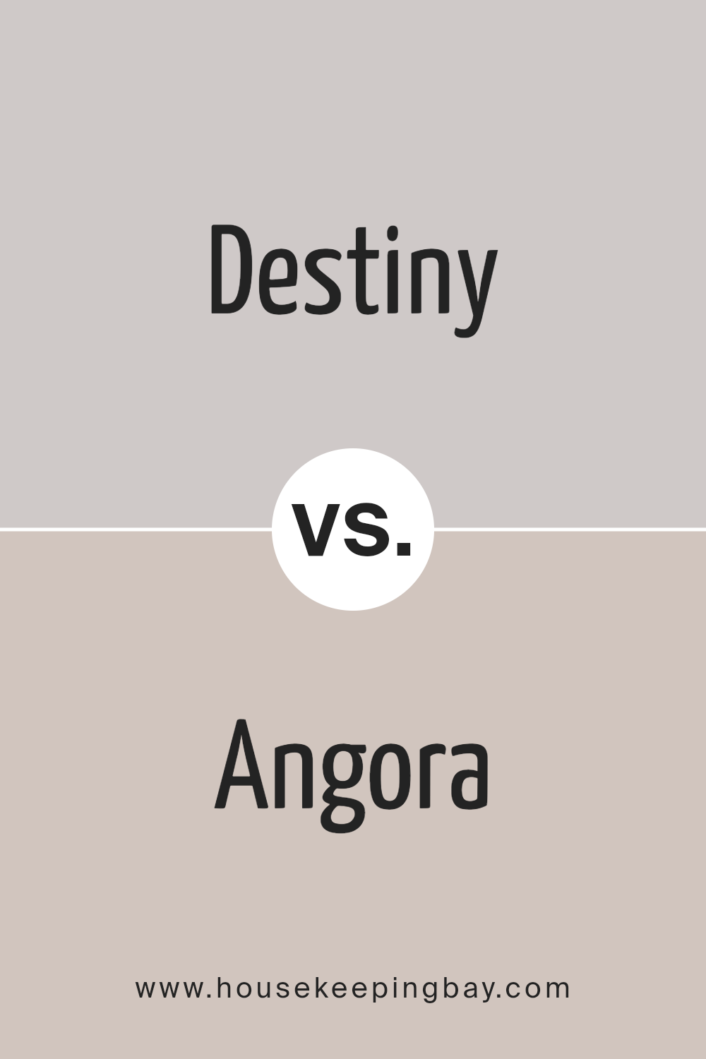
Destiny SW 6274 by Sherwin Williams vs Angora SW 6036 by Sherwin Williams
Destiny SW 6274 and Angora SW 6036, both by Sherwin Williams, are two beautiful colors with their own unique appeal. Destiny is like looking at a deep, serene sea that calms you down. It’s a dark gray with a hint of blue, giving it a cool, soothing vibe. It’s great if you’re aiming for a refined, yet modern look in a room.
On the other hand, Angora is like warm, fluffy cotton. It’s a soft, light gray with a touch of beige, making it super cozy and inviting. It’s the kind of color that makes a room feel like a warm hug, perfect for spaces where you want to relax.
While Destiny sets a bold and elegant tone, Angora creates a gentle and welcoming atmosphere. Both are stunning, but your choice depends on what mood you’re going for: the strong sophistication of Destiny or the tender comfort of Angora.
You can see recommended paint color below:
- SW 6036 Angora
housekeepingbay.com
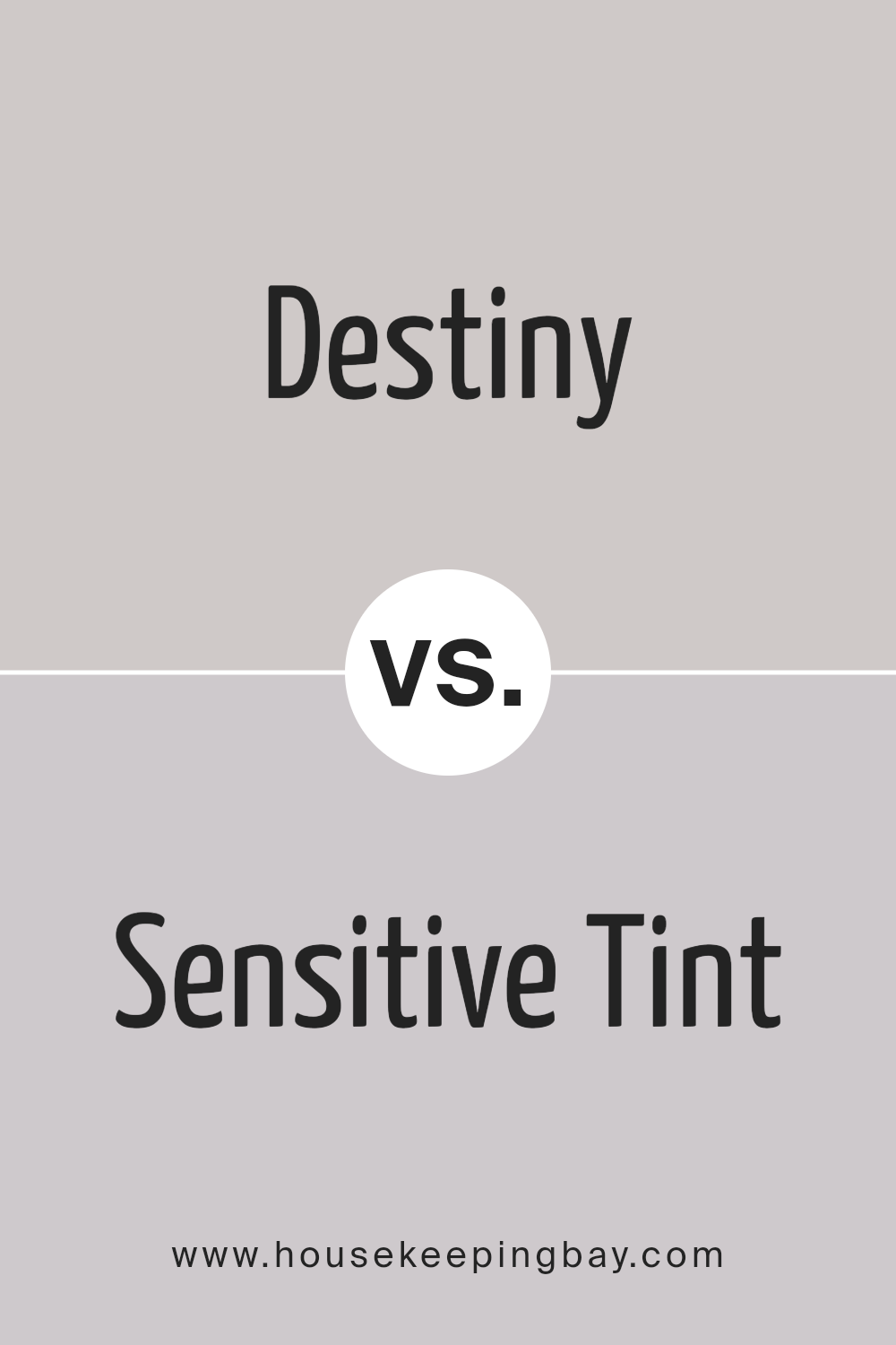
Destiny SW 6274 by Sherwin Williams vs Sensitive Tint SW 6267 by Sherwin Williams
Destiny SW 6274 and Sensitive Tint SW 6267 by Sherwin Williams are two unique colors, each with its own charm. Destiny is a deeper, more pronounced shade. It has a strong presence, making it a great choice for spaces where you want to add a bit of sophistication and depth. On the other hand, Sensitive Tint is lighter and softer.
It brings a gentle, calming vibe to any room, perfect for creating a relaxing atmosphere.
While Destiny adds drama and character, making a bold statement, Sensitive Tint offers a subtle touch, enhancing spaces without overpowering them. Whether you’re looking to create a cozy corner or brighten up a space, both colors have their merits.
Destiny might be the go-to for a focal point in a room or an accent wall, whereas Sensitive Tint works beautifully as a backdrop for artwork or furniture, blending seamlessly into the background and complementing other colors in the room.
You can see recommended paint color below:
- SW 6267 Sensitive Tint
housekeepingbay.com
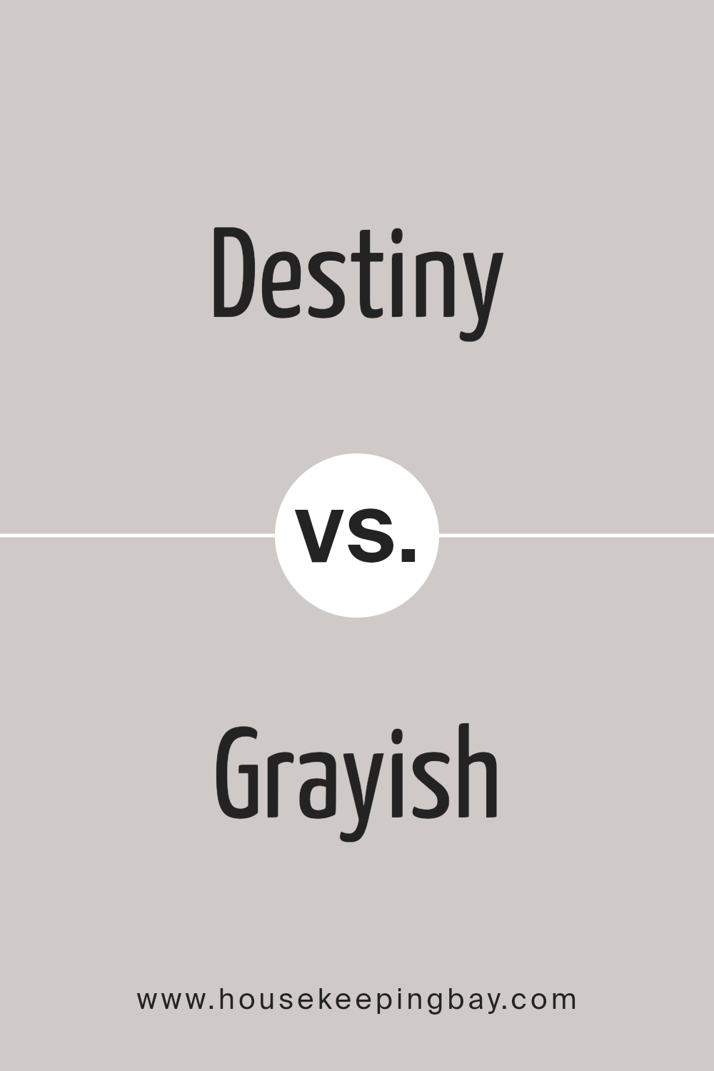
Destiny SW 6274 by Sherwin Williams vs Grayish SW 6001 by Sherwin Williams
Destiny SW 6274 and Grayish SW 6001 by Sherwin Williams are two different colors worth talking about. Destiny is a color that’s not just blue, but has some purple in it too. It’s a unique shade that stands out because it’s not just one simple color; it’s like a mix that makes it special.
On the other side, we have Grayish SW 6001. Despite what its name might make you think, it’s not just gray. It has a touch of green in it, making it more interesting than your average gray. It’s kind of warm and inviting, not cold or dull.
When you put these two colors together, Destiny feels deeper and more intense, while Grayish gives off a more relaxed and soothing vibe. So, if you’re looking to add some personality to a room, Destiny could be a great choice.
But, if you want something that feels calm and easy to look at, Grayish might be the way to go.
You can see recommended paint color below:
- SW 6001 Grayish
housekeepingbay.com
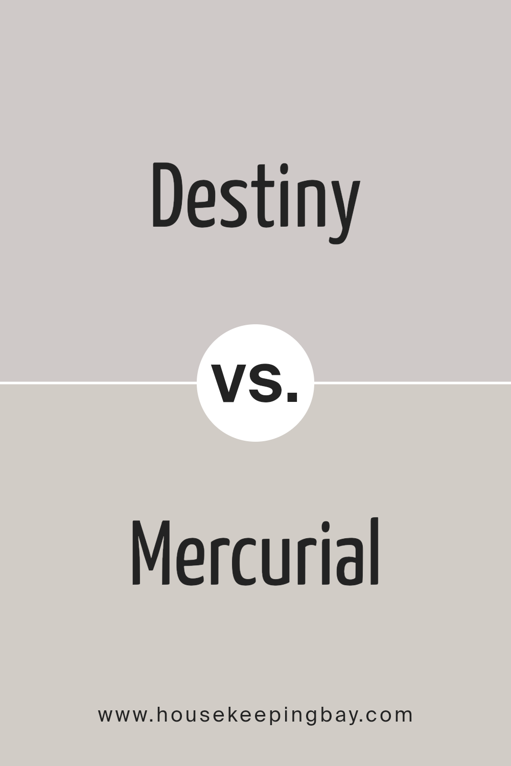
Destiny SW 6274 by Sherwin Williams vs Mercurial SW 9550 by Sherwin Williams
Destiny SW 6274 by Sherwin Williams is a unique shade that brings a sense of calmness and sophistication to spaces. It’s a soft, muted color with a hint of lavender, making it perfect for creating peaceful environments.
On the other hand, Mercurial SW 9550 by Sherwin Williams stands out with its dynamic and lively feel. This color is a bit bolder and more vibrant, leaning towards a deep, rich purple that can add a touch of elegance and drama to any room.
When comparing these two colors, it’s clear that they offer different vibes for interior spaces. Destiny provides a serene backdrop, ideal for relaxing areas like bedrooms or cozy reading nooks. Its understated elegance supports a wide range of decor styles without overwhelming the senses.
Mercurial, however, is perfect for those looking to make a statement. Its deeper purple hue commands attention and works well in spaces designed for entertainment or creative expression.
Choosing between Destiny and Mercurial depends on the mood you’re aiming to achieve. Destiny is your go-to for tranquility, while Mercurial sets a striking scene.
You can see recommended paint color below:
- SW 9550 Mercurial
housekeepingbay.com
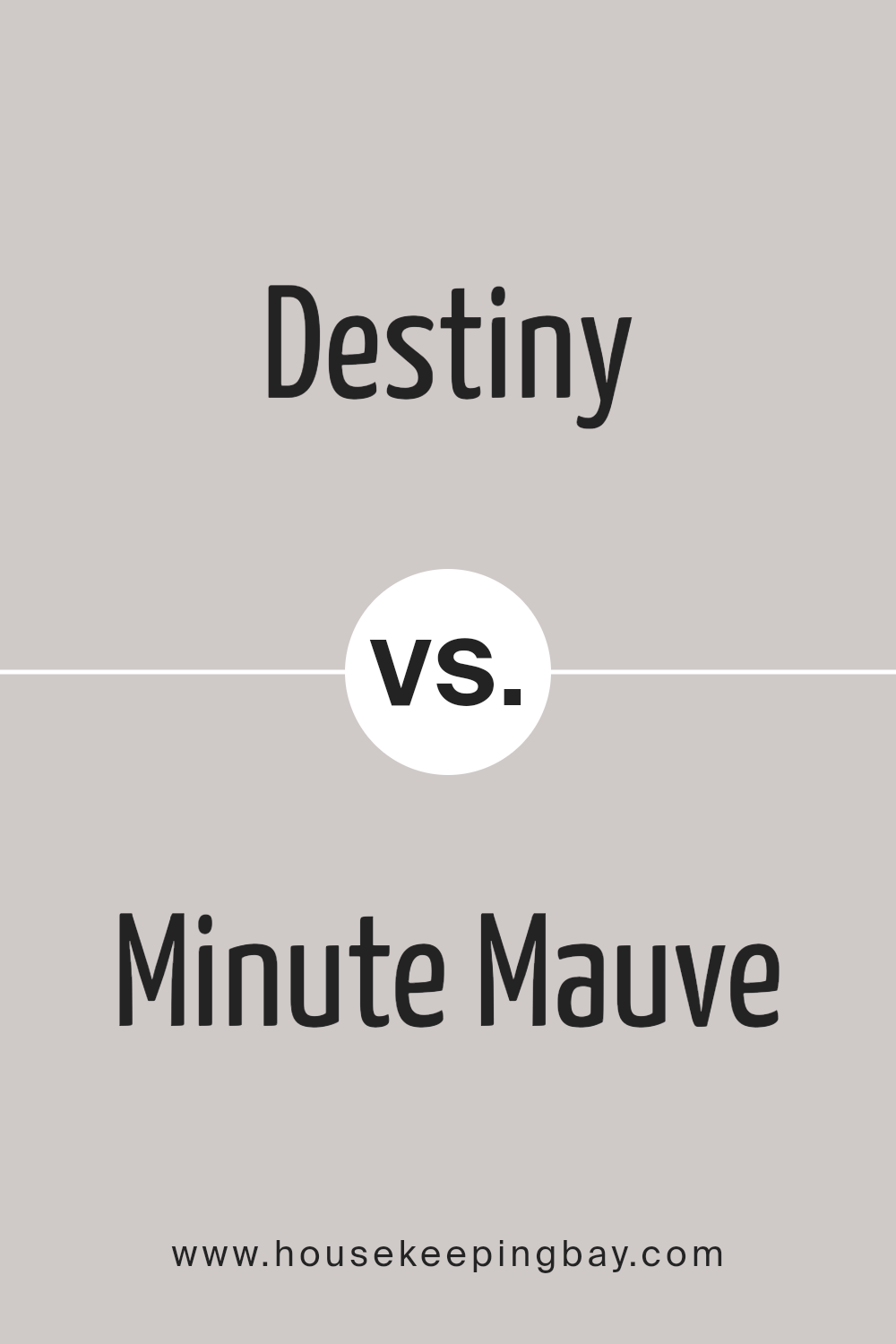
Destiny SW 6274 by Sherwin Williams vs Minute Mauve SW 7078 by Sherwin Williams
Destiny SW 6274 by Sherwin Williams and Minute Mauve SW 7078 also by Sherwin Williams, are both unique colors, yet they share a subtle, soothing quality. Destiny is more of a muted blue with a hint of gray.
It’s the kind of color that feels calming and can make a space feel more peaceful and relaxed. On the other hand, Minute Mauve leans towards a soft, gentle pink with a grayish undertone. It brings a warm, cozy vibe to any room, creating a comforting atmosphere.
While both colors are understated and can blend well with different decor styles, their distinct hues set them apart. Destiny’s cooler, serene blue tone offers a fresh and tranquil look, perfect for a quiet and reflective space.
Minute Mauve, with its warmer, tender pink, adds a touch of softness and is great for creating a welcoming and comforting area. Whether you’re looking to refresh a bedroom, living room, or bathroom, both colors provide a great foundation for experimenting with accents and furnishings, depending on the ambiance you aim to achieve.
You can see recommended paint color below:
- SW 7078 Minute Mauve
housekeepingbay.com
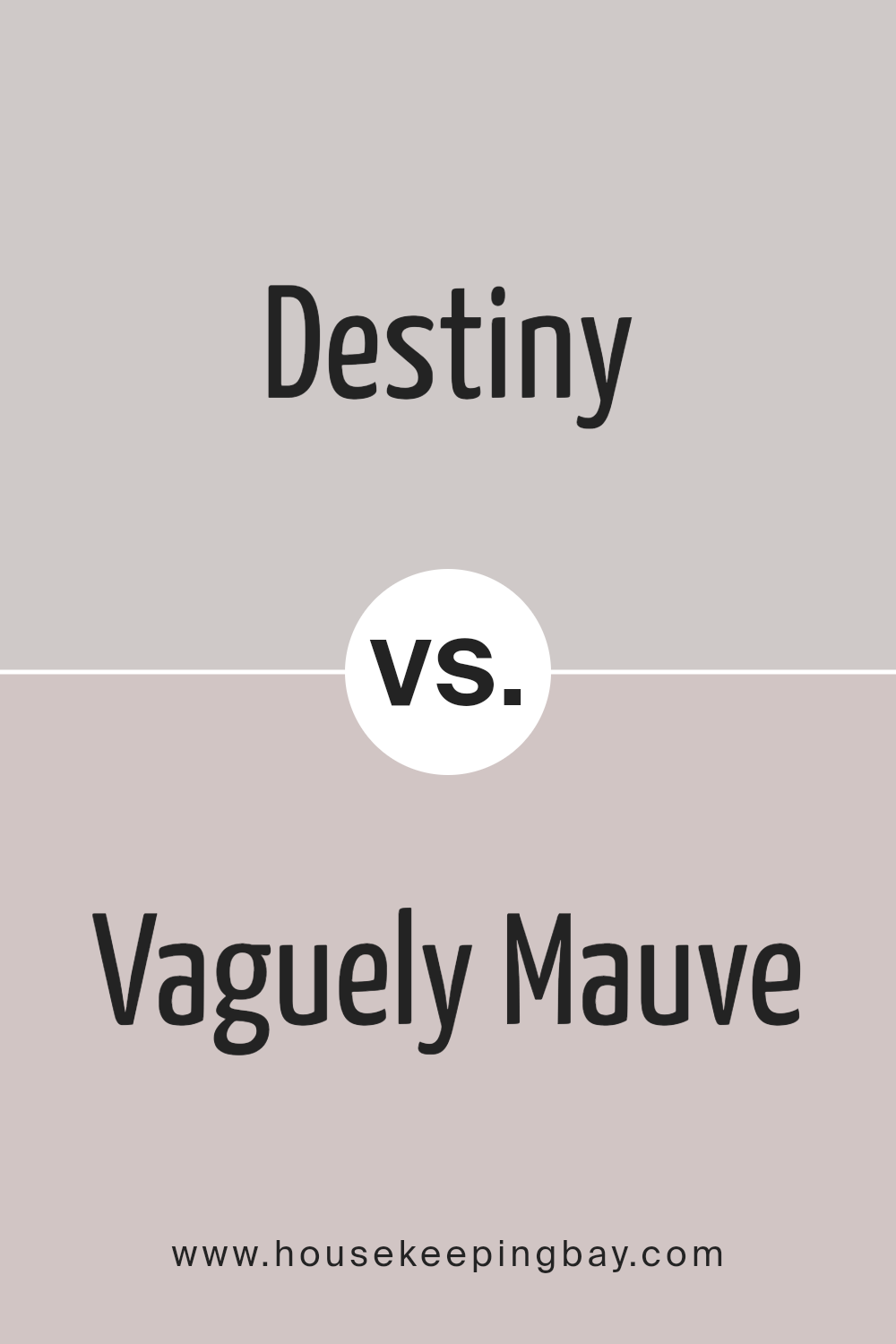
Destiny SW 6274 by Sherwin Williams vs Vaguely Mauve SW 6015 by Sherwin Williams
Destiny SW 6274 by Sherwin Williams is a gentle, cool gray with a hint of lavender, creating a serene and calming atmosphere. It’s a sophisticated choice, perfect for spaces where you want to promote relaxation and tranquility, like bedrooms or quiet living areas.
Its subtle lavender undertone adds a touch of warmth, making it versatile for combining with various decor styles.
On the other hand, Vaguely Mauve SW 6015, is a soft, muted mauve that leans more towards a dusky pink than a classic purple. This color offers a cozy, welcoming vibe, making it great for spaces meant to nurture warmth and comfort, such as family rooms or dining areas.
It brings a gentle pop of color, giving rooms a refreshed look while still maintaining a soft, understated elegance.
While both colors share a softness and warmth, Destiny leans towards a cooler palette with its gray-lavender blend, offering a tranquil retreat. Vaguely Mauve, conversely, has a warmer tone that adds a subtle, inviting charm to any space.
Each color creates its unique mood, making them suitable for different rooms depending on the ambiance you want to achieve.
You can see recommended paint color below:
- SW 6015 Vaguely Mauve
housekeepingbay.com
Conclusion
Destiny SW 6274 by Sherwin Williams is a color that brings a sense of tranquility and simplicity to any space. Its subtle yet elegant hue has a unique ability to blend well with various decor styles, making it a versatile choice for homeowners and interior designers alike.
Whether it’s used on the walls of a cozy living room or as an accent in a serene bedroom, Destiny SW 6274 adds a layer of calm sophistication to interiors, making spaces feel more inviting and relaxed.
The beauty of Destiny SW 6274 lies in its adaptability. It can serve as a neutral backdrop for bold furniture and art pieces, allowing them to take center stage, or it can be paired with softer tones for a more cohesive and understated look.
This color is perfect for those looking to create a peaceful retreat in their homes. Its popularity is a testament to its timeless appeal and the serene ambiance it helps to cultivate, proving that sometimes, the most impactful statements are made with the softest whispers.

housekeepingbay.com
Ever wished paint sampling was as easy as sticking a sticker? Guess what? Now it is! Discover Samplize's unique Peel & Stick samples. Get started now and say goodbye to the old messy way!
Get paint samples