Queen Anne Pink HC-60 Paint Color by Benjamin Moore
In the world of interior design, colors play a pivotal role in shaping the ambiance and character of a space.
In the world of interior design, colors play a pivotal role in shaping the ambiance and character of a space. Among the myriad of hues available, Queen Anne Pink HC-60 stands out as a distinctive choice for homeowners and designers alike.
This article delves into the specifics of this unique color, exploring its warmth, undertones, and coordinating colors to provide a comprehensive understanding of how it can transform any interior.
What Color Is Queen Anne Pink HC-60?
Queen Anne Pink HC-60, a color of subtlety and sophistication, is a hue that captivates with its gentle warmth and soft presence. Resembling the delicate petals of a spring blossom, this color exudes a sense of calm and serenity. Its versatility makes it an excellent choice for various interior styles, particularly in classical, romantic, and shabby chic decors.
The color pairs exceptionally well with natural materials like wood and stone, enhancing their textures. Fabrics such as linen, silk, and velvet also complement its understated elegance, making it ideal for spaces that aim to create a cozy, inviting atmosphere.
housekeepingbay.com
Table of Contents
Is It a Warm Or Cool Color?
Queen Anne Pink HC-60 radiates a warm essence, akin to the gentle touch of the morning sun. Its warm undertones create a sense of comfort and intimacy, making it a popular choice for living rooms and bedrooms where a cozy ambiance is desired. In contrast to cool colors that recede and create a sense of spaciousness, Queen Anne Pink adds depth and warmth, bringing walls closer and making large rooms feel more intimate and welcoming.
Undertones of Queen Anne Pink HC-60
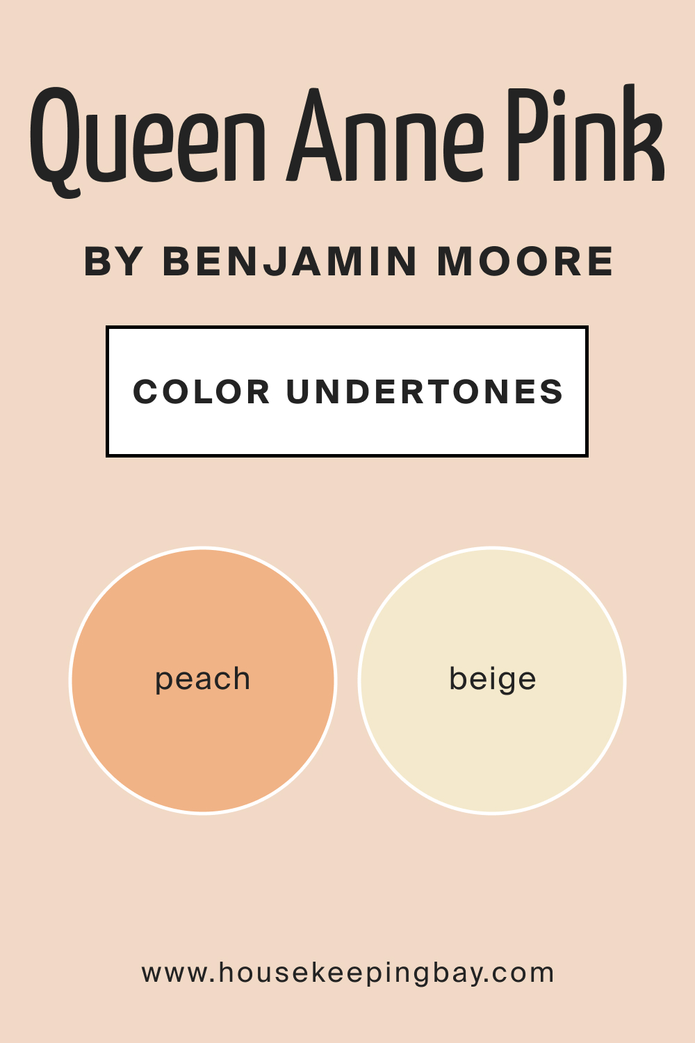
The undertones of a color significantly influence its perception and interaction with light and surrounding elements. Queen Anne Pink HC-60 possesses subtle undertones of peach and beige, which contribute to its warmth and depth. These undertones play a crucial role in how the color is perceived, as they can shift under different lighting conditions, displaying a richer or more muted appearance.
On interior walls, these undertones provide a dynamic visual experience, changing subtly throughout the day with the movement of natural light.
housekeepingbay.com
Coordinating Colors of Queen Anne Pink HC-60
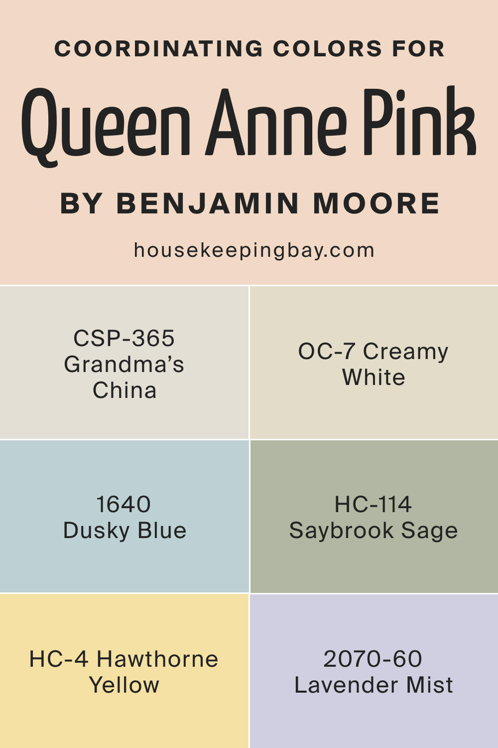
Coordinating colors are hues that harmonize well with a primary color, enhancing its beauty and creating a balanced look. Queen Anne Pink HC-60 pairs wonderfully with soft neutrals like creamy whites and light grays, which accentuate its warmth without overpowering it. Earthy tones such as sage green and muted blues also complement its subtlety, offering a natural, grounded palette.
- OC-7 Creamy White : A soft, soothing white that brings out the warmth in Queen Anne Pink.
- CSP-365 Grandma’s China : A gentle gray that provides a contemporary contrast, highlighting the pink’s softness.
- HC-114 Saybrook Sage : A muted, earthy green that complements the pink’s warmth, creating a natural, harmonious look.
Additional Colors:
- BM 1640 Dusky Blue : A subdued blue that pairs beautifully with pink for a serene, calming effect.
- BM 2070-60 Lavender Mist : A gentle purple that enhances the romantic feel of Queen Anne Pink.
- HC-4 Hawthorne Yellow : A light, cheerful yellow that adds a sunny, uplifting contrast to the soft pink.
housekeepingbay.com
How Does Lighting Affect Queen Anne Pink HC-60?
Lighting plays a crucial role in how we perceive color, and this is particularly true for Queen Anne Pink HC-60. In natural light, this hue reveals its true character, displaying a soft, warm glow that brings a sense of calm and serenity to a space.
The quality of natural light, however, can vary depending on the direction of the room. In north-facing rooms, which often have cooler, indirect light, Queen Anne Pink may appear slightly more muted and subdued, emphasizing its beige undertones. In contrast, in south-facing rooms bathed in warm, direct sunlight, the color becomes more vibrant and lively, highlighting its peachy undertones.
East-facing rooms enjoy the warm, yellow light of the morning sun, which accentuates the warmth of Queen Anne Pink, making it feel cozier. As the day progresses, the light in these rooms becomes cooler, which can make the color appear more neutral.
In west-facing rooms, the color experiences the opposite effect. The cooler, neutral light of the morning gives Queen Anne Pink a more subdued look, while the intense, warm light of the evening sun brings out its vibrant, warm qualities.
Artificial lighting also impacts how Queen Anne Pink is perceived. Under warm artificial light, such as incandescent bulbs, the color becomes richer and more intense, enhancing its warmth. Fluorescent lighting, which is cooler, can make the color appear a bit more muted and less vibrant.
housekeepingbay.com
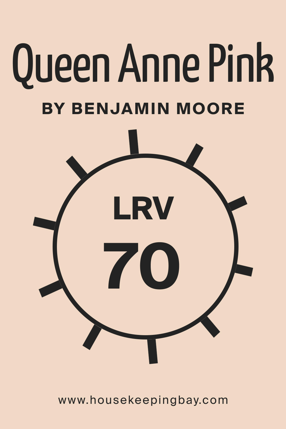
LRV of Queen Anne Pink HC-60
Light Reflectance Value (LRV) is a measure of how much light a color reflects. Ranging from 0 (absolute black, absorbing all light) to 100 (pure white, reflecting all light), LRV helps in understanding how light or dark a color will look in a space. Queen Anne Pink HC-60 has an LRV of 70, which means it is fairly light-reflective. This high LRV enables it to reflect a significant amount of light, making spaces appear brighter and more open.
The high LRV of Queen Anne Pink makes it an excellent choice for rooms that need to feel more spacious and airy. In well-lit rooms, the color will appear lighter and more vibrant, while in rooms with less natural light, its high LRV helps prevent the space from feeling closed in or dull.
This characteristic makes Queen Anne Pink HC-60 a versatile color that adapts well to various lighting conditions, maintaining its beauty and warmth.
housekeepingbay.com
What is LRV? Read It Before You Choose Your Ideal Paint Color
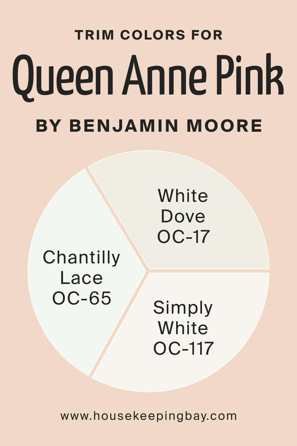
Trim Colors of Queen Anne Pink HC-60
Trim colors are the hues used for painting the architectural details of a room, such as door frames, window frames, and skirting boards. The right trim color can accentuate the main wall color, creating a cohesive and polished look. For the Queen Anne Pink HC-60, choosing the right trim color is crucial to enhance its elegance and warmth.
When selecting trim colors for Queen Anne Pink, shades of white are ideal, as they provide a crisp, clean contrast that highlights the softness of the pink. A few recommended shades from the same brand include:
- Chantilly Lace OC-65 : A bright, pure white with no undertones, Chantilly Lace offers a stark, clean contrast to Queen Anne Pink, making it stand out more prominently.
- White Dove OC-17 : A soft, warm white with a hint of gray. It complements the warmth of Queen Anne Pink, creating a harmonious and soothing transition between the wall color and the trim.
- Simply White OC-117 : A warm, inviting white with a slight yellow undertone. This shade pairs beautifully with Queen Anne Pink, enhancing its cozy, welcoming feel without overpowering it.
These trim colors work together with Queen Anne Pink HC-60 to create a refined and inviting atmosphere, highlighting the best qualities of the main color while adding depth and dimension to the space.
housekeepingbay.com
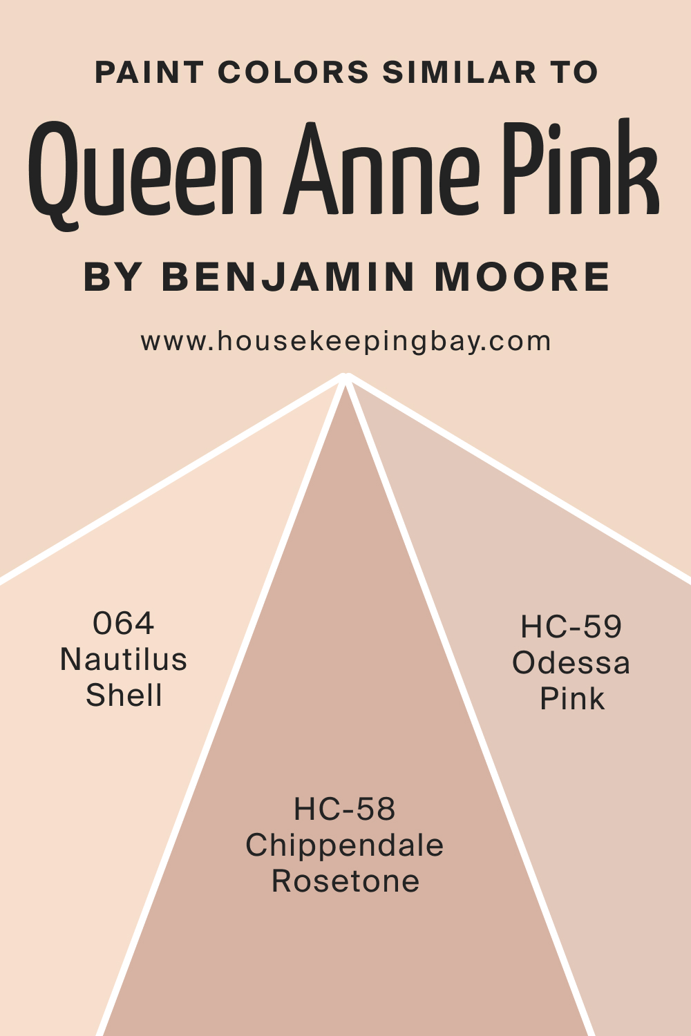
Colors Similar to Queen Anne Pink HC-60
Understanding colors similar to Queen Anne Pink HC-60 is essential for designers and homeowners looking to create a cohesive color scheme while having options to slightly vary hues for different purposes or settings. A similar color, like BM 064 Nautilus Shell, offers a subtle alternative, providing flexibility in design choices.
Three colors similar to Queen Anne Pink HC-60 include:
- BM 064 Nautilus Shell : This color is a soft, muted pink with a subtle touch of warmth. It evokes a sense of calmness and serenity, making it perfect for creating a tranquil and relaxing space. Its understated elegance allows it to blend seamlessly with a variety of decor styles and color palettes.
- HC-59 Odessa Pink : A gentle blush pink with a hint of warmth. This color offers a fresher, more youthful vibe. It’s ideal for spaces that aim for a soft, yet invigorating ambiance.
- HC-58 Chippendale Rosetone : A deeper, more saturated version of Queen Anne Pink. This color maintains the warmth and coziness of Queen Anne Pink but adds more depth and intensity. It’s perfect for accent walls or spaces that require a bit more drama and richness.
housekeepingbay.com
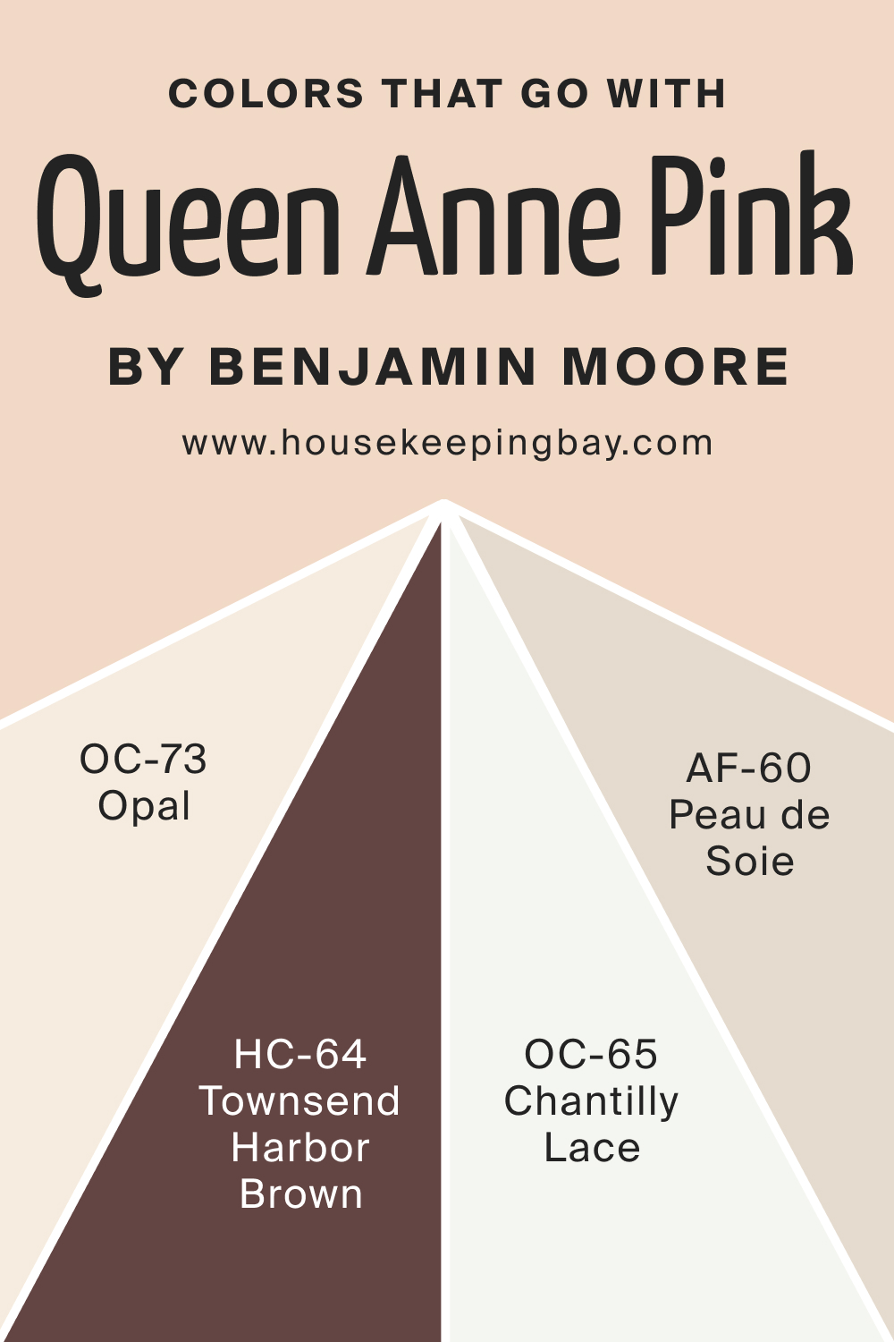
Colors That Go With Queen Anne Pink HC-60
Choosing colors that complement each other in a room is crucial for achieving a balanced and harmonious interior design. Complementary colors enhance the beauty of the primary color, creating a visually appealing and cohesive space. For Queen Anne Pink HC-60, several Benjamin Moore colors pair exceptionally well:
- HC-64 Townsend Harbor Brown : A rich, warm brown that adds depth and sophistication when paired with Queen Anne Pink, creating an elegant contrast.
- OC-65 Chantilly Lace : A crisp, clean white that provides a stark, refreshing contrast to the softness of Queen Anne Pink, highlighting its gentle warmth.
- AF-60 Peau de Soie : A soft, muted hue that complements the subtlety of Queen Anne Pink, adding a touch of understated elegance.
- OC-73 Opal : A light, airy color with a hint of green, providing a fresh and calming contrast that enhances the serene quality of Queen Anne Pink.
These colors, when used alongside Queen Anne Pink HC-60, contribute to a well-rounded and aesthetically pleasing color palette, suitable for various interior styles.
housekeepingbay.com
How to Use Queen Anne Pink HC-60 In Your Home?
Queen Anne Pink HC-60 is a versatile color that can be used in various rooms and interior design styles. In a contemporary setting, it adds a touch of softness and warmth, while in a traditional or romantic style, it enhances the elegance and charm. This color works exceptionally well in bedrooms and living rooms where its calming nature promotes relaxation and comfort.
In bathrooms, it creates a serene, spa-like atmosphere. Even in kitchens, Queen Anne Pink can add a subtle warmth, especially when used on cabinets or as an accent wall. For exteriors, it offers a unique, welcoming facade, particularly when paired with complementary trim colors.
The color’s adaptability makes it suitable for both minimalist and maximalist styles, as it can serve as a neutral base or a gentle accent, depending on the desired effect.
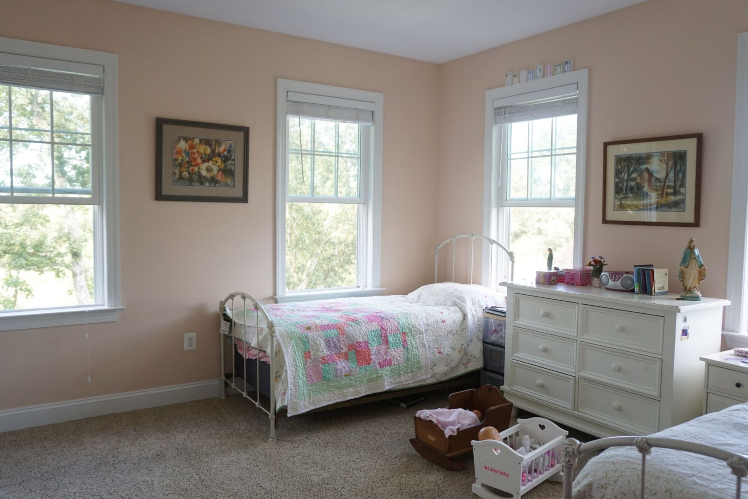
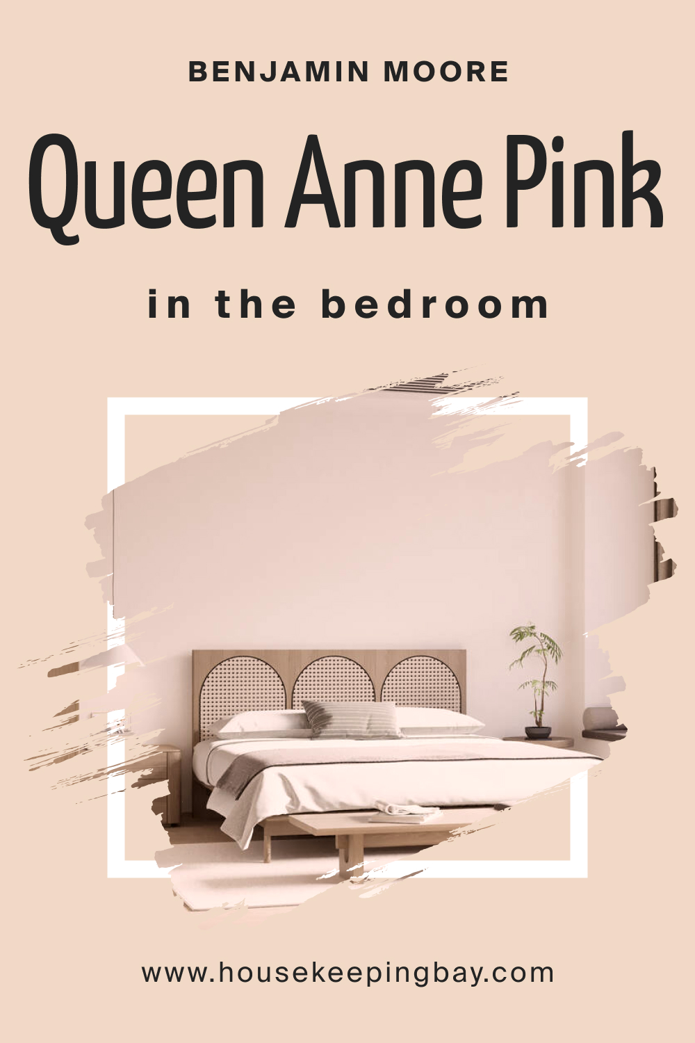
How to Use Queen Anne Pink HC-60 in the Bedroom?
In the bedroom, Queen Anne Pink HC-60 creates a peaceful and inviting atmosphere. Its soft, warm hue promotes relaxation and comfort, making it an ideal choice for walls. For a harmonious look, pair it with light-colored bed linens and curtains. To add depth and texture, incorporate accessories in darker shades or complementary colors like sage green or muted blues.
This color is perfect for creating a romantic ambiance in a traditional bedroom or a calm, serene environment in a contemporary space. Accentuating the room with natural materials like wood or stone can further enhance the warmth and tranquility of the space.
Queen Anne Pink also works well with metallic accents, such as brass or copper, adding a touch of elegance to the bedroom.
housekeepingbay.com
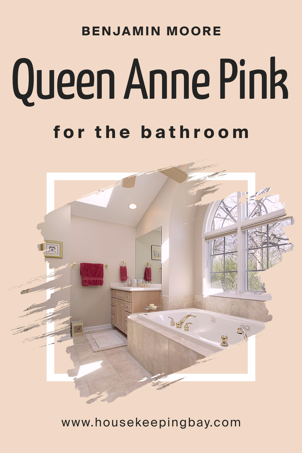
How to Use Queen Anne Pink HC-60 in the Bathroom?
Queen Anne Pink HC-60 in the bathroom can transform the space into a tranquil, spa-like retreat. Its warm undertones bring a soft, soothing vibe, ideal for creating a relaxing ambiance. Pair it with white fixtures and cabinetry to create a clean, fresh look, or contrast it with dark wood for a more dramatic effect.
This color complements natural stone tiles or marble countertops, enhancing their texture and adding to the luxurious feel of the bathroom. Use it on all walls for a cocooning effect or as an accent wall to add a splash of color. Queen Anne Pink pairs beautifully with brushed nickel or chrome fixtures, adding a contemporary twist to the space.
For a cohesive look, incorporate towels and bath mats in complementary colors like soft gray or light blue.
For a cohesive look, incorporate towels and bath mats in complementary colors like soft gray or light blue.
housekeepingbay.com
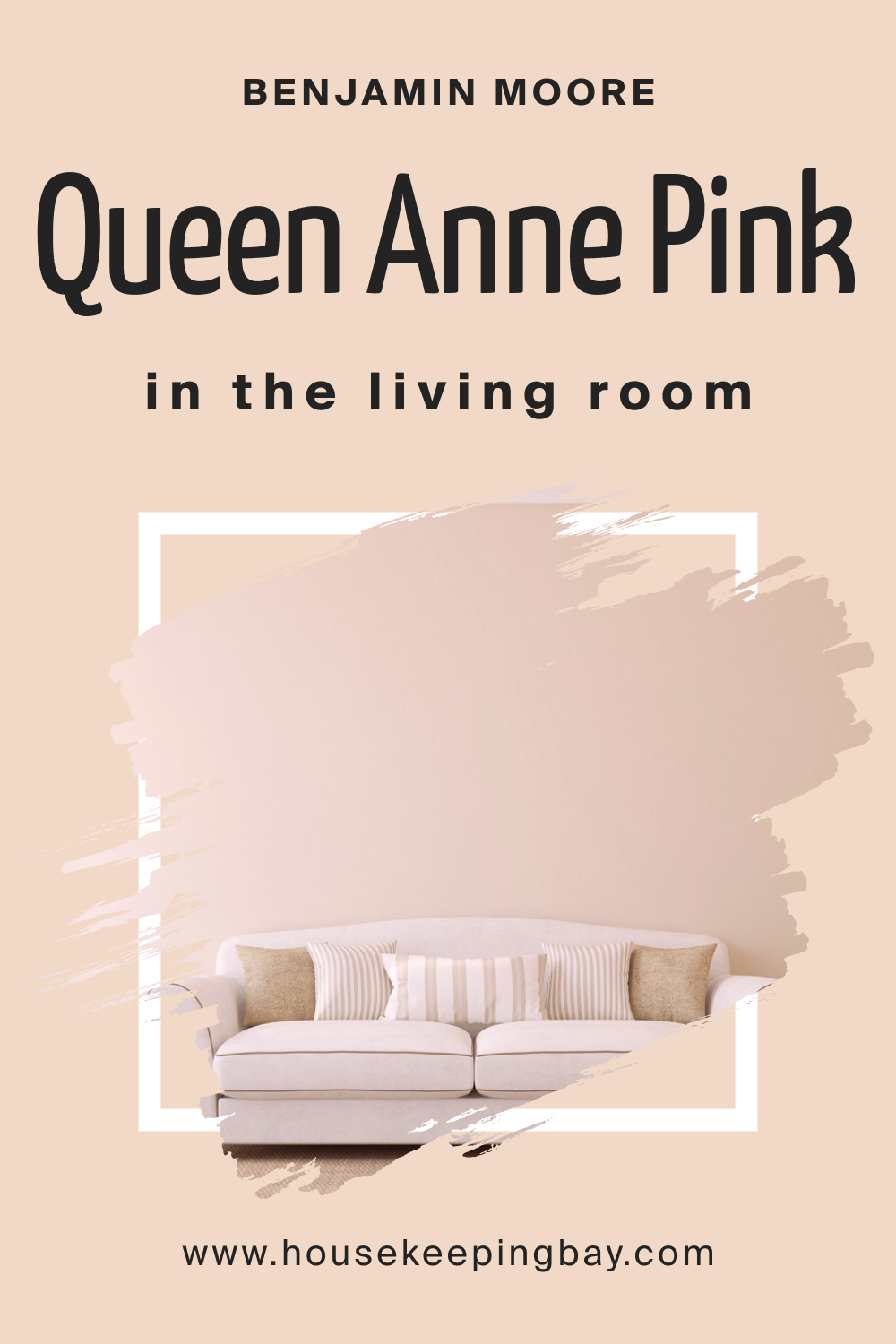
How to Use Queen Anne Pink HC-60 in the Living Room?
Queen Anne Pink HC-60 in the living room adds a touch of sophistication and warmth. Its gentle hue creates a welcoming atmosphere, perfect for spaces designed for relaxation and socializing. Use it on all walls for a soft, cohesive look, or as an accent wall to add depth and interest. This color pairs well with a wide range of furnishings, from modern, sleek pieces to more traditional, plush sofas and chairs.
For a balanced aesthetic, combine it with neutral tones like beige, cream, or light gray in furniture and accessories. Queen Anne Pink also works well with natural elements like wooden floors or stone fireplaces, adding an organic touch to the room. Incorporate metallic accents in gold or copper to enhance the warmth of the color and create an elegant, inviting space.
housekeepingbay.com
How to Use Queen Anne Pink HC-60 for an Exterior?
Using Queen Anne Pink HC-60 on the exterior of a home can create a charming and distinctive facade. This color works well for traditional, cottage, or Victorian-style homes, offering a soft, welcoming presence. It pairs beautifully with white or cream trim, which highlights the architectural details and adds crispness to the overall look. For a harmonious exterior palette, consider using darker shades like deep green or navy blue for shutters or doors, adding contrast and depth to the facade.
Queen Anne Pink can also be used on exterior accents like window boxes or front doors for a subtle pop of color. In landscapes with abundant greenery, this color complements the natural surroundings, blending seamlessly with the environment. When choosing this color for an exterior, consider the natural lighting and surrounding elements to ensure it complements the home’s setting.

housekeepingbay.com
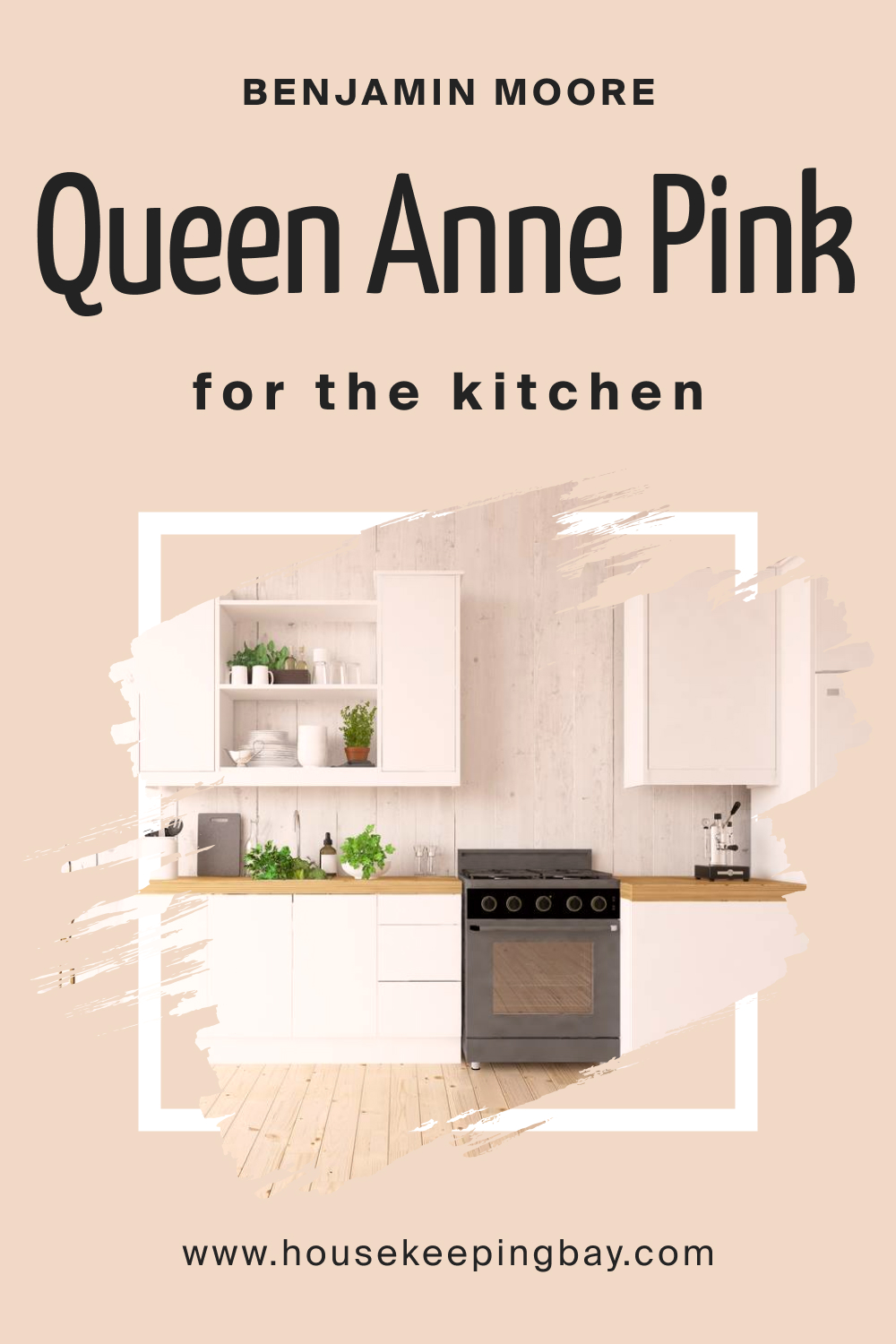
How to Use Queen Anne Pink HC-60 in the Kitchen?
In the kitchen, Queen Anne Pink HC-60 can add a touch of warmth and personality. This color is perfect for creating a cozy, inviting atmosphere, especially in open-plan spaces or smaller kitchens where a sense of openness is desired. Use it on the walls to pair with white or light-colored cabinetry for a fresh and clean look. For a more contemporary feel, contrast it with dark countertops or stainless steel appliances. Queen Anne Pink works well with natural materials like wood or stone, enhancing their textures and adding a rustic charm to the space.
To maintain balance, keep the rest of the color palette neutral with shades of gray, beige, or cream. This color is also ideal for highlighting a breakfast nook or dining area within the kitchen, creating a distinct, welcoming space for family meals.
housekeepingbay.com
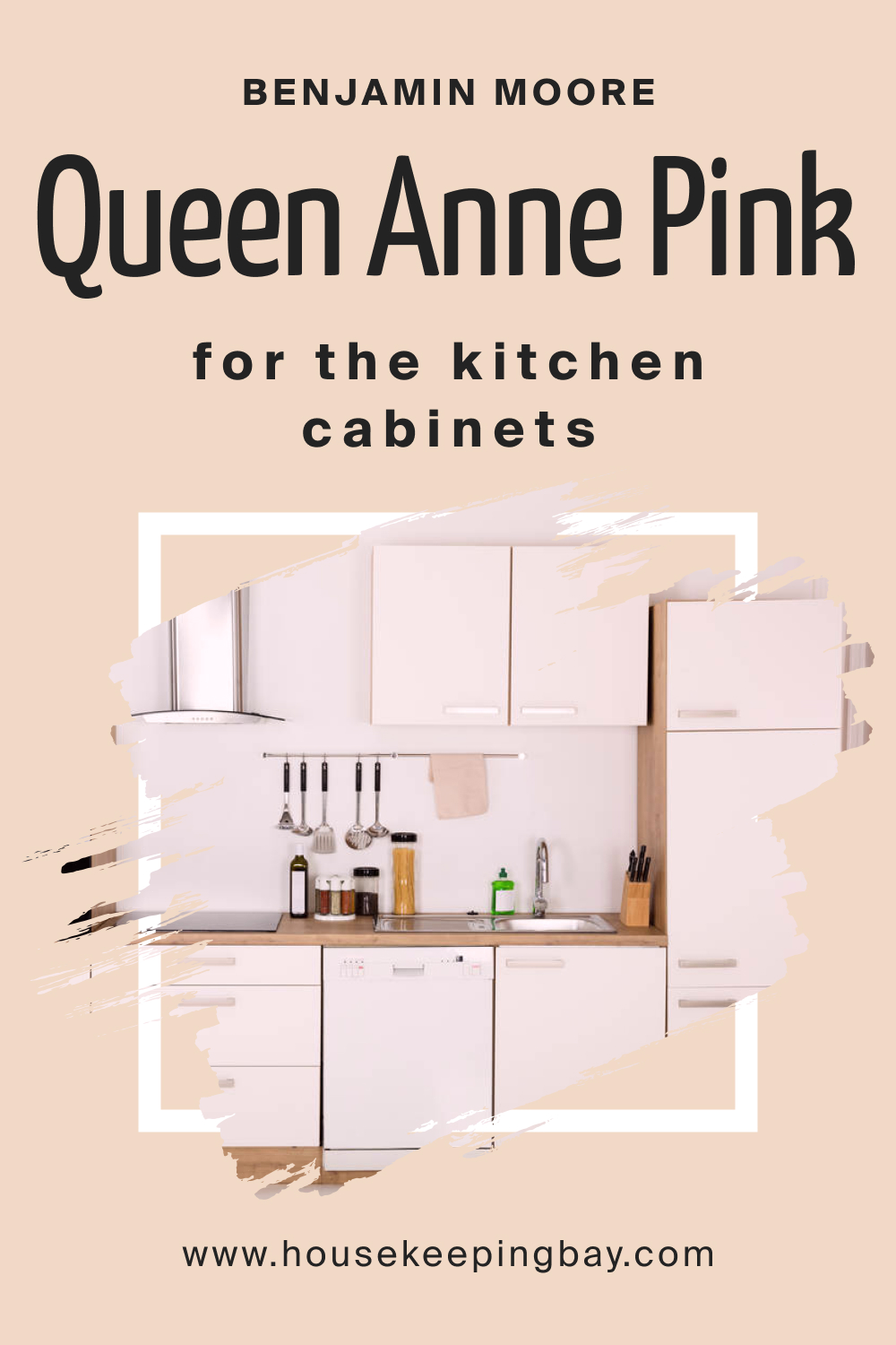
How to Use Queen Anne Pink HC-60 on the Kitchen Cabinets?
Queen Anne Pink HC-60 on kitchen cabinets offers a unique and stylish alternative to traditional kitchen colors. This soft, warm hue brings a sense of freshness and uniqueness to the space, making it ideal for those looking to add a personal touch to their kitchen. The color works well with various countertop materials, such as marble, granite, or butcher block, and pairs beautifully with both stainless steel and brass hardware. For a balanced look, complement the pink cabinets with neutral walls in shades of white, cream, or light gray.
This approach allows the cabinets to stand out as a focal point without overwhelming the space. Alternatively, for a bold, contemporary look, pair the cabinets with darker colors like charcoal or navy. Queen Anne Pink cabinets are especially effective in shaker-style or flat-panel designs, adding a modern twist to classic cabinetry.
housekeepingbay.com
Comparing Queen Anne Pink HC-60 With Other Colors
Comparing different colors, like Queen Anne Pink HC-60 with others, is vital for understanding their unique properties and how they can influence the mood and style of a space. This comparison helps in selecting the perfect color palette for interior design, ensuring that each color complements and enhances the others.
It also aids in visualizing the contrast between hues, which is crucial for creating depth and dimension in a room. By comparing Queen Anne Pink HC-60 with various colors, we can better appreciate its versatility and learn how to pair it effectively with other shades, whether for a harmonious, subtle look or a bold, dramatic effect.
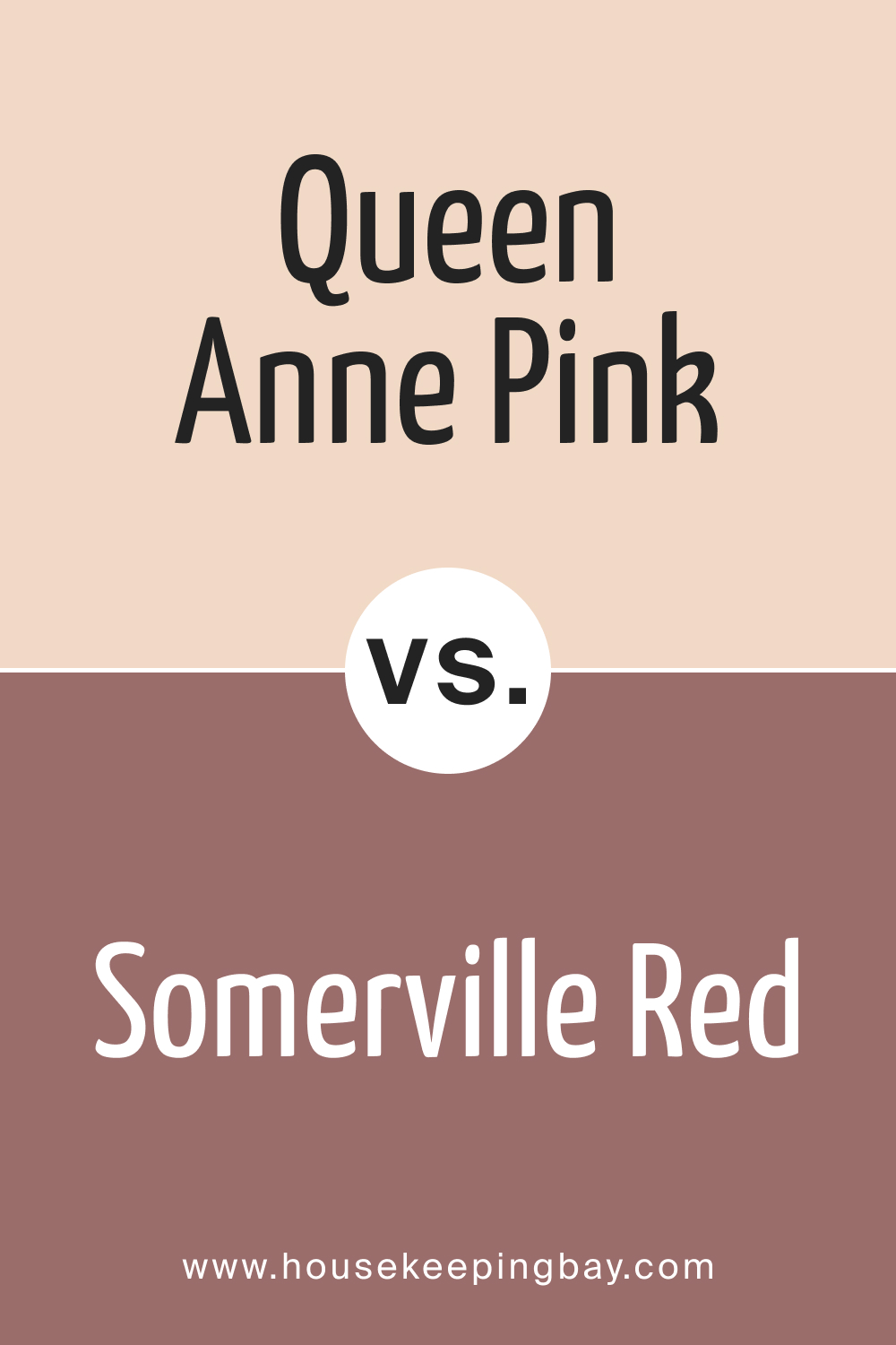
Queen Anne Pink HC-60 vs. HC-62 Somerville Red
Comparing Queen Anne Pink HC-60 with HC-62 Somerville Red reveals a stark contrast in mood and intensity. Somerville Red is a bold, vibrant color that commands attention and brings energy to a space. Its deep, rich hue is reminiscent of traditional elegance and can create a strong focal point in a room. In contrast, Queen Anne Pink is much softer and more subdued, promoting a sense of calm and serenity. While Somerville Red is ideal for creating dramatic accents or statement walls, Queen Anne Pink is more suitable for creating a soothing, gentle ambiance.
The two colors can be used together for a dynamic and sophisticated palette, where the boldness of Somerville Red is balanced by the softness of Queen Anne Pink.
housekeepingbay.com
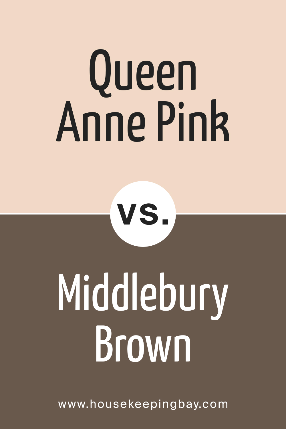
Queen Anne Pink HC-60 vs. HC-68 Middlebury Brown
Queen Anne Pink HC-60 and HC-68 Middlebury Brown offer a study in contrasts between softness and strength. Middlebury Brown is a deep, earthy color that exudes stability and grounding. It’s a robust shade that can bring warmth and depth to a space, making it feel cozy and secure. On the other hand, Queen Anne Pink is much lighter and airier, contributing to a sense of openness and tranquility.
While Middlebury Brown is well-suited for creating a strong presence, especially in traditional or rustic decors, Queen Anne Pink is ideal for spaces that aim for a lighter, more delicate touch. Together, they can create a balanced and inviting color scheme, where the strength of Middlebury Brown is softened by the gentle touch of Queen Anne Pink.
housekeepingbay.com
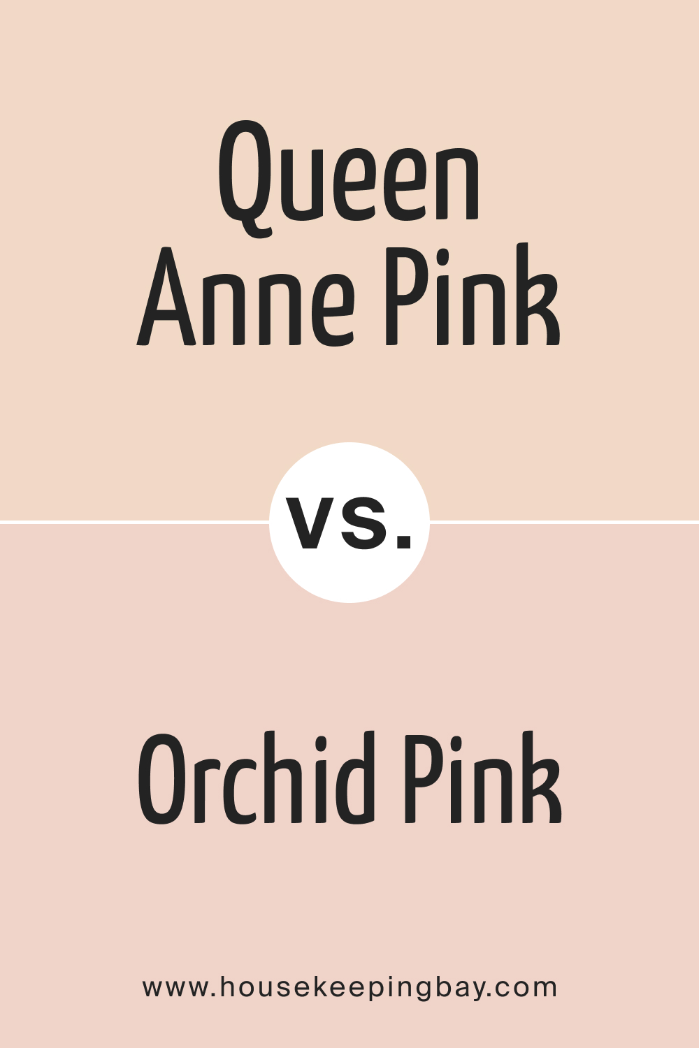
Queen Anne Pink HC-60 vs. BM 036 Orchid Pink
Queen Anne Pink HC-60 and BM 036 Orchid Pink are similar in their overall vibe but differ subtly in tone and impact. Orchid Pink is slightly more vibrant and has a more pronounced pink hue, giving it a youthful and playful character. It can bring a fresh and lively energy to a space, making it a great choice for areas that need a pop of color.
Queen Anne Pink, with its softer and more muted tone, exudes a more sophisticated and mature feel. It’s perfect for creating a calming and elegant atmosphere. When used together, these two shades can create a layered pink palette that ranges from subtle elegance to playful brightness, suitable for a variety of interior styles.
housekeepingbay.com
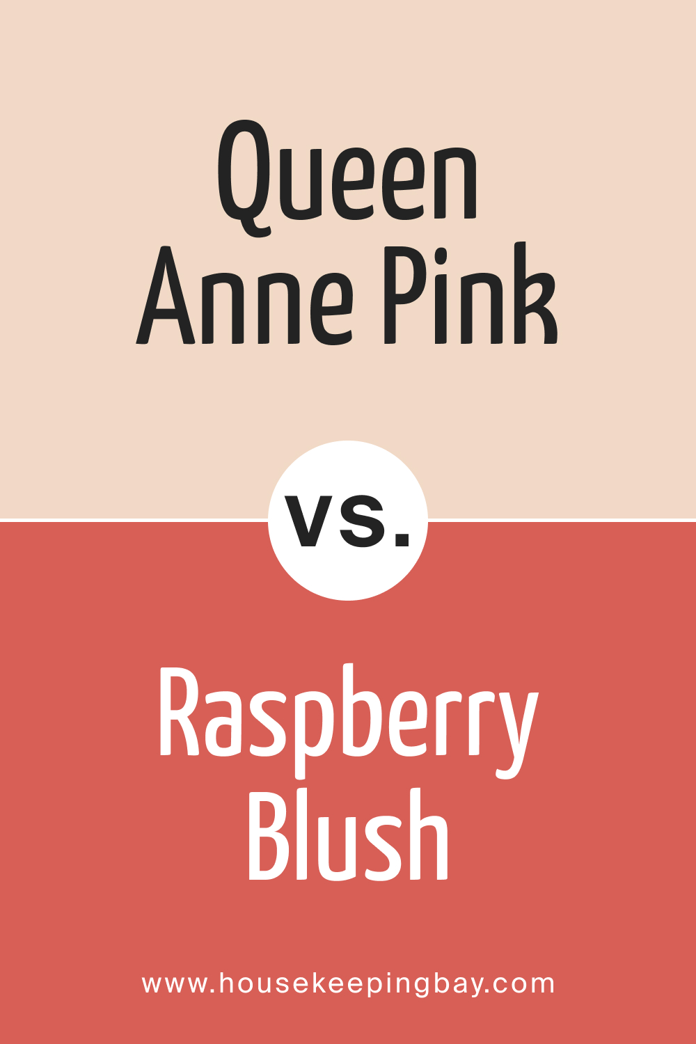
Queen Anne Pink HC-60 vs. BM 2008-30 Raspberry Blush
Queen Anne Pink HC-60 and BM 2008-30 Raspberry Blush present a comparison between subtlety and boldness. Raspberry Blush is a vibrant, intense color that makes a strong statement. It has a lively and energetic feel, perfect for spaces that aim to stimulate and invigorate. Its rich saturation provides a dramatic backdrop or accent in a room.
In contrast, Queen Anne Pink is much more understated, offering a tranquil and soothing presence. It’s ideal for creating a relaxing and peaceful environment. The two colors can work well together in a space where Raspberry Blush’s vibrancy is balanced by the calming nature of Queen Anne Pink, offering a palette that is both exciting and restful.
housekeepingbay.com
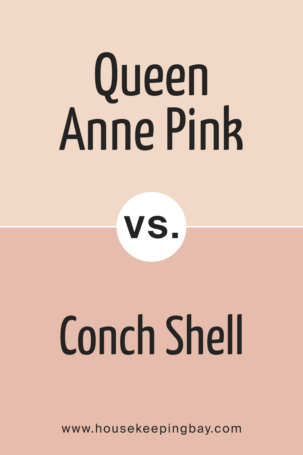
Queen Anne Pink HC-60 vs. BM 052 Conch Shell
When comparing Queen Anne Pink HC-60 with BM 052 Conch Shell , we observe a subtle variation in the realm of soft pinks. Conch Shell leans slightly towards a peachier, warmer undertone, offering a hint of coastal freshness and brightness.
It evokes a feeling of warm breezes and soft sunsets, making it ideal for creating a cozy, welcoming atmosphere. Queen Anne Pink, on the other hand, maintains a more traditional pink hue with a serene and refined quality.
It’s more associated with classic elegance and a tranquil ambiance. Used together, these two shades can create a nuanced and layered pink color scheme, blending traditional elegance with a touch of coastal warmth.
housekeepingbay.com
Queen Anne Pink HC-60 vs. OC-145 Atrium White
Comparing Queen Anne Pink HC-60 with OC-145 Atrium White highlights the interplay between color and neutrality. Atrium White is a clean, crisp white with a subtle warmth, making it a versatile background that allows other colors to stand out. It’s perfect for creating a sense of space and openness, acting as a blank canvas for any design style.
Queen Anne Pink, with its gentle hue, stands out against the neutrality of Atrium White, providing a soft wash of color. The combination of these two shades can create a delicate and refined look, where the purity of Atrium White enhances the subtle elegance of Queen Anne Pink. This pairing is ideal for those looking to add a hint of color in a sophisticated, understated way.
Conclusion
In summary, Queen Anne Pink HC-60 is more than just a color; it’s a statement of elegance and warmth. Its versatility in pairing with various textures, materials, and coordinating colors makes it a superb choice for those seeking to create a space that feels both inviting and stylish. Whether used in a classical setting or a modern home, this color has the potential to infuse any space with a sense of grace and tranquility.
By understanding the nuances of Queen Anne Pink HC-60, from its warm undertones to its coordinating colors, homeowners and designers can use this color to create spaces that are not only visually appealing but also emotionally resonant. It’s a color that adapts to its surroundings, reflecting the light and mood of a room, thus making it a timeless choice for any interior design project.
Ever wished paint sampling was as easy as sticking a sticker? Guess what? Now it is! Discover Samplize's unique Peel & Stick samples. Get started now and say goodbye to the old messy way!
Get paint samples


Frequently Asked Questions
⭐What kind of lighting works best with Queen Anne Pink HC-60?
Queen Anne Pink HC-60 flourishes under natural light, where its warm undertones are highlighted, creating a soft and serene ambiance. In artificial lighting, warmer tones like incandescent lights complement it best by enhancing its cozy warmth. In north-facing rooms, which tend to have cooler light, the color may appear slightly more muted.
⭐Can Queen Anne Pink HC-60 be used in small spaces?
Absolutely! Despite being a warm color, Queen Anne Pink HC-60 has a high Light Reflectance Value (LRV), which means it can make small spaces appear brighter and more open. Its soft, warm tones can create an inviting atmosphere without overwhelming the space.
⭐What are the best coordinating colors for Queen Anne Pink HC-60?
Queen Anne Pink HC-60 pairs beautifully with soft neutrals like creamy whites and light grays. It also works well with earthy tones like sage green and muted blues, as well as with deeper, rich colors like Townsend Harbor Brown for a sophisticated contrast.
⭐Is Queen Anne Pink HC-60 suitable for exteriors?
Yes, Queen Anne Pink HC-60 can be a charming choice for exteriors, especially for homes with Victorian or cottage-style architecture. It pairs well with crisp white or cream trim and can be complemented by darker shades for shutters or doors.
⭐How does Queen Anne Pink HC-60 affect the mood of a room?
Queen Anne Pink HC-60 tends to create a calming and relaxing atmosphere in a room. Its warm, gentle hue promotes comfort and serenity, making it an excellent choice for bedrooms and living areas where relaxation is key.


