Inner Balance 1522 Paint Color by Benjamin Moore
In the ever-evolving realm of interior design, color plays a pivotal role in shaping the ambiance of a space.
In the ever-evolving realm of interior design, color plays a pivotal role in shaping the ambiance of a space. Among the myriad hues available, BM Inner Balance 1522 stands out as a nuanced choice, offering a unique blend of sophistication and tranquility.
This article delves into the intricacies of this captivating color, exploring its specific characteristics, warmth or coolness, undertones, and coordinating companions to aid homeowners and designers alike in crafting harmonious interiors.
via benjamin moore
What Color Is BM Inner Balance 1522?
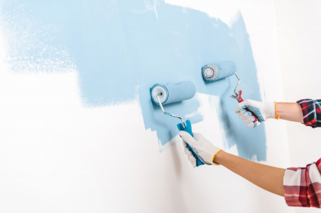
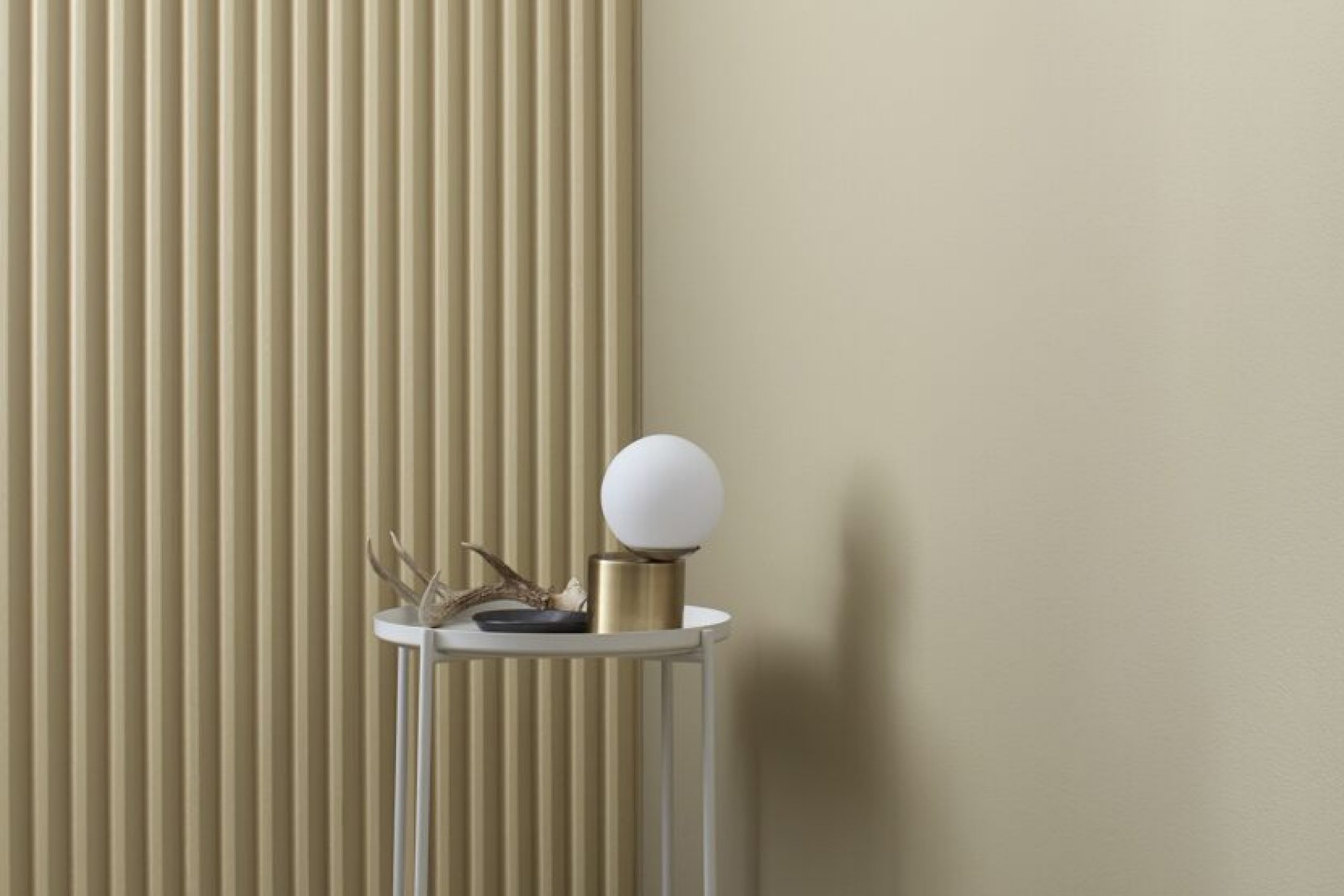
BM Inner Balance 1522 is a subtle and refined shade that can be best described as a muted, silvery sage green with a touch of gray. This color exudes a calming energy, making it ideal for creating serene and balanced interiors. Its versatility allows it to seamlessly integrate into various interior styles, particularly those embracing a modern or transitional aesthetic.
BM Inner Balance 1522 thrives in spaces where natural light enhances its muted elegance, making it a perfect choice for living rooms, bedrooms, and home offices.
This sophisticated hue pairs exceptionally well with materials like light-colored woods, brushed metals, and soft textiles. Its muted nature complements the warmth of wooden surfaces, while its subdued tone adds a touch of modernity when paired with metallic finishes. Textures like linen, wool, and velvet enhance the tactile richness of spaces adorned with BM Inner Balance 1522.
housekeepingbay.com
Table of Contents
Is It a Warm or Cool Color?
BM Inner Balance 1522 leans towards the cooler spectrum of colors. The subtle infusion of gray in its composition gives it a cool undertone, contributing to its calming and tranquil character. This coolness makes it an excellent choice for spaces where a serene and composed atmosphere is desired, such as bedrooms or meditation rooms. However, when paired thoughtfully with warm accents and lighting, it can create a balanced and inviting environment.
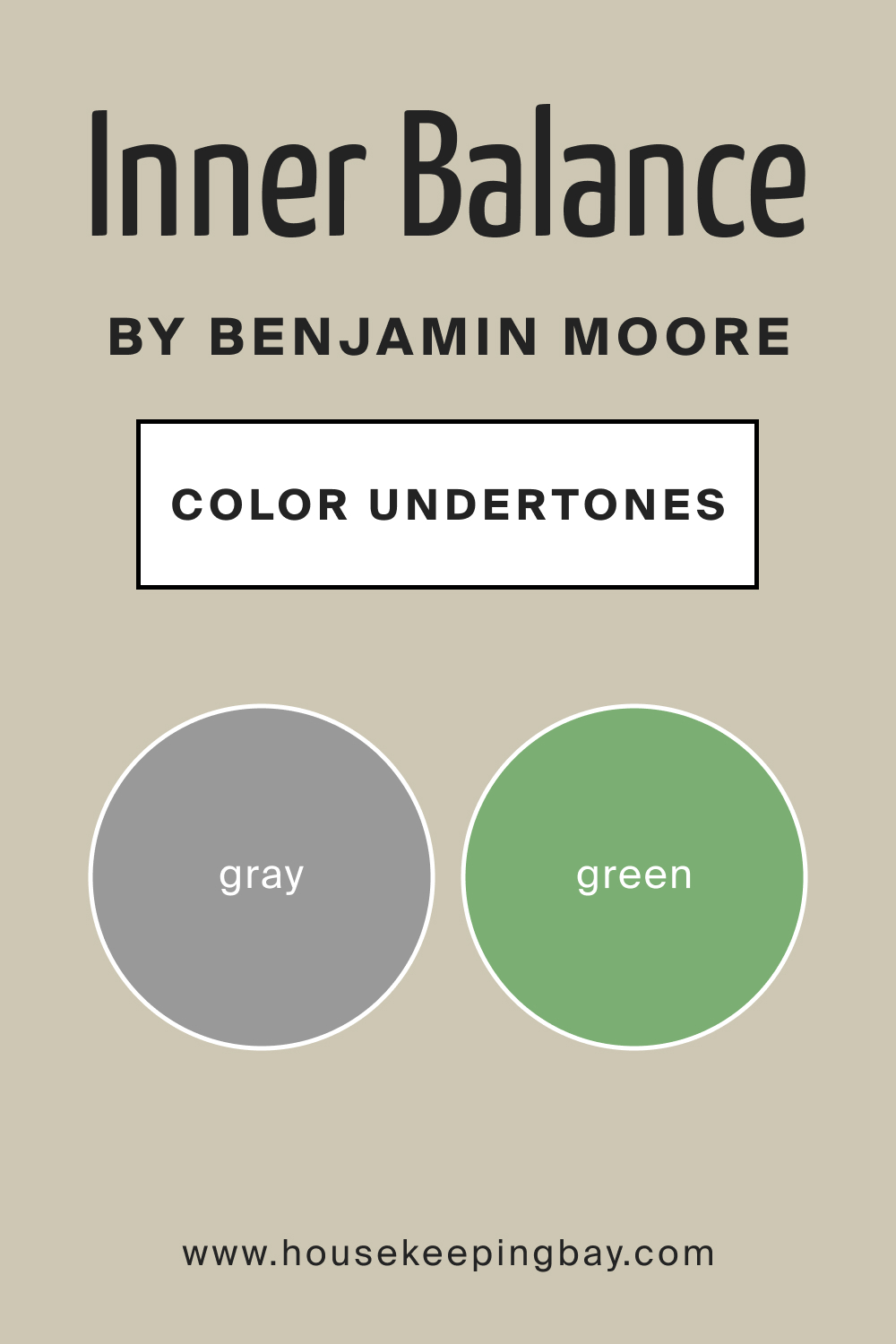
Undertones of BM Inner Balance 1522
The undertones of BM Inner Balance 1522 are a delicate dance between muted green and subtle gray. These undertones significantly influence how we perceive the color, infusing it with a sense of depth and complexity. On interior walls, the undertones manifest in varying intensities depending on the lighting conditions. In natural light, the green undertones may become more pronounced, imparting a fresh and lively feel to the space.
Artificial lighting tends to highlight the gray undertones, creating a more subdued and sophisticated atmosphere.
housekeepingbay.com
Coordinating Colors of BM Inner Balance 1522
Choosing coordinating colors is crucial in achieving a cohesive and visually pleasing interior. BM Inner Balance 1522 harmonizes effortlessly with a carefully curated palette of colors. Complementary shades like OC-45 Swiss Coffee and OC-130 Cloud White provide a clean and timeless backdrop, enhancing the overall tranquility of spaces adorned with BM Inner Balance 1522.
Adding depth and a touch of nature, BM 447 Holiday Wreath introduces a subtle green companion that complements the muted sage tones. For a bolder statement, BM 2136-40 Aegean Teal introduces a rich and jewel-toned accent, creating a sense of depth and contrast.
Additionally, three other colors that seamlessly align with this palette are BM 2143-40 Guilford Green and BM 2111-60 Barren Plain. These hues echo the muted sophistication of Inner Balance 1522, ensuring a cohesive and balanced design scheme.
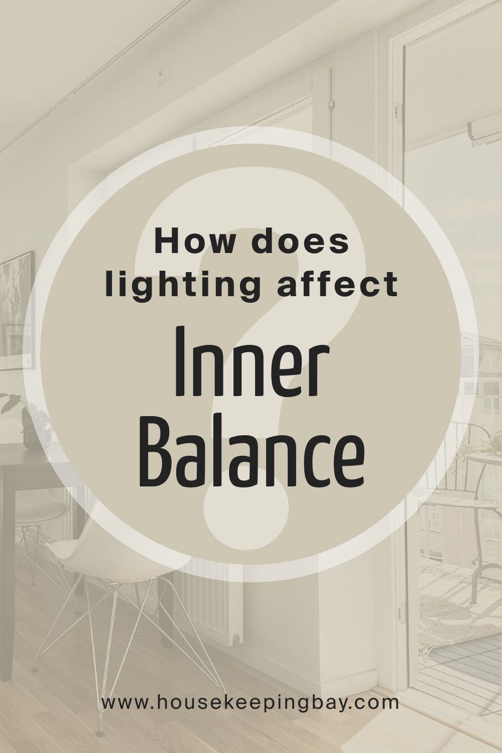
How Does Lighting Affect BM Inner Balance 1522?
Lighting plays a pivotal role in shaping the perception of BM Inner Balance 1522, a color known for its subtle elegance. In different lighting conditions, this muted green-gray undergoes captivating transformations, revealing its versatility.
In natural light, the color’s nuanced undertones come to life, adapting to the changing hues of the day.
North-facing rooms embrace a cooler ambiance, enhancing the calming character, while south-facing rooms bask in a warm radiance that accentuates the richness of Inner Balance 1522. East-facing spaces benefit from the soft morning light, unveiling the color’s subtleties while west-facing rooms enjoy a deeper, more dramatic effect in the afternoon glow.
In artificial lighting, the color takes on a different dimension, showcasing its depth and sophistication. Whether bathed in sunlight or illuminated by artificial sources, Inner Balance 1522 adapts gracefully, offering a timeless and harmonious presence in any space.
housekeepingbay.com
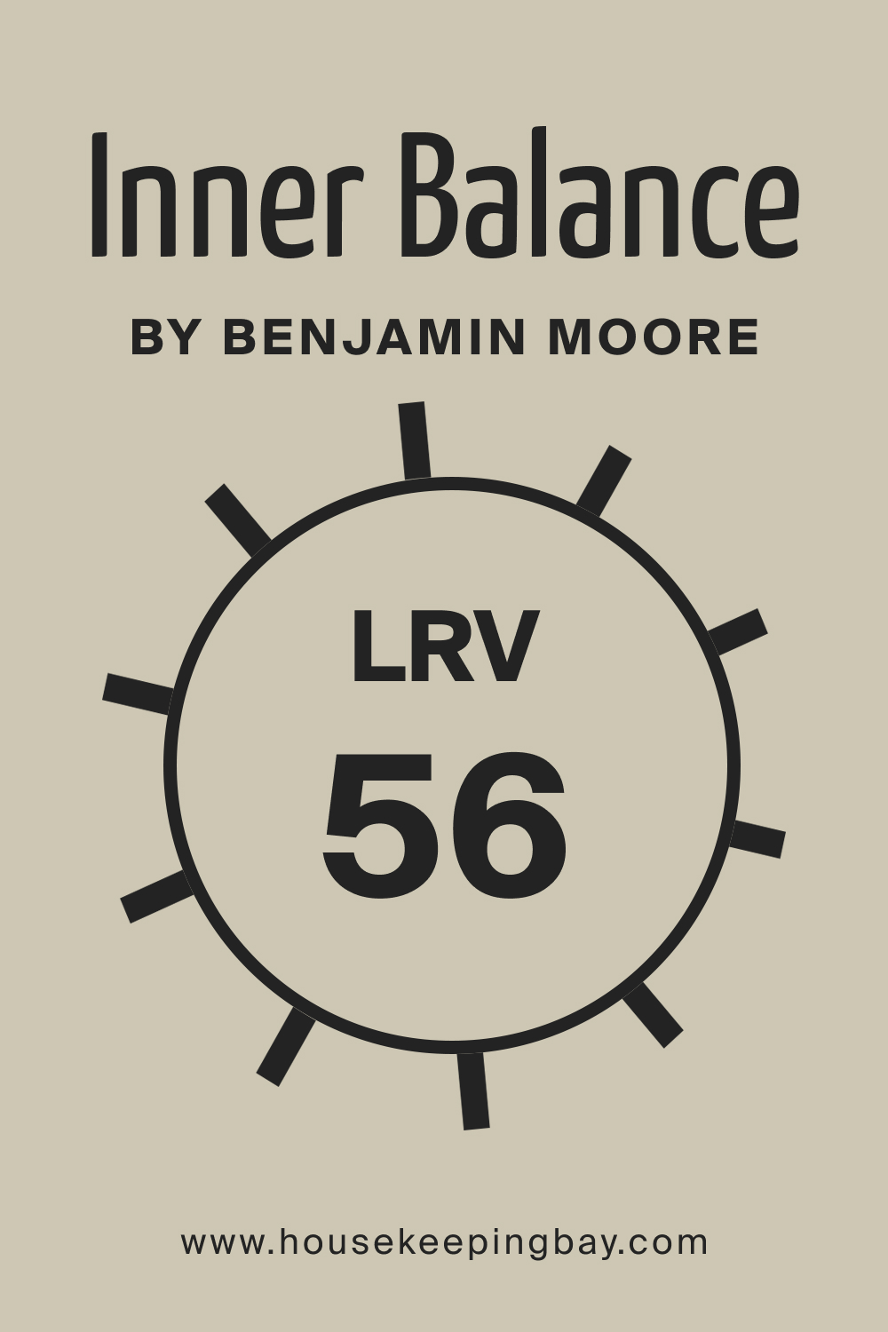
LRV of BM Inner Balance 1522
Light Reflectance Value (LRV) is a numerical scale that measures the amount of light a color reflects. With an LRV of 56, BM Inner Balance 1522 sits in the mid-range, indicating a balanced reflection of light. Colors with higher LRVs appear lighter and brighter on walls, while lower LRVs create a more subdued ambiance. For Inner Balance 1522, the moderate LRV ensures that it maintains a tranquil and composed presence, striking a delicate balance between brightness and depth.
housekeepingbay.com
What is LRV? Read It Before You Choose Your Ideal Paint Color
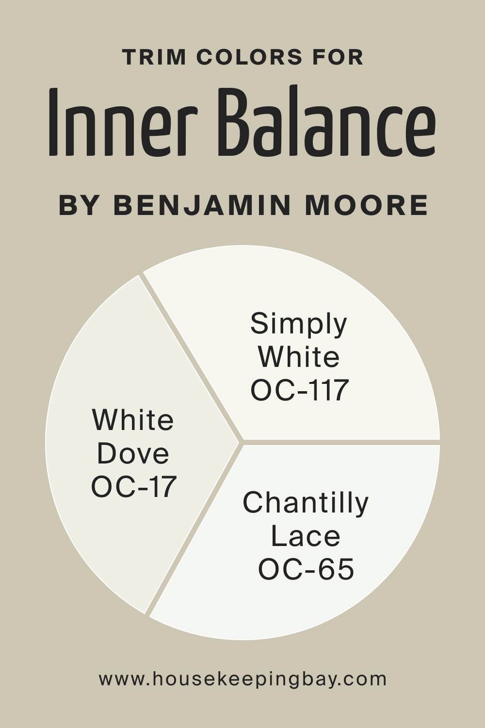
Trim Colors of BM Inner Balance 1522
Trim colors play a crucial role in framing and accentuating the main color. For BM Inner Balance 1522, trim colors should complement its muted elegance. BM White Dove OC-17, Simply White OC-117, and Chantilly Lace OC-65 are ideal choices. White Dove adds warmth, Simply White provides a clean contrast, and Chantilly Lace offers a crisp and modern touch. These shades of white enhance the overall aesthetic, creating a cohesive and polished look.
housekeepingbay.com
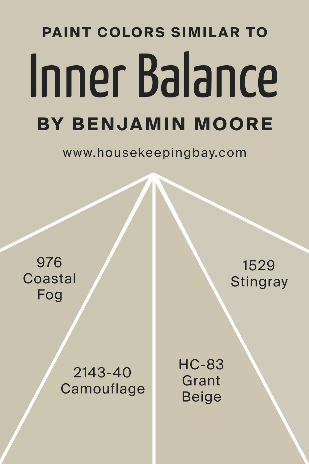
Colors Similar to BM Inner Balance 1522
Understanding similar colors expands the design palette. BM 976 Coastal Fog, BM 1529 Stingray, HC-83 Grant Beige, and BM 2143-40 Camouflage share the muted sophistication of Inner Balance 1522. Coastal Fog brings a coastal charm, Stingray adds depth, Grant Beige introduces warmth, and Camouflage provides a touch of nature. Each color presents a unique character, offering versatile options for varied design preferences.
housekeepingbay.com
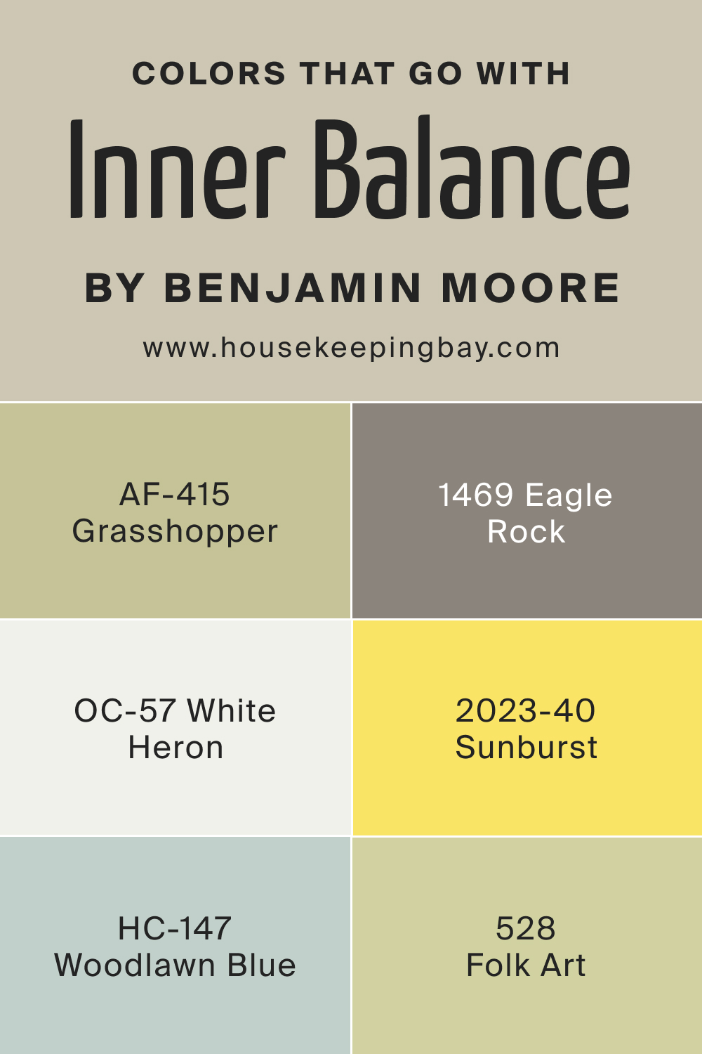
Colors That Go With BM Inner Balance 1522
Harmonizing colors in a room is essential for a cohesive design. BM 2023-40 Sunburst adds a burst of energy, AF-415 Grasshopper introduces a refreshing green, HC-147 Woodlawn Blue brings a subtle coolness, BM 1469 Eagle Rock offers a warm neutral, BM 528 Folk Art adds a touch of sophistication, and OC-57 White Heron provides a timeless backdrop. Together, these colors create a balanced and visually pleasing environment, enhancing the overall aesthetic of a space adorned with Inner Balance 1522.
housekeepingbay.com
Using BM Inner Balance 1522 In Your Home
BM Inner Balance 1522, with its calming aura, is a versatile choice suitable for various rooms and design styles. In living rooms and bedrooms, it fosters tranquility and sophistication. Ideal for modern, transitional, and coastal styles, Inner Balance 1522 pairs seamlessly with light woods and metallic finishes.
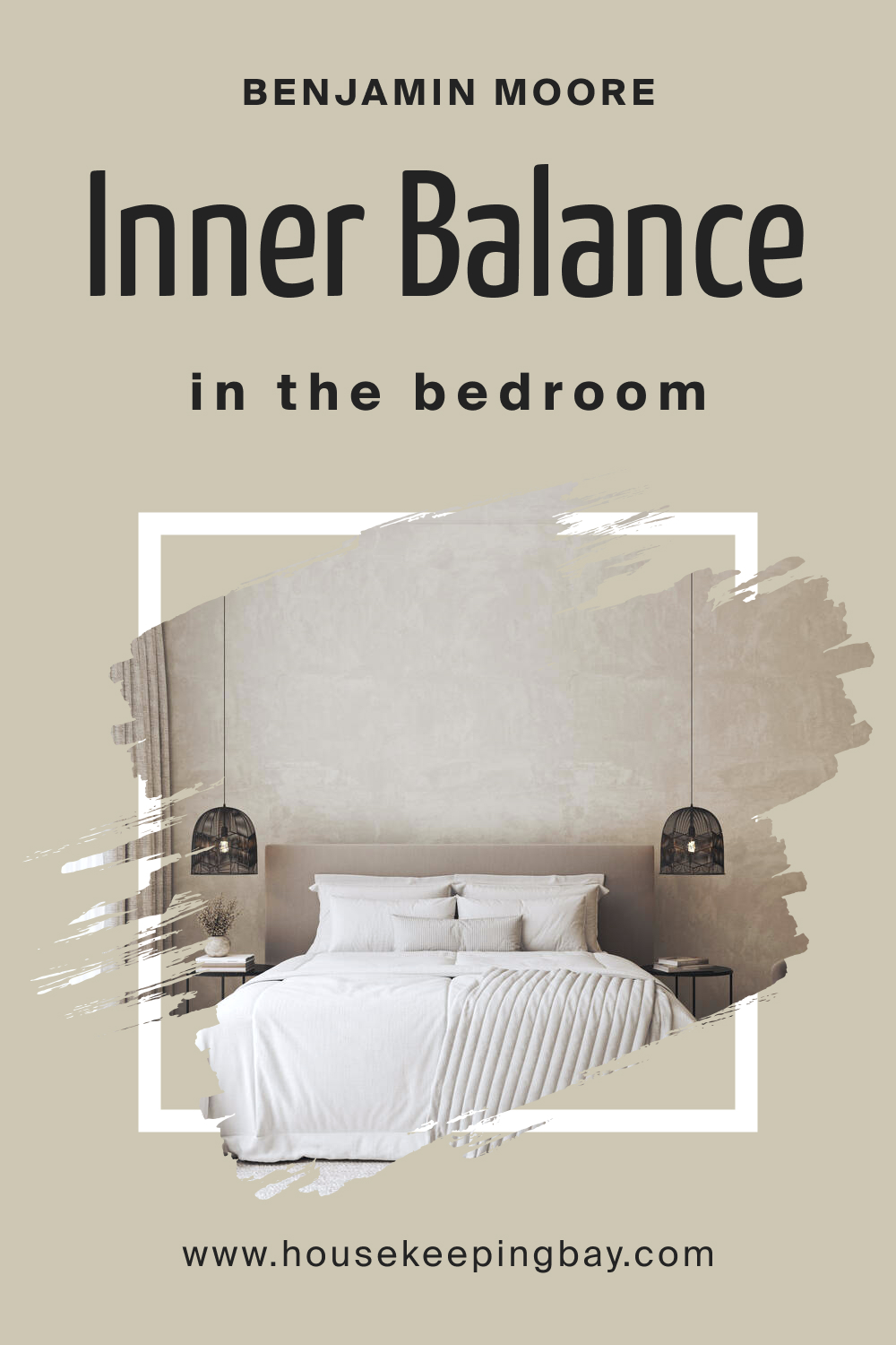
BM Inner Balance 1522 In the Bedroom
Create a serene sanctuary by applying BM Inner Balance 1522 to bedroom walls. Its muted elegance promotes relaxation, making it perfect for cultivating a peaceful sleep environment. Accentuate with soft textiles and neutral furnishings to enhance the tranquil atmosphere.
housekeepingbay.com
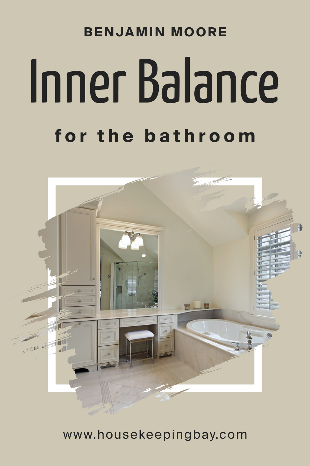
BM Inner Balance 1522 In the Bathroom
Transform your bathroom into a spa-like retreat by incorporating BM Inner Balance 1522. Its muted green-gray tones evoke a sense of calm, ideal for unwinding. Consider using it on vanity walls or as an accent color, complementing it with crisp white fixtures and natural textures for a rejuvenating ambiance.
housekeepingbay.com
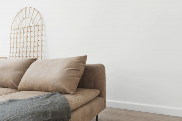
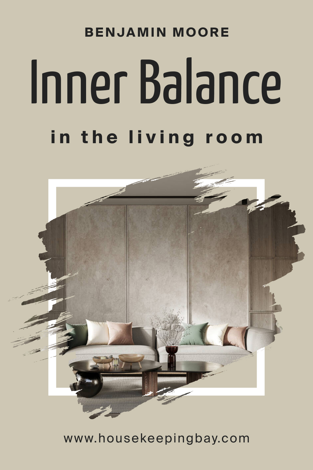
BM Inner Balance 1522 In the Living Room
Elevate your living room’s sophistication with BM Inner Balance 1522 on feature walls. Its versatility complements various furnishings, from sleek modern pieces to classic designs. Enhance the cozy atmosphere with plush textiles and accent decor in harmonizing hues.
housekeepingbay.com
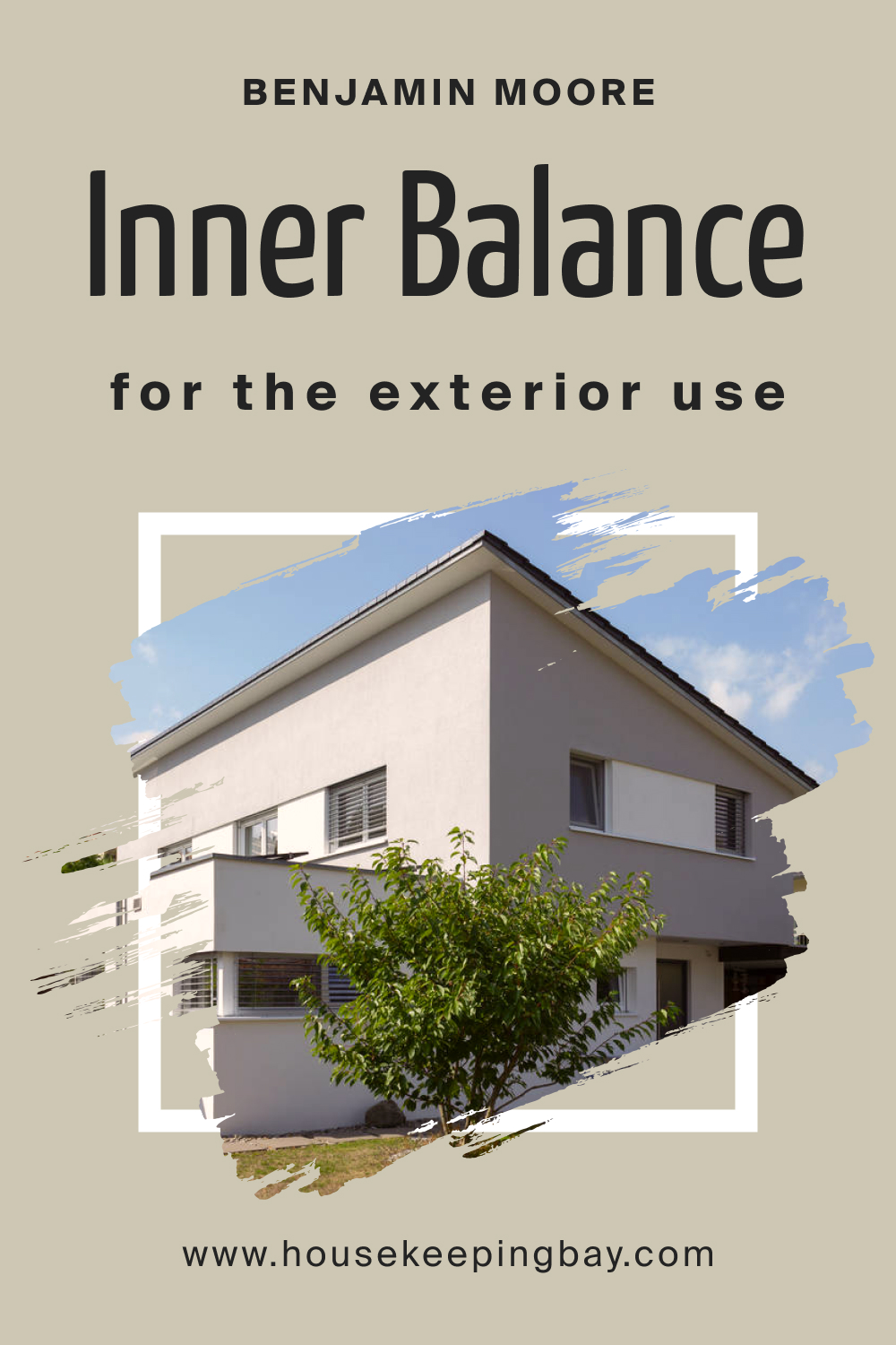
BM Inner Balance 1522 For an Exterior
Give your home exterior a timeless appeal by using BM Inner Balance 1522. The muted green-gray harmonizes with the natural surroundings. Apply it to the siding for a subtle yet elegant look, pairing well with white trim and natural materials.
housekeepingbay.com
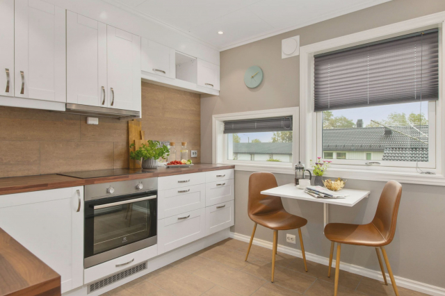
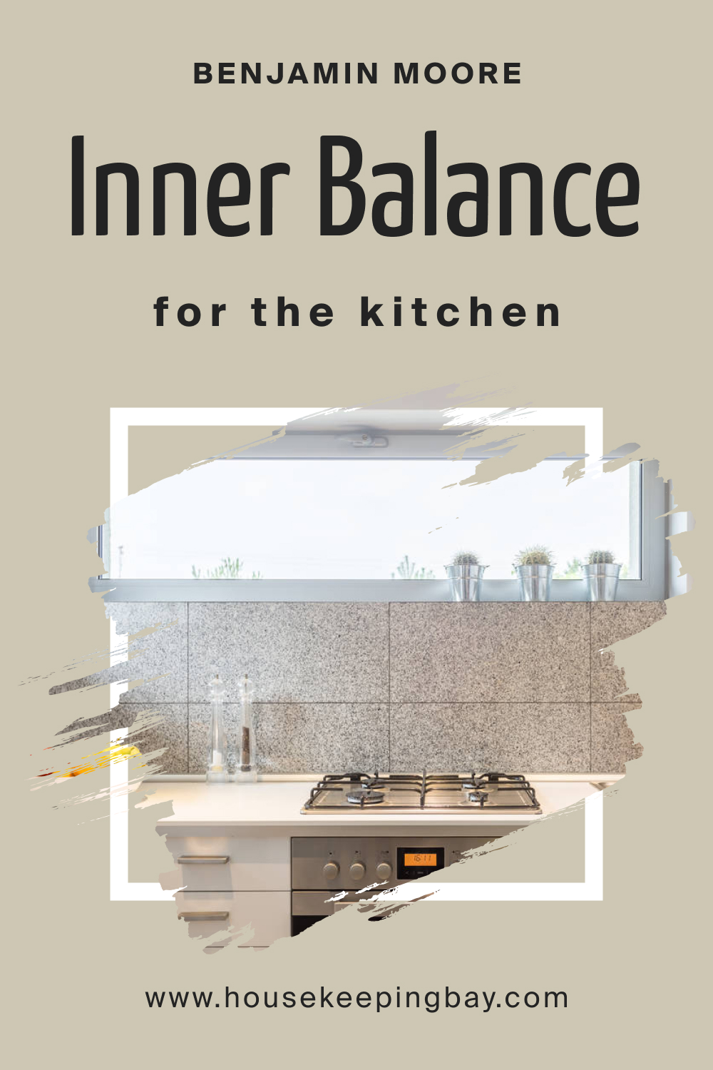
BM Inner Balance 1522 In the Kitchen
Introduce warmth to the heart of your home with BM Inner Balance 1522 on kitchen walls. Its muted tones create a cozy atmosphere, blending seamlessly with light-colored cabinetry and stainless steel appliances. Enhance the inviting ambiance with natural light and botanical accents.
housekeepingbay.com
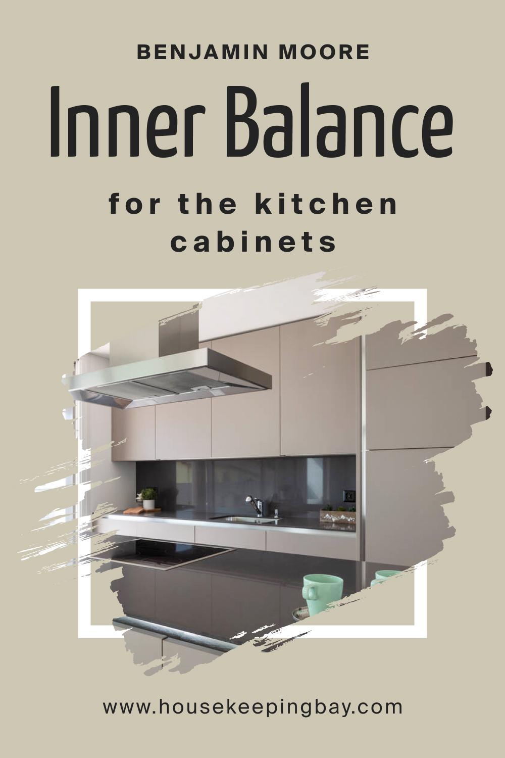
BM Inner Balance 152 On Kitchen Cabinets
For a kitchen transformation, consider BM Inner Balance 1522 on cabinets. The muted sage green-gray adds depth and sophistication. Pair with light countertops and hardware for a balanced and timeless look, creating a kitchen that exudes both style and tranquility.
housekeepingbay.com
Comparing BM Inner Balance 1522 With Other Colors
Understanding the nuances of various colors is essential in interior design, as it allows for informed decisions that align with aesthetic preferences and the desired atmosphere of a space. By comparing colors, one gains insights into their undertones, intensities, and overall visual impact. This knowledge ensures a harmonious color palette that resonates with the intended mood and style of a room.
BM Inner Balance 1522 vs. BM 1520 Hushed Hue
While both colors share a muted elegance, Inner Balance 1522 leans more towards green-gray, exuding a subtle sophistication. In contrast, Hushed Hue tends towards a warmer gray, imparting a cozier feel. Inner Balance is versatile, complementing a range of styles, while Hushed Hue may find its ideal match in spaces seeking a touch of warmth and intimacy.
housekeepingbay.com
BM Inner Balance 1522 vs. BM 1521 Nature’s Essentials
Nature’s Essentials introduces a lighter, earthy tone compared to Inner Balance 1522. While both share a calming nature, Nature’s Essentials leans towards a more neutral gray, making it suitable for creating airy and open environments. Inner Balance, with its subtle green undertones, adds a hint of tranquility that might be preferable in spaces seeking a touch of nature.
housekeepingbay.com
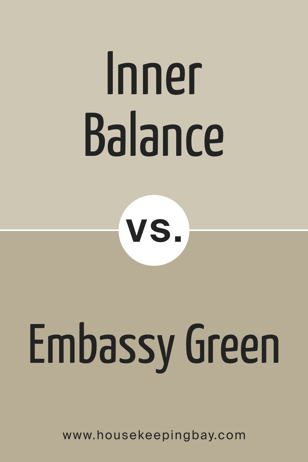
BM Inner Balance 1522 vs. BM 1523 Embassy Green
Embassy Green presents a bolder option with deeper green undertones, offering a more pronounced and rich appearance compared to Inner Balance 1522. Inner Balance maintains a softer, muted elegance, ideal for those desiring a sophisticated yet understated palette, while Embassy Green creates a more dramatic focal point.
housekeepingbay.com
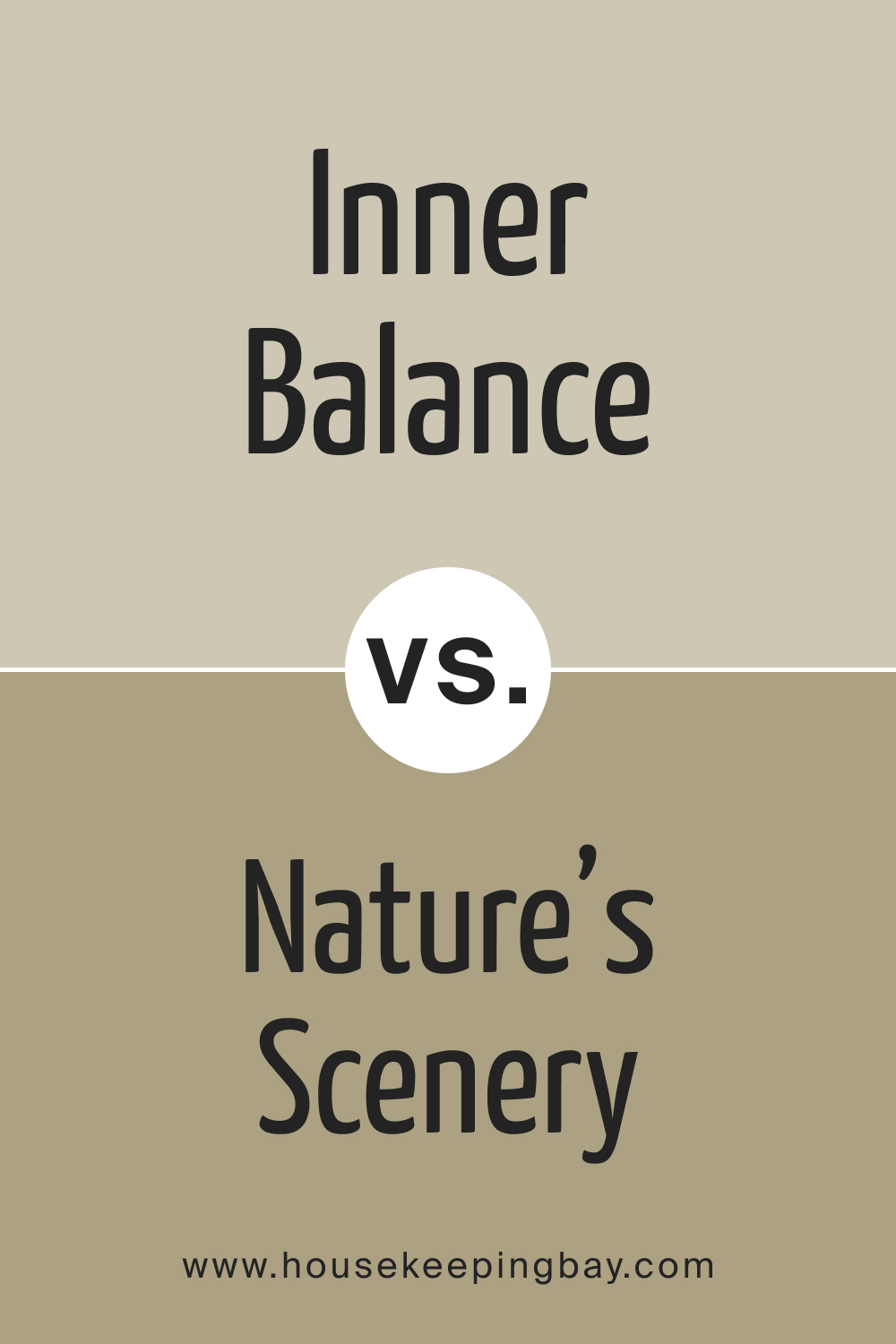
BM Inner Balance 1522 vs. BM 1524 Nature’s Scenery
Nature’s Scenery introduces a warmer, taupe-like tone compared to the muted green-gray of Inner Balance 1522. While both evoke a sense of calm, Nature’s Scenery leans towards earthy neutrals, providing a warmer foundation. Inner Balance’s unique blend of green and gray remains an excellent choice for those seeking a touch of nature without compromising on sophistication.
housekeepingbay.com
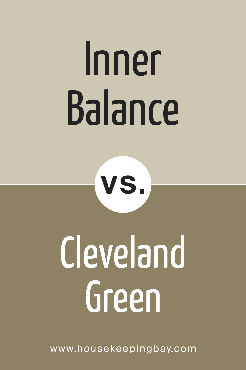
BM Inner Balance 1522 vs. BM 1525 Cleveland Green
Cleveland Green , a richer and deeper green, stands in contrast to Inner Balance 1522’s subtlety. Inner Balance maintains a more versatile and adaptable character, suitable for a variety of design styles, while Cleveland Green demands attention, making it an ideal choice for those looking to make a bold statement with a darker, more intense hue.
housekeepingbay.com
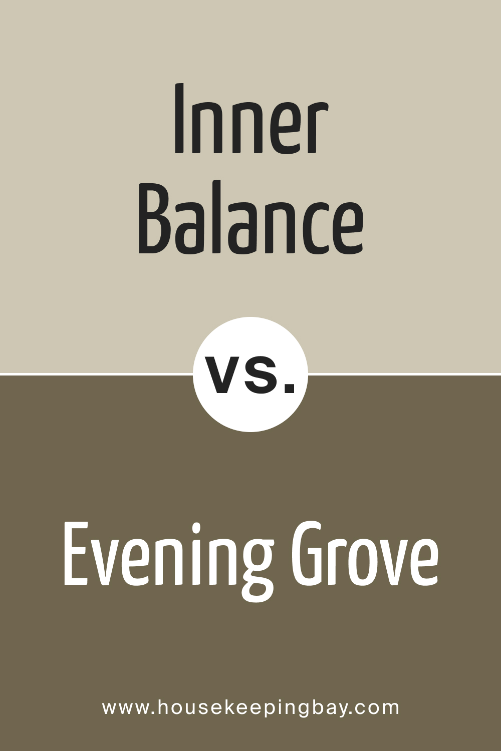
BM Inner Balance 1522 vs. BM 1526 Evening Grove
Evening Grove introduces a darker, more intense green, creating a moodier atmosphere compared to Inner Balance 1522. While Inner Balance exudes tranquility, Evening Grove makes a bolder statement. Choosing between them depends on the desired level of drama and the overall aesthetic goals of the space.
housekeepingbay.com
Conclusion
Comparing colors like BM Inner Balance 1522 with its counterparts offers a nuanced understanding of their unique qualities, empowering individuals to make informed choices tailored to their design preferences. Inner Balance’s muted elegance, versatility, and calming presence make it a timeless choice for a range of interiors.
Whether juxtaposed with warmer neutrals or deeper greens, Inner Balance 1522 stands out as a color that effortlessly adapts, contributing to spaces that evoke a sense of sophistication and tranquility.
housekeepingbay.com
Ever wished paint sampling was as easy as sticking a sticker? Guess what? Now it is! Discover Samplize's unique Peel & Stick samples. Get started now and say goodbye to the old messy way!
Get paint samples


Frequently Asked Questions
⭐Is BM Inner Balance 1522 suitable for small rooms?
Absolutely! BM Inner Balance 1522's muted and sophisticated tones make it a great choice for small rooms. It adds a sense of depth without overwhelming the space, creating a cozy and elegant ambiance.
⭐Can I use BM Inner Balance 1522 in a modern-style kitchen?
Certainly! Inner Balance 1522 complements modern kitchens beautifully. Its muted green-gray tones bring a touch of sophistication, making it a versatile choice for various design aesthetics.
⭐ How does BM Inner Balance 1522 fare in high-traffic areas?
BM Inner Balance 1522 is durable and holds up well in high-traffic areas. Its muted color helps conceal minor scuffs and dirt, making it a practical and stylish choice for busy spaces.
⭐Does BM Inner Balance 1522 work well with natural light?
Yes, Inner Balance 1522 thrives in natural light. Its subtle undertones shine through, creating a dynamic and calming effect, making it an ideal choice for spaces with ample sunlight.
⭐Can I pair BM Inner Balance 1522 with bold accent colors?
Absolutely! Inner Balance 1522's muted nature allows for versatile pairing with bold accent colors. Consider jewel tones or even a pop of vibrant color to create a visually striking and balanced look.