Wishful Blue SW 6813 by Sherwin Williams
A Splash of Serenity: Unveiling a Tranquil Hue
If you’re on the hunt for the perfect paint color to freshen up your space, look no further than SW 6813 Wishful Blue by Sherwin Williams.
This charming shade of blue is like a breath of fresh air for any room, offering a light and airy feel that can instantly transform your home.
Whether you’re thinking about giving your living room a makeover, wanting to create a serene bedroom retreat, or looking to add a splash of color to your kitchen, Wishful Blue has got you covered.
This delightful color strikes a beautiful balance between being calming and vibrant, making it versatile for both modern and traditional spaces.
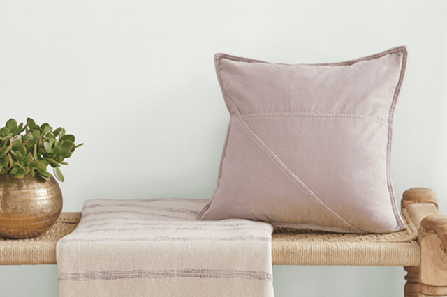
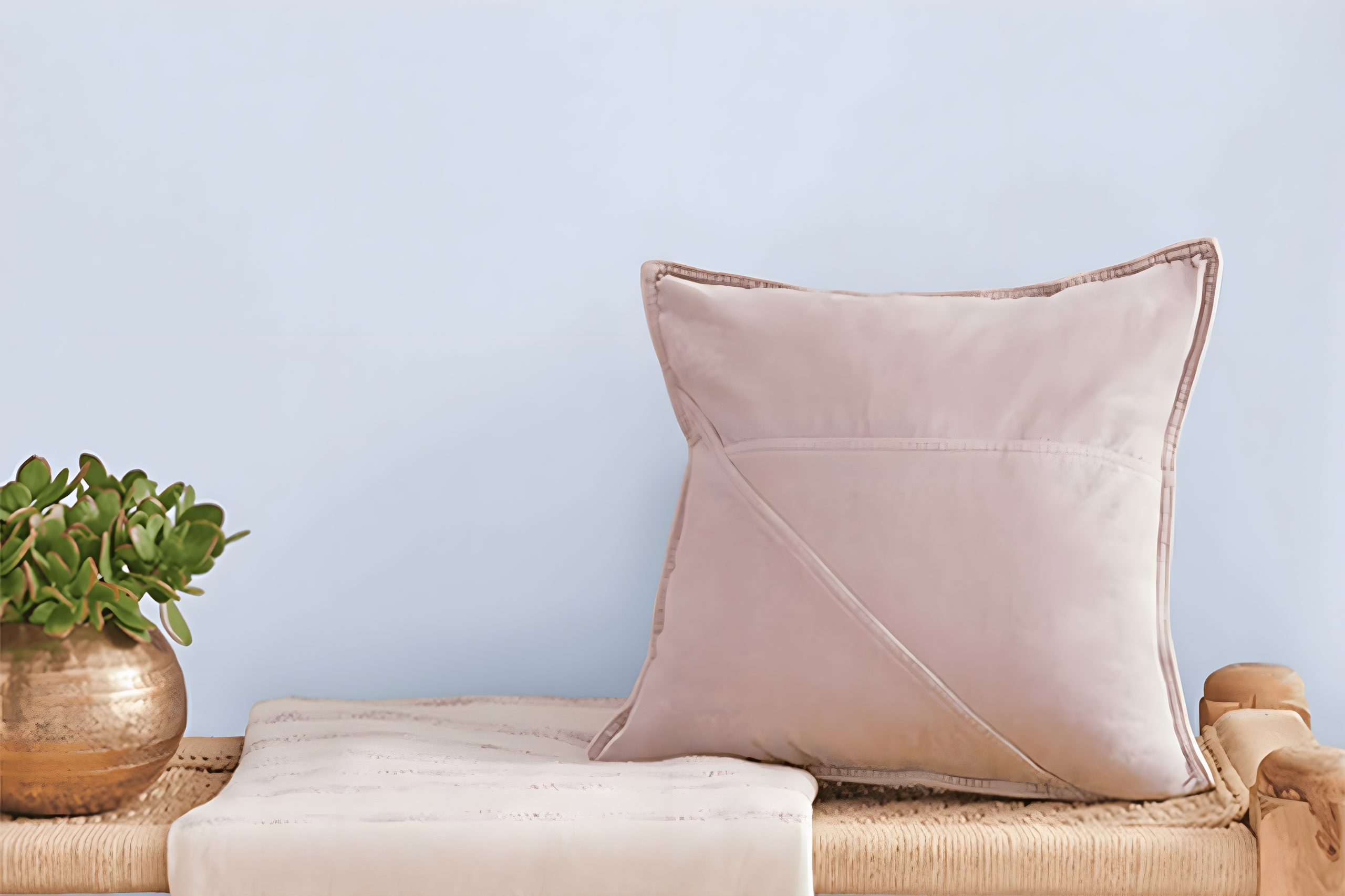
It pairs wonderfully with white trim and can be complemented by a wide range of decor styles and color palettes.
If you’re worried about the painting process, fear not! Sherwin Williams paints are known for their excellent coverage and durability, ensuring that your walls will look fabulous for years to come.
In this article, we’ll explore the characteristics of Wishful Blue, provide tips on how to best use it in your home, and suggest color combinations that will help make your space feel welcoming and cohesive.
Whether you’re a seasoned DIYer or considering your first project, Wishful Blue is a great choice for bringing a fresh and uplifting vibe into your home.
via sherwin-williams.com
What Color Is Wishful Blue SW 6813 by Sherwin Williams?
Wishful Blue SW 6813 by Sherwin Williams is a soothing and gentle hue that brings a sense of calm and tranquility into any space. This light blue color has a soft touch that seems to whisper of serene skies and quiet mornings.
It’s perfect for creating a peaceful retreat in your home. With its subtle and airy vibe, Wishful Blue is versatile, fitting effortlessly into various interior styles, particularly in spaces aiming for a relaxed and serene atmosphere.
This color works wonders in styles such as Scandinavian, where simplicity and comfort are key, and coastal, where it mimics the soft tones of the beach and sea.
It’s also ideal for a traditional setting when paired with classic furniture and patterns, adding a fresh breath of air to the timeless decor.
Moreover, modern minimalist spaces can benefit from its subtle presence, adding depth without overwhelming the senses.
Wishful Blue pairs beautifully with natural materials and textures, enhancing its calming effect. Think of pairing it with light woods like oak or birch to promote a warm, welcoming feel.
Soft textiles in whites or creams can add to the serene vibe, creating a cozy and inviting space. Accents in silver or glass can introduce a touch of elegance, making the room feel more spacious and bright.
This color, with its soft and subtle character, is perfect for creating a peaceful sanctuary in your home.

housekeepingbay.com
Table of Contents
Is Wishful Blue SW 6813 by Sherwin Williams Warm or Cool color?
Wishful Blue SW 6813 by Sherwin Williams is a soft and gentle shade of blue that brings a peaceful and calming feeling into any room.
This color is like a breath of fresh air; it’s light enough to make small spaces seem larger and more open, yet it has enough depth to add character and a sense of coziness.
Imagine the serene feeling of looking up at a clear sky on a sunny day; that’s the vibe Wishful Blue brings into your home.
This color works wonders in bedrooms, bathrooms, and living areas, where you want to create a soothing atmosphere. It pairs beautifully with white trim and light wood furniture, giving a fresh and clean look.
For those who like a bit of contrast, it also goes well with darker colors and can add a nice pop of color without overwhelming the space.
Overall, Wishful Blue by Sherwin Williams is a versatile color that can help make your house feel more like home. It invites calmness and relaxation, making it perfect for anyone looking to create a peaceful and inviting space.
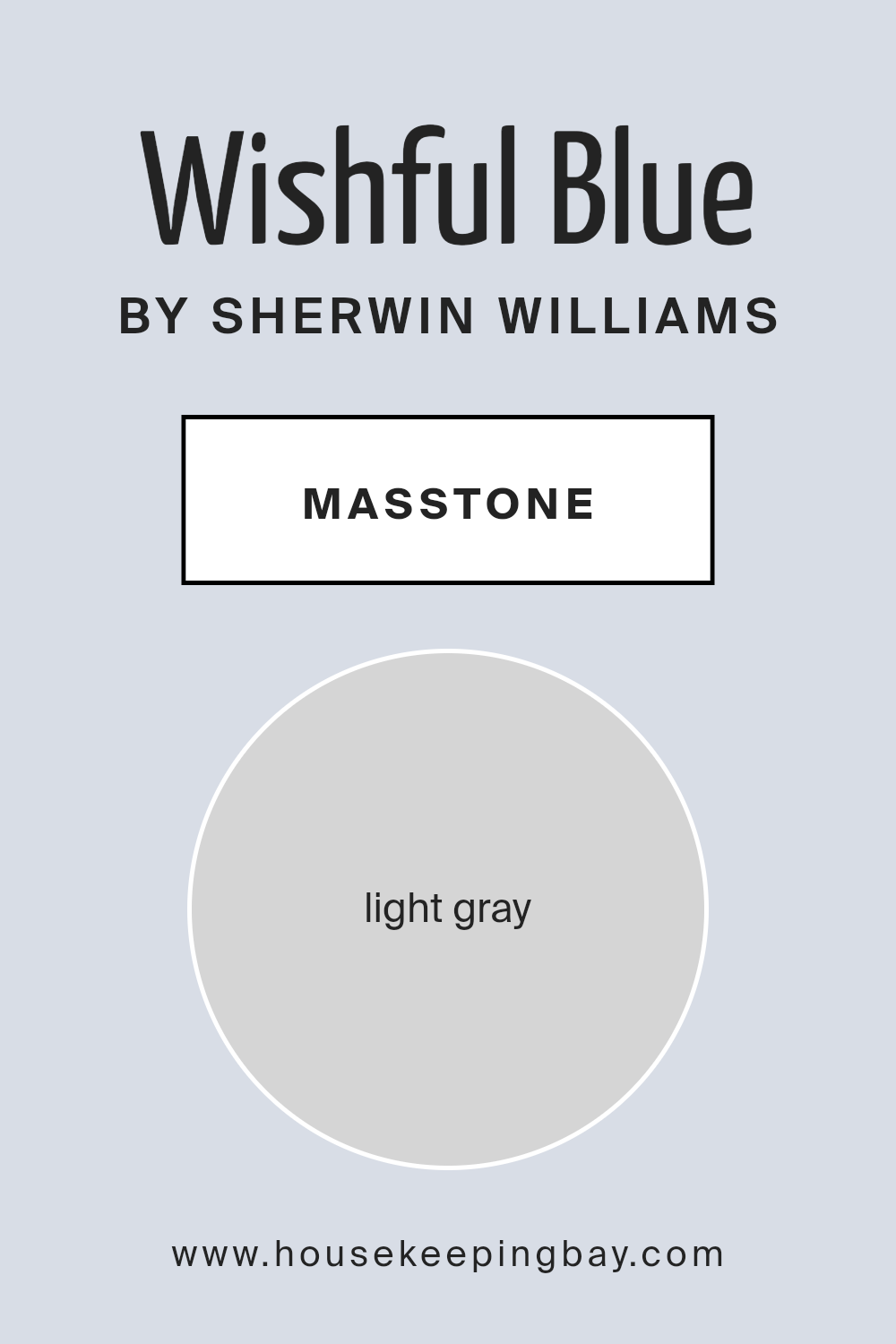
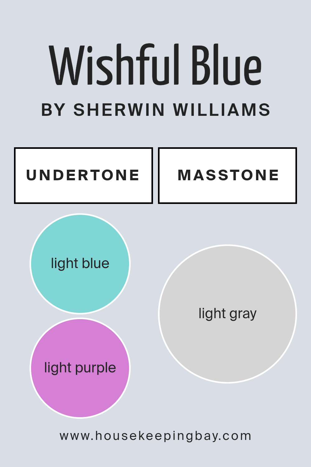
What is the Masstone of the Wishful Blue SW 6813 by Sherwin Williams?
Wishful Blue SW 6813 by Sherwin Williams has a masstone, or the main color you see in the paint, of light gray, which looks a lot like the color #D5D5D5.
This cool, soothing shade has a special way of making homes feel more spacious and calm. Since it’s fairly light, it can brighten up rooms that don’t get a lot of sunlight, making them feel more welcoming.
The subtlety of Wishful Blue means it’s really versatile; it can work in any room, whether it’s a cozy bedroom or a busy kitchen, without overwhelming the space.
It pairs well with lots of other colors, so you can add furniture or decor in brighter shades and they’ll pop against the light gray background, or keep things muted for a more serene vibe.
Overall, its ability to adapt makes it a popular choice for people looking to refresh their home.
housekeepingbay.com
Undertones of Wishful Blue SW 6813 by Sherwin Williams
Wishful Blue SW 6813 by Sherwin Williams is a unique and lovely shade that has subtle nuances hidden in its composition.
The first thing to understand about undertones is that they are like the secret ingredients in a recipe that can slightly change how the main flavor is perceived.
In the case of Wishful Blue, it has light blue and light purple undertones. These undertones work behind the scenes to add depth and complexity to the primary blue color.
Undertones can greatly influence how we see a color because they can shift its appearance under different lighting conditions.
For example, in a room with a lot of natural light, the light blue undertone of Wishful Blue might become more pronounced, giving the walls a crisp and airy feel.
In contrast, in a space with less light or during the evening, the light purple undertone might step forward, adding a touch of warmth and coziness to the room.
When applied to interior walls, Wishful Blue SW 6813 by Sherwin Williams can therefore offer a dynamic range of expressions. It’s not just a flat, static color; it’s a shade that can evolve throughout the day and in different settings.
This versatility makes it a fantastic choice for anyone looking to add not just color, but also a subtle mood or atmosphere to their space.
The presence of these undertones can enhance the aesthetic appeal of a room, making it feel more welcoming and engaging without overwhelming it with bold color statements.
housekeepingbay.com
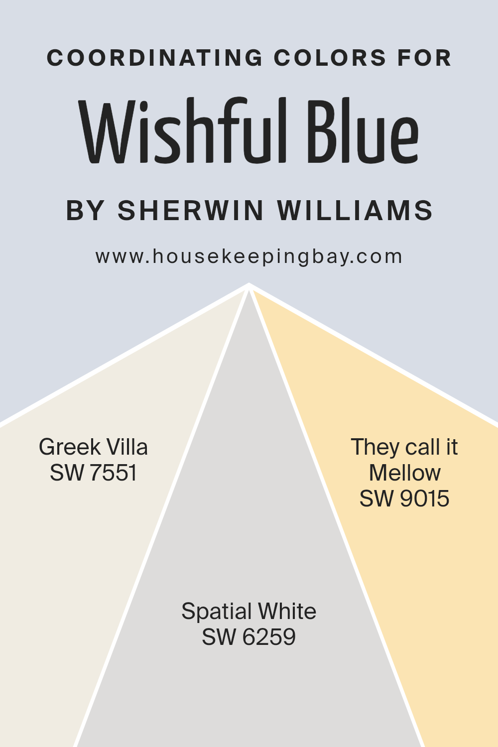
Coordinating Colors of Wishful Blue SW 6813 by Sherwin Williams
Coordinating colors are hues that complement each other when used together in a space, creating a harmonious and balanced look. They are selected based on various color theories to ensure they enhance the primary color’s attributes without overshadowing it.
When dealing with Wishful Blue SW 6813 by Sherwin Williams, a serene and inviting shade, certain colors work particularly well as coordinating options to bring out its best qualities.
These coordinating colors can either add contrast, create a subtle backdrop, or highlight the main color to achieve a cohesive design aesthetic.
The first coordinating color, Greek Villa SW 7551, is a soft, off-white shade with a warm undertone that provides a gentle contrast to Wishful Blue, making it stand out without creating a stark difference.
It’s ideal for creating a soothing environment that feels both open and cozy. Spatial White SW 6259, on the other hand, is a lighter and airier white that brings brightness to a space, complementing the light-hearted nature of Wishful Blue and giving a sense of expansiveness.
Finally, They Call It Mellow SW 9015 is a delicate, muted yellow that offers a subtle hint of cheerfulness to balance the blues, ensuring the space feels warm and welcoming without being overpowering.
Together, these coordinating colors work seamlessly with Wishful Blue to create a space that feels put together and thoughtfully designed.
You can see recommended paint colors below:
- SW 7551 Greek Villa
- SW 6259 Spatial White
- SW 9015 They call it Mellow
housekeepingbay.com
How Does Lighting Affect Wishful Blue SW 6813 by Sherwin Williams?
Lighting has a major impact on how colors appear in any space. The way a room is lit can make colors look different at various times of the day or under different light sources.
When we talk about Wishful Blue SW 6813 by Sherwin Williams, it’s essential to understand how this particular shade interacts with light, whether it’s natural sunlight or artificial lighting.
In artificial light, Wishful Blue can lean towards a softer, gentler hue. This is because most artificial lights, especially warmer ones, can make blues appear more muted.
In rooms lit with cooler LED lights, Wishful Blue maintains its true color better, showcasing its calming and serene attributes.
Natural light, on the other hand, brings out the vibrancy in Wishful Blue. How this color looks throughout the day changes based on the direction the room faces.
In north-faced rooms, which get less direct sunlight, Wishful Blue may appear more subdued and cooler, giving the room a calm and tranquil feel. This cooler light highlights the color’s subtle undertones and can make the space seem more airy and peaceful.
South-faced rooms bask in abundant sunlight, which can make Wishful Blue look brighter and more lively. The warm light accentuates the color, making the room feel inviting and cheerful.
This setting is ideal for spaces where you want to create a vibrant, energetic vibe without overwhelming the senses.
East-faced rooms enjoy the morning light, making Wishful Blue look soft and pleasant in the mornings, then shifting towards a cooler tone as the day progresses. It’s perfect for spaces used mainly in the morning, like kitchens or breakfast nooks.
West-faced rooms get the evening light, which can make Wishful Blue appear warmer and more welcoming in the afternoon and evening. This is great for living spaces that are used more during the latter part of the day.
In summary, Wishful Blue’s appearance can dramatically shift depending on the light it’s under, whether it’s the softer glow from artificial lighting or the varying intensities and tones of natural sunlight throughout the day.
housekeepingbay.com
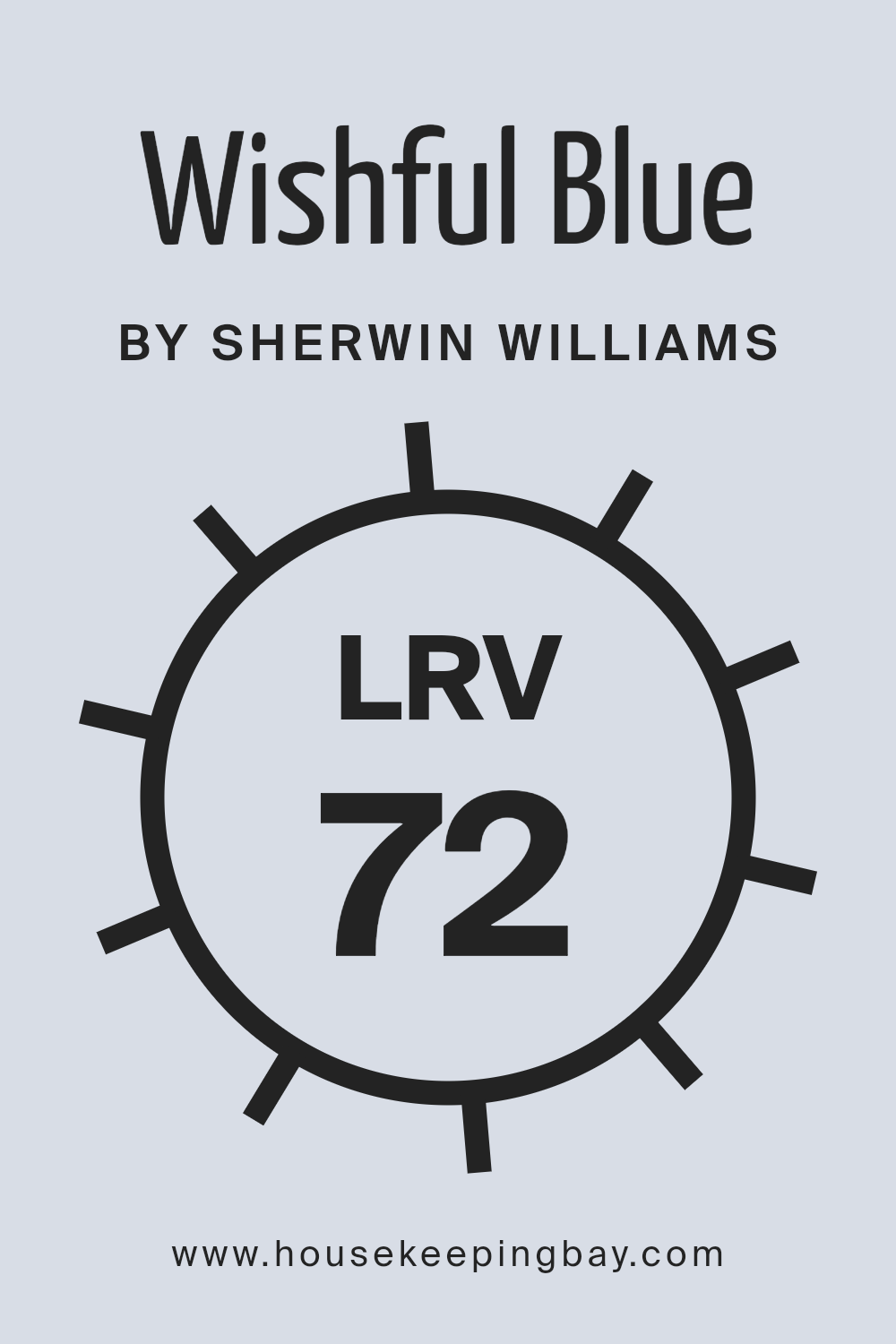
What is the LRV of Wishful Blue SW 6813 by Sherwin Williams?
LRV stands for Light Reflectance Value, and it’s a way to measure how much light a color reflects. Think of it as a scale from 0 to 100, where 0 is completely black, absorbing all light, and 100 is pure white, reflecting all light back.
This value helps you understand how light or dark a color will look once it’s on your walls. The amount of natural light your room gets also plays a big role.
In spaces with lots of sunlight, colors can appear lighter than they do in areas that rely more on artificial lighting.
When it comes to Wishful Blue SW 6813 by Sherwin Williams, with an LRV of 71.789, it’s on the lighter end of the scale. This means it’s a color that will reflect a good amount of light, making rooms feel brighter and more open.
It’s an excellent choice for spaces where you want to enhance the feeling of lightness without going towards very pale shades.
For smaller or darker rooms, a high LRV color like Wishful Blue can help make the space feel larger and more welcoming by bouncing more light around the room.
housekeepingbay.com
What is LRV? Read It Before You Choose Your Ideal Paint Color
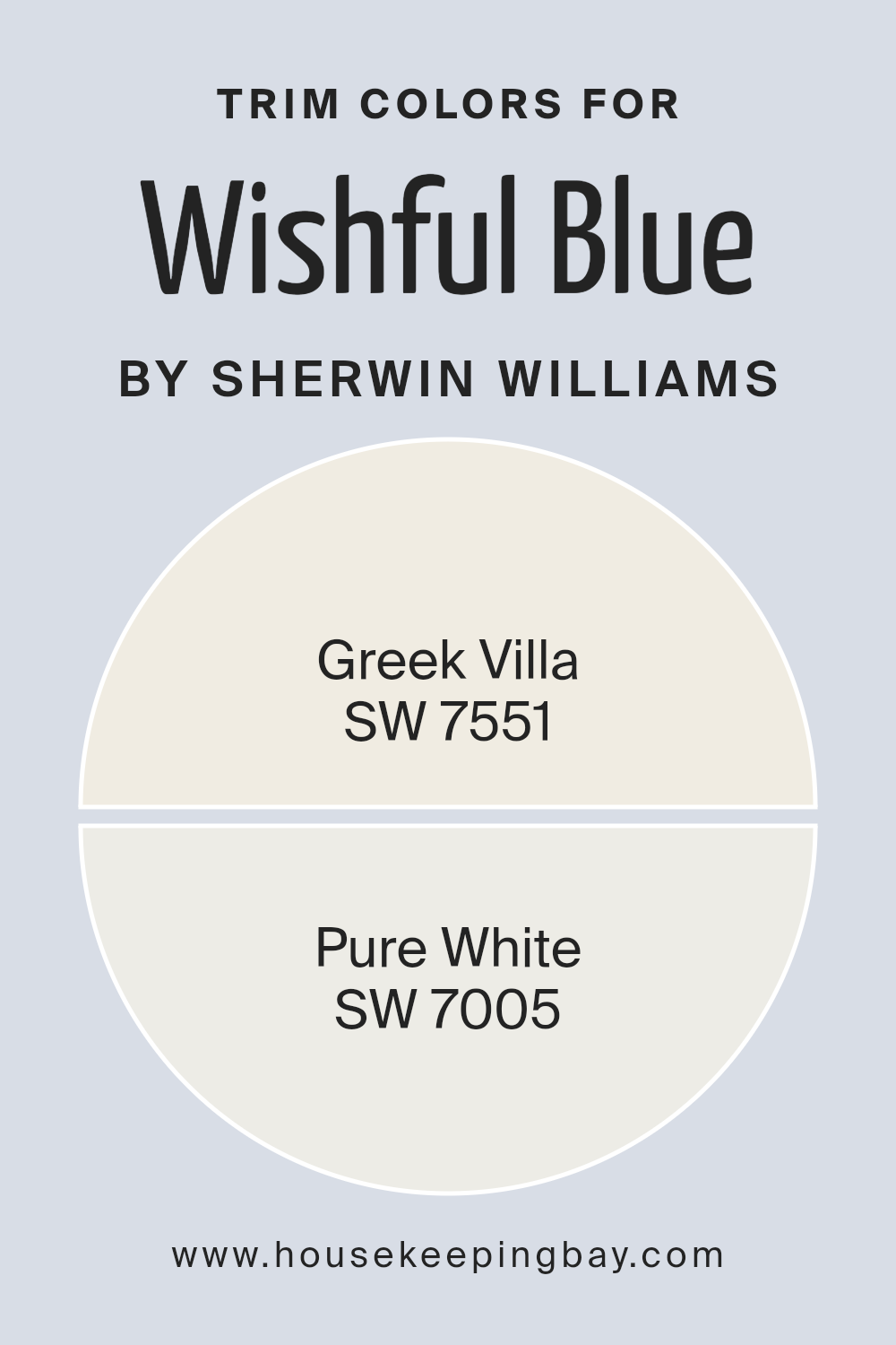
What are the Trim colors of Wishful Blue SW 6813 by Sherwin Williams?
Trim colors, essentially, are those used on the edges or borders of walls, like around windows, doors, and along ceilings or baseboards, to accentuate or contrast with the wall color.
These colors can greatly influence the feel and aesthetic appeal of a room, defining spaces clearly and adding depth or highlight to the overall design.
For a color like Wishful Blue SW 6813 by Sherwin-Williams, selecting the right trim color is crucial because it can either subtly complement the serene and gentle vibe of Wishful Blue or create a striking contrast that frames the walls beautifully, drawing attention to the color’s unique tone.
In the context of Wishful Blue SW 6813, SW 7551 – Greek Villa, and SW 7005 – Pure White are excellent choices for trim colors.
Greek Villa is not just a simple off-white; it has a slightly warm undertone that can soften the transition between the calming Wishful Blue and the trim, creating a harmonious and inviting space.
It brings a touch of warmth without overwhelming the soothing quality of the main wall color. On the other hand, Pure White is as straightforward as it gets, offering a clean, crisp edge that can make the blue really pop.
It’s perfect for those looking to define spaces more dramatically, providing a fresh contrast that enhances the light and airy feel of Wishful Blue.
You can see recommended paint colors below:
housekeepingbay.com
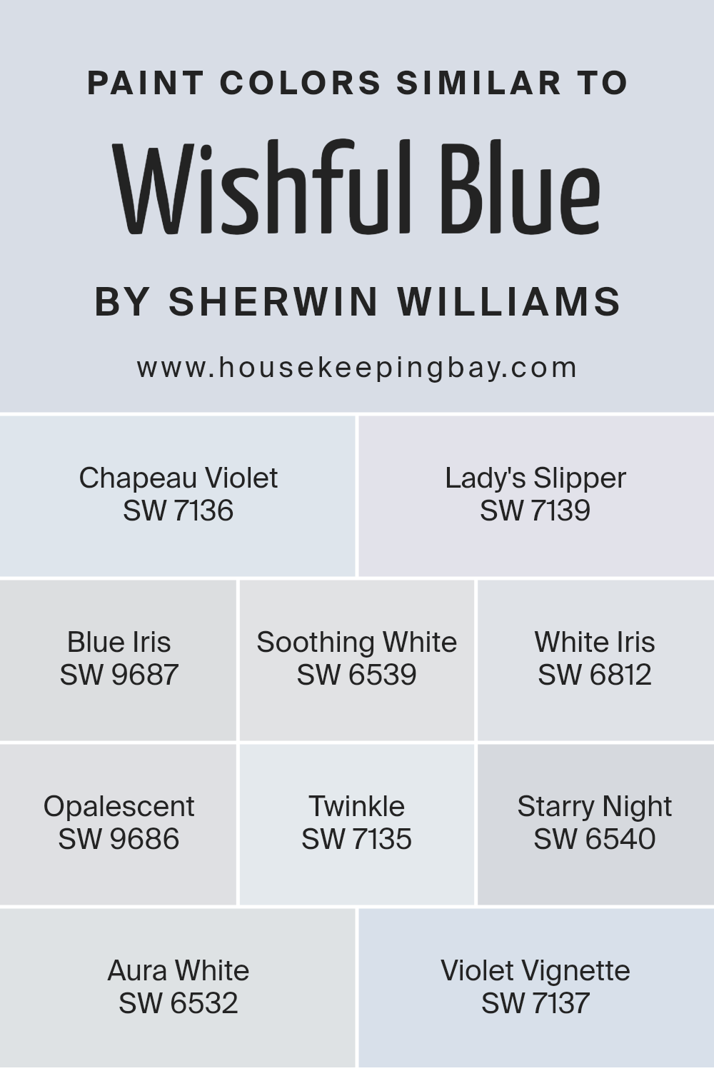
Colors Similar to Wishful Blue SW 6813 by Sherwin Williams
Understanding the significance of similar colors, particularly when working with a palette close to Wishful Blue SW 6813 by Sherwin Williams, is crucial in achieving a cohesive and visually pleasing ambiance in any space.
Similar colors, such as the ones connected to Wishful Blue, possess a harmonious quality that seamlessly blends one shade into the next, creating a subtle yet impactful variation that can enhance the depth and complexity of interior designs.
This continuity in color can make spaces feel more expansive and connected, providing a tranquil and soothing atmosphere.
For instance, Chapeau Violet SW 7136 introduces a muted, sophisticated touch of purple that whispers elegance without overwhelming, perfect for creating an understated yet rich backdrop.
Lady’s Slipper SW 7139, akin to the delicate balance of light and shadow at dusk, offers a soft, dusky lavender hue that imparts a serene, comforting feel to rooms.
Blue Iris SW 9687 draws from the deeper end of the palette, providing a bold yet calming statement with its richly saturated blue that echoes the serene depths of the ocean.
Soothing White SW 6539 captures the essence of tranquility in a bottle, presenting a barely-there hint of blue that enlivens spaces with a fresh, airy vibe.
White Iris SW 6812 serves as a whisper of lavender floating in a sea of soft white, ideal for adding a hint of intrigue without dominating the visual space.
Opalescent SW 9686 offers a unique blend, marrying the coolness of blue with a subtle, dreamy luminescence that enhances spaces with a touch of mystique.
Twinkle SW 7135 embodies the playful flicker of early evening stars, a light violet that teases the eyes with its soft sparkle.
Starry Night SW 6540 plunges into the mystery of the night sky with a deeper blue that adds a dramatic flair. Aura White SW 6532 is the epitome of subtlety, bearing a faint blue undertone that delivers an immaculate, crisp finish.
Lastly, Violet Vignette SW 7137 cloaks rooms in a shade that reflects the wistful beauty of twilight, a gentle blend of violet that evokes a sense of quiet reflection.
Together, these similar colors complement Wishful Blue in creating spaces that feel connected, harmonious, and beautifully layered with an array of soothing hues.
You can see recommended paint colors below:
- SW 7136 Chapeau Violet
- SW 7139 Lady’s Slipper
- SW 9687 Blue Iris
- SW 6539 Soothing White
- SW 6812 White Iris
- SW 9686 Opalescent
- SW 7135 Twinkle
- SW 6540 Starry Night
- SW 6532 Aura White
- SW 7137 Violet Vignette
housekeepingbay.com
How to Use Wishful Blue SW 6813 by Sherwin Williams In Your Home?
Wishful Blue SW 6813 by Sherwin Williams is a light and airy paint color that brings a sense of calm and serenity to any space.
Imagine the gentle hue of the early morning sky right inside your home; that’s exactly what Wishful Blue can offer.
It’s perfect for creating a relaxing environment, whether you’re looking to freshen up your living room, bedroom, or even a bathroom.
Using Wishful Blue in your home is like inviting a breath of fresh air into your spaces. Its subtle tone works wonderfully as a main color for walls, providing a soft backdrop that easily matches with various decor styles and colors.
Since it’s not overpowering, you can pair it with bolder colors for a dynamic contrast or keep things serene with soft whites and neutral furnishings.
In the bedroom, Wishful Blue can help create a peaceful retreat, making it easier to unwind and get a good night’s sleep. In living areas, it adds a light, open feel, making the room appear more spacious and welcoming.
Plus, in bathrooms, it injects a spa-like vibe, turning your daily routines into more soothing experiences.
Overall, Wishful Blue SW 6813 is a versatile choice that can help you create a home that feels both refreshed and soothing.
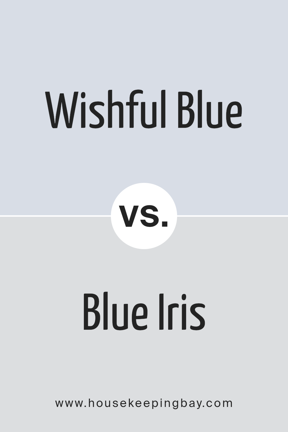
Wishful Blue SW 6813 by Sherwin Williams vs Blue Iris SW 9687 by Sherwin Williams
Wishful Blue SW 6813 by Sherwin Williams is a soft and light color. It gives off a calm and soothing vibe, perfect for creating a peaceful space. This color is like a faint sky on a bright morning, offering a sense of openness and freshness.
On the other hand, Blue Iris SW 9687 is a more vibrant and deeper shade. It’s richer and has a bold presence, making it great for adding a pop of color to a room.
This hue resembles the petals of its namesake flower, providing a more energetic and striking look compared to Wishful Blue.
While both colors belong to the blue family, Wishful Blue leans towards a serene and gentle ambiance, ideal for relaxing environments. Blue Iris, however, stands out more and brings life and energy to a space.
Depending on the mood or atmosphere you want to create, each color has its unique appeal and uses in home decor.
You can see recommended paint color below:
housekeepingbay.com
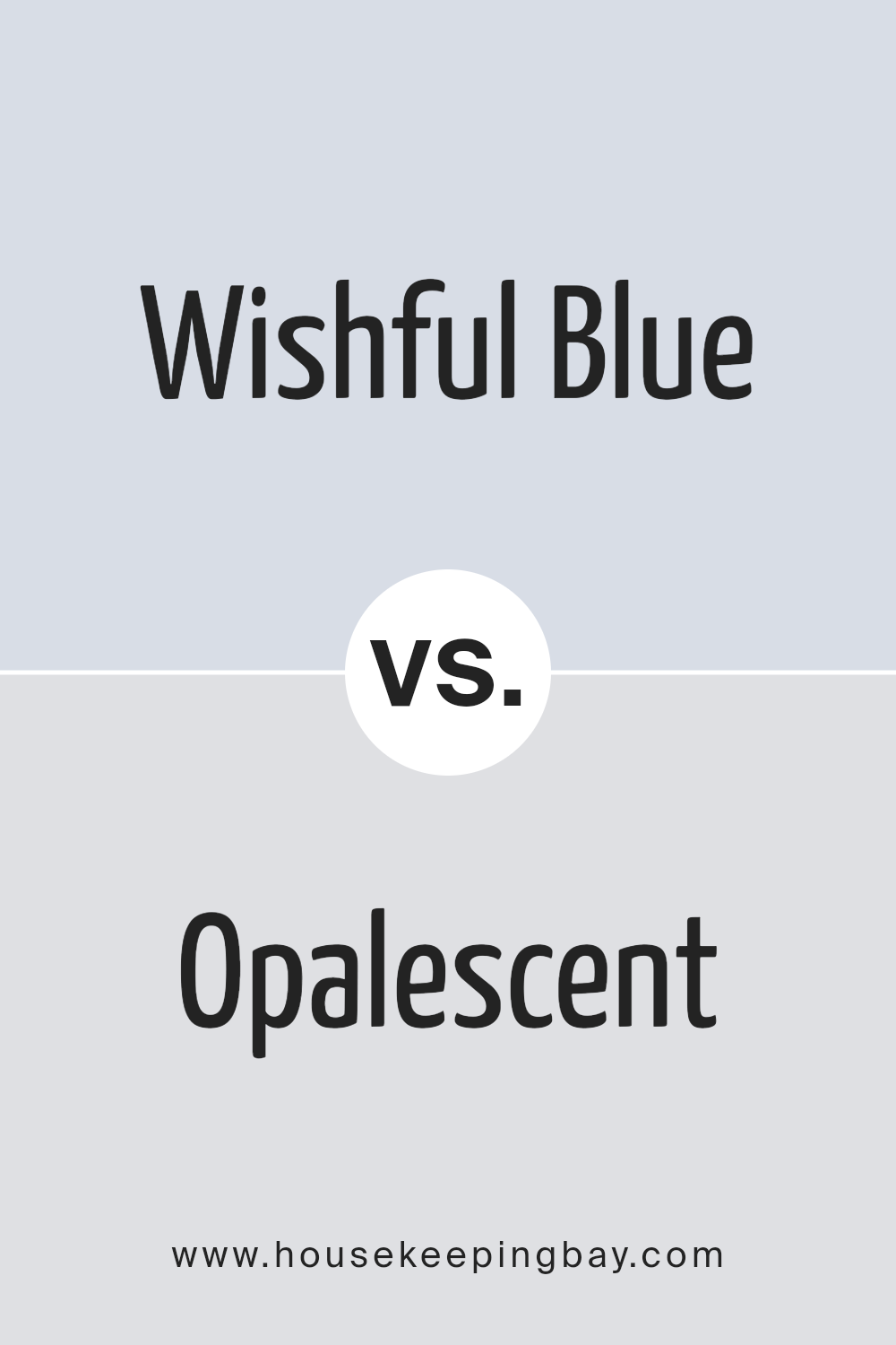
Wishful Blue SW 6813 by Sherwin Williams vs Opalescent SW 9686 by Sherwin Williams
Wishful Blue SW 6813 and Opalescent SW 9686, both from Sherwin Williams, have their unique qualities. Wishful Blue is like a gentle sky on a clear day, providing a soothing and calm atmosphere.
It’s light but has enough depth to give spaces an airy and open feeling, making it perfect for creating a peaceful vibe in any room.
On the other hand, Opalescent SW 9686 is softer and leans towards a delicate, creamy off-white with subtle hints of color, reminiscent of an opal gemstone catching the light.
This color adds a touch of elegance and is versatile enough to be a background hue that complements other colors or decor styles, bringing a warm and inviting feel to spaces.
While Wishful Blue is more about creating a serene and tranquil mood with its unmistakable blue tone, Opalescent offers a nuanced and sophisticated backdrop that’s more neutral.
Both are great color choices, but your decision might boil down to whether you prefer the cool clarity of blue or the soft warmth of an almost neutral with a hint of magic.
You can see recommended paint color below:
housekeepingbay.com
Wishful Blue SW 6813 by Sherwin Williams vs Starry Night SW 6540 by Sherwin Williams
Wishful Blue SW 6813 and Starry Night SW 6540 are two distinct colors by Sherwin Williams. Wishful Blue is a light, soft shade that can give a room a fresh and airy feeling.
It’s great for creating a serene and peaceful space. Imagine a gentle sky on a clear day; that’s the vibe Wishful Blue brings.
On the other hand, Starry Night SW 6540 is a deeper, more vibrant color. It’s a rich blue with a hint of green, making it perfect for adding a bold and dynamic touch to any area.
It’s like looking at a dusk sky, just as the first stars start to shine.
While Wishful Blue is about calmness and clarity, Starry Night offers depth and drama. Wishful Blue works well in spaces where you want to relax, like bedrooms or bathrooms.
Starry Night, however, is ideal for areas where you want to make a statement, such as an accent wall in a living room. Both colors are beautiful, but they serve different purposes depending on the mood you want to create.
You can see recommended paint color below:
- SW 6540 Starry Night
housekeepingbay.com
Wishful Blue SW 6813 by Sherwin Williams vs Soothing White SW 6539 by Sherwin Williams
Wishful Blue SW 6813 by Sherwin Williams and Soothing White SW 6539 from the same brand are like calm friends that go well together, yet stand out on their own. Wishful Blue has a soft, dreamy vibe, like a clear sky on a sunny day.
It’s not too bright or too dull, making it a great choice for a relaxing space. On the other hand, Soothing White is as gentle as it sounds.
It’s not a stark white but has a hint of warmth, making any room feel cozy and inviting without being too bright or overpowering.
These two colors work great together because they both have a calming effect. Wishful Blue adds a touch of color without overwhelming the senses, while Soothing White offers a clean backdrop that makes the blue pop just a little.
Whether you’re painting a bedroom, bathroom, or just looking for a peaceful atmosphere, combining these two colors can create a space that feels both refreshing and comfortable.
You can see recommended paint color below:
- SW 6539 Soothing White
housekeepingbay.com
Wishful Blue SW 6813 by Sherwin Williams vs Chapeau Violet SW 7136 by Sherwin Williams
Wishful Blue SW 6813 by Sherwin Williams and Chapeau Violet SW 7136 are distinct colors with their unique charm. Wishful Blue is a light, airy blue that brings a sense of calm and openness to a room.
It’s like the sky on a clear, sunny day, making spaces feel more spacious and relaxing. On the other hand, Chapeau Violet has a richer, deeper tone that adds a touch of sophistication and elegance.
This color resembles a blend of lavender and grey, making it perfect for creating a cozy and inviting atmosphere. While Wishful Blue adds a breath of fresh air and a calming vibe, Chapeau Violet offers depth and a hint of luxury.
Both colors are versatile, but their impact on a room’s mood and style is quite different. Wishful Blue is great for a serene and airy feel, whereas Chapeau Violet suits those looking for a more grounded, stylish look.
You can see recommended paint color below:
- SW 7136 Chapeau Violet
housekeepingbay.com
Wishful Blue SW 6813 by Sherwin Williams vs Violet Vignette SW 7137 by Sherwin Williams
Wishful Blue SW 6813 by Sherwin Williams and Violet Vignette SW 7137 by Sherwin Williams are both unique colors, but they’re quite different when you look at them closely.
Wishful Blue is a soft, gentle color that reminds you of a clear, peaceful sky on a bright day. It has a freshness to it that can make any room feel more open and airy.
On the other hand, Violet Vignette is a richer, deeper color with a blend of purple and gray tones. It’s the kind of color that adds a touch of elegance and sophistication to a space.
While Wishful Blue brings a light, uplifting vibe, Violet Vignette brings depth and a bit of mystery, making it perfect for creating a cozy, inviting atmosphere.
Though both colors come from the same company, Sherwin Williams, they serve different moods and aesthetics in interior design.
Whether you’re looking for something bright and refreshing or something more refined and cozy, these colors offer beautiful options for transforming any room.
You can see recommended paint color below:
- SW 7137 Violet Vignette
housekeepingbay.com
Wishful Blue SW 6813 by Sherwin Williams vs Aura White SW 6532 by Sherwin Williams
Wishful Blue SW 6813 by Sherwin Williams and Aura White SW 6532 are two distinctive colors from the same brand. Wishful Blue is a soft, gentle blue that feels calm and soothing, much like a clear sky on a sunny day.
It has a serene quality to it, making spaces feel open and relaxed. On the other hand, Aura White is a light, airy white with a subtle hint of warmth. It’s not a stark white but has a softness to it, giving rooms a cozy, inviting atmosphere.
When comparing these two, Wishful Blue offers a touch of color that brings with it a peaceful vibe, perfect for creating a tranquil space.
Aura White, however, serves as an excellent backdrop for any room, providing a light and bright feel while still adding warmth.
Using Aura White can make a room feel larger and more open, whereas Wishful Blue adds personality and a sense of calmness without overwhelming the space. Both colors work beautifully in a variety of settings, depending on the mood you want to create.
You can see recommended paint color below:
- SW 6532 Aura White
housekeepingbay.com
Wishful Blue SW 6813 by Sherwin Williams vs White Iris SW 6812 by Sherwin Williams
Wishful Blue SW 6813 by Sherwin Williams is a light and soft shade of blue with a soothing feel. It’s like a gentle sky on a clear day, calming and peaceful.
This color can make spaces feel more open and airy, bringing a relaxed vibe to any room. It’s perfect for creating a serene atmosphere, especially in bedrooms or bathrooms.
White Iris SW 6812 by Sherwin Williams, on the other hand, is a very pale, almost white color with just a hint of blue. It’s extremely subtle, making it a great option for those who prefer a nearly neutral palette but want a touch of coolness.
White Iris can help brighten up a space while still adding a slight color depth, making it ideal for small spaces or areas that don’t get a lot of light.
Both colors share a calm and tranquil quality, but Wishful Blue adds a bit more color and personality to a room, while White Iris offers an understated elegance with its near-neutral appearance.
You can see recommended paint color below:
- SW 6812 White Iris
housekeepingbay.com
Wishful Blue SW 6813 by Sherwin Williams vs Twinkle SW 7135 by Sherwin Williams
Wishful Blue and Twinkle, both by Sherwin Williams, contribute subtle yet distinct vibes to spaces. Wishful Blue is a soft, airy tone that brings a calm, soothing energy.
It’s reminiscent of a clear, peaceful sky, making it great for creating a serene ambiance. This makes it a top pick for bedrooms or any area where relaxation is key.
On the other hand, Twinkle is slightly darker and leans more towards a muted lavender with a hint of blue.
This color adds a cozy, yet sophisticated touch to rooms. It’s perfect for adding a bit of warmth while still keeping things light and not too overwhelming.
In comparison, while both colors share a peaceful quality, Wishful Blue offers a more traditional blue experience that’s clean and refreshing.
Twinkle, with its unique blend, introduces warmth, making it ideal for those wanting a space that feels snug but also stylish. Choosing between them depends on whether you prefer the crispness of Wishful Blue or the depth and warmth of Twinkle.
You can see recommended paint color below:
- SW 7135 Twinkle
housekeepingbay.com
Wishful Blue SW 6813 by Sherwin Williams vs Lady’s Slipper SW 7139 by Sherwin Williams
Wishful Blue SW 6813 and Lady’s Slipper SW 7139, both by Sherwin Williams, offer unique shades that can really change the look of a space.
Starting with Wishful Blue, this color is a soft, serene shade that brings to mind a clear sky on a sunny day. It has a calming effect, making it perfect for bedrooms or bathrooms where you want to create a peaceful atmosphere.
On the other hand, Lady’s Slipper SW 7139 is a gentle, muted purple with a touch of gray. This color is subtle yet brings a cozy warmth to any room.
It’s particularly great in living spaces or bedrooms where you want a hint of color without overwhelming the senses.
While Wishful Blue has a cool, refreshing vibe, Lady’s Slipper leans towards a warm, comforting feel. Depending on what mood or style you’re going for, either of these colors could be the perfect choice.
Wishful Blue might be better for a crisp, clean look, whereas Lady’s Slipper could be the go-to for a soft, welcoming ambiance.
You can see recommended paint color below:
- SW 7139 Lady’s Slipper
housekeepingbay.com
Conclusion
Wishful Blue SW 6813 by Sherwin Williams is a serene and calming shade that brings a refreshing touch to any space. Its gentle tones can create a peaceful atmosphere in rooms, making it an ideal choice for those looking to add a hint of tranquility to their environment.
This color works well in a variety of settings, from bedrooms to bathrooms, offering a subtle backdrop that enhances decor without overpowering it.
The versatility of Wishful Blue makes it a popular choice among homeowners and interior designers alike. It pairs beautifully with a range of colors, from soft neutrals to bold hues, allowing for creative freedom in design.
Whether you’re aiming for a cozy, inviting space or a more airy and open ambiance, Wishful Blue offers a beautiful foundation to build upon. Its ability to evoke a sense of calmness makes it a standout choice in the Sherwin Williams collection.

housekeepingbay.com
Ever wished paint sampling was as easy as sticking a sticker? Guess what? Now it is! Discover Samplize's unique Peel & Stick samples. Get started now and say goodbye to the old messy way!
Get paint samples