Blue Iris SW 9687 by Sherwin Williams
A Journey Through Captivating Hues
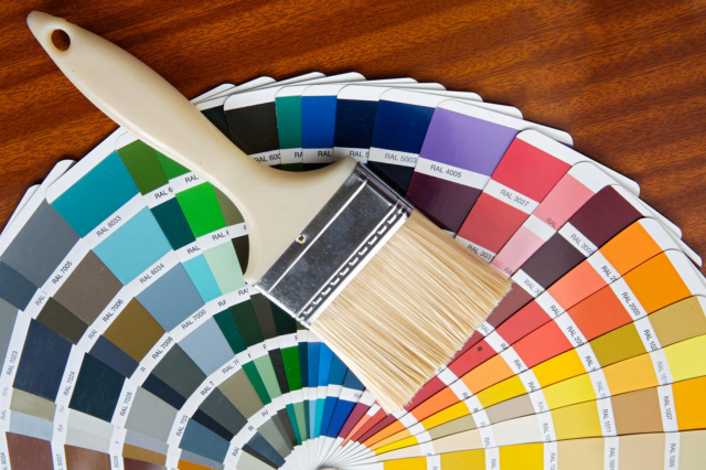
Sherwin Williams SW 9687 Blue Iris is a stunning paint color that captures the beauty and depth of nature’s own palette. This particular shade is part of Sherwin Williams’ exclusive color collection, renowned for their high-quality paints and wide range of colors suited for various design needs.
Blue Iris, as the name suggests, is inspired by the rich and vibrant hues of the iris flower, offering a blend of deep blue with subtle hints of purple. It’s a color that brings a sense of calm and sophistication to any space, making it a popular choice for homeowners and interior designers alike.
Whether you’re looking to add a bold statement wall to your living room, create a serene bedroom retreat, or give your home’s exterior a fresh, inviting look, SW 9687 Blue Iris offers versatility and style. Its unique shade can easily complement different decor styles, from modern minimalism to traditional elegance, adding depth and character to your space.
Furthermore, Sherwin Williams is known for their durable and high-quality paint, ensuring that your chosen color will remain vibrant and withstand the tests of time. In this article, we’ll explore the various ways SW 9687 Blue Iris can transform your home and offer tips on achieving the best results with this stunning color.
via sherwin-williams.com
What Color Is Blue Iris SW 9687 by Sherwin Williams?
Blue Iris SW 9687 by Sherwin Williams is a unique color that brings a touch of sophistication and calmness to any space. This shade of blue has a depth that resembles the striking hue of a blooming iris, making it not just any ordinary blue. It’s a color that manages to be both vibrant and soothing at the same time, providing a refreshing backdrop to a variety of interior styles.
Ideal for those looking to add a statement to their space without overwhelming it, Blue Iris works exceptionally well in modern, minimalist, and coastal interior designs. Its versatility allows it to blend seamlessly with clean lines and simple aesthetics of modern decor, while its natural vibrancy is a perfect match for the light and breezy feel of coastal themes. In minimalist settings, it adds the right amount of color to maintain simplicity while injecting personality.
When it comes to pairing with materials and textures, Blue Iris shows its flexibility. It pairs wonderfully with natural wood, from light oak to darker walnut, bringing out the warm tones of the wood. Metals like silver, gold, or brushed nickel complement its depth, adding a touch of luxury. For textures, consider soft, plush fabrics to accentuate the soothing aspect of the color or smooth, matte finishes for a more understated elegance.
Whether with soft throw pillows, sleek furniture surfaces, or rich wooden tones, Blue Iris SW 9687 emerges as a harmonious choice that enhances the overall feel of a room without dominating it.
housekeepingbay.com
Table of Contents
Is Blue Iris SW 9687 by Sherwin Williams Warm or Cool color?
Blue Iris SW 9687 by Sherwin Williams is a unique and bold color choice for homes. It has a rich, deep quality that can make any room stand out. This shade of blue lies between the calmness of lighter blues and the power of a darker navy, offering a perfect balance for those wanting to add personality to their spaces without overwhelming them.
When used in homes, Blue Iris brings a sense of sophistication and depth. This color works well in living areas, bedrooms, or even bathrooms, providing a backdrop that both soothes and impresses. It can make small spaces appear larger and give rooms a fresh, modern feel.
Pairing it with the right accents and furniture is key. Light-colored decor can pop against Blue Iris walls, while metallic finishes like gold or silver add a luxurious touch. When applied thoughtfully, Blue Iris can transform a simple room into a stylish and inviting space.
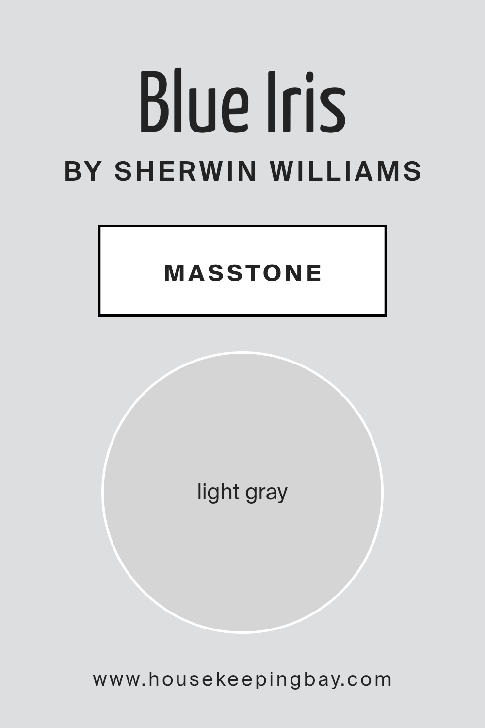
What is the Masstone of the Blue Iris SW 9687 by Sherwin Williams?
Blue IrisSW 9687 by Sherwin Williams is a unique color with a masstone of light gray (#D5D5D5). This light gray shade plays a big role in how it looks and feels in homes. Imagine a soft, gentle gray that can make any room feel calm and cozy. It’s like a light blanket of fog in the early morning, soothing and peaceful.
Because it’s a light gray, it’s super versatile. You can use it in small spaces to make them look bigger and brighter. Or, in big rooms, it adds a touch of elegance without being too bold or overpowering. It’s kind of like a chameleon; it can fit in with lots of different styles and vibes, whether your home is modern, traditional, or somewhere in between.
Another cool thing is that it goes really well with a lot of other colors. Whether you want to add some bright pillows, colorful art, or keep things muted, Blue IrisSW 9687 can handle it. It’s like a reliable friend that gets along with everyone and helps make your home feel just right.
housekeepingbay.com
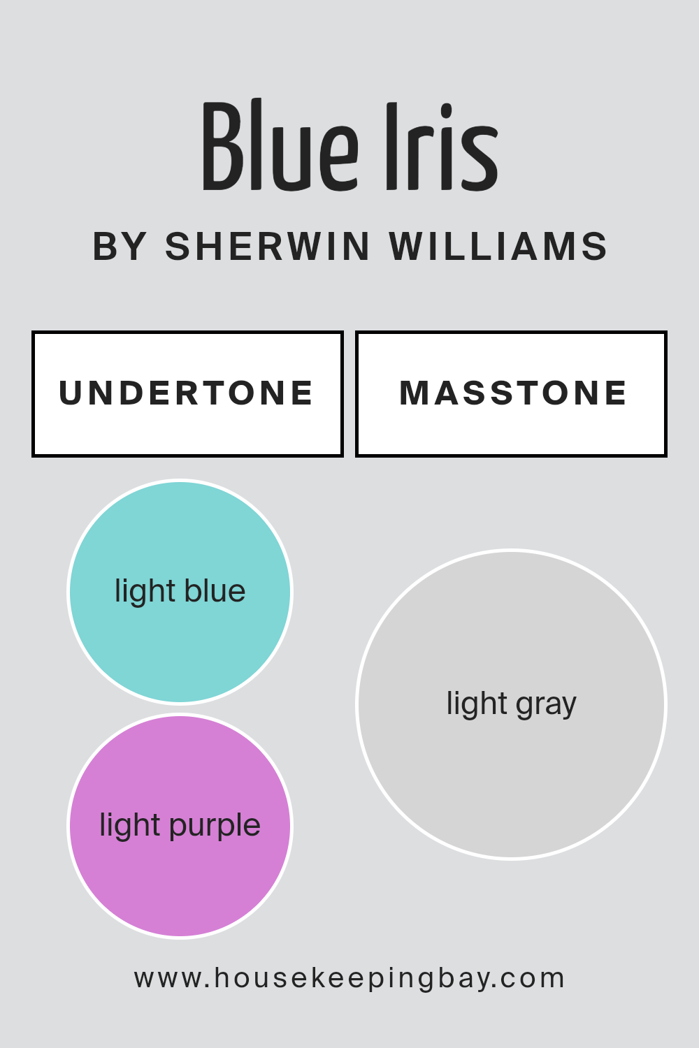
Undertones of Blue Iris SW 9687 by Sherwin Williams
Blue Iris SW 9687 by Sherwin Williams is a unique color that carries subtle undertones of light blue (#80D5D5) and light purple (#D580D5). Understanding undertones is key because they can change how a color looks under different lighting or when placed next to other colors. Basically, undertones are the sneaky background colors that can make a big color seem cooler, warmer, softer, or more vibrant without us instantly noticing why.
When it comes to interior walls, the undertones of Blue Iris SW 9687 can really impact the room’s mood. The light blue undertone adds a calming and refreshing feel, making it a great choice for bedrooms or bathrooms where you want a serene vibe. It’s like having a hint of the sky inside, bringing in a breath of fresh air.
On the other hand, the light purple undertone adds a touch of sophistication and depth. Purple has long been associated with royalty and luxury, so this undertone can make a space feel more upscale and thoughtfully designed. In areas like the living room or dining room, it can add an element of elegance.
Together, these undertones ensure Blue Iris SW 9687 isn’t just a simple blue. Instead, it becomes a multifaceted color that adapts subtly but significantly to its surroundings. Whether you’re going for a calm and collected look or aiming for plush and premium vibes, paying attention to these undertones can help achieve the desired effect on your walls.
housekeepingbay.com
How Does Lighting Affect Blue Iris SW 9687 by Sherwin Williams?
Lighting has a big impact on how we see colors. Imagine you have a room painted in Blue Iris SW 9687 by Sherwin Williams, a rich and vibrant shade. The way this color looks can change a lot depending on the kind of light shining on it.
Let’s start with artificial lighting, like lamps and ceiling lights. These lights can either make Blue Iris look brighter or slightly change its color, depending on the type of bulbs you use. Warm lights, like soft white bulbs, can make the blue seem cosier and less sharp. On the other hand, cool lights, such as daylight bulbs, keep the color true to its vibrant blue nature, making it appear more lively.
Next, let’s talk about natural light, which comes from the sun. This type of light changes throughout the day and can make Blue Iris look different in the morning, afternoon, and evening. Natural light also varies depending on which way your room faces.
In rooms that face north, natural light can be a bit cooler and less direct. This means Blue Iris might look more subdued and subtle. It won’t get that bright sunlight, so the color can appear as a calm and steady blue throughout the day.
South-facing rooms get a lot of sunlight throughout the day. Here, Blue Iris can really show off its richness and depth. The strong light can make the color look vibrant and dynamic, really standing out.
East-facing rooms get bright morning light. This makes Blue Iris look very lively and brilliant in the morning, then more gentle as the day goes on since the intense sunlight moves away.
West-facing rooms have the opposite effect. Blue Iris might look softer in the morning but then gets a golden glow in the afternoon and evening as the sun sets, making the color warmer and more inviting.
So, lighting not only changes how we see Blue Iris but also sets different moods in the room depending on the time of day and which way the room faces.
housekeepingbay.com
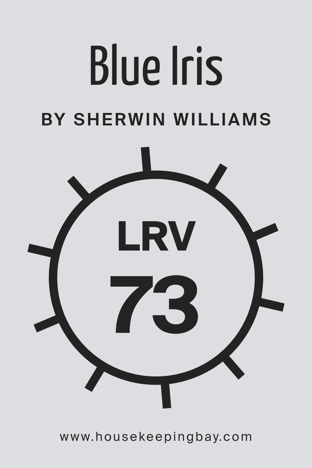
What is the LRV of Blue Iris SW 9687 by Sherwin Williams?
LRV stands for Light Reflectance Value, which is a measure of the percentage of light a paint color reflects back into a room once it’s on the walls. This number ranges from 0, which is the darkest black, absorbing all light, to 100, the brightest white, reflecting all light back.
The LRV helps you understand how light or dark a color will look once it’s applied to your space. It’s crucial because the amount of light a color reflects can significantly influence the mood and appearance of a room. A higher LRV means the color will look lighter and can make a small room feel more spacious and brighter, while a lower LRV can make a room feel cozier and more intimate.
With an LRV of 72.96, Blue Iris SW 9687 from Sherwin Williams is on the lighter side of the spectrum. This means it has the ability to reflect a good chunk of light, adding a bright and airy feel to the room. For this particular color, a high LRV suggests it will help in making the space feel more open and welcoming by bouncing back most of the light that hits its surface.
It’s an excellent choice for spaces you want to appear more luminous and lively, without overwhelming the senses. The soft brightness of Blue Iris can help in enhancing the natural light in a room, making it a great pick for living areas, bedrooms, or any space where a sense of openness is desired.
housekeepingbay.com
What is LRV? Read It Before You Choose Your Ideal Paint Color
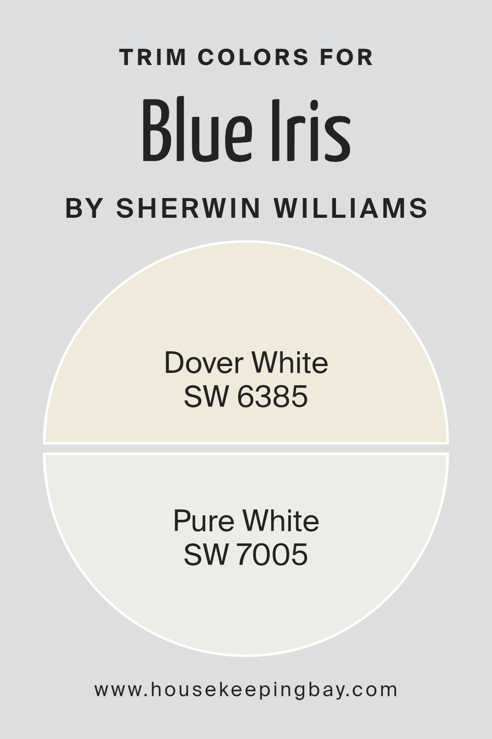
What are the Trim colors of Blue Iris SW 9687 by Sherwin Williams?
Trim colors are specifically chosen hues used to paint the architectural elements of a room or exterior, such as door frames, window frames, baseboards, and moldings. These colors play a crucial role in defining and accentuating the aesthetic appeal of a space.
For Blue Iris SW 9687 by Sherwin Williams, a vivid and expressive color, selecting the right trim color is essential to either complement its boldness or provide a soft contrast. Trim colors like SW 6385 – Dover White and SW 7005 – Pure White are excellent choices as they can help highlight Blue Iris’s unique shade, ensuring that it stands out, while also ensuring the space feels cohesive and balanced.
SW 6385 – Dover White is a warm, welcoming shade of white with a soft undertone that can bring a cozy and calm feel to the dynamic presence of Blue Iris SW 9687. It works wonderfully in spaces that aim for a classic yet inviting atmosphere. On the other hand, SW 7005 – Pure White is a clean, stark white that offers a crisp contrast to richer and deeper hues like Blue Iris. This color is ideal for creating sharp, clear boundaries in a space, making it feel more structured and refined.
Both trim colors, by offering either a gentle complement or a strong contrast, enhance the overall look of Blue Iris SW 9687, contributing to a well-rounded and visually appealing environment.
You can see recommended paint colors below:
housekeepingbay.com
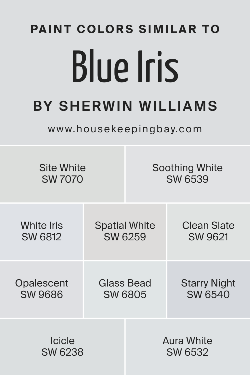
Colors Similar to Blue Iris SW 9687 by Sherwin Williams
Similar colors are crucial in design because they create a harmonious and cohesive look, making spaces feel more put together and aesthetically pleasing. When colors are similar, they share a common hue base, making it easier to mix and match them within a space without clashing. This is particularly important in interior design, where creating a mood or theme often relies on a well-thought-out color palette. For instance, colors similar to Blue Iris SW 9687 by Sherwin Williams, such as Site White SW 7070 or Soothing White SW 6539, offer subtle variations that can add depth and interest to rooms without overwhelming the senses.
Site White, for example, has a clean, open feel that’s perfect for creating a sense of space, while Soothing White offers a slightly warmer tone, promoting a calm and relaxing atmosphere. White Iris SW 6812 leans towards a more muted lavender undertone, providing a unique twist to a space.
Spatial White SW 6259 offers a cooler temperature for freshness and serenity, ideal for a minimalist approach. Clean Slate SW 9621 introduces a deeper, more defined edge, perfect for accents.
Opalescent SW 9686 shimmers with subtlety, adding delicate complexity. Glass Bead SW 6805 glows softly, promoting a light, airy feel. Starry Night SW 6540, deeper and more pronounced, brings drama without going too dark. Icicle SW 6238 presents a frosty crispness, great for adding a touch of clarity.
Lastly, Aura White SW 6532 binds the palette together with its soft, almost ethereal quality, making it a versatile companion to the others. Together, these colors offer a range of options that can work harmoniously in any space, providing flexibility and unity in design choices.
You can see recommended paint colors below:
- SW 7070 Site White
- SW 6539 Soothing White
- SW 6812 White Iris
- SW 6259 Spatial White
- SW 9621 Clean Slate
- SW 9686 Opalescent
- SW 6805 Glass Bead
- SW 6540 Starry Night
- SW 6238 Icicle
- SW 6532 Aura White
housekeepingbay.com
How to Use Blue Iris SW 9687 by Sherwin Williams In Your Home?
Blue Iris SW 9687 by Sherwin Williams is a rich and bold paint color that can bring a unique energy into your home. It’s a shade that stands out, perfect for those looking to make a statement in their space. You can use Blue Iris in various ways to add depth and character to your rooms. For instance, painting a feature wall with Blue Iris can transform a bland room into a striking area without overwhelming the space. This approach works well in living rooms or bedrooms, where a touch of drama adds to the ambiance.
Kitchens and bathrooms also benefit from Blue Iris, where it can complement white cabinets or fixtures, making the space feel vibrant yet sophisticated. If painting an entire room or wall feels like too much, consider using it on furniture pieces or as an accent in decorations like pillows or curtains to inject color without the commitment.
Blue Iris can fit into many design styles, from modern to traditional, depending on how you incorporate it into your home.
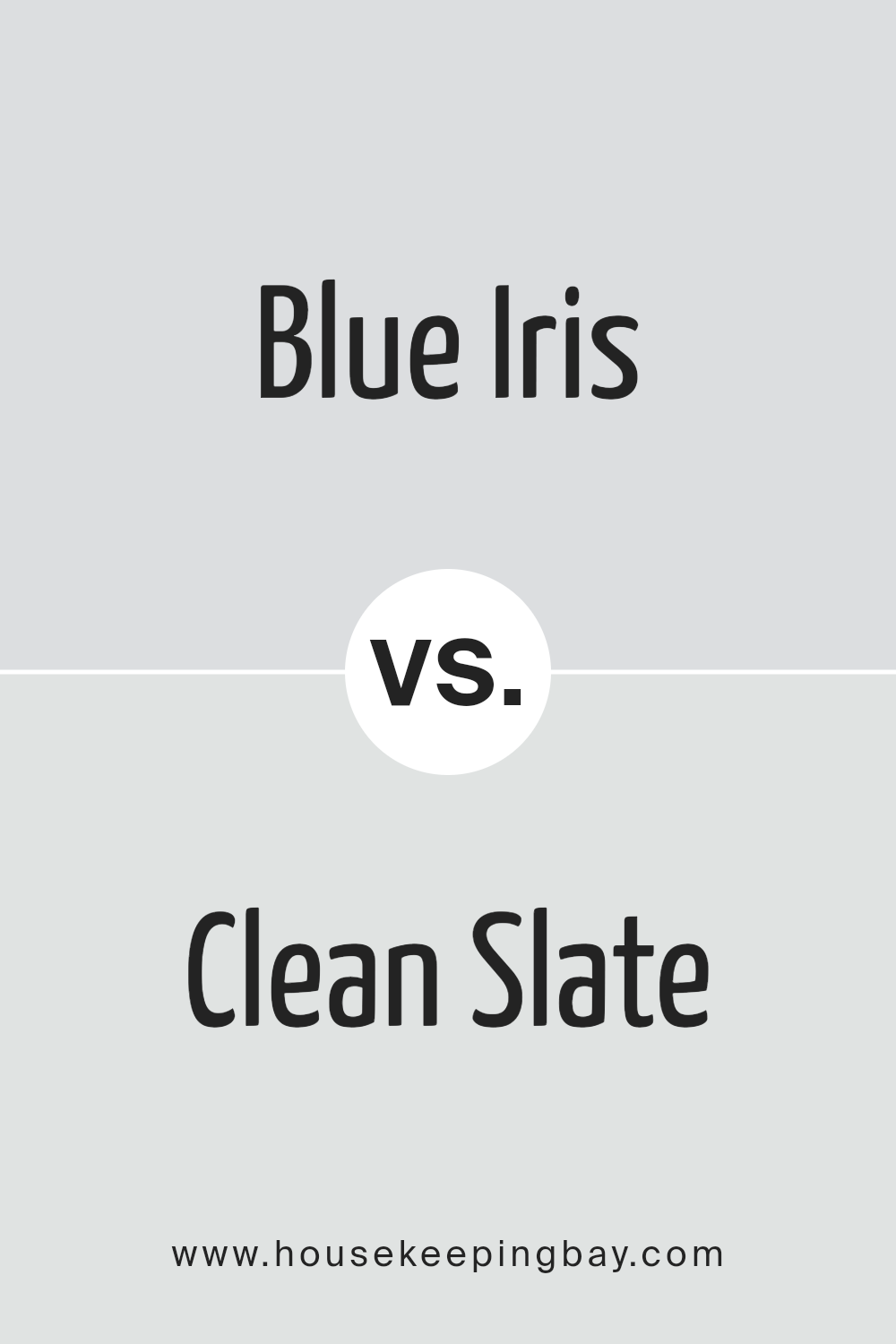
Blue Iris SW 9687 by Sherwin Williams vs Clean Slate SW 9621 by Sherwin Williams
Blue Iris and Clean Slate, both by Sherwin Williams, offer unique shades for anyone looking to add a touch of color to their space. Blue Iris is a deep, rich blue with a hint of purple, making it a striking choice for a feature wall or furniture. It has a boldness that stands out, yet it’s surprisingly versatile, fitting well in a bedroom or living area.
On the other hand, Clean Slate is a lighter, softer gray with subtle blue undertones. It’s incredibly flexible, working well in any room of the house. This color brings a calm and soothing vibe, making it perfect for spaces where you want to relax and unwind.
While Blue Iris adds drama and depth, Clean Slate provides a tranquil background, suitable for a minimalist or a more laid-back aesthetic. Both colors have their charms, depending on the mood you want to create in your space.
You can see recommended paint color below:
housekeepingbay.com
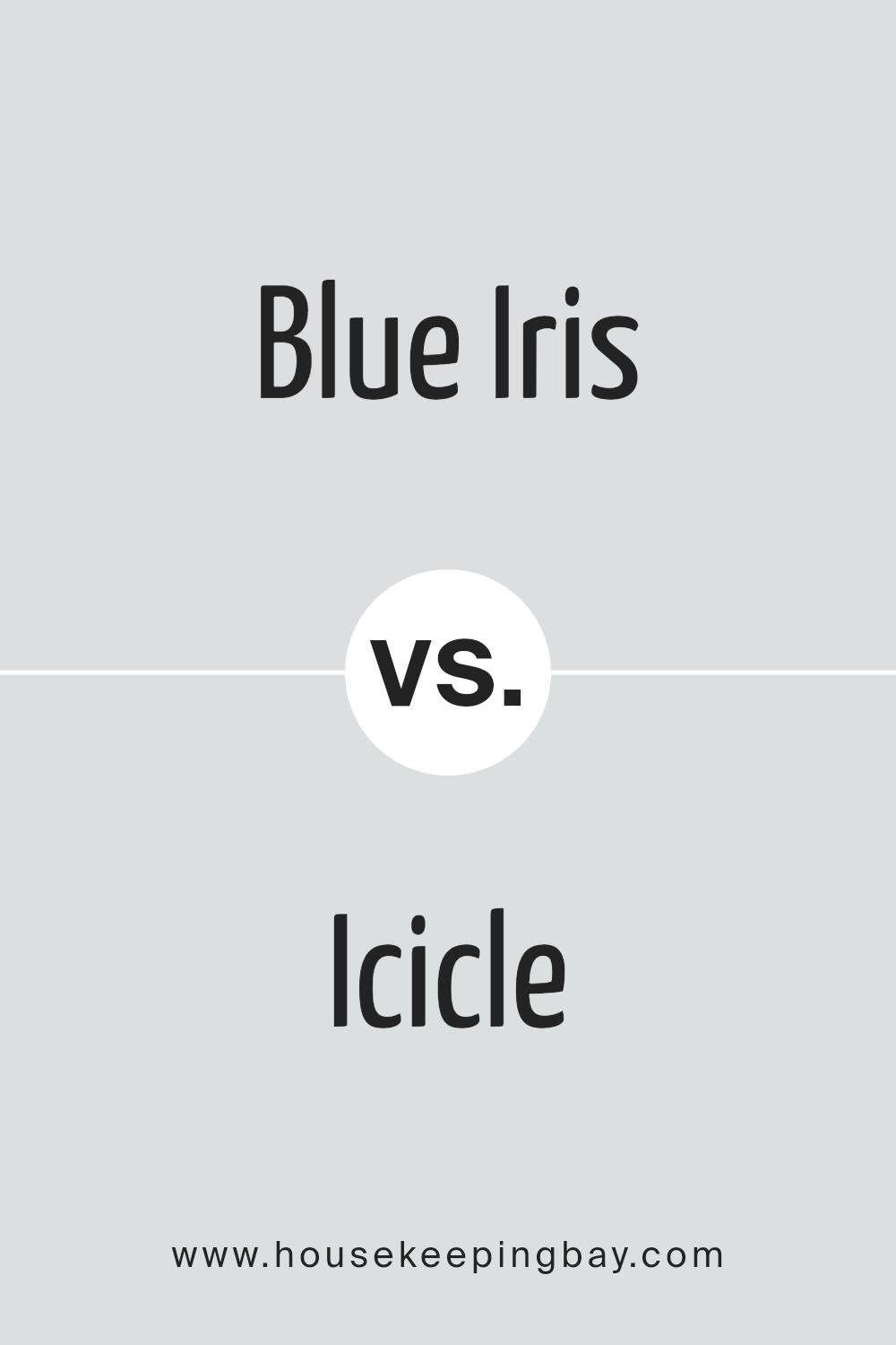
Blue Iris SW 9687 by Sherwin Williams vs Icicle SW 6238 by Sherwin Williams
Blue Iris SW 9687 by Sherwin Williams is a deep, rich color that resembles the dark petals of an iris flower. It’s a bold choice, giving off a strong and elegant vibe that can add a lot of character to a space. On the other hand, Icicle SW 6238 is much lighter and leans towards a cool, soothing shade of blue. It’s very calm and feels airy, making it great for creating a relaxed and peaceful atmosphere in a room.
When comparing the two, Blue Iris stands out as a statement color, perfect for accent walls or places where you want a splash of deep color. Icicle, being subtler, works well for larger areas, providing a serene backdrop without overwhelming the senses. Both colors reflect different moods and can be used in various settings depending on what feeling you’re going for in a space.
You can see recommended paint color below:
- SW 6238 Icicle
housekeepingbay.com
Blue Iris SW 9687 by Sherwin Williams vs Aura White SW 6532 by Sherwin Williams
Blue Iris SW 9687 by Sherwin-Williams and Aura White SW 6532 by Sherwin-Williams are two very different colors. Blue Iris is a deep, rich blue with a hint of purple. It’s the kind of color that can make a bold statement in a room, bringing a sense of sophistication and depth.
On the other hand, Aura White is a soft, airy white with a slight warmth to it. It’s the kind of color that can make a space feel bright, open, and welcoming. While Blue Iris adds drama and intensity, Aura White offers a sense of calm and cleanliness. They could complement each other well in a space, with Aura White brightening up the room and Blue Iris adding a focal point or accent.
Using them together could create a balanced and harmonious look, with the contrast between the deep blue and the soft white bringing out the best in each color.
You can see recommended paint color below:
- SW 6532 Aura White
housekeepingbay.com
Blue Iris SW 9687 by Sherwin Williams vs Soothing White SW 6539 by Sherwin Williams
Blue Iris SW 9687 by Sherwin Williams is a bold color that brings a lot of personality to a space. It’s a kind of blue that stands out because it has a deep, almost royal feel to it. This color is great for making a statement in a room, like on an accent wall, because it’s strong and noticeable.
On the other hand, Soothing White SW 6539 by Sherwin Williams is a very calm and clean color. It’s a soft white that can make rooms feel bigger, brighter, and more open. This color works well in almost any space because it’s very versatile and easy to match with other colors.
When comparing the two, Blue Iris adds drama and a sense of boldness to a space, while Soothing White offers a peaceful and relaxing vibe, perfect for creating a light and airy feeling. Both colors have their unique qualities, but they cater to different moods and styles in home decor.
You can see recommended paint color below:
- SW 6539 Soothing White
housekeepingbay.com
Blue Iris SW 9687 by Sherwin Williams vs White Iris SW 6812 by Sherwin Williams
Blue Iris SW 9687 by Sherwin Williams is a rich, deep blue color that’s bold and striking. Think of it as the kind of blue you’d see when the sky starts to darken at the end of the day, but still holds onto some brightness. It’s a color that stands out and can make a big statement in any space. On the other hand, White Iris SW 6812 by Sherwin Williams is much lighter and softer. It’s not just plain white; it has a hint of cool undertone that makes it feel a little bit like you’re looking at a cloud. This color is great for making a room feel open, airy, and peaceful.
When you compare them, Blue Iris is the choice if you want something that’s more dramatic and eye-catching. It can give a room a beautiful focal point or add a sense of sophistication. Meanwhile, White Iris is perfect for creating a calm and relaxed environment, working well in places where you want to unwind. Both colors are beautiful in their own right, but they serve different purposes depending on the vibe you’re going for in your space.
You can see recommended paint color below:
- SW 6812 White Iris
housekeepingbay.com
Blue Iris SW 9687 by Sherwin Williams vs Site White SW 7070 by Sherwin Williams
Blue Iris SW 9687 by Sherwin Williams is a vibrant, deep blue color that catches the eye and makes a bold statement wherever it’s used. It has a richness that adds depth and personality to spaces, making it a great choice for feature walls or decor accents. Its strong presence can create a sense of calmness and serenity, reminiscent of the evening sky.
Site White SW 7070 by Sherwin Williams, on the other hand, is a soft, neutral white with subtle, underlying tones that prevent it from feeling cold or stark. This versatile color can brighten up spaces and make them appear larger, offering a clean and fresh look. It works well as a background color, allowing other colors, like Blue Iris, to stand out more prominently.
When comparing the two, Blue Iris brings a vibrant, lively energy, while Site White offers a calm, clean backdrop. Together, they can create a balanced and dynamic contrast, making spaces feel both inviting and stylish.
You can see recommended paint color below:
housekeepingbay.com
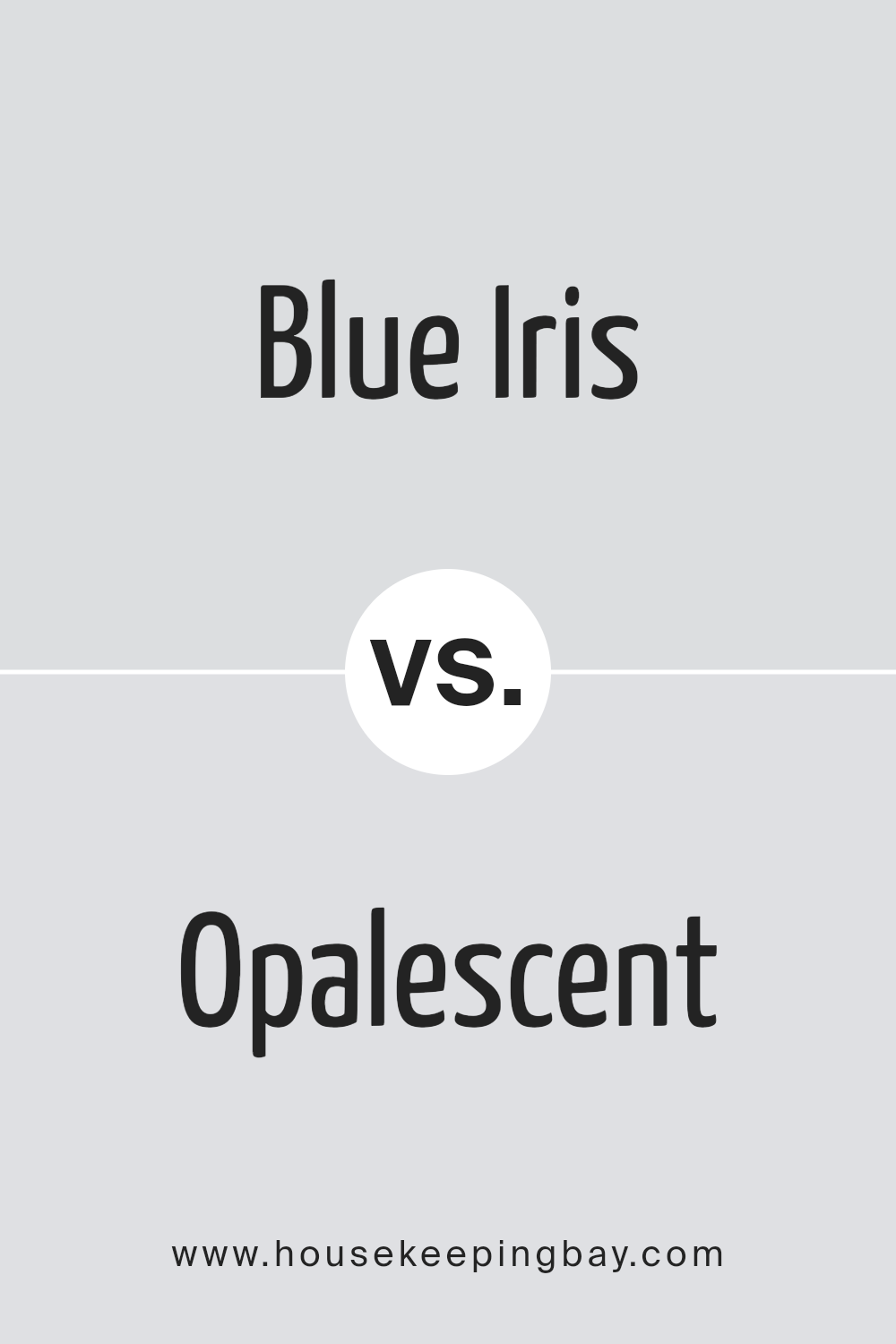
Blue Iris SW 9687 by Sherwin Williams vs Opalescent SW 9686 by Sherwin Williams
Blue Iris SW 9687 and Opalescent SW 9686, both by Sherwin Williams, offer distinctive touches to spaces but in different ways. Blue Iris is a rich, deep blue that brings a sense of sophistication and strength to an area. It’s the kind of color that makes a bold statement, whether on a feature wall or as part of a color scheme in a room. It has the depth that can make spaces feel more grounded and secure.
On the other hand, Opalescent SW 9686 is much lighter and tends to lean towards a tranquil, soft vibe. It’s a color that can brighten up a room and give it a fresh, airy feel. This hue works well in small spaces or areas that get a lot of light, as it can help the space feel bigger and more open.
In essence, Blue Iris is all about making a strong, bold impact, whereas Opalescent offers a gentler, more soothing atmosphere. Whether you’re looking for drama or calmness, these colors offer beautiful options.
You can see recommended paint color below:
- SW 9686 Opalescent
housekeepingbay.com
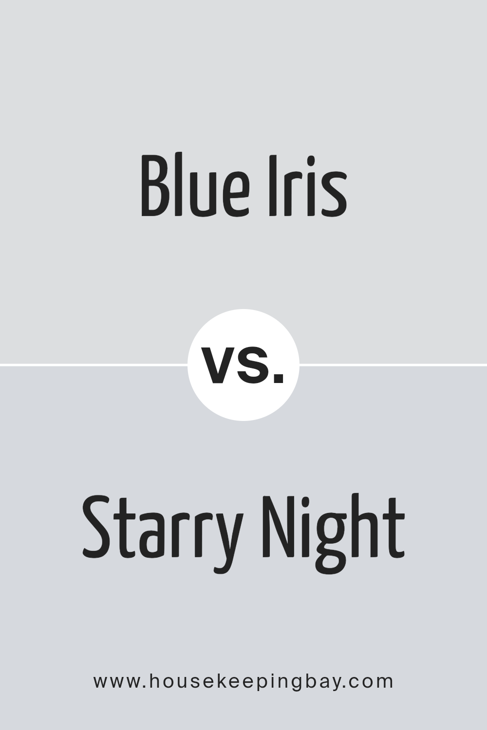
Blue Iris SW 9687 by Sherwin Williams vs Starry Night SW 6540 by Sherwin Williams
Blue Iris SW 9687 by Sherwin Williams and Starry Night SW 6540 by Sherwin Williams are two distinct shades of blue. Blue Iris takes on a deeper, almost royal blue tone that feels rich and strong. It’s the kind of color that makes a bold statement, whether on a wall or as an accent piece. This hue has a certain warmth to it, making spaces feel cozy and secure.
On the other hand, Starry Night is lighter and carries a bit of a playful vibe. It’s a vibrant, bright blue that can light up a room and make it feel more airy and open. This shade is perfect for creating a cheerful atmosphere, adding a splash of joy to any space it adorns.
While both colors share a blue base, their impact and mood setting capabilities are different. Blue Iris offers depth and sophistication, making it great for formal areas or places where you want a touch of elegance. Starry Night, with its lighter and brighter touch, is ideal for spaces that aim to be more relaxed, lively, or inviting. Depending on the mood you want to set, each of these colors can offer something unique to your space.
You can see recommended paint color below:
- SW 6540 Starry Night
housekeepingbay.com
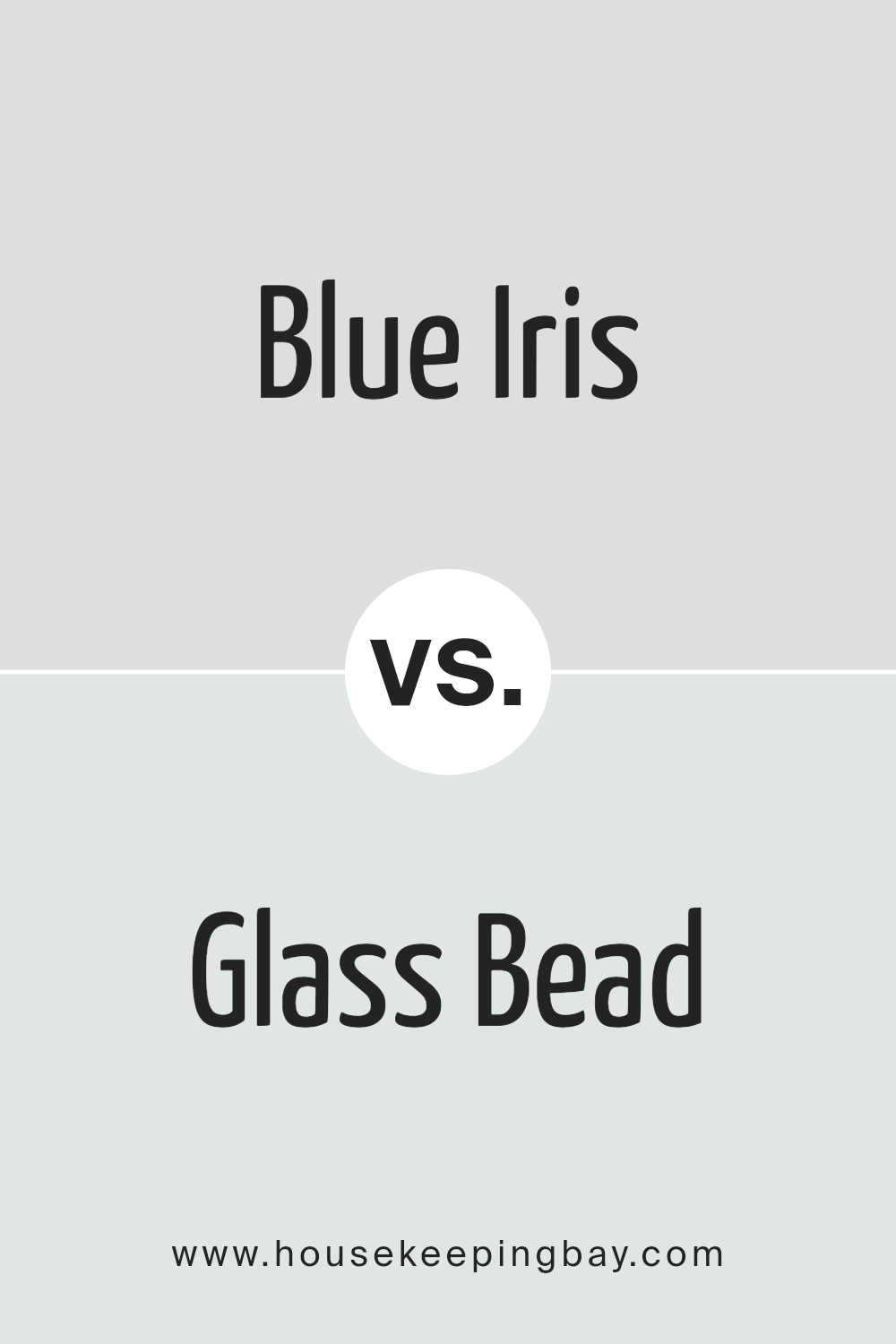
Blue Iris SW 9687 by Sherwin Williams vs Glass Bead SW 6805 by Sherwin Williams
Blue Iris SW 9687 by Sherwin Williams is a rich, deep blue that has a hint of purple in it, making it stand out as a bold and elegant color. It’s the kind of blue that feels regal and can bring a lot of character and depth to a space. It’s perfect for creating a statement wall or for spaces that aim to have a bit of a sophisticated touch.
On the other hand, Glass Bead SW 6805 by Sherwin Williams is a light, airy blue with a gentle touch. It leans towards a more serene and calming vibe, making it ideal for creating a relaxed atmosphere in a room. This color shines in well-lit spaces and can make small rooms feel bigger and more open.
While Blue Iris packs a punch with its deeper, more striking hue, Glass Bead offers a softer, soothing presence. Both colors have their unique appeal—Blue Iris bringing in drama and elegance, and Glass Bead promoting tranquility and openness. They can work beautifully in different spaces depending on the mood and style you want to achieve.
You can see recommended paint color below:
- SW 6805 Glass Bead
housekeepingbay.com
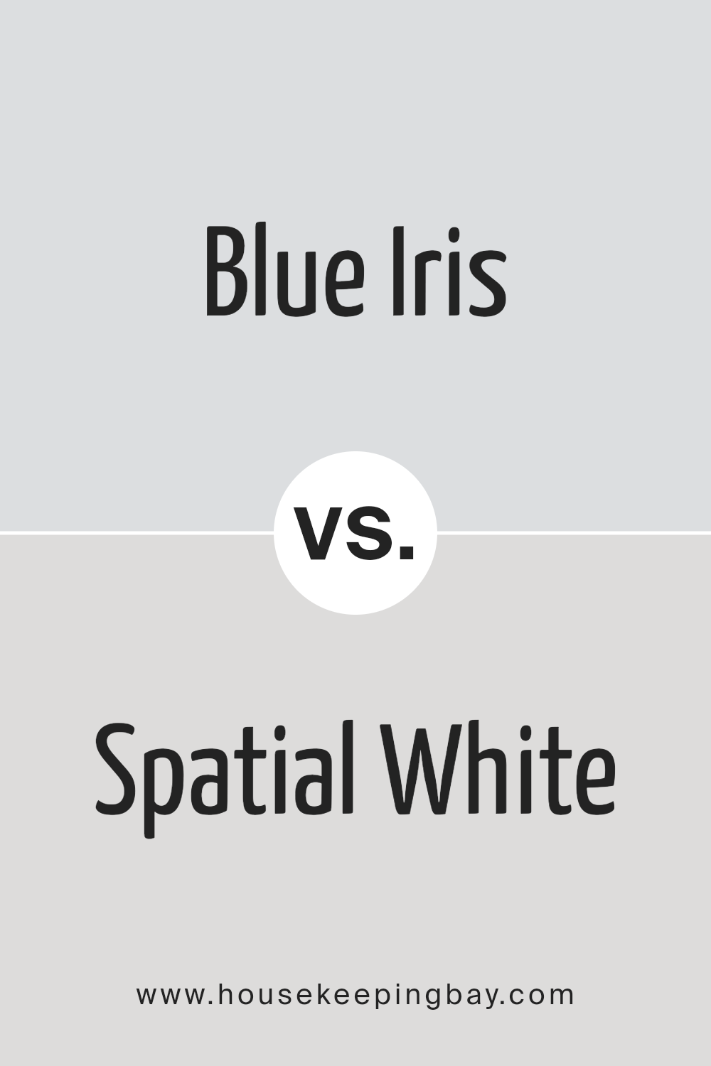
Blue Iris SW 9687 by Sherwin Williams vs Spatial White SW 6259 by Sherwin Williams
Blue Iris SW 9687 by Sherwin Williams is a rich, deep blue shade that exudes elegance and sophistication. It’s a strong color that makes a statement, whether used on a feature wall, as an accent, or to decorate an entire room. It has a certain depth that can make spaces feel cozier and more inviting while still adding a touch of drama.
On the other hand, Spatial White SW 6259 by Sherwin Williams is a soft, clean white with subtle undertones that give it a warm and welcoming feel. It’s versatile and can brighten up any space, making it appear larger and more open. This color works well in any setting, whether you want to create a minimalist look or complement brighter, bolder colors.
When comparing the two, Blue Iris brings depth and intensity, offering a bold splash of color. Spatial White, however, provides a neutral backdrop that can either stand alone for a crisp, clean look or serve as a counterbalance to more vibrant hues. Together, they could create a striking contrast, with Blue Iris adding richness and Spatial White offering a sense of spaciousness and light.
You can see recommended paint color below:
- SW 6259 Spatial White
housekeepingbay.com
Conclusion
Blue Iris SW 9687 by Sherwin Williams is a paint color that has gained attention for its unique and versatile qualities. This shade of blue strikes a balance between being bold and soothing, making it an excellent choice for those looking to add a touch of elegance and calmness to any room.
Its ability to complement various decor styles and themes means it can seamlessly integrate into a wide range of interior spaces. Whether applied in a bedroom, living room, or even a kitchen, Blue Iris SW 9687 brings a refreshing and contemporary vibe to the environment.
The popularity of Blue Iris SW 9687 is not only due to its aesthetic appeal but also because it reflects the current trends in interior design that favor colors which provide a sense of serenity and sophistication. The versatility of this blue shade allows homeowners and designers alike to create spaces that feel both inviting and stylish. As people continue to look for ways to enhance the ambience of their homes, Blue Iris SW 9687 stands out as a top choice for those seeking to add a modern touch with a timeless color.

housekeepingbay.com
Ever wished paint sampling was as easy as sticking a sticker? Guess what? Now it is! Discover Samplize's unique Peel & Stick samples. Get started now and say goodbye to the old messy way!
Get paint samples