Tradewind SW 6218 by Sherwin Williams
Soothing Breeze: Exploring the Calm of Coastal Blues
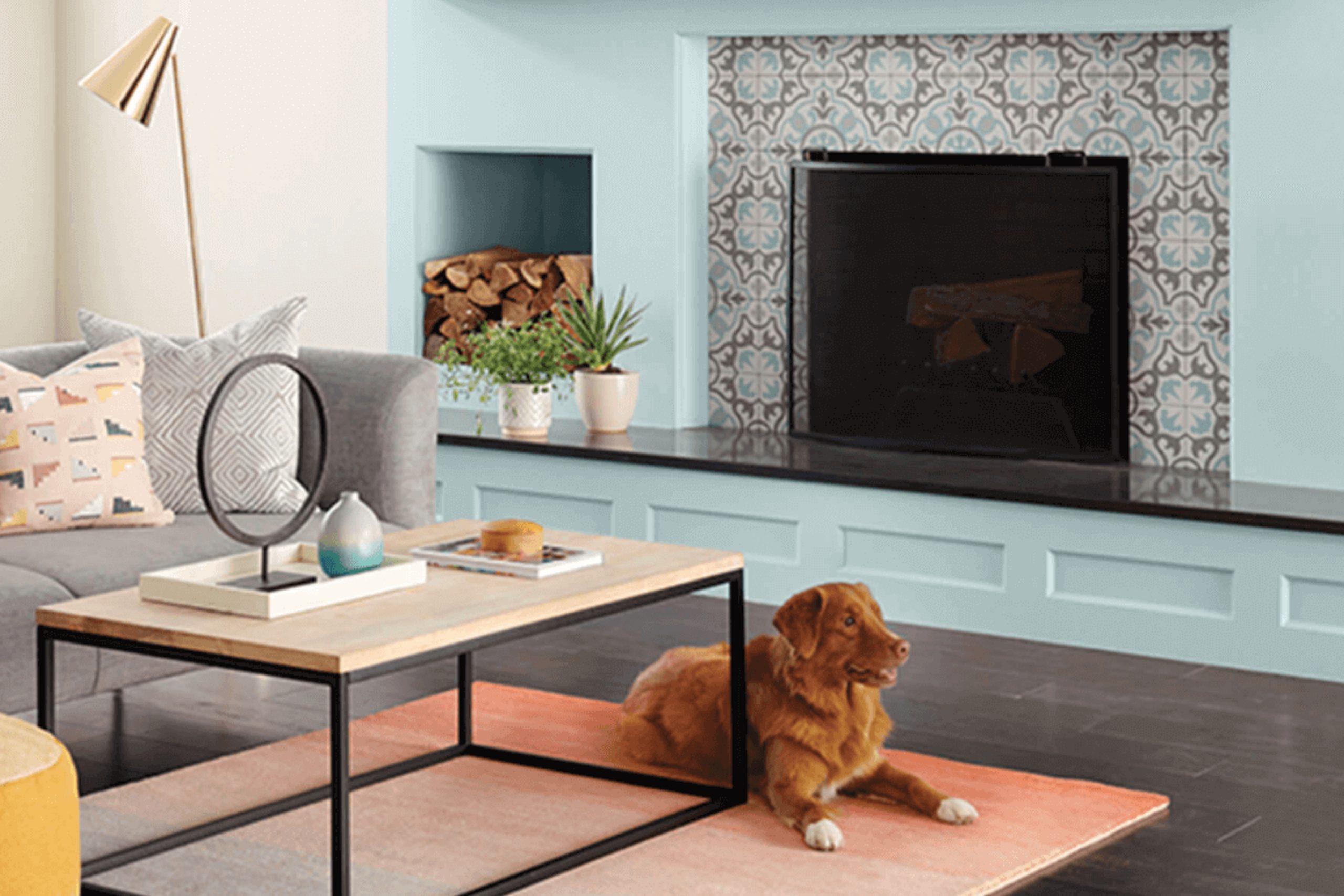
The color SW 6218 Tradewind by Sherwin Williams is a soothing shade of blue that brings a sense of calm and freshness to any space you choose to paint. This color resembles the serene blue of the sea on a calm day and can make your room feel more relaxing and airy.
With its subtle gray undertones, Tradewind strikes a delicate balance, making it versatile enough to be used in various rooms, from your kitchen to your bedroom.
This shade works beautifully with natural light, enhancing a space with an inviting coolness. It pairs well with whites, creams, and soft wood tones, allowing you to create a space that feels both comfortable and stylish.
Whether you’re painting an entire room or looking for an accent wall, Tradewind by Sherwin Williams offers a breath of fresh air to your home design. So, if you’re looking to refresh your space, consider Tradewind for its peaceful vibes and stylish versatility.
Tradewind SW 6218 by Sherwin Williams
What Color Is Tradewind SW 6218 by Sherwin Williams?
Tradewind SW 6218 by Sherwin Williams is a refreshing blue with hints of green, giving it a soothing and airy feel. This gentle hue mimics the serene vibe of a peaceful sea, making it perfect for creating a relaxed atmosphere in any room. The color is light enough to make small spaces appear larger and airy, but its depth adds character and subtle vibrancy.
Tradewind works exceptionally well in coastal or beach-themed interior styles, bringing the calmness of seaside living indoors. It’s also a great fit for modern and contemporary decors, where its cool tones complement clean lines and minimalistic designs.
Even in a traditional setting, Tradewind provides a burst of fresh color while still maintaining a classic look.
As for pairing, Tradewind goes beautifully with natural materials such as light woods, wicker, and linen, enhancing its earthy qualities. It also matches well with creamy whites or soft grays for a gentle palette. Textures like jute or sisal rugs, cotton throws, and ceramic or glass accessories can help to create a refined yet welcoming space, allowing the color’s soothing nature to stand out.
This versatile shade also pairs nicely with metallic finishes like brushed nickel or soft gold, adding a touch of elegance to the calming palette.

housekeepingbay.com
Is Tradewind SW 6218 by Sherwin Williams Warm or Cool color?
Tradewind SW 6218 by Sherwin Williams is a soothing blue color that brings a fresh and serene feeling to any home. It has a hint of green, making it versatile and calming. This color is perfect for rooms where you want to relax, such as bedrooms or bathrooms. Its light tone helps to make small spaces seem bigger and brighter.
Tradewind is also great for creating a peaceful backdrop in a busy kitchen or living area, where it can help soften bustling activities. Because of its subtle green undertone, it pairs well with natural materials like wood and stone, enhancing a home’s natural beauty without overpowering it.
It’s compatible with various decor styles, from modern to rustic, making it a flexible choice for different tastes.
Applying Tradewind on accent walls can unify diverse elements in room decorations, and it offers a gentle contrast when used next to warmer hues. It’s a color that quietly supports a wide range of design choices, making a home a pleasant retreat.
What is the Masstone of the Tradewind SW 6218 by Sherwin Williams?
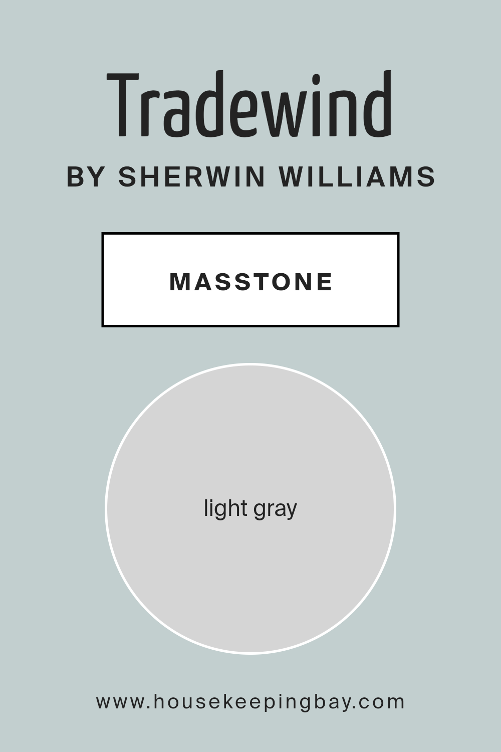
TradewindSW 6218 by Sherwin Williams presents a masstone of light gray, which is represented by the color code #D5D5D5. This neutral shade offers a soft and subtle backdrop for any room. Because it is light gray, it works well with almost any other color, making it incredibly versatile for home decorating. This flexibility allows you to pair it with bold, vibrant colors to create a lively space or with softer tones for a more soothing atmosphere.
The light gray nature of TradewindSW 6218 means it can help spaces feel larger and more open. It reflects light effectively, brightening rooms even when natural light might be limited. This color does not overpower spaces but instead provides a calm and gentle presence.
It’s ideal for living rooms, bedrooms, and even kitchens, where a sense of cleanliness and order is often appreciated. Overall, this shade of gray can serve as a foundational color in homes, blending seamlessly with various decor styles and preferences.
housekeepingbay.com
Undertones of Tradewind SW 6218 by Sherwin Williams
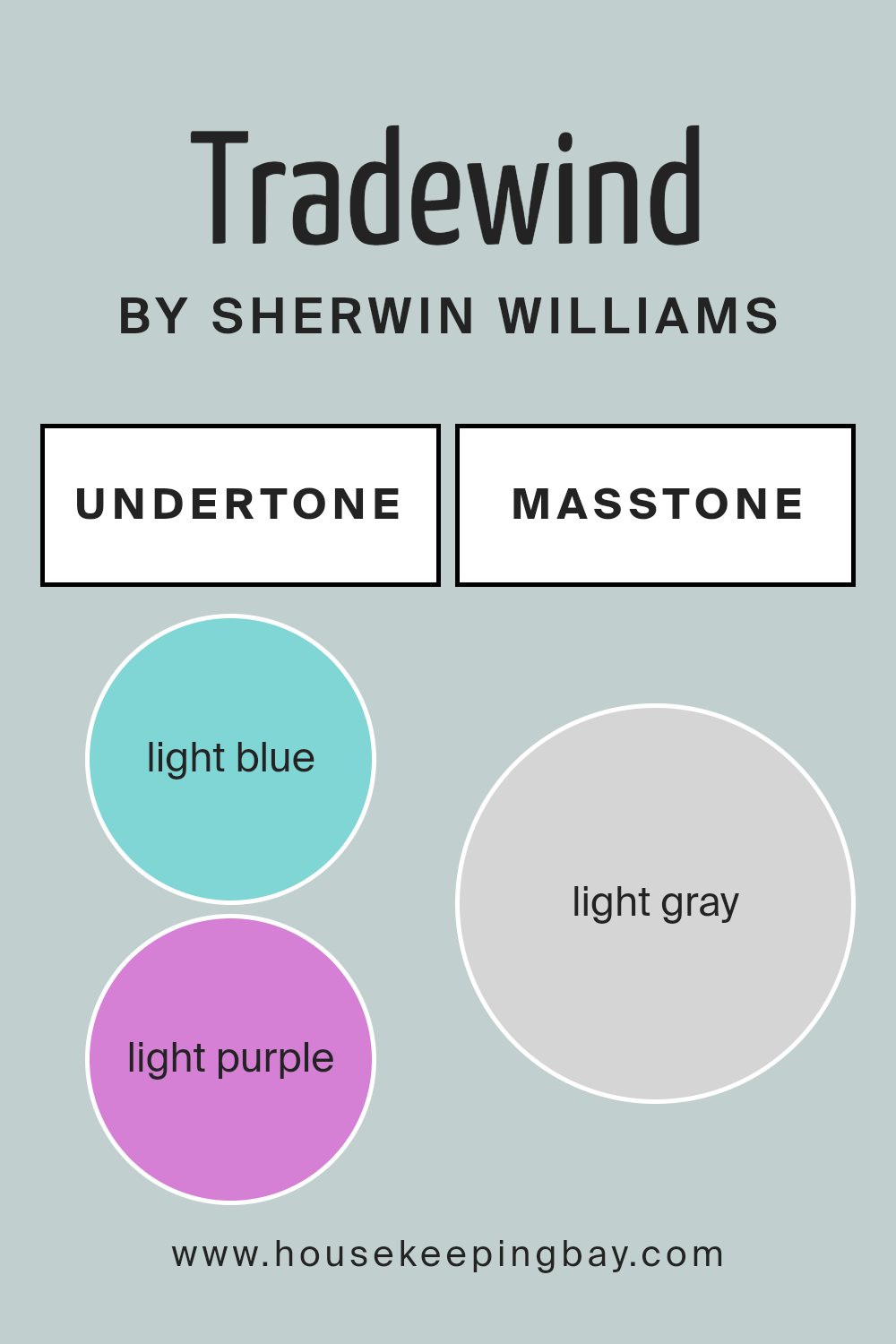
TradewindSW 6218 by Sherwin Williams is a versatile paint color with a medley of undertones that subtly influence its overall appearance and feel in a space. The undertones of light blue, light purple, pale yellow, lilac, mint, pale pink, and grey add depth and complexity to this shade, making it adaptable to different lighting and decor styles.
Undertones impact how we perceive a color because they can shift the main hue warmer or cooler, brighter or more muted, depending on both natural and artificial lighting. For instance, in a room with a lot of sunlight, the pale yellow and light blue undertones of TradewindSW 6218 might make the walls seem brighter and airier.
Conversely, in a space with less light, the grey and lilac undertones could give the walls a more subdued, serene feel.
When applied to interior walls, TradewindSW 6218 brings a soft, soothing presence due to its diverse undertones. The light blue and mint provide a fresh and airy feel, ideal for creating a calming atmosphere in bedrooms or bathrooms. The subtle hints of lilac and light purple add a touch of sophistication, making the color suitable for living areas or dining rooms.
Additionally, the pale yellow and pale pink undertones warm up the space slightly, ensuring the color remains inviting and not too cold. Overall, the complexity of TradewindSW 6218’s undertones allows it to adapt seamlessly across various interior styles and settings, making it a popular choice for those looking to refresh their home.
housekeepingbay.com
Coordinating Colors of Tradewind SW 6218 by Sherwin Williams
Coordinating colors work together harmoniously to create a balanced and pleasing aesthetic in any space. The key is selecting hues that complement each other without overshadowing. For Tradewind SW 6218 by Sherwin Williams, a soothing and gentle gray-blue, there are specific coordinating colors that support its serene vibe effectively.
These matching shades are chosen to maintain a fluid theme throughout any room, enhancing the primary color’s qualities while contributing their unique characteristics.
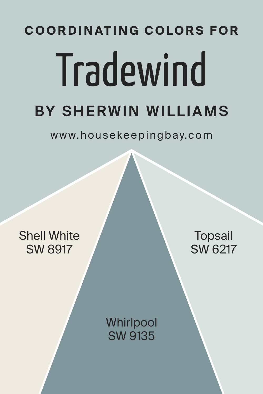
Shell White SW 8917 is a soft and subtle white that offers a clean and calm backdrop, making it perfect to pair with the deeper tones of Tradewind. It acts as a gentle buffer, bringing light and openness to spaces that feature richer or darker colors.
Moving slightly deeper, Whirlpool SW 9135 brings a fresh and lighter blue tone, providing a cool complement that reflects a refreshing energy, thereby maintaining a lightness around the primary hue of Tradewind.
On the other hand, Topsail SW 6217, a lighter and airier version of the main color, extends the theme by adding depth and continuity without overwhelming the senses. All these coordinating colors collectively ensure a cohesive look that feels connected and artistically composed.
You can see recommended paint colors below:
- SW 8917 Shell White
- SW 9135 Whirlpool
- SW 6217 Topsail
housekeepingbay.com
How Does Lighting Affect Tradewind SW 6218 by Sherwin Williams?
Lighting has a significant impact on how colors appear. The reason is that different light sources have varying characteristics which alter the perception of color. Natural light, depending on the time of day, and artificial light, depending on its type (LED, fluorescent, etc.), can make the same paint color look different.
Consider the color Tradewind SW 6218 by Sherwin Williams. This is a soft, soothing blue with gray undertones. Under artificial light, such as LED or incandescent bulbs, Tradewind tends to appear more muted and more profoundly grayish. The warmth or coolness of the bulb can affect whether it leans more blue or more toward gray.
In natural light, Tradewind reflects ambient hues and changing light conditions. Its blue seems more pronounced during the bright midday but can shift towards a softer, more gray tone near dusk or dawn.
The orientation of a room also plays a role in how Tradewind will look:
- North-Faced Rooms – These rooms get less direct sunlight, which can make Tradewind appear more subdued and cooler, enhancing its gray tones. The color stays consistent throughout the day though may feel slightly cold.
- South-Faced Rooms – With ample sunlight, Tradewind will look lighter and brighter here, reflecting a true, vibrant blue throughout most of the day. This can make the room feel airy and fresh.
- East-Faced Rooms – Morning light is warm and yellow, which can make Tradewind look softer and slightly greenish in the morning, returning to a cooler blue-gray as the light fades.
- West-Faced Rooms – Evening light has a reddish tint, which might warm up Tradewind, reducing its blue appearance and increasing the gray perception as the sunlight diminishes.
The result is that Tradewind SW 6218 by Sherwin Williams is a versatile color that shifts subtly according to both the lighting and room orientation, offering peaceful blue hues under bright conditions and soft, calming grays in dimmer environments. It’s a great choice if you want a color that adjusts with the day’s rhythm.

housekeepingbay.com
What is the LRV of Tradewind SW 6218 by Sherwin Williams?
LRV stands for Light Reflectance Value, which measures the percentage of light a paint color reflects back into a room. Basically, it tells you how light or dark a color will look on a wall, based on how much light it reflects
The LRV of TradewindSW 6218 by Sherwin Williams is 60.691, which places it in the lighter category of paint colors. With this moderate-to-high LRV, Tradewind will reflect a good amount of light, making it a suitable choice for spaces that aim to feel airy and open. This particular shade of blue can help in making a room appear brighter and more spacious. Depending on the room’s exposure to natural light, the color may appear slightly different at various times of the day, generally maintaining a light, breezy feel that complements a range of decorating styles.

housekeepingbay.com
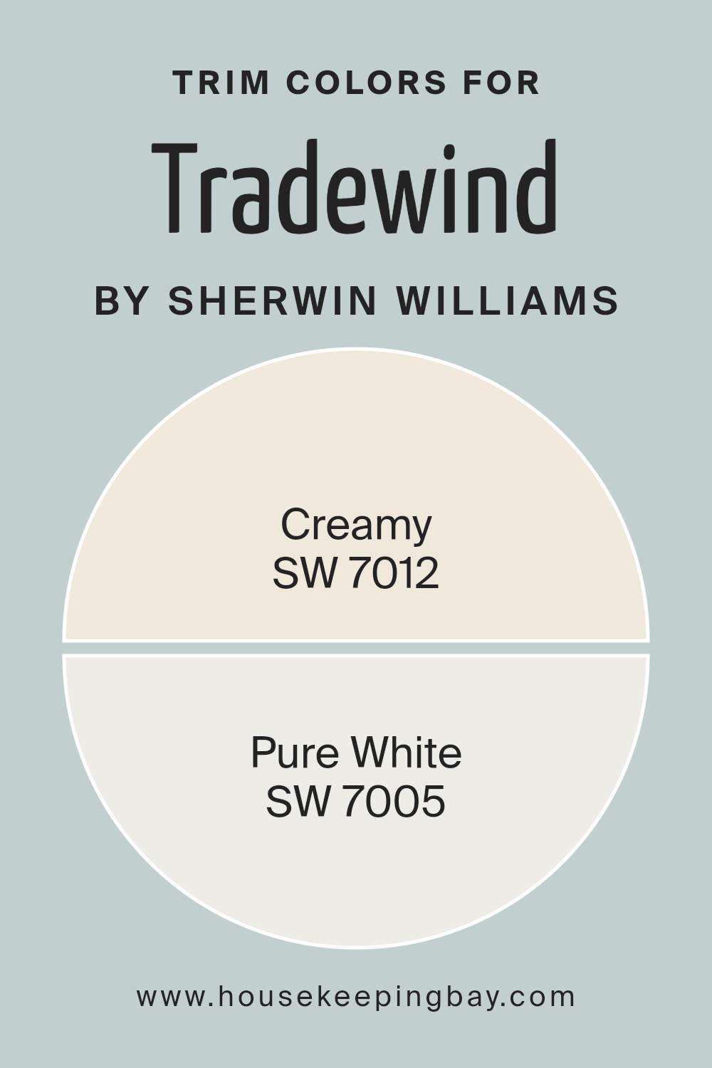
What are the Trim colors of Tradewind SW 6218 by Sherwin Williams?
Trim colors are specific shades used on the architectural elements like door frames, moldings, and window trim to accentuate and complement the primary colors of a space. In the case of Tradewind SW 6218 by Sherwin Williams, which is a soft, soothing blue, choosing the right trim colors can markedly enhance the overall appearance and feel of the room.
SW 7012 Creamy and SW 7005 Pure White are both excellent choices for trim colors as they offer a clean, crisp contrast that can effectively highlight Tradewind’s gentle blue hue.
SW 7012 Creamy is a soft, off-white color with a warm undertone that provides a subtle contrast, thereby softening the boundary transitions between walls and trimmings, thereby creating a cohesive look in rooms that aim for a comfortable and inviting atmosphere.
On the other hand, SW 7005 Pure White is a bright white trim color that offers a more striking contrast to Tradewind SW 6218, giving a sharper, more defined edge to architectural features, making them more pronounced and attention-grabbing. The use of Pure White as a trim color can lend a fresh and dynamic visual clarity, enhancing the modern aesthetic of any space.
You can see recommended paint colors below:
housekeepingbay.com
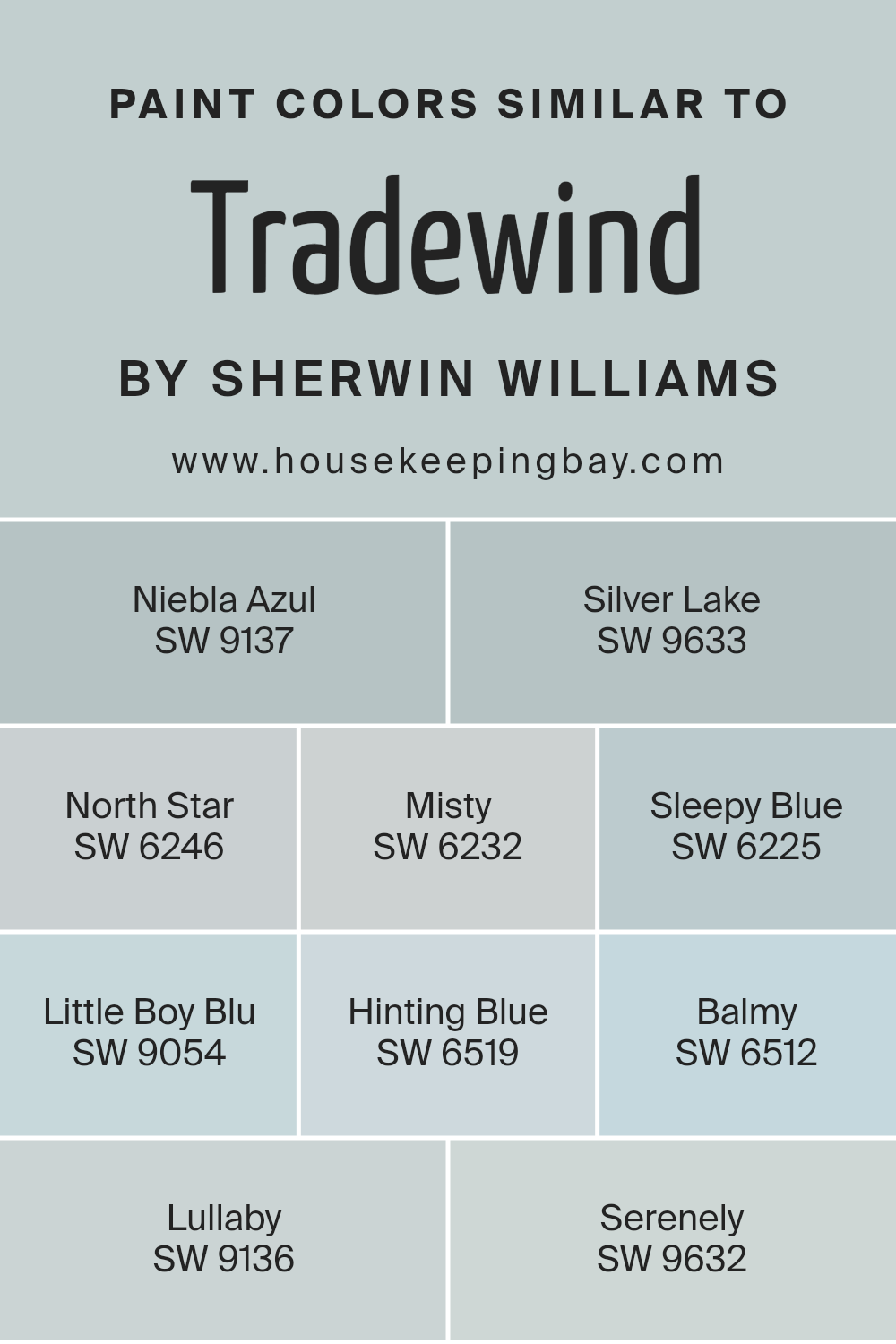
Colors Similar to Tradewind SW 6218 by Sherwin Williams
Similar colors are essential in design and decoration because they create a sense of harmony and flow in a space. When colors like Tradewind SW 6218 by Sherwin Williams and its similar shades are used together, they provide a soothing visual experience and make the environment feel cohesive.
This color palette, ranging from cool to warm blues, allows for a versatile backdrop that can adapt to various decor styles without overwhelming the senses.
For instance, Niebla Azul SW 9137 is a subdued, grayish-blue that lends a gentle, restful feel to any room. Right alongside it, Silver Lake SW 9633 offers a slightly lighter, airy quality that seems to open up smaller spaces. North Star SW 6246 introduces a touch of the early morning sky into interiors, with its calming light blue hue.
Misty SW 6232 leans towards a soft, almost whimsical blue that’s perfect for creating a peaceful retreat. Sleepy Blue SW 6225 has a dreamy quality that works well in bedrooms. Little Boy Blu SW 9054 is vibrant yet retains softness, ideal for adding a playful yet serene touch. Hinting Blue SW 6519 whispers a faint blue that is almost neutral, easy to blend with other colors.
Balmy SW 6512, as the name suggests, is a mellow, soothing color that feels like a gentle ocean breeze. Lullaby SW 9136 is a tender light blue that nurtures a tranquil atmosphere. Lastly, Serenely SW 9632 offers a crisp, clear blue reminiscent of a serene, cloudless sky, perfect for fostering a refreshing ambiance.
Together, these colors support one another, creating environments that are both peaceful and aesthetically pleasing.
You can see recommended paint colors below:
- SW 9137 Niebla Azul
- SW 9633 Silver Lake
- SW 6246 North Star
- SW 6232 Misty
- SW 6225 Sleepy Blue
- SW 9054 Little Boy Blu
- SW 6519 Hinting Blue
- SW 6512 Balmy
- SW 9136 Lullaby
- SW 9632 Serenely
housekeepingbay.com
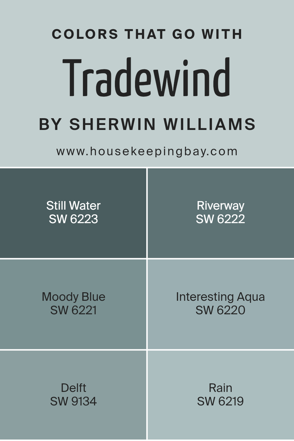
Colors that Go With Tradewind SW 6218 by Sherwin Williams
When decorating any space, choosing the right color palette is crucial as it sets the overall mood and style. Colors that pair well with Tradewind SW 6218 by Sherwin Williams, such as Still Water SW 6223, Riverway SW 6222, Moody Blue SW 6221, Interesting Aqua SW 6220, Delft SW 9134, and Rain SW 6219, offer a harmonious and balanced look.
These colors ensure that the space feels coherent and visually appealing, as they all share cool, soothing tones that create a serene atmosphere.
Still Water SW 6223 is a soft, silvery blue that imparts a quiet and calm feeling, perfect for a peaceful retreat. Riverway SW 6222, with its deeper teal shade, adds a touch of sophistication and depth, complementing the lighter tones of Tradewind. Moody Blue SW 6221, as its name suggests, offers a somber yet comforting blue hue, excellent for creating a focused or restful area.
Interesting Aqua SW 6220 also leans towards a soft teal, lighter and more playful, suitable for spaces meant to inspire creativity. Delft SW 9134 brings a bolder, more saturated blue that draws the eye and can act as a fantastic accent color.
Rain SW 6219 is a muted blue with gray undertones, ideal for those looking for a neutral but mood-setting color to complete their palette. Together, these colors work seamlessly with Tradewind to create environments that are both balanced and refreshing.
You can see recommended paint colors below:
- SW 6223 Still Water
- SW 6222 Riverway
- SW 6221 Moody Blue
- SW 6220 Interesting Aqua
- SW 9134 Delft
- SW 6219 Rain
housekeepingbay.com
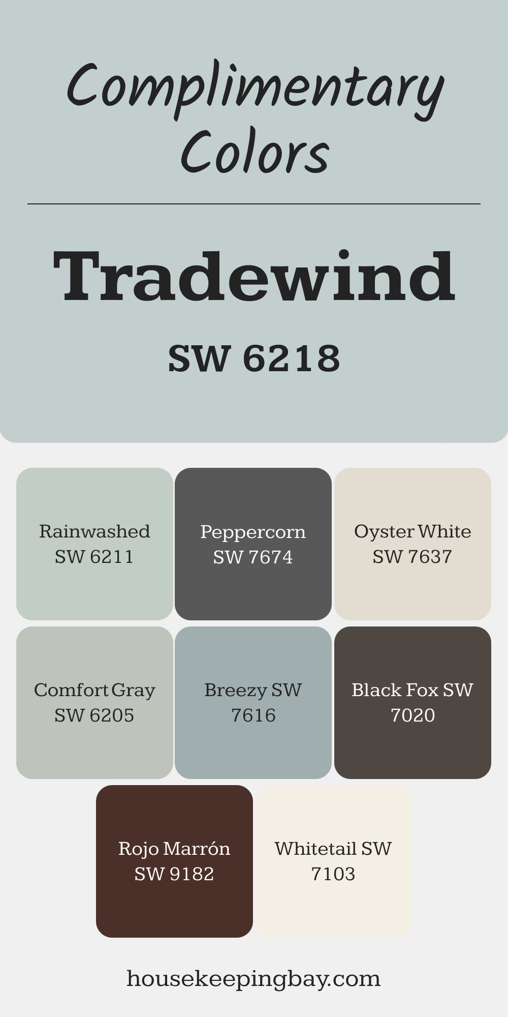
Complimentary Colors for Tradewind SW 6218 Paint Color by Sherwin Williams
Tradewind SW 6218 is a soft, light blue that works well with various shades to bring balance to any room. Pair it with Whitetail SW 7103 for a light, airy feel or Breezy SW 7616 to enhance the relaxed vibe. For a subtle touch, Comfort Gray SW 6205 and Oyster White SW 7637 create a gentle contrast without overpowering the space.
For deeper, bolder accents, try Black Fox SW 7020 or Peppercorn SW 7674. Rojo Marrón SW 9182 and Rainwashed SW 6211 add richness and depth, complementing Tradewind’s cool tones beautifully.
via housekeepingbay.com
How to Use Tradewind SW 6218 by Sherwin Williams In Your Home?
Tradewind SW 6218 by Sherwin Williams is a soothing blue shade with a touch of gray that offers a serene and refreshing look. Ideal for any room aiming for a calm and peaceful atmosphere, it works wonderfully in bedrooms and bathrooms where relaxation is key. Its versatility means it also fits well in living rooms or kitchens, complementing both modern and traditional styles.
Using Tradewind in your home can help create a feeling of lightness and airiness. If you’re worrying about the room feeling too cold, balance the cool tones of Tradewind with warm accents like beige furniture, wooden elements or soft yellow lighting. It pairs beautifully with white trim or cabinets, enhancing the clean and open vibe.
For those looking to add a subtle hint of color without overwhelming a space, applying Tradewind on an accent wall can be an excellent choice. This strategy works great in smaller rooms or spaces with limited natural light, giving them a more spacious feeling.
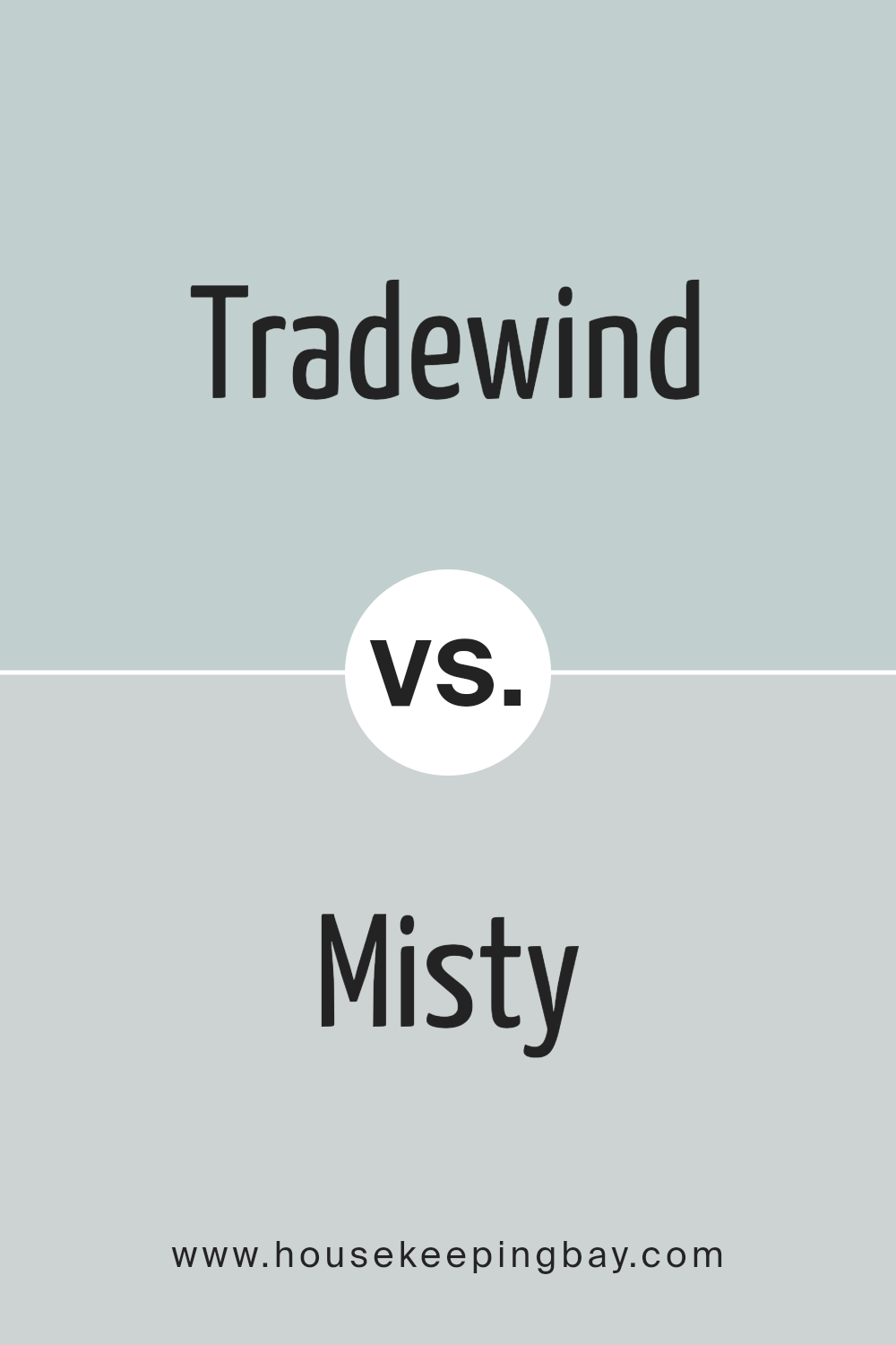
Tradewind SW 6218 by Sherwin Williams vs Misty SW 6232 by Sherwin Williams
Tradewind SW 6218 and Misty SW 6232, both by Sherwin Williams, offer pleasing, soothing tones for different spaces. Tradewind is a gentle blue with gray undertones, providing a cool, calm feel ideal for creating a peaceful environment.
This color tends to bring a serene and refreshing vibe, perfect for places like bedrooms or bathrooms where relaxation is key. Misty SW 6232, in contrast, leans more towards a light, airy gray with subtle blue undertones. It’s a softer shade that fits well in spaces that aim for a minimalist and clean look, such as modern living rooms or kitchens.
While both colors promote a restful atmosphere, Tradewind offers a slightly deeper saturation, making it a touch more prominent against neutral decor elements. Misty, being lighter, works exceptionally well in smaller or less naturally lit areas to help open up the space visually.
You can see recommended paint color below:
- SW 6232 Misty
housekeepingbay.com
Tradewind SW 6218 by Sherwin Williams vs Hinting Blue SW 6519 by Sherwin Williams
Tradewind SW 6218 by Sherwin Williams is a serene blue with hints of green, giving it a soothing and refreshing feel. It’s a versatile color that pairs well with both bright and neutral tones, making it ideal for living rooms and bedrooms where a calming atmosphere is desired.
In contrast, Hinting Blue SW 6519 is a lighter, airier shade of blue. This color has a subtle vibrancy that can make small spaces appear larger and more open. It works beautifully in bathrooms or kitchens for a clean, crisp look. Both colors carry blue tones yet serve different purposes; Tradewind offers depth and calmness while Hinting Blue provides a gentle uplift.
Neither is overwhelming, making them suitable for varied interior design styles.
You can see recommended paint color below:
- SW 6519 Hinting Blue

housekeepingbay.com
Tradewind SW 6218 by Sherwin Williams vs Lullaby SW 9136 by Sherwin Williams
Tradewind SW 6218 by Sherwin Williams is a gentle blue color with hints of gray, giving it a cool and soothing feel. It’s reminiscent of a serene ocean breeze and suits spaces aimed at relaxation and calmness. Lullaby SW 9136, on the contrary, is a soft lavender shade that leans towards a pastel tone. It’s subtle yet provides a refreshing pop of color, making it ideal for creating a peaceful but cheerful atmosphere.
While Tradewind offers a more neutral palette, making it versatile for various rooms and complementing a wide range of decor styles, Lullaby brings a touch of warmth due to its purple undertone, perfect for personal spaces like bedrooms or nurseries.
Both colors are light and airy, enhancing natural light in a room, but their different tones mean they set distinctly different moods. Tradewind leans towards a minimalist, fresh look, whereas Lullaby adds a playful, tender touch.
You can see recommended paint color below:
- SW 9136 Lullaby

housekeepingbay.com
Tradewind SW 6218 by Sherwin Williams vs Niebla Azul SW 9137 by Sherwin Williams
Tradewind SW 6218 by Sherwin Williams is a soft, soothing gray with a tinge of blue. It creates a gentle, serene atmosphere, making it perfect for a bedroom or a relaxing living space. This color reflects light beautifully, giving spaces an airy and open feel.
Niebla Azul SW 9137, also by Sherwin Williams, leans more towards a deeper, muted blue with gray undertones. It offers a stronger presence, suitable for adding a bit of sophistication and depth to an area. While Tradewind is more subtle and light, Niebla Azul provides a more pronounced shade that can make a statement in a space.
Both colors pair well with a variety of decors, but the choice between them depends on the mood you want to set: tranquil and light with Tradewind, or bold and grounding with Niebla Azul.
You can see recommended paint color below:
- SW 9137 Niebla Azul

housekeepingbay.com
Tradewind SW 6218 by Sherwin Williams vs Little Boy Blu SW 9054 by Sherwin Williams
Main color Tradewind SW 6218 by Sherwin Williams is a light, airy blue with gray undertones that gives it a soothing feel, perfect for creating a serene space. It reflects the calmness of the sea and sky, making it ideal for restful areas like bedrooms and bathrooms. This color pairs well with soft whites and natural woods for a fresh, clean look.
In contrast, Little Boy Blu SW 9054 by Sherwin Williams is a more vibrant blue that has a playful and youthful vibe. It’s bolder and brighter, suitable for energizing a space or adding a cheerful pop of color. Little Boy Blu works well in kids’ rooms or creative spaces where you want to inject some fun.
Both colors offer different moods and can be utilized effectively depending on the vibe you’re aiming for in your space. Tradewind is more subdued and peaceful, while Little Boy Blu is lively and spirited.
You can see recommended paint color below:
- SW 9054 Little Boy Blu

housekeepingbay.com
Tradewind SW 6218 by Sherwin Williams vs Sleepy Blue SW 6225 by Sherwin Williams
Tradewind SW 6218 and Sleepy Blue SW 6225 by Sherwin Williams are two appealing shades of blue. Tradewind is a lighter, softer blue with a hint of green, giving it a refreshing and airy feel that can brighten up any space. It’s versatile, working well in both modern and traditional settings.
Sleepy Blue, in contrast, is a deeper, more muted shade that leans more towards a true soft blue without the green undertones. This color provides a serene and calming effect, making it ideal for bedrooms or bathrooms where you want to create a peaceful atmosphere.
While both colors share a blue base, Tradewind offers a cooler, more vibrant look due to its greenish tint, whereas Sleepy Blue presents a classic blue that is more subdued and soothing. Depending on the mood and style you aim to achieve, either color can enhance your space beautifully.
You can see recommended paint color below:
- SW 6225 Sleepy Blue

housekeepingbay.com
Tradewind SW 6218 by Sherwin Williams vs Silver Lake SW 9633 by Sherwin Williams
Tradewind SW 6218 by Sherwin Williams is a soft, muted teal color that brings a soothing and peaceful feel to any space. This color has a calming effect, making it ideal for bedrooms or bathrooms where a serene atmosphere is desired. It pairs well with creamy whites or soft grays for a fresh and airy look.
Silver Lake SW 9633, also by Sherwin Williams, is a gentle gray with subtle blue undertones. This color provides a sleek, modern vibe and is versatile enough for various rooms, including kitchens and living spaces. It works nicely with bolder hues or as a standalone color for a minimalist design.
While both colors offer a sense of calm, Tradewind leans towards a warmer, ocean-inspired palette, whereas Silver Lake gives off a cooler, more urban tone, making it suitable for contemporary settings. Each color supports different styles and preferences, contributing to unique aesthetic atmospheres in home interiors.
You can see recommended paint color below:
- SW 9633 Silver Lake

housekeepingbay.com
Tradewind SW 6218 by Sherwin Williams vs Serenely SW 9632 by Sherwin Williams
The main color, Tradewind SW 6218, by Sherwin Williams, is a soothing blue with hints of gray, providing a calm and refreshing look that is reminiscent of a gentle sea breeze. This color works well in spaces intended for relaxation and can help create an airy, serene environment.
On the contrary, Serenely SW 9632, is a much lighter, almost sheer, pastel blue that leans towards a soft, muted tone. This color is ideal for creating a peaceful, soft atmosphere in a room, enhancing natural light and making small spaces appear larger.
Both colors, Tradewind and Serenely, offer unique blue shades that cater to different aesthetic preferences. Tradewind, with its deeper blue-gray tones, can add a touch of sophistication to a space, while Serenely, being lighter, brings a delicate, fresh feel. Both are excellent choices for achieving a calm, soothing ambience in interior spaces.
You can see recommended paint color below:

housekeepingbay.com
Tradewind SW 6218 by Sherwin Williams vs North Star SW 6246 by Sherwin Williams
Tradewind SW 6218 by Sherwin Williams is a soft, light blue with a hint of green, giving it a refreshing and soothing feel. This color mimics the serenity of a gentle sea breeze and is ideal for creating a calm and inviting atmosphere in any space. It works well in bathrooms and bedrooms where a peaceful vibe is desired.
North Star SW 6246, on the contrary, is a cooler, muted gray with subtle blue undertones. This color is versatile and understated, making it perfect for modern and minimalist decor. North Star can serve as a neutral backdrop, allowing other colors in the room to stand out.
Both colors, while soothing, have distinct qualities: Tradewind leans towards a warmer, tropical feel, while North Star offers a crisper, more neutral look. Depending on your style preferences, either color can effectively enhance the aesthetic of a room, providing a clean and peaceful ambiance.
You can see recommended paint color below:
- SW 6246 North Star

housekeepingbay.com
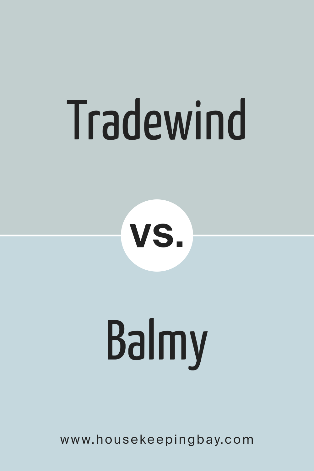
Tradewind SW 6218 by Sherwin Williams vs Balmy SW 6512 by Sherwin Williams
Tradewind SW 6218 by Sherwin Williams is a soft, cool gray with a hint of blue, giving it a refreshing feel that’s perfect for creating a serene atmosphere in any room. It’s subtle enough to act as a neutral, yet possesses enough color to add depth and interest to your space without overwhelming it.
Balmy SW 6512, also by Sherwin Williams, leans more distinctly towards a light blue, imparting a slightly brighter and airier feel compared to Tradewind. This color can make a room feel more open and breezy, making it an excellent choice for smaller or darker spaces where you want to visually expand the area.
While both colors share a cool palette, Tradewind offers a more understated vibe, and Balmy provides a lighter, more vividly blue ambiance. Both are excellent for those looking to create a calm and inviting environment, yet each brings its own unique mood to interiors depending on how much blue you prefer to incorporate.
You can see recommended paint color below:
- SW 6512 Balmy
housekeepingbay.com
Conclusion
SW 6218 Tradewind by Sherwin Williams is an excellent choice for anyone wanting to give their space a serene and breezy feel. The color mirrors the calming hues of the seaside, making it perfect for rooms where relaxation is a priority. Tradewind has just enough depth to add character without feeling overwhelming, making it incredibly versatile.
Whether you’re looking to freshen up your living room, bedroom, or even the bathroom, Tradewind could be the right fit. Its ability to pair well with both light and dark accents also means that you have a lot of freedom in selecting complementary colors for furniture and decor. This makes it easier for you to achieve a harmonious look in your home.
Overall, if you’re considering a new paint color, SW 6218 Tradewind provides a fresh, clean look that can easily rejuvenate any space. It’s a practical yet chic choice that will help create a peaceful atmosphere in your home, reflecting a style that is both inviting and stylish. Whether updating one room or revamping the entire house, Tradewind is a reliable and beautiful choice to consider.

housekeepingbay.com
Ever wished paint sampling was as easy as sticking a sticker? Guess what? Now it is! Discover Samplize's unique Peel & Stick samples. Get started now and say goodbye to the old messy way!
Get paint samples
