Topsail SW 6217 by Sherwin Williams
Sailing into Serenity with Soft Blue Shades
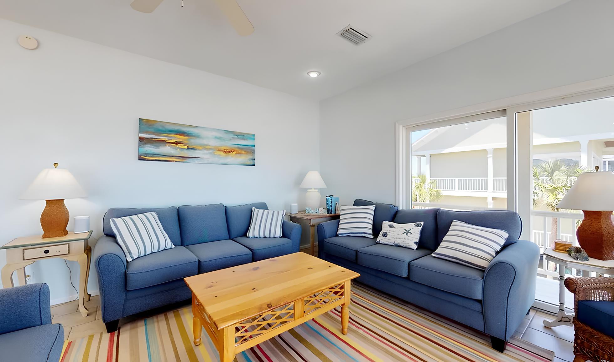
If you’re thinking about giving your space a fresh look, consider SW 6217 Topsail by Sherwin Williams. This subtle shade is part of their coastal-cool collection, which is perfect for creating a calm and relaxed atmosphere. Topsail is a light, airy color that mimics the serenity of a quiet beach and the softness of a gentle sea breeze.
It’s an ideal choice if you want to refresh your walls with a color that brings a sense of peace and simplicity into your home.
Topsail is versatile and works beautifully in spaces that get plenty of natural light, where it can appear almost ethereal. Yet, it’s substantial enough not to be overwhelmed in darker rooms. This color pairs well with soft neutrals and rich wood tones, making it easy for you to coordinate with existing decor and styles ranging from modern to traditional.
Choosing Topsail can help you create a welcoming environment in your home where you can relax and unwind. Whether you’re updating your living room, bedroom, or even the bathroom, this color can be the background to your life’s moments.
via graceandhenrydesigns.com
What Color Is Topsail SW 6217 by Sherwin Williams?
Topsail SW 6217 by Sherwin Williams is a gentle hue of blue that provides a serene and calming feel to any room. Its soft, airy quality makes it an excellent choice for creating a relaxed atmosphere. Classified as a light blue, Topsail has a hint of green, giving it a fresh and clean appearance. This subtle versatility in color allows it to act as a neutral backdrop for various design styles.
Topsail works well in coastal, Scandinavian, and modern minimalist interior styles due to its light and soothing qualities. In coastal themes, it mirrors the airy feel of the beach and pairs beautifully with sandy beiges and soft whites.
In Scandinavian decor, Topsail complements natural wood finishes, enhancing the style’s emphasis on clean lines and natural materials. For a modern minimalist look, this color contrasts effectively with black or dark gray, providing a crisp, uncluttered aesthetic.
When considering materials and textures to pair with Topsail, think of linen, cotton, and light woods for a soft, organic feel. These materials help maintain the lightness of the space while adding functional comfort.
Additionally, elements like frosted glass or brushed nickel finishes can integrate a modern touch without overwhelming the quiet nature of the color. Over all, Topsail SW 6217 is versatile, supporting a variety of textures and materials to create a seamless and inviting home environment.

housekeepingbay.com
Is Topsail SW 6217 by Sherwin Williams Warm or Cool color?
TopsailSW 6217 by Sherwin Williams is a soft, soothing shade of pale blue that brings a light and airy feel to any room. Particularly well-suited for spaces aimed at relaxation, such as bedrooms and bathrooms, Topsail carries a subtle brightness that can make small rooms appear larger and more open.
Its gentle hue acts as a versatile background, allowing for flexibility in decor choices. You can pair it with bolder colors for a dynamic contrast or keep things calm by coordinating with soft neutrals.
This color works especially well in homes with natural light, enhancing a fresh, clean look. Moreover, it performs beautifully in settings where a sense of calm is desired. For homes in hotter climates or areas with lots of sun, Topsail SW 6217 reflects light, helping to keep rooms feeling cooler.
Overall, it’s a highly adaptable color that fits smoothly into various design styles, from contemporary to coastal.
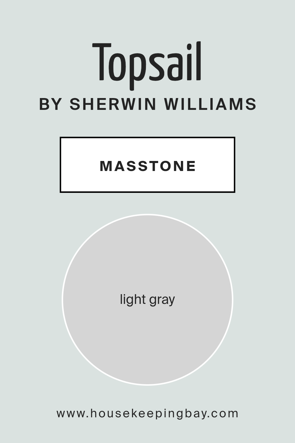
What is the Masstone of the Topsail SW 6217 by Sherwin Williams?
TopsailSW 6217 by Sherwin Williams has a masstone of Light Gray, reflected in its hexadecimal code (#D5D5D5). This shade of gray is soft and subtle, making it a versatile choice for home interiors. The lightness of Topsail helps to create a calm and peaceful atmosphere in any room, which is excellent for spaces meant for relaxation like bedrooms and living rooms.
This color has a muted quality that doesn’t overpower other elements in a room, allowing furniture and artwork to stand out. Its neutrality means it can harmonize with a wide range of decor styles and color schemes, from bright and bold to soft and pastel.
Whether it’s the backdrop for a modern minimalist design or a traditional setting, TopsailSW 6217 supports various decorating aspirations without clashing.
Additionally, light gray walls can make small rooms feel larger and more open, as the color naturally reflects light. This feature is particularly helpful in homes with limited space or less natural light. Overall, TopsailSW 6217 offers a clean and fresh look while maintaining a cozy, inviting ambiance.
housekeepingbay.com
Undertones of Topsail SW 6217 by Sherwin Williams
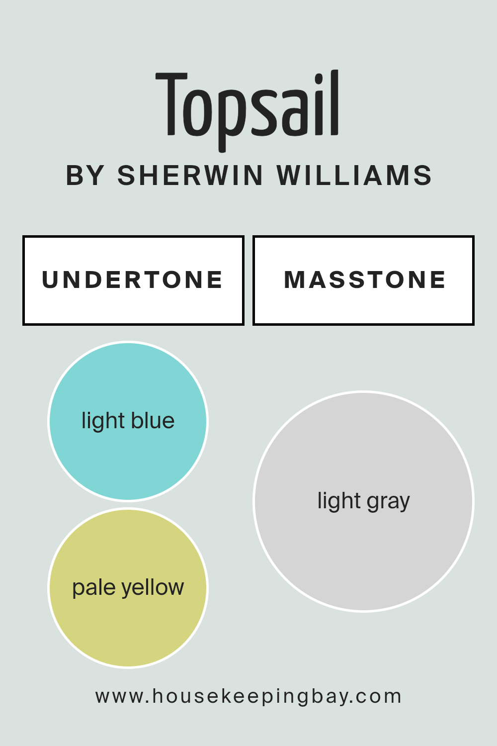
Topsail SW 6217 by Sherwin Williams is a versatile paint color with a complex blend of undertones that can subtly influence the ambiance of a room. Undertones are the colors that lurk beneath the surface of the main color, affecting how it appears under different lighting conditions and when paired with various interior elements.
The undertones in Topsail SW 6217 include light blue, pale yellow, light purple, mint, lilac, pale pink, and grey. These undertones can make the color shift in appearance throughout the day. For instance, in bright natural light, the light blue and mint undertones might make the walls seem more vivid and fresh.
In contrast, during the evening under artificial lighting, the softer lilac and pale pink can bring a warmer and cozier feel to the space.
These subtle shifts are why it’s important to consider the undertones of Topsail SW 6217 when choosing this color for interior walls. The presence of grey undertones helps to balance the brightness, ensuring that the color remains soft and muted, which can be soothing for spaces like bedrooms or bathrooms.
The versatility of the undertones also allows for flexibility in decorating; this color pairs well with a range of decor styles and colors, accommodating everything from modern minimalism to rustic charm.
Overall, the careful consideration of undertones in Topsail SW 6217 can greatly enhance the atmospheric quality of an interior space, making it feel more tailored and harmonious.
housekeepingbay.com
Coordinating Colors of Topsail SW 6217 by Sherwin Williams
Coordinating colors are those that complement each other well when used together in decorating schemes, creating a cohesive look throughout a space. When you choose coordinating colors, such as those for Topsail SW 6217 by Sherwin Williams, it’s about finding hues that enhance the main color yet maintain balance without overwhelming the senses.
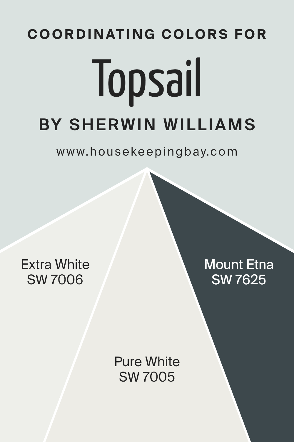
In this scenario, the colors SW 7006 – Extra White, SW 7005 – Pure White, and SW 7625 – Mount Etna, each add distinct elements that harmonize with the calm tone of Topsail.
SW 7006 – Extra White is a clean, bright white that brings freshness and clarity to a room, making it appear more spacious and light. As a coordinating color, its pure quality allows it to act as a neutral backdrop or as a contrasting detail to highlight other colors. On the other hand, SW 7005 – Pure White offers a slightly softer approach with its warm undertones that provide a gentle, soothing effect and help to soften sharper contrasts within a decor layout. SW 7625 – Mount Etna introduces a more dramatic aspect, a deep, smoky blue that can create a strong visual impact and add a sense of depth and sophistication to a room’s aesthetic, offering a nice counterbalance to the airy lightness of Topsail.
You can see recommended paint colors below:
- SW 7006 Extra White
- SW 7005 Pure White
- SW 7625 Mount Etna
housekeepingbay.com
How Does Lighting Affect Topsail SW 6217 by Sherwin Williams?
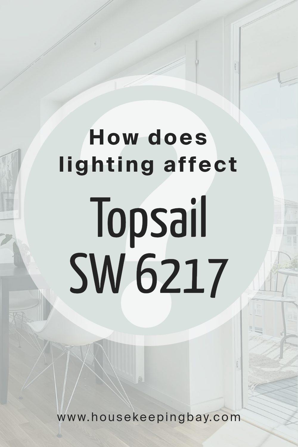
Lighting plays a key role in how colors appear in different environments. The color Topsail SW 6217 by Sherwin Williams is a light, airy blue with a hint of gray. It interacts distinctly with types of light and different room orientations, affecting how it is perceived.
In artificial light, Topsail SW 6217’s gray undertones become more prominent, giving the color a more muted and subtle appearance. This is ideal for creating a soothing atmosphere in spaces lit by warm bulbs. In rooms lit by cooler LEDs, Topsail will retain more of its true blue shade, maintaining a fresh and calm ambiance.
Under natural light, Topsail SW 6217 shifts according to the quality and angle of sunlight. More vibrantly, the color’s gentle blue is highlighted, revealing its soothing and airy qualities. This light reflection makes Topsail an excellent choice for spaces intended to feel peaceful and open.
Room orientation further changes how Topsail looks:
- North-facing rooms: These do not receive much direct sunlight, causing Topsail to appear cooler and more muted. It helps maintain a consistent, soft look throughout the day, which is perfect for creating a peaceful space.
- South-faced rooms: These rooms receive plenty of sunlight, which can make Topsail look much lighter and more vibrant. The warmth of the sun enhances the blue, making the room feel brighter and more open.
- East-faced rooms: Morning light is warm and will initially brighten Topsail, making its blue tones pop. However, as the light fades, the color can appear softer and more muted, reflecting a more tranquil effect by evening.
- West-faced rooms: Evening light in these rooms will bring a warm glow that softens Topsail, blending its blue and gray tones beautifully, especially towards sunset when the light is richest.
Understanding these lighting effects can help when deciding where to apply Topsail SW 6217 to achieve your desired ambiance.
housekeepingbay.com
What is the LRV of Topsail SW 6217 by Sherwin Williams?
LRV stands for Light Reflectance Value, a measure indicating how much light a paint color reflects or absorbs once it’s on a wall. This scale ranges from 0, which is completely black and absorbs all light, to 100, reflecting all light like pure white.
Specifically, colors with higher LRV make a room feel airier and larger as they reflect more light. In contrast, lower LRV values can make spaces feel smaller but cozier because they absorb more light.
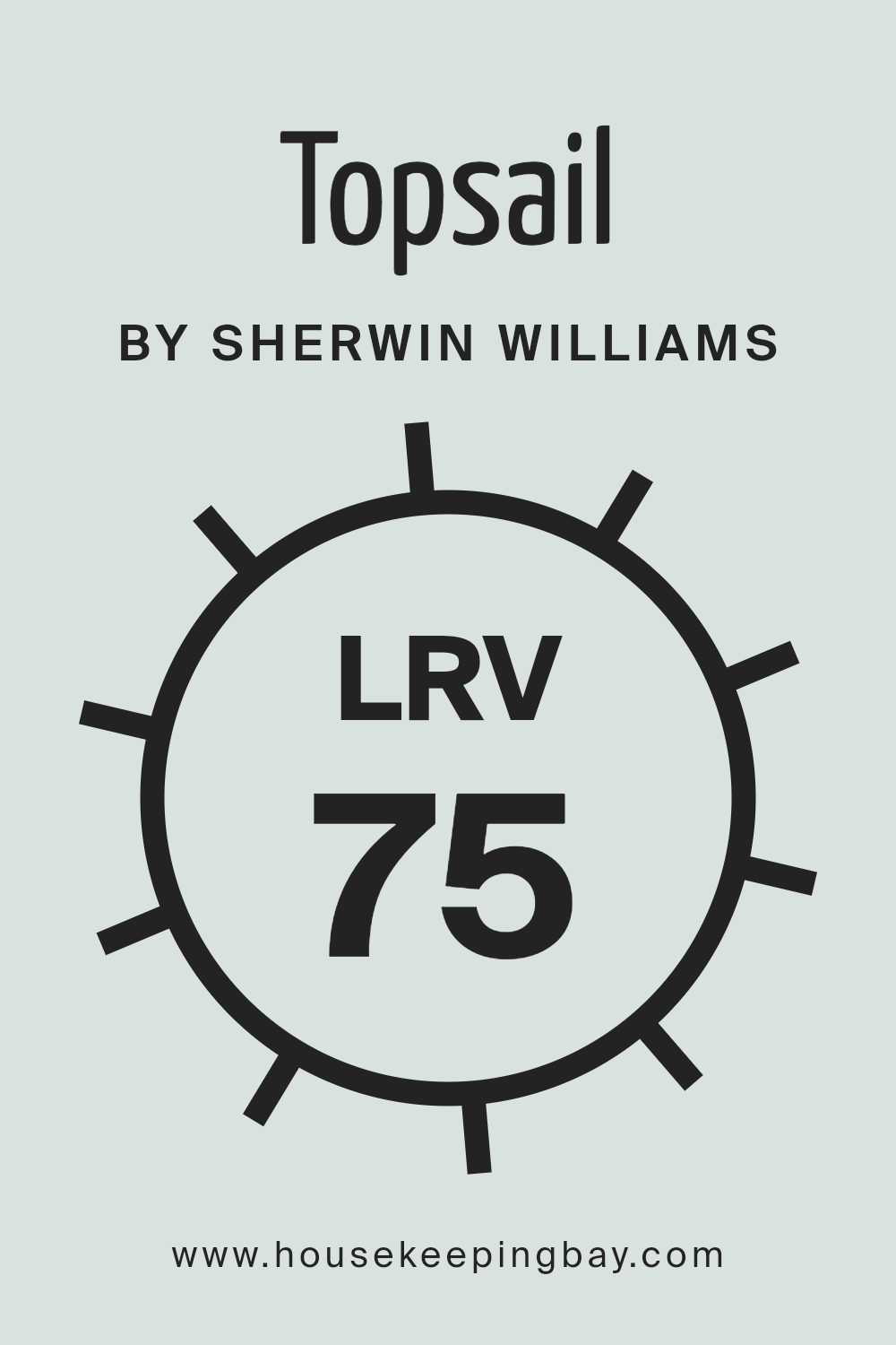
For Topsail SW 6217 by Sherwin Williams, which has an LRV of 74.898, it’s a color that will reflect a lot of light. This makes it an excellent choice for making smaller spaces appear bigger and brighter. The high LRV means it’s near the lighter end of the spectrum, helping to illuminate the room naturally, especially in areas that receive a good amount of sunlight.
This characteristic is beneficial for creating a light, open, and calm environment in any home or office space.
housekeepingbay.com
What are the Trim colors of Topsail SW 6217 by Sherwin Williams?
Trim colors are accent colors used on specific architectural features of a room such as door frames, window frames, molding, and baseboards to define and highlight these areas. For Topsail SW 6217 by Sherwin Williams, which is a soothing and gentle color, choosing the right trim color can enhance the aesthetic and bring a sharp, clear contrast to the walls.
Properly chosen trim colors effectively frame the space, giving it a polished look and can also affect how the size and shape of the space are perceived.
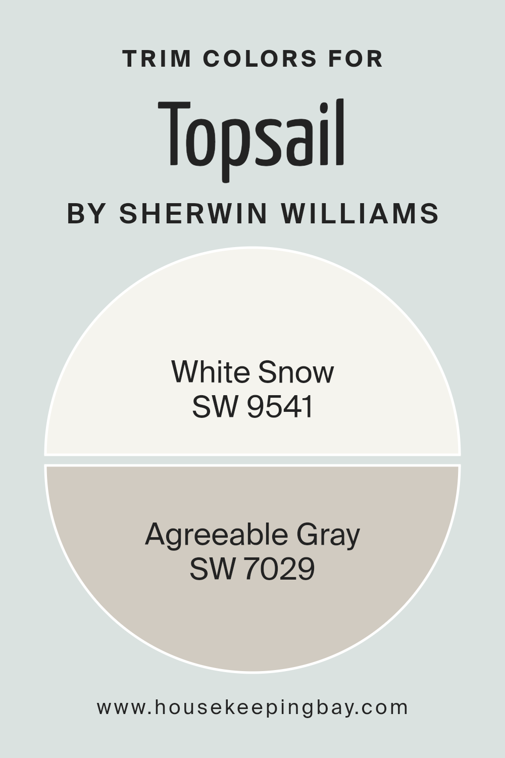
White Snow SW 9541 is a bright, clean white that provides a crisp boundary against Topsail, offering a fresh and airy feel to any room. It can make the Topsail feel more vibrant while making the room appear larger and more open. Agreeable Gray SW 7029, on the other hand, is a soft neutral gray that blends smoothly with Topsail, creating a subtle and harmonious contrast.
This color helps in achieving a more seamless transition between walls and trim, making it ideal for creating a cohesive look in a space that aims for a calm and soothing atmosphere.
You can see recommended paint colors below:
housekeepingbay.com
Colors Similar to Topsail SW 6217 by Sherwin Williams
Similar colors play a crucial role in interior design because they create a harmonious atmosphere that is pleasing to the eye. They allow for a smooth transition from one shade to another within the same spectrum, making the space feel cohesive and well put together.
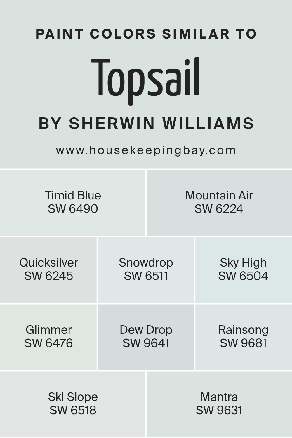
For instance, when looking at colors similar to Topsail SW 6217 by Sherwin Williams, such as SW 6490 – Timid Blue, the subtle, airy vibe can evoke feelings of calmness. Meanwhile, SW 6224 – Mountain Air offers a slightly more robust shade while keeping within the same calming color family.
SW 6245 – Quicksilver provides an almost metallic touch without overwhelming, and it’s great for modern spaces that need a cooler undertone. SW 6511 – Snowdrop gives off a pristine, clear tone that can make any room appear brighter and more spacious.
Moving to slightly bolder hues, SW 6504 – Sky High and SW 6476 – Glimmer both offer a dreamy blue that’s soft yet inviting. For off-whites like SW 9641 – Dew Drop and SW 9681 – Rainsong, these offer a very subtle hint of color that can easily blend with diverse décor elements.
And for those who prefer something leaning towards cooler tones, SW 6518 – Ski Slope and SW 9631 – Mantra provide a refreshing touch that works well in areas that aspire for a clean and serene backdrop. These shades are not just about adding color but also about setting a tone that’s relaxed and comfortable, illustrating how similar colors can enhance the design and feel of a space effectively.
You can see recommended paint colors below:
- SW 6490 Timid Blue
- SW 6224 Mountain Air
- SW 6245 Quicksilver
- SW 6511 Snowdrop
- SW 6504 Sky High
- SW 6476 Glimmer
- SW 9641 Dew Drop
- SW 9681 Rainsong
- SW 6518 Ski Slope
- SW 9631 Mantra
housekeepingbay.com
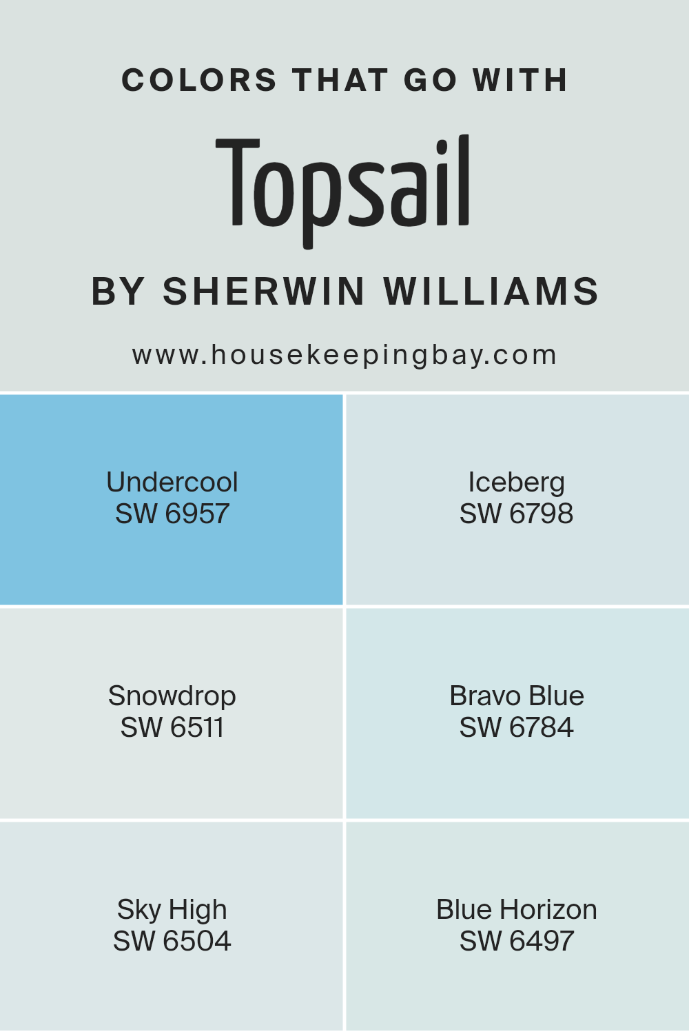
Colors that Go With Topsail SW 6217 by Sherwin Williams
When choosing colors that complement Topsail SW 6217 by Sherwin Williams, it’s important because these colors collectively create a harmonious and aesthetically pleasing palette. Topsail is a soothing, soft gray with a hint of blue that brings calmness to any space.
Pairing it with the right colors can enhance the overall visual appeal and set the desired mood in your room.
Colors like Undercool SW 6957 and Iceberg SW 6798 offer a vibrant yet understated match. Undercool is a lively light blue that adds a gentle pop of color that is neither overwhelming nor too subtle. Iceberg, with its very light bluish tint, almost whispers serenity and complements Topsail by providing contrast while maintaining a light, airy feel. Snowdrop SW 6511 brings a fresh, crisp white into the mix, giving life to Topsail and making the space feel more open and bright.
Bravo Blue SW 6784 is a deeper, more pronounced blue that can act as an excellent focal point or an accent in a room that allows for more depth and interest while still maintaining harmony with Topsail. Sky High SW 6504 is another soft, peaceful blue that enhances the sense of relaxation in the setting.
Lastly, Blue Horizon SW 6497, a moderate blue, gives a bit of color and warmth, tying together the cooler shades in a balanced manner. All these colors work together to create a cohesive look that complements the main hue well, being Topsail, enriching the environment without overpowering it.
You can see recommended paint colors below:
- SW 6957 Undercool
- SW 6798 Iceberg
- SW 6511 Snowdrop
- SW 6784 Bravo Blue
- SW 6504 Sky High
- SW 6497 Blue Horizon
housekeepingbay.com
How to Use Topsail SW 6217 by Sherwin Williams In Your Home?
Topsail SW 6217 by Sherwin Williams is a soothing, soft blue color that can beautifully brighten any space in your home. This hue has a gentle, calming effect, making it perfect for bedrooms where a peaceful ambiance is key for relaxation and sleep.
Additionally, Topsail can refresh and lighten a bathroom, turning it into a serene spa-like retreat. Its versatility extends to living areas and kitchens, where the light blue can give a clean, airy feel, enhancing natural lighting and making spaces feel larger.
When paired with neutral-toned furniture and decor, Topsail creates a harmonious, balanced look. It also pairs well with white trim and cabinets for a crisp, fresh aesthetic. For a more dynamic vibe, combine it with bolder colors like navy or rich browns in accent pieces or wall art. Topsail SW 6217 offers a simple way to update your home, providing a soft backdrop that complements various interior styles and settings.
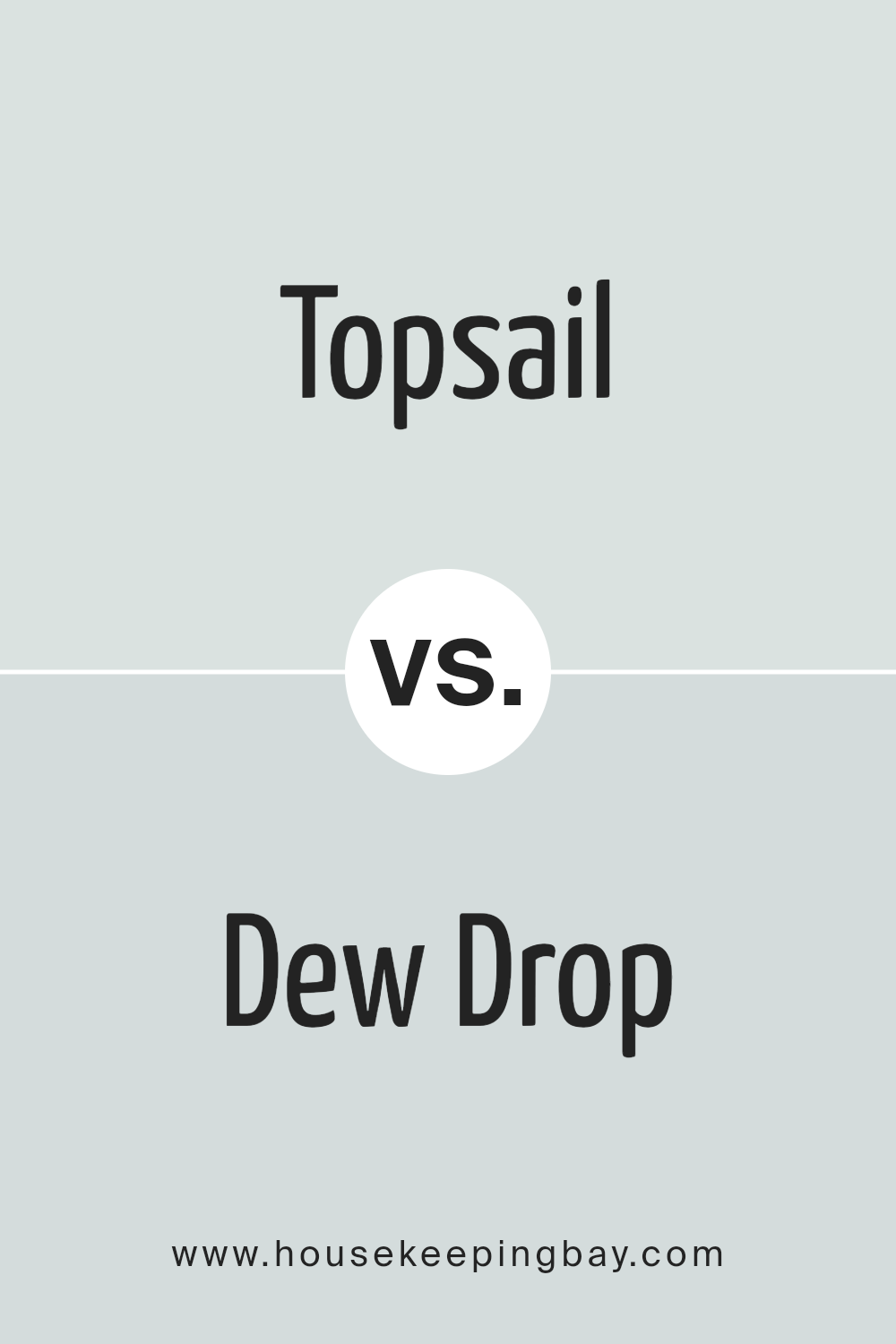
Topsail SW 6217 by Sherwin Williams vs Dew Drop SW 9641 by Sherwin Williams
Topsail SW 6217 by Sherwin Williams is a soft, soothing gray that has a hint of blue. It’s light and airy, making it ideal for creating a peaceful and serene environment. This color works well in spaces aimed at relaxation such as bedrooms and bathrooms.
On the contrary, Dew Drop SW 9641 is a gentle beige with a touch of green. It offers a warmer tone compared to Topsail. Dew Drop naturally complements wooden finishes and natural textures, giving rooms a cozy and inviting atmosphere. It’s particularly suitable for living spaces and kitchens where warmth is desired.
Both colors share a calm and gentle vibe but Topsail leans towards a cooler palette while Dew Drop brings warmth. This distinction can affect the mood and perceived temperature of a room, with Topsail refreshing a space and Dew Drop making it snugger.
You can see recommended paint color below:
- SW 9641 Dew Drop
housekeepingbay.com
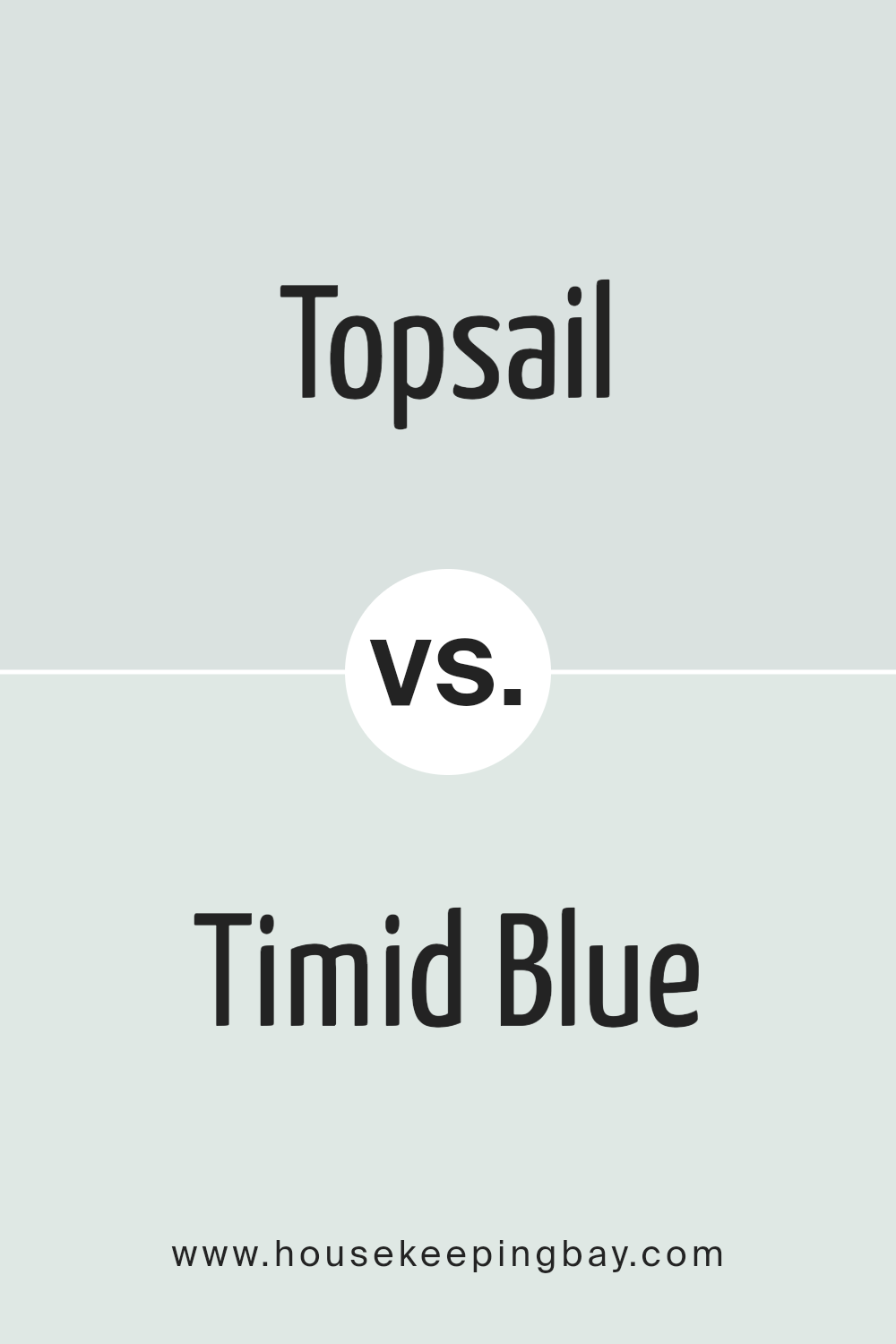
Topsail SW 6217 by Sherwin Williams vs Timid Blue SW 6490 by Sherwin Williams
Topsail SW 6217 by Sherwin Williams is a soft, light gray that almost appears as a misty blue under certain lighting. This neutral shade is versatile and ideal for creating a calm, gentle atmosphere in any room. It pairs well with various decor styles from modern to traditional, making it a great choice for living spaces and bedrooms where a serene vibe is desired.
In contrast, Timid Blue SW 6490 is a brighter, more evident light blue with a cheerful and refreshing feel. This color vividly stands out more than Topsail, bringing an airy brightness to any space. It’s perfect for areas like bathrooms or children’s rooms where a light, playful energy is preferred.
While Topsail is subtly neutral, Timid Blue offers a clearer hint of color. Both colors can work beautifully in a home, depending on the room’s intended atmosphere and the desired impact of the color scheme.
You can see recommended paint color below:
- SW 6490 Timid Blue
housekeepingbay.com
Topsail SW 6217 by Sherwin Williams vs Ski Slope SW 6518 by Sherwin Williams
Topsail SW 6217 by Sherwin Williams is a soft, calm shade of blue with a hint of gray. It brings a serene and peaceful vibe to any space, making it well-suited for bedrooms and bathrooms where relaxation is key. The lightness of Topsail creates a refreshing and airy feel, enhancing small spaces and helping to make them appear larger.
Ski Slope SW 6518, also by Sherwin Williams, shifts towards a cooler palette. It’s a light blue that borders on icy, mirroring the chilly hues of winter skies. This color is ideal for spaces intended to have a crisp, clean look, such as kitchens and modern bathrooms.
While both tones can brighten a room, Topsail offers a warmer and more comforting atmosphere, contrasting with the cooler, more detached aura of Ski Slope. Each color works well in its right environment and can be chosen depending on the mood or functional use of the room.
You can see recommended paint color below:
- SW 6518 Ski Slope

housekeepingbay.com
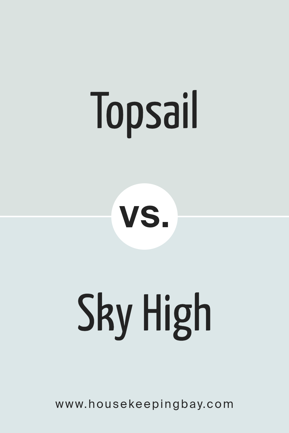
Topsail SW 6217 by Sherwin Williams vs Sky High SW 6504 by Sherwin Williams
Topsail SW 6217 by Sherwin Williams is a soft, soothing light gray with a hint of blue, creating a calm, serene atmosphere. It can give a room a fresh and airy feel, ideal for creating a peaceful setting. This color works well in bedrooms and bathrooms where relaxation is key.
In contrast, Sky High SW 6504 is a vibrant, cheerful light blue. It has a more lively presence compared to Topsail and can make spaces appear more spirited and inviting. This color is perfect for areas where you want to add a bright and energizing touch, like kitchens or children’s playrooms.
While both colors share a base in blue tones, Topsail leans more towards a subtle, muted gray-blue that suggests quiet and restfulness, while Sky High offers a bolder, clearer blue that injects more energy and brightness into a space. Depending on what mood or style you wish to achieve, either of these colors could work beautifully.
You can see recommended paint color below:
- SW 6504 Sky High
housekeepingbay.com
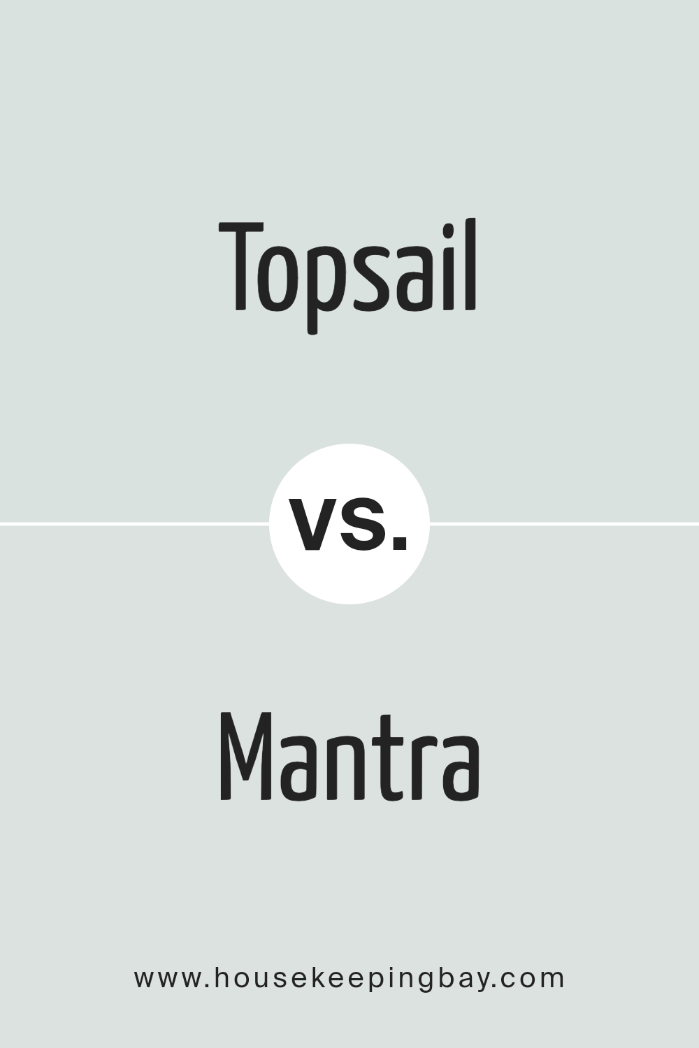
Topsail SW 6217 by Sherwin Williams vs Mantra SW 9631 by Sherwin Williams
Topsail SW 6217 by Sherwin Williams is a soft, soothing pale blue with a hint of gray that gives it a calming presence. It’s light enough to brighten up a room while maintaining a serene atmosphere. This color works well in spaces meant for relaxation, such as bedrooms or bathrooms.
Mantra SW 9631, also by Sherwin Williams, leans more towards a muted gray with subtle blue undertones. It’s a neutral shade that offers versatility, making it suitable for various rooms and design styles. Mantra tends to provide a modern and sophisticated feel, perfect for living rooms or kitchens where a chic, minimalist look is desired.
Although both colors share a certain softness and neutrality, Topsail is distinctly lighter and cooler, producing a more airy and refreshing feel. Mantra, with its deeper and warmer tones, offers a grounding effect. These qualities make Topsail ideal for creating a breezy, open atmosphere, while Mantra is better suited for crafting a cozy, refined space.
You can see recommended paint color below:
housekeepingbay.com
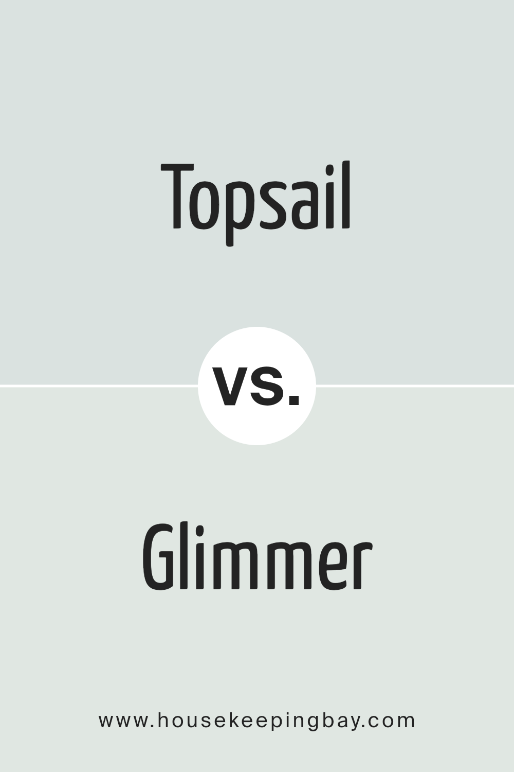
Topsail SW 6217 by Sherwin Williams vs Glimmer SW 6476 by Sherwin Williams
Topsail SW 6217 by Sherwin Williams is a soft, serene pale grey with a hint of blue, creating a light and airy feel that’s ideal for calming spaces like bedrooms or bathrooms. It is quite neutral, making it versatile for pairing with bolder colors or serving as a quiet backdrop in minimalist decor.
In contrast, Glimmer SW 6476 is a light, silvery green that adds a gentle splash of color while still maintaining a fairly muted tone. This color shines in spaces needing a subtle touch of vibrancy without overwhelming the senses. It works well in areas with a lot of natural light, as the color can appear almost ethereal.
Both colors share a lightness and softness, but Topsail leans more towards a neutral grey, providing a cooler overtone, while Glimmer offers a hint of green, giving rooms a soft, refreshing vibe. Each color supports a theme of calmness and softness, yet they direct the mood of a room in slightly different directions due to their underlying hues.
You can see recommended paint color below:
- SW 6476 Glimmer
housekeepingbay.com
Topsail SW 6217 by Sherwin Williams vs Mountain Air SW 6224 by Sherwin Williams
Topsail SW 6217 and Mountain Air SW 6224 by Sherwin Williams are both soothing, light hues but they offer distinct vibes for your space. Topsail is a very light, soft gray with a hint of blue. It’s a neutral shade that provides a clean, calm background, making it perfect for creating a serene and airy atmosphere in any room. This color works well in spaces that aim for a refreshing and peaceful feel, such as bedrooms and bathrooms.
Mountain Air is slightly more vibrant, yet still maintains a soft presence. It leans more towards a clearer sky blue, giving a more noticeable but gentle pop of color. The cool tone of Mountain Air can invigorate a space while keeping the overall feeling relaxed. It’s a great choice for areas where you want a bit of color while still keeping the mood light and breezy, like kitchens or living areas.
Both colors are versatile and can enhance the natural light in a room, but Topsail stays more neutral, while Mountain Air adds a subtle hint of cheerful blue. Whether you choose between these depends on how much color impact you want in your interiors.
You can see recommended paint color below:
- SW 6224 Mountain Air

housekeepingbay.com
Topsail SW 6217 by Sherwin Williams vs Quicksilver SW 6245 by Sherwin Williams
Topsail SW 6217 and Quicksilver SW 6245 by Sherwin Williams are two unique paint shades that offer subtle differences in mood and space perception. Topsail is a light, airy gray that leans towards a soft, calming blue under certain lighting conditions. This color is ideal for creating a serene and relaxing atmosphere in spaces like bedrooms or bathrooms.
In contrast, Quicksilver SW 6245 is a cool, medium gray that carries more depth. It provides a more modern and sleek look, making it suitable for contemporary living spaces or kitchens that aim to project a clean, crisp feel.
Both colors work well in spaces that benefit from a neutral palette, allowing for flexible decor choices. Topsail, with its lighter and more ethereal quality, tends to make rooms feel more expansive and open. Meanwhile, Quicksilver, with its slightly darker tone, is effective in adding a touch of sophistication and can also be used to highlight specific areas within a room.
Depending on the desired ambiance and functional needs of a room, both Topsail and Quicksilver offer appealing choices, each setting a distinct tone through its unique shade of gray.
You can see recommended paint color below:

housekeepingbay.com
Topsail SW 6217 by Sherwin Williams vs Snowdrop SW 6511 by Sherwin Williams
Topsail SW 6217 by Sherwin Williams is a soft, airy gray with a hint of blue that gives a soothing and calm vibe to any space. It pairs well in rooms aiming for a light and serene atmosphere. Topsail is versatile, easily matching with both bright colors and neutral tones, making it ideal for living areas and bedrooms where a gentle and peaceful aesthetic is desired.
Snowdrop SW 6511, also by Sherwin Williams, is a vibrant, clean white with a slightly cool undertone. This color is great for spaces that require a fresh and bright look, such as kitchens and bathrooms. Snowdrop helps reflect light, making small rooms appear more spacious and welcoming.
Both these colors, Topsail and Snowdrop, provide unique attributes. Topsail offers a muted calmness suited for relaxing environments, while Snowdrop serves well in areas that benefit from a crisp, clear presence. Together, they can create a balanced and harmonious look, with Topsail softening larger areas, and Snowdrop accentuating details and trim for a polished finish.
You can see recommended paint color below:
- SW 6511 Snowdrop

housekeepingbay.com
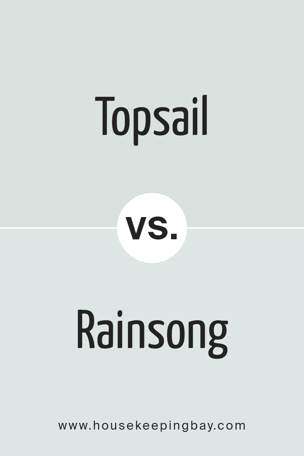
Topsail SW 6217 by Sherwin Williams vs Rainsong SW 9681 by Sherwin Williams
Topsail SW 6217 by Sherwin Williams is a soft, airy light blue-gray shade that provides a serene and calm feel, making it perfect for creating a relaxed atmosphere in any room. This color is versatile enough to work well in spaces like bedrooms or bathrooms where you want a soothing atmosphere. It reflects light beautifully, making smaller spaces appear larger and more open.
Rainsong SW 9681 by Sherwin Williams is also a light hue, but it leans more towards a neutral green with hints of gray. This color is ideal for those looking to bring a subtle touch of nature indoors, as it mimics the calming shades found in a misty rainforest. Rainsong works well in spaces where a connection to nature and a fresh, airy feeling is desired.
While both colors are light and can help make a room feel more spacious, Topsail is cooler with its blue undertones, whereas Rainsong offers a slightly warmer touch with its green-gray palette. Both are excellent choices for creating a peaceful environment, yet they bring different elements to a space depending on your color preference.
You can see recommended paint color below:
- SW 9681 Rainsong
housekeepingbay.com
Conclusion
Concluding, SW 6217 Topsail by Sherwin Williams stands as an ideal choice for anyone looking to freshen up their home with a gentle, soothing shade of paint. Its soft, airy blue hue adds a serene ambiance to any room, making it perfect for creating a peaceful retreat in your living space.
Whether you’re updating your bedroom, bathroom, or even your kitchen, Topsail offers a versatile backdrop that pairs beautifully with a variety of decors and styles. Furthermore, its ability to reflect natural light can make your room feel more spacious and open.
If a calming, refreshing feel is what you aim for in your home environment, considering SW 6217 Topsail could indeed prove to be a wise decision. Its ability to seamlessly integrate with different settings while maintaining a clean and inviting atmosphere is what makes it a trustworthy color choice for your home’s palette.
housekeepingbay.com
