Rosemary SW 6187 by Sherwin Williams
A Blossoming Touch for Sophisticated Spaces
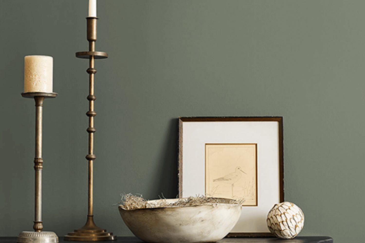
Imagine finding the perfect color that brings warmth and charm to your room. Say hello to SW 6187 Rosemary by Sherwin Williams. This color is a true gem that can transform your space into a cozy haven. Rosemary isn’t just any green; it has a depth that adds elegance and sophistication to any area it graces. Whether you’re looking to spruce up your living room, bedroom, or even your kitchen, Rosemary offers a unique blend of freshness and tranquility.
You’ll appreciate how this color works beautifully in different lighting conditions, showing off its versatile nature. It can pair wonderfully with a range of decor styles, from modern to rustic, making it a go-to choice for those looking to update their space.
If you’re worried about the color overwhelming your room, consider using it on an accent wall or as part of a color scheme that includes neutral tones. This will let you enjoy the richness of Rosemary without it taking over.
Choosing the right paint color is crucial for setting the mood in your home, and with SW 6187 Rosemary, you’re on your way to creating a space that feels both inviting and stylish. Ready to give your home a beautiful makeover? Rosemary could be the perfect starting point for your next decorating project.
by sherwin williams
What Color Is Rosemary SW 6187 by Sherwin Williams?
Rosemary SW 6187 by Sherwin Williams is a warm, earthy green that brings a sense of calm and serenity to any space. This versatile green has a hint of gray in it, making it a perfect choice for those who want to add a touch of nature to their interior without going too bold. The color is soft enough to act as a neutral, yet it holds its own character, making it an excellent backdrop for various design styles and color palettes.
Rosemary works wonderfully in farmhouse and rustic interior styles, as its natural vibe complements wood textures and organic materials brilliantly. It’s equally at home in modern and minimalist spaces, where its subtle complexity can add depth without overwhelming the clean lines and simple color schemes typical of these styles.
When it comes to pairing with materials and textures, Rosemary SW 6187 is incredibly accommodating. It looks stunning with natural wood, whether it’s light oaks or richer, darker tones, enhancing the wood’s natural grain and warmth. Metals like copper and brass pop against its earthy backdrop, adding a touch of glamour.
For textiles, consider soft, plush textures in neutral colors to create a cozy, inviting space, or mix in some bolder patterns in complementary colors to add interest and dynamics to your room. Overall, Rosemary SW 6187 is a beautifully flexible color that can help achieve a range of aesthetics while maintaining a warm, grounding ambiance.
housekeepingbay.com
Is Rosemary SW 6187 by Sherwin Williams Warm or Cool color?
RosemarySW 6187 by Sherwin Williams is a unique and versatile paint color. Its charm lies in its serene and earthy green hue, which brings a sense of calmness and nature into any space. When used in homes, this color has a soothing effect, making it perfect for areas where relaxation is key, such as bedrooms and living rooms. Its subtlety allows it to blend well with various decor styles, from modern to rustic, adding a touch of elegance without overwhelming the space.
Moreover, RosemarySW 6187 has the ability to make rooms feel more spacious and inviting, thanks to its light-reflective properties. It pairs beautifully with natural elements like wood and stone, enhancing the overall warmth and coziness of a home. Whether applied on accent walls, cabinets, or throughout a room, this color works wonders in creating a peaceful and stylish environment. Its versatility and pleasing aesthetic make it a popular choice for homeowners looking to update their interiors with a fresh and tranquil vibe.
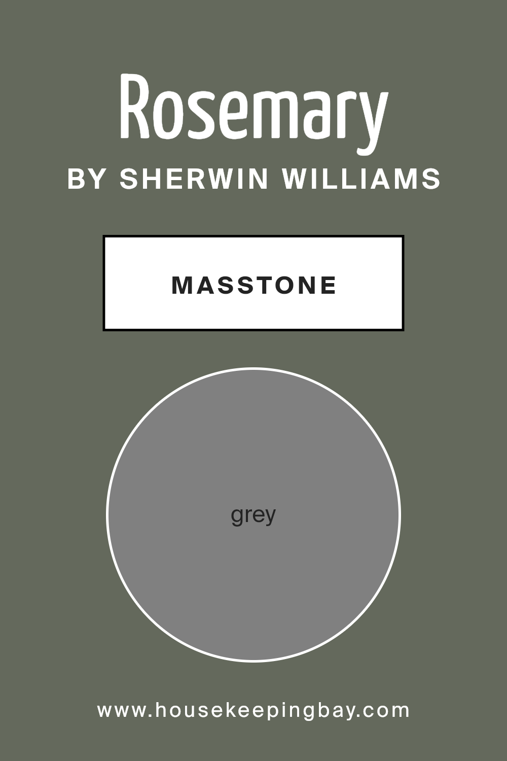
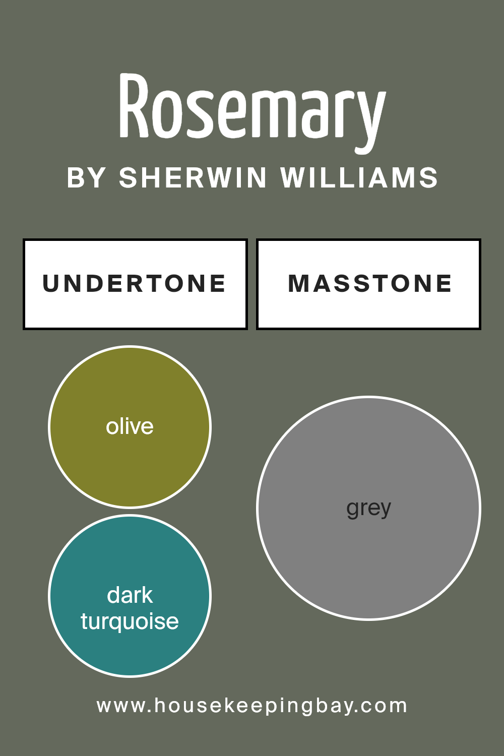
What is the Masstone of the Rosemary SW 6187 by Sherwin Williams?
Rosemary SW 6187 by Sherwin Williams has a masstone, or main color, of Grey (#808080). This grey color influences how well it works in homes, making it a versatile choice for many spaces. Grey, being a neutral color, provides a calming and solid foundation for any room. It’s like the color can effortlessly match with other colors, whether you like bright, bold colors or prefer softer, more subtle shades. This means you can change up your decorations, like pillows, curtains, or artwork, and Rosemary SW 6187 will still look good.
In homes, this grey can make rooms feel more spacious and elegant. It’s great for living rooms, bedrooms, or even kitchens. The color isn’t too dark or too light, hitting a sweet spot that’s cozy and inviting. Plus, it hides marks or dirt better than lighter colors, making it a practical choice for busy homes. Overall, Rosemary SW 6187’s grey masstone offers flexibility and a timeless look that can easily adapt to different styles and tastes.
housekeepingbay.com
Undertones of Rosemary SW 6187 by Sherwin Williams
Rosemary SW 6187 by Sherwin Williams is a unique color that can transform a room depending on its undertones. Undertones are subtle colors hidden within the main color, and they greatly influence how we perceive the main hue. For Rosemary SW 6187, these undertones include a wide range of colors from olive to light gray, making it a versatile choice for interior walls.
The undertones like olive, dark green, and brown bring a sense of nature and warmth into a space, making rooms feel more inviting. Darker undertones such as dark turquoise, purple, and navy can add depth and sophistication. This complexity allows Rosemary SW 6187 to adapt to different lighting conditions and design elements, showing various appearances at different times of the day or with different furnishings.
Mint, pale pink, and light green undertones give a fresher, softer look, perfect for creating a relaxing atmosphere. These lighter undertones can make small spaces appear larger and more open. In contrast, vivid undertones like orange, pink, and red can add energy and vibrancy to a room, making it feel more dynamic.
Using Rosemary SW 6187 on interior walls means the room can embody a multitude of feelings and styles, from calm and serene to bold and energetic, depending on the lighting and surrounding colors. The wide array of undertones in Rosemary SW 6187 makes it an exceptionally adaptable paint color, capable of complementing a broad spectrum of interior designs. This color, with its complex undertones, can truly transform a space, reflecting various moods and styles.
housekeepingbay.com
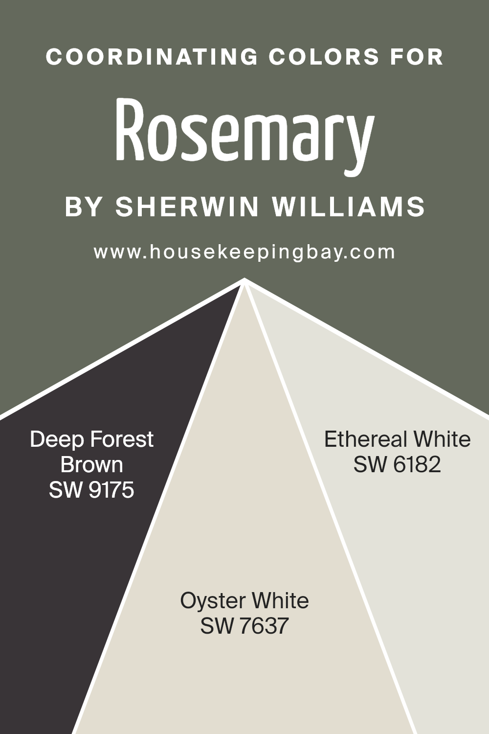
Coordinating Colors of Rosemary SW 6187 by Sherwin Williams
Coordinating colors work together to create a balanced and harmonious look in interior design, enhancing the aesthetics of your living space without overwhelming it. Essentially, they are colors that complement each other and bring out the beauty in one another when used together. For a color like Rosemary SW 6187 by Sherwin Williams, which is a serene and sophisticated green, choosing the right coordinating colors is key to achieving a cohesive and inviting atmosphere.
Deep Forest Brown SW 9175 is a rich, earthy brown that provides a strong foundation when paired with Rosemary. Its deep tones offer a sense of warmth and stability, making it an excellent choice for grounding a room or adding a touch of elegance. On the other hand, Oyster White SW 7637 is a soft, off-white color with a hint of warmth. It acts as a versatile backdrop that allows colors like Rosemary to pop while keeping the space light and airy.
Lastly, Ethereal White SW 6182 is a light, almost ethereal shade of white with a subtle cool undertone. This color brings a fresh, cleansing feel to the palette, enhancing the vibrant yet soothing nature of Rosemary. Together, these coordinating colors create a beautiful, harmonious living space that feels both inviting and stylish.
You can see recommended paint colors below:
- SW 9175 Deep Forest Brown
- SW 7637 Oyster White
- SW 6182 Ethereal White
housekeepingbay.com
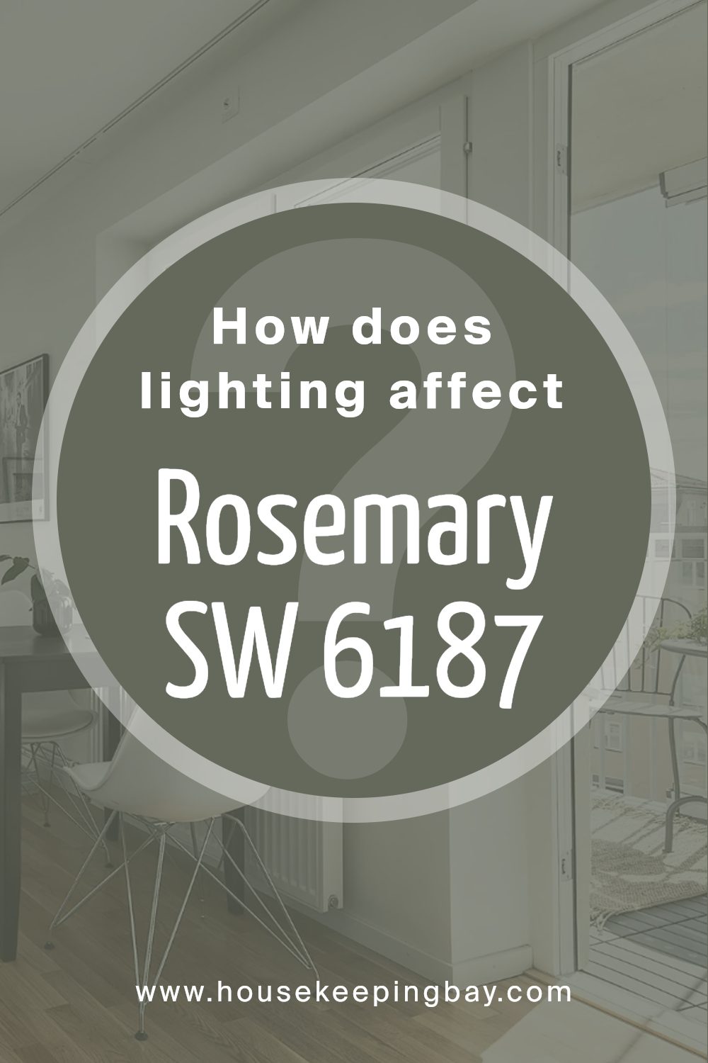
How Does Lighting Affect Rosemary SW 6187 by Sherwin Williams?
Light has a big impact on how we see colors. Imagine a crayon you’ve picked under the sunlight and how it might look different when you see it under a lamp at night. That difference is because of the lighting. Different sources of light, like the sun or a light bulb, can make colors appear varied. This change happens because lights have colors too, which can mix with the color of objects, altering how we perceive them.
Let’s talk about a specific color, Rosemary SW 6187 by Sherwin Williams, and see how it changes under different light conditions. Rosemary is a unique and sophisticated green with hints of gray, capable of transforming depending on the lighting.
- In artificial light, which usually comes from bulbs inside our homes, Rosemary can look warmer or cooler. The kind of bulb matters; warm bulbs can make it look more inviting and cozy, adding a soft, golden glow. Meanwhile, cool bulbs might enhance its gray notes, giving it a sharper, more modern vibe.
- Natural light plays with Rosemary in interesting ways too. In rooms that face north, where light can be cooler and softer throughout the day, Rosemary might lean more towards its gray undertones, presenting a calm and soothing green. South-facing rooms get a lot of warm, bright sunlight; here, Rosemary will appear warmer and more vibrant, highlighting its lush, green qualities.
- East-facing rooms get bright, morning light, making Rosemary look fresh and lively in the morning then softer as the day goes on. West-facing rooms, however, bathe in the intense, warm light of the afternoon and evening, transforming Rosemary into a cozy and inviting color with deeper, golden undertones as the day progresses.
So, lighting truly shapes the way we see colors. Whether it’s day or night, natural or artificial light, the appearance of Sherwin Williams’ Rosemary SW 6187 changes, showing off its versatile beauty in any setting.
housekeepingbay.com
What is the LRV of Rosemary SW 6187 by Sherwin Williams?
LRV stands for Light Reflectance Value, which measures the percentage of light a paint color reflects from or absorbs into a painted surface. This scale ranges from 0, which is absolute black and reflects no light, to 100, pure white, reflecting all light. The LRV score helps you understand how light or dark a color will look in a space once applied to walls. It’s a practical tool for choosing the right paint color for your room, ensuring that the brightness levels contribute to the ambiance you want to achieve. In essence, higher LRV colors make a room feel more open and brighter, while lower LRV colors can make a space feel cozier but smaller.
With an LRV of 13.561, Rosemary SW 6187 by Sherwin Williams is on the darker side of the scale. This means that it absorbs more light than it reflects, resulting in a color that will appear quite dark on the walls. Such a low LRV can dramatically affect the mood and perception of space in a room. In well-lit rooms or spaces with plenty of natural light, Rosemary might appear more vibrant and dynamic, yet still quite deep.
In contrast, in rooms with limited natural light, this color could create an intimate and somewhat smaller feel, as it will absorb most of the light, not reflecting much back into the room. Therefore, considering the LRV is crucial when deciding where to use this color to achieve the desired effect in your decor.

housekeepingbay.com
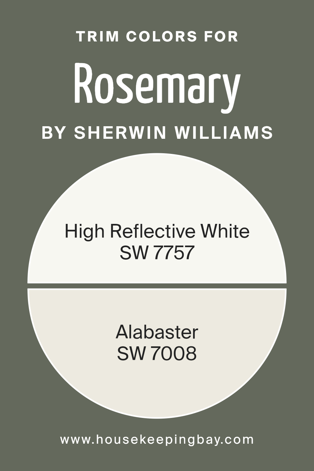
What are the Trim colors of Rosemary SW 6187 by Sherwin Williams?
Trim colors are the hues chosen to accent or highlight the architectural elements such as door frames, window trims, and skirtings in a room or on the exterior of a building. For Rosemary SW 6187 by Sherwin Williams—a rich, soothing shade that evokes the natural serenity of the herb after which it is named—selecting the right trim colors is essential.
The right trim shade can frame and enhance this distinctive green, drawing attention to details and adding a layer of sophistication or contrast. In essence, while the main color sets the mood, the trim color defines and refines the overall aesthetic, bridging the gap between concept and reality.
High Reflective White SW 7757 and Alabaster SW 7008 serve as excellent trim choices for walls painted in Rosemary SW 6187. High Reflective White is a brilliant, pure white that offers a crisp contrast, brightening up spaces and making the green appear more vibrant and fresh. Its radiant quality ensures that any room feels more spacious and lively.
On the softer side, Alabaster SW 7008 provides a gentle, creamy white with just a hint of warmth. This subtle elegance makes it a favorite for creating a cozy, inviting atmosphere where the natural tones of Rosemary can really stand out without overpowering. Both colors add their own unique spark to the room, allowing Rosemary to truly shine in its natural sophistication.
You can see recommended paint colors below:
housekeepingbay.com
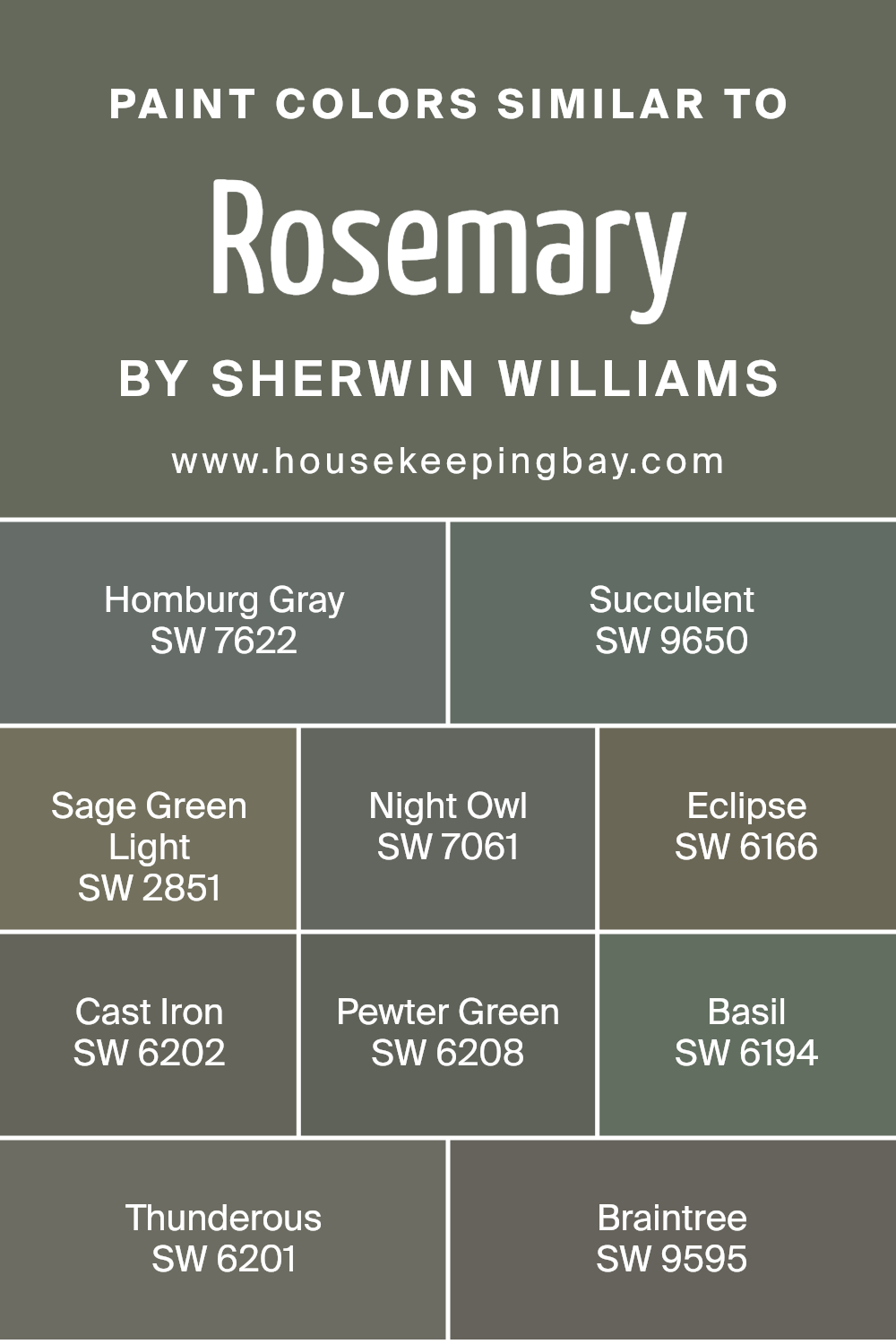
Colors Similar to Rosemary SW 6187 by Sherwin Williams
Using similar colors to Rosemary SW 6187 by Sherwin Williams can create a harmonious and unified look in any space. These colors, like shadows in the same forest, blend together yet each holds its own unique beauty and character. This palette ranges from the subtle, mood-setting grays to the deep, rich greens, allowing for a cohesive yet diverse design.
- Homburg Gray SW 7622 carries a dignified gray tone, acting as a grounding force, while Succulent SW 9650 brings in a whisper of color, soft and barely there, perfect for serene spaces.
- Sage Green Light SW 2851 offers a hint of nature, refreshing and light.
- Night Owl SW 7061 adds depth with its dark, mysterious hue, and Eclipse SW 6166 envelops a room in its almost black embrace, sophisticated and bold.
- Cast Iron SW 6202 is strong and unwavering, a true statement of strength.
- Pewter Green SW 6208, with its rich, muted tones, speaks of elegance and tranquility.
- Basil SW 6194 provides a touch of herbal freshness, lively and invigorating.
- Lastly, Thunderous SW 6201 and Braintree SW 9595 stand as the bookends of this collection, with Thunderous offering a stormier, more intense experience and Braintree lightening the mood with its soft, welcoming whisper.
Each color, while individually beautiful, works together to create a palette that’s both versatile and coherent, perfect for those seeking to bring a natural and sophisticated feel into their spaces.
You can see recommended paint colors below:
- SW 7622 Homburg Gray
- SW 9650 Succulent
- SW 2851 Sage Green Light
- SW 7061 Night Owl
- SW 6166 Eclipse
- SW 6202 Cast Iron
- SW 6208 Pewter Green
- SW 6194 Basil
- SW 6201 Thunderous
- SW 9595 Braintree
housekeepingbay.com
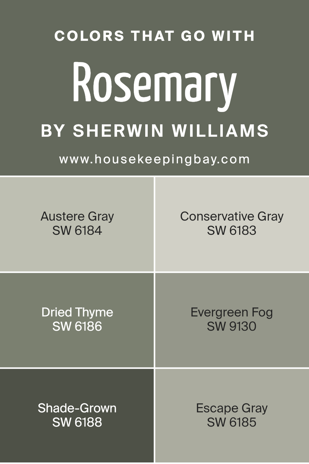
Colors that Go With Rosemary SW 6187 by Sherwin Williams
Selecting colors that complement Rosemary SW 6187 by Sherwin Williams can greatly impact the ambiance and style of any space. These complementary colors, like Austere Gray, Conservative Gray, Dried Thyme, Evergreen Fog, Shade-Grown, and Escape Gray, work in harmony to enhance the green undertones of Rosemary, creating a cohesive and refined palette. The importance of these complementary colors lies in their ability to bring balance, depth, and versatility to interiors, making decorating with Rosemary SW 6187 not only easy but also aesthetically pleasing.
Austere Gray and Conservative Gray offer a soft, muted backdrop that allows Rosemary to stand out without overwhelming the space. Both shades provide a neutral canvas, with Austere Gray leaning towards a cooler undertone and Conservative Gray adding a slightly warmer touch, making them perfect for creating serene and inviting environments. Dried Thyme and Shade-Grown introduce a more pronounced green hue, echoing the natural elements of Rosemary, but with distinct intensities that add character and richness.
Dried Thyme is lighter and offers a herbal freshness, while Shade-Grown is deeper and brings an earthy robustness to the mix. Evergreen Fog and Escape Gray, meanwhile, bridge these elements with their unique tones; Evergreen Fog has a dusky, sophisticated green that contributes to a tranquil atmosphere, and Escape Gray infuses spaces with a contemporary, almost elusive gray that complements the primary hue without competing with it. Together, these colors form a harmonious and versatile palette that enhances the beauty and utility of Rosemary SW 6187.
You can see recommended paint colors below:
- SW 6184 Austere Gray
- SW 6183 Conservative Gray
- SW 6186 Dried Thyme
- SW 9130 Evergreen Fog
- SW 6188 Shade-Grown
- SW 6185 Escape Gray
housekeepingbay.com
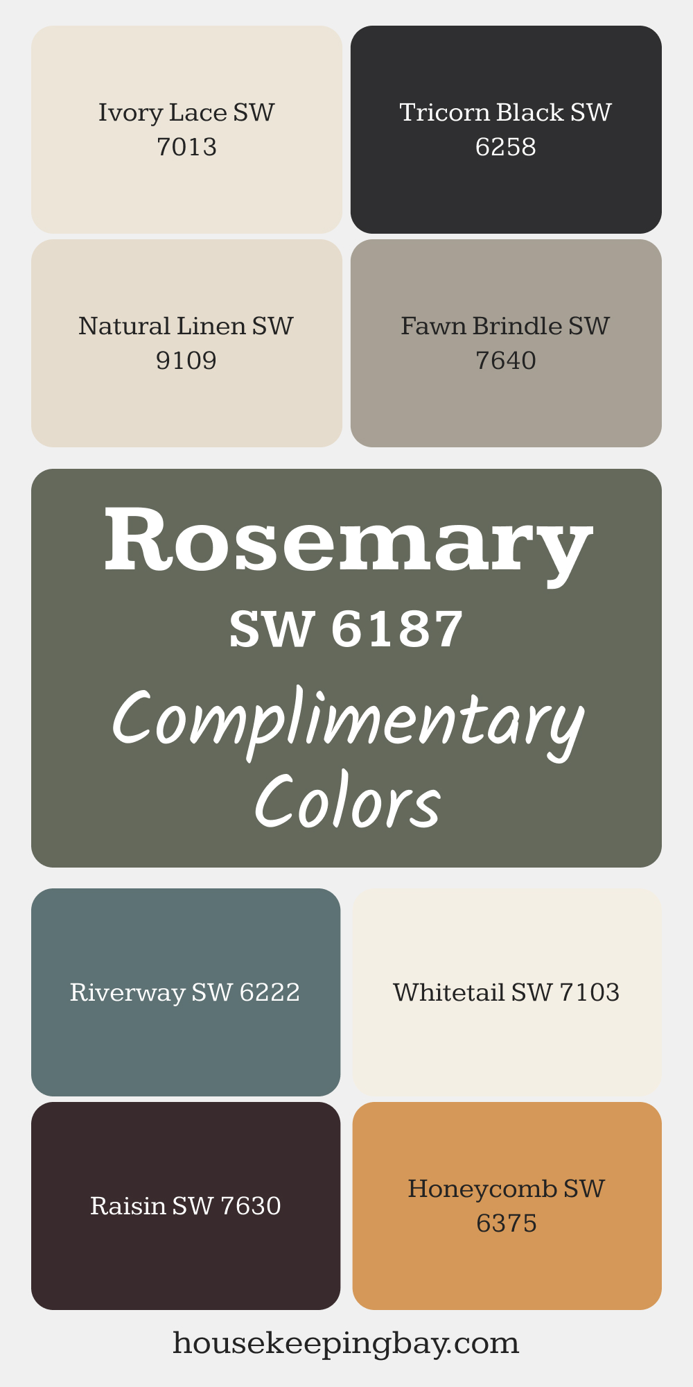
Complimentary Colors for Rosemary SW 6187 Paint Color by Sherwin Williams
Rosemary offers a grounded, nature-inspired tone that pairs beautifully with soft neutrals like Natural Linen and Ivory Lace for a light, airy feel. Whitetail adds brightness, creating a clean and fresh look that complements the earthy green.
For a bolder contrast, try Tricorn Black or the deep warmth of Raisin.
Riverway enhances the calming green tones, while Honeycomb and Fawn Brindle bring warmth and richness, offering plenty of flexibility for your palette.
via housekeepingbay.com
How to Use Rosemary SW 6187 by Sherwin Williams In Your Home?
Rosemary SW 6187 by Sherwin Williams is a beautiful and versatile paint color that can add a fresh look to any home. Imagine the soft, herbal green of rosemary leaves, and you’ve got the perfect picture of this color. It’s a shade that combines the calming qualities of green with a certain brightness that can make a room feel more alive. Whether you want to paint an entire room or just an accent wall, Rosemary can add a touch of nature-inspired tranquility.
This color works great in spaces where you want to relax and recharge, like bedrooms or bathrooms. It pairs well with whites and creams, creating a light and airy feel, or with darker woods for a more grounded, natural vibe. If you’re looking to update your kitchen, Rosemary cabinets can give the space a fresh and modern look. It’s also great for exterior doors or shutters, adding a welcoming touch to your home’s facade.
Using Rosemary SW 6187 is an easy way to refresh your space with a color that’s both calming and full of life.
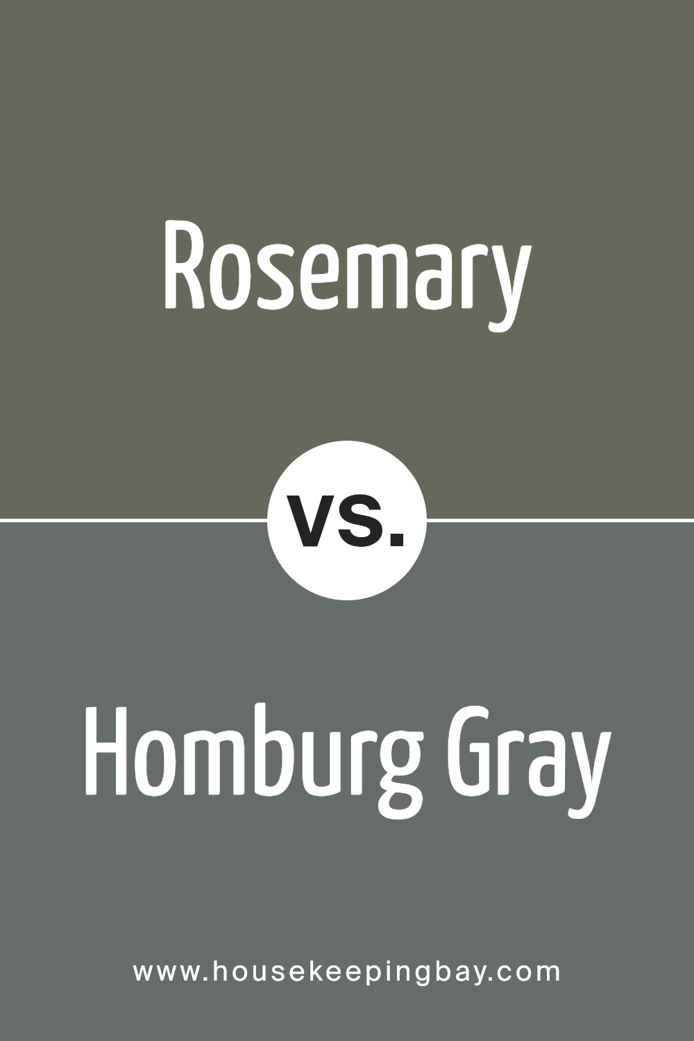
Rosemary SW 6187 by Sherwin Williams vs Homburg Gray SW 7622 by Sherwin Williams
Rosemary SW 6187 and Homburg Gray SW 7622, both from Sherwin Williams, are two distinct colors that offer unique vibes for any space. Rosemary is a deep, rich green with subtle earthy tones. It brings to mind the natural freshness of the rosemary herb, adding a sense of calmness and serenity to rooms.
On the other hand, Homburg Gray is a sophisticated, muted gray with subtle blue undertones. It’s a versatile color that can make spaces feel both elegant and grounded. While Rosemary adds a touch of nature and depth to a room, Homburg Gray provides a cooler, more refined look. Both colors work well in various settings, depending on the atmosphere you want to create. Rosemary is perfect for those looking to add a natural, comforting feel, whereas Homburg Gray is ideal for achieving a chic, modern aesthetic.
You can see recommended paint color below:
housekeepingbay.com
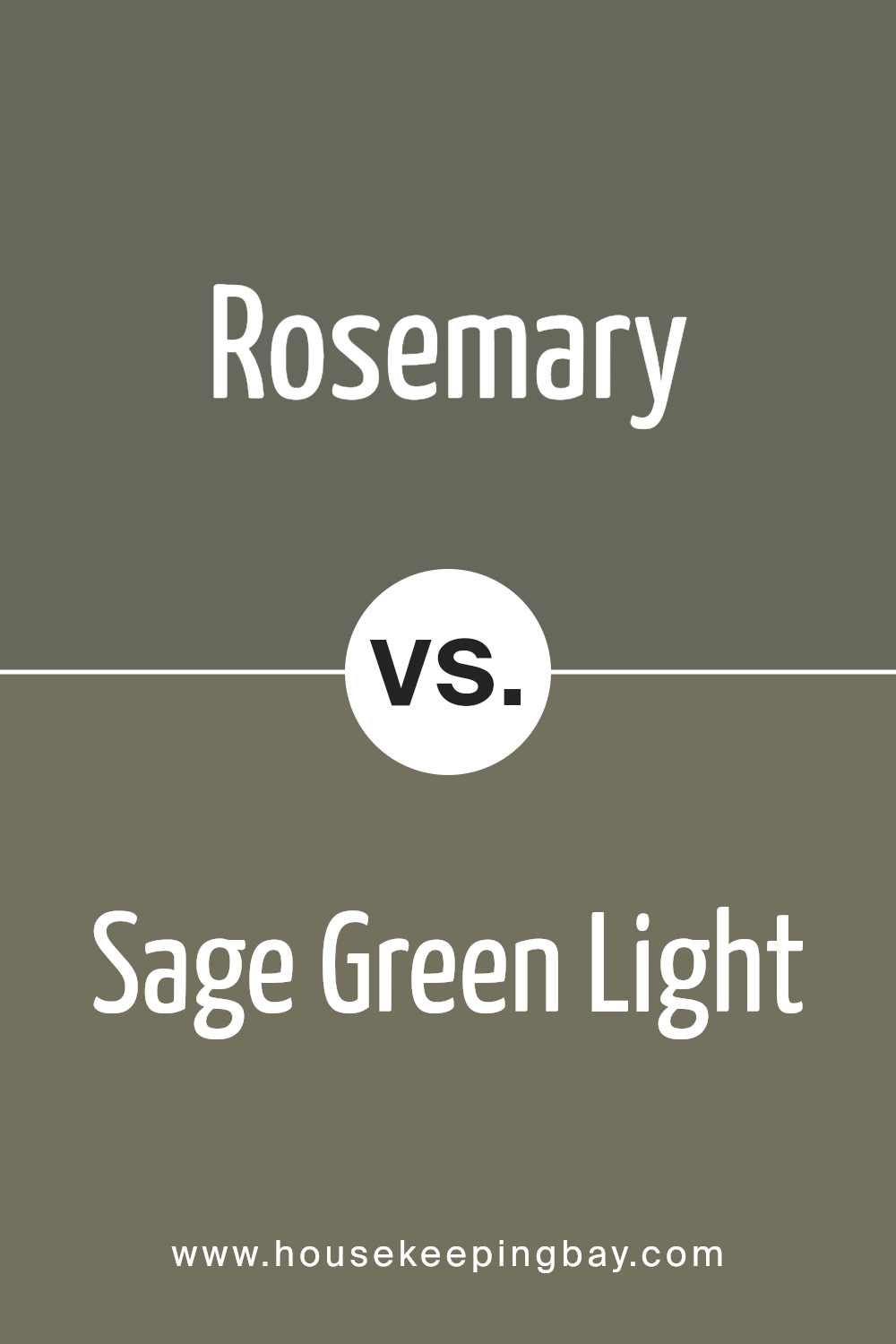
Rosemary SW 6187 by Sherwin Williams vs Sage Green Light SW 2851 by Sherwin Williams
Rosemary SW 6187 by Sherwin Williams and Sage Green Light SW 2851 from the same brand are both nature-inspired colors, but they bring different vibes to a space. Rosemary is a darker, richer color, reminiscent of the herb it’s named after. It has an earthy, soothing feel, perfect for creating cozy, intimate spaces.
On the other hand, Sage Green Light is, as the name suggests, a lighter shade. It leans towards a fresher, airier look, offering a sense of calm and openness. This color can make a room feel more spacious and bright. While Rosemary might be better suited for accent walls or smaller rooms to add depth, Sage Green Light works well in larger areas or rooms with plenty of natural light. Both colors reflect the beauty of nature but in different tones: Rosemary gives a warmer, enveloping feel, and Sage Green Light provides a breezy, light touch.
You can see recommended paint color below:
- SW 2851 Sage Green Light
housekeepingbay.com
Rosemary SW 6187 by Sherwin Williams vs Succulent SW 9650 by Sherwin Williams
Rosemary SW 6187 by Sherwin Williams is a warm, earthy green that brings thoughts of natural herbs and the cozy calmness of a garden. It’s a color that leans more towards a muted, soothing vibe, making it perfect for creating a relaxing and serene space in your home. On the other hand, Succulent SW 9650 takes a lighter path. It’s a cooler, more uplifting green, reminiscent of fresh leaves or the vibrant, new growth of a succulent plant in the spring.
The brightness of Succulent lends itself well to spaces that aim to be refreshing and full of energy, offering a more invigorating feel compared to the subdued nature of Rosemary. While both colors find their roots in the green family, Rosemary provides a deeper, earth-toned atmosphere, and Succulent offers a crisp, lively ambiance. Together, they showcase the versatility of green hues in decorating, from creating cozy retreats to energizing environments.
You can see recommended paint color below:
- SW 9650 Succulent

housekeepingbay.com
Rosemary SW 6187 by Sherwin Williams vs Braintree SW 9595 by Sherwin Williams
Rosemary SW 6187 by Sherwin Williams is a deep, muted green with earthy undertones. It gives off a natural and soothing vibe, making it a great choice for spaces where you want to relax and unwind. It’s like the color of thick forest foliage, offering a sense of calm and tranquility.
Braintree SW 9595, on the other hand, leans more towards a subtle, grayish-green. This color is lighter and softer, providing a more understated elegance. It resembles the gentle hues of a misty morning, creating a peaceful and serene atmosphere.
When comparing the two, Rosemary is the bolder, more pronounced green that draws attention and sets a grounding mood. Braintree is quieter, blending into the background with its soothing, lighter tones. Both colors offer a sense of calm but in different intensities. Rosemary sets a statement with its deeper, earthy feel, while Braintree offers a gentle whisper of color for a light and airy space.
You can see recommended paint color below:
- SW 9595 Braintree

housekeepingbay.com
Rosemary SW 6187 by Sherwin Williams vs Eclipse SW 6166 by Sherwin Williams
Rosemary SW 6187 by Sherwin Williams is a deep, rich green with earthy tones, reminiscent of the herb it’s named after. This color brings a sense of nature and tranquility to spaces, making it perfect for creating a cozy and grounded atmosphere. It’s a versatile color that works well in many areas of a home, from living rooms to bedrooms, giving them a sophisticated yet natural feel.
On the other hand, Eclipse SW 6166 by Sherwin Williams is a much lighter, subtler shade. It’s a soft, muted gray with a hint of green, giving it a calm and soothing presence. This color is ideal for those looking to add a gentle, peaceful vibe to their rooms. It pairs beautifully with a wide range of decor, offering a clean and airy feel that can make small spaces appear larger and more inviting.
When comparing the two, Rosemary brings depth and warmth, creating a cozy retreat, while Eclipse offers a light and serene backdrop, perfect for a minimalist or a scandi-inspired space. Both colors bring their unique charm, depending on the mood and style you’re aiming for in your room.
You can see recommended paint color below:
- SW 6166 Eclipse
housekeepingbay.com
Rosemary SW 6187 by Sherwin Williams vs Cast Iron SW 6202 by Sherwin Williams
Rosemary SW 6187 and Cast Iron SW 6202 by Sherwin Williams are two distinctive colors with unique appeals. Rosemary is a gentle, soothing green, evoking the calmness of a lush garden. Picture the soft, natural greenery you see during a peaceful stroll in the park – that’s Rosemary for you. It’s light and airy, bringing a sense of relaxation and freshness to any space.
On the other hand, Cast Iron is a deep, strong gray that resonates with solidity and sophistication. Imagine the sturdy, reliable feel of a classic iron skillet – that’s the essence of Cast Iron. This color adds a layer of seriousness and elegance, perfect for creating a bold statement or grounding a room with its rich depth.
While Rosemary offers a breath of fresh air with its light, refreshing vibe, Cast Iron provides an anchor of strength and class. Together, they could complement each other beautifully, balancing lightness and depth in a space.
You can see recommended paint color below:
- SW 6202 Cast Iron
housekeepingbay.com
Rosemary SW 6187 by Sherwin Williams vs Thunderous SW 6201 by Sherwin Williams
Rosemary SW 6187 by Sherwin Williams is a rich, earthy green that brings a cozy, natural feel to any space. It’s like the color of deep forest foliage, providing a calm and refreshing atmosphere. This color suits rooms that aim for a comforting and grounded ambiance, perfect for living areas or bedrooms where relaxation is key.
On the other hand, Thunderous SW 6201 by Sherwin Williams is a strong, dark gray with a subtle hint of blue. It carries a modern and sophisticated vibe, making it ideal for spaces that aim for a sleek and contemporary look. This color works well in areas that require a bit of drama or a strong focal point, such as accent walls or kitchen cabinets.
While both colors offer unique aesthetics, Rosemary leans toward a more natural and earthy palette that’s soothing, whereas Thunderous gives off a more bold and modern edge. Choosing between them depends on the mood and style you want to achieve in your space.
You can see recommended paint color below:
- SW 6201 Thunderous
housekeepingbay.com
Rosemary SW 6187 by Sherwin Williams vs Basil SW 6194 by Sherwin Williams
Rosemary SW 6187 by Sherwin Williams and Basil SW 6194 by Sherwin Williams are two distinct colors that stand out for their unique tones. Rosemary is a deeper, richer green that brings to mind the natural elegance of lush foliage. It has a subtle, earthy vibe that makes any space feel more grounded and serene.
On the other hand, Basil is a lighter, softer green with hints of freshness that brighten up a room. It reflects a calm and soothing ambiance, adding a gentle touch of nature to your decor.
While Rosemary offers a more intense and profound green that can make bold statements in design, Basil provides a more relaxed and breezy feel, perfect for creating a peaceful and inviting environment. Each color has its charm and appeal, depending on what mood or style you’re looking to achieve in your space.
You can see recommended paint color below:
- SW 6194 Basil
housekeepingbay.com
Rosemary SW 6187 by Sherwin Williams vs Night Owl SW 7061 by Sherwin Williams
The colors Rosemary SW 6187 and Night Owl SW 7061 by Sherwin Williams are quite different from each other, offering unique touches for any space. Rosemary is a soft, soothing green that brings to mind the natural freshness of the herb it’s named after. It creates a calm and inviting atmosphere, perfect for spaces where you want a touch of nature and a peaceful vibe.
On the other hand, Night Owl is a deep, grayish-blue that evokes the quiet of the evening sky. It’s a color that adds depth and sophistication to a room. Night Owl can make a space feel more grounded and cozy, ideal for creating a serene retreat or a striking accent.
While Rosemary breathes life and tranquility into a space with its lighter, earthy tone, Night Owl offers a bold and contemplative feel with its darker, richer hue. Both colors have their unique charm, depending on the mood and style you want to set.
You can see recommended paint color below:
- SW 7061 Night Owl
housekeepingbay.com
Rosemary SW 6187 by Sherwin Williams vs Pewter Green SW 6208 by Sherwin Williams
Rosemary SW 6187 by Sherwin Williams is a vibrant, lush green, mimicking the fresh herb it’s named after. This color brings a sense of nature and rejuvenation to spaces, making rooms feel alive and welcoming. It’s perfect for those looking to add a natural yet sophisticated touch to their home.
On the other hand, Pewter Green SW 6208 is a deeper, more subdued shade. It leans towards a grayish-green, reminiscent of aged pewter with a hint of greenery. This color provides a more refined, elegant look, offering a quiet backdrop that’s ideal for a variety of decor styles. It’s great for creating a serene, calming atmosphere in any room.
While Rosemary injects vibrancy and freshness into spaces, Pewter Green offers a sense of calm and sophistication. Both colors have their unique charm, suitable for different moods and settings. Whether you’re aiming for a lively ambiance or a tranquil retreat, these colors from Sherwin Williams have got you covered.
You can see recommended paint color below:
housekeepingbay.com
Conclusion
In sum, SW 6187 Rosemary by Sherwin Williams stands out as a paint color that can truly transform your space. This shade isn’t just green; it’s a unique blend that brings a sense of calmness and elegance to any room. Imagine your walls wrapped in the soothing essence of nature, where each glance offers a fresh breath of tranquility. Whether you’re looking to refresh your living room, bedroom, or even your kitchen, Rosemary has the versatility to uplift and harmonize with various decor styles and colors.
For those of you seeking to give your home a makeover without the fuss, Rosemary could be your hero. Its timeless charm means you won’t have to worry about your space feeling outdated anytime soon. Plus, pairing it with other colors and accents is a breeze. From light woods to metallic finishes, it works magically to enhance the aesthetic appeal of your surroundings.
So, if you find yourself longing for a change or simply want to spruce up your homestead, consider giving Rosemary a go. It’s more than just paint on the walls; it’s an opportunity to infuse your home with a vibe that’s both refreshing and warm. You might just find that this color not only beautifies your space but also uplifts your spirit each day.

housekeepingbay.com
Ever wished paint sampling was as easy as sticking a sticker? Guess what? Now it is! Discover Samplize's unique Peel & Stick samples. Get started now and say goodbye to the old messy way!
Get paint samples


